Transcripts
1. Introduction: Hello, everyone, and welcome to the Color Palette Art class. Get ready to dive into
a vibrant world where we transform color palettes
into captivating art pieces. In this class, we'll embark
on a creative journey, starting with exploring
inspiration books and brainstorming doodle pages
to spark our imagination. We'll experiment with
various black pens to find the perfect match our surfaces before delving into the realm of color palette
inspiration and mixing. From there, we'll unleash our creativity across
different projects, playing with shapes,
decorations, and surfaces such
as loose paper, art journals, and Canvases. I'm Denise Love. I'm an
artist and creative educator. I'm excited to bring
to you this fun and exciting dive into
artistic color palettes. Along the way, we'll infuse our artworks with
hand drawn elements, stamps, stencils, adding layers of uniqueness
to our creations. Get ready to unlock your artistic potential and bring your color palette
visions to life.
2. Class project: For your class project, we'll create a
mixed media artwork inspired by chosen
color palette. Using techniques like
blending and layering, we'll explore different
color combinations on Canvas or in an art journal. Incorporating hand drawn
elements, stamps, and stencils, each student will
craft a unique piece, reflecting your interpretation
of the palette. It's an opportunity to unleash your creativity and experiment with different mediums to produce visually
engaging artworks.
3. Supplies: Everyone, let's talk
about the supplies that you might gather up and
consider using for class. Your basics are paper, paint, and a pencil or a pen. You can do this with
the absolute basics. Everything else that
we're going to talk about is just things
to think about. And consider and
look around for. You're going to need
something to swatch, some type of paint that
you're interested in. That could be acrylic paint, it could be any acrylic
paints that you have. It could be oil paint if
you're an oil painter, I might play with acrylic
paints on one of these, I might play with
watercolor on one of these. I've let me set
this to the side. I've pulled out my
whole bine gah, which I have put in a pan
to be able to use those, but you can use
liquid paints also. But I've got my gh. I've also got my Daniel
Smith watercolors. You can use any watercolors that you happen to have on hand, but I've put mine into little
tool kit palettes here. These are nice and handy for being able to curry
your paints around, and these are palettes
from Amazon that were duper handy
with a magnet on it, so I could make these a
little more convenient than just having all of the
wet paints in their tubes. I've got some kurtaki paints that I could consider
swatching on something. You can see these
are just everything that I happened to
paint with and like. But you don't have to just
limit that to paints. You could do pastels, you could do oil pastels
or soft pastels. You could do really any
art supply that you have, pencils, any of
the pencil things. I mean, anything that is a color that you carry
in your art room, you could do swatching for. Just keep that in mind
and look around at all of the different supplies that you have that you
might want to swatch. These are all dry, so they're
moving around in here. But anything that you've got that you want
to color swatch is fair game in our swatching. Let me set these to the side. Got Ma Kia takes, I love those. Also, you're welcome to do projects on any paper
that you have on hand. If you've got the watercolor
papers, those are perfect. Ksen XL is a good
budget friendly paper, it is a student grade
wood pulp paper, but it's a good option. Also, my favorite
watercolor paper is the Honam cotton paper. I also like the
arches cotton paper. If you want a good
quality watercolor paper, that would be my
choices for that. Another thing that
I want to consider, or I want you to
consider because this is probably what I am going
to be using in class, I'm going to be using
the cody cotton papers. These are handmade
papers in India, and they come in
several different forms and they have
beautiful torn edges, the pretty decled edge. It is 100% cotton paper. It's a weird paper compared to normal copres watercolor
papers. It is different. You keep that in mind. But when you're using the
eight by eight inch square, It's already halfway to looking like a finished piece of art because of these edges. If you do something in the
center and you're like, Oh, I wish it was smaller,
we can trim this up. These are some pieces that I had already done for
myself and played on some of this paper
and you can see how I trimmed it up to
a different size and it ended up with
beautiful edges that you can't even tell
weren't original to the pieces. Don't let the size hinder you. We can tear it down to
the size of our piece. And just see what
we end up with. After doing all
the different ones that I have played in and done. I love this cody paper because it's just beautiful
when you're finished. It looks like a piece of art that you'd be
proud to hang up in your room and refer to or you could even frame
these there so pretty. I'm working on the cody paper. You can work on any
paper that you have on hand to practice
and get started. It comes in the sketchbook, which is this size here, which I think is probably
a five inch size Six inch, so it's six inch
by six inch sketch book. Can you just see that full
of beautiful palettes, that could be your
pallette book. Also comes in the
eight by inch square. Also comes in this larger size, which is an A three size, and let's see what size
that is in inches. It's like a 12, I
think it's 12 by 16. It's a 12 by 12 by 16 inch. If you get the bigger
pieces of paper and you want to do the
smaller art in it, you can just tear these down, which we can take a
look at later in class. The another reason why
I like these besides the fact that they're
lovely handmade paper, is that they're budget friendly. If you are wanting to use
a nicer paper and you want to step up from say the
student grade paper, which would be like your
Canson paper XL pad, if you want to step up to
a nicer art looking paper. These are just beautiful and they are super budget friendly. That is why I have
chosen this paper to work on in class and to do my pallets on because
I love how they end up, and I might want to hang
some around my room. Choices. We can also work
on my little samples. We can also work on old
book pages and papers. If you have some and you're thinking, I don't
want to ruin that, make a color copy of the
old page that you have, so I can get a
couple old pages and then you can make a
color copy of them. And use those copies
over and over. But I really love old pages and they're very easy to prep. You just put some clear eso over that page and that'll
protect the old paper part, and then liquitex clear Jess with what I would use for that. Then you're ready
to once it's dry, paint something on top of it. That goes for an old book too. If you'll just so that
page in the book, you can then paint on top of it. That's something to consider
looking around for. I get old pages off of EtS
and Ebay and antique markets. Another thing with these is you'll notice on
my little samples, I had different
little drawings and doodles and different things
that I have done on these. If you're thinking, I
don't know how to make those or where I want to see
something to get inspired. You could look at some
of the doodle books for inspiration on how you want
to decorate your palettes. They don't have to be in a classical design like
I've selected to do. They could be more contemporary, they could be fun and whimsical. 20 ways to draw tulip is a good flower one if you wanted a nature theme
around your color palettes. Creative doodling and beyond
is a book that I've had for quite a long time
when I thought it was entangling and doodling
and things like that was fun. What's nice about these books is the breakdown where you can see, Oh, here's how it started. Oh, here's how I get
the pieces decorated, and it just goes step by step. Showing you and breaking down
how the doodle was created. This is a fun book to look through and
get inspired by and take some ideas for your pattern making around
your color palettes. That one's fun. This
one, drawing book, how to draw cool things, how to draw the coolest things. This book just takes it from the very basic how do you start
to get to there? I like that. If you're looking to up
your drawing skills, this is a fun book for just getting you started and taking you through
some nice trials. Another thing that
you could consider is collage pieces around your your color
palette or your art piece, like you could collage, something on here and
have the colors in the collage elements
in your color pallet. There's just all kinds of ideas that we could
do in this book, there's a whole little range of these botanical art to cut out and collage, 500
botanical illustrations. This is a book I haven't had
for very long and I thought, Oh, such a cool idea. But you could get stuff
like this, scrapbooking, things to collage and different things that
Tim Holtz makes. He does a lot of interesting Scrap bookie collage pieces that you could be inspired by, but I love this one
because they're elegant, almost elevated into a
piece of art themselves, and I can totally see
something like this cut out, really tight and then put onto our piece and it be
a beautiful element. I may or may not
use this in class, but I just wanted
to throw the idea out there and have your
thinking about it. Another thing that I
played with in class, and I'm going to be using some stamps that I've
had for quite a while. At the time that I
filmed this video, each of the places that
I found that had these, which I think it was Amazon, I'll put a link below, but they had ten each
and they're like, only ten left,
better buy it now. I was like, I may have had
these long enough that might be near the end of their
shelf life of being sold. But that doesn't mean that
you can't use pre swashes. Look for Flourish stamps
or flourish borders or lines and borders or architectural pieces
or anything like that. This is recollections, and
it's called formal esc ES QUE. It's formal swash pieces. This one is in Ink and concato. I and K AD, in KD O, Inc and ink auto. It's called ornate flourishes. I may use some of these. These in my mind,
turned out currently, my favorite for the looks that I wanted to
make and create. But you don't have to
have anything like this. You can do drawing your own flourishes in here and I've got
some ideas for that, which I'm going to talk
about in class two. But see how pretty the
stamped floses are. I've decided that I like this a little bit more formal
flourish stamped look. I thought it was beautiful. It was right along
what I wanted to do on the day that
I was making these. But the drawn ones are just as pretty and elegant and we have different ideas and things
where I've combined some of the stamps and some hand drawn elements
like this piece is stamped, but the rest of it's drawn. You can get creative in how you decide to do your
pieces and this one, all of it's hand drawn, and you can see there's
lots of options. I just throwing ideas
out there at you. With these stamps, you
do need the blocks, the stamp blocks
that go with it. Also found having a ruler handy. Having a pencil handy. I like mechanical pencils, but you can use whatever
you like to draw with. I'm going to do a pin video on testing out lots of
different pens for us. There's lots of options. One of my favorite options
though that I'm just going to tell you about here is micron. Pigma micron pens and I had a whole little set of
the different sizes. But if you only want
a couple sizes, I like the 05 and the 08 are
the ones that I was using. Most in class, the other, the eight, is just a
little bit larger. Those are my two favorite
sizes to use on making these, but the other ones
will just give you some lovely, finer details. I've got 01, 03,
that's a duplicate. Five and 08, 05 and
08 were my favorite. But I do have a pin video
that we're going to look at a lot of other options that I just
happened to have here, that the reason why the pin is important is because
on some of these, you'll see I have painted watercolor on the different
elements or in the squares, and I like a pin that
I can draw on my paper first and later
come back and add water to it if I needed to
add watercolor or whatever. I wanted the pin to not smear. That was my criteria for my favorite pin on
these, not smearing. The microns did well. My favorite ink, For stamping, I discovered recently when
I got some color palette, some interesting stamps
that I wanted to do for a different type
of color palette that I was keeping in my mind and then that morphed
into where I am now. But I like this ranger acid free permanent waterproof
archival ink. That out of the
several inks that I tried was my very favorite. The goal that you're
looking for is archival acid free
waterproof permanent. If you have a different
ink available to you, definitely try it out. But that's the features
I was looking for, and that's the one I liked. I'm also going to be using
Posca pins on some of these. I like these because
they're acrylic paint pins. What I like best
about Posca pin is, I don't like to just
use a stamp and then be done because I feel
like that's too flat. I'm using the paint pins as
extra detail and decoration. On top of some of the
things that I've stamped. What I like about that is then it looks more
three dimensional, more like a hand drawn
hand embellished piece, makes it more personalized. You can add a color in there. I decided to use the
Posca pen for those, which is acrylic paint pin. You can use a brush and paint, however you want to do yours, just throwing you
another idea out there. My gold, I could use a
dip pin and gold ink, which if you've been around for any length of time
around my stuff, I love this uratki gold
Mica ink with a dip pin. But not too long ago, I had gotten a Z
acrylic liner in gold, which is a kurtoki, gold Mica ink in a pin form, which totally makes
everything so easy and it's that same
brilliant gold mica that I love. I'll be using my Zig acrylic
liner on some embellishing. You can use metallic
watercolors and a small brush. You can use any gold
pen that you have, you can use any thing to embellish that you want
to embellish with. I just happen to be
what I'm going to use. I also like having
a eraser handy. Because I'll put pencil marks draw something on the
watercolor paper and then get my ideas maybe cemented
with then I want to erase that back off of
my watercolor paper. You could either do that with a needed eraser or a
soft polymer eraser. I like this high polymer eraser because it doesn't make
a lot of eraser dust. The eraser dust sticks together and you can
just brush it away. I like using this one. But
with the needed erasers, you don't have any
dusted and you just squeeze them back
into whatever it is, you just squeeze it
back into the piece, and these things last forever,
it's a little stiffer. This one's pretty new, so
it's nice and flexible, but these last forever. Whatever eraser you've got
on hand is mine, I'm sure. Then I'm going to be using, I decided after I had
done some of mine in a brush like this that
it was a good choice. This is a half inch Rosemary
and Company Comber. You could use any brush
that looks like this, a nice inexpensive one, would have been this half inch, simply Simons, simply
Simmons from Michael's. That would have
been just as good. That's an inexpensive brush
that's a good choice, but my favorite
brush ended up being Number eight round and I'm using the Aqua elite Princeton brush. This actually ended up
being my favorite brush. If you only have one brush, a number eight round
is a good choice. That works for acrylic paint,
watercolor, and guash. I don't think it would
work for oil paint, but if you're doing
the oil, paint stuff. You can grab one of
your oil paint brushes and see what you think you like. I know that was a lot of stuff to throw at you and
be inspired by. One other thing I
want to talk about on these old papers is the decorations that you
could look at and be inspired by and the flourishes
that are on the papers. That's where some of my
inspiration came from for some of these ideas and old papers
that I already had. I like looking at signatures and the little swashes that people do at the end of
their signature. Just look around at some of the old things that
you can find and see what's beautiful that
you might could use that element or that
idea in your piece. I love this whole
header of this one. All right, so that is
just a lot of ideas, and you can of course, use any art supply in your art room to do any of the things that we're going
to do in class probably. Get creative and then pull together what you
think you're going to make some of
your pieces with, and I'll see you back in class.
4. Book inspiration: Let's talk about vintage
inspiration and books. I showed you a bunch of
old papers and stuff that of inspired the look
I was thinking going for, and I showed you a few
of the books that I have for doodling
and drawing and just giving you some ideas
on how to accomplish different patterns
from the starting line all the way up to
the full decoration. What I like about
things like this is if you're not
a strong drawer, and I'll be honest, I was a strong drawer
when I was younger, and then I just got to the
point where I was like, Oh, just don't like to draw, then in school, I was a drafter because I have a
degree in interior design. When I came out of school, the computer aided drafting
programs were just in their infancy and they weren't
being taught at that time. I learned how to draft
on a drafting board. I have a lot of drafting tools and rulers and T square and stuff like that
from my college days, and I went through the
next 20 years doing architectural things and working in drafting and CAD and stuff. I have just let my own drawing, which I don't like to do anyway. It's not something
I ever focus on, but I've let my own
drawing go to the wayside. I get it. If you're thinking, I don't know if I want to
draw on my little things. But then I remembered. These were some ideas
that we already talked about in
the supply video, but then I remembered
these books that I bought. Literally ten years ago in 2014. Whenever you're
watching this video, that would be ten years ago
from whenever I filmed this. I looked on Amazon to see if these were still
available and some of them are still available in
Gang Ho and some of them say more coming soon and some of them it looks like
the last one of them. But what I love about
books like this and you can Google for more options. There may be way more than this. I just happen to have
them because I like them it's given us some drawings and look at there
like a DVD rom. I don't even have anything
that would go in, but look at these.
Look at these. Now, you could of course, cut these out of these books, but that's not what I
want to do with it. I want to use these images. If I see something that I
really love and I think, I love that, I want to use it as inspiration for things
that I can draw. I can also, let's say I was
inspired by the top of this. And I'm going to show
you there are apps that let you draw stuff.
Let me open this. There's this app called Davini I With this little
little D right there, that little color D. What's
cool about the di vinci I is you can draw different
things in your telephone. If we take pictures of this, let's say, I want to be
inspired by this right here. I can come right in here
and take a photo of it, make sure I'm straight. I can take a photo of it. Now that's in my photo library. Now I can pick out that picture. I'm using classic mode. I haven't looked at
what the AR mode is. This is an app that
you would pay for, but it does have a free trial, so you could test it
out, and what you could then do is pull
out your piece of paper. And you can position this app on a tall glass or say you
could use a little tripod, you can use anything that you've got that you can set this up on, let's just say this box, for instance, I could
position this on the box. I could probably
flip that. Well, I could probably flip it in
my photos. How about that? Let's say I want
to do that because I'm going to do
this from the side. Then I can open this backup. And leave my drawing. Let's go ahead and pull it
back in flipped classic mode, and now it's ready flipped
the way I want to go. If you've got something like
a tall glass or something, then your phone can
be sitting up here. I've got a hand thing on the
back of mind. There we go. It would just sit on top
of whatever you have. Then you could take a pencil
and as you're looking at the phone here, you can draw That design on your paper. You see how we
could draw that if we had our pencil out
here and we could then trace everything that
that's doing fairly easily, and you can change the opacity of the piece
and make it less opaque, so you can really see
what you're doing, just however much you
need that opacity. It is a really cool drawing aid for helping you get
proportion right. You can do it at
just the height of the paper so that then I'm now drawing
on the whole paper. You see how something
really cool like that, even just getting
proportions and getting you started, could be helpful. I have really
enjoyed playing with that app for mimicking
elements that I'm like, not sure about getting
that proportion, and you see how
easy that is to get that in your phone and
then into the app. I wanted to mention
that super easy. I just downloaded it and tried
the free trial and think it's 29 or $30 for a
whole year after that, but you might just
get it started. If you do the free trial though, now that
I think about it, I did If you have the basic app, then it's only good
for seven days. If you have the basic app, you can only use
photos in the program. Like photos other people
have uploaded to trace. If you go with the
purchased app, you've got seven days free and then you can do
your own photos, and then it's $30 a year
after the seven free days. If you want to try
this and not pay for, do the seven day free trial, do all of the drawing that you want to do and then cancel it. But it is actually super cool, and then I could get something
really cool in here, and then I could
look at my phone while I'm moving my
pencil and drawing, and I love that it can
get my proportions, can help me get a
decorative idea that maybe I'm looking at and I'm
a little overwhelmed with. Super fun app. And nice drawing aid. I love books like this because we could just take
a picture of whatever, and we could do it
with an old paper too, take a picture of it, put it in that
app, draw and have fun to your heart's content with the extra
decorative elements. This was old fashioned frames. I like this one, especially
1,500 decorative ornaments. These are by Dover. Then look at all of the
little elements and things. The thing about putting
it in your phone is you can zoom it in
bigger or smaller. But you can see how easy
if you break it down, how easy that would be to draw. If you wanted to do
it through that app, you could get even more exact, but I love these
decorative flourishes. You see that would
be a little harder, but definitely possible
and easier with that aid. Such beautiful. Look at
this one right here. I love that one. Oh my gosh. I definitely feel
on these tall ones. Whoa. It's been so long
since I looked at these and I just pulled this off of my shelf because I'm
like, wait a minute. I filmed that supply video
and I'm like, wait a minute. Don't I have something
with these flourishes in it that could be
then separated out? Look how gorgeous these are. Definitely a good
place to get ideas. Now, if you're not going
for the classical look here for your color palettes, then maybe these won't
be as exciting to you and you could go
for some other style. But I love all the
ideas in here. Super fun and look
at the floors. Oh, my gosh, this
look right here. I hope this is one
that's available. Yeah. Let me take a look. That one is the 1,500
decorative ornaments. Let me just had them up on my
Amazon and I was looking to see what would be available
and what, see that one. That one says one left, but more on the way. So that's definitely a book
that's still available, and it's about 16 95, and it might be the
most exciting one for me out of those, even more so than the frames, because even on the
ones that I did, I did not frame it
out completely. I was doing stuff on
the top and the side. Some of them I framed out,
but you could turn the paper and draw a frame with
the different elements. Just a piece at the top. You can see how grabbing one of these pretty pieces could be a great element at
the top of something, especially like this
kind of design. W so excited. We found this in my bookcase. And that I hadn't
randomly thrown it away in the past ten years. This one, this one
is my favorite, decorative ornaments, 1,500 decorative
ornaments by Dover. Old fashioned frames by
Dover, that was that one. This one's 1,268 old
time cuts and ornaments. Another thing that you
could do with these if you don't want to
draw and you don't have a stamp is you could photocopy these and cut
them out or you could just cut them out because
some of this is more like dictionary drawings that I've
got in an old dictionary. I wouldn't say
that's my favorite personally for these
color palettes, but could be your favorite
for these color palettes. It's just like
historical drawings that looked to me like they
came out of the dictionary. Then we've got some historical flourishes and stuff in here, but they're so detailed that
I don't know about you. I look at that and think,
h, that's overwhelming, but it might be the most perfect
decoration on the top of a color palette and totally
worth the time and effort. I definitely want
that drawing aid or some type of drawing
aid or maybe even copy it onto another
piece of paper and put a piece of the duplicating
paper underneath it. What do they call that stuff that's the word is escaping me, but you put the paper
underneath it and then you draw and it
leaves the mark on the paper you're drawing on and then you go back
and trace over it again. Can't think of what
that stuff is. I know you know what
I'm talking about. It's just escaping my mind. But that seems like a lot of extra work when I could
just take a picture in my app and then pre hand it
by looking through that. Beautiful choices here. The front of this books got better choices than
the back of the book. Then butterflies and moths. I do love butterflies and moths. This one's all in color. A in color, probably
not my choice, and the 922 decorative
vector ornaments. So yeah, this is another good choice for
swashes and decorations. Look at that one.
Oh, I like that one. Wow. Okay, good choice
on this one. All right. There's three there that
would be a favorite for me. This one and the
other two, these are Nuva, which I really love. Look how gorgeous those are. Man, I want all of
this as a stamp. Another thing to that I wasn't even thinking
about is stencils. We talked about stamps, but I didn't pull out stencils. You could do stencils to and might find some good
choices in stencils. I wanted to give you a few more ideas that I
didn't cover in the supply video
that actually are even better choices for the drawing part of
what you want to do, and just get your
juices flowing. I will try to link all of
the books I've referenced. Let's say a few of these are
the best choices for ideas. I'll see you back in class.
5. Da Vinci App - Drawing Assistant: Let's talk about the Divini app. I know I mentioned it in the video where we talked
about these books, but I thought that we
could take a look at maybe taking a few
photos of some of the drawing
things in this book. Then we could open those up in the Divinci app and use them. Now I've got a couple that
I've taken photos of, and I just want to open the Divici I app.
I've really liked it. It's got really
easy instructions when you download the app, you can try it for free, and if you're in
the free version, you can only draw things that other people have
uploaded into the apps. You can take a look
at some options that are free and see if any
of those would work for you. You do have to pay
for the paid version to be able to use
your own photos. There is a seven day free trial. If you're very
industrious and you don't want to pay for it,
but you want to try it, you could photograph a
whole bunch of stuff, draw a whole bunch of stuff, and cancel at the end
of your seven days. If you don't cancel at the
end of your seven days, it is like $30 a
year for the app. I thought it was
worth it to try it and play because I
don't know about you. You may be an expert drawer and doodling and that might be
your favorite thing to do. It's not my favorite
thing to do. I did a lot of drawing when I was younger because I've
always been into art. Then at some point, I just decided, I don't
like the drawing. I like abstract
things. I like color. I like texture. I like
other aspects of art. I got a degree in
interior design and that involved
a lot of drafting. So I learned how to draft on a drafting table and have all the drafting supplies still. Some of the templates
that I might pull out and use later in class, are going to be some 30-year-old drafting templates I have. Just because I have
them, but there'd be circles and
squares and ovals. That's what I'd usually be
referencing from those. That you can get at any office
supply store or online. But I decided, at some point that I didn't
like the hand drawing, and then I spent
the next 20 years doing auto cad work in a
computer with the cad drafting. So I just let my drawing
skills just fade away. I like the abstract stuff, I like weird, crazy lines, but I don't love drawing
pretty exact pieces like we do here in our
little framed out stuff. I did hand draw these
and I can draw, but I just don't love it. But sometimes in doing some of the more
decorative elements, maybe I'd want it
to be a little more finished than a
little less shaky. These I drew by hand. I'm thinking playing with this divinci app on some of
these elements would be super cool for nailing down something that maybe I just
wouldn't normally do. I really loved this art Nuva
page. Of these elements. I like this one that looked like a tree from the 1,500
decorative ornaments book. I took a picture of it
and now I'm in the app, I'm going to hit the draw
and let's see right here. I'm going to use classic mode. I haven't tried the AR mode. I'm still in my free trial, but let me tell you
I downloaded it and tried it and I was like,
That's what I needed. Now you can see, I'm
going to take off my little hand holding thing
on the back of my case here. Now you can see the thing I took a picture of and the
opacity is lowered, so I can up the opacity or
down the opacity to be able to see through it so that we can draw on the paper
underneath my phone. How cool is that? The goal
here to get that size you want is just to get it in
the place that you need it. If I've got my eight
by eight sheet of paper here and I need it to be about this size. I need to move the phone up and down to get the correct
position for that. I'm going to use my canvas lamp. I like this because I use it for filming things
like reels and stuff sometimes and I
can exactly adjust it up or down to the
size that I need. I need that picture to
be a little smaller. There we go, let's
come down a tiny bit. There we go. That's
where I want it. Then I can decide based
on the edge of the paper, I want it even a little further. Maybe I'll pull this out a
little further and come down. At the bottom of the
down. There we go. That's where I want
it. The nice thing about the Canvas lamp is you
can adjust it and move it. I at the very bottom of
where I want it to be, so Because normally you come up a little bit, what I mean there. But I'm feeling
like right there. I know there may be a glare
from my lamp on there, and I apologize for that. But you'd decide where
you want that tree to be and then positioned out here and I want it on
this side of the paper, and then you've got
your pencil and you can just stand above it and
watch where you're drawing, just follow those lines. I almost needed to have a ruler. To do this a little bit, but it's kind of awkward the way I'm standing and filming,
but that's okay. Funny story, too, while
I'm drawing this, I thought all artist
free handed stuff. It never occurred to
me that people used projectors on the wall and stuff like that or on their
page to draw out things. Did you know that? Most a lot
of artists use some type of drawing aid to get their
proportions and every correct. I just never occurred to
me that people did that. I can see them getting off a
little bit, but that's okay. That's why they make erasers. Even when I'm done, it
might not be perfect. But my goal for stuff
like this is not perfect. My goal is interesting,
something different. If your first one that
you draw is not perfect, draw two or three or four more because the first
one or two times that you try
something like this, you're not going
to be as good as the 15th time that you've
tried something like this. It is about practice. And concentration and
thought and just getting your hand used to holding the pencil and drawing and following something
with the eye, your training, your hand and your eye with
something like this, which if you go 20 or 30
years without drawing, since you're a kid, you need to practice again and follow the eye
and do some of that. Just to give us an example
of what we've ended up with. Not too bad for something that I'm filming and I'm trying
to be good with it. But the same time, I'm trying to talk and think
and I'm being less exact. But you can see how you can
get all your basics down, and then you could
come back over that with your ink
pen and ink it in and be more exact and pretty and then erase
your pencil marks. You can see how you can get that to the sizing you need
positioned on the paper. We could do our color
palette out here, and then our piece could be
a finished piece of art. So I just wanted to give you an idea on how you
could use something that would help you get where you're trying
to go if you don't feel comfortable looking at something and free
hand drawing it. I'll see you guys back in class.
6. Creating A Doodle Library: This video, I want you to start brainstorming and
thinking and getting ideas. These are some color
ones that I've done for myself prior to even making this class that
led to this class, so I haven't painted
the class ones yet, but I want to get an idea for different ways that
maybe we'll frame out our swatches and possibly
even our larger piece, if you want to think that far, but I'm wanting to do different decorative squares and circles and things like that
that we might consider. Then as I was painting more
and more of these for myself, I really liked this style, I really liked this just
frame out the color with maybe a little decoration
in like gold or something. I really like that. Then I liked drawing around the square
with a little gold touch. I just thought that was pretty. I wanted to just doodle, get started warming up. Doing some different yummy
frame doodles and seeing how many squares can we think of as what we can doodle and draw when we
get to our palette pieces? I'm going to just start brainstorming and
thinking of some ideas. I've got out this
book that I just remembered that I
had that we talked about in the book inspiration. This is old fashioned frames, and then I've got 1,500
decorative ornaments down here. Both from Dover,
but I like this one because we can look
at this and think, k, this is very interesting. How can I use
something like that? I really like this one here. I like the little simpler ones because we're drawing these. The simpler, the better. But it is nice to just
get some ideas and think, I like this, how
could I use this? We could just brainstorm,
look at some of these. Look at these pretty swirls
and stuff here in that one. I just have these
out to references. I'm looking at stuff
and get ideas. But I just want to
brainstorm and say, well, what can I do as
maybe some of those? That could be my own little
frame library basically. And maybe a basic square with a little flower in the corners and maybe a little outer frame, not so hard to draw. That's how I'm going
to break these down into different ones. Because that one was so easy, maybe I like one with a frame, and then maybe that frame
could have an inside frame. Then maybe that can have a decorative little
outside frame. You see how I'm just
building it line by line, and then
thinking, Okay, how can we layer on
top of what we've already done and make
it more interesting? Then maybe there
could be some dots in that frame and maybe
on our finished piece, those dots could be gold. I'm thinking, what can
I do with some gold? I love some gold. Let's
work gold into it. And then now I'm thinking, Okay, what piece can I do that's
a little more decorative? Maybe something like a flourish. Now on something like
that, I'd probably turn my paper so that I could
duplicate it more easily. Again, you're not looking
for perfect here. You're looking for ideas,
maybe some interest. How can you layer
more layers into it? Then any type of imperfection that you see in your mind
is not really there, or if it is there, it's
part of the piece. Maybe we can do a
little decoration on the end and then maybe
we can follow it out. Le more detail, just
another layer. That's fun. Maybe we can do something where we've got something in each corner that
we've got to work with. Then we could come down and do like
that. Like that. If we have a circle
in here at the top, then we could come and
do a detail like that, and we could come on around. You can see how easy it
would be to frame out, and then you can just imagine your paint painted
here and the center of that like I did on the piece where I was
brainstorming and playing. That would be like these
little yummy pieces. Just lots of ideas here. I want you to get out
a piece of paper and draw out as many squares and
ideas as you can think of. Maybe reference some
online references if you don't have any of the books, or you can look at the
library too, get some ideas, take some photos of the
pages in your phone ready for you to use that app. If you wanted to try
the drawing app. Can see where the drawing app is going to take a
little practice, but I love the idea of it helping you get
your proportions and then you fill in in the details after you
put the app away. I can see that being a great use for that because
I don't know about you, but sometimes proportions
from what I'm looking at to what I'm drawing. Sotes I don't get
drawn on the paper, exactly what I was looking at. This will be
especially handy with faces and hands and body parts if you like to draw people
and stuff like that. So I'm just again,
just giving you some more ideas on those. Maybe we've got some little
sores coming off of this one. This is why I like that eraser. I'm not quite sure
what I did there. Sometimes my mind
doesn't want to make something backwards
of what I just did. Here we go. And
then maybe a frame. Happens. Someone's jacked
up, but that's okay. A couple of pages of doing ideas like this and
your frames will get a little better and a little better and a little better
and a little better. But you can see what
I'm saying here. I want you to draw as many square ones as you can think of. Then I also want you to maybe do some rectangular
ideas like some of those ones that I was doing
were basically the color, and then the frame
was like this, and then I had some
yummy little gold dots. Then I also had what I really
liked was a rectangular, and then a gold line down there at the
bottom of my piece. That was a nice little element. We could also do
something rectangular, and then maybe some type of
flourish here on the top, something really
easy and simple, but giving you that
extra little detail, we can even come below with an extra detail if you've
got the room and you think, yeah I want something fancy, so maybe come up with
some of those ideas. Another thing that
I was thinking, a lot of minor circles. I got my little architectural
things from school. I've had this envelope for 30 years and little
architectural pieces in here that you can get these at the office supply
store anywhere that sells. The art store has
drafting tools, but you can get your
little circles in here. You could then get
creative with the circle and maybe Maybe this
one has a reflection. Maybe you can do maybe a circle, but maybe in the circle, we have a little vine. You can Some of my favorite ones were have little gold
dots here at the base. That was a favorite
little design that I did. Also like something
like maybe with a leaves coming off
of it, it's a vine. That's fun. We could even draw a vine
instead of a circle, but the vine in a circular
shape, that would be A fun idea. Ovals or another
fun shape. Something oval. Trying to give you ideas on
different swatch shapes. Again, I could do a little
gold here at the bottom. A lot of the ones that I really liked were hand drawn ovals. You might get the piece of paper out and just do a bunch of ovals hand drawn to
get you started. You can do any shape you want. Another cool shape
is like a window. Something like this where maybe it's the
shape of a window, but at the top of the window, you've got a little flourish. That might be a fun little idea. Hand drawing like little
windows in there. Again, just trying
to give you this is a furniture template that
that little window is in, but you could do that by hand. You don't have to
have a template. I'm used to having those. I'm like, why not use them? We could have our own little
windows that we drew though. You don't have to have
those and then maybe this is some decoration around it. Get creative there
and play around. I want you to have
some sheets of some ideas though
for what you can do for different shapes and doodles and just get your
hand used to drawing. You might look into some of the different patterns and designs that you find online
or in one of these books, simple and say,
Okay, I think I got it before I move on
to, look at this one. That right there
would be super easy. It's like a leaf with some dots in it. How
easy would that be? That's basically three of these. And then a dot and a dot and three of these
and a dot and a dot. You can see how you
could make that go in a shape pretty easily. That'd be easy to look
at different historical, you may have furniture books, you may have online sources. Definitely lots
of online sources for stuff like this now, look and practice
and think, Okay, I like that, and that's
not hard to draw. Let me practice that and see
what you can come up with. All right. Another thing
that I want you to do is think of some different
pallette orientations. Let me get my little
samples back out. We're going to do more in class. These are the ones I
did weigh before class, but look at these
different orientations. I've got squares. I've got some ovally
egg shaped ones. These were free hand obviously. But in elongated different
numbers on each row, but you could tweak that to whatever your
collar palette is. We've got rectangulars
in a line. We've got rectangular
short and long mixed. A long in a
configuration like that, and then that is my pen test. Yeah, Think of different
configurations and start brainstorming. What are some ideas that I have? You could just draw
yourself a square, and you can say, I
like that over one, maybe I like that configuration. You can do a little
pre planning here. And let's say that you like that tree that we were
looking at in that book. Maybe that can go over here, and you can see here's how
we can configure that. Now you can start brainstorming, fun ideas on different
palette ideas, and then when you get
to your palettes, you won't be stuck on what
do I want to create on this? We could have those long ones. Obviously, I'd want
those to be closer. Then we have some
little doy up here, doing some fun stuff. Then maybe we have a
little doy down here and we could even top it off with something at the bottom.
That's another idea. With this little nine piece, I actually had it framed
out on four sides. Then I had the pieces in here. Could I get any further away? You could put some
time and thought into here and to really get these going exactly
the way you want it. Just trying to give you some ideas and some of the
stuff that I've painted. It is sometimes easier just
to jump on in and say, Okay, what I want to do here? But I like all the
different ideas that have already started brainstorming and
that we're going to come up with when we get
to our painting projects. Start brainstorm some ideas. I've got some other ones that I'd started and played
with on my own. Here also. Just some ideas to
have a starting point, get you warmed up, get
you thinking about these, and then I will see
you back in class. I want you to do
several different pages of these and just see what ideas can you come up
with for yourself so that you have something to reference when you're actually
painting and creating. I'll see you guys back in class.
7. Black Pen Tests: This video, I thought
we would test out. Most of the black pins I could
gather around my pin dish. I did this the other
day for myself, but there were a
bunch of duplicates. This time, I'm going to do
it. I found a few more. And I've took out
the duplicates. Instead of doing three different
sizes of the same pin. I'm just going to do one in the brand and then
we're going to water color on top of it and
just see how it did. I've got some extra ones
that I found that may or may not work and hopefully
they're a dark color. Can't tell if this is black
or purple until I use it. This is Tombo mono drawing pin. This is a water based
pigment ink marker. And it is white, black, and it's the 05 size. That one's okay. I just we would just write
on each of these and then this is COPI
multi liner in a 1.0. I just thought we would draw on the paper that
we're going to use, take whatever black pens you've got and do the test on the paper that
you're going to use. Because nothing is
more infuriating and now that I say that I'm going to pull out
one of those pins. Nothing is more infuriating
than not knowing, this is the urataki, Fuji Gci. Nothing is more infuriating
and I love this pin, but it draws beautifully. I'm just going to
call it Fudd pin. Wait until you see when you
do all that, you're like, favorite pin, and then you put water on it because
we're doing palettes. Which one is going to smear. Now we'll know which
ones will smear. This is a very old la pin. I don't think it's
going to work. I'm going to go ahead
and throw it out. I was going to use the lain, but I can see that there's
some sludge out there. We'll say no to L pin. I could probably find a
different color of the la pin. But I feel like they probably will run, I'm going to move on. You've got old pins. This is the perfect time to find out. This one is Mrabeu
fine liner graphics. Mrabu fine line. You don't want to smear
it after you do it. This is the pigma. Micron. Then we've got
King's art ink line pen. King's art. If you'll
do this first, then you won't do
your whole pie, put some water on it,
and it run on you. This is this is a Mu, but it's a permanent marker. This one is like a sharpie. That's what that
just reminded me of. This one's a Faber Castell
pit artist brush in black. It's supposed to be India Ink, which when India Ink dries, this is the brush one, but I've got fine liner ones
over here too. But I think all of mine
that I have over here bruh. India in when it dries is supposed to be
waterproof, so we'll see. I thought I had this set, maybe in some other sizes, I probably do somewhere. This is the Zebra
Sasa final liner. You can see how doing this
right in the name of the pin. Now you'll know what pin
rather than drawing a shape. This is the sketchbox
signature one. It's a brush. This is the archer and
all of acylgraph pins, and I'm sure I've got
a black somewhere, but the gray is what I found. I love the acrylgraph pins,
they're acrylic paint. We should have really
good luck with it not smearing because
acrylic paint doesn't smear once it's I
love the acrylgraph pins. They're a line, they're finer line than
most of the posca. Here is a Derwent
line number 08. O. You'll be able to if you
do a test like this, you'll be able to see what line quality they're
all given you. Then I've got a post
in the black in the very fine tip there. You'll be able to
look at it and say, which ones are my
favorite and which ones are going to run and when
I put water on top of it? Let's just get a
water color out. That was all the ones
that I pulled out. You could also do this test with any graphite pencil that you're thinking you might want to
use that you might try out. You could be real
creative there on what what you want to use
for your drawing implements, but I thought blank in
black ink is a nice choice. By putting water color
on top of these, just like we would be doing
in our swatch things, we'll be able to see
which one smears. I might not have let that posca dry enough because I
do see some smearing, but it might not have been dry. Let me dry that with a heat gun. We'll just see. Because I feel like that should not have smeared. Let's try that again. Yeah. The pasta was not dry because I'm thinking
it's acrylic paint. There should be no
reason why that smeared. Now, my very favorite
pin to be using for a lot of drawing
was the one. You can see it smears
the w. You can see if you've got a favorite
black pin like I did. It may be the worst
pin for this project. Instead, if you'll
go through and test all your blacks or your pencils or whatever it is that
you're going to use, you'll know if you
should draw after you paint or if you can
draw before you paint, whether something
is going to smear. I thought that was a really
interesting test and we could see which ones
did not do well. The dir went did not do well, but it could have been wet, but I'm going to say, and the Kurtoki one did not do well. But look how good all
these other ones did. You'd be pretty good with just about any of the
other pins that I tried. If you've got any of these pins, or if you want a recommendation, I recommend the pigma micron. That's probably the most available out there at any
arch store in most common, that would be a good choice. Posca pins are always
a good choice. I love posca and I use them for everything.
That's a good choice. I personally like the
archer and olive pins. It's like a Posca
acrylic paint pin also. But if you have any
of these other ones, there's lots of good choices
and I thought you might enjoy knowing which
ones would smear first. Do this test on the
paper you're going to try with all the black
pins that you have if you've got some
different black pins and just water color on top of it when you're done and
see if any of them smear. If they smear, pull them out
of your collection for this. I'll see you guys back in class.
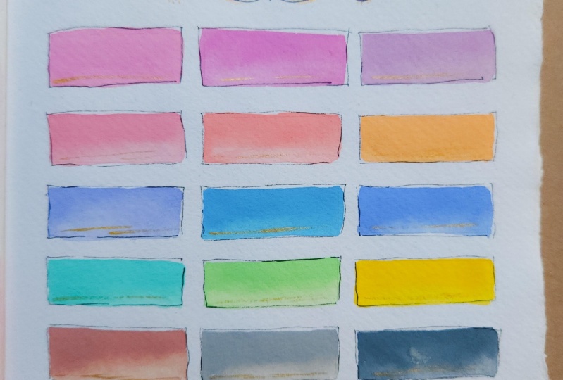
8. Color Palette Inspiration: Want to share some good sources
for some color palettes. I like to for these, use some different things. You might do color
palettes of your supplies, if you were
interested in saying, I've got these watercolors
and I'd like to have swat sheets of
those watercolors, and I might make a
Daniel Smith one of my reds and then I might
make a Daniel Smith one of my blues and greens and
that could be the way that you decide to do one
of your palettes. You could also just pick
these palettes back up here. These are fun little
samplers that I had been just experimenting with for
myself before I was like, Man, these are so beautiful,
we need to do these. Something like this might be, here's all the colors
that I have in a particular supply
rather than doing something plain like
our painter diary where we swatch out
colors like this. This could be the new swatch out way that you
do things instead and then these are
pretty enough to hang up. Keep on the wall. Then on some of
these, if I did that, I wrote on the back side
what each of those were. You could number your swatches. Right in there, you could
add a little number or below it a little number
and then on the back side. You could write what
you swatched out or if it were a recipe
for each color, you could write that
recipe and you'd have plenty of room on the
back of the page. You could also write this on a separate sheet of paper
and tape it to the back of the page so you can
write it as you're going because these
will be wet probably. You could also write
it underneath. If you have handwriting
that you want to display and just have it where you can see it,
you could do that. There's lots of things
that you could do there. A color swatch of your supplies is the easiest place to begin
with something like this. You could also do color
mixing and swatching. Let's say that you've got a blue and a green
and you're like, what are the colors
can I get using these two colors and you
could do mixes down below it. To then be like, if
I use these colors, here's the colors that might
come from those two sets. That's really fun to do
those because it gets you into color mixing and then you can be color
specific and be like, I want a green palette,
I want a blue palette, I want a blue green palt, I want a yellow palette. Whatever it is, you could
do like 1 million of those, create beautiful art
while you're doing it and give yourself some super cool swatching palettes while
you're doing that. I did that with the greens here. You could also vary
up your shapes and maybe a particular color palette that
you want to use. Maybe you'll pull
this color palette out of your whole set of colors and instead of
having all the options, say, a, this year, this is my signature
color palette. And you could number those
or write them on the back, what it is by row. Lots of options there. You could also do a color palette for a collection
that you're working on, and I particularly love pulling color palettes out of my color cube and doing
color challenges. Something like this would be
a really great way to create a color palette like
this that goes with a collection or a painting
that you're painting, or to remember a particularly favorite color palette
because a few of these, I've loved so much that I pulled them out
and hung them on the wall so that I could revisit it over and
over and over again. Even though these just have
five or six colors on them, you could then make
combinations of these colors like I did
here in the screen palette, and then see what
other colors could come out of here that would
be harmonious with this, that you could still put
in with that palette. Lots of options there. You could also pull colors
from your own photos. I've done that a lot.
You could also look on Pinterest and pull color
palettes on Pinterest. You just go to Pinterest and type color palettes
in the search bar, and then you'll see
thousands of ones that are free for you to look at and use on there and then
because it's online, and you're like, Oh, I have
nothing to hold in my hand. If you go ahead and
create yourself a color pallette from that, then you could very
easily then be like, here's the one in my
hand that I could use. I'm Just brainstorming
some ideas here with you. I think for mine,
I'm going to work on color mixing and
stuff and just see like, I want a blue palette or a green palette and how
could I make that happen with white and black
and maybe all the blues and greens that I have,
something like that. You could also I had this great idea and we'll
do one of these. Do a family tree
palette of burstones. Then you could have
that tree that we drew from The other video where I
was showing you the divinia. You could have a tree
and then you could have your color swatches be the
birthtones of the family, O and with it not being
a circle or a square, maybe it could be a leaf shape. I'm thinking leaf shape
as your color swatches. You can get real creative
with these and see how you can go in
different directions. I just wanted to start off
saying if you're thinking, what colors am I going to use? Those are some options for you. So in this class, I'm
probably going to work with Daniel Smith and
Holbein watercolors and Holbein guash
because they're convenient to pull out for
demonstration purposes, but you can use whatever
you have on hand, whatever paper that
you want to use, whatever colors, and whatever material that you want
to use to swatch out. You could do this with
pencils and you could do it with oil pastels
or soft pastels, don't just limit
yourself to paint. I just wanted to give you some ideas there to
help us get started and how are we going
to come up with these color pallets
that we're making? I'll see you back in class.
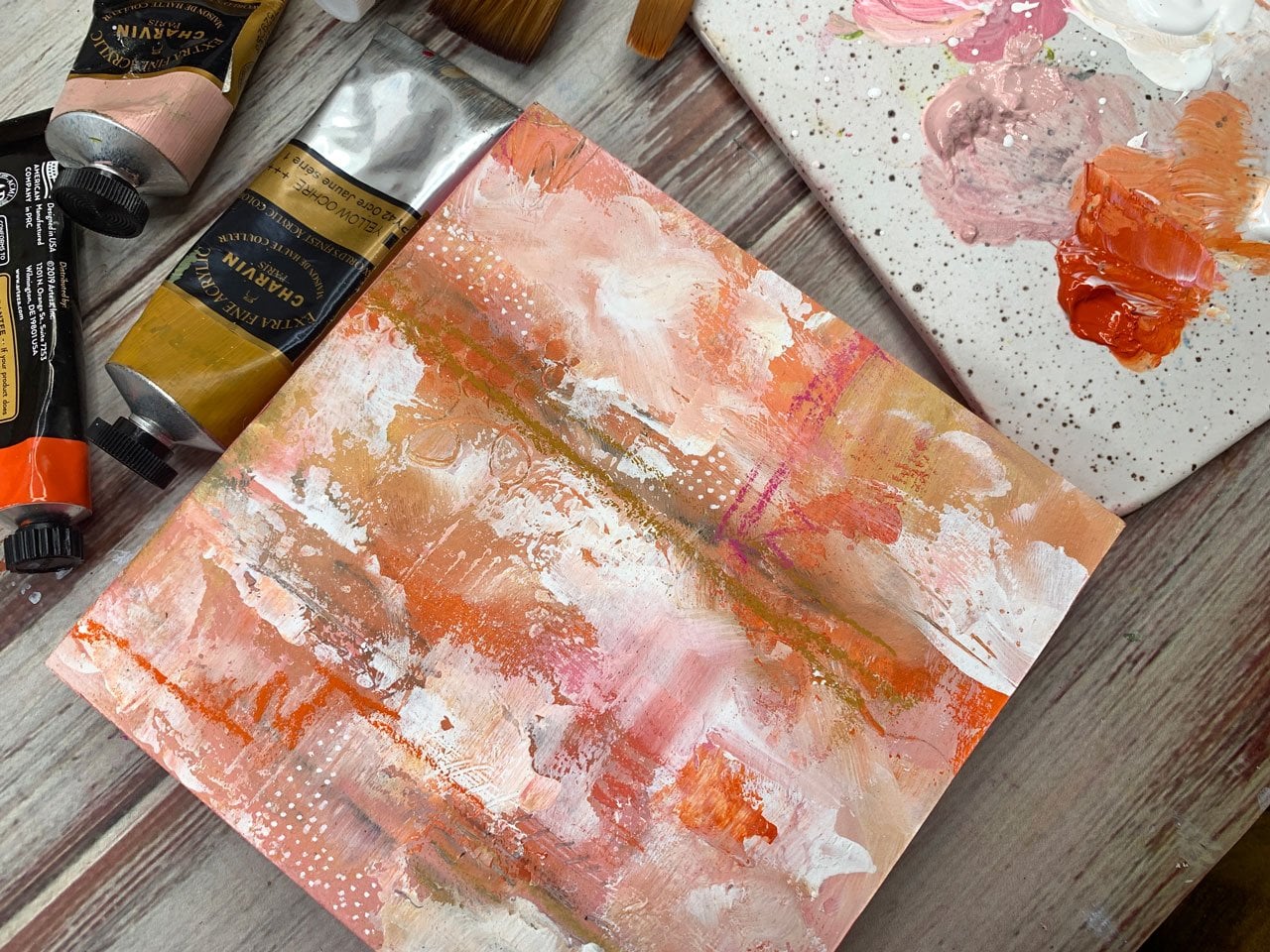
9. Creating a Harmonious Color Palette: This video, I want to start
with a particular material, whether it be squash or
watercolor or whatever you have, and talk about doing
harmonious color palettes, and how we can make
it harmonious. If you're looking at your color palette and you're thinking, Oh, I want to use something
in the a red, blue, green, pink,
orange, whatever. You're looking at all these
colors and you're like, they don't all really
match exactly. There is a way that you can make harmonious
color palettes out of regular colors by picking a color to be
like a base color, like maybe a gray or titanium. Buff titanium or maybe yellow and you want
all of the stuff to blend in with
whatever color that you've picked out or
maybe this yummy teal. You're like, Well, how can I get all the colors to be
harmonious with that teal? If we use that teal
as our base color? We can mix a little bit of teal into every other color that
we're thinking of using, and that will bring
all the colors into a harmonious feel because they
all have that base color. I'm just going to Do a little demo here before
we actually get into making our big art pieces. I'm just using
whatever paper it is that you're going to be
using for your projects. Now that I thought
of that, thinking, let's go ahead with
these Daniel Smith. Let's do one that's
a little bit crazy. Well, maybe not crazy, but I'm thinking, let me
just wet all these down. These are in my little
art tool kit palette. I took all my tube colors and put them in these little art tool kit palettes, which I love. But let's say that our
base color is this yellow. I'm just going to put that
color out on my palette. That one is Van dike let's see. That one is three, that
one is yellow Ochre. Yellow Ochre is my base color. That's that color right there. I'm going to have
that out there and then not sure what my total composition is
going to be at the moment. But what if we just do some elongated lines
starting with that color? Then we might come back
and decorate this. Once we're done painting it. But this is basically
how I get started. I'm like, what do
I want to do here? I might paint all of the things first and
then decorate it after, or you could decorate it first and then
confine yourself to a little place within
what you've left open. This is that teal, which is sleeping beauty. To make this total and blending, I'm going to mix sleeping
beauty with the yellow ocher, and that's my second color. After you see a few of
these and do a few, you might get an idea for
how you want to do it, whether you want to
paint your swatches first and decorate your paper after to be a finished
piece of art or vice versa, decorate it first and then swatch it afterwards,
because I've done both. If I've got the yummy stamp
patterns and I'm like, I want to stay within a
certain area like this one, then I might confine
the area first and then decorate and swatch just open
there to how you do that. Thinking that I like
this color right here, which is amas genuine. Again, I'm just going
to come over here and blend that in with
some of that ochre. I want that yellow ochre to
be in every color that I do. It's not going to be pure
color when you're done, but it is going to be a beautiful harmonious
palette when you're done. If you're thinking, Oh, I'm not going to get these all lined up. As I'm painting, you can
draw yourself a box or a rectangular or whatever to confine the painting
and then erase those. If you're wanting it
to be an exact line, you can even tape these
off each time you do one. Not looking for
perfection personally. That's why you don't
really see me doing that. I have tried several different
brushes to paint these. I do like the round
brush that I'm using. We could be using a square brush like a half inch wash
brush would be fine. Not. I don't care if it's perfect. That's why I haven't
gone there so much. Then I might think,
what's the next color? Maybe I want something out
of the pink orange palette here just because maybe I want to try that bright
pink right there. That is quinacridone coral. So Let's just do
it, look at that. As we get that yellow
ocher in there, you can see it tones it
down just a little bit, and it will give us a color that even
though it's brighter, still harmonious here in the palette that
we've chose to paint. This is just a number
eight round brush, especially with the shapes, I have found this to be
the easier brush to use. But you can use any
brush you want, experiment and play after you've seen how you do
something like this. Just play and experiment. There's no right or
wrong way to do these. It's just when you're done.
How did you get there? You want to remember
how you got there. I like this color right here, which is raw umber
violet, right down here. I'm going to mix
that in with that. Yellow ocher, that's pretty. You see almost any
color that we pick. It just looks like they blend in and go
together because we've started off with a base of
one color and added to that. Of course, they're all going to look like they fit
in that match. I think I'm going to
pick one more color. Then we will be even enough where we've come down and I can add things around it, maybe and then we could
still add other colors. I'm thinking this crazy orange right here, which is that one. That one is
quinacridone deep gold. Let's just get a little bit of that color that
we started with. Which one did I say that one?
Yeah, that one right there. I'm not too worried about
contaminating stuff. I don't want it
to be so off that all my colors are
completely contaminated, but at the same time, I'm not being super precious or careful. We'll get some of that mixed in there and get that
color down here. Even though that
was a color that might have been okay
just as it was, adding a little bit of the ocher and it really pulled
it together for us. I like that. Is not perfect. I could have drawn all those in. We could have used
a ruler, we could get really as fussy
as you want to get. That's not my goal
to get super fussy. I do want these to dry. Then I'm also going to I'm going to stamp on these
rather than do doodles. Thinking like some.
I'm going to use one of the In ink. I'm there's a correct
way to say that. I'm sure somebody
will correct me, but I've never even seen this
brand in Inca Inca In Dad. I think that's what
it is, Inca Dina. Anyway, I like these
flush. That's one option. Oh, you know what else I got these trees that I
thought were pretty. We could do a tree
thing over here. That puts it right on it. It could be interesting though. I'm just thinking, look at that. I'm feeling like that
looks pretty good. Let's pull the tree off. I'm trying to see which way so it's going to be down that way. Let's pull this one up. I want the tree
here on this side. That's the stamp edge. Oh, my gosh. This thing
is attached well. These, I think I just
found on Amazon. These are called Autumn
forest tree stamps. Holy cattle. That did
not want to come off. Thinking though, what if
we did that right there? That goes right in with that. Then we do have some lovely little stars over here that
could go in there. You know what I do like
this little flower thing. You could do a little
flower right here to end it off and that could
be our palette and finished piece of art. Filling that. I'm just thinking
out loud as we're going. Then I also have some of
these little things that you Put these on. But I might not have one the
exact size of that tree. These are the blocks that
you put these stamps on so that you can
stamp them down. Some of these still have
the plastic on them. If you get a little
cheap set of these off of Amazon, one of them said, take off this plastic
thing before you start, I was like, what plastic thing, I that showed us right there. But now, then you can stamp
the little rubbery things. This is just my clay tool
that I was using there. I'm thinking that the tree tree is not
going to be perfect. You know what? Pulled
off the wrong one. Okay. I can see now. I don't know. Maybe
that was the right one. Just sticks it down and gives
you something to aim for. I'm going to do the tree first, using that ranger archval I, which is my favorite one. I'm going to just go
ahead and get it covered. This is a fairly new ink pad. This is not an ink pad
that I've had forever. I like every once in a while
replacing the ink pads or have you can get a re inchor for these where you just spread some more ink on it. I do have a rechor. If you've got old stamp pads, you might consider
getting a newer one or re ink it and make sure it's
fresh and ready to go. I feel like that's pretty good. I hope. Feeling like
this I realize now. I had some of these. But I didn't have
enough, they weren't big enough because
I've had stamps for a long time grab booking days now see that if
you pull the other side off, I can actually see through
it a better and I can really go Here's the right spot. I can really judge that before. I put that down. I like it. Then for this, I just stamp that on a scrap
piece of paper. I will set that to the
side and do that in a moment. Then this side. If you have a black pen and it didn't in where you wanted it to or it wasn't dark enough, you can go back over these with black ink pen or a micron pen. I'm not looking for perfection, so that's not what
I'm going to do. I'm looking for fun,
artistic, just creativity. Not trying to think super duper
hard, but check that out. We could continue adding a few more decorations
to this because I don't generally just leave something I stamped on to my paper
just like it is. I do sometimes go over that with Posca pen or my gold pin. I feel like a little
bit gold and my pencil. Let's see. I could go over
that with the micron. Let's pick a five micron. Where is it? Well, let's
just pick whichever I got. Here's one micron. This is finer than. Than the one I was going for, but now I could come
back over here, define some of
these a little bit, just as a rough box around the box and give
it some definition. That's just an extra. I like doing it. You
don't have to do that. It's like why did you do that? I like it. It gives just
more interest around it. It pulls those boxes into whatever ink that
we did. I like that. If you're into
nature and you could do something like
butterflies and flowers, if you're into super fun,
whatever subject books. You could do fun book. This could be like books stacks. You could do books
stacks and book stamps. That would be cool. You could really get creative with
color palettes like this. I'm feeling pretty good. My extra these are like your, your extra scribble and mark
making, and stuff like that. Feeling like I want a
little gold in here. And that's just going to
shine as the light hits it. It's not going to necessarily
be anything super major. Let me get a piece of paper so I can just I was just
pumping it a little bit. This is my acrylic liner, Kur Toki, the Zig marker
that I got from Sketch box. I love it. Then we could also come back in here and do some yummy
gold with the tree. We could add we could add little gold leaves
if we wanted to. You see how you could
just really keep on going and get real creative after you get your initial
color palette down, and how you can
decorate beyond that. I like something
like a little bit of gold because it just adds a very interesting little shine without it being too much work. At that. Oh, my goodness. It's just little
touches and details. You could do that with
white pen if you've got a white posca or something
like that, we could do that. You could continue
embellishing further. I could have leaves coming off floating out
here if I wanted to. But I think for this project, I've gotten the point across of what I wanted to talk
about was creating harmonious color palettes and just picking a base color and seeing how you can make five or six other colors
fit that color palette. In the end, it may not be a color palette that
you want to use. It may be something you
were experimenting with, but it's an excellent
way to play with color mixing
and seeing how you can get those colors to blend in together for
a color palette for you. I hope you enjoy this project. I'd love to see some color
palettes that you did. You could even on the back if
your paper is thick enough, this paper is thick enough, you could let me get my brush
out, but you could say, I started with this color and then write what
that color is, and then say, and then
I added this color. You could put on
the back side of that palette what colors
you started with. Then later you wouldn't be
like What did I do there? I'm confused. Keep that in mind, different things that you might
try and how you got there and it doesn't come through
this super thick paper, but you'd have to
definitely judge the paper. You could do this
on a scrap piece of paper as you're working and then just washi tape tape it
to the back of your piece, as the color palette with
your original colors. That's something
that you could do because after you
do enough of these, you're going to be thinking,
how did I get there? That's an idea for you on the back if the paper
is thick enough or a scrap piece
of paper as you're working that you can
just tape to the back. I'll be have fun
with this project. I can't wait to see your
color combinations, what your base color was, and the palette that
you created with it. I'm looking forward to
seeing some of those, and I'll see you back in class.
10. Working in an Old Book: In this project, I want
to talk about using old books and old papers
to make color palettes in. This book that I'm using here is a very old sentimental
choir hymnal. I've used this for a long time. I introduced it at some of the very first classes
that I did on here. Maybe two years ago,
I've had this for a long time and for the
majority of the time, I've used it to put the piece
of art and the supplies and the color palette that I
did with that piece of art on these pages. It's probably one of my favorite possessions because
now I can just open this little n. And I can get inspired by different color
palettes that I tried, and I can go back to
ones that I thought, those were some of my favorite or that was a good challenge. This was an extremely fun way to keep up with color
palettes and such. I thought I would just talk
through how I created in the book so that you could prep your pages and create
pretty easily. What I did was these pages are
very fragile in old books, and I had decided at the time
that I did these to staple a couple of pages
together so that I wasn't trying to put a color palette
on every single page. But you certainly could. This is a single page color
palette and it's done okay and that's a single page, but they get very thick. And so you can see how the pages I've done stuff on versus the
ones that are still left. You could try the
single pages if it's more delicate paper or
you've got some torn pages, then consider stapling
a few together. That's a single page and this is a couple pages stapled together. I just did one staple. It's not a big deal,
and generally, I staple them together
with the piece of artwork that I was
attaching to make it easy, but here's one that I've
already staple together, just planning on something fun, and to paint on these pages, you need to gesso that paper. I used the liquitex clear Gesso, and I just painted an even layer right on
that page and let it dry. Now I can feel that it's
got the Gesso on it. It's a gritty feel. The page is protected, and it's ready for
me to paint on it. I could paint on
top of this with the same way that I've been doing some of the
other projects, and I could I'm going to use the Gach because still
got it sitting out up here. This is my half inch
simply Simmons brush. But I think what I'm going
to do is just create myself a color palette squares. I'm just going to do
squares on this one. Then that would be
a really fun way to get all your
colors in a palette sampled out and then
you could decorate around it or let the book
page be that decoration. But it's super cool just
to have this with colors going across the
words or the music or whatever paper it is
that you chose to do. I like how bright and vibrant
this color palette is. Now, I have used Gesso
on this and I'm using basically a water based product that's very similar
to watercolor. If you're doing water color, this may or may
not I don't know. It probably will
work. That's working, but it's working a
little different than it does on cotton paper. You might consider
something like watercolor ground if you're going to do this on top
of something like this, but I think the watercolor
ground might be white. Just experiment.
That's my point there. Don't be afraid of
stuff, go ahead, experiment, and if you think, I wonder if this
will work, try it. That's the only way
that you're going to know is just try it out. And these are the
whole bine guash. These are the tubes of
whole bine that I have squeezed into
little pans because I have discovered
all the little tubes of water color and
gash live in a drawer, and they're not convenient. I don't pull them out
as much as I'd like. By putting them in a
little paint palettes like this, I have Pulled them out way more than I have done
in the past year, and it makes it
super convenient. Now these have been in these palettes here for
a month or two, and they dry up, but you just reincorporate
them with water. I just sprig some water on
it when I got started here, and then they were ready to go. It doesn't matter if they crack or if they pull
away from the sides, you're just trying to resaturate them
with some water and just let them do their thing. Look how pretty this is. Let's
go over here to the blues. I got some more space here. You could list out on a separate sheet of paper
and staple it on this side. If you want to list
out the colors, you could do a little
label underneath, if you can get a label in there. You can get creative
in how you do those so that you
recall what you used. But that's not my goal today, but I'm just giving
you some ideas to keep track if this is a
color palette that you're actually going to be using going forward to see what you got. Mines more in an art
journal capacity, so that's why you see me. Not doing that as much
with some of these. I've still got a little space. I've got the colors
marked in my palette, so I'm just not
worried about it. I'm just going to
pick a few colors there. Finish this out. We've got this yummy rib. Look how pretty that looks
just doing it like that. Got earthy color orange. You could be real exact
and get pretty squares, you can get real exact and do pretty circles. W, look at that. I like the fact that
mine's not perfect, but look at the
crazy yummy colors. Then we can still
decorate on top of this. I'm going to let
these d for a moment, and then maybe we'll do on
top of them. All right. This piece is dried,
and I'm going to do an experiment and take a hit
for the team and just see, what would this look like if we stamped on top of it
because I've never tried stamping on top of the book pages and
saying, do we like it? Do we not like it? I like this little flourish
that came out of that little floors set that I was I've been using
this whole time, which is made by recollections. I got it at Michael's and
this is the formal esc set. Depending on when
you watch this, there may or may not still
be any of these available, but I'm thinking maybe a
little floorsh up top. And then we could
decide, Do we like it? Do we not like it?
Is it too much? Do we want to leave
it as a book page? Then when you get to
using old papers, you'll already have an opinion
of if you liked it or not. Because all my other pages, I just put the art in
the color palettes. I did not do any
doodling or decoration. Be interesting. Let's
just do it right there. Because it might just add to the chaos of all the
writing on the page. That's actually pretty,
isn't it? Okay, I like that. That's a pretty
little do loi there. We could do the other side
if we wanted to frame it in. We could do it down
here in the corner. I'm liking what I've done there, so I don't feel like I have
to do any more of that one. I'll just put that one
back in the thing there. That gives you a good idea. I think that actually did
work out pretty good. I can see it right on top. We could also take this time
to doodle on top and see if we can add any extra decoration or anything that maybe
we would like. Maybe we can just edge it
in the goal. Might be fun. You can use any of
your art materials. You can use soft
pastels, oil pastels, although I would
finish these off with a pastel spray if you're going
to go the route of those. I just picked a doodle, no reason there why
we did that one. We could come on top of our stamped doodle and add
some gold if we wanted to. I might add a little
dimension to that. This one was awfully pretty
in the black those too. I don't know. Use your
discretion there. Since I added the
gold down there, I thought, might be pretty. Super fun, and then that just will give it a
tiny bit of shimmer. As we hit it with the light, a tiny bit, could
have been dots. I could have been could
have done it in black, we could have all kind
of options there. But I wanted to give you
something fun to think about. Consider using old book pages, look how cool that looks. We could scan this
in and that would be a really cool print
and frame it out. I so many ideas that you
could do with old books. You could pick books that have
some significant meaning. This happens to be an old hymnal and I just thought it was cool. You could pick your
favorite song out of that hymnal to do
your color palette on top of and let it have more meaning than just randomly picking them as I have done. But I just think
it's a cool idea, and it looks cool
when you're done. I hope you enjoy
exploring this project, and I'll see you back in class.
11. Working In An Art Journal: Project, I thought we would
do one in a sketchbook. I'm using a little cody papers, a sketchbook because
I love the books. They've got the hand torn edges, and if you were going to have a pallette book of
different colors, this thing would be
perfect for doing different palettes on every
page and getting creative. This would be the perfect
sketchbook project. I pulled out some stamps which I've just got because I thought, I want more flourishes
and pretty things. This one's called long
vintage retro flower stamps. Doesn't have a brand. It says made in China. But I thought they were
really pretty and they could be lovely on our piece. I'm going to use these. I'm going to play
in the Gach steel because it's just convenient for something like we're doing because I can
have all the colors, I can decide what I want to use without pulling
out all my tubes of paint. I think I'm going to
play in those and I like how vibrant they are. I've got all of those. I also have my ink pad. Right here, I'm still using that ranger archival ink because
I know it doesn't smear. Now I just need to think
about composition where am I wanting to put these versus what I want
to do on the page? Look at these and think for a moment. That's that one there. I could do circles, could have it like right
there, maybe little ovals. I've got some different little
furniture templates and stuff from when I used to do drafting and I could
do little ovals. If you don't have
little templates, you can free hand your ovals, which we might as well
do that because it's a sketchbook and you could think like how many ovals do we need? I'm thinking in my mind, I'm going to work
with these oranges and pinks because I like them. I've got my palette here. This is just a plate, a white plate for hors
d'oeuvres and stuff, and I got it at the TJ Max, and it's a lot cheaper than paint palettes and stuff
and you just wash them off. When your stuff is dry, if you need a clean palette, you can wash these water
colors and stuff off. And it's really look
what is this one do and It's so beautiful what
those colors are doing. That was in our last
little project. But how beautiful is that? Now I want to just take
that up and keep it. Yeah, we can just decide
on how many do we need. If I just go through
these reds and oranges, maybe ten, would be good. One, three, four, five, six, 789, I could even do
mixes if I want to do 12. I could plan on having another little stamp
right up here. Just thinking here. This one's really pretty,
so maybe that one instead. I like how that one comes over, but really it's going
to go that way, so it's not going to go the
exact way I'm looking at it. Let's flip it over. I know
that one's going that way. That was really pretty too. That could be over there. Now I can think and
I'm going to do them here just free handing them so that we know there's
nothing special. And I'm doing it in pencil, so I could erase
it if I needed to. But if you get L esse
racing is better though. Let me tell you on
the cotton papers. But if you get your
decorations and you could do this with stencils. You don't have to have
something like the stamps, but I just find them convenient. I've got some pretty ones, and I think they're fun. That's py cool there. I think I'm going
to go for that. It doesn't have to be perfect, I'm not looking for perfect, I'm not looking for exact. I think I'm going to
start off and try not to dump link pad on my
page, which I've done. Then I've got some of
these stamp blocks that I can put this on to get a good and then I will probably decorate on
top of the stamp. When I'm done because I like when it doesn't look like
a stamp or a stencil. And so I like to do that. Look how pretty that is. I'm just going to put
this one back over here and I can get a piece of paper and just get that ink off of
there, pretty good. Then we've got this piece here. When you're doing this,
try not to ink it on top of your paper because I have Dump the ink pad on
the paper accidentally. I'm clumsy. I drop things. Like I almost drop that. Be careful when you're
using stuff like this, not to do it on
top of your paper, if you can. Oh. You missed the little edge
there, but that's okay. I don't feel like I want to
try to do it on top of that. Just is what it is. I wasn't careful enough about the edge. Then maybe some
pick that back up. Then I just put the
clear thing back on top of it and stick
it back in the package. Sure you could go to the sink and wash them off
if you need to, but that's what I do and to
keep moving with my art. Then let's go ahead and
we're going pink and orange. Then I will do some extra decorating and
doodling on top of this. I'm still going to just use this palette here and I've got a thing of
water over here. Getting my brush in there, and we're just
going to go for it. One thing to think about
as you're doing this. Any pencil lines that are up underneath the paint that
I can see shining through, there's no way to
get rid of those. If pencil lines shining through are going
to really bug you, then I recommend you experiment with watercolor pencils because those might dissolve
and blend in with whatever color you're
painting on top of it. That might be one choice. For these gues, I was
using pale, Nope. I was using Cadmium red deep, brilliant orange
ramion, pale coral. O, brilliant number two. Rose violet, rose opera
pink, and brilliant pink. I was using those
two rows there. Then I came over here
to my other palette and grabbed two more like reds out of there so
I could keep going. I grabbed cadmium red
purple and ism crimson. So I'm going to let these dry and then we're going to
decorate on top of that. But look how pretty that is. I love it. I'll be right back. This piece is mostly dry, so I'm going to decorate it. I thought what we could do is I like to draw on
top of my pieces. I don't like it just to
be just plain stencil or stamp because I feel
like then it just looks like you
stamped something on there and it didn't
take a lot of effort. If we do something on top
of it like maybe color or maybe gold or just something that gives it that
extra dimension, then it looks more hand done than if you just stamped
it and went on your way. I thought maybe I would just
take some posca pen and do some extra little marks and dots and whatever
because I like it. And do as much or as
little as you want. I just think it
adds to your piece if you'll add extra elements and layers and
dimension in there. You can do that with just gold because I'm going to put
gold on top of this. I was trying to stay within the color
palette that I picked here just because
I like that combo. I'm going to use my gold Zig
marker because it's easy, but you can use dip pin. You can use any gold you want. This is a Kura Toki, gold Zig. It's the same brilliant gold as their Mica ink
that I like so much. You can use the Mica
ink with a dip pin. That will work great, too. These are just so nice
with something like this. If you need it to be
heavier gold accents, then use the ink with your
dip pen or a brush and that can definitely give you
a much heavier accent that would be really beautiful. I'm just following some of the lines that are
already in the stamp. That's what I'm doing
here, nothing special. Just making it look more hand
painted than stamped on. I think I'm going to
grab the 01 micron, which is the very fine point and just outline. No perfectly. I'm not looking for perfect, but I might do a couple of little rounds of the outlining in that way, the
pencil underneath. Doesn't bother me.
If it's shining, it doesn't matter
because now it's part of what we've added to the top. It makes it like it was
supposed to be there. I like it because the one
is a super fine line, so it's not going to overpower. You could do this with pencil. You could do it with any
of your colored pencils. You could have done that
with that. Just whatever you have on hand, get creative. I like that. Get creative with what
you do with your pieces. Now I'm feeling like we need. Let me get this started
on a piece of paper. I got a little piece
of paper out here. I'm just pumping some
fresh color out of here. Look how pretty that made that. Let's do a few more dots, maybe. I'm thinking, What am
I thinking or do I like it just like it
is? It may be there. Almost feel like maybe
something up there, or should we just leave well enough alone because
that's really. I'm thinking on this side, we've got extra space that
we didn't do you want to leave it like that
or do we want to do 11 thing over here
because I got. That way, it looks like
the whole thing is a finished spread because
I got these flowers. That could be pretty over there. These are stampers anonymous
Tim Holtz flowers, but maybe we could just do a stamp or
something over here. We could use those same
flourishes if we wanted. We could do. You can't
really flip them though. If you don't have two
because it'd be nice if you had one this way
and one that way. If you don't want to do
something on the other page, like, I don't want to leave
it blank. What can I do? Do a line drawing over here, or something like one of
these. What about that? What do you think
of that? Or I've got this swirly tree one that I found a long time
ago at the Michaels. This is Ica fall tree, maybe like that tree there. Fill on the tree now
that I've found it. Definitely just look at
what's available out there, go to your craft
store and just see, is there anything out
there that you're loving and that you would
maybe use more than one time. I hate to buy a stamp and then not use it more than
once or not at all. This wasn't used at all. I came out of mytash. Just go for it, Look at that. Then that could be the
finished other page. It doesn't have to do
anything else now. You just pick a design
and do your thing and then flip the page and
these two pages are done. It helps to not painting on the back
side of something that's got paint on it if your
sketchbook may not take it. That's a way that
we can handle that. I'm loving what we
ended up with today. Can't wait to see
if you decide to do a color palette
project type thing in your sketchbook and
then you'd be able to flip through the lovely pages of what those would look like. I'll see you back in class. Oh.
12. Tree With Leaves Palette: For this project, I went ahead and finished just sketching the little last part
of our inspiration drawing here in the divici
app that I was working in. I thought I would just ink
it and show you what I would do to finish the drawing part of it and then we'll put a
color palette over here. I was thinking
this could be like family tree, tree of life. Anything along the lines
of leaves falling, it could be a fall palette. So I can leave this open
and refer to it if I want. I can bring the opacity up if I need to really see what it is, and we can just see
what Can we do? I want the 05, which I don't know where
I have stashed it out. We can do it 08, a little
bit bigger, that's fine. I want the bigger point. We could do it in Posca. Let's just do it in
the Black Posca pen. Just make sure that started
on a piece of paper, and now I can look
at this and see, What we've got over here
are inspiration piece, it doesn't have to be exact. I'm not looking for
perfection here. I'm just looking to
clean up what I did because you're drawing blind when you're looking
through the app here. Once you get all most of the
stuff that you need on here, you can come back
and clean it up, make the lines a
little straighter, add in leaves or patterns or decorations in where you
think maybe you lost them. You can take your time
and really finish it off. That's what I like
about things like this. I was mentioning that. I just didn't
realize that artist a lot of them, not all of them. Use drawing aids, the paper
that you can draw underneath. I still can't think of
the name of that stuff. It's the blue stuff that you draw on to something
on tracing paper and then the stuff in between and it makes the drawing
on the page below. It's just escaping me. But I didn't realize
that people did those. They used projectors,
they used anything. Sometimes if they
are free handing, they're using a drawing grid. I mean, in my mind,
you're an artist and you are doing everything yourself. As a photographer, I did
all that work myself. It didn't occur to me that
Not everybody did that, and you don't know if
they don't talk about their art practice and exactly how they
created something, you don't know how
that got on there, so it's not really necessary and important for you to draw everything from
complete scratch, if that's the most frustrating
part of your journey. There's no shame at all in using something
like a drawing aid. It just I don't know. It just didn't dawn
on me that there were tools out there
like that and that people did it because I didn't
focus on drawing so much as the other aspects of art
and things that I liked. And I just thought
that was fascinating. I even saw this documentary
one time on this artist. Might have been a
Japanese artist, and they did these
gigantic paintings of what probably was
like Geisha girls. I watched her do this painting. The start of her painting
started off with her projecting the girls
photographs onto the wall, and then painting
from that projection. That's where I realized that, not all artists do
everything from scratch. I just it never occurred to me. Then she had drips of paint coming down
their faces and I wish I could remember What
artist that was. This was several years ago. That's when I was the
light bulb came on like, even big gigantic painters
want to have some help. This was a gigantic wall size painting that
she was doing. They get help in getting proportions right and
getting everything sized out and
creating their vision without stressing about
trying to draw a human head, eight feet in size and trying to get it all
correct by hand drawing it. So you can see where some of that stuff definitely
would come in handy. Then let's see. We've
got something over here. Again, with this, draw it out, get your proportions correct. All kinds of ways
that you can use. Any tool available to you to get your vision onto the
paper is acceptable. You don't have to tell
people how you did it. You don't have to think
that you're not an artist because you used something like this to get that onto the paper. It's nobody's business, but
you, how you got it there. In the end, it's
just the piece of art that you created
that's important. A get this. Let me dry this. Hang on. Look at that. I think we did pretty darn
good for a first try because, as I was about to say
before I did that, this is the very first time
I've ever tried the app. I was the guinea pig on camera. I did not practice
with it before. I mean, I downloaded it and it p the little instructions and then I took a
picture and I'm like, h, k, I got it. Very first thing I
actually did with the app. I would say that we did fantastic for a very
first go with the app. It did exactly what
I needed to do. The reason I wanted to do that because I wanted
to be able to say, it's super easy,
look what we did with the very first
time we tried it. I'm just erasing all of our pencil lines so that we're just left
with what I drew. We can continue to go back
and add details if we want. But I'm pretty impressed with
how easy that was to use. Then we can come back and add more details as we're
looking at it and thinking, Oh, I think I need a
detail here or there. But how cool was that? Super cool. Now,
thinking in my mind. If you're thinking family
tree or you're thinking autumn palette, thinking
autumn palette. What colors are you thinking? I'm thinking autumn palette and maybe the
leaves are falling. Maybe you want to give
it a little try before. You get everything
out here and going. Let's think autumn pale
palette but you can do this as family tree. Is going
to wet all these. I'm using gas because I like them and I want
to play with them and they're convenient because
I've got them right over here in a little containers that I have squeezed
out my gouache. I'm thinking like leaves
instead of circles. What do you think of that?
Because we could do. I'm going to get
my color palette out here that I can
mix things with and we can turn this into our
harmonious color palette. We can play with
some of these colors and get different shades. We can practice our painting here on a scrap piece of paper. I'm still just using that number around
number eight brush here. I just got a cup of
water right here. I'm just sometimes
swishing my brush in. Then if you're worried
that you're going to not get these exactly
where you want on here, we could take a pencil and very lightly decide where we want
these falling leaves to be, how big we want them, where exactly we'd
like to have them. What if this were our big color palette and we wanted all the
colors out here, It's our family tree. It's the burst stone colors. It's a palette of something
that we're about to create, all kinds of reasons
we can have to create a piece like this and just take it one step further with lovely pieces like a
decoration on the side. We could have. We could have down here,
we could have drawn What could simulate a leaf pile, where these leaves
are falling down. Let's just go ahead and do that. Now that we just
thought of that. We can put some
leaves down there, we can get the pile to
go a little higher. But we can see where
the leaves are falling. You see how creative you can get with some of these pieces. It doesn't have to be just
straight boxes. Like that. And I feel like I want to do this harmonious maybe
fall leaf thing. That's what I'm going to do. And just picking a color and mixing it
with the color next to it. So that all the leaves are matching but slightly different. Maybe this gold over here. These are whole bind gas. This is my red palette. In this red palette, I do have the sampled over here and all
the colors written. You can see what colors I'm You might want
to screenshot that, that way, I don't have to
look and tell you what I'm using as I'm going. I want each of these
to be slightly different rather than
them all being the same. If this is a piece of art with falling leaves and you want them all to be the same, go for it. I'm going more for a color palette that we could have been using on a
project or whatever. That's my inspiration for this and I'm going to
continue down that path. But if you've got reds and orange and pinks and
stuff like that, you might mix them up
a little bit like I'm doing where I'm not putting
a yellow next to a yellow, keep some of that
thinking in your mind. Then if you do the
burstone ones, then if you've got burstones
that are the same, you could definitely
go ahead and use those all in your piece. You can write under
each of them. There's so many ways that you could get
creative with this. Now I'm just mixing
some colors just to see what would we get
a mi as we're going. Oh Then I think what I'm going to do when
I get to the end here. I think I'm going to then
draw over the leaves with some graphite and add a little extra
element in there. I've got some. We've got some metallic colors here
on the top of this palette. We could even some
metalics in there just to see what that looks like
some of the other things. Still mix some in my
palette here too, though, so they're
still harmonious. That one's good. I want a
silver one just to see. When I made this palette,
the whole binds are in little tubes when
I made that palette, it took days for them to dry. Some of these cracked. But you'll notice
that even cracked, we just moi just squirt them with water and they
reconstitute beautifully. Here we go with a silver
All right, look at that. Now thinking, we need
to let these dry. You could even
paint and decorate the piece that you've drawn if you want to your
preference there. I looked up and I
looked down and there was a paint that came
out to the side there. I have to watch the video
and see what I did. If you do something like that, I'm just going to take some
water on that and then see because it might have had enough wet
stuff in it that when I just went
off to the side, we did that accidentally. I'm just seeing if
like water color, we can pull that color back up. Experiment. Then if
you do this on yours, you can be like, I
know how to fix that. You'll have better luck
doing something like this on paper rather than
wood pulp paper. And somebody also told me, which this would
be a good way to experiment with this
glue residue eraser. Somebody told me that
works really good, too. I have had this sitting
up here for a while. Now you got to be really careful with the p if that's what you're doing it with because
this papers like layers. A Now, I'm not sure what
that color was, we're just going to I must have just pushed water out there or there was a handmade
piece that did that. If you have something like that, don't get super upset
because I can see here too, this gold one went
off to the side. Maybe if it starts
doing funny stuff, stop stop what you're doing because you're
changing the shapes. That's though because I'm going to draw on
top of them anyway. Just happen to think
if we're having the layers of leaves down below. It might have been a
good idea to sprinkle some color down here so that we knew it was the leaves
falling down there. That might have been it
might have been good. We can do that right
there if we wanted and we could paint that
up there if we wanted to, but I thought it's
very obvious that we've got these leaves
coming down this way. Maybe we want a little
color down there. Maybe I want a little
bit of the yellow. I'm going to finish drying this now and I'll be right back. Now we're mostly dry. I'm
going to go back with that same graphite pencil that I was using to
initially draw my tree. I saw a pencil line there
that I didn't get earlier. I'm going to come back and redefine our shapes
here and maybe doodle. It's not supposed to be perfect. I want to just add
interest and have some fun here because there are some
pencil lines underneath that shows what I'm
doing. Doing this on top. We'll give it a
reason to be there with how do I get rid of that thought. That's
just my choice. You don't have to do it the same way I do it, get creative. You could definitely decide how you want to do your pieces. I'm just thinking as we're going and getting creative with our mark says we're doing stuff. I didn't have a plan
for this piece when I started other than what
about falling leaves? The doodling and drawing
that you add to it, you can just do what
feels good to you at the time that you're creating. Oh, I like that. Look
how good those look. Some little leaf. Here we go. Look how good those look. Yummy. Then if you want to continue
decorating your piece, you could, but I'm happy
exactly where I ended up. Then if you were doing a color
palette, then on the back, you could do the colors
or we could have done the colors as we were going
and taped it to the back. We could do whole bin, we
could put that on the back with that just so that you can keep track of
what you're doing. If you're creating art for sake, like what I'm doing
with some of these, and it's not so important, then you can do it however. You know, feels good to you. I hope you enjoy giving
out a tree of life kind of painting in your
color palettes and just seeing like
what you could create, and I'll see you back in class.
13. Decorative 2-Color Palette: This project, I'm thinking, what if we do something like two colors at the top and then mixes that we can get
from that below it. I'm wanting to do something
perhaps odd shaped, so maybe something that
we're going to trim in just to play with that. I'm thinking that we could maybe do some
boxes, what if we did, and I'm thinking
down a little bit, and I might want to do a
decoration at the top, I know we've got eight we've got eight and
a quarter inches. Let's center that. If I'm coming thinking like
maybe 2 ", and then a break. T's see. What am
I thinking here? What is the center?
We'll say centers here. And I'm going to do it really
lightly so I can erase it. Then coming in maybe maybe 2 ". That'll give that'll give us a guide perhaps
all the way down. Not looking for perfect here, so don't worry about doing a little hand drawing
if you don't want to get a ruler and
do all your drawing, but we could do it with a ruler. Fell on this. I'm thinking maybe Maybe a color
right in here. You can just get our
thoughts together here with a pencil and then
we can erase the pencil. Or most of the pencil
one we're done, maybe, but this is a good
way to just get our thoughts in line
and get it lined up because let me tell
you I'm the worst about just going for it and free hand and
everything and just painting and then
after I'm done like, I didn't quite work
out the way I thought with a little more planning, you avoid some of
those disappointments. I'm feeling that right there. Then I'm even
thinking after that. Some larger blocks because I'm trying to give you
different ideas and variations, different layouts so that not every piece you
do is the same and maybe one of these layouts will really spark some
excitement for you. I've tried to do quite a variety
of layouts here in class just to get you excited and be like, I'm going
to try that one. I'm still going to just stay in the gua because it's convenient, but use whatever
paint you have on hand that you're wanting
to experiment with. Fill in that, at the same time, I think I left too
much space right here. Now I'm going to come back and
adjust these a little bit. And see if we had just
painted all that, we might have been upset
because we're like, no. But we could we could
have also put a. Even if you just go for it, you could put a decoration
in there. I don't know. Did I just take up any more
space at all? Maybe not. But I am thinking now
that I said that, little Dolly and
some decoration. My thoughts there.
I'm definitely feeling that. Let's go ahead. I'm going to, we could
work with a square brush. Maybe I'll just work
at the round brush. I just like this round brush. It's really convenient,
but the square brush does give me some edges. I think I'm going
to start. I got the round brush out
here if I need it. Round brush number eight, Princeton Aqua, same
one I've been using. But also have this simply
Simmons wash brush, which is a nice square. I might What I like about this
is then I can get a square edge and go edge
to edge rather easy. I'm just using a yellow
ocher and a bright orange. What bright orange is this? That would be Vermilion. The goal here is
to start off with the two colors and then we can
mix the colors with white, black or each other is my thinking on a color
pallete thing like this. I might have liked the
round brush better. There we go. Then let's go
ahead and get that orange. I just put water in those. That's the whole b. I just
added water and let it sit for a moment so that I was getting some really good color out
when I picked up my brush. Again, does not
have to be perfect. Don't spend all your time
trying to get it exact exact. I feel like maybe we'll put this a little to the
side or I can use this. How about that?
Now I'm thinking. I don't mind if I get other
colors mixed into it, so I don't bother cleaning
my palette there. We're good with the palette. But I am thinking
maybe we'll do some of the yellow ocher with a
little bit of the orange and that could be a color mix that we're coming down
underneath the yellow ochre. Got a piece of water
right here. There we go. Now my goal is just to use these two colors and a white
or a black if I want and come up with this number of color variations
of squares that we've drawn just for interest and playing
and color mixing. I color mixing is a thing that you don't feel very strong, this is the perfect
way to get stronger and p and end up with something beautiful
when you're done. I just want an edge
here. I love it. And then maybe I want more orange with a
little bit of yellow, so maybe more orange, but some yellow, maybe let
me grab some of this white. I've got white over here
and not too worried about. Getting the color in there, I'm not super
worried about that. I probably should be,
but I'm just not. I don't worry about
contamination. It doesn't bother me. I'll just be extra excitement on
something else that I create. Why does that do
that every time? There we go. Look at
that. I like that. Then we could take with
that peach color in it, since it's in the go paint
this bigger one with that. Since it's just right
on in that white, we could just go
ahead and use it. I could even do that with
the yellow if I wanted to, I could take a whole
bunch of this color. Go ahead and put
that out over here, and grab some of
this yellow ocher. That could be the
next color in there. You can see how you
could just come up with 1 million
combinations of colors with doing
something like this. You could come up with
just a different combo. This could be an excellent
hundred day project. Then imagine all the
beautiful color palettes that you would have
when you were done. This could be a collection
that you could sell. They'd be so beautiful. The more you do the
better you get at them. They'd be gorgeous. This would be perfect project. I feeling like D I want to mix a little bit of black in with one of these? Let's see what that does. Gives us a gray. Look at that. That's another color mixture in with everything
that we've already been working with right there with a little touch of black, and I gave it a lovely
brownish color. That was actually
totally unexpected. That was way unexpected. I totally wasn't even thinking that's what we were
going to get there. Then last combination,
feeling like maybe orange with
what we just did. Let's just see if we
get even more brown, like orangey brown.
Let's just do it. That'll be our last
little combo here. Not looking for perfect.
Keep that in mind. Your boxes don't have
to be exactly perfect. But that's pretty
cool. I'm loving that. That's a color palette
that now that we're done, I didn't expect at all. I did expect this. I did not expect that, and that is actually
super exciting. Now I'm glad I did that. Let me move my gases. Let me move all these back where they went
and we can start. Let that dry a tiny
bit and decorate it. I am thinking I'm
go ahead, do it. Thinking this
recollections formal es that I was using before. I really like this stamp here. That looks like
little flourishes and stuff and I'm
going to use it. Let me just move some of
this stuff. Here we go. Looking for my ink stamp. Get that right there and then get the ink out
and I'm going to try to be really careful not to damage this while
I'm inking this. There we go. I think
I've got a good ink. Still using that
ranger archval ink. Then I'm going to try to get that right in the
center and straight. Feel like that might
be it right there. Commit. It's easier when
I can look over it, so I was looking up
at the screen here. Then very carefully, perfect. Perfect. Then I'm just going
to clean that off on there. Then I really like the
yummy decoration in here. I'm going to use this bitty one. We'll put this back
over here after I just cleaned it off on
the paper a little bit. I'm going to use
this tiny flourish. I don't know if we
use this already. We may have. I know
I've used it once. I'm just going to get a lot
of ink on there. There we go. I'm going to put it
right there where I've designated a little circle. Oh, yeah. Totally what I wanted.
It's beautiful. Let's set that back on
there so I don't lose it. Then I will just put
the piece of plastic back on there and put that
back in that package, and that's how I store those. Now that's some prettiness. Now I'm going to color
there on the top piece. I might look at some posca pins. Here's a peachy color
that I don't know if I've ever used this color
or not, but it's fun. Thinking thinking, let's just go ahead and I might not let that
ink completely dry. Let's cover the ink pad. If your posca pin soaks
into whatever you're doing, it might not be shook up enough. If it's a light color, it may not paint coming out, it might be way too much. But it might just be the
liquid in the binder. It could be the light
color I've picked. Now that I've picked it, I'm going to put
it in a couple of places so that it looks
like it was on purpose, and then we'll come over
with some other color. It's my trick when I do
something that I'm like, I love the way that I did that. Then I go ahead and just let it, do it in a couple of
places, let it dry, and then you can come
back and do some stuff when a driver color on top
of it, adds to the layers. And the ink could have been wet. But I'm actually
loving what that's doing that it's got the light in the dark because it looks like It's got some shadow
and darkness there. Looks really good actually. I like that one. Also got this dark red and the archer
and olive that's real. Archer and olive pins are
also acrylic ink pins, but they're much finer tip and there's really
pretty colors. T. I just happened to
think before I do that, I might want that same lightness and darkness on this piece. Everything's dry but that
big splot of paint there, we're just going to
let that do its thing. I'm going to come back with
just some other details, maybe in this darker color. I like doing this on
stamps and stencils, and you can do all
this with stencils, if you've got a nice range
of stencils, get those out. But I like decorating
on top of whatever we stamp or stencil because
then it looks hand painted. I It's still very
I It's a design that doesn't maybe look
hand drawn unless you've got those calligraphy circles and you're really good at them. But I like the layers
and depth that we can then add
if we'll decorate on top of whatever
we've stamped or stencil that looks more hand
done and beautiful that way. Now I'm thinking. I wish I could go to
let that one dry. I think, because
I like doing it, we might outline these. We could outline these
in the Burgundy. I know I use the black before. Make sure my ink
is But this could be our outline in this kind of rgundy color
instead of black, and it doesn't have
to be perfect, so I'm not even looking
for solid lines. I'm just looking
for that darkness and that definition, really. Okay. I feel like we're kind
of there where I was going. You can see how lovely
the gold kind of looks and shines and the light and
just a little mark making. There we go. I like
that. All right. Let me let this dry and I'll
be right back. All right. We. I'm just going to come
th here with hi polymer and Gently get rid of any pencil lines that are outside of any
part of the painting, which was our guidelines, that it's not super
obvious on our piece. Then because this is more centered and I
did that on purpose, I want to show you how you can create some
different sizes here. Okay. I've got my rip ruler, which it's called a
dual edge ripper. I call it my rip ruler. You can do this with
a regular ruler, but I like the ripper because
it's got a fun edge on it, and I'm just going to
come outside the piece, hold this down firmly, and then I can just share
the paper towards that edge, and then the edge looks very similar to the original
edge that's on my piece, and that's what I'm wanting. Just wanted to look
similar and not look like, I tore extra off of it thing. Then if you have any piece on the torn part
that you don't like, then I pick up the
paper and tear that down so that we don't end up with something
tearing off the top. Look how pretty that is. I could go ahead and tear a tiny bit off the
bottom so that the edge on the three sides
is actually more similar. I can just do that. Then I'll have a more even edge
around the whole piece. I might tear this
little piece down. There we go. There we go. How pretty that is.
Oh, my goodness, look how pretty that is.
That's a pretty piece. I probably showed you my
inspiration piece early on, but I did one very similar
in blues and greens, so you can see how you can create just a whole
collection of those. Then I also did one
similar to that. Edges, but with
ovals oval shaped it and did a fun
design that way also. Hope you have fun with this technique and
you come up with some really good color
combinations and color palettes that you can then use and refer
to in your work. I'll see you guys back in class.
14. Decorative Frame - Bar Color Palette: This video, I thought that I
could pick a color palette, say all greens, and I think that's what
we're going to do today. Let's pick all greens. And I'm just going to
mark the center of my p. I'm feeling like, here's where the center
falls basically. Feel let's do a frame
out like one of my inspiration pieces
where I framed it out and then drew decoration on it and
went from there and we did elongated pieces and you can look at your library that you created
and get inspired. And get inspired for
marks and stuff. You can look at that
little library that we created doodles
and things and get inspired for doodles and decorations and different things that you might want to create. I'm going to free hand it since I've done
all that research. I'm just going to draw
these on here and decide, what's my top and
what's my bottom? This is going to be the bottom. I'm coming in about an inch from each side and I'm going to come down
about 2 " from the top. What I'm thinking
is that will give me enough space for
something at the top, like some doodle or
something up there or decoration or flourish or
whatever we wanting to create. That's how I'm boxing off here. You can do it free
hand if you want. I just thought a little
more exact might be nice. There we go. I'm thinking that
I'm going to do this with my Daniel Smith, my green, my green palette here. And so feel like if we
use this half inch brush, which is just a half
inch wash brush. I could get one,
two, three, four, five, six, I could get like
seven in there, six or seven. I might go through
the blue green line up here that I've
got in my palette, which if we look at my
swatch card that I created, we've got JD, genuine, cascade green, Kingsman green, chromium green oxide, Tera
verte, rich green gold, serpentine genuine, olive green, sap green, undersea green, parallin green, and we could
end up with sleeping beauty, just go this away. That's also blue appetite
genuine and moon glow. We'd go down this
row and back up. That's what I'm feeling
that I'm going to do. We're just going to get started and I'm just going to start at the top and eyeball my
way towards the center, and I say eyeball my way. I've given myself a center here and I could get it started and then actually
which might make it easier. This is handmade paper. If I've got a spot
that's darker, it's picking up some
texture of the paper. But I could take this as my inspiration for the rest
of the line and mark it out because I tend to I tend to not
get straight lines. After I've got started, I shrink as I go down. But what we could do is go
ahead and give ourselves a little light pencil line guide of where to start and stop, which I know that was
a little extra step. But man, having a stop and starting point
makes it easier. Because now you're not thinking, can I get it right where
the other one stopped. Now you're thinking, I got it. Good one. Then Color three. How pretty that is. When you're making your different
pallette pieces of art, I want you to think of different configurations as you're going. We're doing the
lines and this one. Next one, you could do circles. You could do squares that you frame in with little frames. So many options. If you end up just loving this very elongated bar
look, then go for that. I'm just saying maybe create
different configurations, and then you'll have
some fun options. I've just got to Can
of water over here. Can a cup of water over here that I'm
dipping my brush in. I'm not trying to keep
that off of camera. I'm just got it sitting
further over on my table. I got one, two,
three, four, five, six, one, two, three,
four, five, six. Here's number seven. Somebody said in one video that I did that they couldn't
replicate what I was doing. It must be the water
sitting off to the side that was making all
the difference, and I'm like, Okay. Try to put the
water in the frame, but I'm not doing
anything special with the water I promise. Let's see. Two, three, four, five, six, seven. We can get eight in
here. Let's just do it since we've got the space, or I could have
stopped and then I could have just raised
that bottom line. But I think it's fun to have the extra color since I
got them in here all tight. Then look how gorgeous
these are within our definition here that
we decided. Here we go. I'm going to do that on this
side too. Just very light. Give myself a
similar visual guide so that they hopefully
are about the same because that's my
center point right there. Let's just hope I
got the similar. We had eight. Let's
keep on going here. The goal is not perfection, but the goal was to
at least be uniform. If you have one
that's not exact, don't overly stress about
it. Just keep on going. I think I'm going to have
extra colors on here. If I do have extra
colors, Paraling green, sleeping beauty, blue
appetite, moon glow, I'll have indigo and
Amthys genuine, probably. Then I've got Napide M, a maroon and Lunar
blue and pains gray. That's what wraps up this line. If I'm going any further. Look one. That one was perfect. All right. Look at that. Oh, my gosh. Okay.
We got 16 colors. Good job, good job. I want to be very,
very careful not to do some stuff I've done on some other ones where
I touched wet water color. Maybe we'll just dry naturally, but at the same
time, I want to move on with my decoration
here for our filming. I think I'm dry enough
not to smudge something. Once everything is completely dry and you're done drawing, you can go back and
erase pencil lines. I'm going to take
my posca pen with the very fine fine point there
and start drawing my frame because I want this one to
be a picture frame like an antique gold picture
frame or something like that with some good decoration, framing it out is
what I'm thinking. I'm just going to
start with my box. You could have inked everything to start with if you wanted to, you didn't have to
start with pencil. I'm just throwing ideas out there for you to
get you started. I know this is the top
because I've got more space. But if you wanted more
space at the bottom and have a do at the
bottom, you could do that. Depends on how you want
to plan out your pieces. I'm thinking a decoration
on each corner perhaps. Maybe a do lolly. I'm not looking for perfection. It does not have to be exact. Then maybe out of that,
I want some dots. Why not? The dots
were a good choice. I'm going to do the same thing. On this corner, you could
do the same thing on all four corners or you could let two corners
do one thing, two corners do something else. Just layering on more stuff to get the look we're going for. Look at that. I love it. Now I'm thinking and I want to be careful not
to put my ruler right on what I just did because this is paint
pin, it's not ink pin. I don't want to smear it. Definitely worth the trouble
to maybe dry it before we go further because let me tell you after
you get this far, if you do something
crazy like smear it with your ruler or your hand, so sad. I am very aware of what
might still be wet. Now I'm just making up layers, just building it further
out, it could be a frame, like an antique frame that's nice and wide that we're taking our inspiration from perhaps
You can pre hand this. I'm using a ruler because my free handing tends
to make everything warp sided or not centered like
not centered on the page, which is why I went ahead
and gave myself a center. I'm really good about shifting to the left or the right
and then being, no. For you guys, I'm like, let's just take the time
and do it right. We end up where we
want to end up. I like that. Then what about this? What if we do this,
it is an old frame, we come out, but come
back in and just wavy. I like that. I like it. So. You can have more layers
of that if we wanted to. We could also do
something down the center now since I left such
a big distinct center. I did leave a very large
center there, didn't I? A thinking got some
decorations here. This one came from this floors
one that came from Incaco. And it's called
ornate flourishes. Just look around
like Michaels and stuff and just see at your craft store, like
what's available. Almost thinking, do we
want a flourish up top? Of course, we could
draw the flourishes. We don't have to use
something like this. But just thinking it would be
interesting if a fish were there and dividing down the
center that might be fun, like what we could do. Just thinking out loud. We could do some type of yummy
little decoration. This cool little flourish came out of this one from
Michael's called formal S ES QU E. It's got
lovely little decorations. I could do this one and then do this at the top,
that would be pretty. We've got these little
flourishes in here. Let's just open
this one back up. Some of these may or may not
be available when you're looking and you'll just
need to go check out, what's at the Michaels? I feel like yes, to this big flourish. Instead of this one
that I have out. Maybe I'll put this one
back in this little thing. I feel like this bigger
one might be more fun. Maybe we'll stick
that one right there. I do try to keep these in order because somebody is
always like, what was that? If I take all the
stamps out, who knows? Who knows what it was when I take all the stamps
off of these things. But now I'm thinking
we could have a a bigger fish to go with this possibly
and this at the top, maybe. I need a longer one. I need this long one. I'm trying to be careful
because I have accidentally dropped my ink pad onto this and been very sad that
I was like, Oh, no. I'm filling this
at top, so let's commit definitely feeling this. Let's just go ahead because I'm going to then further embellish this with out of the way. I'm going to further embellish
it with some markers. I'm about the center.
I mostly centered. I'm filling that right
there. What do you think? It commit. There we go. Now I'm not worried
about whether the ink completely covered it because I am going to color it myself
with something else. I'm not worried
about that. Let me move some of this over here. I get all the little
pieces all in the way. Now I'm thinking. We could either do
those flourishes or this great big piece here. We could do that piece there. I do like this piece here. That would have
been pretty on the edge if we had done that. Feeling like a flourish inside would be pretty because now that I'm thinking it,
let's just do it. Get one of these that
I just sat over here. We could do a
flourish right here, and then we could do the
other one right there and that fills in our
center. I like that. Let's commit. Let's do it. Oh. Oh, my goodness, that
was a lucky save. Don't do this right
over your art. That would have just
left me a block. That would have been very sad. Let's go and I can see I'm right here at
the sleeping beauty, the four, I know the next one will be the four
up, so I'm good with that. All right. I love it. Way over here. Let's keep
the pad away from the piece. Now I'm feeling like down here. I have right there. I've got that right
at that fourth piece. I like it. Just committing. There we go. Cover the ink. I'm very clumsy sometimes. Some days are worse than others. Now that we've got these
pieces all in here, I'm thinking that we can
now incorporate these further into our piece with
some paint pin on top. I've got a posca pen and
a pretty olive color. This is a bigger nib, but I'm going to still
use it because I'm feeling like this olive
matches in with here. I've also got this blue
that I think matches close enough to the sleeping beauty and it's a little
bit smaller nib. What I like to do and I'd like to do this with stencils too is layer on top of the
stencil or the stamp. If you've got stencils,
and you want a stencil on top of stuff rather than
stamp on top of stuff, definitely get
your stencils out. I may do that on one
of the other ones. I just think it's fun. To layer on top of things and just get more depth
and dimension on stuff. This pin is actually really really dark compared to what I thought it
was being going to be. I thought it was going to
be a little bit lighter. But I still feel like
with some touches of the teal and some gold,
I think will be there. I'm not worried about it. Then it looks more
hand drawn rather than just a stamp or a
stencil or hand painted. I like that that extra
bit. I like that. Looks like you put
more effort into something than just
stamped it and kept going. I like it. Okay. Let's
go with the blue. I've just got just a
sample sheet of paper over here to test it
and get it started. These are paint pins, it shod sit on top of whatever
we're doing fairly easily. Without just sinking right in and disappearing. Good choice. Now that green is just acting like a really
beautiful shadow, which is exactly what I wanted. Look at that now. We could come back and do some of that on our other pieces too so that we're not actually leaving those out
there to do their own thing. I happen to think. Now I'm feeling like gold, and I'm using my
take gold zig pin. But you can use pin and in. You can use gold paint. You could use anything
that you've got on hand. You can use a dip pin with gold. Before I do that, let's come
back to the gold, hang on. I want to frame these out with some graphite just
because I want to. Then I want to
before we do that. I want to erase A pencil lines that I don't
want on the final piece. Let's go ahead and erase those before I add
more graphite. Where we drew in our guides, go ahead and erase that. Then after you've got all
your pencil guides erased. Then I want to come back with graphite and just
roughly box these in. Just as an extra decoration
and defining line. I'm doing that graphite
because I like it. You can do a pen,
you can do it with, you can do it with
the black ink, you can do it however you want. But I like the little
defining bits. It doesn't have to be perfect. I don't mind if I
can see them or they overlap or
they go underneath. I'm not looking for perfect. I'm just looking
for interesting. It's the extra details
that add the interest. Because my lines aren't
perfectly straight either. If you've got pencil that's
not perfectly straight, it feeds into your aesthetic
that you've created. Some people might be like,
my OCD couldn't take that. Don't do it that way if that's
not what appeals to you. It's what I like that I'm doing. These are very customizable
to how you want to c. That was a piece of
the handmade paper. Let's let that go on its way. Because these have bits
of fiber paper does, bits of fiber and stuff. I think that's why
I love it so much. It's not perfect
either. It's beautiful. It's got the torn edges. It all lens. Leans into the whole feel and
aesthetic I was going for. You could do this on any
kind of paper if you've got regular paper is fine. I'm just leaning on into these being pieces of art
that I can hang. If they're pretty enough,
you could offer prints. I would buy prints of
beautiful color palettes. I would love that. Oh, I love that. Now
I'm going to go in with some gold detail on the top
of this just because I can. It'll shine pretty when you look at it in certain
directions and I like it. That's pretty. If you did make prints of this piece of art and you did something
like gold on here, like I've been doing, the gold is not going to
show up on the print, that might be an instance
where you get it printed and then you
hand embellish it. Just keep that in mind
that some of your details, you could come back and add
once you've got that print. Look at that. That
is pretty gorgeous. I hope you enjoyed
seeing this creation start to finish and just doing a color palette of your colors just
straight down the line. And you can list
colors on the back. We could have listed them on a separate sheet of paper
and taped it to the back. I just enjoyed creating with
the colors in my palette in a specific blue
green palette or pink red palette or
something like that. My original one was with Guash and it was the pinks and the oranges and the blue
greens are really pretty. I hope you enjoy trying out just watching some of your colors
onto something like this, framing it out, and
embellishing it. I can't wait to see
what you create. I'll see you back in class.
15. Working On Canvas: Everyone. In this video, I want to do a Canvas piece. I have a role of 24 inch by six feet
unstretched Canvas rolled, and it says acrylic
primed, 100% cotton, triple primed, acid free, Gesso, artist painting
backdrop, 12 ounce. I got this online because
I wanted to play on Canvas and just see
what can we create, that's different than paper, and I cut off a strip
of it so that I could just save the rest of the
role for something in a bit. I've painted one, and I'll
show you that one in a bit. I think I'm going to
use my so flat paints because I have a bunch of them. I feel like, is this the primed surface Is
this the prime surface. But see this doesn't
feel primed, but this is the
surface that I like. On the one that I have already been playing on,
this one right here. Look how lovely this is. It senciled beautifully. It let me put some spots for some colors
really beautifully. What I'm going to do is
show you how I created this and then on this piece here. Then we can set this to the side to dry and
we can paint on this, so we don't have to
wait for dry time. Look how pretty this is. This, you could hang
just like it is. They've got these little bull
clips that come in gold. I can just see these hanging on little clips
hanging on your wall. You could also put grommets at the top of this and
hang it from grommets, and you could hang it
tall was with ways. You could also frame it. It's so pretty. Let
me show you how I created that and we'll
just go from there. This is the piece
I started with. It is approximately,
and to be honest, I just rolled out a quantity
and thought, This is it. Is 12, 13, 14 " this way. The piece that I end up with is about 14 by 9.5. There we go. No real reason how I ended
up with that other than I thought let's just
take the whole piece, paint on what we
want to paint on and cut it down and
that's what I did. Then I've got this lovely
fluor stencil by Tim Holtz, ts32 that I used also found another one that's really pretty that
I thought for this one. We could do this one and then I have it slightly different. This one is ironwork layering
stencil by Tim Holtz. What I like about this
is it's a nice size. You could get bigger, you could frame something out
on all four sides. You get really
creative with this. But what I liked about this
was I could line it up here with the top give or take a little bit
and go from there. I do want to match this. I wasn't as exact
when I started this, but this one I want
to be similar. I'm down just the
hair from the top. That's about quarter of an inch. Then I just took
some painter's tape, aligned the stencil up
with the side here, and I took some painter's
tape and secured it. I worked my way down this way. Then I used some of that flat mineral
paint because I like it in this Chesler color. I'm going to use
the S flat paints for my color palette painting
because I like them. We could on this one,
try the S flat as the stencil as a variation. This is a dark purple, don't want dark purple. Want pines gray or raw umber. Let's do pains gray. I have a little bit of pains gray
here that I'm just going to. This is a little
tiny bit thicker than that mineral paint
that I was using, but I'm going to get this out
here and with a dry sponge. This is just those artist
sponges that I like. With a dry sponge, I'm going to get that
paint on my sponge and we are just going to go. We'll see. How this works out. Now, I really did like
working on the Canvas. The pieces turned out so
crisp and beautiful that I was completely blown away,
how much I liked it. I hope when we go back to
paint our color palette on it, I'm still just as loving
it and blown away. So we'll just have to see It did on the
original piece seem to be a crispy clear
yummy stencil. Hopefully, I don't jinx it and it not be as pretty and
crispy clear on this one. But I did like how
easy it was to paint around the stencil and my pattern come out
really beautiful and clear. Then of course, I want to
be real careful not to tip over the top there and get paint outside the stencil area. All right. I hope I got it
nice and even. We'll see. I'm going to pull
the stencil up, be careful not to touch. Look how pretty that
is. Oh my gosh. I'm going to let this dry a bit, so we're going to do
our center section. But when I do it, I think
I'm going to flip it so that it's exactly opposite
what's on the top. I'm going to set
that to the side. Well, if I flip it though, I used this as my
guide from the edge. Maybe I won't flip it or we could trim it and
then I could flip it. I don't know, we'll decide,
just think it all out there. For the lovely
center section here, I do want to pick out how
many colors do we need to. Do on our color palette, and then that's how many circles or squares or whatever
it is that you want to create there and you don't
have to do that at all. I just liked it, but it was like how many circles
do I want to have? I have this bleed proof white. I decided that this lid was the perfect size
for those circles. So I just dipped it down into my paint and then stamped
it down onto my piece here. I'm going to flip it upside down so I can see what I'm doing. It's good if you can stand up above your piece and
then just commit. Then I'm not looking
for perfect. I am just looking to
create a lovely circle. And then another lovely circle
and another lovely circle. I'm just trying to
be fairly even. If I were standing on top of it, where your camera is right now, it was a little easier,
but that's okay. I don't mind if I get any little offshoots
accidentally with my finger. I'm just trying to be
fairly consistent. Then I'm just going to come
down and continue that on. Let me tell you I did
use my circle stencil. This circle ended up
being around 1.5 inch. But I did end up using
the to visually help me like just hold the line so that I wasn't all over the place
with the next lines. You might use a ruler or
something to just help you keep going in something
that's similar uniform. Doesn't have to be
perfect, but I did want it at least uniform. You see how that makes it
easier to just line them up if you've got something
helping you there. You could just draw
circles too if you want. I just thought this was fun, and that's the way
I decided to go. All right. I'm thinking.
It's not perfect, but it is pretty.
Now I'm thinking. Do we want to trim it or do I want to go ahead
and because if I trim it, then I can let this
go this way easier. Let's just do it this away. I'll trim it at the end. Then at the very bottom here, I can see I've got about that same quarter of
an inch at the bottom here. I'm going to put this
lid back on here? Hang on. K. I just happened to be the
one that was the right size. At the bottom, I've got that same about 1
centimeter or so in size, but I think I've got
more room up there. I think what I need to do is measure how much space I got between that
and where it starts. We got I think we got about
three little lines here. Let me get it where
I can see it. We really got an
eighth of an inch. I need to just come
up closer where I can see that that's
about a similar edge. Then I'm a lining that edge up with the edge of the piece. You just decide what works
best for you as you're creating a little more space here at the bottom
than I had originally. That's okay because I
can cut this when we're done to get it to
the right size. There we go. Let's
see if we got it now. Then There we go. I'm going to grab my cutting mat and we will trim this down. I just have a great
big cutting mat here from Blick. I'm
going to put this on. Then I've also got this is a quilters ruler that I found at the fabric store
one time when I'm like, I need something bigger than whatever it is I've got that
I was using at the time. I can just line these up straight here on the
edge so that I know I've got it straight and
then I can line these edges up straight also. We can measure from
one side to the other and just decide, but I'm eyeball on this one. Then I'm going to. I'm lining my ruler up with
the lines underneath it, and I'm just going to take
an exacto knife and very carefully cut along the edge of this ruler, and there we go. See how easy that
was. Now I can square up the edges because I can see this is the edge that I cut. Cut it off the roll
and it looks crooked, and I think that's dry because
I had moved further down. Now, I can line up the
side that I know is straight and I can just
straighten this edge up. Make sure my ruler is straight. Then we can just
clean the edge up. Then on the bottom,
it's still wet. But I can eyeball it
from this direction. Here we go. I'm just lining
it up from the edge here, eyeballing it with
the top there. There we go. Look how easy
and clean that is to cut. I've left the sides wide, but could trim that in tighter. But I can leave that to the side later if
I want to bring it in tighter or not because an even edge around it would be nice if
you're framing it, but give us some choices
and for the moment, I'm not going to trim
it down any further, but that's how I trimmed it. Originally when I
did the first piece. Now I'm going to set this to the side and let
it do its drying. I'm going to pull the one
over that I had already done. Now we can start painting
colors here on our piece. I've got the so flat paints and that's what
I'm going to use. We could do a harmonious
palette if we wanted to pick a couple of colors and just see what colors can
I get out of that? In doing that, we
pick a base color and we add that
color to everything, and now that I've thought
of that, let's do that. I like this Naples yellow, Maybe as the base. I definitely love That blue, which is that's Naples yellow. These are the golden so flat
paints because I like them. Use whatever paint you have. That's pains gray. I also really love
Nat fall pink. I might put some
of that out there, and I've got white
over here if I want to mix anything
in with some white. I put that over there. I like orange. I've
got cadmium orange. I could do that and mix that could be the whole
color palette right there. Why not? Let's just
get it started. I've got a little
bit of water back here and I'm not going to worry too much about
cleaning everything out. I want a little bit of this
yellow in with everything. I could actually start with
the yellow and we'll just have to be careful pick up, pick whatever your favorite
brush is to paint with, but I'm painting with
this half inch brush. I could you could have done
this any stencil color, did not have to be a dark color. You could just be creative and what you come up with there. I liked it having a boundary. It made it easier for me to think in symmetry and stuff, but you didn't
have to do that. You get creative and see
what you can create. I can't wait to see what
you guys come up with. Look at that. Look at that. Now fell in light. Let's mix in the yellow
with the orange. Get that to be a really nice harmonious orange next to that yellow rather than it
being its own clean color. All right, that was pretty. Now, I almost want
some white end with some orange or
maybe with the blue. All right, I'm going to
pick up some of the. Maybe we'll wash the brush out. Pick up that yellow. Maybe a little bit
less over here. Maybe a little more blue. We're going from blue into
greenish color there. And I just added white to that
mixture and I came up with the color. The perfect color. That's the aqua coolor. I got a aqua colored sofa. It's my most favorite color. This is how you discover some lovely colors that
you're like, I love that. I need to use this in some other piece of art
project or whatever. That's how we can
discover some of that. That was basically
the cobalt teal with Naples yellow
with titanium white. We just got that color
moving in that direction. Now, I'm almost
thinking a little bit of yellow and pains gray, maybe. It's almost like a It's
more of a puki brown. Pu brown. It's a brownish color. I don't know if I
like it or not, but we're going to If you want to keep track
of how what color, you could do that
on a separate s and just t it to the back of your canvas
if you needed to. I don't want to
use just the panes gray because I might
pull this green out. I don't want to
use just the panes gray because that's
what our colors were. I feel like if I do
panes gray on those, on that, I'll just be a dark
circle that blended in. No in necessarily a good way. This is dark green and
that Naples yellow. I don't know if I like that
color either. Look at that. Which way do I want
to go? Let's just look at this. I like raw umber. Raw umber might have been nice. I don't think I like that
green that we just created, so I'm not going to
put that on there. You can just look at stuff
and judge it and think, Is that direction I want
to go? You don't have to. I do want to keep in that little harmonious
color field and I might do the brown and then
I actually like the brown. Maybe we should keep the
brown with less yellow. Oh do the brown here. I might not have mixed up enough now that I've
played with it. This is just the, some
of the yellow and some of the pink because I wanted to see
what it would do. I could mix in that
with some white. Then I could ended off
with just the raw umber. That might be nice. Cause. Just play and come up with
color palettes that you love. You can put a whole lot more thought into your palette than I am right here painting. You could come up with a
whole series of these. Get the perfect color palettes going and create a whole
line of color palette art. I'd probably buy some of
those that's what I like. Let's do that and then we'll do some brown here at the very end. Still going to have a little
pink in it, but that's okay. Because that's
what's in my brush. But I can get that mixed in. Or I could just get
it out of my brush. There we go. There we go. Then you can just decide, do we want to trim it in? Do you want to
just do its thing? I do see that it's
buckling a tiny bit. And I noticed in something
that I painted my art journal. The Canvas page has shrunk in, so that could be a possibility. We're just going to
have to see what this looks like when
it's completely dry. But I think that's pretty cool and a really cool way to make a color palette
from a little bit of doodle work or
stencils and some paint. I hope you enjoy trying
out this project, and I'll see you
guys back in class. Then I'll be able to see too
as that. Let's just dry it. Let's just see what
it does as it dres. All right. We do have
a little tiny bit of canvas almost like a buckling. What I think I'm going
to do because I do this on other projects is
just take a piece of wax paper over my piece and
just let that sit underneath a heavy book overnight and then that usually just flattens that back out when
I do it on paper, so I feel like it's going to
do that for the Canvas too. Once it's dry. Once it's completely dry and that
paint quits grabbing it, I think we're good. All right. I hope you enjoy giving some of this projects a try
that we did in class. I had a really good
time creating and d, coming up with different ideas and exploring things
with you guys, and I hope you really
enjoyed playing with this. Another thing that we could
do on top of the stencils, let me just throw this idea
out there before I log off is we could paint on top of the stencils
with the posca pens. And the gold and such just like we do in the paper pieces. Consider that if you want
to embellish your pieces. You can do that with
paint pins also. I can't wait to see
what you guys come up with and what creative
projects you end up doing. Definitely experiment
and play with your different surfaces and just see what you
can come up with. I'll see you back in class.
16. Final thoughts: We conclude the color
palette art class, I'm reminded of the diverse
and inspiring creations that have emerged from our exploration
of color and technique. Each student's journey
has been a testament to their own individuality
and creativity, showcasing unique interpretations
of the lessons learned. From experimenting with
different mediums to honing our skills in
composition and design. This class has
provided a platform for artistic growth
and expression. As we part ways, I encourage everyone to
continue exploring the world of color and keep pushing the boundaries of
their creativity. Thank you for being a part of
this enriching experience, and may your artistic
endeavors continue to flourish beyond the
confines of this classroom. See you guys next time.
 DENISE LOVE, Artist & Creative Educator