Transcripts
1. Welcome: Hey, I'm Denise Love and I
want to welcome you to class. Let me show you what
we'll be doing. In this workshop, we're going
to do some yummy abstracts focusing on a limited
color palette. Every time I do one of
these little workshops, I like to focus on a
little different aspect. Today, I decided that
was going to be color. I am focusing on yellow,
orange, and pink. Then I have picked out different shades of pink
and orange and yellow. It doesn't have to be the
most primary of those colors. That is what I'm
experimenting with today. If you want to do a little
nice deep dive into color, definitely check out
the color workshop called A Color Story, because we get into working
with different color palettes and mixing color and
different things that are going to help
you along your path in things like what
we're creating today. In today's workshop, we're focusing on orange,
yellow, and pink. I'm doing this as the
cut-out abstracts where we create a big piece and then we cut pieces out
of there that we love. We'll take a look at
some different ways to finish your pieces. I have one that we have
finished on a cradle board that I'm going to
hang up in my house and look how beautiful
it turned out. I'm pretty excited
about that one. Then we'll talk about saving
your different color palettes as you create fun
things like this, because you always want
to be able to come back and visit color palettes that were really
successful for you. I'm very excited
about this class. I hope you get some good
tips and tricks out of it. I can't wait to see
what pieces you create. Definitely come back
and share with us. Let's get started. [MUSIC]
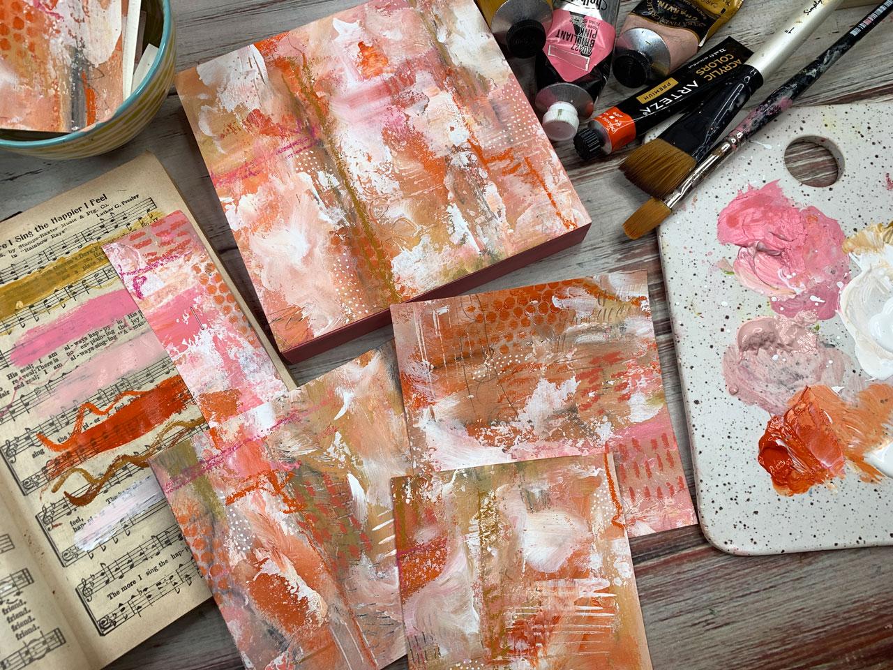
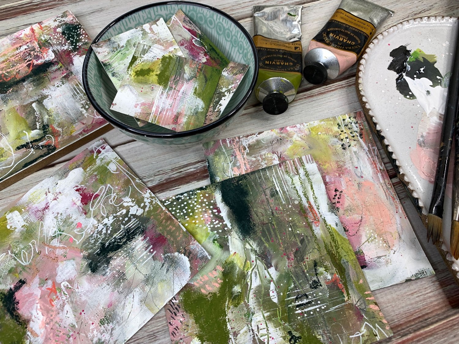
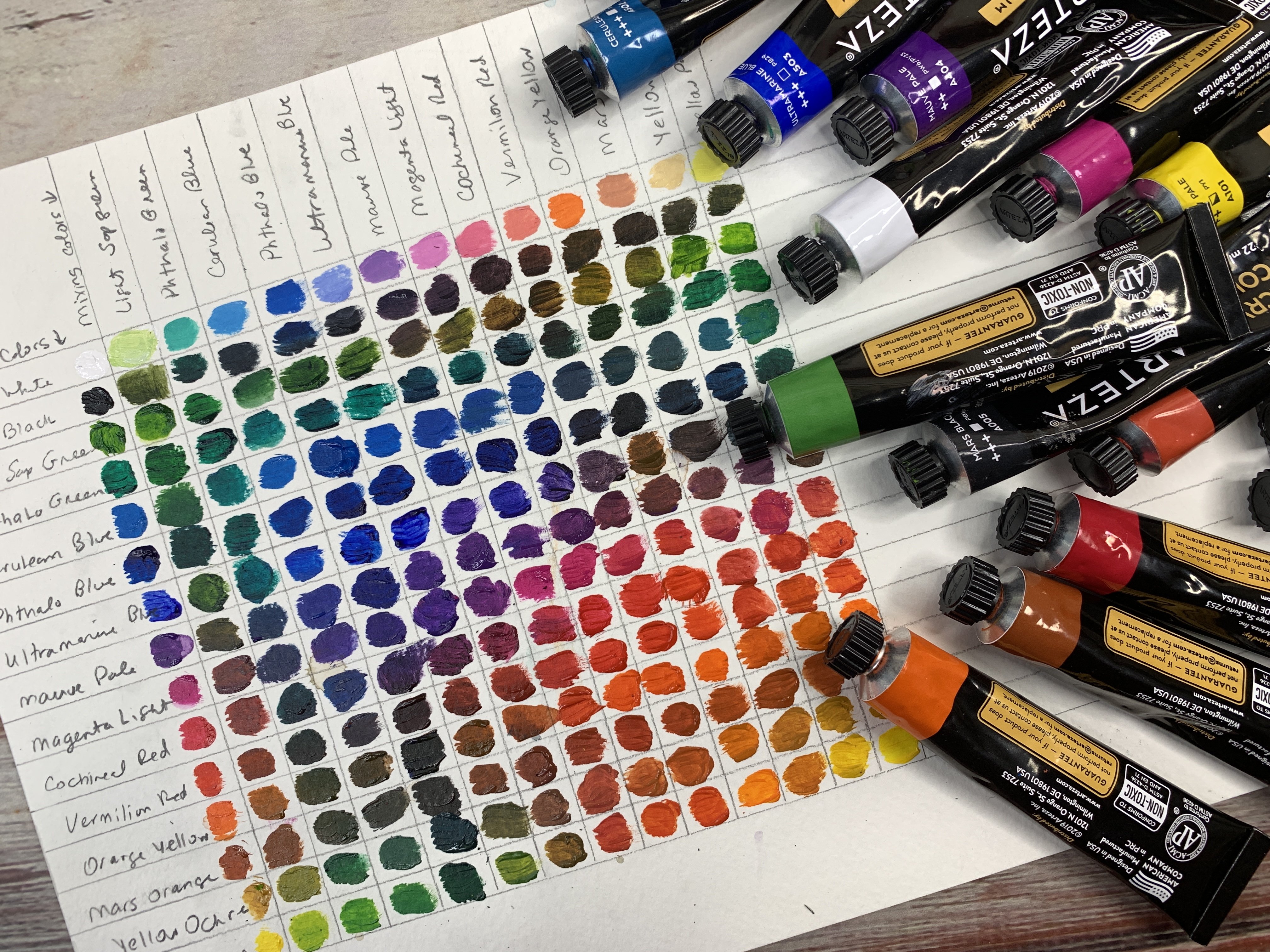
2. Supplies: [MUSIC] Let's talk
about the supplies that I'm using in this class. I've decided to do limited color palette
here in this class. I have pulled out of all
the supplies that I have, a limited range of colors
that I want to play with. This is the perfect time also to experiment with supplies that
you've never used before. I want you to get creative
with your supplies and think, what have I not
used that I could experiment with in this project? You can use any paint, you can use any supplies. The goal is to limit
your colors to two or three shades or colors
that you're working in. I chose pink, orange, and yellow because I really
love pink and ocher. These two colors here. This is the Caribbean pink
and the yellow ocher. Those are two of my favorite
colors to pair together. Well, I don't want to just do
the same thing I've always done because then I'll
get what I've always got. I decided, let's add in
some brilliant pink. We're still in the pink
family and some orange red. I've got my pink, my
orange, and my yellow. This is whole being color, and this is that
inexpensive Arteza brand, which I really like. If you just get a box of these, like I have, put these in a little
Easter basket thing. I found a target for a dollar. If you just get a box
of those 60 colors, you could pick out three
colors that you want to experiment with every time you sit down to do this project. Those are really fun. We're using today
those colors in my project and you can use
the colors that grab you. I'm also using a few colors. I've pulled out
the same colors as I have pulled out of my paints. I'm in the pink, the yellow, and the orange family. These are these little
charden hard pastel sticks. I like these because that's
not very expensive at all. I got it on Amazon, and they make the
most beautiful, crisp lines versus
the soft pastels that make real chalky lines. I've got some soft
pastels here that I've chose to use in the same pink, yellow, and orange family. Does not mean that I
use all these colors, but I had decided to at least pull myself out some options. I also pulled out this
Derwent charcoal set, extra-large charcoals because I don't use these hardly ever, and so I'm not as
familiar with them, but they had a pretty
ocher color in it, and I thought, let's
play with that. Because this is the
perfect type of project to experiment with all those supplies
that you've never played with or that you want
to get more familiar with, that you want to just
experiment with and see how they combine
with other stuff. Perfect way to just dig
into all your supplies, pull out a color range
and go for that. I'm also using some gesso. I've got clear and white. I mix that in with the
paint so that I can then layer pastels or
whatever on top of it. You certainly don't have to use pastels if that's
not your thing, experiment with the
supplies that you love. I'm using a couple of
cheap paint brushes. I've also got my little
mechanical pencil because I like to make lines and I like to make marks and draw through
wet paint with that. I have one of those. I've also got some
stabilo pencil, I've got white and
black, just in case. I've got my posca pen
and white because I love adding some details at the end, like these little dots, and the posca pen is the
one that does that best. I love using that
white posca pen. Got a palette knife to use, and we use that mainly to
spread our glue onto our piece. I'm going to show
you how I mount a piece to cradle boards. I just have a 6 by
6 cradle board to go with the 6 by 6
piece that I cut out. My favorite glue to glue that
down with, is Yes paste. It's nice and thick. It
dries clear, it's archival. It's got tons of uses
and it's perfect for laying heavier watercolor
paper on a board. But you can use heavy matte
medium, that's perfect. You can use archival
glue sticks, whatever you've got handy that you might want
to try to use, that's what you're going
to go ahead and go with. I've also got some punchinella, which is the stuff they
make stencils out of. This is the leftover piece of metallic strip that all the
sequence got cut out of. What's left is
called punchinella. I've got some
punchinella to make some little dots here
in some of the pieces. I like the way those come out. I'm using a piece of that. You can use stencils
if you've got little stencils that
you'd like to try out, you could use those, keeping the options open there. That's basically the supplies
that I'm using today. I'm also doing this on extra large piece of
Canson watercolor paper. This is cold press. This is the 11 by 15 size. Or if you're in
the metric system, the 27.9 by 38.1 centimeters. I like this extra large
size because I get lots of pieces out of that. When I'm done, I can get
easily three or four pieces of art and some extra pieces for collage bits out of that size. I do like that. I also have a size that's
even larger than that. That takes up a gigantic
swath of this table, but it's too big to film. [LAUGHTER] Use what
you've got. I do like the bigger the
paper the better. I just like making a big mess. Then I have a couple of pieces
of watercolor paper that I have taped together in some different sizes to
use as my viewfinders. I've got a 5 by 5, and a 6 by 6, and a 5 by 7 that I've
created for myself. These are handy
for searching out the sizes of art in
your bigger piece. That's most of the supplies
that I'm using through class. I do encourage you to use
what you've got on hand. Play with the materials
that you already own before you go out and
buy lots of materials. That's what this type
of project is good for. But I want you to use
what you've got in a limited color palette
and see what you get. I'd love it if you did pink, orange, and yellow, and show me your pieces, so that I can see
what cool designs and things that you came out
with different than mine. I'm pretty excited
about this lesson, and I'll see you
in class. [MUSIC]
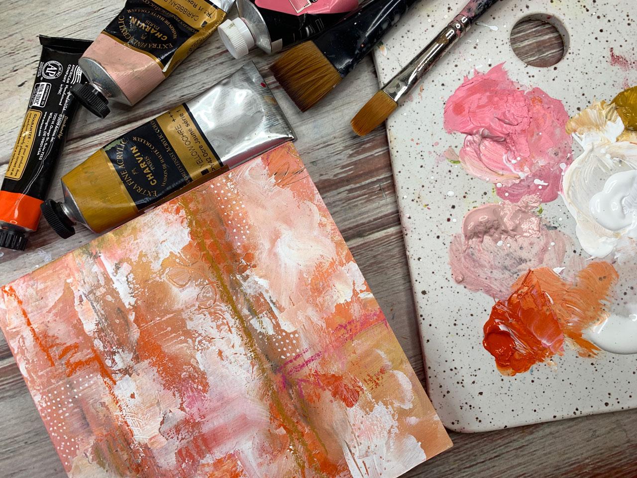
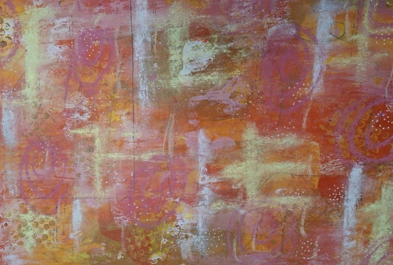
3. Project - Blocking out color: [MUSIC] In today's workshop, I'd like to work on a
limited color palette. I've already got some colors
out here on my palette, and I'm working in
orange, pink, and yellow. I've just pulled out
some random colors in that range from the brands
that I happen to have. I've got a brilliant pink that I've pulled out by Holbein. I've got this orange
red by Arteza. Then I've got yellow ocher and
Caribbean pink by Charvin. I'm going to work in those. You definitely work in whatever
brand you happen to have. But I think that this color palette is really
fun and one of my favorites. I have a couple of
other supplies. I've got a marks all
pen in the black. This is a stabilo marks all, I've got a white posca pen. I have a gold posca pen over here because I thought
we're in yellow, maybe that would be okay. I've got a white stabilo
pencil and I've got just a regular
mechanical pencil that I use sometimes to draw and sometimes to make
marks in wet paint. It's just a nice
handy little thing. I've also got over here some
pastels, hard and soft. I don't know what
I'll end up using. Then I've also got out here, this Derwent charcoal package and I just put
charcoal on my paper, but that's okay because
we're on the base layer. It had this yummy yellow, like an ocher color in here that I thought
I might try out. I might use that on this base. Then I've got a big
white piece of paper. I'm just using 11 by 15 extra large Canson
watercolor cold press paper. Because it's nice and
big and easy to work on. I'm probably going to just take a paper towel and wipe off the charcoal that I
just put on my paper and it doesn't even
bother me if it smears. Because when I get to the
very first layer here, my goal is to just put
marks on the paper so I don't get paralyzed
with that white paper, paralysis that I tend to get. I'll sit here and
I'll be looking at this white page and I want to create some masterpiece
and then I just get stuck. The way you can
get unstuck is to just start scribbling
on that bottom layer. Now you're no longer worried
about messing it up. Because technically
it's already messed up. The goal here isn't to
make something beautiful, it's just to make some marks. Practice some technique
with some mark-making, maybe experiment
with some color. If you want to make it as ugly
as possible, that's fine. The goal here is just to cover the paper
with some scribble. Then I'm going to
get into paint. I'm going to cover this whole
page with random paint, not going to get stuck
on where things are and creating some beautiful
composition at this point. Because my favorite
way to create abstracts is to
create a big mess. Then search out little
pieces that I love, which if you've taken any of my other abstract
adventures classes, that's the technique that's my favorite for
making abstracts. You'll have seen me do
this several times. That just happens to be
what I love and every time I sit down to
create with that method, I get something
that I really love. I'm just right now laying
paint on here randomly. There's no order to it and I am mixing it with the
clear gesso just so that I get enough texture in that paint to be able to
lay things on top of it, like the charcoal
or the pastels. Because if you're painting with acrylic paint solid without
mixing anything in it, it's real shiny and it's
not really conducive to adding layers on top of it unless you coat the whole
thing with gesso later, which you can do if you prefer. You can tell it here too. These are transparent paints
and I'm getting a lot of the underneath charcoal
that smearing with the paint and you're seeing
through it and that's okay. My goal here is to just get a base layer and then we'll
add some other layers. We'll keep just adding onto here until I think I'm
at a point where I'm ready to search out some
yummy compositions. [NOISE]. At this point I haven't
been changing out my paintbrush because
these colors are all similar and
blend really pretty. I am using the ocher with a little bit of
white in there now, just look how pretty
that color blended there from what's
on my paintbrush. I might let this dry a little
bit so I can then come on top of this with
another layer of paint. I don't necessarily want all this dirty blackness
being my final layer. I'd rather, we'll just keep
painting on top of it. I'd rather that just be a
show through here and there, but not necessarily everywhere. Then if you're getting
stuff that looks too brush marquee like these look too brush
marquee to me. Get in there with your fingers, if you're using paints that are got some toxic stuff in it, put some gloves on
and then don't be afraid to get on here and
do a little finger paint. I'm using the three colors, but I do consider white
and black my neutrals. Even though I've said a
limited color palette of just the pink and the
yellow and the orange. I am using white and black as my neutrals because
they are the things that you would mix in with
paints to get tints and shades and I'll use them as my lights and
darks to some of this. Look how pretty
these colors are. If you're ready to
really dive deep into color and experiment
with color palettes, definitely check out the color
story class that I have. Because we really
take a deep dive into colors and how to mix them and
interesting color palettes and ways that we
can get things like that Caribbean pink
without having to go buy all the most
expensive paints out there. I love this. I'm going
to take my pencil. This is just my mechanical
pencil and I'm going to start doing some mark-making while we've got some
wet paint here. These are just so pretty. For this color palette, I've just picked out
stuff that I like. There's no rhyme or reason, but if you're looking on the
color wheel, pink and red, and orange, those are all colors that sit near each
other on the color wheel. We could probably pull that into an analogous color scheme, colors that sit together, which is something that we
cover in that color class. [NOISE]. Just doing some marks all over the board here. No thought going into this, I'm just trying to create
without pressure. [NOISE]. Which is why I like
this technique so much because when I
sit down to create an abstract from scratch
on a piece [NOISE] of paper of say a definite size. I get stuck in the composition and where
to put things and I just paralyze myself in the
creative process by thinking too hard and
not wanting to mess up and not wanting to end
up with something ugly. When you create in that way, then you just don't come back to your art table very frequently. I'd go months without
coming back in here because by the time I'd got down
with whatever I was doing, I'd be so mad I wouldn't
come back for a while. [LAUGHTER] Whereas now
doing this right here, every single time I
sit down to create, I'm got a relaxed mind, maybe I've got some music going, just practicing with
my different supplies. This is the perfect thing
to experiment with supplies because I got a lot of things than when I had a
SketchBox subscription; lots of pens and pencils and
markers and different paints to experiment with and I
didn't do anything with them. I stuck them in a
box and I was like, look at these supplies. I think collecting
art supplies is just as much a hobby as doing
the art with the supplies. [LAUGHTER] It's two separate
hobbies. For a long time. I've collected the supplies
and I've used them in making textures for my photography business
but I haven't played with all the different
supplies that I'd get other than that. I wouldn't sit and create and have fun at my
art table making different things with art
other than the textures. Now creating these, I end up
with pieces that I want to frame and hang up in my
art room. It's a real joy. I'm going to go back and
add some more paint. I think now we got some other size paint brushes here that
I might get into. This one's just my cheap, bigger paintbrush that I've got but I do have some smaller ones that
I might go back in here and just do some marking and throwing in some
more intense color. I don't know if this will end
up in the painting or not but playing here with
all the different areas. We're going to hunt out interesting things
when we're done. My goal here is
not to do anything specific anywhere, just play. Another thing I've got
over here, I get out here, I've got some stencils with some big round spots
and some punchinella. I liked the
punchinella because I like the little round circles. I could actually go ahead and do some little round
circles in here maybe with this brighter orange. Look at that. That just
made me very happy. I'm dry brushing it on here. I'm just using a
little bit of paint not any water on the brush. Just so that I don't have
so much paint that I'm shoving the paint
underneath my stencil. You could do this with
a rubber sponge too, not a rubber sponge
but a makeup sponge. You could do that with those. There are lots you can do with like little punchinella
or little stencil. You could do a
little stencil work. To Do, you love that?
[NOISE] Another thing that I like to do is take my catalyst and pick a color
and do some line work. A lot of times I'll
do that in white. I'll just pick an area
and do some lines. I like that a lot. Then sometimes, well
that ends up in the pieces what make
the piece to me. Yeah, like that. [NOISE] Get all your tools and all your
stuff. Another thing I like to do too is,
I've got some stamps and some of these
rubbery-looking stamps. Sometimes on the wet paint, I will go through
and do a little dab of some stamping and add a
little texture in there. Get creative with the things
that you're using to mark, make, and do different
lines and stuff. [NOISE] I got a sharp tool. That's just the
clay tool that we could make some marks in. [NOISE] I'm trying to lay
paint and make marks at the same time
because I don't want the paint to dry before
I get a mark in there. I could even do some
very purposeful strokes. Doesn't all have to be
completely random abstract? We can make some different lines with our brush head in
a particular color. That's really fun. I want to grab my two, I've got a couple of these
that I've just put together. This five by five and
this five by seven. I've just taken
watercolor paper to and strips and taped them
together to give me a viewer's window
so I can look and see what I'm I getting already and what else
do I need to add? If I'm looking at any of these, is there a composition that's already
starting to grab me? But as I'm looking at this, I'm already thinking
that maybe there's not enough white in there so I might go back and start adding some
white stuff here. I could do that with a palette knife or I could
do that with my finger. I'm just using the
white just so for now but I might start going on here and hitting
some light areas. Because really when you're
looking at painting, you want light and you
want dark and you want that contrast so that as you
get into a particular area, you've now got the range of things that are going
to be interesting. [NOISE] The paper boughs a
little as you're working at. This is 140 pounds which
is a really nice weight. As it's wet, it will buckle and bow but then when
you go to cut it out those flatten out
when they get dry or you can set them under
the heavy book later. [MUSIC]
4. Project - Adding details: [MUSIC] [NOISE] That's fun well with the white in. Look at those, see. Now you start seeing
areas that get exciting, because they've
got that contrast and some of those differences. You can do these marks
and streaks in a color, it doesn't have to
be always in white. If you need that contrast
to be black, pick black. If you need that contrast to be some bright color,
pick that color. We're just going to
go in here and add some additional lines and
stuff and other colors. Look how pretty that turned out with the orange and the pink mixed up on my palette
knife. I like that. That's pretty fun. We
haven't even gotten into our pastels or anything. I'm actually going to
put these paint brushes in water so that
they don't dry out, and see what else can we use? I need this to dry a little bit, so I'm going to take
my heat gun and dry it. That's mostly dry. I'm going to get into these charcoals and
these little pastels and see if we add any details, if I like that. I don't use these hardly ever. I got it and
thought, "Oh, I love it," but I haven't tried them. But, I do like this ocher. I might come through
and see if I do some lines or different marks. This really is like the pastels. They're water-soluble,
so I could come back and add water to that
if I wanted to. I just want to try it just
to see do I like them? They're big, they're
blocky, they're chunky. It is fun to work with great
big chunky art supplies. The drawback to using
something like the charcoal and the pastels on
top of your piece, is that they're chalky. People always think, "Well, how am I going to
finish that later so that I'm not
ruining my piece?" But to be honest, there's not really any
way that you're ever going to fully
secure a pastel or a charcoal to the page where
it's 100 percent never going to move or smudge simply because of the
nature of the product. This is just a really
chalky substance that I've drawn onto a paper, and there's no way to adhere
all those little bits of chalk to your surface. I used finishing spray
and I'll show you how I finish the pieces
in the next video. I do use finishing sprays, and it does do a really good
job of tracking it down. But when I'm doing
paper pieces like this, my goal is probably
going to be to frame it. Under glass, those chalky
products that I used on top of a painting
are going to be secure. I'm just picking
different little pastels here to draw with. But if this is something
where you're going to put it on board, and you're thinking
that maybe you want to just hang it however it is on that board without coating
it with a piece of glass, it's likely that somebody
came up at some point and smeared it with their finger that it's going to
smear possibly. There's just not 100
percent way to fully secure any chalky substance you're putting on
top of a painting. That being said, I use
them because I like them and I have them, and it's a reason to experiment
with another supply. If you think that
that's going to bother you and you don't want to have something that's
going to ultimately have the ability to be
smeared by somebody, then maybe the pastels as something on top
is not for you, maybe you want to stick
to acrylic paints. Maybe the oil pastels
which actually never dry if you're using those oily pastels and
I have some of those, but those basically never dry. They're creamy and smudgy for
a reason. I do like these. These give you a
nice crispy line, whereas these give you a nice smudgy line and you
can see the smudgy lines. This is a little bit finer. These harder pastels, I
really like this set. This is the Charvin set of little pastels that
I got off of Amazon. Actually, they're
not very expensive. It's this little set here. They're not very expensive
and they come in the most wonderful colors. I like the way that
they draw on things. I did drop them at some point
and break them in half. [NOISE] But you know what?
That doesn't even matter because it doesn't
matter how big or small these are to use them. I'm still sticking
within my color palette. We got lots of different shades of yellow, pink, and orange. So I pulled out just the yellow, pinks and orange and all
of that that I was using. We could allow ourselves
some black if we feel like we need to go with black because black and
white are neutrals. But I wanted to
see if I just did these in these lighter colors, would I have enough in there? I'm still feeling like I might need some more white
in some of this. I'm going to go
and strategically do some yummy white in here. I'm just using [inaudible]
over that [NOISE]. Because I've got the
chalk on here now, I'm definitely going to be doing some chalk smears. That's okay. I'm just eyeballing.
Maybe part of these, I'll have a little extra
white in it and part of my wand and then we'll see what am I end up liking the best, and maybe I like the bigger size if there's
something in here that I love. I do like the 5 by 5 size, or 6 by 6 or 7 by
7 or 8 by eight. Let me get me a little
more just so out. I like that being able to do
in squares, I like squares. If I have like some 6 by 6 boards that I wanted
to mount these two, then I would cut 6
by 6 pieces out. That would be great. I do have some 6 by 6 boards. So maybe what I need to
do is create us 6 by 6 view finder window and get those boards
out in this set, that might be how we finished these now that I've
thought of it. I like creating and
thinking as I'm going because then you get
ideas that you're like, "I love that idea. Glad I
thought of it." [LAUGHTER] So I'm loving this. I think what I'm going to do, let this dry a little bit and I'm going to
think about it for a bit and I'm going to make us a six-by-six little window. I'm just going to
cut out strips of water paper from my watercolor pad and
tape them together. So I have a six-by-six hole to then search around
and see what we've got. I've got us a six-by-six cutout now and you can see I just
took strips and taped it together and I've got some of these six-by-six cradle
boards by Blake and this is the exact size of the board and so I cheated now
I use this board as my measure guy there instead of trying to
measure out the size. [LAUGHTER] But what
I want to do is go ahead and remove the paint out of the way since I
always paint on everything, I want to go ahead and
pull the tape off of this and search out
some pieces that I love and then we will have an opportunity after we find a few compositions
that we like. Before we're finished,
we'll be able to then add some additional marks and
things that we'd like to use. So let's just pull
the tape off of this and I do have a
cutting board back here and got a utility knife and I've got a board that
I'm going to use as my cutting board because I like to use a little cheat
board or a little flat panel. This is the five-by-five, and use that as my
cutout surface. [LAUGHTER] But you can just find something
that you love, draw a line around it and cut it out with
a pair of scissors. Either way works just fine. So I just want to search out. I want at least one six-by-six
and then the others I can have smaller and
I'm okay with that. Loving this area right
here for some reason. If I go all the way to the edge and sometimes they easier to if you'll
stand back as you're looking, I'm looking up at
my camera screen so that it's like looking
further back for me. So which piece do you
think I should cut out? [LAUGHTER] I need you to vote.
Then we'll cut that one. I do like that there. Don't be afraid either
to turn it around. Maybe if we look at it from
a different direction, let's look at it
from the other way. I'll see I still
like this area right here for some reason. So let's go ahead and take
this as our six-by-six. So I'm just going to
cheat a little bit. Use my board as my
thing. I cut around. But you could draw
it out with pencil and just cut it with
a pair of scissors. Look how beautiful that
is when you cut it out. I think I like
doing this so much because, in photography, which is what I've done for more than a decade in
my regular business, I'm always searching out compositions and
framing things out in camera that look beautiful
and taking that photo. I'm not creating a
composition from scratch. For some reason, I
love this right here. Like I love it. I almost want that to be
like a four-by-four piece. I think I've got a
four-by-four board so let me run and grab
that. Here we go. So I've got a
four-by-four board. I'm going to just eyeball it. But for some reason, this piece right here
is speaking to me. So I'm going to cut it out. I could probably do
that with scissors too but look at that one. This one is speaking to me. I love that. This one. Now that I walked
away and came back, oh my goodness, so beautiful. So let's look at the
rest of this and see if there's anything
in here that we love. I think I'll go back down to the five-by-five because this right here in the corner is
speaking to me too. Yeah, I think I loved
this right here, and then here's the other
way that we could do this. I could take a pencil
and I could just mark this with a pencil and
then we can come back. Let's go ahead and
mark another one. I do love that one right there. I love that right there. Maybe we should
just cut that out. I see. I now like you're already there.
Let's do that one. The only reason I don't
like to draw on these with pencil is then I might not
get the pencil cut off, but then we can pretend
it's a mark that we made, but I just don't like the edge with pencil mark around it. But I just want to show you
different ways to do this. I got a pair of scissors
here and we will just cut this out as
evenly as we can. Look at that one. I love it. This is my most favorite part. I mean, you might want to wonder why on these little
abstract classes, this is the technique
I choose to do, but I'm telling you, this brings me joy every
time I sit at my table, just seeing what I get
as I cut these out. It's like when you're
doing a bigger piece or another piece
where you've got it taped off and you peel off the tape and you reveal
your finished piece. It's like opening a
Christmas present, something that you always
wanted and it's so exciting. Yeah, look at that one. I like it this way I think. But we could do it this way. We could do it this way. I like it this way. I
think this is the fun way. [LAUGHTER] I'm like a kid
in a candy store when I start peeling these off and then look at these beautiful
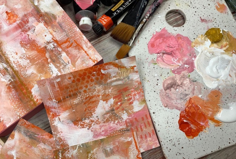
leftover pieces. Now, these pieces could be
tags or collage pieces, or micro pieces of art. If we wanted to do some
little micro pieces, you could mount these to a
cradle board that you painted white and have this as the
little centerpiece like, look at this one right here. I'm really digging that. I cut this white off. You know, we could
make this a bookmark. Look how pretty
disabuse a bookmark. Look how pretty that
would be as gift tags. That piece, right there
is a pretty piece of art. This one's real pretty too. I just love all of
these or any of this four-by-four and I get
another four-by-four. They're slightly too small. So these could be three by
threes or something smaller, but these could be
our extra little collage elements or pieces. I love this little area
right there on that. This little piece is
a nice collage piece. This one I might actually use in my color palette book perhaps, or maybe I'll put this one in my color palette
book. I don't know. But when we're all done, look at what we've
ended up with, and then we'll decide, do we need any extra marks
or anything on these. I'm really careful when I'm not on camera and I'm moving
a little slower to make sure all my stuff is
straight because I almost feel like maybe these are
not perfectly square. But if you're going
to frame them, it's not a big deal. If you're going to mount them to a cradleboard like we're
going to do one of these. Then you might make it slightly
bigger than your board and then we can trim
that to the board size. These are just so beautiful. So I'm going to get
my Posca pen out. Oh my goodness, I'm so excited how beautiful this
color palette is. This is definitely
a color palette. I will visit again. So I'm going to take
my Posca paint pen and maybe do a few
marks on here. I like white dots, so I might do some dots
I'm filling over here, maybe a few dots
would be pretty. It just to me adds a
little bit of whimsy. [MUSIC]
5. Project - Finding small paintings: [MUSIC] I love it. I always like to have a few little dots. Once you do enough mark-making and playing with your supplies, you'll start getting into a feel for different
elements that, see look how pretty that just
a little bit of dots did. You get into a feel for some elements that you
love and you might want to replicate in all
your different art pieces. That's going to
change over time. But those are going to be
the defining elements that say this work was
done by Denise Love. I recognize it. I recognize these
elements that she adds. Look how pretty that
is, oh my goodness. People are going to
start to recognize some of these things that you do in your artwork and
look forward to them. That's how you figure
out what your style is. You figure out what you like, what you don't like
and you start using all those elements
that you like over and over again and it gets to be a defining thing for your art that people didn't recognize. It's just deciding what
you like and don't like. That's your style. When I was in
photography early on, I kept thinking,
what is my style? Do I finally have my style? How do I get to my style? Just didn't occur to
me or anybody else that I was in the photo clubs with that your style is basically the preferences that
you choose to shoot with. I like shooting with
vintage lenses and lensbaby lenses and unconventional
antique lenses and I like shooting for the
blur and I like shooting specific elements and I like particular moodiness
and color ways. Early on, you don't know
that when you're shooting everything under the
sun, look at that. I just love that. Little tiny little
detail with the dots. Early on when you're
shooting and when you're creating with your art, you're still experimenting and
exploring and figuring out your supplies and
what do you like to use and what do you
not like to use, and what colors do you love. You get frustrated
because you're like, I don't have a style, I
can't figure this out. But this is how you
get that style and doing these little
abstract pieces like this where you're just experimenting with
all your supplies. Just pull out a particular set of things that you want to work with today, just like I did, like I thought I wanted to experiment with this charcoal, and I want to play with just these colors in the soft pastels and
the hard pastels. I wanted to just use
these three pink colors, pink and orange
and yellow and so that's what I pulled out
of all the supplies that I have because part of art work paralysis like
white page paralysis. Part of that is
too many choices. When you have too many choices, it's really hard to
figure out what do you want to create because
you have too many things. You're like, I don't know
what to do. I'm stuck. I've got too much to look at, too many choices, now I'm just getting mad
because nothing's coming to me. Trust me, I've been there many
times and I have found if I'll just pull out a selection of supplies
to work with today, things that I might not have
worked with before and say, this is what I'm using today. Let's make it work.
Let's see we can get. That I've been end
up with fun things like this that I've
never been able to create before without
getting mad and leaving my workspace before I probably would have if I had
been doing something fun. Look at these yummy pieces that we ended up
with here today. I added just a few dots
with the posca pen. I just wanted that little
tiny extra element of detail in there. Look at that. These
are so pretty. This one I'm actually going to mount to a board
because I made it the right size and I'll show
you how I finish that off. These, I might use to frame. I might frame them up
under a piece of mat. I'm definitely going to do
a finishing spray on them. For some reason this one
really appeals to me. I love it so much. I actually have a space downstairs on my gallery
wall where I'm waiting on three little four by fours so may end up cutting
these two down to 4 by 4, so I have my set of three. I don't know, because man, I love these colors. That's another fun
thing about limiting your color palette is
so fun to be like, I love these colors and
I'd use them again. Or I hate these colors and they're never
coming out again. This is fun way to
figure some of that out. I hope you have fun
with this colorway; pink, orange, and yellow. I'd love to see how you do this, what supplies that
you pull together, how it is that your
projects end up looking. So please come back
and share those. I hope you love doing this limited color palette
and in the next video, I'm going to show
you how we're going to finish these off. I will see you back
in class. [MUSIC]
6. Finishing your pieces: [MUSIC] Let's talk about
finishing our pieces. What I have that
I'll do before I do anything else is I have some fixative that I will fix
the top of my pieces with and I'm using the
Sennelier Soft Pastel Fixative. You could spray fixative as many times on
here as you want and it's not necessarily a permanent finish
for the top of this, but it will make it less
likely for anybody to smudge things and for you then to be able to maybe add
a varnish on top. You could easily do 10
layers of fixative. Spray it, let it dry, spray it, let it dry to really get
those soft things to fix. Then as a final finish, I might do something like
an archival varnish. This Kamar varnish
is an archival one. This, you get from
the art store. If you get varnishes
from the hardware store, they're most likely not
archival and created for art, but I do have some that I've
gotten from the art store. You want to be really
careful that they say non-yellowing and
preferably archival. Then what I have here is the board that I'm going
to mount one of these to. I'm going to finish
this one on a board. Then I've also got
just a couple of other options to give you. If you wanted to
frame your pieces, that is the best way to
protect any surfaces on top. I will say though,
that this one is framed in my mind upside down and I had it
visually going this way. I did not tell the framer that. It is framed upside down. Hanging on the wall,
it hangs this way. If you're going to frame
things then take them to the framer because some pieces deserve to be
professionally framed. If you're going to do that, make sure you tell your framer which way you think is up or down because
with an abstract, you're just going off of
however they mounted it and they may have thought
about it and they may not have and when you get it back, however you thought in
your mind was up or down may be different
than how they framed it. The framing is really nice. Under-mat, you want it
to have some matte or some space in between the
actual artwork and the glass. You don't want your
artwork against the glass. Matted is perfect. Then this has got pastel and paint just like
what we did with this piece and it's one
of my favorite and it hangs above my desk on the
other side of the room. You could also go a lot
less expensive than a custom framer and
go to Michael's or Hobby Lobby or anywhere that sells some framing that maybe you could
buy off the shelf. This was not very expensive. I maybe paid maybe
$15 at the most for it and it's 8 by 8, 5 by 5 print. I could frame that right in this white piece and
it would be beautiful. In general too, if
I'm making pieces to frame and I cut
this out at 5 by 5, maybe I really wanted to
cut it out at 5 and 1/4. Keep that in mind depending on what you're
going to do with these. Allow yourself possibly
a little bit of breathing room to do what
you're going to do with it. If you're going to
frame it, maybe cut these a quarter-inch bigger so that they can
be framed rather easily. With this one, I'm
going to mount it to a cradleboard and
this is just a 6 by 6 wood panel cradled
with a 7/8 inch side. If I'm doing stuff for say a gallery and I want
it to look expensive, then I will actually go
with the deeper side, more like 2 inches or
an inch and a half. These are what I have here to do a little fun art projects with. I'm going to use it
because I have it here, but if I'm doing this for something fancier
or for a gallery, I'm definitely going to
go for the deeper side and I have primed it with
the gesso on the top. You do need to prime them. You can't just glue your
stuff down to bare wood. It's more likely that the wood
will soak up anything that you put on it and release your paper rather than
glue your paper down. I've picked a color
for the side, and I've picked one of the
colors that we're using today and just painted
the sides in that color. I'm real careful not
to paint the top. With a painting like this, it's less likely to matter, but I've done these before with photographs and I have
glued the photo down. I accidentally had some colored
paint on the top where I painted the sides black and that color bled through
to my photograph. Now I'm super careful
not to get any paint on the top no matter what
I'm doing, just in case. Then I picked a color from my color palette
that I wasn't out of yet and painted that side so that when I
mount this on here, it's finished and ready
to hang and beautiful. The side of the paper
will be white possibly and I could come back in
with a nice fine paintbrush, just coat the side
of the paper also so that you can't tell I
mounted paper to board. Look at how beautiful that is. I'm just giddy at how
fun this is going to be. I'm going to mount this one just to show you how I do this. Then that'll be
finished for that, but I do like having
other options. Another thing I've
done is I have some of these just hanging on a clip on the board in
front of me as inspiration. You could do that too. You
could just hang them up. As long as somebody
is not over there, smudging on them with their
fingers, they look beautiful. I've not had any
of these damaged, but nobody's in here
touching those. [LAUGHTER] Actually
going to take the YES paste and that's what I'm going
to glue this down with. I like YES paste because
it's nice and thick. It's easy to work with. It's like working with a
really thick frosting. You could also use a thick
matte medium like Liquitex, or Golden have matte mediums. You don't want a
thin matte medium. If the matte medium is in
a container like this, it's probably too thin. If the matte medium is in
a container like this, that's the way to go because
these are real thick. That lightweight matte
medium is not heavy enough. I like the YES
paste because it is nice and heavy, it's archival, it dries clear, and it's so easy
to get it smeared onto my surface and make sure that I've got
everything covered. Then smooth my paper down. Then when it dries, I can trim any little
piece of paper that's hanging over an edge
that I didn't intend to. If I cut it just slightly
bigger than this or something, I can trim that in, but I just coat it nice
and thick. Not too thick. It's thick enough where
there's no blank spaces. I can see it in the
shine of the light. I can see where it is and
I can make sure I've got all the way to the corner
covered. There we go. So now I can see all
my edges are covered. I can take a towel just like
I do with the paint and I can [NOISE] pull that right off of my palette knife so
that I clean my knife. Nice easy cleanup. All good. [NOISE] I have over here
some dry wax paper, which is kitchen deli paper. You could use
parchment paper from your kitchen,
anything like that. We can move the paint
out of the way. I tend to paint
everything as I'm going. [LAUGHTER] Then when you're ready to mount our
piece on here. Then [NOISE] I'm going to use the deli paper
on top to be able to smooth it down because I
don't want to smear anything. I would have already
taken this outside and coated it with my fixative before I got to this part
and I have a roller. If you've got one
of these rollers, this is really nice
for spreading it down. Then we can see if I
have covered everything. Right here, you see we have
a white edge up there. Before this dries, I can
very carefully move that. That's why I like the YES paste. It doesn't dry so fast that you can't get it moved. There we go. Then I'm going to come and
spread that down again. Then once you've got that secured and you're
letting it dry, so you let that dry a bit, then I come back with a real thin very careful line of the same color I painted the side and I paint
the side of the paper. I don't like there to be
a white edge, personally. I go ahead and just touch that up as careful as I
possibly can be. I don't want there to be
pink on the painting itself, like where I painted the side. I want it just to be finished
as you look at the side. That's how I would finish that. Then if you wanted, you could then do a layer
of maybe spray varnish just to give it an extra little
bit of finished touch to it. Then it's ready to hang. You wouldn't do really
anything else to it. Then I had somebody
ask me at some point, could they do resin pour
over this or could they do encaustic wax
over it and you're just going to have to
experiment, but definitely make sure you add
quite a few layers of the fixative before I dared pour anything
on top of it because anything you put on
top of it that's wet could pick up that
pigment and spread. I would do a test piece before I would add anything on
top of it that's wet, or if you're going
to do brush varnish, do a small test piece. Take one of these
little pieces that you've cut out that
you're not going to use for anything else painting-wise and test it out and
see what's really going to work best for you
because something that works for me might not end
up working as well for you. It just really depends on the supplies you pick
and I don't know, the time of day and if you're
holding your tongue right, [LAUGHTER] all these
different things that might affect how a
finished piece ends up. If I'm mounting it to a board, that is how I do that. Look how beautiful that is. That might have even been really pretty with orange sides. I might go back and paint them orange because I'm not
really a pink person, but I'm an orange person, but either way, now it's finished and ready
to hang on the wall. Then we have these
other pieces that we can mount or do something else, frame them or I don't know, this is my favorite piece with that little bit right
there. I love that. I hope you enjoy
mounting these or framing these or finishing off however you're
going to finish it. I can't wait to see
what you come up with. I will see you back
in class. [MUSIC]
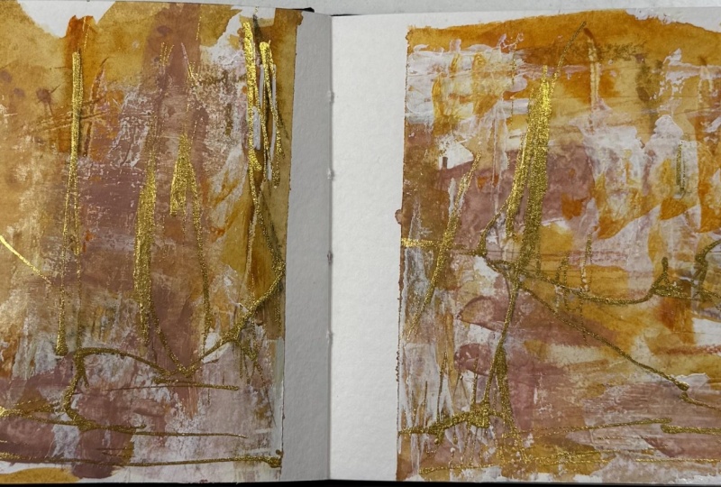
7. Saving your color palette: [MUSIC] Let's talk about
saving our color palette. In every one of these
classes that I do, I always talk about saving your color palette because you're going to want to remember later how you got to whatever
it is that you created. I love having a big
book of reference, things that I can be like, oh, I really loved that. Let me go back to
that color palette and try something new today and then I save the color
palette in my book. This is a color palette I did in the color workshop where
I created custom colors. That's really fun too, if you're into mixing and creating some of your
own paint colors, look at that color
story workshop where I show you how to do this. Then in my color book, I save what recipes created that color so that I do
know how did I get there. These books have tons of uses. [NOISE] This is an old book
that I got at thrift store, so it's not something that
I paid a lot of money for. I just go ahead and coat the page with clear
gesso so that it's got a tiny bit of protection for when I then coat the
page with paint. Before I throw
this paint palette away and hopefully
before it's all dry, I just want to go and
spread each color that I used in this color
palette onto this page. Then this little book is
a piece of art in itself. That's why I like using a
vintage book like this, because now it's something that I can't wait to
show other people. I can't wait to
show you in class, what I created, it's
just super fun. [NOISE] Keep the paint
off my fingers here. It's just super
fun to then share, let me put some white on there, with others what did you use
and how did you get there. Then I just go ahead and
mark on here some of these other little colors that
I used with these pastels. Then it just looks so beautiful and creative.
I just love it. Did I use this color? I think I used this
color. Maybe I didn't. [NOISE] Maybe I used
the yellower one. No idea. That's
okay. There we go. Then I will take
one of my pieces that I have left
over and it might be this bigger one
that I love so much, and I will staple
this in this book. I actually think I
want to do something else with this though. I might take a piece of one
of these and cut it out. I want to make sure I have
enough of the colors in here that I can see
everything I did though. That's fine. Let's just use this here and we'll cut that off. Then I just take my
handy dandy stapler. I'm going to pull two pages together because this
book is thinner. [NOISE] Staple that
right right there. Now I have a record of the color palette
that we'll use today. I will remember seeing
my little piece, what my bigger pieces
were and then I might want to
revisit this again. I do encourage you pick up an inexpensive book
at the thrift store, something you don't
mind gluing things in. This one's going to have
all kinds of stuff in it because by the time
I finish all this side, I will come back and
then do this side. Then every page will just have tons of fun
things in it for me to reference for
pieces of art later. But I love this book,
it's my favorite and there's still
tons of pages left. By the time I'm done, I may not go back and
do the other side. It may have enough in it. [LAUGHTER] Look how
pretty that is. I encourage you save your color palettes
and take a piece of your leftover pieces and put in there with
it so you remember, how did you get to that look, what colors did you use? If you're really organized, you could take a
pen and write in here what each of
those colors are. I'll just eyeball it. But I do wish sometimes that some of the
colors I had written down. Just keep that in mind. I'll see you back
in class. [MUSIC]
 DENISE LOVE, Artist & Creative Educator