Transcripts
1. Welcome: Hey, I'm Denise Love, and I want to welcome
you to class. I'm a full-time working artist. I work out of a home
studio and I have been doing this since I started
my main business in 2012, which is 2 Lil' Owls Studio. In that website, I do
photography workshops and digital art tools
geared towards photography. I have dabbled in art
workshops for many years, put them out and
retired them and put out new things
and retired them. Mainly tried to focus the art on the photography
that I was doing, but I want to experiment
with other things. I love abstract art, I love different art supplies, acrylic, watercolors,
you name it. I've probably got
a little bit of it because I make textures
in my main business and I use all the supplies to
create textures and things. Now I have a big cabinet full of art supplies
to experiment with without having
to go out and buy new stuff because I got plenty. In these classes, I wanted to give myself a break from the photography classes, which take me two
to three months to create and by the end of them I'm feeling a little bit
depleted, not creative. I found, if I come up here and play in my art room for
a week or two or three, the ideas start to flow again. I've relaxed my mind enough that I'm ready to start
thinking of new things. I thought, wouldn't
that be great to channel that into
something like this where I can have some
art workshops in-between the photography workshops and just keep the projects
and my creativity flowing and hopefully have less of those down
periods when I think, oh no, I'm not feeling creative. I'm never going to have
a good idea again. I don't know what I'm going
to do with my business. I thought this would
be a great way to fill the downtime for the
photography side. I'm super excited to
have you in class. I hope you enjoy what
we're doing in this one. Let me show you what
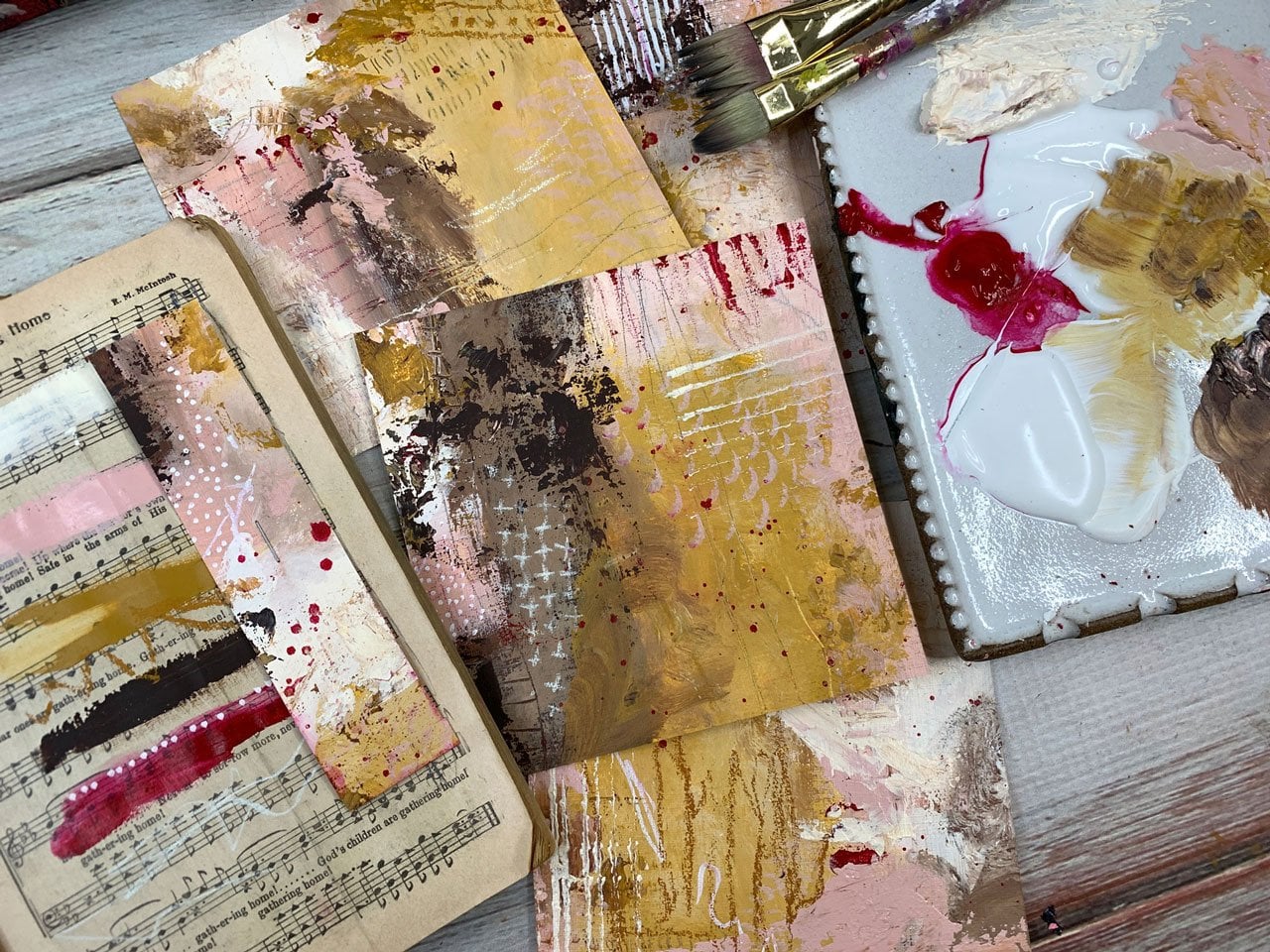
we're going to do. In this class, we're going to do some little color studies. These are four-and-a-half
by six in size, just because of the size
paper that I have used. I also had a fourth one that I used in my
color palette book, which I'm going to show
you how we do those and some little pieces leftover that can be wonderful
tags or collage pieces. I'm really excited to show you how I just work with
a little piece of paper, some of my random supplies that I want to experiment with. I'm limiting my color palette
to just a few set of colors and then experimenting
to see what I can get. This is one of my very
favorite techniques for testing out supplies, experimenting with
the way they work, trying out different lines and marks on top of
different things, experimenting with different
paint types and colors. Maybe I like some
different paint types and I'm experimenting with. You can do this with any type
of supply that you have, whether it'd be watercolor, acrylic ink, acrylic paints, oil paints, although I will say, with oil paint, they'll never
dry, they'll take forever. I do tend to stick to things that
are going to dry. Let me do these fairly quickly. Because I want you to
do these and try to spend 15 or 30 min on it, don't think too
hard about it and just see what you
end up creating. Then these are great ways to
experiment with composition. Just see, what do I love? What do I not love? Did I
love this set? Did I not? If you'll create them and then you love it,
great, frame it. If you don't love it,
leave it alone for a day or two and come
back to it and say, do I love it today? Because sometimes I'll do
stuff and I'll think, oh, I'm not loving that, but I'll come back
tomorrow and I think, oh, that's fantastic. I'm just too close to it, not in the first day, I guess. I can't wait to show you
this fun, easy technique. I do want you to release
some of your expectations and just let it go with the flow and maybe set yourself a timer
on how long you're going to allow yourself to spend
maybe 15 min or 30 min, or if you want to
do some small ones and say giving myself
five minutes, set a timer and just see how fast
you can create because when you are creating on
a time limit like that and you're going
a little faster, you're working a little
more organically and you're not stopping to
question your decisions and you're not trying to think, oh my gosh, do I like
this composition or not? You're just getting everything
on there and being like, okay, what will I end up with? This is really fun. I do this kind of
thing over and over with different color ways. Some of them I love so
much I've had framed and I have them hanging
in my art room. Some of them I'll
have mounted on board depending on how it is
that I want to finish it. Cradled panel so
they're ready to hang. I mean, I do this
technique over and over with different
colorways to experiment and see what I love because that's how you're
going to end up figuring out what you
love and defining what your style is
from the decisions that you end up making. This is the way to do it without putting any
pressure on yourself. Then if you end up with
pieces that you hate, for whatever reason, maybe
you don't like the colors that you chose or whatever, then that's the
perfect thing to do, is to use these as
collage papers. I have a box of little papers and bits that I can then
use later in collage. Look how beautiful this is. I mean, I just loved the strip. Maybe I should use
that as a bookmark or little pieces like this. I love that. I may have loved the whole
piece and I may not have, but I'd really love
this little strip here. Keep this where you're
giving yourself some grace, you're keeping an open mind, you're experimenting,
you're working pretty fast, and then just know you may end up with pieces
you want to frame. When I was getting
started, I thought, oh no, I don't know if I'm
going to like these or not, but now that I've got them done, I've got the tape pulled off, look how beautiful they are. I'm pretty excited to
show you how we do these. I can't wait to get started. I'll see you in class.
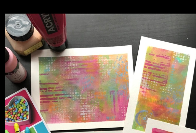
2. Supplies I'm using in class: [MUSIC] Let's take a look
at the supplies that I'll be doing in
today's projects. Usually when you film a
workshop, you might think, film the supply video and
then film the project video. Maybe you've used all the
supplies and maybe you haven't. [NOISE] I've seen plenty of art classes where
people do that. But I've decided to
do these backwards, so I filmed my project first [LAUGHTER] and
then I'm going to come back and tell
you what I actually used on the project. To start off with, I did
decide to go ahead and use acrylic paint on
most of this thing. l'm using some of these Arteza
paints and I like these because they came
in a big box of 60 for not very much
money on Amazon. If you can get these on sale, you might even get
them half price. I think it's 60 bucks
for 60 element. This goes a long way. I can do a lot of
painting with these, and so I like that it comes with as many colors as it does, because then I can
pick and choose and experiment with colors. If I really loved say for
instance this vermilion red, which I do actually really love, later when I run
out of this tube, I can then go back and
buy that one color. I'm not obligating myself to a whole another box just to
get one color out of it. This is a great way if you've never experimented
with acrylic paints, or maybe you only
have a couple of colors and you really
want to focus on color palettes and
experimenting with these color studies like I've
done here in this workshop. This is the best little set for being able to have a bunch of
colors to experiment with. Pull a couple out of
your box and say, l'm using these
three colors today. [NOISE] You just
have so many to pick from that you can be like, in my limited color
palette today, l'm using these four colors.
Let's just see what I get. It's not about making
a masterpiece. It's about experimenting with color palettes to see what
did these colors look like? How did they mix? What do you end up with after you've created some
little pieces of art? I really love this little set. But you can use any
acrylic paints. You can use the basics, cheap ones, liquid tags. You've got a lot of
these like my Michaels . You can use the [inaudible]
Blick brand of paints. I've got all kinds of
acrylic paints around. But I really just particularly like this set because now I can experiment without
having to buy the biggest, most expensive tubes of paint. Because this at about a $1 a tube is much different
than this at $20 a tube or whatever these Charvins
cost because the Charvins are really nice high end paint. There's a couple of
colors that I've seen other people use
that I was like, ''Oh my God, I have
to have that color, '' [LAUGHTER] and that's how I ended up with a few of those. I don't have very many of them because they are expensive. But you can see from
this Caribbean pink, I like it so much that it was worth me
buying a big tube, and at the same time, if I don't use it enough, this one did get
a little gloopy, almost like it's not
as fresh anymore. Big tubes are good if you're
using it all the time, they're not good if you're not
going to use it very often because they don't last forever. They start to dry out and stuff. I'm using vermilion red, sky blue, Bordeaux red, and Mars black in this particular set
that we're doing today. Then in the Charvin, which is [NOISE] a
much higher quality but much more expensive set, I'm using yellow ocher
and Caribbean pink. I certainly didn't
have to do that, but I have and
they're my favorite, so I do use them. But I could have probably
made a Caribbean pink from this brighter pink and add white to it
so that it's almost completely gone from
being so bright. Maybe even added
maybe a touch of this yellow ocher to it so that it's more of this pretty soft, yellowy pink rather than
this bright reddish pink. Just think about ways that you could get colors that you like. With the Arteza because
there're 60 colors in there, you could definitely be
mixing some other shades. Then this yellow ocher is a pretty common color
in every brand. It is different in every brand, but it's pretty common color. I'm using yellow ocher
and Caribbean pink in the Charvin paints. [NOISE] Also I'm using my
white Posca pen a little bit. My blacks Stabilo pencil, I always try to use it a little bit because it
marks on everything. This one, I actually ended
up using a color pencil, and this is a Prismacolor
pencil in pale vermilion. These I've had since
the college days. I used these in college. It's an old set that I have had literally [NOISE]
most of my life now. [LAUGHTER] You can see
it just keeps on living, so I don't really
feel any reason to go out and buy new
colored pencil because the set that I've had for more than 20 years is
still rocking pretty good. These are the Prismacolor
pencils and they're great for adding marks and details
and lines on top of things, and they last forever. [LAUGHTER] These are some
clay tools over there in the clay part of the art store. I like them because this is
like an ice pick almost. It's a nice sharp tip. I use these to make
marks and stuff. I did use these to make marks. [NOISE] I got a
little palette knife. I've got some inexpensive
paint brushes and some water that
I've got here, a little cups of water
to set things in. I'm using a ceramic
paint palette. This one is from the
Sugarhouse company. I also have some from Sylvan Clayworks
that I like to use. I love little clay palettes
because you can basically go just wash this off and
it's ready for the next day. But if you don't have
anything like that, you can use paper
plate for paints. You can use a plate from
your kitchen like it because they're
ceramic glaze plates or maybe a flat
plate would be nice. You could use the
disposable paper pallets. What I like about this
is I'm not throwing any extra paper
away in the trash. I'm being pretty eco-conscious there because this I'll just let dry and I'll scrape it off. I won't normally go and rinse it off in the sink because
that defeats the purpose. You don't want to wash
paint down in the sink, so I will just take a
little scraper and I will just scrape the paint
off of that. Let me see here. Just to give you an example, here's my Sylvan Clayworks one, [NOISE] and basically
you just [NOISE] scrape that paint right back off and then you can throw
the paint in the trash. Then when you get down to
the little bits like this, it just washes right off. Then you've not
put any wet paint down into your sink or
your water systems. I've also got just a rubbery, the paintbrush with the
rubber edge. I like these. This one is by Master's Touch and then I also like
the ones by Catalyst. [NOISE] Those are
fun to play with. [NOISE] I think I also
showed off my bowl scraper. This I use with oil and coal
wax when I'm doing those. But I like this because it's got a longer edge than my little
paintbrush had and I can make longer lines on it or I could smear paint around so l do like my
little bowl scraper. [NOISE] I've also got
here some neo color too. I just pulled out a variety of colors that I thought was in my color palette because again, I'm trying to limit
my color palette to just a set of colors. I don't want too many choices when I'm doing
this because I can already totally overdo
just on a few colors. Imagine if you put 60 day on, I could totally overdo
that for sure and then not like anything
I ended up with. I found that if I
limit my color palette in play in just a
certain set of colors, that freed me up of all
those color decisions. It led me then start creating these color studies to
see, well, do I like this? Do I not like this? Do
I like this one part? What did I use there? Then another thing
that I've used in this one because I used to get the sketch box every
month in the mail. Here's one I'm
using for storage. The sketch box is basically a box that you get in the mail with five or six or seven
random art supplies in them. It's geared more towards
sketching and drawing. There's a lot of drawing
utensils in addition to a few paint and
things like that. I have a tone of pencils and pens and different things that came because it
got that for a year. Then I had to stop getting it because I don't use
all these things that I've gotten in this
year and I have so many now that if I get a
whole another year of these, I'm going to have
art supplies coming out my ears, that
I haven't used. It's my goal in these little
color studies especially is to pick something I've
never used and try it. Today was this Lyra graphite 2B gigantic
piece of lead basically. I used this as a mark
making and I loved it. I was talking in class, I'm not sure how you sharpen it. Maybe l'll just take a knife
to sharpen it if I get past this whole tip up here because I don't think it'll
fit in my pencil sharpener, but it's basically a gigantic
piece of pencil lead. [LAUGHTER] I'm sure you
use it somehow in drawing. It's not something I ever
would have purchased, but it is something
that's very fun to experiment with since I
just happened to have it. I use this for a little
bit of mark making on my piece and that
was fun to play with. I encourage you, if you've got some
random weirdo one off supplies like this or
something that you think, what would I ever do with that? It's just been sitting
in a box, pull it out, and this is the time to experiment and see,
do you like it? Do you not like it? Did it have a good purpose in
your painting or not? [NOISE] I also have
here some soft pastels, and some of these are Sennelier and some of
these are Rembrandt. These little half pieces was from like a little
Sennelier, half pan set. Then if I liked some colors, I went to the art
store and I bought a few bigger pieces of some of the little pieces
that I was using up. Before I used it all up, I took it to the store with
me and bought a bigger one. [LAUGHTER] [NOISE]
I've just picked out a few colors of those in
my same color palette. I'm trying to limit
all my choices to this set of colors, and so I did limit that into
this set of colors too. l do believe that's
most of what l used. You don't have to use
any of what I used. I'm just telling you what
I did because I always like to know what people
use in their stuff also. [LAUGHTER] But the
purpose of these is to experiment with
your supplies and your mark making and the things
that you've already got. I'd rather you use all the supplies that
you've already got and then start experimenting with some new supplies once you feel comfortable what
you've already got. If you don't have any,
then maybe go out and pick a few things in
your favorite colors, or if it's with the
acrylic paints, try out this Arteza set
because it's a box of 60, makes it about $1 a tube. If you get it on sale on Amazon, I got a box of
these for 30 bucks, so it makes it 50 cents a tube. You can't beat that pricing for something where
you're going to experiment [NOISE] and decide what colors do you really love. Then these Charvin paints, they're expensive, but these are my two favorite
colors out of there. [NOISE] I actually have
several of the Charvins, but these are two of
my favorite, I like. I just bought a few of
the colors I liked. I didn't buy a bunch of colors because they are expensive. [NOISE] Get the box
of cheap paints and then work your way
up to the colors you actually love before
you invest in a whole set of the
more expensive paints. [NOISE] I think that's all that I have used in this class. If I missed anything,
I'll apologize now, but I tried to
have it sitting on my table as I was doing it, so I'd remember what I used. I can't wait to
show you how we're going to create these pieces, so let's get started. [MUSIC]
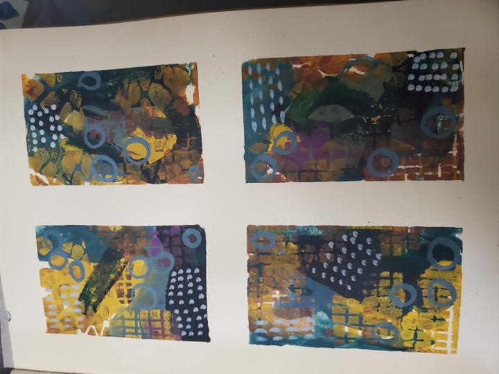
3. Project - Getting started: [MUSIC] In this
project I'm going to do four small abstracts because I love working on this size for a few
different reasons. I like to have more than one going at the same time to create a little series and
I like that it's not so big and overwhelming that I'm scared to
even tackle it. Today I'm using just a small
pad of watercolor paper. This is a medium grade, student grade maybe
from the Michaels. It's 140 pound and this
is the cold press. It does have a little bit of texture on it compared to the
hot press, but I love it. I've just cut these
paper pages in half. It's a 6 by 9 pad, I've cut these into 4.5
by 6 pieces by cutting that paper in half and then this is what
I'm going to play with. I'm being inspired. I'm limiting my
color palette again, I don't like to
have all the colors available to me that
I have because it does get really overwhelming and I have several
different color wheels. I like to experiment with
different color wheels and different color ways and try to come up with things that are really
going to be interesting. When you're working
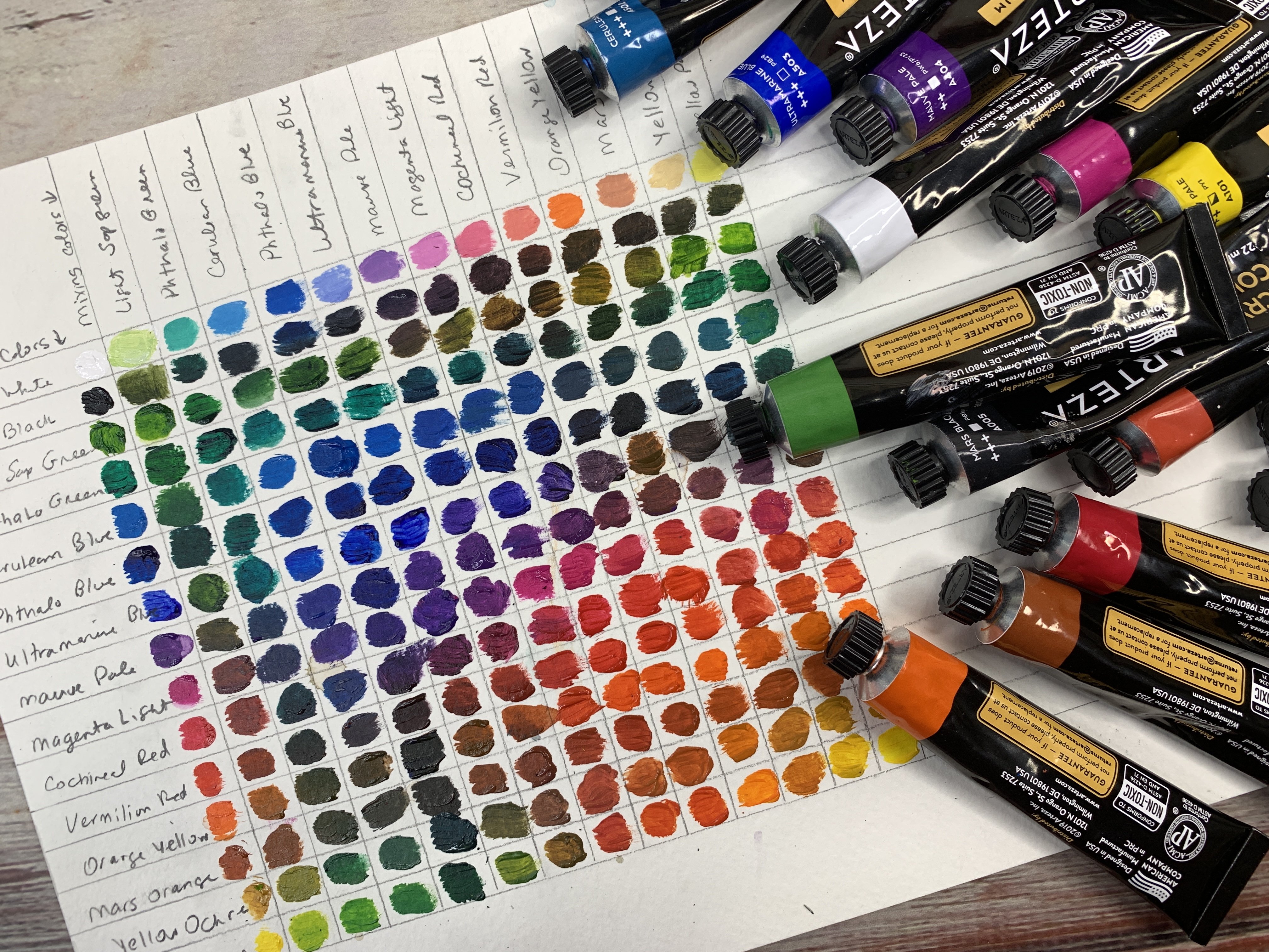
with a color wheel, it helps you pick out things that are going to contrast
and be pleasing together. I really like this color
harmony wheel because it tells you if you're working
in a certain color range, what colors would
be really nice and harmonious with the main color ranges that
you're working in. If you'll notice over here, I have put out my color palette
that I've decided to work in and I'm using the
Charvin Caribbean pink, the Charvin yellow ocher, which are these two. Then I've gone to
these Arteza colors, which I have a box of all the
little colors from Amazon. It gives me lots of choices. I have lots of
blues to pick from. I don't know that I've
picked the best blue, but I thought less
experimental haven't used this color before. I'm using Arteza sky blue. I've got Mars black down here. I've got vermilion red, which is a really
interesting orangey red that for some reason
I'm attracted to, and border red, which is
pretty little burgundy. I have pulled these colors from this color wheel
as my inspiration. Indy red, orange, yellow side here is my
main color palette, and then the blue over here is the little contrasting
pop of blue. I don't know that that
would be very dominant, but it could be like this is most dominant with
a small pop of that color is how that
color wheel is suggesting. That's where I've
taken my inspiration. I also have put out
some colors that are in that same range of
these Neo two [NOISE] colors that I love. This one is metallic
even isn't that fun. These are water-soluble
and I use these mostly to get started and to break up
the monotony of a white page. I've also got out here a few
soft pastels to play with. I've got a random graphite thing that I had gotten in a sketch box that
I've never used and I'm not sure I definitely would never have bought
this and I'm not even sure what you really
do with it and drawing [LAUGHTER]
because it's so big. It's a 2B, so that should
be fairly strong and color and it's more of a gray
than it is anything else. But look how pretty that is. I thought a fun time to
experiment with my pencil. Then a lot of times I like to
see, is this water-soluble? Is the water going
to move it around? It is, but not terribly. Look at that, the water doesn't really move it around very much. I've just learned
from using this, I like the color. I like the way that it
feels when I'm drawing. I like the marks it makes and it's not really going
to push around with water. Now we've learned one new thing about our little
graphite pencil here. When I'm doing these, I'm thinking a little
bit about composition. How am I going to lay the color, the marks, and what
might I want to look at? Composition in photography, I'm always thinking
rule of thirds, a third, a third, a third. I don't want everything to
be right in the middle. You'll notice that I'm offsetting all of the marks
and things that I might do just as if I were in photography and it's
fun if you'll do some of these marks with your not dominant hand
like I'm right-handed, so I'm doing this
with my left hand because they're a little more organic and
a lot less even. They're less rigid. They're definitely
different than what I get if I were using
the hand I always write with. I'm thinking, am I going to do horizon line in the bottom
third or the top third? Am I going to do some movement? Maybe I'll come
through the page, maybe I'll Y up in some shape, maybe I want to have dark
edges, bright center. I'm thinking some
of these things as I'm working with some of these things and
I'm playing with here. Then I'm still trying to stay
within my color palette. We may not actually see any of this bottom
layer, but we may, and it's a way to get yourself
beyond this blank page. At this point, I'm
not thinking is super hard about where I'm laying stuff because I
know that this is just the underlayer and it's okay if I don't like it because I'm probably
going to cover it up anyway. This is another time to
experiment with your mark-making. The more you do this, the more you'll get into what marks you'd like
to make and they'll almost start to define
you and your style. You might just start
experimenting with shapes and lines and
different patterns, different directions just to see what marks can we do and
then with the Neo colors, what I really like about these. I do try to do each color
on each one of these. If it's going to be
the same series, I want a touch of each
color on each one, pulls them together
and what I also like to do here is I like to put maybe the same
type mark on each one. If I'm spreading
the color around, I want to tie it together
with the marks too. The Neo colors they
are water-soluble, so I might just push some
of that around on some of that and leave some
of it really intact. Just play in here. I'm not trying to saturate
the whole page at this point. I don't want it so wet that
it's not doing what I want. Now, one thing I
will say using these on dry paper versus using
them on white paper, completely different
look that you'll get from the wet to the dry. That's really fun
to experiment with. If you like that wet
look a little better, wet the paper and then draw
your random marks on it. That's fun to
experiment with there. I start off with pencil marks, crayon marks, things that I know will
go good under paint. I don't start off with oil pastels because the paint
will repel off of that. It's a surface that depending on what materials
that you're using, whether they'd be watercolors
or inks or acrylic paints, or oil paints or oil pastels, or these crayons, you need to think in layers. What can you put
underneath something else? You cannot put oil pastels down first and then put stuff on top of it,
they won't stick to it. Thinking layers when
you're doing some of that. Over here, I've also got some different
mark-making tools. I've got masterbelo, a
pencil in black that I love, I've got my mechanical pencil, just a regular leaded pencil that I like
to make marks with. This one I just love using it. I've got some clay
tools that you can find over there in the art department when
you're working with clay, these are some of
those and I like these ice pick-ins that we have there and I use
that to make marks. I also have my posca
pen in white that I really love to make
marks with on top, got a palette knife to spread
paint around and I also have one of these rubber
paintbrushes to play with. Just a variety of
paintbrushes over here that I might
consider playing with. I'm going to start now that we've let that
dry a little bit. I was filling in a
little bit of time so the paper would
completely saturate it. I'm going to go ahead and
start laying some color down and the more
of these that I do, I almost like starting with the darker colors and going
lighter for some reason. I also have, I didn't mention, I've got the white gesso
and the clear gesso here to mix in with my
acrylic paints also so that I can lay your
stuff on top of it without any problem
and I'm just mixing that right on the palette and I'm going to just start laying a little
bit of paint down. I have put these papers down with some
artist's tape today because that's what I had
got my hands on first. I don't love the artist's tape as much as the painter's tape, because I feel like
the painter's tape is cheaper and comes off the
paper a little better. Just something to think about. But this is white
artist's tape that I've taped these down with
to play with today and I'm just right now mixing that Bordeaux red
with the Mars black. That's the two colors
I'm starting with just making some dark
stuff go on here. I don't want everyone
to look the same, so I'm trying to vary it up just a
little bit as I'm going and I don't want to put it
all down and let it dry before I start considering
marks that I might put in it, so we're just going to start building layers and
see where we go. Then I do, because
these are not toxic, the colors that I've
got going here, I do like using
my fingers on it, but I do have some
gloves over here. If I get uncomfortable working
with the paint as it is. Every time I do this, I don't always love
what I end up with. It's a way to
experiment with color and to play with color
palettes and mark-making. It gives me ideas later
for larger paintings, maybe I'll need some
ideas on composition and color and marks and what I
like about particular pieces. These I really
consider more like a color study than
anything else. But having said that, I do have quite a few
that I like that I have framed and I can show you
those really quickly. [NOISE]. These are ones that I've
done that I thought, oh, I love that. I think I'll frame it. I love that one. This is another one I had
framed just different colors. You can see here I was going
for movement coming around. Here I had beautiful heavy or splotches and I
have the color darker around the edge and here
also I have a little darker around the
edge pulling you in with some movement
coming this away. I really love these and I love framing them when I'm done if I really,
really like one. It's fun to look back at what you've created
as you're going to. I have like a whole
drawer of these. Also, I'm going start adding some white in here and
making it lighter. I could have some
white acrylic paint like titanium if I wanted to, but it's fun to just work out what you've
got on your palette, and the gesso is just easier and cheaper since I need
to use it any way to give me that grit
I'm looking for. I'm just going to start
working this color in here. This is a color palette
that I've not used before. Every time I do these
little color studies, I want to experiment and try things that have
not tried before. I don't really know exactly what it's
going to end up like, I may love it, I may not. That's part of the
fun in doing these. It's the play. Sometimes I have a hard time giving myself
permission to play. Because I like the color studies and sometimes I
frame some of them, I use that in my mind as my justification for
allowing myself to play. I feel like in the end
I do something with it. We'll go over here
to this vermilion red and start maybe just putting a pop of color
in here somewhere, and I'm actually, I've got so much paint here on
this paintbrush that, you know, these are laying on here pretty good, pretty thick. We may have to get up from
our table and let these dry before we do top
layers and that's alright. At some point, because I am
laying the paint pretty thick, but I'm not going super fast, I'm going to want to start doing a few marks before
I get too far. I think I might
want to actually, before I get too far on that, maybe use some white and know if you're doing something like
this and you're looking for some great texture
and marks on it, but your paint is too wet. Let your paint dry before
you come back with the white to do
something like this, and because I'm doing a
little bit on this one, I want to do a little
bit on each one. I've got some baby wipes handy also to help me clean stuff off. Before I move too far, I want to get some little mark-making going in here
before all these layers dry, so I'm just going to take one of my clay tools here and
do some little marks, and then because
this one is so dry, it's almost not going
to give me that, but it's letting me
run the paint through. Just work in layers and consider in-between the
layers, adding some marks. Bury the marks up. You don't
want to have one line go in the same way on every one you will maybe have
some this way, maybe that way,
maybe some swirls, maybe a ladder if you like that. That's because I like this ladder thing
that I do sometimes. Then I like the little
twirls because it almost makes an
abstract-looking flower. Some stuff to think about there.I almost feel like I want to go with
another paintbrush. Or I might even want
to go with my finger but let's move over
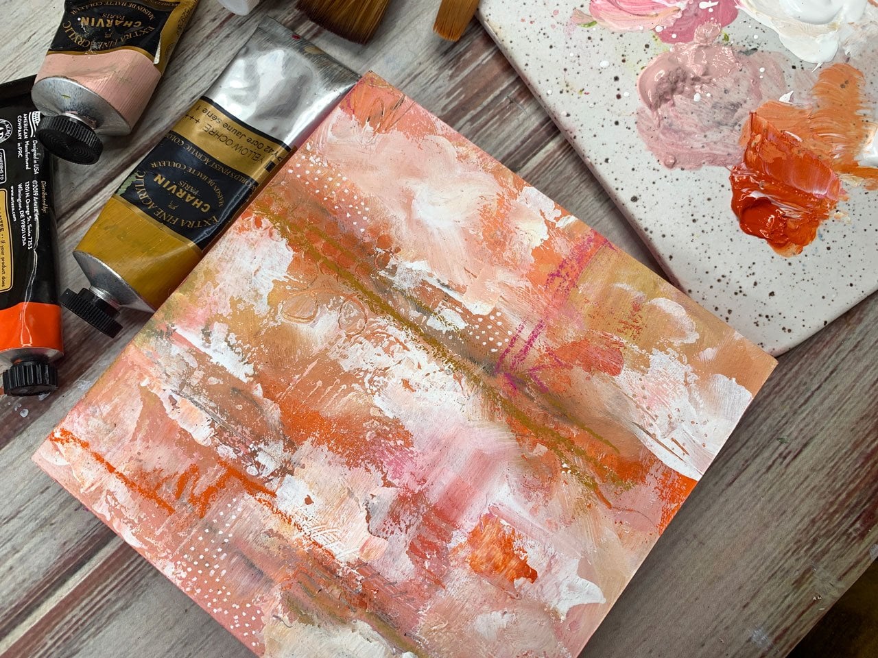
here into this. This is the charvin yellow
ocher. Look at that. I do like yellow ocher
and shades of pink and orange for some reason that's
really attractive to me. If you get this when some of
these layers are still wet, they start to really
combine really nicely. The color starts to blend. If you're doing wet on wet, you do get pretty colored
blends depending on how you're doing this
and I'm mixing it with the white gel so there, so we're getting some
lighter tones in there. I'm just being very
intuitive about this. I'm not going in one certain
area on purpose really. I'm just thinking a little
bit different for each one. Just to see what we might get. I might go ahead and pull in some of those Caribbean pink. I mean, I might've even picked too many colors for this, but, you're only going to figure
these things out if you practice and seeing
what can I get? What am I going to end up with if I do this or if I do that? And this is how you learn. This is how you
figure out, you know, what do you like, and
what do you not like. What would you do
differently next time? Sometimes I will do like six or eight of these
at the same time. I will only like one. I'm going to spread this
a little bit with my ooh. Look at that right there. What that just did.
Oh my goodness. That one little spot just totally made me happy
with the way that that texture blended
and created that. I got a whole bunch
of paint over here. Then if you think, I'm not liking the direction
this is going, sometimes give yourself
a little bit of grace because once you
pull the tape off, it completely transforms your
pieces that you've done. I'm going to get this off before I spread it all over the place. The tape reveals is my
favorite because it's almost magical what you end up with
when you pull the tape off. You get stuff that you
just never expected. Then let's see. I might actually take
my rubber brush here and start doing some
marks like this maybe. Just to start my
mark-making a little bit. I've got a little baby wipe here that I can just wipe
that off really easily with. Then, of course, I want
to make some marks in this wet paint before we get too dry and lose
that opportunity. [MUSIC]
4. Project - adding paint and marks: This is a perfect way to decide what things you need to
work on too in your art. I have found on pieces
that I've done that sometimes I get too tied
in with too many colors. I have real hard
time doing great, big splotchy areas that I really admire and
other people's art, great big blocks of color. I got to experiment
with myself with doing bigger blocks of color and less so of trying to
fit in all the colors, and it being so busy
that I end up thinking, what was I doing there? But then again, that could just be my style, and then maybe I should
just lean into it. This is just my
mechanical pencil just coming in here to maybe add some marks over here
on this dry paint. Acrylic paint dries really fast so as we're going these layers
are drying pretty quick. Can I just continue
layering some stuff here? Let's put that
paintbrush in there and maybe play with
the palette knife. Because you're doing
painting building layers up is what makes
things so interesting. Maybe a lot of the stuff that's underneath we
don't end up seeing because we cover it up
with the next layer and that's okay because
it's those layers and depth and color differences that make abstract
art so interesting. If you don't like
it, to begin with, keep on working it a little bit and then get to the
point where you're like, I like that, pull the tape off. You're like, oh my
God, this is magical. I can't tell you how many
times I've done that. If you don't like any
today, not a big deal. This is something where
you can come back to these little color palette
studies over and over. This is exactly
how you figure out what colors do you like. Did you like a particular
area in a piece that maybe you want
to try to replicate? This is the time to
really figure out the things that you love, which is how you
end up coming up with what is your style
because your style is basically just a series
of decisions in your art that are what did you love. The more you use those, I love this and I
don't like that, the more your art really
becomes recognizable to you because you're using
things that you love and you're making marks
that people recognize and you start making decisions
that really define you and your art and the pieces that you're going to
eventually create and you're not going
to get to that point and find your style and see what you like
creating without just putting the work
in and practicing which I have
personally found very frustrating early on because
I just wanted to sit and be a master painter
with no effort whatsoever. One of my aunts is a painter and she's amazing at
it and I just figured, well, runs in the family, I should be great at this. Just putting a little bit more
of this white gesso down. Figure this runs in the family. Why don't I just intuitively
do this amazingly like she does and
while she's put in 50 years of practice
and I haven't? I don't know what I'll
end up with here. We'll just have to see. I may just be
overdoing everything, but I do like these colors
and I just want to see, what am I going to end up with. At some point will stop and say, well, I need to start
letting it dry. This is just that black. Letting it dry so I can then add some other
media on top of it. Just decide, like
am I there yet? Do I want to let anything
stand out from here? This is my black STABILO which is too wet to use right
now so that's all right. I also have a white STABILO. I've got white charcoal. I've got a black Posca Pen, which we can always
use a black pen. This might be fun if
we had some splatters. If I was going to
do some splatters, it might be fun to try this really bright
pink, red vermillion. Let me just get this really lot of water on that
paintbrush there. I do like splatters and you just got to be careful
when you're splattering. I'm just tapping the brush down and just seeing what I can get, just watering that
paint down and tapping the brush because I used to do this number
where I did like this, but I ended up with
paint everywhere. I do that less now
then I use [inaudible] to try to be a little
more controlled about it. I want to use this blue. I haven't used any blue
even though I intended to so this might be the time
to say, you know what, what little bit of blue
can I add in there maybe with my palette knife, perhaps I just want
to touch a blue. I think I don't want
it to be all over and I might even want
it in some marks. Now that I think about it, instead of with
the palette knife, maybe I'll take
my bigger rubber. This is one of those bowl
scrapers and you use this in when you're doing cold
wax and oil paint, one stuff like that. I use it maybe for
some mark-making. Just to have a pop
of blue show up that you were not
really expecting. That's fun. Look what I just
did that gave us a little tiny pop of a surprise which one you're using that
color wheel I was showing you? That's what that's for, that little bit of color on, let me grab it that
big splotch of color would be all your main colors and they don't have
to be that strong. Obviously, they could be a lot lighter shades
in that same wheel, if you're adding white or
black to it for shades or white for tents so
you can be any shape or color in that range and then a little tiny
pop of the opposite color to add excitement and interest and so that's all
I'm doing here. I'm not trying to make
blue very dominant. I just want it to be like, look at that little surprise. If I do it on one, then I'm going to somehow put it on all levels
a little bit. In the end, I might not love it, but you know what if
I didn't experiment with these at this point, on these fun little
color studies, how are you going to know what you like and don't like
if you just never tried it? I love that. I think that was a
good choice though. I do love my little
bowl scraper. It's good for moving
paint around and creating some differences that
you're not going to get with some other tools too. It's a lot bigger version
of that rubbery paintbrush that I was using
and with cold wax and oil paint that's generally
where I'm using that one. Those are fun. These are almost overdone so when we're done,
there might be overdone. Go back with my tools here and just start
playing in the paint. Maybe making some marks. Again, if I do a
little bit on one, I do try to do a
little bit of that same mark on another one. I like those reds
bladders enough that I might put a
few more on there where I've just
cleared them off. I like that. We're going to have
to let this dry before we can come back and add anything else to it if we even need to add
anything else to it but I might want to
do some mark on top maybe with the Posca Pen and maybe some pastels on top. Let me let this dry where
I can even do some of that and I'll be back.
5. Project - final paint and marks: [MUSIC] Our little sheets
here are mostly dry. I wouldn't say
they're perfectly dry but they're very close. Now I might consider
what do I want to do in addition to all these things that
I have already done. Maybe I want to come in
here with some marks, like with my mark pen,
my STABILO pencil. I could come in here with
maybe some black marks. I could pick colors. I don't have to stick
to a black or a white. I could do colors with
these Neocolor crayons. I could also use
colored pencils. We can do different marks with colored pencils if we want
because now that we've got this or we can draw on top of it because we mixed the acrylic
paint with the gesso. We've now made it so
that I can make marks on top of it with other things
like colored pencils, the POSCA, the STABILO. Because if you didn't put
the gesso in the paint, you would need to
put the gesso on the top because acrylic
paint is shiny, it's a very hard surface and you just can't
draw on top of it like you can if you had added in some gesso or put
the gesso on top. I can tell it's dry now because
it's letting me draw on it and my pencil marks are
showing up so I love that. Because I did a little
bit of orange on one I'm going to go down do a little
bit of orange on them all. [LAUGHTER] Then I might
leave this pencil sitting out so that I can then add it to my color swatch book
of things that I did. I'm going to leave the colors sitting out that I actually do used and I've got over here just some pastels I've pulled out in my color way. I've basically just
pulled some of the ocher. I pulled out a white, I pulled out some of
this reddish color. I'm just eyeballing it. It might not have been
the perfect shades but it could have been. These are really nice because you can put them on and
leave them just like that. You can smear them
with your finger and they are water-soluble. If I were to take a
little bit of water, I could spread that in and it would give a
different look to my pastel. I love experimenting with
the pastels and I like how many different
ways they can be used. I like it because it's
a different texture than the paint so it does give a different feel
than just the paint itself. If you've got an area
that you don't love, it's another layer of color that you can put on
top of something to pull it out however you
need it to be emphasized. I liked the lines.
Let's do some lines. To do the lines, I'm
just twirling it really because as I
flatten out an edge, I want to get another
edge in there. Let's just see, maybe
I want a little bit of red to pop out somewhere. I think that's still a little
bit wet. Let's just see. [NOISE] Look at this red. That's yummy. Look at that. I don't want a lot of it
but I do just want touches, so I might just let this sneak out at the
sides a little bit. Maybe do some little mark-making with
little lines perhaps. That's fun. That was wet there. There's no right
way or wrong way. I mean, you're
experimenting here. You're just trying to
decide, what do I love? Let's go back with
maybe some POSCA pen and see what we can get
with the POSCA pen. I love the little paint pen. I love making dots
with the paint pen. I'm going to do
some dots in here. Dots are whimsical. They add a little extra to the pieces I think. I love that. Just a little bit
of whimsy in there. Doesn't have to be overwhelming, I just liked the extra
detail you can get. You see when the paint is dry, then you can get
some really nice organic lines go in that we couldn't have got if we
didn't wait till it dried some. Now if you draw this on
top of that red pastel, what I just did you do get pastel in your paint
tip so you got to be careful where you're dragging it and if you want to avoid that, do the POSCA pen before
you added pastels. But I'm rough on my
supplies and this figure, whatever I end up
with, it's going to be a little bit of serendipity, so I just let it do its thing. Wipe it off when I'm done
and then comes pretty clean. Maybe do the tip a
little again and I end up with a clean pen again. I'm going to set that there. We do have quite a
bit going on there. I do think I like
where we're at. I could just keep on piling
and stuff on and may get it to a point where
I hate it or I love it. But with the color studies, I almost want you to give
yourself a time limit. I almost want you to say
I've got 15 minutes. I'm going to do the
four. I'm going to go as fast as I can. It's a way to free your mind from worrying too
much because you've got a clock going
that you're working against and you just want to
work as fast as possible. With these, I think I'm
going to go ahead and say, this is done for today. I've experimented with
this color range. I could experiment on another four pieces of
paper with the same colors and come up with
something completely different than I had. But for today, I think
this is going to be it. Let's go ahead and
do the taper bill. It's my favorite part, so rather than just pull
these off and let you not see [LAUGHTER] I'm going to go ahead and pull them
off for your own. Now, this is one
reason too why I like the painter's tape better
than the artist's tape. This almost seems to
pull the paper off, even worse than using
painter's tape, so you don't want to
have a big splotch of paper torn off but I
do want to peel these. If you'll peel them, an
angle, not too fast, you'll get a nice clean edge and it won't pull
your paper off. If you get into a
hurry and you just rip the tape off, you're going to have
it pull paper with it, and ruin your piece. Look how much prettier
that is with a paper edge. All of a sudden it just elevated
it into a piece of art, an at this point too, I might even could turn
it around and be like, well, do I like it
this way better? Do I like it this way? I kind of like it that way.
Do I like it this way? We can then start looking at different directions rather than just the direction that
you painted with it. Just elevates it with the edge I think to a more thought-out
finished piece. Because if you
don't have the edge there and you went to the end, you may never get the
satisfaction of seeing it as a matted-out piece of art. Still might look like
some chaos to you rather than finished art or
at least to me anyway. [LAUGHTER] I love that one too. Now that I've started peeling
these off and you can keep on working on these
after you peel the tape. If you think that needs a little touch of
this here or there, you can still add a little
touches of stuff if you need to but really I try to be done by the time
I'm pulling tape off. But I still could go back
and say this would benefit from whatever it is I'm thinking and go ahead and still
add a touch or two to it. But I really want you to treat these as color studies and move a little faster because I think if you'll move faster, work a little bit more organically and less
thought about it. You'll end up with pieces that you like better than
if you think too hard about it and get stuck
in your own mind space. Well, I think if
you'll do these in a series rather
than one at a time, then you can see how the pieces can work together and if
you love them all or not. I really loved these
three and I almost think I overdid this big splotch are red at the top on this one. But then again if I'm
looking up here at the camera screen where I could see him from a
little further back, I actually like the bigger
blocks of color on this one. Step back from the pieces of art before you decide
if you love them or don't love them because the
pieces are going to look different from real close
up versus standing back. This was an interesting
little sit. I'm going to have to
live with these for a few days and decide,
do I love them? Do I want to do
something with them? Do I just want to put them in my color palette book
and say I've tried to set of colors and here's
what I got out of it? But I love it in a series, it does elevate it into a more artistic endeavor. With this red, now that I'm looking at it, what might be nice on there
could be some white marks and dots just to break
that up and give me that difference I'm
looking for that might. Let's just see here. Look at that, so that's fun. You just decide,
you're going to stop at some point and say I'm not
doing anything else to it, set it to the side
and come back to it tomorrow and see
if you like it. Because some of the pieces
I've done the next day, I actually love them even though when I was sitting
there working on it, I was getting disgusted
with myself and not creating anything that
I thought was amazing. When I look at them
later, I think that was amazing and just I was
too close to the project on the day that I
was working on it. I hope you love this project. It's fun to see how I do these with whatever
different colors I decide to work with that day and now you know what
these colors will do. You can skip some of that process and think,
I love it or oh, I don't love it,
maybe I would try, XYZ differently than you did. Just something fun
to experiment with. I hope you love these and this technique and I
will see you next time. [MUSIC].
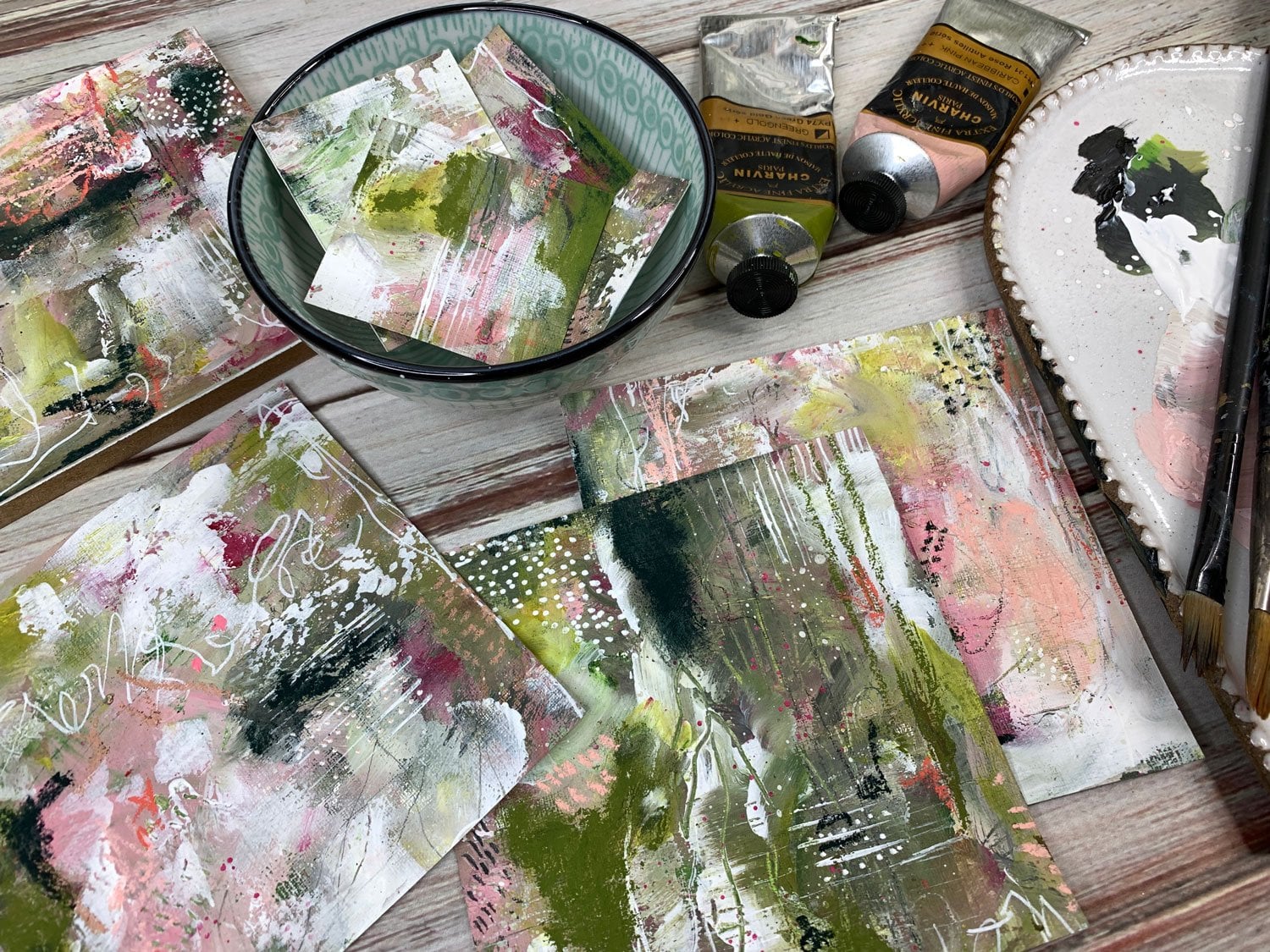
6. Finishing your pieces: [MUSIC] Let's talk for a second about finishing your pieces. I actually have three big pieces and then one piece
that I've cut into some little tags and used
on my color palette. The one in the color palette, I don't do anything with. I mean, I consider
this finished. I will close this page and then that's going to protect it. It's going to look
really nice in there. I will leave it as it is. If it has a bunch of
chalk pastel on it, I will go ahead and use the Sennelier soft pastel
fixative and fix that. I might take it outside and
spray it to fix that in. But I feel like if
it's in the book, it's not getting handled as much as if I
were having it as a piece of artwork
or it was out to be touched or framed or put up. I don't mind leaving
those not fixed, but if you want to fix it, I do recommend the Sennelier
soft pastel fixative. If you're going to do like
little tags and they've got the pastel on it so that you can touch it and it
smears on your finger, then I would probably
fix those too perhaps, with the fixative just
so that it's a little more durable than it
would be just like it is. Then the big pieces, I would use the soft pastel
fixative on it for sure. This stuff stinks, so you
want to take it outside. You want to spray it on one way, spray it on the other way, maybe let that dry a bit
and then do it again. Spray it on one way, spray it on the other
way. Let that dry. This doesn't really
change the color. Depending on your soft pastels, it may deepen the
color a little bit. But I've found for the
most part, when it's dry, it has not changed the colors significantly enough
that I have noticed. Once you've got 3-4 layers of the fixative spray on there, it's going to be pretty durable, but it's not going
to be smudge proof, so you don't want to
then be trying to smudge stuff just to test it because
it will still smudge. [LAUGHTER] You got
to be careful. Another finishing
spray that I like is the Krylon UV Archival
Gallery Series. This is a matte because I
like it not to be shiny. I do think that
comes with a shiny. I like that it's UV Archival, so it's less likely to yellow. This is a varnish. I have other sprays too. I've tried to the
Krylon, Kamar finish. I've tried the water-based
polyacrylic finish. I like this because it says
crystal clear when it's done. You're just going to have to maybe experiment
with some of these. I've also tried the
Rust-Oleum Matte Finish, which is a clear finish and
it says on it non-yellowing. You want to get one
that's non-yellowing. Perhaps Archival. I think these two came from the art store and the others came from
the hardware store, so that might be
your clue also as to if a material is going to
be good for art or not. [LAUGHTER] I do go
ahead and spray the pieces before
I even consider framing them or mounting
them to like a woodblock, because you can mount
these pieces if you created a piece the same as a cradle board or a wood panel like on
one of the ones I did. Here with this one.
This is mounted to a wood board and
the cradled panel is the one that has the
sides on it like this. You can mount these
to cradle panels and these wood sides come
in different depths. If you wanted to really elevate it and make it
look nice and rich, I do like the deeper side, like the inch and a
half to two inch side. I think it makes it
look really rich. If I do something like this, I do paint the sides
to make it look great. I don't leave it unfinished.
This is unfinished. I don't leave it that way
because these are meant to be ready to hang just
like they are. Then I would glue your
piece onto something like this with a matte medium. I mean, you could
experiment here, but my favorite thing has
become the YES Paste. I basically just put that
on with a palette knife, set the artwork on it, and maybe use a brayer with a piece of wax
paper on top of it. I don't want to do anything
on the surface itself. I want to put maybe a
piece of wax paper, spread that out, let that dry. Then if you've got
any areas where it overlapped the panel, you can just flip it over, and with an X-Acto knife, you can then trim those
edges off on a cutting mat. This is a really nice way to finish it and just
have it ready to hang. But again, even if you
use these sprays on them, if you're using something
like a pastel or something, you could potentially damage the surface still
because that pastel, just that's the nature of it. You just want to
be careful and not touch the surface or frame it in a picture frame
like the ones that I showed you a little while ago. Let me just pull one
of these back out. If you frame it like this, then it's nice to have
the fixative spray on it because you're taking it to the framer and somebody
else is handling it. You want to be able
to let it at least stand up to the
initial touching it, getting it framed
and not ruining it, and then it's pretty
safe going forward. Just a couple of things
to think of and different ways that you could consider
finishing the pieces. But I would
definitely, at least, use a fixative spray
on your top of that after everything is completely
dry so that it will last. Even if you're
just putting it in a drawer and saving
it for later. I hope you love those
different ideas on finishing and a little
bit of framing. I will see you
next time. [MUSIC]
7. Saving your Color Palette: [MUSIC] I thought
while I'm letting these dry because they're
not quite dry yet, that I'd go ahead and start my color palette in my
book that I usually start with these before all this paint dries and usually I don't
want to waste all that paint. Usually I'd have
some more pieces of paper ready to create some moral abstracts with and use up the rest of my paint
rather than throw it away, but because I'm filming, I didn't have extra things
set up at the moment. But I do want to create
the color palette, things that I create before I let these paints dry
and I can't use them. Usually what I'll
do, if you took the Abstract Adventures 1 where I had the great
big sheet and I'm cutting little
abstracts out of it. I'll take one of the sample
pieces from that that's leftover and put it in my book along with
the colors that I used. This is just a sketch
book that I'm using. It's not anything important, so I don't care if I get
painting and stuff on it, but my favorite way to do it
now is to use an old book. It just adds another
layer of artistic value, almost to my color palettes. It take some up a notch
and I do it every time, so I don't want to
forget to do it. Most of these I've done when I've done
the great big sheet. I always have a piece leftover. I may not have a piece left over when I'm done
with these or there may be a piece that I don't love as much as the other ones. I might take that and either put the whole painting in
there or cut a piece of that and put it in
here as my sample because I like to
see the colors, what I might have used
with my mark-making and how it blended on the sheet that I was
doing so that I'm like, I remember that, I loved it or I remember that and
I did not love it. I do like having a little
sample with each color palette. How wonderful are those. I'm on a new blank page. I'm going to start this out
by putting clear gesso on it. I do that because
if you're using an old book and I
really encourage you to use a funnel book for a
project like this because look how much more artistic that was than just the plain white paper, but use whatever you prefer. But the old books,
the pages are old and they're very absorbent
and I like to protect the page from the stuff
I'm putting on top of it. I'm just going to go
ahead and brush that in. I might wipe it off
if I've put too much on there and then just let that soak in and then any of the
paints that I paint on top of that will then not soak in
and will sit on top for me. We'll just let
that dry a second. Then what I'll usually do is then just take
either my finger or a paintbrush and I will take each color and do a
stripe of that color. Let's just do my
finger for this one. Try not to get the yellow on
there, but it's in my paint. Just do a stripe of each
color, the pure color. I don't want the color
that's soaked up in another color unless
of course you're wanting to keep track of mixes. If you mix part
of this vermilion red with this
Bordeaux and you like the way those mixed
then include that mix and write in pencil or
something underneath it, right in there, what it was that you mixed so that
you can also keep track of color combination and
mixes that you might like. In another book too, that might be a
good thing to have. Something like this
is a recipe book so that when you do color
mixes that you love, you can save those recipes. Maybe the two main
colors or three main colors or whatever you mixed and then the mixed colors
underneath it, that would be amazing if you had a recipe book like this also of colors that
you mixed and love. Now, that I've got a little
bit of all my colors there, maybe I'll put a
white down here. I'm going to let this, almost set it to the side, really let that dry and
then once it's all dry, I'll go back on top of it with whatever else I'd
might've used for mark-making and put those mark-making
pieces in there too. I got to let that
dry. We will come back to this as we're going. Our pieces, I've
pulled the tape I just showed you the
end of our project, but before we actually finish, I've now let this dry here enough that I can
come back and do some other marks in here to
finish off my color palette. I'm just going through here with any of the tools
that I might have used and just making some marks
so that I remember later. I remember doing that. These were some of the ones
that were on the bottom. Was that big graphite thing
which I really liked, but I don't know how
you'd sharpen that again. [LAUGHTER] I guess
I'll figure it out when I get further
down because I don't think that'll fit
in my pencil sharpener. Maybe I've got a bigger one, but I don't think it's that big. I don't know. Maybe
I'll take a knife and maybe just shave it
off with a knife like you see people do
sometimes. I don't know. I did go back with
some of these pastels. Let's just color
some of these on here so that I
remember I did that. I used this color. What colors did I use? Let's see. I don't think I did. I think that's all
actually used was the the ocher and that red and then there's
my color palette. Then if I decide that I like one of these
less than the others, then I could sit
this in here with it and just let
that live there or I could cut it into a
little strip and let this be a little tags or something that I
have done before. Like if you watched my
adventures with Abstracts 1, you'll know that we cut the bigger pieces
into smaller pieces. I could do the same with this. I could cut this piece into
small tags and pieces to use for other things
because I do like these little micro two-by-two
or so sized pieces. You don't love the piece
as you cut it out, consider cutting it
into smaller tags and using it for something
else and keeping the ones that you love and framing those or giving
away or make them as card sets or saving them in your pile of samples and
things to refer back to. That's how I'm
going to finish off my color palette for today. Hope you enjoy this
particular project, I think because I mentioned it, I might as well go ahead
and cut this one up. I just staple that in and maybe this is
dry enough where I can maybe cut a strip
out and then use the other strips as tags. Thinking sheers, I don't
want to use those. She is my little set
of scissors here. I didn't quite get it. There we go. Close
enough. There we go. I just strip out that I like. See even right now as a strip, I like it even better than
I did as a big piece. That's another thing too. I have a whole container
of pieces that I love that I keep and I save
those as collage bits. If I want to then
use a little piece that I loved out of a
bigger piece later, I have some really
beautiful collage bits and pieces that I can
then use later. Don't finish it and think, I don't love this
because we have tons of uses that
we can use even on pieces that didn't quite end up exactly the way we wanted
and this is one way. It's the way I save a color palette and I just
staple this bit in here. There we go. Now, we've got
our next color palette. There may be certain things
in here that you love, I love this right here. That's like the
ocher, the white, maybe the pink and
the burgundy and maybe I would create
out of that set right there and not
the entire set. That's something to think about and then with the piece
that I have leftover, I might cut this into
three little tags or use it as a collage piece because now that I've cut it, I like it better than I
did as the whole piece. [LAUGHTER] Just consider uses for different things that
you're making there. I love that. Hope you love doing this project
and experimenting. I'll see you next time. [MUSIC]
 DENISE LOVE, Artist & Creative Educator