Transcripts
1. Welcome! : Hey there, my name is Shivani
and I'm an artist and designer based in the sunny city of Chennai in the
south of India. Welcome to my Skillshare class, and I'm so happy
to have you here. I'm a gouache artist and
I've been painting with the medium for over
2.5 years now. And it very quickly became one of my favorite
mediums to work with. In today's class, I'm
going to be teaching you all about painting florals. And to be honest, this class
is not medium specific. So even if you're
an acrylic artist or working with any other
sort of opaque medium, you can completely apply
all of the techniques and everything I'm teaching you
about color and composition to any medium that
you're working with. Nature and flowers and birds and butterflies are some of my
favorite things to paint. So I'm really excited to be here and creating
this class for you. Also before we get started, I just wanted to let you know as a disclaimer that I live in
a very busy neighborhood. So there may be a little bit of background sounds and
things like that. I'm so sorry about that. And the weather has been
a little erratic lately. So if the lighting fluctuates, I'm sorry about that as well. But I'm sure you're
going to enjoy the class nevertheless. In this class we're going to be covering all of the
basics about creating a composition and
working with color to create any kind of florals
is that you want to paint. You don't need to be very proficient with
painting or drawing. Whether or not you've
painted florals before, this class is suitable for
students of every skill level. You can make it as simple or complex as you want it to be. I'm just going to be
equipping you with all of the basics that
you need in order to understand color
and composition to create the most beautiful
floral illustrations. At the end of this class, your final project
is going to be a beautiful floral
illustration of your own. And we're going to talk in the next lesson about what
that project is going to be. So I'll see you there.
2. Here's What You'll Create: So for today's class project, we're going to be creating
a floral composition. I'm going to be taking you
through everything, right from the materials to how
to work with gouache, just the basics of it. And if you're
interested in learning more about how to
paint with gouache, I'd recommend checking out my
previous Skillshare class, which is a Gouache 101 class. I'm linking to it in the
description as well. If you'd like to
go over the basics or if you just want to get
familiar with the medium, that would be the
perfect class for you. Through today's class, I
want to teach you to create any kind of floral illustration
that you want to create. I want you to
know how to understand the forms and the
brushstrokes and composition so that you're
able to put together any florals that you like and create an
illustration of your own. I want this to be a very
flexible class where you're free to create anything that
you would like to create. You don't have to necessarily
do exactly what I'm doing. If it's easier for you,
you can do that as well. But if you want to paint
something different, if you want to use
different floral elements, I want you to feel
free to do that. I'm going to be taking you through how to look for inspiration, not just for the flowers, but also for the composition. And we'll talk
about how to create brushstrokes which are perfect
for floral illustrations. We'll discuss color and how to apply color palettes
to your composition. And finally, we'll end up with a floral composition
of your own. The class is going to be very exciting and I can't wait to see what you all create. As we
go about the entire class, don't forget to keep uploading your projects into
the project gallery. And even when you're doing the practice exercises alongside
me, please upload them. I would love to see
them and I'm sure that other students would love to see and learn from them as well. In the next lesson,
we'll be talking about all the materials
that you will need to create your floral illustration. I'll see you guys
in the next one.
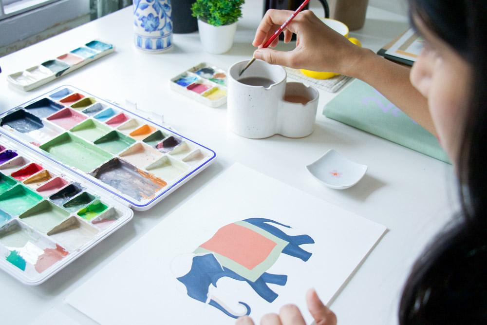
3. Materials You'll Need: Laid out here in front of
me are all the materials that we're going to be using.
When it comes to the paints, I'm going to be using Winsor and Newton designers gouache. But like I mentioned before, you can feel free
to take this class using any medium that you
are comfortable with. You could use any
other opaque medium, such as acrylic
or poster paints. And that's completely fine. For doing our rough
composition sketches, I'm going to be using
this sketch book which has 180 GSM paper. You can feel free
to use any paper or sketchbook that you
already have on hand. For our practice exercises, I'm going to be
using Canson Montval, which is a cellulose
based cold pressed paper. And for our final project, I'll be using Lanaquarelle's
hot pressed paper. That's just because of
my personal preference. I like the smooth
texture that it offers. But for the final project, you can feel free to use either hot or cold press paper. As long as you're
working with gouache, I would suggest sticking
to 300 GSM paper. I then have a palette. I would suggest using
a palette that has wells like the one I have here, but this isn't a necessity. You can use any palette that
you're comfortable with. Just make sure you have
enough space on it to be able to segregate the different colors that
you mix up. You will then need
water containers. I would suggest having
two water containers, one for your first
rinse and then for final cleaning
of your brushes. I have this ceramic water jar which has two sections in it, which I find very useful. I then have a spray
bottle with water in it. I find this useful when I need to reactivate the
paint on my palette, I can just spritz them with
water to keep them wet. Then have a pencil and eraser. And for the brushes today, I'm going to be
using round brushes. These are Princeton
heritage in size 4 and 2. You can use whatever you have. You can even use a size
6. That's perfectly fine. Just try to have one that's
slightly bigger and one that's slightly smaller
so that you can use the smaller one
for the detailing. And finally, I just have a
scrap piece of cloth here. In the next lesson, we'll talk a little bit about gouache so that you can get familiar with the medium. I'll see you there.
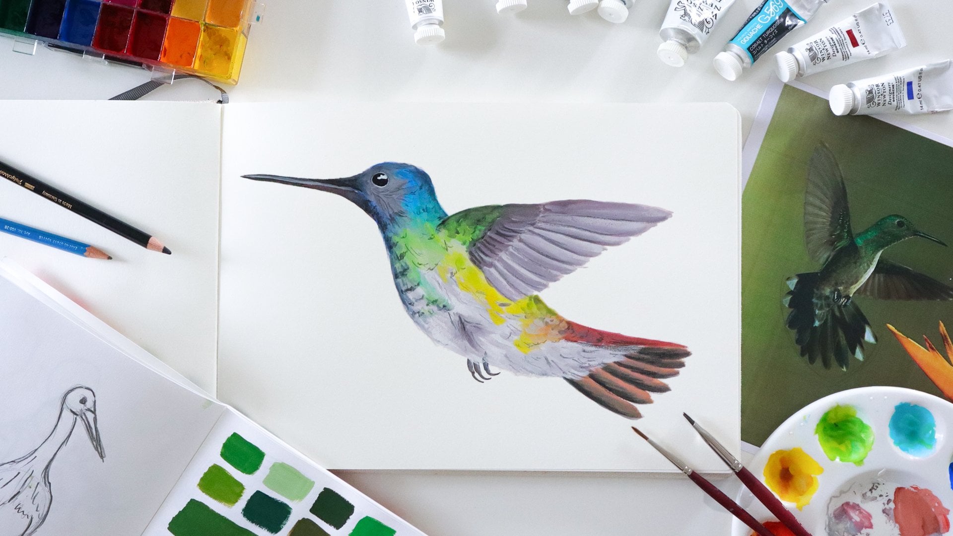
4. Understanding Gouache: So like I mentioned earlier, gouache is one of my favorite
mediums to work with. You can think of
gouache as being something like
opaque watercolor. You can apply similar techniques to what you apply to watercolor, but it gives you very
opaque and matte results. It's perfect for these
kinds of illustrations where you want really bold
and punchy colors, or you just want it to look very solid as compared to watercolor, which is more about
the transparency. And the beautiful thing about gouache is that
if you'd like to, you can water it down and use it somewhat
similar to watercolor. I sometimes do that to create background washes and
things like that. But I love using it for its velvety matte
and opaque texture. If you want to get more
familiar with the medium, I'd recommend checking out my
previous Skillshare class, which is a gouache
101 class where I take you through
everything right from consistency, to
all the materials that you could use when
you work with gouache. I also tell you all
about the techniques, color mixing, and
basically everything that you need to
know to get started. We also go over some beginner mistakes that you can avoid. Going through that
class, however, is not mandatory for
you to take this class. This is going to be completely independent of that
and I'm going to teach you all the techniques and
everything you need to know to create the
floral illustration. Let's get started and I'll see you guys in the next lesson.
5. Finding Inspiration: When it comes to looking for inspiration for
floral compositions, the possibilities are endless. Firstly, you could take a
walk in your neighborhood, look at your own garden
or any gardens nearby. Maybe go to a park, or even visit your
local florist store. Aside from that, of course, we all have access
to the Internet and there's so much
that you can find. So I want you to try
looking through websites like Pinterest or even Unsplash for inspiration. Here, I just searched for floral arrangements
on Pinterest. And there are so many
beautiful arrangements that you could take
inspiration from. You can look at the way floral
arrangements are composed, how they have a combination
of larger flowers, smaller ones, and then some foliage to kind of
balance it out. And that can help inform the choices for
your own artwork. I of course, don't want you to directly copy something
off the Internet. We just want to take
inspiration in terms of color palettes and arrangements
and then make it our own. Sometimes it's also
helpful to look at watercolor
floral compositions because there are
so many of those and it could give you some
ideas of arrangements. For example, they could be bunched up something like this. You could even have a curved
composition like this one. You could have wreaths,
something like this. In a couple of minutes, I'm going to show you
a few examples of a practical application of all these different
compositions as well. Now, aside from the
composition itself, you could also look
for inspiration for the flowers that you want to
include in your composition. For this, like I said, it's helpful to look around
in your neighborhood and sometimes it's useful to have reference books as well. I find this book really useful, which is called The
Book of Flowers. And sometimes I
just open this up and scroll through it
looking for inspiration. If you know exactly what
flowers you want to paint, then maybe you could
look specifically for those flowers just
to get an idea of how the petals are formed
and what kind of shapes the buds take. That
could help you depict them more accurately
in your paintings. I also like following a few
accounts on Instagram to get some inspiration for some beautiful and unique
floral compositions. For example, there's @sarapearch,
@floretflower, And @soilandstem. These are just a few
that I really like. And really you could search for inspiration from just about anywhere and compose it into something that's
truly your own. In the next lesson, I'm
going to quickly show you a practical application
of all of this in the form of the
illustrations that I created to turn into
my own wedding cards. I'll see you guys in that one.
6. Floral Composition Basics: So here's an example of how you could take inspiration from different flowers
and then create multiple different
compositions using them. I created this entire
set of illustrations to be used in my wedding
invitations last year. And the flowers that I chose to include were chosen to represent the four states in
India that me and my husband's families
are originally from. So we have the
Marigold for Gujarat, we have this flower
called the Kurinji, which is something
from Tamil Nadu, which is the state
where we live. And then we have Jasmine, which represents Andhra Pradesh, and we have Mustard
which represents Punjab. I looked at the flowers
themselves and then I tried to roughly sketch them out and
develop it into my own style. I then painted them individually before combining them
into a composition. So this one is created
in a bouquet style, which I used in our
save the date cards. And then these two are Wreath styles and I ended
up using this one, which I used for the
cover of our invitation. I have this one which I created around the
four corners of a square so that I could then create a graphic where
there's text in the center. And finally, I created this beautiful and lush
bunched up illustration, which became our main
wedding invitation. I wanted to show these to
you for you to understand all the different possibilities once you have your
floral elements. So I hope this sparks a
lot of ideas for you. In the next lesson, we're
going to be creating different brush
strokes for you to start creating floral
illustrations of your own. I'll see you there.
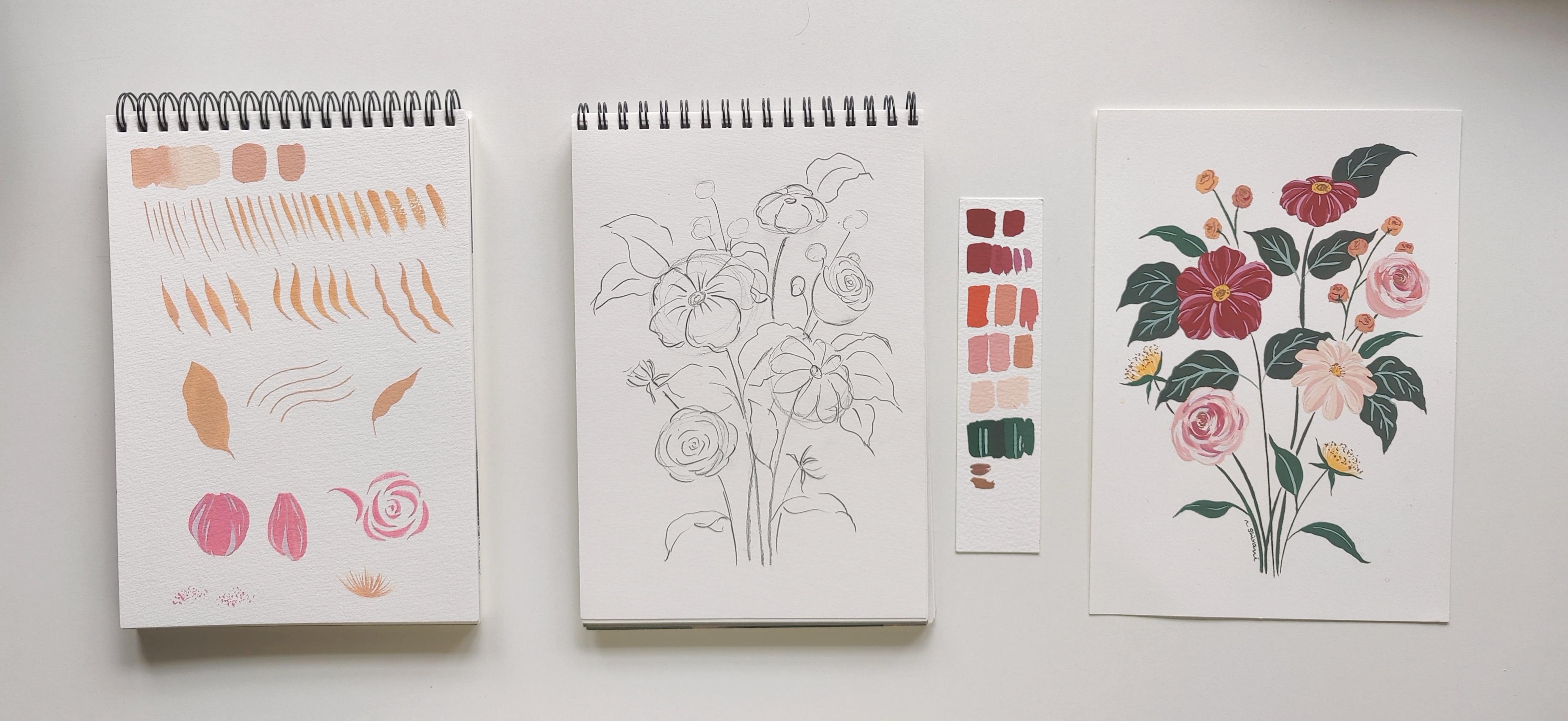
7. Essential Brush strokes Part 1: Through this activity, I want
you to get used to the different strokes that are possible using just
your round brush. You're going to be stunned with the number of possibilities. But first, before
we get started, a small note on gouache and it's consistencies
for this activity, you can use colors that you already have mixed
up on your palette, or colors straight
from the tube. That's completely fine. You can use any
color that you want to. When you're
working with gouache, especially for the kind
of illustration that we're going to do in
today's class project, you want to achieve a smooth
and creamy consistency, something that's similar
to melted ice cream. You don't want to water
your paint down too much so that it becomes
kind of like watercolor. So here I'm showing you how it ends up looking if you
add too much water to it. This is what you don't want. You need it to be wet
enough so that it's buttery and easy to
move on the paper. You don't want to be
getting dry brush strokes, but at the same time, you don't want it to be so watery that it looks
like watercolor. This year is the
perfect smooth and and opaque consistency
that we're going for. For this activity, the
brush I'm using is a Princeton Heritage
round brush of size four. You can use a size
four or size six. Just try to use a brush
that comes to a fine tip. Otherwise it's going to be hard to get thin lines and details. But work with
whatever you have. The first going to try to
achieve nice thin strokes. I want you to be confident
with your strokes. Place your brush on your paper, use the tip of the
brush and just give it a gentle
flick downwards. Try to get your lines
as thin as possible. Once you're
comfortable with this, apply slightly more
pressure for thicker lines. And once you're comfortable
with that, repeat the same, apply a bit more pressure
and then a bit more again. I want you to be
able to see just how thin and thick you can go with the strokes that your
brush can create. Next, let's try some
composite brushstrokes. So for this, we're going to
try to create a petal-like shape, where we first place the
tip of the brush down, drag it down a bit, and then press down the belly of the brush and then lift
it up back to the tip again. This gives you a
kind of petal shape. This is an activity that's
actually very common when you try to learn
watercolor florals. But it's useful to know all of these strokes no matter what
medium you're working with. Now we're going to do something similar to the previous one. But we are also curving
the brush in the process. So as we're dragging
the belly down, I'm curving my hand towards the right to make
a curved stroke. And now again using
a similar stroke, but I'm trying to
make the line wavy. So as I drag it down, I'm wiggling my brush
a little bit to create this wavy line
on the side of it. Now, let's try to
combine two wavy lines, one on the left and
one on the right. And then we'll fill them
in to create a leaf shape. And this is how simple
it can be to create these very solid
leaf illustrations. This is another
stroke where we're using the tip of the brush and dragging it upwards to
create this curved line. I'm now going to combine
that stroke with a wavy stroke to create
another kind of leaf. Feel free to watch these
exercises multiple times and practice them over and over again until you get
comfortable with them. This is going to
make your process of illustrating florals
so much easier. In the next lesson,
we'll talk about a few more strokes to create
flowers. I'll see you there.
8. Essential Brush strokes Part 2: In this lesson,
we're going to do a few more brushstrokes
for you to get more comfortable to be
able to illustrate flowers. Again, feel free to use any color on your palette
or from the tube. For the first activity, I'm just using the tip of my brush to create
a petal shape. I'm using some straight
lines and some wavy lines, and then I'm just
filling them in. I'm creating another
petal shape beside it. The first one was a wide petal, and now I'm creating something that's narrower and longer. The next thing we'll do is
try to create C strokes. Now, we're creating
C-shaped strokes, which are using
the same technique that we learned in the
composite strokes above. That was to first use
the tip of the brush, then press down the belly
and lift to the tip again. But we're creating it in
these curved shaped strokes. These kinds of strokes are very helpful when you want
to create a flower, a rose, for example. And you'll see us use it in the final project
to create a rose. You need to practice this multiple times to
get comfortable with it. So I'd recommend
doing it as many times as it takes for it to
come more naturally to you. I'm now mixing up a
lighter shade of pink to add a bit of shading to
the first two petals. As you can see, I'm still using the kinds of strokes
that we learned above. Everything is formed by a combination of all
of those strokes. The first layer of
shading that I gave it a color that's just mildly
lighter than the base color. Then add a second
round of shading, which is much lighter than that, to add detail and highlights. And again, as you can see, I'm using the same
kinds of strokes just to create line
work and detail. This helps add interest
to our petals. We're going to just try out a
couple of more things now. The first
thing I'm doing is creating slightly curved
flicked upward strokes. This is helpful if
you want to create something like a
dandelion for example. I'm creating these very
short strokes and just flicking my brush upwards and
lifting it off the paper as I do, so that I create these very
delicate strokes. The last thing I want to
teach you is stippling. Pick up some pigment
on your brush. You don't want that to be
too much paint on your brush because then you will
find that you're not able to control it as easily. And then you just create this dotted texture
on your paper. And this becomes
helpful when you're trying to create stamen
on your flowers. Again, practice
this multiple times until it comes to you naturally. Perfect. So now you're aware of all these
different brushstrokes, and you just need
to combine them in different ways to create
your floral illustration. We're now going to be diving
into the final project. And I hope you're
as excited as I am. If you're not completely comfortable with
these strokes yet, please don't worry, it
always just takes practice. You can still do the
final project and you can improve upon your strokes
even as you're doing it. So let's go on and create
the final project.
9. The Class Project : Composition and Colour: Oh my God, you guys made it. I'm so excited to see
you here and that it's time to get started
on our class project. In this project, I'm
going to start by taking you through how to
create a composition. We'll start by just
creating a rough sketch before you go in with
your final sketch. And then we'll
start painting it. And I'll take you through
how to apply all of the techniques that we've discussed in the
previous exercises. I think you're going
to really enjoy this and I cannot wait to
see what you create. So let's jump straight into it. As a first step for
our final project, we're going to be creating a rough layout for
our composition. After this, we'll do our final sketch and then
we'll start painting. For mine, I'm going to be creating a
bouquet style illustration. And I'm going to be using a mix of two or three different
types of flowers. I want you to feel free to
create whatever flowers you want to and any style of
illustration that you want to. If you find it simpler
to follow along with me, then please feel free to do so. I'm going to start by creating
a very simple sketch. I'll start by placing
out my key elements. First, I'm going to
draw a simple circle here to indicate where my
hero flower is going to be. This is going to be the largest
flower in my composition. I'll probably paint it
in a deep color. I'm then placing my second flower. And above this, I'm placing
a slightly smaller one. I'm placing one more below. And just to balance it out I'm placing a fifth one on top. I also want you to
be aware of odds, which states that in composition it's better
to have odd number of the main elements because our eyes tend
to form patterns. So when things are
in even numbers, we tend to group them
together and form patterns. Whereas when things are
placed in odd numbers, our eyes travel through
the composition better. Now I want to create a
few smaller elements. So I'm just creating
something like buds or berries in two positions. Then I want to add two more buds or probably something
like dandelions, so I'm just adding those in. I'm now going to
give a little bit more structure to my flowers. I'm adding the centers
and adding petals. So the one which is going to be my largest flower is going
to be a five petaled flower. Again, I'd like to remind you that this is just
a rough layout. You don't have to
be super specific about it and you can
change things up later. This is just to
make sure that you like the way things
are being positioned before you go in
for your final sketch. For the second flower, I'm creating something
with more number of petals and they're
longer and more narrow. These two, I want
them to be roses. I'm just creating these lines to indicate layered
structure of rose petals. And for my final flower on top, that's going to be similar
to the first one I did, which is a five petaled flower, but it's sort of
leaning backwards. So you can pretty much see
only three of the petals. I'll now add in my
stems and leaves. And like I mentioned I'm creating it
like a bouquet, so I want all the
stems to end up in a similar position at the
bottom of my composition. For the leaves, I'm going to be drawing two styles of leaves. One is going to be more
large and with wavy edges, sort of like these. And the second is going to
be longer and more narrow. I'll be placing these in a few different positions
on my composition. As I'm filling in my leaves, I'm basically just
trying to fill out the gaps in my composition
and make it look balanced. I want to have a good mix
of the two types of leaves because I'm also planning to paint them in two
shades of green. I don't want one to be
overpowering the other. So I'm just making
sure that they're scattered well around my composition to create balance and harmony. Once you've filled
in all the details, just take a step back and look at your composition as a whole. If you feel that there are any gaps that look out of place. You can fill them
in or if you feel that anything is
looking too cluttered, you can feel free to erase
a few of the elements. And that's the great
thing about having a rough sketch before you go
in with your final sketch. Once you're happy with
your rough sketch, it's time to do your
final sketch. For this, like I mentioned earlier, I'm going to be using
hot pressed paper. You can use 300 GSM paper, either cold pressed
or hot pressed. Both are completely fine. You'll notice that once I'm
going into my final sketch, I'm keeping my pencil
lines a lot lighter. Even if you need to draw
your guidelines like the circles that we drew
before we drew in the petals, feel free to do that. And because gouache
is an opaque medium, most of your pencil lines
will get covered anyway, but make sure you're keeping
your lines very light. Now that the sketch is complete, you can notice clearly
that it's so much lighter than my rough sketch. So if you feel that you've made your pencil lines too dark, feel free to just go
in with an eraser and lightly erase over the lines
so that you lighten them. It's now almost time to
paint our composition. But the first thing
we're going to do is decide on our color palette. So when you're painting
this illustration, the first thing you're
going to want to do is paint all of your flowers before you paint any of your
leaves or stems. That's because you want the flowers to be
your hero elements. And you can also
mix up a color for your leaves that
complement the flowers well. So to decide on our colors, let's just take a quick
look at the color wheel. You can decide to go with either an analogous
color scheme, which is colors
beside each other, or complementary color scheme, which is to use complimentary colors which are opposite each other
on the color wheel. For example, with flowers, yellow and purple is
a great combination. I think for mine,
I'm going to go with an analogous color scheme
and use shades of red, pink, peach and yellow. And once I add in my leaves, I'm also going to have a bit of a complementary scheme going on because red and green are opposite each other
on the color wheel. So I think I'm going to stick
with that color palette. You can decide what
colors you'd like to work with for
this composition. When you're painting
with gouache, also always remember to
have a scrap piece of paper next to you so that you can swatch your
colors as you go. Because gouache never dries exactly the same as how
it looks when it's wet. Lighter colors dry darker and darker colors dry lighter. So it's better to swatch them before you put them
into your painting. When I'm painting with gouache, I like working with
a limited palette of colors because
that really helps you explore your colors
more and come up with unique and interesting
color combinations. So I've chosen to work with just these five colors
today, which are spectrum red,
permanent green middle, primary yellow, permanent yellow deep,
and permanent white. So now that you've
picked out your colors and you are ready with
your composition. Let's start painting.
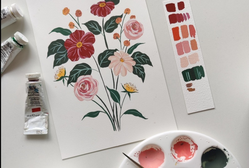
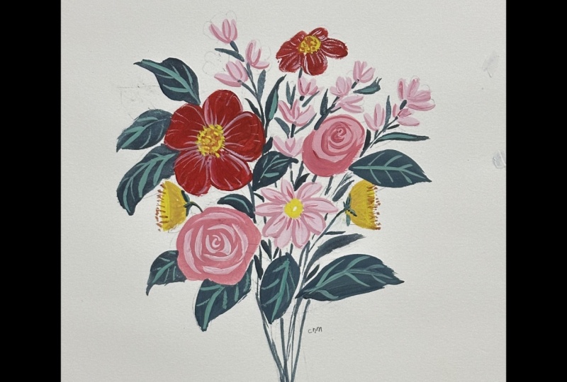
10. The Class Project : Painting the Flowers: It's now time to start
mixing up our colors. I'm going to start by
painting these two flowers, which are going to
be my hero flowers. And I'm going to make them
in a nice deep shade of red. To do this, I'm going to start by taking out some spectrum red and I'll be mixing it
with permanent green middle. The reason I'm doing
this is because red and green are complimentary
colors on the color wheel. What that means is that they kind of cancel
each other out. Complimentary colors
always mix to form a very deep brown or
almost gray color. When you mix them together, they deepen each other, but it's very important to add the green into the red
very incrementally. You don't want to
suddenly add too much because you'll find that it overpowers the red very easily. Add very little at a time, and keep swatching your
color as you go so that you'll make sure it's
exactly what you're going for. Once I've mixed up a shade
of red that I'm happy with. I'm just adding some white so that I can lighten the
value of the color. Again, add the white
very gradually. You don't want to add too
much in one go because I'm still trying to achieve a
very deep shade of red, but I just want the color
to be a lot more visible. Otherwise it looks too
dark on the paper. So I'm adding a bit
of white to it. Once I'm happy with it,
I'll start painting my petals. I'll start with the
biggest flower here. And you'll notice
that all the strokes I'm using are different
combinations of the strokes that we learned in the previous practice exercises. Before we add any
shading onto the petals, Let's first add in the base
color for all of them. Once I'm done with
the first flower, I'm moving onto the second one. And like I mentioned,
in this flower, some of the petals are
leaning backwards. So this gives it a very
three-dimensional look. So make sure that you make those petals which are
leaning backwards, only partially visible
while you're painting. I'm now going to start adding
some shading and I'll be using two lighter values of
this red for the shading. And for those of
you who don't know, value is the lightness
or darkness of a color. So to lighten the value, we add white to it. I added a bit of
white until I'm happy with a nice medium
tone of this red. And I'll use that for my
first round of shading. After this, I'm adding even more white to create a
lighter shade of red. And I'll go in and add some thin line detailing
on the petals. For this, make sure you're
using the tip of your brush. Try to keep the lines
very delicate because it adds a very beautiful
look to the flowers. The next thing I'll be
painting are my roses. For this, I'm trying to go for a nice deep shade
of a peachy pink. And to do that, I'm
using spectrum red, permanent yellow deep,
and some primary yellow. I'll mix them together
and I find that it forms this very
vibrant shade of orange. I'm adding a lot of white
to it to lighten it. And I'm also adding in some red because I don't want
it to look so orange, as I mentioned, that keeps
watching the color as I go. And it's so important
to do that with gouache because the colors appear
different when they dry. I'm now saving this color as my deep hue and I'm taking some
of it into another well on my palette,
and adding white to it. If you're looking to
make a color very light, then it's better to
add the color into white rather than adding
white into the color. Because if I try
adding white into that first shade
that I mixed up, I'll find that I need a
lot of white for me to get it to the lightness
that I'm trying to achieve. I have again taken some of
this into another well, and then I'm adding
even more white to it. And once I'm happy with it, I'm going to start
painting the rosw. I'll start with this
one on the right, which is a three fourth view. To create the rose,
we're going to use the C-shaped strokes
that we learned. In the center of the rose, try to keep the C strokes smaller and more densely packed. As you move towards the
outer petals of the rose, you can start making
your strokes bigger and wider by pressing down the
belly of the brush even more. I'll then start varying the
shade by adding some white, adding a bit of the
darker tone as well. And I'll create C strokes
using those. In parts, I'll also be blending them with the strokes which are
already on the paper. And this creates a nice
variation of the color. If you've ever painted loose
florals with watercolor, and if you've ever done
roses in that style, you will note that
these strokes are very similar to what we
do with watercolor. The main difference is
that with watercolor, you allow transparency
and the whiteness of the paper to create
the variation in hue. Whereas in gouache,
you need to actually use white paint and you need
to fill it up completely. We don't let the white of the paper show through when
we're working with gouache, makes sure the center of your
rose looks a little darker and looks more densely packed. I'm also using a bit of my deep red hue to add a
bit more contrast to it. And finally, I'll add a few highlight strokes
in just pure white. I'll then start painting
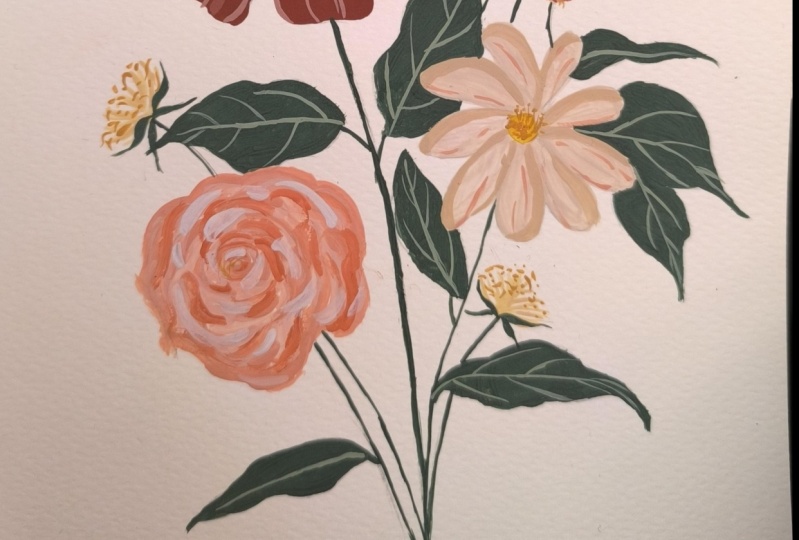
my next rose. And this one's going to be
completely front-facing. So it's like you're looking
at the top of the rose. So it's just going to
be the petals and we don't see the body
of the rose at all. We're using the same technique that we did for the first one. So to create this flower with the longer and more
narrow petals, I used the same peach
tone as the roses, but I added in permanent yellow
deep and a lot of white. And I use that to create this peachy base
tone of the petals. I then used a
slightly darker tone to create some shading on it, along with a lighter tone
to create some highlights. I'm now again using the
darker tone to create a bit more detailing in the
form of these delicate lines. Now that that's done, I'm just going to add a bit more white highlight
detailing to the second rose, similar to how I did
in the first rose. The next thing I'm
going to do is paint these small bud like flowers
that I have drawn out here. For this, I'm using permanent
yellow deep along with white and some of the peach that I have mixed
here on my palette. I'm going for a more
yellowish tone for this. I'm adding a lot more
white and more peach. I'll then start painting
these buds in these slightly oval shapes
with ruffled edges. I'm also adding a bit of
this red in and creating a bit of variation in the colors of the
different buds. I'll continue the same way for the second group
of buds as well. I'm now using a
darker version of that same mixture to create thin ruffled lines on these flowers. This makes them look
kind of like Marigold. Small buds of flowers, with
tiny ruffled petals. I'm now taking some more
permanent yellow deep on my palette and adding a bit of this light
peach color to it. I'm going to use this to create these dandelion like flowers using the same technique that we discussed in the
practice exercises. I'm creating strokes
using these short flicks, so that they
have very soft edges. Now that that's done, it's time to start painting our stems and leaves before we come back to the flowers to add our final detailing
and our stamens.
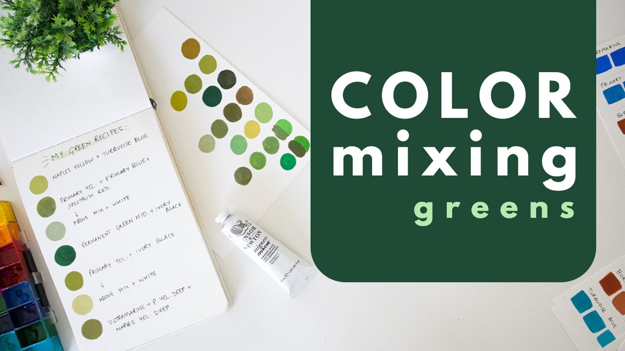
11. The Class Project : Final Touches: I'm going to be mixing up two
different shades of green. I'm using permanent
green middle. And now instead of adding
green into the red, we're adding a bit of red into the
green to do the same thing and make it a more earthy
and brownish shade of green. Keep adding the red just a
little bit at a time so that you adjust it to exactly the shade of
green that you want. You will find that you get this lovely foresty shade of green, which looks very rich
and interesting. I'm now taking some of this shade into another
well on my palette before I make any more
adjustments. To the second well, I'm adding a bit more red and I'm adding white to it. I'm adding a bit more red to the first shade of
green that we mixed. I feel like I need a little
bit more paint on my palette, so I'm adding some
more red and some more green into the first
green that we mixed. I'm making sure I'm
okay with the shade by swatching it before
I start painting. Now I'm ready to start painting. I'll start by creating
one of the stems. And then I'll start
filling out the leaves. Again, go back to the techniques
that we learned during the brushstrokes exercise and apply the same to
create these leaves. I'll first be filling
all my leaves in block colors before I go in and add the veins
to the leaves. Let's continue doing that. Once I'm done with
all of the leaves and stems in my darker
shade of green, I'm going to start
with my lighter shade. This is going to be used for the narrower and longer leaves. So let's start filling them in. Now that's done. And I'm really happy
with how it's looking. It's time for all of
our final detailing. I'm using my second shade
of green and adding it to a lot of white to mix
up a much lighter shade. And this is the shader
I use to create the veins and detailing
on all my leaves. Again, I'm testing this out
on my swatches by painting it over my shades of green so that I make sure it's
visible against them. I'm still feeling It's
a little too dark, so I'm adding more white to it before I add it
into my painting. This looks good to me now
and I'm switching over to a number 2 round brush
to do this detailing. For the wide leaves, I'm just adding a center and adding a few veins
coming out of them. So now I'm going
to start creating the centers and stamens
on all my flowers. I'm using some yellow, some of the red that's
mixed on my palette, and just creating a tan color. I'm finding it a bit too red, so I'm adding some
yellow to that. Once I'm happy with
the tan color, I'll start with my dandelions. For this, I'm using the stippling technique
that I taught you. And just adding some
detailing on the top of my yellow strokes.
Scatter these out well, don't make them
look too organized. Let it look very natural. I'm adding a bit of
the same color to the centers of my rose as well. Next, I'm taking a bit
more permanent yellow deep on my palette. Mixing that up with a bit of the peachy tone that I
already have there, just to tone it down a bit. And I'm using this to paint the center of my daisy-like flower. My deep red flowers
are going to have two concentric circles
in the center. So I'm adding one with
this yellow first. Now I'll use the tan to create some short strokes and dots
in the center of the daisy. And then I'll paint in the
center of my deep red flowers. I'm also adding just
a light touch of it to the center of these
tiny buds as well. Just a few finishing
touches and we're done. Once your painting is fully dry, it's time for my favorite part, which is to erase all of your pencil lines and look at your painting
in its entirety. If you feel like there are any final details that
you'd like to add, you can do that at this stage. And that's it. That's our
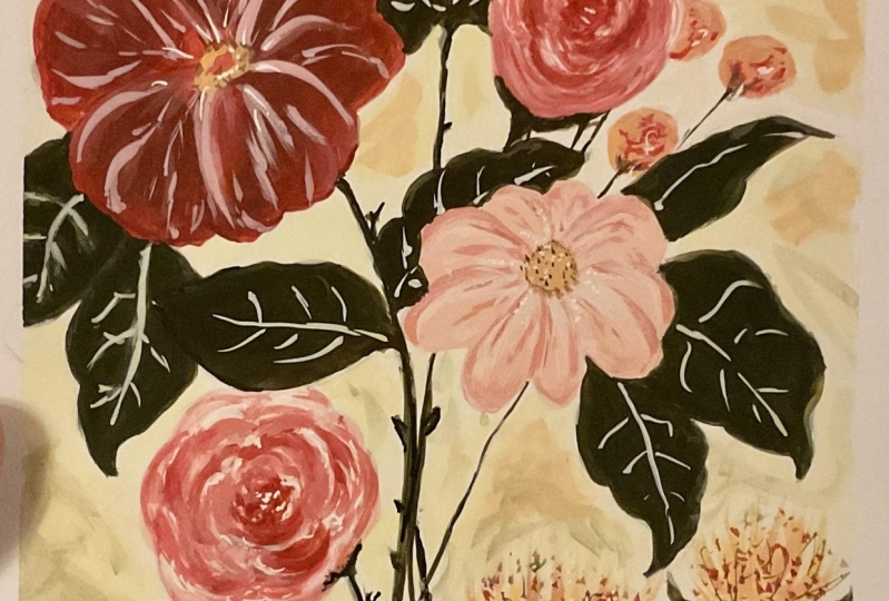
completed final project. So that's it. Your
class project is ready. I hope you guys are proud of what you've been able to create. Please go ahead and upload
it to the project gallery. I and the other students
would all love to see it. Before you leave, let's just go over all of the things that
you learned in this class.
12. Summing it up: Congratulations, you made
it to the end of the class. I hope you guys had a lot of
fun doing these exercises, learning how to paint florals, and creating a
composition of your own. Just to recap everything
that we learned, we learned how to
look for inspiration. We learned how to come
up with a color palette which may be analogous
or complimentary, and how to apply that into
a floral illustration. We also learned all the different
essential brushstrokes, which would help you construct any kind of floral elements. We learned how to bring
it all together into a composition and we
created a final project. I wanted to remind
you once again to upload your projects to the project gallery and don't forget to leave a
review for the class. If you have any questions, please reach out to me in
the discussion box below. I'd be happy to get back to you. To stay connected with me, don't forget to follow me on Skillshare as well
as on Instagram. You can also find
me over on YouTube, where I talk a lot about being an artist and a creative
business owner. I also talk a lot about
working with gouache. I think you'll find a
lot of value there, so definitely go check it out. Thank you so much for
being here and I'm so proud of you for reaching
the end of this class. I'll see you guys
in the next one. Until then, bye.
 Shivani Patel, Gouache Artist | Creative Entrepreneur