Transcripts
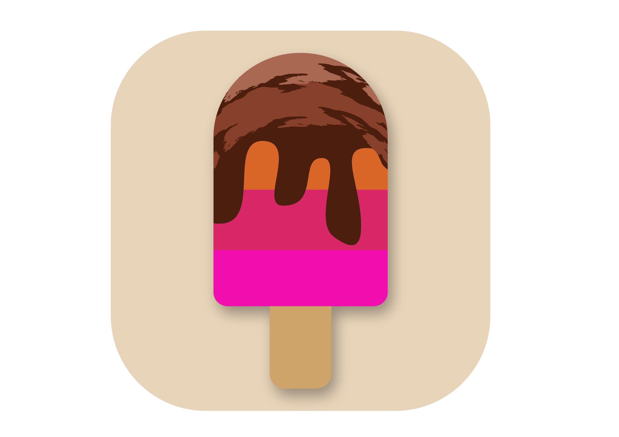
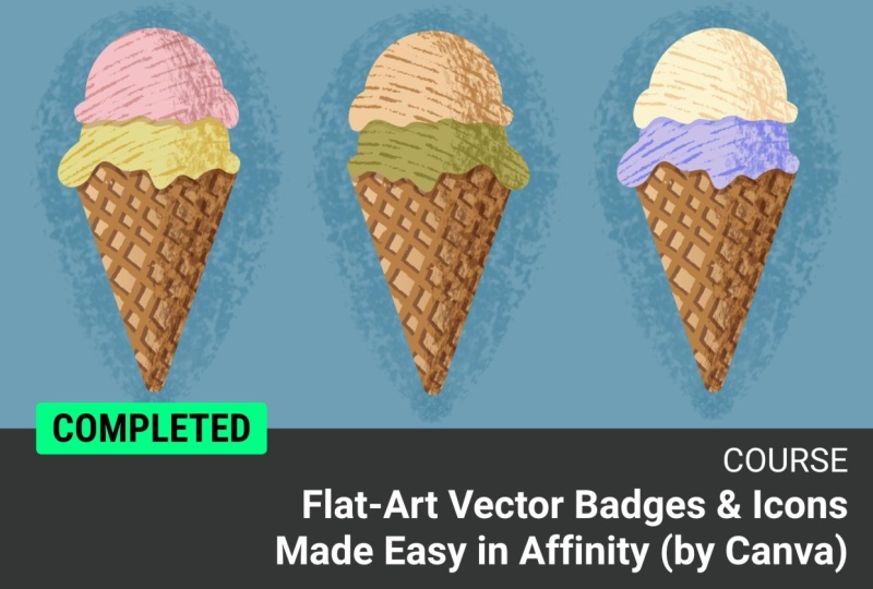
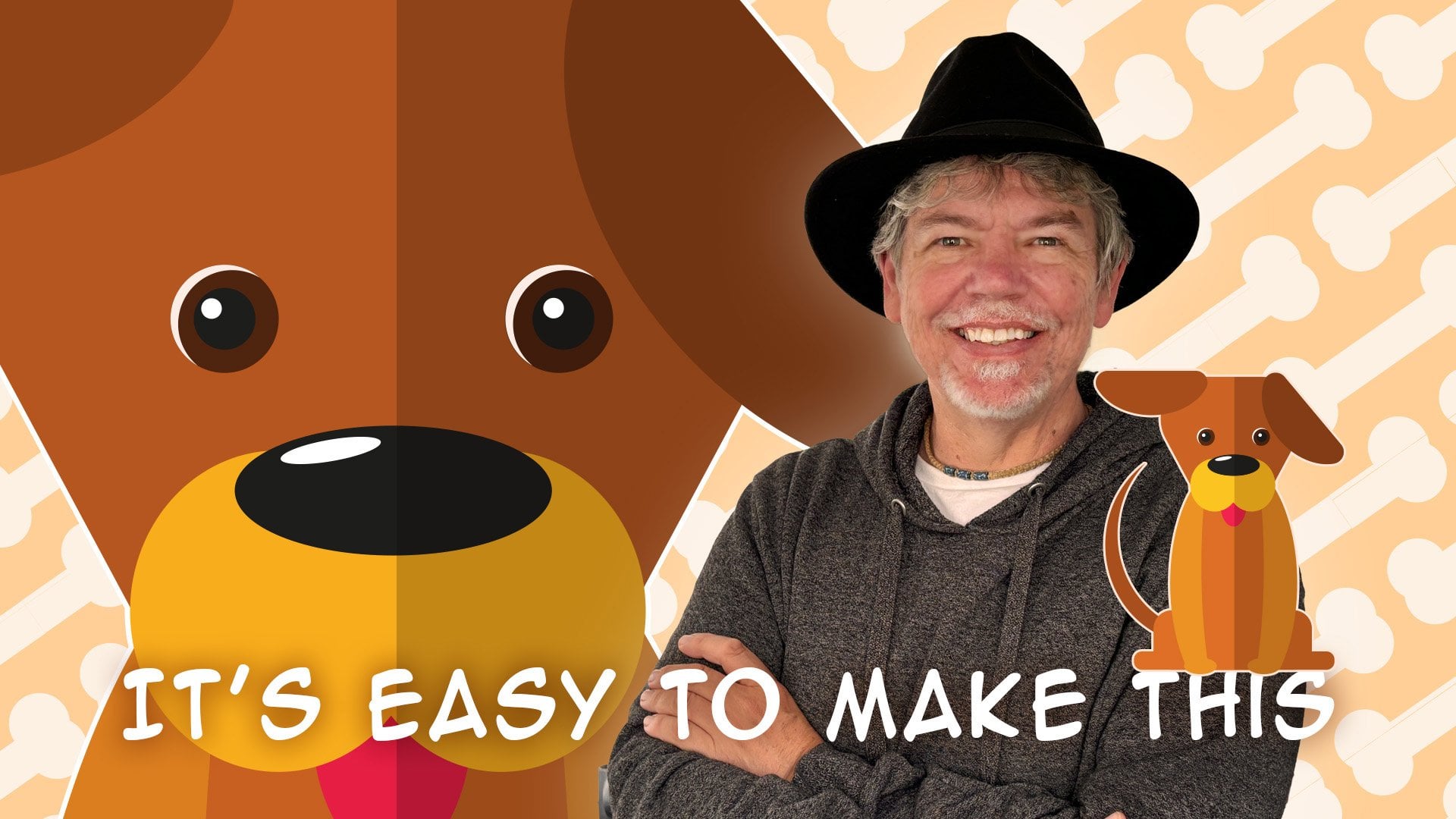
1. Welcome to this Flat-Art Vector Badges & Icons Class: Have you ever wanted to create badge style graphics like this? If you have, you are absolutely in the right
place. Let me show you how. As you can see, this graphic is made up of really simple shapes, and we're going to do
everything step by step. It's such a cool technique, and I can't wait to help you with this. Let's get started.
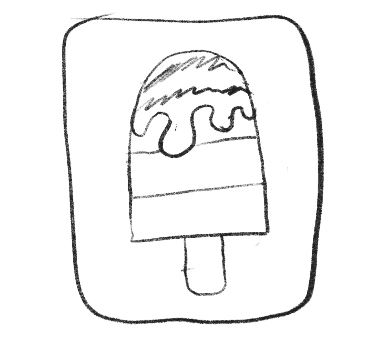
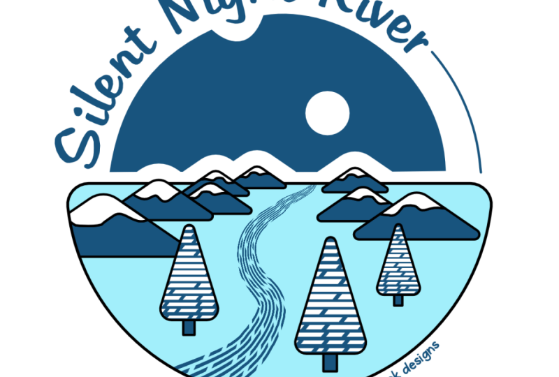
2. Design Thoughts & Basic Shapes: I've made some rough drawings of the badge I'd like to create. Now, I've done this on an iPad, but, you know, I could just as easily have done it on
paper and pencil as well. You can see it's not
terribly brilliant. There's some triangle shapes over there to create this one. This one here, once again,
same sort of thing, but I thought I'd put on a
semicircle over there as well. There's a few things that I
want. I want to be able to lead the eye into the design. So I've kind of got a bit of
a road going on in there. I've got some trees, we've got some snow on the top
of the mountains. And if we wished, we could actually go
in and we could put a sun rising up behind
the mountains as well. Anyway, we're not going
to work from this. I just wanted to
give you an idea of the rough design and the
process that one goes through. Let's get on to this. Now, I'm going to start by
doing a new document, so file a new, and I'm going to do a square document
over here for this. I'm keeping on A four, and I'm just going to
change this and make this 210 by 210
size wise in there. I'm also working on SRGB and
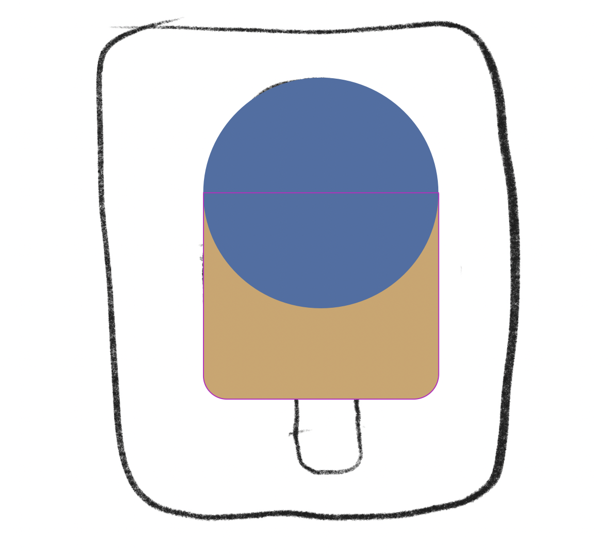
RGB color format in there. Let's click on Create document. So here is my square. Now, I'm going to start off
by putting in my main shapes, which is going to be the ground, which is either a
square or a semicircle, and the two little mountains. Now, color, we don't need
color at the moment. We can change the
color later on. So I'm going to go over
here and I'm going to find something that will allow
me to do half circle. Now, I could take
a full circle like that and cut it off
using the geometry, but I find it's easier to go
down to something like this. The Pie tool is brilliant because I can just click and drag
to make the Pie. I'm holding down the Shift
key to get a perfect circle. And I can pull this around until it gets to
the halfway point, you can see it kind of snaps
onto that point there. By the way, when you
start to work now, I would suggest you go
in here and just make sure that your snapping
is switched on. The snapping worked on here, whether that was on or off
because this is an object. It's not like a
traditional, normal shape. So I've got that, and I can just change to
any angle that I like. I'm going to go and do
some triangles now. So once again over to
the triangle tool. I'll click and drag
my triangle in, and those are going
to be my mountains. I think I like that.
Yeah. And then I won't make a second copy
yet because I'm going to do some things to
it before I start. Looks like a little child's drawing of a
sailboat, doesn't it? Anyway, if you'd like
to get up to that stage there really simply,
and then we'll move on.
3. Round Corners & Create Snow: Now, let's change the
corners because I think they're a little bit too
harsh being pointy like that. So I'm just going to
select this one over here. I'm going to go to
this Corner Tool, and I will click on
this one to select it, and I'm going to click
and drag down to make them a nice sort of rounded top. Now for these ones over
here, I want to do the same. Now, watch this because if I do that and then click and drag, like, Well, why
doesn't that work? It's just worked on the top one? Well, you have to
be very careful to keep your eye on
what happens here. Because what actually
happened was when I went to this tool here and then I was trying
to select them, it jumped back to the node tool. So make sure you're
on your corner tool. Then you can select the
ones you want to effect, keep an eye on there,
and then I can pull that in a little bit
to round off those corners. Let's try this again over here. So I go to my node tool and I'm going to just select
those corners there, and then click and drag to round them off's have a
nice big rounded bit. Over there. I'm not worried about the size. I'm just getting something
which looks nice and round. Now, we're going to have
two of these mountains, so I'm going to make a copy
of that one over there. This one I'm going to cut up, so I want to cut it
off the top so I can separate the snow from
the mountain itself. And we're going to go
along. We're going to use our knife tool. Now, to find the knife tool, if you got your
pencil, it's in there. And the great thing
about the knife is you can do it freehand. So I'm just going to draw in something here like a little
bit of snow coming down. Can even look like an
ice cream, I suppose, and that will separate those
two into two separate parts, this part there and that part over there. Let's do this one. I'm doing them
differently rather than just doing one and copying it so that we can get a
different look to them. And this one over here, let's go over there and just
do some big globs. Like that in there. Now, just so you can see the
differences between these, I'm going to give
them some color, so we'll just make
that a little bit darker and these ones here slightly different
color over there. Anyway, if you'd like
to get that far, just have a bit of a go round
off the corners and then do some snow which is kind of falling down
from the mountain.
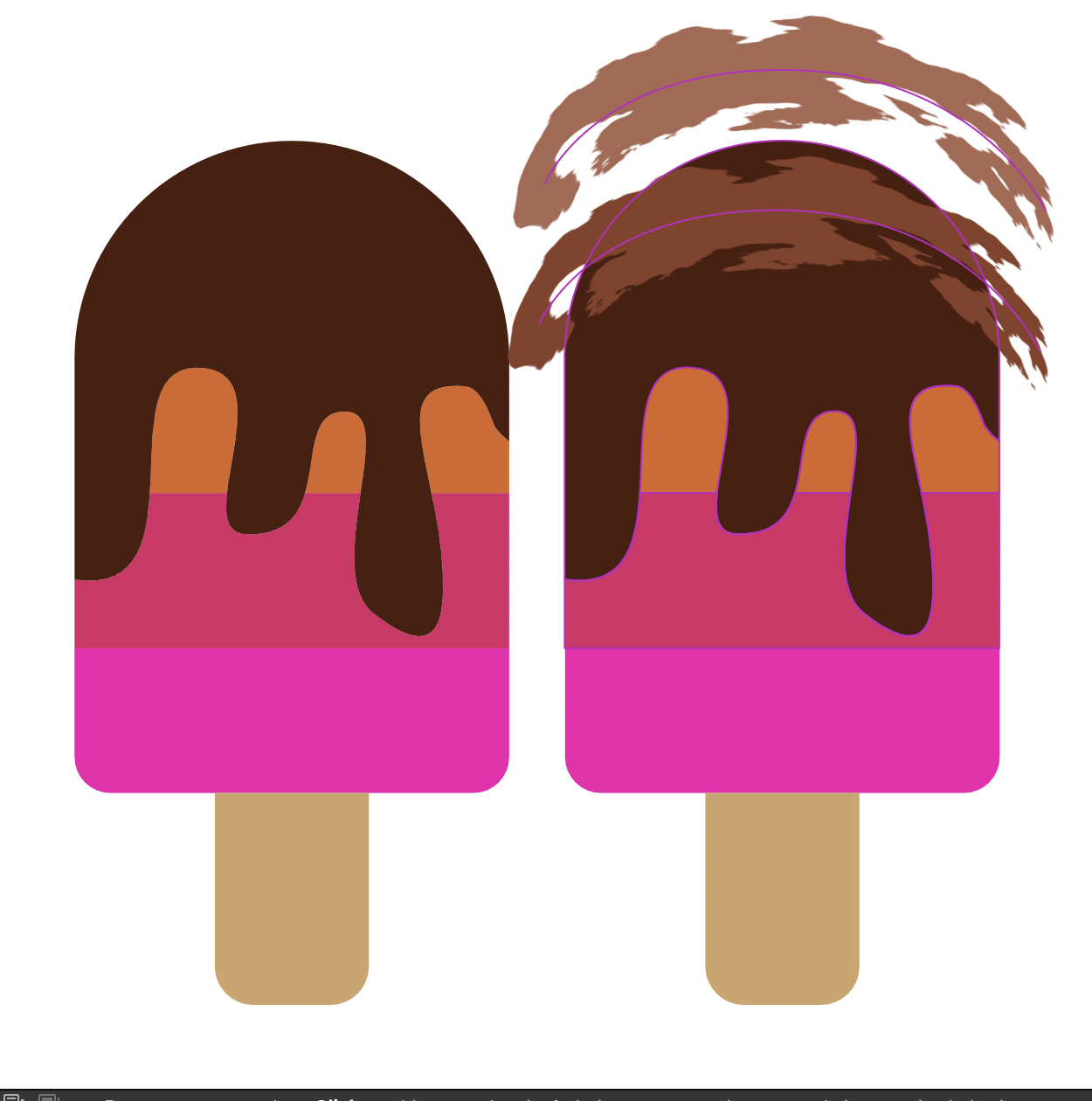
4. Add a Pattern to the Snow: I'm going to make one of these mountains slightly
bigger than the other one. And we can always
change the size later. So if you're not happy with
it, change it later on. I'm also going to just change the color of the
background over here. So I'm just going to go
to my color and just pick a different color
for my snowy scene. I know this looks awful, and we'll just have to
change the colors as we go. Let's do a different
color for that. Over there, maybe that
blue will look great. Now, I want to put
something in here. Now, we're not going to actually
make a pattern as such, but what we're gonna
do is we're going to use a brush stroke. I'll show you what I mean.
I'm going to go into my brushes and use
the path Brush tool. And I'm going to find my
Path brushes over here. The one that I'm
looking for, and you can use any of these
that you like, by the way, are the
engraving brushes. I think these are quite cool. You can see all the
different engraving styles that we've got in here. I'm going to actually go
with one of these ones, I think, something
like that one. I'm going to make
my brush bigger. So I'll go over here and just increase the
size of my brush, something like that.
Let's just try that out. Yep, that's the sort
of thing that I want, but I want it bigger still. So let's increase that. That's 340. I'm going
to go to about 500. Ah, that's perfect. Now, I'm
going to paint with white. So I'm going to go along and I'm going to get
white as my color. If a fill, I will just
pick white in there. And I'm going to
paint just a stroke like that across there. Now, you can see that because it is on top of everything else, well, okay, it's not being
seen on the white background. But if I went to the view menu and I switched off clip to canvas and pulled
that to the side, you can see that's what
I've actually got in there. No, I want to put this
just into the snow. So I'm going to go over here and let's have a look at
which snow we've got. That's that one, so
it's this one here. Move that down just above
the snow layer over there, and I'm actually going to pull it on top of that snow
layer over there. So it places it inside
the snow layer. And that gives you kind of
quite an interesting effect. Let's do another
one for this side. So I'm going to
do the same thing again, go to my brushes, go and find an interesting
brush Path Brushes, let's go with a
different one this time. Something like that. Actually, that'll
be even better. I'm going to take my size right up probably around
about the 500 mark, and I will just click and
paint a line like that. Let's move that
over. By the way, I started it right down here so that it was
obvious what I was doing. You could see exactly
what I was doing. It's not quite big enough. If we go to the stroke, we're kind of set to
100 pixels in there. So how can we make this bigger? Well, we could always try
using this little tool here, which when you
click and drag can make the stroke larger or smaller. Now,
have a look at this. If I do that, you can see we get this really cool
effect on there. So I'm going to move
that across over there. I kind of want that
type of look in there. And once again, drag and drop
it on top of my snow peak. So it's just in there. I could always go back to
this one, click in there, click on the curve to select the curve and try using
the same tool again. So this tool that we've got over here is the one that
affects the line width. Now, I need to
make sure that I'm actually on the
curve when I'm using that and clicking
and dragging on the curve to increase or
decrease the width of that. And while I'm in there, I can move that around as well. Let's go with
something like that. Anyway, do try that out. So there's two
techniques in there. One is to actually use a
brush, paint on the brush, make it really big, and then
just clip it onto the shape. The second technique is where you can take
anything you like, and you can take a brush. I'll just do this
once more over here. Path Brushes. I'll
click on that. Let's give it a different color so it's easy to see rather than white on white. Make
the shape that I want. Use this little tool to click
and drag and adjust Oh, if I can get hold of
it, there we are and adjust the width in various
places on that brush. Try it out.
5. Add the Brush Path: I think I need a bit
of a stroke on these. I'm going to go to the stroke, and I'm going to increase the
stroke width a little bit. So. And I think the stroke
color really should be black. Let me do it on
these ones as well. So I'm going to go
into my stroke, make sure I've got
a stroke on there, and increase the
width in there to something a little bit more
interesting like that. Now, these ones here, I'm going to group
together there. Those ones I'm going
to group together. So these two here, I'm going
to group them together. And so we've got two
groups and the bottom. And let's move that into
the right position there, and this one that can go
behind that one rather nicely. That fits actually
really very well. And we've got enough room, should we wish to put a sunshine kind of coming
through from behind. Now, what I'd like
to do here is to do a little row that's
going to kind of go into the distance over here. So I will use my pencil, sorry, my brush tool. And I'm going to go and find
a brush that will work. So I get something
which is, well, it's not quite so perfect as these lines are or
robotic, shall I say. So I'll go to my path brushes
in here and I'm going to go up to my inks there
they are over there. And let's just take
something simple like that. I'm going to draw in a
little shape like that. So now I want that to be white. So I'm going to go to
the color over here, pick white for that shape. I should make sure I select
it first, shouldn't I? Let's go over there and choose white on the stroke. For that. You can see we've now got
a little interesting bit of texture on there. And I will use this
tool once again to just increase the width of the
line down the bottom here. So I'm going to
click. Let's zoom in a bit so I can make sure I know exactly what it
is that I'm clicking on. Go over there, click and drag to make this
bit a bit thicker. And this bit here,
I'm going to click and drag to make it thinner. That gives us a really
interesting line going through. However, this is going out on the edge and it's kind
of going over our stroke. It's also going on
top of the mountains. So I'm going to
drag this down and I'm going to drop
it on the curve, and you can see by dropping
it where it says curve, not on the picture itself,
but where it says curve, it will just clip it into that shape so the stroke will
then come out above that. So do have a bit of a go with that and just use
any brush you like, but use that shape that
little tool there, which is the stroke Width tool. I'm getting tongue tied
with the stroke with tool. And then just drag it on top of that shape so
it'll clip it to it. There is your shape in there.
You can change the color. You can do whatever you
want at that stage. And if we go down to the
path brushes over here, I can change it to
a different brush now that I've got it in there. That actually looks
quite interesting. And if you don't like
these ones, well, by all means, try
something else. While you try that out, I'm going to have a look
and see if I can find a more interesting brush that
I like the look of in here. There's all sorts of weird and
wonderful ones to try out. So have a go.
6. Create a Tree: Now, I decided to actually go with one of
the engraving brushes in the end because we've
got this engraving look going along the top there. But let's say that I've done that and I
thought, You know what? I'd be interesting if it
was the other way around. Well, as long as I go
in here and I click. So I've opened that curve
up, clicked on the curve, I can go to the
top and I can just flip it around using
flip horizontal, that little button over there. And I can rotate it when
I'm in there, as well, so we can just pull
that around and maybe get something
else going like that. Now that I've got that and
I'm feeling happy with it, I want to add in some trees. So I'm going to go and
create some trees. Now, I think we'll keep going with this sort
of triangular shape. So I'm going to go over
here and do some triangles, and I will use my triangle tool, click and drag to
make a triangle. I'm making it bigger than
it actually needs to be. I'm going to use this
little tool here. Remember our corner tool. I'm going to click on there and round the top of the tree off, and then these ones here. Now, I've just done it again. I've clicked and dragged
to select those, and it's jumped
to the node tool. So just be careful. Make sure
you're back on that tool. Select those two there, and I
can round them off as well. Let's get kind of quite a
big round on the bottom. I will give it some
color right now, so I'm going to go to
my colors over here, and I'll use the same blue, but maybe a little bit
lighter than the background. So I'm just changing it
in my color wheel there. And we could even put in
a bit of snow on the top. It also needs a stem. Let's zoom into
that. Over there. I feel that this color seems to be different from
that very different because I've chosen a
different shade in there. There's probably more saturation
than there needs to be. So I'm going to just
select that shape again and go in and
maybe desaturate that color a little
bit like that. I think that looks
better though. Let's do the same thing now and put some snow on the top of this tree using remember our knife tool, using
our knife tool. So I'm going to just
start over here. And break those two apart. This bit here, I'm just
going to change the color. So we got some light
on top of the tree. And then finally, really simply, we're just going
to put in the base of the tree down here. And this really should
be dark or black. If you want to move it to the back, that's
absolutely fine. Move it below the
layer in there. Now, all of these,
once you've done them, we're going to do we're
going to make into a symbol. But let's group those for now. The shortcut for grouping is either Control G or Command G, depending on whether
you Mac or PC, rather than having
to go and click on that little button
down the bottom. Let's see what that
looks like on top there. Not bad, but I think that both of
these should have a stroke on them to
match everything else. So that one there and that one, I'm holding down
Command or Control to click multiple
objects in there, and we'll give that a stroke. As well to match the
rest of the style.
7. Make a Symbol: Now, we want to make
this into a symbol. So I'm going to go along to the window menu down to
Vector and find my symbols. In there, there they are. And I'm going to
click on Create, so it makes it into a
little symbol like that. And then I can just drag as
many of these out as I want. So I want some, which
are going to be really small in the
background like that. Now, we've got a little
bit of a problem because when I scale these
down or scale them up, the stroke always
remains the same. So what we need to do is
to change our settings. As we scale up and
down, the stroke will remain consistent. Now, what I'm going to do
is I'm going to undo that. And we're going to go over
to the stroke option here and I'm going to switch
on Scale with Object. So when I actually
scale this now, you can see the stroke
scales appropriately. Now, this is something you might want or you might not want, especially if you're going
into a big tree like that. You might want to keep
the stroke the same. But because I'm doing some
of these really small, I will need to change the
stroke when I scale it. So I'm going to have
one over there. To hold down the old key
to make another one. Let's have another
slightly bigger tree. Another one over
here. As they're coming towards me,
they're getting larger. Let's take this one here. That one. Oops. Hold down
the alter the option key, make that a bit smaller still. But there. Oh, we've
gotten this one. Let's bring that one
in right over here. It's a fairly large arch tree. I think that's enough
trees in there and that kind of gives
us that snowy wintery, almost ice cream pudding, if there's such a thing,
type of feel to it. But the reason that
we've done it like this is if we look at that
and thought, you know what? I don't like the blue on here. What we can do is we can
go into one of them, and I can click on the blue over there
and change it and say, Well, why don't we
try that as white? And, of course,
they'll all update. Now, I didn't want to do the stroke on there.
That was my mistake. So let's just go back over here, make sure that I'm actually on fill and change
the fill to white, and they'll all
update automatically. I prefer that, to be honest. Let's have a go with the
fill color as well on this one and see how that works
if we did a bright color. I think that works a lot better. Anyway, you might have
different thoughts on that. But do try it out because any of these things at any point, can now be changed
or that I'll do. Can be changed as you want. So do try that
out. Don't forget, pop it into a symbol. So when you change one,
they'll all change. And also, don't forget that if you've clicked
on something and you're scaling it and you don't want the stroke to scale or you
do want the stroke to scale, go to Stroke and
remember this scale with object button in
the stroke options.
8. Add Text to a Path: Let's close down the
symbols and get that out the way so we can just
keep this nice and simple. I want to put some
text on the top here, which is going to
say winter trails. So I'm going to go
and get my ellipse, and I'm going to draw
in an elliptical shape. Now I'm holding down
the shift key so I get a perfect circle over there. And let's get rid of the fill so we can see this a
little bit clearer. I'll go to my color, remove the fill, and that's
not quite in the right place. I think I'll pop
it in like that. Now, I want to put my
words around the top. So I'm going to go over here.
I've selected that first. I'm going to go over here
to my artistic Text tool. I'm going to move over. Now, let's have a
close look at this. Move over the line. If I were to click on the
outside line over here, just on the outside
ever so slightly, it will then allow me to put text on the outside like that. Let me undo that. And
we'll start this again. Once again, if I go along to my artistic text tool and I
go to the inside of the line. Now, that's not coming up.
Why is that not coming up? Well, because I
didn't select it. Let's try selecting that again. So over here, go over to the inside of
the line and click, and then the text goes
on the inside like that. Now I'm going to undo this over here because I want to
put text on the outside. So I'm probably going to want to start my text
about over here. Let's have a look, so I'll
go just to the outside. Do one click. Make sure
this is nice and big. Well, I've gone
with 90 in there. I think that's pretty good. Yeah, 96. And I will just
choose a typeface that I want to use I'm looking for something which is going to
have a feeling of coldness, but also to be quite fun, so maybe rounded, as well. And honestly, I could just
spend hours and hours going through all of these
different typefaces. I've got something here
called Beyond the Mountains. You might not have
that on your system, but just choose
something that's fun. So let's type in winter Trail. Or winter trails. Now, I'm going to zoom out a little bit, and you can see that it doesn't
quite fit around there. It's a little bit too
far down that side. Now, have a look at
what we've got here. We've got a little green line, a green arrow there and
an orange one here. This one, if I pull
on the orange one, is the end of the text. So if I pull that up, you
can see how it sort of removes a bit of text and forces it to go
onto the inside. Let me pull that out
again. Over there. This one is the
start of the text. If I click on that, I can
actually move the text around. If you want to move them both at the same time, hold
down the Shift gear. You can move both the green and the orange one around very, very quickly, like so. Now, it doesn't matter
that it's sticking out. We're going to make
this whole thing a bit smaller in a moment, anyway. But I think I will just
select all the texts. I've clicked a few
times to select it, and I'm going to go with
a dark blue on there. Anyway, do try that out on yours and don't forget
to have a bit of a go with those green and the orange arrows and
see how they work. One's the start
and one's the end.
9. Cut the Line: Now, let's go and just put
another line in over here. So I'm going to do another
ellipse over there, just roughly the same size as the middle of the
text over there. So kind of it'll start
then finish there. I also want to on this line, remove the fill over there, and I then want to break
this up a little bit. Now, one of the
ways we can break this is to actually go in using the Node tool and I can click over here
to put in a point. Now, if you find that
you can't put in points, just change it from a basic shape into curves.
Now it should work. If I go in there,
click on there, I can put in a point, and we've got some buttons
along the top. This little button here
just breaks the curve. I know it's still
in the same place. Let's click on this one
here and once again, break that curve with
that button in there. Now, this means that
this is in two parts, so I can remove that
and delete that one. And I've got my other
little shape down here. Let me just click on that shape. There, I need to move it down
just a fraction over there. Anyway, do try that one out
as well, see how you get on.
10. Export with Transparency: Now, I'm going to go
along to file and do a save as and save my document. Now, you really should be
saving this as you go along. And it's one of these
things kind of do as I say, not as I do because
I am the world's worst when it comes to saving. I get so excited about what I'm doing that I forget to save. So I have lost work
before because of that. Anyway, I'm going to
make sure I save it. I'm going to go to
File and export. Now, I want to export this with a transparent
background behind it. So these bits here,
these all have white. So they need to remain white, but all of this background
here needs to be transparent so I can put on
different color documents. So what I need to do first
is to get a document set up and switch on transparent
background in there. So you can see the
check and effect means the backgrounds
transparent. I can go to File Export. I'm exporting it as a PNG file, which will hold
the transparency. And I'm going to click
on Export over here, give it a name and
click on Save. Now, let's have a
quick look at that. If I go over here, you'll see
that I've got there it is, and it shows with the transparent
background like that. Have a bit of a go with
that and enjoy yourself. Try some other variations of different badges that you can create using very,
very simple shapes. Mostly, have fun and
share your work with us. I love to see it.
11. Well Done & Thank You: Congratulations. You've reached
the end of this course. I'm sure you're
creating amazing work. Now, don't forget to
leave us a review. It really helps us to help to
build more courses for you. I also do courses in Adobe, as well as Canva and Procreate. Don't forget to follow me and
have a look at my profile. I'll see you in the next one.
 Tim Wilson, Adobe Certified Instructor and Expert