Transcripts
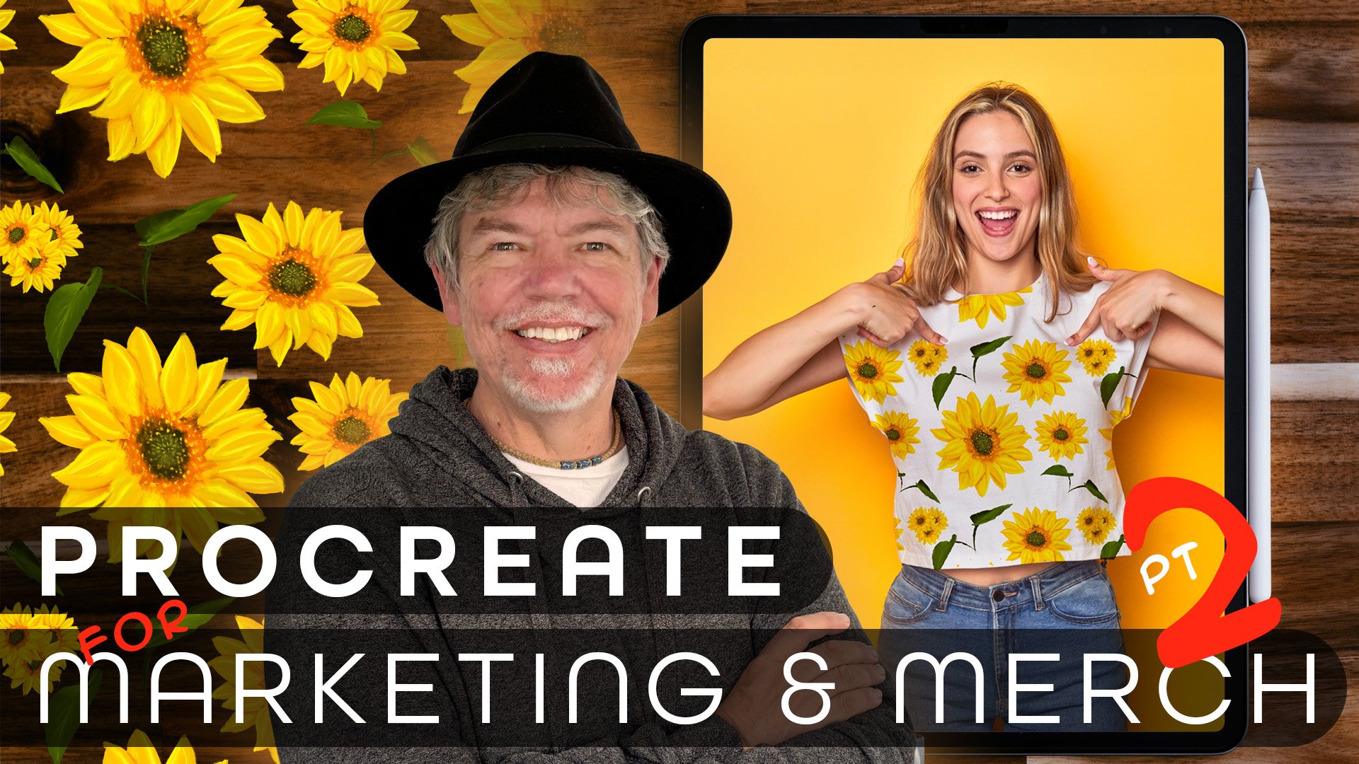
1. Intro to this Course: Can you really go from crime scenes to creating
beautiful designs? Keep watching, and
I'll show you how. In this course, you'll learn
how to turn your ideas into powerful visuals for
your business, clients, personal brand or hobby, whether you're crafting
your first logo or refining a full
design system. Here's what we'll
create beautiful logos for brands and
personal projects. Marketing content
like social posts, posters, flyers and banners. Graphics for
merchandise, apparel, and products you sell, Infographics to
simplify complex ideas, patterns for wallpaper,
textiles and products, and plenty plenty more. We'll start right
at the beginning, and I'll take you
through everything step by step in easy
bite size videos. Hi. I'm Tim. I live and work on
a beautiful barge traveling the canals around
London with my wife, Allie and our cat, Fuji. So, what about the
crime scene thing? Before becoming a
professional designer, I worked as a CSI photographer for Scotland Yard in London. Since then, I've spent
over 30 years working with design software and
have trained some of the world's top
companies like BBC, Disney, the Times newspaper, and many, many more. This course will help
you bring your ideas to life through
visuals that inform, inspire, and express
your unique vision. What are you waiting
for? Start right now, and let's get creating together.
2. Create a Document: So as I said in the intro, if you are fairly
af with Procreate, feel free to skip this whole section because this will be going
through the basics. But if you're not,
well, let's get going. Now, the first
thing I'm going to do is I'm going to go along, and this is the
Procreate gallery area. But I'm going to click
the little plus at the top to make a new document. So we click on plus over there. And with all sorts of
different sizes in here. If you want to make
your own size, we click the little plus over there. There's
a little icon. I don't know what
it's supposed to be, but we're going to
click that icon anyway. So we click on
that, and this then allows us to make
our own canvas size. Now, we're going to make
something for Instagram here. So I want it to be 1080 pixels. By 1080 pixels, the
DPI doesn't matter. I know it sounds really weird to not worry about resolution, but when it comes to
things for screen, the resolution doesn't matter. It's really only for print
that it's important. And I'll be talking about resolutions later
on in more detail. And then I'm just going to
click on Create over there, and that will make my document. Let's have a look
around the interface. Starting on the left hand side, we've got some
sliders over there. I'll explain those in a moment. There's a little
button in the middle, and we've got some
bits along the top. So on the right hand side, if you've played with this,
you'll know this already. You've got your brushes, and we've got brush
libraries in here. Now, depending on which
version you're on, you might have just
one brush library or with the new
update to procreate, you'll have multiple
brush libraries. I'm just using the standard
brush library for now. Past that, we've then got a little smudge tool.
We've got an eraser. We've got the layers, and we've got the color
that we can use. Your color might
not look like mine, and you can see you
can look at colors in different ways by clicking
the buttons at the bottom. And then on the left
hand side at the top, I'll just click to
make that go away. On the left hand
side at the top, we've got a number of just
different drop down menus. So the little spanner at the top has got our
actions in there, and once again, we've got different areas that
we can go to in there. You'll find you've also got
adjustments over there. And if you use things
like Photoshop or any application which
does pixel based editing, you'll recognize a lot of those. And then over here,
we've got some sort of selection type tools and also the move tool
or scaling tool. And we will run through those in different ways
throughout this course. Now, what are these
two slides over here? Well, if I go to
one of the brushes, I'm just going to click
on the brush over there, and I'm just going to choose this brush that I've got here. Now, you'll notice that
I'm in Tim's brushes. You can make your own
sets of brushes in here. It doesn't matter. When
you're trying this out, just pick any brush you like. So you can go to
sketching and you could pick a brush in there. But basically, when we're painting and I'll just
choose a color over there, you can use this to just
change the brush size. Now, you'll notice
that my brush size, if I hover because I'm on a later iPad with
the pro pencil, it'll actually change the brush and I can see what I'm doing. The slider at the bottom here, this is to do with the opacity. So from 100% opacity, right down to something
ran minimal in there. Lastly, this little
button over here allows us to click
and sample colors. Have a bit of a play with that. As I said, if you've never used Procreate before, have a play. If you have, and
you're just checking out to see what's in the video, jump straight in
to the next one.
3. Brush Basics: Now, I'm sure you've had a really good play with that and made a total mess
of your screen, so we're going to
go and clear it by going along to layers, and we're just going
to swipe left. By doing that, it'll give
you a little red button which says clear and that will clear everything
off that layer. Let's have a little
bit of a look at some of the brushes now. So what we can do is we
can go along to any of these sets of brushes that we
want to use. Click on them. If you want to get
deeper into the brush, you can click on
the brush itself and go in and change
all the settings. Now, we're not going to
go down that route much. In this course, we'll have
a little bit of a look. But if you want to get in, have a play, by all means, do so. I'm going to go along to
my sketching brush brushes over here and I'm going to
choose this wet acrylic brush. Now, as before, it works with
a little slider for size, and as you can see, mine is changing when
I hover over it. And that's because
the iPad Pro pencil that I've got has
got a hover feature, but that honestly doesn't matter whether you
can see it or not. Now, if you do have an iPad pro pencil and you
can't see that hovering, there's a setting
that you can go to. So you have to go along to the
little spanner at the top, and we're going to go to the advanced cursor
settings and make sure the brush says show
while hovering over there. And then make sure that your brush cursor is
switched on over there. Now, when I'm
painting with this, and I'm going to go over to my colors over here
and choose a color, so I'll just pick sort of a
bluey green color in there. And I'm painting, of course, we've got pressure sensitivity. I'll just take that right up
over there and a number of other features which change depending on the brushes
settings in here. For the moment, let me just
choose a simple little brush. I'll go over to this pencil. I'm going to make that
a dark gray color, and once again, I
can just paint away. Now, if I then decide that
I want to erase something, I go along to the erased tool. And I can erase from there,
but have a look at that. It's got a completely
different brush. If you click in
here, you can change the type of brushes that
you're using to erase. I'm just going to go to the
sketching, choose the pencil, which is that one there,
and now when I'm erasing, I'm erasing with a pencil. There is a shortcut
for doing that that I'll show you later
on in the course. Once again, click over here, swipe over to the
left hand side, whoops, and choose clear to
get rid of what you've done. Anyway, have a go with some of those basics while
you're doing that because I'm not going
to go through it separately and you've painted
a little bit in there, do try the smudge tool, it enables you to
take something and just smudge it around
really quickly. Have a go, and then we'll have a quick look at the
basics of layers.
4. Layer Basics: Let's have a look at
the basics of layers. When I go along to my layers, I've got the background
color there, and I've got layer
one over here. When I'm painting by default, it starts off by
painting on layer one. If I then want a new layer, I can click on the
plus over there. Let's do this in a
different color, and I'm now painting on that
second layer over here. We can change the stacking order of these layers and I'm
just going to do that with my finger by just clicking and dragging down underneath
that layer like so. What about the background color? Well, if you click on
the background color, it allows you to change it
to any color that you like, so I can just pick a
different color in there. Now, you can't
actually get rid of the background color that always remains that
background layer, but you can't switch it off. If you don't want to see
it, you switch it off by clicking on that
little icon over there. Now, I'm going to just click
on the background color, go back to white, and let's go along to some of
these layers here as well. So starting starting
with this layer here. The first thing is, if you
want to name the layer, just click on the
layer and go up to rename at the top.
I'll call this blue. If you want to hide the layer, you click on the little
tick on the right. If you click the N over here, we get some options
over here for blending, and we'll be looking at
some of these blends later on with photos. And you can also just
click on the layer itself and get the
menu down here. And there's a number of things
that we can do in the menu that we will actually be
doing throughout this course. If you want to delete
in a layer entirely, just scroll over to the
left and it says delete. If you've only got one layer
up, it'll just say clear. So I can just choose delete. Now, I'm going to just undo that last layer that I got
rid of, so two fingers down. And when I close this
down and I'll click on Gallery to close it back
into the gallery over there, it remembers all the layers. There's something
to be aware of, and that is that the things
that you are saving into the gallery here are
saved onto your iPad. If you have your iPad stolen and things are not backed up, you might find that you
will lose all of your work. So always for an important
piece of artwork, I will always then take these
and save them out again, but more of that later on. Let me just click on
that to go back in. So do have a bit
of a look at this. Go into your layers, add some
more layers, rename them. Just have a quick look
to see that there's a few items down
the bottom there. Scroll over to the
left to delete. And if you're on a layer, you can then use this
move tool over here to move the object
around on that layer. You can scale it and you
can rotate it as well. There's no kind of okay button, but when you click
back on your brush, it sort of okays
it. Try that out.
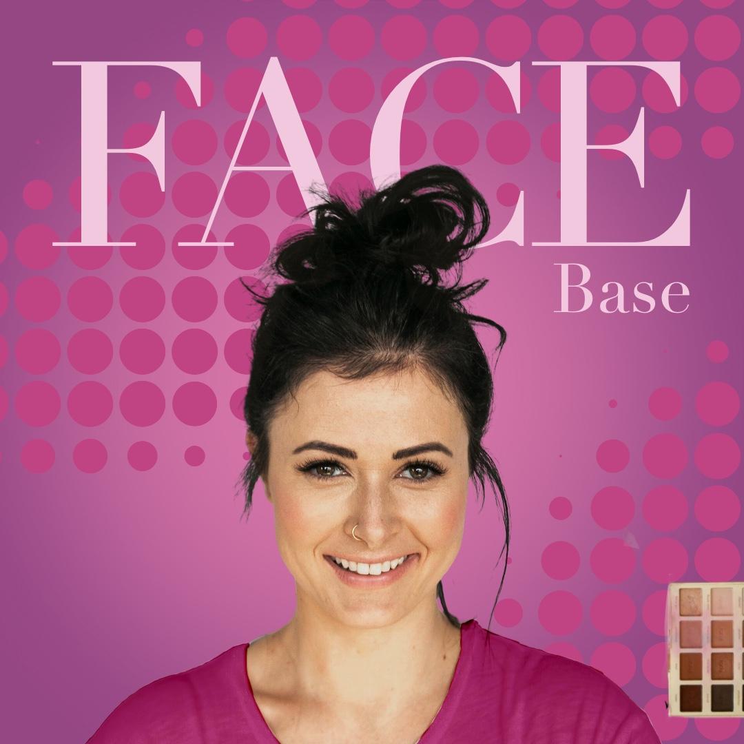
5. Social Media Project - Intro: In this section,
we're going to be creating something
for social media, and we're going to
create something along this line over here. Now, as you can see,
we've got text in there. We've got shapes. I want
to show you how to do interesting shapes using
a brush this time, although we'll do it
differently later on. And we're going to be
bringing text into that. We're gonna be making
things black and white from color and all sorts
of really good things. So let's get started.
6. Document Setup - RGB & CMYK: For this particular project, let's start with a
brand new document. I've gone back to
the gallery area. I'm going to click on
the plus over there, and we're going to go to
this little plus at the top. Now, if you're making
something for screen use, we're going to be using
the RGB color mode. If you're doing something
for print, we use CMYK. If you go over to
the left hand side, you'll see we've got
color profiles there, and you can choose from
either RGB or CMYK in here. Now, if you are doing
something for print, you would choose one of
these CMYK profiles. You might want to
talk to your printers about which one to use. If you're not sure, just use the generic CMYK
profile. It'll be fine. If you're doing something
for screen use, then we go over to RGB. Now, we've got a number of
different profiles in here, and one of them,
which is very popular is the Display P three profile. And if you use that, you're
going to find that the colors tend to be very bright
and very vibrant. However, they might
look great on an iPad, but when you put them
onto a different device, you might find the
colors don't look quite as good as they
looked in the first place. So I'm going to recommend that you actually
just go to RGB, which is standard RGB in there. And that way, the colors that
you see on the iPad will be very similar to the colors that you'll
see on an Android, on a normal computer,
laptop, et cetera. So we're going to stick with
RGB and SRGB as the profile. Let's go back to the dimensions. And once again, if you're doing
something for screen use, you use width and
height in here. If you're doing
something for print, then instead of using pixels, we would be using
a physical size like millimeters or
centimeters or inches. So if I was doing an
A four size page, I'd go to millimeters. I'd put in the millimeters
that I wanted, and I'd also put in
the DPI in there. Now, the DPI generally
that you'd use for print is going to be
about the 300 range. We're doing something for
screen at the moment, so we're going to
work with pixels. We don't need to worry about
the resolution in there, and the width and
height that we're going to put in Sorry, I have a cat wandering
over my screen, so I'm going to remove him. Come on, you. Let's go. So I'm going to
put in a width and height in there in pixels. And although they
change ever so often, if you're not sure
of what size to use, just ask Google or chatGPT or something
like that for the size. I'm going to go with the
square for Instagram, so I'm going to use 1080 By 1080 pixels in there
and click on Create. Right, if you'd like to
get your document ready, and this one is going
to be for screen use, and then we'll start to
put some content in it.
7. Add a Photo and Make a Hard Brush to Clip Photo: Let's go and find a picture. I'm going to use my browser over here to go
and find an image, and I've gone to a website
called unsplash.com. Now, the reason I'm
using them is because the images that they give
you are mostly free, and you can see very
quickly at a glance, I've just typed in business
meeting in the search, and I can see that some
of them say purchase. They've got a little cross on the side if they are to buy. The other ones that don't have that cross are free to use. Depending on the use that you're going to be
using them for, it might be an idea to check
the fine print in here. But generally, you
should just say thank you to the photographer by
giving them a bit of a credit, but you don't usually have to. Anyway, I'm going to go and find an image that I want to use, and I'm just looking for maybe some people having
a bit of a meeting. I like that one, so I'm
going to click on it. And then at the top here, I'm going to go to the drop down, and I'm just going to choose
a medium size in there. It doesn't have to
be the biggest one. So we'll just go medium
size over there, and I'm going to download
it onto my machine. Now, let me go back
into Procreate. And I want to bring
that picture in. It's going to come
in as a new layer. So I'm going to go up to the
little spanner, the actions. And over here, along
this little menu, I'm going to go to add, and I'm going to
say, add a file. And I'm going to go and find it. Now, this is actually downloaded into my
Downloads folder. Yours might be set to
download to different areas. So don't just assume
that it will go to the Downloads folder
if you've changed it. And I'm going to go and
find that image now. I can't remember
what it was called, so I'm going to have to do
a quick search in here. There it is. Now, you can see the
image has arrived in here and it's got a little
box around the outside. So if I want to, I can actually just grab a
side and scale it up and down. If when you're scaling things, they don't scale
proportionately, make sure that in the bottom
box that comes up here, instead of in free form,
you're in uniform. This is what will happen in
free form if you do that. So onto uniform and
you're good over there. I'll just make it roughly the size that I want it to
be something like that, and you can see I'm
moving it around. And I'm in this little arrow, the move, and the
scale tool over here. Once I'm happy with that, I just click on one of these
tools like the paint brush, and it's now locked into place. Be careful when you do this, because if you move something, it cuts off everything
that's on the outside. You'll see if I go there again, even though I sort
of pushed it over, it's cut all of that off. So I'm just going to undo that and change back
again to my brush. Now the next thing
we're going to do is we're going to
create a mask so that we can put this
picture into a circle. And we're going to do that by actually using a round brush. I'm going to go to my
paint brush over here, and I'm going down
to the airbrushing. So this gives me a whole
lot of different brushes. You can see I've got a
hard brush over there, and if I paint with it, I'll just put a new
layer on there. So I'll just click over
there, paint with it. You can see I've got
that huge brush. Let's make it a bit
smaller. Like that. I'm going to be using
this brush to just click once to make a circle and I'm going to make
it rather large. But let's set the brush
up properly first. I'll just undo that.
I'm going to go to the paint brush and I'm going
to click on the hard brush. You see how this brush
sort of fades in slowly. I don't want that, so I'm going to click
on the hard brush. And in this area, this shows me what the
brush will look like. If I just paint like that, I can sort of see
how the brush works. I want to be able
to just click once to get a very solid circle. So I'm going to go down to
the Apple Pencil options, and where it says flow, I'm going to take
that back to zero. So now when I just click, I will just get a solid circle. See, now, if I go and
make my brush bigger, so I'm making sure that
I'm on a new layer there. I'll make my brush bigger. And in fact, if I hover now, this is where it's
actually quite useful. I can go, Oh, yeah, that's
the size that I want. And I click, it will just
give me a circle like that. Let me undo that again. So just take the
opacity right up. Let's go with a black
in there and a click down to put in my circle. Have a bit of a go with that. The settings here, there's
plenty more that we can actually use over here. But for now, we're just
going to go in and change the flow in there and
set the flow to zero, and the flow is within
the Apple Pencil. If you want to play with the other settings,
by all means, do so, there are ways to reset the brush if
you make a mess of it. All you have to do is to go up here to where it
says drawing pad, and we can clear the
drawing pad over there. We can also reset all the brush
settings in here as well. I'm just gonna leave
mine like that. So try it out and
get to this stage.
8. Make a Clipping Mask: Now what we want
to do is we want the picture inside the circle. So we need to change the
order of these two layers. So I'm going to click
on the circle and drag it underneath the picture.
This is the magic part. All you do is you click
on that top layer on the picture layer and say
Clipping Mask over there, and you can see how it sort of automatically popped it in. Let's go back to the
move tool over there, and I can then move around
the picture inside the mask. I'm going to move it
across like that. If I want to move them both
together or just the mask, if I go to there, I
can just move whoops, move the mask by itself. Or what I can do is if
I click on one of them, and then I just very quickly flick across like that
with the above layer, both of those are now
grouped or locked together. So if I use this move tool, I can move that up to the right position that I wanted to be in which is up there.
9. Make Color Circles and Turn Image Black & White: I I like to put in some
more circles in here. So I'm going to start off
by making a new layer. I'm still on the same brush
that I've got in there, and I'm going to
paint in a new layer. So I want to find
some colors in here. Now, you can, of course, go to your values and you can put in your hex colors if you've got some brand colors
that you want to use. I think I just like to use different shades of
something which looks gold. Now, to do that, I'm going
to go across the sort of yellow orange and
up to about down. I'm hoping that's kind of
got a goldish color to it. Then all I need
to do is to go to the middle and to
click on over there. Let's try that again to make
the shape on that layer. Now, I'm going to go
and take that layer and drag it underneath
the other two layers, use the move tool, and move
that into the right position. And in fact, I might just
make it a little bit bigger. Make sure you're on uniform
if you're doing this, so we can get something
which looks like that. And let's do a few more. Once again, I'm going
to do another one, so I'm going to just
go to my layers, add a new layer, click with a pencil over the middle
to put the shape in. Use the move tool to move it and scale it to the size
that I want it to be, so I'm looking for
something maybe like that. I don't want another
smaller one on top of that. Now, here's a nice little
trick that you can do. You could actually
just go in here, swipe this over to the left. Whoops, you don't
want to delete it, but you want to use duplicate, so I can duplicate that
and then move that Oops. Let's try making sure that
I'm just on the one and then move that one across to
wherever I want that to be. I can rotate it into the
right position should I wish. I want a different
color one over here, though, so I'm going to
go back to my colors, choose maybe a lighter
version of that, color, go back to my paint
brush, same brush again. Make sure I've got a new
layer and do a click in the middle and then move that and scale it to the
right size Ops. I clicked twice by mistake,
so that was my fault. Let me just scale
this down and maybe place that in their o. Let's have one more. Once again, over here to the
layers. Get my brush. I'll paint in the
brush that I want, and I think I'm going to move
this one across to there. Now that I've done that, I think this one
should be lighter. So if we go up to the
Adjustments menu, I'm going to just choose
hue saturation and brightness and I
can then lighten that layer up all by itself. When you lighten it up,
though, in this case, it looks, I don't know, on my screen looks
a little bit green. So I can actually go to
the hues and I can adjust the hues in their little bit, as well, if it wasn't quite the right color that I wanted. Finally, if you wish to go to the background and change
the background color, click on the background and pick whatever color you
want to use for this. Maybe I'll go with a
darker color like so. I don't like the colors on
here. I like these colors. They may be the brand
colors for the client, but I want to change
the colors in there, and I just want that
to be black and white. So really easy go along
to your adjustments, choose hue saturation
and brightness, and the easiest way
to do it is take your saturation and
drag it down to zero. Now, why hasn't that changed? Well, it's Because I've
done a very stupid thing, and I've forgotten to change my layers and go
into the correct layer. You'll do this all the time, but I didn't do that intensionally. By the way, that was
a genuine error. Let me go to Hue
Saturation again. Take the saturation right down, and you can see how the
image goes black and white in there. Do try that out.
10. Add Text: I think we need a
bit of text in here. So I'm going to go to
the little spanner. I'm going to go and add, and I can just add
text in there, and I'm going to put in the D return expert marketing Group. And we'll close that down. And of course, then I can use the move tool to move it
around wherever I want. Now, you can obviously see the problem
that I've got here. The text is the wrong color, and it doesn't really
look that great. So to edit your text, go back to the layer, click on the layer, and
in the drop down menu, you can see we've got
edit text in here. Now, I want to select
all my text so you can just keep clicking
to select it all. There are some quick options along the top that we could use, but I'm actually going to
go to the idle A over here, and that gives me lots
of options down here. Now, I can change the
type or the font, first of all, over here. You'll find that some
people call these fonts. Some people call
them font families. And some people call
them typefaces. But we've got our fonts in here. I'm looking for something
quite bold over there, so let's have a
look and see what that one looks like or that. You can just flick
through and decide exactly what you want in here. I think I'm going
to use this din condensed and I'm going
to put in a return, so I'll click between those two and do a return over there. Let's just select that again. Now, I want to change the
color of that so I can go to my color up the top
and just change that too. I want this to be
black. Now, you'll notice when as you
go round here, it's just like, how do
I get to perfect black? Well, the easiest way is just double clicking near the bottom, and that will give
you perfect black. It's the same as if you go
towards where white is. If you double click up there, it'll give you perfect white. So you can see it jumps to
these 45 degree points. So double click near the bottom, you've got perfect
black in there. The second thing
though, is that I want to adjust some of
this text a bit, so I'm going to change the size so I can drag the size up. Maybe I want to see what it'll look like if all the
text is closer together. Down here, we can go to
something called leading and leading just adjusts the
distances between the text. I can adjust it like so, and we'll make it a little
bit larger in there. If I'm happy with that, I can come out of that. So
I just go in here. Back to my layers, and let's
have a look and see how that looks there. It looks okay. Could still do with a
little bit more work. Let me double click on so
let me click on there, click on Edit Text, and let's see what
this will look like if we align
it to the right. So we've got a left, right, and a center
alignment in there. I think we're going to
pop that over there. I think something
like that might work. Let's move that to
the right position. Remember, you can always still
scale it up and down here. You can manually
scale it as well. With your text, you can also just adjust individual
words so I can take there, double click on there,
and I'm going to go and just take it to some
sort of dark gold color. I'll do the same with group. So we've got expert marketing in black and the rest in gold. It's entirely up to
you. Try it out.
11. Add a logo With chatGPT and a Cat: Now let's go and get a logo. We're actually going to find
one in one of two places. Now, you can either go along to a website called pixabay.com, and if you go to the top, you'll find that
you can actually search things by vectors. So vector images, and then you
can type in, in this case, I've typed in marketing
logo, and it's given me, well, quite a few
different logos. Maybe that one
would work as well. You can click on that and
you can then download these logos. From here. Now, I would actually suggest
taking it as a PNG file, which will give you
the transparent background if you need. The other way you can do it,
and this is the way that I've done it is to
go to Chat GBT. And the prompt I've put in is, well, it's misspelled,
but it actually says, Make me a logo for a
marketing business, simple one color black on
a transparent background, and let me have it as
a PNG file, please. And it's given it to me, and
I did another one over here, and I said, and a white version as well. It's given me that. I can click on this
and I can then just, um, get rid of that. And I can then actually
go in here and I can just download this
one to my Downloads folder. So over here, we've
got a save option, click on save, and I
can then download that. I've done that already
with the black one. So let me just stop in there. So let's go back in here. So I just want to
bring in the logo. I'm going to go up to the top. I'm going to go and
say, insert a file, find that file, which should be my downloads
folder somewhere. There it is. It's brought it in, I
can then resize it. We need to a bit on the
squiffy side there. Let's just grab that top. And on. There we go. Get that straight. And there we go, and here's
the cat at the same time. Now, this is what I've
got to work with. I hope you have an assistant who's quite as helpful as well. I'm going to leave
that where it is. And I want to Seriously, Kitty. And I might have
to actually come back and do a new video
to show you how to save this out because he's gonna just have so much fun
with my Apple pencil now.
12. Save & Export: Well, after that
interlude from Fuji, the boat cat, let's carry on. Now, I was just thinking this marketing logo that
I've got over here, I've already got expert
marketing down there. I don't need marketing in there. So I'm going to go
and get my ras tool, and I'm going to
go along and just find a a nice big old eraser, and I'm going to use the
same one that I did before. So I'm just going to go
along to my airbrushing, and I'm going to use
this hard eraser. Now, it was quite big. Let's just move
that for a second. So I'll just make it a
bit smaller like that. Make sure I'm on the
correct layer and then just erase out this bit over here. It's quite a
destructive process, but we can look into that later with using masks on
objects like that. I think that's pretty
much in the right place. Now, if I just go
over here to Gallery, it closes it and it just saves
it in this area over here. And as I said before, be careful because this is
saved on your iPad. So you might want to make sure that you're
actually backing up somewhere to the cloud
or to another device. And we can do that by just
selecting items in here, clicking on them to make
sure that they're selected. And then we can say share. So I'm going to go
to share over there. And then I can either save this somewhere else as
a procreate file, so I can save the
Procreate to back it up, or I can go along,
and I can save it in any of these formats. Now, if you're using
Photoshop, for example, you could save it as a
PSD file quite happily. Of course, I'm saving
this out for the web, so I'm going to save
it as a JPEG in there, and I will just go and save it somewhere
where I can find it, save to files over
there, give it a name. This will be expert marketing. Click on Save and that's done, that's exported out
as a JPEG file. Once you've finished in here, you can just click
on that little X over there to close down
the selected items. If you need to go back in,
back onto the image in there. Do you have to go to the
gallery? No, not at all. If you go along to
the little spanner, you'll see there's a
share option in there. You can share as Procreate, JPEGs, Tips, PNGs,
whatever you wish. Once again, it's
exactly the same thing. So don't forget, have fun
and try some variations. Of
13. More Social Media - Intro: In this section,
we're going to be taking the social
thing a lot further, and we're going to be
using paint brushes to make interesting shapes
for the background. We'll make gradients, once
again, using brushes. We're going to be looking at
a few brush options as well. We'll also be going into text, but diving a lot deeper than
we did before and looking at a lot of the typography
options in there. And then I've got some
effects to show you. We're going to be
well, as you can see, with the images coming up here, there's quite a few
variations that we'll do. I hope you enjoyed this
one. This is one of my favorites. See
you in a moment.
14. Cut Out Images: Now, we're going to use a cut
out in this next example, and I want to show you two
ways of doing it and why one, the traditional method
is actually better. Now, I'm not an
absolute heathen. I really do enjoy using chatGPT for so many
different things, but I want to show
you why cutting out is not one of
its strong points. I'm going to take an image here. So I've gone into Unsplash, and I've put in women
pointing in there, and I've downloaded this
particular image over here. You can see she's on a
background like that. And then I've gone in and
I've opened this in chatGPT. I've asked chatGPT to remove
the background for me. And there's the version.
Here's what it gave me. And I've done the
same thing again, but with a different
way of doing it. I've actually gone in to a
website called Pixel Cut. I'll show you all
this in a moment. And I've got Pixel
cut to do the cutout. This is kind of like a
Photoshop cutout would be. So having a look at the
difference between these two, what I'm going to
do is I'm going to hide the top one, first of all. This is the one from Pixel Cut, which gets rid of
the background. She is actually on a transparent
background in there. And it looks okay. Maybe we've zoomed
in a bit too far, maybe the quality is not
quite right, but it's okay. It's not bad at all. This is the one that
chatGPT did for me, which when I first saw it, I thought, Oh, that's
a nice cutout. Then I started looking closer, and in fact, chatGPT
has remade this person. And that's a different
person over there. And look at the hair. The hair is actually
different over there. The hands are
slightly different. She's got nail polish on there. She hasn't over here. Look at
the pattern on the clothes. It's changed it. Be very
careful when you use chatGPT to cut things
out and ask it to cut things out because it actually remakes the entire
image for you. That looks like an AI image. That is a real image in there, even though they're
very, very similar. Now, I did another version, and with the prompt
for ChachiPT, I told it to make
sure that the image remains unchanged and the
background is transparent. And I've put the two together, one from ChachiPT
and the original. And I'm sure you can guess
which one is the AI, even though they are
almost identical. Yes, I'm sure you're right. It's this one over here, which is the AI version. It's done a very, very good job, but it still doesn't
look quite right. Even the clothing over here
with the folds are the same. The pattern on the top, very, very similar, but
it's not identical. The smiles are almost there. The eyes are almost
there as well, but it's still almost. That's still real.
That still looks AI. Now, I'm going to
make a new document over here for this next project. I'm going to go down over here and find one that
I've done before. So over here, you
can see I've got one called square 1080, SRGB 1080 by 1080. I've actually got two
more over there as well. I can choose one
of those. If you prefer to click on the little plus and put in the
sizes again yourself, if you can't see them
here, that's fine, too. But I'll just use
that one in there. Now, I'm going to go
and get a picture, and we're going to go
to unsplash.com there. If you do have an Adobe account, you can actually go along
and use Adobe stock. Now, if you are
using Adobe stock, most of it is paid for, but there is some free stuff in there have a look along
the menu at the top, and you'll see that there's the option to
download free ones. But you do need an Adobe, license to even get into them. W, I've just done a search for
woman pointing over there. I'm going to use the same one
that I showed you earlier. I kind of quite like her. It's an interesting background, but I want my own
background in there. So I'm going to
go up to the top, download a medium size of her, and I'll just choose
Download in there and say thank you to IF
Ebony who created it. Now, in order to cut this out, I'm going to go over
to pixelcut.ai. So all you've got to do is
search for Pixel Cut. Dot AI. And it's actually the free
background converter. So if you have a look, it's
pixelcut.ai forward slash Background hyphen
remover that'll take you directly to the
page that you want to be in. Then all we need to do is to
upload the image into here. So I'm going to go
to choose a file. I'm going to find the image
that I want to upload. Let's click on open,
and it just does it. It's really quick and shouldn't take that long
at all. There we go. There's our image. Now, I want
to actually download this, and I'm going to
go to Downloads. If you are on a desktop machine, you could just go to Downloads, click on the free version
over there and download it. On the iPad, though
it gives you this do you want to download
it? Well, yes, we do. If you click on Download, it might or it might
not download it. On my machine, or on my iPad, it doesn't want to download it. I don't know why, but
yours might work. But the other way to do
it is to actually just click view over there
to see the image. And then if we click
and hold on it, we can then actually
save that out. I'll just say save to photos, and that's done, it
saved into my photos. Now I'm going to go
back into Procreate, go along to the little
actions option, and I'm going to
say Insert a photo, which will take me into
my photos library, find the picture and
bring it in like that. I'm on the move tool, so I'm just going to
move her down to the corner over there. Have a bit of a go with that. Get this far. If you want to
have a bit of a play with the options cutting it out in chatGPT, by all means, do so. Just remember with chatGPT, sometimes even if you've
got a paid version, you've just got to give it
to it and then go make a cup of tea and come back and
hopefully it's done by then. If you're on the
free version, you can pretty much have
lunch sometimes. Anyway, get this
far and then we'll make an interesting background
and some text for this.
15. Make a Background: Now, let's make a groovy
background for this. What I'm going to do
is I'm going to add a new layer in here and I'm going to use the pencil to draw a little swirly
background on here. Now, I've gone to the
pencil and I've been using that hard
brush once again. And if I'm drawing
with this brush, you can see it's okay, but that's still
not perfect at all. If I try and be a
bit more perfect, that's better, but it's
still not quite there. So what I want to do
is I want to show you how you can smooth
your brush out. You see, when you're
using a brush, it's well, it kind of
follows your hand, and unless you've got an
incredibly smooth hand, you will get a bit
of a jaggy line. So what we do is we
go to the brush, and we go down to
stabilization over here. Now, let me show
you how this works by just clearing that. So this is without any
stabilization on in fact, I should make that brush
a little bit smaller, but it gives you the idea. These lines are not perfect by any stretch of
the imagination. If I switch stabilization
on and go extreme, then when I'm doing
this, you can see how it's just
smoothing that line out. Now, let's take that down over there and you can
see how both of them will smooth out
with stabilization. I'm probably going to go
just a little bit over halfway because I think
that will work quite well. Let me just click on Done there. I've chosen a color. I'll
use that yellow because it's there and I'm going to then
draw in this little bit here. I'm going to zoom out a bit. What I want is something
that comes round like that. If you don't like what
you've done first, just two fingers undo it. Make sure that you've got
a new layer up over there. I'm going to get
my paint brush and I'm going to just paint
something down here. I'm going to start
right out over here and just do a
little line like that. There we go. That's a really
nice smooth little line. Over there, I just
fill those bits in. And then I'm going to
take that, and I'm going to move it
behind my person. I think to balance it,
let's have a bit over here, so I'll just do
something like that. Oh, maybe just smoother. Sometimes, there we go. That looks a whole lot
better on the once again just making sure that I'm doing it on the right layer. Now for the background, I'll just click on
the background. And I'm going to pick a color, so I want something which
is a pretty dark blue. So I'm kind looking for
something like that. Anyway, do have a bit of a go and don't forget
with your brush, click on the brush, go
to stabilization and just experiment with
the stabilization here. Clear what you see on
the drawing board. Clear the drawing
board, do some lines. And then make some of them
smoother and some less smooth, and then experiment and see what happens when you drag this up and down to those
lines. Have we go.
16. Add a Gradient Effect: What about if you
wanted some sort of graduation effect
in the background? Well, I just go in there. I add a new layer, and I'm going to go to
my pencil once again. I'm still in airbrushing, and I'm going to use
the soft brush there. And my soft brush,
I'm going to make pretty big something like that. I'll just get black
and I can kind of paint over here in there. Now that black doesn't look
so good with the blue. I'm going to undo
that two fingers and maybe I'll go with
a dark blue instead, something along that line there. So it's still a little
bit blue. There we are. And I'm going to move that
below that layer in there. So you can just add
more color as you need. I think a bit of lightness at the top maybe maybe
down this side. So once again, I'll
go to the blue. Now, I want to select that
particular blue over there. So using this little dot
between those two sliders, I'll just hold that down
and go and click up there and that samples
that blue in there. So I can then go, let's have
a lighter version of that. Maybe I'll put the
lighter version. On that side. Do play with that. Remember, it's not set in stone. You can always switch
it on, switch it off. If you don't want, delete it, and try again. Have a go.
17. Add Some Text: Let's get some text in for this. So I'm going to go along
to the little spanner. I'm going to add text, and my text is going to
say City Women Network. Now, I can't see what I've done there because it's blue on blue, so I'm going to change
it to a different color. And here, I'm just
going to choose one of these historical colors, which is the yellow
that I used down there. And let's continue
on over here, sir. I'm going to move it across. So back over to my move tool and I'm
going to scale it up. Maybe something along that line. But remember, you
can always go back in and use Edit text in there. You'll notice sometimes I
use my finger. For this. Sometimes I'll actually
use my pencil. It's exactly the
same either way. Have a bit of a go. Pop
some text in there, and don't forget when
you're doing your text, check out these options so make sure you know
whether it's left, right or centra aligned,
whichever you prefer.
18. Use Typography Settings: As you can see, I've popped
in a little bit more text, and I've gone with a
typeface or a font, which is a little bit
more businesslike. If you think of things
like the Times newspaper, this is the Times font. So I want to make a few more changes to that and show you a
few more options. So I'm going to go into here. I'm going to choose Edit Text, and I'm going to select
all my text and then go to my type options in there. Now, first of all, I think bold italic would work
quite well with that. The next thing is, in this little area here,
I'm going to go along, and we've looked at this
before to my leading and just move those two
slightly closer together. But then I also want to go to
something called tracking. Tracking allows you to
move the characters further apart or closer
together in there. I'm just moving
them just a little bit further apart like that. By moving the characters
further apart, you get more of a cinematic
feel to large titles. Be careful if you
do it on body text, but for titles, it does
seem to work okay. Another little option that we've got over here is this one, which is all caps. If you switch that on,
everything goes capitalized. If you switch it off,
everything goes lower case. So I'll just use two
fingers to undo it because I wanted to
keep it like that, and I'll choose done in there. And you can see I've
just got a little bit more text over there. I think I'm pretty
much happy with that, so I could either export
it out, remember, up to the little spanner
for the actions, and just go along to share and choose how
you want to share it. Do you want to save
it externally? Do you want to send
it to Photoshop, or do you want to use a JPEG
or a PNG for social media? Have a bit of a go,
add some text in, finish that up, and then
we'll do another one.
19. Adjusting Contrast Using Curves: We're going to be using some
filters with this project, but to get up to this stage is exactly
as we've done before. I went along. I found a
picture. I downloaded it. I took it to Pixel Cut. If you can't remember
where that is, just go along to the
previous video or it's called
pixelcut.ai in there. And I've cut out and
I've brought it in. Now, the first thing is that this car is facing
that direction there. For this project, I
want the car to be going that way from
left to right, because I feel that that
would work a little bit better with the text that I'm going to
be bringing in. So what I can do
is if I click on the little Move tool up the
top, down the bottom here, we've got all sorts of options, and one of them is
flip horizontal, so I can just flip
something over like that very, very quickly. We'll have a look
at some of these other options later on. But I've got that like so. Now, the next thing
is that I want to go along and I want to make
it black and white. So I'm going to go up
to the adjustments. I'm going to be using
hue saturation, and I'm going to take
my saturation down, which makes it black
and white in there. Now, it's okay. I'm not really happy with the amount of black
and white in there. So I'm also going
to go along here and I'm going to be using
something called curves. Now, curves are really
interesting because they allow you to adjust the
various parts of the image. You see, with this curve here, if I go to that, it'll dot at
the top and pull this down. What it's doing is lowering all the whites to make
them black in there. By the way, if you
want a silhouette, this is a quick way
to do it like that. If I go the other way, it's taking the blacks
and making them white. In fact, if I pull that up there and then this
one down here, you can see it actually
goes negative, which is kind of a cool
effect in its own. So I'm going to pull that
up and then pull that down. If we click in the middle, we can actually move
this up to lighten the image up or down
to darken it down. So it keeps the
white points white, the black areas black, but it's moving the
middle points in here to the middle shades to make
them lighter or darker. In fact, you could
leave that there, and then you could go here
and you could say, Well, I want the lighter
bits to be lighter still and the darker
bits to be darker still, which makes something
more contrasty. If you go the other
way and you take that down and this one up, you're saying, I want
the darker areas, not the very dark areas, but the darker
areas to be lighter and the lighter areas
to be slightly darker, which reduces the
contrast on an image. And although I'm doing
it on a photograph, this will work on any
particular layer that you want, obviously, text aside because, well, you wouldn't
do it that way. If you've done this and you've made a mess
and you've gone, Oh, let's pull that one
up and this one up, that's actually looking very cool like that looks
almost like it's chrome. If you've made a
mess like I have, you can just click on the
points and choose Delete. Over there, delete. And let's get rid of
that one, as well. So I want to make the car look a little bit more interesting, so I'm actually going to
click in the middle and maybe just darken that down
and lighten it up, so we have a bit more
detail in the car. But if you want yours to
look like it's metallic, just go wild in there. Remember, once you've
finished in here, you can then just click onto
a different tool to okay it. Try that out. Have a little
bit of a go. Do a cut out. It's exactly as
we've done before. But most importantly, go up to the little adjustment
option in there. Choose curves and have
a play with this. Click, click and drag. If you want to get rid of it, remember, use your finger, click on it and choose delete. Like so. You can, of course, use two fingers to just
undo as well. Try it out.
20. Adding Movement Using Blur: I'd like my car to look like it's got some movement on it. So I'm going to go along and
just move it down over here. I'm making sure I'm not pushing it over the edge in there. And I'm going to duplicate this layer because what I'm
going to do is destructive, so I want to keep an
original of that. And the easiest way to
do that is to slide it over to the left and
just choose duplicate. I prefer to do it
with my finger. Let's try it that way
so you can see what I'm doing and then choose
duplicate over there. And I'll just hide
the underneath one. Now, to get some sort of
Zoomed effect on this, I'm going to go once
again to the adjustments, and I'm going to go down
to Motion blur there. Now, I've gone to motion
blur and nothing's happened. Well, all you have to do is to click and drag
over to the right. And you can see, as
I'm dragging around, if I drag up and down,
it blows up and down. If I drag left and right,
it blows left and right. So I'm going to put on a
bit of blur like that, just to give it an
interesting amount of blow. So this is one way that you
can get things to blow. Another way that you can do it is to use a different
option in here. Let's try and get that again
called Perspective Blow. Now, perspective blur,
I can move over there, and once again, if
I click and drag, you can see how it's actually blurring the amount,
but not so much there. So if I move this over
to the front of the car, when I'm doing this, I'm
getting more blur at the back. It's very, very nice
effect, actually, because I could just
keep going like that. But I do have to be careful because I want something
which is going to be sharp, so let's go back a
little bit like that. We have got some more options
down here at the moment, we're on proportional,
sorry, positional. I can also choose
directional in there. But I'm going to go with
that for now. Try that out.
21. Combining the Two Images: Remember how we made
a copy of that layer? Well, I'm going to go
to underneath layer, which hasn't got any blur on. I'm going to move it above the other layer
and switch it on. So you can see we've
got a hard version and then the blurred
version underneath it. Then I'll use on the top layer the erased tool with
a very soft brush. And I'm just going to erase some of that hard version away, which will kind of leave
the movement on there. So I really just want this
sort of blur going that way, but the sharp car in the front. I'm also going to go to the underneath layer and
just erase the blur from the front so we
get a really nice sharp version at
the front there. Now, I'd like both of those
to actually be on one layer, and we do that by pinching. So use your two fingers and
just pinch them together, like so, into a single
layer like that. Have a go with that. If you
didn't get this, by the way, just watch this video again
because there's a few bits in there that you might need
to go over a second time.
22. Using Color: A now, the other thing
that we can do is we can change the color of the car by going along to something called
the Gradient Map. With the gradient map, we've got a few premade color
maps in here as well. So you can see, as
you flick through, we can just experiment
with different colors. Now, there are ways to actually make your
own colors in here, and I'll be showing
you those later on. But if you do want
to try out one of those, they're
absolutely brilliant. I'm just going to go back
to how I had this before. It might take a little while to go back to black and white. Here we go. Anyway, let's
go and do the background, so I'm going to go to my
background over here, change the color on the
background to something else, a little bit more interesting. And the other way
that we can work with an image is we can go to the
modes and change the modes. So I'm on the image layer. I clicked on the N
over the N for normal. And then I can just
experiment with these different
overlay modes in here. Multiply works quite nicely with black and white images on color as does screen where you get the lighter
versions coming through. Screen the lighter pixels
come through with multiply, the darker ones come through. But there's no right
or wrong here. You can just experiment
with different things. I quite like that. That hard
light looks really good. That's the one that
I'm going to go for and I'm going to move my car just down to
the bottom over there, and then put in some texts. Now, you've seen me
do text so much, so I'm not going to force you to sit and watch me do that. But anyway, have a bit of a
go with those two options. One of them is
changing the modes, the blend modes in there. The other one is
experimenting with the gradient maps and just
trying out a few in there. Then put a background
color in for yourself and come back and I'll have the
text done by then.
23. Text Effects: I've got a bit of text in here, and I want to say speed up your workflow really
big and bold. I've done one text
layer in there. I'm then going to move that
across and duplicate that. Move this one down and
change this to your, and of course, it's going
to be a different size. So let's do that. Well we
want all that in caps. I'm going to just adjust
the size on that. So back to this ittle
move tool, pull it out. Then we're going to have
workflow at the bottom. Once again, I'll
do the same thing. I'll go back to speed
up, make a copy of that. I could have done it with
your, but it's so big and I'll have the workflow small. We'll duplicate
that, move it down, and I'm going to
adjust that text. Like so. And that needs
to come over there. Now, the W is on a
different line over here, and by dragging
this, I can't get that to go onto
that line in there. So I'm just going to
select the text again. So let's go into edit text. While I'm in the editing area, now if I pull that out, it'll flow onto
that line in there. And you can see that this is
just not not small enough. So I'll just select it, go in here and just change
the size manually in there. Of course, we can
always now go back to this little tool and
adjust the size that way. Now, I've got this
text over here. All I now need to do
is to go to my car, take my car and drag
it above the others, and we get a little
bit of the car coming through on the workflow as well. Have a bit of a go with that,
change your text in there, use three lots of
texts so you can adjust the size and get
them looking as you want, then move your car
above the text layer. Now, if the text layer
is black like mine, and I've chosen
hardlight in there, if I'd chosen something
like multiply, it actually looks like it's
behind the text anyway. But some of them when you
do this will look like they're in front of
the text over there. That one there screens quite
cool actually over there. But as I said, I like the
hard light option for mine. Anyway, do have a bit
of a go with that. If you then want to go in, you can go and
export that out as a JPEG file ready for
social media. Try it out.
24. Make Variations: Once you've created
your work like that, maybe you want a
variation on it. So all you have to do is to
go along here, choose Select, click on the artwork that
you want to duplicate, choose duplicate, and I've now
got two of those in there. So I'm going to go
to this one here, maybe change the
background color, and let's go with a bit
of a blue for that. Whoa, that really is in your face kind of kind
of blue, isn't it? Turn that down a
little bit in there. Maybe I can change the text, so I can just go along to my
text. Change that to white. I won't make you watch
the whole thing here, but I will just very quickly
change one of them to white. You notice how I'm double
clicking in there just to get it to jump to
white very quickly. And of course, the other thing is with
the car at the bottom, you could then go in to the car, which is actually
on the top and try different blend modes in there. So this time multiply
might look a little bit better on top of workflow. I'm going to change the
speed up your to white, but I won't get
you to watch that. Anyway, try it out and
try some variations.
25. Crop & Resize, Copy & Paste: To going to make another
copy of the yellow version. So I'm just going
to choose Select. Click on that and duplicate it and stop the
selected process. I'm going to click
on one of them. And what I want to
do is I want to adjust the page size over here. So I want something more
as a banner for a website. So I'd like this to be 1,000
wide by about 400 high. So if we go along to the
little spanner over there, we've got some options
in the canvas, so I can choose Canvas in here. And I can just crop
and resize a canvas. So I can actually pull this
out to change the size. Now, as I'm putting it out, you can see my width
appears just over there. So I can say, Okay, well, this actually should
be 1,000 wide. Let's get to thousand there. You see, it's a
little bit fiddly, and this one here
should be 400 high. So I just keep going
to 400 over there. And I choose done in there. Now, I'm going to go to the car and I want
to move the car up. If I click over here, well, the car doesn't exist because nothing exists outside this. By changing the canvas size, I've actually deleted all
those extra pixels in there. You'll notice that
if I go to the text, the text is editable text, so that will go off the edge. But unfortunately, the car
layer has lost the car. How else could we do this? Well, let me close this down and I'm going to delete
the original over here, so I'm going to click on Select, click on that and
then choose Delete. Right, so I'm going to do
this right from scratch. So I'll click on
the plus over here. I'm going to do a
new screen size, and this is where I
would put in my width. So let's make it 1,200
wide by 400 high. Once again, we'll click
on Create for that. And then I can change
my background color to whatever I wanted. Make sure I'm actually on the
background before I change the color in there. And then I can actually go
back to this one. Go in here. If I click on the car layer, I can go to the top, and I'm going to be
using copy for this. So where it says share because we're going
to be sharing it. So where it says
add, we choose copy, and I can then go
back into the other one and just once again, paste that straight in. And there's my car, make
it a little bit larger, and maybe I'll move it
across to that side there. Now, what about
bringing in the text? If we go to the text over here and I'm going to
start off with speed up. So same again. I'm
going to go to copy, move over to this one, and I'm going to choose paste it will paste in the
text over there. And when you have a
look, you'll notice that it says inserted image. When you copy and paste text, it takes the text
and makes it into pixels so you don't have the ability to
edit that anymore. I can still do the
usual things over here. I can move it around
over there. Be careful. Don't increase the size too
much because if you do, what you'll find is that it softens off the
edge of that text. So I'll just do the
speed up over there, or you can put in
new text yourself. I'm going to go back to
workflow, bring that one in. So workflow and speed up
will be the text from here, non editable by the
time I've finished. Let's go over there to copy. And into this one
here and paste. Over there, so we'll have speed up workflow and go down there. And then lastly, what I
like to do to put in your. But I'm going to
do this manually so I can actually
make it a lot bigger, and all we do is we add the
text as we've done before. And I was using
impact for that one. And I can then make that a
whole lot larger in there. Now, that doesn't look so great, so I'm going to go
into your here, click on the little N
and change the opacity. And I think the car needs
to come up as well. So let's take the car, move
it above the other layer. Sometimes it's just
easier with your finger. And once again, it's
lost its blend mode, but I can go in there and choose the same hard light
blend once again. So remember, you can copy
and paste objects across, but if you do it with text, it will lose the
ability to be edited. But of course, you can add more of your own text in there. Have a bit of a play with that. Try it out and see
if you can create another version from
an existing version over there using copy and paste.
26. Adding Text Effects: There's one more thing
that you can do with text once it has been
converted into pixels. Converting into pixels
is called ruseization. So once it's been rustized so it's non editable
text anymore, you can go in here and you can
add some of these effects. I'll use the
perspective blur again, move it onto workflow, and just drag across like
that so we can almost get the blur blurring into
the car in there. Anyway, do try that out and
try some variations. This.
27. Find & Insert an Image: We're going to start
this project by creating an image in chat GPT. And the prompt that
I've given this is, can you create a flat
style illustration? Those are the main words
of three coworkers, which I've misspellt sitting at a desk with laptops
happily talking, please. I put in some sizes in there, although that's not really
necessary because it ignored it and did the
incorrect size anyway. After a little while
and a cup of tea, it came up with this. You can create your own,
or you can actually go along to a website and I'll
show you which one it is. It's called Pixabay, Pixa BAY. And in Pixabay, you can also search in here not
just for free photos, but for free vectors over
there or illustrations. So once again, I could
go in here and say, people at work at desk. And once again, see
what it comes up with. And after a lot of searching, I might find something
that I kind of like. I should have used the
word flat art in there. It might have helped
with the search. But either way, we want
something like this. I'm going to go into
Procreate and I'm going to create a new
document over here. I want my document to be
1,200 wide by 600 high. So 1,200 by 600, I want to make sure that it
is in RGB mode and not CMYK, and I'm going to click
on Create over there. And once you've created that,
we've done this before. Once you've created it, download
it and then go along to your little spanner actions and either insert the file or insert a photo depending
on how you've done it. I'm just going to bring
those in like that. They're not bad, but
they don't quite fit. So I think I shall move this I'm actually
making it a bit bigger, I think, and I'm going
to put the desk at the bottom like that. So what I'm looking
to do is to just get some extra space on this side
so I can put in anything, any text and images that we're going to
be using later on. Have a bit of a go with that.
Find an image, bring it in. Make sure there's some space
on this side over here, and then we'll
move on with that.
28. Procreate Blend Image: My image doesn't
actually quite fit. So what I'm going to do is
I'm just going to soften this edge so it sort of blends
out into the background. And I'll do that by
using an eraser. I'm going to use a soft eraser. Once again, I'm in
the airbrushing area. Soft eraser there. I'm not sure about size wise. Let's have a look and see
what sort of size I've got, something like that might work. And I'll just erase out this bit over here to get that sort of soft blend out into
the background. Now, I also want to get this color over there so
it doesn't go to white. It actually keeps that cream
going all the way through. So I'm going to put
another layer in here. And I want to fill that
layer with that color. So I need to sample that color. So I'm going over to the little
square between those two. I hold it down and I click on
there to sample the color. Now, it's not sampling anything because I'm on the erased
to not on the brush. Let's make sure I'm on the brush first, on the right layer. Once again, I can now sample that color over
there. There it is. And then because I'm
on this layer here, I'm just going to
use my paint brush, large brush to just
paint it out, like so. Then, of course, I can move
that one below that one. Now, we want these
to be one layer, so it's one object together. So I'm going to use two
fingers and just drag them on top of each other like
that. Try it out.
29. Procreate Extend Image: If you're feeling
brave and you want to paint on your document, so for example,
here, I might want to sort of, that's a huge brush. Just make it smaller
so that you can see. I might want to extend the
desk area over to there. Once again, I would do that
on a separate layer so I didn't mess up the picture,
get my paint brush. I'm going to use a
hard brush over there, and I'm going to make sure
when I click on the hard brush that my stabilization is
really across to there. So stabilization there
all the way across. So when I do this, it will
smooth out those lines. And then I need to
sample that color, so I'll hold down
that little button and go and sample that brown. And then I've just got
to try and do this. I'll make it go up like that. And I'll paint that
in with a few lines. Like so. It's very
difficult to paint things in when you've got a lot
of stabilization on there. Do the same with the bottom, so I'm going to hold
down that button, click on the bottom over there. Once again, get my brush to
roughly the right position. Now, this is a difficult
one to get perfect. So what I might do is I might
actually go in over here, do a new layer for this, paint that in, like so. And then because
it's on a new layer, if there's any problems there, actually, it's
worked pretty well. But if there were problems, I could go and get
my rays to and just erase out the bits
that I didn't want. Now, I'm actually
quite happy with that, although I think I'm
going to go back to this layer here,
sample this again. Let's try that once
more. Sample that. And I might just take that
around a bit further. Like so. Trouble is, when you start going with this, you just keep going. I'd better stop before
I go too far with that. Anyway, do have a
play with that. If you want to extend that. If you don't and you're
happy with the way it works or you don't like
painting, absolutely fine. Just move on to the next movie.
30. Procreate Using the Gradient Map: I want to change the
colors of these, so I'm going to go over
here to the layers, and I'm going to squish
all these layers together into one like that. So once again, I'm just tweaking them together, pinching
them together. And then I'm going
to go over here and I'm going to use
the gradient map. And you can see, as I go
through the gradient map, I've got the different
colors in here. I'm just looking for
something that I think would work really well. I really like that blaze. Now, I clicked on
Blaze over there, and actually brought
in the colors in here. So I can actually move
these around and go actually let's lighten
up those colors there, get more orange in there
and maybe the background. Color, we can make that
even whiter. Like so. You can just play
with these colors and lighten and darken them or
move them across, if you like. Once again, there's still
a lot more to this, and I'll be showing it to
you properly later on. So I'm done with that. There's my background ready to have some more content on it. Try it a gradient map.
31. Copy Canvas: Now, let's bring in the bits that we want to show on here. And I want to use this to show the content that we've
created already, or at least one of them. So I'm going to
go to my gallery, and I want to use this one here to show off
that piece in there. So I'm going to copy it
up to the little spanner, and I'm going to
say copy canvas. And that copies all of the layers and
flattens it all down. So when I go back in here
again and I paste it, it'll paste it in, and
that's one layer over there. You'll see if I do that. It's
just one layer in there. So have a go and bring in one of the pieces that you've
created already.
32. Using Selection Tools: I've gone back to unsplash.com, and I've searched for a phone. It took me quite a lot of scrolling to get to
the one that I want, but this is the one
that I'd like to use. So I'm going to just
download this one, and I'm going to use this 1920 by whatever it is
and download that. And I want to separate
it from the background. So I'm going to go
into Procreate, and I'm going to bring
it in over here. So let me go and
import the file, find the phone. There it is. And I will just make
it fairly large, fairly large over
there, like that. And then I want to get rid of this area around the outside. So I'm going to use a selection. We've got a selection tool here, and you'll see
there's free hand, rectangle, ellipse
and automatic. With the automatic,
I'm going to click on that outside area over there. And when I change over
to these tools here, and I'll go over to
the arrays tool, you can see that certain parts have got these
lines through them, and certain parts don't the parts that
have got the lines through them are protected. So that's the best way
to think about it. This messes with your head
if you've used photoshop, but think about the lines are protection bars if you like. So I can now use my raised tool, and I'm just going to
erase out the bits that I don't want over there. Now we can just switch
off that selection. There is a little
bit left over here, so I'm going to make the
brush a bit smaller and just erase that bit off there
and that bit over there. And then I can move this
into the right position. Over there. Have a bit of a go.
Get a simple phone. This one's a perfect
one to try out on and then use that erase
tool on a selection. So it's this
selection over here. Make sure you're an
automatic and just add, and then you can erase out
the bits that you don't want. Try it out.
33. Add Some Text: I'm going to change
the layer over here, so I'm going to pull
this one below that one, and I'm going to move my phone
into the right position, and then I'm going to
move this one over here. Let's get the Move tool. Wow, that was almost
a good guess. Let's make it a
little bit smaller so it looks like it's
actually on the screen. Over then I'm going to just
place it right in the middle. If you wish, you could go
and get a screenshot of maybe the social media platform that you're
putting this on. Or what we're going to do
is we're just going to put in some text over here, which says awesome ideas and the phone number
down the bottom. Over to the text tool.
And this will be awesome. I'm going to have that separate, so I'm just going to get
that to go in there. I'm going to make
a copy of that, drag that across not
too far to delete it. Duplicate it, and move
that one down a bit. I'm going to edit that and this one will be the word ideas. Now, I'm not going to get you
to watch the rest of this. Have a bit of a go,
put some text in and the phone number
at the bottom or a number or anything
you like at the bottom. Try that out and I'll
show you what I've done.
34. Add Finishing Touches: Now, I've put in a
little cult action at the bottom over here, and all I need to do is some
sort of shape as a button, or as this is probably going to be on a
banner or social media, they can contact us
via the details below. Anyway, have a bit
of a go with that. Try out some different
graphics in here. You know, instead
of using a phone, do a computer screen or
absolutely anything, but just have a lot of fun
with that and experiment with the different new areas that I've shown you in
this little project. There it is nearly done. Maybe I can go and add a
few more details in here or go and adjust the colors and see if it looks better
a different way. Either way, you tried
out yourself and have lots of fun with it
and do some variations. Don't forget, as always, please share your
work and show us.
35. Infographic - Intro: Businesses love infographics. It's such a lovely way
to present data to people who would get very
bored by looking at numbers. And Procreate can actually create some really
cool infographics. We'll be using brushes,
we'll be using gradients, we'll bring in pictures,
so many things to create this really
cool infographic. And if you can create
this one, you can create so many different variations
on it. Let's start.
36. Create Your Icon: For this, well, I'm going
to do this Instagram post, but you can do it for
whatever social you wish. I'm going to do a portrait. The first thing I
want to do though is I want to create a little icon, or you can call it
a logo if you like. But I'm going to do that on a separate file and
then just copy it over. I'll have my logo still
editable on a separate piece. I'm going to click on the
little plus over here, and I want this to be a
reasonable quality as well, because I can always
scale it down. You can't scale things up
terribly well in well, not just Procreate, but in
most pixel based software. Vectors, you can
scale, no problem. But I'm going to start off, and I'm just going to use one of these settings that I've got. I've got a square, which is, um, about 2000 pixels wide. We're going to start off by
making a circle over here. So I'm going to go
along to my brush. I'm going to go over
to and you can use any sort of solid brush
you want with this. But I'm going to go
down to my airbrushing, and I'm going to use this
hard brush in there. When you've been
through your brushes, you might find that there's
other brushes that you prefer to using a hard airbrush. It's entirely up to you. You
might make your own brushes. If you are already
experienced with brushes, I'm sure you've
got some hard ones that you like to use anyway. So I'm going to click on that, and I'm going to remove any
stabilization because I want to draw a nice circle over here. And let's close that down. Look at the size. You can see those are the
size of my cursor, I'm just looking for something around that sort of
size over there. On this layer, I'm just
going to use black, and I'm going to double
click near the bottom, which gives me pure black. And then I'm going to
draw the circle in, so I'm just going to
draw a perfect circle over here, hold and wait. Now, if you haven't
done this before, when you are actually
drawing something, if you just keep drawing, stop, but then keep holding
the brush down, you can then get little snap
to that particular shape. And that's what I'm looking
for a circle like that. And then I want to put in some of the cross
pieces over here. These are going to be
the bits of wool or signify the bits of wool
for this ball of wool. Now, I'm going to go once
again up to the top, and I'm going to do
it on the same layer. So not a new layer for this. Over to my brushes, I
want something, well, which is less,
perfect than that. So I'm going to go
over to the inking, and there's a really cool
brush here called syrup. There it is in there. You can use any other brush
that you like, but remember, as you'll see just now, you can get a texture
out of that brush, as well, which you might
or you might not want. So I want a nice
solid brush for this. So then I'm going to draw
in the lines over here. So starting over there,
draw something like that. You can see it's a
little bit wonky. So if I go back to
that brush over there, I'm going to go
to stabilization, and I'm going to put in some
stabilization on there. You could just test
to see how it works. That's nice and stable in there. Now, let's try that again. So I'm going to start
over here and just do one across the
middle like that, maybe another one over there,
another one over there. And I think we'll have
another one that way. And then I want some
going this way, as well. So I'm going to do
the same thing. So I'm going to have some
going to go that way there. And just that one, so
we've got two at the top. Now, there are some of
these that I don't want, so I want to remove them. Now, a quick little
trick over here, which some of you might know
if you're painters already, is if you want to use the
same brush to erase with, if you just click and
hold on that brush, you can see at the top. I'll just do it
again. It just says erase with the same brush. So rather than having
to go and find a brush, you're on the same brush there, and I can then just erase
with that same brush. The problem with
erasing with a brush, which has got a lot of
stabilization on it, is that it, um you know, it's changing the
brush as you go along. So if I were going to do that, let's go back to that one there. I would probably actually end
up taking the stabilization off because it's much easier to erase without
stabilization on it. And over there, I'm going
to do the same thing, make the brush a
little bit larger. Quite honestly, I wanted to use that technique to just show you
about that holding. I'm actually just
going to go back into my I can find it airbrushing, and use that as an eraser because it's nice
and predictable, and I know exactly what I'm
going to get out of that. So I'm just going to get
rid of some of these. You can be a bit more
accurate with yours. I'm just going to do them quite quickly
because I don't want you to have to sit
and watch every single little line that I make. Obviously, there's
some other ways of doing this as well and
other ways of painting it, but we're just doing this in a very simplistic
way for the moment. Let's get rid of those, and that I see a bit of
a wonky line there, but we'll pretend
that it's perfect. I think that's pretty much it. Now, what I'm going
to do is I'm going to then go to the plus over
here to add a new layer, but I'm going to go down
to the bottom layer, the one underneath it. Click on it, and I'm going to
make it a reference layer. And you can see then it
says reference on it. Now, it means that these
layers here will look to that layer as the layer
that will affect it. So I'm going to use
a fill process, and I'll just choose a
different color for this fill so you can see it
nice and clearly. Let's go with a blue color. In there. And when
I drag and drop, it will just fill those areas. Now, if you want to do multiple colors in here,
that's absolutely fine. I'm just going to
use the one color. So you drag and drop. We'll talk more about
this at a later stage because there's a
bit more control that you have over here. And that's filling those
little areas in there. But it's filling it on this
layer, not on that layer. So if I then delete this layer, I'm left with that
little shape in there, and it's transparent around it. So that's what I'm
looking at doing. That's going to be
my little wool icon. It's supposed to look
like a ball of wool. If it doesn't to you, well, try something
slightly different. But that's what I'm
going for with that, and I'll just put in some wool underneath it on
the final piece. But have a bit of a go and
make yourself a little icon. If you don't want
to do the wool one, try something else using
that same technique. I
37. Change the Color: I want to change
the color of this, and there's different
ways of doing it. But one of the quick ways, if I want to make it black is to go to the
hue saturation and brightness and just
push the brightness all the way down
to black in there. I could also take it up there and I could
change the hue on it to any color that I wanted. But I'm going to
make that black, so I'll take it all the
way down into there. Try that out and just change
the color if you wish.
38. Create Your Custom Canvas: Let's go and make
the final file. So back to the gallery,
click on the plus, and I'm going to click
the plus over there, and this one is going
to have a width of 1080 and a height. Whoops. Let's try that again. 1080 and a height of 13 50. That gives us a nice portrait
style for Instagram. But as I said before, you do it for whichever
social you wish. Just check your profile and
make sure that you're on SRGB as well while you're at it. And then we're going to build our infographic in here
and we're going to do it using brushes and a number of other new techniques that I want to show you as we go along. Just get your document ready
and then we'll get going. H.
39. Create Infographic Bar: Let's start making
the little bars. So what I'm going to do is I'm just going to
rotate this a little bit so I can use the direction
of my hand to draw them. I'm going to go along and
find a large solid brush, so over here into my
brushes, and I'm going to, of course, go back
to the airbrush, the hard airbrush in there. But I will put on a bit of stabilization
again, should I need it. And then I'm going to draw
in the shape that I want. Now, because I want to
change this later on, I'm just going to pick any sort of brightish color in there. Remember, we can
always go and change the color and the
lightness using that hue saturation
and brightness option that we looked at before. So it doesn't matter
what color you choose. And then I'm looking
for a brush probably about that size over there. So if I just do a little
line, you can see it. That's what I'm looking to
do. So what I'm going to do is I'm going to start
drawing across here, but I'm going to keep holding until I get that perfect line. And while I'm doing that and
I'm still holding this down, I'm going to put my finger down, which will then
give me the ability to do it in increments. So I'm just looking to create something along that
line over there. So I've got a long
one over there, and then I'm going to
have copies of that, which will be in
different colors. But I'm going to finish this one first before I actually
make some copies. The second thing I want
to do is I want to cut out a circle over there, maybe probably about
that size in there. To do that, I'm
going to go along to the eraser and just hold it, and that picks up the
last brush that I had. So let's go and make
that the right size, and I'm going to
click over there. And just click in there. Now, unfortunately,
I've just missed it, so I'm going to do this
a little bit larger. So that's what I'm after a little shape that
looks like that, and we're going to have
three of those to signify the different levels of wool sales over the
different months. Try that out. Make the shape. Make sure obviously it's
on a layer by itself. You can see over there, we can move it around there, but that's really is
what we're looking at creating for now. Try it out.
40. Add Color & Effects to Bars: Now, I want to have
two more of these. So I'm going to go along here and just duplicate
the layer twice. And then we'll use
the move tool to move them along. Now,
just be careful. If you move it too far in
and you kind of okay it, you will cut off that
little bit over there. So we need to kind
of get an idea of where these are going to be going before we start to
change them too much. So we're going to be
having this one here, which is going to be um Winter, then spring, then summer. And these are going
to be the sales. So we'll have winter over
there. Summer up here. No, winter there.
Spring over there, and then summer is going to be down here because
people are outside, they're not buying quite
so much warm yarn. I'm happy with
those. Oh, that one has got a bit missing out there. So I'm going to just go
back to the move tool, go to that layer
and pull it down. Oops. Pull it down
just a little bit. Over there. I've just made
sure the gap is similar. I think that's absolutely fine. Now, I'd like to change the
color of these individually. So let's go along to one of these ones over here.
I'm going to go up. You know where I'm going,
hue and saturation, and I can go to the hue
and just adjust the color. We're going to have some
really vivid colors for this. So that's going to
be green, blue, and I think this one here, the short one, which
is that one there, I'm going to make that
more of a purple color. And I think the middle one actually could be maybe a
different shade, as well. And while you're here, if you find that
they are too bright, you can just adjust the
brightness in there, see if that would
work with a yellow. No, I think that blue is good. It just needs to be
darkened down a little bit. Anyway, play with those colors. When you're happy with
those, if you go into the layers panel and you
squash those layers together, you won't be able to
change them individually. So before we do the next step, make sure that you're feeling happy with how they
are actually looking. So once you're good with those, you can then go in and just pinch them together
into one layer. Now, we're then going to take these and we're going to
duplicate them again. I'm going to switch
off the top one and go to the layer underneath, and I'm going to
make them all black. You'll see why in a second. So take the brightness down to make them all black like that. And then when we
switch the top one on and we move the bottom one, you'll see that
we've kind of got a shadow. Going under there. Now, that doesn't look
very shadow like it. Well, it's harsh, really. It does look really harsh. So what about if we went up to the adjustments and
went to Gaussian blur. Now, to use Gaussian blur, you just choose gaussian blur, and then you click
and you drag over to your right to get
the blur coming in. And what we've done
is we've just blurred that underneath layer like that. Once again, it's
still too harsh, so you can just go in there
and reduce the opacity to get something a lot more subtle coming from
behind those brushes. Have a bit of a go with
those. Make sure that you're comfortable with the height
of your three little bars. Once you've done
that, put them all onto one layer and
duplicate them. The underneath one, make
it black, once again, using the saturation, et cetera, and then you can use
the gaussian blow to blow that layer as well. The top layer over here, I hide that while I'm doing
it so I can see what I'm actually doing
below. Try it out.
41. Use Alpha Lock: I now, to make this look a bit more interesting and also so that I can show
you another effect, I'm going to go to
this layer here, and what I'd like to
do is I want to put a line across those
at the bottom, the same color all
the way through. So I'm going to paint it on. I just use a paintbrush
and basically just do that over there, to be honest, I'm going to do that, wait, and then hold my finger down to make sure it's
perfectly parallel. But in doing so, I
want to actually go to this layer and I want to use the Alpha lock on that layer. What that'll do is it'll lock down any transparent pixels. And remember, all
these pixels around here are all transparent. So we go along there, we switch on the
Alpha lock in there. And now you see, when I paint, it only paints where
there are actual pixels. So I'm going to make my brush a little bit smaller over there, and I'm going to go
with, let's have a let's try with white and
see what that looks like. No, I am going to go with black. So double click over there, and then I can start over here, drag across, weight,
put my finger in there, so it's going to be
perfectly horizontal. I'm going to do another one
slightly smaller than that. So over here, click
and drag over there, do one last one
between those two. So you can just create
different effects with these. Oh, that last one
was a bit wonky. I must have let go of my finger or this before I actually
made it into straight line, so I might have to just
redo some of those. But you get the
general gist of this. In fact, I tried
a thick one down the bottom over here,
draw it across. Wait until you get
the straight line, put your finger down.
Oh, that's better. That's sort of more
what I had in mind. Anyway, do try that out, and don't forget you are using the Alpha lock in there. And
42. Adding Effects to Text: As you can see, I
brought in a little bit of text over there. So can we use that same
drop shadow effect on text. Absolutely. But there's something else that
you need to do. So I'm going to take
the word summer. I've got it in black over there, and I'm just going
to duplicate it. So I've got two versions of
it. Let's hide the top one. We go to this one here, and if I go over
here to my effects, I'm going to go down
to Gaussian blur, and you can see the text
layers will not be blurred. So if I do that, I can blur it, but it converts it from text into or from editable text into a normal layer over there. So that's the only
difference between those if you wanted
to actually take something like a text layer
and just convert it into normal pixels so that you could paint on it or erase
it or something like that, you can actually use rasterize. Rasterize means that it takes something which is
editable or vector based, and it converts it into pixels. But that did it automatically when I went up to that setting. So now I can go to the top one. Oops, over here,
switch on the top one. I'm going to change
the color on that, I won't do the
other ones for you. You've seen how this one's done, but I'm going to go along
to it a text in there, and I think I want to use a
darkish green from my text, and then I'm going to
go along to the shadow and just change the shadow and maybe move it
over a little bit. To get something along
that line. I'm just ready. I might have to change
the text again, looking for something which
will kind of stand out, but won't be too over the top. I will just try and change
that text color one last time, and we'll see how that's
going to look. There we go. That's the sort of
thing I was after something lighter like that. You know, I'll do the same
with these two, as well. Although I won't force
you to watch me doing it. Just remember,
make a copy first, go to your underneath
one, put on some blur. And while you're there,
you could also try out using some different
effects in here. Multiply usually
works quite well to blend the color with
the background. There we go. That's
just what I was after. Anyway, have a go with that one and do all three of them.
I'll see you in a moment.
43. More Reference Layer: Now, I brought in my three
bits of text in there, and I put a shadow
underneath each one of them using that
original technique. What I always want
to do, though, is I want to make a new layer
right at the top over here. It doesn't have
to be at the top, but I'm putting it
there for the moment. And I'm going to go
down to my layers, so layer one over here and
make it a reference layer. So you can see, I've switched
on reference in there. Now, this means that
on this new layer, if I want to go and
change any colors, so for example, maybe I don't
like this little black bar, and I'm thinking, you know what? What about making it
slightly darker purple? All I need to do is
drag it on there, and that goes onto
that top layer. Now, it would if I was on the right layer, so
that's my fault. Let me just undo that. So let me try that
again properly. So I'll go to this layer here. Remember, that is
the reference layer, so I'm filling this layer, drag that on and drop
it in there, there. Now, when you're dragging
these colors in, so for example, here, I want to drag onto that one, and I've chosen, I don't
know, a dark color of that. When you drag it, don't let
Let's try that one more time, making sure that we're on the correct layer up the top there. When you drag it on, if things go wrong like
that, just don't let go. You can use your threshold over here to just affect
different parts. So as I go up, the threshold is increasing until it
gets both of those. If you go too high,
it does everything. Oh, that's a horrible color. I'm going to go with
a lighter color. I think a lighter
blue. Let's try that one. That
looks a bit better. I've done this on a
separate layer so I can always delete it
if I don't like it. And one more over here, this is going to be
with that bright green color that I had. I'll make that even lighter
still, drag it onto there. And if you're too far back, you can see a little black
line around the outside. So just pull that forward
until it looks okay. If you go too far, it might
get absolutely everything, so I'll just do those like that. That's looking quite good.
I'm happy with that.
44. Add Icon & Edit Background: Let's bring in our
little wool logos, and I'm going to put them in
the little circles up there. So I'm going to go
back to this one. I want to copy just this layer, so I'll go up to
the little spanner, and I'm just going to
say copy from there. It's going to be huge
when it comes in, but at least it means
that I can scale it Whoops. I can scale it down. So over there, pasted in, it comes in really large. I could just scale it
down to the right size, and I want that to kind of
go just in there like so. Once I've done one,
don't do it again. Just duplicated,
duplicated twice more, and I can move those into the appropriate areas over here. Right, we need a background now. So I'm going to go
along to the bottom here and I'm going to just make my own background. So
I'll do a new layer. I'm going to move
it right the way to the back over there. And I'm going to
paint in some colors. So this is entirely up to you, but I'm
going to get a brush. I'm going to use a very soft, very large brush in here
and just pick some colours and paint them in on the background see if I can start with
something like that. And then we'll just add
in some brighter areas. I can sit and play
with this for hours, so I'm not going to do
too much over there. I'll stop there. But
if you are painting things and you find that it actually looks too
harsh, the edges, go up to here and
use something like your Gaussian blow
and just click and drag all the way across
to blow those colors. You can see how it's blurring
them together there. You can even do stripes or
something like that and then blur them together as well. Anyway, I'll make an interesting background
while you try that out.
45. Change Icon Color: I painted a few colors
in there and got that sort of gradient
effect going on. But I'm thinking that
these little icons are just totally vanishing now. So what I'm going to do is I'm just going to go back here
and just make them white. And we can do that in two ways. We can either click on that
and choose the alpha lock and then pick white as my color or any other
color you like. And you can just
paint them like that. Or I'll do it on this one now. You can actually go in here, go to brightness and just increase the
brightness, as well. Whichever way suits you. There are just so
many ways of doing the same thing in Procreate. I'm going to use
that same one again, brightness and just push the
brightness up like that. There we go. That's
actually showing up a whole lot better now. Try that out.
46. Edit Text: I brought in some text. I've just got three
individual layers of text saying the
wool Emporium. And what I like to
do is to see what it'll look like if I changed the two O's in wool to these little balls of wool
icons that I've got over here. Now to do that, I'm going to make a copy of the word wool, so I'll duplicate it just in
case I make a mess of it, and I always do
this just in case. So I'll hide the underneath
one and go to this one, and I want to erase out those
two little O's on there. So I'm going to click in there
and I'm going to choose to rusterize it so it makes
it into normal pixels. So you can see now it
says wool in there. And I'm going to
go to my eraser, maybe use a smaller brush. Over there, and let's just get
rid of these bits in here. I think I'll leave that little
line that a bit smaller. So something like that. And then all I've got to
do is to take one of these duplicate it, move it across, make it a lot smaller so it
kind of fits into there, and we'll have that
one there, and we'll duplicate it again and
move that one across. To there. If I like the
look of it, I can keep it. If I don't haven't lost anything because I can just
hide that one and bring those two back
again like that. So experiment with
it. Try it out. Remember, if you have
done something like this where you've got almost
a logo if you like, on multiple layers, and I
want to move them all across, I can just select one, swipe
over to the right quickly, and I can move all of those at the same time when I'm
moving them around, like so. Have a go.
47. Blend Modes: If I want to put some texture onto this because this
is very, very flat. This is almost like vector art. But if I wanted some texture in the background, maybe a photo, what I've done is I've gone
along to Unsplash and I found a picture of some wool
that I want to bring in. I want to use that texture. You can choose
anything you like. I just went and put in
the word wool in there, but you can try yarn or
whatever works for you. I'm going to go and
bring that image in, so I'm going to go and
insert a file there, find the wool picture. I think let's rotate it round. I'll go over to there and
rotate that around to there. That's right. Let's
pull that up. L. I'm going to move that
below all the other layers. This one here is going
to move down so there. Now, that actually looks
quite interesting by itself, as well, with that nice
texture in the background. But you could also experiment
with different blend modes. So if I go along to the
blend modes and see what it looks like with some of these blend modes in there. There's no right or wrong here. You just go through
until you find something that you
like the look of. Hmm. That's an interesting one. Um, quite frankly,
I really like the, the normal like that with
the wool in the background. But it's entirely up to you as to what you want
to do with this, but that gives a nice blend of realism with graphics, as well. If you don't like that, though, just stick with the gradient
on the background there. Lastly, you could
put the gradient just above that
layer over there. Change the opacity
so you can whoops, wrong one, and change the opacity of this so
you can see some of it coming through underneath. Anyway, have a play. See what you make
of it. Try it out.
48. Finishing Touches: Now, lastly, sometimes
when you have an image and you
have text on tap, especially if it's a photograph, it's very difficult to
read some of that text. So what I'm going to do
is I'm going to go up here just underneath the text, and I'm going to put
a new layer in there. And I'm going up to the selection tool and I'm
going to use a rectangle. So I'm just going to
draw a little rectangle in that area there. Now you can see with
this selection, it's very difficult I know, but you've got these
stripy bits over here. As I've said before, the
stripy bits are locked. They cannot be changed and the non stripy
bits can be changed. So if I got a paint brush over here and I got
some black text, sorry, some black paint, let's make that brush. Sensible size and painted, it will only paint
in on that area. As soon as you click on that,
it just deselect it again. So I tend to do
something like that, and then just reduce the opacity so you've got that type of effect where you can still
read everything below it. And once again, if you're
moving them around, don't forget to move that
black item, as well. Anyway, I hope you've
enjoyed that and that you can put all these effects into your own really
cool infographic. And when you've done something, if you want to show it to
anybody, show it to us. We love seeing what you've done. And yeah, we'll comment, and I only ever say nice
things about people's work. So, have a go and create some really
amazing, awesome stuff. I'll see you in the next video.
49. Create Carousel - Intro: Let's create some
carousels for Instagram. And what we're going to do,
as you can see on the side, we're going to create
one long document and then slice it up into
appropriate parts. We're actually going
to do that on the web, and I'll show you a website that will slice it up for you. And then, obviously, we can put that into
social media and you'll see it as
one long document. But in the document itself, we've got so many
things to do, as well. We're going to be
looking at blends. We're going to be taking a brush and looking at some
smoothing on the brushes. We're going to be
bringing pictures. We're going to be
changing the colors, so many new things. And I hope you
really enjoy this. And once you've
created this one, create all sorts
of other carusels, they look really, really cool.
50. Set up Carousel Canvas: I'm creating a new
document for this, and it's going to be one long
document because this is going to have six
individual pages, which are together
in a carousel, but we're doing it as
one long panoramic, and then we'll split
it up afterwards. So I've gone to my width here, and my width is going to be 1080 times six, which is 6480. My height is going to be 13 50, and that should be
perfect for Instagram. And I'm going to click
on Create in there. And you can see that gives us
this really long thin page. Now, we need to figure out
because obviously we're going to be seeing each one
of these pages 1 to time. So we need to figure out
the size of each page. And we can do that
fairly easily. I'm going to go
along to the spanner and I'm going to go
along to Canvas, and I want to switch
on drawing guides, but I also want to be able to edit the drawing guides in here. Now, you can see
that at the moment, it's just a great
big gridded effect. So I'm going to go to
the grid size here and I'm going to change
the grid size and keep going until I get six
of those in there. So it does require a little bit of fiddling
to get it right. I think that looks okay. So I've got this
divided into six. Don't worry about the
line through the middle. We want those six in there. And I'm going to
click on Done now. So now that I've got this grid, well, I can't see it very well. I'm just going to
pop back in there again back to the
Edda drawing guides, and I'm going to change the
opacity to make it really solid and maybe make the
lines a bit thicker. It'll be easier to see
exactly what I'm doing. Like so. Right,
that's ready to go. Now, I'm going to bring in
the background picture, and that's going to go
across all of them. And I'm going to use the same
will that we did earlier. If you want to do something else different absolutely
fine. No problem at all. You just choose a
different subject. But I'm going to go up
to the little spanner. I'm going to go and add
and I'm going to insert my file. There it is. I'm going to click on that.
I'm going to make it larger, so I'm going to put it all
out across all of those. Make sure that when
you download it, you download quite a high resolution file for
your background. I can just move this
to wherever I want to. I kind of like having
this wooden background in there with a few balls of
yarn in the top there. So I think I'm going
to go with that. I'm happy with that,
and once again, I just change to a
different tool like so. It's going to be quite
dark at the moment, so it looks very, very dark. So I'm actually going to go and I'm going to add
another layer in. And I'll just fill that layer with a color for the moment. So I'm going to do the
usual thing that I do, and that is to go
along to a large brush and just paint over that area
with a big brush, like so. Now, we can mix
that with the layer below by either
changing the opacity on there or by going to any of these options in the
different blend modes. And it's up to you what you
want to do with your colors. So at the moment,
I think I will try something like an overlay. It's probably very, very bright, but I will change that
as we go through. If you'd like to
get to that stage there where you've got
this long panoramic divided into six and you've got some sort of
background picture in there, you don't have to put a color overlay on if you don't want to. It's up to you. Have a go. Okay.
51. Overlay Color: If you put a layer over the top, should you wish to experiment
with different colors, don't forget you can go up to your hun saturation and you can just adjust the colors in here. You can adjust the
amount of saturation, and you can adjust the
brightness as well. So we can always
change this later on, so don't feel that
you have to choose something correctly right now.
52. Set Up the Front Slide: Let's do the front page. Now, I'm going to have
the wool logo over there, and I also want to have an arrow to show people that they should swipe
over to the left. Most people, you know, know that if there's
three little dots or five little dots or
whatever it is, they swipe. But it's also a
good idea to just, you know, help to remind
them with a little arrow. And I'd also like
to have something. So as they go from page to page, I want the whole thing
to look unified. So I want something which is going to flow all
the way through. Now, of course, we're
dealing with w here. And so it'd be really nice
to have a little sort of line running all the way through the whole
of the project, almost like it was
a piece of wool. If you want to draw in your own will, that's
absolutely fine. I'm going to do mine as a simple line there
and a little arrow. Now, I'm going to do
this on a new layer. And I'm going to
take my paint brush. And remember, we're working
with a paint program, so we may as well use
its best features, which could be one of
these sketching brushes or I particularly
like an inking brush. I like this Ika brush in here. And I'd like it to
be really smooth, this sort of line,
and it's going to go up and down all the way through. So what I'm going
to do is I'm going to make sure that when
I go to the brush, I click on the brush and I
go to the stabilization, and I push the
stabilization amounts up. In there. Now, I want to get
a nice sort of flow across. So I'm going to move that
to the right position. I'm going to start off with something like that make
it a little bit smaller. I just want something like that, which is going to flow
all the way through. Now, I've put that
on that layer. If it's not in the right place, I can just go and move it down because it's on a
separate layer, maybe to something like that. Of course, if you
don't like that, delete it, add a new
layer, and try it again. I'm going to do this with
a slightly smaller brush this time over here. The other thing that you can do is once you've created
this, if you think, well, that line is pretty good, but I really want to push this around or move that
part of the line, if you go up to your adjustments
and down to Liquify, there is a brush
here that you can use if you go to the push brush, and this will enable
you to just push things around as well. Just be careful. When you
push a brush from there, you might find it actually
squishes it together. So you want to actually go
on the brush and just do it in small increments if
you want to move it around. But I think that looks alright. It's got a nice
texture to the edge. You can try it out with
different textures. Have a bit of a go with that. Once you've done that, we want a little arrow
down here as well. So once again, back
to the brushes, I'm just going to do
it on the same layer. For now, I'm going to have
a smaller brush over there. I'm just going to draw
in a little arrow. A bit thicker than that.
A little arrow like that, and put some bits on. Just like that to
give it a bit of a hand drawn type of feel. Anyway, have a play with that. Create something interesting.
53. Import Logo: Just redrawn mine because I wasn't entirely happy with it, but using exactly
the same process. I'm going to go to
this first page over there or first slide
for want of a better word. I'm going to go to the gallery, and I'm going to go and
find the logo that I had on this wool emporium
Instagram post. Now, what I want to do is
I want to take the wool emporium over there with
the black background. So I'm going to hide all the other things
that I don't want. So over here, let's
get rid of all of these down to transparent. So that's all that I want, and then I'm going to
go and copy that. So I'll just copy the
canvas as it stands. Now, I'll just use two fingers
to show all those things again. And close it. If you just leave it
like that and close it, that's how it will be
seen in the gallery, and you think, What an
earthsat. It's just a logo. Let's go back in here again, and I'm then going
to paste it in. So up over here,
let's use paste. It's coming over there, and I'm going to just scale
it up a little bit like that. I think that's what I want
just in the middle over there. Have a go and get that far.
54. Add Text to Next Slide: For the next two slides, I'm going to bring a picture
into the background to say, see the new brands, and I'm going to have a photo
in the background there. But obviously, I want some text. I'm going to go in and
add some text into here. It's exactly as
we've done before, and I'll just put in new brands. I'm not going to spend too long getting this right while you're watching because you've seen this done so many times before. Just pop in your text in there, choose a font or a typeface.
I've got something in here. It's an interesting type face, but it looks like
the wool in there. If you want to find your
own custom typefaces, if you've downloaded
something, you know, there proper websites where you buy your fonts from or if you go to
one of the free ones, like, for example, DFont, you can then go and import that font directly into
Procreate in there. So have a go, get some
text in over there, placed in the right position. So that's going to sit
down over there, I think. And then we'll also want to have two more
versions of that, but we'll just copy that
one across in a moment.
55. Add Image to Next Slide: For the picture in
the background, I've already downloaded
something from Unsplash, and I'm going to go and get it, so I'm going to go and insert the file and find the image. I've just got some
wool in on a shelf. Let's pull that out a bit. And I'm moving it across two
of those slides, wrong ones. This one here. So you have something like that? I might zoom in a bit so
I can sort of see exactly where this is going because I wanted to go from
that side there. Through to that side there. And this is purely
by coincidence. The edge of the wool things fits right into the size
of two of those slides. So find a picture, bring it in. But then go and move it below your text and also
below the orange line. You might find that you can't read your text
and you're going to have to move it somewhere where you can actually see it. Alright, so if you still
can't see it, try elsewhere.
56. Blend Image: I'm going to insert another
file over here as well. So I've got somebody doing
some knitting, I believe. So I'm just gonna go and find
her Now, I brought her in. She's kind of looking
out of the screen. I want her to be the
other way around. So while I'm still in this move tool, I'm
going to go and say, flip horizontal over there. So we've got two screens here. We've got this one in here where you can actually see
her knitting and this one, which is just her arm, and we're going to be putting
some more text in there. So it doesn't matter that
it's just her arm. Whoops. I will just zoom in a
bit there so I can get that into the right
position over there. Now, if I thought that this edge was a bit
harsh over here, what I could do is I could
just take an eraser. I'm using a very soft brush for my eraser and just erase out that edge to soften
it down or use a bigger one and gets much
more of a softer edge. So we've got this blend
really nice blend between the background
wool and the woman's arm. Once again, if you
thought, Oh, you know, we don't really want
a shoulder in there, we're concentrating on
the hand over there. So maybe I could just erase
out some of that top section. As well. And you can
just blend things really nicely by using an
eraser on a photograph.
57. Sample Colors: Now in this mid section here, we're going to have
the new colors. So we will have some text
which says new colors. So I'm going to zoom
in a bit over there, and I want the new
colors to be up the top. So it's going to be
the text is up there, then it's going to go down,
then it's going to go up to give some variation. So as people flick through, they're not just seeing the
same text in the same place. Now, because we're working
with a drawing package, well, it would be wrong
not to actually use an interesting brush
to do the colors. And I think I'll try one
of these ones over here. So I'm going to do a new layer. Let's zoom right in. Go to
my brush, check the size. It's a little bit
on the small side. So let's make that
tiny bit larger. I don't actually
like that brush, so I'm going to undo it. And I'll probably, to be honest, go back to this
Inca brush because I really like that
one over there. You can see as I'm doing this, it's having trouble
keeping up with my pencil, and that's because there's a
lot of smoothing on there. So if I go into my smoothing
and stabilization, I will just take those off, and this way now it will
do exactly what I want. Then I'm going to just start to sample colors over here
to put the new colors in. So I'm going to go over, press on that little button there, sample a color and paint it in. Sample a color. We just work through a few
different colors. Like that. Now, those colors, they're okay, but I want to give them a little bit more depth. So I'll use the same
technique that we did before. I'm going to make a copy of the layer. So we'll
duplicate that. Go to the underneath one. Let's hide the top one. I'm
going to paint those black. So I'm going to just
click on there. I'm going to say Alpha Lock, so it locks the
transparent pixels, and then I'm going to go
along to my paint brush, choose black, and I can actually paint over
them in black. Now, this is one way to do it. The other way that I showed you was you could
actually just go over to your hue and saturation and take your brightness all the
way down to zero. So just two ways to work. Let's show the top one,
go to the underneath one, and I'll just move it out to give those a little
bit of depth like that. If you wish, you can still go
in to Gaussian Blur and put some blurring on there
if you feel did it work. Now, look at that. The blurring is not working, and this is why I wanted to show you why is that not happening? Well, remember when we went to this layer and we locked
the transparent pixels, while I'm trying to blur it, it's not going to allow
me to blow because it won't allow me to blow
onto those locked pixels. If you switch that off
and then go to blurring, it'll work absolutely fine. You can see how easy it is
to blow those like that. I kind of quite like
that harsh shadow that they've got over there, so that's how I'm going to
leave it, and don't forget. You could always blend it
down if it's too hard. Anyway, once again, have
a bit of a go with that.
58. Add Some Text: I've made a copy of new brands, moved it over,
called new colors, and I'm going to do another one, so I'll make another
copy of that, and I'm going to move
this one over to the end, and it's disappeared. Where's it gone? Well, what's happened is it's actually
underneath this layer there. So I just need to move it above that layer and
it will come back. I'm going to move that up to the top and change the text on that to
just say contact us. Right, have a go. I'll
pop on some text.
59. Add a Map: Now, why have I got a picture
of a map up over here? Well, what I want
to do is I want to bring in a map to kind of show where this shop is. And I've just
zoomed into an area of London I live near London, and I've actually got a
three D map in there. This is just the Apple Maps. And all I'm going to
do is take my finger and swipe up from the
left hand corner, and that will do a
screenshot of that. Let's pull this in a bit. That's really the
bit that I want. And then over here
where it says done, I can then go and copy
and delete the map. Now, if I go back
into Procreate, I can then go up to
the little actions menu and click Paste and
paste it straight in, so I'll say Allow
paste in there. And here's my map that
I can then move across and resize. I'm
going to place it. Up there. Obviously, we want
a little arrow on there, so I'll do a new layer once again and just draw
in or paint in a little arrow I want a white, I think might show up okay, and maybe it's over
there, like that. Now, when you're actually
looking at your project, start from the beginning and try and visualize how people
are going to see it. So that's going to be the first one that
they're going to see. Then it's that one,
then it's that one. Then they're over to there.
And when you're doing this, also look at the out.
Does that look right? I think the word the new colors is slightly too far
over to the right. So I'm going to go
back over here, go into new colors, and just move it over
slightly. Like that. Once again, onto this page here, that looks very,
very dull that map. I'm not that happy with it. So what I might do is just go to the maps layer and
I'm going to go over to Adjustments and just increase the saturation
to brighten it up a little bit like that. Change I don't want to
change the color really, maybe that saturation to get a bit more color in there.
So that's that one there. And then finally,
we've got the contact us Page over there. Right, have a go with that,
get everything ready, and then we're going to save it out and
we're going to take it, and we're going to cut
it up and then put it onto a phone as a carousel.
60. Animation - Intro: Procreate can actually do
some really cool animations. If, however, you want to go really heavily into animation, then I'd suggest using another Procreate package
called Procreate Dreams. You can find it on
Procreate's website. But within Procreate, we'll do some cool
animations, once again, lovely stuff for social media and we'll animate some
little bits like suns. I'll show you how
to animate text, and we'll also take as you
can see on the side here, the infographic that we created
and put a little bit of animation onto that, as well.
61. Intro to Animate Assist: I've got a blank document here. You can see this just
layer one over there, and I want to do an animation. So what I'll be doing
is I'm going to go along to the little
spanner actions, and I need to go to Canvas and switch on the Animate Assist. Now what happens with
the animation assistant is you have a little
bar along the top, which says play,
settings, and add frames. So the thing you
need to know about animation is that each
layer is a frame. So if I were to take
a little shape, so I'm going to go
to my pencil tool, and I'm just going to draw
a little squiggle in here. So there we go, one
squiggle there. And then I added a frame. Now, you can still see that one. That's called onion
skinning where you can see multiple layers
at the same time. And then I drew
another one over here, and then I added a frame, and I did another one
that went like that, added a frame like, so I'm not actually doing
anything particular here. When I go back to my layers, you can see each one of those
individual brush strokes is on a separate layer. So now all I need to do is
click Play and I'll play those one at a time. That's
quite cool, really. If you find it's too fast, go to your settings and you can change the
frames per second. I could take that down
to four frames a second, or I could speed it up
to 60 frames a second, but then the animation
doesn't really work. So that's how animation works. It really is just a matter
of doing a number of frames. Let me do this again, so
I'll just pause that, and I'm going to get rid
of these layers here. So let's do this again
with some circle. So I'm going to start off with
a small circle over there, add a frame, make it
bigger, add a frame. You do these in different
colors if you wished, as well. Just change that too.
That, add a frame. I'm going to stop
at any moment now, but let's add another frame
and do one more color. Oh, I missed that frame. If you miss one, just
go back over there. And I think for the last one, which is this one here, I'll just have it exploding. You see, this is
pretty rough and ready the animation
that I'm doing. When we play that, those
come out and explodes. But when it gets to the
end to this one over here, I want that to stay on here
for a number of frames. So if I click on that, I can go to the whole
duration and I can say, I want that to hold
for another, oh, ten frames, and you
can see how it's making those extra
frames in there. Let's play that.
There's so much fun that you can have
with this frame by frame traditional
style of animation. So do have a bit of a go with that and create something
really wild and wonderful.
62. Animate Your Name: Now a really fun one
is to try your name. So once again, I'm just
going to go up here, go along to Canvas, switch on Animate Assist, and I've got a small
pencil over there. I'm just going to do W. Then I'm going to add a frame. Now the problem with
this is it'll just play one at a time like
that, which is fun. But what about if I wanted
the name to slowly build up? Well, what do we do then, and I'm just going
to undo those? Let's just get rid of
that last frame, as well. So here's my first frame. Then instead of actually adding new frames, I'm going
to do it from here, but I'm going to actually
just swipe over to the left hand side and say duplicate and then
put in the next one. You can see where
this is going here, and we're just building
this up really slowly. So W dot, and then I'm
going to keep going. And let's have another one here. It's always trying to remember how to
spell your own name. And one more. My name there. And then I'm going to have
another frame over here. We'll duplicate that, and
this is just going to have an interesting
line underneath. I'm going to go to my settings and just take down the
frames per second, so it's a bit slower,
and let's play that. And, of course, at the end,
we want to stop there. So we'll go to the
last frame over here, and I'm just going to take
the duration up quite a lot, add a lot of frames. So it'll just sit on that last point for
quite a long time. And anytime now, it
should replay itself. So start at the beginning play, and it waits there for a while. Anyway, have a bit
of a go with that. It's all fun at the moment. This is not terribly
useful for business yet, but there's some fun stuff
that we'll be able to do soon. If you want to get really into animation and do
quite a lot of it, I'd suggest rather than
actually using Procreate, I'd go with Procreate dreams. There's more options in there. H
63. Animate Hand drawn Graphic: I'd like to make something
for social media, I'm going to click the little
Plus button over here. I want this to be
Instagram portrait. So at the top here, the width is going to be 1080, and the height is
going to be 13 50. That's perfect for Instagram. And I'm going to click
on Create over there. I want to bring in a picture in here that's going to
be my background picture. You can choose any
image you like. I'm not going to give you
this or say use this one. Just pick anything you want. And I'm going to go to add. Find the image that
I'm looking for. So insert a file, and I've got a
surfer over there. So what I'd like to
do is like to animate a hand drawn son over
here in the corner. Now, this is going
to be a problem because if he's on
the first frame, then how do I get him
onto the next one? Well, one of the ways I could
do it is I could just keep duplicating his frame with a picture on it. It's
not ideal really. So instead, what I'm going
to do is on the first frame, and let's go and switch on Animate Assist on the
first frame here, I'm going to click
on that first frame. And I'm going to say,
make that the background. You can see I can switch
on background there. I'll just show you
again, background there. And that means that this
frame will always show. Now I can go in and do my son. So I'm going to pick a
yellow orange over there, and let's add a frame. Even though that frame
hasn't got the picture in, they will both show
at the same time. So I'm just going to go and find an interesting
little brush. Let's try this one here, and I'll start off
with a little dot. And then I'm going to just
add in more frames over here. Now, I can either do
that by layers or I can do it by adding
frames over there. We'll make that a bit bigger, a frame. We're there. So I've now got that
happening there. So there the sun is sort of suddenly exploding
in the sky. I'm going to stop
there, so you can get to that point there just with a picture in the
background and then do some little dot which
is animating out. And then what we're
going to do is we're going to put in some sun rays around here and we're
going to spin them around. But get to that point first. M
64. More Animation of Graphic: Now, let's look at
this top layer, go to the very top layer over there, which
is the last one. I'm going to duplicate that
layer and I'm going to draw in my little sparkles here, sunrays, I suppose,
they're called. There. And then I want to
take that and spin it around. So I'm going to pull
over and duplicate that, and then I'll just use my rotation tool to
rotate this around. Use my finger to do
that just a little bit. And this is where actually using those the onion skinning really helps because you can see exactly
what you've done. Let's do a few more of
these once again in there, rotate that a bit further. Duplicate that
again. I think this will be the last one that we'll need and rotate that further
round as well, like so. And of course, we want
to stay like that. So we're just going to
once again go down here to the last frame and
just hold on that for another nine frames. Check the settings. I'm going
to go down to ten frames a second and let's have a look at that from
the beginning. It's fun, and it's just a
bit eye catching when you have something like that
on a social media post. You could bring that
in and then bring in some text after that, as well. Anyway, have fun with that, and then I'll take
you a little bit further on with
this in a moment.
65. Export Your Animation: Now, how do we export this? Well, if we go along to the top to the spanner,
we go to share. Then we've got some ways
of sharing it down here. There's an animated gift, which is great if
you're putting it onto something like a website. Unfortunately, things
like Instagram don't use animated gifts. So what we have to do is have an animated MP four
file for Instagram. Now, the problem with Instagram is it won't
recognize a file as an animation or it
won't allow you to use it unless it's at least
3 seconds long. So just be aware of that. You might have to animate
a lot more or add a lot more frames at the end to get your full
3 seconds in there. Anyway, I'm just going to
choose animated gif, sorry, animated MP four over there, and you can see it shows
me how it's running. I could actually even slow down the frames per second in here. Okay, it looks better
when it's faster, but then I'll just export that out and I can save
it wherever I wish. Once again, try exporting that and changing
the frame rate, but just be aware of using at least 3
seconds for Instagram. It's got to be an
animated MP four. Otherwise, if it's
just for a website, an animated gift is perfect.
66. Make Background & Add Text: I've gone to a blank
document again, still the same 1080
by 13 50 size. And I'm going to go and bring in the same picture once again. So I'll just go to my ad and add that
file in very quickly. Now, what I want to do is I want something else in here as well. So I want to bring in a
piece of text that I want to be on the animation
permanently. So I'll go up to the top, add text and put in surf shack. And I would actually like
to just adjust that text. So we want something a little
bit more groovy in here. As I said before, just
in case you missed it, you can import your
own fonts in here. You just click on Import Font, find it, and it's done. I've got a really wild one over here that I'm going to use, and I'm going to make
that text a bit bigger, and I think I'll
just change it to interesting color like so. Okay, so I've got my surf
shack text in there. Now I just want to animate a little squiggle over
here maybe going across. So how can I do this? Because I've already got
two layers on there. If we go up to the top and switch on our
animation assistant, I go to my first
page here and I say, this one here, I want this
to be the background. Only that will be
the background. The text will only appear on
the second frame in there. The way round it is to actually group your
layers together. If I take this one and I'm
going to just click this one, flick this one over to select
it and then say group. That is now a group,
and those are both in that same frame if
you like in here. I can go to this frame and say this one is just going to be
the background all the time. Both of those bits
will always be there. And then up here, I'm
going to go and add another frame in there and
just put in my squiggly line. So I think I will
then duplicate that, and you can see it's made
a new frame in there and maybe just go wild with it. Anyway, you get the
idea you don't have to watch everything that
I'm doing over here, have a bit of a play with those. But the important thing is
using that last setting, which is actually going in
and grouping them together. So when we play this,
those will be there, but that will be on a
frame by frame basis. Try it out. Two.
67. Animate Icon & Export: I'm going to go back to
something we created earlier, which is this one over here. You can see we've got tons
and tons of layers in here. I would like to animate
a little ball of wool with some knitting needles going round in the corner. So because I've
got all of these, if I were to just go into
my animation assistant, you can see if I played that. It's just showing
them one to time. So, as I said last time, what we need to do
is we need to go and select all of these
items in here. And group them
together over there. And then I can bring in my
shape that I want to use. So that's going to
be this ball here. And while I'm here, on that same layer, I'm just going to draw in some knitting needles
on there as well. So we'll just use
some black over there and draw in a little knitting needle
which is going to go there. And another one. Oh,
let's do it here. So it looks like it's
actually sticking into the into the ball itself.
I'm going to copy that. So over to here, once again, I'm going to go and copy, so it's add, copy that. It's just that layer
that's selected. Now that I've copied it, I can actually use
two fingers to undo that just in case I want to get back to
the original again. And let's go back
to this one now. Now remember, I have
grouped all those together so I can show and
hide that group in there. And then I'll paste
in this little shape. Make it smaller. Now, I want that to be white. So let's go along
and have a look at our hue saturation
and brightness. Can I pull that up
to make it white? Yeah, there we go. Really
easy and simple like that. This is going to go in
the corner over there. We'll just scale it down a bit. And the rest is simple to do because all we have to do
then is to animate that, so it's there, duplicated,
rotated a bit. Let's try that again,
duplicate, rotate. And I'm just gonna cut the spit out because
it's gonna take, you know, you don't
want to watch me going all the way around it. Right. I think that's just about it. You can see I've got lots
of players in there. And on the last one, I
just wanted to stop, so I'm going to
hold the duration in there for a number of frames. Let's just go with 20
frames over there. Let's play it and
see what we get. Now, why is this
going backwards? Well, it's to do with
the settings in here. This is set to Ping Pong. If I choose that way it'll go forwards and then backwards while
you're watching it. If we just go to
loop, it'll get to the end and it'll run
round again and stop. Once you get to the stage here, just remember you can go
up and go to your share, choose animated MP
four or animated gift. And one last thing,
when it says web ready, don't worry about
using that one. The quality is really low. Always go with Max resolution in there and export it out.
I hope you enjoyed that. Have lots of fun doing
different animations. It's a great thing to
do and sit if you're sitting watching
something on screen, and you can just fiddle
with the animation and create some really wild
things for yourself. But most importantly,
have fun with it.
68. Making Things Look Realistic - Intro: If you're working with products
in procreate and you want to cut them out
and put them onto other backgrounds and bring in texts and all sorts of things, very often what you want to
do is you want to add shadows or reflections into the image to make it look that
little bit more real. And of course, that's
what I want to show you how to do in
this next section. We're also going to
add some liquefy so you can see how that works beautifully while trying to
make something look well, as realistic as possible.
69. The Power of Composition: I now, let's do a new image, and this is going
to be for Tik Tok. So I'm going to click on
the little plus over there. I'm going to make a
new document which is 1,000 wide by 1,500 High. This is the two by three format. And I'm also going to check my color profile
to make sure I'm on RGB and SRGB down there. And I'm going to
click on Create. And I want to bring
in a picture, but just before I do that, I like to just talk about
positions on a Canvas. Now, when we go to a Canvas, I'm just going to
choose a smaller brush. Over there, when
you go to an image, whether it's a canvas or
a photograph or whatever, there are certain parts of
the image which are more powerful or they draw the
eye in more than others. One of them is actually to make something right down the
middle there and use symmetry. So you've got the same
thing on both sides. It's not free down the
middle. There we go. So you've got the same
thing on both sides, and that's a really lovely
composition that one can do. The second thing is you can have symmetry across the
middle like that. However, if you're doing
something across the middle, I would suggest that you never put it right
in the middle. Put it just a little
bit above the middle. This is known as
the optical center. This is the true center. Well, as close as I can get, but that's the optical center. When you look at an image, your eye naturally sits just
above the center over there, not too high up, but just
a small amount above that. Once again, it's used for composition and it's
called the optical center, so slightly above the
normal center line. But the other things we've got are things called
the magic third. This is where you divide
an image up into three. Like that, and let's have
thirds going that way. So when you look at
the composition, these lines here are the most powerful
lines on the image. So compare that to
something alike there, we've just got sort of
two lines in there. It looks okay, but having
those other lines in there, the thirds gives it
a lot more power. Now, there are even more powerful positions
on this image, and this is obviously where
you want to put your brand, your image, the main
focus of the image. And that's where these
two thirds cross. Nops, let's go back to that one. So it's kind of there,
there, there, and there. And those areas there are the most pleasing
areas on the image, and they are where most people's
eyes will gravitate too. We'll talk a little
bit more about composition later
on in this course. But if you'd like to get your image up or get
your canvas made, then go along and find
an image to go in there. I'm using this image over
here of a water bottle, and you can see right
in the middle there, that's very, very
powerful over there. The horizon is slightly
above the middle. So it's not quite in the middle. It's just slightly
above. As I said, that's the moth optical. In fact, if we did that, would be closer to the optical center going that way as well. But another way to put
this image in would be to actually have it on
the third over there, which gives it a lot more power being on that third
line in there. Yes, if you move it across
to that side there, you got lots of room for text, but it loses the
power that it has when it sits on that third line. Anyway, as I said, find this image and bring it in. This one came from Unsplash
and we'll move on. From there, get your
image in and put it on the third and don't forget to leave some room at
the bottom because we're going to do a
reflection down there.
70. Create Reflection: Now, sometimes when
you have an image, especially if you're
making it up yourself, you might find that you
want to have a bit of a shadow or a reflection
in the image. And I want to have a bit more of a reflection of
this bottle down here. So let me show you
how to make them. What I'm going to
do is I'm going to use the selection tool, and I'm just going over to the free hand tool over here and I'm going to basically cut a little bit of the
bottle out like that. Now, let's just look
over there to oate. So what we've got here is all lined areas the
protected area, and this bit here is selected. And I don't think I got
everything in there. You can see there's some
lines going on over there. So I can go to add
and I can add this in over here. It's just go. Add that bit in. Now, I'd rather have too much
than too little because I can always
erase it later on or put a mask on when
we do masks later. I'm going to go along
to edit and copy, or the free hand tool, you can just say
copy paste in there. And that'll automatically,
if I just hide that, just copy and paste that
section straight in there. Now, it does look a
bit rough and ready. So I'm going to take
my erased tool over here with just a standard brush maybe a little bit
softer than that. So I can go in and just change my settings over
there to soften it, or I can choose one of
these other brushes. I think I'll actually go with
medium hard blend in there. Take the size down a little bit, and I'm just going to erase
out some of this over here. As I said, this is a little
bit rough and ready, but don't worry too much
about it because you won't actually notice when we
finished what this looks like. I'm just going to take
that and once again, erase out this bit over
there and this last bit. Down here. So now that
I've got that on a layer, what I want to do is
I want to flip it upside down and put it
underneath the bottle. So I'm going to go over to
my move tool, and down here, I'm just going to
say flip vertical, and I don't want to
push it down there yet, because if I do, I will
lose the bottom section. But that's going
to go down there. You can see it looks
rubbish at the moment. I will show you how we can
fix that very shortly. Anyway, do try that out. Get something on
a separate layer. So you've got the bottom
section on a separate layer so we can then adjust
that as our reflection.
71. Using Liquify: Now, I'm going to use the move tool once again
and I'm going to just push this down to there and maybe move it up a
little bit like that. What I want to do now because the reflection shouldn't
actually go over like that, I should actually go
around and follow. You move that down, you can see it should just follow
the base of that. It shouldn't sort
of go over there, I should go from
there round that way. So I'm going to go along and I'm going to use
the liquefied tool. The liquefied tool allows
me to push things around. You can see I've got a
very big brush there. You can change the
brush size down here, and I'm on the push option. So now what I can do is
I can just push with this liquefied tool to kind
of move those bits down. If you use a brush
which is too small, you're gonna get
something which looks really weird like that. So I always go with a big brush, probably bigger than
I think I need, and I can just push those down. To this doesn't have to be perfect because nobody's going
to look too closely at it. It's just got to look
vaguely like it's correct. Let's move that down
into the right position. So roughly about over
there. That's great. Now, all I need to do is to
change the opacity of that, and we'll have our little
reflection over there. There we go. You can see it
looks like the reflection. If I switch it on and off, you can see before and after. As I said, it doesn't
have to be perfect. It's just got to give
the impression of it being a reflection.
Do try that out.
72. Add & Adjust Text: Let's bring in a bit of text. So same again as per
usual, add some text. I just put in the word
hydration in there. I think I'll just select it, change the color
to maybe a white. And over here in my settings, after I've made sure
I've got the right font, I would just go over here to the tracking and just adjust
the tracking slightly. I think I want something a
little bit bigger, like that. I don't want it too close
together. Over there. Let me move that down into
the right position over here. Now, the other thing that I
want to do is I want to get more of a liquid feel
to that word hydration. And if I go along
and I'll go back to my adjustments
down to liquefy, I can then liquefy
text, as well. So I'll just make
this brush a little bit smaller and I
can then start to pull it Put that H
out a little bit. So maybe the N can
come in. Over there. I'm happy with that.
Come out of that. You'll see what's
happened is it's taken the editable
text and made it into just normal pixel so I can treat it like any
other pixels as well. I'm going to just
take the opacity down on that bit of text. At any time, you can
just go back in there again and we can continue so make
that H come in a little bit more like that. There we go. Have a bit
of a play with that. Use the Liquify
tool on some text.
73. Add Animation: I like to create a
bit of animation now, so I'm going to go in
here and I'm going to take all of
these three layers, select them all, and
group them together. And those which are all
grouped together are going to be when we go over to
our animation assistant. Those are all, if
I click on here, going to be the background, so they'll be there
all the time. And then what I want to do is I want to sort of have
a painted area, so it almost looks
like somebody's painting this whole
background picture in. So I'm going to go and add
a new frame over here, so let's click on
the plus over there, and I'm going to fill
this frame with well, whatever color you want, Tele, I think I might go and choose an interesting blue but make it a bit brighter over there. And then I'm just going to
paint use my standard brush. And fill that whole
thing like so. So that's the first
frame over there. So even though we
go back to here, that will still be the
first frame of there. And then I'm going to
slowly start to reveal this using the erased tool and making copies of that layer. So let me go and find an interesting brush
that I can work from. And I always like
these ink ones. I think they're
quite interesting. So that one, you can
see if I erase it, we'll get something like that. So I need to have one or two frames
over here so this can sit for a moment in there. So I'm just going to say
hold that for five frames. And I've then got the
five frames over there. Then when we add another frame, I'm going to go in
here and I'm going to duplicate that frame. Now, this one here is
also holding for five, so I'm going to click on
that one and just say, that's going to just
be one frame in there. So do watch out for
those hold frames because it's easy to then just keep repeating the
one that you've done, and then it's really slow. So with this one, what I'm going to do is just very simply take my brush and start
to erase like that. And I'll do the same
thing again and erase a bit more. And
the same thing again. And erase some more of that. And I can just keep going until I've erased all the bits that I want to reveal that picture. You can see that my
brush is not taking through 100% of that
or appearing not to, but it's actually not
the brush itself. It's because of the onion
skin that we've got in there. You'll see it will actually
look okay later on. So let's duplicate that one, take out a bit more.
Duplicate again. I'll just leave a few little
bits in there to give it that interesting look.
Let's do that one. Over there. And one last one. Over here, we can
get rid of that and most of that as well. And then that's pretty much it. But this last one here, I'm
going to have to hold on that frame for a while so people can see how
an amazing image. So for 30 frames in there, let's have a look
at the settings, and I'm just going
to take this down to ten frames a second for
now and we'll play that. There's a bit of a
funny jump. Over there. I might have to go back and
have a look and see why. I've got a frame that seems to hold on itself for a moment. Maybe I'll have to remove that. But do try that out,
and you'll find you can do all sorts of really
interesting effects over here, start from the middle
with the spiral and just keep working with the
spiral and you can get this image to undo
itself in there. Anyway, I'm going
to sort mine out. You have to go with
that experiment with it and see what you can get.
74. Experiment: Now, I've done exactly
the same thing, but I just started with
a small circle and got bigger and bigger and
bigger all the way out. Of course, you could do it the other way around where you could actually start with painting it in and just start to paint
and then paint more and paint more to get
something to cover up. But you'll see there's
my layers in there with small circles
getting larger. So try all sorts of
different experiments. If you want to try with
a brush that's moving, you can do a little bit more of a brush and then some more
and then some more and then some more to get an
interesting effect from that. Remember, when you
want to export this, go along to actions. We're going to go
along to share, and you're going to be
using animated MP four. You can animate it out. Have fun with that and try
some other versions.
75. YouTube Splash Screen - Intro: Let's create a YouTube
splash screen. Now, when we do this, we're going to be looking at cutouts, but we actually want
to take the cutout on a little bit further so I can
show you how to tweak it, especially hair, which is
always a bit of a problem. And then we're also
going to look at creating this sort of
custom frame using a brush, which is quite a cool technique that you can use
on so many things. Of course, all the techniques
that we look at here, you can use on socials, you can use on printed
materials as well, obviously.
76. Set Up Document: Let's build a YouTube
splash screen. So I'm going to go and make
a new document over here, and for YouTube, the width
is going to be 1920 pixels. This is for HD by 1080. Or you can go with four K
a lot higher than that. But for the moment,
let's do 1920 by 1080. Once again, check the John
SRGB and click Create. Now, for this example here, what we're going to do is
we're going to use the idea of a journal and how to write a journal or
how to create a journal. So we want a journaling
picture in the background. We're going to have some text. We want the person's face because we want to
personalize it quite a bit. We're also going to look
at the composition of this as well as a number of other things
to do with cutouts. Anyway, I've got that. I'm going to go and find
my journal picture, so I'm going to go and add it in but and there's my image. I do want to make it a lot bigger because I'm
really actually only interested in this
little section over here where her hands
are as the background. So if you'd like
to get that far, find an image, bring it in. And if you need to, you can change it by
going to your settings and you can use
your adjustments to lighten up or darken down
or change the color. For the moment, I'd suggest not doing that until you've
brought the other images in, and then you can kind of see the relationship between
all of them. I know mine looks dark, but it's deliberately
so. Doctor.
77. Bring In Cutout Portrait: Now, I'm going to
bring in an image, and I've used the same technique that we looked at
earlier in this course. So if you can't
remember how to do it, go and have a look at one
of those previous lessons. I'm going to go up here and
I'm going to insert a photo. So I've got a cutout
photo over here. Remember we did this with the car and also
with that person. So I brought her in, and I want to have a look
and see where to place her. Now, remember what I said in the previous video about having things on the magic
third or golden third. You see, if I break this down into thirds, that's
about the third. So if I move her across, in the middle, it's
very powerful. But if I move her across there, it's much more powerful, much more pleasing to
have her there than, for example, just right
on the end over there. The other thing is her
eyes are really important. So I want to put them
also on a third, so I'm just going to make
her a little bit bigger. So she's going to
go on, let's see. The third is there. And I think that's on the
third that way as well. If it's not quite perfectly
in the right position, it's not the end of
the world, but get it as close as you possibly can. So that's what I'm looking
for. Something like that. So she's her face is pretty much the most
important part of this. Once again, bring her in and
place her wherever you want. Unfortunately, you can
see that the edge of her top is kind of out a bit.
I'm going to cheat here. What I'm going to do is
I'm going to go in there, and instead of actually
being able to put that back, I'm going to use an erased tool, and just with something as
simple as the airbrush, softish airbrush,
I'm just going to go down like that to make it look almost like
that so shoulder. Oops, which is going in
over there. Have a ga.
78. Tidy Up Cutout: Now, when it comes to hair, let's have a look at her hair, you'll see that there's
some white areas over here. It's not so prominent on here. But if I were to put
in a background, for example, you'll
see this a lot better. So I'm just going to temporarily put in something behind her. I'm going to make it very dark. And just kind of paint there. So you can see those little
bits of hair are very, very light over there. So if you've got
something against a white background
which has been cut out, it's
absolutely perfect. Against dark background,
not so much. So how can you get around the problem if you do
have a dark background? Well, if, for example, I had taken this
background here, I'll just get rid of that
one that I've just done, and I'm just going to go
and flip it horizontally. So let's see if that's
going to be a problem. I'll have to bring my
background in again. Yeah, so that's fine. I really just I'm
doing this to show you the way around the problem. What I'm going to do now is
I'm going to go along to her layer because I want to paint those little
hairs much darker. I'm going to use a paint brush, and I'm going along
to my airbrush, and I'm going to
use a soft airbrush up here, not too big a brush. You can see it's quite small. Now, if I were to on
her layer, just paint. You can see that's a
nonstrter over there. But what about if I actually went in here and I clicked
on there and I said, Lock the Alpha Lock
the transparent bits. When I paint now,
you can see it only paints where there are pixels
on that particular layer. I'm going to take my
brush opacity down a bit, so it's not going to
be quite so dark, so let's go and reduce
that a little bit there. And then when I paint, it'll only paint where
there are pixels, and I can just
darken those down. Same on this side over here. Now, I don't want to go
too far in or I'll end up painting straight
on her face, and a few of those around there, just to darken them
down a bit so it's not so obvious on that background. Actually, that looks
quite good with that, but the writings the wrong
way wrong way around. Anyway, do you have a little
bit of a go with that. If you ever have
those white pixels around the edge, you
just click on there. You go to Alpha Lock to
lock down the Alpha, and then you can use your
paint brush and just paint in those pixels
very, very carefully. Don't go onto the
face. Don't go too far into the hair because others
will just go flat black. You've got to be
delicate with it. I'm going to put my other
background back in now.
79. Add a Frame: Let's give the image something a little bit more interesting
to bring the eye in. I'm going to go
to my paint brush and I'm going to
choose a bright color. I'm going to go with,
say, for example, this orange color there, and I'm going to do a
new layer over here. So layers, add my layer in. And then I'm just going
to paint in something. Now, what brush should I use? Well, once again, I'm going
to go with the inking ones in here just to get some
interesting texture like that. That doesn't look very orange. Let's make sure that
we are on orange. And I'm just going to
paint something on this side here and maybe something on that
side to balance it. You'll notice when I do
something on one side, I generally tend
to do something on the other side to
keep that balance. Now, what else could
we do in here? Well, I think I'd like
to have another layer. And when it comes to
color, at the moment, we've got some skin tones and we've got some
orange in there. I want to use a
complimentary color, color which is opposite the
orange on the color spectrum or close to opposite to help balance out the
colors in this image. So I'm going to choose
a different color. So here, I'm going to
go down to the blues, and I'm going to pick a blue. Now, it's given me
this blue over here. I don't actually like that,
so I'm going to go with a slightly more
greeny blue, I think. You can see I've
actually got a green blue right next to orange, and those two just go
beautifully together. So although technically it's
not complimentary color. It's actually closer to
complimentary than not. And I want to just make
a little line or paint a little line around the
outside on my new layer. So I'm going to go
and I'm going to use a selection tool and I'm
going to use a rectangle. And I'm just going to
draw a rectangle from that side down to
there. That'll do. So you can see here that we've got the
lines on the outside, and on the inside, we've got the unprotected area. So if I went to paint, what would happen
is when I painted, it would only paint
up to that line. Now, that's not
really what I want. What I want to do
is the opposite. So I'm going to go
over there again. I'm going to put in my
little shape over there. And here, I can just go in
and invert the selection. So now the center is protected and the
outside isn't if I took my paint brush over here
and I just did kind of like a little line up there and a little
line over here. I'm looking for sort
of a painted effect, but the middle is going to be absolutely
smooth and straight. I don't like that top line. Let's try that again.
Doesn't have to be perfect. We're just getting something
painterly. In there. I think that will do. Let's go over here and
just move that below. Now, I don't want to put
it below the yellow layer, but I do want the person
above that layer. So I'm going to
take my person and drag her above that
layer over there. I switch off that
selection in there. Lastly, we just
need some text in. But if you'd like to
have a go and get up to that stage over there, then we can bring some text in. You don't have to use the
shapes that I've done here. You can use any shape you like. I just wanted to
show you some tools working with the
shapes themselves. M
80. Add Finishing Touches: I've brought in some
text over here, and I've got my two lines of text in there saying
journal basics, and I'm going to just
change the size over here. But I want the two of them
to be closer together. So I'm going to
change the leading because the leading
allows you to move the lines of text
closer together, like so. And then I also want to go to
my tracking and just change the tracking and pull it out
just a little bit in there. Now, if I click between the
J and the O over there, and let's just go
back in here again. I can use Kerning to just adjust the distance of
individual characters. So urning allows you to
just individual characters, whereas tracking changes a
whole lot of characters. I think I want to actually
change the color of this, and I'm going to make it white, and hopefully that will be seen. Well, not quite so much. Let's move that up a
little bit to this side. Now, how can I make the
text stand out a bit more? Well, what I could do
is I could actually go in here and put a layer
underneath the text. So I'll do a new layer in there, get my paint brush, and I'm going to sample some dark brown from
this underneath picture. So I'm going to hold down the little square
over there and click, and that will allow me
to sample that color. Using the paint brush, I'm going to go along
to my airbrushing, use a very soft brush, and I want that brush to be
slightly bigger over there. Let's make it a
little bit harder. And then I can sort
of paint over there. Under that. Now, if that
looks a little bit too harsh, just go back to the
layer and first of all, change this to multiply. You get a better looking
shadow that way. And you can then just adjust this until your text is visible, but you can just about
see the image underneath. Don't forget if you
move your text around, you need to move
that shadow as well. So you could then just
select both of them, so slide over to the right
and group them together. So that way, they will actually move together as one in there. I'm going to pop that
at the top, like so. Remember, you can always size
them both together as well. Have a bit of a go with a
simple shadow like that. Once you've tried
that, you might wish to try a shadow
behind your person. So I can go and do that. Same principle again. I'm going to go to my brushes. I'm going to use a
larger brush this time, and maybe just put a
bit of darkening behind her and exactly the
same thing go in, change it to multiply and
reduce the opacity in there. If you get to this
stage, you might look at your picture
and go, well, you didn't actually
really want anything quite like that or you want
to change the picture. Because everything's in layers, you can then always go
and change that picture to something which is more
suitable. It's up to you. Anyway, have a lot
of fun with that. Once you want to save
this out for YouTube, just go along to
your export options, and we want to go to share. And we're going
to export this as a JPEG file over
there. Have a go.
81. Monograms - Intro: We're going to be
looking at monograms. Now, monograms are like logos, but they're with letters,
and all of a sudden, you're going to start to see
monograms all over the show. Every time you've thought
of a logo before, it might be a monogram. Now, we are going to look at monograms and look at the
history of monograms, and after that, we're
then going to go in and we're going to create some
of our own monograms. So you'll be able to do
the letters of your name or something like
that as a monogram, should you wish. Let's start.
82. Monograms: So what is a monogram? Well, a monogram
is when you take letters and you put them
together to make a logo. Now, there are all
types of monograms, but let's have a look at
the earliest monograms. Monogram started
out about 350 BC. Yes, that is BC, not 350 years ago, but 350 BC. Some of the Greek cities used to use the first two letters of the name of the city on coins so they could distinguish where the coins had come from. And that was a
monogram. So where are we using monograms today? Well, they are all
over the place. And normally, if you look at a logo and it's
made up of letters, that's usually known
as a monogram. But they're used on
clothing quite a lot. They are used on caps. For example, I've
got an image here of a New York baseball
cap with the NY, and you can just
about read the NY and they're making a pleasant
logo type of shape. So what things do we actually
need to make a monogram? Well, obviously we
need two letters, but there's certain things
that we need to be able to see to make the monogram
a good monogram. First of all, we need to
look at the readability. Does it work when
it's big and small? And you can see the
New York monogram works even when it's
absolutely tiny. Like that. Let's have a look at some other
monograms in here as well. So I'm going to start off with the Chanel logo or
the Chanel monogram, because it's just two Cs, one facing that way,
one facing the other. Does it work? It's readable? Yes. Does it work when
it's really small? Absolutely. Now let's go with
another one, Volkswagen. Yes, once again, that's
a monogram because you've got the V
and the W in there. There are so many logos that you'll now start
to notice and you go, actually, it's a monogram because it's made up of letters. Let's have a look at
another one over here. Now, this is the Cellarin
logo or monogram, and you can see the Y, the S, and the L in there. So what else do we need for a good monogram? Well,
we need balance. And this little logo here, at first glance, you
think, Oh, my goodness, it's just a complete mess of
three characters or letters, but it is actually balanced. If you have a look here,
you'll see the top of the Y and the L are absolutely
in line with each other. The Y and the other side
of the L are aligned. And then the S sticks
out here to kind of balance the shape that
comes out that way. It is when you start to
really look into it, it's actually a
beautifully balanced logo. Now, the logo should also
be relevant to your brand. Once again, you've got the
Y L, it's very delicate. It reflects a brand perfectly. Let's have a look
at another one that will reflect the brand. For example, the EA Sports
logo or monogram in there, the E and the A, it's
got speed to it. There's a mountain
to show achievement. It reflects the
brand beautifully. It's thick lines, there's power, this punch to it. The other hand, I've
got another logo here, and this is one of my
absolute favorite logos. This is from the VNA Museum, which is the Victorian
Albert Museum, which is a very, very
famous museum in London. And this is such a
beautiful logo because the letters themselves are so simple. We've got the V there. That line is reflected
in the A over there, but the A is the whole
of the A is not there. It's only that part of the A in there with the Amsan
in the middle. And it just works really
well because it's delicate, it's old, and it shows what
the museum is all about. So those are the things
you need to really look at when you're creating your own monogram.
Is it readable? Can it work big or
small? Is it balanced? Is it proportionate? If you flip it upside
down, does it work? Some of them will,
some of them won't. And most importantly,
is it relevant to your or your client's brand that they are that
they're using this for? Now, the last thing I'd say is when you're
creating a monogram, always get feedback about that monogram because things can go wrong and you
can't always realize it. I want to show you a
little example here. So I've created a few
little monograms over here, very, very simple bits just
to give you some ideas. This little one here,
this is M two initials. There's a T over there,
which goes across there, and there's a W for
Tim Wilson in there, which I've just put the T on
its side and the W in there. Now, you might think,
Okay, that's right. Nothing special about it. The problem with this is
if this went onto a shirt, the moment that it
went onto a cuff and somebody lifted up their arm, they would read it that
way and they would read E T in there. So just be really careful with your logos and
get somebody to feed back or a number of people
to feed back on your designs because they might see something
completely different. A quick little story,
her personal story is that my mother was a potter. She used to throw a lot
of pots on a wheel. She also used to create
a lot of ceramics, ceramic dolls, ceramic,
all sorts of things. And she had a little monogram
that she did herself. Her name was Yvonne Pratt, so she used the Y from Yvonne and the P
from Pratt in there. And she started putting
this onto her products. And a little while later, her brother came along and looked at that and
said, What's that? So she said, YP. And he said,
Well, because I have to. And so it's things like that you don't always pick up yourself. So she popped in an
M in between from her middle name just to get
away from the YP thing. So just be careful of that. I'd like to show you
another one over here, so I'm just going to go back
to these logos over here. And this is quite a famous example that's come up recently. And this is when Kia changed their name or
changed their brand, shall I say, to
this one over here. So this monogram, and we've
got the K, the I, and the A. Unfortunately, most people
read that as a K and an N, so KN in there. If you see that in
the review mirrors, well, it just doesn't
make any type of sense. So how could they
have fixed this? Well, one of the ways they
could have done it was to just make sure that people
did read that as an A. So if I, for example, went in with my pen over there, just make sure I'm
on black in there, and all we need is a little
shape over there like that, the bar of the A in there. And immediately it reads
as KIA over there. Maybe they wanted the
controversy around it. It gives them more
free advertising. I don't know, but always get
feedback before you give things to clients or before you show them to clients because
they might love it so much, and then the feedback says, Oh, there's a problem and the client doesn't
want to know about it. Anyway, I will stop there, and the next video, we're going to make a new we're going to make a few monograms.
83. Hidden Meanings: Now, let's have a look at a
few easy to make monograms. I'm going to start with
these ones down here. This is just a simple
B that I've put in. And what I wanted to do was I wanted to
take somebody's name. Their name surname
was Brown and take the B and make it into
some form of monogram. Now, when you're doing this, you need to think about
what it portrays. So this one over here, and I'll show you how to
do these in a second. But this one here,
I've just taken the corner and cut the
corner off like that. But what does that
actually say about the person that they like to
cut corners? I don't know. It doesn't work for me. Is
this one, on the other hand, where I've actually
put a cut mark down on the B and just
extended that out. This is like a key line
over there, or a stripe. It says that this
person is upright. There's so many things that
it can say, but for me, I'm thinking this
person is upright. They are accurate. They're all the things that they might need to be for a business. So I would go for something along that line over
something like that. Now, if you want to start cutting up your letters
like I've done there, really simple to do, I'm just going to do those ones again. So I'll just go with the
screen size over here. I'm going to put in some text, I'm going to add in some text, and I'll do the same
thing that I did there. I'll just put in the B in here. You can change the typeface
to anything you wish. I'm just going to take that
and scale it up over there. Now, if I want to start
manipulating that bit of text, what I need to do
is to change it from a text layer into
an editable layer, and we go along and we
use rusa rise over there, and that just converts
it to normal pixels. And this means
that I can then go in and make any
adjustments that I want. So I want to put a
little bit of a stripe down over there, so
I'm going to go along. By the way, I'm doing that, so my hand goes in
the right direction. I'm going to use my eraser. In the eraser, I've gone
down to calligraphy and I'm using the
monoline over there. If you click on the monoline, just make sure that your
spacing is fairly low there. The spacing is the
number of little dots that make up that brush. If the spacing's too far out, you'll see how it becomes dots. If you want a dotted line, that's the way to
do it, by the way, is just change the spacing. So I'm going to
make sure those are really close
together down there. I'm also going to go
to the stabilization, and we can change the
stabilization amount over there, and more subtly, we can change this streamline amount as well. I'm just going to leave those
on there for the moment. Now, I want to
erase across there. So I'm going to make my brush
a bit smaller over there, so I'm just looking
for a smalish brush. And I'm going to click
and drag like that. I keep holding, and then
I can drop that there. Now, I've dropped that, and it's not quite in
the right position. You can see it's a funny angle. But you see here straightaway
when I've let go, it says, Do you want that to be a line or do you want some
other shapes in there. We'll deal with those shortly.
I want that to be a line. And now I can grab this corner here and I can actually move it around into exactly the right position
that I want it to be. So I'm looking for
something like that. And all I've done there, you can see it is I've just erased part of that
line over there. And it's a lovely way to
just give something a bit of character as well
by just removing part of it or
expanding parts of it. Should you want to
expand something, I would go to the
selection tool over here. And, oh, by the way, if you're thinking,
why don't you use the mask for that Tim,
yes, you could do that. I want to do this
simply for the moment. I'm going to use a
rectangle, by the way, to select that little
section over there. And I'm going to just
basically manipulate that out, so I'll go back to my tool here, go over to free form, and then I can just
grab a corner, sorry, a side and pull it out. As much as I need. But now, be careful because
that now reads IB. If I take that to about half, now it still looks like it's
part of the B in there. So do watch what you're
doing with these. Have a bit of a play with that. Do some erasing on text,
create something interesting. If you want to use
multiple items in there, by all
means, you know, put in two letters together and then start erasing with them. And then we'll take this
a little bit further.
84. Join 2 Letters Together: Let's create something a
little bit more complex by joining two letters together. What I'm going to do
is I'm going to go in. I'm going to add some text in, and I'm going to
take the letter J. And I want to have
two Js in there. Maybe this is somebody
called Jack Johnson or Joan. Jumper. I'm going to
do a J over there. But I want this to
be quite delicate. So I'm thinking
about this person. They are very stylish. I'm thinking in terms
of things like vogue, like the VNA, that feel. So I'm going to go and find a typeface that reflects that. Once again, if you don't
have the right typeface, just find it and then click the Import font in there to bring in the
fonts that you want. And I've got one in here
if I can find it called I'm not sure if it's
pronounced Dido or Dido or Didot, way it's pronounced. It's a really beautiful font, and it's the type of
one that they use for covers of magazines like
vogue, that sort of thing. And I'm just gonna
make it a lot bigger. Over there, I'm
going to say done. Now, I want two of those. So I'm going to go in here and
I'm going to duplicate it. And let's have a look
at what we can do with that because really it
is a matter of playing. I could take that along there, and I could just put
two of them together, maybe next to each
other like that. I don't like that because
these are touching. If you have an item, just
touches another one like that. It causes a lot of
tension in that area. So you either got to
overlap it properly or you've got to give a
bit of a gap between it. So we can try moving up. We could try overlapping
it a bit over there. That's a funny little
lump over there. Or what I'm going
to do is I'm going to overlap it a little bit more. So I'm going to have those two. Oops. Could be careful when you're zooming in when
you've got this selected. I'm going to move those
until they match perfectly. Now, to do that, I
need to zoom in a bit. And just move this around. Bear in mind, I'm having more problems than you might
have because I'm looking at this at a funny angle because I'm trying to record
it down as well. So I've got those two together. I might want to move them
across just a touch. So let's see if we can move
that across like that. I'll just make sure that
those are perfect in there. And I've got these two
coming together nicely. But what I have over here
is this funny little lump. Do I actually need that? Will this still read as
JJ if I got rid of that? Well, let's try that out. I'm going to go to this top one here, which is that one there. I'm going to rusterize it, and then I'll just use my
eras tool to erase out this bit over there. I've got a really nice
look of JJ in there. Now, a lot of monograms
are in a circle. So let's put this into a circle. I'm going to go
back to my brush, and I'm going to make
sure I'm on my monoline, and I'm going to
draw a circle in. Now, I'd like this to
actually be on another layer, so it's easier for me to
move it around later. I'm going to draw the circle in over there pretty roughly. Just keep holding it until
it snaps to become a circle. Then when you let go, you'll see that at the
top, it says ellipse. If I click on that, I could say, I want that to be a circle, and that gives me
a perfect circle in there. Let me do that again. I'm just going to undo
this. And this time, I'm going to make the line
a little bit thicker. So. So once again, I'll just
draw in the rough circle. Don't let go, keep
holding it down until you get this
shape over there. And then I'm going to let go, go to the top where
it says ellipse and choose circle in there. And because I've done this on a separate layer over there, I can then go and use my
move tool to just move it into the right
position over there. You can see there's a
little gap over here, but that won't take very much
for me to just go in with my paint brush and just
paint that bit in. Like so. So have a bit
of a go with that. Maybe mixing some characters
or letters together, erase, if you wish. Try to circle. You can also
do other shapes as well. So for example, over here,
if I want to square, I can draw a rough square
like that, keep holding, and then go up to the top and just choose
square from there to get my square size. Try it out.
85. Wrap a Letter Around Another: Now, as you can see, I've just
done a little S and a put them together to create an
interesting shape like that. Nothing special
about that at all. But what about if I wanted
an S and a and I wanted to wrap the S around the Well, let me go and do this now. I'm going to add some text. I'm going to put in the S
in there. Going to select. I'll go over to my options, and I'm going to make
it a lot bigger. But I also want a very
simple font or typeface. So we could try avenir. That's quite a nice
simple typeface. I think that would
work really well. And I'm going to move it down and scat it up a
little bit like that. Now, let me go and
make a copy of that, so I will duplicate that layer. I'm going to go and
choose edit text. Let's select that and
make that at like so. Now, I want to just change
the T and move it around. So I'm going to pull it down
a little bit over there. So I want something like that. And you won't believe
how easy this is now. What I'm going to
do is I'm going to take the T and the S, and I'm going to
rusterize them both. And let's go over here
to the T because I want the the bar of the T to go behind the S. So if
I go to the T layer, get my erased tool and I'm going to make sure
that I'm actually on a monoline once again, and I'm going to have
some streamlining and stabilization on that
to keep it nice and smooth. And then I can zoom right
in. Let's have a look. That's about the right
size brush wise, and I'm just going to
try that once more. Paint that bit. You like
so. Same over here. Just going to paint that there. I'll give the impression that
it's actually going on top. Now, there's a bit
of mistake there. I need to undo that, and
let's try that again, so I'll just paint that over. I think it's the direction
that my hands going in. It doesn't want to
create that nice curve. There we go. That's better. Then this one here, the middle one, it's
going to be the opposite. So we're going to go
along to the T and remove the S and remove part of the S. Let's
go to the S over there, and we'll just remove
part of the S over there. By the way, with this one,
because it's straight line, you can just click drag and hold to get there to be
a perfect straight line. Let's do that again. So, and one more at
the bottom here, this is going to be the T
that we're going to remove, so it goes behind that one. So onto the I told you
it was going to be easy, and I will just pull
this around so I can then start to erase
that bit there. Look at that as simple as that. So, have a bit of
a go with that, get some characters,
put them together. You can always erase, you
can remove bits later. If you look this
and you thought, I wonder what that
would look like if that bit there came down
and erased part of that, and rounded that off. Like so. Might improve it, might
not, try it out and see. You can always add bits in there as well if you thought
it would look more interesting if I
actually went in and maybe added that
as an extra bit, I could just paint it in,
use some black and say, well, what about here, if that went down, then the S kind of
continued over there. We get rid of that and
then using an arrase tool to just clean that
up. A little bit. I'm doing this really
fast and a weird angle, so apologies it looks a bit strange, and that
looks horrible. So I'm going to undo all those
bits that I did in there. Have a play with that, make some really
interesting monograms, put circles around them. One of the things about a
monogram is they are almost always in one single color. So although you can
add extra colors in, you might want to just keep
it as a standard color and check your monograms with other people and
check it yourself, making sure that it's readable
when it's really small. That one isn't the B is fine, the JJ is fine, and the
S and the T work okay. Have lots of fun, try it out, create something wild
and wonderful. But
86. Well Done & Thank You!: Alright. Congratulations.
You've got to the end of this
first section. Now, I'm sure you're creating amazing work, but obviously, you want to go on
and take it further, so there is another course that you can go straight on to. Now, don't forget to
leave us reviews. It really helps us to well, create more courses for you. Apart from Procreate,
I have lots of other courses in Adobe, including Photoshop
Illustrator in design, after effects, and Express. And in affinity, there
is photo, this designer, this publisher, and I also
do a course in Canva. To see more of my courses, if you search for my name, Tim Wilson and go
along to my profile, you'll see them all in there. Remember to follow
me, and that way, you'll get all the updates whenever I release a new course. And finally, get started with the advanced section of
this Procreate course.
 Tim Wilson, Adobe Certified Instructor and Expert