Transcripts
1. Introduction to this Course: In this course, you'll
learn how to turn your ideas into powerful
visuals for your business, clients personal
brand, or hobby, whether you're crafting
your first logo or refining a full
design system. Here's what we'll create
graphics for merchandise, apparel and products you sell, patterns for wallpaper,
textiles and products, and plenty plenty more. Everything step by step
in easy bite size videos. Hi. I'm Tim. I live and work on
a beautiful barge traveling the canals around
London with my wife, Allie and our cat, Fuji. I've spent over 30 years
working with design software and have trained some of
the world's top companies like BBC, Disney, the Times newspaper, and many, many more. This course will help
you bring your ideas to life through
visuals that inform, inspire, and express
your unique vision. What are you waiting
for? Start right now, and let's get creating together.
2. Graphic Design Principles - Intro: In this section,
we're going to be looking at graphic
design principles. Now, those of you
who are graphic designers will know all of this, but those of you who aren't, some of this might
be new to you. There are things like balance
and magic surds that well, graphic designers just
take for granted, but they might be new to
you and they'll help you to design beautiful
and balanced work.
3. Graphic Design Principles: Let's have a look at
some design principles to help you get ready, ready professional looking work. I've got a number
of different slides here that I'm going
to go through. So let's start off
by looking at one of the things which looks so good on graphics, and
that's repetition. Now, repetition can be all
sorts of things repeating. It doesn't just have
to be a pattern and we will be doing
patterns later. But it could be that you've got a document and you've got lots of pictures in rows like that, and they just repeat, the whole thing could
be filled up with images or bits of
text or shapes. You could have different lines and different colors of it. As long as it repeats, it looks
very pleasing to the eye. Now, moving on from that, sometimes when you've got repetition or a
number of things, you want to emphasize
one of them, and it could be that
you've got lots of photographs there in a post, but you want to just draw the person's attention
to one of them, and you can do that by maybe
making a different color, making a contrasting color, maybe just making it darker
and everything else lighter. You can see I've
kind of put that almost on the third
position in there. It's not quite, but it's close. Now, the other thing is balance, and I've done this sometimes in the examples that I've
shown you so far. You'll notice that sometimes, if I do a big shape on one side, I'll do a small
one on the other. There's always got to be
some kind of balance. Let's get rid of
that for a second, between the different objects. So if you've got a
large object like that, you might want a smaller
object on the other side. But maybe it's a brighter color, and that's a duller
color over there. Or, if this is lighter,
maybe that's darker, something to help with the
balance of the document. If that was on that side, there, the whole thing would
kind of want to fall over like that all the time. So watch out for balance. The other thing is
negative space. Not filling your post
up with too much stuff. Yes, you know, you've got lots of things you
want to show people. And sometimes, if it's a
pattern, that looks great. But if you've got, for example, a photograph and some text and maybe another
photograph like that, if you had too many things, it honestly, it
just looks cheap. So give yourself lots of
room when you're designing. If you look at some of
the really good brands, and, for example, Apple
is a perfect example. They don't fill
their whole webpage with lots and lots of stuff. They leave room for
the design to breathe. It says that it's a
premium product that it's just very special because
you can leave you can afford to leave all
the space around it. So once again, watch
that on your designs. Even something like
this one that we were doing over here,
we've got space. There's sort of
space around here, this space around there to try and not fill everything
with too many bits. As I said, we've got
these bright colors over here and balanced on
that side over there. So the bigger one here balances the smaller one,
which is further up. We've got complimentary
or contrasting colors. We've got these colors here, which complement
or contrast those. And, of course, we've got
our main subject being on the third going back
to this once again, let's move on to another slide. So over here, we've got contrasts which
I've just been talking about, and it could be colors which are contrasting like
yellows versus blues. Anything which is opposite
the other one or almost opposite on that color wheel
is a contrasting color. Now, that's a whole
another world in itself, and we're not going to
be going into that, but there's a lot to do with color that you can really
get into if you want to. Blacks and Whites, once again, they're contrasting, big and
small, they're contrasting. So just find things that are contrasting to help your design. The other thing is alignment. If you want something to
look really professional, it's important that you
align things properly, and I have actually misaligned these ones
deliberately so that you can see. This one here is out of
alignment from there. That one is out of
alignment from there. If I were to just
go along and use, say, for example, a rectangle, put a little rectangle
around that over there, and then just move it
into position over here. It's almost there. And the
same I could do with this one. Up here, we could
just select that one. And once again, I'm
looking at aligning it left and right and up and down, as well, based on the top. In there. It just looks so
much more professional. When you've got things lined up, you've also and I
haven't done it here, but you've also got
distances which are the same all
the way through. Let's move on a little
bit once again. Now, the other thing is
something called hierarchy. This is a big part of
design where you want to make certain things be
seen in a certain order. Now, with this little
design that I've got here, what is the hierarchy? Well, we've got two
big blue squares and two little black
ones over there. Honestly, they're all pretty
much the same sort of thing. Maybe those are
photographs over there, but it doesn't shout out. This one's more important than that one or that
one than this one. But with hierarchy,
we can actually read things as one being more
important than the other. You see, if I do that
now, now all of a sudden, I know that this one is bigger, so it's more important
than that one there. So we can read this and we
can say, big photograph, small photograph, read
through the text, top one, and then
the bottom one. So there's kind of
a flow to it as opposed to this. There's
no real flow there. Do we go right, left, we
go up and down in there. So once again,
watch that flow or the hierarchy in things
that you're creating. It's always a good idea to
just step back from your work. Once you've created something, go and have a cup of coffee, come back again and look at it, or get somebody
else to look at it and get them to do it
with a critical eye. Hope that helps you with
your design principles, and you can incorporate that into the coming
examples that we're doing.
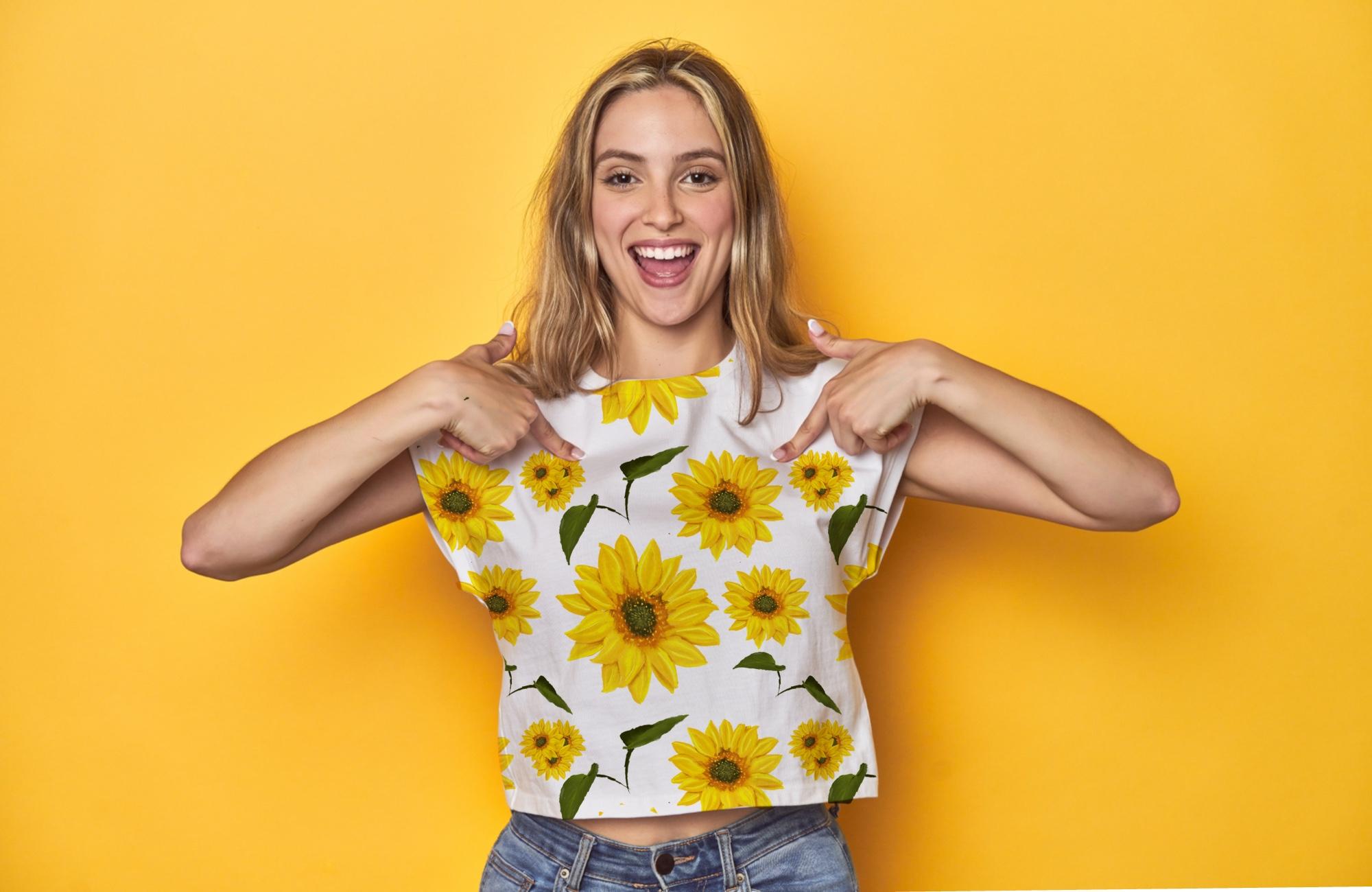
4. Put Your Designs on Merch - Intro: In order to sell your work
on a website like Etsy, what you want to do is to
put it onto a product, and you want to make it
look as realistic as possible because you
don't want to have to print all these things out in all the variations and
photograph them again yourself. So what we're going to do is
we're going to take one of your designs and put
it onto the product, and we're going to
use a tote bag. And I want to show you how
you can actually make it look realistic and then put it into another graphic to show off the product
and maybe some of the variations of that.
Let's get started.
5. Add Image to Fabric: Now, I want to bring in a person onto this background
I've created, and the background is
really simply a new layer. And then I use my pencil. Over there, I used a hard brush, and I've taken the streamlining
right up so I could just go and do some
lines like that on it. It really is as simple as that. This light blue, dark
blue, and the gold. Once again, thinking
in terms of colors, we have got a large area
here, and, of course, it's balanced by the small and the lighter
area up the top. And then this bit over here, this is a complimentary
color to the blues. Now, I'm going to
bring in a picture, and I've cut this picture out, and I did it in the pixelcut.ai. So you can see if we
just go to compare, that's it with the background, and it's actually done
a really good job of cutting that out.
Very, very nice. And what I want to
do is I want to put something on this tote bag. So let's go back
into here again. I'm going to bring my person in, so I'm going to go
over to the usual ad, and I've brought in as a photo. If you're not sure
how to do this, just go back to some of
the earlier lessons. There she is in there, we just make her a little
bit bigger. Over there. Right. And then I
can put the details about the designs over here. So I want to bring in
the design onto here. So I'm going to go
back to the gallery, and we're going to use one
of these ones in here. I'm going to use this speed up your workflow as the
design for my tote bag. So I'm going to go to
the top and copy it, and I'm just going
to say copy canvas, which copies all the layers, and then I can go back into that one and I can choose
paste in there, and we can take that down a little bit to the right
sort of size for that. Let's move this
across a little bit, and I'm going to put it
roughly where I think it should go. Like that. Now, this looks like
it's stuck on the top. So first of all, I want to actually make it
look like it's actually got the same folds as the tote bag. The tote bag doesn't
have many folds, but it is folded slightly. Let's zoom in a little bit over here and you can
see if I hide this. There's some sort of
folds. Like that. Now, I can pick up those folds
really easily by going up here and just choosing
a different blend mode. So when I go to darken, what happens is the darker areas of the tote bag get darker, the lighter areas
stay as they are. If you find that by darkening
it down, it goes too dark, you can always go along to
adjustments, hue saturation, and brightness, and we could lighten this up a
little bit in there. If that doesn't look so good, you can always try the curves. Remember with your curves, we can just grab
this middle section and lighten things up
or darken them down. I'm just going to lighten it up just a little bit like that. Now, of course, you can
see the arm through, we'll deal with that shortly. It's still not fitting
quite correctly. So let's have a
look at what we can do if we go to this tool. And the move tool I'm going
to go over here to freeform. Let's try that again. Sorry,
distort, not freeform. That one over to there,
that one up to there, and the same with those. Once again, when you're
putting something on fabric, it's still not quite
right because that's a perfect straight
line on that fabric. So we can do something else
that we've done before. We can go into liquefy. And using liquefy, I'm going to make my brush just
a little bit smaller. Maybe I can push this in over here to make it look almost like it's going
over those edges. Just push that in a
little bit there, maybe this one here
so it's not as perfect. As it could be. There we go. It's just looking like it's actually going
over those areas now. Lastly, I'm going to go in and I'm going to
just erase this. We'll be looking at using
some more masks later on. But for now, I'm
going to do this in a very destructive way
with the erase tool. I'm going to click on
my hard brush and take the streamlining
stabilization off and then I'm going to just erase those bits out over there. Now, of course, I'd probably zoom in and do this a lot more carefully if I wasn't trying
to record at the same time. So let's just try and get those bits in there and
that bit over there. We've got one more
problem over here, and that is that we need some sort of shadows
because they'd probably be a slightly darker area just
underneath that section. So we'll come and deal
with that in a moment. But have a little bit
of a go with that. Play with that, use
that background and bring in an image that you want to use
on the tote bag.
6. Add Shadows: Let's just do this
manually for the moment. I'm going to put a
new layer on here. I'm just going to
go up over there, get my paint brush,
soft brush, use black, and just paint with a very small brush where I think there should be a slightly darker
shadow under there. Now, of course, if I've
gone too far over there, I can just zoom in over here, use my rays and erase out the bits that I didn't
mean to paint on. So, of course, all we have to do then is to change
the opacity of that. I've realized that
I actually made a mistake over here and
didn't go far enough. Unfortunately, because we're
not working with a mask, there's nothing I can do
about that at the moment. But when we have
a mask, later on, you'll find out that I can very easily sort out
problems like that. Now, we've got one shadow there. Let's have another
shadow underneath her. So I'm going to do this in
a slightly different way. I'm going to make a
copy of her layer. I'm going to go to
the bottom one. I'll just hide all these layers above it so you can just see this one under here. I
want to make it black. So remember, one of the ways we can do that is
to go to hue and saturation and just take the
brightness all the way down. And then I'm going to add
a bit of a blur to that. So up to my adjustments
down to blurs, and I'm going to be
using the Gaussian blow and just click and drag
to blur it out a bit. Now let's switch on
the other layers. You can see there's sort
of a dark area around her. But if I move that layer now, we've got a shadow behind her, and then the usual, we go and we make that multiply and we adjust the
opacity on there. Look at the difference
without and width, it just slightly separates
it from the background. Now, if I thought that that bit of the front didn't
look quite right, well, just use an erase tool. Honestly, you can just erase out the bits. That you don't want. So now I've got the
shadow just behind her. Have a bit go with playing
with some shadows in there.
7. Add Variations: I've just brought
in two more copies of the speed up your
workflow yellow one. One of them, and I'm going to
do this top one over here. I'm going to adjust
the colors of that, so I'm going to go up to the top to hue and saturation
and just adjust the color on there
so we can give the clients some
variations to work from. So what about a bit of
a shadow behind those? Will you do it exactly
the same way that we did the shadow over here?
What about a shape? Well, that's actually quite
easy because all we have to do is we have to
make a new layer, go and get a
rectangle over there, and I can just draw the
rectangle in to the right size. And fill that with a color. You see, over here,
we've got a color fill. If I click on that,
it just fills it with whatever color
you've chosen in there. Let me do that again.
So on this one, over there, once again, I'll want a new layer for that, so I'm just going
to add new layer, use the same tool to
another little shape. Over there, and you can see it's automatically
filled with that color. Now, where on Earth
has that one gone? Well, it's underneath,
if I just pull that up. There we go. Bit of text, maybe
over there saying, pick your design
for your tote bag. Have a little bit of a
play with that and put some other designs
in there as well.
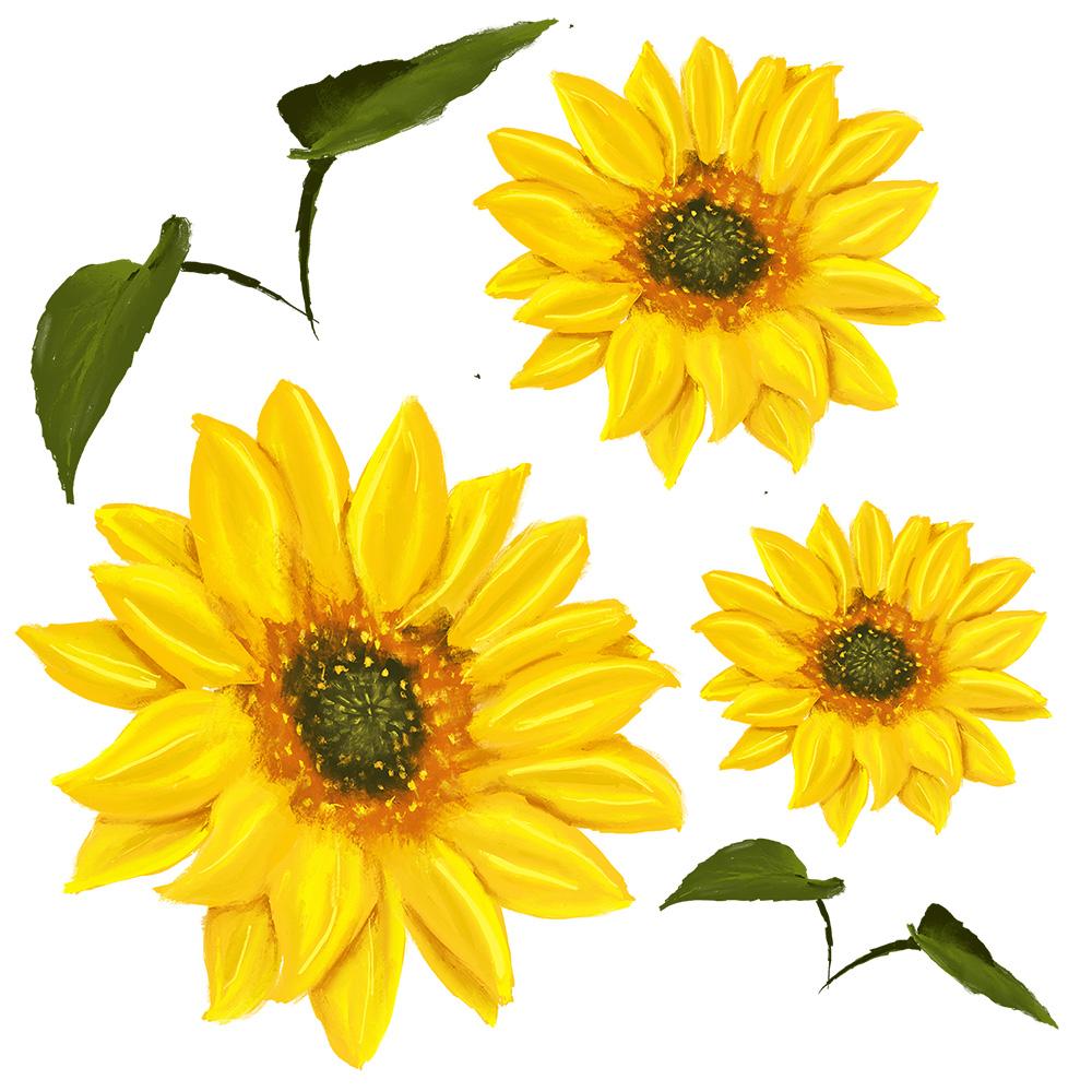
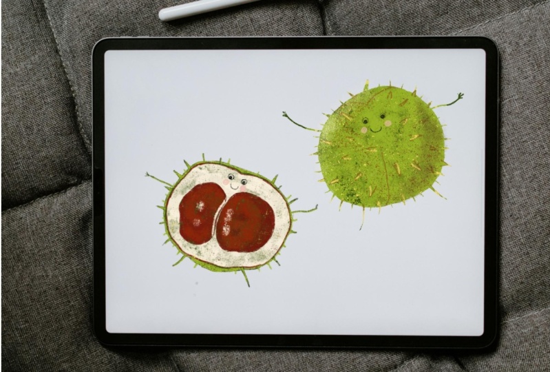
8. Drawing for a Pattern - Intro: I love this project. We're going to be
taking a drawing, and I'm going to get
you to draw something. Now, as you can see, I've
got a forest scene in here, and I want to show
you how to draw these individual items.
Now, don't worry. If you can't draw,
it's not a problem. I'm going to show you
how you can actually do a rough trace of them and use the colors from the
original photograph and then repaint it from there. But it won't just be a
copy of the photograph. I want to show you how
you can make it your own. Of course, if you're
an experienced artist, you don't need to go through
that part of the program. You can just do your own thing. Now, once we've created this, we're going to do a
few little things, as I've got a forest
theme going on in mind, and I'd suggest something
similar to yours. And then we're going
to take those, and we're going to put them
together and make a pattern. So if you want to go down the
route of selling patterns, and there are some websites
that will sell patterns, you can sell them
for wallpapers, you can sell them
for wrapping paper, you could sell them for fabrics. Anyway, I'll show
you how you can set those up so you can put them onto those
sites to sell them. And we're going to then take that pattern that we've created, and we're going to then move
it into a Behance project. I want to show you how to
set up a Behans project. This is the type of things
that you could then present to a client or you could just use it as part
of your portfolio. Behance is absolutely brilliant
for projects and getting other people to appreciate and comment on your work
if you want them to. Or you can just send a
link to a client and say, what do you think of
this project so far? Now, once we've done that, I want to show you how
you can then take it out as a PDF so you can put
the whole thing into a multi page PDF once
again to send to a potential client or just to save as part of your
own personal portfolio. There's so many
things to do in this, and I hope you
enjoy it as much as I do because I love
this one a lot.
9. Get Project Ideas from Chat: I. For this project, we want to create
something for autumn, and it's got to have patterns. It's got to be able to put the individual items
onto T shirts. So what I've done
is I've gone to Chat GPT to ask for ideas. And the prompt that I've
given it's really simple. It's just said, I'm
creating an image to use on sites like Etsy
on t shirts, bags, and also on sites that
will allow me to create patterns or accept patterns
for wallpaper and fabric. And I've put in there, I'd
like to do something autumn, and also I've asked for
ten different ideas. So HAGBT or any of the large language
models are great for getting ideas for projects because there's things in here
that I hadn't thought of, for example, acorns and berries, I didn't think of those at all, hot drinks like steaming mugs of cocoa, candles and lanterns. Those are brilliant
ideas that I can use. So having done that now, I've got a number of
different ideas to work from, and I'm going to go and find photographs of those
particular items. Now, if you are an artist, and you are confident
to just draw those sort of things in your style.
That's absolutely fine. You don't have to
work through this. But if you're not, I'll show you how one can do it
using a photograph. We're not going to just take the photograph and
use the photograph. We're going to redraw
from a photograph. So it's kind of like
reference material. If you can't draw, don't worry, you'll still be able to
create something which looks amazing, I promise. Anyway, have a
little bit of a go. Try with Chat GBT, and just put in a bit
of a prompt like that. If you want to do
exactly what I'm doing, by all means, just move
on to the next movie. If there's something else
you want to try out, by all means, have a bit of
a go and get some ideas. So, let's get started.
10. Find Reference Material: What we're going to
do now is we're going to find some reference material. Now, if you are an
artist and you can draw these things in your
sleep, that's absolutely fine. If you're an artist and you need reference material,
that's great. If you can't actually or
believe that you can't draw, you'll notice I say
believe because I think that most people can with
a little bit practice, draw very well, then what we're going to do is we're going to find
some reference, and we're going to
trace those items, but we're going to
make them our own. So if you believe you
can't draw, don't worry. I've searched for some
acorns over here or acorn, and I'm just going to
download this picture. And then I'm just going
with the smallest size, they don't need to be that big. So let's just go and
get that small one there and download it. Now, rather than you watching me find all of the different items, I've gone along and I've
found the other ones already. So I've got some acorns. I've got a pumpkin, I've got
toadstools, some leaves, all the things that I
think might make up autumn based on what Chat
GPT said over here. I haven't done all of I might just actually
add in a moth, as well, that might look quite interesting
or a butterfly. But anyway, um, if you want to work on the
ones that I'm working on, I will include this file with these pictures in it
in the course, as well. So, have a look and find some images that
you wish to use.
11. Trace Reference Material: We're going to make
a new document here, and it's going to be
a square document because whatever
we create in here, we're going to be using
a pattern in the end. So I'm just going to click
on little plus over there. And I want something which is a reasonable size
when it gets printed. Now, we haven't really
talked about CMYK and RGB in detail at the moment. But for now, I'm
going to choose RGB, and then we can look at
what it'll look like in CMYK at a later stage. Anyway, I'm going to
go in and I'm going to choose the color that I want,
so I'll click in there, and I'm going to go with 4,000 pixels by 4,000 pixels here. Now, do be careful because if you're using
a larger file like that, you are limited in layers, and you can see it says
the maximum number of layers is 61 at the moment. The larger you make
your document, the less layers you can
work in in Procreate. So just be aware of that. And it also depends on
different machines as well. If you are not on
the pro version, you might find that there's
less RAM on machine and you get less maximum layers, even for the same size
that I'm working on there. Going to click on Create over there and
here's my document. I want to bring in those
photos that I can work from. So I'm going up
to the missed it. Do you find that when you go to click on one of these,
you always miss it, or is it just because I'm
sitting at a funny angle trying to because I've got the
camera above the screen. Anyway, I'm going to go over to the little actions over there
and as we've done before, add and I'm going
to go and insert the files and start
to bring them in. Now I'm not going to
bring in all of them. At the moment, I'll
just bring in one, show you what I'm
going to do, and then you can do all of yours. So I've just brought in
this pumpkin picture here. It's pretty low res, and that really doesn't matter because I'm just using
this as a reference. So I've got the pumpkin there. What I want to do is
just draw that shape in and maybe get some
colors from it, as well. Now, this is all pretty rough. So as I said, if you are an artist and you want to redraw that yourself, that's fine. If you're not, you
can just go along here and make a new
layer and trace it. So I'm going to just
trace it over here. I'm going to just
choose a pencil. I'll go along to
my sketchings and I've got a six B
pencil in there. Let's just zoom in a bit. I am on a new layer, and I'll choose a black. It's my color. And then I'm just going to
trace this roughly, and it doesn't have
to be perfect. You can see it's not
exactly as it is on there. Let's just go round to there. Round, round round.
Another one there. And this just give Whoops. Miss that a bit. Gives us
a rough of that shape. And if you make a mistake, just go over it again, use your razor, erase out the bit that you
didn't intend there. Now, let's sample
some colors and put some colors next
to this as well. So we've got those colors
as if we need them. I'm going to do is just
go along over here, tap on the little square there
or you can hold it down, move it over, sample that color, and I will use a slightly
larger brush for this. So it really doesn't
matter which one I use, but I'm going to go
to the air brushes and just use this solid one, so I can just put in a
bit of color over there. Let's sample another
color over there, and we'll have that one and
then maybe a color from the stem as well and the
highlight from that. B. That is it. Now, we can just
hide that if we don't want, but we've got the rough of
our pumpkin ready to go. I won't get rid of this
because when I paint it, I might need it as a
reference so I can go back in and see exactly
what I'm going to be lightening and darkening. Anyway, try that with
your other items. So I will just very, very quickly bring
in the next one. I won't do the whole
thing, but I'm just going to go
and insert a file. I'm going to find the
toadstool that I want. Let's just scale it up a bit. But there I think
something like that. Don't forget, add a new
layer and redraw it. I'll use black again over here. Now, if you find that
you're struggling to see what you're doing
because the pictures very dark, just go to the photo and
reduce the opacity like so. So very quickly, I could
just go around that. Over there. Let's do this
down to there, up to there, and just that I can see them a few little shapes on
the toadstool, like that. It's pretty rough, and
that's absolutely fine. Unfortunately, I've done
that with the wrong brush, but it's fine. I'm not going to be using
this in the final piece. We're going to be recoloring it. Don't forget when you want
to sample the colour, take the opacity up to 100%, and then you can see exactly what colors you're
going to be sampling. Be careful, though, when
you sample colors like this underneath
here on a toadstool that would normally be sort
of mushroom brown or white, but it's green because of the
reflection from the grass. So if I sample that now and
I painted it somewhere, on that layer, you'll
see it's actually green. We don't want that. So
you're going to have to use some artistic license in choosing some of the colors, but we'll get to that just now. Have a bit of a go
and bring in all of your different pieces
that you want there. And I'd say have
at least probably about five different items
in your illustration. If you're not sure
quite what to do, start watching the next
video because I will have done it on all of the
ones that I want to use. In fact, I'm going to
redo this toadstool with a pencil rather than
that thick line as well.
12. Sample Colors: I brought in a second
toadstool picture, and you can see the
difference in color. This one's very orange
and that one's very pink. Now, for simplicity's sake, I'd like to keep them
both the same colour, even though I'm having two
different types of toadstool. But what I do like
about this is you can see the stalk is actually white, slightly yellow, whereas
that's very, very green. So with this one, I'm going to sample the color from the stalk. So let's use that, but there put in some color and
some of this light. It actually looks like
white almost, really, and maybe a little bit of
that color underneath there. So when it comes to
doing my tote stools, I'm going to use this
color over here for the tops and that for
the bottoms in there. Still got a few to go, if
you carry on with yours.
13. More Sample Colors: Now, I'm working
on this ladybird. And because it's also
reds and blacks, what I'm going to do
is I'm actually going to use the reds
from the toadstool, so we don't have too
many different shades of the same color in there. So I'm going to not
pick up those colors. I'll just use a slightly darker version of that red there. Doesn't look like ladybird
when you look at it like that, but the moment that you put in the lack the red
with black dots, it looks absolutely fine.
14. Customize Your Sketches: I'm going to go along to my
mushrooms, because, remember, we've basically copied
or traced a photograph, and I want to make this my own. So I'm going to go to
this mushroom over here and I'm going to
adjust it a little bit, so I can go along
to the adjustments. I'm going to use liquefy. And then I would just
use the liquefy brush. I'll make it a little bit bigger and tweak this a bit and
maybe just pull this over a little bit
like that to get an interesting base on that. Maybe I can pull this down
a little bit like that. Maybe that can come up
a little bit in there. It's exactly the
same if I go along to my pumpkin that
I started with. Onto the pumpkin here,
same again, liquefy, and I'm just going to adjust that top a little bit in there. Maybe pull this up a little bit. So if you put this
over the photograph, the original photograph,
it wouldn't look like it. We've actually made it our own. And I'll just work my way
through all of these items, just using the liquefied tool
to tweak them a bit so they don't look too so in our hearts, we know that we haven't
actually directly copied them from the
photograph. Try it out.
15. Start Painting: Let's start putting
some paint on these. I'm going to start with
the leaves down here. So go along to my leaves,
move them to the side. Here we go. So I can
sort of see that. Now, sometimes you find that
there's things in the way. You don't need everything
on this layer, so just take an eraser. I'll use a large
chunky eraser there. I don't want that, so I'll just erase out those bits there, and you can get rid
of anything that's distracting you from your goal. And doesn't have to be perfect. This is just a reference. There we go. So I want to start painting
these leaves now, and we're going to do
them on a new layer. So I'm going to make a
new layer over here. And I've put my layer underneath
the drawing over there. So I'll be able to see
it when I'm painting. Starting on this layer here, I want to then sample a color. So let's do this leaf over here. So we're going to
sort of give it an orangy color and
then we're going to use some dark to
create the veins. So once again, I will just
sample the color over here. Remember, I use this color
let's try that once more. I use that color over there. I'm going to go and choose a brush that I want to work with. Now, it's up to you what
brush you like, really. It's a personal preference. I'm really into these
inking brushes. I really like them, but you
don't have to use them. You can use whatever
brush works for you. And I'm just going to start
to paint these areas in here. Now, this doesn't
have to be perfect. Remember, this is supposed
to look like a painting, not like a photographic
rendition. So I'll just go around here. By the way, you're not going
to have to watch me do this whole illustration
with these. I'm just going to do
one or two of them. And I like this brush
because as you press down, you can get really heavy
brushes like that, but you can also do fine
detail with it, too. Let's do those around here. Then I want a darker color to
do these details in there. Once again, I will just
sample the colors. I've got my main colors there, but I'm also going to sample a darkish brown
off of that leaf. Let's just sample again
that dark brown in there. Same again, I'm just
going to go in here, drawing that and it's drawing
some details over here. As I keep saying, it
doesn't have to be perfect. And don't forget to just
twist your canvas around as you're drawing if your hand needs to go in a
certain direction. I tend to draw with
these arcs all the time, so I keep changing
the angle so I can draw arcs in over there. We'll just speed this
up a little bit, add in a few more bits. Let's switch that off so we can see if it looks acceptable. We just switch that drawing off. There we go. That's
not too bad a leaf. If you find that some of the
things are not quite right, this is where your
artistic license comes in and you can just go in and put in any
little bits that you need. In there. I'll do the other one. And once again, I'll
switch this on. I'm going to sample the color. So I'm going to start with
the yellow, I think there. This is not a painting lesson, so if you prefer to
start working from dark colors up to light,
that's absolutely fine. Get my paint brush and
paint it in. Over there. Just check that you're on the right layer all
the time because it's so easy to do this on the wrong one and then you've
got to do it again, and that is very annoying
to have to do. Here we go. That's looking good.
Now, new technique. I also want to have some orange
bits on the leaf as well. So I'm going to go and sample
the orange over there. But I don't want
to actually paint, have to paint it in perfectly. So I'm going to go to my layers, and I'm going to click
on there and I'm going to say, use the alpha lock. Cause remember the
alpha lock when I'm painting only paints on
the existing pixels. So it won't take me
long now to just put in a few little details
in here. In orange. And I can do those with
a hard brush in there, or if I wanted more of a
sort of a gradient on them, I can go along, make sure I'm on the right
layer all the time. Go along to my airbrush, using the soft brush and maybe just sort of
put in some orange. Areas in there. I'm happy with that. I just now need to go and put in all of the veins onto that, and I'm going to
do it in exactly the same way that I did that, so I won't force you to
watch me doing that. But have a bit of a go
with something really simple like your leaves
if you've got some. When it comes to putting
in the stem over here, remember that what you've done is you've gone in and
you've alpha locked it, so it won't allow you to paint on anywhere that's
not on that area. So to put in the stem, you'll have to switch off
the Alpha lock, and then you can actually
go in and you'll be able to paint
anywhere on there. Totally the wrong brush,
but you get the idea.
16. Painting & Blending: Once you've got your leaves in or whatever you've painted, you can actually get rid
of this layer over here, and I can just
delete that layer. And the photograph, well, you could get rid of
that if you like. It doesn't have to
be there. We've got our final piece in there. But lastly, I'm also
going to click on there. I'm going to go and lock it. So in order to lock it, you won't find lock in
there because that's an Alpha lock that locks
the transparent pixels. But if you drag this
over to the left, you'll see you've
got a lock option in there, and that will just, if you lock it, stop you
from working on it by mistake and clicking on the wrong layer and
ruining your image. So have a go with the same
technique with something else. I'm now going to do one of the mushrooms or the toadstools, which are a little
bit more detailed, so I'm going to show you
what I'm going to do. And I'm going to pick, I think, this one over here. As I said, if you are
illustrator or an artist, just go ahead and do your own. So I'm looking for
that one there, and I'm going to
zoom right into it. I just want to be
able to see that pink up the top over here. I'm going to start
that on a new layer. So paint brush there,
sample the color, and I'm going to just start off with the darkest
color over here, and I'm going to paint
this area in over there. So I'm just really painting
this sort of stem, I suppose, I think
they're called. I'm not very good with plants, but I do know what a
toaster looks like. So I'm going to do
that one there. Remember, you can
always erase later on. I'm also going to
just move that layer below the other one so I can
actually see my details. Let me go in and
do another color here because that's
the darker area. Now, when it comes
to the lighting of this particular scene, the light's going to be coming from this direction over here. So we're going to have
the darker areas on the left hand side
of the objects and the lighter areas on
the right hand side. But you'll notice that I've done this little stem bit over here. Now, when it comes to using my other colors in
here to lighten it up, I can just use my
Alpha lock to lock it, get my paintbrush, choose my next color, and
then I can just paint. I don't have to be
too careful because I've already done
that area there, so I'm just going to paint and leave maybe
a little bit of the darker area on
that side over there. And then whilst
that's still there, I'm going to use the very
lightest color over here and put some
lightning on like so. Now, if you wish to
blend those together, kind of like to get that
sort of effect that we had, we can do it in one or two ways. One way is to actually use, and this is the way
that I like, is to use this finger tool. It's the smudge tool.
And with a brush, you can just go in and kind of smudge those colors together, and you can see how
with a bit of smudging, we can just blend
them together in a really pleasing way to get the lighter area coming down in the darker area over there. The other way to do it is if
you've got an alpha lock on, you can go up to the
top over here and you can just use Gaussian blur and you can just
blow those together. You can see how it can actually blow those colors together. But that does give you
a very airbrushed type of look. And I don't want that. I want the brush
stroke type of look. Now, for this little
thing over here, I'm going to pretty
much do the same thing, but I'm going to have to switch off my alpha lock so
I can paint on there. Let's choose the darker color. I must make sure I'm
on the right tool on the paint brush or
samp that darker color, I'm just going to draw
in the darker color. Under there, I'll
get some lighter. Let's go over the top and the very light color right
at the top over there. I can still, if I want
use my smudging tool, make the brush a bit smaller
over there and just smudge some of these colors
around like so. Oh let's do the top. Once again, I'm going to
go and sample the colors. I'll sample the red
that I want to use, and I can go in here
and darken it down. Now, when you're darkening
colors or lightning up colors, I like to go along to
the values over here. So we've got these different
views of our colors, and I like values because
I can just go along to this darkness slider and just darken things down
really easily like that. So I can just take
that color and just darken that red
down a bit like so. Anyway, I'm going
to paint this in, so with my paint
brush very quickly. Get it in roughly like so. Now, let's have a
lighter bit at the top. Remember, go in there, switch on your alpha lock. I'm going to choose this
lighter red up here. Sometimes I do get
a bit annoyed with this little color
picker over here, particularly because
I've set it up. So when I double
click on the pencil, it brings it up, but it can
go in the wrong position. Anyway, I've sampled that
red and I can then you see? Let's just double click and
move that across to there. I've got that red now
back to my paint brush and I can just paint
in some lighter areas. Oh, remember the
lights coming from this direction down there, so this bit will be lighter over here like that, but is lighter. And then maybe even a little
bit near the top of pink. So once again, I will
just double click on my pencil, move
it up to there. Of course, you can use
that button, as well. That gives you the pink, and I'll just put in a little bit of pink over there. Same thing. Use the smudge tool and just go in and smudge these
around a bit. If your brush is too small,
make it a bit larger. And if you want to
darken it down, by all means, do so. Just sample a color again.
You can darken it down. Remember, we have still got the Alpha lock
switched on on there. So if I were to paint down here, it doesn't matter if
I'm missing it a bit. I'd be fine. And then use my smudge tool to
smudge that around. Be careful, though, I've smudged unfortunately onto
the stem itself, so I'm just going
to have to undo that and watch where I'm going. Lastly, we've got these little I don't know what
you'd call them really, the things that go on
top of a toadstool. I'm going to do those in that
very light color as well. I'm going to use two
colors for that. Once again, onto the pencil, sample my color, which is
going to be that one there. I'm just going to
start putting in some little shapes over here. As you can see from
the photograph, they don't have to be perfect. I always think of
toadstools as having these perfect circles that
you see in children's books, but obviously they
don't some of them do, but not these ones anyway. So I've gone in with a lightish
color but not pure white. And then I'm going to
go in and I'm going to sample the white or almost white and just go and put some highlights
on them as well. Now, if I just turn that
overlayer off for a moment, close that down for a second. You can see where I'm going
with this. Over there. We need quite a few of them. Up the top. They don't
have to be perfect. Remember, this is
an illustration. It's not a perfect scientific
rendering of a toadstool. But once you've
done that, if you think, Oh, my goodness,
you know what? Look at those edges
on that toadstool. I want to round them
off a little bit more. What you can do
is you can go in, switch off your Alpha lock. Use the same brush
for your eraser. So if you just go to erase tool and hold it
for a few seconds, that will give you the same brush that
you were working on, and you can use
that brush to just do some erasing out here. So I'm just going to round
off this edge a little bit. Maybe that bit there
can round off. Whoops. That's a bit too
much. Round that off. I think that can
probably rounded off. Once again, two fingers to undo. Like so. And I've now got my little toadstool not quite
ready to go, but almost. Do have a bit of a go
painting something. If you've got
toadstools, try it out. If you want to go through
this little lesson again, by all means, have a look again. But just use those
tools that I've mentioned and don't
forget your alpha whips, your Alpha lock over
there if you want to then start with a base
color and then build it up from that point onwards. If yours don't look
great, don't worry. We've got a number of other
things to draw, as well. If you want to keep the
colors more flat without having the details in like
I've done, that's fine, too. You know, make a shape over there with one or two colors
in absolutely perfect. No one's actually
going to see this in the final result in the same detail that
we're looking here because it's going to be
a pattern on a wall or a piece of fabric. Try it out.
17. More Painting & Blending: Now, that toadstool
was pretty heavy going if you've never
done this before. So I hope you did okay with it. If not, don't worry about it. These things just take a bit of time and
a bit of practice. Now, let's go over
to the pumpkin, and I'm going to do the pumpkin. As always, if you're
confident with these things, you just get on and paint. But for those of you who
are not quite so confident, I'm going to go and
switch on this pumpkin here and I'm going
to move it across. So if you'd like to
watch this video, if you're not that confident,
by all means, ago. And I've got my pumpkin there. I'm going to go along to the layer where
the pumpkin is on. That's the drawn layer. I'm going to put a
new layer on there, and I'm going to move this
layer below the other one. And then we're going
to do pretty much the same thing that we
did on the last one. Get my paint brush, sample the color that I
want to work from. So I'm going to
start off by doing this big round area
of the pumpkin, and I might do it with a
sort of a darkish color and then work with lighter
light colors as I go. So I'm going to sample
the dark orange in there. Paint that area in, and you can see exactly the same
as the last one. I'm not being that careful, just getting these colors down. And it doesn't
really matter that I'm going over that because I'm going to put the
stem in finally, so that will be right. But once I've got this color in, then I'll do as I did before, I'll switch on the
lock transparency. We go, Let's just get
that one in like that. We wanted to have
that painted look. So I'm going to go over here. I'm going to lock the
transparency on that layer. Alpha lock on there. And
then I'm going to bring in some lighter
colors onto that. So once again, I'll sample this orange over here and
do some lighter bits. So what I'm looking at here
is sort of having these areas being lighter and
then a shine on them. So I can just go over here
and paint in this bit. Not too worried about going over the edge because
the Alpha lock is on over there and it's just
paint this area over here. Now, we do have a bit of a problem because
these ones here, the light's coming from
the top right hand corner. On the pumpkin, it's coming from the top left hand corner down. So once we've done it, we might flip it around so all the light goes in
the same direction. So I'm just looking at the
light coming from there. It there, and let's have this
one quite light. Like so. Same again. Let's make
this lighter still. So I'm going to sample
the color, go up here, go over to my values, and I can then just lighten things up a little bit in there. If you find that you get
to the end, you go, Oh, my goods, I can't
lighten that anymore. You can then start to drag
these color sliders around, but be very careful because you might be
adjusting the color. You could also go
along to your disc again over there and just pull this over that way
to lighten them up. Or, of course, you
could straight sample the color directly off of the photograph.
Come on, you. Let's try double clicking. I don't know where
my sample has gone. It does get a bit, a
bit annoying sometimes. Oh, there it is down there. So let's just sample a light
color from that and I'll just paint in a bit of lightness over there.
Same over here. I'm just kind of
looking where it is, so it's kind of on
that side in there. We've got a little
bit more going on in here and I'm
going to take a bit of creative license and do a little bit over there as well,
maybe some on the top. And then we can use our smudging tool to smudge some of those
colors around a bit. You can see I'm kind of
going up and down in the direction that
the brush is going. You can still, if you
think, it'll work, just go in and add a few more. Little bits to that a little bit more highlights and the
same with the darker color. You go back to your
darker color over there. You can darken it
down even more, and you could add
a bit more detail in the darker areas over there. But remember, if
you're adding in dark, I put in made that very dark. You might need to smudge
it in a bit to get it to blend with the other
colors as well. Make my brush a little bit smaller, and just
smudge that in. So let's have a look without the lines along the
top to see if it looks vaguely like a pumpkin. Well, it's got that
feeling of it. Let's put it that way. And
then, of course, remember, I can always round it off
using the arrase tool over here and just go in and arrase the bits
that I don't want. Like so. We just round it off there and maybe
down here as well. Now, what will make it
look like a pumpkin really is to have this
bit done at the top. So I'll switch that on again, and this is where I'll need
to get the other colors in. So I'm going to start off
with a dark color over there. Let's sample that one. Paint brush and
just paint this in. Now, why can't I paint up there? Well, I'm sure
you've guessed it. It's because we've got the
alpha lock switched on, so just switch that
alpha lock off and you can then
carry on painting. But there. And let's have a lighter version of
that on this side. Maybe something along that line, and maybe even a sort of a medium light
version further down, so I'll just darken
that off a little bit. In there. You might
find at this stage, you think, well,
actually, there should be some darkening down there. By all means, go for it. Just sample your colour
and paint in a bit more. Around there. Right,
let's switch off the top. There we go. We've got something
more pumpkin like there. It does need to be tweaked a little bit because we've got
some funny lines in there, so I will use my rays tool to just round some of
these off a little bit like that cause the thing about pumpkins
is they are pretty round. So we want some sort
of rounded area. Like that. If you find, you think, Oh, you know what? I wish I could push
this out somehow. Go along to your liquefied tool and use your liquefied tool. I'll use a slightly
smaller brush in there. And I can then
actually go in and I can just push these things around and move the
pixels around if I need. And this is great for round things I've found because I can just pull them out to the shape that I
want them to be in. In fact that could
be just moved out a little bit like that. I really should use my finger smudge tool to just smudge that in a
little bit, like that. Now we want everything to have light coming
from the other side, not the left hand side, but from the right hand side. So I will select that and
just use flip horizontal, so it's the other
way around as well. Anyway, have a bit of a go with that and try it out and
see what you can do. Once you've done that one,
we'll go on to the next one. In my case, it's going
to be the ladybird. You might have something
entirely different to do.
18. The Ladybird: I'm going to get
rid of the pumpkin photograph because
I don't need that. I also don't need the
lines over the top, so we'll get rid
of that as well. And I'm then onto the
ladybird over here. So I need to find
it. There it is, and find the
photograph, as well. Now, the photograph
is in the way, so I'm going to switch it on, move it across and so I don't have all this
other stuff around it. I'm just going to get rid of everything which is
not on the ladybird. Now, we can do that by using a selection tool and just
selecting around the ladybird. So I'll just use
free hand in there, do a selection around
the ladybird like that. I'm going to invert
this selection. So over here, we've
got an invert option, so the ladybird is
now protected and everything else can be just
very quickly deleted out. One way to do it
takes a little while, but you can do it that way. The other way that we can do it is if we make a selection, I'll just use an
ellipse this time. I'll select the
ladybird like that, copy and paste, and there we go, I can get rid of the
other photograph, and I'm just left
with that part there. Whichever way you want to
work, it's absolutely fine. We're just using that as a
little reference in here. Now, I want to start
painting the ladybird, so I'm going to add a new layer over there underneath
the drawing. You can, if you prefer, go to your drawing
and actually reduce the opacity so it looks a lot lighter when
you're painting. Now I'm going to be
using the reds from here because we want to keep all the colors
very, very similar. So I'm going to be
sampling colors from this and make sure I'm
on the correct layer. I'm just going to
paint in the back of the ladybird over there. So paint brush and just
start painting that in. So once again, pretty rough. We want that nice
painterly look to this. The head is going to be black. So let's just go in
and do a very dark. Black looks so heavy and
hard on an image like this. I'm actually going
to go to a dark red rather than pure black, and we're just painting that
little section over there, and finally the last little
head bit over there. And I'm going to
make my brush a bit smaller and just do some legs. Sticking out over there. And the same with these
shapes over here, we just paint them in with
that very, very deep red. We've got and there is a line that goes down the
back between the two wings. Alright, let's hide
the top layer. That's not bad at all. The thing is,
though, when you're painting and you're doing
lots of details like this, it's very difficult
to then go and lighten those areas up
or darken them down. So I'm going to
use two fingers to undo the dots that I've done
on the back over there. I'm going to put
in a Alpha lock, and then I want to lighten
and darken these areas. So I'm going to just sample
that red that I've got, and I'm going to use a
slightly darker version. Remember, our light is coming
from this direction here, so I'm going to just
darken down this area a little bit over here, maybe round to the head,
a little bit round. I'm going round to
sort of show that this thing is actually rounded, just a little bit
by the head there. And then let's do
a lighter red up the top over here. And finally, a much lighter red. Oops, that doesn't look like
a lighter red, does it? Let's try that again. A bit
more saturation over there. And you can actually
then go in to a pure white and put a
highlight on there if you like. But don't forget use
your finger tool to just smudge those
colors around if you want to blend them
together a little bit. Like that. Now that
I've done that, I can go in and just do
the dots on the back. So paintbrush. I'm just going to sample
this dark color here, painting that little
shape. Those ones there. And let's have a little
look at that without this. Get rid of that one,
get rid of that one, and there's our little
ladybird up the top. Once again, have a go with
the ladybird if you like.
19. Add Background: A few more bits and pieces. I've done some other
mushrooms in there. I finished this
toadstool over here. I decided I didn't
like the branches, so I've left them out. And I was going to
do some acorns, but I think the colors that I've got in here are
absolutely perfect. Now, I want a color which is going to help in the background. So rather than just
being some white, I want something which is more
of a greenish brown color. And I'm going to do that by
putting it onto a new layer. By the way, I've got a
lot of layers here that I don't actually need
still like that. So I'm just going to remove
and then you don't have to, I'm just doing it so it's simple and you can
see what's going on. I'm going to go and put in
another layer at the top here. So let's add in a new layer and I'm going to fill
that layer with a color. I'm going to move it
right to the back. So I'm going to choose
a color to go in there. Now, most of our colors
have been in this sort of range over here, so around the reds and oranges. So if we go for a color
which is complimentary, it's going to be these
colors over here. So I can then start
thinking, Well, what about something
along this line? Not too blue because this
is going to be autumn. We want warm colors, but maybe a sort of a
warmish green up there. You can see we've
got these greens from vivid green
through to a nice, dark, foresty green over there, maybe even something
a bit lighter. Now, remember, I made
a layer over there, so I'm just going to drag this and drop it straight
onto that layer. I don't actually like
that color, to be honest. I think it's a bit too much. So I'm going to go and try and find something which has got a little bit less green in it
and just keep dragging it. That's more what I'm after. Once you put your color in, I find that I like to go
up here to the hue and saturation and just adjust it with the hue and
saturation and go, Oh, actually, oh, that looks so much better with
that gray color. And I can either saturate it
or desaturate it over there. So the first thing is, get rid of things that
you don't want, and then we can add
in a background, so add in a new layer,
put in your color, and you can adjust it with your hue saturation
and brightness. Once you've done
that, come back, and I want to show you
how nice little trick I make some of these
things really jump out and have some really
awesome color on them.
20. Add Glow : Let's take this toadstool
in the middle over here. So I'm going to go
along and find it. What I want to do
is I want to get some light coming in
from this direction. You can see it's slightly
lit underneath there. That bit's lighter
than that bit. But I want some more light
coming in over here. So I'm going to add a
layer on top of it, and I'm going to go and get
my paint brush over there. I'm going to be using an
airbrush for this technique, and I'm going to use
a very soft brush. I want an orange and I
want a very bright orange. Now, bear with me on this
because it does work. And I'm going to go
and take my airbrush, I'm just going to paint over the area that I want
to really lighten up. I want to get some more
interesting color in there and maybe a little
bit over there. Now, the first thing is that I want to actually
clip that to that shape. If I click on this layer here
and choose clipping mask, what it will do is it'll
clip it to the layer below, and it will remove anything which is transparent
on this layer. You see if I do
that clipping mask, it's just clipped it
to the layer below. If you want to undo
it, you can just undo clipping mask in there. This is a really nice technique. So how do we get this
to look interesting? Well, go along, this
is really easy. Go along to the N and choose
a different blend mode, and I tend to use
for this technique, either add or color dodge. So what happens when I go
to color dodge or add, it just gets that
glowing effect on there. Let's try color dodge in there. That's not bad. I think
that's actually better. And you can always reduce
the opacity of that. If you don't like the color, just go up to your
hue and saturation, and you can adjust the
color in here and go, Oh, actually, you know, we want
something a little bit less. Alright, so and just adjust
it. Let me do that again. I'm going to do it
on this pumpkin, so I'm going to get some light
coming in on the pumpkin. And once again, I'll go
to the pumpkin layer. I'll add a new layer above it, get my paint brush
with a soft brush. Orange is the color, and
I'm going to paint it in on my new layer. Now, I think I've gone
a bit too far on there. So I'm going to hold
the eraser down, and that will then pick up the eraser with that
particular brush. I can then just
erase maybe some of these bits over there. Remember, click on the layer, go to clipping mask, and then change where it says, normal, change that to
add or color dodge. I'm going to go with
Add and just take the opacity down over there. And look at the
difference over here. If I switch that on and
off on the pumpkin, you'll see the it
just gives it life. I'm going to go through
all the rest of these items and just add some life to them
in the same way. I'll do one more with you, and then I'll do
the rest on my own. So let's add another
layer to that. Find the orange that I want. Re bright orange over there, and I'm going to
use my paint brush, nice big brush, paint over the area that I
want to brighten up. On the layer, go to clipping
mask and then change the mode to add or
color dodge in there, and then take down the opacity to just get that
interesting look. Now, as I said, I use this technique a lot, and I just like to show you some examples where I've used it on images which are
completely different to that. So for example, here, I created some guitars, pictures of guitars, and I've used this technique
on most of them. Let's go into this
one over here. You can see how the
guitar is lighter at the top and the amplifier at the back has got this
sort of orange glow to it, and that's done in
exactly the same way. There's a layer over here. The layer is set to
add cities down. If I switch it off, you
can see how it just brings life to that
particular image in there. I I switch it off,
it's like, Okay, but that just gives
it that lovely, lovely highlight color. And it's not just
images like that. I do it on most
things when I want a little bit more
interesting color on them. I'll just take you
through into another of my images over here. This one over here, I wanted a glow from the
fire coming onto the dancer. And if I go back here, there's a layer there
with add on it, and that just adds the
glow to that image. As I said, I add it to most of my images in
one way or the other. Do try that out on yours and get a little bit
of life going on in them, and then we'll come
back and add some more.
21. Variation on Leaves: Now, I've got a few bits and
pieces going on in here, before I go any further, what I want to do is to just save this as a separate item. So I'm going to go
back to my gallery. I'm going to choose Select. I'm going to select that item, and I'm just going
to duplicate it. So I've now got two of them. We can just click on the
X to get rid of that. And now I can carry on
working on this one. Over here, knowing
that I can always go back to the originals,
should I need. Now, what I'd like to do is, I like to get some of these
things on the same layer. So we can just go and
pinch them together. So, say, for example, this
image here and layer eight. So I'm just going
to pinch together the highlight and the layer. Same with the
ladybird, pinch that, pinch those, pinch that, and those ones as well. Didn't do the leaves. I'm going to just leave them separate because
I'm going to be spinning them around and
making some other versions. So let me start with
the leaf over here. Now, my leaf is locked. So I'm going to unlock it, and I'm going to make
a duplicate of that. This duplicate, I will
move somewhere else. Oh, let's just put it
there for the moment. And I'm then going to go
over to my adjustments, and I'm going to
use my hue to just change the color on that leaf. Probably not too much,
just a little bit. You can go completely
wild, if you like. Just adjust a little
bit like that, maybe take the saturation
up or down to get a slightly different
variation on that leaf. We brought in just a
little bit of green now, so that's absolutely
fine because it is autumn and some of the leaves
are still slightly green. Have a go with that and
clean up your layers, make sure that you
make a copy of that just in case, and
then we'll move on.
22. Darken Areas: Now, that same technique that I've shown you to do highlights, you can use something
similar to do shadows. So if I want to darken down this side of
the pumpkin here, what I might do is add
another blank layer. I'm going to go and choose
a dark color over here, so I'll just use the sample tool to sample something quite dark. Doesn't have to be very
dark but quite dark. Using a soft brush, I'm just going to paint in
the area that I want to make darker over there, so maybe that a little bit. In there to give it a more
rounded kind of feel. Then as we did before,
go to the layer, use the clipping mask to
clip it to that layer, and then change the blend mode. But this time we're
going to use multiply. So it will multiply the
two colors together, and then you can change your opacities to bring
that down a little bit. Now, have a look at
before and after, so that's before,
and that's after where it just darkens
it down slightly. You can still at
this stage, take your paint brush and
go, well, actually, let's just darken this
bit down and paint on there and maybe
darken that. As well. When you're happy
with that, as before, you can just twist
them together, so it's all in one. I'll just do that again with maybe this end of the toadstool, so it's that one
over there, I think. Yes, I'm going to add
another layer onto that. I'm going to choose
a very dark red. So I'm going to sample that
red there. There it is. I want a darker version of that. I'm going to go to my
values and just push that down quite a lot. And then taking the paint
brush, I'm just going to paint, making sure I'm on
this layer here, paint an area over there, which is going to
be sort of reddish. Or darker. As before, go in, use your clipping mask, change the blend mode to multiply
and take down the opacity. Once again, just switch
it on and off to see if it works for you and
you've done the right thing. Now, I've done that, but there's some darkening
coming in there. If I didn't want
that, I could use an erased tool to just erase
that out from that layer. Of course, if I'm
happy with that, I can just twist those together
to get them to come in. Have a go with darkening
things down using a blend mode. A
23. Add Image to Clothing: Now, should you
wish to sell one of these on somewhere like Etsy, what we need to do
is to just put it onto a bit of clothing. So I'm going to click
on the plus over there. I'm just going to use the
screen size over there. This doesn't have to be huge, but it does need to be a
reasonable resolution. Now, I clicked on
that button very, very quickly because I
want to show you this. You see, if you use something like the
screen size in there, what sort of color
mode are we in? Is this in SRGB? Is this CMYK? Is it something
entirely different? And if I just go
back again, in here, you'll see when I
click on the Plus, with screen size next to it, it says P three. P three is great if
you're only going to keep it on the iPad. But as soon as you go
onto another platform, whether it's a phone or a different tablet or
a laptop or something, the colors will go
a little bit weird. So even though I've want to
use screen size in there, it's best if I just go up to the top and change this
and put it in manually. Now, I'm going to choose
2000 pixels wide. By 1,000 pixel or sorry,
1,300 pixels high. And I'm going to make sure that my color profile
is not on P three, but it's on SRGB over
there. Let's click Create. So next thing is to
bring a picture in. Now, I've got a picture, which I will put in the
options for you to download. You can find your
own if you wish. I'm going to go
along to my actions, and I'm going to go
and find that picture, so I'm going to insert a file. Here it is over here, and we're just going to make that the same size
as the document. I want to bring in the
toadstool onto her T shirt. I'm going to go across
here to gallery. I'm going to open
up my toadstools and I'm going to find
the toadstool I want. I want to use this
one over here, I'm going to go up to the actions and I'm
going to copy that. Just copy the layer, not the entire canvas back
again to this image, and I can then
paste that one in. We just choose paste over there. The move it into
the right position. It's going to be smaller
on the final design, and maybe it's twisted over
there a little bit like that. Now, the problem with
this is that it's actually not real because
it'll never print out like that because
it's print on the fabric. The lightest part of the image will be the white of the fabric. So we're going to go in here
and we're going to change the blend mode from
normal into multiply. And that way, the
whitest part of the image is the white
of her shirt in there. It doesn't look quite
so bright and vivid, but it's more realistic to the result that people will get. Of course, if you want to, you can then have
the bright version, which you could save out
onto a white background on the side to show
this is the design. That's it. It's as
easy as that to put something onto a t shirt, but just make sure that
when you're doing it, you're using the blend
mode of multiply. There's a number of other ones in here that you could try out, but multiply seems to give us the best result for
that. Anyway, have a go. Put it on some clothes.
24. Add Image to Cap: I want to show off some of
my products on Instagram, so I'm going to click on
the little plus over there. I'm going to do a square. Now, once again, if
I look down here, I can probably find 1080 by 1080 pixels in
here somewhere, but you do need to
make sure that it's set to RGB when you're doing it. There we go 1080 by 1080 sRGB, and I'm now going to
go and get my image. You know, once
again, I've provided this for you if you
want to use it. It's just this cap over there. So let's take that up. Make it a square in there. So it's pretty much going
to be the same thing. I'm going to find the
image that I want to use, and this time, I'll use
the same thing again, but we can try
different things later. Make sure I'm on
the right layer, copy it, go back into
there again and paste. But this time, we need to
tweak this a little bit. I can move it across and
I can rotate it round, but it's still at a
really funny angle because we've got perspective
going on in here. I'm going to go to distort. With distort, I could then start to bring this around like that. I'm thinking that on the cap, it would probably be
angled around like that, maybe a little bit
shorter because we're looking at it from the side. But Do be careful when you're
putting it onto something like this that you're kind of getting the perspective
correct in there. If you want to go stage further, you can actually go to warp, and then we can
warp things around because if you were thinking
that this was on a curve, you could then go
and you could pull these things out and just warp it to the size that you
want that to actually be. I'll just pull that around a
little bit there, like so. Same as before, go in there and change into
multiply over there. I want to show you a
quick little trick here. If you want to put a line around the outside of
something like that, say, for example, we
wanted to show that it was going to be a
transfer on something. What you can do is you
can duplicate the item, go to the underneath
one, and fill it with well, this is
going to be white. So I'm just going to go up to the top hue saturation and pull the
brightness up to 100%, which gives me a white object. Now, this is a bit strange, I know, but bear with me. What you do is you take this
layer and you duplicate it, and you just keep
duplicating it. A number of times and
then squish those, and then keep
duplicating it again. Yes, there is a bit of method
in this weirdness I know. We'll just keep squishing those together and duplicating
those as well. And what this will do, it'll actually end up giving us a little white
line around the outside. Look at that. If
I zoom into that, you'll see that there's a subtle white line around the outside. If I just hide that, that gives us the line
around the outside, so it could be something
like that where it's been sewn on over there. You can just keep
going with this and it will get bigger and bigger if you keep going
on for long enough. Duplicate that again and
you can see how it's enlarging and I can hide
that if I don't want it. The other thing is, be very
careful if you're putting something on this and some
things are out of focus, that is out of focus in
the background over there. You might need to adjust it slightly so it's a little
bit blurry on that side. Anyway, do have a bit of a go with that and
put something on an angle that you
wouldn't normally put it on like that cap.
25. Pattern Prep: Now let's get on
and do the pattern. What I'm going to do is I'm going to go over
to the pattern, but I'm going to
duplicate it first. So I'll choose
Select, click on it, duplicate it, and
then stop selecting. This is the one that I'm
going to be working on. Now, what I'd like to do is, I'd like to move these around
into some sort of order. So I'm going to be
using my move tool. I will just get my
layers up over here, and I want to start by moving
this little one up a bit. Now, I've gone to move
to try and move it, and you can see it's pulling
it around like that. And that's because
I'm actually on warp at the moment.
So let's undo that. Over there. We'll try this
again. Go to the move tool. I'll just make sure I'm
on uniform in there. And that way, if I do move
around, it's absolutely fine. So I'm going to just move that
up a little bit in there. I'm going to spread some
of these things out. Let's go along to these leaves. Once again, just
move them along into an interesting position.
I'm going to keep going. I think the pumpkin
could move as well. A place that over there. And well, you get the idea. We'll just move them around until we like the look of them. In here, I'll go to
those green leaves and move them about as well. Actually, those are too
close to those ones now. They'd better go up
there, and maybe my ladybird needs to come down. Over to here. Um, I
kind of like that, but I think this one actually needs to be a little bit bigger. Now, normally, it's not
a good idea to scale things up too much when
you're working with pixels. But because this is going
to be repeated and will be a lot smaller, we
can get away with it. So I will scale it up a
little bit like that. And I'm going to stop
at that point there. So make a copy, go along and move
all your items so that you can see them in there. We'll be able to try. Once
you understand how it works, you can then move them
around and try them and get an interesting
pattern after that.
26. Create Pattern: Obviously I don't want to
wreck that because that's ready to go for repetition. But I am going to
make a copy of it, so I'll just select. I'm going to go to duplicate, and let's open up the copy. Now, all of those
are on one layer. So let's make four of them. I'll go up here and I'm
going to pull this down. And because of Snap, you
can see it just snaps into that corner. Let's
duplicate that. This is where the patterns
actually happening, and I'll pull that
one up to that side. Let's duplicate it again. That one goes in there. This is where this is the
part I love because the magic just happens now. And we duplicate that one, and there it is. There
is your pattern. All done and ready to use. Of course, you could
do that again, take that smaller
and go down as well. Uh, occasionally, you
might find that there's little lines that
appear in there. What I tend to do is to
group all those together. If there's still a bit
of a line in there, you might need to go
and paint it out. It's only about a pixel in size. Sometimes it's not even that. You can see it's
only over there. So what I tend to do is to
put another layer in there, fill the layer with
the background color, the same color that
I've got over there. So I will sample that color. Fill that layer over there and move that one
behind the other layer. And then you can
see, there it is, and there it's gone in there. Anyway, try that out, have lots of fun with it, and then try some other
things as well. The main technique here
is just about taking the pattern and making half go that way,
half go that way, putting them together, and
then same half up, half down, and then put the
whole thing together and create something
absolutely awesome. I'm going to take all of these items here
and I'm going to pull them down onto a
single layer like that. Now, the reason I've
done that is that when I start to make the
copies over here, it'll all work a
whole lot better. The other thing I'm
going to do, and I know this is a bit weird, but it will help me
with my selections and my movements is I'm going to put some marks on the
four corners here. So I'm just going
to hide that layer. By the way, I will sample the color of that
background layer first. I'm just going to go over here and hide that background layer, and then just take a brush, small brush, not too large and just paint right into
this corner here. Just make sure that I'm
on the correct layer and that I don't have
Alpha lock switched on. One there, one there, one there, and one there. So why did I do that? Well, when I select this now, you see with the select tool, it selects the entire
area over there. If I didn't have those,
I'll just undo them. When I actually
selected that layer, it kind of puts this
selection over here, so I can't get it exactly
right when we make copies. So where could we
sell these patterns? Well, there's a number of
online places that will sell, and I've just gone to
one of them over here. It's called spoon flower. It seems to be quite
a popular one, and you can upload your
work and then sell as wallpaper or fabric
through that site. Hope it goes really well for you and that you enjoy
creating patterns. There's so many variations
that you can work on. We've done something
which is very warm home. But think about things like children's toys, robots, cars, those type of things
for children's rooms or for offices where something is a lot more
subtle rather than mushrooms. Anyway, I hope you enjoyed this.
27. Prepare to Show Your Work - Intro: Now that you've got your pattern created and you've got
all the original items, let's prepare this to
show to other people. As I mentioned in
the previous intro, we're going to be
doing something for Be hunts and we're also going to be doing something as a
PDF. Let's get started.
28. First Behance Screen: Now, we're going to make
our new document at a reasonably high quality because when people view
this on the website, if they're not
viewing it on a phone and maybe they're viewing it on a large screen as some of your potential
clients might do, we want them to see it
in the best quality. Now, we don't want to go over
the top and way too big, otherwise it just slows
everything down on the web, but we do need a decent size. So when I go in here, I'm
going to do a new document, and I'm going to go
2000 by 1,300 or 13 50. It doesn't really matter
the height over there, but the 2000 will give us a reasonable quality
across the website. I'm going to click on Create not forgetting to go to
the color profile and make sure that I'm on SRGB
in RGB mode in there. Now, I'm going to go and get one of those patterns
that we made earlier, and I'm going to go
along to one that I've already created over here, and you can see I've
that's the one up there. Now, if you haven't got one
of these multiple patterns, go back to the last project
that we were doing where we were setting this up and just recreate it again with a
number of different ones. If you haven't got things
quite in the right position, so there might be tiny
little lines in there. There's a number of
things that you can do to get around that now. One of them is you
can actually make the background the same color
as your background there, so you won't actually
see the white lines on the dark background if
you've got a dark background. The other way would
be on this layer to just take a paint brush
and just very carefully paint in the colors on
those areas which are not quite right that you
might have missed out when moving things around. Anyway, once you've got this,
we're going to copy it. I'm going to go over here up and I'm just going
to say copy canvas. And we'll just say Copy
Canvas over there. Now I've done copy canvas, so it also copies
any backgrounds that I've got which are hiding
any little marks on there. We'll go back to
my document that I created and I'm going
to paste that in. Exactly as we've done before, just paste onto there. You can see we've got a
reasonable image in here. Now, this is the first
page of our set. I could either take this, move it across because I want this to be full full screen. Then I can go over here,
make a copy of it, so duplicate that and then move this copy
across over there, making sure that you've
got snapping switched on. I like to have quite a
reasonable distance in there, so it snaps with
quite a big snap. Otherwise, if you've
just got one in there, you don't feel the
snap terribly well. As I said before, if you get a funny little
white line in there, I've got a tiny touch of a line, maybe one pixel in there
where it's not quite perfect. What I can do is I can just
go along to the background. Now I'm going to use my
sample tool to sample that green and then I can go to my background and that's the color green that
I've got over there. That hasn't actually changed
the background color, but I've just
clicked on it so you can see it goes
into the history. Now if I go to my background, I'll just find it in
the history there and that's changed the
background color over there. You'll never really see
that little line in there. Once I've done that, this one's very, very
straightforward. That's all we're
going to do apart from putting some
text into the middle. I'm going to just go and
flick those together, so we've got one shape. Now for the text in the middle, I want to keep this really
nice and simple over here. I'm just going to make
a little rectangle in there and then put
some text on that. I'll use a selection
tool on a new layer. We'll go and add the new layer. Go to my selection tool. I'm going to use
a rectangle over here and we've got the fill
color in there as well. If that's switched on, when I
make a rectangle like that, what it'll do is
automatically fill it with whatever color happens to be in your chosen color palette. So that's absolutely fine. I'm reasonably happy with that. It's on a separate layer. So if I do want to change it, yes, you can see it doesn't really work as well
as I was hoping. But if you want to change
it, just go along to your hue hue saturation
and brightness, and you can just change it
in here for something else. Don't go too wild
with your colors. Remember, these colors
need to work together. So instead of
changing the color, maybe you might want to
just change the brightness. I think that's going
to Better still if I lighten that up and then my text is going to
go on top of that. Once again, over
to the add option, add some text in and
this is going to say, I'm going to call this
design pattern, New forest. Now, don't forget when you
are creating text like that. I can't really see
it. There we go. Make sure that you choose a typeface which is sympathetic
to your whole design. I know a lot of you
will know this, um, but I'm going to
mention it anyway. So go along, have a look
through your fonts. If you can't find
any, go and have a look and download
your own fonts. There are various sites where
you can download them from. I use one called Defont do check on the individual
font in its details, what it says about copyright. A lot of them will just
let you do anything. Some of them if you're doing it commercially will
require payment. Just be careful of that. Also, be careful of certain and I'm not going to
mention any of them because there's so
many of them around. Of certain font sites
where you download things and they might end up actually putting a virus
onto your machine, do be careful with those ones. Defont usually, I'm
not guaranteeing it, but usually seems to
be absolutely okay. Anyway, you download it
and then you just click on Import font and you can
bring it straight in. Anyway, I'm looking for
something which is going to be sympathetic to this. I'm probably rather than
something too modern, I'm going with something which
is traditional maybe along the lines of times New
Roman, that sort of thing. That type of font in there. Now, when you are choosing
fonts, I'm going to suggest, especially for something
like this where you might have an interesting
font for the name, keep everything
else really simple. I like to say with design
that you treat your fonts like a double comedy act. So you have two
comedians together. And when you have two comedians, if you have one who is really
funny and really a bit odd, maybe a bit quirky, and then you have the other
one who is very, very serious, they just work off each other
so beautifully. Bring in a third or a fourth
comedian into that mix, and the whole thing
just falls apart. And the same with fonts. Have something which doesn't have to be wild,
wacky off the wall, but something which is just a little bit more
interesting like that, and then you can have
another font in there, which is a bit more
of a serious font. If you add a third one, you
might just about be okay, but always think about
comedians over here. Anyway, I'm just going
to choose done for now, and I think what I really
should do is just make that white or a color that
I can see clearly. You've done text before. I'm not going to do
this while you watch. I'll put in my text, and then you can have
a go with yours.
29. Design Principles: I've incorporated a few things that I've talked about
from design into here, and I don't know whether
you can spot them. The first one is balance. Although I've got the text
in the middle and I've got my name just above
the word forest, I've balanced it out by having the wallpaper series on the
left hand side over there. So those two are
balancing each other out. The other thing that I've
done is that this text and the square are not quite in
the middle of this page. They are slightly above
it in the optical area. So where we have
the optical center, which is just above the middle, it's just where the eye rests, and it just seems to be a
little bit easier on the eye. The other thing is also
because this might be on a desktop machine
and people are scrolling, the bottom might
be cut off anyway. So you want something
slightly higher over there. Now the next thing we're
going to do is another page, and this is going to
be our second one. So let's go in and straight
into the document. You'll see if you go
down to the bottom, it remembers your last document, so that's the one I'm going
to be working on over here. If you'd like to
get that ready and then we'll build
this one together.
30. Telling a story: With this website, we
want to tell a little bit of a story or this portfolio, we want to tell a
little bit of a story. So the first thing is
we introduce people to the finished product and we
give it a name at the top. Then when they scroll up, the first one we want to show them is some of the
original artwork. So maybe some of the drawings, the fact that we've
taken them from real life photographs,
something along that line. Now, I don't have any of my
original drawings that I did, so I'm going to have
to redraw them again. If you've got them, you
can still use them. But I want to show you how quick this will actually be to do. We're going to make it look
as if they've been drawn in pencil on a little sketchbook, the type of thing that you might take into the forest
and sit down. So we are going with the idea that this
is all very manual, that we've gone into the forest. We've taken our sketchbook. We've sat there, the
sun's streaming through. We've looked at the plants. And we're selling the story, as well as selling
the actual pattern. So I'm going to go in and I'm going to bring
in a photograph, first of all, on this one side, and I'm going to have another
photograph which is going to be the sketchbook. Couldn't remember the
word for a second there. So let me go over to
here, and I'll bring in. So I'm going to insert
a file over there, and that's going to be the
file of my original tot stool. So here's my totstool. I'm going to bring it in. I
will just resize it slightly. If the quality is not that good, go and download it again, so you've got something of a slightly higher
quality in here. I think I'll just move that
along to the edge over there. And then on this side, we're going to have our book. Now, I've done something which you might be
looking at thinking, Tim, just, you know, go to your own design principles.
That's not center. It's not on the third, either. It will be on the third when I actually put in the
background over there. So just in case you
were wondering that I wasn't actually
doing what I said. I'm going to bring
in the picture now, and so I'm going to
go and find one. Now, I've done a
search on Unsplash, and I just came up
with this image of a journal or a sketchbook. So I'm going to
bring that in now. You can find your
own, or I will, with all the other
bits and pieces, leave a copy of this in the
items for you to download. Go over to my insert a file, bind the picture of the book which I've provided for you or you can find your
own on Unsplash. And I'm going to just scale
it up and maybe rotate around a little bit like that. So I kind of want something
along that line over there. We just want to see a little
bit of that in there. Now, I'm happy with that, but I want to get
rid of the white. So what we're going to do
is we're going to go over to the selection tool, make sure you're on
automatic and also make sure that your color
fill is not switched on. That needs to be
switched off in there. I'm now going to try and
select the white area, and you do that by clicking
and then just dragging. And you can see how we've got
this threshold over there, so I can kind of
drag the threshold up and down to
select more or less. Let me do that again.
So starting over here, I click and I can just drag
that threshold. That's it. That's selected. Now, all
I've got to do is go back to my erase tool and I can actually erase those
bits out if I don't want them. The white, by the way, is the
white from the background. If I hid that
layer, there we go. You can see I can do that. Now for the pencil over there, oh, we're missing a
little bit in there. So let's go back again. So back along to
the selection tool, I'm just going to click on
that tiny little piece there and drag until it's
selected over there, and then we can just
erase it like so. If you find that
there are other bits, so you finished with
your selection, you go, Oh, hang on a second. There's some other
lines around here. First of all, make sure
your background is switched off so you can
see what you're doing. Then just use your
arrays tool to just erase those without
any selection on like that. That's it. My book is now ready to go. Let's just show the
other bits over here. Have a bit of a go with that and get to this
stage so you've got your book open and
you've got a picture, maybe a toadstool or something
which is appropriate to the ones that we've done so far or your pattern over there. Once you've done all of that, there's just a little bit
extra I want to add in. Let's go along and
let's make a new layer. We're going to go
over here and we're going to make a
selection and we're going to fill that
layer with a selection. Now, you know already
if you want to fill something with a selection, the best thing to do is to
choose that color first. I'll pick that color because
it's in the history. Use your selection tool, go and get your rectangle, make sure that color
fill is switched on, and then you can do
something like that. And it will fill
it automatically for you. And here we go. We've now got the thirds
in there as well. So that's going to just
sit on top of that one. If you need, you
can always go to your bottom image
and move it across. If you feel it could do with it. Mind certainly could
like so. Try it out.
31. Add a shadow: Let's make this a
little bit more interesting because
at the moment, my book looks like it's just
sitting, well, in space. I want to give it
a bit of a shadow. To make a shadow, we make
a copy of the layer. I'll just duplicate that layer. Go to the underneath
one, go over to Hue saturation brightness, darken it down, which should make it black. You
can see it's black in there. And then all I've
got to do is to go along to the adjustments over to gausian blur and just blur it out a bit like that. Let's move that over a bit because it's on a
separate layer. You can see there just a little bit and reduce the opacity. We don't want such
a heavy shadow that people notice the shadow. They should just think that
the book really was there. Once again, have a go, try that out. And do
32. Add Images to Sketchbook: Let's bring in some
images so they look like they were actually
part of that sketchbook. I'm going to go to my gallery, and I'm going to go and find the images that I had over here. Now, I've still got these
as separate layers. If you don't have them on yours, you could just try
painting another one. I know that's a lot
of work, or you could actually erase out the
extra bits around it, so you could just copy it
using this little tool here. You could just use
the free hand. You could just go around
something like that, and then use copy and
then paste it into the other document and erase the bits that
you didn't want. But let's get rid of
that for a moment. Mine are still on
separate layers. So what I'm going to do is I'm just going to
select one of them. I'm going to start
with this ladybird, and I'm going to go along up to the spanner and copy
just that layer, go back into here again, and I'm going to paste this in so I want to
move the ladybird along and just
rotate it until I've gotten the position
that I think maybe it was drawn in
something like that. Now, the first thing is that
we need to go in here and we need to change normal
into multiply. So the highlights, because the sketchbook
is slightly yellow, the highlights are
not pure white. Maybe somebody used
a pastel with white, but we're going to go with
the color of the paper. Now the next thing
I want to do is I want to give it a
sort of a smudge look. So somebody's done
it with pastils and they've kind of
smudged it a little bit. So I'm going to go over
to the smudging tool and just use a brush over here to just put a few
smudges on that. Is if somebody's hand has
sort of gone on there, so we don't have too
many details around it. Okay, let me do another one. So once again, I'm going
to go back to my gallery. I'm going to go and
find the pumpkin. I'll bring the pumpkin over, so I'm going to copy it again. Back into here and I'm
going to paste this in. Remember, all of these individual
pages that we're doing, you could use those as
separate posts as well. Now, I want to rotate this around. Have a
look what happens. You know the little
green line over there. If you're struggling
to rotate something, you just sort of
grabbing it over there, and it's like, this
rotates really fast. Pull this up, and you've
got more of a lever to slowly rotate something into the right position over there. I'm just going to pull that
up a little bit like that. Once again, exactly
the same thing. Go in, use multiply in there, darkens it down slightly, get your smudge tool and just
smudge away a little bit, where maybe some of the
colors have actually run. Like so. We'll give it a little bit more of a
interesting look in a moment. Let's have one more.
Maybe this one has been done in pencil. So, same again, I'm just going to go and find the one
that I want to use. So up to here, I'm going to use a
mushroom this time. I'll use that little mushroom. So I'm going to find it, copy it back into this
one, paste it in. And let's just place that
in the right position, it's going to be over there. Now, we're not going
to be using this one. I mean, it would look great if we did, and if you want to, by all means do so, you could
go along and change your normal into multiply and then
smudge it out a little bit. But that's beside the point. We're not going to use it. I'm
going to make a new layer. I'm going to use my pencil or the sketching tool and
the six B pencil in there. Find a color. I'll
go with black, and I'm just going to sketch this very quickly
on a new layer. So it doesn't have
to be perfect. We want that sketchy
type of look over there, let's have a few
lines down here. And we'll go around
the top here cause I want this to look like
it's a very fast sketch of that mushroom on the side. Now, while we're here, let's go across to some of these
ones as well and say, well, let's put in a few
little lines over here. It looks like this was
actually sketched at the same time and there's maybe a sketch under there before
we put the color on it. Same with this, I could
just go in there and add a few little lines to give
it at sketched of look. At this stage, if you
want to go and write anything in there with your
own handwriting, you know, maybe notes on it that you were making to yourself while
you're sitting sketching, just go in and write them
straight in over there. But I am going to now get
rid of that mushroom, and we've got that
really interesting look. Now, we're going to use multiply
on that and also because the artist might have used something like a six
B and smudged it, let's just go and smudge
out a little bit of that to give that smudged
in there as well. Right, there is our
second page all done. If you want to do
anything else on that, put in any more images. By all means do so.
Add a bit of writing, you know, so it looks
like a sketchbook. If you find that these are
too dark, just go into them. Maybe reduce the opacity
slightly if you want something a little bit lighter so it
doesn't look quite so bright. It's up to you have a play until you get something that
you like the look of. Don't forget your background. You could change
the color if you want it to be something else, as well. Have fun with it.
33. Display the Items: Now our next page is
going to be really easy. We're just going to show the
elements that we've got. So once again, I'm going to go in and make a new document. I'll go down to the bottom, choose the last one
that I had in there, and I'm going to copy them
from this page over here, or any page where
you can actually see the individual items over there. So I'll just start over here
and I'm going to do them one to time so I can move
them around individually. Let's start off
with this one here. Once again, copy it. Up to the gallery over
there, paste it in. And this is going to have a little bit more
structure to it. So we're going to
move these across, and I'm going to have
all of my items over two rows and a bit
of text at the top. I'm not going to ask you to
watch me do all six of them. I will just do one more, and then you can try
it out yourself. So once again back
into the gallery, find the next one that
I want to bring in. I think I think it should
be another mushroom. Once again, copy. You get the idea.
Paste. And that goes gonna go
somewhere over there. Anyway, have a bit
of a go with that. I'll do all of mine, and then we'll put some text
along the top, as well.
34. Display the Pattern: That's it. It's just
as simple as that. We've just got the
elements in here. So look at our story so far. We've got the overall
starting story, which shows the whole thing. We've then got where the story starts where
we went into the forest, we drew them in our
sketchbook and up to here, this shows all the
elements that we've drawn in our
sketchbook, supposedly. You'll notice, by the way,
that I'm in the gallery here, and we can just flick with these items to
show them very quickly. Doesn't actually take
us into Procreate. It just shows the whole
thing as a full frame. And I like doing that, just a quick little flick over there and then flick
to go back again. Our next slide is going to show the original pattern and what it looks
like as a repeat. Once again, I'm going to just go in to a new document over there, find the one that
I want to copy. I'm going to be
using this one here, which is the basic one.
I'm going to copy that. That's the pattern itself
before it's been repeated. Go back into here and paste that in I'm just going to drag this down until
I see the halfway line. I know that this is half
the size of that document. We can move it around now
into the right position. I'll put pop it over
there on the left. Let's go and get
the final piece, which shows the pattern. Once again, I'll just check
that I'm copying it directly, so I'm just going
to copy the canvas. I've got everything in
there, back into here again, paste this in and once again, this one needs to come down
to about the halfway mark, so it should be the
same size as that one. We can then move that around into the right
position over there. I want to move them
both down a bit so I can get some text in
at the top there. I'm going to select one, drag over on the one underneath,
drag over to the right. They're both selected
and then use my move tool to just
move those down. Lastly, we need some text in there. This is really simple. Add some text and this
will say patterns. So or pattern over there, that's going to go above that one and I want the other one
over here to say repeat. Now, I've actually got the
wrong typeface on there, so I'm just going to edit
that text very quickly, go and find the font
that I want to use. I was using Times
New Roman in there, and I did that before I do that, so I can actually just
take a copy of that, duplicate this one,
move it across, pop that in the middle as well. And that one is
going to say repeat. All right. And we've got
another slide done. Have we go.
35. Add Pattern to a Room Wall: Let's go onto the next slide. This one we're going to show the picture in
situ in a bedroom. I'm going to once again, do a new slide here and I'm going to go
and find the image. I found a picture which once again I will give you to use, but if you want to find
your own, that's cool too. I'm going to go over here and
I'm going to go and insert a file and it looks like that. So I've tried not to be too, too harsh with this, as in, I've tried not to make it too difficult to put the wall in. So I'm just gonna
fill this little wall in the background over here. Now, I'm going to take that
down and pop that in like so. So we've kind of got the
picture in the middle, so it's almost framed. And then I want to go and bring in my pattern to go in there. So I'm going to go once
again over to the pattern. Certainly the repeat,
should I say. But, if you've got
other ones as well, you might find that
you've got more than you've actually repeated. By the way, I've just done
that and I've got two of these together in
what's called a stack. If you want to make
a stack yourself, if you haven't done
this in Procreate before, it's really easy. You just drag one of the documents that
you want like that, and I can just drag that
and drop it onto that one, and it makes a stack of them, so there's two of them together. And the order that these are in are where they'll
show on that stack. So I'll just take this one
here, drag it around to there. So you'll see when I go
back to my stack now she's at the front rather
than the hat. A nice way of just putting
your things into orders. You'll notice from my own
work if I go down here, a lot of it is in stacks. If I go to that one
there, I've just got three little items
in that stack. If I go down to this one, I've got tons of them
in that stack in there. So it's just a way of working or keeping your
documents together. Anyway, back onto
this one over here. Now, I can either use this
one and then repeat it again, or I could go along to the first one that I
did, that first slide. Because remember,
I've actually got that whole thing over there. I'm going to copy that one. So up to the top,
copy that layer. So I've just taken
the pattern from that one back into here. We'll paste that in and
it's huge at the moment, but I'm just going to scale
it down a little bit. Now, what I'm doing is I'm
looking to scale it so it fits in this area over here. So up to that corner, and I like to zoom right in to see what I'm
actually doing, making sure I'm getting
it in the right position, like so over there. And this one is not anywhere
near the right position, so I'm just going to go to
this corner and pull it out. And by putting that
corner to start off with, what it does is kind
almost when you scale it, it scales towards that one that you've got in
the right position. So I'll pop that over there. I need to get rid
of some of this, and I want to see
what I'm doing. So I'm going to
reduce the opacity on that layer so I can see
exactly what I'm doing. And this is also quite
useful because you can see sometimes if you haven't got things in
the right position, you can always move them around. And if you need, sometimes you might need to
rotate things around a little bit as well because that picture might
not be perfect. I just noticed that I'm
slightly out on that, so I'll just push
it in a little bit. Like so. Oh, I'm still
not quite there. Let's move that across. There we go. That looks
a bit better now. And now the top is out. I'll have to check the
rest of it as well. But I then want to get rid of this bottom section over here. I'm going to go along
to the selection tool. I'm going to select
with a rectangle, make sure color fill
is not switched on. I'm just going to
drag a rectangle over that area up to the bed. Or no, it's not the bed. It's the top of
something weather over there. Let
me do that again. So we'll just clear that
selection and try it again. So over here, up to there. So this bit can now be deleted. I'll just use an erase
tool really quickly. I love using erased
tools to delete. They just It's so satisfying just getting
rid of things like that. Right. So let's take the
opacity on this right up again, but it's flat on there. So we're also going to
choose and multiply. So with multiply,
the darker areas of the wall will actually
darken down on the pattern. Sometimes you might find that the pattern itself
darkens down a little bit too much
because this is not pure white in there. You can put other
things underneath it, or you can go in to
something like your curves, and you can just
lighten the pattern up. I drag in the middle over here, you can see how I can
just lighten it up a bit. Over there with those curves, and that's on the pattern layer. If you've gone too far,
two fingers, try it again. Once again, over to curves and just a little bit
of lightning in the middle. Like so. Anyway, have a go. If you use two fingers to
undo, three fingers to redo, have a bit of a go and
get that next part of your story in there.
36. Make a Color Palette: Let's look at our stories so far before we go any further. So I'm just going to out pinch. I'm sure there's another word
for pinching the wrong way, so we'll pinch outwards. So I'm starting with the title
screen, the hero screen. And then we're showing
the story where we are going into the forest.
We're doing the drawing. The next thing, we're
showing the elements from that drawing
that we've created. Then we're showing how
it's been put together in a pattern and then the pattern, what it will look
like on a wall. Now that we've got all of those, the next thing we're
going to do is we're going to show the
technical side, bringing in the colors
that we've used in our pattern and
maybe even putting in some numbers
because certainly designers and people who
are working with print, they love to have the numbers
of the colors in there. Now you can put in
the numbers in CMYK, you can put them
in RGB or you can put them in as hex
numbers as well. Or all three of them,
it's entirely up to you. That's going to be
our next slide. We click on the plus over there, go down and make a new slide. Over here and we need
to find those numbers. Now, to do that, I'm
actually going to go over here back to the existing one. Let's use this one over here. I'm going to use this
little sample tool to go and sample the
red color over here. Now, we don't have to get
every single color in here. We just need the main
colors that have been used. Once again, over there, sample the red and I'm going to
click on the red over there. Now, to see the numbers, we're going to go
to value over here, and this shows the values. Yeah. So we've got our
values in RGB in there. We've got the values
as x in here as well. Now, we're not in CMYK, so we're not seeing those
CMYK numbers at all, but those will give us a good starting point and there's plenty of
sites where you can put in RGB value to get the nearest CMYK value as well. Anyway, I'm going to write those down because I'm really bad
at remembering these things. And now I'm going to do the same with the other colors as well, so I can see the other color
that I used over there. So once again, I can see
the hex number over there, and I will write that one down. So it's 66d 624d. Anyway, I'm going to stop there so you can go and
do that on your own. Don't do every single number, maybe about four of the main colors that
you've used in there. So for me, it's going
to be a little bit of green and maybe some of the yellow orange or this
light color over here. It's up to you what
you want to add in.
37. Create a Palette on the Page: I've got four colors, and I just need to decide how
I want to put them in. I can do them either in
nice little neat boxes, or I could do them so
they look like they were little splashes of paint,
something like that. I'm going to go and
do the box method. As before, I will go over
here to my selection tool. I'm going to use a rectangle
and the color fill. Now I'm going to be
filling with the color, so I'd better actually put
in the color that I want to use and fortunately, if you're doing this method, once you've sampled
those colors, they come in your history there. That was the first color
that I chose FF 1632, which I'm checking on my
written down one. That's it. So if I now do a little
rectangle like that, That should fill it with that color if I use the
color fill in there. Now, you don't need
to do that for every single one because what you could then
do is you could say, Okay, well, we've
got that size right. Let's make a copy of that
layer, duplicate that. We'll just move that along
a little bit like so. And on this one, I can then go in and use this color over
here and just paint it. Oh. Now, I did two
stupid things there. Firstly, I didn't check
which brush I was in. So I'm going to go back
again and do that. And the second thing was that
I forgot to actually go in here and change that to
a different alpha lock. There's one more way
that we can do this, and I prefer this way
of all those ways. And that is to just
take the color and drag and drop it
straight on there. Um let's do another one. So we'll duplicate that
again, move this one along. And find my next color, which I think was this one here. Onto there. One more. Well, we need to make a
copy first, don't we? So we copy that. Move it along Make sure I'm
on the right color. Dragon drop that
across. There we go. So now I've got those in there. I can then just select
all of them and move them across to the top. And I'm not going to get you
to watch this whole thing. I'm going to go in and I'm
going to put in some text, and I'm just going to have
the hex number text below it. You've seen me do text so many times. You can do
that on your own.
38. Another Picture: As you can see, I've put in a few extra bits
and pieces in here. I've just done another
copy of the um, pattern. I've also done another picture as well, which I've
brought it in. You can see I've got
this picture over here. Once again, I will
provide you with the image if you want
to use it and we've just got that as a layer
sitting on there and I've used the multiply over there to get it to look like it's actually in
the right position. Have a bit of a go and
put that one together, another picture in
there and a pattern. If you don't want to do the other picture,
well, it's fine. You can just do more colors or just make another version of
that pattern to go in there.
39. Color Variation: I'm going to do three variations of
the pattern in colors. If you want to go and
make the pattern with different things in
different positions, absolutely, go for
it and have fun. But I'm just going to do
mine as color variations. So what I'm going to do
is to go along here. I'm going to find the pattern, first of all, and it
was where was it? I lost it. There
it is. Over there. I'm going to copy that
and paste that one in. Let's make that a
little bit smaller. We're going to have
three versions of that. So the original and two other
subtle variations in color. So I will duplicate that. Move that one across.
And I'm going to go up to my hue
saturation and just change the hue on that so we
have a pink one like so. And doing it again, I'm going to make
a copy of that, so duplicate that,
move the copy across. We can move these around,
by the way in a moment. And exactly the same, go in there and do another
color variation on there. Let's have a sort of a
blue version of that. Or if you prefer
black and white, you can just take the
saturation down like so. Yeah, let's go with
black and white. Anyway, I just
select those three, use my move to move them
around into the middle. And then I want some text up the top, which
says variations. You know how to do that. So have a go and do some variations. If you're really getting into
this and you want to make some totally
different variations, feel free to go back over here and go to
your original pattern. If you've still got
the original pattern with all the different
things on different layers, just move them around into
a different sequence, put the pattern together
or remove some, make some bigger, and do yourself some different
patterns in there. Clients love to see
variations on themes.
40. Check Files & Export as JPGs: Now the final one, and that's going to be exactly
the same as the first one, but we're just going
to say thank you on them for having looked
all the way through. So I'm going to go to select. I'm going to select this
one that we created before, and I'm going to duplicate it. And then I can go along to that. Oops. Make sure we
deselect it first. Go along to this one here, and it's just a matter
of changing the text to say thank you as simple as that. One last thing. We want to have a look at
this and just make sure everything works correctly. Now, I've made
these into a stack, as I showed you before. So I'm going to just pinch out with that. So this
is the first one. Then we go into this one here, and then we start to go to
these ones to tell the story. Unfortunately, I'm finding
that this one's great, but this one here doesn't seem to fit in with
the rest of them, which are white backgrounds
and fairly simple. So I'm going to go to
this one, and I'm just going to change the
background to white. Always check your story to make sure that it flows correctly. To change this one to white, I've just opened in Procreate and I've got this layer here. Remember, I can just go
pick white from there and I can just drag and drop it onto that background and
change it really quickly. I'm hoping that that will
look a little bit better now. When we go back to
the gallery, yeah, you get in the idea that this is full and then it moves
over to the next one where the background starts to get white and you've got
the white background with all the other bits
on there until we get the full
picture in there. If you need to make
any changes to yours, now's the time to do it. Once you've got
everything correct, you can then go through these individually and you
can then save them out. Or you can go along
to the gallery, choose Select, and then
just select them in here. I'm just going to select
all of these over there. Then I can say share. I'm going to share
them as a JPEG and save them to my file
somewhere with some names. I just click on save in there. I was quick and easy that
Have a go, get them saved.
41. Make a Behance Project or Portfolio: Now there are numerous websites around where you can
put your portfolio. BehanS is one of the big ones, and there is a free
account that you can use. What you have to do though, you have to get an Adobe ID. It doesn't cost you anything. Just go to adobe.com and
sign up for a free Adobe ID. Now, once you've done that, you can go to Bhansdt net
and you can just choose signN and then put
in your sign in details into here
and it's signed in. Now, once you get here, what you want to do is you
want to create a new project. So we're going to go along, and I'm going to say,
share your work. And I'm going to go down
to project in here, and then it opens up
this little window, and we can start building our project really,
really easily. All I need to do is click on Image to add
an image in there. I'll choose image
from these files, and we can go in and just add in all those images that
we created earlier. So I've got to my
downloads folder. Here all the images are. I'm going to start
with this one. Over here, click on
Open and drop it in. Now that's the wrong one. That was a bit
silly of me really. So to get rid of it, there's just a little
pencil at the top. You can click on that
and I can delete that image in there.
Let me do it again. Once again, choose files. I'll get the correct
one this time. And there's my new
forest first page. All we now need to do is
go and add more down here. We could do that on the side, so I'm just going to add
content, add another image. I'm not going to run through
every single one of these. You can see how they work from one or two
of them in there. I'll just keep going over here. Let's get another one in there. You can then see
how this project is actually going
to look because people are going to come in over here and they can scroll up. They can see your entire
story going all the way down. Now, I'll stop there and add
the rest in very quickly.
42. Publish a Behance Project or Portfolio: Now, I've added all
those images in. I'm just going to
go to the bottom, and I'm just going to
click on Continue in here. And this is where I can put in all the details
about my project. And hopefully, it'll be found
by well, customers really. I won't put in anything
at the moment, apart from Forest in there, you could do all
the rest yourself. Now, once you've published
your document, have a look. This is how other
people will see it and they're going to see this as a story exactly
as we've created. This is the finished result. It shows us going to the forest, doing some drawings, showing the elements that we've created. We've made it into a
pattern, a repeat pattern. We're giving all
the details about the color schemes
that we're using and showing it in situ to help people envisage what that
pattern is going to look like. Your own areas. And over here, we've got the variations. And obviously, as I said, you can do different
variations in there, and finally, just showing
the pattern again, but thanking them for looking, and they can then just click on the little thumbs up to
appreciate your work. You can send that
directly to a client. You've got a website. Sorry, you've got a URL in
there to just email around.
43. Share as a PDF: Now, I'm not going to go
through this example. We've done it all before,
bring in the pictures, bring in a bit of the pattern, but this is the type of thing
one could just email to a potential client as just
a one page document to say, Hey, what do you think
of this pattern? Or is this the type of
thing that you were after? I've renamed my
documents over here. I just call them NF
New Forest 12345678 so that I remember
which one's which. I'm going to put them
into an order that I want them to appear in the PDF that I'm
going to create. So I'll just start dragging them around over there,
so that's one. That one's. This is
why I renamed them. Oops. That one goes
there, three goes here. And to rename them, just click on the little name, and you can name
them over there. One, two, three,
let's see, four. Five. Hadn't named these, I would be completely lost here, and that one goes over there. So they're all in
the correct order, starting from the top. Now, I'm going to
click on Select and just select all
of these items. And then I'm going to
go along to share. I'm going to choose
PDF in there. Now, when it comes
to the quality, I'm always going to go
with best in there, and I'm going to find
some way to put them. So I'm saving them to my files. I'm going to call
this Forest brochure. Over there. I'm going
to click on Save. Now, let's have a
little look over here. This is my Downloads folder. There is my Frost brochure.
I'll click on that. So this is the PDF file, and you can see the PDF has now created with all of those in there ready to be sent out
or emailed around to people, and I can then just flick
through those pages in the really nice
and easy to do. Anyway, have a bit of a go, create a PDF because
very often people will ask for a PDF document
of something.
44. Creating for Print: CMYK, DPI & Bleeds: Now we're going to use
some of these or a card, so an actual printed
bit of artwork. And there's a few things that we need to do when we
create the card. First of all, I'm going
to click on the little plus over here and I'm
going to do a new document, and I want this to
be a five size. So I've got my width
and height in there, but I'm going to go across
to millimeters over there, and I'm going to choose the size that I want
in millimeters. So this is going
to be 210 by 148. Now, by creating something
that size, that's a five, actually I want it
the other way around, but we'll come to
that in a moment. But what about
things like bleed? Because when you go along
to a printer, they'll say, Could you put a bleed on that or have you put
a bleed on that? What does that actually mean? Well, it means that you
make the document slightly bigger than the size that
it's going to be printed at. And this extra bit the
printers will print off, but then their glotins
will cut that away. And it means that if you've got a color that goes
right to the edge, the giltin will cut
through that color, making sure that you have an absolutely perfect print right the way to the
edge of your document. There is no auto
bleed in Procreate, but we can create one ourselves. So what we do is instead of actually using the
size for a five, we're going to add another
6 millimeters to that. That's going to be 3
millimeters all the way around. So let me do this again. So in my width, my width
would actually be 148. So that'll be 154. Wide by the height, which would normally be 210, that's going to be 216 high. So it's the size
plus 6 millimeters, 3 millimeters on each side. The second thing we need to do is we need to go to
the color profile. And in the color profile, we're going to choose CMYK. CMYK are the colors that the
printers print with sine, magenta, yellow and black. K for black doesn't really
make sense, does it? But if you think that that
used to be the key color. And down here, we have got a number of
different profiles. Now, these are less
important than the SRGB type of profile. I'm just going to choose the generic CMYK profile in here. You could actually
ask your printer what profile they would prefer. In the States, people
tend to use the swap. Over in Europe, we tend
to use Fogra so FOGR 39, but I'm going to ignore
those and go straight to generic CMYK profile
and click on Create. And there is my
document. It's done. Now, what will happen is that if I put something
in here, let's say, for example, I'm not going
to use a photograph, but let's say for
example, that I had a photograph that I
popped into my document. Over there, let's just go and
find something over there. The 3 millimeters along
the edge over there will be cut off all the
way around the document. So don't put anything 3
millimeters away from the edge. I mean, one shouldn't anyway. And that makes sure that
when the giltine cuts, it cuts into this printed area and you get a perfect edge. If the glatine was to cut here instead because you
made the document the correct size
without any bleed, if the Giltin was slightly
over to this side here, there wouldn't be any ink
and you'd end up with a little white line down the
edge of your printed page. Do watch that and
always put a bleed on. The industry standard
is 3 millimeters. Occasionally, if you're
doing something very large, the printer might
say, could you make it bigger than three mill? Have a go and make that
document in there. If you're unsure of
your document and what size you've made
it and how big it is, by the way, I'm just
actually going to delete that picture
because I don't need it, so you can go along up to
the little spanner again, go to Canvas and in Canvas size, if you go to your dimensions, you can see exactly how
large that document was. Now the second thing that
I hadn't talked about, then I just left
it on the default, but I want to mention
now is the DPI. That stands for dots per inch. It's also known as
pixels per inch or PPI. They're both the same thing when it comes to the
final printed documents. Those of you who come from a technical printing background will contradict me here and say, well, actually, DPI is to do with dots from the
final printing stage. Well, yes, you are correct, but for our purposes, DPI and PPI are exactly
the same thing, and 300 gives us a really
good high resolution file. Make sure it's set
to 300 in there. We've never bothered
about that up until now because DPI or PPI does not affect
actual pixel sizes when you're doing
something for screen use. It's only about physical sizes, which is the printed
size in there. I'm just going to
choose Done over there. So if you'd like to set
yourself up an A four document and just make sure that
it's CMY K 300 DPI, and also don't forget
whatever size you choose, add another 6 millimeters
to it, height and width.
45. Why Colors Can Look Dull When Printed: I'm going to bring a
picture into here, so I'm going to go along
to my images there, and I want to bring
this little thing in, um, whatever it's called
toadstool in there. So I've selected that. But I want to do
something else to show you how colors change. I'm going to go and choose
this very vivid green color, and I'm just going to paint
on there with vivid green. So it's really bright. Let's actually go with
a bigger brush in there and make some really
bright green over there. I'm also going to go with
some really bright blue. I think so a really
bright vivid blue like that and paint
that in as well. Now, I'm going to copy that. So I'm going to go along
to copy over here. And just before I
change documents, look at the colors
that I've got. I've got vivid blue and
I've got vivid green, and the colors in here
are pretty bright. When we go over to
this print document, and I paste, can you see how dull those colors
have become in there? Now, that's not a problem
from the copying. It's because of RGB and CMYK. You see RGB has got
much brighter colors. It's made up of red,
green, and blue light. CMYK is made up of inks. If you are working CMYK and you go to your
colors in here, see the colors just
don't look as bright. If I go to green, I
want a bright green. That is as bright as I
can actually get it. I can never get
that bright green over there because it
just doesn't work. If I choose it, you
can see it just goes to that slightly off
color green in there. So do be aware of that. If you are going from RGB to CMYK and you've got a really
vivid color in there, you might find it changes
in a CMYK document. Now, let's have a look at the differences
between RGB and CYK. So RGB is all about light, and this is how
devices work phones, watches, digital cameras, anything which is a device works with red, green,
and blue light. If you don't have any light, then the device is black. So on my iPad here, you can see that this
area here is black, and that's because
the iPad is not showing any light in that area. And if we have a combination
of those, we get pure white. So that's what we use for
anything which goes on screen. And the great thing
about this is you get these very vivid colors, the bright greens,
the bright blues. All the colors that
we've been working through so far are in there. When it comes to
printing though, print with the printers
print on white paper, almost all the time
they work on white. Even if you look
at a document and it's got a blue background
or a green background, something like
that, it's usually ink that's printed
onto white paper. Then they work with four
different color inks, Cyan, which is the blue color, magenta pink, yellow, CMY and K, which is the key color, which is black in there. If there's no ink on the
paper, the paper is white. And with a combination of sine magenta and
yellow, you have black. Those three they create black. But because you don't
want to always have to use Cinemagenta and yellow ink to create black because
most written type is black, we also use black ink in there. You can combine the black
ink with Cinemagena yellow to make something
called a rich black as well. But we're going
down a rabbit hole, very rapidly, so
I'm going to stop. That's the way that
these two work. These are all about inks, so anything for
print is about ink, anything for screen
is about light. And you can notice
here straightaway, that the colors here that we
see on screen are much more vivid than something
that's been printed out using cimagenta
and yellow ink. It's just not possible with those three colors to
create something as bright and vivid as that green or as really deep and
vivid as that blue. And that's why when you've done something and
you've printed it out, it very often looks a little bit duller than what you
see on your screen. Now, does that mean
that everything that you print out is
going to look awful? Well, no, it doesn't there's a number of
reasons for that. When you go into a shop and you look at all the magazines
that are on display, you don't look at
them and go, Oh, my goodness, look at
the colors of those. They look so dull. They look
really bright and vivid. And two reasons for that. The first is that
you've actually got nothing to compare it to except the other magazines who all have the same CMYKRGB printing issue. So that's the first thing.
If you took some of those magazines home and
you had the original file, you might look at it
and go, actually, the blue on the sky doesn't look as good as it
looks on screen. The second reason is
some of them also, to get a very vivid color, use an extra ink
with CMYK, as well. These are called spot colors, and they enable you to have very vivid and bright
extra colors as well. That's more expensive
though when it comes to printing and not really within the scope of what
we're doing. Moment. So I just wanted you to understand the differences
between those colors, and that is why
when we go and we paste something into
this CMYK document, the colors might not look as
bright as they did before. Anyway, I'm going to go
and paste something in, so I'm going to go in
here and just paste my um my little uh I always
forget the name of this thing. Toadstool in over there. We'll just make it a
little bit bigger. Remember, you can't go too large in here because as
you're scaling things up, the quality is kind of not looking quite so great.
But I don't want to. I want to keep it sort of at
a reasonable size in there, and I'm going to bring
in another toadstool and pumpkin in here for this
particular example. I will go along to my erased
tool and just erase out that color that I put in there because we really
don't need that. So going to have one over there. If it does look a little
bit on the dull side, go into your curves, and you can use a little
curve called an S curve. Now, that means
that you click in the middle and you click over here and
you click over there, and you make this
into an S shape. And what that'll do is it'll
increase the contrast. Have a look, if I pull
this one up slightly, and this one down, it makes
that a lot more contrastie. So sometimes if things come
in from RGB into CMYK, you can increase the contrast to get them to look
a little bit better. If I do two fingers,
you can see a before and three fingers
to see an after, it's very subtle, but it's
just increasing the contrast. Now, I'm going to go and find two or three more items
to bring into here, put in some text, and then
we will save this out. If you'd like to do the same
thing, make your document, put in your bleed,
make sure it's CMYK and add some content.
46. Share as CMYK Tiff File for the Printers: I've just put an interesting
little background in there. As you can see, it's
just that little shape, which I did with a brush. Using a straight line, I used my I used my hard brush in there and just dragged
a line across like that. Now, this is ready to
go to the printers. So what I'm going to do is
I'm going to save it out in a file that I know that the
printers will be happy with. And I'm going to
go up to the top. I'm going to go to share, and I'm going to choose one of these share image files as opposed to the share
layers down there. Procreate, the printers probably won't be able to open
up a procreate file. Some of them will have Photoshop and might be happy with a PSD, but printers tend to
like TIF files in there. So I'm going to
choose a TIF file, and I'm going to
just save that out into my file over there. I should give it a proper name, but there we go, and it's done. And that's it. That's
already for the printers. They shouldn't have any
issues with that at all. I hope you enjoyed that
last little example. Try out some different
graphics for printing. Whether you're going
to be sending them to printing or not, you can take this and
you can save that out as a JPEG for
screen use as well. However, it's much better
if you're going to do something for screen
to do it in RGB.
47. Well Done & Thank You: Congratulations.
You've reached the end of this advanced course. I hope you're creating amazing
work. I'm sure you are. Now, please don't forget
to leave us a review. It really helps us to make
more content for you. Don't forget to follow me. Also, have a look at my profile and you'll see all the
other courses that I do. In Adobe, I've got Photoshop
Illustrator in design, after effects and Express, and in Affinity I've got photo, affinity designer and
affinity publisher. And I also do a course in Canva. I do hope to see you in
another video very, very soon.
 Tim Wilson, Adobe Certified Instructor and Expert