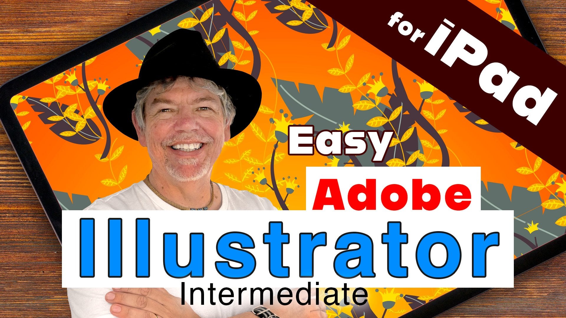
Transcripts
1. Illustrator iPad Advanced Course Overview: Hi, my name is Tim Wilson from Red Rocket studio and Adobe certified Illustrator instructor. And I would really love to help you to learn illustrator for the iPad. This course is the third part of my Illustrator on the iPad series. If you haven't seen the other two courses, there is a link to them in the class description or search within Skillshare for Adobe Illustrator on the iPad beginner, or Adobe Illustrator on the iPad. Intermediate will go through illustrator for the iPad from absolute scratch. And I'll explain all the concepts, tools, and techniques. During my 20 years of training, I've taught thousands of students just like you, from companies like Nisan Disney, Adobe, whether they were online courses or classroom courses. This course is designed for you in such a way that you'll first cover a section of lectures. And then at the end of each section, you'll have a project or two to work on. These projects will allow you to put the knowledge you have learned, practice in real-world examples. You'll get to practice what you've learned in showing that you are new knowledge is cemented into your memory, will work through everything in bite-size portions step-by-step. My goal is to help you have a productive, but of course, enjoyable course to help you to pursue your creative path. I can't wait to help you to learn Illustrator on the iPad.
2. Working with Color - Intro: Now, for the next set of lectures, we're going to be looking at color, everything from RGB CMYK, which you find your hex code. Now for some of you that will have just called wash of your heads. But don't worry, I'm going to explain everything as we go through. Of course, if you're already using Illustrator on the desktop, you understand that terminology. Feel free to just skip through some of these lectures, but don't skip the project.
3. RGB / CMYK: Now we have two main color modes in Illustrator. The one is CMYK, and that stands for cyan, magenta, yellow and black. And the other one is RGB, which stands for red, green, and blue. So see my K is all about print. You start off with a white page and you can see over here, I've got a white background in there. And then we've got our cyan magenta, yellow, and black inks that we use to print with. So if you're doing anything for print, we normally go with CMYK. On the other hand, if you're working on something for screen, we use RGB, which is red, green, and blue. Now on-screen, if you don't have any light, because that's what RGB is all about. It's all about light. If you don't have any light, then your screen is black. And then you add red, green, and blue, and a 100 percent of red, green and blue light gives you pure white. So the next time when you start off making a new document and you go to print, you'll find when you pick one of these, the default color mode is usually CMYK. If you go to screen and you click on one of those, the default color mode is RGB.
4. Spot Colors: So what about spot colors? What our spot colors, spot colors are for when you're printing, and they are specific inks. So for example, if you're printing up a brochure and you're using cyan, magenta, yellow, and black. But you might want a very specific tone of blue and it's got a match that color absolutely perfectly. What you would do is you would use a spot color when the printer prints, that will print up with cyan, magenta, yellow, and black, plus they will also use that particular blue ink. Now, how did we get to these in illustrator? Will, if you go to the colors and I've just got my fill color here. And then I'm going to go down to the swatches. In swatches, you find the terracotta books. So I click on the Color books, and these are the different color books that we have. So from various companies, the HK S over there, we've got lots from a company called Pantone and then down to true match at the bottom. So if I want to use one of them, I can just go in and pick one of those. And this shows me all of my Pantone colors in there. Now, should you be using pen towns? Well, it depends. And if you use patterns in a job, bear in mind that the printer has to then use extra inks along with CMYK. And those things are going to cost you more money. So it means that your, your colors can be very accurate. If you've got a particular brand colors that you need to be perfectly accurate. But from a printing perspective, it's going to probably end up costing you more if you're working with CMYK plus your spot colors.
5. Color Wheel and Sampling: Now let's have a look at the color wheel. If I click on the fill, no stroke, I've got right at the top, the color wheel. If you don't see it, just click on the little arrow to the left of it. And it's fairly simple. Around the outside we have the huge is the color on the color spectrum. And then on the inside, we've got saturation over to the right and lightness and darkness going up and down. And basically just pick your, pick you shade in there. But we've got black and white in there, and we've got none. But the top right over here, we have got a color picker. So let's go and find some colors from something and pick them. I'm going to use a photograph. So I'm going to go across to this little tool right here. And this allows me to import, I can import from the camera, I can import photos, I can put files, count documents, often Library. I'm going to go to photos, which is just going to go into my photo app and Dropbox. And I'm going to take a photograph or get a photograph from there. So let's say that I'm doing a document and I really liked the colors that are in here. Well, all I've got to do now is to go along to my solid colors and the color wheel. I can use the little eyedropper. And now I've just got it, grab it by the middle and move it around and you can see it sampling whatever color I go over. So I move it over there and I've got that really nice blue. Now I can go to my swatches and I click on the plus in the swatch, it adds that blue in there. Let's do another one. I'm going to pick a few colors here. So I'm going to get some nice creamy brown color from the rocks. And once again, add that into my swatch. And we'll go with one last one bit of the sea green in there, lightest green. And once again, add that in. And if you have a look, these are the colors that I've got. I've got the sea green there. I have got a let's do another another shape. Over there. I picked the rock color and last of all, copy of that. I've got my blue from the sky. So nice quick way of just guessing. Colors quickly form an existing image.
6. Library and Capture: So let's have a look at the very bottom area of the color section. We've got swatches and then under that or in that we've got color box, Pantone colors to match, et cetera. And at the very bottom, we've got libraries. Now within libraries, we can then go to colors which are shared between our desktop version and iPad. And if I didn't click on one of these libraries here, you can see I've got some colors from my library, from the desktop. And we've also got themes in here as well. Now, if you're not using Illustrator on the desktop, um, you can still use the libraries and there's a great app that works with it. So this app works with it's on an iPhone or whether it's on Android phone. It's from Adobe and it's called Adobe Capture. Now it is a free one. But what happens with Capture is you can then either use it on existing photograph, which is what I've done here. Or you can actually do it live with the camera itself. And you can see in here what it's done is it's showing me all the colors in that image and I can even move them around, but it's making up this little set or palette of color. Now the great thing about this is when I click on the Okay button, it shows me the value of those colors. And then from there I can save it into my library and I can pick it up writing in here. So really with doing this, some other interesting things about Adobe Capture, you can use it for identifying typefaces. So you could point at a building or a bit of packaging you like the typeface off and they'll give you an Adobe equivalent for that particular typeface. This also sorts of other things from patterns to identify bits for, for your art and right, great piece of software industry. Give it a go.
7. Swatches: Let's have a look at the swatches. So in here, I'm going to go down to my swatches. And we can add new swatches in by clicking on the plus. We can also view our swatches either by grid or by ListView. And if you want to edit a swatch, just click and hold on the color that you want to edit. Click on, Edit up there. And who open up an editing window in here. And we can rename the swatch. We can change it from process color to spot color. We can make it a global color. And we can go to Color Mode and change that to RGB, CMYK or hex, whatever you wish, and that will affect your color sliders. So we can just adjust how color in there and click on save.
8. Global Color: So what about that global setting? Well, in here, I've got the blue, the rather large blue spots, right, put around two squares, put around, are set up as a global color. What that means is that I don't have to select them. If I go into editing that blue and I'll click on edit in here. And I change that color change at her bright yellow and click Save. It will update that color wherever it's been used as in the document. If you don't have global setup, it won't change those colors and you'd have to go and change them manually. So sometimes can be really useful. Sometimes. Well, if it's knowing if you've done it without realizing it.
9. Gradients: Let's have a look at the gradients. I'm going to call square on my art board. And I'm going to just select it with the arrow. I'm going across to my solid colors. But just to the right of that it says gradient. So I'm going to click on gradient. Now to get the gradient to pair, I just choose one of the three gradients along the top, we've got a linear gradient, a radial gradient, or a free form gradient. I'm going to click on the linear gradient every day. You can see immediately I've got a gradient in here. Now, if you're used to Illustrator on the desktop, you'll be very used to this way of working because what we do is in the little line, we can grab one of those points and move it around. We can grab the other one and move it around. Move them closer together or further apart. We can also move the center so I can move the yellow more towards the orange side or vice versa. What about if we want to change the color? Click on one of those little dots and go in and pick your color from your color wheel or your swatches. I'm just going to pick a purple over there. Let's go to the other side. Click on there. And once again, I'll choose a color from the swatches in like sir. So with these simple gradient, you just move them around. When you want to save it. You just go down to the swatches and click the plus to add it to your swatches.
10. Radial Gradient: Let's have a look at what we can do about adjusting the tellers. So again, to go into the gradient area. And if I click on one of these endpoints, I can then just really easily change the color as you saw in the last lecture. But what about for wants to put in new colors? Will all have going to do is to click to add a new color in. And I can pick the color that I want from their same again, click and add a new color for that little spot. Let's try that again. Back so you don't want to color. Well, it's kind of obvious, ready, there's a little bin day. So I can just go along, click on the bin and remove the color for those ones in there. So nothing needs to do. Move it around. What about the next one? Well, the next ray, a gradient is a radial gradient. Click on that. You can see we get a radial gradient in here. Once again, I can change the size of the gradient and angular route. Now you might think, why do you need to Angular round if it's a circle? Well, at because of the other little circle or dot here. If I pull that in, I've now got this more elliptical shape for my gradient. And once again, I can just adjust the colors in there. So if I've made a gradient and I then want to save it out, all you have to do is to go back to your normal swatches. Click on plus, and it adds the gradient into your swatch. Me go back and do a radial one. Once again. Add that in.
11. Freeform Gradient: So what about the free form gradient? Well, I'm going to click in the Gulf Coast my gradients, and I will click on the free form. It's make sure that we've selected first. By the way, if you want to pull those colors out, if you don't like them, the left-hand side just drag it by the top and you can move them around as little panel. So int my gradients over to the free form. And you can see what we've got is at the top right is a little gray dot and the bottom left is the sort of golden color that I had. I can move those around and I can also change the color on them. So I can go to this gray one. And once again pull that around and adjust its color. Let's make it orange. Outside of the little dot, we've got a circle so I can pull that in and out to get that Dr. effect. A greater or lesser area stood on here and I could pull this out like so. That's okay. But let's add another coloring. All I've got to do is click. It adds another dot and we can choose a different color. Once again, I can pull this around. Honest, you just have hours of fun just playing with the colors in here and moving that little circle in and out. It really is as simple as that to use the free form.
12. Gradient Transparency Blend: I'm going to use a gradient for the social media posts that I'm creating. So I've got not board, which is 1080 by 1080 pixels, which is at the moment it's gram sides. And I need to bring a picture in here. So let me go along to my files and I'll just find the picture that I want. That's looking kinda cool. It's making a little bit bigger, unfortunately, too big for my art board. So what I'm going to do is I'm going to take a rectangle, put the rectangle over him. I'm going to hold down my main button there. Primary touch. To make a perfect square. I'm going to select both of those items. And then I'm going up onto the right-hand side to the Object menu and say Make Clipping Mask. So it just clips it to the size that he is. Guess right in the middle of day, it looks kind of like that old Polaroid style. But what I want to do now is I'm going to use a gradient on and I want to get a gradient to fade into a solid color at the bottom, but we can still see his face. So I'm going to, first of all, find the color that I want to use for this gradient. I'm going to go into my colors. I'll move it off to the side here because I can. And I'm going to use my eyedropper tool and I'm going to eyedrop the area that I want, the color I want, I'm looking for something. I think that's quite nice and I shade over there so I can add it to my swatches. So let me go and draw the shape that I want to use. I'm going to have a shape that's going to go over the top there. And we'll just move it down a little bit like that. And then that's the correct color. I'm going to go to gradients. So for my gradient now I'm going to use gradient. And you can see I've got that color over there and it's going to purple at the top. I'm going to choose the same color for the top and the bottom. And then for the top of my age have selected that. I can then just pull that down to 0. Just drop this down a bit. Every day. We just get a nice gradient, which takes out the little detail at the bottom. So I can then use that for text. Let's try another one, slightly different this time. So I'm going to go along a bit to make a new document once again. And I'll use a website, web size this time. So 1920 by 1080. And I'm going to go portrait and landscape for that. Let's click on Create. I'll bring my picture once again, same thing. I'll go and find the image and mines in my downloads. And we'd put my picture in there. Let's make it just a little bit bigger over here. And for this one, let's do something really interesting. Let's put a color of the top. But this color, once again, I'm going to use a gradient. But to go in, choose a gradient and I'm going to have two colors. So let's get this one to go from sort of purple on one side. And that's going to go the gradient once again. So we can have purple. And I think we'll get it to go into blue. Gonna go into blue color over there. All right, we have to move that around. Maybe something like that. So what can I do with that as well? Well, rather than just changing the transparency which I could do, I'm going to go across to my properties and I'm going to change the blend mode. So these colors will blend with the image that's underneath. And you can see when I start to experiment with these, I get very interesting results from the ready different colors coming across the top. Let's go down to soft light over there, which is actually looking kind of cool on this. Or my favorite, I'm going to go right to a down second for the Muslim, which is color mode. In the end, it just adjusts all those colors in the document and colorizes of them with the colors that we're using on our gradient. Now, of course, because I'm still in the gradient, it means I can go back at any stage and go, Well, let's move that down to there, and let's try and see what we get if we change that to yellow. And you can have as many colors as you like. Give it, we've got, it's fun. You could get Tokyo the top and enjoys really.
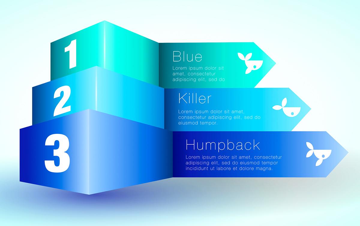
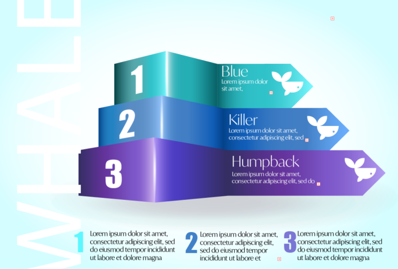
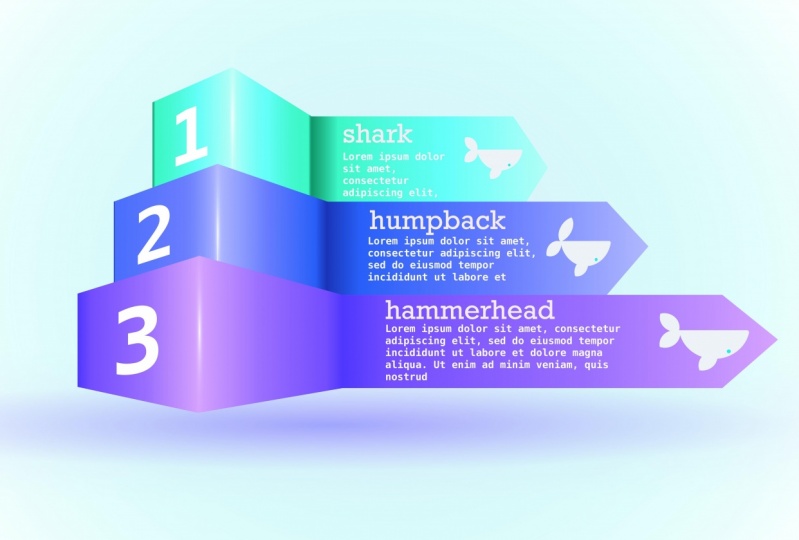
13. Create a High End Infographic Project Overview: I've got such a good project. This is one of my favorite projects to do. And we're going to do an infographic. And it looks really, really cool. And it's surprisingly not as difficult as you think. Bear with me.
14. Project: Part 1 - Introduction to Infographic Project: So this is what we're going to be creating. It looks all 3D, but it's actually an optical illusion. They are just flat shapes, but we're going to be using so many gradients. Gradients for the errors themselves, gradients for the hundreds, gradients for the shadows. And we're gonna do some texts stuff as well to get the text to serve skew itself around. Anyway. Don't be to put off by the complexity. It's actually a lot simpler than it seems. Anyway, let's jump straight in. We're going to be doing this bit by bit so that you can see exactly how it works and follow along with me.
15. Project: Part 2 - Creating Colors: So let's get started on this awesome infographic. What I've done, rather than you sitting watching me all the time doing it slowly, is I've made up some colors. So if I go to my color area here, you can see my swatches. I've got various new colors, and my colors are three sets of colors. Man, a fairly subtle, very similar colors. But if you want to, you can go with totally opposite colors. You'd have oranges and purples and greens or whatever you wanted. But what we do want is we want four shades of that color. So over here I've got the sort of sea foam green and aka for shades of that, I've got four shades of blue, purple, and I've got four shades of blue down there. You want to going from dark to pretty light. They don't have to be perfect. All of them just as long as I roughly roughly correct. Now, one thing that I do like to do is I don't just change the lightness of the color. As I'm, make it lighter and lighter, I often move the color along the color spectrum. So for example, here, if I click on this sea foam, you'll see that over here it's on the sort of the greenish area up there. If I click on this color, you notice it's moved slightly more towards more green. And it just gives you a sort of an interesting twist on the gradients that we're going to make from this. So before we move onto the next lecture in this project, if you'd like to make yourself up three sets of four tons each, as I've done here. Once again, use my colors, choose your own. It doesn't matter if you need some inspiration. Just Google infographic arrows, and have a look at the pictures and see what people are doing cutaways in there. Of course, you could use your smart phone if you've got Adobe Capture on that.
16. Project: Part 3 - Setting up Gradients: So now that you've got your colors, let's make some gradients. I will do them onto a shape. So I'll just make a shape like that. Now I'm going to go across to my gradient and I'm going to choose a linear gradient for this. So now I'm going to my gradient and its start over here. So on this point here, I'm going to be using the darkest tone. And on this point here of the same color set I'm going to use in the lightest tone. And then just in a little bit here, maybe about, oops, we've got 10 percent in. I'll click in there and I'll use the medium dark tone. And then over here in the middle, I'll have the semi light tone. And that's what I want from the gradient. Now, once I've got that gradient, I'm going to click on the little plus in my swatches to save that gradient. So let me go into the next one so I can now reuse this gradient here. So I'll start with the lightest. I'm going to have the lightest blue on there. On that side. The darkest of this sort of purply blue. Oh, now missed a bit over there. Sometimes you have to be a little bit more careful. Pick on the right area, darkest blue on there. This one here is going to be the next purply color, and this last one here is going to be that lighter blue. Once again, I'll click on plus to add it into my swatches. And I'll do the last one now. So you can see it's the same thing again, choosing the darkest tone. I'd like to do the darkest and the lightest over there and then I'll just work through the others. I think that's a correct one, yes. And this one here is going to be the second two darkest. Once again, click on plus to add it in. So I've now got three gradients in here. So there's this one here, is it's making a copy of that. This one here. I'll make another copy. And this one of the going from dark to light. And when you look at them, if they don't work together or you want to adjust them. By all means go in, make a change to them, and just resave your new Gradient. Get on with that, then we'll start building in the next one.
17. Project: Part 4 - Create the 3D Arrows: So let's get on with making some arrows. That's the exciting part. Where I'm going to do is I'm going to start off by making a rectangle, just how long rectangle, like that. And then I want to more squares basically, which are the same height. So I'm going to click on the duplicate button and I'm going to move this across. So moving the duplicate across today and you can see it lines up perfectly those smart guides of showing me that it's perfectly in line. And we need to make that lot smaller, maybe something along that line. And then I want another one of those. I'm going to duplicate that again and then move another copy across to them. Now the calendar I've got yet really doesn't matter. It's just so that you can see what's going on. We'll put the gradients on in a little while. What I'm going to do now is to double-click on this first rectangle. And cause, as you know, that takes me to isolation mode. So now I can use my pen and I'm going to click up in the middle of the end bit to add a point. And I'm going to use my direct selection tool, pull that point out. And that's what makes my little arrow in there. So now this is still a straight line and what we're going to be doing is we are going to get it to look like it's in it's got perspective to it and we've got depth and then coming up towards us. And I'm going to do that by using the direct selection tool and moving these points. Yes, I've selected the one-point of the one shape and 1 to the other. So I've clicked and dragged across to select those two points. And I want to move that point upwards. This whole thing of course, is just a trick of the eye to get that depth and shape. So I'm going to move that up. And you can either do it manually or you can go along to your Properties. And then you properties. I've got X and Y in there. If I click in y, you can see there I can actually move it up like that. And it was being very, very accurate about this one or be thinking of doing is putting an exact number in there. So let me do the same thing with the other one. I feel though we actually went see the other one, but I'm still going to do it because we sit on the very bottom one. I'm going to select that, go into why, and then we'll move this one down a bit. Like so. Now how much you want to do this really depends on you. And if you've looked at one it all, that's not enough. You just click it again and go and make a change in the right eye, kind of like what I've got there. So I'm going to stop at that point. And I want to have three of these. And we're going to be slightly different sizes. But for now, I'm just going to copy them all and move them down. We'll just pull that around a little bit. And then I can select the individual parts and say these three parts here. I'm going to pull them out like that. I'm going to do it again. So I'm going to select these three here. Copy them, move them down with a copy down. And we'll move this forward a little bit like that. And then same again, I can select these two and pull them out to change the scaling and you can do whatever you want. With that. Lastly, to change the length of these items here, we're not going to grab it and put it in like that because as you can see, it affects the angle of that era. We want to keep that error the same. So I'm going to double-click it. That takes me to isolation mode. Use my direct selection tool to select all three of those points. And then I can move those points in like that. Let me do that again. On the next one, I'm going to double-click into isolation mode. I can select those three points there and then move them in. And if, once again, if you want to be more accurate, you can go into your properties up here and you can just move them around like that. So I'm going to move that piton bit the bullet that back to the first one and make that smaller still. So I'm going to double-click, select those points there. And then in the, oh, wrong one in the x. That way, I'm going to go in and I'm going to pull those in a little bit. Like sir. Alright, so there's quite a few things in it too, to get going with. If I did go through it a bit faster than you'd like, just get back on this video and watch it a few times and try creating something like that. And then I'm going to show you how we're going to set up the gradients on there. And then it'll start to really ready come to life.
18. Project: Part 5 - Add the Gradients: So this is the exciting part. This is putting some gradients in. What I'm going to do is I'm going to start off with the one at the top and select it. And I'm going to add a gradient. So I think that like mine to be the green one at the top. Greenish. And then I'm going to go to the bottom one over here, select that one. Doesn't matter what order you do these in to be honest. And then there's this one here. Now this one I'm going to select, hold down the primary touch so I can select these two, rather just clicking and dragging over them because that was a match, select the other ones by mistake. And then that would be my mid gradient. Who miss that one? Mid gradient over there. Now the next thing to do is to get rid of the stroke on here. So we're going to choose a none for the stroke. And then we need to adjust these gradients so because they're not quite right. So I'm going to curse the top one up here. And I'm going to click on this middle box in the end, I want to adjust that gradients are going on to the gradient tool. And then the top that here, the selected at the moment. Just undo that. I think that should be lighter. So I need to then find the appropriate color in here. Choose the lightest part in the next one down here. I probably don't need that, so I'll just put it off. That cals absolutely fine there. But this one here really should probably be one of the darker ones like that. So i'm, I'm looking to kind of get the light part coming up to the point. Yeah. And then I'll do the same with the others. So I just worked my way through them. Once I've done those. I'll go to this last one here. And I think the down part is to dock on the same again, I will go over to the gradient. And then maybe for this last part here, which is selected the moment, um, I just choose the darkest color on the second darkest color in the Korematsu, even manually adjusted to taste and slacker? Yeah. Kind of like what I've got in there. Now, don't worry about this middle section here that you're not actually seeing that corner because we're gonna put something on there to give it a really nice shine shortly, but just have a go. Those are the gradients. And I've done a one. But if you want to do all three of them, and while you're trying that out, I will get these ones done as well. So be ready for the next lecture. Give it, give it a go. Be careful if you do make mistake, just treaty two fingers to undo.
19. Project: Part 6 - Build the Shine: So let's get some highlights going on here. And I'm going to do that surprising using a gradient. What I'm going to do is I'm going to make a new gradient. So I'll just do it on a little ellipse. And I'm going to do it right over here so that you can see what I'm doing against a dark background. So I'm on my elliptical shape there. I'm going to go up here and I'm going to choose radio. I don't want any of these little lamb controls in here, so I can just click on them and delete them. So that's good. This one here. Delete that one, this middle one. I keep missing it. What I'm really after is to have white in my gradient. So I'm going to just choose white for all of these colors. Are all of these points in here at May 1 happen wide. And this one here which is doesn't want to move there it is. So got white going out to white. So a white one. Now, what I'm going to do is I'm going to click on the transparency over here. And I'm going to change the transparency. I'm just going to take it to 0. So you can see what we've got. There is a great integrals from white to transparent. And then I can click on this little controller the top and pull the same. So what that does now is it gives me a shape which goes from white to transparent. If I put it on top of that, you can see what it's doing. And I can use that to make highlights. So I'm going to rotate it around like this. Let's move it over there as you can see it properly. I'm going to squish it down to make it really, really narrow and thin like that. Maybe pull it in a little bit like so. And that is going to be my highlights. So I'm going to put that right on the edge. Then we have this beautiful soft highlights on the edge. Now what I'm going to do is to take a copy of that and move it up for the other two. Now this one here unfortunately, is showing up on my shape at the bottom. So obviously I'm sure you've realized this by now. All we need to do is to take that and take it below that shape. Let's get one last one on the other one. And of course, if you make them even thinner still you find that you get a much sharper edge in the, pop that into the right position. So one mole. So I'm going to take this one, I'm going to copy it. And again to move it right up to the top, the copy up to the top there. And so and where it's covering the other one, I'm going to move it underneath. In my layers. Don't think I quite got it. This move, the right one. That's the one. And that gives us a really nice crisp edges. If you find that they are too crisp for you, will only have to do is to coach your transparency and reduce the transparency of them. Same again over here, I can just go in, reduce the transparency of those. We don't want people to go wow, nice crisp edges. We just want them to look at and go, Oh, that looks really cool. So lovely. Infographic. So have a go with those. Pop and some of them, and we'll come back. We're going to use a similar technique for the shadows underneath.
20. Project: Part 7 - Shadow from a Gradient: So the next thing I'm going to do is to create a background and then some shadows underneath my, my shape. And I'm going to be doing that with gradients once again. So I'll start off with the background. I'm going to draw a rectangle of my artwork. I'm going to go into my gradients. I'll be using a radial gradient for this. I'm going to pull this down. So that's kind of a bit of an oval, oval shape. And then I can go along to the parts of the gradient. This bit here, I'm going to change the color and I'm going to make it a lighter version of the colors that I've got this, I'm going to lighten it up quite a lot, but it's still fairly sympathetic. And this middle one here, I'm going to go with pure white. So it's going to be a very, very subtle gradient just with some lightness in the middle, going out towards the blue on the side. And then if I take that and move it right way down to the bottom over here. So sometimes it's difficult to grab these things and move them down. There we go. So it gives us like a glow coming out from behind. So what about the shadows? Well, it's going to be the same as when we do the highlights. I will make an ellipse. And I'm just going to take the lips of their drawing my ellipse. This ellipse is going to go, What's going to have a gradient, first of all, which is a radial gradient. And it's going to go from a black through to black. I like to use black in my shadows sometimes, but sometimes I'll actually use the color of the shape as well. If I, if I want it to look like it's semi-transparent, but for the moment I'm just going to add black to black to show you the effect. Have you here, 0, get to the end of it and pull it in a little bit like cern. So there's my radio, radio gradient. I'll put it into that shape over there. So one side is going to be black, the other side is going to be black, but the outer side, the transparencies gauge be 0. So what this does is it gives us this very soft type of shadow which we can then place underneath. Now, it doesn't look very much like a shadow yet, but bear with me. So once I've got that in there, I just want to have feel a very rough feel that there's darkness happening. So I'll go over to my properties and I'm going to change the opacity of that entire area. So just darken it down. I can maybe bring it out a little bit like that. You'll find sometimes that it's also useful to go into your blend modes and change the blend mode to multiply. So that gives me an overall shape. But obviously this still, well, it just looks like it's a dark area underneath. I want these to look like they're floating prevalence and color underneath as well. So what I might do is make another one of those. So I'll just copy that one. And this one, very difficult to see it and know. So I'm going to change the opacity back to 100 percent. This one, I'm going to use some of the color that's in our arrows. So I'll start off and go to the middle here. And let's go with purple color in there and the outside. Let's go through the green color in there. But I'm going to reduce the transparency on the outside one once again down to 0. And that gives us this lovely sort of shade of blue going out to green. Once again, I'll place that underneath there. And now you can see that almost floating. If I move that up today, I might have to change the size a little bit in their posts around and drop down the opacity. Just sitting just under there. You've got that sort of floating feel. And you can just play around with these gradients, as many of them as you like to just lighten and darken areas, highlight and highlights and shadows. I could keep going with a few more to get more of a field, but I'm going to stop right there, have a bit of go with that. The fiddly, but it's so worth it.
21. Project: Part 8 - Add the Icons: First of all, don't panic. You're not in the wrong video icon over to this project that we did earlier because I want to use the little whale that we created in the infographic. Now, if you didn't do this project, you can find it. It's in the Pathfinder project. Or you can just make your own little shape. So I'm going to copy that. So I'm going to go over here to the edit and choose to copy. And then we'll go back to the project over here. And before I go any further, I'm actually going to make a new layer. So I'll add a new layer in there. And then when I paste, I'm going to be pasting onto that new layer. Now, just that this looks a bit better and I can see what I'm doing. I'm going to name these layers. So this one here, I'll just name as arrows over there. And the top one, you just drag to the left to get to the editing. I'm going to call logos and text. Now, I've got this. Honestly, I can actually just start to break it apart and just take the bit that I need. From here. I'm going to lock my arrows less. I can't touch it by mistake. That's really important. So easy to mess something up without realizing. So I'm going to ungroup this. We click on the little ungroup button down there. And I don't actually need that rectangles. I'm going to delete that. This is what I'm after, this sort of fish shape here. It's still a group. And I can ungroup it again. But I want a few variations on it for the different types of fishes in here. I'm going to just resize it. Some hotel primary touch to resize it, make it a lot smaller. We'll move it over to the right position. And then I'm going to hold down secondary touch with a copy of it. Try that again. Here we go. Undone it. Finally. Let's do that again. I'm going to scale it down epidemic. Then I'm going to hold on my secondary touch. And I'm going to drag a, drag a copy and zoom into to do that, drag a copy over to there. And I'm going to drag a third copy across to them. It can move those interact position in a moment. But just that I have some different looking whales. And maybe I'll go into this copy here. And what I want to do is I just want to move his tail around a little bit. So I'm going to double-click on this part of the tail and then I can just move it down to there. And maybe I can double-click on the fin. And we'll give this one a slightly different or bigger fin which goes down there. This one's in the wrong place. By double-clicking, it just takes you into the isolation mode, right? Let's try this one here. So I'm going to double-click on that one. I'll get rotated around to that sort of angle. That's an angle there. And let's move it around to there and this one can come up. So I'm going to double-click that. Put that up there. And I think for this one I'm actually going to remove that side fun. So you got three slightly different looking icons. They're all based on the first one that we've done. Have a couple to go with that and then we'll put in some text finally, on this.
22. Project: Part 9 - Manipulate the Numbers: I've added some texts in already, and these are just little textboxes. I just went to my type tool over there and I clicked and drag to make little text box. It automatically fills it with Lorem Ipsum texts so you know, your client or whoever you're creating for the can go and change this later on. And I've just put a few of those in. I've put some numbers in as well. These numbers, as you can see, are just what I just typed them straight in there, just large and with slightly different colors on them as well. I do want to do one last bit of a bit of text along the outside that I'm going to put some numbers on the boxes themselves as well. So I'll just use my type tool. And this time I'm just going to click once, put in the text the title that I like. So I'm going to have well, and it's a bit on the small side, so I'm going to scale it right up and I'm going to change the typeface to something which is fairly heavy. And you might type options here. I'm also going to make it all caps. And I'm going to rotate it round. And I'm going to hold down my in a so-called the primary touch so I can rotate it to exactly 90 degrees. And I'm going to put this over here on the edge. So, and then I'm gonna make it white, I think so. It will be almost invisible, but just enough so that you can sort of get the idea that there's a whale text in it. It's more graphical than anything else. Now, the next part, and this is the one that's quite difficult and will not difficult. It's difficult to figure out to be honest because it's an easy thing to do in Illustrator on the desktop. I want to put some text on my shapes, but the top two need to be slightly skewed. So what I'm going to do is I'm going to do a bit of texts. So in fact, I'll just use one of these over here that I've got. You're ready, I'm going to copy it. So I've got the number in there and I'm going to make it a little bit larger. And I'll copy it again. So I've got one for the number two. And what I want to do with this is I want to angle it around. So I'm going to actually, and this is really strange. I'm going to use the pencil with a stroke and I'm just going to drag a little line at the angle that I wanted to be at. And then I'm going to select both the text. It's contour outline. Overdamped both the text and that shape. And I'm going to go over to my type. I'm going to say type on a path. So it pops it on the path at an angle. But how they had targeted to go straight? Well, here's the trick. When you go into type on a path and you got your properties down the bottom, you can change how that type sits on the path. I've got rainbow at the moment, but I'm good to go skew, which would then stand the text up straight. So now if I just change my type to bite, it should look correct. Maybe my part wasn't quite right. But that's okay because I can always zoom into that path over there. And if I adjust the path selected again, you can see it'll adjust the text. So let me just run through that again because it was a little bit tricky not do this with this one here. This is going to be number two. So I use the pencil because it's the fastest and I have got smoothing set to maximum. And I'll just draw a line at the angle that I want this to be at heavy here. And then I'm going to select that. And I'm going to hold down a primary. Click on the number to go to type, type on a path. And because the wrong angle we go down in our properties to, instead of the rainbow, we're going to choose skew on there than the right position. You write down the x, so almost must cover up. And I will just select that text and make it white as well. And then the number 3, we'll just go straight, straight on there because it's it's not particularly skewed that way. So I'm just going to pop it straight on. So I'm going to just copy it over there. Make that white and scattered up a little bit. And I'd love to go on. But on the large cyber hit the general, the general idea with that. So have a go with those. I think we're just about done now. There's a few bits and pieces that you can add in some more text if you want to put in new more logos, anything at the top? Just have so much fun with this. And this is the basis of a lot of the arrows that you see in infographics and not just normal arrows. These are fairly heavy duty arrows. So you've got this far. Congratulations. Absolutely brilliant. And just enjoy it. Illustrator is so-called.
23. Type Overview: So onto the type. Type is very similar to the desktop version. But a few of the bits and pieces they use, the terminology they use is a little bit different. If you haven't done any type of phone, you've got no idea about these things. Don't worry. I'm going to be covering all of it in here.
24. Type Basics - Point vs Area: Now working with text in Illustrator on the iPad is very similar to working with it in the desktop version. They do, however, changed the terminology a little bit. So you'll find that we have a line spacing rather than letting and things like that, which to be honest, make a lot more sense. Me show you how it works. I'm going to go down to my type tool and I'm going to click and drag a little box and it immediately fills it with Lorem Ipsum text, which is just coupled to me. And if I were to just select that text, I've just clicked a few times in there using my pencil. So you've see if I can click, I can select it all. And then I'm going to delete it. So the keyboard's come up. I'll just press Delete. And I've copied some takes from the Adobe website. So I'm just going to go to my edit options and just paste it straight in. Now, the text box that I've got, yeah, I'm going to use my arrow and put it around. And you can see that this box now scales and the text just flows within it. So if I go over to the Properties panel now the properties panel is near the top. You can see if I click in there, it opens up the properties. I've got some text properties here. And the first one I want to look at is the container that has the text in it. And that's this little one down here. So you can see I can go between one on the left and the one on the right. Now, when you look at the text looks pretty much the same, but look what happens if I get to the left. Now when I drag out the text, it's constrained and it changes the size of the text box. Forget the one on the right changes the textbox, but the text flows within it. Now you'll notice from Illustrator on the desktop as area, type and point time. What happens if I lose some text in there where we get a little red plus on the bottom. And if I happened to go back here and click on the other container, it actually says converged point type but lost text outside the text box. I'm going to use my two fingers to just undo that in the pelvis down into the red disappears. Due bit of a go. Just get used to the idea of point type and area type. And then come back for the next lecture and we'll take it on to the next level.
25. Rotating Text: So what are the differences are there between point type and area type? Well, if I'm on the one on the right-hand side and I rotate my textbox, the type remains the same. So I'm do that. If I go to this one here and rotate, it will rotate the text as well. So if you do want takes on its side, remember to change between these two.
26. Fill and Stroke on Type: Let's add some point type in. Now, before when I was clicking and dragging that was area type, this time, good to do point type and to do that, instead of clicking and dragging a box, I'm just going to click once. And that's ads in area type. But remember we can always change it in the text container down the bottom. So I've got my type in there. What about changing the color? It really is as simple as going to your fill to change the fill color of your text. And if you wish, you can go over to your stroke and you could add a stroke to the type as well. It's a yellow stroke in the dock. Going to see that, to be honest. So I'm going to go to my fill and I'm just going to choose none which will leave my text as now applied. So remember, if you're bringing in point type or area type, you either click 4 type or click and drag for area type, but you can change them later on.
27. Font Size and Line Spacing: So let's have a look at some of the options in the property, starting right at the top with the typeface. If I click inside the typeface, we've got a number of Adobe typefaces in there already. But the great thing is right at the top, there's a little plus over there. And you can add your own in there as well. You just click on the plus, find it on your machine and it'll go straight in. The next thing I want to look at is just down from that, and that is the text size over here on the left. So I can just click on the text size and choose different point sizes. If you're not sure how big points are, there are 72 points in an inch. So half an inch high text when it's printed would be 36 points. To the right of that. We've then got something what will, in Illustrator on the iPad, It's called line spacing, but in the desktop version it's called lading. So if I click in there, I can change the leading or line spacing, whatever you want to call it, the distances between all of the lines.
28. Kerning and Letter Spacing: Moving down, we have got the tracking, which is the distances between the individual characters, or the kerning, which is the distance between individual characters. Let me show you what I mean. If I went in between the I and the p.band on iPad. So I'm going to click a few times and click once to select that area there. Don't need this keyboard. But in my Properties, I can now go to my kerning. And I can adjust the kerning between those characters and move it closer together or further apart. Well, if I wanted to do this over a number of characters I could select, for example, I just double-click to select the word Illustrator. And then to the right of that, I can go in and I can change the tracking. And that's the distances between multiple characters. Usually with tracking, you don't want to change it on normal body text. It's great. On large text. It gives it that amazing cinematic feel. But on body text it just makes it difficult to read to be, to be honest, the only time you might want to change it is if you want to adjust your text slightly because you've got things like widows know for instance, you want to get rid of.
29. Widows and Orphans: So at the end of the last lecture, you might have been left wondering, what on earth is he talking about widows and orphans? What is that? Let me show you. So if you've got some text and maybe make this text box a little bit smaller. You can see that there are two words that are sitting by themselves. So one is mark and the others message at the bottom. And it looks a little bit ugly. So in order to get rid of those and that's what wouldn't know things are the way would sit by themselves on the line. I can either change the width of the column that they're in. Or I can go over to my text options. And I could go to my, it's also called letter spacing, but we normally in, for example, Illustrator on the desktop, we refer to it as tracking. And if I change my tracking, you can see I can get those to just come back depending on what I'm doing or disappear. So that's it. There's no fins are just little word that said, oh, by themselves.
30. Text Settings: So let's have a look at the last options here. In the text area. I can choose to have things, all caps, small caps, underline, or strikethrough. If I want to adjust the height and width of characters, I can actually go in. And let's just take the word Illustrator. And I'm going to go back into here over to where we found the original font. And I can then choose horizontal or vertical scaling in there. Just click on that again. Moving down to the bottom, we've then got our paragraph options, which is left, right, center line in there. Now, what else could we do? Well, if I click on the Type, you'll see that there is a little contextual display that appears. And we put some type options in there. Now with text which is point type like this. The option I've got is to show or hide the keyboard. If I go in to the next one, I can then change the text size. And then over here I can go and change the letter spacing, which is also known as your tracking. Now the next one's not gonna make any sense at all because I don't have any multiple lines. So let's go down to this area type over here. And on the area type, I'll go to the fourth one along. And that's my line spacing, which is my lettering as well. Use whichever method works for you.
31. Type on a Path: So let's have look at type on a path now, especially fooled the Illustrator on the desktop users. You're going to be surprised because when you go into your type, over here, we only have two kinds of type. We've got horizontal type and we've got vertical type. And vertical type works in exactly the same way as horizontal type, except it goes downwards. So ways type on a path. Well, this is the way that it works. I'm going to make my path. I'll use the pen and I'm just going to put a stroke on here. You can use a pencil any tool you like. And I'm just going to click and drag to make a path. And I'm going to put the text in that I want to put on that path. So I'll use my type tool. And I'm just going to click once over here and pop in a quick bit of text over here. Right? So how does it work? You select your text, you select your path. You go over to the right-hand side to the type options and you can see it, the type on a path. Click on that, and the type will jump straight onto the path. And then very similar to illustrate, the type is sitting in the middle because my paragraph option is set to the middle, but I can set it to the left or to the right-hand side by just using the paragraph options in here. Of course, if we have set it to the middle or left to the right, we can still grab the ends and just move it around. Once again, as we would do in Illustrator, if you put it underneath, it will go underneath your path there. So I've just put it above to move it above the POS, see the little red thing appears with some myText is missing, I just need to put it out. So when I click off of it, the path will disappear. If I selected again and go back to the type options, I can then choose to edit the path. And I can adjust the path. Oops, better. And my type will adjust. At the same time. Have been for go with it, make path, make the text, and choose type on a path.
32. Outline Text: So I've got some type in here and it honestly doesn't matter whether it's point type or area type. What I want to do is I want to make it into outlines. So why would we make something to outlines was two reasons. One is that we can actually individually edit the shapes. The second reason is if you are sending a file with editable text to, let's say the printers, for example, they would need to have that typeface on their system in order to do anything with that piece of artwork. And they need to by the, by the typeface in themselves. You can't just send them a copy of them. Remember, type is a copyrighted item. So by making something into an outline, it means we can send this over and we don't have any issues with having to send fonts as well. Well, let me show you how it all works. I've got my Type selected. I'm going to go across to the t on the right-hand side and choose outline texts. It really is as simple as that and you can see it's made it from editable type into a whole bunch of shapes. Now, if I want to, then I could say, I could select these points, I can move them around because this is just purely an editable shape. Now, let's click out of that there. So do try to add. You can do some really wild stuff with your text using this method.
33. Social Media Graphic Project Overview: We're going to look at doing a project and using some typing and we're gonna put type around a path can make type into little logo style. And we're going to do it as a social media post.
34. Project: Part 1 - Introduction to Social Media Graphic Project: So this is what we're doing for the project. For type. We're going to take an image which I'll give to you. And we're going to put some text over the top and some more text at the bottom, making the text the bottom always whose brand like, logo like. And we'll create that little para glider right at the bottom as well. And then I'll give you a little bonus at the end, we'll change some colors on this too. But jump right in. This one's going to be fun. We are creating something for Instagram. So yeah, moment you've done it, pop it on Instagram.
35. Project: Part 2 - Setup Document and Import Photo: So let's do something for social media. I'm going to create something for Instagram, which at the present time is 1080 pixels square, optimum size. So I'm going to go and create a new document. And I'm going to make it 1080 square, but I'm going to say that as a preset. So over here, I'm going to go to an existing one in screen, which in this case is 1920 by 1080. And I'll just change the 1920 over here to 1080. So that's going to be square. And then down the bottom it says save the size. I'll click on Save this size. So I've now got a version of this saved in my saved options. But unfortunately, it does say your web 1920, I'm going to call this 1080 square. Let's click on Create file. So what I want to do with this is to bring a picture in the background. And then we're gonna put some text in there and we're going to use some of the options that we've done in the last set of lectures. So I'm going to go along here and I'm going to go to Files. And this file is in your assets. It's the parent lighter if you want to use it. Once again, you can do what have been put a view like. And I'm going to go up to my layers and I'm going to lock that layer so I can't touch it by mistake. So let me stop this. If you'd like to get yourself a picture in a, or this particular picture, and then come back for the next lecture. We'll look at putting some text. I'm going to put some text over the top of the para glider.
36. Project: Part 3 - Type on a Path: So we're going to use type on a path. So I'm going to make my, my path first and I'm going to be using the pencil for that. You can use the pen if you are confident with it. Absolutely fine. And I'm going to go along and I'm just going to choose a stroke, no fill. And I'm going to draw the shape around here now, you can see that I'm getting quite a nice circle around their necks because my smoothing is set really, really high. So once I've done that, I can then go in and I could do my text. So I'll just click over here and put in the text that I want to go in there. I'm going to select that and put in some type here. This, Let's have adventure begins today. But I'm happy with that. Now, in order to get it onto the path, what I'm going to do is to just select it and select a path at the same time. Easiest way to do that is to click and drag across both of them. Now, if you've locked you picture, this is not going to be a problem. You haven't locked you picture, you end up moving your picture. So do Lacayo. You fetch graph first. I'm going to go along to the t on the right-hand side, which is the type options and just say type on a path. So my type is come in on that path and I'm going to do a few things to it. I'm going to go up and choose my typeface in here. And it doesn't really matter what you choose for this particular example, but I want something which is fairly bold. Similar para gliding is a bold sport. And, and then I'm going to also increase the size a bit over here. So we'll click on the size. Try that again, click on the size and adjust the size to make it a little bit larger. Now I'm not going all the way around to the end because we don't want to be too huge. But what I do want to do is to actually then change the distances between all the characters, which is normally known as letting go in here and let us spacing. So I'm going to click down here and just increase the letter spacing in the insulin goes all the way around. Now I think I'd like my type to be white so it can be seen fairly easily. And I'm also going to go along in here, right way down to the bottom and change the opacity. So it's not quite so in your face. And it's because subtle in the background. Now, at any stage you could go to that line and you can adjust the line, use your direct selection tool. You can move the whole thing around if it's not quite in the right place, either. Like that on a, on a semicircle. Even though the, the kite itself is kind of a slight flat top because of the angle. Right? Once again, if it's not quite in the right position, just feel free to rotate it around until you feel happy with it around, until you have a go. And we'll come back and we'll do some tiny little logo very quick and some text to the bottom.
37. Project: Part 4 - Create a Text Logo: So while you've been away, I've just put in some text in there. Same para gliding. Just such genetic. Watch me do it all, you know, attitude, text. And what do I need to do is I'm going to put in some more texture in here because I want this to say Oxford parallelizing school. So what I'm going to do is I'm going to just use this bit of text here and I've set up the typeface in there and all sorts of things. I'm just going to copy it to duplicate it. And then I can very quickly just go and change that to whatever I want. So I'll have Oxford in here. And now I'm going to just take that bit of text and reduce the size. So that's kinda, kinda go over there. And then I want the same thing underneath which says school same size. I'll use the same bit. Duplicated. Move that across. And going to change the type in there to say SCO. One last little thing that I'd like here is a kind of a little logo or icon type of thing. And because of the whole look of the para glider with that lovely curve, I'm just going to do something really simple. I'm going to take two ellipses. So I'll make my first ellipse like so. I'm going to make it perfect circle. I'm going to make a copy of that. So I will just copy it by clicking on the Copy button. And I'm going to pull the copy down a bit so you can kinda see the shapes. I'm going for that, that crescent shape. I'm going to select both of those, go across to probably the tool that I use the most in Illustrator, the Pathfinder and minus the front. And then we'll convert that to a path. And here's my little shape. So I'm just going to take the size down a bit over there, rotated a bit that's coming in into this oops, jaunty angle to jaunty. And we'll just reduce the size of that a little bit so I can pop that over here on the P. So much easier when you zoom in. Now of course, I might want to move all those around, so I'm going to select them all, group them together. And it's easy for me to just move that whole thing around into the right position. Now, if I feel that I've got everything that I need from that, all I need to do is to go to the top, click on the Export button. I can go to publish settings, and I would save that as well. I'm just going to go with the PNG file over here. So I can then export that to wherever I needed to be exported to. Right? We'll stop there. So have a good putting some texts, try a little bit of a logo, and have a go at creating a few of these items in here. And don't forget, finally, his bonus. If you need to make some variations, just take a shape. Put the shape over the top, change the color of the shape in there and it's to a blue early morning version of this. And then go into your properties. Down here. In the Blend Mode, change it to color mode, and you can get a variation on the color. And even then you can still click in here and you can just try different colors and see what works. Oh, that's quite nice. I like that. You have a go with it.
38. Importing, Exporting and Saving Overview: Well, this is the last set of lectures and this is going to be about exporting and importing. And also very importantly, working between Illustrator on the iPad and Illustrator on the desktop and how you can work between them. So when you finished, don't stop. I've got a surprise project for you at the end, which you'll see when we get there.
39. Import Photo Files: So when it comes to importing bitmaps pixel images into Illustrator on the iPad. It really is very simple. Go through to import and you can choose from either photos or files to bring them straight in. And it really is a matter of just clicking in the choosing what you want. And it will appear on your desktop as a bitmap and we can then resize it in there.
40. Import Layered Photoshop Files: So let's have a look at importing the Photoshop file. As you can see, I've got a Photoshop file here. This is done on my desktop. And it's quite a few different layers in their sockets and texts layers. And I've got some shapes and I've got some bitmaps. Now, I have used a typeface or font in there, which is not available on my iPad. But you can see what happens if I use one which was available. It would be absolutely fine on the iPad. But let's have a look. So I'm going to go along to the Import menu in the tools. And it reads Choose Files. And I'm going to choose the file that I want. Now, once I've got that file, it opens up this little Import Options window and it says, understands this layers and they don't convert into objects, would you order flatten them down? So of course, I want to keep those layers so make this editable as possible. I'll bring it in and here's the final result. Now, as you can see, the text is showing up with pink in the background, which means that the typeface that it's trying to use isn't available on my machine. So I can go to my layers and I can even click on that and just update to something else for activity as it is. And the other thing that I want to show you in the layers are these little question marks. Question marks with two vector shapes that I used in Photoshop. And Illustrator at the moment doesn't support those vector shapes, even though they just a straight little square or rectangle that you could create in Illustrator on the iPad? No, it just be aware that there are different things which might or might not be supported when you bring in a Photoshop layered file.
41. Take a Photo From Within Illustrator: So what we need to do with the camera is we click Import and the camera. And this then directly takes the camera image through into your document. So that's my desk with my laptop there. So what I'm gonna do is click on the tick button and then click on Done. And there it is. There's the image straight into Illustrator.
42. Libraries: Now I'm going to use my libraries to bring in a few assets to make a quick poster. And anything that you've put into your libraries in Adobe Cloud, WCC illustrates a food shop, etc, will be available in here from vectors to bitmaps. Now what I'm going to do is I'm going to click in here. And I'm going to go to my libraries. And you can see I've got a number of different libraries in there. So if I went to my library, for example, you can set up various parts, bits of artwork in there. Let's have a look at a different library in there. And I'll go to this one over here with colors. And you can see I've got some colors in a different piece of artwork, et cetera. There are certain things, of course it won't work in here, especially used to saving out your styles into InDesign libraries. So bear that in mind. What will work in here and what won't. Yeah, I'm good to go and find a bitmap. So I'm going to go into my files first of all and just get my bitmap. And this is going to be my background. So I'm pretty much happy with exactly where it's coming top to bottom. And I will just lock that down. Now I want to bring in the picture that's going to go on top of that net gain to be a vector file which I created in Illustrator. But rather than saving to the Cloud, I put it into my libraries. And here it is, and it's quite big when it comes in. They were quite a few lines on there. Now, I could try and scale right up. All right, Our socket, see the whole thing and then try and move it down manually. Or I can just go over to my Properties, go into my width and height, making sure that they are linked. And then just take this down. I'm gonna take it down quite small, say about 500 in there. And you can see it disappeared down, so it's off the screen somewhere. So then I'm going to buy X and Y position. And I'm just going to put in, say 0 in there. This will just help me to find it and be a lot closer in there. We'll have 00 in there it is. And it's now easy to bring in. So if you lose something somewhere on the canvas, this is a nice fast way to work. Now of course, if I'm manually scaling this over here, I can scale it up and down by just dragging it and just make it a little bit larger. It is slightly slower because it is a quite a big file and it doesn't look it, but it's pretty large. So that's going to be the main part of my poster. And then I want to bring in my own little logo in there. So once again, I'm going to go back to the libraries. Because my library and I keep my logos in here, so I'll click on that, brings us straight in. And you can see now if I start to scale that it does scale all over the place. So just hold down your primary touch to constrain it. So it is totally vector. I can move that wherever I want. I'm going to place it over there. Now, let's say that I was looking at the snapshots, you know what, that red just doesn't go with the rest of this design. Well, because it's vector. I can go straight into my layers. There it is, levitates the top group. I can open up that group. It's a clipping group, and it's got another clipping group in it and another one and another one. And if I keep on going for long enough, eventually I will get down to the individual parts of the object. And I can click on the flames in there. And I'm just going to make them white so it blends in with the rest of the image. So last thing about this, what I want to do, well, I want to unlock my background. And I'm going to put a clipping mask over the whole thing because I only really want that middle section now with white border around the outside. So we select everything on there. And then once again, I go over to the right-hand side to the object panel and I find Make Clipping Mask in the end that will just mask out the whole thing. So very, very quickly just using assets from my library.
43. Work Between Illustrator on the Desktop and the iPad: So I'm an illustrator now. And what I'm doing is I'm just saving this document, but not saving it onto the computer. I'm saving it into the Cloud. And when it gets to the Cloud, it then means that I can then go into my iPad and I can open it directly into the iPad. So I'm I'm back on my iPad now. And as you can see in my documents, I've got cloud documents in here and there is my cyber wave. I can just open straight up. It's opening directly into Illustrator on the iPad. So we can work between the two, between one, we can open it up in the iPad, we can save it and we can open it up on the desktop version. I've got my jazz poster over here, and i've, I've saved that from the desktop version. I've opened jump in here, I've worked on it here. I've sent it back and change things in the desktop version as well. I'm getting us off very confused.
44. Save As: So you finish your artwork and what happens when you want to save it? Well, firstly, if I were to just close this like that, you can see it comes up in my recent but it automatically, as you know, saved it into the Cloud. If I go to your work over here, it shows up in in my Cloud documents. But if I want to save it in different ways, for example, I want to send it to somebody else they can open up in Illustrator. We'll then I go to the top and to the export options. Now first of all, if I click on Publish and Export, over here, you can see we've got various file formats that we can export it out too. If I choose AI, it will save it out, has an AI file, which I can then pass on to somebody else. Once again, I've got PSD files, PNG files, SVG, and PDFs. And all you have to do then is to click the Export button. And it says exporting. And it will ask me where I wanted to save that. I can just go in and save to my files in here, give it a name called this poster. And save that out. And that's then saved out. Wherever I've chosen to save it. It really is as simple as that, to save out.
45. Create Graphical Design - Bonus Project Overview: Well, here it is. I'll surprise project. What do you think? I'm going to take you through building this step-by-step. It's good to get on.
46. Project: Part 1 - Create the Circular Arrows: Let's build an infographic here and use some of illustrators, interesting tools. What I'm going to do is I'm going to start off by making a little elliptical shape. So here I'll do an ellipse. I'm going to just click and draw. I'm gonna hold down my primary touch to get a perfect circle. Make it reasonable size. And I'm going to click on this little double arrow there to go from filter stroke. Now, if I want to move this to the middle of the page because it's kind of slightly offset. If you go up to the right-hand side and you'll find there's an option here called a line. And the line option I can then just align things centrally in the middle of the page. Now the next thing I want to do here is to increase the stroke width. So I'm going to click on the stroke width button at the bottom in that contextual heads up display that pops up. And I'm going to just increase my stroke weight until it gets to the size that I want. I think something along that size looks good. Let's just change the fill color in here to something different. It really doesn't matter at the moment what color you do. Now, I want three of these circles, concentric circles just getting smaller and smaller. And obviously on the desktop there's ways of doing that very, very quickly by using your command D and scaling down using Command D. But in here, what do we need to do is I'm actually going to just click on the duplicate button down the bottom. And that's duplicated. That shapes are one is on top of the other one. I'm going to go up to the properties and making sure that the little padlock is switched on. I'm going to click on the width because at the moment the top object is selected. So I'm going to go up today and I'm going to just make that smaller. I mean, something like that would be perfect. I'll do it again. So click in here and up to there, and it's have another one. I love digital wheels on here that they're giving you. They just really, really pleasant to use, right? I'm ready to move on, maybe a little bit smaller there. So that's all very well, but those are strokes. I want to make them into objects. So I'm going to convert them into outlines. So I'll select all three of them. Now, let's have a look in the layers panel. What we've got, we've got those three ellipses in there. So I'm going to select those. I'm going to go over onto the right-hand side to the Object menu. And I'm going to say Create Stroke outline. And that's now made outlines of those strokes and effect. If you have a look in here, it's what it's made, our compound paths. So if you haven't used compound path before, compound path is where you could at least two or more strokes on the same object. I'd like to start to cut these things up. So I'm going to use another shape here. I'm going to take a rectangle. I'm going to draw a rectangle in. Now when I'm drawing, I'm watching out for my smart guides. Because when you use when you, when you re scaling, so I say your smart guides will pop in. There we go. Can you see it? I've got that horizontal smart guide. Missed it. But the horizontal smart guides are numb right in the middle that way. And if I want this to be perfectly in the middle this way, once again, There we go. Now, what I can do is I can select those four objects. And I'm going to go up to the top, to the, sorry, to the right-hand side. And I'm going to use the shape builder. And the shape builder will then allow me to just click on the bits that I don't want. That's it. Those are done. Not quite. I now want to cut some of those circles off at different angles. So over here, I'm going to go into my shape there. I'm going to just draw a little shape in here and I'm going to rotate it around. Now, I could choose when I'm rotating to rotate at 45 degrees. If you hold down the primary touch, if you can hold down the secondary touch, it gives you 10 percent increments. So the first one I'm going to do at 20 degrees over there. So I'll have the middle circle being all way around. This next one is going to be at 20 degrees. I'm just doing this by item and deciding where to, where to place it. But I'm kind of looking to see where to sort of fit perfectly on the line. And I'm now going to select this shape and that shape in there. And then once again, I will go to my combined shapes and I'm going to subtract or minus the front object. And then we need to go down here and we say convert to Path. Let's do another one. So I'll take a little shape like this. Once again, I'm going to rotate it and I'm going to hold down my secondary touch. I'll do this one to 40 degrees. I'm going to move that across until it fits in perfectly. That select both of those. Once again back to my combined shapes. And I'm going to use the minus front and convert to path. Right? The next thing to do is to put some arrows in. So four arrows I'm going to use, I'm going to make my life easy to be honest. I'm just going to use a little triangle. So I want a triangle like so. And I'll need three of them. So I'll press this twice, 1, 2. And that gives me, whoops. Zoom in a bit. Shown on the right, Move Tool 123. This one here is going to be at 90 degrees. I'm going to hold down the primary touch. And that's going to give it at 90 degrees. The next one here is going to go at 20 degrees. So hold down my secondary, touch it to 20 degrees. And my last one over here was 40. That right? Yes, I've got that right. Now. My collapse easier. I'm going to select both of those. Use my combined shapes. Combine them, convert to pass, send over here, select both those shapes. Combine, convert to path. And one last one here, combine convert path. Right? So the basic shapes are, are done. And the next section, I will do the background, put in some text and do some interesting colors with some gradients on here.
47. Project: Part 2 - Add Gradients and Logos: We've got the three shapes now let's put in some colors. Now, what I'm going to do is I'm going to use gradients. And to make a gradient, if you make a little shape like that, you can go across to your colors, my fill color. Click the gradient option at the top and choose one of the three kinds of gradients in there. So for this one, I've just got two colors which have defaulted in there. And I can then start to move the gradient around with the little handles on them. I can also change the color of those areas. I can click on a handle, drag it, and adjust the color to anything or like you want to add more, just click on the line and you can then add more colors integrated to save it. Click on the plus in your swatches to pop it into your swatches. Now I've done that already. So I've got three colors to put in here, which I've made exactly like that. So what I'm going to do is start with the outside one over here, and we'll have that gradient on there. Let's go on to the next one. Over here. We'll have that gradient there. And finally, gradient over there. Now I want to a, a shape behind this on just a great big gray square. So I'm going to take my rectangle tool. I'm going to draw a squaring. Again. Draw my rectangle in, and I'm going to fill it with gray or black. Let's go with black now. You can see it's just popped in with a black on the gradient. That's because I'm still on the gradient at the top there. If I click on Solid Color, now I will get the solid colors. So easy mistake to make. I do it all the time. And now what I want to do is I want to move this down the stacking order. So let's open up the layers that you can see, the rectangles at the top. Then I've got three groups of objects. Now to move these down in the stacking order, what I'm going to do is I'm going to go along to the little stack button here. And I'm going to just drag it to the left. And you can see by doing one quick drag, it's visually, it's moved, it. Nothing is happening to my layers yet. Now, do it again until I've gotten right now. I'm happy with that and I click off of that and then the latest updates. So if you find that you're moving that till stacking slider and nothing is actually seemed to change in the list. Don't worry when you finished, it should update itself. So I'm happy with what I've got in there. And let's make it, let's try gray and see what we can get from the gray. Now, in here in the swatches, I don't have a gray in there. I'm going to go to my libraries at the bottom. I'm going to use my personal library because I've got a lot of colors in there and I've got a nice gray and to be honest, upward black. So let's just pop in a quick bit of text over here. So the type tool I want to put in point type, so I click once, put it in my type of cancer, what I'm doing, so I'm going to change the type to white over there. Let's click that a few times to select it. And I've got infographics in there and move it down into the right position. And in here what I want to do is I want to change the tracking or letter spacing as it's called in here. So I'm going to click on this little button down here. And I can just adjusted right over there. Yeah, I think that will that'll do. And lastly, I want to bring in a logo, company logo, which I've got in my libraries. So I'm going to go into my library. And that's in the input options. I can go to libraries. I'm going to find my Red Rocket logos and I just click on the one to bring it in. You can see there it is over there and I can just scale it down, holding down the primary touch to make sure it's scales correctly. Put my logo at the top left corner there. Now, if I'm sending this to a client, obviously, I'll remove my my logo from it, but maybe they want some text and I just want to give them a textbox, put some things in. So what I will do this time is I'm going to have white text, just a box at the top here, and click and draw a little box in there. Change that type to white and you see it will put in an area type in there. I'll just select all the type and change the size. There's a size option in there. Right? I think that we're very nicely, if they want more than one, hold down your secondary touch and you can just drag objects. Now, when it comes to type, normally you can hold down the secondary touch and drag it. And I do this every single time. It doesn't work on type yet. So I'd have to make a copy and then track it down. Like so. Let's do that last one over here. Drag that one down and we can select all of them. Select all of them. Hold down the primary touch and de-select the black line around the outside now, move it into the right position. So when you want to send it to a client, go up to the top, click on the Export button. And we just got to publish and export and you can send them PDFs, SVGs, PNGs, PSD, whatever they require. Hands-on with it. It's such good, such good piece of software.
48. Course Conclusion for Illustrator on the iPad: Thank you so much for doing this illustrated for the iPad course. We've come to the end now, but we will have some more courses coming up very soon. If you've enjoyed this, you will enjoy our Illustrator for desktop course. Take care and keep illustrating.
 Tim Wilson, Adobe Certified Instructor and Expert