Transcripts
1. Welcome to Class: Hello, Skillshare. Let's
fill a sketchbook together. This time, we're
doing pretty spreads. In my previous Phyllis
sketchbook class, I went over basics of sketchbooking in a way
that makes sense to me. I really hope that it
helped you out, too, and you have gone on to
fill many gorgeous or ugly, no judgment, spreads in
multiple sketchbooks. This time, I am
specifically going to be going over how I
develop pretty spreads. You know, the ones that
are Instagram worthy. Now, I want you to
all know that sharing a pleasing sketchbook spread isn't the most important
thing about sketchbooking. It's the actual doing,
making, exploring. But it is quite satisfying
to finish a spread that you're especially proud of and like looking at, am I right? In this class, I will
be taking you through different sketchbook
templates and layouts to making satisfying, pleasing spreads much easier. I will also share the process of what it takes to get
to a pretty spread, which often involves loads of preliminary sketches in
an ugly sketchbook first. I will be sharing my process of sketching out possible layouts, coming up with themes, and choosing color palettes and my process of finishing a page. Hello, everyone. I'm Christina Hotkrenz
illustrator and surface designer from Maria Fred Sweden, and welcome to my
pretty pink studio. I primarily work digitally for my day job as a
surface designer when I'm working for clients such as Hobby Lobby or Joanne or
Orange Circle Studio, et cetera, with my
agent Pink Light. Studio. But I have found
sketchbooking really beneficial to me and my
practice as an artist. It's something that
I do for myself. It's something that has
developed my art skills, and I really just enjoy it. This class is great
for anyone who loves the idea of creating
pleasing spreads, but hasn't quite
figured out how to or would love even more
sketchbook inspiration. This class is open to all
artists, hobbyists, et cetera, of all levels, and
you can choose to use whichever art materials
you like to use most. So let's get started.
2. Supplies and Class Project: All right, to follow
along in this class, you're going to be needing a
sketchbook and art supplies. Now, you can use whichever art supplies and whichever sketchbook
that you like the most. Maybe what I like
isn't what you like, and maybe what you like,
isn't what I like to use. Also, from day to day, I like to use
different materials. So just choose what you're in the mood for at the time
of creating the spread. But in a following lesson, I'm going to go over
all the materials that I'm loving at the moment. The class project will of course be to create a final two page spread that is pleasing to you or whatever
you find pleasing, or whatever you found
inspiring from this class, and I can't wait to
see them already.
3. Pretty vs Ugly Sketchbooks: Alright, I need to show you some of my
sketchbooks, right. So I'm going to go through
some of my pretty sketchbooks, some of my ugly sketchbooks. And when I say ugly,
they're not actually ugly, but it's more like
they're not as finished. And I will also go over how
I navigate sketchbooking. It's a whole It's a
whole science, actually. Not really. But let's talk
about sketchbooks, okay? Hello, friends. Welcome
to my brain in book form. I do not know how I can explain this section without coming off as possibly a little crazy. But this is how I work,
and it makes sense to me. Maybe it does not make sense
to you, but that's alright. So I like to work in
multiple sketchbooks at the same time because I like to have them
for different uses. That's just how it
makes more sense to me. And, yeah, I'll
just get into it. Like, what is this? This isn't even all of them, which is just kind of crazy. But we'll start off
with, like, ideas. I have two sketchbooks that
I have I start my ideas in. This is a beautiful notebook that I was gifted and it's like, it's so pretty that, you know, like, it has to be
something precious. So this is where
all my ideas go. So this is just written words and my brain dumps and trying to sort through
things that I want to draw and put them in written form so that when
I don't know what to draw, I can go in here and I can check something off or I can or, you know, when you're
wanting to be creative, but you don't feel
like drawing like this having a
notebook where you're just writing is kind of
interesting as a visual artist. So that's the first
thing I wanted to mention to have a place for ideas to sort through that because sometimes I
write ideas in here. This is more like a traditional
messy or ugly sketchbook. Where I have written stuff, and, like, my son and my daughter like to
draw pictures for me. And, yeah, and then
I have characters, and I have just, like, more writing and it's a illustration of my
daughter Tali the cat. So this is just, like,
it's random and mixed, and her pages are really thin. So this is my ugly sketchbook. Like, it's not ugly, but the
idea is that it's messy. It doesn't have, like, it
doesn't have finished artwork. It's mainly in pencil or colored pencil or
maybe some like, here's some oil pastel, but there's definitely
no paint in this one. This is the tram
strum 1917 notebook, and it has 250 pages
that are cream, and I really love these pages. They're very thin, but they
are perfect for sketching. And like here, I've
even used some markers. So it works like that. So this is a perfect, like, place to start, I think. Let's see. What else? Like, I do little thumbnails, and this is just
what I'm not Like, maybe I'll create something
that I really like, like, this character,
this girls really sweet. But for the most part,
it's just, like, Yeah, here I'm trying
to figure out her face. So I drew her face
like several times. Like, which one do we like? Like, this one and
this one and this one. And then maybe these ones, like, you'll recognize this in
another sketchbook that I have. Anyway, so that
that's where I have, so I can write down stuff. I can do thumbnails.
I can do sketches. This is just, my daughter
again created some sketches. It's not so precious. So it's nice to have something that doesn't feel like, Oh, every time I want if
I mess up a page, I can just, like, swipe it. Here's more of Tilly's drawings. She's so incredible. Yeah, so I love having
a notebook like this, and this size is so perfect. I think it's like five by
seven or something like that. We're a five. This
is my favorite, like messy, ugly sketchbook. So that's that. Then I
have a second level of, like, it's not quite an ugly
sketchbook, but almost. So these are the art
creation by Royal Talons. And they are very affordable, but they're still, like,
quite a few pages. They have that nice
cream color to them, but the pages are a lot thicker than the strom regular notebook. So you can actually
paint a little bit in here and use more art
materials and tests. Like, this small one has mainly become like a testing
ground, and I also do some. But I don't really
like the size weirdly. It's too thin, but
I use it still. Like, you'll see in this class, I'm going to show you some of these sketchbook spreads and things that I've been planning
out and stuff like that. Well, look at that
later. But anyways, this one I've decorated. I glued fabric, and I'm
painted on top of it. And I've declared this one play so that I know that this
is a safe space to play. And that's really important. So, again, like, so
the art making doesn't feel so stressed here. I did some studies of other
artists that I adore, like Isabelle Arsenault and Emma Carlisle and
I M Alka or here, like color palettes or, you know, just more. I feel like in this
kind of sketchbook, I can still draw and write
ideas and things like that. But then, at the
same time, create something a little bit
more finished with paint. These are some still
lives that I can do, and then they can
move from this. So it becomes a
little crazy that I first possibly go from this notebook with ideas that I want to do still
lives with fruit. And then I maybe do some
thumb nailings in this one, and then I do some
color studies in here. And then once I've done that, I move to my, like,
pretty sketchbooks. But that's just how
I enjoy working. But you may be, doing a page like this in this
kind of sketchbook. With sketches and
things like that. And then the next page could
be beautiful sketchbook, like a layout that's,
like, finished. But that is totally up to you. Depends on how you
like to work and how precious you want a
sketchbook to be or not. I like both of these ideas. I like having a space
where I can, like, play and think about
different ideas, and it's, and my daughter
can paint with me, and then I can do thumbnails, and then I can do something
more finished like these do more studies. There's that those ones. And then I have
these are my more. These are my favorite
sketchbooks because I really like the format.
I like how they look. I love the paper, and they
just feel good to me. So I have two different kinds. These ones are fresh and new. These sketchbooks
are from Ranger, and they are the art
what are they called? Art creation delusions,
creative journal. I don't even think they are
marketed as a sketchbook. There if you are in the
they're an American brand, and if you go to Michael's, for example, they're in
the scrapbooking section. So they're not even
marketed as something that you can paint or draw in,
but you definitely can. The pages are cream, again. It's just really nice
to work on cream, I find rather than white
because more welcoming. The pages are incredibly smooth. It's like card stock. And they're just quite thick. So they take paint
really nicely. I just really like I just I
really love how smooth it is. Like, I'm sure somebody
would hate how smooth this is that there's no grit
or anything on the page, but I really, really like it. So this is the smaller size, like an A four, I know, A five, and then they have
the bigger size. It's a five. So these I have ready to go
when I'm done with these, of course, but
they're nice to have, like, backup, and I know. It's like, comforting to know that they're
waiting for me. So, here's another version. This is the Ranger one, but this is from another
company from the Netherlands called
VasVsen Creative, I think. I'll have everything written. But this one instead it's
like the same thing. They must have been
very inspired. But this one's has white pages. And I'd say the quality isn't as good the seams and things, so I have a lot more glue
that's gotten stuck. But it doesn't
matter to me, again, like this, just a
place we're exploring. This one I called life because I wanted to draw to
draw everyday life, everyday life scenes, not like
life drawing with people, but, like, um, environments. So yeah, so this is
somewhere, like, I still see this
as being sketchy, but it's also at the same time, kind of more finished than
my other sketchbooks. So these pages, I
don't fill with writing and I don't fill them with m thumb nails and things like that
or color palettes. Like, this is just
where I'm landing. Either I've done some studies
like I've shown you in the other previous
sketchbooks or I jump right in and create
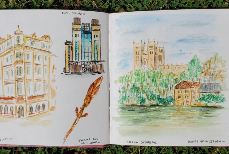
something finished like this. This is in Stockholm.
Where else. Here's some snowy scenes. It's in the city where I
live at night. Some snow. So, yeah, I love preparing
pages like this. We'll also get into that later. So yeah, this is
another version of a notebook and how I yeah, create a pretty a pretty I feel very conflicted
about saying pretty a pretty sketchbook, but a sketchbook that has more finished artwork or
more intentional artwork or more pleasing rather
than just pencil sketches. Doesn't mean that I'm not
experimenting in here. It's just that it's a
little bit more finished. I hope that that makes sense. And I can quickly go through
this one because this is actually the sketchbook that I am currently most proud of. I've been working on in this
for the past year or so, and it's just I feel
like, you know, since February 2024, I just feel like I've gotten some so
far with this sketchbook. And this one has primarily
been landscapes and things. But it's nice to
sit down, I think, in a sketchbook and take
some time with a drawing. Rather than always just
sketching out ideas, but I think it's nice to spend, and create something finished. It skips home. What else? I don't want to show
you the entire thing. Or you can just do a little
flip through. The light. So here, yeah, I can show
you I did those sketches, the thumbnails in my
other play sketchbook, and then here I went in and
created a more final version. And then later, maybe
I would go and create these even more final on a separate piece of
gorgeous watercolor paper. It's a nice wintry scene back
in December, created that. But the pages, they really
take a lot of materials. Here's a lot of paint and pastels and all kinds of things
that I've thrown at this. Yeah. I just it's really pleasing when you're finished
with a sketchbook like this to go back and flip through and see all these
beautiful artworks. And I hope that this class
is going to help you feel comfortable making
pleasing spreads, too. Yeah. I'll flip through
a little bit more. Really love the texture
in these rocks. Doesn't mean that everything
is really successful. Like, this one, I don't
think is my best work, but I still had fun creating it. Okay, so that's an overview
of all of my sketchbooks. Not all of them. Like I said, I have other ones, but that is how I go about
using my sketchbooks and how I start and that I want you to
know to get to this, there are other steps. Like, I have other
sketchbooks that I'm working through before I work
on something like this. It's not always
that it just, like, sit down and create
something like this. It takes work and planning and thinking
through and playing with your materials and
other pieces and in other sketchbooks that maybe you feel a little bit less precious. I've become a little
bit less precious about this sketchbook because it isn't it's not
incredibly expensive, and the pages aren't
that amazing. But still, so, yeah, I hope you enjoyed taking a peek into my
sketchbook and you're starting to feel inspired about creating in
your sketchbook, too.
4. Materials: Alright. Now it's time to
talk about art supplies. I think in every single
sketchbook class I do, I always talk about art
supplies for way too long, but it's because
it's so much fun. But since my last
sketchbook class, I've gotten new favorites
that I need to talk about. So it's time to talk
about art supplies. Alright, we get to talk
about materials now, and this is my favorite thing. I wish I could just talk
about materials all day. But I've done material chats in many of my or all of
my sketchbook videos, so I don't want to
repeat myself too much, so I'm just going to
go over some things that I really like right now. So I still really enjoy
working with gouache, and I use traditional
gouache that you can re wet. This is the Karen dash pan set. Just a basic pan set.
It's really nice. But I have taken out the
plastic thingy holder because it's quite clumpy. And here are all the colors that you get in
that regular set, just like the primaries. And I have also put in my own
watercolor pans filled with my own color mixes
that I use most often. I can show you my color
palette. Where's that? Here. These are the
colors that I mix by myself so that I get the
colors that I most use. And I found these custom colors by noticing the colors
that I was drawn to in other materials such as colored pencils and in
other artists work. And I started pulling
those colors more often. And then when I started creating these colors and
having them to hand, then I would, of course,
use them more often. And these are
starting to feel like my kind of colors and
my color palette. And you can see that
when you look through my sketchbook that you will see these colors more most
often because I have them to hand and they
feel really good to me. So I use this arndasGuah paint, but I also to do these, I use Windsor Newton
traditional guash, and I will mix them together
and put them in these pans. And here I just, like, Yeah, you can see the kinds of colors that I am liking at the moment. And this is always
something that can change. But, yeah, wash. And when you use
guash, you, of course, need water and something to
clean your brushes with. I like a rag that I can wash. It's a cotton rag. I have other little things
like it's not necessary, but an old, like, toner spray bottle that I can I have filled with
water that you can spray your paints to keep them wet or a little dropper also
from, like, skin care. You just clean them, of course. And then you can drop water onto your paint so
that they moisten. Alright, and then
brushes, of course. And I don't have a particular brand or any kind of brushes. These are brushes that I've had. Some of them I've had
for, like, over 20 years. And they're pretty
beat up and banged up. But, I mean, like, I kind of
like when they're kind of frayed and messed up 'cause I don't do
very precise artwork. But yeah, just a mix of brushes. I really like a flat brush. That's my favorite to
work with to paint with, but that's very personal. I think most people like a
round brush for a round brush. I like both. All right. What else? I'll go
back to a plain page. So maybe I should just paint
a little bit with you guys. Let's see. What kind of brush?
This kind of cool brush. I have no idea what
this shape is called. I'll paint with some of these custom colors
that I really like. I like naples yellow
is one of those. I'm just really enjoying
the warmth of this paper. And I'm loving these
colors like this, like, gold green kind of color. And then I will
always love pink. Also really gotten
into ultramarine blue, I think maybe because it's
such a good compliment to these really really
yellow golden colors, but really like that. Yeah. So paint, and I feel
quite comfortable painting, and I love that as a base. Like, I love starting all
my artworks with paint. Another base that
I've been working with lately is pan pastels, and they are also really
fun to work with. I've been trying to get the
past year or so, two years, I've been interested in pastels, but they're so frustrating
because they're so chalky and they
get dust everywhere. But these pan
pastels are in this, like, lovely little
easy container. That's like a makeup thing, and they come with a lid
or you can put it in a little whatever plastic
thing that you can get. And you don't use your finger, and they hardly get
any dust anywhere. And they stick to the page. So there's just it's like how
I wish pastels would work. There's funny little
tools that you can get. And they're just making using pastels so much
easier and lovely. So that's something that I've been really enjoying lately. Again, I really like
these as a base. So instead, sometimes
when I don't feel like waiting
for paint to dry, which can take
forever sometimes, having a base set
pastels is really nice. These ones you don't really
have to set with a fixative, but if they do, transfer. So it is nice if you're going to be working
on a piece for a long time that if you
do a base with pastels, spray it and then continue to work 'cause you will get messy, but it's not at all as messy
as traditional pastels. Those are crazy messy. So there's those. I'll chat about these in an upcoming
sketchbook class again. And then so those are my like the materials that
I like to use as a base, and then we have, of
course, things to do all the details and
things like that. So I love working
with colored pencils. This is my role that
I bought at Ikea. They sell everything. So I have on my desk jars of different colored pencils grouped in different color ways. So I have the worms and
the cools and neutrals. But sorting through all
my pencils like this every time I'm going to
draw is overwhelming, and I get stuck spending way too much time choosing pencils
rather than drawing. So having a selection of
colors to hand is really nice. So every few months or so, I go in and take these all out and then pull a new selection. And they're usually
the same colors I've like I told
you with the paint, I've kind of figured out the kinds of colors
that I really like, like, the warm yellows. And I'm starting to
really like, like, peaches and things like that. And then the funky greens, like, I love this color again. So it's matched with the paint, and, yeah, like
cool greens, too. And the blues that I'm loving, like all the ultra Marines and, like, a lighter version
of ultramarine. So these are all colored pencils are so versatile that you can, like, do some
sketches with them. You can add all the
little details. You can draw with them over
your paint or your pastels. Like, I really like
colored pencils. They're really fun to work
with or just feel like a vital drawing uencil
material, something like that. And I'm not brand loyal at all. I really love let's see. I really love the
Derwent drawing pencils. They have such creamy,
interesting colors, too. Like, they're really
thick and fat. You can't get, like,
details with these, but these are great for creating
lots of shadows or yeah, just, like, drawing lots of shapes and shadows and
texture and things like that. I also really love
the prisma colors. You can't get those
really in Europe so much. But in America, I think
they're creamy and lovely, and I really love that the color is on the pencil. I
think that's so nice. Like, I do, of course, love the Karen Dache
luminance pencils, but it's kind of annoying that the color is only just
right here in all of them. They're beautiful, that
they're like, the would look. But I really like having
the colors here so I can see what I'm drawing. But the luminans are insanely pigmented. Like, look at this. So if you want
something pigmented, especially like
when you're doing line work or just trying
to working over something, the lumina pencils are
incredible for that. I can show you another,
like, darker one here sepia. Just they're insanely creamy
and dark and pigmented. So it's kind of like, you know, use pencils for
different things. I have a few of the fabric castle because
they're affordable. Like, the luminans cost a
scary amount of money each. And like, the fabric castle are half the price,
but as you can see, like, this is the same color, but this one just, like,
a lighter version. But sometimes that's okay, too. So, yeah, that's pencils. And it's fun to be able to see
them like this and not get overwhelmed by my
entire collection. And I have a little
floppy brush here, too, just to get rid of the little
bits that happen sometimes. Okay. Moving on, I also I would say something
like a step up from a colored pencil, but in more like
a stick form are the neo car and dash neoclorTs. And this just feels like a
really nice, colored pencil. But in crayon form, that's also water soluble. Let's choose some colors. They also just go on so
creamy and delightful and you can get quite
good details with them. If you sharpen them. I highly suggest that you save the sharpenings because these
are organ really expensive, and you can turn
them kind of into paint if you put them
in a paint palette. So yeah, here you can kind of see where I've
sharpened this. So you can get a nice point
and get good details. I don't use it very much
as a water soluble medium, but I've seen some artists to get some different textures, you can get the color from
colored pencil and the paint, and then you can
have a little water to kind of blend it
together a little bit. It's quite interesting. So I need to think about doing that a
little bit more often. But yeah, so these
are just nice that they feel kind of less precise than a colored pencil and they go over
paint really well. They're really easy
to draw on top. Of other materials. They're very difficult
to draw on top of these. So if you have drawn,
Oh, with this, it's going to be
very difficult for you to do anything on top of this except for
other neo coolors. But again, like,
they're very waxy. So this is kind of
like a last item that you would have on your
piece, the last details. Speaking of which another
thing that is just for the last details is oil pastels. And I really just love how pigmented they are and
they go over everything. So once you in a painting and you've tried your colored
pencils and you've tried your neo coolors and you
still want some pops of color that aren't quite you
are not able to achieve, like here, I wasn't able
to get the color, like, a creamy oil pastel on top, and you just get
that color pay off. And they have such
a lovely texture, and you can kind of
smoosh them in, too. I used to hate oil pastels because I thought
they were just sticky, but I was using cheapy ones. And since, yeah,
moving to, like, new pastels, they are
really beautiful. The saneli, the French
brand is incredible, too. I even have some
from Van Gogh brand that are nice and affordable. So, yeah, I just really like how they just go
over everything. So that. That's my favorite
materials at the moment. It's always fun to
talk about materials. One thing I want to mention
is just use what you have at home and figure out
different ways to use it. Like, take time to
experiment and see what you can put on
top of each other. Like, just because
some other artists that you see is using something doesn't mean that
you have to, too. You can test it out.
Like, just buy a couple. You don't have to
buy like 5,000. Not to begin with, at least. And I would have to say, like, sometimes it doesn't have to do with materials
that you're using. It's not going to make your
artwork magically better. But sometimes I feel like
if you're struggling with low quality materials
that can be frustrating, like, I hear some
people say, like, Oh, just use crayola crayons. Like, your kids art supplies. No, they suck. Like, you can't do anything
with crayola crayons. But I'm sure
everybody has, like, some colored pencils at home
or something or some paint. So yeah, start where you are and add to it and experiment. Like, baby, I wasn't I had tons of old art supplies before, like oil pastels, and I
didn't really know how to use them because I thought you had
to use them by themselves. But since I've realized that
I can use paint and colored pencils and pastels and
neoclors and oil pastels, that is, like, opened up
my brain to be like, Oh, I can just reach for whatever I want and use the
materials how I want to. There's no rules. Okay, that's my material chat. Now we have to start talking
about artwork, I think.
5. Tape: Alright, now it's time to
jump into the fun part, which is talking about
the different layouts and tips and things for how I go about creating pretty or pleasing spreads
in my sketchbook. So first up, we're
going to talk about the simplest thing, tape. Alright, my friends,
time to get into my tips for making pretty
spreads, pleasing spreads. So I would say, like, the easiest in it is tape. We have beautiful sunshine. Now we'll see how that
is going to affect. As much as Idure creating
full bleed spreads like this, it can be overwhelming to open
up a blank page and think, like, now, I'm going to
create a masterpiece. And that's just kind of sad. So I think the best easy win or the best in is to use tape. When you tape off your
page and create, like, a little frame, your artwork all of a sudden becomes like the
masterpiece right away. You don't I just
happens that way. It's just because
those crisp lines. I can show you some
of the artworks that I created without the edge. And they just look more messy. But if I had taped these off, they would have looked like
a final piece of artwork. It's weird how that
works, but it works. But these feel like
sketchy to me, but these feel like I could scan these in and sell them, I guess. I don't even they're not, like, the most amazing things
that I've ever drawn, but because there's
a frame around it, it automatically looks good. So here, I've set up two pages with tape
my favorite tape. I use them reuse them all the time because I
like to reuse things. So I just paint, and then I'll put
them on another page. So once I'm done with these, unless they got
really messed up, then I'll put them on
another page in the future. And when I come to that page,
I'll go and paint that. And here I've already
done some backgrounds. So the tape that
I like to use is the Tessa Professional
sensitive. This is a Swedish brand, but I'm pretty sure it's
available worldwide. It's sensitive because
it's supposed to be it's made to be
used on wallpaper. So I've found that it has
never ripped my paper ever. It's also a really sweet pale pink color,
which is adorable. But just, like, it's
not super sticky, but it also stays to the page. It's just perfect. So
it's my perfect tape. I love that it's pink,
and I love that it doesn't rip my pages,
and it's easy to use. And it's easy to find for me, at least here in Sweden, but
I hope that you can find it, too, or something similar. But, yeah, so just
taping up a page, it feels also nice to
have this set up for you. So I don't know what
I'm gonna paint here, but I've set it up for me. So in the future, when I
sit down to paint, like, I already have these
pages ready for me with background
colors put in. Like, this is the pan pastel, so it's a little sticky. I'm not sure if I set it. I guess not since it's
rubbing off my finger. But anyways, I just sometimes it's nice with a
full page spread. That's just, like,
the whole page, and you can feel like a real artist or whatever that means. And then and then you can just sometimes you want
to work on something smaller that doesn't
feel so much pressure. Like, this is an A
four sketchbook. So working on a double page, that's an A two, right? No, A three. Sorry, I'm
getting my A sizes mixed up. So this is an A three. So yeah, it's kind
of overwhelming. I like it personally because I feel like I have more
space to move around. I kind of get kind of call
oustrophobic and small space, and I feel like I
can't do anything. But, you know, sometimes
it's nice to work small. I want to show you also,
here I did with four. Again, because they
are taped off, they just look so
much more finished. Like, these paintings
aren't very good at all. Like, I think the faces became
really muddy and smooshed. But because I taped it off, it looks so much
more put together. And yeah, that's not
what's so important. But if it's something that
helps you feel like, Wow, I did something nice
today in my sketchbook, I really think that
that's nice, too. It's important that you feel good about your art
when you finish it, and you pull those
tape pieces off. It's so satisfying with that
crisp edge and I kind of feel more finished and it's
just, uh, yeah, satisfying. So again, just really lovely. And also, just because
this is, like, my pretty sketchbook
doesn't mean that messy mishaps are gonna happen. Like, paint's gonna seep through the binding and come
onto another page, and something's gonna
get messy or I don't always I most often
don't fix my pages, so they after a while,
they get a little, like, messy and cruddy,
but that's okay. So, yeah, I just wanted to
talk about the easiest way to make a beautiful spread in your sketchbook is to use
tape and either just do, like, framed artworks like
this or do more grid format, like I just showed
you. Where were they? Something like this,
you could do even smaller to really
set up your page, making more random sizes. This is quite thick tape. It would be nice
to cut it in half, so I could have
smaller sizes, too. But yeah, how easy is that? Just use some tape, and you'll make some
pleasing spreads.
6. Planning Pages: No next step. Now that we talked about
tape, that was thrilling, we're going to talk about
frames, grids and panels, which is kind of
the same concept, but we're stepping it
up a notch with having multiple grids panels on a page. It's going to be fun.
All right, my friends, now I want to talk to you about
how we go from just using regular old tape
to just tape off some sections and make it into something a
little bit more fun. I've been lately playing
with spreads that are a little bit more curated,
a little bit more fun. I've seen so many other artists
on Instagram, et cetera, that create spreads in
their sketchbooks are art journals that are a lot
more curated or designed, and I really wanted to
test that out, too. I think there's something
about creating a page that feels really
pleasing to look at, but it's also fun to
create that feels really interesting to me at the moment,
because sometimes, as much as I love creating
a full page spread, it's nice to do
something a little bit more designed, I guess. So a page like this, I love that it's both
pleasing to look at, but there's kind of a
thought behind it as well. I don't want to just design
for the sake of design or create art just to show it on Instagram.
That's the worst. So for these images,
I'm thinking, I really want it to
be functional at the same time as being
pleasing so that you can make better artwork or
have an enjoyable time. So setting up a page like
this just feels fun. Like, I created the boxes. I drew them in with
a colored pencil, and then I filled them in later. And just having some pages with some grids that
are already ready for you to go is kind of fun to figure out what can I put in this page and what can I
fill these sections with? And having spaces
that you can have some color swatches so it feels
more organic and playful, so it's not so
perfectly polished. And here, like, this
was a paint clump that like transferred because it wasn't completely dry
when it closed the page. Like, stuff like
that doesn't matter. I also enjoyed having pages
like I've seen other artists like Melissa Lake
and Sophie Mac Pike. They create these boxes or even or even our very
own Queen of Skillshare, Dylan M Mwenski?
Sorry, I don't know. What did you say your name? Dylan M here on Skillshare, that you can create
boxes with pattern. And that really appeals
to me since I'm a surface designer as well, and that's what I
usually call my day job. So having a space
where you can test out color palettes or just a space on your page to play while you're waiting for your paint
to dry is kind of fun, too. So I like having purpose basa
behind my pages as well. So they're not just pretty or I'm not forcing
it to be pretty. Here, I tested out a border. And that was kind of fun, too, like spending time
just coloring in. So it becomes kind of like
a meditative act as well. So you create your painting. And this was quite
fast and easy, but I spent a lot of
time filling this in. And again, like I
could listen to an audiobook or a podcast or YouTube or something like
that. It's kind of nice. And then these are the kinds of pages that I call more of like a two D scrapbook page
where you're drawing and mixing sketches and
a finished painting where the color palette, grid brid pattern thing, color swatch is like you're
curating a page, but again, like this can kind of happen organically at the same time as you're designing beautiful page. So I started with some sketches, and then I added I
wanted to add in, like, a final space for a final
final irate illustration. And then I have a space for, like, something a little
bit more designed. And then the color palette because I think that
looks really nice. You could if you wanted to add in text, if you want to do, like, visual journaling, as well, that's not
really my thing. But I know, like, artists
like Rebecca Green are really good about that by adding text and making a little
bit more personal, and that's something
that you could try out. So that's what we're going to be doing for our class project. We're going to be
creating a page like this that feels like, set up and designed,
but at the same time, it's functional for you
and creating your art. So I want to show some
inspiration pages that I've collected
and created with you. So here in one of my
smaller sketchbooks, we can take a look at some
of the sketches that I've taken of other artists artwork. We can zoom in so we can
get really close in. And when I say take inspiration, so I will make some sketches of how other artists have set up their page, but I'm not also, like,
doing it exactly. And I'm not going to sit
and create my artwork and look at that artist's
art at the same time. I really don't want to copy. I just want to get some ideas of how I can play with my pages. And again, I'd like to mention, like, Sophie Mc Pike, Katie Moody, Melissa Lakey, Rebecca Green, and
there's so many others. But these ladies have
such amazing sketchbooks, and they often
share spreads that are really visually pleasing at the same time as they have
lovely art, obviously, too. So when I'm creating my little
thumbnails of their pages, I'm also bringing
things myself and how I want to set up because not everything appeals to me. Like, Melissa Leakey, she
does a lot of small grids, and I can find that kind
of overwhelming to me. Like, I prefer almost sometimes a full page spread because that's just one thing
I have to think about. If I have to think about
how to fill up one, two, three, four, five,
six, seven, eight, nine, ten, 11, 12, 13, 14 different boxes, that
kind of overwhelms me. So maybe I'm a little bit
more interested in, like, a space like this or even, like, setting up
a page like that. There's so many
interesting things. Like it was I was
inspired by Sophie for the mushroom spread
I just showed you with a large painting, some sketches, like
space for sketches, a decorative element, and
then the color palette. And I just really like that,
so it turns out nicely. I also like the idea
of this one with having a final landscape
at the top of your page, but having thumbnail
sketches at the bottom, you could have thumbnails. You could have color studies. You can test it out and
then create your piece. And then on that page, you have the whole progression of bringing that image
together rather than it in three
different sketchbooks like I showed you that
I would maybe do. It becomes just easier
to open up one page and start working and then having
a final piece as well. And then maybe you can decorate
it or write something. Like, there's just so many
things that you can do, and it's really fun to be
able to test things out. Here was that last spread
or the first spread I showed you with the
two landscapes and two decorative elements
in a color palette. But there's so many, take notes from my page
and work with that. Or when you're scrolling
through Instagram and you see somebody set up
their page interestingly, take out your sketchbook
and create some grids. I also have a few more here. There's just so many ideas. Like, this one was
a full landscape, and then there was these
long landscapes that I saw on an artist's page. So there's so many things
that you can do to set up a page that feels
kind of it's curated, but at the same time, maybe it comes a little
bit free flowing. So we're going to
figure out what we're going to be doing in this class. So which one of these
layouts do we like and we can kind of work
that out together. So I'm going to I'll make a box a little bit
bigger so we can see. So here's my full page spread. Use the gutter in the middle
just to think about that. I'm not really sure
what I want to do. We can procrastinate,
and I can show you something else while
we think about that. But I saw, like, Sophie Mc Pike, especially does these
beautiful grids or Dylan, or here, I've also I'm inspired by Magdalena
from the Wild Pencil. She has beautiful sketchbook
spreads, as well. And they do those decorative
grids where you can test out your color
pallor or just have fun and make it look beautiful. So I was looking
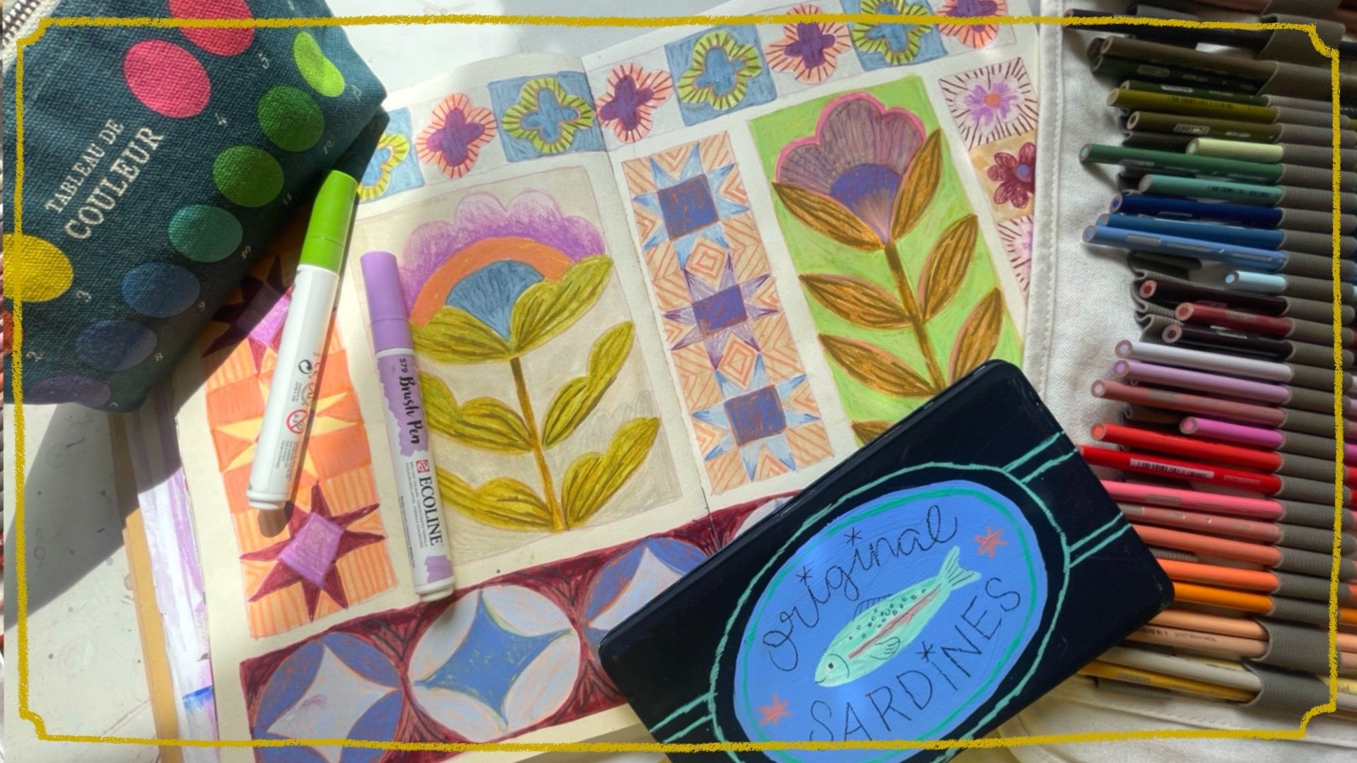
up quilt patterns, and that was really
fun to explore. So that's another way
that you can fill up some sketchbook
spreads is by looking up these kinds of
patterns that you want to fill and
have, like I did. This one you saw already,
but things like this, and it will be fun to sketch that out and fill
that with paint or markers or whatever material that
you like to work with. I definitely want to
do some kind of I want to I think I want
to do this pattern. It appeals to me. So what should we
do? I like the idea of having something final, like a final page
or a final image. And it's kind of nice to
break it off with the gutter. So again, it does
become so precious. It can't, since it is,
like, right there. And it disrupts the
picture so you can't, like, make it perfect. And that's kind of
nice when you're working in a book
format like this. So do we like any of these? Do you like the idea of, like, the This is kind of nice. This is Sophie again. Like a landscape,
and then we could do some color palettes and other sketches and
things at the top. Maybe we should do
something like that. I don't know. Again, like, I get overwhelmed by having
so many little boxes. Let's look at her other.
Now, I've lost my page. Yeah. But I also really like the the borders are really fun. Which one should we do? I think we'll try something like this. I really like this one,
but we'll make it our own. I'm sure I made
this my own first, and then we'll do it
again another step. So I think I'll start with we'll have the final landscape. We'll do a landscape
because that's kind of my happy
place at the moment. And then I will
leave space here for a color palette because I really love how the blobs
of color look. We can do a little so like
this feels like curated, but at the same time, it's
just, like, it's kind of nice. This is a part of
designing, too, to create pleasing spread. So I want to do an
illustration of some flowers. And then, like, with
the rest of it, should I just do
my pattern here? Yeah, my pattern. What
did that look like? We do four boxes like that, and then it was a grid. This. And then it was, like, a pinwheel Then there
was another shape. Yeah. Wait. Okay. So that is my little idea for how to set up my page
that I plan on doing. But I highly suggest that you
guys do something yourself. You can take inspiration from my little thumbnails,
like I said, or you can check out
all these illustrators that I have named. I will make sure to link
their Instagram pages so that you can check
them out too and gain inspiration and remember, like what the difference between inspiration
and copying is. Like, make sure that you're
doing your own thing, too. But there's a lot of illustrators who do
this kind of thing, so don't feel like you're stealing somebody's
very unique idea. Besides creating drawn grids, I really like painting in some background grids like I did in this little sketchbook. This is one that
I've mainly been working on little
painted in grids. Here, I don't even sketch
them out the size, really. I just go in with paint, and I really like that
while I'm waiting for another larger piece to dry
in my other sketchbook, I can go in and prepare pages like this where I
can go in later. So it's a good use of your
time if you're waiting for pink to dry or just again, like those days when you don't feel creative, don't
feel like drawing, but you still want to use
your art materials, like, set up some pages in your sketchbook.
Don't do all of them. Like, I enjoy having I will skip pages so that I
have room to, like, I'd say, room to breathe
so I can feel like, Oh, I don't want to, like, force myself to do this. I want to just paint
something big. So here, like, I've
done several like that, and then I will paint this. And then it's just fun.
Like, what do I want to paint on a pink background? And what would look better
on this beige background? And what about hot pink? What how does that look? So it's really fun to have your sketchbook kind of
as a project, and, like, some pages a year, I skip them, and I need to go back
and do these again. It's just like the
whole sketchbooks kind of a project ongoing, and I really like that. Here again, like, here's
at the beginning. I need to go back
and remember to do these green squares and figure out something
to put there. And here in this sketchbook, I've been doing, like, more small studies
of things to figure out lighting or techniques
that I want to try out. Oh, and then some final pieces that I really
enjoy like this one, I really think is sweet and kind of more naive in style
than I usually do, but I'm trying to loosen
up my style a little bit. Here's an example of using
quite a few small grids, as well. I was inspired. This is Alysa Eufa. I was looking at her work and sketching things that I
really enjoy about her work. Like, she always has
these really funny birds, I have huge mngous feet, and I really like her use
of colors, et cetera. Yeah, we're thinking
about lighting. So sometimes working in a smaller sketchbook
size like this is really nice because it
feels more doable and even, like, a spread isn't as huge, but it's still nice
to break it into smaller sections so that yeah. I don't know why the barrier, the white page can be so scary. And just like going in
and just I don't know, not really ruining pages,
but setting them up, like you could do
some with paint, and some you could
sketch out a grid, and some you can leave blank. So that's kind of, like, all
ready for you, ready to go, rather than just having
page after page after page blank and you just kind
of feel overwhelmed by that. So I just wanted to
mention that, as well. And so that we're
ready to get started on the class project
in the next section, let's just sketch out this
little grid in our sketchbook. So I'm going to zoom out again. So I'm going to use this
sketchbook that I have, and I'm going to open
up to a new spread. The only thing that I
would say the downside of this sketchbook is
that it doesn't lay flat. So that's the only thing that
I don't like about it and doesn't work so excellently, especially now at
the end when there's just a few spreads
left, but no matter. So I don't like sketching with pencil because it
usually gets muddy. It mixes with the paint. So I will use something
like a neutral color. What's this? Violet
gray, that'll do. And as much as I love tape, it's kind of nice to do something
that feels a little bit more not so crisp and perfect. And for the most part, you can follow your own paint
lines pretty well, too. I'm just going for it. I'm not going to use a ruler. And so it'll set this
whole bottom area up with a nice long landscape. And then I wanted to
do some I'll leave some room for flowers that
we can draw together, and then I wanted to do
a little pattern here. Not quite all the way. And we're gonna set that up. Again, that became
wonky, but that's okay. If I was drawing this
knot for a class, I would use a much
lighter pencil or draw even lighter because I don't really want
these to show up. But that might be a look
that you really like. I know that Katie
Moody, for example, often she uses a bright color. She can use red or blue
to mark out her grids, and that look is quite
fun and playful, too. There we go. So that's my page set up so that we can paint. And here I can add
the color palette. If I was good at text, I could write in nice
beautiful cursive. Here we can draw a
little flower together. And here we're going to do
our final little landscape together. So yeah. And when you're
feeling creative, but you don't feel like
creating the actual piece, you can go through
and fill some of your pages with these kinds of grids that you
can fill in later, skip a page and leave that
for a full page spread, put some tape in
on another spread, create some grids on another one so that when you sit down
to create your artwork, they're already good to go
and you kind of feel like, Oh, what can I do on this page? Rather than coming to a
scary blank page like this, you already have something
that's set up for you, such as this or a taped out page that you can just get
into painting right away. So that's another
tip for you to make a sketchbook feel a little less precious or a little bit
more like a project. I also like that I don't
always work chronologically. I don't go from page to page. Like here is I painted
after this page, and I left these and
I will come back to them when I feel like I know
what I want to put here. But for the moment, I haven't really figured that
out if I want to do more of these still lives
or if I want to draw, like, a portrait or if I do want to do another
landscape or something. So yeah, it's kind
of nice to have these pages set up for you when you come
to sit and paint. S. In the next section, we're going to get started
on our class project of painting this
spread together.
7. Class Project: Part 1: Now that we've mastered
tape and panels, we're going to jump into
the painted scrapbook page. This kind of page has kind of scared me because
it's a little fiddly, and I thought it was
maybe too curated. Previously and thought it was too, like, Instagram worthy, and I didn't want to create
those kinds of pages, but they've kind of sucked me in because they
are beautiful. Like, we can do fold
plate spreads all day, and we can do messy
pages that are ugly. But, I mean, like,
a nice, curated, kind of scrapbooki type of
page is just really pleasing. So let's jump into that. Alright, my friends,
it's time to get started on our Ware spread. I'm going to be showing
the images that I will be painting
from with you if you want to paint
something similar, and it'll be fun to see how you interpret everything as well. So I don't necessarily do visual journaling,
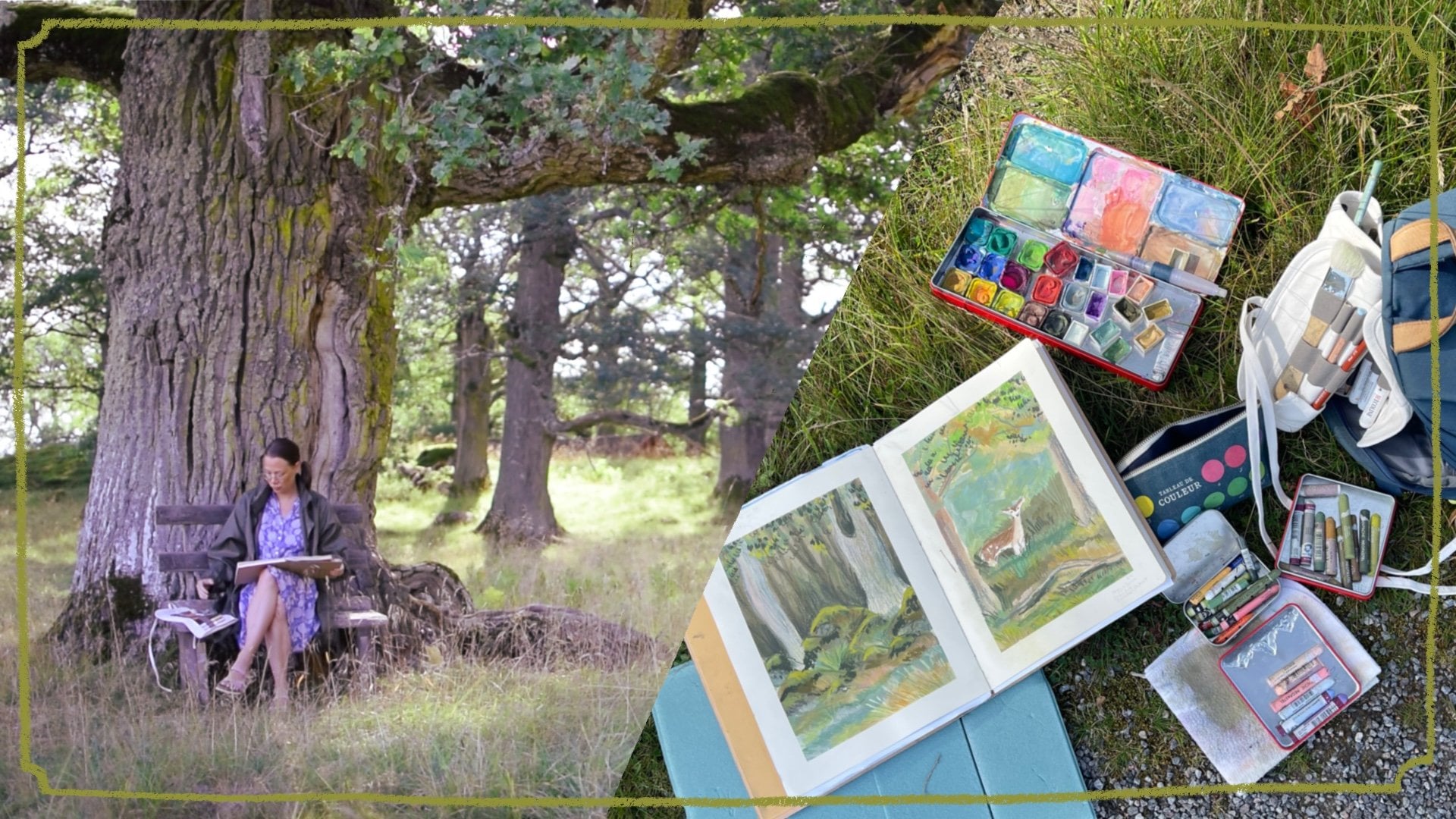
but I do it in my way. Like, I take photos
when I'm on walks or I use photos that I have
taken years ago and paint. So this was a recent trip
that my family and friends went to the woods and
we picked wild garlic. So I have this image
to share with you, and I'm going to interpret
it in my landscape here. I know that the
format is different, but we're going to use
it as inspiration. And then I can also post
some Swedish spring flowers. I thought that would
be great over here. And then we can use the color palette in our
little decorative element, which is just kind
of for fun, as no. So yeah, again, I put this clip here to
keep this side down, but this side I'm gonna
have to hold with my arm. So, what should we
get started with? I think, just to
get into it, maybe, I will do this my
little sketch of a flower first
because it just feels like an easy in and I
don't feel like I'm gonna mess it up. Well, at
least I hope not. So I will use my weird green
that I've been liking using. This is Fabric
Astel's green gold. And I'm just gonna
draw the flowers and this isn't the
most important. It's just thing ever. Then I have another
big one here. Again, you get kind of
messed up when you draw on the edge here, the gutter of the page, but that just adds to it
becoming not so precious. This isn't a typical flower
that we see very often. It looks kind of
like a I don't know, or like a buttercup, maybe. I'm not a flower professional, but they we were
discussing as a crowd, my friend and I when we were picking these possibly
called Gul sipur. I have no idea what
they're called in English. But in Swedish, we
think that this is g Lusipa because
it's quite big and they were mixed with all of the more the very
well known spring. Swedish flower is a tsipa has the same shape
of the flower, but they have different leaves. So very interesting, I guess. I don't do sketches
and studies of flowers like this
ever really or often, so it's kind of
nice to just, like, start off kind of
warming up with your painting drawing session
with some regular sketches. And like, these could
become painted later. But for right now, I'm
just going to leave it as just just a regular
pencil sketch. They're really weird,
like, rounded leaves. Kind of like wrap
around the stem. Kind of feel like I want to
have one more in the photo, there's a flower
peeking up behind. So that could be nice. I can
get some shading back there, that flower and the
little other petals. Something like that. Kind
of decorative and fun. Okay, so I did that. So now I can't procrastinate
the image anymore. So I'm gonna go in and draw my scene with all
of the wild garlic, Swedish calls Rams look. Rom's look depends on
how you want to say it. So my happy place lately has been painting greenery
strangely before. I never in the past, like, two years ago, I'd never, like, landscapes was
like my nightmare. But then I kind of forced
myself to test it out, just giving my paints a little sprits here
to wake them up. I took out a really
small pencil, but I think not
pencil, paintbrush. It's confusing
because in Swedish, this is a pencil in English, and this is a pencil in Swedish. Pencil. So that's annoying. So usually, when I jump into a painting like
this in my sketchbook, I don't sketch it out because I like to just figure
it out as I go. But maybe that's not
the case for you. I'm just going to go for it. So there's a really
cute little stump, and I'm going to use that as my, like, vocal point, I guess. And then I'm going to do
the greenery around it. So I'm going to put my stump off to the side
over here with this, like we need some darker colors. Should I bring this closer
so you can do that. So you can see more
what I'm doing. I'm just using colors from my palette these
that I've pre mixed and just going in.
That's my stump. It's a lot lighter on the top, so maybe I'll try to get
some white up here too. It's a little bit lighter. Okay. And then the background
of the image is quite. There's a lot of
pink and warm tones mixed in with all of the greens. So could try to attempt
having a little bit of the pink peeking
through in some areas. And again, I don't
need to use this edge as I super have to
stay within the lines, but it's kind of
nice just to keep the shape and form Good. I'll do a little of the yellow, even though I don't see
much yellow in the piece, but there's still,
like, a warmth, and it's nice to use these
signature colors that I have. Ben giving a lot of warmth to
many of my other paintings. Okay, and then of course,
there's so many greens. We need to get some
greens in here. I have this more neutral green. I use that in a
lot of the pieces. I have I really like using this cool green to give contrast to the two greens that I have, so it's not everything so warm,
so there's some coolness. So there's a patch of moss by the trunk of the stompie
and it's more like warm tone, but I'm going to make
it cool tone just to make it different
and more my own. And then I also want to use some of that cool
tones in other spaces, so I will add it in. Kind of, I got to say,
kind of randomly, but also I enjoy using
a color three times. So if you bounce around an
image, boom, boom, boom. Unless it's something
very specific, like, I want to keep this brown
maybe just in this area. I need to go back into my
regular neutral green. Making some leaf shapes here. This is a green
that I mix myself. So the pigments don't
always stay together. Same with these, the gray,
the turquoise green. And I kind of like that
when it separates, it becomes like another
element of interesting color. One thing that I need to get
better at is adding dark, let me get this dark. I also like having this as individual pan so I
can pick them up like this and use them
more like that. Get some darks around
my little stump here so that you
can see it better. One reason why I
really like drawing greenery is because
you don't have to really It can be
quite What am I drawing? Abstract. It doesn't have
to be photorealistic, and there's a lot that you
can just kind of make up. That's fun to me because I get overwhelmed by looking
at an image and think, like, Oh, I have to draw every single leaf. Like,
that's not happening. But here, you can kind of
mimic leaf shapes and, like, the organic, like, craziness that's going on in a in a nature scene
in a landscape. To here, it just
looks like a mess. But this is also, I
want to remind you, like the underpainting is
also just in my sketchbook, and I'm just playing
and having fun. And it will be even
more fun when we go in later and do all the details
with pencils and pastel, oil pastels and new pastels and all the other fun materials. Okay, so here, mainly, I just want some lots of greens. Still not dark enough, but that's something I can
go in with my pastels. Were not pastel colored
pencils and stuff. I want to bring some, like, highlights some
of the leaves are really bright and vibrant
now in the springtime. So I'm going to use this, like, sap green mixed with some
greens that I have over here. So it'll be a little
bit more muted, and I want to bring
those in a little bit, like, to the warground. Maybe I'll do some. Highlight some rooms
there in the front, and then I'll have some
in the back here, too. Again, that like rule of
threes like a random. I like uneven numbers. Okay. Go to want to go back to my stump here 'cause I need to make it a
little bit darker, maybe some more of
this gray color. Okay. Okay. Now to consider
how we're going to do our little this one. And I was hoping to work
on that while this dries. So maybe we shouldn't
use wet media then. So let's get out
our colored pencils and do some fun scribbles there. The yellow spur Gilipur or
that beautiful yellow color. So I thought it would
be fun to do yellow. And this, again, like, should this be you
could do this with markers or with paint, if you like spending time coloring in little
sections like that. This isn't so vibrant. I kind of want to bring
out my new colors to see if I can get a
really vibrant yellow. Okay, let's see what's
this golden yellow. Like, that seems more
of what I'm going for. Kind of like that,
almost, what's it called? Like a pre effect. So I'll do that.
I'll do the edges a little bit lighter sketchy. See, this is the thing
that's so fun about sketchbook is that
I am just playing and I will figure out
things that I like doing or just sitting here and talking to you
is really enjoyable. Or if I'm by myself, like, yeah, I can watch Book tube on YouTube and think about what I'm going
to be reading next. Go. Mm. These are so nice and creamy to work with. But what's cool about No colors, they don't really transfer, so they're not messy. Okay. Thinking about our
color palette here. Also, this is I didn't do any
color testing over there. Now I have to be like a
poser and add those in. But just it can be nice to test your colored pencils on top of these kinds of colors. So it is nice to have. So not complete poser. Just a small poser. What's a little bit of
that pink in there. There we go. So then I have
that area to test out stuff. Hopefully, that will also dry by the time we're ready with our little decorative
element over here. So, you know, we have to think
about our color palette. So I want this nice, cool, bluey green color. I'm going to take this earth green, and where
should we place that? I don't know if I want
to put it exactly there, but it also can be
something I can change and test out maybe in the background. Do every other. I have to say it is nice
to be able to draw on your page while you're
waiting for the paint to dry, 'cause that's something
that I get so frustrated with when I'm working
on a full spread, and then you're waiting
for paint to dry. And I swear when you're
waiting for paint to dry, it dries, like at half speed. You kind of get warmed up. Maybe you get a little bit
looser so that you feel like you're not going to mess this up or something like that. Okay, so there's my little
do I mess that up. No. Um, so the other color, maybe I should do more
like that Another green. Get all my greens. Thinking about this section. I'm not sure what I
want to do there. Maybe the pink since you
have the pink in there. But then I want
something that really contrasts with the
beautiful golden yellow, and I'm thinking I have the
perfect oil pastel for that. But right now, I think I will do this whole section pink and I'll do it darker in the middle
and lighter go out. Back to wild garlic. I don't know if you're
a forager where you live if there's places
where you can go forage, but since well, since
moving to Sweden, that's, like, a thing that people do lots of people in Sweden
love being out in nature. And then since we
moved from the city, Stockholm to out
into the country, that's become even
more of a thing. And in 2020, I started becoming
like a mushroom forager. And then since then, once
you start getting like, learning more about mushrooms, you want to, like, move
to the next thing. So I have been going to
more greens and things. So wild garlic is
in the springtime. Like, it's the first
thing that you can forage that I know of. And it becomes this outing we've been doing for
the past four years, and it's so exciting that we found this
place where there's so much wild garlic that
you can't believe it. Like, it's just,
like, an ocean of it, and it's just really
exciting to me. You become like a
wild garlic hoarder. Just because it's free and out
in nature and you can pick it and we brought
home bags of it, two bags, and it's like, What do I do with all of this? Okay. So I was thinking this
gorgeous lilac color. I feel like this light
purple violet color is my favorite at the moment, and it's gonna look
amazing with this yellow, so I'm going to go for a nice little click here in
the center, and that looks. Really lovely. And because we tested this
color palette out, I definitely want to add a
click of this color somewhere, even though it's
not in the image, but it's my image,
so I can make it up. So I'm going to put this color over here so I
remember to use it. I'll have it over here as well. I also probably will
want to use this bright yellow somewhere as well. So that is finished, my little decorative element up here and even have the
flowers over here. This isn't quite
dry in all places, but I can start to
work in some areas. So, let's see.
8. Class Project: Part 2: No I also I kind of I
want to be, I don't know, like I want to be brave
and write something, but I just know, sometimes
I just don't like it. So I'm gonna skip that for now, 'cause I don't want to
feel like I ruined it, even though you
can't really ruin stuff. So, okay, let's see. I definitely need to get this dump to get a
little bit more, but that's where it's wet. So let's go in
with these leaves. Like, I want these Rams leaves to stand
out like the dump, and this is going to be the
part plus some zi pour. Um, let's see. Okay. I want to get some
definition on those. So let's see. Is
this dark enough? Too brown. Let's see. Try this one. I'm gonna get some definition to these. They're quite delicate
these leaves, but I want to get some
definition in here, so I'm going to go
quite dark with these lines just 'cause I
want it to kind of stand out. Okay. And here, test out
if it's dark enough. Yeah. So here I can
get some contrast to this stump to make
sure that that's, like, sticking out more. Just giving some shadow. This stump has
interesting texture. Here again, it's hard
to work over when some areas are still
wet, but it's okay. As long as you don't
rip your paper. It would be really cute
if I drew something that would be sitting here on
the stump, but again, like, I'm still kind of afraid of doing little
characters and things. Something that's
holding me back, I need a little bit more practice. That's what I envision, like having some
little character. Maybe we could come
up with something. Maybe we'll gain more
confidence as we go. I hope so. Okay, so
then we need some more, here's some darkness there,
and here's my leaves. I kind of feel random
at the moment. But then I can go in and then just I also like to create
outlines of leaves, even though you haven't painted, like, a specific underpainting
with that color, but just to give
some outlines here. And then let's see. We'll use some neo colors. I'll grab some colors.
Test those out. Here we did the
rumslk over here, so maybe some lightness. Also, Yeah, can we get some
light into those as well? Highlights. That looks nice. And it kind of softens
those dark lines. What does this color look like? Quite green, green. Just a little bit of that. Okay, that's fun. And then, again, like,
work with some outline, some shape, something
more defined, something still quite abstract. That's just how I've been
playing and finding it really exciting and
fun to draw greenery, you're just kind
of making it up. Let's do some
lightness over here. I'm going over these
areas too, my moss. How do we make this
look more mossy? I need something to define that. Maybe this color
like little dots. Since I did those
little dots here, maybe I want to replicate
that somewhere else, again because of my
rule of repeating. Unless it's something really you want to be standing
out like this, I want to stand out, so
I'm not going to have an open area that's lighter than everything
else somewhere else. But in a few other areas, I can add in these like mossy textures Okay. This class isn't really supposed to be about how
to draw greenery, but I hope that this maybe helps you feel
more playful when you're drawing greens and things like that in your sketchbook
that it doesn't have to mimic every single leaf and I can't draw and
talk at the same time. You don't have to draw
every single leaf, but you can mimic certain areas
that look like the image, and then some areas
are abstracted, and then some areas
go into, like, like here in the corners, maybe it's not important that we have anything that's
defined at all, but here where it's
closer to, like, the stump that's
supposed to be my um, visual focal point that I do things here that are a
little bit more defined. Let's see. We need to
bring in my white flowers. I'm not really sure
how to draw those in 'cause now I didn't leave any white space
for the flowers. So we can maybe hope that one of my neo cuddles can
go in with that. Let's see if this goes over. Like, it goes over the
yellow quite well. Yeah. Nothing colored pencils do not go over neo colours
very well at all, but I can use another neo
colour possibly to get some definition there
inside the flowers. Kind of cute. Hmm. Let's see. Anything else you want
to define a little bit? Okay. And then we need
to do my purple element. So this is supposed to
be the wild garlic, but this is my image, so we don't have to follow that. So I'm just going to insert
that color here with some random flower shapes. So we get that pop of the purple that looks
really nice with the yellow so cute. Okay. Now we need to
figure out if we can make a little cute dude here. I draw. I've been
gonna do a little Give me a little
bug taking a break a little read a little
ladybug or something. Ladybug sweet. Taking a little break on
a stump reading a book. Alright, so how do we draw that? Again, I'm not a huge fan
of using black in my work. I think it's too
harsh, especially when I use so many light colors. So my darkest color that I have used so far has
been this color. Draw that in again.
Just to have that. And I will draw
in a little feet. Land. Difficult to do the face. H. I leave openings for the go. And then, like, do you want
to introduce another color for the red for the maybe. The book shouldn't it be yellow maybe to
continue with that? Can you tell? Can you
tell it's a book? Maybe I'll keep
my palette small, so I'll just give them.
It'll be a purple. It'll just be a bug. Very cute. The face is a little frightful, but that's okay. Cute. All right, I need some
shading underneath there, so they look like
they're sitting on it. I can also give the log, even though I can't
really see it, but I want to give
the lines in there. I want to do a little
bit darker there. Okay All right. That's
my little page. It's really sweet. And I would go and possibly write something if that's something that you like. I definitely would
write the date. I like writing the date
to when I'm done this. I kind of feel like I didn't
use this dark color enough, so I want to, like, use it here. Ooh. And it smudged some of that purple that
looked really pretty. See, again, like,
that was a mess up. But that just like a little pretty Okay. Like, I could continue doing
this forever and ever. Okay, I'm gonna call
that it's done now. I think that turned
out pretty cute, and I added a little character
here just to make it a little bit more
playful and fun. So that's my little spread. And I think it's both
pleasing and it's also um, helps you
with your art. I didn't test anything
out over here, but I can I can show
you that in retrospect. I get stressed, I have to say, when I am filming and drawing
at the same time, like, I forget to do certain things, and I talk much quicker, and it's difficult to
talk at the same time, but it is handy to have these spaces and test out colors so you know
what they look like. But when you go in and
create your final artwork, they also good
reference later you go back and flip through your sketchbook and
think, like, Oh, what what did I what kind of
color combinations did I do? How did I layer certain things? Sometimes you'll not
figure out what you did, but you can at least try
to mimic it a little bit. Hm. Yeah, pretty fun. I enjoyed that. So yeah, I think I'm going to continue to create pages like this.
Like, not always. I love still creating
pages that are full page spreads because I just feel like I can
breathe sometimes, but sometimes it's just I don't want to sit down and
do a whole painting. So it just feels more doable and approachable that I can have pages that are
setup like this. Like, I can go in now
and create a few layouts so that when I sit down later and want to draw,
I have them done. And then I can go back and look at this and share
this and think, like, Oh, I had a nice time while I was waiting for
this to paint to dry. I did this little section, so I didn't feel
like I was wasting my time scrolling through. Instagram or something like
this. It is really sweet. I am compelled to write,
but I don't want to. Oh, my God. I'm having,
like, a crisis. Never mind. But I
will write the date, even though I'm filming
this on the May 7. So there we go, and I can I don't know. Should I go for it? G SIPA. I don't even know if
it's called that. God. S. There we go. Added text. Go me. Okay. That's it. I can't wait to see your spreads and see if you also created a
scene like this. And if you want to add a little
character to your stump, who's your little
character going to be? This was so fun. Thanks so much for painting with me today. Bye.
9. Next Steps: Right. That's it. Now that we have learned
all about how to create more pleasing spreads or how I go about doing that, I hope that you're inspired
to do that, as well, and you find it a
little bit less scary, maybe, or, like,
you're gonna mess it up or you just can't do it. I'm sure you can. So I
would love for you to take these next steps to keep going with your
sketchbook journey. And the number one thing is to bring that
sketchbook with you, bring a small
sketchbook with you. Maybe it's more of
your ugly sketchbook so that you can jot down ideas, or when you see
something beautiful, you can kind of take notes. And if you're going on a more of a longer day trip with
art possibilities, you could bring a
pretty sketchbook, too, and lots of art
supplies so you can sit in a park and draw or at a coffee shop or something
like that and create a spread that's a little
bit more well thought out, especially if you've taken the time to think through your inspiration,
things like that. Go over the exercises that I have shared
in this class or in previous sketchbook
classes over and over again because you can
always learn something new. You can always develop
another skill. You can always get inspired
by a new color palette. This is why
sketchbooks are so fun and why it's so exciting to flip through it at the end
when you see how you've progressed from the first
page to the last page. The last thing I want
you to remember is that sketchbooks are
supposed to be fun. It's a safe space just for you. You don't have to share
anything on Instagram. I usually do not. But still, it's nice to be able to flip
through something, and, yeah, maybe you'll have a few dud pages that
are kind of ugly. But it's just a
part of the journey of learning new things, and then you can jot
notes and be like, that messed up because I
mixed colors really weird or I just started wrong
and it like messed me up. Like, it's no big
deal. That's why moving to the next page is okay. And yeah, it was really
bad and it just, like, really bothers you, just paint
over it and start again. No big deal. It's
supposed to be fun. You're supposed to
see the progression. That's why it's so
great to have a book at the end of as an end product, because you can see
from the first page how maybe you were a little
shaky learning things. And then by the like 50th page or however big your
sketchbook is, you can see things happening. And that is really exciting. So I hope that you'll enjoy
filling lots of sketchbooks with my tips and other classes here on Skillshare that are
really inspiring. Just keep drawing and make
sure to draw for you. If you have something like
I do like fun Friday, where I dedicate a whole
workday to just playing in my sketchbook and that
is so important to me. I highly suggest doing
something like that. It's really beneficial
and it just loosens you up to
being able to play. Get all your work done
Monday through Thursday, and the rest of the week, that little chunk of
Friday is just to play and have fun and remember
why you want to be an artist in
the first place.
10. Where Else Can You Find Me: H. Alright, that's it. Thanks so much for taking this
class with me and filling your sketchbook
with different tips and tricks that I've
shared in this class. I can't wait to see
your beautiful spreads in the project gallery, so please be brave
if you want to and post a picture of one of your favorite sketchbook
spreads that you've done, which was inspired
by this class. And I would love to see it. If you would like any
feedback, please let me know. Otherwise, I will just give you some positive encouragement. And if you would like to hang out with me
outside of Skillshare, you can find me on my website at Kristina hot krantz.com
or Instagram, where I post on occasion
at Christina Hud krantz. I also have a gorgeous, fun Friday Patron group where I post videos every Friday
about art making, my process, art materials. I have different drawing prompts every Monday that go out, we do a new theme every month. So if you'd like to draw with me on a monthly
basis rather than just taking my classes when
they come every so often, I would love to see you in that beautiful creative
group on Patrion. That's it. Until my next class, make sure to follow me
here on Skillshare two. So you'll be notified when I
post my next book class or my next surface design class or whatever I come up with next. And until then, bye.
11. Bonus: Sketchbook Flip Through: Hello, fends. I'm so excited to share this sketchbook flip through with you all
because this has been with me for over a year, a year and a half nearly. And I'm just really
pleased with this. I think this is the
first sketchbook that I have created that I'm truly, really proud to share. Like, the other ones
I was proud to share, but they weren't as
they weren't full of such beautiful drawings
like this one is. This is my pretty sketchbook. Yes, it took me longer to work on this
because I don't fill my pages with silly
sketches or mess ups. Like when I go to
this sketchbook, this has been a
place where I create more finalized artwork and that's why it took
so long to fill it rather than my ugly
sketchbooks where I can play or if
I mess up a page, I just move on to
the next thing. Let me just get into it. Again, if you were
wondering this is the Ranger delusions
art I don't know, creative notebook,
something like that. It's marketed not as
a art sketchbook. It's more for scrapbooking, but I think it
works just as well. I think the pages are really thick and they're
very, very smooth. So some of you might
not like that. If you like some paper texture. This has zero paper texture. It's almost slick, but I've
learned to really like it. It has a nice warm color. Anyways. So, I also just like the design that has this pocket that
I don't ever use. It just looks nice, but
it's not too fancy. It wasn't too expensive. I started in February of 2024 and I finished it
now in May 2025. And, start off the page
with big test page, just test out this new slick
paper that I had never used. This is the first time
I've used this sketchbook. So we'll just get into it.
So, in the beginning of 2024, I was really getting into
working from my own photos of places the place where
I live in Marie frit in Sweden and learning
to love landscapes, which I had never in my
entire life enjoyed drawing, but I guess when you turn 40, you enjoy stuff like landscape drawings and drawing
birds and stuff. I don't know. This is the
beautiful castle where I live on a sunset
in the wintertime, so this is 2:00 P.M. I didn't sit out drawing
because it's icy, yeah, I take photos
and work from home. Same thing here. This is also in my neighborhood on a
dreary winter day. I was really inspired to try
and capture that dreariness of the winter because
sometimes it just I haven't been inspired to
draw something like that, but it was really enjoyable. I love this fence
that I created. Here's from a TJ Marston
session on Patron. Also Sweden. Funnily.
Funnily enough? Here is when I went to Florida, I took some photos when
I was visiting family. This is the view from
my parents' house and this was somewhere. I don't know. There was a bird and what are they called turtle. So again, just
navigating how I want to draw landscapes and
plants and things. I think by the end of
that you'll see how I've developed my color
palette and how I use paint and things.
It's really interesting. That's why using a sketchbook so fun because I have a
catalog of what my artwork looked like in February 2024 and what it's going to
look like in May 2025. Here's for a session
with Emma Carlisle and her patron working with trees and there's some stuff
that I love about this. Then I was getting excited or obsessed with trees
for a little bit. I think they just went a
little bit too mystical, magical, but there's
something in there. Then there's this tree by
the castle where I live, and I just think
it's stunning and I still haven't been able
to capture it properly. It doesn't look like this.
This part looks good, but the top doesn't
look like that. Here, more just exploration, trying to get into the woods
and cute little creatures. I think this was for one
of my patron sessions. Here's some cats trying to think about trying
illustrations that have a little bit more character
or something going on because just empty landscapes
can be a little bit empty. This is not my backyard, but close to where a
view from my house is with rabbits or hair. Here's another place in Marie Friet my live cute
little is called Arcman. It's like Duck Island where
they've set out a teeny little miniature house and
outouse for the ducks. Where's the castle again. This one I did actually sit in the gardens and drew
it on Plan Air. Another view from
the castle towards a mansion that's out
in the countryside. Here's the Emma Maliaka
session on Patroon. Back to the Castle Gardens. This Castle gardens that we
have here is so stunning. I'm starting to realize
the colors that I like to work with the cool
greens and the warm greens. I'm really liking the
ultramarine blue too. More castle, more castle. What is it castle. It's another like exercise
I did my patron group. The three materials challenge. It's actually quite difficult. Here's from our
beautiful Deer Park, I managed to take a
photo that's similar to this with a deer
looking straight at me. It was so nice to capture this. This has been one of my
favorite drawings of my sketchbook
throughout the time with my sketchbook,
I don't know, something just clicked and
the ability to use all of these different
kinds of greens from cool to warm to dark and light, I feel like something I really managed to get
something when I created this. I love this so much. Just
like looking back at it. Like, I still
reference this when I go to paint new things. It's
just like I don't know. Sometimes, you know, when you're just like in the zone and you create something
and then you don't even realize how you did it, like, I don't even
know what I did here, but I can kind of go back and feel the materials.
Like What did I use? I love this. It's
just okay, drawings. More Sweden. Like, I feel like Sweden has really crept
into my work this year. More from where I
live. It's my friends I painted this from my friends
garden. They have sheep. Not so much loving this, but this is really sweet. Too bad I didn't fix this size, this page got all
messy, but that's okay. This I believe we did for one
of my Skillshare classes. I'm not sure which one.
More drawing outside. I did actually draw
this while sitting outside and looking
at different rocks. Creating all these
textures is so much fun. This was on a trip to Denmark. I didn't capture it as much as I wanted to the
beautiful rolling hills, but you can always try again. More deer and greens. I really started to love greens. Again, playing with texture has been
something that I've been really focusing on creating
these beautiful textures, but also everything
can't be textured. So finding that balance between what areas
are super textured. But again, there's some areas in this painting I really
love the trees, how I capture the trees
and the warmth here. But here it's a
little bit messy. Then I tried to capture my kids. They look a little
funky. Some birds still not comfortable
drawing birds. Again, more from
my neighborhood. I feel very privileged to live
in such a beautiful place. There's so many different places to draw and gain
inspiration from. Just loving all this warmth here in the grass.
It's really nice. Here's another beautiful
garden where I live. Here's from another
Emma Malika session. She has amazing sessions for
drawing. Again, with Emma. Drawing the C side,
another MMA session. I think I was catching up on all of the sessions I missed. Another EMA session. You're trying to get
into the dark side, that's something I'm
usually afraid of going dark in my work and having that super contrast so that's something you
need to work on. Here's another EMA session
that I really love these. These feel like artworks to me. I should probably
scan this in before they go really messy
because I love this. I love creating these little
fake tree clumps. It's fun. Then some mushrooms and
this I guess fall, October, we're getting to fall and I
was using some neon colors just for fun. More painterly. Use the castle again, but now with fall colors. Don't think I
captured it as much, but I also feel I didn't
spend as much time on this. I could have spent
a lot more time. It's the only page
that I left empty. Here's some more exercises
with my patron group. Drawing from film. We're back to another session with Emma. Now we're in December, so it's wintery capturing those dark Scandinavian
Arctic winters with ice and the darkness
and the glow from the city. Then how it looks like there's this beautiful light if you've ever been somewhere
where it's cold. It's like the air is icy. Here more darkness. Then I didn't use my sketchbook for a couple of months so now we're in April. I wasn't feeling so well. But now I jumped into
springtime with lots of still lives and the trees
were starting to bloom again. This is where I live again. I live out in the countryside. Here more still lives. And here is by the
Castle Garden again, these two cute old men. I used to see them
all the time on my morning walk because I would always walk around the castle. I don't do that walk anymore, and I unfortunately haven't seen them together in a while. I've only seen one of the guys, so maybe the other
man has moved on. But it was really sweet. I took a little sneaky
photo of them once in this scene where they
were walking on the path. I'm so happy that I captured it. I'd love to try it again because yeah, you always
go to try again. More still lives. Now here starting to
get obsessed with creating these spreads
for this class. I wanted to test that out
in this sketchbook too. Mushrooms and more that water because I really like that
other one that I created, wanted to create
something similar. Another scene from
where I live by the lake and more
trees and my greens. I really locked down my color
palette that I like to use. Now I'm trying to incorporate small little cute figures and characters
because I think that would really bring my my work to life and here's the spread
that we did in this class. I just really like the idea of bringing that
playfulness into my artwork and I can't wait to practice on that in
my next sketchbook. This not. This might be my least favorite artwork in this sketchbook,
but doesn't not. There's still some nice
beautiful moments. I love what's going on here. You're another little mushroom character that I've
been working on, little Correll, super cute. I really like what's
going on here. It's that mix between. I'm trying to figure out
that messiness that I like, but also having crisp elements. How do I get that? I'm trying to work
on lighting too, so it's always something to
work on more of the castle, plot, castle, some simple floors because we're getting
close to the end of the sketchbook and
I just want to fill it because I want to
get to the next one. Here's the last spread. But
some cherry blossoms that we've been having lately,
it's so beautiful. I took some photos with
the Swedish red houses, one of my neighborhood houses and they have this beautiful
cherry tree in their yard. I've been really enjoying
these decorative elements too because it's
just fun to focus on something else
that's not just trying to capture
flowers and trees. So that's it. Here I did some sketches for
my next my next notebook. I have it ready over here. Nice and crisp and new. I'm starting to decorate it with some nice
flowers on the top. I'm going to give it a name this time, and it's ready to go. It's nice and fresh, so
many possibilities for so many new fun
drawings and scribbles and learning new things with textures and composition
and lighting. I'm so excited for what this sketchbook is going to take me because this one I feel
like it took me so far. Yeah, I hope you
enjoyed and found this inspiring to see
my journey through 1.5 years in one
sketchbook and how my artwork has developed and what I'm working
on and thinking about. I can't wait to
show this to you in maybe a year's time. Bye.
 Kristina Hultkrantz, Illustrator & Surface Pattern Designer