Transcripts
1. Welcome to Class: Hello, Skill Share. Let's draw Plan Air and Sweden together. This past year, I've been bitten by the drawing on Location Bug. Since 2020, I've been reigniting my love for
Sketchbook practice and have slowly been
figuring out what I love to draw in
my sketch books. I usually keep my
sketchbook practice for free time at my
desk in my art studio, but the pull to draw outside
has been really strong, especially after a long
winter cooped up indoors. I have just had to
get outside to draw, even just in my back yard. But it has been really, really nice to pack
up my backpack of supplies and bike to a local park or forest to draw for a few
hours. It's calming. It feels like a
mini art vacation, and it also really
helps to develop observational drawing skills and put me outside of my comfort
zone a little bit, too. It's incredible to pack for
a few hours of drawing, picking out a new or
familiar location and sitting down
to draw in nature. I love hearing the
birds chirping, saying hi to dog
walkers passing by, the wind blowing at
my sketchbook pages, and little bugs crawling
over my art supplies. In this class, I will
be taking you through my process of packing
and drawing on location. How I go about choosing
a place to draw, my process for drawing on
location in my sketchbook, as well as how I take reference pictures to take with me to continue
to draw at home. I will also share several
short films of locations around the area of
Sweden where I live for you to draw
from on your own. Hello everyone. I'm
Christina Hultkrantz, an illustrator and
surface designer from Maria Fritz Sweden. And this is Abbe,
our garden nom. Welcome to my garden. I am primarily a digital artist, but I really enjoy doing sketchbook work for myself
as my little hobby. And taking this
hobby into nature has made it into an even
more of a special treat. It just feels so
luxurious to be able to get outside and
draw for a few hours. It It really does feel like I'm taking
myself on an art retreat. I always feel so much more
calm and at ease and it feels. Even if I'm going to my local park that
I've been to many, many times before, I always just feels new and
fresh and exciting. This class is great for
anyone who loves the idea of getting outside
and would like to feel more
comfortable doing so, or just wants to
travel to Sweden virtually and draw a
location from afar with me. So let's get started.
2. Supplies and Class Project: The supplies for this
class are pretty open. It's completely up to you
what you like to work with. I like to bring
absolutely everything, but maybe you prefer just to bring a sketchbook
and a couple of pencils. It's really up to you. In a future section, we'll go over all the materials
that I like to bring. The class project
will be to upload a photo of one of your
sketchbook spreads, and you can either do one of the scenes that I'm
sharing in this class, or you can share
a spread from one of your own on location
adventures from where you live.
3. Intro to On Location Drawing: I want to talk a little bit
about drawing on location, and I understand that
it can maybe put some people make it them uneasy. You either maybe don't feel comfortable
drawing in public, or maybe you don't
feel safe outside. In nature. It depends
on where you live. I am very privileged
that I both live in a safe country with people
wise and animal wise. We, of course, have
wild animals like wolves near where I live, but they stay away from humans, and I don't try to think
about that too much. They are more scared of us than we are of them, supposedly. But again, yeah, I
don't think about that. So I feel really safe in
the Swedish woods even by myself. They're
very friendly. There aren't any
poisonous snakes or bugs or spiders or
anything funky like that. But maybe where you live, it's important to maybe work in a park from a park bench
or table or something, but I can literally sit anywhere in the
woods that I want to. So you have to adjust your
drawing room location to the location where you live and what you are
comfortable with. As far as people goes, most people are very friendly and they're just curious
as to what you're doing. If you have brought all of your art supplies and you're sitting in the
middle of the path, I think you should expect to say hi and tell people
about what you're doing. But maybe if you
choose a place that's, like, off the path a little bit, maybe I think
people will respect that you are just sitting drawing by yourself and
won't come up to you. It's Again, Swedes, I'm
very used to Swedes. They're very respectful
of other people and quiet and we'll just
say a simple hello. But maybe where you live, they're a lot more
friendly. Or curious. So start small, bring just a small amount of supplies
and see how you get on. And as you go and get more confident in your
location drawing, you can bring more and more
stuff and you can yeah, try new locations and maybe
you'll really love it. Like I have started
to. It's really fun. And I've also I like
going by myself, but it's also fun to have
a drawing buddy as well.
4. Packing Materials: I want to talk a
little bit about materials that's so much fun. I mentioned that I like
to bring everything, but sometimes, you know, that's not possible, and if
I'm going to be a minimalist, and I just want to go for
a quick sketching time or something like that, then I will bring my fanny pack. And I have found that the royal talents fits perfectly in this
one. It's Fn Heschel. And I would just throw in a couple colored
pencils or markers, and then that would be
a good little pack. And that pretty much, like almost can bring
with me all the time. But when I go in my
real art adventures, and I bring everything. Some extras that are
good to have besides my art backpack full of
stuff or a water bottle, both for me to drink and to fill up my
water brushes with. And apple is nice for a snack if you're going to
be outside for a while. This is my healthy option. Swedish weather is
very unpredictable. So a jacket is a good idea, can get chilly in the woods
or it can just randomly rain. All right. I like to bring my
hog gloves backpack, just regular standard backpack. And I usually don't trek
very far to my locations. I usually have my bike with me, and I stop right next
to where I am going, so I'm not so concerned
that it's quite heavy. Again, if I was actually
going to go for a hike to another location, I wouldn't bring
this much stuff, and I would limit a lot more. But this is like my
ultimate bring everything. This is going to be fun kind of drawing session with my bike. So first st, I have a sit pad. These are great to cushion your butt if you're going to just sit on
the ground like this. It also keeps you from
not getting wet or cold. These keep you warm. So if the ground
is cold and wet. My favorite sketchbook
at the moment is this Ranger Delusions
art creation notebook? I think that's the full name. This one's in the the
A four letter size. And I just really like the design that it kind of
feels like a vintage field notes notebook with the pocket that I like to put scrap
paper and the red binding. And then the pages
are super smooth. And like thick card stock, and they're really hard pressed, and I really like
that slick texture. I like how my materials
sit on top and everything gets really
mat and luscious. But maybe that's
something that you won't like if you prefer
more paper texture. Again, sketch books
are very personal. But this one I feel like
I mesh with the most, I just really, really like it. Again, this is a pretty
big size to take with you. It's quite hefty, so
the smaller, like, A five size is a more
practical option, but I feel like I'm not I'm
not always very practical. Okay. I like I love my
new pencil role for quia. Quia has everything. They have everything. So it's nice to have a selection
of my favorite colors, and I even packed a few markers. They're nice to lay out
a composition with, and I have a brush to brush away little dust marks
from the pencils or, you know, little bugs or
something on my page. So these are a nice selection of colored pencils that I like
to work with from Derwin, Prismacolor, fiber
castle, polychromos. I even have a whole bind pencil. I I like lots of
different brands, Luminans, pencils from Caran
Dash, stunning as well. So it's nice to have
a selection of colors to sketch with or details. I have a little
traditional pouch full of the extra
stuff that I need, such as my water brushes. I like to use water brushes
when I'm out because I feel like I then I don't have to have a water dish and then pour out gross paint water
into the nature, and I can use these
water brushes and I clean clean them on a rag, so I'm never pouring dy
paint water into nature, and I can just clean my
rag when I get home. And that's a really it's just a really nice and clean way of working with paint
out on location. I've really enjoyed using that rather than
having a water dish. I also bring big clips to clip my sketchbook pages if it does start to get a
little bit windy, and you don't want
pages to rip and fly. I have a pencil sharpener because you need
sharpen pencils. And I have a little tin
full of neo colors. I really like
working with these. It's like working with an
even creamier colored pencil, and they're just bigger. And these ones are
water soluble. You can I even enjoy wa working on top of
my wet painting. If I can't wait for
the paint to dry, then I can just kind of go
in with the neo colors. So those are great. We're adding those details and a different texture
on top of the paint. Speaking of paint, I
like to do ways some underpainting on my
artwork in Gach. This is a standard
set from Karan dash. And it is a pan set. And I took out the
holder for all the pans. And it comes with
the traditional red like, primary colors. But when I took out the holder, then I was able to put in pans watercolor pans that I filled
with my own mixes of guash and it's really handy to
have a palette of colors that is already good to go rather than having
to mix constantly. So I mainly use
these mixed colors. With my water brush. And you will see that process
in the rest of the class. So, yes, this is really
bulky and quite heavy. And if I were to actually want to do something a
little bit lighter, I could I sometimes use this tin and put the
watercolor pans in here, and you can get quite a
few in such a tiny tin, and that is a lot more portable, tiny option, and it's
a lot less heavy. Last, but at least,
I like to on top of my paintings,
use oil pastels. I just really like that they go over absolutely everything, and they have this beautiful, luscious, creamy finish
on top of everything. And the colors are rich
and yeah, just luscious. So I just really enjoy started using oil pastels on
top of all my pieces. I like to smush them in
so they're not too thick. And it's just like the
ya, icing on the cake.
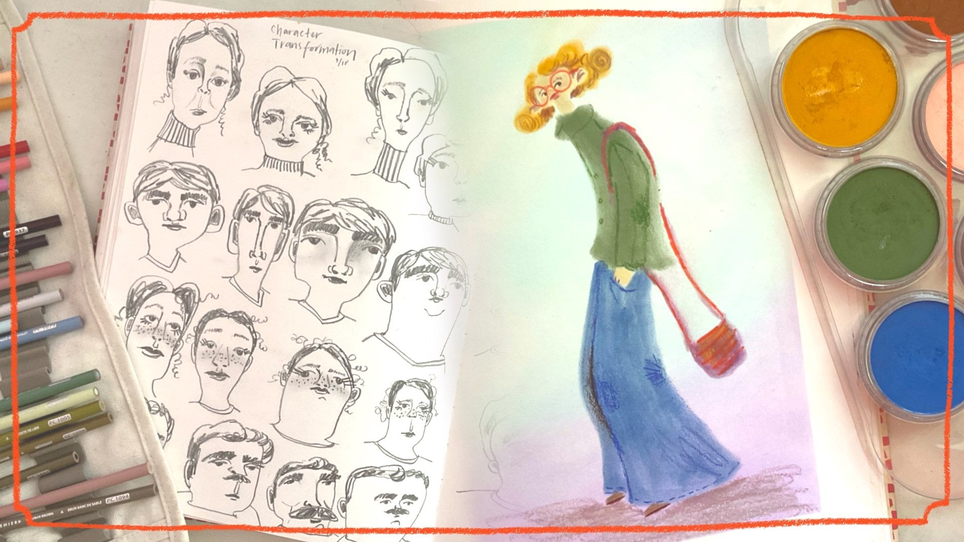
5. A Look at my Sketchbook: I want to share with
you my sketchbook, a closer look at
this one because I feel really proud of
where it's going already. I started it in February
2024 of this year. My intention was for this to be a landscape and on location, plane air sketchbook,
but of course, in February, it's
another age in Sweden. So I had to work from photos, but I would take photos
around where I live. This is the beautiful
Gripshm Castle and it was snowy landscape and the lighting in Sweden in
the wintertime is amazing. I just it started me off. I really enjoyed working on
this and it just continued. I just really jive well with this sketchbook and
starting to draw. On location or like
on location from photos that I've taken around
where I live or visit. This is also drab winter. I always tried to
make images that are so beautiful and
beautiful colors, and I usually probably would have used photos
from the summertime, but I realize that there's
so much beauty and texture in working from
that drab. Winter look too. I really love how
these turned out. I especially love
my little fence and like melted snow on gross, grass, if you live
somewhere that's cold, you know what that looks like Everything just
looks kind of gross. But in a image like this, it's fun to work on. More snowy landscape. Then I went to visit
my family in Florida, so it was like a completely
different contrast. There, I could sit outside on their balcony and this is the view from my parents' house, which is ridiculous,
like a nature preserve. This is from a fellow
artist drawing session. I got obsessed with
drawing this tree, and then I was like
I had a tree phase. The next y, I was How
do I create a tree? I have this beautiful tree
in the city where I live. During the winter,
there's no leaves on the trees, obviously. So trying to capture a drab tree but make it look exciting
with different colors. I think it became a
little bit too magical, mystical, too fairy for me, but I'm still working on it. Here's the tree in
the landscape has the castle in the
background again with the drab, winter,
everything's dead. But I'm trying to realize
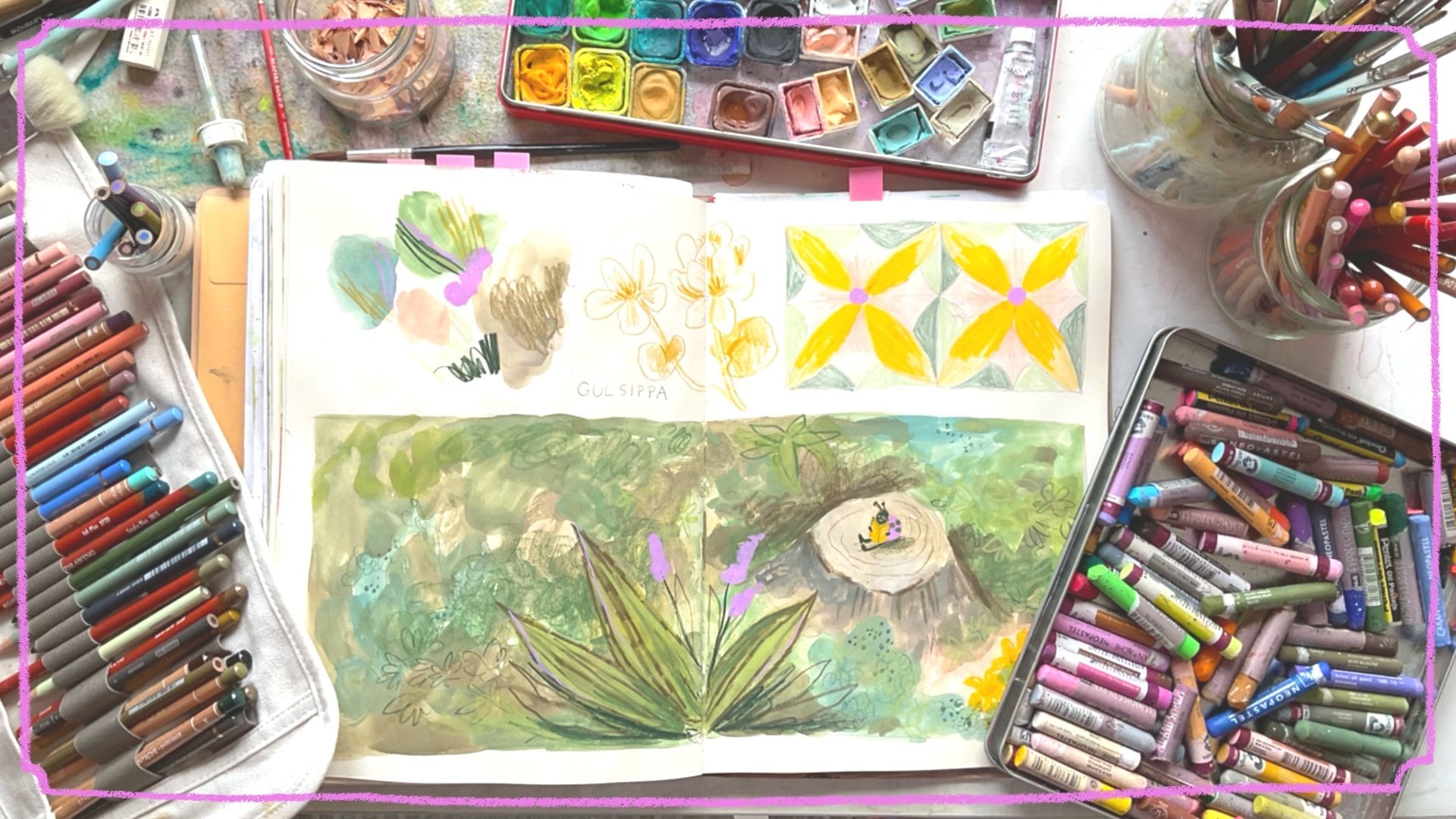
there's so much beauty in that. I just exciting to me. And then playing with texture
and cute in the forest, like a stump with moss on it and convert it into a
little fairy house, why not? Then I don't know
when this is April. Not quite spring yet
in Sweden for me. I think this was an old
photo from summertime that I worked on and I added cats
just to make it even cutter. I'm trying to not make this
sketchbook too precious by making it with finished
pieces on every page. Here I did have a swatching page just to break it up so I
don't make this too precious, but I do enjoy working
on final pieces in here. Here I was looking at
my view from my house, like a y. I added a
bunny just to add some life because I feel like sometimes these is
just a landscape, it becomes, it's not
that much interest. Add a little not a bunny a hair. We have quite a few of those. I saw that in a morning walk, I think the day that I saw this. Again, the landscape hasn't
bloomed into life yet. In April. Here, More around where I live. But again, I used photos
from the springtime. I think now is, May. I think that's when
everything starts to explode. Now when I was
sitting on location by the castle, it
actually did have. There was leaves on the trees, and, look a beautiful
butterfly, my God. That is one of the
amazing things of filming outside and
drawing outside, like, Oh, my God,
that was magical. Yeah. Again, this one I could
actually sit outside, that's when that my love for drawing outside
really exploded. I was like, Wow, this is
the most amazing thing. I sat outside and I sketched the castle and I didn't
spend hours on this, but there's some parts of
this that I really love. I love textures over here in the tree and just like
having been outside, I can remember that day and
how that felt to sit there. It's another view
from the castle park. It's another session I did
with another artist online. Here's more of the castle. I just it's such a
beautiful place and it's so easy for me to visit because it is an open park and it's
very close to where I live. I've started to figure out my color palette as well,
going through this. I've defined the greens that I like and the materials
that I like. Here's more grips castle
and the path park. I don't know. Not every drawing
is going to be amazing. More grips. In M Castle Park. Again, not obsessed with these, but you always learn
something when you draw. Here I did three
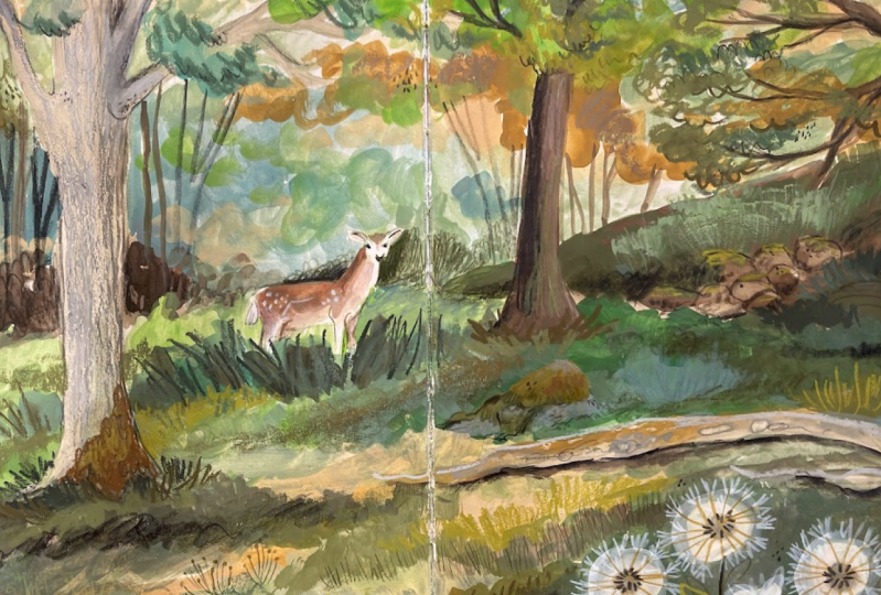
materials challenge. It's difficult, but it's fun. Here is Utah gen that we are painting in this
class and drawing. Utah is magical. It's a deer park where like 100 fallow deer just roam freely and you can walk
around on the paths. You see the glimpses
of deer walking past and the ancient oaks because there's tons of
really really old oaks. They must be
500-years-old at least. And there's just so much
greenery and I just love it. This drawing again,
made me fall in love with green on green scenes because there's so
many greens on here. I did spend a long time on this illustration, like 2 hours, maybe three, just taking my time to add just like layers upon layers
of different greens. I feel like I captured the
sunlight coming behind the trees and in the photo that I took because I didn't
sit and draw this, but I took a photo and
there was actually a deer that just stopped
and looked at me. Yeah. More Swedish is a
midsummer celebration and a house outside of
Utagan, the Deer Park. I here, trying to
work on seascapes. Not my area of expertise, but something I'm
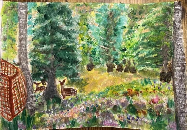
trying to work on. And then more into the forest, this is my artist, friend, Cindy's garden, her back yard and
they have sheep. So I really happy with
this little painting. Also, when you tape
off an illustration, it always just looks so much more professional
and finished. This side too sketchy and I
don't like the composition, but yeah, I love
what's going on here, especially the Ber tread, birch trees and the
sheep and like, Yeah, just the textures in this. I feel like, Yeah, I really got. I got it. Here's a drawing that we
did for my last class, fill Sketchbook. Pretty fun. Then yeah, more drawings. I drew in the woods with my, my artist friend Cindy, and we did rocks in the
woods with moss and again, this is just fun to draw because there's
so many layers of textures and another landscape. This was in Denmark
recent trip this summer. You can also see if
you look at my dates, I jump around in my sketchbook. Maybe I did this and I
left this page empty and I'll jump to another
page to do a full spread. Then maybe I'll
forget to do that in a while and I'll go back a few weeks later and fill that page. It doesn't bother me that it's not completely
chronological. Here's a view of
Denmark on a road trip. I tried to capture
what it looked like. It was so stunning when you see rolling hills of
different fields and the wind whatever those are called wind
mills in the background. It looks like a little kids
drawing, I don't like it, but definitely you would
like to try this again. Here we're to the class
project that you will see the process of in
the coming videos. This is a drawing that I did
quickly for another event. Yeah, is that it?
Now, I have one more. I just working on my sea scapes. Again, like, Yeah, I
love what's going on here and this and
some of the water, but it's a little bit
too much going on. I need to remember to keep things a little bit simplistic. And my figures, I
wish I had given them a little bit more like
they stand out better. But it's always a
work in progress. But, I just really love what's going on
right here and here. That's it. Now I have, I re use my washi tape so that I can I just move it until it gets really
grubby, and then I throw it. That's it.
6. Picking a Location: I want to talk about
picking a location. It's difficult to teach that because it's just going to be a location that's
going to draw you in. Maybe you don't like the allure of drawing in
the forest, like I do. Maybe you more like to be
at the marina and draw boats and water and cliffs
and things like that, or maybe you prefer,
like a rose garden. So it depends on what is your interest and
picking a location. Again, like, depends on
where you live and how safe the area is or what you're
allowed to do here in Sweden, we're allowed to go out into any forest, wherever we want, as long as we take care of the space and not
put lots of garbage there and respect people's
gardens, obviously. But maybe that's not the
case where you live. So yeah, again, it's up to you picking a location
I like to look out for different
beautiful places when I'm on walks or driving
in the car somewhere. And I always also make sure to take photos when
I'm out walking because not only is it great to prepare yourself when you go before going out on location, you can think about the
colors that you need to pack. Or you can also just
draw from location, but at home, using a photograph. I am obsessed with
Sweden where I live, even after living here
for over 16 years. I still am really just enamored with how
beautiful everything is here. So I feel like anything
can be drawn here. There's so many beautiful
Swedish red houses, and it's beautiful parks and
where I live in Mari Fria, there's a deer park
that I'm going to be sharing beautiful
scenes with you. And It's just I have
a lot to choose from, but I'm also really open to drawing on
location right now, so everything just seems great. I also think that once you
start getting into it, even a simple scene
like your garden or a plant like this or my basket of fire chili plant
or something would be inspiring to you once you get started and figure out
what you like to draw. At the moment, I'm
really inspired by drawing nature scenes
in the forest. I love drawing rocks covered in moss and green on green scenes. I'm really inspired by
green at the moment, and I really like to try to find that contrast with a
different tones and shades of greens and light screens and dark greens to make a scene
that's pretty much all green. But doesn't read as being
really flat and boring. But I also love the challenge of water and gardens. So yeah. The only thing that I
haven't pushed myself to start doing is drawing in the
city with lots of people. That stresses me out, but
we'll tackle that one day.
7. Take a Good Reference Photo: I'm not a professional
photographer, and I don't feel like I'm super great at taking
photos really, but I still try my
best when I'm out on walks or when I am
drawing on vacation, that I make sure
to try to capture the scene as best that I
can with my phone camera. I just make sure to
I usually get low. I think the compositions usually look better when you
get a little bit lower. And I tried to compose the photo in a way that
I would like to draw it. So I make sure that I have maybe a tree that's
maybe one third in or, you know, thinking about
two thirds or one third. Those magical thirds
always look really great. There's so many classes
here on Skillshare about composition and photography,
and they can help you. But mainly use a photograph
so that you remember the colors or the light or a certain tree that was really amazing or a rock or a boat, or it's just it is in
the name reference. And you can also remember
that a reference is just like a hint
or a help for you. You don't have to draw it exactly as you see
it in the photo. You can add and take
away things that you don't like or would like
to have seen and seen. Can combine several photos. You are the artist, so you're in charge,
which is really fun.
8. My Drawing on Location Process: 1: All right. It's
time to get started in the following videos, I'm going to be sharing my
process of how I go about drawing on location in
my sketchbook in Yutaga. Hello, friends.
Here I am in token. Token, as I mentioned before, is a nature preserve. That's a home to
about 100 fallow deer they're called t in Swedish. To stay away from the
deer, you have to sit. You have to stick to the path. I picked a place by on the path. Otherwise, in a regular forest, I could sit anywhere. But you have to be
respectful of the animals. Here to start off
with, I have used my washi to tape off the page, so it looks really clean and
nice when I lift it off. Now I'm just using a
very light green pencil to map in the composition
of the piece. These lines don't
show very much. You can hardly see them. But they're just a way for me to map out where I'm
going to be painting. It's not important to me
to get so many details, is just to figure out the
forms and what I want to put emphasis on. In the bottom corner, you can see my reference. That's what I was looking at. Now I'm starting
to paint and I use these pre mixed greens
that I've created. I have a very cool green
that I'm using here, and then I have a more
neutral green and I have a very yellowy olv green, and then a dark green
that's also quite olive. Here's the dark olive green that I'm using. It's very warm. These are just the
greens that I prefer. You might prefer
other tones of green. So it's, of course, up to you. You have to figure that out
by using different greens and buying different materials and which one speaks
to you the most. And this is the kind of green that I have realized
that I really like. I really like the contrast of
those live warm greens with a green that's quite cool
and almost minty. H. Only figure that out
by testing things out. It's a little fly on the page. I love. I love that. I hate that they sometimes get smooshed by the paint brush, but that they're
there is so sweet. It was a really lovely
day sitting here and being able to capture
the nature like this. I felt silly with my camera, but I tried to just
quickly get over myself because nobody cares. I met like three
people exercising. They just walked past
and said, hello. At the end of the
session, though, there was a group
of older people, the four older people, and they stopped, and they were so curious what I was doing. So it was really fun to
show them my sketchbook, and they were asking so many questions
about where I teach, and they thought I
would the teacher at a proper school in the area, but I told them about skill
share and they're like, that exists was so sweet. Here again, here's my contrast using the minty green
with the olive green. I just really like that combo. I think that it has that brightness and
then the coolness, and then it neutralizes
each other. I can't explain why I like it. I am looking at my reference, the scene and trying
to see the shadows. Those are going to be more cool, and then the areas where
the sun is hitting. That's where I'm here, I'm putting in a
Naples yellow to really capture those the grass, the dried grass
in the foreground that is hit with the light. So beautiful. I mainly or I think I only use this
dir went water brush. It's a very large flat brush, but I really like the
texture that it brings. And then if it's slightly dry, you can get a dry texture look. I'm bringing in a more
of a beige that I have mixed for the base
of the tree trunks. Strange doing a voice
over and talking about my own work rather than in
real time, like I usually do. I believe this is my first
voice over, so forgive me. If I chat too much or too
little, I don't know. But noticing what I do
is really interesting in analyzing it afterwards rather
than while I'm doing it. Here, I struggle to get those
dark darks in my scene. I am very good at
lights and midtones, but I'm not as comfortable
doing the dark, so I'm layering up
my green so that I can get that richness
in the background, so there's a contrast
between the tree trunks in the mid ground and the dark
foliage in the background, and then the really bright
grasses in the foreground. I'm also working on the
rocks because my feet, I love drawing rocks and the
moss on top of them and how they hit the light from
different directions both from the side and behind. Just remember
switch up my greens because if you were to just
look at this photograph, maybe you just read
it as being green. But if you look closely, you can see how many different
variations of green it is and that makes it interesting
to look at and to paint. Here I'm using my
more neutral green. It's not too yellow and
it's not too mint blue. That's just like my
mid regular green. This is also how I work. I choose to, I really like
doing underpainting where I just figure out the main
gist of the colors, and then I like to go over
with dry media and top later. You'll see that in
the next section. When I pause, I'm pausing
to look at the scene to figure out where
the light is coming, where the lightest areas are. I might also be waiting
for somebody to pass, so I don't feel as watched. I don't know. I can't
remember in the moment now. Here again, switching
to my warmer green, so I can bring in
some warmth once I've brought in some cool.
It's also lighter. So bring then that brightness to that main rock in the background
in between the trees, has a beautiful below. Hope that I can capture
that by the end. These are gash paints
that I'm using. These ones are the Windsor
and Newton that I have pre mixed and then they dry into those full
watercolor pants. But I feel like they nicely.
They're very creamy. The co not as thick as if you were painting directly
from the tubes, but I just like the
convenience of having a dried pan in my
watercolor or gah set. Now you can see how I
clean my brush on my rack. I told you in my previous video, I don't like to
bring a water dish, both because it's
messy and I don't like throwing out the
water into the park. I'm adding some
gray to the rocks. I think we're in the
middle of hitting the really ugly phase
of a painting when you just everything just
looks like a messy blob. These are the nash pans that come originally in
the set that I have. Here I'm bringing in that
really neon green to really brighten up some of the
areas that are glowing. But I think you
have to get through these kind of sections. When it looks ugly and you don't really know if it's
going to come together, you just have to keep going because at least in my process, I know when I bring those
details and I bring in my darks from colored
pencils or new colors, and that's when it
starts to make sense, but now this just
messy underpainting. Here I'm not quite little
water with the brush, so I can get those dry marks, Somos like dried grass. You can see better that you get the brush texture
that I really like. Trying to remember to give
some love to the tree trunks. I think they're quite light in my drawing in comparison
to the reference image. But I also wanted to make
sure that they did pop out from the background
because in the photograph, you can see that it is they
blend into the background, so that was something
that I used my artistic license to change. All right. Here is a closer look at my page and where
I've gotten so far. I want to show you a close up
of the brush texture so you can understand how messy I am
making this underpainting. So you understand how this
brush works. I really like it. I feel like it's starting
to get battered, but that almost makes it better. Yeah, that is the first
section of my process, an underpainting with lots of textures in different
shades of green.
9. My Drawing on Location Process: 2: F. Hello, my friends. Now we're jumping into
the second section of my process
drawing on location. So I'm going to be sharing
with you my process of turning my under painting into proper drawing with
lots of little details. So as you can see in
as in the other video, I have the reference
image in the corner. And now I'm just using neo coolor pastels
from Caran Dash. These are the Aquerll version, the water soluble kind. This one's in Umber, I believe. Just to give some
shadow and definition to the tree because at
the moments very light, and I'm going to need
to work quite a bit to make sure that the trees stand
out from the background, the background stands
out from the rocks. I didn't do that very
well in the paint, so I have a lot of work to do with my dry media,
which is kind of fun. Sometimes I take more time
doing the underpainting, and sometimes they
take more time in using the dry media more. Depends. And this day, I did a lot of a lot less
work on the underpainting. And I'm going to have to
do a lot of work here. I feel like I just said that
three times. It's all right. I use different strokes to
mimic the bark on the trees, and sometimes I use darker
strokes to create shadows. Here, I'm using the
same umber color to bring in the trees
in the background to really define those as well. I do most things quite scribbly. Not so precise. That's not really
what I'm going for. I really enjoy the texture that these new colored pastels give. They're wax type of crayon. It's like a Creola
crayon for adults. They're really easy to use. It's like using a very
large colored pencil, but it's a lot creamier, and they go over everything. I've switched up to a
more, light yellow, and this is just to bring
out all those patches of the grasses in the foreground that are
so bright and light. Again, now that I have a
bird's eye view of my artwork, and I'm looking at it from afar. I wish that I had
worked in paint and made those areas a
little bit brighter, and then areas around
it slightly darker, so that it would have been more impactful when I went in
with these lighter colors. Now it's quite subtle, but I think with paint, I could have worked on
that a little bit more. That's why working
in a sketchbook is so incredible and
also not spending, like, 5 hours on each
piece, just spending. I'm not sure how long
this is going to be, maybe, like, 40 minute
drawing, something like that. You have plenty of time to just do another one and
another one, another one, and you learn new things
each time and you'll discover layers of materials
that you really like. Hopefully, you'll remember the combinations.
I usually don't. Sometimes when you
look at a piece, you're just staring at at it, wondering what you did and how you could do how
you possibly did it. But you could always write yourself some notes
if you really enjoyed some materials just so that your future self will be
reminded of what you did. Here, I just jump in between different
areas of the piece, so I don't get bored
with one area. I don't like to finish one area, and then move on to the next. I kind of jump around. So I did some of the
grasses in the front, and I switched between
different colors. Now I'm going back
to the umber color, and I'm defining the rocks and bringing some
darkness and bringing in some cracks and things
like that into the rocks, so that they look
a little bit more rocky rather than just
like blobs of green. Just some definition.
I don't like to give my work dark outlines really, but you have to give some
contrast definition somewhere. This is what I'm simply just going in and creating
some texture there. Then again, just mixing up
different shades of green. If you are doing a green on
green illustration like this, it's important to have
many different shades of green and tones of green. So you have warm greens
and cool greens and light greens and dark
green so that you can create lots of
contrast and interests, so it doesn't become
just a blob of green. Think it's also important
to remember that a green scene isn't also
just completely green. Like in the photo that you can see the warmth in certain areas, it almost goes towards peach. And in the dark areas, it almost goes towards blue. So depending on your style
and what you like to do, you can pull those things out. I if you just observe the photo, or you just observe your surroundings if
you're out in your own, nature scene, your known park. Then you can just try to pull out those colors if you're
really looking for it. If you see some leaves
and they're quite cool, you could just
change them to blue. Why not? A sunny patch that's shining almost in peach tones. Turn
that into pink. Why not? Just try it. Here I'm lighting it up with a light green, new color pastel. And just whenever I
introduce a color, unless it's like a
really specific color, if there was a character that
has a red hat or something. That's really important,
that is just one thing. I usually like to use the color at least
three times in a piece, so it bounces your eye around. So now, see, I'm
bringing out my pink. So I'm bringing in the pink into those warm
areas in the grass. It's very subtle.
But then again, I'm remembering to use
it in several areas, like in the grasses in the middle ground and
to the side as well. I'm also bringing it
up into the tree just so the tree has a little
bit more warmth than light. And this is not necessarily in the photo
or in the reference. I'm just thinking about
my own personal rule of wanting to use a color in several areas of a piece just to make it come together nicely. And again, now I'm jumping
into the background. I'm using a quite warm
green, very olivey green. And again, I'm just
bringing in more textures. So it's just just layers and layers of textures and
different tones of greens. As much as I like
the painting part, I think I really like this
part better because this is when you really see that
everything comes to life. I like that the tree is
starting to pop out now. The background is darkening so that the tree
that's quite light, and I've made it a lot lighter than it is in the reference. Then it's starting to just
to have that contrast. You can tell that
it's a tree trunk and it's not melting
into the background. Here I'm adding
some variation to the greens in the
background to mimic leaves and different patches of light as it comes through the
trees in a simple way. I'm not drawing out
every single leaf. Maybe that's something
that you like to do, but it's definitely not something that I
would like to do. Even though I wanted the
background to be dark, I think it's important to have
little areas of lightness. So it doesn't become
a blank or a black, harsh, flat background. If you have lots of variation and the different colors, Yeah, just I'm trying to mimic the sparkly leaves that
you see between the trees. All right, now we're
jumping back into adding warmth into the scene
because there's a lot of warmth through
the trees there. So bringing in that, like,
warm, light, yellowy orange. Well, now we have jumped into
working with oil pastels. And I really have started
to love working with oil pastels because they
seriously go over everything. So if you have a page full of paint and colored pencils
and neo colored pastels. Now you could just if there's certain areas
that you want to add more texture and different colors to oil
pastels, will go over that. So now I'm adding
even more texture to the tree trunk here. It kind of looks like I'm
taking away everything, but it's hard to see, but, adding a lot of
that nice texture and different colors
of warm Basian. Dark gray beige to mimic
the bark on the tree trunk. I also have this
very dark green. It is called O olive black. It's from neo pastel, and this one is
really rich and dark. Sometimes I find it
difficult to find really dark colors and colored
pencils and neo colors. But this oil pastel
really helps me to get those dark dark so
that I can really get some definition in the
moss here on the rocks, and I can just bring
up the contrast for it because for the
past few minutes. It's been very in the
same kind of mid tones, and I didn't have any
really dark dark areas. So it's really important to
have those dark areas as well of the light areas and the
middle middle ground areas. Something that I'm
still struggling with. I'm not very comfortable
putting in the dark darks. I'm just jumping around the different rock areas
because this is where I want to define the most because
I thought it was the most interesting
part of the scam. I'm jumping in with
a more medium tone regular green oil pestel, to blend those darks together
so it's not so harsh. Then I have this even, very light olive green, and that's going to give
that those brights. Again, now that I'm
looking at the reference and looking at my own decisions. I wish that I had spent I had
found a different color for those bright sun drenched rocks in the middle
of the scene. Because in the photo,
they look so golden. And here I e the green color. I wish I had chosen those
peachy tones in the middle. I think that would have
been really beautiful. But as I said, I can just redo this scene as many
times as I'd like until I feel like I've learned more and more things or
draw similar scenes. I usually don't like
to draw the same scene twice unless it's
really gorgeous. And as I continue
looking at this as well, I don't really like
the composition that I. I took away too
many of the trees. I wish I had had
three trees because the two trees With the
empty space in the middle, I feel isn't a very
nice composition, and it would have been
nicer like in the photo, the three trees, but I had just taken the two in the center. I wish I had taken
that third one that's more closer
to the foreground. I would have been
nice. But that's something you can
do in your version. Okay. Again, just changing to different tones of green
so that there's interest and variation within them so that they recede and they pop out, certain areas of the rocks and the moss feel like they're like, in shadow, and sometimes
they're in the golden light. Oil pestels are quite sticky, and they can have those
little rolled up balls of oil pestels. Sometimes I just smush
them into the page slightly or lightly
brush them off the page. I think these brands that I have are they're not so
sticky and messy, but they certainly can be messy. Here I'm bringing even
more lightness to certain rocks just to
really bring them out. Here's a very very
brownish green. Again, here I think
I went overboard, so I correct it
with another color. But I do like the
warmth of that, especially if you are
looking at the reference. There is so much warmth. So it's important to use that. And then if I bring
in too lightness, I can go in with my
darker tones to make sure that I am keeping
that contrast. Yeah. Again, if I feel
that it's starting to get sticky or messy, I can use my fingers to smoosh in the oy pestles a little
bit with my fingers. Here, I'm bringing
back the neo coolor to give even more definition
to the background. Using the umber color I switched to because I wanted
it to be even darker. And I feel like
that umber color is warm enough and almost green so that it works
really well in green scenes. I really like the color umber. T. Here. Then by making the
background even darker that rock in the
center that I wanted to be the main feature of this illustration
really makes it pop. Also helps with the tree trunk so that they really
stick out as being tree trunks in the
foreground rather than just a weird section
in the background. Using some of the oil pastels at the top for the leave so that they look
even more leaf like. And then using my darkest
oil pastels to give even more definition to the leaves at the top
of the trees there. So again, so that they
look like they are leaves, and so there's a lot
of definition there. So that also matches
the rest of the scene, that we have the kind of
flattish textured background, but then we have
the textured leaves and the textured rocks. I like to just mimic the
shapes of leaves with little swirls or something like that or little
blobs of color, but not necessarily drawing
out individual leaf shapes. I'm starting to feel like
the images coming together. I'm taking off the tape to
reveal the final image, and this is a so satisfying because
that clean edge makes it really feel finished. I use a sensitive wallpaper
tape from Tisa Otsa T ESA, it's meant to be used when you're painting trim
on a wallpapered. So it doesn't rip the wallpaper, and I found that it
works really well in a sketchbook that it
doesn't rip the paper. Then we have the
final piece of tape. I hope this was relaxing and interesting to
watch and listen to. I am finished with
my piece in taken, and I'm quite happy
with how it turned out. I always learn new things and wish that I had done
things differently. There's some gorgeous texture in there and I had a lot
of fun drawing this, and I was outside, so I
hope that you enjoyed.
10. 5 Swedish Scenes to Draw on Your Own: Mossy Textures: There was so many places that I wanted to share with
you in this class, but I feel like it would be a long winded class if we drew
at every single location, but I still wanted to
share these with you. So my thought is these
are some calming, short videos of different
locations around where I live that you can draw
from as if you are there. I've also left stills in the reference area if you'd
prefer to work from a photo. Yeah, I hope that you enjoy
drawing around Sweden with me and enjoy these
beautiful scenes as well. A This first scene, if you need a little
bit of instruction, please try to focus on just
the texture of the scene. Think about those rocks
in the background, even though they're
quite in, like, a cinematic out of focus, can try to mimic the textures and colors
that you see there. Also think about
that nice white mass on the top of the other
regular green mass, and how you can capture
those kinds of looks. Also the leaves, and just
anything that you prefer, but really focus
on the colors and textures and layering of
materials on this one. Also, feel free to pause the video and use as
much time as you like. Enjoy.
11. 5 Scenes: Fallow Deer: Moving on to the next exercise, if you need a little
help with these ones, I have chosen two scenes
with deer for you to watch. I have slowed them down so that the deer practically don't move, and you feel free to
pause at any section, if you'd like to capture
them in more detail. But mainly, I'd just
like you to capture the deer in their environment, think about the co and how
they melt into the scene, or into the landscape, or draw the landscape. Again, it's up to you. And of course,
remember that you can rewatch the video several times, or you can pause
whenever you need to if you need a little
bit more time. Enjoy.
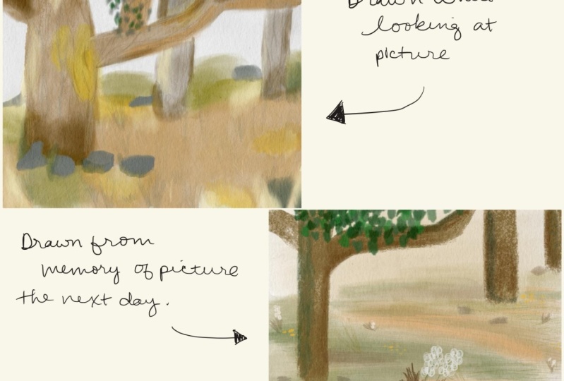
12. 5 Scenes: Around the Corner: For this image because it's
so composed with the tree, and there's such a
difference in the values. I think it would be really
interesting exercise to work on a value study. So rather than painting
out the scene, you could use pencil
and just work in black and white tones or you could use a color
of your choice, a dark brown or a
dark green and sketch out the scene as it
is in the image. But you can also test
out what would happen if you made the focus on the
background and not on the tree Just play with the image and
see what you come up with, but you can also paint it, too. And also, it's
quite empty scene, so if you want to add somebody sitting on
that bench or somebody walking on the path that would bring this image
even more to life. That would be great. Enjoy.
13. 5 Scenes: Angled Oaks: I love this image. I really hope that you
find so much goodness to paint or draw or
sketch in this scene. There's so much light to
play with and shadows and depth and textures in the grasses and the trees
and the bark in the trees. So just really go full force with everything that you learned
in this class or that you took from
my process and just go for it in this very
green on green scene. Think about the different
greens and how to do the textures of the
bark on the trees. Oh, I really hope that you
enjoy creating this image. Fin. One success. Successful sss specs. Isis's sss. That's sss. Isis's success success
14. 5 Scenes The Bench: And now we are on
to our last scene. This is the scene you saw me at the beginning in the intrio. I could sit there all day. Such a lovely spot, and that bench looks really
rickety, but it's solid. It's really sitting there. So the lighting is
beautiful in this piece. The ancient oak is gorgeous. There's a little red
shack in the background, and there's a dead branch in the foreground that looks
like this monstrous snake. I hope that you find lots of beautiful details to
capture in this piece, and I really, really can't wait to see
your final results. So please upload something
to the project gallery. Enjoy. This is. This is sss That's sss. That's sss. Sss. Ss. Sss. Sss.
15. Next Steps: Alright, that's it.
My hope is that you now feel a lot more
comfortable drawing outside and are excited
to do so and that you enjoyed drawing on location
virtually with me in Sweden. I'd like to go over
some next steps for you so that you
can keep this going. And that the first
one would be to bring your sketchbook
with you at all times. If you have a small
bag and you have a small sketchbook
that fits in there, make sure to bring that with you so that rather than scrolling on your phone when you're waiting at the doctor's office or
something boring like that, that you can sketch
for a little bit. And if you have some reference photos already on your phone, of beautiful nature scenes, you have something
to draw right away. You can create different albums of photos that you'd like
to draw in the future. And then you have
stuff to draw from. That leads me to my second tip, which is to make
sure to take lots of reference photos
so that you always have beautiful images to draw from when you are
waiting somewhere, or you're at your
child's soccer practice, or you are at home on a rainy day and you
wanted to get out, but you can draw from
nature from inside instead. You can create different
albums on your phone of, like, nature scenes that
are in the forest or the seascapes or gardens or whatever it is that
you like to draw. And last but not least
research lots of different places that you
would like to draw in, if that's different nature
preserves or gardens, or if you'd like to
take a little day trip somewhere else and research the colors and
what the scenery is like, so you know what kind
of colors to pack and what materials to bring
for that little art trip. And I hope that you enjoy
planning these days, and you can bring a friend along with you and make it
a whole full day. It's such a really
nice activity. I really really love
drawing on location. I'm sad that we're going towards the fall and winter when
I'll be cooped indoors, and it's really actually
not possible to draw outside when it's
minus ten or more. -20. No It's usually difficult to even
take reference photos in winter because
my hand freezes for those several seconds
where I'm just trying to take a reference
photo. It's insane.
16. Final Thoughts: Okay, that's it. Thank you so much for watching
this class with me, and I really hope that you enjoy drawing on cation in Sweden. I really can't
wait to see all of your spreads in the
project gallery. So please be brave
and upload those, and I would love to
comment and like and just see what
you got going on. Especially if you have
drawn one of my scenes, but especially especially
if you have gone on your own location adventure, I'd really love to see those. If you'd like to hang out with
me outside of Skillshare, you can find me on Instagram at Christina Hot
camps or my website, Kristino camps do com. And I have a really
beautiful Petron You can also find me there, Christina Hokans we have
monthly themes such as this going in nature in Sweden or seascapes
or people or animals. And every month, we have
different draw with me videos, and I've even done a
couple Zoom sessions. So I'd love to see you there if you'd like to draw with me on a monthly basis as
well. So, that's it. See you in my next
skill share class, so make sure to follow
me here as well. Bye.
 Kristina Hultkrantz, Illustrator & Surface Pattern Designer