Transcripts
1. Welcome to Class: Hello, Skillshare. Let's fill a sketchbook together
this time with people. My previous Phyllis
sketchbook classes, I went over my basics of sketchbooking in a way
that makes sense to me, and I also did a pretty
spreads edition, too. I hope that it helped you out, and you have gone on to
fill many gorgeous or ugly, like I've mentioned, spreads. There's no judgment in
multiple sketchbooks. This time, I'm specifically going to be going
over how I develop people and get better at drawing people and characters
in my sketchbook. Sketchbooking has become one
of my favorite things ever. Through my sketchbook practice, I have developed my
skills as an artist, experimented, had fun
in the process, too. As much as I adore getting
better as an artist, I really mainly enjoy
sketchbook time as me time, a time to be enjoyed. My sketchbook is a safe
space and it doesn't need to be shared unless I
want to, like with you all. But I mean, I also really
enjoy getting to hone my skills and noticeably see
that I'm getting better. And this has been a long
journey with drawing people, and I'm so happy to share what I have learned
with you all. In this class, I
will be taking you through different exercises
that you can do in your sketchbook to help you to develop people and
characters easier. I will share simple
exercises to help with character building
and my tips for drawing and painting interesting
people all in the safety of a sketchbook.
Hello, everyone. I'm Christina Hultkrantz, an illustrator and
surface designer from Marie Fred Sweden. Welcome to my CheeryPink studio. I am mainly a digital artist. I work in Procreate, but I really love playing
with art supplies. In my sketchbook, too, I have a whole day dedicated
to it called Fun Friday where instead of
real work on Friday, I play with art
supplies and hone my skills and take
creative classes, and it's obviously the
best day of the week. Drawing people has
been a journey for me. Drawing people
photo realistically is kind of what I learned
through school and art school, but trying to break
that to create characters that
reflect me and how I want to show people has been interesting and
fun to go through. I don't know how to explain it. But, yeah, I have been for years trying to
hone how I want to represent people in my way and not just looking at
photos for reference. So I'm really excited
in this class to share what I have learned and how I have honed my
personal way of drawing people. And also, I want to
mention it's not done. Like, this is a constant
process that I'm developing and getting better
at, and you will, too. So let's get started.
2. Supplies and Class Project: To follow along in this class, you'll be needing a sketchbook
and drawing supplies, and they can be any
drawing supplies that you prefer to use. You could just work
with a simple pencil and a simple sketchbook. But if you would really like to follow along with
the things that I like, I will be sharing my
favorite materials in a coming up section. For the class project, you will just be sharing a
page from your sketchbook with the different characters
and people that you have developed in this class
using some of the exercises. You can choose whichever
exercise or page that you are feeling most proud of to share in the
class project gallery.
3. People Sketchbook Journey: In this next section, I want to show you my
journey of drawing people and characters in my
several sketchbooks that I've had over the years, especially my latest
sketchbook called Menkuan, which is Swedish for the person. And, um, yeah, let's
take a look at that. Alright, my friends,
it's time to talk about my sketchbooks that I
use for drawing people. I mean, you can draw people
in any sketchbook, obviously, but I wanted to show
you two that I have dedicated to my journey
with drawing people. So I've had this one since 2023, and I keep adding the
year because I'm a bit of a slow sketchbook user sometimes because I have so many because I have different themes, so I never get done with just one and then
move on to the next. I have like 20 going
at the same time, maybe not 20, maybe like ten. So anyway, one this is the ostrem 1917 in
the A five size. And I really like it because it has tons of sheets of paper. That's why it takes
so long because it has, like, 250 sheets. And the pages are nice, that cream color, and
they're very thin. It's 80 GSM, so
they're very thin, so you definitely can't
use paint in here. But just to use just like a traditional pencil
in here is so lovely. I think the pages are so
smooth, and I really like it. So for just taking
notes, ideation, coming up with characters, I really like this sketchbook as a place to start because it
doesn't feel so precious. These are quite expensive, but when you factor in that
there's 250 sheets of paper, I don't think that
it's that much. Am I lying that
there's 200? No, 250. Look, 249. There's
actually 251. See? And here I've used marker, so it does take a little bit of but you can see it
buckles a little bit, and you can kind of it
doesn't totally seep through, but you can see it
on the other side. So I'd say it does take
a little bit of, like, marker or colored
pencil and dry media, but for the most part, yeah. So this is, I would say, if I'm gonna sit down
and draw something, I'm not really sure what it is, I will sit in here and fiddle with something, make thumbnails. I have written lots
of notes about different characters
that I want to create. Here, if I'm trying to figure out how a character
is going to look, I can redo their head a
couple of times and, like, just test out before I draw in this one that feels
a bit more precious. And like I have to
create final work there. Let's see. So I
don't really want to do a tour of this one
it's I don't know. This one feels a bit
more personal because it's a little bit sloppier and, there's lots of
stuff for my kids. They draw stuff on postts
and I shove them in here 'cause they're so
cute. Like, What is even. I think this is a
portrait of me. Anyways, yeah, here I was
drawing a little character, my daughter Tilly
and she's so sweet. My daughter, I think, helped me draw her body,
which is, darling. Way better than mine
turnout. These are good. Anyway, so I just wanted to
mention that I have that I really like this kind of
sketchbook to have just, like, reference, and we'll go over
soon how we draw the face. And yeah. It's nice to have a place
where you just put your ideas, and this is where
the ideas get going, and you can sketch freely and kind of low pressure that it doesn't have to be beautiful
in every single page. But you're just
coming up with stuff, and I think this is
here where I am making the most advancements
in my artwork because I am testing out stuff and I'm not being too precious about it. That has to be perfect. Like, these characters
aren't perfect, but they're really acute and
they're getting somewhere. And I just Oh, and then, like little
characters. How cute are these? The flurps. I want to do
something with these. Look at these ones.
Then I'm gonna do a little little
kiss. So precious. It's okay to be obsessed with
your own artwork, I think. Oh, here, I was trying
to figure out what a hedgehog looks like. Look at the progression,
like, from this, and then I finally got here. Sometimes, you know, you
have to draw something one, two, three, four,
five, six times. Alright, so that's that one. And then I have this one. This is a beautiful sketchbook
from is it Fabriano? Where are Wait, Fabriano? This is the Venezia
Sketchbook. It's really big. This is the biggest size I have. I'm sorry, I don't
know what size it is, but I'll make sure
to link it below. It's a beautiful cover. The pages are like 200 GSM, so they're really
thick, beautiful crisp white drawing paper
that's relatively smooth. There's like a
classic grain to it, but it's very slight. So if you prefer, like
classic drawing paper, then this is a
sketchbook for you. It comes in different sizes. It has, like, the A five size. And a smaller A six size too,
but I really like this one. I've called it Mincun.
This is in Swedish. Mencun means the
person or the person. Or people inequan but
people, the person, humans. So I've dedicated
this sketchbook, and I started this
in March 2024, and in the hopes of bumping up my game with creating
people, so I started off. And here's going
to be all kinds of different things that we're going to be doing in the class. So I hope that you'll
get excited for different exercises we're
going to be doing together. This is the 40 faces
challenge started by Sarah Dyer and we're
definitely going to be doing that because it's so much fun here and then
doing another version. But with full figures. And it's fun to see, I don't think that
these are bad at all. They're really good, but we'll see how my artwork progresses, even just like in a year because now it's more than
a year, actually. Now it is September 2025. So how far have I
gotten in these pages, and I'm almost done. I have like five pages
left or something. Anyways, here. So just playing
with mixed media, different materials and
layering things up and trying to exaggerate colors and
forms and things like that. This sketchbook is great for mixed media because the
pages are so thick. It really takes paper, takes paint and
different layering. Maybe if you really use a lot
of watercolor and a lot of water and a very wet media,
it wouldn't be so good. And I would get a proper
watercolor sketchbook, but for, like, just slight
painting, it's pretty good. These ones not so
happy with the color. I wish I didn't do
the backgrounds. It It just looks messy, but there's some nice
characters in here. I like this guy. He looks cozy. And
who else can we find? He looks also very nice
and he looks very content. She looks angry. And then, yeah, little people
to have in backgrounds is really fun to remember to do
or have, like, a reference. So when I'm doing a painting, I can open up this
page and pick out different little people that
I played with, creating. Right. Here's a full
painting that I tried. You'll recognize
this girl that I just showed you in
my other sketchbook. So I had sketched out the
dog first to get a feel for the shape of the back and how it was standing and same
with her and her face. So mermaids. And here I went last year to the castle that we have in the place where
I live in Sweden, called Grips homes Castle. And they have a huge Mongos portrait
gallery, and I, of course, had to go and sketch all of the funny portraits of the different here's Queen Kristina. And lots of others.
And these are more in my realistic style. So when I'm sketching
an actual painting, this is how I would
try to depict as realistically as I can
without major stylization. And that is a good
practice, of course. Here I drew my children. Looking at the Griolm castle. We live in a really
beautiful place. Even though I really
like this sketchbook and even though it has
relatively smooth paper, I still find that it's a little bit more texture than I prefer. So I prefer other sketchbooks
for when I do painting. Here's some more portraits. And here's another exercise that we're going to be doing drawing a person and then seeing how you can stylize them further. Here's some learning I
did with Rebecca Green. Here's some more black and
white kind of portraits in my more realistic style
that I like to do. Here this is from Emma
Carlisle Sessions. More of that. Here's a little
portrait I did of a character I came up
with called Rosie. Here she looks like
a giant child. I supposed to be a child, so she should be like Edy bitty. So Can't Ovie always do well? It's just like my
journey as I think about stylizing and exaggerating people's
poses and their clothing. I think it makes characters more interesting when you pull out something of their character to make it more
interesting to look at. Like this woman with her nose here is a more realistic nose
and then pulling out, her face just became more interesting to look at
with that nose, I think, or here with big eyelashes and this woman and that
she's leaning back, walking is way more interesting than if she was just
standing straight. What else? Yeah, this old woman's
coat and dress is way oversized than what she probably looked
like in the photo. Here again, just trying to draw the same
face over and over again until you
find something that feels more like what
you're going for. Like, I drew this portrait, and then I tried her again and again and this one
looks more realistic, but this one looks more like a character in a book
and I really like that. Here's Rosie again. I was
trying to recreate her. And here's the 40
faces challenge, but this time because I was annoyed with
all the color that I used last time I used a
very limited color palette. There's some really fun
characters in here, too. What do we like? This girl with her pompom hair is really sweet. I like this girl,
you'll see her again. So it's also like, once you
draw characters like this, and you've just
done their faces, but you can pull out them later for other paintings
and drawings. See, here I used her again
and gave her a body. And here's another nice more painterly I forget to fix my pages so they
get a little messy. It was just a random page
where I was testing out some materials and mediums to see how that
worked on this paper. And then some more sessions with other amazing artists
like Emma Malaka. I really like how this
portrait turned out. And here, I usually like to use dry media when I draw people because I feel
like I have more control, but it's fun to add in the
paint to also test out that. And I of course
love using paint, but just constantly
trying to figure out what materials
I like to use. Like, here, I was
using oil pastels. I love the look of that,
but it also they get so it gets a little
messy sometimes. This is a self portrait of
me when I was ice thing. This past winter and
trying to, like that. Here, I don't know if that face is good enough, but, yeah, here it's more like, it's
so cold and delightful. Here, I started working
with PanPastels, and that's something
that I'm going to be focusing a lot
on in this course, because I just
adore them so much. So here's some group
drawings that we did with another artist
teacher Emas Moka. And here's some more
portraits and people. I just love this medium. I love how soft it looks. I like the effects
that it gives, especially when you're
drawing skin and hair, it has this because it has a see through texture
that you can get. I just really like it. And then with pencils on top,
it just works really well. I also like that you don't
have to wait for paint to dry. So pastel has become
something that I've really enjoyed
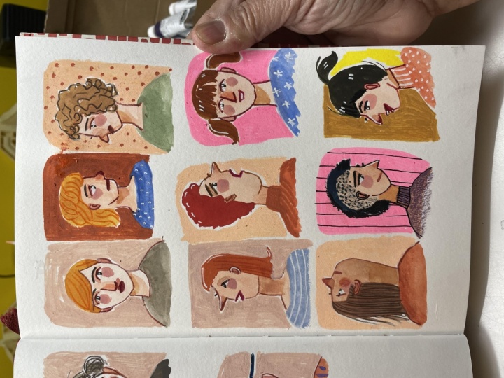
working with, especially when drawing people. So I feel like the rest of my sketchbook is filled
with this pan pastel. Here's some more character work. Here's the pastel in
the background just to give some color for my
little character study. I really like these are fun. If you have kids, you
know that they don't just sit still and,
like, sit pretty. Like, if they're sitting
or doing something, they're like, they have they're doing they're doing things. And here's a little
ballet scene. Honor me as a ballerina. Here's another 40
faces challenge. My daughter helped me again
with a couple of them. Those are really
great. And here, I've been really trying to push the shapes of people's heads, so they don't have to be a
perfect oval every time. So shapes like this that
are a little wonky are starting to find
really interesting because it just gives
them more character, and that's something that
I would like to achieve. Maybe you are trying to achieve something a little
bit more realistic, and that's fine, too, obviously. And again, the limited
color palette is really helpful in this kind of situation when you're just
trying to figure stuff out and you don't have to think
about 5 million colors. Here's a I'm getting ready to do a little exercise with
you later in the course. So that would be fun to do. Here's some paintings
that I tried to do. This girl's very cross
eyed, which is unfortunate. But yeah, and I, whatever. You learn every time you
create something new. Very green on green. I've been enjoying the greens. Here's some more fun exercises. Here setup so we can do the
40 faces challenge together. Here I did another really exaggerating arms
on two characters, and I think that is,
again, really fun to do. Like, I saw this
image and she was wearing a rather large
coat for her size, but I really accentuated that. And here, just thinking about
walking home with groceries sometimes feels sometimes
like it's this big. I really like how these
turned out as well. This one, again, I need to fix. I need to fix that. Because they turned
out really beautiful. Alright, here we're
going to work on some more full figure people, and we'll finish
this page together. Again, I just love the look of the soft pastels with colour
pencils. It looks so pretty. I hope that you'll enjoy
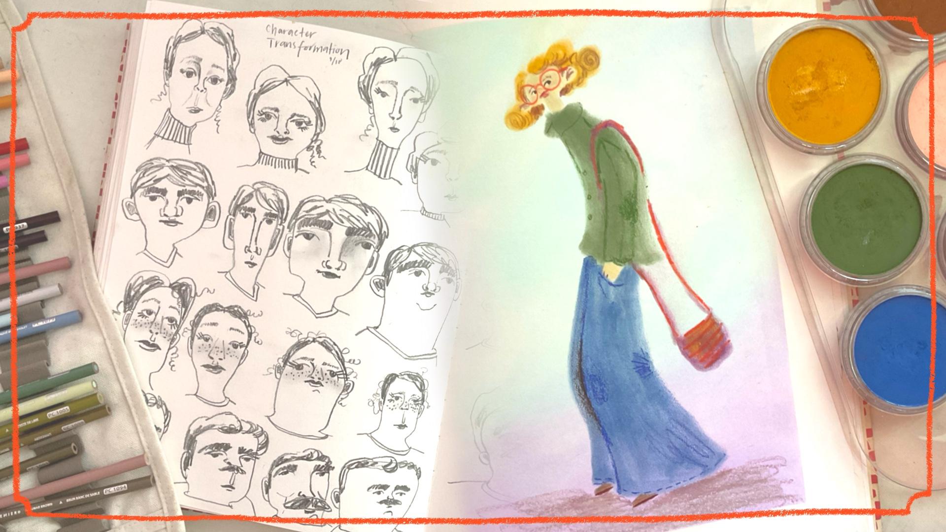
learning about that, too. And here, character
transformation, I use the same reference
image for these four people, and then just saw how
I could pull that and make different ideas
and think about that. So we'll do that together. And here is set up a
page so we can do a similar finished drawing
like I did here. With washi not washi tape, with a wallpaper tape. I really like that
tape. It's from Swedish brand T Tessa Tesa. And here's another one
that I did recently, did this yesterday, actually. And again, drawing a figure, trying to accentuate
different things, testing different faces out. Um, yeah, I really like. This one I had
drawn her head big. That's why I colored out the
background and tried again, and I really like how her
head just makes more sense in the contrast between
her large body and her huge feet and her
teeny little head. And that just looks
way more fun. And when she had a
head that was, like, in proportion to her body, it just looked boring
'cause everything was big. It was a big head, big body, big legs, big feet. And then working on expressions,
I really like this one. She's really giving
good side eye there. This one's pretty good too.
This one's more side eye, a little bit suspicious. This one looks like curious
and kind of cheeky maybe. This one's just kind of sweet. Alright, so that's it
from my sketchbook. So I hope that you're going
to be looking forward to filling more of these
pages with me together, and we can learn
more about creating really interesting
fun characters that you can then pull out of your sketchbook to create maybe children's book
illustrations or posters or in your
illustration work or maybe even character design within your surface
design portfolio. Okay, let's get started.
4. Materials: Alright. Time to talk
about drawing materials. I'm especially going to share with you the kinds of drawing materials that I like most and feel most comfortable with
when I'm drawing people. Since we're going to be
playing with materials now, I thought that I would
bring out my play sketchbook because this
is the royal talons. It's a little bit more affordable and doesn't have as snazzy paper
as the other one. So I'm going to bring out
that to talk about materials. So for this class, we're going to be
working a lot in just traditional materials like a colored not a catalog pencil. A regular pencil. So this
is the black win pearl. You can use whatever
pencil you like. I like this one
because it's very dark and it's very smooth
and it's very nice. I also like the
Caveco sport holder, and you can buy
replacement leads. I believe these are five. This is the five
millimeter size, and the lead that I purchased
is from Fabri Castel, and I think it's five B. I think so. So it's
also very, very dark. So that one's also similar. It's very even smoother. It feels really soft, and I like the chunky size. So those are some pencils. And if you're an eraser person, using any kind of eraser, this is from Sabra Castel too. It's fine. Then we can talk
about colored pencils. I enjoy creating all the details of my works with
colored pencils. So I really like the
colored pencils from prisma color. I think
they're very nice. I like that they also are
the color on the pencil. So I use those a lot. I think they're
really smooth and they have really vibrant colors, and you can also buy
them individually, and you don't have to
just buy them in a pack. They have interesting colors. So here are some colors that I really like like rosy beige. And clay rose. They're very similar, like, the darker and lighter
version of each other. We also have henna. If you want something more
warm, that's a nice color. I like these colors, too. This one is called beige
sienna. It's very pink. This is the only one I
would say that does not match the color on the pencil, but it's a very
interesting beige color. And then what else? This one sandbar brown is nice, very greeny brown. Like those. So those are the prisma colors, and those are really
beautiful to use. I also really like der
went drawing pencils. They are so thick and creamy and they have beautiful colors. I like those. So this
is the light Sienna. I have also seen on the Internet that they're coming out
with even more colors because it's been a pretty limited color palette
that they have. And then polychromos are a
classic. They are also nice. They're nice because
they're affordable and easy to find here in Europe. It's difficult to find the
prisma colors in Europe. Um, yeah, and you can see, like, they layer nicely. I don't usually layer
much, but anyways, and I like those. Those are those. What else? We also, of course,
have the luminans by Carendas that are
beautiful colored pencil, but they're very luxury. But this one, Sepia is
just insanely pigmented. So it's nice to have a
few of these in some, especially the dark colors, like sepia and they have a dark indigo
color, a dark blue. That's just
ridiculously pigmented. So I definitely suggest
picking up those, but the regular kinds of colors, I would I would choose
polychromos or Prisma colors. So that's the colored pencils. And now I want to share with you these beautiful pan pastels. And so I bought a set.
It wasn't a full set. I think it was, one, two, three, four, five,
six, seven colors. It was the portrait
set, so it had, like, these browns and
this in the blue, and I've added a
few other colors, and I have other colors that I've purchased
separately on the side. They usually come like this in little they almost look
like makeups, I guess. And in comparison
to regular pastels, soft pastels are beautiful in
texture, and there's, like, the stick kind, like regular soft pastels
that are quite they're quite chalky and they're
really pigmented, but they get a lot of this dust. So yeah, you have to, like, work them really into your paper or really
use a fixative. And it's really, really messy. There's also not col it pencils, pastel pencils, so it makes it less messy, but
they still have that. There's so much dust
when you use pencils, and it's not recommended to
blow that because it blows into the air and then you
breathe that into your lungs. So using a little brush to brush away is ideal or bringing
it outside is better. We're letting it fall working. So that's something to consider when using soft
pastels like that, but pan pastels they have
some kind of other binder, so they really stick
well to the paper. I would compare it to working
like with eye shadows, and they come with these
funky little tools, or you have to purchase them, but they are made for
these, which is fun. So you just dip them slightly, and then there's a
lot less of that. It was I have tons on
my page to begin with. Lots of dust, but I need to show you that it's not that dusty. You can kind of work
them into the page. And many times in my sketchbook, I don't even fix them because they're like,
they're on here. But these ones,
they're just so messy. Like, here it is messy. If you are rubbing your
hands all over it. But there's just a
huge difference, and then using these
tools just feels fun. And because they're
such a weird shape, you don't have as much
control painting like this as you do drawing with a pencil that you have
a lot of control. So I just really enjoy
this medium a lot. And they come in tons of colors. They're quite expensive. So look for them on sales
and things like that. But I just if you enjoy this
texture of soft pastels, but have just hated how messy
they are, this is for you. I don't like how
much plastic it is or anything like
that, but sometimes. It's just, I don't
know, I have to deal. They mix quite well. You can layer them beautifully. It's just a really
interesting new texture, and I really just
like how they look. They get messy. You can have several for different
types of colors. I usually keep one for light
colors and one for dark. I also use a rag to just lightly dust or wipe off the excess colors so
I can choose another color. I have some of these pinky one and a light yellowy
one and a brown. These are great for skin tones. They also besides these
funky little tools, they also have other tools like this one that's
more straight, but I find this one
just breaks a lot. I has like a silicone cap, but it, um, just breaks. It's a little bit
more awkward to use. I prefer the other
ones that are flat. But this works, too. Just feels like you're painting, but it has a soft effect, and they layer beautifully. And if you do an underpaintings
with different colors, you can, of course, fix
that with fixative. They also have
these funny tools. I have them in an old dam jar. They look like, again, like
beauty tools, beauty sponges, but they're a little
bit more compact. They're not super soft,
so they still have, like, some I don't know, form to them. They come in different shapes, so you can get different um like detail you can see the layer quite nicely
over other things, doesn't completely wipe it out, but it just gets, like, a hazy effect, so they're just so pretty and fun to work with. So there's that. I also want to show you the fixative that I use in
case that's interesting. This is just a cotton rag. I prefer that over
single use paper. I have found this
one I really like. It's a a giant fix basic. And it doesn't stink super bad, and it's quite affordable. So this is the one that
I have found where I live in Sweden
that works nicely. And again, it's
not stinky and it doesn't it doesn't feel like there's a weird
coating or anything. It's just really nice. You can use just regular hair spray, but it's not as good, and I feel like it doesn't
spray as nicely sometimes, and your papers going to
stink like hair spray. Okay. Okay, so that's all the fine materials that we are going to
be using in this. In this class, for
the most part, I might whip out some paints, and if I do, I'll talk to
you about them in the class.
5. Drawing People Basics: All right. In this section, I'm going to be sharing you
everything that I know, all my little tips and tricks
that I have learned over the years of taking
1 million classes from different teachers and going to art school and just drawing and drawing
and drawing so that you can also feel comfortable
creating images of faces, of people, of characters, bringing your own
personality to things. Let's go through it all. I take a very relaxed
approach to most things. I think you would notice that if you've taken many of my classes. I'm not very particular about being super realistic or big huge rules or
anything like that. I like to just be casual
with my art making, and I think I prefer that. It's less stressful. It's
less pressure on yourself. This is me telling you
some things about anatomy, but if you want to
take a proper class, there's many here on
Skillshare that will actually teach you about
drawing people properly. I'm just going to share with you the absolute basics so that
you can create people, and then you can learn
how to break the rules. So I'm going to choose a
nice colored pencil here. I like this one.
It's called henna. So if you're going to be
we'll start off with faces. So if we're gonna be drawing
a head, you can, of course, do the normal, ovalis shape. And here is the top of the
head and here is the chin. And in the middle, I'm sure you've seen many
times that people who draw will break this down into
halves and then here. So in this half of the face
is where your eyes sit. So you can put the pupils there, and then your eyeball sits on top of that or
your lid, I guess. Now I didn't do that
very proportionately because also the
next rule is that one eye one eye should
fit in between here. So there should be
another eye that fits here and an eye on each side. Again, I don't think that it's important that this
is exactly perfect. That's what's going to make your characters have
some character. So here I made my character
have quite wide set eyes, and I think that's pretty. But if you wanted
it to be a little bit more realistic looking, you would make sure
that your eye are approximately one eye
apart on all three, A one, two, three, four,
five places. Alright. So there's your eyes. And then
in between your eye line, there's halfway mark
and your chin line, you're going to make a new mark. So it's halfway through. And that's where
your nose stops. So here you can put
your little nostrils and create a nice little nose. And then your nose goes all the way up
to your brow bound. So if you're going to
do that and the brow sits a little bit
over your eyes. And again, this is
something you can play with to make it your eyes more. Like, men have eyebrows that are thicker and
closer to their eye, and women might have
more eye lid space and have thinner browns. Depends on, again, the type of character
that you're drawing. And between the
nose and the chin, again, we're going to half
that, and that's where the bottom of your lip sits. So here you can draw
a little mouth. There. You can do the little cupid's bow
in here if you like. Then you have space
for the chin. And it looks to me sometimes like you
have a huge forehead, but right now there's
no hair on this person. We also need to talk
about ears, and ears sit. They can start at the middle of your brows to the
bottom of the nose. But, again, this is,
like, preference. If you want to make somebody
have bigger ears maybe more Hmm This is
a quite big ear. Yeah, there's something
you can play with having more sticky outdi ears or just, like, a simple ear
or small, you know. So this is just, like,
a realistic face and where you foot stuff. This again is the
top of the head, so maybe you draw pull the
hair line a little bit down onto the forehead
where it feels. Good to. I don't have
like I don't have, like, a mark. It's
not like halfway. It's less than halfway down. And then here we can give them something have to give
them a little sideburns. We give them a nice middle part. Also, this is the top of the skull so the
hair can also go up. I mean, you can
have really fluffy, big Texan hair, or you can, you know, keep it
a little flatter. But, I mean, this is, again, where you can add flair. If somebody has big curly hair, their hair could be
all the way up here, you know. So that's good. Men have thicker
necks than women. So a male, you might have a much thicker neck like to hear to give them
that masculine look, and women have thinner necks, you would bring in the
neck a little bit further. There you go. Same thing with noses and ears on
men would be larger, noses would be bigger. So these are all things that
you can play around with, but now you at least know
where you put things. If we just go over it
really quick again, here's just a simple oval face we can do the lines
to begin with. Here's the middle part.
Here I'll try to do this better by making the
eye a little bit. Bitter. So here, it's
like one eye space there, one eye space there, and one. Again, I'm not very
good at those. I did, like the
same. I make them a little bit too wide set. But I don't think it's
needed to take out a ruler. It's okay. Here's
the middle point. That's where the nose nose goes. You'll do nice funny. I've been liking to do
kind of piggy noses. You can bring up this
to the brow boon. Again, with eyebrows, you
can do a lot of expression. If you make the
eyebrows like this, they look really surprised. Or if eyebrows like
this, you look angry. In between the bottom
nose and the chin, you have that middle line, and that's where the mouth
goes on top of that. So if you're just doing
a simple character, you would put just,
like, the bow like that. Or if you're gonna add in
upper lip, you would do that. Here, again, I thought I put the ears a little bit too high. So I'll do it maybe somewhere in between and make the ears
a little bit smaller. A, stopping there. So And this is more of an
adult face or a young adult. I can teach you some
tricks for other things. So here we bring the
hair line again, not completely halfway
down the forehead, but a little ways,
maybe one third. And then you can
draw in some hair, give them some volume so their hair isn't
slick to their skull. And here we have a nice part. This one looks more, I
would say masculine, so I'll give them a thicker neck to show that they are man. If we're going to start
talking about like a kid, so maybe you'd make their head a little bit more round than oval, we do the lines on their face. One thing that one
little trick in the cartoony world is that
you add the eyes underneath the line instead and give little kids bigger
eyes, a large forehead. All their features are
just cuter and smaller. So I would say, like, just
making everything smaller, compactor on the face. So not doing this
with the lines, like keeping the nose and the mouse and the eyes quite close to each other
and eyebrows. So see that it looks
more like a baby. You can exaggerate that further, and that's things
that you can try out. But even more round and here's
the middle of the face. Here's nice big eyes on the little baby and you can do like a mouse and all
this much closer. You see that they look
younger? I don't know why. I assume 'cause kids, you know, they just have, like, big heads in comparison to their body. You just give them, like, a little hair on their head. Uh, old people are the same. Like, with kids, you're gonna
make sure that you don't give them any expression lines. If you start giving a baby
expression lines, like, cheeks like this,
they automatically look like old person. So if you're gonna do,
like, old person here, the usual if you
think about the face, maybe you get more
jowels and things, but same thing here with the the eyes in the
middle of the face, and here's the middle
where the noses, noses and ears get bigger
and bigger as you age, the old people have
nice chara noses, maybe the eyebrows
are a little bit more sparse or the old man, they might have
nice extra hairs. Halfway through halfway
from the nose and the chin is the mouth. You
can add that in. Here, if you add
these like the lines around the smile line and
then like crow's feet, you can even give some eyebgs. This is really where you're
going to make them look older by having the face maybe more everything's
hanging a little bit more. And then wrinkles
in the forehead. Ears can be really big here because people have they keep growing, which
is really sweet. I'll give them a nice make
them thicker. There you go. So here's some simple ways of putting up the
face so that you make it look so that the human eye
can recognize it as a face. And then in this class, we're gonna be further
playing with this. These are what the things
that you're going to do to make it feel weird. You're still going to recognize a face by having the eyes, the nose and the mouth,
but if all of a sudden you will play with this
a little bit more. If you change your eye line to appear, what does
that look like? And then you can choose
to do what you want. Do you want to do
this? But the nose is down here. We
can try that first. So you still recognize
it as a person, but they look funny. They look interesting.
So, or we can try you can also make
everything smaller on the face. So like, really small features. Here I'm just gonna
go for it instead. Just also looks funny. And interesting gives
a different look. So there's so many things
to start off with, but yeah, test out
in your sketchbook, just creating different people
and see how if you play around with different details, can you make somebody
who can you do a progression from a baby to a teen to an adult and see how you can make this person with the same
maybe the same hair. But as they get older,
you could even do a fourth and make them
into a grandpi by just, you know, adding
more wrinkles and jowels and make them
look really great. So this is something
that you can play with in your sketbok. To quickly go over the
rules of drawing a figure, I want to use this example that I have drawn in
one of my sketchbooks, and you use the
measurement of a head to signify what age somebody is, which is
really interesting. So an adult is, if you think about the size that
you created your head, they would be nine heads tall. That's an extremely tall person. Maybe a regular adult is more like seven or eight heads tall. And a baby is two heads tall. So to really just accentuate
how big babies' heads are, the head is the same size
as the rest of their body. A three to 5-year-old, small child is three heads, and like a five to
9-year-old is four heads. When you get to a teen, maybe you're five or six heads tall. So that's something
that you can think about to get the overall, proportions of people correctly, especially if you're
trying to draw adults versus children. I think that's the
biggest difference. I don't think you need to again, bring out your ruler and
measure out that you've done exactly seven
heads tall a person, but it is interesting
to know that so that, again, you get the
proportions correct. Something that you can make.
Obviously, you're an artist, and you can choose how you
want your characters to look. And if you do play with
these proportions, that's something that
is going to be really fun and interesting.
And I like that. But, again, you have to have
some thoughts within that, like that babies do
have such if you draw a baby in the same
proportions as an adult, it's just going to
look like a shrunken, adult rather than a child. Again, I would look up proper anatomy classes on Skillshare if you
want to learn more about that and
drawing figures and, like, the framework of people. I really don't want to
go over that because I don't feel like
that's my expertise. I think you should just go
for it and see what happens. And then if your people
are a little wonky, like, that is a stylistic achievement. Alright, so now we have
felt comfortable with the general
proportions of a face. Now it's time to get started drawing in our beautiful
sketchbook together.
6. Grids of Faces: Mm in the following lessons, we're going to jump into the different exercises
that I suggest that you can do to start getting better
at drawing people. So to start off with,
we're going to do grids, and that is a great
way of setting up your papers so that you're forced to create
different characters. I will show you
several exercises that you can do in order to hone your skills and develop lots of
different characters. Alright, my friends, time to get started on our
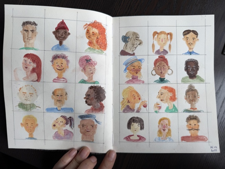
40 faces challenge. And again, this is from was started by the
Illustrator Sarah Dyer. So if you do this and you want to show it on social media, definitely tag her in it. And use the hash tag Sarah dire Patreon
because it's only fair. I don't want to steal her
steal her idea as my own. But I think it's a
really good one. I think this is the only
time where I suggest taking out a roller
and it's really fun to sit down and
make your grids. I have done 40, so it's four by
five on each page, and you just have
to make sure to do some simple math
and figure out how big your squares can be
on your specific size paper. I believe mine are 5 centimeters
square each, I think. And yeah, just sit and
take some time doing that. And then once you've done that, you can get started
on adding your faces. It depends on what kind
of person you are. If you like to start in the
corner and go row by row, I'm more of a jump around kind of person,
so I'll do that. I will bring out my PanPastels and I'll just work on
a few on this page. Again, I have my funky
little tools here. I'm going to stick to these
more skin tony colors. I like to be diverse
when I draw, so I'm going to do several
different types of skin tones, and you can mix them slightly because this one's
a little bit too yellow. This one's a little
bit too pink, and this one's quite brown. So you just, go for it. But also, this is characters. So if you want somebody with
purple skin, then go for it. So again, in the last section, we learned how to properly
draw a person, and I mean, you can go for that if
that feels good to you, create like proper ovals here. Here, we can do one. We can
start off with just a nice, simple, regular oval head. Again, I like these
tools because it doesn't make them too crisp. And I have a little fluffy
brush here just to simply take away the excess without blowing all over my page
and getting in my lungs. But hopefully that delicately
just moves it aside. And there's not
that much. I also like to when I'm drawing, make sure to include a neck because people aren't
just a floating head. So I'm going to go
in with this color for a little bit and add in. But also at the same time, you can just make more
interesting shapes. Like I was talking about,
I've been enjoying creating shapes
that are different. He makes some heads a little
bit bigger and some smaller, some rounder, some
squarer, some funkier. So here's really
quite square head. I'll give them a
pretty thick neck there and just kind of
randomly adding these in. Here, I want to make some
really long and skinny. That could be fun to play with. So that's that. And then I'll just brush
that color off here. I have my rag down here. Brush up that color,
and I can use the more pinky tone and then add in a few of those
figures, again, like, just going for it because you can't be super
precise with this tool, so I'm just gonna Yeah, this one looks more like
a bean. That's fun. And also, we didn't
talk about that, but drawing people at an angle, again, you just move
the center line. Here. I do another
big head over here. This could be a
row of big heads. Oh, another thing that you
can add in, of course, are ears if you want to
add in ears at this point. Like here that become
very big here, and then they can have
really skinny neck. So that's something that we
forgot on other figures, so I can add in a little ear on some of those. Who else to do? To another really
tall, skinny person. I'll go in and give ears to a
couple of these characters. And they're approximately
in the middle of the head. That one's maybe
a little too low. Okay. So there's some
light skinned people and shades of pink and yellow, and then I can go in with a sponge for darker
color and bring in some darker skin toned
floating heads. So, let's see. I can make someone with
quite very round head and a really small neck. We didn't talk
about that either, but little kids have
really tiny little necks. This can be a sweet
little child. And I think maybe
while you're working, you kind of figure
out different people and I like to do
everything in stages, so I'll do all the heads and then I'll add
in all the hair, and then I'll add in all
the shirts as you see. That's how I like to
work, but maybe you prefer to work on one
character at a time. But I think it just feels like it goes quicker and I don't think so much about each character if I'm moving
from one to the next. I don't do really,
like blobby head. Like no neck. That's
kind of fun, too. I've been trying
to disperse them. I like that bean shape, so I'll try that here again. Okay. I'll do another, like, more I don't know, safe, normal oval type of face. I would like a nice neck. We'll give them some
ears. And one more. Do them right here.
What else should I do? I'm tempted to go
back and look at the other characters that I've created previously
in this sketchbook. Oops. It's not to do that. But as you can see,
it doesn't give off that much dust,
which is so nice. And even, like, this is
a very fluffy brush, but it doesn't,
smudge it all around. It just takes away.
It does a little bit, but not noticeably.
So it's so nice. So there I've done
all my little heads, and I think I'll stay I'll keep it sparse like this
because I don't want again, I don't want to be here all day with you doing
this, even though actually, I do want to be here all
day with you doing this, but you get what I mean. And then I'm going
to use some of these nice candy
colors to add in some just simple shoulders just so that they're
not floating heads. So I'll give Like, the kids, again, like, their shoulders are tiny. Like, their head is so huge, so I'll make sure that that is really exaggerated,
that the head is big. And then men have
squarer shoulders. And then you can make
somebody look more hunched over if you
bring the shoulders up. So something gives the look
of somebody being, like, upset or looking down
or something like that. But this is just
simple simple things. It's just to bring in some
color and personality. Okay, this person. So so that there's
that let's use this pretty purple color
on the other people here. Like, this person
looks pretty big, so it makes them fill up almost the entire
bottom area here. And this one, too,
women's shoulders are usually a
little bit rounder. You can really make
these your own by having people do things with their
arms or having other details, but I wanted to just focus on just simple quick little
portraits of faces, but including shoulders
so that you do get Yeah, you get more of a sense of the character when you
can see more of them. Okay, one more down here. Okay, so that's really
simple adding in. So now we're getting
somewhere with these people. I am just doing
these from my head, but you could, of course, bring up a Pintresbard of different people that you saved or hairstyles
and things like that. Now we're going
to get into hair, which is always fun. Alright, so let me maybe switch back to my other one
that has more darker colors. We can start by making a
couple of people blonde. So I'm going to use this, like, ochery color to give a couple people nice
bond blonde hair. So here, this looks to
me like I'll give them a more. Short hairstyle. Again, I just love these
tools that you get these smooth unexpected shapes. It's not perfect. Who
should I else make blonde? Here, this person
can be blonde, too. Like, I just really
like how this looks, and it's not so
perfect and precise. Okay, so there's some blondes. And then I unfortunately
don't have, like, a nice orangy red. That would be nice
to make somebody a redhead, but that's alright. We can give Let's give
somebody some, like, interesting blue hair just to be fun this person can have
some blue, curly hair. I feel like curly hair and these pastels really
mesh well. Okay? So that looks fun. And then we can give some
people some normal brown hair. So, um, here. I also want to this dude
can be a little balding and maybe we can put in a mustache
mustaches are excellent. And then this person, I feel like we've
done a lot of dude, so I need to get some more slightly more
feminine hairstyles, possibly, just to represent
different people. And obviously, we're going to do androgynous people as
well, non binary people. You're a nice, like, regular, flurry mom haircut?
I don't know. Um, okay. This person, again,
I don't know. Should we do some,
like, cool bangs? This can be I don't know. They can have kind of
like a mullet with banks. I don't know what that is. Also I could be like a librarian with a
nice bun with banks. I'm trying to carve out a little ear space
there. That looks nice. Who else are we missing?
Got two more down here. Um, you can do other hairstyles, here, I'll do another with
banks 'cause banks are fun. Then we can give
them kind of like a Wednesday Wednesday
Adams braids. There we go. And
then the last one, we can also keep somebody bald. So maybe they should be bald. But then I feel
like they need to have they need to
have ears then. So I'll give them
really big ears. Okay, so this is my bald man
or bald woman, whichever. So that's nice. Okay, for my figures here
with darker skin, I need to give them darker hair so there's more contrast there. But also would be beautiful. Let's give somebody see
that one was a little bit dark and it that one's
smudged a little. That's too bad.
Alright, we'll give somebody a little blonde
'cause that's fun. Who should go blonde? This This one can have
a nice blonde look. Nice, big blonde man. Beautiful. Not much contrast here
with With the skin tone, but we're going to go in with
colored pencils to give, um, contrast and
details to everything. So that's fine. I
have this dark brown. I think it's a umber
dark umber raw umber. So, this one's great. We're gonna give this little boy nice curly hairstyle. Pretty. Um. What should we do? This is where it's nice to
have something to reference so you can reference hairstyles. This one I want ears as well. We can do braids and
things like that. Uh, let's do this one. Since there's no
ears, I'll cover it. So we'll make them
have a very beautiful. Fluffy here. It's going into the other one. That's slightly asymmetrical
afro. It's beautiful. Alright, this person.
Mm. Quite like let's do another man
with a mustache. Ooh, get nice and
fluffy in there. Should this guy have
more hair on top? Maybe can have a nice little do. Again, I didn't draw ear, but I can kind of dig that out. Should we do another bald guy so we don't have
to deal with hair? We can do can do some braids. Some nice rows of braids
braids. Looks good. You can bring them down. See, it's beautiful texture. For those because they
are so dark and they seem to be I'm going to just dump this on my
studio floor that make up. Okay, so now we have some
people and they have some the basic colors on them. So now we can go in with our colored pencils to
bring in all the details. I have some colors that I
like to use on my people. I like for light skinned people, especially the ones
with the pinkier skin, I like to use a more
reddish colored pencil. I think that looks really nice. But this is something
you have to figure out, like, do you like something
more peachy or brown? That's what something like
this is really good to do. I also really like,
this one's really good is the polychromos caputmrtum. It's also a brown
that's quite red, but it's not as red as this one. And then for the dark details in the dark hair or dark faces, then I have dark umber. I don't like using black. I think it's too harsh, but
I like a really dark brown. So who shall we start on? And here so I I don't know. I'll use the cap put mortem
on some of these faces. So we learned about
these proportions, and of course, these faces, I don't want to draw a line
straight through them. I'm just going to
go for it and try some stuff out and think
about, like, Oh, generally, where is the middle of
the face and try to get two eyeballs in there with an eyeball in between an eyeball
on both sides. Here I'm going to accentuate the ear a little bit like this. Depends on how much
you like to do. Here, I didn't give them, any
sideburns this character, so I'm going to just accentuate that the inner ear a little bit. I don't like to do
outlines around the face, so that's just something
I prefer not to do. Here we need to
give them eyebrows. I could pull out a
blue pencil to match the That could be fun
to match the hair, and I could pull that down to you're gonna give them
nice fluffy eyebrows. I kind of general face. I have other sketchbook classes where I have gone through lots
of different expressions, and I can link that in the
description of the class. Here I'm going to do one
of my little piggy noses because I think they look cute, and I'll just give
them a simple smile. There's a first character done. To accentuate the hair, I think I'll use my dark brown
just to give them a few, like, just some hair,
accentuation aligns. There we go. And then the shirt, we're
going to bring that out, here's for my teal one, I'll just make a
collar like that. I don't want to put too
much emphasis on that. So there's my first
character done, and now we'll do another one. Let's do this one with
a nice fluffy mustache. I'll make sure to
accentuate his mustache, and then we'll go in with
his bigger nose there and his lip is just
slightly re there. And here's his ears. I'm going to accentuate that. And his hair just get
that look of that nice fluff, curly texture. I'm just gonna give some
shading to the bottom area. I think that looks
really natural and nice. Accentuate that nice. That nice texture of curly hair. Okay, and then figure out, is he going to be happy? Maybe we can, test it also
with eye positioning, so we'll make his eye like this. I'll make them
looking to the side. Since they have such
a fluffy mustache, you need to have
fluffy eyebrows. This one character is
quite hunched over, so I have to make sure that the collar looks more like that. You could add like arm. You could go in and add some details just for
funzies if you want to show. Like, obviously, you
can put as much time into these little characters
as much as you think is fun. So there's that person. I can test out more of this peachy color on this skin tone to
see how that looks. I think I like that as well. It's a little bit more subtle. I think it looks, just sweeter. I think this would work well if you're doing
drawing children to use not as high contrast
as you do on adults. For eyes to
accentuate them more, I do think it looks better with a little bit more contrast. So here's darker for the pupils. You could even do different
colors for their hair. Their eye colors
could be different. This is all stuff that you can play with and how you
want to draw people. So this person
looks quite young, even though they
don't have any hair. Some people don't have hair. You can also think
about rosy cheeks as something you can play with. Freckles are always sweet. Also, I think, really gives somebody a youthful look
if they have freckles. So there's so many fun things
that you can play with to make your characters your own and look really different. And this is something
that you just keep going and playing with. Since we're working
on this area, I'll work on this
characters braids. I'm just going to do,
like, a criss cross here, so it looks like it's been
braided a little bit. You get that idea. And then then I'm going to
accentuate the ears. There's different ways
that you can draw ears, figure out what you like to do. Right now, I've been
filling them in. Sometimes I like
to just do here, I'll do up here, a
little accentuate some lines like that. Okay, then this person, should we have them
more like I don't know, not sad but a little sad. Different noses, here just
like everything looking down. It just looks kind of content. All right. And then for the purple here we
need to get one. Does this show up? Yeah. There we go. So they look nice and content. Alright, who should we do now? We go do her. She has an interesting hair, so maybe didn't accentuate that we should have
a different color. Here's more like a burnt
ochre kind of color. Does that match? So it doesn't it doesn't
have enough contrast, so maybe I'll go in
with my more like brownish try to get
some curls in there. I don't really like that.
I like drawing in curls. And some outside of the pastel, too looks really fun. Here, I'm just
going to make that more dark because I don't like I didn't
like those strokes, but I can make sure this side's a little bit
more in shadow then. I can give the hair some
shadow over here, too, then became more
contrasted there for the face to show up better. I can also show, how the features look with
a darker brown pencil. It gives a softer look, so
we can have this person. Again the eyes. Now I'm making the nose quite
close to the eyes. Again, makes them look a
little bit more useful. I can make fuller mouth. Looks pretty and
here's a nice brows. Here we go. Sometimes
adding white to the eyes on darker skin to make them pop a little
bit more is nice. I can do that on the
other skin tones as well, but it doesn't show up as much. But it just looks it just
makes them more prominent. So that looks really nice. Again, you can think about
different colored Rouge. That's too light. So I'd have to choose something
a little bit darker. That looks really nice. And shall we do one more? Because yeah, because
it's so much fun, but I also, we have
other stuff to do. This one's getting
quite smudged. You could, of course, do all the bottom with
the pastels, fix it, and then go over with
colored pencils, but I like living on the wildside and having
lots of smudges. The smudges do erase
quite well, too. I have to mention that
with your eraser, you can go in and clean up the smudgy bits of the
pastel before you fix it. So it's all hope isn't lost. So even, like, up here
it's smudged a bit, so that's easy to take away. And then be a little bit more
careful with your brush. See, I did that again. But the color not
the colored pencil. Their eraser does nice work
here cleaning stuff up. Okay, so we up that. So we're going to do
our little brown hair Wednesday atoms down here. So I'm going to accentuate
the hair again. I'm gonna, you can, color it in a little bit to
make shadows or some kind of, like, braid dish pattern
to signify braid. For their face, I'll
continue with this one or I'll show
you how it looks with the more ready color. Um, we can try
something different. This person has
such a long face, so let's give them a long nose. I'll do a different shape there. And then eyes like this. And then mouth, simple mouth. Give them some eyebrows. All right. Coloring a little
bit of that shirt that green color
kind of went away. Anyways, there's another
character quickly came up with. And again, just there's
so much that you can play with here and
the different shapes and the different ways of drawing eyes and eyes
and nose and hair and what colors you want to use to accentuate the face if
you prefer something a little bit deeper like
this or something that's more close to the skin tone, like here with a warmer
brown and here with like a peachier color to accentuate the light
tones of the face, and then also think
about how to make somebody youthful or
a little bit older. Um, yeah, have fun with this. Fill up your page with
different faces and characters. And if you do this several
times, you can, of course, go back and work from
other characters that you've created before and just keep going from that and creating the same
character over over, but improving them or accentuating something
different each time. It's just really fun, and I like doing these every few months just to get
out more ideas and test out different things
and figuring things out that I like and what looks best
with what skin tones. Like, here on the blonde hair, I used that more like um what did I use this
kind of color, burnt ochre, and it looks
more reddish in tone. Looks really nice. So just go for playing with different things and testing
out different things so you can learn something and
what you prefer the most. Out of all of these
characters that I've created, I really like this
one the most so far, but we'll see what
happens when I continue on in this
page by myself.
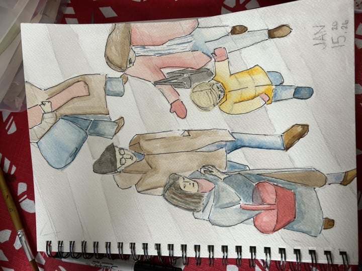
7. Exaggeration: Alright. Since we worked
on those 40 faces, I want to show and
teach you how you can bring that process further. So here I've set up my grid a little bit longer
so that we can really accentuate and work
on a few at the time. So I've created a few
of my characters. I pulled them from my
previous 40 faces, and I pulled out the ones that I liked that I want to
play with further, and I tried to
recreate them here. And then we're going
to take this one step further and using our
reference as a reference. So I'm going to take
out my PanPastels again and make sure I have all my materials
at the ready here. So we're going to choose
some of these characters, and we're going to continue to exaggerate them a little bit. So here we can start
with this young man. And I made his neck quite
large and his face. Quite wonky. So he is
quite exaggerated already, but how can we make that
even more noticeable? So here, I don't know, like, make the neck even longer, make his head even
shorter and stubbier. And like square there. His ear was quite large, down and quite low and weird. So that's a step forward, maybe. It's a little bit different. They're quite similar,
so how can I make it? What if I make his whole
head like more like a blob. I don't like I don't know if
I like how that turned out. There we go. We'll see. And then I'm going to
do their purple shirt. Trying to make the shoulders a little bit more angular here. So we have that one.
And then we'll do their neighbor over
here just so that we're in the same vicinity. So I need my other So we'll
get the brown tone for her. And again, her face is
also quite so I just maybe really
accentuate that angle of the face that I created. It could be interesting. And
since I have that brown, I'll use the brown for
this hair, and, like, we can really accentuate
that hair curly hairstyle. So I make it really
quite silly there, and then I'll give
her a nice hair. She almost looks like
she's falling over. But how can we recreate that? Making the hair also have nice more interesting
shape. This is quite round. So here I'm going to try to
make it a little bit more asymmetrical. That
looks interesting. And I just need to bring
in her green shirt, maybe make her shoulders a
little bit more rounded. Okay, so now we have two
people to accentuate. There we go. So those are
the base layers there. So I'm going to go in with
this character first. I'm going to use that
warm brown color, and I'm going to give them some nice curls to their their
very, like, Buffonti hair. And here by the edges, I thought this looked nice. I'll continue that as well to accentuate the side
burn area here. Hmm. Definitely like how I did the curls on
that one better, but, you know, sometimes
when you try again, you don't always succeed better. But then you can learn, like,
Oh, well, that wasn't it. I'm gonna use this peachy color. It's not quite the same as
that one, but it's alright. And I made their face
quite smooshed together, so maybe I'll try
that as well again, but maybe even more exaggerated. So here's my little, like, upturned nose that I like. This and they had a I don't know, Broy expression there. And give them brown
eyes can make them look a little bit
more to the side, give them some nice
fluffy eyebrows. That's interesting. I can't say that I think that
it's way better. I prefer the first one, but I just, you know, I
got to try stuff out. But this one's interesting, too. Let's see how we can work
on this lady's expression. I'm going to use this
dark brown for the hair, and I liked how I did
the large circles to signify larger curls on her and a little
bit darker around the face to give that contrast between the face and the hair. And then it gets lighter
and lighter as it goes out. That looks so beautiful. I think it gives that like
lightness of curly hair. That looks nice. Okay. And then I'm going to use
that warm brown for her skin, 'cause I also prefer that, I think it just looks
softer than using the dark brown for
the features as well. Let's see. I've made her also. Like, I don't know.
Really exaggerate her. Since she's so long, maybe I'll bring her
nose down further. And she's sad for
whatever reason, which is not fun. And then to accentuate
the sadness, you have upturned eyebrows.
Mm, I don't know. She looks silly.
But anyways, again, I don't know if I'm
doing such a good job at this one to show you. But my idea is that when you use your
own work as a reference, you can push it
somewhere else and try something else and
you can understand, does this make it better? Does it now, I feel like
does this make it worse? Like, yes, I feel like I
preferred the features. I made them too exaggerated. So it doesn't look as good, but the hair was
doing really well. So we made the hair look more interesting rather
than more round, but I like this shape,
it looks really good. Shall we do one more? I almost want to try one
on this side because I thought we had some
good contenders. I like all of these. I quite like this girl, 'cause I like her the size of, like, the angle of her face. I think that turned
out really nicely. So we'll try her if
we can get that. And then she had this, again, really long neck. How do we make this even? We can make her face,
like, really wide. And then small ears
that are quite low. That seems to be a
thing that I've done on many portraits that I
do the ears too low. It gives a nice
kind of appearance. And then I will add
in the curly hair. How can we make this more exaggerated Again, just making the shapes a
little bit more asymmetrical. So more angular. That could be a little
bit interesting. There. So that's not so round. This was so round.
This is more like accentuating the angle
of her head. Okay. I'm going to use
that warm brown. Here I'm going to
do the middle part and here around the ears. And then behind the side of the neck that it gets a
little bit darker there. And then here, there's, like, a curly cue there. Okay. And for the features, I'm going to use the nice
more What is this nectar? Like a warm pink. Okay. For the angle
of the face, again, I want to make sure that I get that and then the
feature is smaller because when I make the features like I did over here
that I learned, I just exaggerated
that a little bit too much and I just
eyes are too big. So I'm going to make sure
to do the smaller eyes. Here, I give her nice, like accentuated eyes,
which look nice, almost looks like makeup, so I'm going to give
her the darker, like, eyeliner, almost. Oh, alright, don't miss this up. Make this eye a little
bit tall higher up, and then I can make
this one lower. Okay, that's a good size. And then I like that her nose, her face, everything's
tilting this way, but she's looking that way. So that was good. And then with the lips, accentuating the upper lip
and then just a bottom lip, here we can give her
some rosy cheeks, too. I think she would look
nice with some freckles. We need some eyebrows, 'cause that's
something that you're gonna give her slightly,
like, uneasy look. Like, she's thinking
about something. Alright, and then
gonna try some lashes. Okay, so here I feel like we
at least tried something. We didn't make it too wild. We just, like, accentuated another aspect of
this character. Gonna put in her purple. It was away. It was a little
dirty, but that's right. Okay, so there's that character, so it's same but different. So that's mainly that
was more of my point. What can you do to just slightly tweak something to make
it hopefully better? I can quickly just go
over the other examples that I had done previously
quite a while ago. Let's see. Where are you? Here, I did these examples, and some of them I tried to make more, like, very characterized. I did my more like a realistic
look and then tried to simplify them with simpler noses and eyes and forms like that. So that's something you
can do, draw them more realistically and then
make them a character. So that's another option
that you could try. Alright, so hope that you
found that fun, as well.
8. Exaggerating Even More: All right. If you
want to talk about exaggerating your characters
further and how you can practice this without
having to do all the color and you just want to
focus on what you can change in a short time, I would love to present
creating a page like this just in
regular old pencil. All right. So rather than
using photo reference, I'm going to use this face, which is done using
my regular method of, you know, halfway the proportions that we
learned in the beginning. So here's the face, and I use this one to manipulate and
create these characters, but we can continue to use this. You can pull up images
on Pinterest of different faces or just
make them up as you go. So I like to start off with creating
different head shapes and how we can and adding in the neck
because that makes it more interesting to me. Here's three versions, and then we can
think about, again, the proportions and
doing them as they are more realistic proportions or we can just play with
different things. I love squishing the face
features together to give a thicker neck and more of like a plump person appearance. I
think that's really sweet. Making a face really small
is also really interesting. Pulling the features
down a little bit, making lips bigger, eyes bigger, nose is bigger, longer,
ears bigger, smaller. There's so many different
things that you can try. And they create all
different effects, but it's interesting to
have certain parameters. So if we think
about this person, very simple hairstyle, few
curls coming out and freckles. So how can we make them? They also in the photo,
very square jaw. Here I decided to make
it quite rounded, but you could really
exaggerate by making this person have
a very square head. So I'm just gonna go for it. I also have my references here, so how can I further develop
the ones here that I enjoy? Like, here I enjoy, again, I really like that look with
the squeezed together face. We could try that
on this long one, rather than making
the face really long, we could squeeze it together. So let's see if we
do some simple eyes. I'm liking the eyelashes on her. It kind of looks like
she's looking up, and we'll do my character nose, and I'll give them
nice freckles. I like to smog that in to give, like, the blush look. I'm gonna give them
quite full mouth. Lower lip there. If you
upturn the lip a little bit, then they always look
like they're smiling. It's very simple just
to make sure that the ends of the mouth are
just going up slightly. And then we have
to have eyebrows. Since it kind of looks
like they're looking up, I'm going to have the eyebrows looking quite up like that. And then we have the ears. If they're looking up, you can tilt the head a little bit, so the ears are a little
bit lower actually. And then they need hairs. We need to add in some. Just some simple
curly curly hair. We can have some curls
that have escaped. We can have some
down here as well. There's one version, and then they're adding,
like, the clothes. Just looks a little
bit more interesting. Looks little wonky and
silly and different. Okay, so for this one, maybe, I do kind of feel like the angle of the face is a little bit. So if you think of,
like, the invisible line here of the face
front of the face, you make sure that the
nose is sitting on that. And here we can make the
mouth upturned like this. And then one eye
you would hardly see and then the other one. Here's some eyebrows. So here I'm hardly
looking at my reference just taking a few aspects of it. You wouldn't see the other ear, but this ear would be here. And then we bring in the hair. And here we have
to figure out what the back of the hair looks like. Maybe we give them a nice a bun here in the back of their head. And then, again,
some curls that are just There we go.
So that simple? What else can we try? If we
look about my other examples, like, making the features
really big, really small. We can do a really
small version and see what happens there,
what that looks like. Could look really silly. Mm. Set the nose. Then some eyes quite
close together, too. A in her nice eyelashes. Make the mouth smaller, maybe. Die start out? Kind of looks like
a ridiculous egg. But, you know,
like, it depends on what type of mood
your character has. Like, are they kind of Do you
want them to have kind of, like, a big baby effect, like, a huge, like, baby? Like, imagine what
kinds of characters and what their features say about them and how they
become as a character, L it's interesting how you can change how a
character looks. So, yeah, you can just keep going and testing
different things out. And you could even write a list of things you
want to try, like, squeezing everything
together, making everything smaller,
elongating everything. Um what else can you try? Accentuating the eyes,
accentuating the mouth, the lips, the eyebrows, then it's just yeah, just test everything out, like accentuating
the cupid's bow, making this area really long. I really like that look too,
having everything realistic, but then pulling the mouth down much longer or further down. That's something that I
test a lot that I like. Long noses are interesting, especially if you have
a character who has a really long face. So just go for it
and play around, pull up, either draw
realistic portraits, and then use that as a reference to reference that further, so you can really make it
your own or get photos from the Internet to play around with and
just use this reference. You don't need to look like
a photo realistic thing. The whole point is create
characters who have a lot of personality and interest.
9. Full Figures and Groups: Alright, now we're going to get into drawing full figures, and I just go for it. I don't like sketching out
and mapping things out, but that's because I've been
practicing for a while. So if you need to map out your characters a
little bit with some light colored pencil or a light regular
pencil, you do that. But I like just going forward
and seeing what happens. For these, we do actually
need some reference. So I pulled out this book
that I have on my bookshelf so I don't have to get
out something else. And I'll just do the
girl in the covers, and then we don't even have
to hold the book open. So I'm going to copy. Obviously, this is
for just learning, so it's okay to copy
other copyrighted images. These are by Scott Schuman, so they are his copyright, so you're not allowed
to recreate them. And sell them, but
this is just for my sketchbook and just to
learn, so that's fine. But if you're going to create characters that
are going to be in a children's book or going to be printed and you're going
to profit from them, you need to make
characters that are fully your own from your
own imagination and and you've used lots of
different types of reference. Okay, so I got that out of the way. It's always important. I feel like with students, sometimes you maybe have
missed those kinds of things. So before we get started on a portrait
like this, I want to, like, think about this person and how they're standing and what I want to get out of this. I mean, we can focus on really just making this
person realistically, kind of like I've
done with these. Simplifying their shapes. But
you can also think about, she has a beautiful curve to her body. So that's
really interesting. We could exaggerate
that or we can think about exaggerating that later. So let's just jump into it. She has a nice green jacket. I think it's easy for people
to start with the head. And I would like to say I would
give you a big tip to not start with the
head often you get the sides of the head wrong
when you draw a body, and then you've done the
head too big, usually. So I would suggest doing
the the body first, and then you can
make the head size. All right, so let's
just go for it. I'm using this again, this shape is just easy
to carve out the details. I'm just going to
make and I'm going to try to accentuate the nice
curve a little bit more. So here's the arm. It's a weird jacket. It's hard to kind of tell
what's going on here, and stuff like that makes
sense in photos sometimes. But in your illustrations, you have to simplify things
so that it makes sense. You understand what things are. I'm sure there's some interesting
cutout in that jacket, but that doesn't make sense to us as the viewer of this photo. So I'm going to simplify
the silhouette. And then I need to accentuate
this arm a little bit more. We'll accentuate it further with the colored pencil later, but there's the jacket. And then I'm going to go in
and make the big wide pants. And again, these could be
created even more wide. I didn't clean off the green because I kind of like that
they melt into each other. I'm gonna make that
really large bell bottom. And here, it's kind of like I
can't really tell right now where one pant leg
starts and ends, but I kind of like that, too. So I got a nicer curve
to this person's body. They're holding a bag there, but that doesn't
really interest me. I think I'll just focus on
this portion of their look. I'm gonna grab my other
one to use for her skin. I will do the more yellowy tone, and here they have a hand. I lucked out on this photo that the hand is
in a pocket so we don't even have to struggle
with drawing hands. That was very nice. There we go. And then the face and the head. So here I've made it
really angled already. I think also because often, I think it looks a little bit more interesting
to make the head of adults slightly smaller
than they should be. So I'm going to make
it quite small. So it's a very tall
skinny person. But again, you could
totally redo and accentuate and create proportions differently
the next time, or you can try it
several times and make them short and
stout or something. I know I said that
you're not supposed to, like, blow, but I'm
being very careful. I'm not blowing, like, a ton. But it's just natural
to do it easier cause this one kind of smooshes
the darker colors in. Anyways. And then
we need some L, the shoes are pretty much, um, non existent there, but
I'm gonna have some, like, pointy toes sticking
out just to, like, mimic, again, shoes. Again, to, um, just make things make more sense in an illustration than they do in a photograph. Okay. I kind of feel like I have to go in a little bit
more with this green here, the back of the jacket I can make it more
shape like that. Okay, that looks good. So that's a base of that. And then I need. They
have this red hat. I don't know if I want to
add the red hat and we'll just go in with some
interesting hair. So I don't know. We'll kind of hair,
we'll just try to give them some kind of flu fy up de kind of thing here. Okay. So that's the base
of my illustration. Also, when you create people, it's nice to give them, like, shadow so they feel
like they're grounded. So so we do a little purple
shadow down here just to make sure that it definitely feels like
they're standing. There without. Okay, so
that's my person very simply. Created there the base
using my pan pastels. And we're gonna go in and create all the details of the person. So I'm going to start
with bringing in some structure to the hair
so that ear comes out. There we go. And
then I'm going to create I kind of want her to look a
little bit more pensive. So I'm going to do closed
eyes and, like, content. That went a little funky. All right. And then
some eyebrows, I guess I'll do also in
this brownish color. I want to give her color in her cheeks her
skin got a little, like, grayish
there, so I want to bring in some warmth there so
it doesn't look so sickly. And then her hands also
became a little dark. You can't really
see the fingers, but I think I will
add in fingers there, so you kind of get more of an idea that that
was the hand, right. And then I'm going to add in some hair accentuating lines and make the hair
look more for real, if there's hair coming out of out of it, it
looks more lively. There we go. And
then I'm going to add feel like she does need, like, a pop of color 'cause
it's kind of boring. So it is kind of sad
that I didn't add in the hat, but it's alright. Alright, so if I want to accentuate these dark
pants, I have this one. Is this dark indigo? No sepia. Like a dark blue would be nice. Is this one like
ultramarine can try that. Just Just accentuating certain
areas there. Um, the ground, I want
to give some textures. It looks a little bit
more interesting. I need to give this coat a little bit more
structure there. Again, because I
use the soft tools. They don't get
super tiny details, but you can get quite a lot. But here, I like, change the type of collar
this jacket has, but we kind of kind of
bring in other here, the jacket has a nice
seam down the arm. And again, I don't need to make it look exactly
like the photo. It's actually way better if
I don't because then I make it my own so that if
you see this image, you wouldn't really think
that I drew the same thing. As an interesting pocket
here can do that. We could do could do
buttons, you know. Um here we go. So there's a very simple, full figured character trying
to think about exaggerating their pose or exaggerating their features or
exaggerating the feeling. This is all comes with practice, like with everything
everything in this course, I may be making it
look quite simple. I just go for it and I created a character that
looks like a person. And for you, maybe
you sit there and you feel like you
really struggle. So it is always really lame and boring to hear that
practice makes progress. I don't think practice
makes perfect ever, but progress is good
to think about. And if you do work on
things like I did, I've shown you the
progression of my sketchbook here from these images where I didn't
like they were good. But, I mean, these characters are a little
bit more awkward. Here's the same character that I drew like a year and a half ago. And then now today it
looks like this instead. And yeah, maybe I'm more happy with this character
than this one, but, I mean, it doesn't matter. It's okay. Um, here, I want to accentuate certain areas darker,
it looks nice there. And then the bottom
of the shoes, maybe. But this one would
look pretty cool like a bag hanging off or something. But anyways, that's how do
approach a full figure. And again, it's just
a matter of practice, working with your tools
and what you like. I want to quickly go
over people in groups. I just want to show you some of my examples and
talk you through it and hopefully make it
feel less daunting. When you see an image
with like ten people, it can feel really overwhelming. And one way to really break it down is to focus on one thing. So for this image, I saw all of these string instruments, and
that's what I drew first. So I drew those in first, and then I blocked in
the people's heads. And then I did their hair. And then I started
pushing in the arms. And, I mean, there are
some weird empty spaces here where there
should be a person. But when you're doing a crowd, it's not important
that you are filling in every single person
exactly as they are. You have to make
it understandable, and I think that if
you work in that way, like, step by step, you add in one thing, like,
the most prominent thing. Like, for this one, it was
the instruments to me. I thought that they
stuck out the most. And then the individual people, then maybe their hands, and then I pulled in the arms. Same one with these musicians to start off doing the
instruments or I don't know. Maybe I did the bodies on this one. This one
I don't remember. Just doing one
section at a time, like putting in the heads when I'm putting in the arms
or something like that. Do I have more with groups. Here's another No,
that's not that. Where's the one with
the ballet dances? Here. This one, I believe
I started with the tutus. So I drew in all the tutus because they were kind
of meshing together, and then I probably did
the legs and the arms, and then I did the hair,
and then I did the details. So you just, like, find something and simplify
it even further, even further than how
I was simplifying the shapes and proportions
of one individual character. Where is that? I can't find
anything in here. Here we go. Yeah. So just
remember to simplify things at the same time as
you're exaggerating things. And then I think
you will find that you will make really
interesting characters.
10. Final Character: Okay, in this final
section of this class, I want to show you
how I go about creating more finalized
image like one of these. I'm going to be doing that
and I will use let's see the I'll use the character pose that we created
in this one, but I wasn't so excited about
her expression or her face. I'm going to look
through some of the characters that we created previously in the
class and see if there's something
that I like better. I quite like this girl, so maybe I can incorporate
her in that pose. So because I will be using this sketchbook
to create my artwork, I want to just do
a quick sketch on a simple other piece of
paper so that I have her to reference without having to open my Without having to open up my sketchbook and
switch pages all the time. So here I'm gonna roughly, and I liked how the hair became more like angular like that. And then, so that's
something we didn't discuss, but working faster
also is a way to make here almost look
like a mustache. Alright. But anyways, the ear is
a little too low there. Okay. So just to
have some reference so that I can see that face. Better. Correct. And then I
have this and I can reference the photo
again rather than this, but to think about
how I did it before. So I'm going to go to
this page and I use tape to tape off my page so that
I get that crisp edge. It just makes it look
so much more finished. To make the background, I am going to use
the PanPastels, and I will what did I do before? I like I did a purple one
and more yellowy one. And she's wearing this person's wearing a lot of green and blue. Maybe this, like,
really beautiful teally aqua kind of
blue would be nice. So I'm going to rub this into the entire page so we get
that crisp background. I can put it in a
little light blue just to have some
variants in it, so it's not perfectly solid. And this one is a little dirty, so it's bringing up some
other colors in there. I'll bring some more
blue over here. Oops. I think, just to make the
ground seem a little different, I'll bring the purple. Nick, not making it perfect in any way and not like
a perfect line. So that's a nice start to that. And then I'm going to
bring my reference again. So I'll have this here. And then I need my tools. And I started with the jacket, and I think that
worked out nicely. So I'm going to do that again. And I'm going to make her fill out the page
a little bit more. So we're going to test out
slightly different try to make her maybe we can make the
top of her very skinny. Again, I made this very
jacket sticks out like that. You can kind of layer
them a little bit and get slightly darker areas and
lighter areas in other places. That's also another reason why these are so
nice to work with or rub off a little bit of that green before I go
pull in that blue. And again, like I
can remember that beautiful maybe I'm exaggerating the size of the pants again
even further in this one, and then remembering
to make sure that I accentuate that
there's two legs there. Like, stuff like this, that's
the thing that I like about this material that
it it's just nice. That part, I want to
keep for the hand, so I'll erase a little bit
where the hand is gonna go. I liked how the little
shoes stuck out a little pointed boot or something sticking
out there to show that. And then I thought that it
was missing something in the previous image that
we did, like, Well, so I'm gonna bring in this pink, and I'm going to
give them a bag, and the back we're going
to make really long, too. Yeah, I have so
much of the pastel, so it's not going
on so well there. But I'm gonna do best I
can, and I'm gonna have it, like, hanging really. Quite. Just do a simple bag
shape like that, and it's kind of
flying in the wind. That's kind of interesting. Okay. I'm going to do my legal blowing the blowing of the dust here, but it's okay. Again, like, I love that
this they don't horribly. It's not It's not a
complete disaster. Alright, so I need to bring out this color. So
here's my face. I'm going to try and get this look in this
angle of her head, making sure not to
make her head too big. Bringing her hand
collar down here. Okay, and then hair. Yeah. Okay, interesting. I kind of want to bring
some of that down into this bag. Make
that brighter. Okay, so that is the
base of my illustration. I'm gonna keep my
little face here. I go start on her face first, just to get that out of
the way and try my best. So I'm gonna angle
her nose this way, but make sure that her
eyes are looking that way. And then I'm making the mouth
look less like a mustache. Okay, and then doing
this dark umber. I'm just gonna give
it a nice sharpen. Okay. Gonna make nice to
find eyes looking like that. I'm gonna skip the eyelashes on this one because her
face is quite small. I don't want it to
get too mottled. Okay, so I'm just going to accentuate the hair
a little bit here. The ears, give some eyebrows. There we go. The hand a little bit just showing a
little bit of fingers there. Okay, and we can
give the bottom of the shoes a little
dark darkness there. Mm hmm. Okay. And then
what else can we do? We can give her face a
little bit more warmth. I think the lips there
a little bit too light. Can I make them a little darker. Okay. Interesting.
I'm more happy with her face than I was on the other page. So
that's interesting. And now I'm gonna go
in and accentuate these pants and make
sure that we have some, I can show that that's a pocket. Like a little creasing by the backs of the
knees. Make the knees. You can make them
darker or lighter. Accentuating that
there's two pairs here, more creases you could put in. Some interesting
stitching at the bottom. I want to add some darkness
a little bit more to accentuate that there are two pairs and two legs
here a little bit there. It's interesting. Okay. So the dark jacket, again, I'm going to create kind
of my own collar here. M. Yeah. And then this bag, if we want to I don't know, can we bring in a
more bright color? Does that show up? Yeah, just to make
it more vibrant. Can make it stripy. And of course, like, go in and make these patterns
and different colors, and we could have
stripes in the pants, and she could have glasses, and there's all kinds
of stuff we could do. Shall we give her glasses
just to, go for it? Oversized orange glasses. It's kind of fun. Maybe
a little bit funkier, very tall and skinny character. I think that it really
shows that, you know, when people are really tall and sometimes they hunch
over because they don't want to appear taller
than everybody else, they, crouch over a little bit. My dad does that,
who's quite tall. Now we just again, like, we have the bottom a little
bit different color, but I want to accentuate
that it is ground. So I'm gonna is
this dark enough? Hmm. I want to do something
maybe more purple. Let's see what this looks like. Clay rose. Yeah, maybe this. Just to get some
shadow in there. I got mixed in
there, so I'm gonna just keep using a
little bit on there, too, so it doesn't look
like I messed up place. But it looks like it was
supposed to be like that. So here's just my simple
take of creating a portrait, and I think it
looks quite sweet. It's not the most amazing
character that I created, and the exaggeration
isn't that exciting, but I mean, it's good enough. And now we're going
to do the fun part, which is revealing it the final. Look, when you take
away the tape, everything just looks
so much more exciting. I'm just gonna blow
that excess away, even though you
weren't supposed to. I'll save that tape on the side over here and
put it on a different page. Just look how gorgeously
crisp that edge looks. If there's any smudgy bits, you can erase them before you fix the page with some fixative
if you want to do that. So this is just a simple page in your sketchbook
where you practice all the different things that we've gone through
in the class and I hope that you enjoy
creating something like this. Find your own reference
image or just build off of different characters
that you have created in your sketchbook
so far in this class. I really look forward to seeing what you come up with because the possibilities are endless when it comes to
creating characters. There's so many things
that you can do to make a character feel like
your own and your thing. This is how I do it, and I'm so happy
that I was able to share all that I
know about creating characters and
depicting people and having fun with that in your
sketchbook in this class. So yeah, thanks
for being with me.
11. Next Steps: Mm. Alright. So that's it. I hope that you have
enjoyed learning about drawing people
with me in this class. I hope that you feel a little bit more inspired to draw people or have found it fun or found it easier. How
cool would that be? A few next steps that I
would like for you to take. So you can continue the momentum
of drawing people is to, of course, continue
to draw people, do the exercises that we did in this class over
and over again, especially that 40
faces exercise. I love doing that one,
and every time I do it, I swear I come up
with better faces. I learn how to draw
people in a way that I like way better than
the last page that I did. And then just continue to
draw force yourself to maybe. Maybe you have to give
yourself a little kick or push to put
people into scenes. If you usually just draw
landscapes, just like, put a little figure
in the background, even if it's just a
teeny, tiny little thing. Like just push yourself
to continue to draw and add people
to your work. It's maybe not as
scary as it seems. Even though drawing people, I don't know. It's
really difficult. Well, we can do it,
right? I needed that message mainly for me.
12. Where Else Can You Find Me: I Alright. That's it. Thanks so much for taking
this class with me and learning all about drawing
people and characters. I hope you really found it fun. If you did, I really
hope to see also your spreads from
your sketchbook. Can you share a few with
me or one or two or three? In the project gallery? I would love to see how you are developing people
and characters and has anything
that I've shared in this class helped
you in any way, that would be so fun to hear. So please be brave and
share those with me. If you'd like any feedback,
please let me know. Otherwise, I'll just give you some encouragement
and it thumbs up. And if you'd like to hang out with me
outside of Skillshare, you can find me on my website, Kristina hultkrantz.com or on Instagram on occasion
at Kristina Hultkrantz. I also have a beautiful
patron community where we draw together every
month at a different theme. We've already done People twice, so there's two months
of content already plus over years worth of
content for you to check out. We have drawing prompts every Monday for that theme that
get more and more difficult. And every Friday, I share a video where you can
draw with me or learn more about materials
or just nerd out about other drawing and
fun Friday kind of stuff. So I'd love to see
you there as well. Until then, make sure that
you are following me here on Skillshare so that
you'll be notified when I post my next
class, otherwise. See you. Bye. See you next time.
 Kristina Hultkrantz, Illustrator & Surface Pattern Designer