Transcripts
1. Welcome!: Welcome to another Sigma class, right, in a few lessons, you will learn how to create a professional web desperate for project management purposes, quickly introduce
myself. My name is Jana. I'm a UX designer
and I enjoy creating an educational content about
Figma and the ball design. During this class, I
will walk you through the whole process from the
beginning till the end, how to create a web dashboard. That means we will start with
setting up the layer grid, and later we will move on to designing the navigation bar, the icons, the profile picture, and other elements
within the dashboard. And in the end, I
encourage you to send me your work so that I can
give you my feedback. And in this way you
can learn and also growing your design skills. So hurry up, enroll
to this course, and I hope to see you
in the next video. We will start with the
basics of delay on grid.
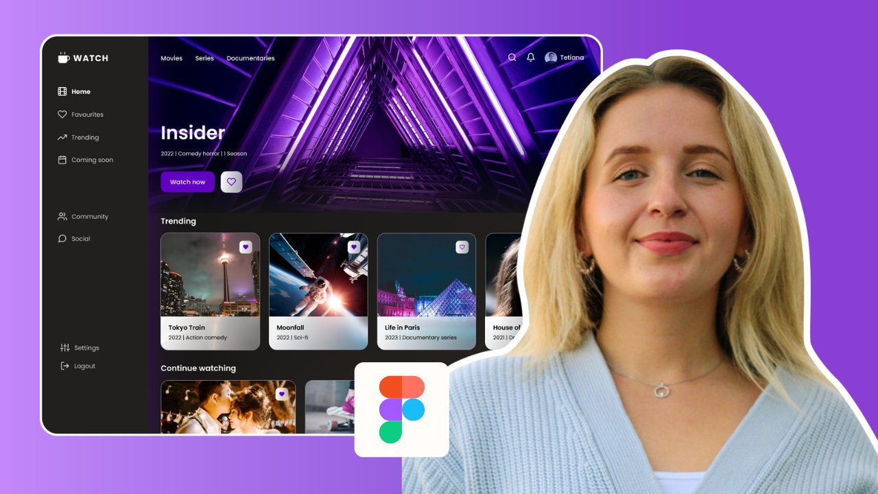
2. Set up layout grids: Welcome to the first part of
this class where we're going to set up a grid
for our dashboard. And setting up a grid is
quite a good practice before we start to
design any type of UI because with the grid or the elements within our
frame can be consistent. So to start, let's
quickly select a frame and we're going to
create a web dashboard. So in the predefined frames, we're going to select
a desktop frame. I will quickly rename it. The first step will be to
go to the Layout Grids and to create the
first grid right here. So we're going to start
with the grid itself. So by default you see
the size is ten pixels, but we're going to
change it to eight because we are going to work together with the
eight pixel grid, which is quite common nowadays while designing different UIs. So if isometry right
here you can see oldest different squares and
if you have some elements, for example, a rectangle, you can see how
it's going to move within the grid right
here with this element, if we hold our Shift keyboards and actually move our elements, it jumps immediately by
ten pixels to decide. We're going to
work with together with the eighth pixel grid. Let's go to the preferences and actually adjust
our notch amount. So by default the big
notch is set to ten, but we're going to
change it to eight. Basically, this value will
adjust our resolution and actually independent
bullet points that we are going to
work together with. This is great. Let's basically select again rectangle tool. And we're going to draw the left side of the menu bar that we usually
see in our dashboard. I'm going to use actually
my eighth pixel grid to just guide me on where to see the
margins for my menu bar. And let's say that the width of our menu bar will be 192 pixels. And as you can see right here, it falls perfectly
into our 8 grid. Let's quickly fix our
layer right here, and we're going to
select our frame and the layer grid section, we're going to add another grid, but this time instead of a grid, we're going to select
columns and in a column, so you see all these
different types of settings. And usually when we
work with web UIs, we will work together
with 12 column grid. As you can see, the
number of columns we're adhering to immediately
change in the type we are going to select that our columns are going to
start from the left side. So you immediately see
how they actually move to the left and right
here with the gutter, as we work with 8-bits, logarithm is a common
practice decided to 24. And actually we are also
going to work with an offset, which means the width of our left menu bar together with the margin that we
want to set within. I'm going just to hold Alt and actually increase the
value right here. Let's zoom in and
actually check. So it's more precise. I think that we
should modify it by one pixel and the
one I basically draw another rectangular
tool I can see in the width what is
actually the margin. So it's extra 56 pixel. This is kind of a set
point that I'm going to have on another side of my frame basically
from the right side. Let's go back to our
layout grid settings. And actually we are going
to want to phi width. So basically our columns stretch all the way to the
end of our frame. As you can see, 80
pixels is quite too much because the last column
goes behind the power grid. So let's decrease
the value 72 width. And I'm going to duplicate this the ankle and
place with here. As we can see, it's
slightly more. Our margin is 64
pixels instead of 56, but it's quite fine because
usually in dashboards you need to have a bit of more
space on the right side. So simple as that, we set up our grid. So the first grid is important to align all of our
elements within the frame. Second grid is with columns
where we've just aligned vertically our elements
on our dashboard. So see you in the next video.
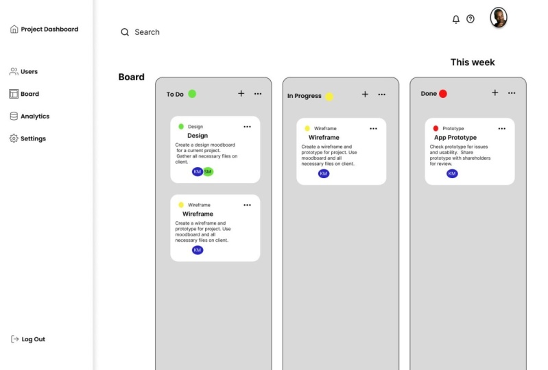
3. Design side navigation bar & icons: Welcome back to the second
part of this class. In a previous video, we set up the grid that we are going to have as a main points to design the elements
within our dashboard. Let's quickly hide actually
our columns point and go to our left menu bar
and we're going to start to design
basically the menu items. I'm going to start
actually with some icons. And to have some icons I already installed the feather
icons plugin. I left the link to this blog
and where you can actually find it and easily install
it on your Figma profile. So in front of our icons, it's quite easy to work. You can just search
for different types of icons or search
them with a text. So I'm going to use
this icon for my logo, basically the logo
of my dashboard that I'm also going to use this icon and a bunch of other ones that I'm
going to quickly select. Right here are my icons. It looks a bit messy,
so I'm going to move this away from each other. Right? So let's place this
one on the top and also the other ones right
below the first icon. I'm going to select
all of these icons, align them in the
center and also have the same space
between each of them. So for example, I'm going
to use the value of 36. Well then the
Eigen, I think that the stroke is quite thick. So I'm going to select
each icon and actually modify the stroke value
to the lower one. So for example, equals
select this frame. I can select older
vector layers and actually go to Stroke and
modify the value to one. The same goes to other icons
that I just select it. All right, let's add
some text to this icon. So the first one is going to be the name of our dashboards. So for example, the
problem manage. I'm going to also change
the text fonts will pop and actually increase the size
and the weight of my font. Good practices to have actually the distance of
increments of eight. So for example, 16 fixed
cells or even more. So I'm going to copy
this layer and actually put it down and modify it
to the different tests. Right here is going to be bored. Let's also select all of this text layers and align
them to the left side. And also we're going to send
them to each of the icon. When we're done, we're going to select all of these
layers and move them actually to decide
of our menu frame, we're going to position it exactly with our credit
we just created. I'm going to actually increase this layer a bit to the
value of 224 because I feel like I need more space
for our icons and for our texts within perfect
song grades will lower the logout value a bit to
the bottom side because it's kind of the less irrelevant
evaluate to have for us. And also this four menu items, I'm going to lower
a bit more down so that we have our
logo mole distinguish. Let's also select our layer and change the fill so it's
going to be white. And a way to also apply effects. So drop shadows and we
can actually distinguish this layer from other
parts of our dashboard. Something like that. So let's also hide our
rate to see how it looks. And I think we can
slowly modify it, have it less visible. Also, the last thing we
have is that we're going to highlight exactly
the menu item where we are going
to be located. And this is going to be in the
item that is called board. So I'm going to have the value, I'm going to have as
painting into the black with other values, I'm going to basically change
it to the lighter gray. Here. I'm going to increase
the weight of the font. And also I will modify slightly the colors of both of
this vector layers. More colorful and it
looks more like a logo. And the last thing I want
to still highlighted, I'm located inside of the board. Here we have our
rectangle with a fill that we are going to align
in the center as well. And I'm going to also color
it in the light blue. Then I'm going to
decrease the opacity to the value of ten. So it's slightly visible that
were inside of our boards. We just simply created our first menu bar
from the left side. And in the next video we are
going to create our Heather and move on with other elements to create a simple dashboard.
4. Header and columns: In this part we're
going to work on the header and also on the first elements
within our dashboard. As again, I'm going to add more icons to basically
showcase that the person can search and see notifications and the help
center within the dashboard. I'm going to go
back to the feather icons plugin and
search for more icons. Perfect, three of our
icons are right here. I'm going to move them
again from each other. My search icon is
going to have also this gray color so
it's less visible. And other tool I going to be colored in black and
I'm also going to slightly decrease the weight of the stroke tool one pixel. Perfect less alone
both of these frames and actually move them
a bit more to the top. For this case, I'm going
to turn on my layout grids against so I can simply
align basically my elements. And as you remember, we already changed our width
of the menu bar. So it's important also to change the offset of our columns to have more space between the elements and
our left menu bar. So let's have a
slightly bigger offset and also decrease
the width a bit. Whether we also need to
make sure that our width perfectly lays inside of
our eighth pixel grid. That perfectly so
the width of 70 tool and offset of 256 fits perfectly into our eighth
pixel grid right here. Let me quickly move
this search bar. I will also align
it to the center with our pro managed layer. And also this two-layer cells are going to be
centered in the middle. Let's move them a
bit to this side. Also right here,
I'm going to draw a circle which will showcase the profile of the user that is currently
in this dashboard. So I'm going to set the
width and height of fatal pixels and find a
picture of the person. I'm going to go to
another plugin called Unsplash and search for
the image of the person. For example, this image
fits quite perfectly. It's quite casual and
also professionals. So if you want to modify
the settings of this image, you can simply go to the fill, click on the image and go
to the crop vignetting. And actually you're going
to increase, for example, this portrait and center it more in the center of the shape. Like that. It looks
quite perfect. I'm going to move it
as well to decide of the credit and going to
align it in the center, perfect balance, align it
again with our search layer. The next for this search icon, I'm going to also
write text search. So it's more obvious
what this icon means. Let's also change the color of the specs and see basically that it has displacement of
16 pixels from the icon. When I turn off the layout grid, let's see how actually our items look within
the dashboard, so it looks quite nice. Let's also put our layer grid back and I'm going to
talk base the title. That means that you're
within the board section. I will also increase
the value of the style of the
plenty nine pixels. And also we'll settle for the
medium weight of this text. Let's also make sure
that it's centered with the first item in
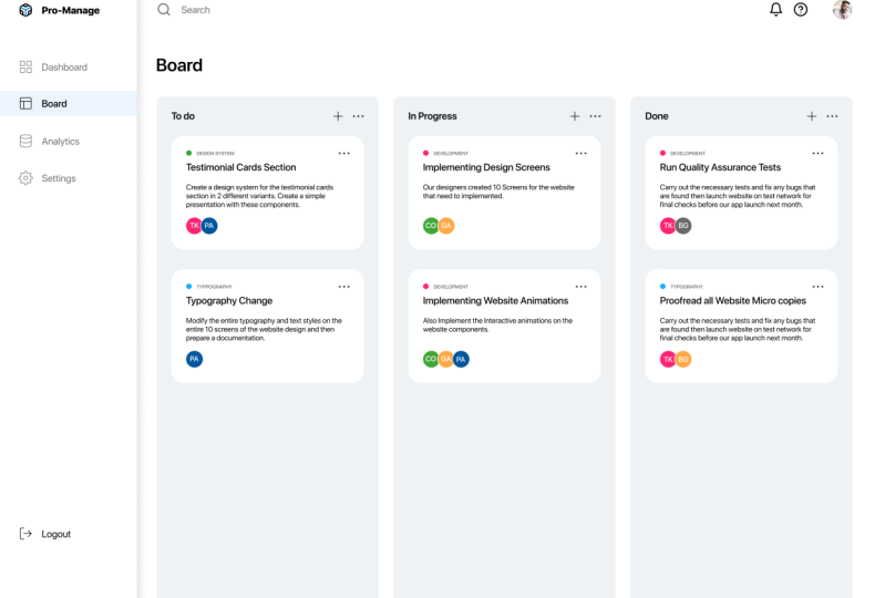
our left menu bar. Alright, it looks quite great. So I'm going to put again my layout grid and
I'm going to create the three columns
where we're going to paste our tasks that we
have to do in this project. So for example, to do
in progress and done. So for that, I'm going to go
again to the rectangle tool. And as you can see
right here in our grid, we have 12 columns
and we're going to have three elements
are the same size. So it means that each
element will take the width of four columns in this UI. Unless actually copied
and place it here. It's actually centered
and it fits perfectly. And I'm going to go
to the corner radius and change the value to tense. Our coroners are smooth and
actually unless so sharp, which just had them right now, for my premise project, I actually copied the
color palette right here that I want to
use for my dashboard. You can apply your own
color palette or you can actually use the
one that I'm using. I also left in the
description of this class the color codes of each color that I used
for this dashboard. So I'm going to select
all of these three layers and change their color
to the lighter gray. And this also write the titles
for each of this section. And of course, I wanted to
be perfect with the credit. So let's make sure that
it's perfectly aligned. And I will also
add another icons which is plus and Morris ethics, to search for the plus icon
and also for more settings. Exactly like that. I will
of course again go and modify the value of the
stroke, the one that health. And also I'll do the same
with the second icon. But it's also love
this rectangle so it doesn't move on our way. And we're going
to select both of these layers and
actually put them on the same level
with our subtitle. If I select all of these
three layers and align them exactly in the center
and right here, I will also make
sure that we have a good alignment of all
of these three layers. And the distance between
them is going to be also relevant to our
eight big slug grids. As someone born to select these three layers and group them and also carpet them two times to basically
put them exactly in the same position to
the other two sections. The final thoughts will
be to actually change the text to in
progress and done. I think our desks were starts getting better and better and more filled in with a
friend types of elements. In the next video,
we're going to add more elements within
each of these sections.
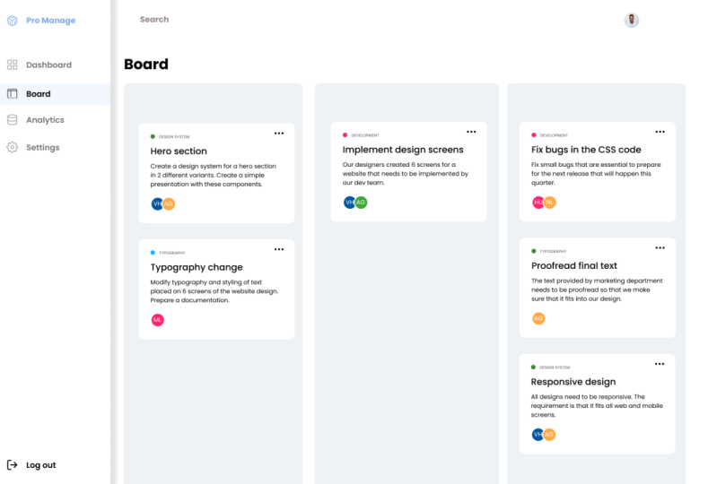
5. Card elements & avatars - final steps: Welcome to the last
part of this class. And right now we're going
to finish our design with creating the simple cars that we are going
to place our board. Before we start
designing our cards, Let's quickly select our frame. I'm going to activate back
the eight pixel grid for me just to see how I'm going to place my guard with
the tasks to do. Let's quickly zoom in. And I'm going to start
with a To Do section. And I'm going to select
the Rectangle Tool and I'm going to draw a white
rectangle right here. So I'm going to make sure that the margins fit basically to the left and the right side of my elements that I
earlier created. And I'm going to
go immediately to the corner radius and
change the value to 20. So I am going to have the
rounded corners for my card. And of course the
color will be white. I'm going to also
increase a bit the height of this element
and make sure that the space between
the to-do title and my element is 24 big cells. So the next step is going to create the label
for Martha task. And in this case I'm going
to type a design system. So let's select this layer. And I will also change
the fill to light gray and also the
font weight medium. And I'm going to make
this label a bit smaller, so it's not so obvious as the other elements in the
morning to create a bit later. And I also want to mark
it with a color code. So I'm going to create quickly
LPS by holding shifts. So my Q values are
basically the same. And I already prepared before the color palette
that I'm going to use the pipette tool right here. So when you activate,
these are highlighted with a light blue color and
I'm going to select, for example, a green
color for this case. In the end, I will
also select both, both of these layers and align them exactly in the center. So let's, for example,
quickly group this part and I'm going
to make sure that my spacing between the top and the left margin is 24 pixels. The next step is going
to create a title. And in this case I'm going
to read a hero section. So this is going to be the task. For example, some
team has to design. The header will have the
font weight of 18 pixels. And let's also make sure that
it's aligned with my label. So right here I'm
going to move it a bit closer to the label. And the next step is
going to be just a copy. This here, affection. And basically, this
is going to be our primary texts
where we're going to describe what
the task is about. And I'm going to
decrease the value of my font and also keep us to regular exactly what my description is going to be spread through all the cards. And just to make sure that
the spacing is 24 pixels from left to right side
and right here off new quickly type in
some description. This is just as simple text
gouache and scheme up with. And I'm going to also make
sure that the spacing between the primary texts
and the title is eight pixels as well as well. I want my car to have
also the settings. So I'm just going to select the earlier created
settings icons and I'm going to copy it and
place it next to my label. Of course, it's going to be also centered to the right side, the same as my primary text. The last step is going
to actually create small labels would initials of people who are going to be
responsible for this task. And for that I'm going to
select again an ellipse tool. And by holding Shift, I'm
going to draw a simple circle. And immediately I'm going
to go to the stroke and add a simple stroke with white color that is going to be
inside of the Alex. And of course, by
selecting fail, I will select the game I 5-bit and go to my color palette and select one of the colors that I prepared earlier in this class. As well. I'm going to create some
initials of a person who is going to be responsible
for this GSK. By selecting both
of these layers, I'm going to send the right Exactly in horizontal
and vertical position. And in that, let's just quickly group both of these elements. So I also am going to lower the position of this
element by 16 fixed cells. And for example, I will
also copy this element. And because I want, for example, people to be
assigned to this issue, Let's quickly go again to my
color palette and change, for example, to this
color. Right here. I'm going to change the
initials like that. The right here I also
want my ellipse to have 24 pixels of distance to
the margin of this card. So I'm going to simply increase the height of
this white rectangle. This is just a simple example
of how we created our card. I'm going to disable the grid just to see how it
will look like. So I think it looks
quite simple, but also quite nice. And I will just select all of these layers that
I just created. And I'm going to group
them together right here. Just to finish off our design. I will copy this card
and change the content in it so that in
the end we can have quite a nice dashboard with the tasks. Here we go. It looks like an awesome
dashboard that we just simply created for
such a short time. Let's finally select our frame and see it in the
presentation mode. This is how we created our simple and very
professional dashboard for task management, for the project team. So guys, I'm really
curious to see your work. Whether you created a similar dashboard are a bit different, one that you wanted
to create for your portfolio or just
for fun for yourself. Let me know and I'll
be happy to give you a feedback and thank
you so much for following this class and
I hope to see you in the next class that I'm
going to prepare quite soon.
 Tetiana G, UX Designer