Transcripts
1. Course intro: They want to learn the basics of Figma and it's essential
features from scratch. And doing lady wants to quickly apply all of these
tools into practice, then you are definitely
the right place. Because what is hands-on
practical course? We're going to design
a movies application. It's a perfect opportunity
to cover all of the basic tools and
stigma such as Layout, Grids, text, colors,
styles, and so on. But we will also cover all the important features
including components, variance, and also prototypes. So if you're ready to design
the movies application, don't wait and enroll to
this course right now.
2. Figma Assets [Free file]: So exactly for this course, I created a Figma file, then you can use it for
your own reference. This file is super
handy because I create all types
of colors, styles, textiles, great styles, and also components that you need
to use for this project. You can find oldest
styles right here on the right menu bar and reuse
them throughout this course. You can also check out all of the different components that I prepared for you that we will
cover some of them as well. Also, there's another page
that is called design screens. And right here you can see all the different
designs that are relevant to this
movie application. Specifically, we
will focus together on the Welcome and
the whole screen, but you can also
browse and check other screens that
I prepared for you. This is a great
opportunity to use the screens for your
learning practice. And also maybe if you'll want to reuse them for your portfolio. So make sure that you don't
want this Figma file. I left the link under
this course description. And let's just get started.
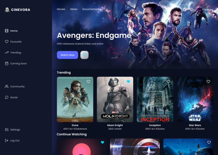
3. Design Welcome Screen - Part 1: So let's start with designing
our first welcome screen. If you're going to use my
Figma file that you can immediately navigate to the
Pages tab and add a new page. So I'm going to do
exactly the same and just name this
page expert size. Feel free to name this
page the way you like. So the reason why I'm working
in exactly the same file is because I already
have all these textiles, colors, styles, and
grid style defined. Of course, I'll explain
everything from scratch, how everything was
designed initially by me. So the first thing in
Figma to do when we start designing our
web application, in this case, for movies app, we're going to go to the upper
menu bar and select frame. Frame allows us to create
some sort of screen that we're going to use
for our web application. In frame on the right side, you have a lot of presets that you can use
for your projects. So e.g. if you're working with mobile applications to have different screen
sizes for iPhones, Androids, and so on. But for our case, I'm great
to work with desktop. I'll just quickly grab this template and
click it right here. So right now we've
created our first frame. You can also see
in a later step. So on the right menu bar you
can see its width is 14, 40, and also the
height, 1024 pixels. Let's quickly rename this frame. Name is welcome screen. So now the first thing
we're going to do is to change the fill
color of this frame. So make sure that
you navigate to the section and you can
actually do it e.g. manually to select the color that you want to apply
for this project. Or you can also go to
the styles menu and select one of the colors styles that I prepared
for this project. So exactly for this one, I'm going to use dark
angular gradient that I will just apply
and with one-click, already have this beautiful
gradient for my screen. If you want to find out
how it was created, you can always click
on detach style. And right here you can see exactly how this gradient
has been created. So e.g. the color of gold for this purple
color and also put a dark color and all other settings that are
applicable for this gradient. But I will just
actually go again to my colors styles and re-apply the style just for
the consistency. Then I'm going to
grab a rectangle, basically created
inside of my frame. So I will make sure that
the dimensions are exactly the same as my frame to
match exactly the size. You can also see
that the rectangle belongs inside of the frame. So make sure that it's placed
exactly inside because e.g. you can easily see when it
doesn't belong to the frame. It's also visible in
the layers panel. So exactly for this rectangle, I want to apply an image. And for that I'm going
to use some plugins that are applicable in Figma. So right here in the
resources bottle, we can go to the plugins and actually search for the
plugins and we want to use. And in my case,
let's find Unsplash. This wagon helps you
to find a lot of free resource images that you
can apply for your project. And we're going to use this plug-in for quiet so many times. So here I'm just
going to type movie and find exactly the image that wants to apply
for my background. And let's quickly
click on this image. I think it looks great. But the thing is, you can
see that the field has to style for the solid color
and also the image. Let's quickly remove
this solid color. And I'm going to
decrease the opacity of this image to
something like 10%. And I think it looks
great because now our background looks so
much more interesting. Alright, the next step is
going to be to add actually layout grid for our frame
right here in the style. So you can again go to the grid styles and
select them calm center. Let's quickly unpack this style just to see how it all works. So you can seen a drop down. There are three different
types of layout grid, but for web application we
will always use columns. So the count is ten columns that the number of columns you can see right here in the screen. And also the width
is set to 104, which means that this Rep, column has this type of where the gutter is
set to 16 pixels. And this is exactly the distance between bulk of the
columns that you can see. Of course, the five is
aligned to the center.
4. Design Welcome Screen - Part 2: Now we can quickly add all of our visual elements
to this screen. So I'll quickly navigate to
the assets and find my logos. So I will just quickly drag and drop it right here
into my frame. If you want to see
how it's made, just make sure that you open
up this component and see all the type of
vector shapes that I applied and also the text. But for now we're just
going to leave it as it is. And I would just make sure that it's horizontally aligned. And then we're going
to select decks and type here some
texts that makes it attractive for people
to login. Styles. I'm going to select
18 pixels regular. So if we unpack this style, we can see that I'm using
puppets as my pond. And the weight is regular
and also the font size if it infects cells
and the line height is 20. Let's again align
it to the center. And I'm going to quickly decrease the width between
both of these layers. If you want to know
exactly how many pixels are between both of the layers, you can hold Option on Mac
or Alt on Windows keyboard. Then I'm going to select
a rectangle and throw my button right here that matches two
columns on my screen. I will also quickly change the corner radius
with the value of 14 and the highest is
going to be 54 pixels. So quickly, again, I
will change the color to purple and add another
text right here. To make sure that my text is exactly aligned in the
center of this button, I will select this
rectangle layer and also this bottom layer, and align them horizontally
and vertically. Finally, let's quick with
our right mouse and click on the Group Selection to create a group in our layers section, we can also rename it to login button just for
our own reference. I just lowered exactly the
bottom right here and maybe I'll also decrease
the distance here. Let's also grab this text
layer and duplicate it with a key shortcut that is Control plus or Command
plus B on your Mac. So I'm going to drag it exactly right here
and we are going to change text which
says no accounts. Sign up. I will quickly also decrease
the size of this text and also make sure that sign up it's selected and it's
changed to the bolt. Wait. Let's also quickly go to Font Settings and Add the underlying tool,
our sign-up, perfect. So let's select all
of these layers, align them to each other, and also, and also
right-click on your mouse and select
the group selection. Finally, we can also
align everything again according to our French just
to see the end results. So make sure that
you're also select your welcome screen frame. And we can hide
this layout grid. And in this way you
can exactly see the design and how
everything is aligned. Perfect guys, which has created this extremely simple screen, but I hope that you
managed to repeat all the steps that we
just made together.
5. Create Dashboard Side Navigation: We just finished designing
our first welcome screen. And now we're going to
create a dashboard, which is going to be our first initial home screen
for the movies app. So let's again navigate to the upper menu bar
and click on frame. And also in the frame presets, I will click on
the desktop frame. Let's quickly rename
it to home screen. And I will immediately apply the color style to
the frame background. And it's going to be
dark color style. So first of all, let's design
a site navigation bar. And we can do it by
selecting a rectangle tool and throwing it on the
left side of our screen, I will change the
width to 274 pixels. Make sure to align it to the
left and also to the center. Here, I'm going to apply
this type of color. So this is the hex code. It's slightly lighter than
our dark background color. Also have some
visual separation. I'm going to go to the effects and actually
apply a drop shadows. So I will use this
color which is actually purple and it's going
to be 40% opacity. And I will make sure that
the position of that is zero pixel on y-axis and
also to pixels right here, also the blur value, I will increase
it to 90 degrees. Right now you can see some
sort of purple glow that actually goes from our
side menu bar. None. Again, Let's grab
our logo and we are going to align it
exactly to the center. And that will also
change its position to make sure that the
distance from top is 40 and the same distance is going to be from the left side. Now let's select the
Text tool where we're going to create a
few texts layers, that means the pages
of our dashboards. So the first one is
going to be home. And I will immediately apply the 16th pixels regular font. And you can see the purpose. The line height is 24
pixel and the size is 16. I'll just duplicate
it a few times. Now what I have to do is
just to change its contents. Since we are going to be located
on our initial homepage, I will change its
weight too bold. So also in this menu bar is
quite a good idea to add some visual icons to
also symbolize where the user implicated
in my assets. I prepared a bunch
of icons that you can just simply
drag and drop right here to this area and actually apply
them to your project. If you want to find this
icon item come from scratch. You can quickly go to
the plugin section and type weather icons. And this is exactly
the plug-in that I use to work with in my
applications. So e.g. if you type movie, you can see exactly the same icon
that I just applied here. The only difference is that by default it has black colors, so you have to change the
styling to match your project. But anyways, let's select all of these icons by
holding Shift key. And I'm going to align them
exactly to the center. So now we can see that the
distance is 12 pixels. This is what I want to
achieve in this design. And now we're going
to just go one by one and exactly apply the vertical alignment to our text layer and the IP layer. And for each, that's an icon, I'm going to create a group
with control plus G shortcut. You can also achieve it with a right-click mouse and
click on Group Selection. Now you can see
new layer section will have bunch of
different groups. So I'm going to select
all of these groups and also make sure that
I tidy everything up. And the distance between
all of these icons is going to be 35 pixels. I will also make sure
that they are aligned to the left of my logo as well. Right here also, the distance
is going to be 58 pixels. And I also want to separate
a few of these menu items. So e.g. I'm going to lower
them all the way down. Finally, I also want to
separate this type of players, so I will also lower
them all the way here. Perfect. And actually the last thing that we're going to do with all of our menu items except of our homepage, is to select them. And also in a later
step we are going to decrease the opacity
to 80 per cent. And the reason for that is that I want to visually show to our user that they are
located at the homepage. So finally, when
we get everything, Let's select it
and then group it by controlled plot,
cheat shortcut. And I will just quickly
create a component. And this component
we are going to reuse across of our application. Let's quickly rename this
component right here and call it site nav bar.
6. Introduction to Components in Figma: To briefly explain to you components if you
are new to them, that means that we have, first of all, our
master component. You can sit in your layers panel if without the k that we have actually a child
component which is actually called
instance in Figma. We can also duplicate
unlimited number of instances in Figma,
and that means e.g. if I go to my master component, you can see it also
in the menu bar, e.g. I want to change the fill
color of my rectangle. You can see how everything
is being changed as well. So it actually really speeds up your workflow and your
design process. So e.g. you will not have to go
to all of the copies of your navigation bar
and change them manually, but you can do it
with one click. But for now, let's delete all of these instances and just
focus on our home screen.
7. Design Movie banner - Hero Section: For our home screen. So decide further. I'm going to apply a
layout grid because I want to make sure that everything
is properly aligned. So let's go to our
layout grid styles. And this time we're going to
select 12 columns side grit. And you can see that the grid is actually moved more
to the right side, that it doesn't actually
encounter our navigation bar. So if you're unpack
this layout grid style, you can see that
the column count is 12 and everything is
aligned to the left. The difference before
we had everything, it was alive more to the
center of the screen. But in this case, we really need to work
with a left alignment. And also you can see the width value of
each of the column. The offset is 306 and the
gutter value is 24 pixels. Now I want to create an opera navigation bar that
is going to be quite simple. So we're going to start with a text layer and type movies. So I will just select 16th
6-fold regular font style. And that will make sure
that it's aligned to the side of this grid. Let's duplicate
twice the sets layer with Control D or Command
plus the shortcut. Here we're going to dive
series documentaries. I will select three layers
and also click on tidy up and make sure that the distance
is 32 pixels between them. So let's quickly group them
and just go up or text. Here, I want to add an avatar, so I'm going to click on Alice. And actually by holding shift, I will draw an ellipse with
a value of 16 by six pixels. This ellipse is going
to be my avatar. So I will use again
Unsplash tool. With Unsplash to allergens find the portrait I want to
apply for this avatar. Here with a text layer, I will again type my name and also makes sure they are both
aligned to the center. So let's also make sure
that the distance between this text and Avatar
is eight pixels. And right now, I think that this Alix looks rather small
compared to the text, so I will just increase its dimensions to the
value of 32 pixels. And right now, I think it
looks much, much better. Let's again make a group. And finally, I want to add two more icons for
my assets panel, which are actually bell
icon and also search icon. These elements are just
additional visual ads on that we can use in our style. So let's make sure that the
distance between all of these three layers is 24 pixels. And I will group them all and make sure
that they are also appropriately aligned right here to the left side
of my column grid. Great. Now we can actually
grab everything right here and also align
it to each other. So I'll create another group
and call it upper bar. Right now, I will again
create a component that we're going to reuse
through our project. So let's make sure that
the distance to the top of our screen is 40 pixels. So briefly, this is how our home dashboard
looks at the moment, which I think is actually
starts to get some shapes. I will activate back my column for it and we're going to add another visual element here is the main movie that we're
going to show to our users. So right now I'm going
to draw a rectangle, make sure that it's properly aligned to the left
than the right, and that its height
is 455 pixels. Now I'm going to align it exactly so the top
of the screen. So make sure that
in your layers, your rectangle is placed all the way at the
bottom so that you can see your other elements that
we just created together. Now, I will disable the grid, and I will also look for another image right here that we're going to use
for this movie. This one looks quite
gray and I'm going to apply another linear
gradient so that we can have more contrast
between the upcoming texts and other visual elements and the background in the field. Let's select linear gradient and just change his
markers like this. And also make sure that
the opacity is 100%. So here we have a much
better smoother transition we will use for this element. Now let's create a
title of the movie e.g. inside or this is shift, this super random
name I came up with. But you can use other movie
sides of that you love. Right now, I'm going to apply 48 pixels semi both
Poppins fonts. So let's also make
sure that it's aligned to the left of
my opera navigation bar. I will duplicate this layer
and actually rename it. And I'm going to change the text style to fix
and pixels regular. Maybe it's also better idea to decrease the font size a bit. Finally, what I have to do is actually to design some buttons. Let's grab our rectangle
and draw it right here. And I will change the
dimensions to 139 to 54 pixels. And also the corner radius is
going to have four pixels. So right now, let's go to fill and also modify it,
the purple color. And of course we have
to type call-to-action, which is called watch. Now it's going to be again, the 16th pixels,
medium font size. And we'll just grab both of these layers and align
them to each other. This button is going to
become another component that we're going to reuse
across this project. Now I also want
to finally create another secondary
button which will allow our users to like
and unlike our films, which means that they can
save it to favorites. So I'm going to
select the rectangle, and by holding Shift, I'm going to draw a
rectangle which actually has the dimensions of
54 by 54 pixels. And also our corner radius is going to have four pixels. Here. I'll grab again an icon, and I'm going to change the
selection color of this icon, which has a stroke
to this dark purple. Let's again align everything to each other and you can see how basically it's a
perfect square and the distance from each
side is fifth and pixels. This icon is just a simple gray, has a simple grave fail. But I'm going to go to my
fill styles and select another style which
will allow us to make this icon much more blurred. Let's also add some stroke, and I will just select
this line near fill. Click on Control plus C, select the right here and click on Control plus b so that we can change the fill
color of this element. Also, if you don't like
how this icon looks, you can always basically
modify its value. So e.g. something with
opacity or other way around. Alright, so that's why
it looks so much better. And right now let's actually
close our linear gradient. Again, we're going to group
these layers and also create another component
that we are going to rename, Like button.
8. Like Buttons - Variants in Figma: So this is how our home screen looks at the moment I
think it looks super cool, but feel free to
use other images or other cells if you want
to, before we continue. So the other sections
of the screen, I want to introduce a
new concept for you, which is called a variance. And this is another topic that is relevant
to our components. And I'm going to show
you quickly an example. So let's grab this like button. And the thing is
throughout this project, I want to have different
variations of this component, which is like and
unlike battery. So what I'm going to
do is actually go to the components menu and
click on Add variant. Right now you see that inside
of my master component will have two different
variants that we just created. So I will basically rename
this property tool. Unlike the difference
right here is going to be that our heart is
going to have a fill. So that means that
the universe saved exactly this movie and he or
she is also able to save it. So we can also quickly rename the component property
to this one is like, so now you have this kind of purple rectangle
around our variance. And it doesn't look
so good because it's actually not even
a part of the design. So what I will do, I will
quickly just move it outside of our frame just
for now for a moment. And I will basically just
go to the Assets panel. And right here, when you
work with your assets, makes sure that you go
to the exercise page. This is the page where
we work at the moment. And you can actually drag
this like button right here. And now the cool thing
is that when you see here the
variance properties, you can either switch
from like or unlike. And I think it's super
amazing because it's going to speed up our
design process as well. And it's going to help
us a lot while creating some interactions for
our design in sigma.
9. Design Trending Movies Cards: Alright, so we are
ready to define other sections for
this home screen. And I'm going to start with creating the title
for the fraction. So let's grab our text tool and I'm going to type trending. So right here we
will use 20 pixels, semi bold, OpenStack style. And I will also make sure that the distance
right here from the main image to
the six pixels, and that is also appropriately
aligned to the left side, match all of the other elements
would create an Before. I will again activate my
crit because we're going to create movie cards that
the user can interact with. So let's again grab our rectangle and
we're going to draw it right here with a width of 254 pixels and the
height of 300. I will change the
corner radius value of 20 pixels and also change the distance
between trending and this rectangle to
the value of 16. Actually 24 looks a bit better. So let's also add
a stroke color, which is also with gray fill. And we're going to find a symbol image for
this movie card. Again, I will go to
Plugins and click on Unsplash and just find the
image that fits right here. So this one is quite
perfectly as an example. So we can see that witches
have our image and the text. I'm going to grab
this rectangle again, duplicate it with control plus C. And instead of the fill, I'm going to use
solid for the moment. I'm going to also change
the corner radius, which means that
the top corners are going to have a value of zero. And write down, this
is exactly we are going to create this section
of the movie cards where we're going to write the text of movie title and
also the subtitle. Now, NFL, I will also
apply this glass clerk radians so we can see it much better how everything
is located. So let's grab our text layer and we are going to
rise some titles. So e.g. Tokyo train
as an example. And then I will duplicate
this text layer with the control plane sneaky shortcut and change
its contents. Let's also decrease
this font size. So right here the value
is 16 pixels by 16. And the same way we
are going to align everything to the
left side and also move its position a bit more lower with a value of
eight pixels over distance. I will also change the font. So right now we have our
movie card almost ready. The only thing is I'm going
to go again to my assets and actually flagged
it Like button. In this case, the button
looks a bit too big, so we're going to select a
scale tool by holding Shift, I'm going to decrease
this size to the value of 32 by 32 pixels. Perfect. And let's also modify
its possession to make sure that it's
aligned 16 by 16 pixels. Great, so we have everything
ready right here. So let's just moving
card vertical. And I will create
another component that we are going to reuse
through this project. So let's quickly duplicate this movie cards with the
control plus dq shortcuts. And I'll repeat this
action torr times. So right now we have four cards and the only
thing we have to do is actually to change its image
and also text content. Alright, so this is actually
how we are almost done with our home screen for
this movie's dashboard.
10. Continue Watching Section: Finally, let's finish up this design screen by
creating our final section. So first thing, I'm going to
grab this trending layer and duplicate it with control plus D that's located right here. And I'm just going to rename
it to continue watching. Then I will duplicate
again this movie card. And for now I'm going to
place it outside of my frame. So what I'm going to
do is first of all, I'm going to detach
this instance. And that means that
this instance will not belong to our
components set anymore. That means if I go back to my master component and
make some styling changes, it will not get influenced
by that so easily I said, I can basically
grab this layer and actually deleted the same I
will do with our texts layer. So the only thing I have
to do is actually to change the dimensions
of this cart. Here in the width is going to be 348 and in the height's
going to be 200. Then the same way, I will modify the position
of the slider button. So this value that actually
to the edge of this 16 by 16. Right now you see that the image does not look so good anymore. It's a bit pixelated. But what we can do is actually
add the images that we want for our project the same
way with it, these cards. So again, let's group this card. So now I'm going to
rename this card to movie card horizontal and
create another component. And that's why I can
duplicate this component twice and located right
here to the left side, and make sure that the distance between all these
cars is 24 pixels. And this is exactly
what we can drag. Again, discards back to our home screen play such
as here at the bottom. So again, we'll just
need to make sure that our content right
here is difference, such as we'd have
to go either to the Unsplash plugin or just
based on our own images. You can see when I base of my first image and because
it's the master component, other instances got
exactly the same image. But we can easily change the image of other
instances as well. Perfect, Now it looks like a really cool dashboard that we have for our
movie application. If you want, you can also go to this like button and change the variant
to the like status. And you can see because I
work in my master component, again, everything has changed. So I'm going to Control Z
that and go to the instance instead and actually apply
the Like button right here. Well done just together, we've finished the
section where we created a whole screen for
our dashboard.
11. Basic Prototype & Animations in Figma: So since we finished
designing two screens now we can quickly move to
another part of this course. What we're going to create a very simple interaction
between both of these frames. So first of all, I'm
going to connect my welcome screen to my home
screen and other way round. So for that, I will have to navigate to the
prototype section, and this is where I'm
going to start my float. Let's quickly go to
my welcome screen. And I'm going to actually select this login button and actually connected
with my second frame. In the interaction details, we have all types of different settings
for our interaction. Right here we have our trigger and we're going to
work with onclick, which means that when I
click on this login button, I'm going to see another
frame for animation as well. I'm going to use smart animate. And this is a super
cool animation because it just can simply show you a very good translation because it matches all
the similar layers, which allows it to make it more fluid and more
smooth the same way, let's actually go
to my logout group and I'm going to navigate
back to our first frame. And for the interaction details, I will do exactly the
same settings with the onclick trigger and
smart animate animation. So the quickly check
our simple interaction. We will go to our flow
here on the Play button. So here we have our
presentation mode where we can interact together
with our product side. So if you're not
sure where to click, you can simply click
on an empty area. And right here you see
the blue highlight. And this is exactly the thick
mud L2 where the hotspot, which means the
interactive point, is, Let's quickly click
on the Login button. This is how we have this smooth transition
to our home screen. The same way we will click on our logout because we don't
want to use this app anymore. And we'll navigate back
smoothly to the login screen. So you can play around and make this animation
mushroom are complex, but the idea is very simple
because it just go back to your Figma working area and make different types
of connections. And in Figma you can make unlimited number of prototype
connections between frames.
12. Interactive Components in Figma: Now let's talk about
animating our like buttons. So what I'm missing
right here in my prototype when I login, I cannot really like
or unlike this movies, which means I cannot
save them as a user. So to do that, because we've
worked with variance before, if you remember in
the previous section, we can simply prototype
them as well. That means we do not have duplicate multiple
frames many times we can only make one connection and it will perfectly
work for us. So basically it makes sure
that you are again in the prototype that if you
are lucky in the Design tab. Now let's select
our first variant and connect it to
the second variant. Here we will use again onclick Trigger with
smart animates settings. The same way. Let's connect our
second variant, which is unlike
variant to our first, like bottom, with the
same interaction details. And this is basically
if it's super simple, only two connections which is created in our components set. And this is exactly
the way how which has created an interactive
component. So basically that's it. We can go to our
presentation mode again, and I'm going to login
to my whole screen. Right now. You can see how I can quickly like and unlike my buttons here, which has interacted
with muscular components for the movie card. And we actually applies exactly all the transition
to other remaining cards. Here. If I work with instances, I can quickly like and unlike my movies as I want,
as you can see, the interactive components
make it so much easier because in our file we only had the
quake, one simple connection. We did not have to make all the different
copies of the frames. And two WK this type
of interaction. So I hope that you've managed to repeat all of these actions to create a super amazing for that connection, for our design.
13. Well done! Final insights: Congrats my friend, you finally
finish this mini course. And I hope you really
enjoy designing this super simple
movies applications. So we basically covered
the components, the basics of the layout, the layout grid, and
other visual elements. And in the end, I'm super happy that we also managed to create a very simple product
ab connection and also cover the basics of
interactive components. If you like this
course, make sure that you spread it
to your friends, your colleagues, and network. And also don't forget to leave me a review under this course. I appreciate all of your honest feedback
because I always try to improve my content and also make sure that you are happy
with the following courses. Thank you so much
and I see you again.
 Tetiana G, UX Designer