Transcripts
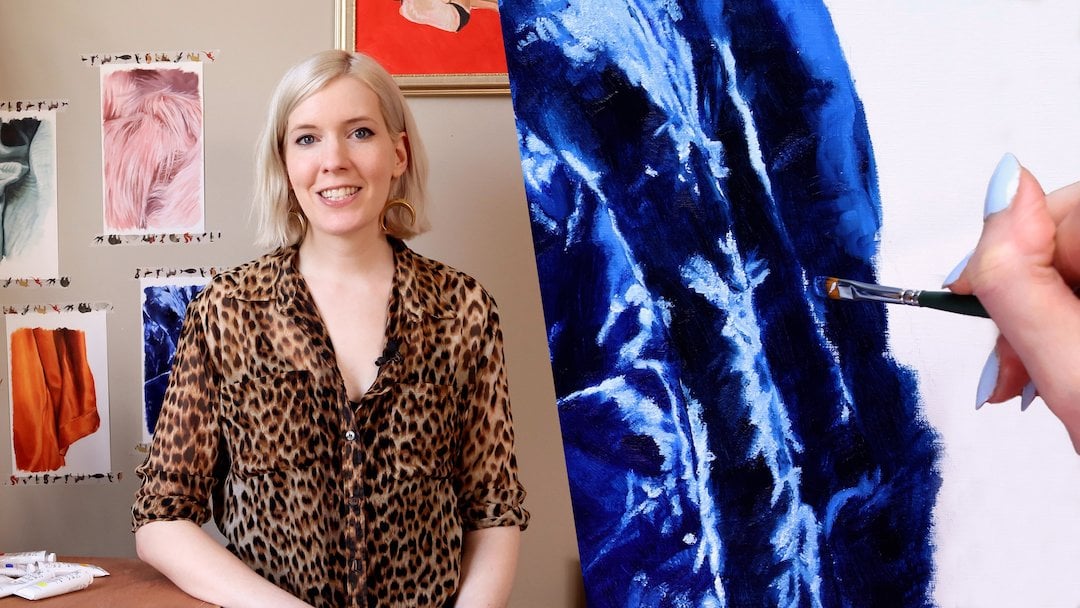
1. Welcome to Fearless Color Mixing!: Hi, Welcome to the
Fearless Color Mixing. My name is Amy Plante, and I'll be teaching
you the tips and tricks of mixing color in
any paint medium. I'm a multi-passionate,
creative, and I've spent most
of my life painting and mixing my own
color palettes. Though I started this
journey at a young age, my big "aha" moment came in a high school art class
when I learned how to mix the color black from scratch and a whole world of possibility
opened up to me. Since then, I've been passionate about never using
colors right out of the bottle if I could avoid it and I'd like to share
that passion with you. What's so great about
mixing your own colors? Learning this technique will pay dividends to you down the line, both artistically
and financially. Mixing your whole pallet with
just primary colors is much cheaper than buying
a different tube of paint for every hue you need. Once you've learned the
basic rules of color mixing, you can create exactly what
you have in your head. Eventually, you'll develop your own look with your
palettes which will give your paintings a unique style and a less out-of-the-box feel. If you're new to
painting or have ever had trouble mixing
your own colors, this is the class for you. Together, we'll create
a painting using a color palette we've mixed
entirely from scratch, and by the end, you'll
have learned how to mix a wide range of colors using
only red, yellow, blue, and white, how to assess
the hue, value, saturation, and temperature of a color
so you can mix it yourself, when it's better to buy a
color rather than mixing it, and how to avoid common mistakes so you
always have success. I find mixing my own color
palettes usually rewarding, and I know you will too. Let's get started.
2. Class Project: Class project. In this course, we'll create a painting using only colors we've
mixed from scratch. This class is best suited
for beginners who are new to color mixing or have had
trouble with it in the past. You'll mix a palette for
your painting project using only red, yellow, blue, and white paints
as your starting point. The painting can be
either abstract or representational but you should be working from some
kind of reference, either from life or a photo to base your mixed
colors off of. To get the most out
of this lesson, I recommend picking a
subject with a good amount of color variety so you
have plenty to explore. Your final painting
shouldn't have any colors that are
right out of the tube. All colors should be mixed. You can use any paint medium
you are comfortable with. The information I'll
be sharing with you is universal and will apply to whichever kind of paint you use. Later on in the course, I'll provide tips
for color mixing that are specific to watercolor, acrylic, and oil paints. Along with these video lessons, I provided a downloadable
PDF cheat sheet and shopping list to guide
you through this project. Now without further ado, let's dive right in on
color theory basics.
3. Color Theory Basics: Color theory basics. Just as all mixed colors
start with simple components, so does color theory
start with basic lessons. There are only a few
vocabulary words to learn that will allow you to speak the language of color fluently. Hue refers to the
specific name of a color. For example, ultramarine blue. Value describes how light
or dark a color is. Saturation refers to the
intensity of the color, in essence, how
rich or dull it is. Temperature refers to how
warm or cool a color is. While these first three are
fairly self-explanatory, I find temperature tends to
trip people up a little more. I'll go more in-depth
with that later. The next group of
words you should know refer to the color wheel. You've most likely seen
one of these before. It's a simple tool
to illustrate how colors relate to one
another on a spectrum. On the color wheel, there are primary colors, red, yellow, and blue. Secondary colors, orange,
green, and purple, and tertiary colors
or colors that fall between the primary
and secondary colors. Complementary colors
are colors that sit opposite each other
on the color wheel. In this course, I
will mostly refer to primary and
complementary colors. In a traditional art class, you will most likely create color and value charts to learn how to mix different hues. While this is an
excellent way to learn, it is also desperately dull. If you've taken my class,
fearless oil painting, you'll know that I take
a different approach with something I call
color intuition. Color intuition is
something you already have and can build up like
a muscle with practice. Knowing the difference
between blue and purple, for example, is where
you already are, and knowing whether to
choose ultramarine or cerulean blue to mix the green you need is
where you'll end up. All it takes is practice and
learning a few basic rules. Complementary colors
will dull each other. Warm and cool colors
can dull each other. The three primary colors make
brown or sometimes black. Colors that fall next
to each other on the spectrum will change
the hue without dulling. White will lighten your color, while a combination of
primary colors or simply a deep blue like ultramarine
can darken your color. Once you understand
these basic principles, you can easily select the components for the color
you are hoping to achieve. These rules also help you
fine tune your color, which is something I will go
over later in the course. Before we end this lesson, let's circle back
to temperature. Temperature is an
often-overlooked factor in color mixing, but it is something that can
make or break your results. If you've ever mixed
blue and red expecting a beautiful royal purple and
ended up with a muddy pink, differing temperatures
in your paints were likely to blame. Understanding the temperature
of your hues before mixing them will lead to
more predictable results. When you choose the red, yellow, and blue paints for
your starting points, make sure you first understand the temperature of your subject. If you're mixing warm
colors, for example, make sure your primaries lean
towards the warmer side. If your subject has both warm and cool
temperatures in it, you may need a couple of different hues for
your primary colors. Here's an easier way to think about the temperature
of a color. Each secondary color,
orange, green, and purple, is made up of a warm color and cool
color, the primaries. Let's take purple for example. Purple is made up of the warm color red and the
cool color blue. The mixed purple will
fall on a spectrum of tending more towards
the red or blue side. If the purple has more red
tones than blue tones, it is considered a warm purple. If it has more blue tones, it is considered a cool purple. As a beginner, I
recommend you keep it simple and stick with
neutral primary hues. That is neither too cold nor too warm to give you the
greatest range for less. These pink colors are often
called simply primary red, primary yellow, and so on. In the downloadable cheat
sheet I've provided, there is a list of
common primary colors and where they fall on
the temperature spectrum. Some paint brands will
also have a master list of their color temperatures on their website and I've linked to a few of
them in the PDF. Once you've determined the
temperature of your colors, how do you use that information? Remember two of our five rules. Warm and cool colors
can dull each other, and colors that fall
next to each other in the spectrum will change
the hue without dulling. If you're looking
to keep your colors saturated and vibrant, you should mix it with colors that are all the
same temperature, either on the cool end of the spectrum or all in the
warm end of the spectrum. If your color is too vibrant and you need it to be
more gray or dull, adding a complementary color or a color of the opposite
temperature will do the trick. Let's recap what you've learned. You learned about hue, value, saturation, and temperature, and how they affect color. We went over some color
wheel vocabulary and how to use it to help you
decide which colors to mix. I gave you my five rules for color mixing that will help
you if you ever get stuck. We discussed temperature
in-depth and how it can make or break your color
mixing experience. Next, I'll share
with you tools that will set you up for success.
4. Tools for Success: Tools for success. You don't need much to get
started with color mixing, but there are a couple of tools that will make your life easier. If you are using a thick
paint like acrylic or oil, you'll want to use
a palette knife to mix your colors so you don't ruin your brushes by forcing paint deep into the bristles. Palette knives come
in a wide variety of shapes and styles, but the best palette
knife is the kind that feels the most
comfortable in your hand. If you can, try a couple of different shapes to find
the one that allows you to easily mix the paint on
your palette and apply it to your canvas if that
is your painting style. I recommend getting a
metal palette knife as the repeated pressing
and scraping of a plastic knife will
break it eventually. Another important tool is, of course, the palette itself. Although, it's
great to re-purpose egg cartons and plastic
food containers, having a dedicated non-porous surface that is specifically designed for this
purpose will make the paint mixing
experience much easier. Palettes come in
a wide variety of styles to suit your
particular needs. Ceramic palettes and butchers
trays are great for mixing fluid colors because
they contain liquids nicely and
clean up easily. Sealable palette with wax palette pads are
great for keeping your paints wet for
longer if you were working on a piece
over a period of time. The paper palettes can be peeled off and discarded
for easy cleanup. If you primarily work on
toned paper or substrates, you can find gray palettes that will give you a better idea of what the mixed color will look like on your final piece. To recap, use a palette knife to prevent your brushes from
becoming damaged. Try out different shapes
to find the one that works the best for your
style of painting. I recommend metal palette
knives for their longevity. Use a palette that
works well with your medium for
the best results. You can certainly practice color mixing without
buying special tools, but having a palette knife
and palate that work well for you will set
you up for success. Now, let's take everything we've learned so far and
see it in action.
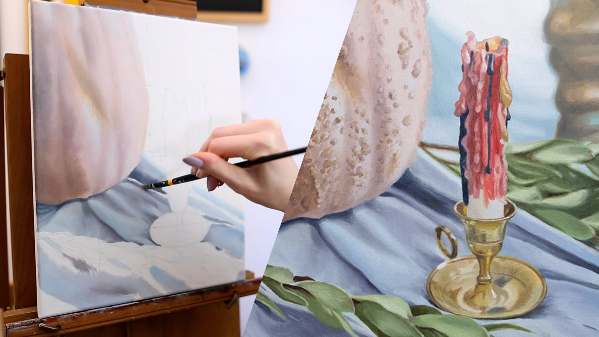
5. Mixing Your Palette: Mixing your palette. Let's try and mix the colors
in my still-life. The first thing I do
when I'm trying to match a specific color with paint
is name it in my head. What I mean by that is I quickly assess what the hue
of the color is, its saturation, its value,
and its temperature. What those characteristics
are will determine which primaries I use and
how much of each I use. You likely won't
be able to guess all that if you are
new to color mixing. Let's start with the basics. Here I'm going to show you
how I would go about mixing the colors for this
particular still-life. I'm going to be using the
Golden Open Acrylic line, which is a slower
drying acrylic paint. Normally I wouldn't mix all of the colors ahead of time
for an acrylic painting. But just for the purposes
of this demonstration, I'm going to be mixing as many colors as I
can find this palette. Right off the bat,
I want to show you the big difference that can occur between choosing
your primary paints. I'm going to start
with using cerulean blue and this Hansa yellow, just to show you what
green you would get with that and how
that compares to using ultramarine
as your blue tone. Right off the bat, you can
tell it's really way too aqua for the greens that
I need for this painting. But I might be able
to use this color for the bluer tones in the leaf that's in the
foreground and it's all blurry. I may come back to that, but for now, I definitely will need
to use the ultramarine. That just shows you
it's good to have a couple primary color
options if you can. When you're mixing a
color like a green, you know what components
make up the green. That's your starting point. I'm just going to mix
the yellow and the blue together and then go from there. What I'm going to find
is I need more of one. They're probably not going
to be an equal amount of yellow and blue in
this particular green. Right now I can see it's
getting a little too yellow, I need to add some blue to it. When you're adjusting
your colors, remember to work incrementally. You only need to do
a little at a time. If you get a little too overzealous with that
and have a big glob, you might end up
making a huge mistake. Always just work a
little by little. Now I'm happy with
that green for some of the medium greens
in this painting. But I want to create
something that's a little bit more yellow
because that leaf, that's in the very foreground, that's completely blurred out, that is quite a bit more
yellow than the other leaves. I've got like a hue that
I'm pretty happy with, but it's too dark. When we're adjusting the value, we can add a white
to make it lighter. But as you'll notice, when you add a white to a paint, it will create a
more pastel color. To get the vibrancy back, you have to tweak it with the original colors in your mix. In this case, I'm going to add a little bit more
yellow to bring it up. Now I'm realizing
that that original green that I made to
just show you guys how it would not work for my painting is actually
going to be perfect to get that blue tone and leaf
that's in a very foreground. I'm just going to add some
white and a little bit of the other green I made to make it the right
shade that I need. The best thing about
mixing your colors is when you mix some and then
you go to mix others. You can use the colors
that you've already mixed for making
additional colors and it creates a really
unified tone and vibe for your painting that
really is hard to get if you just use
out-of-the-bottle paints. That's a great little bonus. Now I want to mix a couple
of shadows for the green. All I am doing is adding a little bit of red to
dull down the green. Because adding a complementary
color will dull the color. Then I'm going to add a
little bit of blue to make it darker and to take out
some of the yellow. Now I'm going to work
on that rust color because it's a big
part of the painting. You could probably get a beautiful version of this
color by using burnt sienna. But I want to show you that you can really do
a lot with primary. I'm going to just use
the primary colors to get this deep coppery color. Even though this
color is very warm, it definitely has an
orange hue to it. It's not as vibrant as
the orange in the bowl. I want to dial it down a
little bit with the blue. Then what's going to
happen is I'm going to be pulling back, adding some more red, maybe adding some more yellow if I think it looks too red. It's just about
getting a balance and tweaking the colors
a little by little. There's a lot of light and shadow happening
in this painting. What I usually do is try to find the mid-tone of whatever
color I'm working with. The fabric, you
can see there are some bright bright highlights
and very dark darks. I'm just going to try to find
the mid-tone to start with. Then from there, I can easily
make the color darker. Maybe like set aside a little bit of it
just for the shadows, set aside a little bit of
it for the highlights, and add some white to it. Starting with the mid-tone
is a great way to go. Here I'm working
on the highlight. As I said, you don't have to start from scratch
when you're adding highlights and shadows to a
color you've already mixed, you can use that
color as a baseline and you'll actually get a more accurate color
if you work that way. Now I'm going to mix the
whites in this painting. If you look at it,
there's actually two temperatures of white. There's the warm white
in the skull candle, and then there's the
cold white of the bowl. Even though it's an
overall too warm image, there are cools and warms in it. See, I just used a little
bit of that rust color I made to add to
the skull white. It's just going to give the
painting a more unified feel. Now I'm going to
mix the white in the bowl because
it's a cool white, I'm going to add a tiny, tiny bit of blue. Now obviously, when you're
mixing a very light color, you really want to be very, very incremental with
any other colors you add because it
will be dramatic. Another thing you'll run into is your different primary hues will have different strengths. If you see like, oh, well, I needed at least
this much yellow to have any impact on my colors, so I'm sure the red
will be the same. You might find that you
only need a little bit of the red to make a big impact, but you need a lot of the
yellow to make a big impact. Just always be incremental. The white I mix is
not pure white. It might look pure
white on the screen, but I added a little bit of
a blue and that's really what it needed to get
a little bit colder. I'm going to mix some
of the fruit colors. That orange has some
bright highlights on it and some dark shadows. I'm just going to mix
the mid-tone color of the orange skin. The lemon, I'm seeing
some of the orangey tones in the lemon that
are the fabric. I'm going to take
a little bit of that rust color mix to
warm up the yellow. I'm going to add white to mix a little bit of the highlight
colors on there too. I'm going to use the fabric
color again to create the color of the shadow
that's cast on the lemon. Then finally, I'll mix
the color of the lime. Again, we're just
going to start with the basic components of green, yellow, and blue and then
I'll tweak it from there. What I'm doing is I'm
just mixing the color, comparing it to the image. Or if you're painting from
[inaudible] compare it to real life and you say like, okay, is my mixed color
too warm, too cool? Is it not quite the right hue? Is it too saturated?
Is it too dull? You're just comparing and
contrasting and then using the rules that I've taught you to get it to where
it needs to be. Let's recap what you've learned. To know where to start to find the hue, saturation, value, and temperature of the
color you're trying to mix, start with the basic
components of your colors, such as using blue and
yellow to make green. Follow the color
rules you learn to guide you in how to
tweak your color. Work incrementally to maintain
control over your color. Use colors you've
already mixed to make new colors and give your
palate a unified feel. Start with mid-tone
colors and then mix your highlights and
shadows from there. After you formed up your
color mixing muscles, go ahead and create
your class project. Please post a photo of
your piece along with any reference images you
use to the project library. I encourage you to
share any challenges or successes you had as well. Don't worry so much about whether you're painting is good, this is just an
exercise in exploring the many different shades we can mix with just primary paints. As a bonus, share
with us a photo of your palette with all the
different colors you mixed. Up next, tips for working
with different mediums.
6. Tips for Specific Mediums: Tips for different mediums. So far the information
I've given you can be applied to any painting medium
you may be working with. But there are a couple
of things to keep in mind regarding specific
types of paint. Due to the transparent
nature of watercolors, there is an additional
color that you must always factor in
when you are mixing. The color of your substrate or surface you are painting on, a color that may look darker
on your palette might look much more pastel once
you get it onto the paper. In addition, adding water will, of course, affect the value
of your mixed colors, and it can be difficult to
predict what the color will look like precisely when
it hits your substrate. When I work with watercolors, I always have a scrap of
watercolor paper next to my palette to quickly test the color before I add
it to my final piece. Another method you
can use is swatching. When you're happy with
the color you've mixed, make a swatch of it
on a square of paper. Record on the back
which colors you use to achieve it and paint the
other side of the square. Eventually, you'll have built up a library of colors you can reference and mix
and match them to inspire you with
future paintings. Another tip is to use a mixing palette that is the same color as
your substrate. This will allow you to see how the background color will
affect the paint color you mix. When you're working
with opaque paints such as Acrylic Gouache, your color mixing will be more predictable than when
transparent mediums. Some acrylic paints are
transparent by design. For example, Golden
brand paints. In that case, keep the tips for watercolor paint
mixing in mind. Also, keep in mind that different hues will
have different levels of transparency. The biggest challenge
with mixing with water-based paints
is the drying time. It can be really frustrating
after you've mixed the perfect color to then discover that you
haven't made enough. If you need your mixed colors to stay wet for a period of time, you can mix them in little jars that can be sealed with lids, or use a medium that slows the
drying time of your paint. Alternatively, you
can swatch as you go to keep track of
how you mix color. Once you've nurtured
your color intuition, you'll be able to
quickly remixed paints just by looking at
a color and matching it. I find oil paint to be the
easiest medium to work with as it stays wet for so
long and it's very forgiving. Since I don't have to worry
about the paint drying before I've had a chance
to apply to the Canvas, I usually mix 3-5 colors
ahead of time on my palette. An important tip to keep in mind about working wet
into wet is that the color you mix on
the palette will change depending on what you blend
it with on the painting. For example, if you're
mixing a shadow color, mixing a few shades darker than what you are
trying to achieve. Once you've blended it into the paint you've already
applied to the painting, it will lighten a fair amount. If you'd like to learn more
about painting with oils, I have a class called Fearless
Oil painting that gives you everything you need to know about working with this medium. Let's go over what
we've learned. When working with watercolors
keep in mind transparency, the color of your substrate, and how those will affect
the color you mix. Your swatches and tests
on scraps of paper. When working with acrylics, you can extend the drying time of your paints by
mixing them with a slow drying medium
or putting them in salable jars for later use. When working with oils, keep in mind how
the colors you mix may blend with the
colors on your painting. Adjust the colors on your
palette accordingly. Up next, we'll discuss when
not to mix your own color.
7. When Not to Mix a Color: When not to mix your own color. There are certain
colors that can't be achieved by
mixing other hues. Typically, these
will be neon colors, saturated light colors,
and of course, primaries. For these types of hues, it is better to buy the
exact color you need. However, the beauty
of knowing how to mix color is that these instances of needing to buy the
exact color in premixed form will
happen less often. Paint buying will be a lot easier because
you'll be able to be deliberate in your
color selection and buy only what you need. There are so many colors
you can achieve with red, blue, yellow, and white. Typically, these will be the only colors I will
have on my palette. There are a couple of
paint colors, however, that I will add because they do that little something extra. I usually use ultramarine
as my primary blue, and when mixed with raw umber, it creates my favorite
black to work with. Black paint straight
out of the tube can look lifeless and harsh
on some paintings, but this ultramarine
raw umber combo creates a much richer,
deep black hue. Another shade I will
make an exception from my palette is burnt sienna. I find this straight out
of the tube color is a great base to mix
skin tones from, as it has a rich
warmth baked into it. I usually add a
little ultramarine to this to dull the
orange tones a bit. You can also add white to
create lighter skin tones. You can achieve
beautiful skin tones with only primary colors, but burnt sienna
is a great cheap. I don't want to
discourage you from ever using a bought paint color. There are some
truly gorgeous hues available to
purchase these days. I just want to empower you with the knowledge of color
mixing so you can be more deliberate and selective
when you go to the art store and buy
only what you need. To recap, neons,
saturated light colors, white, and primary colors need to be purchased
out of the tube. If you want to mix
your own black, I recommend blending
ultramarine with raw umber. Burnt sienna is a great color to purchase as a base
for skin tones. There's nothing wrong with
buying colors pre-mixed, but use everything
you've learned in this course to
empower your choices. Next, I'll share with you a few common problems with color mixing and
how to solve them.
8. Problem Solving: Problem-solving. "Mud mixing." Ending up with a muddy
mess is probably the most common problem that beginners encounter when
mixing their own color. The easiest way to avoid this is to adjust your color
little by little. Think of it like adding
seasoning to a soup. If you add too much salt, the only way to
save the soup is to add more of every
other ingredient, which is obviously not ideal. But adding a little
pinch at a time and testing as you go prevents
you from ruining the law. If your color is too saturated, add a very small amount of a complementary color to
dull it and go from there. That way, if you've
made it too dull, you can recalibrate
it by adding more of the other colors
you've already mixed. "I ran out of a mixed color and I don't know
how to re-mix it." Unfortunately, there is no easy solution
to this scenario. The best way to avoid the problem in the
first place is to swatch as you go and write
your paint combos on the back. You can also mix more paint
than you think you'll need. The more you practice
color mixing, the better you will get
at matching colors. Remember to always
fine-tune a color in small increments for
the best results. Also, if you really can't
match your original color, you just go with
it and add more of your new color to the
painting. Make it work. "The mixed color looks fine on my palette but way
different on my painting." It's important to remember
that color is relative. You may have blended
the perfect pale pink on your palette only to find that it looks like
off-white next to the dark colors you've already
added to your painting. Look at the totality of your palette as you
work and use it as a testing ground for
how the colors will play off each other
on your painting. If you intend to add a shadow to a certain color
in your painting, try it out on your
palette first. If you're working
with watercolors, have a scrap of paper
nearby to test things out. If you run into any
more challenges, please post them in the
discussion section of this course and I will give you my best advice for
addressing them.
9. Conclusion: Congratulations. You've completed
Fearless Color Mixing. I hope you feel empowered to start mixing your own colors. Over the course of this lesson, we discussed the basics
of color theory, along with rules to guide you
as you mix your own colors. We saw these color
rules in action as you watched me mix a palette
for a still-life painting. We also went over the tips and tricks to help you when
mixing watercolor, acrylic, and oil paints. Finally, we discussed
when it's better to not mix a color from scratch, as well as common
problems you might run into and how
to overcome them. Remember to post a photo
of your class project in the project gallery along with any reference photos you used. As a bonus, I would
love to see a photo of your palette after you've
mixed all your colors. Don't worry about whether
you're painting is good or not. Color mixing is all about exploration and making mistakes. If you have any questions, feel free to post them in the classroom discussion
or send me a message. Thank you so much for taking
Fearless Color Mixing. Keep in touch and
happy painting.
 Amy Plante, Multi-Passionate Creative