Transcripts
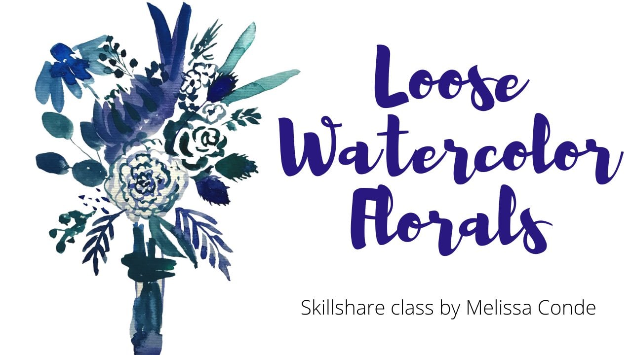
1. Introd: Hi, guys. Welcome to my skill share class. Fashion illustration and watercolors. Three styles. My name is Melissa Cont and I am a Brazilian artist and illustrated. I teach drawing in water colors off line and I am thrilled to be here with the skills 13 in this class will illustrate together three kinds of fashion illustration A full body run may look 1/2 body editorial look and a close up fashion face illustration. If you are a beginner or if you are on experience Artist, I encourage you to take this class just to practice or to learn some new skills. I will be given some tips along the videos and I can't wait. See your work at on Project Session of the Quest? Don't be shy. We are all learning here. Thank you.
2. Materials tip: Let's go over the materials. I will be using this wrong watercolor brushes. I used the's, but if you have to, you can do just a couple of these. I used mostly the eight and zero for the details. But if you have one of these and the these with two colors, I like, they're really sharp point. They have a really sharp point, and, you know, if you press it, you have a larger stroke. If you go delicate with the tip of it, you can do the details just fine. A pencil. Any racer, this one is optional. You can sketch with the pencil really lightly. I will be using this for filming purposes, but if you feel the need, you can use this one, too. Then we have the water colors. I used this one secure. Oracle's has been vibrant colors, and it looks like this after a while. But you can use whatever is available to you, especially if you're a beginner. I wouldn't tell you to buy looking too expensive. Paper towel, masking tape, water. The paper I'm using this big one perfuming purposes, but you can buy the month that is half of this And if you do have a big one like this, you can just folded. Happen. Cut it. And you have a piece like this, which is a standard, uh, piece. A tip I have for you about the paper is that sometimes you could feel little pressured using the good watercolor paper. So if you're a beginner, especially, I would tell you to practice a few times in. Ah, normal, simple, cheap paper. As many times as you need a couple 45 Just do it, Aziz, much as you need until you get the hang of it and then you go to the watercolor paper. What happens is that sometimes because we're using the good paper, we feel pressured to do perfect, and it's it ends up ruining. When you do it in the normal paper, you feel more free. So I would and I did many times practice before, do a little warm up in the simple sheet of paper and then go to the watercolor paper. OK,
3. Inspiracao: I have Ah Pinterest born. These are the places where I look for photographs and inspiration. I advise you to get ah board and collect some fashion pieces. Here's my instagram page, where you can take a look. It's on my work, also where I follow a lot of artists, photographers or you can just go on a Google search. A lot of vintage photographs or great have great poses. Fashion photography, editorials, runway shows. So I prefer to have ah, print or a magazine in my hands, but it's really up to you.
4. Chanel halfbody illustration : I am just going over what I've already sketched so you can just take Look at the picture I selected. You can use this picture, or you can choose one of your own online or wherever you like. This one I chose from a magazine have I usually like to have the printed version in my hands. I think it makes a little bit of a difference, but it's up to you. You could be looking at the screen, and that's fine, too. This is just a rough sketch. We going to do most of the work with the water colors, so I'm gonna come in now with the flash stones, just a little bit of pink making prints and textures. It's always a challenge. So this is how I solve this problem. I just look at the picture and I take a look at the colors. I'm seeing a little bit of green, blue pink, and I just insinuate some texture in it. Very light, watery colors. If I like, I will come back into it again over these. If not, I can noise go over it because they're very right. So I think it's looking all right, so I'm going back and reinforcing some of the first strokes. Very loose. Don't worry too much. A little bit of shadow under where I see it. This is just the first layer. So I'm marking the colors where I want them playing a little bit with texture. Shadow here, and they're basically just looking at the picture back and forth and building on it. You see that I don't do straight lines kind of wavy because of the way this leaves are little bit of shadow on her neck back there. Well, I'm really exaggerating the bull in her hair because I I just like that that look, this is not really a portrait. It's an illustration. So sometimes I will choose a part of the the styling, and I will exaggerated just for for the sake of art. But it's up to you also. You can choose not to. I think I did it a bit. It was too happy on the shadow under her chin, so I'm going to come back with the water and water it down, since it's not really try too much water. So get up with paper tall. Don't mind my nails because I had a mishap of the black bottle and it looks awful. So here I liked those saddles. So I come back with more Torri black and I do it some more Where I'm sure I like it. The lips I leave that little negative space and white to give that little shine in her lips . She has really red lipstick on. While that dries, I come back to the food being forced those textures where I see fit to see I'm passing the general vibe of the suit and not exactly ah, portrait O R A technical illustration, too much water. And they're either. But let's see what happens. I brought us with a watery brown in the magazine. I don't know if you can see it. Well, there is Ah, think right, big background. Sometimes I will do that. Sometimes I leave it right. I think it's nice. It gives it Ah, little pop in the piece, but very watery, darker on the right and then lighter around it. There paper it'll you see, her eyes are not draw yet, so they're not ready to paint. So I'm just going to do a little bit of shadow on her eyelid make up and hold my anxiety to do those eyelashes later that with a blush, very watery. Think dirty water. Think notice that the the iris of the eye is covered on top in the bottom with the lids of the eye. You don't want to draw the whole iris it because that would give her kind of a cycle. Look. So cover a little bit of top on the bottom and the black part, The pupil of the eye also towards the upper lip. Okay, that makes a big difference. The nose Don't mess too much with it. Just give her a place to breathe. Insinuate where the noses and we're almost turn. Just putting some more shadow around there. Just her head. You don't overdo it. You want to know when to stop. That's important. And there we have it. Show no suit. Have half body fashion illustration. The finished based
5. Moschino runway look: Curie have Ah, musky no statement piece from a runway show spring collection I already had sketched in pencil. But now I'm going to, um, sketch it on with the ink pen for filming purposes. If you feel that you can go straight from the pencil to the watercolor, I encourage you to do that. I'm going to do this just so you can see better how I'm sketching it. So I usually look at the silhouette at contour of the image and not so much in the details . So I look at the proportions and I place the flowers where see them just placing. Don't overdo the details with the pen. Just put the flowers and leaves while you were looking at the image. You can go ahead and do that on the lower part of the arm. I see there's more volume, so I to that in the full body fashion illustration. The face is not so much full of details, so I just place the eyes mark. The nose, just mentioned the nose on the mouth and just, you know, doodle around, placing whatever you feel. It's most important that girl also the shape of the hand you don't have to do every finger , just the outline. That's it. So after I sketched, I already place the yellow's where I see them just watery. So it is better to start lighter and then build up instead of the other way around. No, I put some reds just from observation. You know, just look at the image and stop putting some color. Have fun with Don't let the pressure get you read here to see get a little balance on the colors. Never put this the colors straight from the tube or the box. Always mix it with another color, even if it's a little bit it avoids. Took to give that amateur look. When you put the colors straight from the bottom, it gives it a look that you don't want. So whatever color you putting in makes it just a little bit. So it breaks that strong straight from the tube appearance. - Now I come with the dark brown and black just on lining a few places. I want to get a little bit more definition, her hair, her hands, feet and there you have it. Our own fashion illustration. Statement. Runway piece by musky no spring 2018
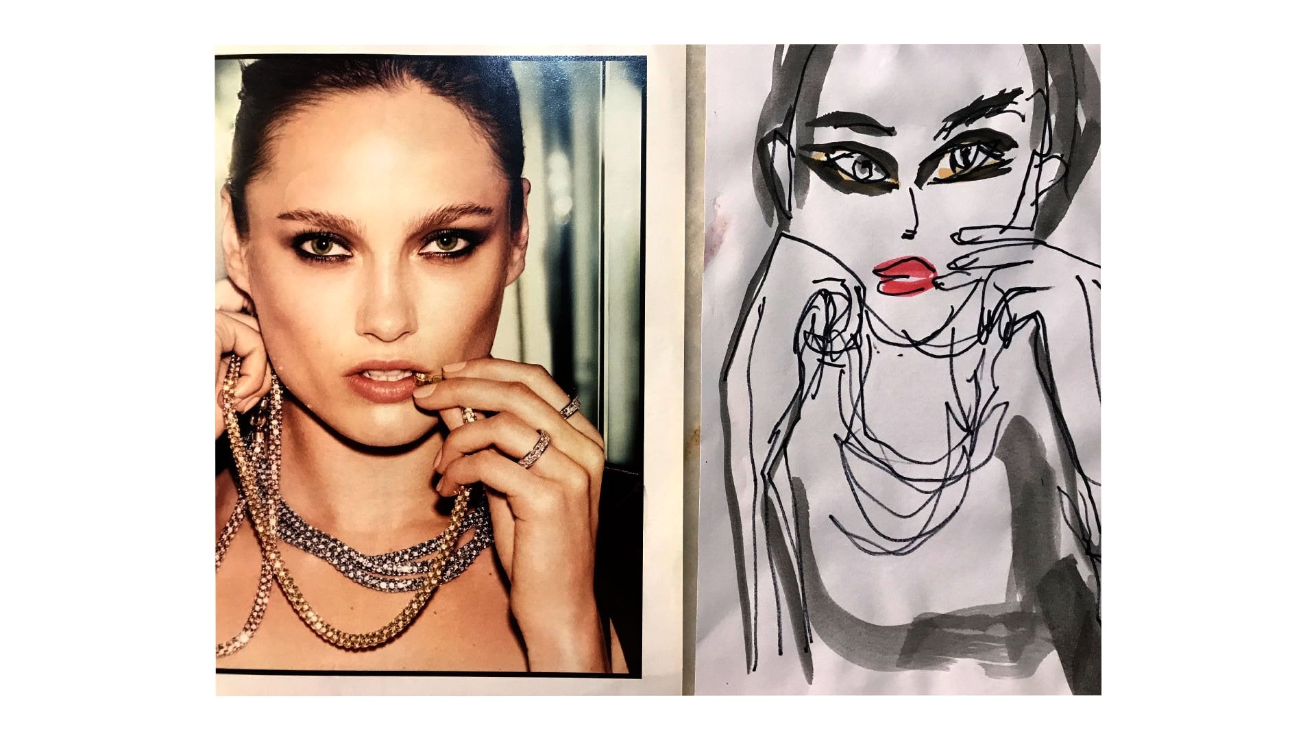
6. Closeup Face illustration: Let's get to our closer face fashion illustration. So I hear I'm laid down the flash tones as always, Um, some poker with red, very watery. Make sure you spread that watery tone very well, so you don't have those brushstroke marks on her face that could really ruin it a little bit dark on the neck where there's a shadow. I see she has some brown's eye shadows who I do that give it a little shut on her eye. I've already pre sketched very lightly. There's a mistake easy to make. The face was still wet when I started doing the eyebrow, so I soak it up with the paper towel and come back to that later. Let's out find this big hearing it that I exaggerated because it's the main piece of the picture. So I exaggerate that just like I exaggerate the bowl on the half body illustration. So I want to make sure that's the statement of this piece. I left a little negative space there on the hearing. There's a bit of shine sometimes I makes the color on the paper. You see the brown with the Joker around the hearing, make it that kind of gold tone. And don't be shy with the large pieces, you know, Get in there with that black. It could be water. Yet first, just to market where this See that I don't get too close to the face, so it doesn't happen. The same eyebrow effect. I'm just pulling the color where the shape of the head is on the other side. I can see some hair on it on the top of her head, and then it starts a little bit under her cheek. So I do that right there, just marking the shape where the black iss for No. Again, much out. But the face gotta be very careful with the dark colors around the face just mentioned the year, you know, have to do a full drawing of the year. I see that her blouse has some Brent. So this is high. Solve that problem. Just do what I see here on the hearing. I see the background color is a yellow mixed with. Okay, so I do that. And while it's still wet, I dab a little bit of two reds that I mixed really quickly and gives it the marble effect outlining a little bit here and there. While I still have the read in the brush, I go to her lips a little bit of water down and mark that I also leave that negative space to give it that shine that we love so much. In this first part, you see, the colors are all very watery because if I don't like something, I can always come back and change it instead of the other way around. So there's too much water there. I dry the paint brush and I soak up that little dot in the eyes. Make sure you cover the iris with the top eyelid and the bottom. You don't not want to paint or draw the whole iris of the eye. That would give her a weird look. Also, I left the negative space for the that little twinkle outlining the eyebrow. I'm doing it brown, and then later I'll come back with the black to do very thin hair on the eyebrow. Notice that the eye on the left this one is smaller than the other one, cause she has her head turned a little bit so that I is smaller. Same thing here. I draw a little ball there so I can leave that blank space and then I paint around it. It'll be the hair missing there. Now I come again with I know I like where the black ISS, so I'm sure of it. So I come back with the more paint than water in my brush, and then I do it over. It's good when you have the black hair around the face like that, because you can fix any mistakes about the face. If you don't like the shape of it, you can always come in with the black or fixing her 10 or her cheek up lining their the jaw line the Mac with the tip of the brush. I'm using the same brush just for Ryan. The using the middle or the tip. You make a confident one stroke brush around the eye. That's important. Don't go making little strokes when you're doing the eyelid there. See the nose. Like I said, you don't want to mess too much with the nose. You just want to give her a mention of it. The one side is a stupid figure. The other side just ah, stroke. Oh, the eyelashes that we love so much, this one, she doesn't have too much. But since it's an illustration, I can always exaggerate a little, a little, a lot. It's not a portrait, it's my interpretation of it. So some color in her cheeks make sure Spread that watery pink. And don't leave brush marks on your face if you have to. You dry your brush and soak up the water to not put um, the paper towel in this part because you might give her face some texture. And you don't want that. I was first a lot of lashes. The and I come over to do the eyebrow hair really quick, thin strokes. I noticed that the uring I don't know, if you can see has some, um, print on, uh, the design on the edges, the golden part. So onto that, the shadow under her 10 going around her jawline. I put too much water. So instead of soaking and I just push it onto the black part and then I come again with more black line neck, a little bit of shadow on her year, notice that in her face on the left side, the black men in a little bit, so I tried to fix that with some more color. There we have it. Our close up face fashion illustration.
7. Conclusion: I hope you had a good time taking my class. I'm here if you're if you have any questions. If you post your work, I can give you feedback. Other students can see your work. Who knows? You might even make new friends. Make sure you follow me on this skill share profile. Click on my name or my picture on There's a Little blue button so you can get noticed within published My next class, also on instagram at mel condi dot art. You can see some more of my work and I'll see you soon. They care.
 Melissa Conde, Melissa