Transcripts
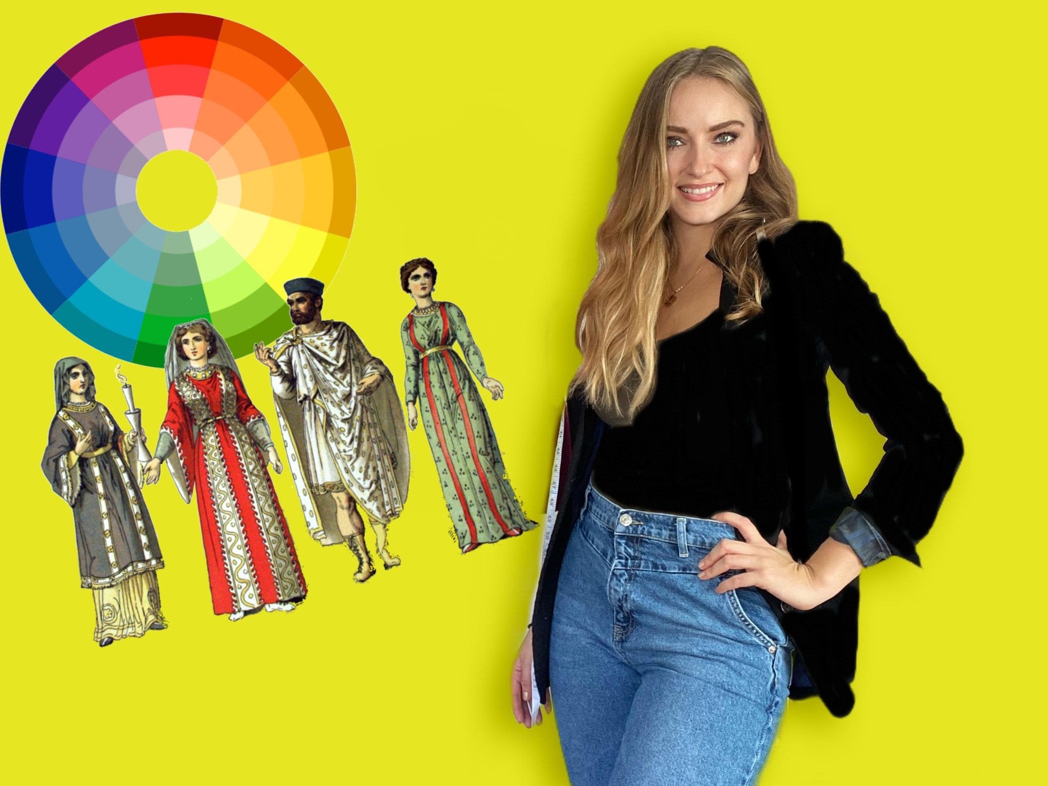
1. Introduction: WELCOME!: Are you a budding fascist Silas, fashion designer or
do you simply want to curate your wardrobe
or personal style? It? So this course is for you. Welcome to fashion
fundamental is one-to-one. I'm radical as a toga
and I'm obsession, service and fashion instructor. For me, fashion is not
just about the clothes. It's also about conveying a certain thought or a
certain feeling or message. You do that by playing
with different colors, fabrics, patterns, and textures. In this course, we will learn
about body type analysis, different textures
and their properties. How shapes influenced the
silhouette of a person. The rules of powder mixing, the five body types, accessorizing for different
phase shifts and of course, many costumes, smiling hacks. We will learn absolutely
essential for anyone working in fashion or passionate about
passion should know. You will also learn how important these strokes
really, really hard. I think it's super passionate about teaching
fashion because they realized how often I use these fundamentals as
a fashion silence. So thinking just as
a passion suburbs and I would love to
teach them to you. I am super excited for today's
class. Let's get started.
2. Introduction to the 5 Body Types: Hello everyone and welcome to our first lesson on the
five different body types. So typically we all fall into
one of these categories. There's the rectangular,
straight body type, there's a triangle
such pair body type, the hourglass, the
inverted triangle. And there's also the
round apple shape. The hour and glass is the most balanced body
type out of all of these are job SMS is to balance out through
different patterns, colors and fabrics and
silhouettes that we play with each and every single
one of these body types. In this lesson, we're
gonna go and look at every single body
type in detail. And I'll teach you guys how to balance out each silhouette.
3. Inverted Triangle Body Type: First body type we're
going to look at is the inverted triangle
V-shaped body type. This one is where typically the shoulders are
wider than the hips. And this body type usually has very slender and long
legs shaping your legs. So you definitely want to show off the legs for this body type. You want to also de-emphasize the top and emphasize
the bottom. Let's look at how to do that. Before we begin. Before we look at
that, let's look at a few celebrities here
that have that body type. So as you can see
their shoulders or rather than their hip area. What we want to do is we want to emphasize that waste area, and we want to also
emphasize and amplify the bottom. How to dress. Typically, you would absolutely
want to avoid dragging too much attention
with silhouettes and patterns and ruffles
and lace to the top. So avoid, for example, using horizontal stripes or any patterns that would
make an area of pair large. You want to avoid putting those patterns
onto the top area. Also avoid waste. It thrills, ruffles,
anything that has a lot of embroidery elements
to it stick to sleek, slender silhouettes and tops. When it comes to the bottoms, what you want to do is you would want to emphasize
the bottom area. The best way to do that is
to pick pants and shorts and skirts that have a
bit of a flair to them. So avoid skinny fit pans and
skinny fit shorts or skirts. Because you want to bring
out that formless at the bottom so it is
balanced out with the top. And don't forget to always, always emphasize the waist. Same thing when it
comes to sleeves, you want to avoid too
much detail here. For example, avoid sleeves that are puffy and
stick to fit it. Tops, cylinder fitted tops. So that you are
de-emphasizing the top area. And you are emphasizing
that bottom area and you're creating a
balanced silhouette. Signaling was shorts. Avoid tight fitted pants, tight fitted shorts, and stick to something with the
flare at the bottom. Also, something has pockets, some sort of a detail. The area will always
appear larger, fine details in those
garments that you're choosing to emphasize and
make an area of pure, larger or all the story. De-emphasize the top,
emphasize the bottom, and always emphasize the waist. Let's check out a few
more tricks to balancing out that inverted
triangle body type. For a dark solid
colors on the top. Dark colors make an
area appear smaller, therefore, a de-emphasizing
the top area. Vertical strips are also a very good strategy
to put on the top. Unlike those horizontal
stripes which end up actually creating a wider illusion
for the shoulder area, which is not what we want here. The neck, open scoop neck
and cap sleeve styles are also great options for
inverted triangle shape. Blouses and soft sleeves and up softening that shoulder area, ultimately
de-emphasizing the area. So that isn't a great
option as well. For the lower half, you want to emphasize that area. So you will do the exact
opposite for that. Bright colors, vibrant prints, patterns, full flares, or
airlines structure pieces. All work really
great because they end up making an
area appear bigger. Therefore more emphasized. And don't forget,
chances are that inverted triangle types have amazing, beautiful long legs. So dresses, skirts definitely work
well to shop the slides. You always, always want to show off the asset of the body. This lesson, we learned
some key tricks to styling that
inverted body type. We learned that we have to
de-emphasize the top and emphasize the bottom because the top is a lot larger
than the bottom. So in our next class we're going to look at a
body type that is pretty much the
complete opposite of the inverted triangle, and it's called the
pair body shape. Let's get learning.
4. Pear Body Type: Our next body type is called a pear-shaped triangle body type. And it's when the hips are bigger than the shoulders
or the bus area. Proportionally the hips are
bigger than the shoulders. Rule of thumb, we want to
create a balanced silhouette. And how they
accomplished that is, we end up emphasizing the top and de-emphasizing
the bottom, and also of course,
emphasizing the waist. Here are a few celebrities here that have the
pair body type. And you can see that
their hip area is proportionally larger
than their shoulders. So here are a few examples on how to address someone
with a pair body type. But when it comes to jump suits, pick something with
detail here at the top. Something with a ruffle
or an embellishment. Something that would create
attention to the top area. What you're trying
to do after all, is balance out the
top with the bottom. Avoid slim leg, narrow
top style jump suits. Because what that does is
it ends up de-emphasizing that top area and really showing off that those legs
and that's hip area, which is not what
you want to do here. What you want to
do is to opposite. When it comes to shorts, we know that short set
or low rise actually end up emphasizing an area and
making it appear larger. For a pair body type, you want to de-emphasize
the bottom area. The best way to do that is
pick shorts that, for example, are high wasted
or something with a flare at the bottom or
something more subdued. Here we see a few examples
of the pair body shape. We see here that in
most of these examples, the top is very much emphasized. There's a lot of ruffles, there's a lot of detail here, which is ultimately
what we want to do. We want to emphasize the top. So we create a balance between
the top and the bottom. And of course, in
every single Look, the waste is very
much emphasize. Let's check out a
few more strategies for styling that pair body shape and creating
that proportion between the top and the bottom. For the lower half, up for vertical stripes as
opposed to horizontal stripes. Boot cut flared pants are also great ends in a line
types of structures. For colors, think
dark colors because their colors and pick an
area always appear smaller. So do add those colors onto the lower half in
order to minimize it. For the top, however, this is where you can have all that fun in terms of color. Pick bright and light colored to create that
volume at that top. Bold and bright
principle also be a good strategy to
adding the volume at any top with a fun
neck line structure and puffy sleeves would be
perfect for this body type. Jewelry is also great for
adding volume to that top area. So do add that necklace
to emphasize the top. Therefore, by adding
volume to the top and de-emphasizing
that lower half, you are creating a
balance figure for the triangles slash
pair body type. As we learned in this class. To achieve that ideal look
for the pair body type, we must emphasize
that top half and de-emphasize subdue
that lower half in order again to achieve that balance look that
we're looking for. However, in our next class, we're going to look at a
body type that is unlike the inverted triangle
or the pair body shape. And it's called the
rectangular body type. So let's check it out.
5. Rectangular Body Type: This next body type
is called the pencil straight ruler,
rectangular body types. So there's many words for it. What it is, is
when the shoulder, the bus, the waist, and the hips are
proportionally the same sides. So what you want to do with this body type is always
emphasize the waist. You want to create volume at the top and create
volume at the bottom. And absolutely
emphasize the waist. Let's look at how to do that. Here are a few celebrities here with this type
of body shape. When it comes to skirts, you want to avoid
angular style at skirts instead up for flaring style waste
defining skirts. Something with a bit of a flare because you're creating
that silhouette. Skirts that really emphasize the waste is what you
want to look for. So high top skirts, something with a belt, Something to create that
definition and that silhouette. Same thing when it
comes to shirts, bog C-style shirts and not for belted wasted type of shirts. Shirts that haven't definition
that have a curve to it. And of course, if you do choose a box style silhouette
for a shirt, do belt it. You can always
belted or Pinot or emphasize a waste in
many different ways. You can also have it tucked
into a high waist at pants, skirt and create
that silhouettes. Here are a few examples of garments that would work
for the straight body type. And as you can see with every single one
of these garments, the waste is in one way
or another. Emphasize. Let's check with a few
more tricks to balancing out that straight
rectangular body type. With this body type, the biggest strategy would be to emphasize that wastes area, anything that is about it at the waist would be
a fantastic option. Rushing cutouts at the
waist or color blocking at the waist really end up
emphasizing that way Syria. And all we are creating
the illusion of a smaller baseline top. So shoulder building,
puff sleeves or puffy shoulders work very well with creating that
volume at the top. For the lower body,
think a line, full flared skirts or pants,
something with volume. Therefore, by pairing the
volume to top and bottom, while also defining the waste, you are creating a
very balanced figure, which is what we want. In this lesson, we learned that the best key strategy to styling that rectangular body shape
is to highlight the waste. We always want to emphasize
and highlight that waistline. And we do this in
order to create the illusion of balance. We actually still have
tumor body types silica. So in our next class, we will look at the
apple body shape. I will see you guys there.
6. Apple Body Type: This next body type is called
a round apple body shape. It's characterized by
a fuller midsection, undefined waste, heavy upper
body and slender legs. In this body type,
you want to bring out that collarbone area and you also want to bring out the
legs. How do we do that? Here are a few examples of some celebrities
with this body type. For Apple body shape, you want to avoid high
and narrow colors. Instead up for low
and wide neck lines, especially the V-shaped
neckline work, evolve with the
Apple body shape. It ends up creating
a balanced look. It also ends up breaking
up the chest area. When it comes to slave. Avoid fitted sleeps, choose something with
a flare instead, also something that is three-quarters and link
would be a great choice because that way
you're not completely eating away a person
with a long sleeve. It creates a
balanced silhouette. And overall it is a great
choice for an apple body shape. Mana comes to genes, avoid high-rise skinny jeans and opt for mid-rise
bootcamp gene, you will end up
balancing the torso and it will take away
from the midsection. However, you can still
wear absolutely address someone with an apple body
shape with a high-rise skinny. You can play it off
with a blazer or about. So you can really make
it work as long as you end up balancing out the look. The way we will learn
in this course. Here are a few examples of some celebrities with
the Apple body shape. As you can see,
every single one is showing off the collarbone
area and that neck line. The leaf-shaped
neckline is a must. If you are addressing someone
with an apple body shape. There's a few more
common strategies to styling that
Apple body shape. The first is to actually
camouflage the stomach area while creating the illusion
of a solid waistline. So to achieve this, think pendulum, full
rap and rushing style, tops, flow we tops half
tucked into a gene, also worked really great
for this body shape. Another great trick
would be to add a bold statement necklace to drive the gaze upwards away
from the stomach area. Wide neck lines would
also achieve this effect. In terms of jackets. Jackets that highlight
the wastes and end a bit lower than the waistline
are a great option. Do avoid jackets that end up that waistline as that actually ends up highlighting
the mid-section, which we want to
actually de-emphasize. Longer structured jackets are the go-to for this body shape. Therefore, it remember
that this body shape we want to show off
that collarbone area, the legs, and of course
camouflage the midsection. Next class we will look at
our last and final body type, which is the
hourglass body shape. So I'll see you there.
7. Hourglass Body Type: Last body type is the
hourglass body type. It's characterized
by complete balance between the hips and the chest. It's also called the shape of perfection because everything
is already balanced. But it doesn't mean that we, a stylus still can't clear RAM at the silhouette
and really bring it out. Bring out it's true
beauty and form. The trick to styling the hourglass body shape
is you don't want to, inside the silhouette and
the shape of the person, you want to highlight the waste. There are several ways
to accomplish this. First of all, you want a
specific type of neckline. The neckline that you'd want is around it, open neck line. And you also want
to avoid boxy fits, of course, because that
ends up hiding the waste. So pick a topic that is fitted. Pick sleeves that are simple to just show off the
silhouette of the body. And if you do pick a boxy fit, you can always of course, emphasize of waste with
them about or a high-res, a high-rise pants or
high-risk skirt and tuck into shirt into the
high rights garment. So here are some
options for neck lines. Why neckline here? What it does
generally is it ends up creating an
unbalanced to lock. It doesn't really show off the hourglass finger the
blame want it to be shown. So don't do a wide neck
line for our glass finger. Up for something that
is an oval neck line. An oval neck line ends up creating an emphasizing
this shape, which is ultimately
what you want. Avoid a lot of embellishments
here at the top. It will create an
unbalanced top heavy luck. Let's check out a
few more strategies for addressing that
hourglass shape. Since we want to show off the natural curves of
the hourglass figure. Body contrasts his
work especially well since they hugged
the curves of that body. Wrap dresses and laptops also end up really
emphasizing the waist. So that is definitely, definitely a very good
option for this body type. To exaggerate the hips
and the thigh area. Of course, skinny jeans will work extremely well
with this body type. Who cut flared and wide legged
pants for the bottom are also great options to balance
out those curves as well. To summarize, you
definitely want to define the waste and emphasize those curves for the
hourglass body type. Next lesson we will
be looking at how to camouflage or emphasize
certain areas. How to make someone to
appear taller and shorter. There are many, many
tricks to doing that with just some close. I'll see you guys
in our next class.
8. Introduction to Camouflaging/Emphasizing Areas: Hello everyone and
welcome back to our second lesson called
camouflaging problem areas. By problem areas I mean
parts of the body that you want to either
emphasize or de-emphasize, make it larger or smaller. So there's a variety
of different ways to achieve that with the
power of clothing. We're going to go
ahead today and look at different parts of the body. And I'll teach you
guys ways that you can make that area appear bigger or smaller and
also taller or shorter. So let's get started.
9. How to: De-emphasize the Hips: The first area we will be
talking about is the hip area. This includes the touch, the legs and the hips. So a lot of clients
would want to disguise their hip area and make
that area appear smaller. The number one way to
achieve this is to pick a dark color,
a darker shade. You absolutely can put them in a denim pants or a tight pants. As long as that color is dark, darker colors naturally make an area appear a lot
smaller than it is. If you put them in a gene, want to make sure that the
pockets or low versus high, high pockets make that
area appear bigger. You also want to avoid a lot of stitching and embellishments
on the back pocket. Stitching embellishments, all that detail makes
that area appear bigger because their
eyes are drawn to it and therefore that
area is emphasized. You may also help
conceal the hip area by diverting attention to
other parts of the body. So emphasize the
wastes with about to divert the gaze from the hips
to the waste, for example. Also add a structured, patterned or bright top to
achieve the same effect. Just like when we looked at the pair body
shape, for example. Also do bootleg or flared pants to conceal the area for skirts, think fit and flared. In this lesson, we learned quite a few strategies for
concealing that hip area. But what if we wanted to do the opposite and we
actually wanted to emphasize those hips so that we will learn
in our next class.
10. How to: Emphasize the Hips: If you want to
achieve the opposite, and you want to
actually emphasize that hip area, that leg area. The best way to do it is
to pick a light cover. We know that darker colors
make an area appear smaller versus lighter colors and make an area appear bigger. Pick that later cover, put them in a genius. A gene is a great way
to show off the body. Light genius specially. And you also want to get
pockets thought or high-rise. Low-risk pockets make the
hip area appear smaller, which we'll look at in a second. Whereas high-risk pockets
make that area appear bigger. Also stitching, you want
to find back pockets that have some sort of a detail and stitching to its embellishments, some sort of a detail because it would draw our
eyes towards that, ultimately making
it appear bigger. You also want to choose
a midrise for the gene. Mid-rise pants ends up also drawing our eyes
towards the area, ultimately making
it appear bigger. Other strategies for
emphasizing hips include pencil or trumpet skirts
and also of course, body current addresses, usually hugging and highlighting the
curves of that hip area. Horizontal lines
are also great for creating that wider
illusion on that bottom. We also know that larger print drag her eyes towards the area. So definitely consider bold and bright prints
for the bottom. Structured bleeding also always makes that hip area look larger. In this lesson, we learnt
that the hips can easily, easily be emphasized
just by playing with light colors,
bright colors, stitching, and of
course patterns and volume of silhouettes,
volume of shapes. Next class, we will
actually look and compare these different strategies
and examples and tricks that we've learned
from our past few classes. I will meet you there.
11. Comparing Strategies: Here we see three
different examples of the placement of the pockets. We see that the example
on the left gives the illusion of the biggest
touch out of all these. The one in the middle
mixed up but look small. The one on the right mix, it also looks small, but a little bit more curvy. You'll see how the
reason why we get this impression is because of the placement of the
pockets and also of course, the shade of the gene. Notice here, the gene on the left is the lightest
shade of them all. Lighter shades generally
make the area appear bigger. You always want to pick
a lighter shade for the gene if that's what
you're trying to do. You also see here that the
packets are placed high. High pockets create the illusion of a bigger touch,
which is what you want. A lower pockets do the opposite. They make such area
appear smaller. You also see that the
pockets aren't too huge, so they're medium-sized
pockets, which is fine. You also would want to find
something with stitching, find something with a designer's fishing or embellishment at the back to also
emphasize that area. Now let's take a look at
the middle, for example. Here. You see here that the
shade of the pant is darker, ultimately making the areas of consciously appear smaller. And you see here how the
pant pockets are low. They're also very large. So this example here, the hip area, that
area up here smaller. It isn't very emphasized
because of pockets are at low and we're not sure if that's not emphasizing
that special area. Now let's look at the
last example here. The dark denim on the right. Again, the darker,
the shade is smaller, the area of the loop here, the pockets are low, which is not something we
want to do if we want to emphasize those hips and
emphasize that touch area. You want to make sure always
that the targets are high. In contrast to
emphasize the hips, we want to use a light color. B. Pick pants with high pockets. See, pick a larger prints
to emphasize that area. And lastly, the US form
fitting or structured pieces to hug or create
those larger hips. In summary, you can de-emphasize that lower half area
by using a dark cover. Be minimal details like no embroidery on
the back pockets. See low back pockets
for Pansy genes. And D, if you do use a print, makes sure that the print
is a small size print. Smaller prints make an
area appear smaller, whereas the larger prints
make that area appear larger.
12. How to: Camouflage the Arms: This one is an extremely
common one amongst Silas. I've had many, many clients that wanted to
camouflage their arms. They were unhappy with their arms and they
wanted to cover them. You don't always have to cover
up the person completely. This is a trick of balance. If you cover their arms, you should show something else. My favorite trick for creating a fashionable
look for someone who wants their arms hidden is the three-quarter sleeve trick. This trick is when, for example, put a blazer on someone or
a kimono are in someone. But you make sure that you
show some of that forearm. You don't want to cover up
the person's arms completely. You want to show a bit of
those arms and breasts. Here we see an
example of a motto, hair wearing a blazer that
is three-quarters in length. And what it does is
it creates a sense of balance because you're
covering her arm area, but at the same time,
you're showing off that wrist area and
that collarbone area. You also don't want to get a top that completely
hides a person. And that collarbone
area in that neck area. Maybe choose a V neck top, something with a
round crew neck top that kind of shows
that collarbone. In summary, when
camouflaging the arms, the trick is to cover
the arms without completely covering the
upper part of the body. Up for button down
tops that can be easily rode up to
three-quarters and length. For blazers and chemo nose. Make sure you apply
the same trick and wrote those slaves. Also up for Rena, low scoop neck shirts
underneath to show off that collarbone area and produce that balance that
we are looking for.
13. How to: Camouflage the Stomach: The next area we're
going to look at is stomach camouflaging. This is a super common
area that many clients on camouflaged and it's super common amongst
Apple body shapes. As we talked about
in our last lesson. For Apple body shapes, you want to Yes,
cover the midsection, but also you want to show off that collarbone area
and you want to show up the legs here, whereas you can cover
the mid-section. You want to make sure you show off that collarbone area in a VNet style top or a
load zip style crew neck. And you absolutely want
to show the legs with either type denim jean or pants, as we see here in this picture. Another great, great trick
is called the half tag. Put your client in a baggy shirt and put them in the high
wasted pants or skirt. Half tuck the shirt
into the pan or the skirt only toucan
apportion half of it into it. What it does is you end up
camouflaging the stomach, but you also end up showing
off that waistline. You're showing off the
silhouette of your client. At the same time, you're
doing what your client months and your camouflaging
the stomach area. Finally, another
great trick for this is to layer that
looks really trendy. A shortcut jacket with a t-shirt underneath the t-shirt half
tucked into the pants. Looks great. And you are still showing off parts of the body
creating a balanced look, being the collarbone
and the legs. Some other strategies to help
conceal that stomach area without using any
shapeless tops include, of course, body skimming tops. So overall, the
design of the top is extremely important
since you can find those tops designed in
such a way that they end up strategically hiding
that stomach area. Another example would also
include empire waistline tops. As these tend to drag attention
to the under bus area. Ultimately also
camouflaging the stomach. Another hack would
be to pick tops with a rounded Hamline versus
a straight home line. The rounded Hamline
actually ends up elongating the lower body and overall ends up creating a
more slimming look. Also avoid of course, horizontal stripes and instead up for vertical
strips for that top. Because as we learned, vertical stripes
produce an illusion of an elongated body, while horizontal stripes and
up producing the opposite, which is the illusion
of a wider upper area. That is of course not what
we want in this case. In this lesson, we learnt how to camouflage that stomach area without completely
concealing that waistline or the silhouette of a person. And it was super important
when it comes to fashion. So in our next class, we will actually learn
how to make someone appear taller through
the power of colors, the shape of the clothing. And I don't mean the
obvious like using heels. So I will see you guys
in the next class.
14. How to: Appear Taller: If you want to appear taller or you want your clients
who appear a tower. There are many great
tricks for this. The most common
trick, of course, is to put your
client or yourself into a nice pair of heels. But it's not just
any type of heel. In the modeling world. A lot of casting and modelling agents
tell the models that they shouldn't wear
heels that have straps around the ankle. The reason for that is that the straps end up
cutting the leg. So it creates the illusion that the leg is cut and therefore, the person appears actually
shorter than they are. If you are trying to make yourself or your clients
who appear taller, you want to make sure
that the shoe that you choose is pointy TO. That's always an asset
and that doesn't have any straps
around the ankle. You don't want to
cut off that leg. In terms of colors, pick a shoe that
is a nude heal or blends with the skin tone
of your client or yourself. You want to elongate
the legs and illusion that the shoe is a
continuation of your leg, ultimately making
it appear Tower. Another great trick is to put your client into
monochromatic lux. Monochromatic walks or looks
that are all one shade, one type of cover, and what type of
shade, for example, an all white walk or an all
blue look, all black look. Why this is a good trick, is it ends up making a person
appear long and continuous. You are continuing that
person through these colors. And ultimately it
creates the illusion of length and that person
appears taller. Another good
suggestion for making a person in pure tower is to get pants that go all the
way down to the floor. Pants that are for length and up again continuing that person, making them look elongated. So it's similar trick
to the nude color shoe. The nude color
shoe ends up being continuous with the
shade of the skin tone. Same thing with the pants. It's elongated and it's a continuous shade
from but to the waist, or for it to make
someone look taller. Our goal is to create the
illusion of an elongated body. So in summary, the
best strategies are to choose a nude heal that
blends into the skin tone. B, mixture the shoes
or strep us and pointing TO order to avoid
the cutting of the leg. C do choose monochromatic looks in order to elongate the body. And finally D, DO sure
shapes such as to wear skirts or long tubular pants to achieve that
dissolution of length. In the assessment we
learnt that we don't just need he owes to make
somewhat appear taller, which is pretty much
the obvious, right? You can also utilize shapes and colors to create that
illusion of length. So next class we will
look at the opposite. We will look at how to make somewhat appear shorter through some very similar tricks and methods that we've
looked at today. So I'll see you in
the next class.
15. How to: Appear Shorter: What if your client
wants to appear shorter? This is not as common
as you're quiet, wanting to appear taller, but it definitely does happen. And the best way to
achieve this is doing the opposite of what you would do to make them appear and torr. So the first thing, of
course, no brainer. You don't want to put
them in a pair of heels where the hills
put them in a nice flat. But not just any flat, not just any issue. You want to put them
into a statement. Something bright,
something with a pattern, something interesting
to drive our attention away from the rest of the
body to the bottom half. It doesn't end
there when it comes to the top and when it
comes to the bottom, you want to break
down the coerce. Instead of dressing
monochromatic, you want to break
down the color at the top and the
color at the bottom. So choose for example, black on top and
white on the bottom. And a nice statement shoe. What it does is it
makes a breaking a look into different parts, ultimately making the
person appear shorter. In this image here we see three different models
and as you can see, they are all wearing
statement shoes. And what it does is our eyes are directed towards the shoes, ultimately giving the illusion that that person is actually shorter because their eyes are diverted towards the bottom. In summary, makes sure you
choose a statement flat. If wanting to make a
person appear shorter. Statements, shoes and
breaking up the body and diverting our gaze
towards the shoes. Ultimately making that
person appear shorter. Also makes sure to
break down the book by dressing someone in non
monochromatic looks. Think two distinct colors or patterns for the top
and also the bottom. That way we end up breaking up the body and making
it appear shorter. In this lesson, we
weren't that we simply have to break down the colors, break down the look to really make someone
appear shorter. So obviously we put
them in a flat, but not just a flat, we should use a statement shoe. They pretty much do
the exact opposite where of making
someone appear tar. In the next lesson, we will look at how
to camouflage or emphasize the bus chest area. So stay tuned. I'll see you in the next class.
16. How to: Emphasize/De-emphasize the Chest: Downsizing the bus chest area. This applies for many inverted
triangle shapes as well. A lot of people
would want to divert attention from the
shoulders, for example. But here if you want to divert the attention
from the chest, the best way to
do this is again, to pick a dark shade. Dark covers, makeup
area appear smaller. Blouses are pretty good
for this. There are baggy. We're not emphasizing
the chest area, but not just any bus. Pick a dark colored blouse, good fitted bras, but
also absolutely help. And perhaps a blazer on top
add more effects of layering. And ultimately, you are
covering that area. And with the colors
that you choose, your de-emphasizing the chest, what you absolutely
want to avoid if you're trying to
downsize your clients. Thus area is avoid colors, lapels, any sort of
detail here at the top, because that way
we know your work, emphasizing that area and our eyes will be
drawn to that area, making it appear bigger. Another great strategy
for downsizing the bus area would be to
focus on the neck line. So pick a V nullcline or
square nullcline for a blouse. These usually create the
illusion of a smaller bust. Make sure to avoid any high neck lines such as
crew neck or a turtleneck. As these end up actually
emphasizing the bus, making it appear larger. In terms of dresses
do avoid body compresses as the tissue we end up highlighting the
curves of the body. Therefore emphasizing the chest. Stick to wrap dresses instead as these tend to minimize
that upper half. On the other hand,
if you want to upset the bus, It's pretty simple. Here. You choose again, a light color of white cover. You pick a push-up
broth push-up browser. Great for this. Play
around with elements, necklaces, frills,
details here at the top, what you're doing
is you're drawing attention to that top area, emphasizing that top area, making it appear larger. Another good strategy for upsetting the bus
would be to put a darker color on the bottom and the
lighter color on the top. This creates an illusion
of a larger bus area, since it lighter colors always make an area appear larger. Creating that contrasts with
the bottom tendons says upper half accessories also work very well for
emphasizing the best. Also do structured tops talk, Split Pose, ruffles, and
also open neck lines. In this lesson, we learned that adding details like lapels and embroidery structured
shoulders and bright light colors
always makes that area, always would make the chest
area appear a lot larger. And we also learned that
we pretty much have to do the exact opposite to
make it appear smaller, dark colors and minimal details. In our next class, we will be doing a little exercise where
we will be testing our knowledge and strategies
that we've learnt so far in this course.
I'll see you there.
17. Camouflaging/Emphasizing Exercise: That's it for this
lesson next class. So we'll be talking about
the shaping of clothing, different textures and fabrics
and different elements and shapes and how to play with them to achieve what you want. And then the meantime,
I'd like you to complete this exercise. Imagine that you have a client who wants
to appear taller, but at the same time she
wants to hide her arms. She wants to be fashionable
and she hired you as a stylus to
achieve her vision. Take some time and come
up with three outfits.
18. Introuduction to Shapes & Texture: Hi everyone, Welcome
back to Lesson three. In this lesson, we're
gonna be looking at shapes and textures and how the shapes and textures end up influencing the
silhouette of a garment. So when a designer, for example, designs
their collection, they always play with
different shapes, textures, and of course,
patterns and colors, which we'll talk about later. To emphasize the
emphasise certain areas and of course,
create an illusion. As stylus, as designers,
that's what we do. We create illusions through
garments, silhouettes, and styling the different
pieces together, ultimately in creating a
beautiful and balance look. So let's go ahead and check on how these
different shapes and textures influenced the
silhouette of a person.
19. Influencing Size Through Shapes: You want to emphasize an area
and make it appear larger. You definitely
want to use wider, fuller shapes, shapes
that are undefined. For example, here
we see a model. She is wearing a shirt here that doesn't
have much definition. So it would be considered
a wide full shape. As you can see here. Her top half is pretty emphasized and it appears
bigger, bigger than it is. That's also the combination
of color, of course, but the biggest factor is definitely the shape
of the garment. The rule of thumb is that the larger the shape
of the garment, the larger the silhouette
of a person will be seen. If that's what you
want to achieve, then that's what you
know what to do. For example, if we have a rectangular body
shape and we want to add volume to the bottom
and add volume to the top. We know that we
should find wider for shapes to emphasize that area
at the bottom and the top, and perhaps belt it at
the waist, of course, to create a balanced silhouette between the top and the bottom. So if you want to make an area
look smaller using shapes, of course you will
do the opposite. Instead you will get shaped
starter trim and compact. By that I mean, shapes that hug the body that
are compact to the body, ultimately creating
a smaller luck. As we see here, this motto here is wearing
a shirt that hugs her body, trim and compact silhouette, ultimately making
her look smaller. Last lesson, we looked at ways to make a person
appear taller. The variety of different
ways to do that. One of the ways is to put someone in a monochromatic look. Once shade one color one's
home from head to toe. Another option was to
put them in a nude heel, which would elongate
the leg know straps. An another option we talked
about was to put them in a wide straight pants that goes all the way
down to the floor. So those pants are considered to be straight and tubular shapes. So general rule of thumb is that straight tubular shapes actually make a person appear taller. If that's what you
want to achieve upfront straight to our shapes. For example, here we see a model wearing a skirt here along skirt that happens
to be straight and sewer. And what it does is
it elongates her, making her appear taller. I'd like you to pause
this video and think of a few different ways that
you can up the slug. I make her look
even more taller.
20. 8 Shapes in Fashion Design: Hi again. In this
lesson we will look at the eight most common shapes
used in fashion design. Each and every single
one of these shapes is used to emphasize
or de-emphasize, add volume to certain
parts of the body. We will also touch base on when these shapes were at
their peak of popularity. Let's get to it. This first shape is
a triangle shape. The triangle shape has
more visual weight at the base of the garment
rather than the top. Hence, it is shaped
like a triangle. This shape is horizontally
unbalanced because of more weight of the garment being at the bottom versus the top, as we can see in this example, the triangle shape
was also an extremely popular during the 1880s, Regency Era, the 1970s, and also of course today. The next shape is the
inverted triangle silhouette. This silhouette is pretty much the opposite of the
triangle shape. You just look at. It is when the visual
weight is applied more to the top part of the
body versus the bottom. For example,
structured tops with shoulder padding would be considered an inverted
triangle silhouette. The silhouette always enhances
a top half of the body, therefore making it
appear in larger, because larger shapes, figure shapes make an
area appear bigger. So it was an extremely
popular so what specifically and
the 1980's or time and of course 1980s
power dressing. This shape is
called a tip shape. The tube shape usually does
not highlight the waste. It is a rectangular shaped
tube silhouette with a drop waste and also looked at can be
pretty androgynous. I was very popular
during specifically in the 1920s flappers addressing
and also of course, the 1970's and 1980's. The cocoon is a silhouette
were most special rate is applied towards the
central area of the garment. This shape usually makes an area appear larger because of course, it's volume has shaped. It was very popular in the 1920s Art Deco stage
and also currently, especially when it
comes to high fashion, looks as you can see in
these examples here. This next shape is
called a bell-shaped. The bowl-shaped was extremely
popular pre 1900s were, skirts were very large and full, creating a big contrast of scale against the smaller
fitted Codices. Today, the silhouette is more popular and tops and
short cocktail addresses. The buck style is a
silhouette that disguises the body's feminine curves and always makes them aware
appear a lot larger. This androgynous shape was very popular specifically
in the 1980's, where that oversize
and masculine fashion was simply all the rage. Contrary to the box style, the hourglass shape was assigned to emphasize the female form. The silhouette is
characterized by a narrow baseline,
rounded hip line. And best, this shape is
very popular currently, the 1980's of course, and think 1946 Dior bar soon. The last shape you
will be looking at is a shape called the S bend. This silhouette emphasizes
around and bust, bustle back and
narrow front view. It was popularized in the
1880s by the Gibson Girls. And it isn't much of a popular silhouette
in fashion today. How many know that
each shape has its own characteristics
and have been used throughout history
and fashion design. Next class we will get into textures and their properties. Specifically, next class,
we will be looking at the difference between
shiny end-all textures. So see you there.
21. Introduction to Textures: Now that we've talked about the different
shapes of a garment and how they can emphasize
the emphasise certain areas. Let's talk about texture. Texture is also the
fabrics character. What that means,
it's essentially the surface and
appearance of a fabric. There are many, many
different types of textures, but we will look at the
basic types of textures today and how they again, play a role and
emphasizing deemphasizing certain areas and
creating this illusion, illusions of size and
shape of the figure. Let's go ahead and look
at all the fabrics and how they play a role in
creating these illusions.
22. Smooth vs Shiny Textures: The Difference: So shiny texture is generally make a silhouette appear bigger. These types of fabrics include, for example, polished cotton, satin, nylon, vinyl, sequin, metallic, different
types of fabrics. Why they make a silhouette
appear bigger is because this type of fabric
ends up reflecting light. The light is reflected. The fabric appears larger. If that's what you
want to achieve, you know that you can use
a shiny type of texture. Tiny textures generally work very well for people
who are tall, it ends up emphasizing their silhouettes
and their figure. Textures actually have the complete opposite
effect of shiny textures. What they do is
they make a person appear smaller than they are. Examples of fabrics that
would be considered smooth texture include per KL, velvety, linen, Shantel,
seer sucker, bull shallowly. So here are a few examples of
smooth and shiny textures. And as we see here in
the models on the right, our rank garments that are shiny and the one on the
left is smooth. We see the difference
between the two. The ones on the right, the
shiny texture ends up making the silhouette appear larger
because it reflects light. However, the one on the left
makes the model appear a lot smaller versus if she
was very shiny texture. Now we know the major
difference between shiny and dall versus textures. We know that shiny textures make a person appear larger versus smooth and del textures
and make a person or that area of pure a lot smaller. In the next class
we will look at breasts of the common types of textures and their characteristics.
So I'll see you soon.
23. Characteristics of Common Textures: The next type of
very common texture is called the dole texture. This type of texture ends
up absorbing lights. The most common types of fabrics
that would be considered doll texture include denim. Denim is adult texture and ultimately ends up
absorbing light, making a person appear smaller. Other types of fabrics that
would be considered dough texture are Rosseau,
Walk, taffeta, Gangnam, denim, load Jersey, sale cloth, broadcloth,
and Schaumburg. All of these textures
absorbed light, ultimately making the
silhouette appearance smaller. Next type of fabric
is called the knobby and bulky fabrics. It's also characterized
by a rough texture. Different types of fabrics
that would fall under this category include wide wale, quarter, mohair,
and heavy tweets. Naturally, what these textures achieve is they make a
silhouette appear larger. And a lot of the time
it also ends up hiding the features and the
silhouette of the body. Here we see high-fashion
model who was marrying rough texture
here at the top. And what it does is it hides the silhouette
of her body and emphasizing that
top area because of the detailing of the
texture and the fabric. Ultimately emphasizing
her top half and making her appear larger. Stiff and crisp textures usually are designed to
stand away from the body. For example, blazers. What it does is it makes again, a person appear larger because you're creating
a shape to it. It's almost like a
wide fall shapes, but you're playing with the
instruction of the garment. So different fabrics that
would be considered different crisp include quarterly denim, again, taffeta, and y, no. So it can add size depending on how the
government is constructed. Commonly, designers will come up with garments that do tend
to stand away from the body, ultimately making the area
appear larger than it is. Another example here, a model wearing a blazer was shoulder
padding here at the top, ultimately emphasizing
her shoulder area, making the shoulders
up tear and larger. So the next type of texture is called the clingy
and soft texture. So a good word to describe it, clinging because this
fabric literally a lot of the time clings to the silhouette and the
body of the person. The two very common
types of fabrics for this are Jersey and chiffon. Usually this fabric ends up highlighting the true form and the true silhouette
of a person. Here we see an
example of address that ends up clinging
to the silhouettes, the body of the person, ultimately showing
off that figure. The next type of texture
is called visual texture. Visual texture is usually
something that has a pattern to it or
some sort of a print. For example, if something
has a small prints, smaller prints make a person appear or the part
of the body appear smaller versus larger prints
make a person appear larger. So here we see another example. This model is wearing a fairly large prints
of polka dots again. And it makes her appear larger. But overall, the stress, the way it was designed
was very balanced. And I want you to
pause this video for a second and look at in which way that
the designer balance out the stress in
terms of the cut, the fabric, the silhouette. The way that the stress is
balanced is that first of all, we see that it's covering the
entire body of this model. It's not V-shaped, so it's also covering fair amount of
collarbone area here. It's long sleeve is also a
wide shapes which should ultimately very much hide
her body and her silhouette. But what we see here
is the designer chose a fabric that
is transparent, ultimately showing the
silhouette of the body, although completely covering it. And choosing a very bold print.
24. Textures Quiz : Now you will have a short
quiz to simply test your knowledge of
the textures we weren't about in this course. I would done after the quiz explained the answers.
Let's get started. This stress picture here would be considered shiny texture. A fabric with shiny
texture makes the body look larger
because they reflect light. They make fabric covers
of brighter and lighter, thus making the body look larger as we can
see in this image. This next one is
a smooth texture. Smooth fabrics and
textures usually hide figure irregularities and are attractive on most figure types. This next one here
is a rough texture. Rough textures seemed to
add volume to the figure. Small figures are overpowered
by these textures usually, but they are pretty good for a tall slender figures can also be used to balance
an irregular figure. For example, take a bulky sweater for our figure with a small
bus and full hips. In order to balance out
the top with the bottom. Here we see a stiff,
crisp texture. So usually stiffer
crisp textures and upstanding away
from the body, and as a result, hiding
figure irregularities. However, very stiff
fabrics appear to also add weight and
dwarf small figures, moderately so fabric serif
for our good on most figures. Here we see a beautiful
chiffon fabric and it is a clinging texture. Clinging soft textures
happen to reveal the body's true
silhouette and true form. As we can see in this picture.
25. Introduction to Mix & Matching Patterns: Hi everyone and welcome
back to lesson four. In this lesson, we
will be looking at a fundamental skill of any fashion stylists
or fashion designer. And that is mixing different
patterns together. There are many do's
and don'ts of mixing different patterns
and quite a few rules to follow when you're doing it. So that's what we're
going to look at today. And we will also be looking at a number of different types of patterns and what usually
works with those patterns. So be prepared for many
different types of examples and also exercises of your
own. Let's get started.
26. Pattern Mixing Using Colour: One of the common
rules to follow is makes sure that
you are mixing two different patterns that are very distinct from each other. So try to not mix
patterns that have a similarity to it are pretty
common with each other. Try to pick two patterns
that are very distinct. So this does not mean
that you can't mix polka dots with polka dots
or florals with florals, are you absolutely shouldn't mix anything similar to
each other. You can. But the golden
rule is if you mix two very different patterns together that are very distinct, that usually works
out for the better. The first thing you want
to look at when you're mixing two different
patterns is color. Look at the colors of the two
or three different types of patterns you were trying
to match and seek. Did these colors end
up working together? Do they compliment each other? A good rule of thumb is to
look at the color wheel. And two colors that
are beside each other on the color wheel usually work together or are close to each other on the color
wheel work together. Colors that are
opposite each other on the color wheel are
complimentary colors. They also work together. Look at those signs on the color wheel and
if the coerce or opposite are close to each other than they usually
compliment each other. Therefore, if the colors compliment each other
they work together, then likely to two
patterns won't work. Let's take a look at these
examples here on the right. The output on the right side here definitely does not work. The top here has a variety
of different colors and the bottom also has a
lot of different colors. Seemingly. There's just too much going on. There are too many covers on the top and too many
colors at the bottom. There's no one-color to tie
in the whole look together. So you're mixing patterns with varying different
color palettes. And there's no two or
three distinct colors that end up working together. The rule of thumb is if the two color palettes don't really complement each
other or work together, what you can do is pick a pattern that has
subdued colors. I subdued colors, I mean neutral colors like black and
white, for example. Notice how the look completely
changes here on the left, we have a busy skirt with a
variety of different colors. And we have a top hair that has these subdued neutral colors
like black and white. And ultimately the patterns
end up working together. Therefore, if you're ever
mixing two distinct patterns, and one pattern is colorful and nothing seems to be
working with that pattern. Pick another pattern that is
subdued in terms of color. For example, in black and white, you can never go wrong with black and white is
something you don't want to do and you want to
mix a different type of color with one of your patterns. A good way to do this is again, to look at that color. We'll see which colors compliment the color
of your pattern. Again, if it's on the opposite, it is a complimentary color. If it's beside of it, it will definitely work. For example, here we
see a look with the bottom being purple and
the top being green. Purple and green are
complimentary colors. And a good way to mix
and match these patterns together is to pick
a darker shade, uh, one of the colors in
your 11, for example, here, the top is a
dark deep green color. Ultimately, making the two
patterns work together. On the other hand, you
can definitely choose patterns that are in
the same color palette. That will most definitely work. For example, you
can pair pastels. Pastels compare
neutrals with neutrals. You compare green tones
with green tones, purple tones with purple tones. If you are pairing
two different colors, makes sure that the colors, of course, compliment
each other. And make sure you check
out that color wheel. If you have any hesitations. Something else you
can do when you're mixing and matching
different types of patterns together is to make sure that the two
patterns you are mixing, both have a color in common. So there's a color
that's shared in one pattern with
the other pattern. What it ends up doing
is it ends up balancing the look with that
one, middle color. By middle color, I
mean a color again, that ends up
balancing out a look. For example, here
we still look with two very distinct
patterns mixed together. And these two patterns both share something called
that middle color. I want you to pause
this video and take a moment to figure out
what that middle color is. The middle color in this look, as you may have
guessed is black. You see the background
and the skirt is black. The stripes on the
shirt or a black. The Blaser has been added
to subdue and toned down. The look also happens to be black and the shoes are black. So ultimately, if this model didn't have
a blazer on, for example, this look would still work with the stripes and the florals because there is a common color shared between the two patterns. And that pattern is black, which is the metal color. In this look here,
the middle color, aka the car that ends up tying the two patterns
together is black. Black is a neutral color. So you will find that this
color is often used in patterns if one wants to
achieve a more toned down luck. In this look here, the middle color is cream. Cream is yet another
neutral color. And as you can see in the slope, the color is balanced throughout the entirety of the outfit.
27. Pattern Mixing Strategies: Let's say you don't want
to style someone from head to toe and many
different patterns. You absolutely don't
have to do that. Another trick to making
patterns work in a look is make sure you spread them
evenly throughout the body. You can show some
pattern at the top, some pattern on the bottom, and some pattern on the
waistline, for example. Just to make sure
that the patterns are evenly spread
throughout the look. Ultimately, we go back to the main principle of
fashion mic's balance. You are creating a
balanced look because the patterns are spread evenly
throughout the silhouette. For example, here we
see a model where the patterns are spread
evenly throughout the lung. We see some clad
picking out here at the top plot peeking out
in the bottom waist area, hip area, and then
patterns on the shoes. As I mentioned, the patterns are spread evenly
throughout the body, creating that
element of balance. Another rule of
thumb for mixing and matching different
patterns is you definitely want to avoid mixing two
patterns together or three patterns together that
are the same size prints. This is a golden rule of
Nixon matching pattern. Why it doesn't work to mix
two different patterns with the same size sprint because
there is no balance. First of all, and second of
all, it becomes overwhelming. Let's take a look here. A great example of this. The look here on
the right does not work and it looks
like a lot going on. It looks overwhelming. It doesn't look
balanced in any way. However, look what a
difference it makes when we choose a smaller prints
pattern for the top here, suddenly this ends
up working out. We have more of a balanced look. Yes, we have bigger patterns, but we also have
smaller patterns. Ultimately the two
patterns and that working together
creating a nice stalk. This first example here we see two very distinct
patterns being mixed. The biggest reason that two patterns work
well together is because there is one color here that's higher than
the look together. The color that balances
out this look is blue. You can see elements of
blue and the blouse, and the same tone is
used in the shorts. This look here works
for two main reasons. First, the colors
compliment each other. The middle color
being light pink, which we've seen, the blouse, as well as the skirt. So therefore, the work is
balanced in terms of color. Secondly, the size
of the pattern on the blouse and the
skirt or different, which is one of the
rules of pattern mixing. This look is unlike
the last examples. Here we have to the sink
patterns and colors mixed, but it works for
quite a few reasons. First of all, the patterns on the skirt and sweater
or different sizes. Another reason is
that purple and blue are complimentary
colors to yellow. We should see that the
darker shadow on the skirt, the color brown hair is
also a neutral color. And neutral colors tend to
match pretty much any color. Look is also very balanced
in terms of color. We have a hint of pink at the
top as well as the bottom. Now that we looked
at the general rules of pattern mixing, Let's go ahead and check out some common patterns and which patterns usually
mix well together.
28. Patterns that "Go Together": Patterns that generally
really work well with floral prints include stripes, polka dot, letter prints,
and double florals. Remember, you can always
mix florals with florals, polka dots with polka dots. As long as you're
following the do's and don'ts of pattern mixing. Polka dots. Another extremely
common type of pattern. Usually what really works
with polka dots are stripes. Graphic prints. Check. Leopard. Double polka dots. Stripes generally work
fantastic with florals. Polka dots, letter
or graphic prints. Camo, leopard, double
stripes, and check. Leopard print is a type of pattern that many shy away from, but it works very well with
the following patterns. Stripes, check, letter
or graphic Prints, floral, camo, and
Leopard on leopard. Chevron is another very classic, beautiful prints and it works extremely well with stripes. Another different
type of texture. Graphic, polka dot, check. Leopard, and fluoro. Paisley is a tricky type of pattern that many shy away from, because generally there's a lot going on in the pattern
and print itself, but it usually works
extremely well with stripes and polka dots. The next type of print we
will look at is tartan, and it can be paired
very well with stripes. Letter prints. Another texture, leopard. Camo, floral. Double plaid. Pattern works beautifully
with florals. Letter prints,
leopard, fair aisle, stripes, and double Gangnam. This next fabric is
called the hounds tooth, literally because it looks
like a tooth of a Hound. And generally this type of
print works beautifully with polka dots and
graphic stripes. Now you know that stripes
is a neutral pattern, meaning it can be paired with
pretty much any pattern. You also know, know
which patterns can be paired together for
that ideal luck. And also some important, important rules for
our pattern mixing. Next class, we will
go ahead and actually compare most of
these strategies we learned and see why some looks work and others
absolutely do not work. So I'll see you guys
in the next class.
29. Pattern Mixing: Comparing Strategies: In conclusion, when mix
and matching patterns, you want to follow the rules that we talked about
at the beginning. So makes sure the colors
are either complimentary, they're in the same
type of color palette, or they are the same type of color but with a different
type of pattern. Another thing you
want to make sure is that the prints are in one way or another,
distinct or complimentary. Don't mix two patterns that
really don't work together. Make sure they
compliment each other in one way or another and
they are distinct. The last rule of thumb is
varying patterns sizes. Make sure that the patterns
are not the same size. That creates an overwhelming,
unbalanced look. And we definitely
don't want that. Here we see three examples and each one ends up
working very well. For example, here
on the left is in the same color palette,
ultimately working. The second example has
complimentary prints, and the third example has
varying patterns sizes. Here are three examples
that simply do not work in under any circumstances. The one on the left too
much going on here. There's not one color at that ties in the top
with the bottom. Maybe if there was
a middle color between the top and the bottom, the look would've worked, for example, white or black. The second option here, the two patterns could
potentially work, but they are the same size. One of the patterns needs
to be smaller than the other for the two patterns
to work together. The last example here, these two types of patterns simply do not work
well together. It is very difficult to make
plaid work with florals. That was it for this lesson. Next lesson we will look at the fundamental part
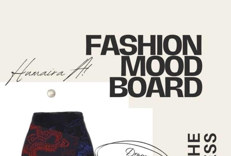
of a new creative job, and that is creating
a mood board. I'll see you in our next class.
30. Introduction to the 6 Face Shapes: Hey everyone and welcome back to another lesson of
fashion fundamentals. In this lesson, we are
going to be looking at the six different
types of face shapes. That includes the oval shape, the round shape, the heart
shape, that diamond shape. And finally, of course
there's the square shape. So all of us typically fall
into one of these categories. And it is very important to know what your own face shape or the person you're styling
or designing for. Not only in terms of what accessories would work
well for each face shape, but also in terms of
hairstyles and makeup. In this specific lesson, we'll be looking at
what types of earrings work for a ***** face
shape and which of course, types of earrings do not
work for each face shape. Let's get to it.
31. Earrings for Round & Square Face Shapes : The first face shape
where we were looking at is called the round face shape. Round shape. People have rounder
cheeks and overall their faces have an
overall circular shape. Earrings that worked
for really good with this face shape are
a long yearlings such as lung dangles or simply long earrings
that go below the chin. What that does is it ends up elongating the face and
creating that nice balance. And it also of course, compliments the features
of a round face. So another great strategy
for a round shape face would be square-shaped earrings. So these are actually very
good because it ends up creating that sharp
contrast between the round, the round face shape
and the square shape. And also of course it ends up breaking up that circle shape. On the other hand, the earrings that you should definitely avoid when styling someone with a round shaped
face are rounded earrings. Why that is is
because it ends up creating that unbalanced slug. If you have someone with
a round shaped face, if you add rod-shaped
hearings on them, it ends up making their face actually appear
rounder than it is. And that's not
what we wanted to. We want to balance
out that shape with another shape like
square earrings or long dangling earrings. It definitely, definitely avoid those round shape earrings on
styling around shaped face. This next shape is called
a square face shape. This is pretty much the opposite from the rounded face shape because the space is generally
shaped like a square. Identified by a strong, beautiful geometric jaw line. And it's also when
the jaw happens to be the same size
as the forehead. That's why it's
called the square. With the square shape, you generally wanted to the complete opposite of what you would do
with the round shape. For this one, you want to
pick rounded earrings. You also want to find something
like hoop earrings and long drop earrings to kind
of soften dose features, soften the futures of the
jawline and the cheekbones. So remember that rounded designs for the
square shape and up complementing and softening the features
of a square shape. So earrings that you do want to avoid with
this face shape. Our earrings that end
right at the jaw line. So what that ends
up doing is when it ends up the jawline
and ends up actually emphasizing that jawline area because our eyes
are drawn towards that area where the earrings
and with the square-shaped, with the jaw line is already
very much emphasized. It's very much
angular and defined. And you don't want to
accentuate it anymore because that won't create that balance look that we're looking for. Therefore, a void earrings
that do end up that John line. Instead make sure you get those earrings that
are long and dangling. That round shape. So long as they do not
end at the jaw line.
32. Earrings for Heart & Oval Face Shapes: Next phase shape is called
the Heart face shape. Heart-shaped face
is characterized by a forehead that is wider than the cheeks and a face that
narrows towards the chin. So literally shaped like
a heart in that case. Here what we want to
do is we actually want to create more volume
at that bottom. Since it ends up narrowing
towards the bottom, we want to create volume here. The best thing to do here is pick earrings that
ends at that jaw line. You want to create the illusion of volume at the bottom here. And the best way to
do that is to pick an earring that
ends at the bottom, like we see in
this example here. Another great trick would
be to get an earring that is always wider at the
bottom than at the top, as we see in these examples. This also creates that illusion as volume to that
bottom area of what we want to do is we want to balance the top part half of the face with the bottom
half of the face. Because it does have that
that shape towards it. We have a lot of
volume at the top and very little
volume at the bottom. We want to add volume to the bottom to balance
out the two-halves. Another thing that looks
great for this face shape, our earrings that our
sauce with curves, such as, for example,
teardrops styles. These also look very beautiful. This next phase shape is
called the oval face shape. This face shape is actually the easiest to style and that's because of oval shape is
a very versatile shapes. So pretty much any earrings
or anything can go with it. It is the easiest to style. This shape has a not
too wide forehead and the line from the forehead blends with the high cheekbones. The face may narrow slightly resulting in that rounded chin. So although everything usually looks great with
this face shape, what looks really great? Or earrings that are
actually also overall size. Oval earrings,
pearls, teardrops, as you can see these
examples ends up providing a soft compliment to the
faces natural contour. And ultimately they
were pretty great. They end up emphasizing
the contour and creating that
beautiful, beautiful luck.
33. Earrings for Diamond & Pear Face Shapes: This next phase shape
we're looking at is called the
diamond face shape. Why? Because it's shaped like a diamond and is characterized
by when the cheekbones, the widest part of the face. So proportionally
the forehead and the chin jaw area or smaller
than the cheekbones. So hence it's shaped like a
diamond for this face shape, since the top half
of the face and a lower half of the face
are already in balance. What works really great with
this or statement earrings? You can go crazy
here and get bold, beautiful, big
statement earrings. It creates that volume here at the bottom and it looks
really, really good. So other things you can do here get earrings
with delicate drops, combination of curves
and straight lines. As you can see, these
examples are also great, great choices for
the diamond shape. The next phase shift that
we will be looking at is called the pair face shape. And it's characterized
by when the jaw is bigger than the cheekbones are the forehead
in terms of width. So therefore it's
shaped like a pair. So this face shape is a little bit tricky in terms of earrings. And what you want to definitely
make sure you don't do is you don't want to drive attention to that jaw line area. How do we do that? We avoid any
earrings that end at that jaw line because it ends
up emphasizing that area. B, you don't want anything too. Statements, statement t, like you don't want
any statement, earring statement pieces
here because that ends up drawing our
attention OR gates, whereas that area instead pick earrings that
are, for example, these studied, studied
earrings or clip odds, for example, really,
really good. There's also your
clips here that look, you're cops that look great. Because our gaze
ends up diverting our attention to boards
upper part of the face. So that's another
really great strategy for the pair of face shape. Remember here we want to balance out the top of the
bottom of the face. And the best way
would be to drag our eyes towards
the top of the ear, the top part of the, the face. That way ends up balancing
the bottom with the top area. Definitely avoid any statement, jewelry or anything that would
emphasize that jaw line. Remember, knowing how to choose the best
earrings based on the face shape will help accentuate the natural
beauty of the face, hair and don't forget
the personality. That was it for this lesson. And I'll see you guys
in the next slide.
34. The Mood Board: Introduction: Hello everyone and welcome
back to lesson five. In this lesson, we
will be looking at something called a mood board. A mood board is a very
important part of a job of a fashion stylists
or a fashion designer, or really anyone that
works in a creative field like for example,
interior designer. So there are a few questions and I'm going to answer
in this lesson. First of all, what
is a moodboard? Second of all, why
is it important than the job of a fashion stylists
or fashion designer? Third of all, how do
you create a moodboard? Where do you begin? What types of
moodboards are there? What elements do we add? How do you interpret
a mood board? And how do you make a mood
board for your clients? Quite a few exercises
in this lesson as well. So be prepared to get creative
here. Let's get to it.
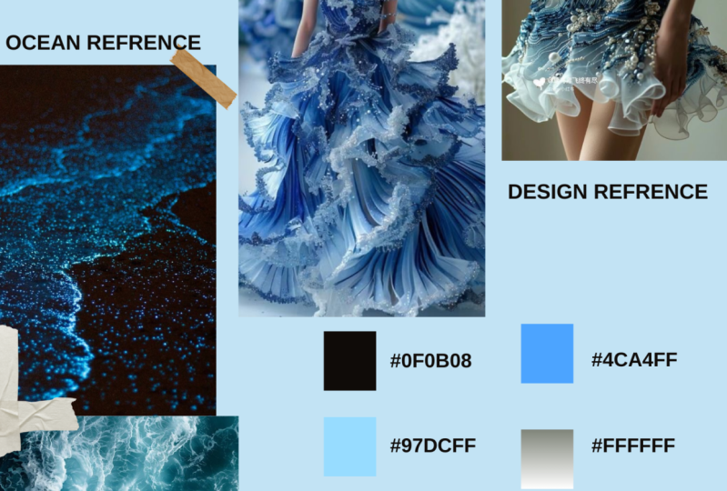
35. What is a Mood Board?: Important questions
to address here is, what is a mood board? A mood board is exactly
the way it sounds. It's a board that happens to show a certain mood or theme. Whatever creative project
you're working on. If you're a fashion designer creating your own collection, you get a source of
inspiration from somewhere, whether it be a theme, whether it'd be a color scheme, a pattern scheme, some sort of a mood and idea that you have. So you want a piece
that idea together. The best way to do
that is come up with a collection of visuals, different textures, and
source of inspiration items, locations, and put it
onto your vision board. Whether that be digital or
whether that be physical, which we'll look at later. A moodboard is very, very important to
expressing your ideas. Simple visual board,
what did earlier. There are two main reasons on why you'd want to
create this mood board. The first one is for yourself to piece together your ideas, your vision board to organize
your ideas and visuals. Whether it be designing, collection or planning
your next photoshoot as a stylist or as
a designer there, it helps see you gather your thoughts, your
inspiration images. The second reason
is the mood board helps communicate
your ideas to others. We also use this as
a professional tool to communicate with her
clients or team members, whoever we're working with. A lot of the time, it's very
difficult to explain what we want or what we're looking
for through words. Since we're in such
a creative field, the best way to explain
our thoughts and ideas is visually recreate
this vision board, mood board to help
our team members and coworkers understand what it
is we're trying to achieve.
36. Physical vs Digital Mood Board: One of the biggest choices to make when you start a moodboard is whether you want it to
be physical or digital. So let's check out a few key
differences between the two. For the physical moodboard. Typically, these are laid out
on a piece of foam board, a craft material used
for purposes as wide ranging as built-in dioramas
and mounting photographs. Cut out your images
neatly and stick them to the board with spray adhesive
for the best results. You might also layer the
images on top of each other so they completely
covered the board. If you perform more of a neat grid layout with
gaps between items, consider painting the board in a color that matches
your chosen palette. Alternatively, a cork
pin board with pins can be a stylized way to
display your inspiration. Digital moodboards are
a contemporary solution to creating a mood board. They allow you to easily incorporate images
you've seen on the Internet or objects
you photograph digitally. So there's a number of
online platforms that offer you a way to bring
these images together. So let's go ahead and
check a few of them out. Pinterest is by far the most common digital
moodboard crater. The social media
platform lets you easily bring together images
into theming boards. It is particularly good for
discovering new images. We will want to use it and
at least the research stage. Another advantage is that many people are familiar
with the platform, so you can easily
collaborate with others. Go ahead, create a
Pinterest account if you haven't already, and start browsing for
those inspiration images. Next super common
digital moodboard crater is called Canva. Canva provides online
graphic design tools that offer free alternative to really expensive
industry software. It's mood board maker
has a very easy to use drag and drop interface, and as well as several
template options. The clean layout makes it a
very professional looking at option for presenting
your work to others. This is another great
browser-based app. It packs some handy
additional features, like the ability to
add videos and gifts, font files and text notes
to explain your thinking. So therefore, it's a pretty
great and easy to use App. So definitely check this one out for creating your
next mood board.
37. 6 Steps to Creating a Mood Board: You really want to focus on
and get inspired by is color. So as you will see, most moodboards have
a cohesive cover in every single
inspiration image. A color usually
ties into the look and the vibe and the theme
that you're trying to go for. First try to envision the
coerce scheme that you want. And of course, it doesn't
have to be one color. It can be a pattern. It could be a combination
of different colors. As long as there's some sort of a unison amongst all of them. For example, here
we see moodboard, and we easily can tell that the color theme of this
mood board is purple. So almost every
single look here, almost every single text style has an element of purple to it. That's what you want to do. First, determine
the color scheme. That's the first and
most important thing to coming up with
your moodboard. If you are a fashion designer, you definitely want
to include pieces of fabric and pieces of different textures
on your mood board. This definitely
communicates the vibe of the types of prints and fabrics and trimmings that you want to focus on in
your collection. However, as a fashion stylus, you can add pictures and images of different
fabrics as well. So if you are planning
that photoshoot, you are communicating to yourself and to your
client that you do want to focus on specific types of textures and specific
types of fabrics. So either way, it is a good idea to have
an understanding of what types of
fabrics you want to utilize in your photoshoot
for your collection? What types of colors, of
course, textures and prints. For example, do
you want a lot of polka dots in your fashion
collection or photoshoot? Do you want a lot of satin and silk type of fabrics
and your photoshoot, maybe chiffon are jersey is
what you want to focus on. Texture and fabric is a huge indicator of
the type of mood and vibe and general ideas and inspiration that
you are going for, whether it be as a stylus
or a fashion designer. So absolutely make
sure to incorporate those pieces of
fabric textures and embellishments to
really communicate that board across to yourself, your team members,
and to your client. Sometimes this step for
me actually comes first. It really depends on what
you are inspired by. But a lot of the time
we have a certain theme that we want to do or a
theme that were inspired by. For example, what
if I wanted to do an all denim type of photoshoot? I already have a theme in
mind and I can draw that. I want to include a lot of
blue denim pieces in there. If this happens to be your first step in
creating a mood board, it's not a big deal. But either way, your
moodboard should always have some sort of a
theme that it's focusing on. Rb doing nineties grunge. Are we doing fifties classic? Are we doing in all
denim 2000s story or RB, inspired by Jeremy, a Scot
phon types of pieces here. So really determined the theme, that angle that you
want to focus on, whether it'd be a photoshoot
or a fashion collection. So you definitely want
to make a clear no matter what kind of
mood board you create, the theme of what
you are going for. I want you to take
a few minutes, pause this video and really
think about what the theme, color, and texture is
of this mood board. As a fashion stylus or
as a fashion designer, what types of looks would you come up with for
this mood board? What types of Luke's would
you pull as a stylist? And what types of
works would you create and design as
a fashion designer? The fourth thing you want to do when
you're coming up with a moodboard is you need to realize who you're creating
this mood board for. If you're creating a mood board, not for yourself but for a client or for
your team members, whoever you're working with, you need to understand
your target market. What is your client looking for? What type of brand or are they? What do they want specifically? I would suggest you absolutely
do your research before, of course, coming up with a
mood board for your clients. Look into their brand, look on their Instagram, their Facebook, their website to understand what
they represent. Are they more commercial
in terms of their looks? Are there more laid back or
are they more high-fashion? Are they more punk? Every single brand or
client has some sort of vibe that they're
going for, an ACE, a stylist, fashion designers need to understand what it is
that they are looking for. We need to put ourselves
in their shoes and be able to bring their vision
to life through clothes, accessories, elements, this overall illusion
that we create a stylus. This also does not mean
that you can't come up with your own elements
so that you can come up with your own style. You definitely can do that. You can add in your own elements in the mood board as well. We generally have also a lot of ideas and are naturally
good at what we do. But you always have
to make sure that the general theme and
mood board that you're creating matches that aesthetic that your
client is looking for. Another thing when coming up
with a moodboard is a lot of the time we have to
actually come up with a name for the mood board. This I personally am not
particularly good at. I am not good at naming. Things are coming up
with titles or captions, but it is something that
we have to do sometimes. So any fashion shoe or a
collection that you design, it needs to tell some
sort of a story. And usually these
fashion collections, fashion magazines stories
have some sort of a title to communicate
that story to the reader. So a lot of the time
boards can actually be a lot more powerful
than visuals. So what ends up tying in
the whole story together? So it's good to have a rough
idea of some inspiration in terms of titles for the mood
board that you're creating. Let's take a look
at a few examples of titled moodboards here. And you can see how the name of each moodboard kind of
gives us an idea of what the collection or
photoshoot is going to be about beyond the
images presented. The last thing you want to make sure you do when you're creating that moodboard is to not only insert pictures
of textures, fabrics and looks and garments, and different locations, but
also pictures of objects. You want to include
different images of props, whatever props they may be, whether it's nail
polish hair or it's a landscape photo
or boots or a hat. It communicates more of what types of accessories
we're going to have. A lot of fashion
stylists also loved to include images of
makeup and hair. Stylist as fashion designers, we have to look at the
big picture of things. We have to look at
the grand scheme of our photoshoot and
our collection. It's not just about the
clothes we put on a person. It's the entire log. It's the hair, It's the makeup, it's the setting,
it's delighting. There are so many elements
and factors that go into it. We have to see the bigger
picture of things. And when you are
creating a mood board, make sure you add an image
that showcase those prof, that showcase the way you want the photoshoot or
collection shots, model inspirations,
and of course, setting inspiration, locations
where he wanted shots. What kind of setting
inspires you? So all of these little elements are super important
to coming up with a moodboard and efficiently
communicating that across to your client
and your team members. And of course, also for you
to organize your ideas.
38. Mood Board: Exercise: That was it for this
lesson on a moodboard. And now I have an exercise
for you where you can practice creating
your own mood board. This is actually a
scenario that I was in myself a few years ago, I had a client who was a
budding country artist and he wanted me
to style him for his next album
cover photo shoot. This is information I was given. So first of all, he's an
up-and-coming country artists. Second of all, he
doesn't really dress up. His style was very late
bag and it's very casual. And overall keep doesn't really
know much about fashion. Third of all, he's very
much enhanced comfort zone, so he likes to dress
casually and he's not really too out there
in terms of fashion. So here are the photos
of this client. Use these photo as
a guide for you to envision what types of
looks would work for him. Also take these
notes into account. I look forward to seeing
what you come up with.
39. 16 Fashion Terms You Should Know: In this lesson, we
will be looking at 16 important fashioned terms that every person working
in fashion should know. We will look at a
handful of examples for each term and also be prepared for a
mini quiz in the end. Let's get started. This first term is
a term that you have likely heard
many times before, and it is owed couture. So another word for this
would be high fashion. So this term is French
for high sewing or high dressmaking and often refers to exclusive designer creations. The exclusivity comes
from the fact that Oak tour outfits are constructed by hand
from start to finish. Couture is always
limited edition and is more expensive than
ready to wear garments. There are also custom-made
according to the rare size. Let's go ahead and
take a look at a few examples of some
oak leaves her garments. Mass market. Mass market refers to the clothing that
is manufactured in large quantities and made
available for the open market. So this is typically
available in standard sizes with many copies of the same type of design. There is a pretty large demand
for this type of apparel. And becoming a mass
market fashion designer is really the most
rewarding at the moment. So you guys definitely
consider this path. Let's go ahead and
take a look at a few examples of some
mass market brands. This next term we're going
to look at is off the rack. There are Designer and then
there are customer and close. And then there are off the rack outfits that
refer to clothing that is made in a large number and is readily available in stores. Off the rock also means readymade garments that are
made in standard sizes, like for example, small, medium, large, extra large,
extra small, et cetera. Capsule collection. A capsule collection is a set
number of clothes that can mix and match with
one another to create many different
types of outfits. So typically, you wear a capsule wardrobe for
about three months. Then at the end of
those three months, you updated for the next season. By having a set number
of closed per season, you limit your shopping. First of all. Thus, you're
saving quite a bit of money. When a piece is worn out
or doesn't write anymore, then one can shop
for a replacement. This is a word that you've probably heard
many times before. And it is fashion forward. In the fashion world of fashion forward actually means that these are styles that are not actually currently in trend, but there are so good that they will become
fashionable pretty soon. Fashion forward also
refers to people who have their fashion game rights and nobody will become a
trend in the near future. Think about it and predict what kind of current
fashion look well, perhaps becomes
super popular and trendy in five or ten years. This next term is pepsin. Pepsin is a type of style
that refers to what top are addressed that has
an outward flared or ruffled section
around the waistline, while the rest of it
remains pretty fitted. Bias Cut. Bias Cut is a
diagonally cut garment. The fabric ends
up cascading over the curves because it
is cut diagonally, therefore creating a
pretty flattering shape. This next term is
called knife plea. Knife plates or a tight pleats
situated one inch apart. It is a sharp and narrow plead that is folded in
the same direction. Ultimately overlapping
each other. This is among the most
popular forms of please. Let's go ahead and check
out a few examples. Applicant, the applicant is stitching or embroidering
one fabric onto another. This is an ornamental needlework in which fabric pieces are stuck or sewn on a larger fabric to create
a pattern or a picture. This next term is called fluted. Fluted hem is a hem with fabric that alternates
inward and outward. As you can see here
in this example, the fluted hem skirt is slim
along the waist and hips, but it has that ruffled flared harm that results
in a snake-like effect. This next term
here you've likely heard quite a few times before. And it's called cap sleeves. So capsule leaves are a
type of sleep that extends a short this sense
from shoulder and tapers to nothing under the arm. This is a very flattering
cut because it ends up elongating the arms and it
also covers those shoulders. This next super common
fashioned term is herringbone. So herringbone is
a v-shaped we've resembles the skeleton
of a herring fish. It compromises columns
of short parallel lines. This is actually a very
trendy pattern for a tweed and wool
type of outerwear. As we can see in these examples. Iridescence. Iridescent is a
fabrics property that appears to change color when it comes in contact with light. It means showing luminous
colors that appear to change when seen from
these different angles. And it's widely used for making
things like party close. As you can see in
these examples. Mandarin color. Mandarin color is a close, small and upright color. This type of color
has originated from traditional Chinese
types of garments. It creates a
minimalist feel and is widely used an oriental
inspired collections. As you can see in
these examples. This next one is e-tailer. An e-tailer is basically a clothing retailer that is completely and entirely online. So there's no physical
store for this retailer. This cells are recent trend
that is quickly changing the world of fashion because it allows
many more people to, first of all become
fashion designers. And it also puts their style
out there for purchase without the cost of actually
running a physical store. In the last term
we will be looking at in this lesson
is GSA Augusta. That is simply a piece of
strong fabric that ends up acting as a protection against things like
holes are aware. And it works to stiffen or enlarge part of a garment
or an undergarment. The strengthened fabric at the color and cuffs
of most men's shirt, for example, is
achieved with August. So as you can see in
these examples here, you weren't some very, very important fashion
terms that everyone working in fashion or passionate
about fashions should know. In the next video, you will have a mini quiz to test
your knowledge. See you there.
40. Quiz: Fashion Terms: In
41. Conclusion: THANK YOU!: Congratulations, you
now know some of the key fundamentals
when it comes to fashion styling
and fashion design, you alerts about
body type a novices the six different face shapes and how to access
the rise for them. Different style hacks emphasizing deemphasizing
certain areas, making someone who appear
taller or shorter, camouflaging the
stomach or the arms. You also learned about how to mix different patterns together, common different types
of patterns and many, many different styling
and fashioned hats. Now above all, most importantly, you know the logic
behind successful style, and I'm so happy to have
been your instructor. I really hope that you use these essentials in
your personal life, your work or career life, or even perhaps just as
a source of inspiration. Next course we'll talk all about color, color, everything. We're gonna be looking at
the four different seasons, the middle color styling for different complexion
and skin tones. And of course, many hacks and finding the
correct color for you or your client's download the resources attached
to this course. There are many of
them that you can download, you can review. And don't forget, you can
always ask me any questions. I'm glad and happy to answer whatever
questions you may have. Thank you so much for an amazing course and I hope to see you soon and I hope that you
enjoyed it. Bye everyone.
 Veronika Lipatova, Fashion Stylist & Costume Designer