Transcripts
1. Welcome To The Class!: Hello, everyone. My
name is Will Elliston, and today we'll be capturing
the beauty and grace of one of nature's most enchanting
creatures, the humming bird. Painting a humming
bird allows us not only to celebrate the wonder of these
expressive birds, but also to explore a wide range of
watercolor techniques. Throughout this class,
we'll delve into techniques such as
wet on wet blending, glazing, and using salt, all as we bring our humming
bird to life on paper. I've been a professional
artist for many years, exploring lots of different
subjects from wildlife and portraits to city scapes
and countryside scenes. I've always been entranced by the possibilities of watercolor. But when I started, I had no idea where to begin
or how to improve. I didn't know what
supplies I needed, how to create the
effects I wanted, or which colors to mix. Now, I've taken part in
many worldwide exhibitions, been featured in magazines, and been lucky enough
to win awards from well respected
organizations such as the International
Watercolor Society, the masters of
Watercolor Alliance, Windsor and Newton and the SAA. Watercolor can be overwhelming
for those starting out, which is why my goal is
to help you feel relaxed and enjoy this medium in
a step by step manner. Today, I'll be guiding you
through a complete painting, demonstrating a variety
of techniques and explaining how I use all
my supplies and materials. Whether you're just starting out or already have
some experience, you'll be able to
follow along at your own pace and improve
your watercolor skills. If this class is too challenging
or too easy for you, I have a variety of classes available at different
skill levels. I'd like to start off with a free expressive
approach with no fear of making mistakes as we create exciting textures
for the underlayer. As the painting progresses, we'll add more details to bring it to life and
make it stand out. I strive to simplify
complex subjects into easier shapes that
encourage playfulness. Throughout this class, I'll be sharing plenty of
tips and tricks. I'll show you how to turn
mistakes into opportunities, taking the stress out of
painting in order to have fun. I'll also provide you with
my watercolor mixing charts, which are an invaluable tool when it comes to choosing
and mixing colors. If you have any questions, you can post them in the
discussion thread down below. I'll be sure to read and respond
to every think you post. Don't forget to follow
me on Skillshare by clicking the follow
button at the top. This means you'll be the
first to know when I launch a new class
or post giveaways. You can also follow me on Instagram at Will Elliston
to see my latest works. Let's get started
with learning fun and exciting morticar
techniques and how we can use them to paint your
own beautiful humming bird.
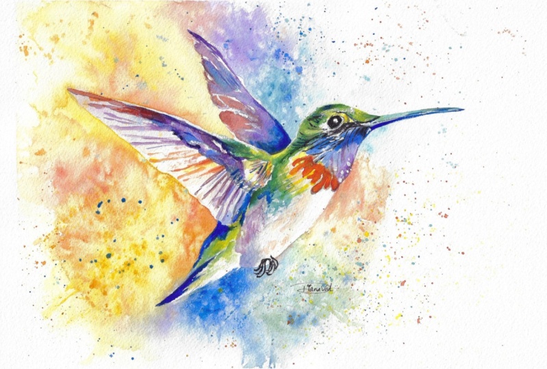
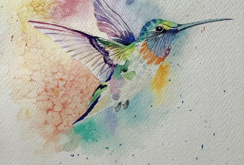
2. Your Project: First and foremost, thank you so much for
joining this class. I'm thrilled to have you here. Today, we're
exploring how to use water color to paint a
vibrant humming bird. What captivates me about humming birds are
their majestic colors, ranging from
brilliant greens and vivid oranges to exciting blues. This is an opportunity to use as many colors as we want
to create a full spectrum. We'll also look into the
interplay of light and shadow, the harmonious blending
of warm and cool tones, and the creation of depth
and realism in our artwork. In the resource section, I've added a high
resolution image of my finished painting
to help guide you. You're welcome to
follow my painting exactly or experiment with
your own composition. As we're going to be focusing on the painting aspect
of watercolor, I've provided templates
you can use to help transfer or trace the
sketch before you paint. It's fine to trace when using it as a guide for
learning how to paint. It's important to
have the underdrawing correct so that you can relax and have fun learning the
watercolor medium itself. Whichever direction
you take this class, it would be great
to see your results and the paintings you
create through it. I love giving my
students feedback, so please take a photo
afterwards and share it in the student project gallery under the project
and resource tab. I'm always intrigued to
see how many students have different approaches and how they progress with each class. I'd love to hear
about your process and what you learned
along the way, or if you had any difficulties. I strongly recommend
that you take a look at each other's work in the
student project gallery. It's so inspiring to see
each other's work and extremely comforting to get the support of your
fellow students. So don't forget to like and
comment on each other's work.
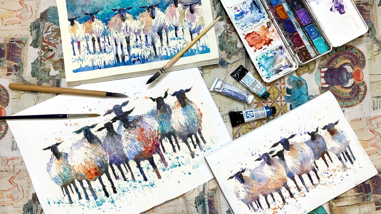
3. Materials & Supplies: Before we start the painting, let's go over the materials
and supplies I generally use. Having the right materials can greatly impact the
outcome of your artwork. So I'll go over all the supplies are used for this
class and beyond. They're very useful to have at your disposal and we'll make it easier for you
to follow along. Let's start with the
paints themselves. And most of the materials
we'll be using today, it's a lot to do
with preference. I have 12 stable colors in my palette that I
fill up from tubes. They are cadmium
yellow, yellow cha, burnt sienna, Cadmium
red, Alizarin crimson, ultramarine blue, cobalt blue, Serian blue, lavender,
purple, di black. And at the end of the painting, I often use white guash
for tiny highlights. I don't use any
particular brand. These colors you can
get from any brand, although I personally
use Daniel Smith, Windsor and Newton
or Holbein paints. So let's move on to brushes. The brush I use the most is
a synthetic round brush like this coda Pearl brush
or this Van goth brush. They're very versatile because
not only can you use them for detailed work
with their fine tip. But as they can hold
a lot of water, they are good for
washes as well. They're also quite affordable, so I have quite a few
in different sizes. Next are the mop brushes. Mop brushes are good for
broad brush strokes, filling in large areas and creating smooth
transitions or washes. They also have a nice tip that can be used for smaller details. But for really small details, highlights or anything
that needs more precision, I use a synthetic
size zero brush. All brands have them and
they're super cheap. Another useful brush to have is a Chinese calligraphy brush. They tend to have long bristles
and a very pointy tip. They're perfect for
adding texture or creating dynamic lines
in your paintings. You can even fan them
out like this to achieve fur or feather
textures as well. And that's it for
brushes onto paper. The better quality
of your paper, the easier it will be to paint. Cheap paper crinkles easily
and is very unforgiving, not allowing you to
rework mistakes. It's harder to create
appealing effects and apply useful techniques
like rubbing away pigment. Good quality paper, however, such as cotton based paper, Not only allows you to rework
mistakes multiple times, but because the pigment
reacts much better on it, the chances of mistakes
are a lot lower and you'll be more likely
to create better paintings. I use arches paper because that's what's available
in my local art shop. A water spray is
absolutely essential. By using this, it
gives you more time to paint the areas you
want before it dries. It also allows you to
reactivate the paint if you want to add a smooth
line or remove some paint. I also have an old
rag or t shirt, which I used to clean my brush. Cleaning off the paint
before diving it in the water will make the
water last a lot longer. It's always useful to
have a tissue at hand whilst painting to
lift off excess paint. Also, you never know
when an unwanted splash or drip might occur that
needs wiping away quickly. I also have a water dropper
to keep the paints wet. When you paint, it's
important to have them a similar consistency to what
they're like in the tubes. This way, it's easier to
pick up sufficient pigment. A hair dryer is useful
to have for speeding up the drying time and controlling the
dampness of the paper. Lastly, masking tape.
And this, of course, is just to hold the
paper down still onto the surface to stop it sliding
around whilst painting. Also, if you plan on
painting to the edge, we'll allow you to create
a very crisp clean border. And that's everything
you need to paint along. Of course, you can
experiment and explore other material supplies that you might want to use
in your painting. But let's carry on and begin.
4. Tips For The Sketch: And like with every painting
that we do and drawing, we have to break down
all the complexity into simple shapes
and find a rhythm. So I'm going to just put a single line the direction of the body and where
the beak comes out. Then going to fill it out with a bit of a
oval shape right here. Then the head, put a different
kind distorted circle. It's a good practice
if you want to improve your drawing just to
practice doing ellipses. And the eyes
slightly off center. Follow that beak out there. Then you can start
sculpting a bit better, what I mean by sculpting
is cut away from those broad shapes
that we just did. Trying to make them a
bit more realistic. So we just use the circles
just to map everything out and then we try
and correct them. It's just a matter of
going back and forth, back and forth until we can no longer see
any inaccuracies. Of course, we're not aiming
for perfection, actually. We're just aiming to have fun. And unless you want to do
a very realistic painting, sometimes trying
to get it perfect ruins the playfulness of it all. The feet. Now, really, I've
broken my own rule here because I've started to add some details before
including the wings, painting the wings, which
might be incorrect. So let's see how that plays out. I think it might be okay. So that's the rough
drawing and I'm going to swap my pencil
to a darker pencil and get a rubber and just really mark out the details that I want to make clear
for the painting. Because really the drawing is the skeleton of the painting. You need to make
sure the skeleton is correct before you add on all the colors and
bulk it out with form. So I'll take a bit
of time doing that, then I'll scan it in and
make a template for you to use if you want to trace
it for your own project. Okay.
5. Starting The Background: With this painting, we're going to start with the underlay, the background because
oftentimes with birds, they have white feathers, and we need to paint the background to negatively paint the shape of the bird like in the
breast area and the tail. A bit like some of
my other classes, we're going to create a circle with a mix of
all different colors. They can be colors
of your choice, or you can follow along with
what I'm going to choose. I'm just going to pre
wet some of the paper. Because I don't want lots of hard edges and pre
wetting the paper in some areas creates a range of different textures
from soft to hard. Makes it a more
dynamic painting. I'm just wetting the paper while I think about what
colors I'm going to use. It's wise to have a tissue at
hand because in some cases, we're going to want to dab
out some of that water which will allow
us more control. I'm going to start off with a
bit of a blue cerlian blue, I think it's a nice color. Keeping it light in
pigment and very watery. And we don't need to so much about the edges up
here in this section because we're going to come back later with darker pigment. Okay. Keep it a bit abstract. I'm going to even
do a few flickers. Keep the energy in there. And let's start incorporating
more colors now, so I'm going to use this purple and going to come in here and influence it
a bit there. Okay. Maybe we can use that
pure purple up here. Even incorporating a tiny
bit of red and see how we're blending different
colors in a smooth way. But it doesn't
have to be smooth. I want to encourage some
interesting textures. So I'm doing splats
of water here and there to make sure the
edges remain interesting. Maybe a bit more
pigment down here.
6. Negative Painting: If we can start painting
down here a bit. Uing the purple, now, going back to that blue
that we used above there. That's a bit too strong for me. So I'm going to clean my brush, empty the water using
a towel and then suck up the brush like a straw that. Because I pre wetted
the paper there, it'll have a smooth edge. And a complimentary
color to blue is orange. So I'm just going to take
some cadmium yellow here, mix it with the cadmium
red to make an orange. And I'm going to
paint that in there. And carefully mix them. Okay. Okay. Go over the feet there. Mixing a bit of that
purple in there now. Few more splats
there, blue splats. Getting a bit sicker with
the pigment down here. Maybe a bit of green because I want to use all the colors I have to keep it a
bit Interesting. They don't have to
be the same colors. You don't have to go out and buy all my colors to match it. You can adapt it to your own palette that you
have or been collecting. Pre wetting this area here. Maybe I'll mix that
green in there. I have a bit more
blue up there. Oh.
7. Using Salt: I always have some kind
of urge to add salt. I haven't quite mastered it yet. Because the timings
are so unpredictable. So I'm not quite sure
what the result will be, but I'm adding a
bit of salt now. Color is an
unpredictable medium, and salt makes it even
more unpredictable. So it's very hit or miss. Don't be disappointed if you use salt and the effects that you are aiming for
don't end up that way. A few more splats. Trying
to keep it playful. Now, I'm going to start working around here and I'm going to balance it out with
orange on that side. Pre some of the paper. Alizarin crimson
here. If you have it, Now, being careful not to
go over the line here. It's not the end of the world, if you do because we
can use white gosh to fix it to keep it a clean
line next time at the end. So at the moment, that's a
bit too red, which is fine, so I'm just going to
dab a few bits of orange in there to
warm it up a bit. Then, actually, I'm going
to use pure yellow. Here, It's a bit like an explosion of color. Makes it more dynamic. Mm.
8. Different Sized Paper: I'm using my Van Gogh brushes. If you look in the materials
and supply section, you'll see a bit more
information about that. Size nine at the moment, but depending on what
size paper you're using, maybe you'll want a smaller
brush or a bigger brush. When it comes to
choosing paper size, there's lots of different
things to think about. When learning, it's
probably best to paint smaller and that's not
because it's easier. In fact, it's quite
the opposite. It's actually harder to
do a good painting on a smaller piece of paper because there's less
room for details. But that's the idea of why you should do it
when you're learning because details are actually not the most important
thing when it comes to the fundamentals
of watercolor. It's about the broadness of it. And by painting smaller, you're kind of using your
mind in a different way. When you paint bigger on
a bigger piece of paper, you have more room to make
mistakes and what would be small details on
smaller piece of paper are actually much
easier to control. Oh. Me to choosing paper size
for a watercolor painting. It's essential to
consider a few factors. Firstly, your comfort level. Larger paper sizes provide
more space to work with, allowing you more freedom in your brush strokes
and composition. However, they may also require
more effort to handle, especially if you're
just starting out. On the other hand,
smaller paper sizes can be more manageable and
less intimidating, make them a good
choice for beginners or for practicing
specific techniques. See, the salt's not
doing much actually. I must have missed the
opportunity to put it in, but I'm going to try and put
it in in a few other spots. Maybe my salt is a bit too fine. Maybe it so be bigger granules. So now I'm just going to
wait for it to dry by itself and allow the
pigment to work its magic. It's a bit too wet
at the moment, but once it dries a
bit, I'm going to use the hair dryer to
speed up the process. Painting often relies on a
careful selection of colors to achieve desired mood or
atmosphere in a piece. While certain paintings
may lean towards a cooler palette or some others might have
a warmer palette. It's important not to overlook the whole spectrum of
colors available to us. In fact, it can be quite a pity not to take the opportunity to experiment with some of the more unusual or unexpected hues.
9. Getting Abstract: I get there. I get a bit more
dynamic up here by adding a bit more abstract parts because it's a bit too flat. Something like that. Okay. And we can even start doing the underlay
of the body a bit. And again, it's a bit abstract. Just using a bit of
light blue and then finding its complimentary color, which is brown or burnt sienna. Leaving a few white gaps, and keeping it darker
at the top here. And as we get
closer to the edge, we're getting very light. Of course, this blue and
brown when mixed together, it actually makes
a kind of gray, as you can see there a gray, but still and I'm going to paint that
brownish gray in there. Just to make it off white, you need some areas
of desaturation or low vibrancy to really
make the vibrant areas pop? A few drops of my brush accidentally fell onto that
blue there. That's okay. Because again, brown is a complimentary
color to that blue, and in fact, if I
encourage it a bit. It'll blend in a bit. I'll create hopefully
something a bit dynamic. It's a bit too dark in
some of these areas, so I'm just going
to use a tissue. Just to dab it out. I remember this is just a
underlayer at this stage. That should be fine. We can start adding vibrant blotches of color
in different areas. Again, has a kind of underlay. But while I think about
my color palette, I'm just going to carry
on doing the under layer. I'm going to. Do a kind of a red purple by mixing
blue and son crimson. And this is going
to be very diluted. I'm just going to paint a
bit of an under layer here. Maybe I encourage a bit
of that red in there. Go back to this blue. Do a bit of a blue
underlay there. And have it blend into
a bit of a purple. Okay. I
10. Adding Splats: Now, I think I'm
going to be quite brave and do some splats. Because these slats,
they remind me a bit of pollen
floating in the air. Of course, humming birds go
to flowers for their pollen. So going to do it with a bit of orange,
using the same brush. I'm going to completely fill up my brush so
it's close to dripping. And just tap it. I got to have something
to hit it on. Only put as many splats as it
makes you feel comfortable. If you don't like splats,
you don't have to do it. Maybe a bit of green
splats down here. Now I'm going to mix some
dark blue. Very thick. Going to do some dark
splats right there. I want the splats to be
even thicker actually. So I'm just going to
add more pigment. Hold my pen almost vertical. So the liquid drops down
to the bottom of the tip. And you can either
flick with your finger, but I feel like there's
less control when you do that to tap it on something. I usually think that
allows for more control. And that's all the taps
and splats that I'll do. Now you can dry with
a hair dryer again, but there's more things I can do whilst I'm waiting
for it to dry. A few more under layers
I can get involved with.
11. Starting The Bird: I'm just going to
clean this section on my palette because I want to mix a vibrant yellow. Start painting that in there. And while we're at it,
we can paint it in other sections too that we
might want that yellow to go. This is lemon yellow, but you can use
cadmium yellow too. It's very similar.
Be it up there too. Okay. Now, into that yellow, I'm going to take some Vardon
green here and connect it. Does that matter? If the
yellow starts to disappear? I quite like this
green, actually. You have to make sure this
bit is definitely dry before. You go in at this stage, the background I'm
talking about, to make sure that the
background is dry. So the background is
completely dry now, and that's considered
the first layer, and that was expressive, and we were open to our own personal touches because we don't have to be strict with what
colors we're using, and we could be quite
expressive and messy. You can see, there's
actually a lot of different textures there that don't mean anything
in particular. But now the second
layer on top of it, we're going to be a bit more controlled still being
expressive with our colors, but we have to be a bit more controlled with where
we're putting the paint. And you can while it's
all wet in those areas, you can start blotting
thick pigment of other colors and have it stew and mix about and create
other unique mixes of color. I'm going to take some of this
turquoise or serian blue. I'm going to put on there, too. Okay. So. And range.
12. Painting The Wings: Okay. So we started with yellow and we went the
green direction of yellow, and now we're going in the
orange direction of yellow, of course, Green is
blue and yellow. Orange is yellow and red. So we're moving around
the spectrum of yellow. Going very strong with the
yellow in this section. And the complementary
color to orange is blue. So we're going to have this mixing to blue
a bit further up. In fact, what we can
do is make this orange a bit so that when it
blends with the blue, it looks like a bit of purple. Another factor to consider
is choosing a brush size. And the different sizes can significantly impact your painting process
and the final result. Large brushes are great
for covering large areas quickly and creating
broad expressive strokes. They can also hold a lot
more water and paint, making them suitable for wet on wet techniques and washes. However, they do lack precision when it comes
to finer details. On the other hand, smaller
brushes are perfect for adding those delicate details or intricate textures
to your painting. They allow for more
control and precision. Making them essential
for fine lines, small shapes and
intricate patterns. However, with using
a small brush, they require more time and
patience to cover large areas. So it's good to experiment with a variety of different
brush sizes to begin with. Don't be afraid to mix and match different sizes to achieve different results and effects and to help explore your
own personal style. Going to mix a bit more red to this blue
to make a purple. But that's too strong, so I'm going to add some
water to dilute it. And start painting
some feathers. Maybe a bit more red.
Up at the top here. Make it a bit bluer down here. So it starts off red and
blends down to a blue.
13. Selecting Colours: A few more favers Maybe. Some orange ones. Talking a little bit more
about selecting colors. Consider the way
certain colors evoke specific emotions or
convey particular themes. Blues and greens might evoke a sense of tranquility
or nature while warmer tones like red and orange can evoke
energy or pasion. However, within these
broad categories like countless variations and
nuances that you can explore and use to make
your artwork truly unique by experimenting
with unusual colors. We can find surprising
and captivating results. Perhaps a touch of purple in a landscape adds some
kind of ethereal quality. And particularly with this
painting using that bright, almost neon yellow creates a dynamic focal point and
creates a lot of interest. By embracing the full
spectrum of colors, particularly in this bird that's already full of vibrancy, we open ourselves up to
endless possibilities for creative exploration
and expression. Don't be afraid to stray from the traditional
color schemes. Mixing some turquoise
with that green idanGreen I'm going to paint. The underlay of the beak, She could be at this end. Soften the edge here. Got a bit of lavender
here and I'm just going to. Put it down there. And I'm going to
use the hair dryer to completely dry it off now. Now it's completely dry. We can paint without
being rowed. We're going to overflow
into different sections.
14. Observation: Go to go very dark down here. Using this. Ultra Marine Blue. I can't see my pencil
lines down here, so I'm relying on
my drawing ability to work it out myself. Moving up a bit higher. One of the most
important aspects of painting is observation. Whether it's
following my painting here and observing how my
painting looks and how you're meant to follow along the same way or
whether you're doing your own original
painting and observing something from a photo or
something from real life. It's not just about looking. It's about truly seeing. When you observe your
surroundings with intention and
attention to detail, you open yourself up to much more possibilities
and better results. It allows you to capture the essence of what
you're trying to convey from the way the light
interacts with the subject. In fact, you can go beyond when you actually are painting, when you're walking around, observing the world around you, you can train your eye to notice subtle differences in
color and light every day, even if you look
out the window now, and you can see how the form of different
things are unique. One of the most important
things to observe when painting, though, is light. Light is what gives painting a sense of
depth and atmosphere, and there's so many
different ways of light, whether it's a harsh
light, whether it's a subdue light or a
low light setting. Light interacts with objects
in a very different way, and it can make things feel
more vibrant and lifelike. You have to have some
dark sections to boost the lightness and
the other sections, like I'm doing here. Makes the green
look much brighter. And related to light is shadow. Shadow adds dimension and
drama to your paintings, helping to define the
shapes and create contrast and by
observing shadows and the way they fall or change throughout the subject or the scene that you're
trying to paint. It can also add a sense
of realism and depth. There's other things to
keep an eye out when you're observing your
subject, and that's texture. That's another aspect of the world around us
that is rich with potential from the rough bark on a tree to the smooth
surface of a lake. All the motiple variations of texture can add interests and character
to your paintings. And by closely observing these textures in
your surroundings, in your day to day life, you'll have a better idea of the tactile quality you
want your work to portray.
15. Hummingbird Challenges: Make this a bit more purple. The higher we go up, So there are quite a few
challenges that might arise when trying to
paint this humming bird, especially with the vibrant
and intricate nature of it with all the multitude of different colors involved. One key aspect to keep in mind. One of the key aspects
to keep in mind is the harmony between
the colors to create a kind of cohesive or visually pleasing composition that ties everything together. And if you feel like
you're straying from the path or you feel like it's not really
cohesive as a full image, take a look at your
painting so far. And instead of adding even
more different colors, try to balance it out with either looking at the
color wheel and seeing what is opposite to what you
have on there already or Finding what you consider
to be the primary color. What is the color that is
apparent in your painting, and that will be your primary
color and you have to keep everything in line with that. Go very blue down
here in this corner. So if it's green, add touches of green
every so often, just to have everything
in line with that green. If it's blue, then add influences of blue
in different places. If you're feeling
lost with a color, add a bit more blue to keep it all harmonized
with that main blue, whatever your primary color is. Then maybe I'll even
very dark here. Green. Okay. Just to make that area really pop. Use a tissue. Just to tap
out some of that pigment down there where
it's a bit too dark. In this painting,
I'd say blue is my primary color because there's lots of interactions
with it in different ways. So You can see we've got blue in the background in the
beak, in part of the wing. Then the rest of
the wing is purple, actually, which is red and blue. So we've got blue
influence in there, and then we've got green, which is yellow and blue, blue and yellow make green. Then also, we've got orange, which is the
complimentary color to blue on the opposite
side of the color wheel. So everything has a relation
to blue in this image, even if it isn't all blue. Rather than painting
individual leaves, I'm just blocking the
leaves into sections.
16. The Journey of an Artist: So I wanted to talk a
little bit about the idea of being an artist
and making art, and that at the end of the day, there is no arriving or end destination when it comes to
painting or being an artist. It's truly a never
ending journey. And by the very act
of you painting now or painting when you do this class
or any other class, or whenever you're creating art, you can already call
yourself an artist. You don't need to say
you're a student, you're an artist,
you're painting, you're physically painting, and that's what
makes you an artist. Of course, there'll
always be a desire to paint a better painting,
but that will never end. Even after we paint
a painting that we're happy with,
very happy with, we'll want to achieve
it again with another painting and
reach the next level. A good mentality is that it's not about painting
the perfect painting. It's about being the artist
that enjoys the process of painting as a journey rather than the
individual results. Also by having this mentality of it being a journey rather
than individual paintings. We don't feel as much pressure
for the paintings to be successes or failures because there'll always be another
painting afterwards. When we view painting as
a continuous journey, rather than a series
of finite outcomes, it alleviates the pressure
that we associate with labeling our artworks
as good, bad, or whatever. We're thinking about
the bigger picture, and we embrace the idea that
each painting contributes to our growth and our learning
process as artists, and we no longer
feel the weight of expectation bearing down on us, and that in turn makes
us feel more free and liberated and that helps
us achieve better results. We approach each
piece with a sense of curiosity and
unbounded openness, eager to explore new techniques, experiment with
different styles, and really push the
boundaries of our creativity. With this mentality,
the fear of failure diminishes and we hope to replace it with a sense of
freedom and liberation. We understand that not every painting will be a masterpiece, and that's perfectly okay. In fact, what some may perceive
as a failure is simply another stepping stone on our journey towards
artistic mastery. We learn to appreciate the
beauty of imperfection, recognizing that mistakes
are not setbacks, but opportunities for
growth and discovery. So for. Putting some blue up here. Having it blend gently into
that into that orange.
17. Always Another Painting: And going back to what
I was saying before, knowing that there'll
always be another painting, waiting to be
created allows us to release the need for each
piece to be perfect. We can paint with
greater spontaneity and authenticity
and fully immerse ourselves in the
creative process without the burden of unrealistic
expectations. Because it's very
common. Everyone has high expectations when
it comes to painting. You don't paint with the
expectation for a bad result, of course, but everyone
has to go through it. But with this new mentality, our work becomes more
genuine, more expressive, and ultimately more
fulfilling by embracing this journey of
painting rather than fixating on individual results, we free ourselves to truly enjoy the transformative
power of art. Was to pigment on the
bottom of the beach. Okay. Okay. Adding a few fur textures. Here over the top. So when painting the feathers in order to create the
illusion of this texture. We're going to use both dry
brush technique and lifting. To dry brush, we're
going to take concentrated pigment and lightly
brush it onto the paper, dragging it across to help
create that feathery texture. We can also splatter
a bit if we want. And then lifting involves spraying a bit of water and then removing the pigment with a clean tissue to adjust
the overall tone. Oh. Okay. Were you wetting this bit here? And softening smudging
out that line here. Just to make a bit of interest, so it's not a perfect line.
18. Finer Details: Now I'm going to move
to a small brush and mix some pure
black on there. I can get in with some details up at the top, such as the eye. Leaving a little bit. Reflection at the top. Oh. I like to use textured paper or cold pressed paper
as it's sometimes known because it has a
slightly rough texture. Generally, there are
three types of paper. There's cold pressed, which
is slightly textured. There's rough paper,
which is highly textured. It's the most pronounced
texture that you can have, and I think that's a bit
too much for my style, but it's good for loose
painting styles or extra expressive
styles if you want to create particular things
like foliage or rocks. And then there's hot
pressed or smooth, which is completely
smooth, no texture at all, which is ideal for
detailed work and fine lines without any
need to add texture. It's less for giving
for beginners, though. Building on these paper
textures. With black. Now, the feet end of the feet, I'm going to keep
it quite simple. And to keep it quite simple. I'm just going to T S shapes. Just to give the lesion. Oh. Just like that.
19. Finishing Touches: So as we get close to
finishing a painting, there's a few things that
we want to keep in mind, and that's refining the details. Balancing the colors. Checking the depth and contrast, assessing the
general composition. And once you've assessed
all those elements, and you're really struggling to see what you should
adapt or change, then you should start thinking
about the final touches. Just a few subtle
finishing touches that might make all
the difference, whether it's a few
splashes of color, a few softening of edges, whatever it could be,
your last few touches, don't have to be
that dramatic. Yeah. What I'm going to do now is take some white quash or
white water color. It's the same thing
from what I can tell. And just go over some areas to bring back some of
the intricate whites Now we're coming towards
the end of this painting, and we've explored many
different techniques that you can achieve
with watercolor. So let's go through some of
the key ones we've done. The main one we've
done is wet on wet. This technique involves
as the name suggests, applying wet paint
onto a wet surface, and it allows the
colors to blend and bleed into each other
in a beautiful way. It's great for creating soft diffused edges and smooth transitions
between colors. It's ideal for many
different subjects, is probably the most used
aspect of watercolor painting, whether it's a sky, an animal, a landscape, Because it really does capture the fluidity
and spontaneity of nature. You can experiment with
different levels of wetness, both of the paper
and the paint brush to control the intensity
of the blending. Next is dry brush technique, and we've used that as well. In contrast to the wet
on wet, dry brush, as the name evolves is applying
paint onto a dry surface by using a minimal amount of water and loading the brush
with concentrated pigment. When we brush onto
a textured surface, it just sticks to
the first layer of the tooth of the paper. That's what creates the gap. It's the texture of the paper, and it's great for details because many
things in nature have intricate patterns
or minute details like foliage or the
feathers on this bird, which it would take forever and it wouldn't
look natural if we individually taped
all those little dots. But the dry brush
effect allows for a natural look to
create that texture. Another technique we've
used a lot of is lifting, and that refers to removing wet or dry paint from the surface using
either a clean brush, like I've done quite a lot. A tissue or if you want,
you can use a sponge. I haven't used a sponge
in today's class, but sometimes I do on my more ambitious
paintings that can help create a different
kind of effect. And this allows
us to selectively lighten areas or create highlights or even
correct mistakes. It's useful for creating highlights in water
reflections, actually. And areas that you might
want a bit of shimmering, like the highlight on this bird. And it can be used to create soft luminous
effects if done in a more careful
manner by removing layers of paint to reveal the white of
the paper underneath. And that's it. Let's take the tape off and review
what we've done.
20. Final Thoughts: Welcome back and
congratulations on completing this class on how
to paint a humming bird. I hope you enjoyed it as much as I did guiding
you through it. From capturing the
iridescence of the feathers to depicting the delicate details
of the wings, we explored what makes the humming bird such
a special creature. We experimented
with a variety of watercolor techniques to bring
our humming birds to life. From wet on wet blending
to learing and using salt. Each technique played
a crucial role in building depth,
texture, and expression. Remember, watercolor painting is not just about technical skills, but also about expressing your creativity and
personal style. I encourage you to continue
exploring, experimenting, and pushing your
boundaries to create your own unique
watercolor masterpieces. As we come to the
end of this class, I hope you feel
more confident and comfortable with your
watercolor painting abilities. Practice is key when it comes
to improving your skills. So keep on painting
and experimenting. I want to express my gratitude for each and every one of you. Your passion for
watercolor painting is so inspiring and I'm honored
to be your teacher. If you would like feedback on your painting, I'd
love to give it. So please share your painting in the student projects
gallery down below, and I'll be sure to respond. If you prefer, you can
share it on Instagram, tagging me at Williston, as I would love to see it. Skillshare also loves
seeing my student's work, so tag them as well
at Skillshare. After putting so
much effort into it, why not share your creation. If you have any questions
or comments about today's class or want any specific advice
related to watercolor, please reach out to me in
the discussion section. You can also let me know about any subject wildlife or scene you'd like me
to do a class on. If you found this class useful, I'd really appreciate
getting your feedback on it. Reading your reviews
fills my heart with joy and helps me create the best
experience for my students. Lastly, please click
the follow button up top so you can follow
me on Skillshare. This means that you'll be
the first to know when I launch a new class
or post giveaways. I hope you learned a lot and are inspired to paint more
in the splendid medium. I look forward to
seeing you again in future classes until
then by for now. Okay.
 Will Elliston, Award-Winning Watercolour Artist