Transcripts
1. Welcome To The Class!: Hello everyone, My
name is Wollaston. In this class we're going to
learn how to paint a simple, captivating watercolour
seascape at sunset. The style we're
painting in today emphasizes simplicity
and a sense of calm. By stripping away
excessive detail, we can distill the very
essence of the sea, conveying its sparseness, tranquility, and
emotional connection. It often evokes within us. We will focus on creating a
sense of balance and harmony, using simple elements to
capture a striking painting, like the serine Horizon
and the setting sun. I've been a professional
artist for many years, exploring lots of
different subjects, from wildlife and portraits to cityscapes and countrysides seems I've always been entranced by the
possibilities of watercolour. But when I started,
I had no idea where to begin or
how to improve. I didn't know what
supplies are needed, how to create the
effects I wanted, or which colors to mix. Now I've taken part in many
worldwide exhibitions, been featured in magazines, and been lucky
enough to win awards from well respected
organisations, such as the International
watercolour society, the Masters of
watercolour alliance, Winsor and Newton, and the SAA. Watercolour can be overwhelming
for those starting out, which is why my goal is
to help you feel relaxed and enjoy this medium in
a step-by-step manner. Today, I'll be guiding you
through a complete painting, demonstrating a variety
of techniques and explaining how I use all
my supplies and materials. Whether you're just starting out or already have
some experience. You'll be able to
follow along at your own pace and improve
your watercolor skills. If this class is too challenging
or too easy for you. I have a variety of classes available at different
skill levels. I like to start off with a free expressive
approach with no fear of making mistakes as we create exciting textures
for the underlayer. As the painting progresses, we'll add more details to bring it to life and
make it stand out. I strive to simplify
complex subjects into easier shapes that
encourages playfulness. Throughout this class, I'll be sharing plenty of
tips and tricks. I'll show you how to turn
mistakes into opportunities, taking the stress out of
painting in order to have FUN. Also provide you with my
Watercolour Mixing Charts, which are an invaluable tool. It comes to choosing
and mixing colors. If you have any questions
so you can post them in the discussion
thread down below. I'll be sure to read and
respond to everything he post. Don't forget to follow
me on Skillshare by clicking the Follow
button at the top. This means you'll be the
first to know when I launch a new class
or post giveaways. You can also follow me on Instagram at will Elliston
to see my latest works. So grab your brushes,
prepare your palettes, and let the ways of
inspiration guide you in our artistic voyage.
2. Your Project: First of all, thank you so
much for choosing this class. I'm very happy that
you're joining me here. Today we'll be
exploring the beauty of a seascape sunset using a step-by-step approach
that will serve as a template for your
own unique creations. The wonderful thing
about this technique is that you have the freedom
to alter the colours, the Horizon Line, and even
the position of the sun, allowing your creativity
to shine through. Feel free to experiment, making your own and let
your imagination guys, you remember there
are no mistakes and not only opportunities
for new discoveries. In the resource section, I've added a
high-resolution image of my finished painting
to help guide you. You're welcome to
follow my painting exactly or experiment with
your own composition. As we're going to be focusing on the painting aspect
of watercolour. I've provided templates
you can use to help transfer or trace the
sketch before you paint. It's fine to trace when using it as a Guide for
learning how to paint. It's important to have that
under Drawing, correct? So that you can relax than have FUN learning the
watercolour medium itself. Whichever direction
you take this class, it would be great
to see your results and the paintings you
create through it. I love giving my
students feedback. Please take a photo
afterwards and share it in the Student Project
Gallery under the project and resource tab. I'm always intrigued to
see how many students have different approaches
and how they progress with each class. I'd love to hear
about your process and what you learned
along the way. Or if you had any difficulties. I strongly recommend
that you take a look at each other's work in the
student project gallery. It's so inspiring to see
each other's work and extremely comforting to get the support of your
fellow students. So don't forget to like and
comment on each other's work
3. Materials & Supplies: Before we start the painting, Let's go over the materials
and supplies I use. Having the right materials can greatly impact the
outcome of your artwork. So I'll go over all the supplies I use for this class and beyond. They're very useful to have at your disposal and we'll make it easier for you
to follow along. Let's start with the
paints themselves. Unlike most of the materials
will be using today, it's a lot to do
with preference. I have 12 stable
colours in my palette. I fill up from tubes. They are Cadmium
Yellow, Yellow, Ochre, Burnt Sienna, Cadmium
Red, Alizarin Crimson, Ultramarine blue, cobalt blue, Cerulean blue, Lavender,
Purple, Viridian, Black. And at the end of the painting, I often use White Gouache,
but tiny highlights. I don't use any
particular brand. These colours you can
get from any brand. Although I personally
use Daniel Smith, Winsor, and Newton
for Holbein paints. So let's move on to brushes. The brush I use the most is a synthetic round
brush like this, a Skoda per the brush. For this Van Golf brush. They're very versatile because not only can you use them for detailed work with
their fine tip, but as they can hold
a lot of water, they are good for
washers as well. That also quite affordable. So I have quite a few
in different sizes. Next are the mop brushes. Multiple brushes are good
for broad brushstrokes. Filling in large areas and creating smooth
transitions are washes. They also have a nice tip that can be used for smaller details. But for really small details, Highlights or anything
that needs more precision. I use a synthetic
size zero brush. All brands have them and
they're super cheap. Another useful brush to have is a Chinese calligraphy brush. They tend to have
long bristles and a very pointy tip that perfect for adding texture or creating dynamic lines
and your paintings. You can even fan them
out like this to achieve for or the
other textures as well. And that's it for
brushes onto paper. The better quality
of your paper, the easier it will be to paint. Cheap paper crinkles easily
and is very unforgiving, not allowing you to
rework mistakes. It's harder to create
appealing effects and apply useful techniques like
rubbing away pigment. Good-quality paper, however,
such as cotton base paper, not only allows you to read
work mistakes multiple times, but because the pigment
reacts much better on it, the chances of
mistakes are a lot lower and you'll be more likely to create
better paintings. I use Arches paper because that's what's available
in my local Art Shop. Awards spray is absolutely
essential. By using this. It gives you more time to paint the areas you want
before it dries. It also allows you to
reactivate the paint if you want to add a smooth line
or remove some paint. I also have an old rag or teacher which I use
to clean my brush. Cleaning of the paint
before diving is in the water will make the
water last a lot longer. It's always useful to
have a tissue at hand whilst painting to
lift off excess paint. Also, you never know
when an unwanted splash or drip might occur that
needs wiping away quickly. I also have a water droplet
to keep the paint is wet. When you paint, it's
important to have them a similar consistency to what
they're like in the tubes. This way, it's easier to
pick up sufficient pigment. A hairdryer is useful to
have a speeding up the drying time and controlling
the dampness of the paper. And lastly, masking tape. And this of course, is to
hold the paper down still on the surface to stop it sliding
around whilst Painting. Also, if you plan on
painting to the edge, will allow you to create a
very crisp, clean border. And that's everything
you need to paint along. I encourage you to experiment and find out
what works best be. Now let's get ready
to start painting
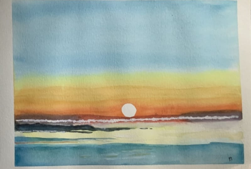
4. Arranging The Composition: So I'll show you the rough
guidelines of how to sketch out so that you can adapt
it to different ideas. Maybe you want to make the sun off-center
rather than the little. And you can use
different colors, different waves,
different sunset colors. Well, the most important
things is having the sunset, the Horizon Line dead straight. So once you've found where
roughly you want it to go, then I use a ruler just
to make sure 10 cm, that is, I'll just
mark that there. And 10 cm only have a side. And then maybe another 10
cm somewhere in the middle. And then you can use
a ruler just to make sure that Horizon Line is
pretty much dead straight. Then when it rough The Sun
roughly in the middle. So I'll just draw that
in that you can use a little template, a bottle cap. I don't know what that is.
I just found it one day. I think it was in the bottom
of a lag of something. The table or Schadt chair leg. We can freehand, draw a
circle. So it'd be the sun. You can add a few waves. You'll keep The Sky clear. Well, maybe you want to add
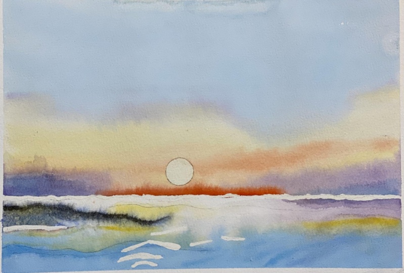
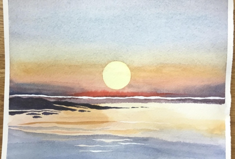
a few waves in the sky. Once I've sketched this out, I'll show you a few examples
I've done in my sketchbook. That's how simple it is
just to put the layout. So it's really focusing
about the paint rather than the drawing because it's a
very simple Drawing to do. For example, with this, you can have the
Sun to the side. You could do it
central like this, but in a square format
rather than a rectangle. You can even really play around with the different
layers and Sky. So the next thing
I'll show you is how to block out the sun because we're going
to paint over that circle, but reserve that white. So you can use masking
fluid if you have that. But a lot of people don't. If you're using masking fluid
to square root of bits in the middle and then use
the end of your brush, not the bristle side
just to drag it to the edge and then wait
for it to dry completely. But what I'm going to show you is how to do it
with masking tape. If you can use thicker
tape or swallow tape, I'll use this because
it just about fits on. And you can either
free doors circle on there with pencil, or you can just use
the same template. Use the pencil just to market in trying to do my best to show you on camera
as well as the I can see. Then just chip away at it. Don't do it in one single cut. Otherwise it won't be accurate. Just gently go around, rotating that ankle, trying not to completely
get rid of the sticky side, try to limit them out. You touch the sticky side. If you've got a good tape, then it won't matter so much. That tape I use is less Tessa. It's quite strong, Scott, nice stickiness to it. And it doesn't actually need
to be a perfect circle. Because if you think
about it when you, you've ever seen a sunrise
or seen photos of sunrise, the heat hays distorts
the sun anyway, it's never a clean
Sun at sunset, it's, you can see the
Ripples of the atmosphere. Now that I've cut that off, you just place that
in the middle. And you push down very hard. Use the back of your nail
to really brush and then you can use a rubber to rub away the pencil markings to make
sure it's nice and clean. Now I'm going to stick this to the painting board and
we'll start our painting
5. Preparing The Colours: So just before we
start the painting, I just wanted to
re-emphasize that that tape must be stuck down properly so that the
water does not get in a tool as well as that
will ruin the effect. And I'm using cotton base paper. Cotton base paper
is good because I know that when I pull the
tape away at the end, it won't tat if you use cheap paper yet to be
very capital that it doesn't tap into it bit by
bit of a lot of precaution. I've got my painting board on a tilt here so the water
or run down because 70% of this painting is just one wash that gradient
in different colors. I'm going to use my mop
brush for the main, main wash. You got to think about what goes
you want before you put brush to paper. I'm going to start off Blue and then have it merged to a Yellow. And then I'll orange down here. And I'm actually,
before we even do that, I'm just gonna put right here, it's going to lay down
some orange straightaway right on the horizon line
so that when we touch it, it can just bleed
up a little bit. So let's mix the colors. Mix the colors before we
start painting the sky. So of course, most of it will
be a nice Cerulean blue. Cerulean blue by Daniel Smith
is a nice pigment to have because the particles in it a nice and thick so
that when it dries, just a lovely texture to it. So I'm going to mix that
there should be enough Blue, little bit more water. Then. Bit of yellow ocher. As the sun comes down
with a bit of yellow in. Then coming towards the bottom, then that's just a pure orange. Red. There won't
be much of that. It's a little touch at the end. Thinking about how I'm going to do all this whilst
I'm mixing it. Then at the very bottom, we're going to have this
kind of almost a gray, a bluish, purplish gray. Just to make the
colours boost a bit. It's a very simple
painting actually. You just have to prepare it
in your mind's eye first. I'm just going to
wet the bottom first and add the reflection. I'm painting the
reflection first. Very light watercolour, you
tend to paint light to dark. I'm going to start
off from that light. Yellow here. Barely
perceivable state had of orange. Then I use a tissue just to
rub off the excess. There we go. Now it's time to paint the sky. I'm going to use this brush, but I'm going to have this secondary brush ready in case I need to add more pigment. So start off, I'm just
going to lightly wet paper
6. Painting The Sky: Splash bit of water
there, but that's okay. You can see how I deal with
that because issues happen. Useful to see how
people deal with them. That I'm just going
to let it be because I'll go over it again
with more colors later. So it shouldn't be
such a big deal. So I'm going to wet the
paper like this. Pure water. Begin with, keep
it nice and soft. I'm gonna go in
with this Cerulean. Dislike that. Maybe a bit of grain
to it at the top I know not green, bit of purple. And the top the very top. Wash down and lower Blue. Bit more blue. I think. You have to make
sure that it remains wet until you're
finished with it. More Blue. Even more Blake. See how it fades down. Pigments are drawn down and it starts to blend a bit
better, clean my brush. Now we're going to add the
yellow and slowly bring it up. Well that starts to dry. You can spread a bit with that. Why don't feel the need
to do that at this stage. At the moment, I'm quite
happy with where it is. More blue up there. I'm just going
back-and-forth a bit more, bit bolder. Now, as we get lower, just going back-and-forth,
back-and-forth. Now onto pure yellow here. Now a way you go over
the sunlight, this, you have to make sure
it's dark enough. Because if it's not dark enough, then the silhouette
won't be as strong. Now we're going to switch
to a smaller brush, smaller mop brush. I'm gonna go over this line. Remember activating that
red that we put in before. I'm going to try and
smooth that out a bit. So I have to re-wet it. Go over it again. That's okay. It is
seeing how it is. Sometimes it doesn't
work out the way you want to begin with. But as long as it stays a wet, it's malleable and you can Masker, that's a bit. Now, we're going to create this purple grayish color here. Make it quite watery. And I'm going to go in that course, a shocking thing to do. But I'm confident
it will create an, create a nice artistic effect. Getting a small brush, again, putting in another
bit of orange. They're thick orange just
to watch it bleed out. Wash that brush, then mix a bit more of
that grayish blue. It looks like I know
what I'm doing possibly. But really I'm just I'm kinda making us
laugh as I go along. I don't want to make it a
bit more Cerulean Blue. When it gets a bit
dry, likeness, a few hazy lines. If you want. Let's just leave it
as it is time being, it's easy to get away, get over the top of it, and end up ruining it. Once it dries. We'll add a
white line across there. But that's later
in the painting. Now, I'm gonna get a hairdryer
and completely dry it
7. Adding Some Rocks: Now it's completely dry. I'm going to add a
bit more yellow. They're set out that
yellow a bit more. I'm just feeling it at squat. I'm just making decisions based on what I feel I
want to express. And if it doesn't
work, it doesn't work. I have to record another
video and that's fine. And it's fine to take risks. So you can take the risk
with your painting as well if you want to. White where the sun is. Keypad illusion of the
sun coming down there. May be made that
had more orange. Then next I'm leaving, getting my number
eight round brush, synthetic round brush, and getting back to this purple, grayish grade down Purple color. A bit more Cerulean in there. Use this thick black pigment,
standard extra thick. And just creating and kind of the top sick bit of pigment that could imply Some
Rocks or something. Just the top there. Seemed my brush a bit. Then
go back and merge it down. A bit more purple in there. Just messing with
the pressures a bit. Bringing us out the handle, the one Matt, I want it to be darker. The very tip actually. Maybe another line here. Just keeping those lines parallel with the Horizon Line and the edges for border
though the paper. And a yellow line
here, fist fades out. Now I'm going to try that again.
8. The Horizon Line: Now, I don't think that's
even there, which is fine. So I'm just going to measure that 7 cm between
there and there. And it goes, it's not completely straight. So what I'm going to do is put a bit of
masking tape there and just soften it down. Straighten up the
edge by rubbing away. So you can use masking tape to interesting things like that. I like quite like the idea
of that purple there. So maybe I'll incorporate
it a bit more. A little bit like that. Maybe even bring back a bit of yellow to blend
into that Yellow. Dry it off again. I spilt a bit there. Take the tape off. Now
9. Adding Ripples: Pick up this Cerulean again. Maybe a bit of blue, purple, gray it down a bit more. Yeah. Then working from the
bottom-up this time, just going to just
below that yellow line. Create some Ripples there. Now we can go straight
and got a trick. So how we can come back later that maybe you want a line going across there, changed to a smaller brush. Bring a line across there. That, Let's try it. Painting that gap there a bit
10. Adding Highlights: Now taken my white white gouache or white watercolor paint. I'm just going to
go along here and repaint where the very end of the water meets the
beginning of the Sky. Using different
pressures on my brush to make the thicker, thinner. You can still see the pencil
line just about the nice. You can use this few
other places too. Maybe there, maybe
right underneath Sun. Here. We can even mix it. A bit of yellow. Do a few right here. More water to make, give the illusion
of some Ripples. Make this one a bit more orange. It's orange goes well
with the blue pop
11. Revealing The Sun: Okay, now, very carefully
with clean hands, I'm going to take off this
some prevail The Sun. Take off the rest of the tape. And it's always
magical taking off the tape because it leaves
such a pretty border. They have it. And
what you can do is explore different colors in different positions
like this Sun. It's slightly under the
Horizon on the level. And I painted the sun a little bit after I took off
the masking tape. So if you wanted to add
a bit of color, you can. I think it looks nice
and bold like that. But as you can see here, the water's green,
go orange-yellow. The Sky is quite similar. You can experiment with different
colors for the Ripples. This was a similar one to this. Just almost smallest Sky
size in a sketchbook. More gray Purple
Sky on that one. Then if you really
want to experiment with the masking tape, different levels, it can really let your
imagination go wild. Can add clouds, really have FUN, reward the pigment can do it. You can see how
the parallel lines really make it very bold. So I'd love to see your
different interpretations.
12. Final Thoughts: Welcome back and
congratulations on completing the class.
I hope you add Fun. And if you haven't already
given this painting and go, now's the time to put what
you've learned into action. We've explored a step-by-step
approach that served as a template for creating
your own unique paintings. Remember, you had
the freedom to alter the colors to your liking
wherever you prefer, vibrant and bolt hues or
soft and subtle tones. You'll palette is a reflection
of your personal style. You can also experiment with the position of the
Horizon Line which plays a crucial role in
establishing the composition. Or you'll see escapes.
Additionally, feel free to change the placement
and size of the sun, even allowing it to
sink below the horizon. To take it further,
try using masking tape to create clean lines
and build up layers. You could even transform your painting into a
serine night scene, substituting Sun with a moon and toning down the color
scheme to a deep dark blue. Remember, the beauty
of a seascape lies with its simplicity
and emotions it evokes. Remember, watercolour
painting is not just about technical skills, but also about expressing your creativity and
personal style. I encourage you to continue
exploring, experimenting, and pushing your
boundaries to create your own unique
watercolour masterpieces. As we come to the
end of this class, I hope you feel
more confident and comfortable with your
watercolour painting abilities. Practice is key when it comes
to improving your skills. So keep on painting
and experimenting. I want to express my gratitude for each and every one of you. Your passion for watercolour
painting is so inspiring. And I'm honored to
be your teacher. If you'd like feedback on your painting, I'd
love to give it. So please share your painting in the student projects
gallery down below. And I'll be sure to
respond. If you prefer. You can share it on Instagram. Tag me at will Elliston as
I would love to see it. Skillshare. I also love
seeing my students work. So tag them as well at Skillshare off to putting
so much effort into it. Why not share your creation? If you have any questions
or comments about today's class or want any specific advice
related to watercolour, please reach out to me in
the discussion section. You can also let me know about any subject wildlife will see need lightening
to do a class on. If you found this class useful, I'd really appreciate
getting your feedback on it. Reading your reviews fills
my heart with joy and helps me create the best
experience for my students. Lastly, please click
the follow button up top so you can follow
me on Skillshare. This means that you'll be
the first to know when I launch a new class
or post giveaways. I hope you learned
a lot and you're inspired to paint more in
this wonderful medium. I look forward to seeing you in future classes until next
time. Happy painting
 Will Elliston, Award-Winning Watercolour Artist