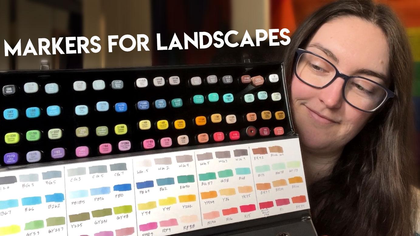
Transcripts
1. Intro: [MUSIC] In this class, you will learn some of
the basics of using alcohol markers to draw
expressive landscapes. This class is labeled as intermediate level
because it will be helpful to have a
basic understanding of light and color, as well as knowing how to draw simplified versions of rocks and trees before
you get started. If you need help
with any of that, I have a bunch of classes that
can help you get started. I'll share my knowledge
about marker supplies, including papers
and sketchbooks, different types of
markers and pens, and insights into why
I chose my supplies, which can help you make
informed decisions. We'll start with some
basic shapes and grayscale markers gradually
building up the complexity. I'll share lots of tips for layering and using markers
in a creative way. My broken color technique is ideal for expressive landscapes. Then we'll move
on to color using a limited palette until finally, we put it all together
in the final demo. As always, my goal
in teaching is to provide you with
repeatable strategies and knowledge that
will help you draw any subject and help you
reach that next level. Grab your supplies and
let's get started.
2. Supplies: My biggest piece of advice would be to get to
know your colors. Doing some kind of
swatch chart like this, it doesn't have
to be this fancy. I just printed out the touch twin color
chart and this is just like a quick reference so I know where I'm at with my
overall color palette. I also have dozens of these scrap pieces
of paper that'll test markers on
as I'm sketching. I'm constantly
comparing colors and different shades and stuff
which is very, very helpful. Speaking of paper, I think
one of the biggest lessons I learned straight away is that paper really does
make a difference. It's just like
watercolor if you use crappy paper or paper that
isn't meant for markers, you're going to struggle. I started out with a couple of different types of
sketchbooks and papers, just testing them out, lots of them were awful [LAUGHTER] and some
of them were okay. This is the Stillman
& Birn data series and it's super smooth, bright white paper and the markers actually
do pretty well on it. The only thing is I think
it absorbs a ton of ink and it's also
not bleed proof, so some of these you can see a lot of bleeding in
the back which is fine. Like I dedicated this
to markers and I knew probably wouldn't be able to paint on or draw
on both sides. But I am going
back in [LAUGHTER] and back filling some of the pages with something just so I feel like it's not a
total waste of space. I was starting to get
a bit worried that I was wasting a ton of ink because it just felt like
the paper was very thirsty. A lot of people gave me advice about different
papers to try. So I ended up getting the Spectrum Noir ultra
smooth card stock. It's a very very thick paper. I think, yeah, 100
pound cover weight. So nice thick sturdy
paper and the markers don't feel like they're just instantly sucked
into the paper. This swatch chart is actually
the Spectrum Noir paper and I find that the
colors are very vibrant. They don't feel dull at all. It is not bleed
proof which is fine, I don't really care about that
on loose sheets of paper. But most importantly, it
doesn't feel as thirsty. [LAUGHTER] The colors
are very vibrant. I just received this paper. This was another suggestion. The paper itself is a bit thinner and it's also
semi-transparent, so that's something
else to keep in mind. It's not quite as
bright white and when I tested it
out just a tiny bit the colors weren't
quite as vibrant. Then the other suggestion
that a lot of people had [LAUGHTER] were the
crescent render sketchbooks. I think they might do
loose sheets of paper as well but I got the sketchbooks. I started with this
little tiny one because I just
wanted no pressure being able to do
really tiny sketches and it has been awesome. I love this paper. [LAUGHTER] It's bleed proof
which for a sketchbook, I find extremely
useful because I like being able to use
both sides of the page. It doesn't feel as thirsty. The colors are super
bright on this paper, they don't like feather a lot and it just feels
really nice to draw on. I got the little one and then as soon as I'm done filling
this little guy, I have the slightly
bigger version, so this will be the next
sketchbook I tackle. [LAUGHTER] I'll be moving up in size and detail in my sketches
once I get to this one. Now, moving on to markers, if you've seen my other marker
videos you know that I'm obsessed with the ShinHan
touch twin markers, particularly the chisel tip. I don't really like
brush tips actually, it doesn't suit me. [LAUGHTER] I have 60 colors and I'm going to
set this aside just because it takes up a lot
of space and show you guys my favorite little travel case that I found for my markers. Well, this is actually
my sketching kit. I have a lot of
different kits or setups that I take outside with me but this one is awesome for markers. It holds quite a few, so I use blue pencils to sketch most of the
time but I also have a regular graphite pencil
and a white charcoal pencil. Then we have all of the markers, [NOISE] I could probably fit a few more markers in
here if it wasn't for all these extra
drawing utensils. [LAUGHTER] [NOISE] But it can easily fit this
many 2, 4, 6, 8, 10 markers which is a
pretty good selection, pretty good amount if you're sketching outside especially
for quick sketches. I just took these ones
recently to the coast. I did a little trip to a boat yard with
just a few markers, six markers, I did the sketch so I don't
even need a lot. Plenty of these sketches
use way less colors, [LAUGHTER] some
of them use a lot but what I do is I make
little color notes. So every single sketch, I can look back on and see exactly what colors I used
to create that to blend, to layer, because sometimes it's not super obvious afterwards. Definitely recommend whatever
sketchbook you have, just make little color notes on the side or somewhere nearby. Because that has been one of the most useful ways that I've
found to learn my markers, to learn my colors. If possible I recommend trying a bunch of different
shapes of markers, different types of markers, because we all know
about the Copics. They're very expensive but very, very nice, high-quality. I have a couple of
types of Copics. I have a Copic Ciao and a Copic sketch because I just wanted to try them
and feel them. [LAUGHTER] But the
more I use markers the more I just love the shape
of the ShinHan touch twin, that's the main
reason I chose these. Well, first of all, they are
refillable and I love that. I don't want to have a lot
of waste if I can help it. I don't know what it
is about this shape, it's very square but it feels really good in my
hand when I'm sketching, especially because
I tend to hold my utensils a little bit loose and when I'm
making fast quick marks, like I'm going like this [LAUGHTER] which may look
weird but my hand is moving across the marker
because it's got a bit of an edge to it because of that slightly
rectangular shape, I don't ever lose my grip. Whereas on a rounded marker, I don't know what it is, it slides a little bit
too easily in my hand. [LAUGHTER] It's
probably just my issue. Yeah. In terms of the tips, I said I like that
chiseled tips. They all have two tips. They have a brush version
and the chisel version. I don't know if you can take those out and replace them with whatever type of tip you want but I always go for
the chisel tips. The only reason I have
this brush version [LAUGHTER] is because
this color wasn't available in the chiseled tip at the time and I was
desperate for it. Anyways, so all of that is very personal and you're
going to have to try a lot of different
markers to see which one suits you because we all have different preferences
and our hands are different and the way we use
our tools are different, so you just got to try them. One thing I can definitely vouch for is the Copic multiliner. It's a felt tip pen, waterproof, and marker proof. Throughout my sketching
life I've moved away from the felt-tip pens because they just
wear down too fast, I guess I'm a little
tough on my pens. [LAUGHTER] I had to go through quite a lot of trial
and error to find one that works for me and it may also depend on what
paper you like to use. I'm not totally sure but this is the one that I've found that actually works on
pretty much everything. Alternatively you could
draw with a pencil like very light lines than user markers and then
do the ink on top. Sometimes I do that, I guess it depends
on what marker or what pens I have
with me at the time. Like this one for instance, I used the pen
afterwards and it was this one and sometimes I just really want to use
my favorite pens [LAUGHTER] and I
am just stubborn.
3. Class Project & Inspiration: For your class project, I want you to find a
sketchbook or make your own sketchbook out of any of your favorite marker papers, and take that thing
everywhere with you. Put some stickers on it, write your name in
it or whatever you want to do to get
excited about it, but try to remember
to keep it with you. Get a set of markers, a small set to start, which I'll talk about a
little bit during the demos, but just even 5-10 markers
and start experimenting. You can either pick a
theme like trees or doors [LAUGHTER] or birds
or whatever you want, but try lots of
different techniques. Try with or without pen, because that also changes
the look quite a lot. Try lots of different
limited palettes. Try layering lots of
different colors, and remember to always
keep color notes. This is again, just going to be so helpful in your journey. Remember that your
sketchbook is just for you. You don't have to
show it to anybody. You can see I use
quite a variety of techniques and maybe some
people would call it style like without
pen, with pen. Something like this,
which is extremely minimal to something like this, which is quite wild. [LAUGHTER] Once you start
your sketchbook and start getting into the
habit of taking it around town with
you or on trips, or even just in your backyard [LAUGHTER] start sketching
anything you see. In today's demos, I'm going
to show you how to draw different things like
rocks and trees. That's what I want you to
start with in your sketchbook. If you want, you can share your progress and post
in the class projects. But otherwise, just keep it for your own learning and
try to have fun with it. One thing I highly recommend
that you start with is grayscale or gray markers and there are lots
of different types. There's cool gray, warm
gray, green-gray, blue-gray. [LAUGHTER] I have a few of each, but the ones I fell in love with are the warm gray markers, especially for landscapes
because it's nice to have just that little bit of warmth underneath
some of the colors. It does obviously depend
on what you're sketching, but I got a selection
of the warm grays. Usually, the gray markers come in a wide range of shades. I didn't buy every single one because that was a bit overkill. I did buy six, which is a lot. [LAUGHTER] But this
pretty much gives me the full spectrum between
really light and really dark. I think one of the
benefits of starting with grayscale is that it takes away a lot of the pressure and the confusion that
can come with colors. Whereas just getting to
know markers in general, how to layer them,
how they work. It's so much easier
when you don't have to figure out what
colors to use. You just know you can work from light to dark
with the gray markers. You still can have very
interesting effects. Just because you aren't
using color doesn't mean that your sketch
is going to be boring. In fact, I really love how grayscale marker
sketches look. If you're limited
on funds or you just want to dip your
toes into markers, I recommend getting
a set of grayscales. Before we start, another thing
I want to mention is that it's really helpful to have
a tiny sketchbook like this. Because you're not feeling
pressured to draw big, really detailed drawings
that take really long time. These are tiny pages and they
can only fit so much data. It encourages you to work
small and work quickly. I think that's one of the best things you
can do for yourself at the beginning [LAUGHTER] stages is to do a ton of
different drawings. Little guys like this, there are only a couple inches by a couple of inches big, and you're going through
lots of different subjects, lots of different
marker combinations, color combinations. That I think is better for
learning your markers, getting the feel for how they
layer without the pressure of a big white page staring at you that you have
to fill with a lot of stuff. Here's an example of one of the pages that only
used two colors. The reason it works is because of light
[LAUGHTER] and shadow. I was studying how the light was falling
through the forest and I assigned two values to
the shadows and the light, white is the color of the paper. That's my brightest color,
that's my highlights. Blue is the shadow color. Anything that I thought would
be in shadow and yellow was just to indicate the foliage or mostly in the background, plus those colors really
play off of each other, and it just gives
it a bit of pop, a bit of warmth, and keeping that orangey, yellowy color in
the distant plane in the background is helpful because it makes it look
like the sun is pouring through those leaves and
they're really bright. That just adds to
the overall story. Again, you don't need
a ton of colors, you can just get a few. I do recommend getting a
few really light colors, and then you can slowly
add to your collection. [LAUGHTER] Something
you may find useful is to use your own drawings
as inspiration. For instance, this is just
a quick little spread. I was studying some trees, and that led to trying
it with markers. But I basically just copied the structure of this drawing. I chose two values the same
as I had for the drawing. The paper color was this lime green and this darker blue color
became this deep purple. I was able to get a feel
for how the markers work, as well as practicing light and shadow in the environment. It's a lot of fun to do that. In fact, one of the studies
I'm going to show you today, one of the demos was inspired by this recent gouache painting. This is the demo
we're going to do very simplified version just to get started with
layering color, and my subject is literally
outside my window. I can see it right now. [LAUGHTER] But I painted
it already with gouache. I already got a feel
for how to stylize it. You can use your own
paintings as inspiration. I did this watercolor
painting a year or two ago, and that was in the
back of my mind when I was drawing this very
simple landscape, minimal color palette again, just studying the shadows and
the light in the landscape, even using very simplified
pen sketches to get a feel for the light and
shadow of a object or a scene. Then assigning marker
colors to those values. Picking a couple high light
colors and a couple of shadow colors even though this isn't a direct
copy of this. But I used what I learned by doing this value study
in this drawing. In addition, you can use the classic technique
of doing master studies or finding paintings that you feel are super beautiful
and inspirational. Maybe it's a master
painter you look up to and copying what you see. This is purely
meant for learning. Don't do this, and then share it online and claim
it as your own. This is supposed
to be for learning and not infringing on
anyone's copyright. Let's take a look
at some examples. You can start off
by searching for impressionist
landscape or similar. You'll probably start seeing
a lot of things like this. Very colorful, loose
brushstroke style. If you scroll down, there's a wide variety of
what it can look like. Let's look at this
one because it's a little more simplified. If we take this as an example, when you are drawing
this with markers, you would probably choose maybe 5-6 colors
to represent this. You'd have one or
two sky colors, one or two tree colors, and maybe a yellow, the same colors you
used in the sky. Trees can be down
here and then a few purples or reds down here. You would practice layering
similar to what you see here. Basically applying
your own brushstrokes or marker strokes to
replicate what you see. But using this as
color inspiration, I feel like this is a
really great way to start exploring maybe unique
color combinations that you would
normally not think of. [LAUGHTER] To break free from the restrictions you may feel with only drawing
representational things. Especially if you've
searched for colorists, and there's a huge
variety of art out there that you could
use as inspiration, but something that already
is simplified into brushstrokes and not just a photorealistic thing
or a photograph. Copying those strokes onto
the paper with the markers. I feel like that
is probably one of the more useful things for
getting a good feel for it.
4. Your First Rock: When you sit down to sketch, I feel like it's
really good to do a quick little swatch
of whichever markers you're using for that
particular sketch session or that particular drawing, so I'll just usually
do something like this in order of value. [MUSIC] I mentioned I like
sketching with blue pencil. That's just my own thing,
my own preference. What I thought we
would start with is just a rock or some rocks. Keep it very simple. I mean, rocks can be
more complicated, but it's one of those subjects. For me, that's like a comfort
object and you can start with a very simplified shape and slowly build up the complexity, and it's also got really
obvious highlights in the shadow sides and it's
just a good marker subject. But first, I would start
with very basic shape. Start to round it out, maybe give it a
few imperfections. Then the final drawing, we would try to make it
as rock-like as possible. [MUSIC] The easiest thing I find is to start with
my lightest color, my lightest value
not only because that allows me to ease
into the drawing, and I think this might depend on the paper or what
markers we're using. If you start with your
darker colors and try to paint or draw
on top of that, you might contaminate
your lighter colors. It might pick up a bit of that darker ink into
the lighter marker. Because we're not
adding white lighter, like we're not adding
our lighter values like we would if
we were painting, this is more like
watercolor where we have the color of the paper
as our lightest value and we can use negative space if we want or work from lightest to darkest. If we use our basic
shapes to practice, this is just a really
easy way to warm up. Once again, it might
depend on the paper, but what I like
to do is slightly overlap my lines if
I'm trying to get a smooth fill because that
allows the ink to bleed together a little
bit and then it dries all in one solid color. If I work in solid marks
that don't overlap a lot, then you tend to get a
little more streaking. It's not super obvious
in the lighter color, s but you probably will notice
it in the darker colors. Let's say the light source is off to the right and it's
coming down this way. The top of my rock is
going to be pretty light. This right side will also
catch a bit of light, but it'll be a bit darker, especially on the underside so I may touch in a bit of that. This is slowly working down from the lightest
to the darkest. I've done these two shades, now I'm going to move down one. This side is going to get
the most amount of shadow, so I'll be filling in a bit more of that with the
darker shades as I go. [MUSIC] And I might also use the fine
tip to make little cracks or blemishes in the rock here and there so that
it's not perfect. [MUSIC] I can do that with any of the shades. It doesn't have to be
just the dark one. Just mess it up as
much as you want, but basically getting
the point across that it's not a
perfect little block sitting on the ground. It's got a bit of
dimension to it, it's got some cracks
and crevices, and I think rocks are really fun because they can
be very organic, they can be very geometric. Yeah, just depends on what
look you're going for.
5. Using Negative Space: Let's do an example
where the rock uses a bit of the white of the
paper as the highlight. In that case, we would have
to draw around the rock. I would probably
choose like a midtone, maybe four out of this range. That would be this one. [MUSIC] I'm just drawing around
the top edge of the rock. I'm not keeping it
super tidy or anything. That's what you'll probably
notice the most in my marker drawings is that I'm not obsessed with perfection. For me, it's more about
capturing shape and color notes, especially because I am
painting outside a lot, or drawing outside a lot, I work really quickly. To be honest, you just don't
have time to fuss with it. Now we have our environment
around the rock. So what I would
do is once again, give it a bit of color
on the highlight side, but I'm going to leave more
of the white showing through, so it'd be like
bright reflections. Then I will work
my way back down. [MUSIC] I gave the shape of
this rock a bit more variety. [LAUGHTER] I think the cool
thing about markers is that it really encourages
creative mark making, or at least for me, and I find the chunkiness of
the chisel tip to be conducive to that
expressive style. I guess if you prefer
the brush tips, you can get all sorts
of other effects but [MUSIC] I like using every part of the chisel tip. So obviously if you have
it flat against the paper, you'll get a big chunky mark. If you use the tip, you can get a bit of a skinnier. But if you use one of the
corners on the chisel tip, you can get a very fine mark, perfect for little cracks
and crevices and stuff. You can get a scratchy
look with that. [MUSIC] Once again, in this example, I'm trying to use
negative space. I'm not adding as much
darkness to the rock itself. [MUSIC] It really does depend
on your style. If you are trying to
go for hyper-realism, you'll really have
to practice how to blend from one
shade to the next, and that is going to change based on the markers
you're using, and the paper you're using. If you like the very
expressive style, then obviously you'll also
have to practice that. But I think you'll be practicing rather than trying to practice perfect
lines instead, you'll be focused more
on trusting yourself and drawing a little bit looser, knowing that you start off with a very messy looking drawing. Then eventually the
more you layer, the more you add a bit of color, you'll get to that final result, but it does require
a lot of trust. [MUSIC] But drawing skills play a huge role
so above all else, keep practicing your
drawing skills.
6. Layering Colors: For this example, I'm actually going to tint it slightly with some very light tones and then finish it with
the grayscale markers. This is something I like to do if I want to bring
just a tiny bit of color into it because rocks are actually quite reflective
or a lot of rocks are. You might get a bit of green
bouncing off if there's nearby grasses or a bit of blue or purple bouncing off
because of the atmosphere. Having really light versions of your favorite colors
will come in handy. As much variety as you can within a specific color range is useful in markers
because it's not like paint where you're
mixing all of your colors, it definitely doesn't
work the same. [LAUGHTER] You can't mix all your favorite greens just because you have
blue and yellow. You can mix some colors
but for the most part, especially these
really light versions, you need to start with
that color marker. I'm going to use this color
called dim green and I'm also going to add a bit of this purple color,
that dark blue light. The reason I would
start with my colors, first of all they're very light, so I don't want to
contaminate them by drawing over dark pigment and
then getting these dark. Also because I like to
know where my color is and so I don't cover it up completely with the grayscale. First, what I will do is visualize this rock
in the environment. If I'm using the same light
source from the top right, this will be more in highlight and I'm going to use a
bit more color on some of the reflective surfaces
like the top maybe part of the side and the green will
be underlaid anywhere, I think the grass
color is bouncing off, like mostly on the sides. I'll start with the grass just because it's the
lightest color I have. I only need a few
marks to make it work. I see, I accidentally grabbed
a slightly darker green. This is the really light
green that I was mentioning. Let's add some of that just
to get more of a tint. It's going to be a
very colorful rock. But this is the perfect
example of like learning, what happens when you don't know your colors or if you're not
really paying attention. How can you make it work? Can you make it work? Will you still make
it look like a rock? Yes, I believe you will in time. [MUSIC] Just a bit of color. Now, I'm going to
visually ignore that. I'm just going to
pretend this is a white piece of paper again and I'm going to work exactly the same way as I did before. Starting with my lighter values
and working my way down. I also want to point
out that some papers don't really allow
you to layer a ton. This is the Canson paper again and I think it
works rather well. [MUSIC] This is going to be a really good test for how well this paper layers
allows me to layer, because I'm using
quite a bit of ink. [MUSIC] You can see how the colors are still
showing through a bit. If you use more subtle
colors underneath, you'll have probably
more realistic result, but I personally love playing
with the vibrant colors. [MUSIC] Wow, this
is interesting. One thing I'm noticing
on this paper is that the more layers you add, the more your color bleeds into neighboring brushstrokes
or brushstrokes that you already laid down. It's not drawing the
same as it was before. I think that's because the paper is ultra saturated right now. There's a lot of pigment, the alcohol still hasn't dried, which is cool because you
can push it around a bit. You can use that
to your advantage. Let's add a bit of
shadow to the side just because I think that it
needs that to ground it. [MUSIC] A bit of the green. [NOISE] I think having fun with directional marks is also why I love the chisel tip, because it is harder to get
more subtle marks with it. From the very start, I'm forced to be a bit more creative and
the more you use it, the easier that becomes to know when to use
what types of marks. Obviously, it all depends
on what style you like. But there's a few examples of how I like to practice
with markers and layer and just using very
simplified shapes can be really helpful to get used
to your markers and you don't need a ton
of colors to get started.
7. Limited Palette: Let's draw a tree
so I can show you my technique for that
or my process for that. Once again, use a
very limited palette. We'll just go with five colors, and that will force us to choose or assign a
color to each value. As always, it's
very useful to do a little swatch example of each color before
you get started. I sometimes do it after, but this is really good
just as a reference, especially when you're first
getting used to your colors. For the tree trunk, my shadow colors are going
to be these two colors. So the deeper orangish
brown and the purple, which will be layering and for the foliage my shadow
color will be this one. The brighter colors, these two, the green and the orangey color, those are going to
be our highlights. We can also use the paper if we want as a
bit of highlight. I'm actually looking out
my window at a tree. It will be important
to already have a good understanding of how light interacts
with the environment, how light affects what we see. Studying from life is
really helpful for that. I recommend doing it
as often as you can. Practice sketching
just with pencils even to start getting familiar with how light
interacts with objects. Because before you can do this, you obviously need to know
how a highlight or a shadow would fall onto an object or be what it would look like on an object such as a tree trunk. I think that's why
I love markers so much because it's drawing, but we get the bonus, the fun of having color, and I know you can do
that with colored pencil, but colored pencils you need sharpeners and
sometimes other things. I just don't want
to fuss with that. For this little study, I will once again start
with my lighter colors. On the tree trunk, I will lay in my highlight tone and we need to know
where are light sources. I'm going to have these
trees be frontlit. Maybe it's off slightly
to the right just to have something, some direction. My brighter part of
the tree trunk will be on the right there. I will drag it over
to the shadow side. I'm keeping my marks a
little bit broken near the top because the foliage
might overlap that area. [MUSIC] That's it
for the first layer, and then for the highlight
areas of the foliage of the greenery, once again, we can have a bit of white if we want that
extra pop of color, but I'm going to try to
pretty much use this green. I'm using directional marks
because it's evergreen. We have needle-like foliage
instead of big leaves, and I think it just
helps visually. [MUSIC] Also doing it this way allows a bit of
that white to show through, and I can always go back in
and fill it in if I want to, but I like having it
at first just to get started and then I can decide
if I want to fill it in. Just the thing though
like with markers, you can't take it back. That mark is permanent. There's no erasing, which is good because I think you make a decision and
then you live with it. Sometimes you have to try
to fix it or adjust to it, but I think it
builds confidence. Right now this looks very rough, very childish, I guess you'd say just like solid colors
filling in our objects. We haven't even done the
background leaves yet, but we're waiting for a second. Now to give it a little
more dimension, some depth, we can start adding
our shadow colors, which in this case, I am going to be
starting with these two. This is the purple. I'm going to add that to
parts of the tree trunk. I'm also going to use a bit
of this darker orange on the tree trunks and some of the branches start
with the orange. In this case I'm going
to use very tiny lines. This is the bark. I'm just indicating
the bark texture with these long,
skinny, scratchy, vertical marks being
as random as I can. If I try to force it, it gets so obvious. Some areas maybe we'll
have a bit more, bit of a chunk of color. Now for the fun
part is starting to layer in the shadow tones. If the light is coming from
the front off to the right, the shadows will appear below the tree branches or the foliage and off
to this left side. [MUSIC] You might have some branch, or spotty light, or a broken light falling
across the tree trunk in there. I think I should have chosen a slightly darker shadow color but we'll just go with this. [MUSIC] Now for the darkest dark which is going to
bring this to life. Basically now be careful to draw around anything that's
a lighter tone, so your foreground,
your tree trunk, your foliage that sits
up here above the tree. [MUSIC] Have a bit of them underneath
here like that. Don't be afraid to
go back and forth between the lighter tones. You don't have to
just stick with that. [MUSIC] I add a bit of the shadow tone up here. It's almost as if we're getting little glimpses through
that bright foliage. It doesn't all have to be
one big chunk of brightness. This is the most simplified
version I can think of. A few colors just
to practice light. You could really use any
colors you want for this. You don't have to go
with the realistic ones because I feel like for
me it ends up being more about practicing capturing light and shadow effects
in the landscape. That's why I love
taking my markers out because I
already know I don't have enough colors to really capture ultrarealism when
I go out with my markers. I just don't have
a big enough case or the desire to bring a
massive amount of markers out. I'm like why not just
have fun with it? Practice observing light in the landscape and how it looks when it falls across the tree. To me, that's much more
fun and then I can play with color however
I want within that. I can also add a tiny
bit more dimension to this foliage up here by
adding some of this purple. [MUSIC] It's also fun I think using the
big chisel marker, like I tried to use the
chisel part as often as possible because it forces
me to get creative with it. I find different
ways of using it. I had discovered I can get
tiny, skinny scratchy marks. By using the corner, it doesn't always
have to be just like one big chunky mark. Well, it's easy to go overboard. What I like to do
is have a bunch of sketches that are
very minimal like this. It's a good reference like, this is what I can do with five colors working
really quickly, and then that can help inform the next sketch and the next, and the
next, and the next. It's one of those
things you have to exercise restraint because it is very tempting to just keep going and keep
going and filling it in, and before you know it, you've lost a bit of
that loose magic, and maybe even I'm gone too far and filled things that you should
have no filled in. I've done that plenty. I think that's why I really
love this tiny sketchbook because I don't feel bad about
leaving things unfinished. I can just work out an idea or practice a technique or
a color combination, and then move on. All of these are really
good to look back on and remind me of certain
things, certain techniques. It's just so useful.
8. Putting it all together: Just like with the rocks, we can also draw around our objects with
a darker color to make the drawing itself pop out of the page using the white
of the paper somehow. Let's do an example of a
little bush or a tree. This time I'm just going to grab whatever colors I feel
like in the moment. I'm not starting with a very
limited palette because this is how I would
normally work if I'm at home sketching. I have all of my
colors in front of me. So I'll just grab what
I want and run with it. But again, we're going to grab a background to our
subject, which is the tree. That means we have to
be very careful about drawing with a darker color
around our lighter areas. I'll start with my
lightest foliage so I know where it is and
I can work around it. In that case, I'm
going to go with the grasses and the
bushes down here, and then the tree foliage. I'm starting with a very
light green called dim green. Using little scratchy marks just to indicate
that this is grass, and then I'll use
bigger chunky marks on the tree to differentiate
it a little bit. I'm also having a bit of that white paper showing
through in this. As I go, I'll make a color note off to the right so that I know
which colors I used. [LAUGHTER] I'm going
to use a bright green for the brighter
parts of my tree. It's almost like a highlighter. It's so freaking bright, but I'm going to
cover a lot of it. I like it as an
undercolor, though, and mostly keeping this
towards the top parts of my fullest parts of the tree. I'm going to slowly
work my way down towards the darker parts. Now that I have my
brightest part, I'm going to switch to
slightly more muted version, or it's not muted, but it's
definitely not as bright, and start filing that in. I think one of the
best or easiest ways, if you are a watercolor painter, I think you'll have
an easier time with markers because you already understand the importance of
preserving your highlights. You have to work around
your highlights, your brightest parts
of your painting. I'm going down to a
more grayish-green. It's called Willow green. I love this green and it's not
quite my shadow color yet, but it's getting there. I'm focusing on the undersides
of some of my branches, trunks of leaves, like
clusters of leaves. I might also use this as the shadow color near
the tree in the ground. Now we're getting into
the deeper green, which is this, it's
called seaweed green. Filling in this shadow, I haven't done the
tree branch color yet. Sometimes you have holes in the leaf clusters
you can see through, so that's what I'm
working on now. Can always come
back and add more. I feel like sometimes it's
good to just start with. I'm going to be a
little bold and I'm going to use a
turquoise blue as my shadow color on the
tree because why not? [LAUGHTER] It'll just brighten
up those shadows a bit. Just like I did before on here, I'm laying that shadow color in. This one is more
obvious, I would say. I'm giving it a dabbled
light effect again, so a lot of broken marks. Then when I come back
in with my bark color, it's going to layer with that and give it
a grayish effect. I left a tiny bit
of white showing on the tree bark down here. For my rocks, I'm going
to go with warm gray, 0.5 and number 2. You can see how
quickly [LAUGHTER] your color palette can build up. So it's obviously a much more styled look if you go with
a very limited palette. But if you want
to either be more realistic or just have
more and more depth to it, using a wider range of values and colors is what
you'll end up doing. So now we have our highlights. Well, the tree is almost done, but we have enough
data to know where we should work around when
we add our background. For the background, you
can choose anything. You don't have to go
with realistic colors. I'll go with sky blue just because I'm going for a
little bit more realism here. It's still very stylized, but you get the idea. [LAUGHTER] Well, I used a lot of overlapping brushstrokes in
order to avoid streaking just to show that you can
do it, but it is tricky. You have to work very,
very fast as you saw and you have to
have the good paper. This is the Canson
XL marker paper, so it does allow you to get some really big areas of color without a
lot of streaking. Something I'm loving
more and more about it, and also what I did was I
made sure I didn't have any solid lines going over my grasses or around
the actual tree. So I tried to use zigzaggy marks [LAUGHTER] around those areas to give them a more jagged edge. Because once again,
the highlight or the lighter parts
of the drawing and the paper need to show through. You can even come back in
and make it more jagged, fill that in a bit. I'm going to add a bit more
depth inside the tree. Instead of filling in this
whole dark area again, I'm just going to fill
in a smaller section of it just to bring a bit more depth to the shadows. Because at the moment, it's a very pastel
painting or drawing, which is fine if you want that. But the wider you go with
your value structure, so darker darks and
lighter lights, the more life-like it will be. Let's see. Can we use any
of these colors to add a bit more dimension
to the tree trunk? I think I need to
add another tone. How about let's have
a bit of fun and go with lavender tree trunk. It is hard to add more detail
if you're working small. Let's go back to
this darker green and add some more
shadow on the grasses. Sometimes I also like to use horizontal strokes
for different surfaces. So perhaps I want
the grass down here, wow, straight line. Nope. Add a bit one
dimension to it. So adding that bright green, this is going to make
it a very grassy green. Taken it to the next level. But the underlying
horizontal strokes will show through
a little bit as the colors blend and just
add to that variety, which I think is really fun. But I left my brighter
parts of the grass here in the distance where
the sky comes down. It's grounded a bit more
when we add a bit more color and values to the grass itself because it was
very, very light before. Let's add a bit of
blue to these stones, maybe even tree trunk. Now you pretty much see my
entire method of practicing, how I layer and
how I think about color and using the markers. But it's always evolving every
time you sit down to draw, every time you go out to draw.
9. Final Thoughts: As I finish this drawing, I just want to share one
final thought and that is, please be patient
with your progress. For me, it was a bit
of a struggle at first because I already know
how to draw and paint, and I have a very
expressive painting style, so I just assumed my
marker drawings would be the same and I would just be able to jump right into it. But there's so much more that
goes into using markers as you've seen and it just
takes one drawing at a time. That's what I
encourage you to do. Sit down with your sketchbooks, start with one drawing
and keep going. I really hope you enjoyed this
class or found it useful. If you feel compelled, I would appreciate
it if you reviewed the class so other people
know what to expect. I hope to have more marker
classes in the future. If you decide to share any
of your marker drawings, you can use my hashtag,
#SARAHBURNSTUTOR. I would love to see
what you're working on. It's a lot of fun to be able to encourage each other
in this journey, but otherwise, take care everyone and I'll see
you all again soon. [MUSIC]
10. Bonus Demo: For those of you who
don't use YouTube, I thought it would
be useful to include this bonus demo that
I recently shared. I'll be sharing my top 5
tips for what has been helping me progress
in my marker journey. The first tip is probably pretty obvious and I know
I've said it before, but start with the
lightest values. The beautiful thing about
having a background in watercolor is that I'm very used to preserving
my highlights; meaning the color of the paper, the white of the paper
is my brightest bright. Same thing goes for markers. If you have a background
in watercolor, you probably are
already one step ahead. In addition, I find it really helpful to go a little
slower at first. Even if that means
I'm just making teeny tiny little marks
all over the drawing just to ease myself into it and slowly build up
that confidence, it does eventually get easier. I think in time and practice, you become a little bit more confident in your
choices and you can dive in a little bit
quicker with the darker colors. But if you're just starting out, I find that it's
helpful to go into it with a very gentle
mindset, a kind mindset. Just start slowly establishing some of your shapes
like I'm doing here and then slowly building
up the color and the depth. Something that can
help with this is if you go into it with
a limited palette. Instead of having every color
under the sun as an option, you go in with a highlight or a few highlight options and a few midtones and
a few shadows. That automatically takes away
some of the guesswork and you have more of a game plan about where
to go with your colors. Throughout the drawing,
you'll be layering colors and those will also lead to more color options so it already can feel
really complicated. [MUSIC] My second tip is to start getting familiar with the process of layering. Not only does this
affect the color, but it also changes
the whole mood of the drawing rather than just being singular colors
next to each other, which can work, but sometimes, it also can feel a bit flat. When you layer, you add a
lot more dimension to it. Just at a quick glance, the viewer's eye starts
to see a color story. I think it's actually magical when you start to get used to how certain colors layer and you plan ahead
for those things. Your limited palette
can sometimes result in a huge variety of
colors and you can get really beautiful
layered drawings. Some ways that I started to
get used to this are to use this little sketch
book to do lots and lots of experimenting. This little sketch book is
only 3 1/2 by 5 1/2 inches. What that means is that I don't
feel the pressure to fill big pages with huge
detailed layered drawings. I can do lots of
quick little studies, although the one I'm showing
you now is probably the most detailed and
the largest I've done in the whole
sketchbook so far. But by devoting this
tiny sketchbook to doing lots of quick
little studies, I've been able to get a better feel for how
the markers work, how they blend, how they layer, and it's actually helping me progress more quickly than if I only ever did big
detailed drawings. I do think there's
a lot of value in sitting down and
doing big studies, especially going more
detailed because it really forces you to practice different techniques
such as blending, which is a whole other thing. It's something that I'm
definitely not an expert in. I prefer a broken
color technique, which means there is a lot
of layering happening, but colors aren't always
blended smoothly together. There's a lot of
more stylized brush or mark-making happening. [MUSIC] My next tip
is about supplies. Once again, this might
be super obvious, but it was something that
I overlooked at first. I've talked about my marker
journey in another video. If you want to hear more of
an in-depth story about that, you can go watch it. But when I bought my
first set of markers, I hadn't ever even considered the fact that different
brands might have different qualities and
the different shapes of the markers might
be good or bad. I just bought whatever
was closest to me. [LAUGHTER] Over
time, I gave up on markers and came back to
them over and over again, and it wasn't until last year when I
bought my first set of ShinHan Touch Twin Markers where I really fell
in love with it. I realized, wow, the actual shape of the
marker makes a difference. This might sound strange to
some people, but honestly, when I switch between different types or different
shapes of markers, I feel such a drastic
difference in my ability to control the marker and my comfort over longer
sketch sessions. I also found such a
huge difference in experience between the
different types of nibs. Comparing the brush tips
versus the chisel tips, that made a huge difference
in my enjoyment factor. By now, I've tried so many different
brands, and shapes, and sizes that I really
know what I like. Now, I can just slowly build up my marker collection
and accumulate colors, although I feel like I'm done for a long time because
I have so many colors. Paper, of course, is going to make a
huge difference, which is another
thing I overlooked. I was using random sketchbooks and different papers
I already owned, never even considering
things like how much the paper absorbs ink or whether it's
going to cause the marker ink to feather
or give you crisp edges. There are actual marker
papers that make the experience so
much more enjoyable. Now that I have some
of those papers, I'm drawing way more often. It feels similar
to watercolor in that sense where the paper
makes such a difference. You don't want to be painting on paper that isn't
meant for watercolor. If you do, you are seriously
going to struggle. That's exactly how I felt when I switch to good paper
in my marker journey. [MUSIC] My next tip is for people who maybe
don't have a huge budget for markers or have never
used markers before, and that is to start with a
set of grayscale markers. I talked about this in the Skillshare class
that I mentioned, but it's something that is so valuable that I wish I
had started this way. I would've been way less intimidated and I think
it would've helped me get over some of those initial struggles that
I had because at first, I was figuring out how
to use the markers and how to pick colors
and layer colors, which was all super
overwhelming. I think that's a reason
I gave up so many times, but thankfully, I'm back at it and I'm enjoying
it more than ever. If you do decide to go with
some grayscale markers, there's a few different options, at least in the
brand that I like. There's cool gray,
warm gray, green gray, blue gray, and they all have a slightly different
tint to them. I personally fell
in love with warm gray because it just
has a bit more of an inviting look to it and it layers really well with
all of my other colors. If I'm using a
gray scale as like an undertone and then
I add colors on top, that warmth in the gray really plays nicely
in a landscape. Even though I do a lot
of color studies now, I also fall back on my grayscale markers in times where I'm just
really stressed out or anxious and I just
want to draw something without any pressure
or challenge of color. Because one thing I'm
noticing with markers is that the most important skill
is drawing, is rendering. Having a strong foundation in drawing makes your marker
drawings much better, which is pretty obvious. But when I want to take
away extra stress, I will just use
grayscale because it simplifies
everything a little more and it lets me practice rendering
light on my subject. [MUSIC] My final tip is a bit more
challenging to discuss, and that is style. First of all, if you
are watching this, especially all the
way to the end, I assume that you like more
stylized marker drawings. Something about that more
loose approach appeals to you. Maybe you either do it yourself or you want to be able to do it, and that only comes with time. Don't feel like when you first sit down to do your
first marker drawing, you need to accomplish this. You probably won't, I didn't. I have a very loose
painting style, so I actually
assumed straight off the bat that my marker
drawings would replicate that, and I was so wrong. [LAUGHTER] But it
did happen in time, and that is only because of that brush mileage as I
call it, or in this case, marker mileage,
putting the marker to the paper and making line
after line after line. But once you get more
and more familiar with different types
of marker techniques, those options open up to you. This goes back to the talk about supplies where if you're
using a brush tip, you're probably
going to end up with a very different look
versus a chisel tip. When I use my chisel tips, I'm forced to get
really creative with my marks because I
only have so many options. I can't just let
things naturally blend together quite as easily, but that's why I love them. They make the process
of working a little bit more loosely
and expressively, a little bit easier. Because it's such a bold mark, the second it hits the paper, I have to accept it. In that moment, I learned
from it and I move on. [MUSIC] The thing that's going to help you
progress the most will be continuing to grow
your drawing skills. In addition to your
marker practice, continue using pencils or pens or your favorite general
sketching tools. Observe from life or still-life
as often as possible. The more you grow your
observational skills, the better your marker
drawings will be.
 Sarah Burns, Painter / Photographer / Youtuber