Transcripts
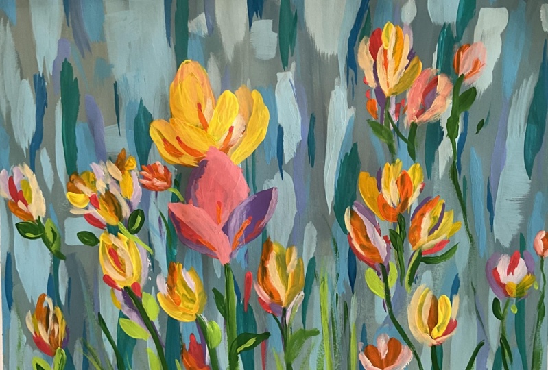
1. Welcome to another wonderful class : Me to a new floral
painting class where you will be learning how
to make this composition. Learning about brush
handling and playing with cotton candy inspired
colors makes this class wonderful and refreshing for someone who hasn't
painted before. Hi, my name is George, and I've been a professional
artist for over ten years. Six years ago, I've fallen
in love with teaching. Both online and in
person classes. Both with adults and children,
I've developed a very interesting and fun
way of teaching. That focuses first on having an engaging project and
a great experience. And all of that while
learning about composition, brush handling, color harmony, and everything that has
to do with painting. Painting doesn't
have to be hard. With the proper guidance
and encouragement, you will be amazed at
your own creation. Let's just jump into it.
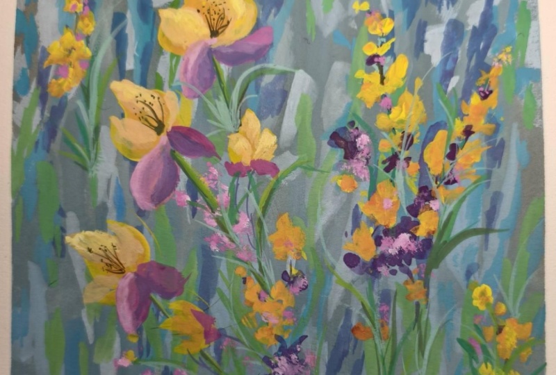
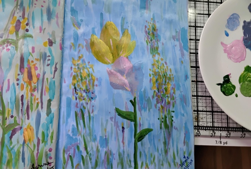
2. Materials needed: One welcome to another
abstract flower course. In this course, you
will need a canvas. This one is 30 by
40 centimeters. You can also use different
types of canvases. This design works on
any kind of canvas, round canvases,
square canvasses, big and small canvases. You will also need
a big flat brush, a medium flat brush, and a tiny flat brush. You will need a place
to mix colors, a plate. So paper towels, some water, and of course, acrylic paint. This is Amsterdam acrylic paint, titanium white.
Azo yellow medium. You can also use lemon yellow. This is just lemon yellow
with some red in it. This is carmine red, Burnt umber, also known as
brown, and brilliant blue. That's all you need
for this course.
3. Painterly blue: First step, you will need some
blue on the mixing plate. So brown, and a bit more white. With the big flat
brush and some water, let's mix a beautiful
grayish blue. Mixing in some brown
over the blue, and then taking some white. You are going to do a bit of
a interesting painting way. You're going to paint in
a very interesting way. After you mix the colors, you squeeze out the
paint off the brush. The way you're going
to paint this is gradually add and change
the colors as you go. There is no science. You just
have to cover the canvas. Don't worry. Just cover the canvas with however
color you have in the brush. And then add a bit of blue over it to change the color and pick up some more color
and start in another area. Notice how it's a bit more blue, just because you've added
this blue into the color. After that, take some white, mix it in over the color, and start changing
it once again, making this lighter
bluer version. Clean up the brush, press
it very hard on the canvas, so it cleans up so you can
cover the canvas faster. And then let's add some brown over the
color and some white. Brown and white. Maybe
a touch of blue, just edit it by accident. And let's add this
over on this side. You can also add it over the colors where
you see some white, and it will beautifully
mix on this canvas. You can also add
a bit more blue. Once you've added the blue and your brush has enough color, you can go at the top
and at the bottom, cleaning up the
brush on the canvas. All you're doing right now is cleaning up the
brush on the canvas. You can also add a bit of
brush direction by going on. And doing top to
bottom brush over, or even when you
mix a new color in. You can go and add it like this. Just going down and
up and down and up. You can also press and then go blend it in a bit
onto the canvas. So it has a bit of
direction going this way. Can go over the areas that have a bit of white still showing. Let's add a bit
more brown and some white and continue
onto the canvas. Every time you don't have
any color in the brush, add a different color over top. Don't change it too much. Try to stick to the
same color palette. So it's not very
apparent, the difference. This is one of the biggest
secrets in painting. It's called color diversity. It makes paintings look
much more complex than they are at a very little
cost for the painter. Add a bit of water,
a bit of white, add a bit of white on top
and start painting over. Notice how it's a bit more
light than usual. That's fine. And you can take some water and brush it over
the transitions. Once you've finished
with that color, add more blue back in again. You can go at the
top at the bottom, add some more brown,
and some white. To find a new color. Maybe it's too light discolor, so let's mix in
some blue back in again and changing it
makes it beautiful. You can take some water to lubricate the paint
and make it runny. Make it much more Mixable. You can add
a bit of water to make the paint a bit more
mixable on the canvas. Let's take some more white, mix it in with a bit
of blue and start continuing the canvas so
that you can cover it all. You can go as fast as you
want or as slow as you want. Pick up some water and
start to do a bit of a wash. You can also make it thicker by
grabbing some more paint, changing the color
to a bit of a blue, and continuing in this corner, adding some brown to it, and continuing to finish this
corner onto the left side. We need some more
white, and some blue. Maybe some brown as
well, a bit more. There is no science behind whatever you
are doing right now. It's just a broken color. That's how it's called.
It's called a broken color, and it makes everything
look much more complex. Our eyes see complexity
in this way, Much more pro eminent. Look at me using fancy words. So try to cover everything, add more blue or brown or white. It doesn't really matter
and continue to brush over. Now, it's time to look at
the canvas and notice if we have some areas that are still
showing through the color. Like, right over here, there is some white and over
here over in this area. You can also take some water. It makes it much
easier to get rid of those pesky little white
speckles of the canvas. And going in over here. Okay. And to give a
bit more direction, you can pick up some blue, add some water to it, a bit more generous with
the water this time and start to add some
up and down movements. Of this newly found
bluish color. It's not very intense, and it's super easy
to add it over, add a bit more water. Water is very important
here because it blends it in much nicer onto the canvas. If you waited for it to dry, you would not be able to
get this wonderful effect. You can also add some white. Don't forget about the water, and then go and brush
over some areas. And if you find some of those
white areas still visible, is focusing on covering them. Let's add some
more of this white over here and over here, maybe. And that's all you need
to do for this step, a beautiful, broken color.
4. Waterfall background: Last step, you've learned
about broken colors. Now you're going to
accentuate this broken color. You don't need to let it dry. In fact, it's a bit
better if it's not dry. If you still find some
areas that are uncovered, that there is bare canvas, like there was over here, and over here, you can
cover them right now. Now, let's do something
very interesting, which is move this towards a more interesting
color and contrast. Let's add some white over this, and this time, no
water is applied. Let's take some blue and make a lighter version of this color. Once you've taken
it on your brush, you can go onto the sides. We're going to focus on making bigger shapes at the top and smaller
shapes at the bottom. You can use the brush
on its side to make smaller lines like this
or on the flat edge, just like this to
create bigger ones. Notice how it's a broken shape. And the fact is that whenever you are
using broken shapes, they look better if
you follow this rule. There is a bit of a rule here. You can break it if you want, if you are rebellious, and the rule goes like this. Big. This is a big one. This is a medium one,
and this is a small one. Big, medium, small. That's how you create
organic shapes. Big, small, medium. And then going from the outside, that's another beautiful rule, going from the outside of
the Canvas and going down. You can go over it, once again, to create more textures. You can also dab with
your brush to create a bit more texture and another
smaller one next to it. Notice how much more
interesting they look. Remember, you can
make small shapes and small lines by going
with the brush like this. If you picked up so much of
the color from the canvas, you can remix it. This will create a new color. It doesn't have to be the same. Notice how it's a
bit more light. This will create even
more interesting colors. Let's now make a bigger
shape over here. Notice how because
the canvas is wet, you need to brush it
over a few times. And the edges are
not very sharp. The way you mitigate
that, oh, fancy words. You can go and add the brush on its side like this and
create some abstract, more defined outlines
of the shape. Let's go over on this
side and do the same. You pick up some
color from the plate, and then you can go
and add sharper edge. Notice how here, there isn't a sharper edge.
We can create it. You can basically
take some of this. You can also take a bit
of water if you want to be Water actually makes
it more blendable. But in this case, it will make a sharper edge, just because the color
will be able to add here to the canvas a bit faster. It will be a bit transparent
because it's more diluted. Notice how this edge over
here is very, very straight. We want to change it a bit
to make it more interesting. Let's go over here and add a different shape,
big, medium, small. Add some more color and
going down over here. Okay. You can go a bit
faster if you want. Try to ruin the painting a
bit by going a bit faster, and then you can
edit the shapes, just going a bit slower. So you're making
a bit of a chaos, a bit of play. Let's mix the color once again. And then you are
going over it to calm that interesting
shape that you've created, these icicles, and this is just to create
a beautiful background. As we go down, we can add
just a few more smaller, more transparent brush marks. You can also take some water and create these
interesting icicles. Just brush it over and
and make a big one, a smaller one, smaller ones, and even smaller ones. Try to not make them like
all on the same length, all on the same position, try to change them,
make one longer, some of them shorter, and to make them a
bit more dynamic. Okay. And also
focus on the areas that have bare canvas,
like over here. Okay. And that's all you
need to do for this step. Let's add a few more and
going from the bottom and from the side just so
we can complete this step. So until now, you've learned
about broken colors, how to create a lot
of diversity of color with just one
analogous color. This gray was a bluish gray, and you've played with the
same kind of colors in order to create a
beautiful abstract, brushed and blurry background. And then you've added
some contrast over top of it by making a lighter
color in order to create this wonderful
directional icicle inspired painting. This is just so you create contrast as well as
color diversity. You've learned a bit about brush direction
and about shapes. And also, you've understood the edges and how to
create more intact edges, which will be a lot more
important in future steps.
5. Adding vibrancy to the background: This next step, you will not need to let
the painting dry. You don't even need
to clean the brush. All you need is to
take some blue, mix it over this color. Over here, mix it thoroughly, and you will do the same thing, but a bit more sparingly
than with the white. You will just have to make
some beautiful shapes. Now you are going towards more vibrancy and darker colors. So you are creating a bit
more contrast because this blue is much more dark
if you squeeze your eyes, If your blue doesn't
look like this, because probably you
have ultramarine blue, just add a bit of white into
it and a touch of yellow, if just a smidge of yellow to make it more like this color. But it looks good even
with the ultramarine blue. Just have it a bit
more light because the ultramarine is
quite a bit more dark. And let's create some
of these icicles, some of this broken
contrast the color. Let's take some water now
and go over some areas. Notice how this area
is way to square. Try to find places where you can where you feel
like something is off. Like for instance, this. Let's add a shape over here. And like this is undefined, so let's cover it
going from the top. Notice how this is
big and now small. You can also break the idea
and have a big and small, not big medium,
small all the time, so it doesn't feel
too repetitive. It's kind of hard to make big medium, small
feel repetitive, but if you repeat
the same brush mark, then it's going to
be a bit more easy. So a good tip over
here is to rotate the brush so that it makes
a different brush mark. Going lower and creating smaller and more
long shapes. Okay. Can also clean up the brush
a bit if you want to create a more blurred kind of color and then go over it with some thicker color to create a more interesting idea and
interesting brush marks. Okay. Notice out,
there is a bit of a leftover middle of the canvas. If you don't have it,
it's not a problem. I've left it there
because that's where the flowers will be. But in case you did it, and you had some
lines over here, I'm going to make some as well. They are not needed, but I'm going to make
them just because maybe you didn't keep this because
I didn't mention it. So I'm making them now, so it's there as well. If you didn't make them,
you don't need to. Okay. And that's all for this step. In the next step, we're
going to add a bit of red, just a touch of
red and a touch of yellow to create some more
variety in the color.
6. Variety of color: Okay. And for this step. Let's add some yellow.
And then some red. It's important that you
start with the red, just because red goes a bit
better with the greens. It makes them less powerful. And purple is much closer. Well, the purple you're
going to mix is a bit closer to the color on the canvas,
because you have brown. Okay. Let's add a touch, a touch of red over
top of this color. And start with this
purplish color. Notice how the brush
is not cleaned. That's because you want to shift towards another color gradually. Okay. Let's add some water, so it makes it even
more transparent, so it doesn't go overboard
with the colors. Notice how it is much more dark and try to find just
a few spots here and there to create a big a medium shape,
and a small one. So medium, small, and then
big. And then continue. This time, if the
color is too dark, you don't want to
pick up more color. What you want to do
is actually pick up some water so that it
becomes more transparent. Notice how different it is. And this creates a more
coherent painting. If you picked up too
much water just like me, just take some color
that you mixed and add some smaller ones and
longer ones at the bottom, some smaller and,
finer brush marks. Okay. Now let's add
a bit more red. So we gradually go more purple. Let's start over here by
making some beautiful icicles. Maybe this one is too complex. If it's too complex, take
the color and go over it, and then you calm
it down that way. Let's also add some textures. And a small one. So it integrates better. Maybe we connect them. We can also think of
connecting shapes. Like, for instance, over here, we might feel the need to connect a bigger one,
just going down. So it transitions from discolor to discolor,
and then to this one. And maybe break this
very straight line, going from outside the canvas, and of course, let's
go on this side. You don't need to make a
lot of these purple marks. Just a few are enough. Let's add some at the bottom. And some in the middle in case you have some of these
colors in the middle. Okay. Perfect. And
now, for the greens, you actually need to brush
a bit the color out of the beautiful
painting device and add some blue and some yellow to create a very
turquoise green. In case it's not this light. You need to add a bit
of white into it. In fact, let's add a tiny bit of white so that you can create this turquoise from ultramarine if you don't have
the brilliant blue. Okay? Let's add it over here. And let's focus on
the middle part, this time and the lower
part with this color. So well, a bit outside
of the middle. And at the bottom, can let them a bit. You can let the colors
mix and merge a bit. It's not a big deal. So you're not very outside
of the color range. You're still using
analogous colors. So Colors will behave
very, very nicely. Notice how some of the marks are continuing
too much on this side. They are dragging
and making a line. So we are going to move them to a side to create a bit
more dynamic colors. And in the middle, taking some water and taking some more water to change the color and make
it more transparent. Okay. With the water, you can also press a bit harder so that you
pick up some of the colors that are still wet and mix them
with this color. You're basically
just getting rid of that color from the
brush on some areas, maybe focus in a bit more on the lower part just because green things tend
to be lower to the ground. Let's take some water and make
this a bit more coherent. And this is the time where
you can look around and notice if there are some
areas like this one, which is too undefined, take some water and
place it over it to make it a bit more blurry
and a bit more integrated. Okay. And as you go, you will notice that this water really makes everything
a bit more coherent. It blends them together. But don't go overboard
with the blending. You want some broken colors. Perfect. And that's all
you need for this step. You will need to
let the painting completely dry because you're going to change color palette. You're going to go in with
some more vibrant reds, yellows, and other
beautiful colors. Before you do that,
clean up the brush. You don't have to
clean it thoroughly, just mix it at the
bottom of the water, and then squeeze it
out a few times. And you can let
the painting dry. If you have a hair dryer, you can use the hair
dryer to dry it faster, but you still have to wait four or 5 minutes so the
water soaks in the canvas. Because if you get the
hair dryer just now, this water will just
spill everywhere. So let it dry almost the water, let it soak it in to the canvas, and then go with the hair dryer.
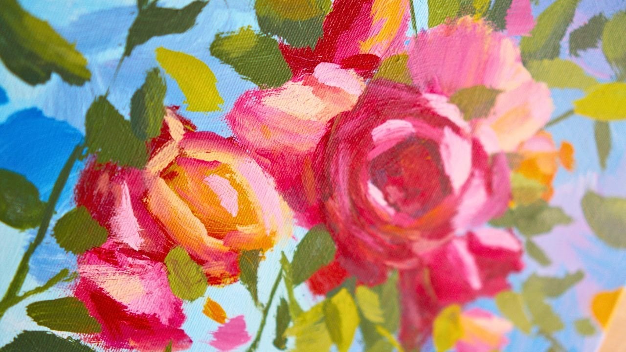
7. Let the flowers blossom: And for this step,
you are going to need a big flat
brush and some red, some yellow, and
a touch of white. Pick up a tiny bit of red and a lot more yellow to create
this wonderful orange color. It's a bit more towards the
orange than it's needed. So let's add a bit
more yellow to it. Once you've added the yellow, grab a tiny bit of water. To make it more pliable. And let's start making the same kind of
icicles on the side, just a few, but these icicles
are more like flower buds. You're starting to
get familiar with the mark making of
flowery structures. Once you are comfortable with this color and
how it behaves, you can start to make a bigger, beautiful flower right on to an area that is not so
busy with dark colors, like for instance, here, and this will be an ris. I think that's how it's
called the flower. Notice how it's very
much like a leaf. To make it more complex, you can add a bit
more yellow and start to add some complexity
onto the edge, making it more of a broken edge. So it's not so perfect. Once you've done that, you
can move further to making another beautiful petal
just onto the lower side. And this time it goes a bit
more towards the right side. So would notice how it's going a bit more
towards this side. I've picked up some more
yellow onto the brush, and you can do the same just to create a bit more
diversity of color. You can also add it
to the first color, and then going a bit
higher and creating another beautiful
petal just over here. And then closing it
just on an angle. You can blend a bit of
colors if you want. Now let's create some more. Let's grab some more yellow
and create some more colors, some more petals on top of these orange beautiful colors that you've created earlier, just to create a lot
more color of diversity, and you can create new
ones right next to the flower or onto
the right or left, onto the lower side. Just creating here and
there are some marks of this newly found
yellow orange. Don't worry if the color
is too transparent. We're going to add
another layer on top. And you can add a
few more textures. You can also just dab
with the brush on its side or with the corner
creating some nicer effects. And rotating the
brush so you can create different
types of marks so you don't repeat the same
brush stroke a few times. The more you rotate the brush, the easier it is to create different types of
flowery goodness. And once you've done that,
you can add a bit of red to the orange, creating a more red orange. This is the same concept you
used for the background. You're just changing it a bit. Let's add a bit more
yellow. It was too red. And now you can add some colors, some flowers, some dabs
of paint here and there. Starting to create some emerging
little areas of flowers. Notice how they are
packed together. If you don't have
them packed together, you can pack them
a bit more now. That's how flowers tend to be in the flower realm in nature. They tend to be a
bit more compact. Just add a few dabs of paint, and you can have some
runaways as well, just some flowers that are scattered in some other places. Once you do that, you can
add more yellow this time. And mix it and add it over top. Some areas creating more colors. More diversity. You can also make some bigger
ones if you want, as well as some small
ones next to the colors. Now that the flower is dry
or at a bit more sticky. We can add a second
layer of paint. You can also add
just yellow on top. And mix it a bit directly
onto the Canvas. You can also take
this opportunity to edit some of the edges if they are too
transparent or inexact. They need to be a
bit more crisp. Okay. I know it looks nothing
like an iris or a flower, but it will look much better once you add
more colors on top. And that's all you
need for this step.
8. Gorgeous, pink and purple: This next step, you
will need to clean the brush almost completely. Just squeeze the color
out and the water. Take some water and squeeze
the color once again. We have some orange on our
fingers, but that's fine. And now you're going to
go into the purples. Now, the purples, you
need red and blue. This time, you're going to use a dark purple that is
more towards the red. You've used one that is
more towards the blue. This time is going to be
one more towards the red. And we're going to focus
in on making some lines. You can even take the small brush and do
this with the small brush. It's a bit more easy. To make finer lines and dots. And if your brush is
not flexible like mine, you can take some water
and press it down until it has that flexibility
back again, so you can add some of these
beautiful lines and dots. And you can do the same
over on this side. Lines, dots, rotate a brush, and you can even connect
them to make a bigger shape. And over here, creating
some more scattered ones. And let's create
some more over here. Once you've created
these beautiful lines, you can take some white, not a lot of white
and a touch of red, and a small touch of blue. Let's put this brush down and create a
beautiful rosy color. It's a purple, but it
is a bit more white. You will notice it instantly. Once you add it, it will be very noticeable because you
don't have this color yet. So it's way more beautiful. And especially where you've put these lines, you can add it. Don't worry, if they
look like nothing yet, they are supposed to be flowers or stems or just
beautiful colors. Make some bigger ones, take some more and
make a smaller one. And as you go, you
can take some more red and a touch of white, and a touch more red to slowly move towards a more pinkish hue. Mix it thoroughly. And
then once you add it, it will look even
more beautiful. Just creating some
color diversity, small, big, even smaller. These colors will work
very good on the purple, as well as on the areas where
you've added these lines. So you've created
a bit of chaos. And then once you add
some more diversity, it calms it down and makes it more like a shape or a
flower or whatever else. So small dots and lines, and once you break
them down a bit, they start to create
this wonderful, colorful array of shapes. And you can go over
here and create more. And now let's add
just red on top of it on top of the pinkish hue. So it's changed and
different once again. It's the same concept. You are changing the hue
of the color to create, as you did with
the background of the whole entire painting. Let's go from the
outside a bit and create some more of these
beautiful lines. Now let's take some more white. Slowly inching the way you did with the background
to other colors. I added some white. Let's add some red and some more white and create a lighter
version of this color. That you can add here
and there to create this these small areas of newly
found beautiful color. Don't worry, if you have an area here where the difference in
the contrast is way too big, and it's not so organic. You can take some
more red and make the color the intermediary
color once again. And once you do, the shape
and the colors become more homogeneous. Funny words. And just touch it.
Move your hand, the more you move your
hand from place to place, the easier it is for your brain to not focus
too much on what you are doing and create a
bit more abstract shapes. Now, clean up the small
brush, just a tiny bit. So you can pick up
some of the yellow. And you can go
over some areas to create a bit of diversity
in hue as well. So you're going back
to the yellows. You don't need to pick
up so much paint. The small brush tends to
pick up a bit more paint, and it makes it a
bit more visible. Okay. And going in and
creating some yellow dots, just to mix and
match the colors, and you can also go
over some areas. Now that the flower
is a bit more dry. You can focus in a bit on it, but it's not yet completely dry. And that's all for this step. In the next step, we're going to make some bigger flowers, some bluish and
purplish flowers.
9. Bigger flowers: Okay, for this next step, you're going to need to add some of this pink to
the medium brush. We're going to actually create
a bit more of this pink. This is red and white, and it has a small
little touch of blue, a tiny bit, so it's
not so intense. So we hold the intensity back a bit and bring it in later. Notice how it cut it. Let's add a bit more red and mix it together. Mix it thoroughly. It's a bit muted just because
you want that vibrancy to go later on onto the canvas. Now, let's create one flower
just touching over this one. And it's a sample iris. You can create it just by making a beautiful rounded diamond. And then you can add this
interesting thing at the top, and then creating some more
edges that are different, just creating some curves
that go outside and in to change the shape and then accentuate the
fact that it goes down. Now, let's make this
a bit more intense by adding some more red into it. We've added some red just so
you can see the difference, and let's create another
one just over here. So you understand that these are two or two different petals, and you make that evident from the fact that you
changed the color. Same thing. It's a square that has a bit of
a rounded shape, and then going down this way. Perfect. Now going
and cleaning up the brush to make a
different type of color. Just taking some blue and white. Just a touch of that pink. Just a bit more. Okay. And we can make another beautiful
petal right next to this one. And this one is going
to be going this way. Right now, they feel
very, very different. But once you go back to
the pink or recreated and add it to the left
side of the petal, just like that, and maybe on the left side of
this one and take some water to blend in this newly found color,
and on this one. Perfect. Can go with some lines. If you have a bit more color in the brush with some water, you can go a bit lower to
add some of this pink, some places this newly
found bluish pink. Now let's go back to the blue, mix in that pink over top. Let's take some more white
and a touch of blue. Getting a lighter
version of that blue to add it over
top once again. And maybe we add it to this
side where there is water, so it mixes very well. And we can clean up
the brush in case you don't feel happy with the
shape of the ris over here. You can add some more color
to it and change the edge. And brush it over. Okay. Now, basically,
what you did over here is exactly the same
thing that you did over here, but on a bigger scale. So now you're going to need
to add some more textures and some more colors that are more intense and
more light or dark. In the next step, we're
going to do exactly that to add some more diversity
to the composition.
10. Turn on the lights: With a clean, small brush. Let's clean it a bit
more thoroughly, and the painting is almost dry
completely on these areas. We're going to take some white, mix it over the orange
with some yellow, creating a beautiful
yellow color that is a bit more towards the lighter side because
it has some white. Once you've mixed it thoroughly, you can go ahead and make some beautiful highlights,
maybe on this one. Just going and increasing
that contrast on the right side so that it's more apparent that this is
a different petal. Take a bit of water and mix it over so you can blend the
colors together a bit more. Take some more color and go on the right
side of this one, creating a beautiful
petal over here. With this color, you can also
add at the top over here. And maybe create a new
petal onto this side. Close by to the purple flower. Grab some more yellow just
to mix it and make it a bit more different where this
petal meets this one. Can also add some more
of this color at the top and Clean up the brush at the bottom of the
water container, add some water onto the
edges right over here. Just a tiny bit, and maybe over here, creating some
transparencies. The flowers don't need to be
perfectly opaque everywhere. Notice how it takes a lot more central stage once
it has that lighter color. And now let's bring some of this lighter color onto the areas where you
have yellow and orange just to
integrate that color a bit more and make it
more diverse everywhere. Let's make this
orange over here. Maybe we can add some yellow just to make
it less vibrant. And just a few touches changes
decomposition even more. You can even make a
bigger one if you want or stick to the small ones. It doesn't really
matter that much. Once you've done that, you
can clean up the small brush. And start to make a beautiful pink where you
have an area that is dry. You make a different,
beautiful pink. Know it seems like
I'm picking up some blue from the bottom, but it's really not. Let's add some more
white and some more red. It's completely dry
underneath the color. So that's why I can mix
it very well there. Now, let's go over on this side. Notice how this color is found, this lighter color is
found on the right side, as you did with
the other flower. Let's accentuate the fact that this petal goes
over the blue one. Okay. And let's
take some more of this color and slowly edit
the shape of the flower. Let's mix it once again because
it's not a lot of color, and we need a bit more. Let's squeeze that paint out of the brush so we can
thoroughly mix the color. Now going into the middle of the flower of the petal,
the middle petal. Don't worry about
the left side of this colorful, beautiful shape. You are going to add
some water later. Now, let's actually do that now. Let's clean up the
brush thoroughly and add a touch of water right where it
meets the other color. Okay. It looks like it's a
bit lighter, but it's not. It's going to dry
very transparent. Let's grab some white and find another area where we can mix
some blue with this white. It still has a bit of
pink into the brush. It doesn't really matter. And let's stick to
the right side. It needs to be a bit lighter, just so it differentiates itself from the
background even more. Just add it and
control that shape. Right up to the beautiful edge. Clean up the brush, take some
water after you've cleaned it and add it to
the intersection. If your water is, like mine, a bit too dirty, you can add just a
little bit and mix it or you can just
change it and that will make it more beautiful. Perfect. Now, here comes
the interesting part, cleaning up the brush,
squeezing all the color, taking some of this orange. If you don't have it, you
can create it by taking some red and some yellow. And let's make a stem, I don't know how it's called. Just a small little
thing over here, and another one over here, and maybe another
one just over here. Perfect. Now, if you
have this color, you might as well just
add some more red, yellowish color flowers, I mean. English, I cannot
English at this moment. Okay. Adding some more as we go, maybe on the lower side as well. And in between here and here, And cleaning up the brush, just because I forgot to add this stem with the
red, pinkish red. Let's add it over in
here and over in here. These are very simple shapes. They are just beautiful lines, and then they become a bit
shorter as you go lower. For the pink, it also
needs a highlight. The yellow being
more transparent, yellow colors are tend
to be more transparent. So they blend a bit more
into the background, as opposed to reds that
they are more opaque, so they need a bit of a
highlight at the top. Just so they become
more diverse. Okay? And if you feel like
you've messed it up a bit, what you can do is bring
even more color diversity by just adding a bit of water
just at the bottom of one. Notice how it creates You can
basically erase the color, and then going back and adding some of that yellow once again. And then you can basically
add the pink over once again. People don't understand
that painting can be very as long as
the paint is wet, you can scrape it off
and add it again. So, that's exactly
what we did here. And in case it's too transparent because the yellow flower
is not completely dry, so you might have scraped a
lot of paint by accident. You can just take a bit more
color and add it over top, just creating more diversity
and beautiful colors. Perfect. In the next step, which will be the last step, you are going to
create some leaves, some greener colors, just to create more diversity and make the composition
more beautiful.
11. Finishing touches, thank you!: For this next step, you don't need to let
the painting dry. All you need is
blue, some yellow. And after you've mixed this beautiful green,
don't start with it. Let's add some of this pink
in case you don't have it. Just mix it once again, just add a bit of
yellow and red. Let's add a bit more blue. It's a darker color. You've achieved a darker green, so you have two greens, and this will be a beautiful
start for your foliage. Take some water, so you can make them a bit
more transparent, and you can add some stems and some dots. With this color. Don't go overboard. Don't overcomplicate the
composition too much. This color is very good to
cut out some of the purples in case you have too much
of a big pile of purple. Like, for instance,
here, we can cut it off. And you can do one
of two things, either just add over
this green this color, or you can add some yellow, mix it in and start
diversifying that way. Who knew you are going to
learn about economics, a diverse portfolio
of stocks and bonds, just creating lines
and edges and dots and lines, again,
longer, shorter, can clean up the brush
just so you pick up some of that beautiful
green that you've created over here
and start adding some more greens now
that you have a place. Notice how it's quite watery. That's good because
you can create finer lines and more
transparent colors. So you can go even more vibrant in later brush marks. Okay. And let's go over here, creating this beautiful stem. You can go over the
stem of the flower, and you can add some yellow
to the color so that it's more intense and
create this beautiful stem. Maybe it has a beautiful
leaf over on this side. It's a very simple shape. It goes from the leaf. It has a little
bit of a curve and then it's shooting out, and then goes back
into the stem. You can repeat it, but smaller onto the left side. And then you can take more
yellow, add it over top. So you can add a little
bit of a highlight onto the right side of the
stem just in a few areas. With this newly found color. You can add some highlights
and some dots in some areas. Keeping that idea of big, medium, small in mind
a little bit as well. Even though it's a bit
smaller, like for instance, here, it's a big shape, a medium shape and
a small shape. So you can do the
same type of things, creating complexity
and variety of color. And let's create
some more colors and some more dots in the
areas that are too calm. And over here and over here, just move around and
find areas where you can put just a few dots and spaces. Going back to the darker
color, if you don't have it, it's just a dark green that
has a bit of red into it, just to add a little bit of a shadow onto the right side of this stem and maybe accentuate
this beautiful leaf, as well as this one, making
it a bit more opaque. Perfect. Now let's
make some more stems, taking some more water and
creating some longer stems, some more abstract ones, taking some yellow,
mixing it over. Let's grab some blue. And now some white, creating this very potent and light green
that is a bit more different than the one that was created by going
lighter with the yellow. Now this color will be
even more interesting. Notice how beautiful it is. Dots, lines, creating a bit
of chaos and complexity. You can even add a highlight
onto the leaf over here, and over onto the
stem in some areas. Can also drag it
with your finger to make it more blended. And let's add a few of these beautiful greens into the foliage and the
other flower spaces. Let's create more lines. And I think let's create some
bigger ones at the bottom, just to add a bit of complexity. Okay. And if you want, you can spend a bit more
time and create some darker, bigger ones just over at the bottom to
create even more of this idea that lower its just stems and flowers
and plants and at the top, the flowers and the sky or
whatever thing this is. And that's all for this course. You've played with the same
concepts from the start, where you've played with the color diversity by making
this blurry background, and then you played with more intense lighter
colors and darker colors to create contrast and
diversity of color as well. As contrast. And then you've played with the same
concept by making smaller shapes and
then making the colors more diverse towards the
purples and the greens. And you've made the same exact
thing on the big shapes. However, the big shapes
are much more coherent because they have
a little bit of a shadow side and a little
bit of a highlight side, as well as some little flower stems or however
they are called, as well as a bigger
stem with leaves. So it's creating this distance where this flower
becomes bigger, and these ones go
into the background, and they are closer together. These are concepts
that you can use from abstract paintings to
figurative paintings to portraits to anything, big, medium, small,
brush direction. You can use a darker color, a more transparent color, and then add highlights, add the opposite color
to create a lot of contrast and a lot
of color diversity. Then go into the greens, add some brush direction, making these stems and keeping everything abstract so that
the mind completes the image. We don't give all of the
detail to the viewer. We have to let them add
the detail in their mind. And you've learned how
to keep the colors clean by letting
them dry in between layers when you
changed from a blue to a yellow or keeping areas dry before you've added a
different type of color when you changed in the color
wheel from a blue to a pink, and you've played
around with that. You've also understood how colors behave when they
are wet, for instance, analogous colors like
blue, light blue, and then purples, and then a bit more towards the
turquoise green. These are called
analogous colors, and they are friends because
they play well together. They don't mix and match
into different types of muddy or chalky colors.
Thank you for watching. And if you are gracious enough, please leave a review so that other people know that this
course is for them as well. See you in the next one.
 George-Daniel Tudorache, Together we will create amazing things.