Transcripts
1. Welcome: Hello and welcome to a new and exciting
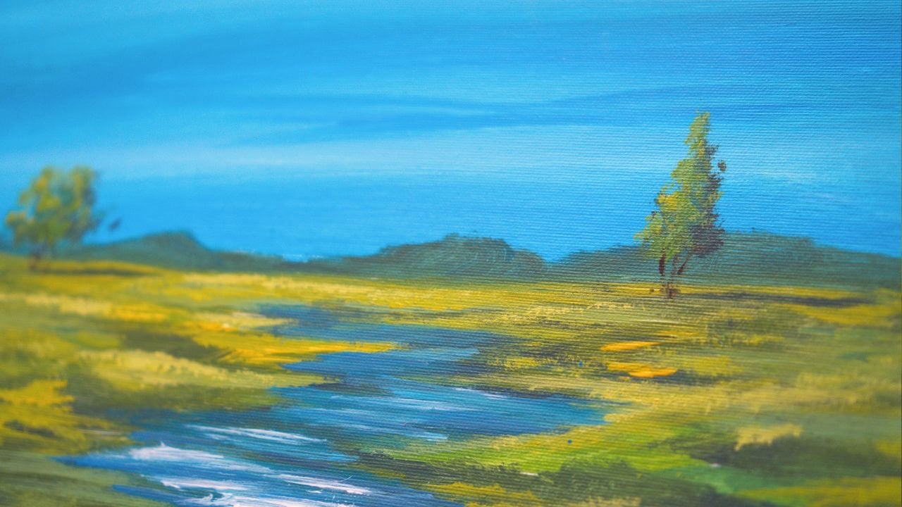
acrylic painting class. Today, you will be learning
about how to create this simple and yet
wonderful landscape. Hi, my name is
George, and I've been a professional artist
for over ten years. In the last six years, I've fallen in love
with teaching. Both online and in person classes with
adults and children, I've developed a
very interesting way of teaching that focuses on engaging and fun projects while learning the key
concepts of painting. If you have never
painted before, then this class is specifically
designed for beginners. It teaches you about color, composition, and, of course, to have fun while painting. With the proper guidance
and encouragement, learning about painting
doesn't have to be difficult. In fact, it can be a
joyous experience. Grab your brushes,
get your paint ready, and your canvas, and
let's just jump into it.
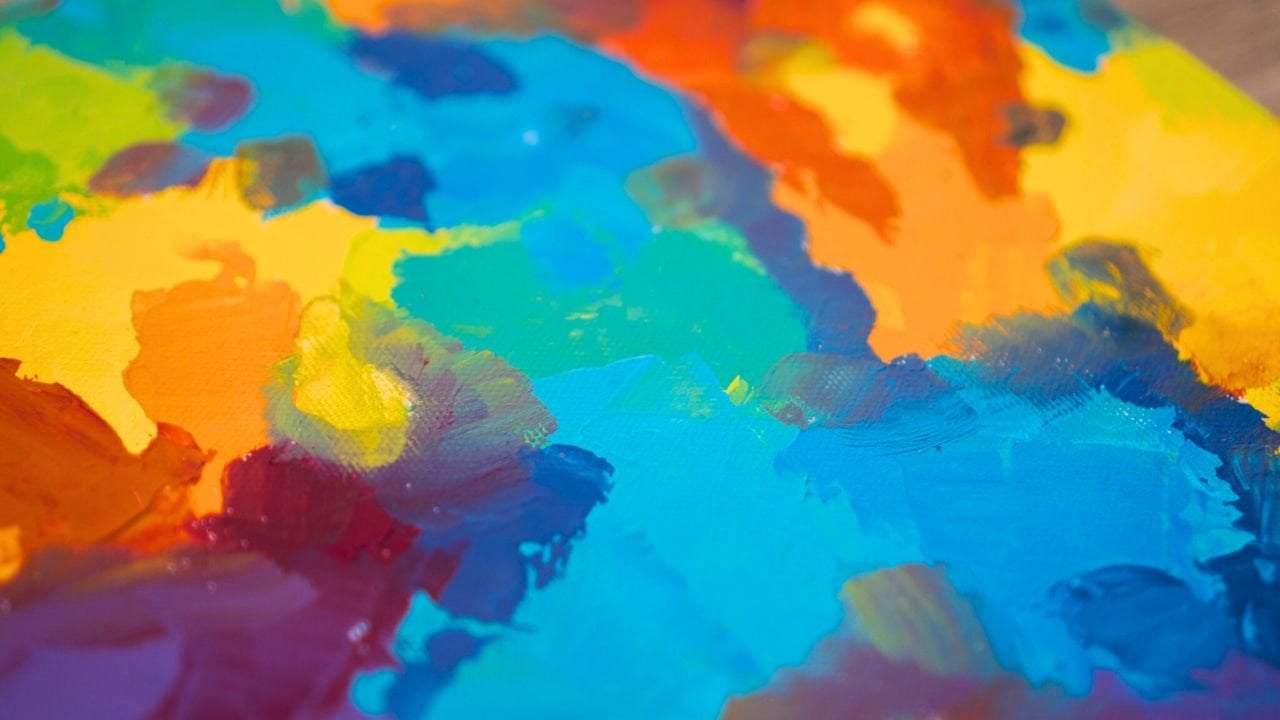
2. Materials needed : Hello, and welcome to
another beautiful course. In this course,
we will be making a beautiful landscape in
a very interesting way. It's a bit more abstract. For that, you will
need a canvas. This is 30 by 30 centimeters. You will need a plate
to mix the colors, some water to make the
color a bit more flowy. And you will need some napkins, also known as paper towels. You will also need
some acrylic paint. This is titanium white. You will need some yellow. This is Azo yellow medium. You can use lemon
yellow if you want. This is carmine red. And some brilliant blue. If you have ultramarine, just add a bit of white
to it and a bit of yellow to make it more
towards a brilliant blue. And that's all you need. Well, you also need two brushes, one big and one small. We are going to do 80%
of the painting with the big brush and use the small brush
just for some details.
3. Wash and sketch : This first step, you
will need to make a beautiful orange by adding some yellow to
the plate and some red. This will be an orange
wash. You might find it redundant to just do an
orange wash. You might think, What's the purpose of this
orange wash if it's going to be visible in the end, 5%. Well, in fact, it
has a great quality. This wash will add a bit more
complexity to the painting. It will make it seem as if you were doing a lot more
things in the background than just painting
a normal landscape, an abstract landscape. Notice how I'm taking
water and not paint. You should do the same.
This paint is quite watery. That's why it's called
the wash. Just so you Get rid of that
white of the canvas. The white of the canvas,
you can also change it. Then you add more
yellow if you want. It doesn't really matter if it's the same color everywhere. The white of the canvas,
it's very harsh, and it makes you paint way
darker or way lighter, depending on your affinities, how you perceive the white. Usually, it makes people paint a lot more light
than it should be. And that's why wash
like this of orange, it's very nice to have
a very intense color, especially if you're doing
something more abstract, just because it
looks intentional. So like they used to say, if you do a mistake,
at least do it boldly. I don't know if it's a saying
or I just invented it, but it sounds like
someone said it before. So let's focus on taking some more water and
spreading this color around. Okay. Just a bit more
going the other side. And just like this, if you go on an angle like this and cover it
all on an angle, which feels the most
comfortable, at the end, you can start to add
some diagonals at the bottom to create sort
of like a landscape sketch. You can also take a bit
more color to add it, add a few lines going in opposite directions to give
yourself a bit of a sketch. Just a few lines,
one going this way, maybe another one over here, maybe another one over here. And then if you take
a bit more color, you can also add some beautiful
trees over on this side. And some over here. So you can use this wash
as a sketch as well. Can also accentuate some more of the lines by adding
a bit more red to them and going in maybe making some trees
over here a bit longer, and by long, I mean
tall and going in. Notice how it fades out
a bit. That is fine. If you can still see it by the
end of the drying session, then you know you've
done a good job. So let's pick up
some of the hairs. If you have some
hairs on the canvas, you can pick them up by
basically drying the brush and then picking them up like this as if you are picking
something with a spoon. And then you can brush
it over once again to notice and see if
you have more hairs. And that's all you have
to do for this step. Don't worry if the canvas is the water and the
sketches going everywhere. If you still see about 60, 50% of it, just the gist of
everything, then that's fine. Notice how there
is a lot of sky. That's for a good reason because you want to kind of cheat at this painting and
make it easier on yourself by painting a lot
of sky because in real life, we see much more sky if we
look into the distance, And if we look up, there is a lot of sky as well. So we are mimicking that. And let's pick up some
of the last hairs. One over here, and we're going to wait for it to
dry completely. If you have a hair dryer,
you can dry it faster, but you need to still let it dry for a few minutes
before you go in with the hair dryer because certain spots might spill
in different directions.
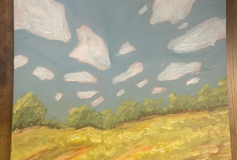
4. Baby blue clouds: That the painting is dry almost completely on the top
side, as you can see, there are some spots
over here that are wet, but we're not going to work
on the lower part as much. You can add some blue
to the mixing plate. And close to double
the amount of white. So a lot more white than blue. You need to clean
up the pig brush, squeeze that paint out, keep the napkins for later. And then you want to add about half of the pile
of white and a touch of blue to the white in order to create this
wonderful light baby blue. Even if you have a bit of orange still
showing, that's fine. If I squeeze quite a lot, there is a bit of orange, but due to the fact
that this is a lot of white and a lot of pigment, it's not really consequential. Now, let's start by
making some clouds. You want these clouds
to not be puffy. You want them to
be more angular, and you want to
focus in on making bigger clouds at the top. And as you go lower, you make them smaller. Notice that in order to create and get rid of
some of that orange, you need quite a lot of paint. So you need to mix
up some paint, quite a large amount to be able to better cover
some of this paint. You might also see that
there are some areas that you can go
in on the edge of the cloud and create
some newly found edges. So more complexity. Take your time and develop these shapes
to be interesting. You don't need
them to be clouds. You can actually
make them a bit more angular and a bit more
straight than you might think. This will add to the
style of painting, almost touching these two
shapes and then going lower. And as we go lower, we can even make smaller clouds. Okay. Go a bit slower if you want more control
and you want to think more about how
to do these shapes. A good rule is to
think about big, medium, small when it
comes to the edges. So you have a big, a
medium, and then a small. Same here, big, medium,
and then small. And you are doing that, and then you can also add some small runaway
clouds maybe over here, and you can use the
corner of the brush to create smaller versions
of these clouds. If you don't have enough paint, you can always add more
white on top of it. Don't worry too much
about the fact that it has changed. That
is actually good. You can also add
it and take some more of this paint from
the first cloud or the second one and continue to add smaller and smaller
clouds as you go down. Notice how they have a
direction going this way, a direction going this way, and you can accentuate that
in the lower clouds as well. Okay. Now, this is called
positive painting, not just because it's fun, but also because
you are painting over something that is not
going to end up the same way. Negative painting is when
you go into the shape, and that's exactly
what we're going to do in the next step.
5. Sky Blue: For this next step, you
don't need to let it dry. You're just going to be
careful and mix in a blue. Just add the white
that you have on the brush into the blue. Maybe add a bit more
from the pile and mix it to have enough color so that you can cover
the whole canvas, the whole rest of the canvas. You don't need to be perfect.
That's the goal here. You put in the orange
just so you can now add a bit of
water and go a bit faster because that orange
will look very nice in areas where you don't
cover it completely. You can even leave onto the blue itself some
areas like this. It will really lighten
up and make that color way more contrasting. Just go in and mix
in the colors and continue lower and in
between the clouds. You can go over the
clouds a bit if you want, sometimes or by accident. The goal here is to cover
the orange with this color. Notice how interesting
that orange looks. And how it creates this
interesting style and bold lights, bold orangy colors. Sometimes you can intentionally
go closer to the cloud, and this is called
negative painting and edit some of the shape by going
inside of the shape. Maybe you want to cut this
corner over here and make the cloud a bit more
angular and going lower, picking up some more color. Going in this corner to go a bit and cover it all completely. Notice how interesting
that orange looks now. If you were to paint
over the white, that orange would not
be there, of course, and it will not make this wonderful play in between colors
because it's orange. It contrasts very well
with the white of the clouds as well as
with the blue of the sky. Now going and creating
some more lines over here. Going in between
these two clouds, you don't need to be perfect. Just pick up some more
color and do a few lines. Even if you go into the
clouds, that's fine. Just mix it very well
in certain areas, pick some of that color up. And continue this filling in. It feels like painting
for children, painting by numbers because you've made the clouds
and now you're going in. If you feel like there
is too much orange, you can just cut it
out in some places, not everywhere, in some
interesting places, add a bit more water, so you can make
the color be more runny and fluid let's
finish up these clouds. The smaller clouds are a bit more hard to cover
because you have to be a bit more attentive to the fact that
they are smaller. Smaller things require
more attention, not only in painting,
but in life as well. Okay, and finishing up
this one underneath. That's why it's good
to have a flat brush. You can go very narrow and very thick at the same time without pressing too much on the brush. Notice what a beautiful
sky has been created. And because you made
the clouds first, now you can edit some
of them by making them smaller or by changing
the shape of them, like for instance, here,
let's divide it a bit more. And that cloud has become
much more interesting. By adding on top. A rule for clouds is that
they are a bit more flat on the bottom and a bit
more angular at the top. They have more of these shapes like mountains or however
you want to call them. Be careful not to go too
much inside of the cloud. And if you do, just mix that color back into the pile that you have on your plate and
continue the painting. You can go a bit lower than
the sketch because you want the sky to be behind the
trees that you are painting. So a bit lower. You can
also brush it like this. It doesn't need to
be perfectly blue, but near the edge of where
you want your trees to be, you need to have
them quite opaque. But then lower, you can
go a bit like this, and it doesn't really matter
if it's transparent or not. You can create opacity by
going twice over an area. Like, for instance, here, if I go twice over
it with my brush, you can see how it
gets into the pores, so you don't always
have to add more color. You can just move it
around so it gets into those nooks and crannies. Okay, let's go a bit lower here. And look at that. Almost half
of the painting is done. Well, more than half of
the painting is done. Now it's the time to look
back just a little bit and see if you can edit some of
these clouds a bit more. If you can edit
some of the shapes, maybe some of these shapes
are not truly needed. Like, for instance, there
should be a runaway cloud here, and this should be a bit
more narrow and flat. So flatter on the bottom and more voluminous on the
top, if that's a word. Okay. And once you do that, you can go ahead and go straight into the next step because you don't
need to let it dry. You are going to add
a few more trees.
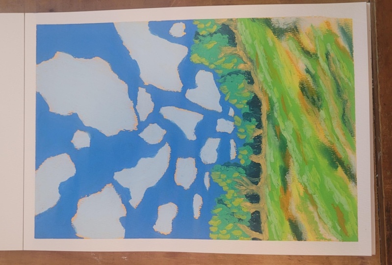
6. Simple little trees : For this next step, you don't need to
wash the brush. All you need is some blue, some yellow, make a
beautiful, nice green. Add a touch of red
into it to make it darker and a bit more blue, and a bit more white,
just so you have enough color onto the plate. Okay. And let's go
and make some trees. These trees are easy to make. You just dab your
corner of the brush, then you rotate the
brush and go further. Try not to clump them up
all in the same spot, move to another area, and then you can connect them by making smaller trees
at the bottom. So you have these
valleys of trees, so they are not all
just a big bush. Just let the direction
and let the paint. If you see more
transparent paint, you can go a bit higher, so you avoid that transparency. And let's move further along. So you also create
more organic shapes. If you move from there to there, you stop creating
these similar trees just by moving a bit. And notice how these ones are
all almost the same height. Let's make this one,
which is a bit higher, just a bit taller. Don't worry about the
small little orange bits. That's fine. Take a bit of yellow and add
it over top of this color. Once you've added that yellow, you can take a bit
of this white. You can take straight up white or just a bit of white with
some blue. It doesn't matter. It's light enough that it
will create the same effect. So add more yellow and
more white until you have a color that is quite light. And let's add this as
a highlight towards the left hand side of the trees. You can also add them
into the middle, but stick towards the left side. Left side of the
trees over here, imagine these are
just clumps of trees or individual trees that
have a left side on its own. So we don't paint everything
just here because this is a row of trees. And if we think of
it as just one tree, then we would paint
highlights just here. But if we think of them
as being multiple trees, you can add more highlights
onto the left side. Okay. And that's
all for this step. Let's go over what
you've learned. You've learned how to
do a beautiful wash and a sketch with the wash. And
then the purpose of that wash is to give you some complexity and make the painting a bit
more stylistic. And then you've
learned how to make clouds without thinking
of them as clouds, make them very
interesting and abstract. And then you've learned
how to make and use the background over top to
create this negative painting. Then you've learned how to make these trees by using the
corner of the brush, as well as adding some
highlights onto the left of them because we decided that the light comes
from the left side.
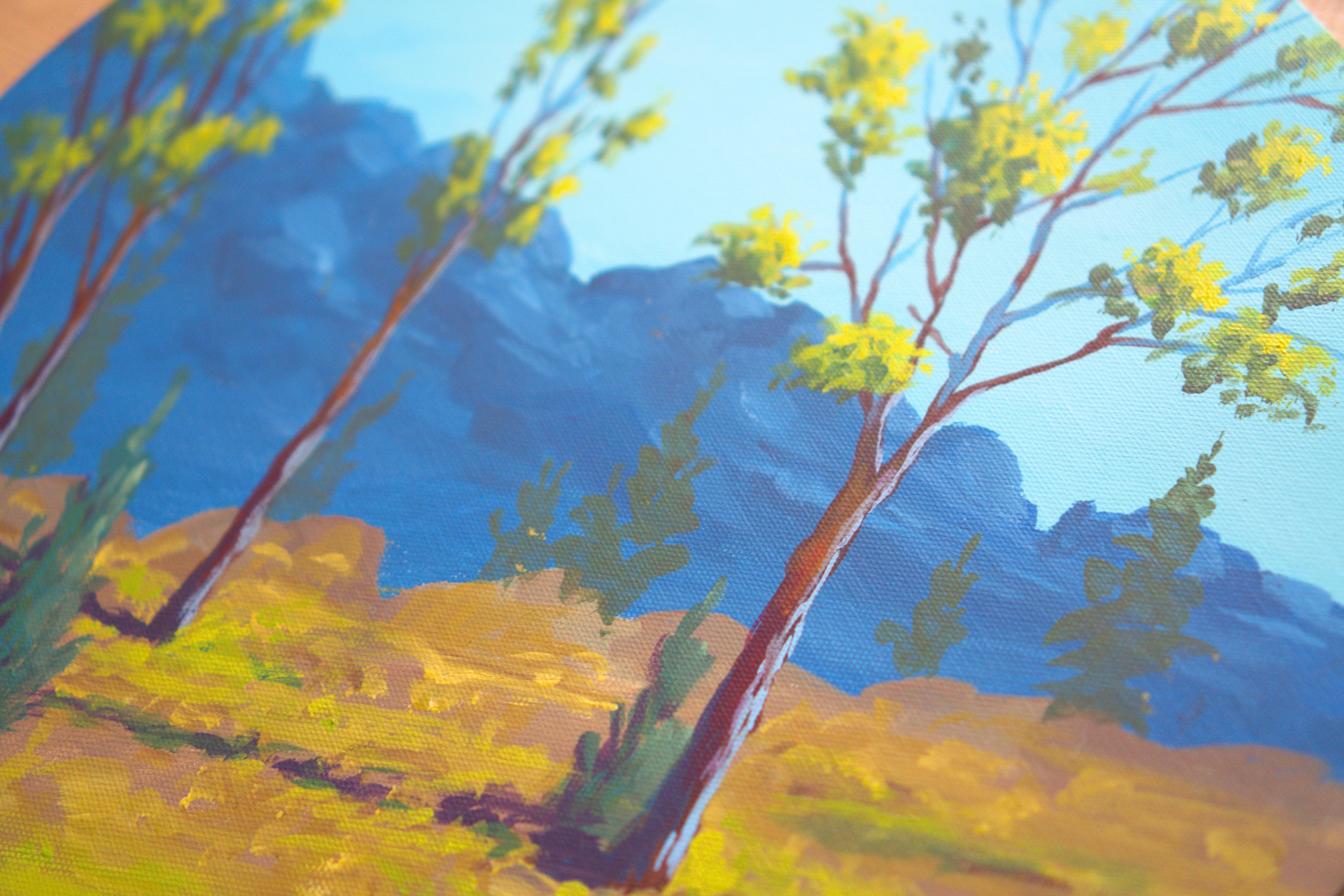
7. Dynamic separation: For this beautiful next step, you will need just the
same color that you had for your highlights. If you don't have it,
you can create it by adding some yellow, some blue, and a touch of white and
create this wonderful green and making a diagonal going this way and another one
just going this way. You can make them very fast
and loose and then add some texture to it just on
the top, like the clouds. Usually, things tend to have especially nature things
tend to be flatter on the bottom and have a bit more interesting
textures on the top. To create a bit of separation in between this hill and the trees, you can clean the brush, just squeeze the color out. You don't need to
clean it perfectly. Take some blue and some red, making a beautiful purple
that is a bit more towards the blue side and
take some yellow. And create a dark
version of green. This darker green can go in between the orange
bits and the trees. You can also think of them as darker bushes or trees and
darker shadow grounds. You can take some
water and mix it in. I will blend a bit
better with the trees. You can make individual trees or you can make
lines that go lower. The orange doesn't need
to be covered completely. The orange is actually
leaving and notice how it creates this wonderful
color and patch of light. In fact, let's clean up take some water and
clean up the brush on an old beautiful napkin. And let's take the small brush. Let's take some white. Find a space for some yellow. Mix it in with the white. You can pick up some
red if you want. I picked up by accident some
orange water from here, but it doesn't seem to
change the color that much. And now you can add
some of this light over top right
close to the edge, creating these wonderful
lines of color. You can also change
the color if you want to a bit more yellow. If it's too white,
mine was too white. And if you pick up
some of the green, that's fine because it's
creating colour diversity. And color diversity
is exactly what you want because it makes
paintings better. You can also take
this color and mix it over the green just
to get rid of it. Okay. And after
you've done that, pick up some of this darker
green, clean up the brush, and pick up some of
this darker green, and you can start to add some interesting textures
into the greens and in between them and creating some shadows
and interesting shapes. Notice how it changes
the whole composition, leaving in that orange
because it looks wonderful. We can even mix in a darker orange by
making some red and some yellow over here
in this middle spot. Maybe that's too much red. But if you mix it thoroughly, even though it's
almost the same color as in the beginning because
it's not watered down, it creates sort
of like a shadow. Notice how it creates
this wonderful shadow. You can add it over
the green parts or over the orange parts, line dots and textures. Creating this interesting color. Don't go overboard with it. It's fine if you just add it. Just makes it more interesting. Can go into the
greens if you want to add more warmth to them. And of course, let's clean up the brush and take some white. Just some white, and a
touch of this orange, creating a very, very
light, sandy color. Okay. Mix it thoroughly, and then you can add it
close to the top over here, maybe into the oranges. And notice that it's a bit
lighter than the background. That is just so you
integrate the background even more the orange background. And just creating it and adding it to the top over here
and at the bottom. And after you did that, you can go back to
some green and add it in between these making it. Let's add a bit more yellow
to this green and create a beautiful
noticeable line Okay. And I think that's
all for this step. And the next step,
we're just gonna add a few more highlights
onto the grass, and that's gonna be
it for the course.
8. Highlights and textures Thank You: Okay. I know it
was a bit chaotic, but it doesn't really matter because this is a more
abstract landscape. So no matter how you
did these lines, if you just add a bit of color
variety, just some darks, some warmth, some
lighter colors, and you kept some of the
orange of the background, it will look amazing. Don't stress too much
over the details. This is an abstract landscape. It's meant to be easy to make. Let's mix in some light green over here in this spot by adding some more
yellow and some more white. And once you have this color, take a bit of paste. And start layering it in
over top of this line, especially on the left side of the hill. Maybe
this is a hill. Look at how beautiful it looks. Add some texture. You can add some texture into the
middle of the hill as well. Now for this other one, let's add some texture, especially on the left of these bushes and on
the left of the hill. Some of the bottom
of these lines, you can blend them and
add texture on top. Just add some texture. Now, let's make a lighter
version of this color by adding some more yellow
and some more white. Okay, even more white. Just a lighter version to add just a few dabs
over on this side, creating a more textured. Remember that you need
to roll the brush a bit. Let's add more yellow
to change the color. Notice how thick this paint is. That's because you want a bit of texture in your paintings. Okay. And let's add
some of this here. And let's blend it in a bit. Perfect. Let's add
some more texture over here and clean up the brush. And in this step, you've
learned that usually things in nature
tend to be textured at the top and blended
at the bottom. And you've learned
that you can add some diagonals to make the
composition a bit more interesting as well as
keep some of the wash still visible to create
this interesting effect. Maybe this is a
hill over some sand or just an abstract landscape. You've learned how to make
some shadow separation in between the hills and the middle ground and also the background
by making textures, by making small little
details that separate the background from the
other side of the painting. And of course, you've
learned how to paint 70% of the painting in a very fast manner
and leave the rest as details to make the
painting more interesting. Thank you for watching. And
if you are gracious enough, please leave a review for other people to know that this course is for them as well. See you in the next one.
 George-Daniel Tudorache, Together we will create amazing things.