Transcripts
1. Welcome: To a new acrylic
landscape painting class. Today, you will be
exploring how to make this wonderful
mountain landscape. You understand key concepts
such as composition, brush handling, and, of
course, color harmony. Hi, my name is
George, and I've been a professional artist
for over ten years. In the last six years, I've developed a very
interesting way of teaching. By teaching both online and in person classes with
adults and children, I've learned the
importance of having an engaging project. Learning about
painting doesn't have to be difficult or cumbersome. It can be a joyous,
wonderful experience. And with the proper
guidance and encouragement, you will be amazed at
your own creation. If you have never
painted before, then this is the class for you. It takes you from zero
to hero in no time. A while learning the most
important concepts in painting. So let's jump into it.
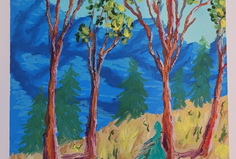
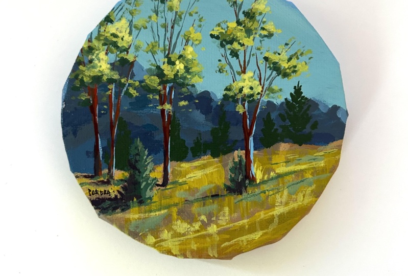
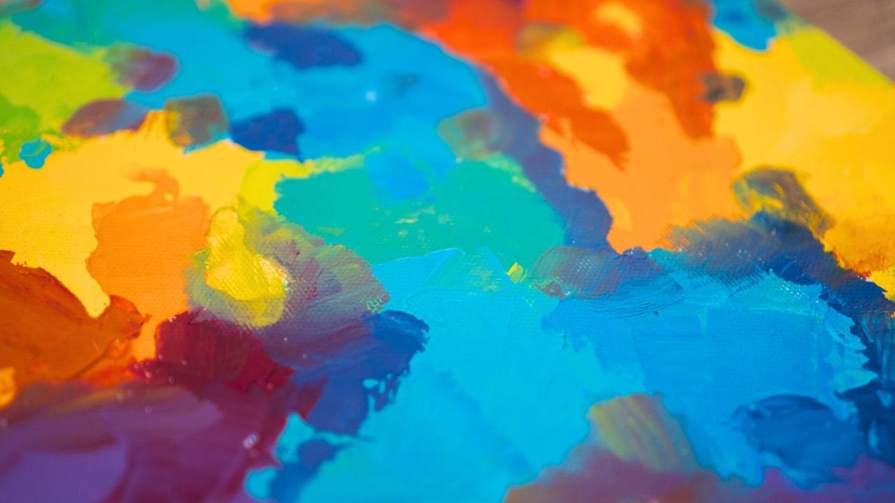
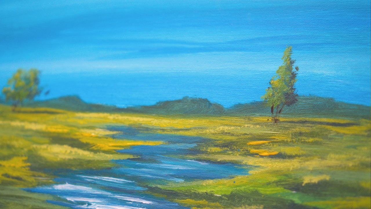
2. Materials needed: We welcome to another
beautiful course. Today we will be
painting a landscape, a beautiful mountain landscape. It will have something like
this, some mountains here, and another tree
line going this way, and then some trees
just going up, a beautiful blue sky. For this painting,
you will need, of course, some brushes, a big flat brush, a medium flat brush, and a small flat brush. You will need some water,
a water container, a mixing plate. A canvas. You don't need to
have a round canvas. You can do this composition on a square or a
rectangular canvas. No problem. Just think of a circle just as a
square without corners. Just extend the composition, and it will be super easy to fit on a square or a
rectangular canvas. For the paints, you will
need acrylic paint. This is titanium white from
Amsterdam acrylic paints. This is carmine red. This is Azo yellow medium. If you have some other
yellow, that's fine. This is just a lemon yellow
with some red in it. You will need some burnt umber, also known as brown. You will also need
some brilliant blue.
3. Wet colors are Fun: First step, you'll add some
blue to the mixing plate. A touch of yellow. Too much yellow. That's fine. You'll also need some white. Let's add some white over here. And with a big flat
brush or a sponge, you can also use a sponge. They are very nice to cover
everything very fast. But I'll be using a
brush just because it's easier and it
leaves more paint. Just a touch of water to make the paint more easily mixable. So blue. Never go inside
one color or the other. Just add color and find another space where you can mix these colors together. You will be making a
beautiful light blue with a touch of yellow, just to make it more different. To have this different
type of hue, a bit more turquoise, a touch of yellow is enough
to make this wonderful color. You don't need to
mix it that well. Let's add some waters just
so it flows much faster. And we're going to imagine just some mountains just going down like
this on a diagonal, you don't need to
focus too much on the outline of the mountains. What you have to do is to
cover everything very fast. If your paint is a
bit more transparent, some cheap paints are a lot more transparent than
Amsterdam paints. You shouldn't add too
much water to them. So in this first step, you will just have to cover on a diagonal the whole entire
top side of the canvas. Notice how beautiful this
baby blue turquoise is. Let's add more color. Don't be afraid to
put a lot of color. You can always take
it off like this. And add it to the plate. It's better to have more color than to
have less color mixed. For instance, now I really
need to mix more color. Even though this is
a bit more yellow, we can add some blue
to it and mix it in to the color
that's already on the canvas to fill in all of
the top side of the canvas. You might think this is
unfixable mistake, but it's not. We take some napkins. I forgot to mention in the
materials the napkins. We take some napkins. You erase some of that color. Keep the napkin for later and mix the color a bit
more attentively. So let's not rush
to mix this color. Let's make it perfectly
nice and beautiful. It was too yellow. It
had too much yellow. Notice how it's a bit more
light. It doesn't matter. Just add a touch of water if
the color is not running, if it's too pasty. This will add more variety. You don't want a
flat color on this. You want more of a broken color. Notice how I'm leaving some
of that space at the bottom, just to create this effect, I'm moving color around
from here to here, I can actually add
some more blue to accentuate that idea that
this color is broken. It's very easy to do. You're just layering some color on top of each other and then focus a bit on the marks
that are just like this. You need to gently brush over them so you don't
have any ridges and any textures because the sky
is usually very soft and pale and it doesn't have a lot of textures because
it's in the background. The background
shouldn't have a lot of textures because textures make things seem more
close to the viewer. Now adding a bit more
blue just to create some ideas of clouds
or shadows in the sky. Just going with some
more colors around. You can also go the
other way and add some white to this newly found
blue and add some of this white around just
going with motions like this and creating
sort of like a ridge, just blending the colors
together on the canvas, makes a very soft transition People are afraid of wet colors, but if they are in
the same family, if they are analogous
colors like blue and lighter
blue, darker blue, or a color that
is close to blue, such as green or purple, they blend together quite well, so you don't really need to have any problems with these colors. And that's all for
this beautiful step.
4. Diagonal mountains: Painting is not dry, but that's fine
because you're going to work on this area. You're going to paint
on this area over here. But for that, you will need
to clean up the brush just at the bottom of the
water container, just swirl it around so that it doesn't have
a lot of paint in it, and then squeeze the water out. For this step, you
will need some red, just a tiny bit of red
to make a darker blue. I know what you
might be thinking. Blue and red make purple. Depending on the quantity, they don't always make purple. Sometimes they make darker blue. Like, for instance,
in this case, even though it is moving
towards a purple, it's just a darker blue. Let's add a touch of yellow. Actually, let's add some brown. We don't want it
to be so vibrant. So brown will just cut
some of that vibrancy out. Yeah. Nice. I stuck
it to the wall. So let's add some brown. It will make it even darker. And now let's add a
touch of this white. Might be thinking, Why white? Well, we've changed the hue
to make this darker blue to have it less noticeable
that it's from the tube. Notice how much more
different it is. That's exactly what
we wanted to achieve. Now we're going to
focus on the mountains. These mountains need
to be different because if you make them like pyramids, this is what kids do. They make all their mountains like pyramids, just like this. Those are not mountains. You need variety. So notice how if I change
this to be like that, and this one, they look
more like mountains. Don't be afraid to go inside
of the color of the sky. And this will go the
opposite direction like this so that it creates some
more dynamic composition. It creates more interesting
things in the composition. For the bottom of the Canvas, right over here, you can just
fill in, take some water. Doesn't really matter if
it's a bit transparent. Just take some water, go over the areas that have
a lot of paint and cover everything that's
at the bottom over here. They might seem like clouds
because they are very round. But as soon as you start
to add more mountains, they will seem like real
interesting mountains. Notice how you need
to really focus on making some different
marks all the time. If you make them like steps,
that's not very good. Notice how this is just
going in one direction. There is a bit of
canvas open here, so that's the perfect
opportunity to go with a mountain the
opposite direction. And you can complicate it by just adding
with the corner of the brush some beautiful
different marks. Now going further,
let's add some water. In case you don't
have a lot of paint, you can just recreate it by
taking some blue, some brown. You don't need the red anymore
because we've added brown. Brown is basically
just a dark orange. That's exactly what it is, actually, a dark orange. It's an orange that
has black in it. So notice how it's
a bit different. It needs a bit more
blue, but that's fine. If you add some water, you can just add it, and it will not seem as
if it's too different. And it creates more
color variety. So let's focus on this edge. Creating small ridges and
some interesting shapes. You can also go and add
slowly just a ridge, just a edge that goes
another direction. You can also calm things down. And like, for instance, here, it's too flat. Let's add some
mountain over here. And then over here, maybe we want to calm it a
bit down and here as well. Let's go ahead and move on to the left side of the canvas
continuing with the edge. Make big mountains, not tall, but big as if it's a mountain that has a similar shape,
a continuous shape. And then you can add a
smaller one next to it. So that it creates
more diversity. Diversity of shape and color is exactly what makes a
painting look amazing. Let's add some water and add
more paint to the bottom, creating a more coherent color. Let's take some
more of this color and continue with the mountains. So small, big. Now, big, small, continuing to create
just making some more edges. Notice how beautiful they look. Let's fill in this color
and take some more. I accidentally took some yellow, but that's fine. Go inside. Don't worry if you take some of the sky color, it's
perfectly natural. Okay, now let's
focus on making all of the canvas disappear
where the mountains are. I believe that this line
is not steep enough. So let's take some water
and make it more steep. So it goes this way, a bit more pronounced. Doesn't need to be line. It can be squiggly and rugged because you're going to add the ground in the next step. Let's focus again
on the ridge making this barely touching
the canvas and getting rid of those white
dots of the canvas and also of the textures that have been created
onto the canvas. Okay, now I'm noticing, let's edit a bit of the shape. Now I'm noticing that
this is way too straight. Notice that nothing is going up. Like, for instance,
here, there is a big valley here.
There is another one. So we cannot create a valley, but we can create a taller
mountain, like here. Notice the difference. It seems more interesting
and it's not a pyramid. It created this
interesting feeling. Created this
interesting mountain. We can also go and make this one taller and more interesting. Now, you can see how it's
like a calligraphic thing, like a line that goes and creates interesting
abstract shapes. Let's cover this white spot and then clean up the brush on the lower side over here so that you don't
have a lot of water in it. And that's all for this step.
5. Shadow and light on the mountains: Now let's add some
more brown and a bit of blue to make some
shadows onto the mountains. You might seem overwhelmed
by the idea of shadows. What are those? It's
such a weird term. It's such an interesting
term. It's undefined. If we say shadows, it's very difficult to
understand what we are doing. So let's simplify that idea
and just make small patterns, especially onto the left
hand side of the mountains, going to the left of the tall mountains and
adding a direction. Notice how they are
continuing this way. Not all of them, just
continuing on some. So we're establishing
the fact that the light comes from the right because the shadows are onto the left. So let's add some
of this shadow. And now going lower, we're going to continue a bit
lower with the shadows and then change direction for
them to go to the other side. This will create a bit of a
bit more dynamic composition. It goes this way this time. And it's less visible. It's more blended because the color underneath
is still wet. It allows you to blend some of this color
going to the left. And if you want, and if you see the color and the shadow lets you go with a
more bald shadow, you can also do that. So play in between the softer shadows and
the darker shadows. And also, don't repeat the same thing over
and over again. Break it a bit,
make it more fuzzy. Make it more interesting. Let's add some more over here. And you can also blend
some of this shadow so it doesn't seem so perfect. Okay. Now, we're going to add some white to this color and some blue creating some
lighter highlights. We're going to add
some highlights. And of course, again, if you
think about the highlights, if the shadows are on the left and the light comes
from the right, where do we put the highlights? Very simply to the right, exactly where the
light comes from. And now going on the opposite direction as the shadows and touching
some of the mountains, even if we pick up
some of the color, that's good because
we want this color. That's why we put some
water over the color. You can also make smaller lines by going with the brush in this direction and continue with the opposite
direction of the shadows. And going onto the right
side of the mountains, notice how this is too boring. So let's add some
texture underneath it and drag a bit of a line. Let's take some more color
because it blended too much. And so we make a big movement, a big light, and then break
it down with some more small. So it's the idea of
big medium small. Big. Let's take some more paint. Big, medium, small. And let's clean up the
brush at the bottom. And if you see something that it's taking your
attention too much, you can just blend it a bit. That's the beauty
of the fact that these colors are still wet. Let's recreate
that lighter color just to add some
highlights that are more visible on just a
few of the mountains. And then some textures,
textured lines. Subtlety is quite good in this idea because these
mountains are very, very far. We need them to be
a bit more subtle. Now, let's clean up the brush and finish
the step by doing this. Cleaning up the brush, squeezing the water out of the brush. It's not perfectly
clean, but that's fine.
6. Beautiful grays: Step, you don't need really a clean big brush just so it doesn't have a
lot of blue in it. And you're going to want to find an area that is
relatively clean, like, for instance, over here, take some white, even though it has some blue in
it, that's fine. And some red. Not a lot of red. The touch to create
a sandy color. Now, add some brown to it, some more yellow to
make it more colorful. So it's basically a gray
brown, light color. It needs to be a bit more dark. So it needs some red and
some yellow into it, as well as some brown to
cut it out a bit more. Just a sandy,
beautiful color that has some of the colors. Notice how wonderful it is. Now let's take some water and add it to the bottom
of the canvas, filling in very fast the
bottom of the canvas. After this step, you
will need to wait for the canvas to dry
because we're going to paint over the blue
areas and over the sky as well with some trees
and beautiful things, bushes and other stuff. This is a very simple just
filling in the color. It doesn't matter the
transition here because behind this interesting grayish color, Let's add some more brown to it, so we change the hue a
bit and some yellow. Even though it's very
dark, that's fine. We're gonna mix it over here and continue
with some water. Notice how even though it's not necessary to really
make a beautiful edge, we can think of them
and get this practice, and it will actually help us. So it will actually make
your painting a bit better. If you just try to
imagine this as a cliff and do the same thing as you
did with the mountains, but not as exaggerated. Notice how this is so
similar and so boring. Let's add a little bit
more texture to it. Now, let's focus on
the bottom part. You can go with some
more vertical things. It doesn't matter if it's the same color
everywhere or not. You don't need to
focus too much on that because this is the first
layer of the ground. All you need to do is cover
the whole canvas so you don't see the white of
the canvas anymore. Don't go very transparent. Try to keep it as
opaque as possible, so you don't have to
go with many layers. Depending on the
color you are using, this will be easier or harder. If it's cheaper paint, it will have a lot more water in it or whatever they
put in this acrylic. Color. Okay, covering
the rest of the canvas, trying to at least make some
sort of smoother texture. So it's not always like this, but it can have some of
that graininess, as well. Cleaning up the brush at the
bottom where we have left some of the this exposed. And over here, it needs more color just because we
don't want fuzzy edges. So if you have fuzzy edges, you can take a bit of
color or water and just go over them and create
a harder edge. An edge that is more crisp
wherever you see fuzziness. Fuzziness happens from doing this and not letting the brush just go and apply
color. Perfect. And once you've done that, you can now let the painting dry, take 20, 30 minutes to
let it dry completely. If you have a hair dryer, you can use the hair dryer
to dry it in 5 minutes. So for the next step, you'll need to let everything
dry so we can paint with different colors
on top of this canvas.
7. How to paint trees: Hello. The painting is
completely dry right now. And let's take the
medium brush this time and create
some brown colors, some brown color, adding
some brown over here, adding some red to it to
make it more vibrant. Remember, brown is
just an orange color that has some black in it. So it's a dark orange. Now, we're going to start to
make the big tree over here, just starting from here. Trees are not very straight. They have some jagged edges. If you have a hard time creating a nice edge to your tree, add a bit of water and make
the paint a bit more runny. But this means you're
probably going to have to paint a few layers to
have it more opaque. Notice how this brush is a
bit bigger than you need. Try to add some variety to the direction and not
make it very smooth. Trees tend to have
a bigger bottom, a bigger trunk at
the start and then become a lot more
narrow as you go up. You can also change to
the small flat brush. This will enable you to make
nicer and beautiful edges, as well as thinner lines. Notice how thin you can go by adding this
brush on the side. By using the brush on the side, let's recreate that color
since we don't have enough. Let's add some red
to it, mix it in, add a tiny bit of water
just so we make it run your Embrace the shakiness. Embrace the textures that
are created on the edge. Be careful not to go too
much outside of the shape. And also try not to go. Like, for instance, if you
make a branch over here, it overlaps the mountains. So let's make it a bit higher and try to make it a
bit thinner, as well. And continuing, you can vary the line by making it a bit
straight and then curve it softly inching
your way upwards until you have you can also use the pinky finger to stabilize your
lines a bit more. Let's go outside of the
canvas with this one. Maybe we are going
to change direction and then going this way with another line and
this one continuing it don't go overboard with
making too many of them. Just try to make it seem as if it's decently
branched out three. Try as you go up, try to also overlap
some of the branches, kind of like this,
overlapping them. Can also go from this
side on this direction. Branches tend to have a curve. They tend to first go with a curve like this and then branch
out to another direction. So they don't go just
out of the tree. Remember, as you divide
the tree more and more, the lines should be softer
and a lot more thin. Continue the lines over on the left side and maybe make another
branch just over here. Let the tree dictate where
branches should go a bit more. Don't try to copy everything
as it is in the course, because you will
be learning more about how to make
beautiful trees if you try to let the paint decide and the branches decide
where they should go. And you will find
out that it's more abstract this way
and more organic. Okay, I think that's enough
for the first three. We're gonna continue
with some bluer shades. We're going to add some blue and some white to this color in order to make it seem as
if it's reflecting light.
8. Different type of trees: I said that we're going to do some other colors like the blue, but let's create
another tree over here. Let's go a bit faster
this time going higher. As we go, we start with a straight line giving it
a bit of a rugged edge, making it thinner as we go up, taking some more color
and continuing the line. Notice how it's too
straight over here. So I'm going to add
a curve on the left, curve on the right, and some jaggedness
let's continue it. Going thinner as we approach
the end of the canvas. And then continuing
this on this side, notice how it
branches over here. Let's make this one a very
tall, skinny little tree. We can continue from
here with some branches, and from here, we can
divide this one as well. And let's add another
branch at the top. Skinnier. And divide
continue by dividing. And I think that's just about enough branches for this tree. Maybe add another one here. And I know they look unfinished, but they're going to
look finished once we add the blue reflections. Now, let's add two more
trees over on this side. This one is going
to go to the left, just going with a small
curved line to the left. And then adding that jaggedness
and branching it out. Let's recreate the
color by adding some red and a touch of brown. And going over the stem, the tree to make it
thicker at the bottom. Now branch it out. In order
to break this curve a bit, we can do a line that goes
a bit more straight and another one that balances
out the tree going this way, this way as well, don't
focus too much on the extending and making
a lot of branches. Leave them a bit unfinished
and a bit less than you need because you're
going to need to add some reflected light. And let's finish by
making the last tree, just going a bit faster, just a tiny bit, letting
the brush dictate the edge. You can go a bit slower to have more control if you feel
uncomfortable with this speed. So you can branch
it out this way, maybe go with one this way, and then over here, continuing the middle
and going outside. Notice how it's going
a bit this way just because it balances
out the second tree. This bump over here
has another branch, and let's divide
this one, as well. And that's all for the
brown of the trees. In the next step, you're
going to add the blue to reflect some of the
sky color into the trees.
9. Color harmony: Okay, now for the
reflected light, you need a bit of
water and some brown into the not a lot of brown. Take some blue and
a touch of white. Kind of creating a grayer
version of the sky. Just add some more
brown and water. And we're going to start
on the actual branches, just so it's its way to light. It needs more blue, so it's
darker and some brown. Now let's go over the branches. Now, not everywhere. Don't go everywhere with
this color on the branches. Maybe some areas are more
reflective than others. Now, this has the benefit of just integrating
those branches and the tree much more into the sky and making it more harmonious. Harmonious is just a fancy word of a fancy concept that means
just adding discolor to discolor and building
an intermediary color in the objects that
are disharmonious, basically that have
a different color. Painters love to
make fancy words and fancy concepts to
seem more exquisite. Just adding more branches,
the thinner they are, the more reflective because
they tend to get more light, more of that reflected
sky onto them. Notice how this area seems a lot more integrated with the sky. The brown doesn't seem
so foreign anymore. And this side doesn't. So let's add some of this
color to the branches. And over here, dividing it up, this one as well, continuing. You can also add new
branches as well. And let's continue on this tree. The color is a bit
transparent due to the water, and that's on purpose, just so it shows the brown
underneath as well. And you can even make
it a bit more light, a bit more transparent
by adding some water. These branches are very thin, so that's why they have
a lot more water in them and the irony of just making thicker lines when I
spoke about thin lines. You can also adjust the ness the thickness
of the branches. If they are too thin, you can add this a
bit more thickness. Like for instance,
here, it was too thin. Can also go where
the mountains are. Notice how much more contrast it creates if it's over here. You can mitigate that
by adding more blue and brown to make a darker
shade of this color. Notice how now it's a
bit more integrated, but it's also making
the tree a lot more invisible where
the mountains are. That's just because
the mountain shade is almost the same as the thing that you
are painting with. Moving on to the left
side and creating some more branches just
going up, dividing this one, and over here, and
let's go back, add more white and continue
some of these branches more. I'm keeping my pinky on the canvas or on the
side of the canvas to just create more precision. Notice how these are like forks. We need to change that up and divide them a bit
more and make them a bit more curved and continue with them maybe
overlap some of them. I picked some of the
white, but that's fine. We can go over it and make
this branch a bit longer. And this one divided up and
continuing it. Perfect. Now, some of the areas
that you don't like, you can cover them some
of the branches and the areas that are
kind of unnatural. You can cover them
up with the foliage. Okay, let's clean up the brush. And in the next step,
we're going to focus on the background to make some trees and bushes
in the background.
10. Mountain trees: This next step,
you're going to want to create a darker green, just adding some
blue, some yellow, and some brown, a bit more brown and
a bit more yellow. Touch more brown. I know this is how
color mixing goes. You slowly inch towards
the color that you desire. Let's use the bigger brush. Let's just use the middle
brush. I have to clean it. Anyway, so putting the water, getting rid of it on the side of the cup and taking
some of this color. Now, these trees
in the background will cut the mountains a bit. They are like
triangles but broken. So start by making
just the top of it, and then go to the left to the right, to
the left to the right. And then try to vary
the texture just a bit, creating more, and
they spray out more like this as you
go to the bottom. Okay, and connect them
down, take more paint, go further away, make the top and start fanning
out, leave some spaces. Don't make them flat.
Notice how they have some little holes in them. Let's make one
over on this side, creating this and and making
it, it's a very fast. Just go left, right, and then add some smaller dents. Just a few touch
ups, and it's done. Some pine trees. Let's make some smaller ones right
next to this one. A bit more interesting shape. Maybe this one is crooked. Okay. And going and
making some right behind these trees just to give the impression like
these are in the background. Even though you're getting
over the trees, don't worry. You're going to change
the color of the tree, the branches, anyway, the trees. And speaking of background, let's make some more
over here, smaller one. Just in the background,
maybe it's crooked again. Okay, with this color, let's add a bit more blue to
it and a bit more thickness, just so we can add a beautiful tree,
let's say, over here. We can decide to
make it about this tall and start doing the same, but this one is going
to go lower and into the actual ground. It's the same kind of tree
just going left, right. Don't make it very robotic. Don't try to vary the edges. Like, notice how this
one seems all the same. Let's accentuate this one. So it changed a little bit, and this one this way. Okay? And let's add another beautiful bush just behind this tree
over on this side. I know it's in front,
but we can squeegee out some of that color off. Okay? And that's all for this step. In the next step, we're
going to add some highlights to these beautiful trees and as well some shadows for the
trees in the foreground.
11. Worm shadows in reflections: Let's add with a small brush some blue to the
screen and some red. You might be saying, What are
we doing with this purple? It's good that you asked. We are going to add some
shadows onto the branches. Oh, it needs more red. Needs to be a bit more red. We're going to add some
shadows onto the left side. Remember, the shadow on the
mountains was on the left, so we should repeat that
onto the left side of the trees as well as adding some calligraphic shadows just going to the left of the trees, bigger as they are closer to the trees and smaller as you go becoming almost
sort of like a line. Let's continue on
this tree, as well. You can also add it
to the right a bit. Maybe there is a bit of a shadow just continuing
on the right. Now going to words, this tree, adding the
shadow and behind it. And continuing it, now going
on these trees over here, and over onto the side. We can continue this
shadow a bit more. And now onto the small
bushes, small little trees, adding the same
shadow and going with some cast shadow
onto the ground. This one, as well. The shadow should be concentrated
a bit more at the bottom than
it is on the top. Notice how it fades out and it doesn't exist at
the top anymore. It's just a few dots. Okay. And now cleaning up the brush
just to add a wash of red. Just adding some
water to some red on this corner of the round plate. And then going and adding a
wash over the tree trunk, going a bit into the shadow. This will create a reflection, a beautiful red reflection
of these trees. And over here, you can continue
on to the branch as well. You can also make some beautiful branches with this color. Okay. And now let's add some yellow to this color
and some more red, a bit more yellow and water. It's a bit of an unclean color, so we're going to
need to clean it up with some paper towel, the brush, and find another spot where we can
mix some beautiful orange. Let's say here, still
has some of that brown, but I feel like it's gonna look a little
bit better this time. H the brush is not
thoroughly cleaned. This orange is good enough. Let's continue upwards,
adding some orange. This orange serves as a contrasting color over the trees over the mountains
in the background, and it will make the
trees more interesting. It's continuing into the red. Don't worry if it
has too much water. We're going to clean the brush and go over the brush
marks to extend them. Clean it up, and
then you can extend it so it becomes a bit more
transparent as you go up, and it doesn't have
a lot of vibrancy. Just extend it a bit, just so you have it
more transparent. Okay. Let's clean up the brush
thoroughly this time. For the next step.
12. Glowing ground: And for the next step, you're going to need
the medium brush. You're going to need
to add some white to a mixing plate so we can
make some ground color, some ground highlights,
a bit of white, the medium brush, even
though it's a bit. It has a bit of brown in
it. We need that brown. We're actually going to add
some brown to this yellow, and then white brown white, and a touch of blue, maybe
a touch of red as well, and some more yellow. And we can start to add some interesting textures just going down here and there to add some of
the slighter color, especially around the shadows. You can also go with
lines like this. Maybe there are bigger patches, but do give a bit of
a raised up texture like making small
little soldiers just going to the
left and the right. As you go further, you can add some more small textures
onto the distant edge. Let's go over here and
create some interesting. You can go over the shadows just covering some of the areas
that you don't like, and then going lower, you can go a bit more broad. Just squeege it squeege
all the color out. And then going on this side, I've picked up some
of the shadow color, but that's fine,
cleaning up the brush. Now let's change it,
add more yellow to it, and some more white. And you can start to see how much more light
this color is. Let's create some more
soldiers and then some lines. Small little caligraphic and
dabs and dabs like this, rotate the brush to create
some interesting shapes, and then you can
brush it off a bit, make some more textures on top and add some
more, brush it off, and then add some
more tall puppies, some tall grass, and
then brush it off. You can also erase it with your finger if you
went over the tree. Okay. Doesn't need to be a lot. Now let's take some brown to make a darker color over this, just to have some darks
as well that will mix very nicely into
the ground color, making it more different. And you can go over and add some of this dark color here and there to
vary the colors. Notice how on this side,
it's a bit too dark. So let's recreate that
yellow white color. Just a tiny bit to give some impressionistic feeling
of a homogeneous color. Okay. And cleaning up a bit of this area just to
make it more interesting, can go with your finger over
it and over on the bottom, creating some more lines. And over here, and over on this side as
well some textures, softening some of them, adding more texture on top, softening texture on top, and then softening some
of these and over here, some more textures as
we go to the shadow. And that's all for the ground. Let's add some more
texture over here. That's all for the ground. And in the next step, we're going to focus on the
three highlights and shadows.
13. Foliage: The step, you'll need a small
brush to be very clean. And this area should be a bit more dry than I
have it, but that's fine. It can be a bit more attentive. Let's add some white
and some blue. To create the highlights
onto the trees. That's why we are painting the background first and
then the highlights so we can accentuate the
edge a bit more. Notice that this paint
has some water in it, and as it just goes a
bit more transparent, just focus on the right edge. This highlight should
be on the right edge. And as it goes more transparent, you're going to be able to build some depth into this
beautiful tree. Let's make it here as well. And over on this side, notice how much impact it has. I'm actually going to clean a
bit brush, take some water, and make it more
thin for this tree. It's watery goodness. It's going to dry transparently. It's maybe too much water, so let's take it off. And continuing with
this transparency, you can go into the other three, just combining the
colors together a bit, taking some more color and
continuing on this side. This being a smaller
and thinner tree, it has a lot more, a little bit more thinner
lines and highlights. Now going on this Tree and creating some highlight onto the right side
of it, as well. Notice how much more
contrast it has than anything in the painting. That's because the more
contrast something has, the more it becomes the
center of interest. So you can keep this
forever in your mind. If it has a lot of contrast, it's going to be
interesting for the viewer. Okay. Now, cleaning
up the brush and making some very
nice shadowy color with some red, some blue. And a touch of brown. I've specifically taken brown from the pile and
not the purple, just so it's a lot more
easier for you to mix. Just mix some of this color. These will be the shadows for
the foliage of the trees. Now, trying to not go
as thick as I did, but I'm just going
to move that paint. Small little patches that
have little holes in them. Try to spin the brush
as you go and build these patches wherever you have colors and branches
that you don't like. Don't go overboard. You don't want to fill them in completely. Because you need space
for the birds to fly and also for the highlights
and the middle tones. This is just the first of the three or four colors
that you're going to apply. You can start with a bigger
dab and then branch it out creating some
interesting textures with the corner of the brush. And over here because it's just a stump over on this side, this branch is awkward. You can go outside of
the canvas a bit and maybe at the ends also, look, this is just
a straight line. It needs a bit
more on this side, just so it's more branched out. Let's go a bit lower
with this one. Okay. And on these ones, just a few of these
shadows just going up. Notice how it's a
bit more different and they go up
with the branches. Remember not to go very thick on the amount of shadows
that you put. These are just the
shadows of the foliage. As you go up, it
becomes more sparse. Well, you have less
of these foliage, less of this beautiful
leaf texture. Covering up some of the things that are a bit more awkward. And let's add a bit more over here. I
picked up some blue. And over on this side,
and maybe over here. And let's take some water, just a tiny bit of
water and go over on this edge over here and create
some foliage as you go, some shadow for the foliage. And over on this side, same rotating the brush, making small little
abstract shapes, focusing on a big area
like this and then adding some more interesting edges to it and smaller dabs of paint. This is very straight over here, so it needs a bit more
interesting areas. This is very empty,
so it needs some. And also, this area over
here is a bit too empty. Okay, and there you go with
the shadow for the trees. In the next step,
you're just going to do some highlights and mid
tones for the foliage, and the course will be over.
14. Tree highlights: For this step,
you're going to need to have a clean,
beautiful brush. Let's mix it over
here with some blue, this yellow, and this blue. Mix them together to achieve this wonderful
green light color. And like the mountains
and the trees, the highlights will
be on the right side. Even though this might seem
quite light, don't worry. We can add a bit more green
afterwards as middle tones. This in itself is a middle tone because
we're going to have to make a lighter version of this to have even
lighter highlights. Focusing, you can also go
inside the shadow parts. You don't have to stick
only to the right side. You can have some leaves that are hitting the
light or the hit. The light hits them on to
the middle of the shape. Okay, continuing on to the
left side of the tree. You can also make some
individual tree foliage with just this color. It will make it seem much
more interesting this way. Not a lot of them,
just one over here, maybe one over here and
make them a bit smaller because they need to
be more transparent. That's why they are lighter
because they definitely have a little bit less
foliage, less leaves. Okay? And finishing up
on this area over here. Once you've done that, you
can go ahead and add some to this side on this middle tree, you can start to see how
it's like turning on the lights on a Christmas tree, the green lights on
a Christmas tree and adding some more paint to continue to bring
forward this color. Okay. And adding the last
part over on this side, maybe adding some more
yellow and a touch of blue. And let's see, the
color is close enough. With the corner of the brush, as you did for the shadows, with the corner of the brush, you can make different
kinds of textures if you rotate the
brush like that. And let's finish
up this last trees over on the left side, continuing to add some to the left and top
side of the foliage, the shadows that
have been created. And over here, just
a few dabs of paint. Remember to rotate
the brush so you create different
kinds of textures. Can already see how beautiful
it started to look. You can also add a bit
of swirly motions, swirly whirly motions to create a bit more
interesting looks. Don't press too hard. It's
just a swirling motion that creates some lighter
three branches, and it makes them a
bit more connected. Okay. And let's add
some of this color onto the grass just to
clean up the brush and also integrate some
of this color onto the right side of the trees of the ground next to the trees because it will make it seem as if they are
harmoniously connected, the foliage and the ground, like you did with the branches, this color will make
them seem and look like they are one painting and
just a few dabs here.
15. Glowing touches Thank you: Okay. And for this last step, you're going to need to add some more yellow to the green. This is just some
blue and some yellow mixed in together
with a touch of brown and add a bit
of white to it. Not a lot of white,
and some more yellow to bring that yellowness
to the forefront. Okay. Once you've
mixed this thoroughly, you can go ahead and
just on the edges, just add a few dabs, then connect them
with some swirls. Maybe it needs to be
a bit more yellow. And just a few dabs. Notice how this is a
lot more textured. That's just because you
want these trees to become these highlights
and these leaves to become the center
of attention. Okay. Not a lot of highlights, just a few here and there. Just add the texture. Remember to spin the brush because I didn't and I made the same mark five
times over here. You should always go a bit
outside of the shapes. You're also using the Yellow as a thicker paint just
because yellow has the tendency to be a
lot more transparent. So if you don't use
thick enough paint, it will show the blue
behind the foliage. Let's add some more
colors over here, and these two need a
bit of love, as well. Okay, rotating the brush because I made the
same mark six times. Okay, taking some more color and going in the
middle over here, these trees should
have a bit less of this yellowish color
since they are smaller and also they are
not the center of interest, but they need a bit, as well. So let's add it. Okay.
And the last ones, just a few dabs over here, swirling, just like this
and one or two dabs, maybe five or ten
over on this side. Now, let's do the same
with this color and add it to the ground. Can also use some water to make it a bit
more transparent. And let's add it to the ground. You can also add it
as a calligraphic, just dab onto the shadow
close to the shadow. And in front of the trees, you can create this
patch of light just going with some lines and then some dots,
some lines again. And maybe some
longer lines around here and some dots to just
break the monotony. Okay. And now cleaning up the brush, taking just a bit of water, you can soften some
of these highlights, making them a bit more together. Just go in the middle of the shape and add a
few dabs of water. You can notice how it
creates a lot more nuances. And also some highlights on the other untouched
sides of the trees. Okay, this one needs a bit more outside and onto the left
and this one, as well. Perfect. Now,
cleaning the brush. And we're going to need to
make a darker shade of green, just taking some blue, some yellow, and some
brown, some water. Water is your friend
here to add some shadows back into the watery
goodness you've just laid down just to make these
shapes a bit more complex and to add some shadows and some colors
into them back again. So you're creating a
lot more contrast by going forward and backwards
with the light and the dark. This being watery, it will
dry a bit transparent. So you can create in the middle of the
shapes just a few dabs, just a few complex shadows. Maybe there is a little bit
of a hole or a leaf that has just a shadow side that sticks on and shows
through the highlights. Okay. And with this color, we can go and add some
more onto the ground, as well, just as line and dabs. And you can also run
your finger if they are too intense and foreign. Okay, let's go over
the shadows a bit, just to soften those
shadows at the edge. They are a bit more interesting. And since we have this color, we can also go onto
the shadow parts of these small little trees. We can add a bit of
white to this color just to make a little bit of a
highlight just in a few spots. Okay, onto the right side, cleaning the brush, taking
some water out of it, and then we can add this
water just to give the idea of a highlight onto the right side of the
small little trees. Perfect. And there you go. The course is over. In this course, you've
learned how to make a beautiful gradient
for the background sky. You've also learned how to
play around with the edge of the mountains
to make them more different playing
with small shapes, big shapes, contours,
making softer, nicer shadows onto
the left side. You've decided that the
light is on the right, so you've put the highlights on the right side
of the mountains. You've also learned how to
apply a very gray and matte, beautiful background
for the ground. And then you've learned how
to do these calligraphic, this interesting design for the branches by going
with the small brush. Instead of using a liner brush, you use the flat brush. This was so that you get more comfortable with the brushes and you learn how to use
them in different ways. So you understand
brush handling. You've also learned how to make these beautiful trees
just as cigraphic shapes. You've learned to go from small and then playing with big, medium, small once
again, the same idea. Big, medium, small. So you always find these ideas, big then medium, then small
or big, medium, small. So you find these
ideas of shapes. You've also learned
about shadow and light, how these shadows are a lot more red and the light
is a lot more white. Shadows should always be
opposites on the color wheel. If the shadows are cool, then the lights should be warm. If the shadows are warm, the highlights should be cold. In this instance, they
are kind of blue so that the shadows are dark
brown, reddish colors. You've also learned
about color harmonies, how to integrate these
trees to be a lot more interesting and connected to the background
by adding the blue. So you've learned
that a simple way to think about color harmony is just to think of
the color that you want to harmonize
to what object. In this instance, the
sky to the trees. The trees were brown. So we added the sky color into the brown and made
some branches, as well as some nice
shapes on the branches. It's the same way
with the ground. We've integrated these
colors into the foliage. Well, the foliage colors into the ground so that they
are more connected. So this feels harmonious. And you've also learned
about how to create these interesting
abstract shapes onto the ground by alternating
between dots, lines, dots and lines. And, of course, you had a
fun time just putting it all together in order to create
this wonderful landscape. Thank you for watching and
being part of this community. If you are gracious enough,
you can leave a review. This will really help others know that this course
is for them as well. See you in the next one.
 George-Daniel Tudorache, Together we will create amazing things.