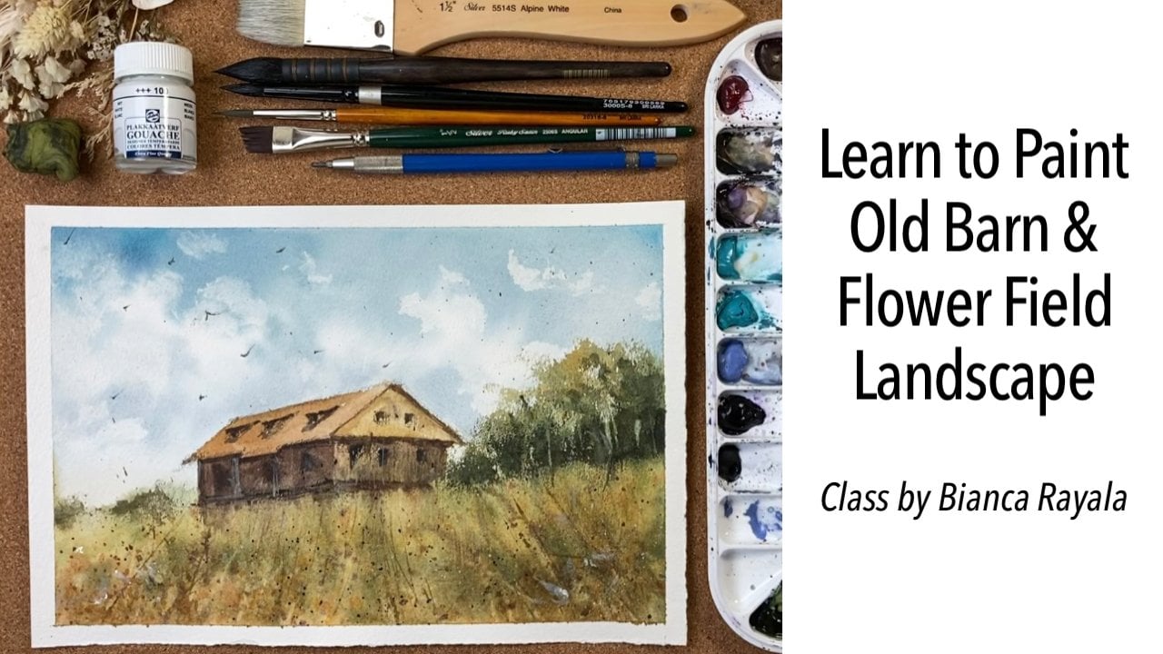
Transcripts
1. About The Class: I've always wanted
to take a break from the daily routines of life
and escape to nature. I remember when I was young I really enjoyed
standing on a ridge with a view of an endless
prairie grassland while watching the birds
in the sky and feeling the grass with my feet. Moments like that really
takes my breath away. Then I thought,
why not bring back those great memories
which I'm sure you also experienced through a relaxing painting time using gouache. Hi, I'm Bianca Rayala. I'm a watercolor artist. My works revolve around the
beauty of life and nature. My purpose is to
inspire people to discover and pursue
their creative fashion. That's the reason why I believe
painting is for everyone. I am here to help you
unleash the artist in you. Over the years,
I've learned that the painting process is more
important than the artwork. This is why we will paint a
place that takes us back to a moment that inspires
and refreshes our soul. Being a very forgiving medium
that allows you to apply multiple layers and enjoy a beautiful math and
pigmented painting, Gouache is a perfect medium
for anyone who wants to relax and jumpstart
a creative journey. In this class, you
will learn a range of Gouache techniques and
as a final project, you will paint a
prairie grassland from our reference photo. To achieve that, first, you'll understand the
unique strengths of Gouache and its key
difference from watercolor. Next, I'll take you through the essentials like
the materials to use, how to create different
consistencies of paint, how to blend and layer colors to create various
interesting textures. You will also learn how
to mix colors and paint basic landscape
elements to bring any landscapes subject to life. Finally, you will apply
all these principles to create your very own
prairie grassland painting. We'll start with a drawing
of a basic sketch. Build tonal values
on the base wash, create depth and
dimension through layers, and enhance contrast in
details with final touches. By the end of the
class, you will gain all the necessary skills
and confidence that you need to turn any
photo inspiration into a captivating painting. Get your Gouache paints ready and let's escape the nature.
2. Materials: In this lesson, we'll
go over the materials we need to complete the
exercises on the class. First is gouache paints. I'm using Maimeri artist
grade gouache in tubes. This set comes in 12
colors, but as a beginner, you can start with
just the primaries; red, blue, yellow, plus white and black. The colors I'll be
using for the class are cobalt blue, ultramarine blue, [inaudible] yellow ocher, titanium white, and black. These colors are enough to
create a basic landscape. We will just mix and match these colors to get
different shades. Next is a sturdy paper. You can use watercolor
paper if you have one, as it works best for gouache. But gouache is a very
flexible medium. You can use a thick card or mixed media paper
as an alternative. For the gouache basics demo, I will use a regular cellulose
paper from Grumbacher. But for the painting
exercise and class project, I will use hot press watercolor, paper, 300 GSM, and 100 percent
cotton from Paul Rubens. One advantage of using hot press paper is that
it is easier to glide the brush and avoid
white streaks on paper because of
the smooth surface. For the brushes, I'll be using
a half-inch angle shader, 3H filbert brush, and Size 8 round brush. All of these are Silver
Silk 88 synthetic brushes. Whatever brush you have at
home will surely be useful. Just makes sure that the
size of your brush is the right scale for the
size of your paper. These brushes that
I showed you are perfect for small to
medium-scale paintings. We will also need other
essential materials such as benzyl, mixing palette, cup of
water, and paper towel. These are all the
materials you'll need to paint all our exercises. The photo of the exercises
and final painting can be downloaded in the Projects
and Resources tab. I encourage you to share your
works by uploading them in the Projects and Resources
tab below this video. Simply click "Create Project" and upload the image
of your artwork. I'd love to see your works and share my thoughts about them. I'd also greatly appreciate
if you could leave a class review if this class has been a great help to you, and you can also leave the review on the Review
tab of this class. That's it. Let's begin our first lesson
on the next video.
3. Getting To Know Gouache: You might have seen some
gouache paintings and wonder what kind of medium is it or how does it differ
from watercolor. Well, gouache isn't a
big form of watercolor. It has the same ingredients
with watercolor, but what brings the
main difference is that it has much more pigment. That's why it creates a beautiful opaque
finish on a painting. Another unique
characteristic of gouache is it has a soft matte
texture when it dries. This property makes it easy
to photograph or digitize. Gouache is also water-soluble. This means that gouache is
activated by water and you can also clean your brushes
and palette with water. Like watercolor, it is very convenient to use
because you don't need any special solvent
to clean your materials. Gouache is also a
not-so-demanding medium. You don't need special paper or a natural hair brush to
start your creative journey. Since we don't use
too much water when painting with gouache, a basic sketchbook would
be fine to start with since gouache won't cost your
paper to warp or buckle. Gouache also quickly dries, which makes it a great medium
for painting outdoors. Because of the
opacity of gouache, we may paint a wide range of
subjects and styles with it. We can apply gouache on almost transparent
watercolor-like gouaches and even thick opaque layers. It also allows us to paint from dark to light
and light to dark. It gives us the flexibility
to add multiple layers, fix any mistakes we might
have along the way, or even mix and blend
colors on the page. I think that's all
there is to know about gouache for now. Let's discover more
about it through actual painting on
the next video.
4. Consistencies, Blending and Layering: In this lesson, we'll learn
about the consistency, layering, and
blending in gouache. We'll tackle the four basic
consistencies of gouache and the best uses for each
specific consistency. We'll also see how
to layer gouache successfully in order to avoid frustrations
when painting. Lastly, we'll go over
different ways to blend gouache to create soft
or rough textures. Let's start with
gouache consistencies. There are four types
of consistencies. The first one is watery mixture, which is pigment
straight from the tube. It is thick and plastic-like. We often use this
for highlights in finer details as they don't spread out easily on the page. Next is creamy mixture, which is the perfect balance between the pigment and water. This mix contain small amount
of water to get a buttery, silky paint that spread smoothly
and easily on the paper. This mixture also creates
the matte coverage that we want to achieve most
of the time when painting. In order to achieve this
perfect mix when the texture is thick yet slippery and
when you make a stroke, the brush slides
easily on the paper. If we add extra water on the
creamy mixture of gouache, we make a milky mix of paint, which is the third type of mix. This works best for details and small
lines where you want the paint to flow easily
from the tip of your brush. Lastly, when we add a generous amount of
water in the mix, we create a tea-like
consistency of pigment, where we can see it
almost like watercolor. Now, let's move on to layering. Because gouache is opaque, we can layer light colors over dark colors and dark
colors over light colors. But because gouache also
easily dissolves on water, when we add on layers, we can unintentionally
reactivate the layers underneath if we will not be careful or
if the timing is not right. The secret in layering is we add another layer when the base or previous layer
is already dry. We should also be careful of the moisture we
have in our brush to prevent unwanted color
mixture between the two layers. Here you can see that the colors are crisp and neatly layered, since the base is
completely dry. On the other hand, here, the two colors made a color mix because the
base is still moist. Although this may not
look ideal to have, there are times
that we may want to achieve this unique
effect in painting. Example of this is when
painting shadows where we want to show the
undertone of the subject. Now, let's take a look on
different ways to blend gouache to create smooth or rough texture
to our painting. Textured gouache is often used for objects in the foreground. We use this as a
base gouache when painting grasslands
or flower fields. We achieve this
blend by creating random textural brushstrokes as we apply the pigment on paper. Smooth blend, on the other hand, is mainly used when painting
different gradient of colors on the sky and
other landscape elements. When creating smooth blends, you need the help
of titanium white. Titanium white is the
opaquest paint and adding it to other color makes
the color opaquer. The opaquer the color gets, the easier it is to blend. Let's create a soft gradient starting with a
milk mix of color. Notice how I glide my brush, making sure that there is no streaks or rough
texture in between. Next, let's add more white to the mix to create
a lighter tone, then softly blending it
to the initial layer. Let's add more white to create a lighter tone at
the bottom part. Now that we've covered
the basics of gouache, let's do some painting
exercises on the next video.
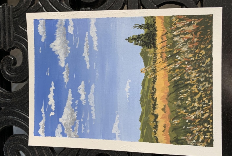
5. Exercises: Sky, Clouds and Trees: Before we dive into
painting a full landscape, let me teach you the
techniques on painting important landscape
elements like the sky, clouds and trees. Learning to paint this will help you feel more comfortable and relaxed when painting
the whole picture. Let's start with
the sky and clouds. I wanted to show
you a simple way to paint them using
just four colors. Cobalt blue, burnt chenna, titanium white for the sky gradient and then for the
shadows on the clouds, we will use ultramarine, burnt chenna and titanium white. I will squeeze out the
generous amount of cobalt blue as our base
color for the sky. I'll add a bit of burnt
chenna to diffuse the color and then I will use white to adjust the tone from
dark blue to light blue. Le t's mix colors using a filbert brush with very
minimal amount of water in it. I mix the three colors to
create a muted dark blue color. I create a creamy mix of paint, which is the perfect mix when painting the base
wash off landscapes. I slightly adjust the color by adding a bit of burnt chenna. Color mixing may take a bit
of time since the colors react well even with a small amount of another
color added to it. Here I'm creating a
gradient wash of dark blue down to lighter tone of blue to portray
the bright sky. We want to achieve a
smooth transition of colors to show
aerial perspective. Remember to use titanium white
to create that soft blend. The secret to having this
blend is making sure that your brush has not
much moisture in it, so you won't disturb the previous layer
of color underneath. When you're done with the sky, let this layer dry completely
before painting the clouds. Painting on the
moist surface will just cause the two
colors to blend. I mixed burnt chenna,
ultramarine blue, and titanium white to create the color of the
shadow of the clouds. I wanted a cool gray
mix for the shadows. Now let's paint the clouds
using generous amount of titanium white
on my round brush. Using the tip of my brush, I do some shaky strokes to paint the fluffy
form of the cloud. Usually, the clouds
should be rounded on top, then a bit flat at the bottom. The size of the clouds also get smaller as they come
closer to the horizon. Next, let's paint
the shadows to build volume in form of the clouds. I still use my round brush
and paint some portions, mostly at the bottom part. Then I gently blend the gray
color to the white color to prevent that very harsh
transition of colors. This is how we paint fluffy
clouds on a bright blue sky. Same principle will be applied on all types
of sky or clouds, whether it'd be a sunset, stormy, or a night sky. We just vary the
colors to be used. Next, let's do some
tree exercises. The colors we'll be using
are yellow och re and black. The surprising thing about color mixing is that when
you mix yellow with black, you get a deep dark green color. For lighter green tones, we can add more yellow in
the mix or we can also add some blue color to create
different shades of green. I'll do a rough
sketch of a tree. Next, I will create
a creamy mix of dark green color using
yellow ocher and black. Try practicing changing the
ratio and proportion of yellows and black to come up with different shades of green. You can also try adding
cobalt blue or ultramarine blue to the mix to
see more shades. Here I paint a tree
from dark to light. I start with dark base
layer of the tree. I use my filbert
brush and wiggle my brush to create some
random dabbing strokes. Next I clean my brush and get
a different shade of green, this time lighter in tone. The mix now has
more yellow in it. This step is where we set up the mid-tone to build volume. I layer this color when the
first one is dry already. Next, let's add the light tone using light green color mix. This one, just paint on fewer spots with the tension to show where the light
is hitting the tree. I then go back to
my dark green to almost black color to
enhance the shadows. Lastly, let's paint
the trunk using branchena added with black. My mix is a bit buttery, although it is not
straight from the tube, you'll notice some
dry strokes as the brush has almost
no water in it. When the trunk is still moist, let's paint the ground
to connect the two. Then you can paint some
grass reeds below too. Now let's do another tree, this time a pine tree. I start with the main trunk. Then using my round brush, I dab the tip of the brush to paint the impressions
of branches and leaves. I keep the triangular
shape of the tree. I still paint the trunk
with a dry brush stroke. Next, let's paint the ground
with the quick stroke. Now that the base layer
of the tree is dry, I add another layer
of darker color. Remember that with
gouache we can paint from light to dark
and dark to light, so it is up to you how
you like to do it. Just keep in mind that
the goal is to build dimension through
layering of colors. I encourage you to try
this small exercises to familiarize you on
how gouache works. Note that you don't need to put too much consideration on the pigment and water ratio
when painting with gouache. But one thing that is quite
tricky is color mixing, so don't get frustrated, but keep on practicing. You'll get the right balance and mix as you regularly practice.
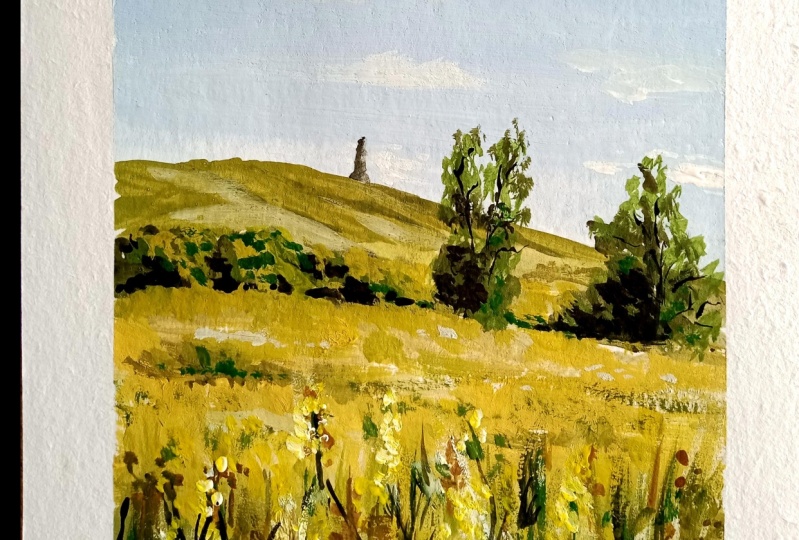
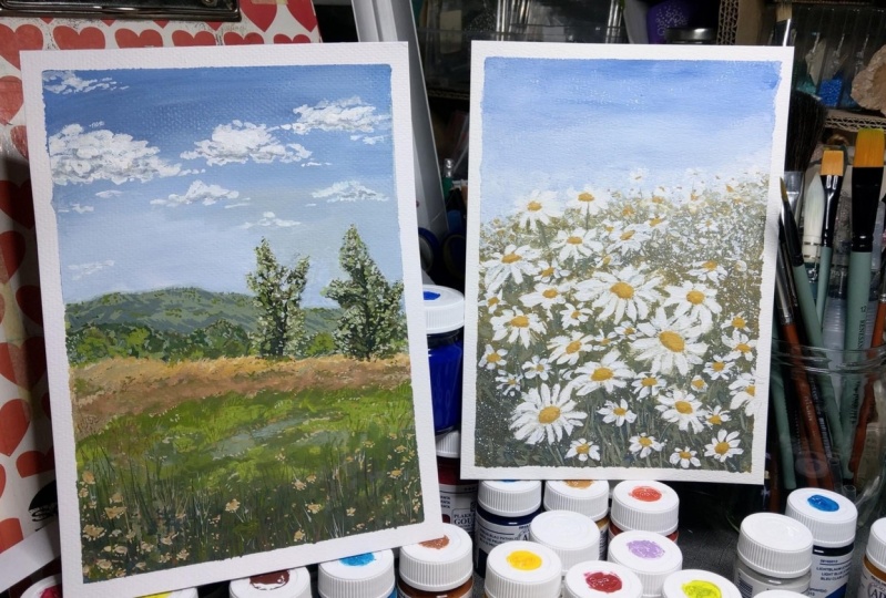
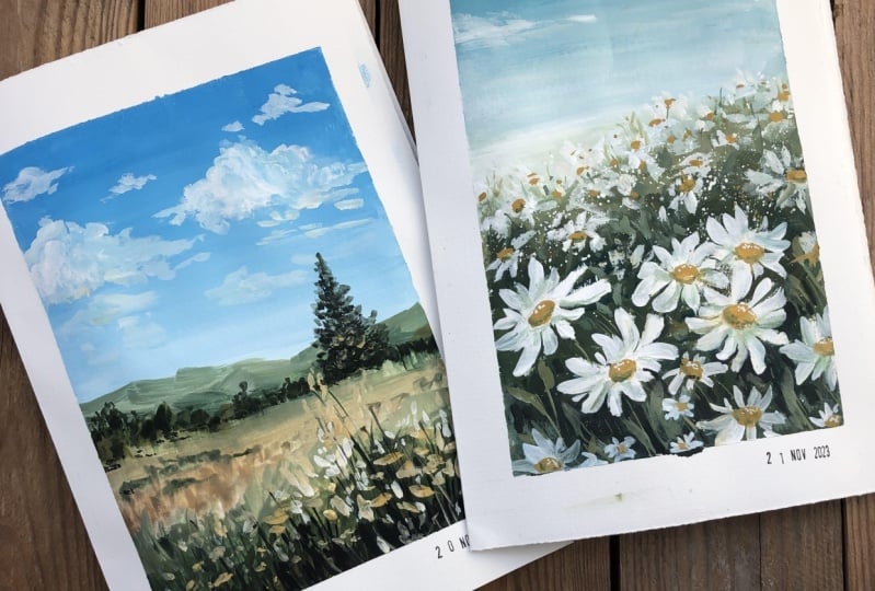
6. Painting Prairie Grassland: Now let's escape to a
relaxing prairie and bring back great memories
we have experienced. I'm painting on a hot
pressed watercolor paper. This paper size is A4. I encourage you to paint on a smaller scale so
it won't be too overwhelming for you especially if you're just starting out. I taped the borders to get a nice crisp border
on my painting. Let's do a very simple
sketch starting from the horizon line on the lower
third part of my paper. Next, let's draw a mountain
and some range of trees. We can add a tree
here on the right and some prairie hay
in the foreground. I won't sketch the
clouds in the sky and we'll just paint them
straight later on. Let's begin by
preparing the colors. I'll use cobalt blue,
titanium white, and a bit of [inaudible]
for the sky. I pour out a generous amount of paints since we are mostly using a creamy mix
for all our washes. Using an angle brush, I mix my blue color for the sky. Notice how a small
amount of white dramatically changes
the color of blue. I'm trying to prepare
a generous mix enough to cover the
entire sky fragment. I adjust the consistency
by adding a little bit of water to keep that
creamy mix of paint. I paint with a light
stroke from left to right and cover
the page entirely. I introduce a bit
more of white to my color mix to create
a gradient in the sky. When you blend the colors, make sure that your brush
has not much moisture in it. I also paint the lighter
tone at the bottom and slowly paint the sky upwards until it meets
the previous tone. Try to cover the white
gaps as gently as possible so you won't move
or ruin the initial layer. Here at the bottom,
the color mix is mostly white with
a hint of blue. We want a very obvious
tonal value transition to show perspective. When you encounter
rough blend like this, just moisten your brush
a little bit then blend the colors with a light
stroke to soften the edge. Now let's paint the
distant mountain. I will use yellow and a bit of blue to create a
beautiful green color. I also add a bit of brown ocher
for an olive green shade. I still use my angle brush and paint the mountains with
the gliding stroke. Next, I create a darker tone, still using the three colors to bring dimension
on the mountain. I use this dark color to
paint the shadowed areas. Next, let's paint
some impression of distant trees at the
foot of the mountain. I just do the same downward
strokes with my angle brush, and you don't need to paint
each tree distinctly. Take advantage of
the brush strokes to show impressions of it. Try to observe that the tone of these trees are way
darker than the mountain. Doing it this way gives a
sense of depth and distance. Now let's start
painting the priory using yellow ocher and white. I still do downward strokes
to paint the base layer. Then I create a darker
muted yellow color by adding brown ocher. While this layer is still moist, I dab some green color to create texture on the grassland. I just blend the colors with my brush so they
will look connected. Now let's introduce a
green color on the field. Do the same step of creating a gradient from
light to dark tone. You make the green mix darker by adding black little by little. I keep a rough texture on the transition of
colors on the field. It creates a nice
contrast between the soft blended sky and the rough textured
blend on the field. Here we're done with the
base color of the field. Let's paint some grass
reeds by dragging the green color up
using a fine brush. Just be careful not to
overdo the details as we will be adding some
more layers afterwards. Using a Filbert brush, I paint the impression of fairy hay with yellow
ocher mixed with white. I vary the size, angle, and shape of this draw
for a natural look. I also mostly paint
here on the right side and add fewer
strokes on the left. Next, let's add
some more strokes but with a different hue. I add a bit of burnt
sienna to my current mix and dab on some hays
I initially painted. Doing this gives the foreground more dimension and will prevent
it from looking too flat. We're not going for
realistic painting, but we try to capture
the essence and at the same time incorporate
depth in our work. Now, let's add some fine
lines for the grass. I don't make them too many. I just concentrate placing
them on the focal area, which is right here on the
right side of the foreground. I also vary the height
of the grass and keep the natural flow by imagining which direction
the wind is blowing. Let's add some dots of yellow
to make the field fuller. Next, I will darken the bottom part of the field to increase contrast
around the hay. I use black mixed with my leftover yellow ocher to
create this dark green color. I just paint the base area, mostly around the hay
in the foreground. Next, I paint again some
of the grass leaves as highlights and we are
done with the foreground. Let's paint the sky with clouds. Since the sky is dry already, I use my round brush with
a very creamy white paint. Remember to make
the upper portion of the clouds fluffy and irregular in roundness or
the bottom part quite flat. If you see some blue
paint showing through, just add another layer
of white over it. I add some smaller strokes of
white to show tiny clouds. Clouds near the horizon
should be smaller too. Next, let's paint
the shadows using the cool gray mix as shared
on the previous lesson. I paint the shadow mostly at the bottom part,
but not completely. Then I clean my brush and remove the excess moisture before blending the green and
white color of the clouds. Be gentle when blending the color as we don't
want to reactivate the blue color of the sky and create an unwanted blue
mix in the clouds. As our last step, let's paint a tree here. Keep it small in
size so it won't overpower the hay
in the foreground. I started with the dark base, then create dimension by painting a mid-tone
and light tone. I also darken some spots here on the distant trees to separate
it from the grassland. Let's do another tree
here on this side with a different shape or
form for added interest. We're done with our
final painting. Let's dry this
completely then you can peel off the tape gently to
reveal your final painting.
7. Daisy Grassland- Painting the Background: I hope you had an enjoyable time painting the prairie grassland. As a bonus, I will share with you another tutorial
where we will be taking a refreshing stroll
in a daisy grassland. We will be using the
same group of colors, namely yellow
ocher, cobalt blue, titanium white, scarlett, ultramarine deep, burnt
sienna, and black. Let's start with
a pencil sketch. I start drawing the
outline of the boundaries separating the sky and
grassland fragments. Next, I draw daisies, focusing on their general
form and gesture. As I draw them, I try to copy the natural flow and
direction of flowers. I also vary the size
and the flow of petals for them not to look
uniform and stiff, I create a bunch of daisies here on the
right side and add some few flowers on the upper left to build
the home position. I try to fill in the space with smaller flowers while finding the right balance
as I place them, I feel that the flowers are enough so we can start painting. For our first step, let's create a lavender-like
mix for the sky. I mix cobalt blue, titanium white, and a bit of
scarlet to create that hue. In gouache painting, I think the trickiest
yet meditative part is the mixing of colors. It takes a lot of
exploration and patience to find the
color that you want. I encourage you to create
a generous amount of mix that is enough to cover
the sky fragment completely. Using my angle brush, I paint the sky fragment
from top going down. I won't be painting exactly as the reference as
I'll keep the sky a bit simple to make the flower feel more attention grabbing. As you paint the sky, keep in mind the rule
of aerial perspective. The top part of the sky
has the darkest tone, then gradually lightens
as it goes down. Here, I notice that the coverage is quite light and
not too opaque, so I will be doing another
layer of the same mix on top. If yours is a good
coverage already, you don't have to
do another layer. I just lay the color smoothly, being careful not to
disturb the initial layer. I also do it a bit fast so I can achieve a smooth gradient. As I paint the bottom part, I add more white to my
mix to lighten the tone. Now, I'll get cobalt blue and
yellow ocher with a bit of burnt sienna to paint
the distant grassland. Notice that I left a small
fragment unpainted because I will be painting that
portion with a white paint. I make the edges jagged. Now I create again mix of green using the same tree colors. As I lay the colors, I paint the area with
a downward stroke. Some of my strokes are dabbing because I want to create that
rough texture of the field. Same rule in
perspective applies. We have to create the
transition from light to dark tone as we approach
the foreground. I still use the same
group of colors, but just intensify
the tone by creating thicker mixture and controlling the amount of water in my brush. Don't worry if the strokes
look too hard and rough. That particular texture gives more interest in
your final painting. As I paint the field, I skip painting the flowers, so it will be easier to paint
them with white later on. Also, you don't need to be too particular in
outlining the flowers, you don't need to
avoid them perfectly. Since gouache is opaque, we can paint over those
green background later on when it's time to
paint the flowers. Now as we've made
the foreground, we need a deeper and
darker green color. I will now introduce
black to create this rich dark green color. I vary the ratio of colors in the mixture to create different
shades of dark green. I thoroughly paint
over the foreground. After this, using a brush
with very thin and dry paint, I do some random dry strokes in the middle ground just to create connection between
middle and foreground. Let this dry completely before proceeding to the next steps.
8. Daisy Grassland- Painting the Daisies: Now that the first layer is dry, let's paint the daisies. I create a grayish-blue
mix out of the colors we had for the sky to
paint the distant flowers. I do this by adding more white to the mix and a bit of black. Be careful when
adding black as it might stain your color so much. With my filbert brush, I dab some colors
on the boundary. I also splatter some paints
to make them look organic. To make opaque splatters, the mix has to be
creamy and saturated. I will cover the
sky fragment with a tissue to protect my
sky from splatters. I placed a lot of them
in the middle ground and just splatter very few
amount in the foreground. Now I get my round brush
to paint the daisy petals. Again, I start with
those at the background. I simply dab the tip of my brush with a very concentrated paint. I still vary the size of the strokes making
them as random as possible so I want unconsciously create a pattern or something. Enjoy the process of
painting dots of whites. It may seem tedious as you will have to paint them one by one. But it is also a great way
to just relax and unwind. Now let's paint the yellow
centers of these tiny flowers using yellow ocher and a little white to make
it more opaque. I dot some yellow over the whites to portray
those tiny daisies. I dot almost all white
in the background with yellow to create that feel
of luscious daisy field. I also splatter some yellow with my tiny brush as extra effect. Before proceeding to
the main flowers, I add more white strokes to make the middle
ground fuller. I repeat the process of
painting white strokes, then adding yellows
in the center. Now let's move on to painting the bigger and more
defined flowers. I load my brush with a very
thick amount of white paint. I put some pressure
to my brush to create teardrop-like stroke to imitate
the shape of the petals. I varied the amount of
pressure I put so I can have both thin
and thick petals. Notice how I sway my brush to create side and curved petals. I encourage you to let your
entire arm move and dance with the brush to create expressive strokes
for the petals. One important thing to prevent the flowers from
looking like a blob of white paint is to maintain those thin and tiny green
space in between petals. The tiny green space defines
the shape of the daisies. Next, I use the same yellow ocher
mix to paint the center. Again, observe where
your flower is facing to paint the center
appropriately. Make the yellow center
really opaque and thick to make the
flower stand out. Now I feel that the bottom
part looks a bit empty so I'll be adding some more
flowers here at the bottom. As you do this, I advise that
you vary the sizes and make them mostly small so they will complement the focal point. Now I create an opaque green mix to paint the stems and leaves. I use cobalt blue, yellow ocher, white and black to
create this green color. I added white so it will be
visible when you layer it on top of the dark background
using a size 2 round brush. I hold the brush at the
end of the handle to paint thin inorganic stems. Let your brush flow
smoothly on paper and put very light pressure to achieve those tiny
delicate strokes. Here I'm just adding yellows on the flowers that I missed. I'll add a few more daisies here at the bottom
part and also on the lower left side to make the picture look more complete. But again, make
them small in size. Let's finish off the painting
with some splatters and some more thin shaky
strokes of stems to fill in the background
with extra texture. I also added some more tiny
picking daisies on top. As a final step, I will paint some shadows on some petals
to create dimension. I use the lavender
light color I used for the flowers in the
background to do the shadow. You don't have to
paint so many shadows, just a few suggestive
strokes will be sufficient to create
depth and dimension. Keep the strokes tiny and very light so they won't
be distracting. Lastly, let's make the
yellow centers pop out by adding shadows as well. I use a muted yellow-green
mix for the shadow and white with a little
yellow as highlights. The painting is complete. Let this dry completely. Then carefully peel off the
tape to see the final look.
9. Final Thoughts: Congratulations for
finishing the class. I'm so glad that you took the
time to take a break from your busy schedule
and escaped to a place where you can
be free and creative. Painting is an effective way to relax and unwind from
the business of life. We're excited to
see you experience the joy of expressing
oneself through art. I encourage you to practice
what you've learned, Find an image that inspires you, an image that creates
an inner spark. You can always start
with something simple. I encourage you to
do practice strokes, create color swatches
of your color mixtures that will serve as your plan before heading to the painting. Doing this allows you
to relax and enjoy the whole painting
process without having to worry about the
next color mix to use. Start with the
background and move to your middle ground and
finally your foreground. Don't overthink of whether to go light to dark or dark to light. Layering is limitless. The process is more
important than the outcome. The end goal is always
to enjoy the time spent painting and the artwork
itself is just a bonus. I'm excited to see your
beautiful projects, so don't forget to tag me on Instagram when you
post them online. If you enjoyed
painting landscapes, I also encourage you to take my other watercolor classes
here also on Skillshare. Thank you so much again
for being with me and I hope to see you on
my other classes.
 Bianca Rayala, Top Teacher | Watercolor Artist