Transcripts
1. About The Class: Gouache is a friendly medium at it's both forgiving
and versatile. Even if you're a total beginner, you can create something
beautiful and alive. Hi, I'm sorry, I lied. When the artists working mainly with watercolor and gouache, I also teach drawing and
painting in-person and online. I'm a Skillshare teacher, educator and silver
brush ambassador. My deep passion for
teaching has led me to impact over thousands of
students across the world. He has always been. My joy is inspire people
to discover and pursue their creative fashion and believing that painting
is for everyone, I teach in a way that students would learn
to paint on their own and not just copy what they do without understanding
key principles. In this Skillshare class, you'll learn how to work with
gouache and discover white. Gouache is so excellently
suited for painting landscapes. You'll be practicing a
variety of exercises to improve your blending and
brush control skills. For the final project, you will create a beautiful
landscape painting highlighting a dramatic sunsets. Questions like which
layers to start with or how many layers are we
supposed to, please? Is there a general rule on going from dark to
light or light to dark? We will start with learning the essential materials
for gouache painting and setting up your color
palette will learn to mix colors using a
limited color selection. Then play around
with brush strokes to get into the
flow of painting. I'll show you the secret
to blending colors to create smooth gradient
on sunset sky. And then you'll
discover how to paint common landscaped
elements such as the sky, decision trees, grass, wild
flowers and silhouettes. Last of all, we will
put all the learnings together and paint
our final project. We start with a sunset
sky background, built texture at depth on
the flower field landscape, and finish the painting with
details and highlights. By the end of this course, you'll be able to use both expressive
brush strokes and vivid colors to capture
the essence of the scene. Remember, being thing
is for everyone. So pick up your brushes, paint. What inspires you and
turn it into art. I'll see you in class.
2. Materials And Color Palette: Welcome to class. I'm glad to have you
here with me today. In this lesson, you'll get
to know the materials and most specialty or gouache
paints to help you complete all our
class exercises. Just a quick overview. Gouache is an opaque
form of watercolor. It has the same ingredients
with watercolor, but what brings the
main difference is that it has much more pigment. That's why it
creates a beautiful opaque finish on a painting. And another unique
characteristic of gouache. It's, it has a soft matte
texture when it dries. This property makes it easy
to photograph and digitize. Wash is also water-soluble. It is activated by
water and you can also clean your brushes
and palate with water. Like watercolor, you don't need any special solvent to clean your materials after painting. So let me guide you through all the materials that we'll
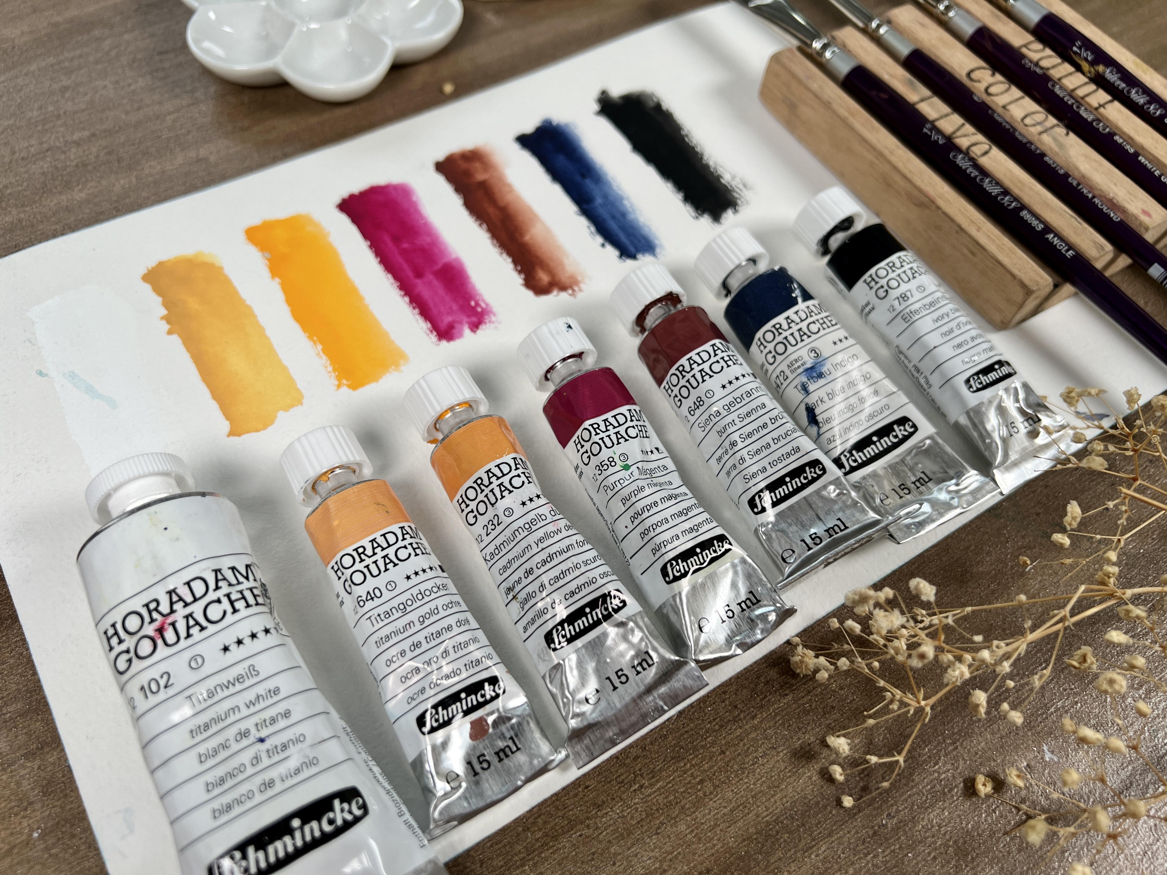
be using for the class. This is a selection of some
basic colors essential for sunset theme being
things I have here. Danny boy, the thing
him, gold ocher, cadmium yellow deep
in Ecuador, magenta, burn Chana, dark blue, indigo, and ivory black. To see their actual shades. I prepared a color
swatch of each color. These are all Sri
Lanka who read them. Gouache paints. What they do love about
these paints is that they don't easily get hard
and dry in tubes. Unlike other brands
that turned really hard on cap and squeeze
out from the tube. These pains also dry
in matte finish. The colors are highly pigmented, very rich in color, easy to rewet and thin out. Remember that you can always do our exercise using
other paint brands or even color names. You just need to have the
primaries black, white, and bring China to tone down or diffuse the
vibrancy of colors. When it comes to paper. Wash being a net. So demanding me do
a basic sketch book or cellulose watercolor paper would be fine to start with, since gouache won't cost your
paper to warp or buckle. The one I'm using is potentate watercolor
paper in 300 GSM. These paper is 19 by
27 centimeter in size. Sometimes I also use a cotton watercolor paper and
prefer the hot pressed one. So it is easier to glide the brush considering
that we often use a creamy consistency
For gouache painting. Now for the brushes, since we don't use too much water when
painting with gouache, all you need to have is a few synthetic brushes to
create your landscapes. For the class, I will be using one half inch angle brush
for painting the washes, size two and size six. Round brush for painting trees, landscape elements and details. And this one-half inch and
three-eighths inch wide, both mop oval brush. These two brushes serve
as my blending brush. When I connect two
or more colors. If you don't have
this kind of brush. You can also use another
angle or filbert brush, which you'll dedicate
for blending purpose. Other materials you'll need to have our two cups of water, all Dowell or tissue paper, a mixing palette for mixing colors and masking tape
for creating borders. These are all the
materials you'll need to paint all our exercises. The photo of the exercise
and final painting can be downloaded in the projects
and resources tab. If you have any
questions regarding the materials or any
part of the lesson, please leave your message in the discussion section of this
class so I can assist you. Let's do our practice exercise. On the next video.
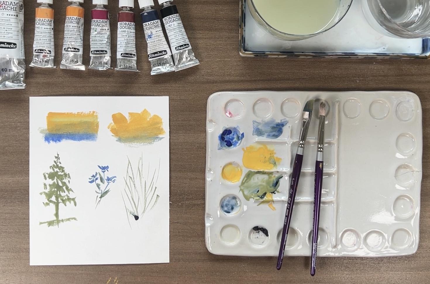
3. Blending & Brush Techniques: Now that you are ready with your materials in this lesson, let's answer the
common questions in painting with gouache. Questions like how to create
a soft blend of colors in the sky to portray sunset
without creating muddy mix. Another question would be, which layers to start with, or how many layers are
we supposed to place? Is there a general rule on going from dark to
light or light to dark? So to give you a
solid foundation, we will start with brush exercises to
familiarize yourself with different strokes you can do with your brush, another one. As we will also
practice blending multiple colors to create
a soft gradient and why they thin white is so important when it comes
to blending wash paints. Lastly, we'll paint a
small sunset silhouette as a practice exercise followed
by the main class project. So let's begin. I have here
three kinds of brushes. Angled brush over mop
brush and round brush. Let's start with
this angle brush. Since gouache painting
often requires a creamy mix for most washes, I love using this broad angled brush to
paint the washers, whether for this guy
or for the field. Simply laid the Brazil
of the brush on the paper and create the
stroke from left to right. Then back. For smooth wash. For this guy. If you'd like to create
a textured surface which is perfect for the
base wash on the fields. You can do quick diagonal
strokes like this. For this oval mop brush that
looks like a scrubber brush, I mainly use it for
blending colors. I dumped the brush, then remove the
excess water from it, then rub it off on the layer of paint to smooth than
or soften the surface. You can also use an angled
brush for the same purpose. Repeat the process of
wetting the brush, then wiping it off to
remove the excess water, then gently rub it on the
surface to blend the colors. Now, let's try the round brush. I usually use this for painting landscape
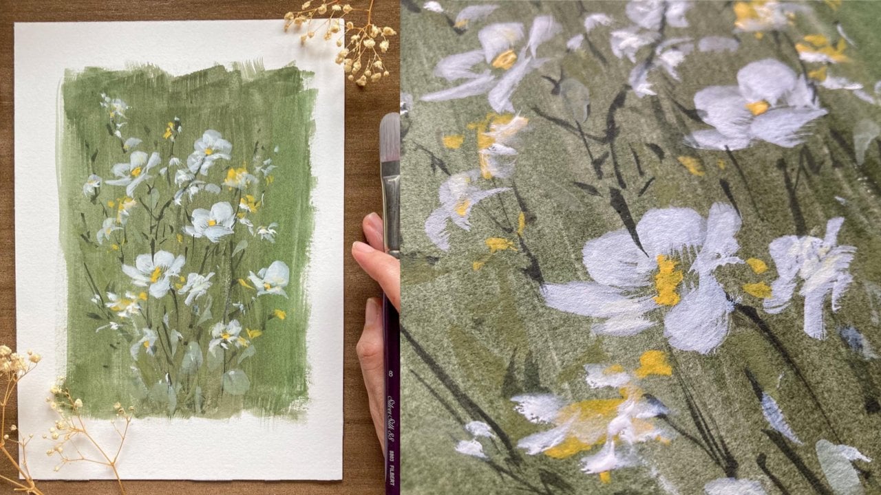
elements like trees, flowers, and grass blades. I particularly liked
this ultra round brush because of its sharp dip, making it possible
to grade thin, fine lines with less pressure in thick marks with more pressure. The paint trees, I
simply dab the tip of the brush to create
marks like this. Then vary the
pressure as I paint the lower part of the tree
to create the impression. On the other hand, the paint
little flowers in the field. I just repeat the dabbing
marks the tip of my brush. Then lastly for the grass, I grade gouache
downward stroke with my brush in an upright angle, you get a very fine mark. Now let's move on to blending. The secret to a beautiful
soft gradient or blend of colors is
titanium white. White is the key to make the paints easier to
blend and not get muddy. So let's try it. Don't focus on the color yet. Here, we just want to practice blending with
the help of light. I start with dark indigo
mixed with white. Notice how creamy
consistency is. I don't want it to dry
or too wet that it is almost feeling
like watercolor. I lead the color, making sure
I get the full coverage. As it goes down, I gradually
add more white to my mix. Now let's introduce a new color. I mixed gold ocher
with a lot of white. Then starting at the bottom, I do this stroke going up
until I touch the blue layer. Notice how the two colors nicely blend because of
the help of white. Now, let's add another color
still mixed with white. This time I'm using
quinacridone magenta. I begin at the
bottom part again, then paint going up until the pink color reaches
the yellow one. I add white on my base color to make the colors
really easy to blend. Here, we see a smooth
transition of colors by simply adding white
to our base colors. Try this simple
exercise in preparation to painting our
sunset landscapes.
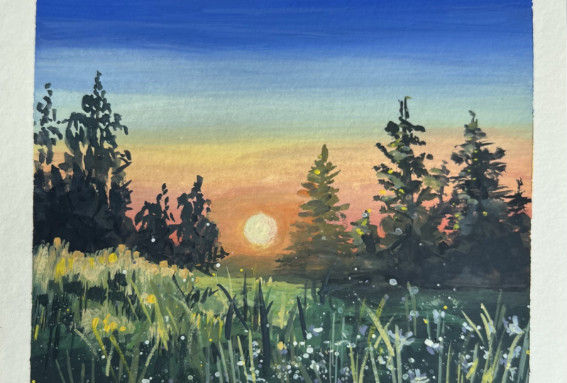
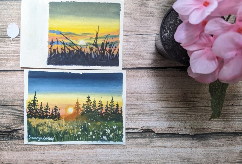
4. Practice: Sunset Silhouette: Let's practice what
we've learned by painting a small
silhouette landscape. In this exercise, our focus is to practice
blending colors by mixing white through
your base color and by using a blending brush. For the upper
portion of this guy, I use indigo mix with a little wide and bring Shanna to
create a grayish color. I mix the colors well, making sure there's no
concentrated paint in the mix. Find a creamy balance
between paint and water to get this opaque
yet moist mixture. As I go down, I gradually
add more white to my mix, making my gray color
lighter and lighter. The grade that soft radian
mode is how I repeatedly make this sidewards
strokes with a light hand. I will introduce a new
color to this guy here. And I'll use the gold
ocher mixed with white. Make sure to clean your
brush very well so there is no hint of blue or
gray in the brush. I painted the bottom
part going up until I reached the
border of the gray color, I will be adding more
white to my mix, then use it to paint and
blend the two colors. Now I need to layer a grayish
blue color just to make sure that the tone of the upper part of
the sky is darker, I still mix indigo and
burnt sienna and white. I added a thin layer to
enhance the transition of colors and also
to show perspective. Now let's add another color in the middle fragment using quinacridone magenta mixed
with a bit of gold ocher, I get this subtle orange color. Of course, we will use white and add it to the mix
to blend the fathers. Now I introduce
cadmium orange to my leftover mix to get this
very warm orange color, I blend the colors gently to avoid lifting off
the initial layer. For the bottom fragment, a mix of indigo and quinacridone magenta with white to
get a purple color. I blend it with orange, still using white as the
blending ingredient. Now we are done with a
base wash of this guy. I'll create a dark
purplish blue mix to paint the clouds
using indigo, inaccurate double
magenta in white. I'm trying to find the perfect
balance between paints in water to achieve an
opaque, yellow, creamy mix. This mix should be more opaque than the base color of the sky. I tried this way, my brush gently to create
this trips of clouds. Now, I'll create
this orangey color to create that fading
effect on the clouds. Since the bluish violet
layer is still moist, you have to be gentle and adding these orange colors so
they will blend nicely. I add this oranges
strokes only here in the edges since I
wanted to portray light reflected on the clouds. Now using burnt sienna mixed
with the purplish color, I added a small
layer on the edge. Now I get a fresh wiping makes with the little
gold ocher for this warm portions of the clouds that will be
surrounding the sun. Repeat the strokes very gently. Now we, they're round brush. I get a very thick and opaque white color to paint the sun. I painted round, but the lower parts lightly
covered by the Cloud. Next, I paint a yellowish color around it to make
it glow nicely. Then they likely spread
the yellowish color is sideways to blend the glow
on this guy fragment. I darken the outer
part of the sun a little bit more to
make it more sharp. Now I'm preparing some more
beans for the silhouette. Instead of using
plain black color, I will mix black with my leftover purple
bean and also add branch and not the create this deep rich dark color
for the silhouette. To paint the grass silhouette. I started with up down strokes to paint those fine
delegate rest bleeds. I make each grass blade look organic by varying
their directions. For the base, I simply block off the lower portion
with heavy color. Notice how lightly I do my stroke to achieve
those fine strokes. Then they repeat
the step of filling the lower portions
with solid paint. I just leave some tiny
dots of space and painted so there's a portion of this guy peeking
through the holes. I add some more
fine fluid strokes using the tip of my brush. Our practice painting is done. Carefully peel off the tape around to get the clean border. I'm sure you are
ready. So let's do our main class project
on the next video.
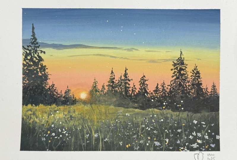
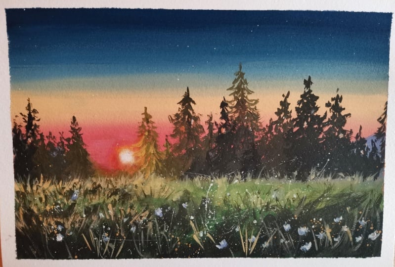
5. Class Project: Painting Sunset Sky: Now that you're ready
for our final project, we will paint a flower
field landscape with distant trees in sunset setting. For the painting process, you start on the sunset sky, then base wash off the field, and then move on to adding
trees and glowing light. We will finish off by adding texture and details
on the field. Let's prepare our colors. We'll use the same color
palette, which is indigo, white, and a bit of burnt sienna for the dark
portion of this guy. Then we'll use gold ocher, cadmium orange deep in African magenta to create
different shades of yellows, pinks, and oranges
for the sunset. Let's start mixing colors. So here I start with mixing a dark muted blue
color using indigo, white and a bit of burnt sienna. Feel free to test
the colors first on the swatch before applying
them on your actual paper. I'm trying to get
the perfect flowy and creamy consistency
in the mix. Thoroughly mix the paint tool. Encourage you to
take the time to mix colors and enjoy the process of experimenting and
color mixing so that you will know
your paints even more. Let's fill out the
upper portion of this guy with this blue color. I repeat this stroke to
make it smoothly lead. Then I add some white
to my color mix to create a gradual
decrease in tonal value. Adding white. I'm also preparing the fragment for
blending a new color. Now I clean my brush very
well for the yellow mix. I add white to my
gold ocher to get the pale yellow color then
blended with the blue layer. I repeat painting over the fragment gently until
I get that smooth blend. Using a clean, damp brush, I tried to smooth and the
border between two colors. I do this with a very
gentle strokes not to disturb the father's
underneath too much. Now I'm getting a more
saturated yellow mix since the initial
layer looked too pale. That is the beauty in
painting with gouache. You can layer
multiple times to get the appropriate
tone on your work. So here I'll just improve the tonal values on the
upper part of this guy. So proper perspective
will be followed. Now let's introduce
another peach color in the sun sets
using quinacridone, magenta, yellow and white. White unites all colors in grades connection between them. You're, I'll paint
another warm yellow color near the horizon using
yellow and burnt sienna. This layer is the
reflected light on the landscape fragment. Gradually transition
the color to green using the yellow
mix plus indigo. As I paint the base
wash of the field, the tonal value should
get darker closer to us, a great darker tone by simply adding black to my
initial green mix. Notice how I tried to light in this upper portion of the field, in some areas here
on the left side, I want this area to show
the light from the sun. This is why I'm
making it lighter. I add some more yellowish layer on top to set up the light. Then I will drop some
darker shades of green in random strokes support
tree grass effects. I will use burnt sienna to make an even darker green
color for the foreground. I'm still using an angled
brush and play with its side and angle
to vary the stroke. So here in painting the field, even though my
strokes are mostly dabbing strokes and
diagonal strokes, I see to it that I keep
the tonal values in place so we get correct aerial
perspective in the field. I will add some
more yellow layer here in the left side
part of the field. We wait for this layer
to completely dry. Then we can proceed to
painting the trees in the middle ground and
details in the foreground.
6. Completing The Painting: The database layer is dry. Let's move on to painting the distant trees in
the middle ground. For this part, I will be using a round brush to paint all
the elements and details. I also get some more black
bean added with my leftover green's and branch and that to get a dark green
color for the 3s. Another color mix I'll make
is this purplish color using indigo and magenta for
the distant mountain. Make this mountain very subtle and not do
attention grabbing. Now let's start
painting the trees. I started with the top part with the dabbing stroke using
just the tip of my brush. As I reached the
bottom part, agreed, thicker pressing strokes to fill in the bigger
areas with beans. The secret of painting
trees loosely is to keep an eye on the general
triangular shape of the three. Vary the height and even the angle of each tree to make them look more natural. Now I'll get some cadmium
orange and mix it with a bit of burnt sienna to paint the trees that are
closest to the Sun. Note that I will place the sun
somewhere here off-center. That's why I'm creating this
warm orange color around. I also being these three
nearest to the position of the sun with warm
color to portray the light coming from
behind the tree. Now, as we go farther
away from the sun, the color will also
transition from warm color to a
darker green color. I would be the
dabbing strokes to build up the range of threes. Here in the right side. Notice how I feel the lower portion of
the trees with father. I simply do robbing
and random strokes who gets rough texture. I also create a play of dawn
so it won't look too flat. I continue adding
some more trees, making the tree appear darker. As I move towards the right
side part of my work. Here, I took some
gold ocher paint, mix it with my green to get these very rich
and opaque color. Notice how big my
mix I have here. It is very easy to create that
defined and details true? Because of the
thickness of the paint. I guess this is also one of the unique characteristics
of gouache. Since we are working most of the time with rich
and creamy beans, painting details
then do take a bit of time to paint in
a brighter note, doing this is very
therapeutic and relaxing. You get to enjoy the time
to paint without worrying about the painting getting dry. So here I have completed the
trees in the background, and now I'll just add
a bit of highlights on some parts of the left portion to portray the glow of light. Now let's paint the sun
using the round brush. I get really thick and creamy white bean with
a hint of yellow. I've been a round shape here
near the orange fragment. Then I make this on
perfectly round, then add a bit of
orange around it to show that subtle
glow of the sun. Next, I will try
to blend this to the background sky by
spreading the paint lightly. I also think in
the white portion to make it look more alive. Little by little, add
some strokes of yellow around the sun and
spread it horizontally. So the sun won't
look like a sticker posted in the
middle of this guy. I placed an opaque
gold ocher here on the left side
boards on to create the texture of the grass. I add some strokes here
in the middle ground. I add more white so it will pop up from the dark background. I also use my finger to blend or plot the
colors together. I keep the strokes very thin
in a downward direction. Here I lived in a darker color. For contrast. I did the same downward stroke when my brush flat on the paper. Next, let's add some dots of Wildflower is using
the tip of the brush. The shape doesn't have
to be so particular. I just do some
tiny little flower like strokes to create
the impression. Take note also of perspective. The flower is closer to us, must be bigger in size. And those farther gets
smaller and smaller. I add some more splatters of white to add more flour dots. I also splatter
some yellow around. And as I do this, I tried to protect or cover
this guy fragment. Here. I mixed a
lavender shade to serve as the shadows
of the flowers. This gives them extra depth
and dimension even though we're doing a loose
impressionist painting. As final touches at add some fine grass blades
strokes using a small brush. Those near the sun, I paint
with the yellow color, while those away, I
paint with dark greens. So here I will add a
bit of yellow again, just to bring out the
light reflected on the field by simply dabbing
the brush on the paper. I finished off by adding a few more strokes
of grass and it is done carefully peel off the
tape around the painting. Some tape tends to
ruin the paper, especially when the
paint is still wet. This is our final painting. Don't forget to sign it. On this side.
7. Share Your Work: This is the end of
the course and I hope you feel
inspired to capture the scenes that inspire you
and paint what you love. I encourage you to practice
what you've learned. Go back and rewatch portions of the lessons that
seem unclear to you and feel free to leave a message in the discussion section if
you need any help from me, if you'd like a more
detailed lesson on the basics of gouache, such as learning the
different consistencies, blending, layering and textures. I invite you to take
my beginner's guide to gouache landscape glass. Here I shared an in-depth lesson on gouache fundamentals and you learn to paint this
prairie and DC grasslands. As you do your class project, remember that you can
always start small. Start with the background, then move their middle ground and finally your foreground. Don't overthink of whether to go light to dark or dark to light. Layering is limitless. Remember that they thin your wife is your
secret blending tool. I'd love to see your
final projects, so I'm looking forward to seeing them in the project
section of this class. Simply take a photo of your artworks and
upload them there. I also look forward to hearing your thoughts
about the class, how this class has helped
you or inspired you. You may give feedback in the review section
after this video. If you enjoyed painting this
subject and would love to learn how to paint the same
sunset scene in watercolor. Plus explore how the grades your very own painting sketchbook. I invite you to join my watercolor landscape
in Sketchbook class. Thank you so much
for joining me. I'll see you on
my other classes.
 Bianca Rayala, Top Teacher | Watercolor Artist