Transcripts
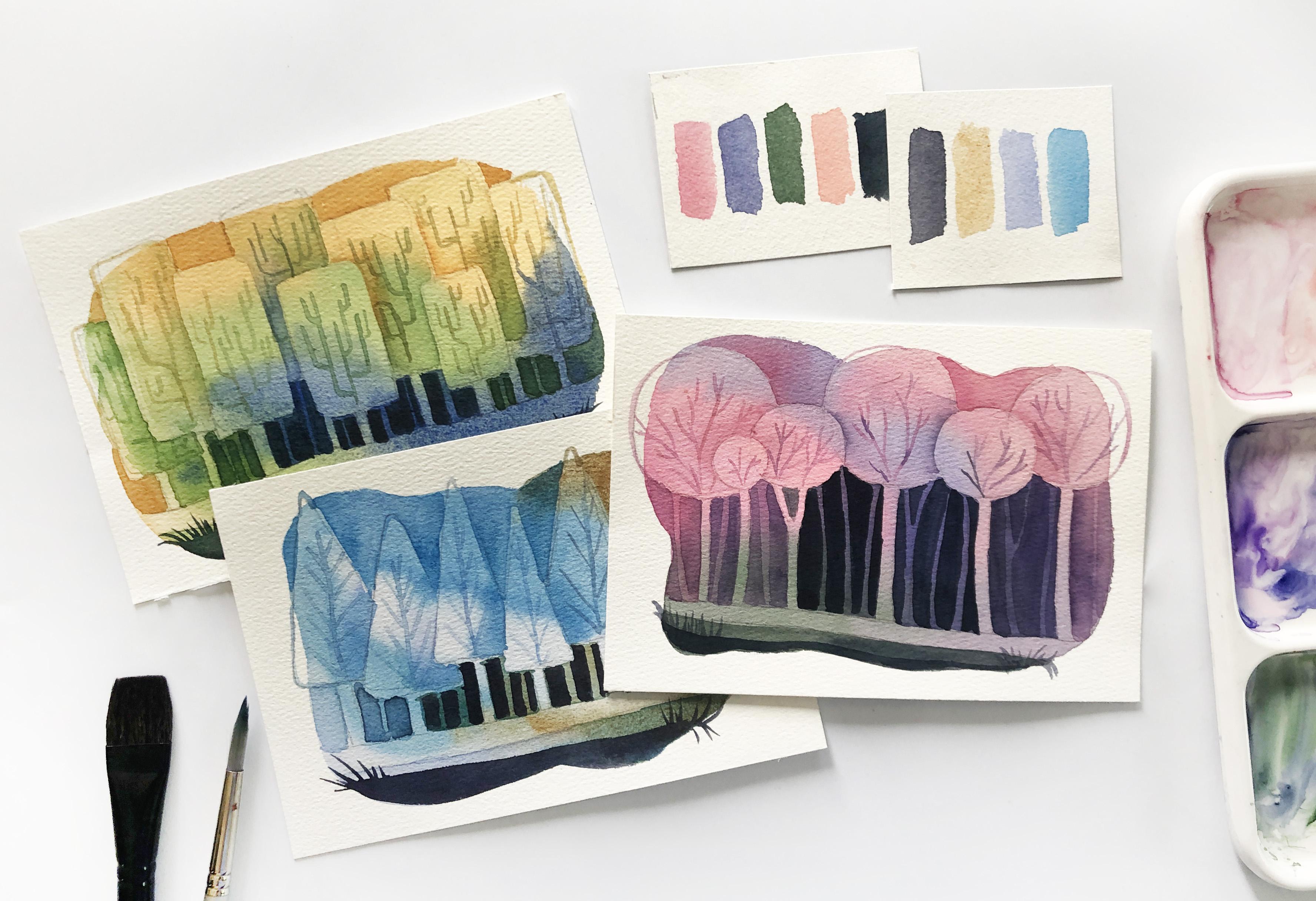
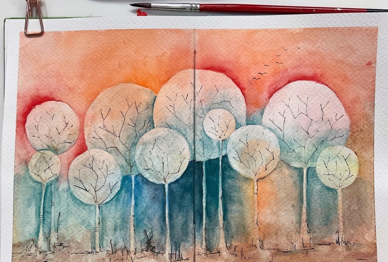
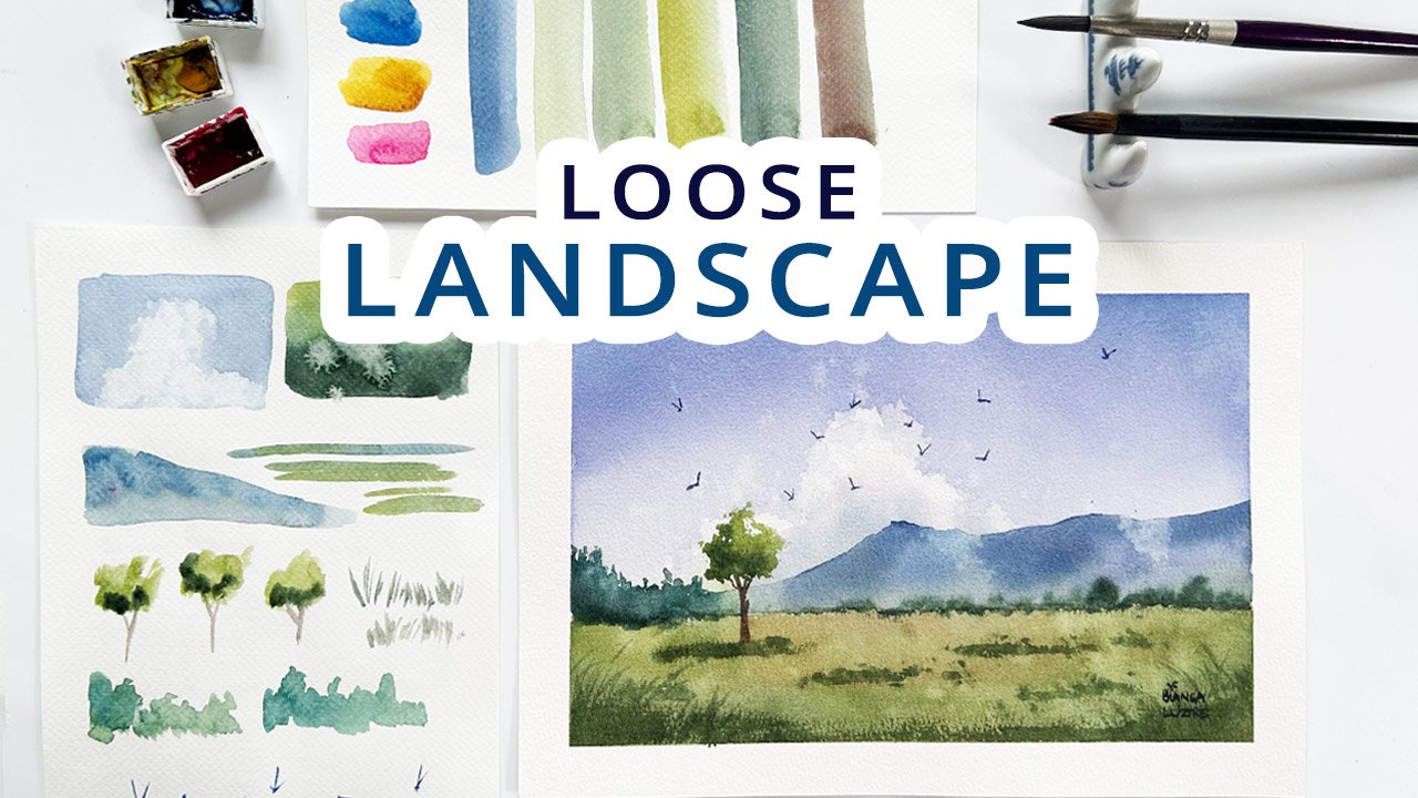
1. Welcome to this Class: During my first year of watercolor journey, I used to avoid negative painting. It looks too complicated for me, and the results that I got are far from what I imagined them to be. Later did I realize that I should have started with simple shapes and focused on learning the technique first, rather than striving to create a masterpiece. Hello lovely people, I'm Bianca Luztreat, an aspiring watercolorist from the Philippines, who has been painting with this medium for three years. I also made it a habit and a commitment to myself to paint every single day, even for just a few minutes. In this class, let's define what negative painting is. Let's use simple shapes to create forests compositions and use them to practice the negative painting technique. We'll also try out different color combinations, practice painting thin lines, and add layers of paint to define the shapes in our enchanted forest. You may paint one forest that you like the best or make the most out of this class by practicing this technique and creating all the class projects. I will guide you how to compose and paint a cotton candy forest, a cactus forest, and a cotton forest. Once you're confident with negative painting simple shapes, you can now try this on a more complicated subject, like these flowers. If you're up to this challenge, let's get started.
2. Negative Painting - What is it?: With the negative painting technique, we are painting around a shape to define it instead of inside a shape. Here are some examples of negative paintings where I painted around the flower shapes. I didn't use any white paint here. Instead, I used the colors of the background for my light flowers to take shape. While these two are the opposite, I painted the shape of the flowers, thus I didn't need to use the background to define them. Here are a few more demos and examples. This is my practice piece for the enchanted forest. Instead of painting the shape of the trunks and the foliage, I used the dark background and painted around them for them to pop out. Compare that with these geometric fruits where I painted inside the fruits themselves to define them. As a simple demo, this is how I usually paint trees with my landscaping things. Painting the foliage, painting the trunks and branches. But with negative painting, I will leave out or avoid the tree shape, the trunks, and the foliage, and instead, paint in the background to define the shape of the tree. Same with this eye, I painted the pupil and the iris, but I negatively paint on this tiny highlight to preserve the white of the paper. That's negative painting. See you in the next video and let me show you the materials that you need to prepare for this class.
3. Prepare These: Here are the materials I used for the project. An A5 size watercolor paper, cold-pressed, 300 GSM, and 100 percent cotton. I'll only need two brushes, a one-inch flat brush for the background, and a size 8 synthetic round brush for the details. It has a nice shape, perfect for painting thin lines. A pencil and eraser for our sketch, a pallet to mix your colors, some watercolor paints. I will use different colors from my other pallets too. A combination of Daniel Smith, Winsor & Newton, and home buying pigments. A rag or paper towel to tap off excess water from the brush, and a water jar. A masking tape for a crisp border is optional, but if you opt to use this, please test the compatibility of the masking tape, and the paper first, or you might pull off a layer of the paper, which happened to me when I used a 50 percent cotton paper. I find that 100 percent cotton papers work well with masking materials. But if you don't have this paper, you may reduce the stickiness of the tape by picking up some lint from your clothes, just like this. Before you take off the masking tape, when your painting is done, make sure that it is completely dry. When all set, let's head to the next video, and let's work on our first painting.
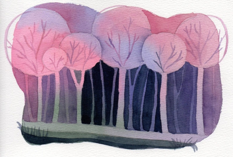
4. Cotton Candy Forest - Colors: For a cotton candy look, my main colors will be pink and violet. For my pink, I will use quinacridone rose, plus a bit of buff titanium white. Because quin rose is too strong for me. I will use the buff titanium to give it a pastel look. Carbazole violet plus ultramarine blue for a beautiful blue-violet mixture. I also love the granulating effect of the ultramarine pigment, olive green mixed with ultramarine blue for a variation. You may also add a bit of yellow if you find that mixture too dark. I'll use shell pink straight from the tube for a lighter and warmer pink version. For the darkest stone, I'll have Payne's gray. These are the colors of my cotton candy forest. Feel free to change these depending on what colors are available to you.
5. Cotton Candy Forest - Background: Let's work on the first layer. I will paint a big abstract shape using this palette except for [inaudible] let's reserve that for later. To do that I will use my one-inch flat brush and really just paint randomly starting from the lightest colors, my pinks. The goal is to let all the colors blend with each other while the paper is still wet, to achieve a smooth background. I will load my brush with different colors as I create this one big shape, one big blob. This layer will be covered with two more layers of paint, so really just have fun with this part. If you want a crisp border instead, you may use a masking tape but please make sure to test if your paper is compatible with masking materials. Let's leave this to dry and continue on to the next video.
6. Cotton Candy Forest - Trunks: Checking if my paper has completely dried. It isn't shiny anymore and not cold to the touch. I can now sketch the outline for my cotton candy trees. As mentioned earlier, let's use simple shapes to create our forest. I'll start with overlapping circles for the foliage of my cotton candy trees. To make this look organic, vary the size of the foliage and the height of the trees. I'll erase some lines here to help me define which trees are at the front and covering the other ones. I've decided that the three smallest will take the spotlight. Now let's draw the trunk. Again, no need for this to be straight and perfect. You can even draw curved lines or add branches. Here is our sketch. To make those three little cotton candy trees appear that they're at the front, we'll paint shadows. It's time for a negative painting. This is an enchanted forest, so no need to draw perfect circles. But if you really want perfect ones, you may use a compass or any circular shaped object to achieve that. What I'm doing here is I'm painting directly using the colors that we used for the background. I will rinse my brush, tap the excess water on my rag, and soften that shadow. You will see me do this again and again to create an illusion of depth. For a better angle, you can also rotate your paper and work on those shadows. Loaded my brush with green, and painting on our foreground. As I reach the right side, I will mix more blue for variation. Time to define our tree trunks. We will go darker at the center, since we want the viewer to look at the center of the painting first. To do that, I'll use carbazole violet, plus ultramarine blue as I define the chunks in the center of our forest. This is a good practice of negative painting. Our goal is to leave out the trunk and foliage shapes. It took me a while to be confident with negative painting and one thing that helped me with that, aside from practice and experience, is knowing which brush to use. Here, you'll see me using silver silk ultra-round. It's a synthetic brush and has this nap to it, and keeps its shape, but soft enough that it doesn't lift up the previous layer that I painted. I find soft synthetic round brushes perfect for negative painting since they retain their shapes and they are easier to control than the natural ones. I also tried flat brushes before, but that is too challenging for me. What about you? What brush are you using right now? Is it perfect for this technique? As we reach the outer part of our forest, let's use our lighter colors. Our pinks and mix them with purple for variation. By doing this, our eyes are directed at the center of the forest, and that is our focal point. Loading my brush with shell pink to define the top of the foliage. I won't use my greens and strong violets at the top, since that's our sky. I want the sky to be lighter than the ground. So let's keep our greens and dark violets away from the top part. Let's leave this to dry and add our final layer to finish our cotton candy forest. See you in the next video.
7. Cotton Candy Forest - Details: It's time for our third and last layer. We'll be using our darkest color, Payne's gray, to define more tree trunks. For the next seven minutes or so, we will paint the branches, define the foreground, and add more trunks, especially at the center of our forest. By varying the direction of the trunks, their distance from each other and their width, the painting is looking more interesting. If you must use your pencil to draw the tree trunks first before a negative painting. You may go as dark as you can with your sketch since we're on our last layer. Don't worry about those pencil marks showing when the painting's done, just have fun with the process, and don't overthink about the output. This is your cotton candy forest, so feel free to add more details as you see fit. You might go thinner from the intended shape, like what I did here, but don't worry, continue painting and focus on practicing negative painting technique. Using the same color, Payne's gray, I'll add another layer for the foreground. As we move away from the center, let's make it lighter than Payne's gray so that the middle part remains as the focal point of our painting. To do that, I'll mix Payne's gray with my blue-violet mixture and add more water. I'll paint more trunks, but going less as I reach the edge of the forest. For the farthest part on the right, I'll mix pink, or my Quin rose with my mixture to make it even lighter. Rotating my paper for a better angle, and I will do the same on the other side. Can you see the effect that it creates when we go from dark at the center and light towards the edge? In case the space between the trees are too tight on your version, you can just color in that space and skip painting the tree trunks. Next, add random branches starting from the center and going upwards. Vary the colors and the length of the branches, but use the same palette for unity. This is an enchanted forest, so have fun shaping your branches. You may even paint cloud or flower shapes if you want. I'll draw a thin outline for the foliage that went outside the background shape. It adds drama to our painting and contrast too. Finally, some grasses in the foreground. Here's our cotton candy forest. Let's paint two more to practice our negative painting.
8. Cactus Forest - Colors: I'm not used to using a warm yellow palette but I'll try that for the second forest. Indian yellow for a warm and bright yellow. Mix that with Prussian blue for this bright green. Then I'll use ultramarine blue. I love this pigment. For the darkest stone, let's mix Prussian blue with our green mixture.
9. Cactus Forest - Background: With my one-inch flat brush, I'll paint a blob shape starting with the lightest color, Indian yellow, and every so often, load my brush with a different color. Let's stick to the palette that we designed earlier, except for the darkest tone. Just paint how you feel, vary the colors, and don't bother about this layer being too perfect, as this will be covered as we negatively paint our forest shapes later. Again, if you prefer a crisp rectangle border, you may opt for a masking tape. For a more vibrant look, avoid brushing the colors too much that they mix on the paper, but allow them to bleed to each other for a smooth transition. Let's leave this to dry, and see you on the next video to define the trees.
10. Cactus Forest - Foliage: We used circles for our cotton candy forest. This time, let's play with rounded rectangles. I know, I call this a cactus forest, but let's reserve the cactus shape for the branches later. Let's work on simple shapes first to practice negative painting. As always, I'm varying the height, size, and distance of the trees so that it won't be too boring to look at. Erase unnecessary lines if you want to, or just let them become part of the final painting, which I personally find interesting. Using shadows casted by the trees at the front, let's separate them from one another. Again using the same colors, my warm yellow, green, and blue to paint in those cast shadows. Don't forget to soften the edges too. I'm actually not doing a good job in negatively painting those rectangle shapes. They're not straight and perfect, but it all comes down to focusing on the process rather than the output. No matter how crooked my lines look, I will focus on improving my negative painting and enjoying whatever the output will be, and I encourage you to set your expectations the same way. Don't be too scared to try negative painting. As hard as it looks or sound and think that you should perfect this the first time you try it, but really be mindful of the process, learn as you go and pat yourself on the shoulder for doing something that you thought was difficult. During my first year of painting with watercolors, I have avoided this technique as much as I can, because I don't like the result. Later did I realize that if I've given myself enough time to practice this technique and had a growth mindset where I focus on the learning part rather than trying to create a masterpiece, then I would have enjoyed negative painting too. Just enjoy the process and see how it goes. Consider this a part of your learning experience. Let's leave this to dry, and let's define the sky and tree trunks in the next video.
11. Cactus Forest - Trunks: By making the center of the forest darker, we're creating the contrast between the light and dark colors more pronounced. As a result, our eyes are attracted to that part. That is our focal point. To define our focal point, let's make the middle part of the forest darker with a layer of ultramarine blue and leave out the tree trunk shapes with negative painting. Now, as we work away from the center, let's use a lighter color or green so that the outer parts of the forest do not compete with the middle part for our attention. It's a simple composition principle where we can direct the eyes of the viewer where to look first. Let's do the same on the other side of the forest and use green to define and negatively paint the tree trunks. Our trunks this time are shorter since the foliage shapes are bigger, leaving us a small area to cover compared to the cotton candy one. I'll even use yellow for the farthest part of the forest. As I define the sky, I will use yellow most of the time for a clean look and avoid dropping my ultramarine blue at that area. Let's add another layer on our foreground using Prussian blue plus green. That's actually just Prussian blue plus a bit of Indian yellow. While I'm on this, I'll also add complicated shapes, grasses that pick outside the background shape. Be careful on painting your thin lines and make sure to use light pressure. Let's add our final details on the next video.
12. Cactus Forest - Details: As mentioned before, we will make the middle part the darkest. Let's load our brush with our darkest color. It's Prussian blue plus green for me. If you prefer black, you may also use that to make it even darker. Some artists don't use black while some love it and maximize its' properties. Personally, I rarely use black pigment. Instead, I use other colors as substitute, such as neutral tint, a combination of ultramarine blue and burnt umber and a mixture of Payne's gray and sepia. I'm leaving out more tree trunk shapes here for the distant trees in the background. I'm going slower and carefully painting those thin lines. This is one of the trickiest parts in painting this enchanted forests. As I reach the further side of the forest, I'll shift to green and negatively paint the trunks and do the same thing on the other side. Now, let's incorporate some cactus shapes through the branches. I will randomly paint the branches, but I am following the pattern of a desert cactus, giving it more branches or pads though, to make them look like they are overgrown. If you want, you can also paint in their spines or add some flowers and even make their flesh and leaves thicker. This is the part where you want to shift to a smaller brush and have fun painting those thin lines. Or if you're not still used to it, consider this an enjoyable way to practice applying the lightest pressure on your brush to achieve these lines. I'm also varying my colors as I paint the branches. But sticking to the palette that we decided on earlier. We're almost done with our second forest. How do you feel about your negative painting skills so far? Was it easier the second time around? Did it help that we used simple shapes first, but made it a bit complicated by painting a whole enchanted forest. Have you found the perfect brush yet for this technique? We got one more forest to do and we can wrap it up. I hope you're enjoying this class so far. Here is our cactus forest. See you in the next video, and let's work on our last project.
13. Cone Forest - Colors: For our last forest, I'll use manganese blue, lavender, or mix violet with white as an alternative. Raw umber as my warm color and indigo for the darkest parts of the forest. Feel free to change this palette to your liking. See you in the next video, and let's work on the first layer.
14. Cone Forest - Background: Just like what we did with the other two forests, we will paint one big blob and let the colors mix with each other for a smooth background. I'll start with my lightest color, which is lavender, and immediately paint manganese blue and let that bleed with lavender. Without rinsing my brush, I load it with raw umber and complete the shape. Again, for a crisp border, you may use a masking tape or a washi tape. I'll stick with these three colors for the first layer and reserve indigo as we do the negative painting later and define our focal point. I'll keep adding to this blob until I'm satisfied, and I will leave this to dry before sketching our trees and painting our second layer, which we'll do in the next video.
15. Cone Forest - Foliage: Once the background layer has dried, try to paint some cone shapes to establish the overall look of our forest. We used circles and rectangles earlier, and now onto our triangles. Vary the size and the height of your cone trees to make them look organic and interesting. Outline the foreground, and let's use simple shapes for the chunks. Erase unnecessary lines, and let's define the foliage by adding shadows casted on the trees behind the ones at the front. I'll stick to my palette and use lavender, raw umber, and manganese blue alternately, and soften them. Sometimes, I'll wipe the shape first and drop my colors. But other times, I'll paint the shadows first and then soften the edges, whichever is easier for me. Going slower and being careful as I reach the border or the edge of this forest. I'll continue defining the trees at the back with the same procedure. I really love how the light part at the center of the background where we use lavender is creating an illusion that some of these trees are a translucent. It is an enchanted forest indeed. Feel free to rotate your paper as you work on the other side of the forest. I'm challenging myself to paint without rotating it, but working on an easier angle is still preferable. See you on the next video, and let's define the top and bottom parts.
16. Cone Forest - Trunks: Let's work on the other areas of our cone forest. Starting with the foreground, I'll use lavender, manganese blue, and a muted green created by mixing raw umber and manganese blue as I define that shape at the bottom. By making this part darker, it creates an illusion of depth and appears like it's at the front. For the next five minutes or so, I will work on the sky and the tree trunks alternately, since some of the shadows on the trees are still wet. Of course using our limited color palette and this synthetic brush that I find perfect for our negative painting project. I want you to observe and look at your own painting and decide which parts you can paint next. Again, the shadows of the trees in the middle are still shiny and wet. So if I define the sky on that part, it might touch the wet area, and my colors will bleed into the trees, which isn't the look that I'm after. So I'll work on areas far from that part first. If yours is already dried, go ahead and paint this sky bit first or trunks first, whichever you prefer. If you'll notice, I'm adding a layer of the same color on my sky for a clean look. But if you want to experiment and see how a yellow layer glazed over blue or vice versa will look like, then please go ahead and do that. Feel free to mix the colors that you chose for this palette. I have a muted green mixture from my yellow and blue. That works well for the dark parts of my forest. Just like the other two forests, I will define a focal point or where I want the audience to look at first when they see this painting and we will do that by using dark colors. I have decided to darken the middle part of this cone forest, starting with a muted green layer. Compared to our cotton candy forest, the foliage is bigger. So we'll only have to cover a smaller part to define the trunks. Same procedure, leave out the trunk and foliage shapes, and continue doing this until all of the tree trunks are revealed by a darker background. As I move farther away from the center towards the edge of the forest, I will add more manganese blue on my yellow and blue puddle to create a cooler mixture. Rotate the paper if you need to work on an easier angle and continue painting. This project will also help you get to know your brush and discover what it can and cannot do. I'm working on the left side of the sky now, since the shadows epicenter have already dried. Again, keeping the colors clean by using manganese blue and a bit of lavender. The same colors I used on the first layer on this part. Let's leave this to dry and add final details on our next video. We'll get to use our indigo or our darkest tone too.
17. Cone Forest - Details: We're onto our final layer of our last painting project for this class. Time to use our darkest color from our limited palette, indigo. I'll start by defining the bottom part and adding a thin blob to define the foreground. Let's add grasses and have some of them go outside the whole forest shape for a more enchanted look. Just be careful in painting those thin lines. I recommend switching to your smallest brush if you're not used to painting this thin. Using the same color, let's negatively paint on more trunks and the background. Since they are farther from us, these tree trunks should be thinner too. Don't forget to vary their size, shape, distance from each other, and the direction they're leaning to for an organic and unpredictable look. Now as we move away from the center. Let's lighten by adding manganese blue, do the mixture and continue defining more trunks. Keep doing this until you're satisfied, and you've covered most of the background. We have tried a normal branch shape and cactus shaped branches for the first two forests. This time, let's use the veins of a leaf as an inspiration and add the final details of our cone forest. But again, this is your painting. I encourage you to design the branches as you see fit. You may even use a different shape or follow a different theme. Either way, I am looking forward and I'm so excited to seeing your painting projects. I'll take this time to remind it to upload your wonderful work of art in the projects gallery or discussions tab. Let's appreciate our fellow artists' work. See you in the next video for some final thoughts and a recap.
18. Before You Go: Cheers to completing this class and taking the challenge of negative painting. We've learned that we can use simple shapes to create a forest composition, where we can practice the negative painting technique. We used three layers. First for the background, then we defined the trunks and the sky. Lastly, we added our darkest tones to direct the eyes of the viewers to our focal point. During this class, I also hoped that you found the brush perfect for negative painting technique. It's time to share your artwork. Please upload them in the projects gallery or discussions tab for a quick feedback. A review would also help me improve my future classes too. Now that you know the basics of negative painting, you may continue practicing it with simple shapes or try a more complicated one like these flowers. Thank you so much for your time and support. See you in my other classes and together, let's make this world a little bit more colorful.
 Bianca Luztre, Watercolor, Productivity, Color Mixing