Transcripts
1. Painting Loose Landscape : Every time I see a
beautiful scenery, a question pops in my mind. How do I paint this? How do I recreate the
skies, trees, mountains, and other landscape
elements while enjoying the process and not
getting overwhelmed? But there's another
question that comes in. How do I teach the
techniques to my students so that they too can get
to enjoy water colors? If you're interested to
learn my approach on how to paint the
different elements of a landscape loosely, then this class is for you. Hi. I'm Bianca Lustre, an inspiring watercolor artist
from Batanga, Philippines. I've been conducting
in person and online workshops
to let my students experience the beauty and joy of using watercolors
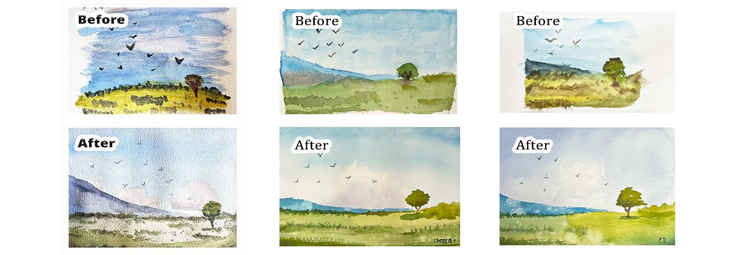
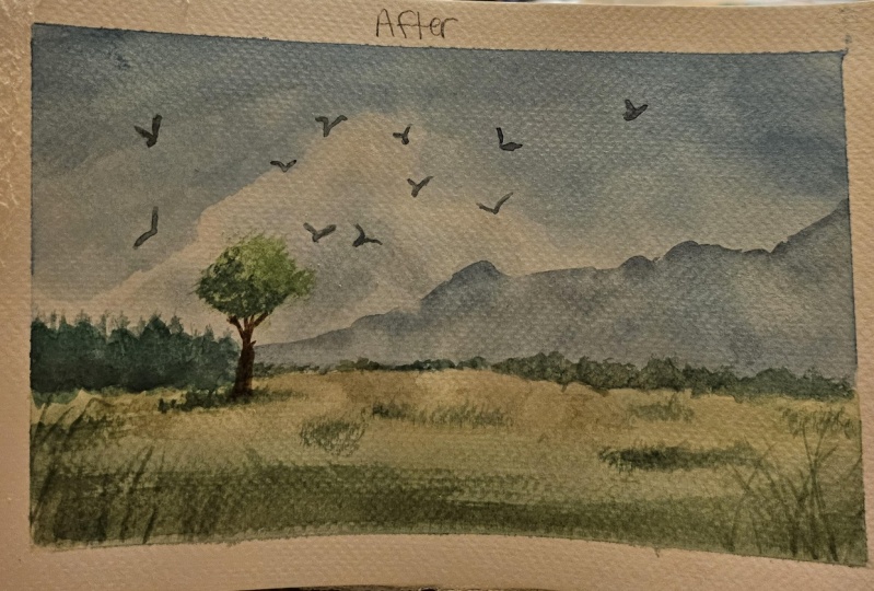
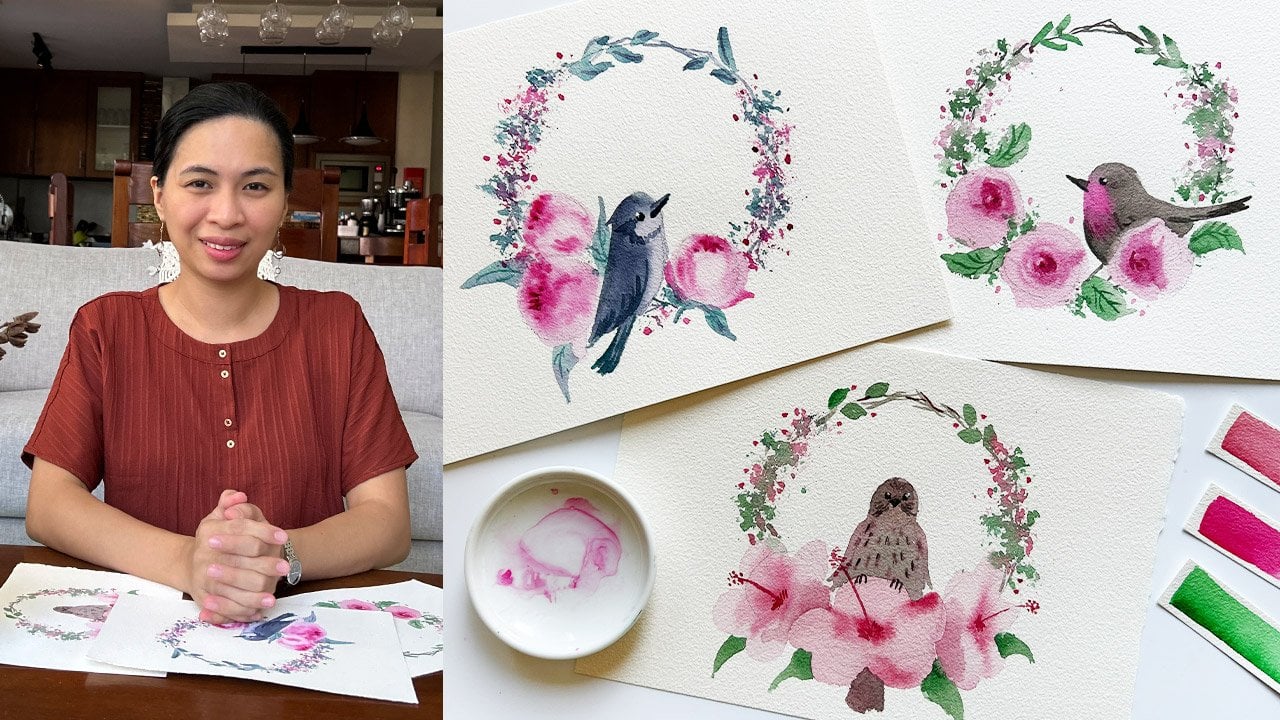
as a medium. In fact, here are some of
their before and after the workshop artworks to motivate you to
share yours later. In this class, I will guide you how to expand
a limited palette, paint the skies, and clouds, effortlessly, work on
the trees, bushes, and other landscape elements, and fix mistakes like these. Once you're done
with a short course, you can then grab your
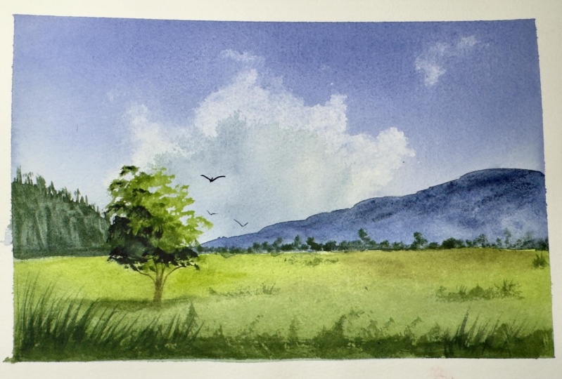
own reference photo, apply the same techniques, and paint a landscape loosely. Here are other landscape
studies I did where I used the very same techniques that I'll demonstrate later. Getting inspired
yet, that's great. Prepare your materials,
and let's get started.
2. Class Project + Gift: Our goal for this class is to
paint this loose landscape. If you stick with
me till the end, I have a little gift for you. Here's an e book containing over 30 combinations of
primary colors that you can use as a reference in picking up your own pigments and designing
your own limited palette. You can grab a copy
by either uploading a class project and or leaving an honest review of this class
and sending me an e mail with a subject,
primary color ebook. Now I know you're excited, but before we get started, I strongly encourage you to do a before the class version
of this artwork. For ten to 15 minutes, without me teaching
you anything yet, I want you to paint this scene. Now, the reason is simple. When taking classes like these, we are so tempted to compare
our work with the teachers. And that could lead to
frustration because you're comparing
your Chapter one to let's say, Chapter 27. So I know that this
is very effective because I've been doing this
in my in person workshops, and the students feel rewarded when they see improvements there before and after the class
or workshop artworks. So pause this video
and before watching the next one where I teach you about my setup and color mixing. Take some time to paint
your before shot.
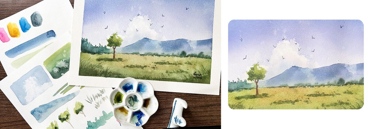
3. Setup and Color Mixing: B. Here's my simple setup. Here I have my watercolor
paper taped on a white board, and I used a masking tape for a clean border later,
my watercolor jar. I have my mini palette here, and I have this dirty
sponge that does the trick. I also have with me some
scrap papers where I can test the techniques that
we need to paint a loose landscape and also
to swatch our colors. Let's get started by
swatching our colors first. If you've been following
me for quite some time, you'll know that I am a fan
of limited palette painting. Okay. The colors that we
have here are Quinn red, Gumbo Chinva, Tile
Blue, and Paints gray. From the tube, I wouldn't
really use these colors. As you can see in our
painting project earlier, you won't see yellows and pinks in the
landscape painting, but they will play a major role in the colors that we'll
be using. Let me show you. Again, Quin Rd, Gumbo hinova, yo blue, and Paints gray. This yal blue is too
strong for the sky. What I love doing with
my blues is adding just a tiny bit of my pink
magenas, or even red. So if you mix some of that pink on that blue and add
water to make it lighter, It will look like this. That's a beautiful
color for the sky. Now, for our greens, I love mixing various greens. I'll have a yellow green. Of course, that would be
lots of yellow plus blue. Then I can vary that
just by adding pink. Look what will happen? If I mix in pink to
my green mixture. Is to blue. I'll grab a bit
of pink and mix that here. It will turn into a
beautiful earth color. Now if you want to dark in that, that's where paints
gray comes in. I think I made it
too dark, let's try. Yeah. That would be a good
shadow color for greens. Now in case you want
some earthy brown color, you can then mix your
three primary colors. I'd like to start
with my yellow, then a touch of pink. You can see that it's brown, but to d saturate the color, you can add a bit
of blue in there. S. We have these
original colors. But if you try and mix
your own combinations can get these beautiful colors that we'll be using
for a landscape. Let me just mix one more, which is a very yellow green, green that's leaning
towards yellow. There. I'm satisfied with this mixes. Now let's talk about the
techniques that we'll be using to achieve a
loose landscape painting.
4. Watercolor Drills: In the previous video, we've talked about
mixing our own colors, and we've learned that
even by using four colors, you can expand that palette by learning how to mix
them appropriately. If you have it already, please do check my color mixing class, where I talk about of different combinations
and color theories that you can apply on
your own painting. Now, let's try the
different techniques that we'll be using for
our landscape painting. So this is what I'll do. I have my scrap papers here, and I will go back
and forth from my scrap paper onto
my project paper. Let's start with the
farthest element in a landscape painting, and that would be most
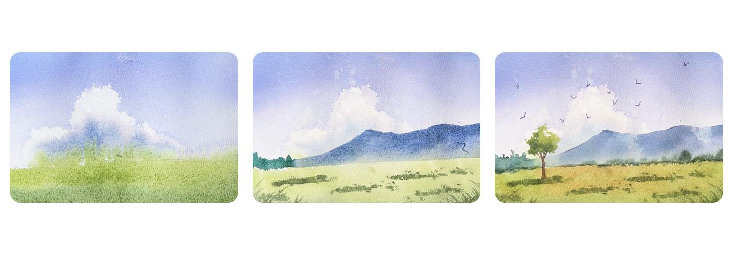
of the time, the sky. So how do I deal with the sky? I use the lifting method
in creating white clouds. So I've mentioned
earlier that I love mixing a bit of
pink on my blue and adding more water to
achieve this Shade, is so lovely, so lovely. Now, while wet, if you want to create sort of
organic cloud shades. You'll have to use
a paper towel. So crumple it into
a manageable size, and then use that to lift
some paint on your paper. Of course, depending on the way you lift your paper
and use a paper towel, the shape of the
clouds will vary. Now, let's try it one more time. I'm reloading my paint here. Also, composition wise. It would be good to make
the sky darker at the top and it creates frame for
the painting itself. We'll see how that affects the overall look of
the artwork later. My paper is still wet and I'll use my paper towel to
lift some cloud shapes. It is an effortless way to
achieve these wispy clouds. And do not worry about
the shadow clouds. We'll deal with that later. We have this sky. Now let's talk about working on the forgot, the grass area. I'll use the same white on wet technique and
make sure that I have the greens that I'll
need before wetting my paper. That would be a yellow green
mixed with a bit of pink, and more And then I will slowly transition
that into a dark green. So you can just add a bit of
yellow on your paints gray, and that automatically creates
a lovely greenish color. So I have my yellow green,
I have my dark green. To prepare the paper
and to make sure that I achieve smooth blending
between the two colors, I love wetting the area
first with clean water. And then starting with
my lighter color, which is yellow green. Loader brush, stop midway. And then without
rinsing my brush, I'll dip it on my
dark shadow color, start from the bottom, and I So if we combine the two, on the background, we have a darker top and
on the foreground, we have a darker bottom. That creates a frame and
encourages the viewer to look at the center of the painting and focus
on the focal area. And in this case, we
will create a tree, a big tree as our main
actor for the painting. Now, while this is still wet, I love splattering, so I'll dip my fingers here on my
water jar and flick. To create that lovely texture. So we've practiced this, now let's move on and work on our background and foreground
in the next video.
5. Background: Right, we've practiced our
background and foreground now. Let's do it on our
actual project. I still have my mixtures here, but let me just
quickly refill this. And while doing, I'd love to remind you that what we're
doing here is just a scratch. It's just a practice. And that helps relieve
some pressure in making something extraordinary
or a masterpiece. We're not really here to
create masterpiece yet, but we're here to learn. So, if it helps, I encourage my students, especially my face to face workshop students
to grab a pencil or pen and then just write
scratch on the project paper. I call it the project paper
just to differentiate between the scrap papers and
the actual project paper. But I do tell them to keep per fitting this mantra that
this is just a scratch. And I do hope that it
also works well for you. Do not pressure yourself
into creating something. It looks like my piece
because that piece is yours. So no need to compare
that to mine. Okay? What you can do is
compare your before and after. And I really hope that you
took the challenge and created a B four
version of the project. Okay. Let's get started.
Composition wise. You would want to put
the horizon either below or over or
above the center. In this case, I want to
show more of the sky. So I'd like to have
my horizon here. Doesn't need to be straight. I'm just showing you that it's below the center of my page. So this would be my sky area. This would be my
foreground area, the grass, the meadow. Now, same approach, I switch now to a flat
brush, a bigger brush, and then I will prepare the background area by wetting
two thirds of my paper. Remember that I also prepared my mixtures here
before wetting the paper because timing is
crucial in achieving a smooth blending of the colors. There you go. Once satisfied, you can also use the same brush loaded with the blue let color and
go back and forth. Making sure that
the top is darker. To create a frame. The top should be darker. As I move downwards, there's less and less
sit. Looks beautiful. Now, for the lifting method, I'm using the same paper towel, I'm crumpling it, and I lift
some cloud shapes here. Don't forget to rotate
your paper towel. Some parts may really get dump, so you will have to rotate that. That's a nice wispy cloud, and I love how that looks. Now, I can re wet some
parts of the cloud. So this part is already dried
because I used paper towel, but this part is still wet. So be careful in
adding the shadows. What I'd like to do
is just focus on the bottom part of
the cloud shape, and I'm being careful not to touch the
still wet background, or else I will have bleeding
or the cauliflower effect, so I wouldn't want that. And then with the same
mixture of my blue violet, I'll add just a teeny, tiny bit of yellow
to neutralize that. I've added more than intended. I'll refill my blue and
pink too much pink. Blue again, and then add just
a teeny tiny bit of yellow. So if you've joined me in
my color mixing glass, you'll know that I am applying the complimentary
color principle. A colors complement will tone
it down or desaturate it. I just rewetting that part. Then yes. That works as a shadow color. And then I'll leave that. I won't touch that. If you
have this kind of brush too, it's just a no brand
calligraphy brush. I think it's made of goats here. You can soften the
edges while still wet. I'm just using very
light pressure. And re touching those shapes. Just to make sure that
they blend in smoothly. Now I can proceed
with my foreground. At this point, this part has already dried
or starting to dry. I have my yellow green
and my dark green colors. I will wet the foreground area, but not too wet. We don't want bleeding. On the background,
but it's okay. This part will be
covered by a mountain, by bushes, and a tree. That's totally fine even
if you have a bit of background or bleeding.
Totally fine. Then again, load my brush
with the lighter color first. This time it's yellow green. That is a lovely grass
color, isn't it? Then without rinsing my brush because the next color
would be darker, I can just dip it on my dark green color and
paint in the foreground. Isn't that lovely? Looking good. You'll
see that some of the greens are bleeding upwards, but no worries, as I
mentioned earlier, that those will be covered
by our mountains and bushes. So just leave it B. But if you don't want any
cauliflower effect like this, then it's better for you
to leave the background to dry and then come back later and work on
the far ground. But for me, I love working
continuously. So I'll do this. Now, I'll dip my fingers
on my water jar and flick. Oh, I should protect
my background. I wouldn't want that
flick. But it's okay. What's done is already done. Now, I'll live this to dry and let's come back later
and add the details.
6. Foreground: Right. Now that the background
and foreground are dry. You can see that it's
a bit of a mess, but I love this
mess because first, this is a loose
watercolor painting. So no need to be
realistic with this one. And second, it gives
me an opportunity to show you how I fix
such errors like this. So first, we have
blooms like that. Let's try and rewet that. I've done this before. Let's
see if this will work. So all you have to
do is rewet that to get rid of the harsh edges. If not, I'll just let it be. It's part of the
painting anyways. And then for this part of the
cloud, I'm also rewetting. But for the cloud, I will be lifting up some
of the colors. So that part already
lightened up a bit. Now, for this part
of the background, I'll just re whole area. I can just pretend that
they are clouds too. And then reload my
brush with blue violet, sort of a different
shade, but that's okay. And sort of cover that. L et's make the top darker and I'll like how it's looking. Looks better than earlier. Now, I'll grab my
favorite blender brush. You can call it a blender
brush and just mix. Now, this gives us some time
to work on the foreground. I'll grab some
scrap papers again and show you how I work
on the foreground. I use the same yellow
and paints gray mixture. For the darker greens, and then there are
several options on how you can add bushes
in the foreground. First is you hold
your brush like this and with an upward motion, you can go like this. Now, if you don't like the
shapes that you're producing, you can use your
finger and that. That. Or you can
do dry brushing. I will drag my brush
across like that. That would give us some texture. It would be helpful if you have a smaller brush and then apply a light
pressure and do this. With quick motion,
you can do that. Now let's try it on here. The sky is still wet, so I won't touch that, but we can work on
the foreground. Again, paints gray and yellow, such a lovely green color. Then we want to make
the bottom part darker. Dry brushing. On this side, I'll start from right to left. Takes a bit of practice
to do dry brushing. It also depends on your brush. I really suggest that you test
it on a scrap paper first. Next, I originally planned
to place the tree over here, but I think I'll move
it somewhere here. So if the sun is shining
from the right side, so the shadow should fall
on the left side, right? Using the technique
I showed earlier, we we'll try to position
our tree using its shadow. So you don't want your tree
to pop out of nowhere, that it feels like it doesn't
belong to the whole piece. So we will connect it
by adding its shadow. So the tree would
be around here. The shadow would be here. So Using the technique
I showed earlier. I'm holding my brush like this. It's also relaxing to
hold a brush like this. And then I'll add
some grass shapes. I can also continue by adding more bushes in the foreground. Have fun. Think too much about creating
a perfect landscape. Just have fin and experiment
with the techniques. Anyways, this is just a scratch, don't pressure yourself, okay? Can also add some grass shapes here in the foreground
and really just have fun. It doesn't look good,
at least you learn, even I have some artworks
that I think are failures, but I still show them to people, just to remind them
that we're not here to always create
a masterpiece. Just paint and paint
and paint and one day, you'll create a piece that
you're really proud of. But if you're just
a beginner the embrace the learning
process, enjoy it. Okay. I think I'm satisfied with how
the foreground looks. Now, I'll just leave
this to dry and work on the mountains and bushes
in the middle ground.
7. Middleground: Now it's starting
to come together. What's left are the
mountains and bushes, and some trees in the
middle ground, and then, of course, our main
character main actor, the big tree, and some birds. Okay. So what I love to do with the distant mountain
is to create an atmospheric perspective where the bottom of the
mountain is lighter. This is how I do it. I'll use the same blue violet color that
I use in the sky, but only bluer and
darker this time. So if my mountain is a
triangular shape like this, I will wet the whole
mountain shape. And then load my brush
with that blue violet. I'll make some paints gray and make sure that
the top is darker. It creates an
atmospheric perspective. Some fog or smoke at the bottom. Now let's try replicating
this into here. The tree would be here, meaning my mountain
shouldn't cover the tree. So I will wet this shape. L et me try to use a pail wash so you know where I'm wetting. I'm wetting this shape. Can you see that? So that would be my mountain. Now, let me reveal my blue violet and add just a tiny bit of
yellow to the saturate that. Then drop the colors
at the top first. So it's darker. And spread
it across the bottom. Now, we need to make the top darker so I'll mix
in some paints gray and drop that
mixture at the top. Isn't it so easy
to make decisions when mixing your color if
you only have a few choices. I have my primary colors and I have paints gray as
the darkest color. It's really an easy decision to pick paints gray
to darken a color. Now, it looks odd living the
mountain caught like that. So I will sort of continue, but I will make that into a blue green mixture
so that it looks like there are mountains
in the middle ground too. So this time it's blue green, and I'll just create
a shape like that. They are now connected. That looks odd. I'll drop
some darker shapes in there. That looks odd. Let me use
my finger and retouch. You can also switch
to a smaller brush. And work on the trees here
in the middle ground. Now the bottom of the
mountain also looks odd. We can connect that with the foreground by using
the same pines gray and yellow mixture and didn't
just drop some colors. It would look like there
are bushes in that area. And that odd connection. You can just use your
finger to retouch. This is the beauty
of loose painting. Don't need to worry too
much about details. As long as it looks like
a landscape painting, then you should be happy. Now, the problem with this,
not really a problem, but the issue that I got
here is the mountain is such a big shape that it will compete with
our main actor. So what we can do is we
can break off the shape. By our handy paper towel. What I'll do is I'll just lift some parts of the
mountain like that. Now it is broken, and it
doesn't compete too much. It also adds a bit of a drama and an atmospheric
perspective when we do this. So now it's broken. That gives us space for
the tree over here. So for the tree, I'd like to start
with a blue green. And I'm adding some there. I added some pink to neutralize the color and then yellow green. We can have it the other way, start with yellow green first
and then the dark green. I'll just use the
side of my brush and create an abstract
tree shape like that. For me, this is a tree. This could do. Again,
use the side of your brush and practice
drawing some tree shapes, and then your paints green and yellow mixture drop shadows on the left side because
the sin is on our right. Once you're confident,
Then let's do it. So the tree would be over here. I'll use the side of my brush. Isn't it lovely using
an abstap as tree, only dry with every lit, every trunk, every branch, as long as it looks like a tree. Now, onto my darker color, and I'm just dropping those
at the lower left side. Remember the brown mixture, mixing all of the
three primary colors. Now it's the time to
use that for the trunk. If you're not so sure
about your mixture, you can always grab a scrap
paper and test it out first. In time, you will
require less and less tries to achieve the color
that you want. Have patients. Have patients. That's
why in my mixing class, I really encourage
the students to take time and swatch
their colors. Get to know your colors, know the mixtures that
they can produce, and you'll be thankful that. Okay. There's my tree. All that's left are
some final details. I'm just leaving this to dry, and I'll see you
in the next video.
8. Final Details: Some are final
touch and we're de. Composition wise, we've
managed to darken the top and the bottom
and that creates a frame, and that encourages the viewer
to focus at the center, but not really at the center because if you divide
this into thirds, the tree, which is our intended main actor lies on one of those
intersections. I I love adding birds on
a landscape painting. And I can also use the
direction of the birds and their position to
point at our main actor. And on this case, that would be this tree. So I'll grab an even
smaller brush and use a darker version of the
sky color for the birds. So it's not too distracting, it's not out of place. And make sure to vary. The position, but most of them should point
towards the tree. So I'll make it so that they're going this way,
this way, this way. Okay? If you need to practice how
to paint birds like this, practice as much as you want
in your scrap paper and then come back in and work
on this final detail. There's always that one bird
that's always left out. It would be this guy. I love adding that additional
detail in my painting. Not too much. I'll stop there. Now, I also want to tie in together my bushes here
with the foreground. And I haven't really used the brown color that
I mixed earlier. So I will add a touch
of brown on this part, se glazing,
watercolor technique, and then the rest, I will cover it
with green again. So that would be paints
green and yellow. If you also plan to do this, like adding a glaze
over the foreground, make sure that everything's
wet and that you are applying a light pressure so as not to disturb the
layer underneath. So I love using a soft brush like this and a big
flat brush, too. So there's less required stroke. Now once I come in here, I will just drop my
brownish color over there. So more greens.
Okay. Looking good, looking organic. Then I'll stop. One more touch, and we're done. I really love flattering. Make sure that your gadgets are far from your working area. This is our class project. I'm really looking forward to see your version
of this artwork, so please don't forget
to share yours and comment on your fellow
students works too. I'll see you in the next video on what you can do next and apply the techniques that we've learned in your own painting. T
9. Claim Your Gift: That's an amazing
experience, isn't it? Thank you for letting me
teach you what I've learned. I used to stress too much in replicating a
reference photo 100%. But with a loose painting style, I get to enjoy the process
instead of the results. And that's my key
takeaway for this lesson. I'd also encourage
you to embrace the mistakes and consider
them as happy accidents, like what you've
seen me do earlier. I could have given up during
the background layer. But as you can see, if you push through, then it will eventually
turn out beautiful. And if it doesn't, who cares? It's all now part of
your learning process. And speaking of
learning experience, you will fully complete it
once you receive my feedback. And to do so, please
don't forget to share your project in
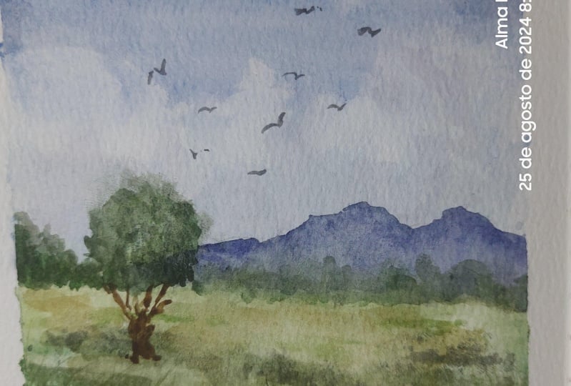
the projects gallery. To motivate you to do that, here are some more
of my students before and after the
workshop artworks. If you want to see
more loose painting and limited palette classes, do follow me on
Skillshare and together, let's make this world
a little bit more colorful with our artworks.
 Bianca Luztre, Watercolor, Productivity, Color Mixing