Transcripts
1. Welcome!: Welcome to Eliana. We are painting
pretty florals with an upward direction in
this ode to wildflowers. You could paint along
with me step by step or create your
own favorite flowers. Before we jump in, I
just wanted to say hi to my new followers and the followers who have been behind me these past four years. I really appreciate
it. Thank you so much. Since 2020, I really feel I found my sense of purpose
in teaching on skill share. It's my happy place. So what will we be
covering in the class? We're going to be
creating a background of buttery yellow in
gouache or water color. We'll be using round
brushes and small filberts. And one of the
aims in this class is to explore analogous colors. So we're mixing between the two primaries
of red and blue. You're mixing a violet, which is between
the pink and blue, a pastel pink, and
then are going to go right over to a red
violet, very deep color. And what Creola
call Jazbery jab. This class is for confident beginners to
intermediate level. I can see this being handy
for those of you who have a Society six or
red bubble or print full account because it lends itself to a replete
design really well. I'm often asked if
it's okay to make salable items from the art
created from my classes, and the answer is
a resounding yes. Any of my classes can be used as a resource from which you
can create your own designs. As always, I design my classes for those of
you who want to nurture self care routines and just to find relaxation in painting. I often paint flowers, and it's not until I finish the painting that I
decide what they are. So allow yourself
the same freedom as we explore these wildflowers. My absolute favorite part of skill share is the community. You're also encouraging
to each other, and I absolutely love
seeing your work. There's no pressure
to share your work, but if you'd like to,
you'll find it under the video in projects
and resources. And then on the right,
you'll see submit project. I know some of you also share
your projects on Instagram. So do tag me as I don't
want to miss anything. So let's move on with our
class Eliana together.
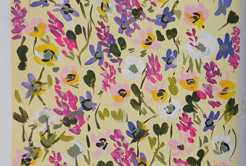
2. Background, White Roses & Michaelmas Daisies: So I'm going to start
by taping off my page. This is just a choice. I quite like some crisp edges. And I believe this is EMT tape. And this is she hot press
paper in the square block. So let's start off by putting
down some titanium white, and handsy yellow deep. The handsy yellow deep
gouache is very pigmented. So I just wanted a tiny
amount with the white. And then choose a large
brush and slosh it down. This is quite thick. It's not like doing a
watercolor background, so about 70% pigment 30 water. I'm now mixing some
undersea green and white. The undersea green is what color and the
white, it's squash. Just mixing a little bit of
the yellow mix, as well. And whilst the
paper is still wet, let's go in and make
some random centers for our first flowers. I find it easier just to
think of these as blobs rather than having to look like the center of a flower,
if that makes sense. I had some quin lilac
still left in the palate, so I just mix that with
some white gouache. Let's now put some white
petals cradling the centers. I'm using a size
ten round brush. This is my scara versitle. Even though it's a
larger round brush, I find it really good for
small flowers because I'm just using the tip to
about a third of the way down. Let's go over some
of the centers with little petals just
so they look joined. I'm not worrying too much about the shape because we can
always add petals on top. So I'm just building
up the layers here. And now let's mix a violet. And I've put down French
ultramarine and opera pink. And both of these are gouache. And I'm mixing a little white. And I'm moving down to
my size to fill bit. And these could be
any flowers you like. I think I see them as
Michelmas daisies. I often paint flowers and then decide what
they are afterwards. So I'm varying the petals
between a lighter lilac, a pinkier lilac, and a lilac leaning more towards
a French ultramarine. Varying the size direction and also doubling
up on some petals. Still a little bit
random in placement, but becoming more
cohesive already. I'm mixing a little
bit of a very light green with our green mix and
the hands are yellow deep. And these centers are so easy. It's really just one
little brush stroke or just a few little dabs. We can keep it simple
because we can add a tiny bit of
detail later on. I used to overcomplicate
my centers, and I'm still apt to do that. So I'm just trying to
keep things quite simple. Just going over this one here because I placed it down
on an area of wet paint.
3. Pink Polyantha Roses: So I want to make a
little bit of room in the well for some opera pink, and I've got buff
titanium there. It's just to take the high
color out of the opera pink, and I might need to add
a bit of white, as well. I'm just going to
see how that looks. Bit of water added. And I want it quite thick. So I think I'm going to add
some of the titanium white. And that's much better, very opaque, very gentle pink. And we're working around a center here that
we haven't placed, but we can imagine. I'm just using
gentle sea curves. And we can keep in awareness
that we are aiming to create analogous colors between the primaries of red and blue. And you can decide on placement. You can start to overlap with some of the
motifs underneath. And you have a choice of more placed motifs or
a more scattered ditzi Such a cute color. I haven't used Opera Pink
for quite a while. So it's lovely, especially
in the gouache, now that I know that I
can use Daniel Smith. It's like a whole
world has opened up. So this is watercolor
undersea green. And I'm just mixing in some of the pink
that we have there. I like doing this because it really starts to bring
everything together when you're borrowing from one color to add
quality to another. And just with the
tip of the filbert, I'm doing these
tiny little centers little blobs and dots. Very, very simple. Just finishing up. And let's move on to Lesson two.
4. Rich Green Leaves: Let's add some lush leaves now. And just as we did in
our Christmas doodles, we're going to mix
lamp black and hands yellow light to create
a lovely rich green. I think it's my favorite green, and there are so many variations
between the two colors. These are both gouache, but what color
would be fine, too? Isn't that just a
gorgeous green? So it's ring on the warm side, but it still has that kind of blue undertone
from the black. And just laying down
these little leaves, quite gestural and quick. And that actually might
be just a bit too dark. So I'm just going to add some
more handsome yellow light. I want it near a green gold. And in fact, if you don't
have black and yellow, green gold would be
lovely for this. So it's easy enough to correct. It can just go over the darker leaves that
you're not keen on. Another way of doing this
to lift the darkness is just to mix a little bit more white in with your
green mixture. And almost mix on the page. So I'm just adding a very, very light green there
over those dark leaves. Little expressive movements. Quite a few of those little side sweeps that we use
a lot in classes. And it's more about what
it looks like as a whole, rather than feeling like you have to add a stem
to every flower. And I find working
really quickly helps. Otherwise, I overthink things and it can get a little stilted. So I'm just casting
my eye around, making sure it's all
looking balanced. And, of course, you don't
have to do one like this. You could do a very random one with your favorite wildflowers. In some places, it's
quite nice just to go over one of the flower petals. And finally, before we move
on to the next lesson, I'm just going to tap in a few little centers to the
white roses with this green. Little taps of the
tip of the filbert. Or you could do this
with a liner brush. And I think that's it.
5. Viper's Bugloss: Now I'm placing down
Perilin violet, which is one of my favorite
colors of all time. I love Perlein violet in
with wild flowers like this. I don't know what
it is about it, but it just completely
transforms what I'm painting. And I'm just adding
a little bit of opera pink there just
to brighten it a wee bit and making it
a little bit more opaque by the addition
of some white. But it's this gorgeous, gorgeous, deep red violet color. This is the color I
mentioned in the intro. After I finished painting, I realized that I'd
painted Viper's Buglos, which grows abundantly on the
waysides close to my home. Echiums in reality, lean towards more of
a French ultramarine, but I think we can be allowed
our own interpretations. So I start from the top with these flowers with very
small petal shapes. And then as I move down, I start to broaden
out the petals. So a mix of the side sweeps, little dots and throw
away expressive marks. And we can continue some of these flowers in between
flowers that are already down, so around the pink
or white roses. You can see that here, not so little details, which is what really
keeps the eye interested. There's so much to look at in one of these
wildflower gardens. I really wanted to bring
that to this painting. So you can see that I'm
going out sideways, as well as I'm making
the petals broader. I'm adding a few more as
we move down the stem. There's no hard or fast
rules with this class. You could paint in your
favorite wildflowers and switch the colors
around, if you like. Very, very restful
to do these flowers. There's not much
about them, really. They look complex, but
very, very easy to do. Once you get into the flow, and then it's very hard to stop. Can you see how
this color is just harmonizing that lovely
pastel pink and the violet? So I am just casting
my eye around, making sure that it's not
getting too overcrowded. And as you'll
probably know by now, I do like to give flowers a little life beyond
the tape or page. So I'm just taking that one and allowing it to
flow off the page. So you can get
really in the zone. The reason why these
are so relaxing, I think is because you're doing the same form of flower
over and over again, each with a little bit
of character of its own. So it allows you just
to rest for a while. And that's why I love
doing these tall flowers. So pretty this color. So taking that one
behind the white flower, And I se behind
the violet flower. Now, I could carry on
painting these flowers. But I know I have to
stop at some point, and this feels like
a pretty good time. So I'm just adding a
few little dots there, but, yeah, I'm really happy.
6. Viper's Bugloss Layers & Elongated Leaves: So let's mix up a pink
with opera pink and white. And I'm also taking some of that over to our parlein violet mix, just so we can vary the
colors a little bit, as we add highlights
to the viperpuglos. So I'm layering petals over the existing ones or placing them in between
the other petals. Just very light touches and moving between
the two mixes there. I do like mixing with
opera pink because it's such a bright color that
it holds onto that base, even when you mute it
slightly with white. It's amazing what these
little highlights do. It feels almost like the flowers are growing
out of the page. I just love this process. So, adding some brighter
petals now nestled in amongst the previous ones with that opera pink
just slightly muted. And it feels almost like being a bee flitting
around the flowers, just adding little touches. And I'm just adding
a few extra petals there where there are spaces. So let's now mix a lovely green using the black and handsy
yellow light mix, but leaning towards the
handsy yellow light now. If you don't have hands
yellow light or black, you could always use
a green gold here. We just wanted to
bring a little bit of contrast to the
darker leaves. And I'm starting the
movement before I hit the page with these
slightly elongated leaves. I'm placing these in the spaces that we've created with our
flowers and darker leaves, sometimes going over
motifs as well. I want to get a little bit
of movement in these leaves, which we can do because
they're more elongated, we can change the direction
of the brush mid movement.
7. White Rose & Michaelmas Daisy Centres: So let's bring the centers
of the roses to life a bit. And I'm just going to put a tiny bit of the handsome
yellow light there, and I've switched to my
size five round brush. I'm just tapping
in a little bit of yellow around the
green in the center. I don't want to
obscure the green, so just painting it beside What we're effectively doing is bringing the flowers
out from the background. So the more detail we
put in one flower, the more we will have to
attend to the others, if that makes sense, so
they're all growing together. So I'm including any flowers I feel just need a little boost. So I'm just thinking about
the Michelmas daisies now and I'm mixing
of chartreuse. This is just that black and
handsy yellow light mix, and it's amazing how
many different hues you can get out of that. So I'm adding this chartreuse to the center of my
Michelmas daisies. And can you see how
they're all starting to level out and become
really cohesive now? It really feels like a walk
in a wildflower meadow. I often feel that because
I am mostly housebound. When I paint, I honestly feel as if I've been on
the longest wonder. It's a real gift, isn't it, to be able to paint and
to express ourselves. So I'm going to do something
that's quite daring. I'm going to add black, black, neat black to the centers
of the Michelmas daisies. It's something I've
seen a few artists do, and I was intrigued
by it because normally people
avoid using black. But when it's used in
the center of a flower, I absolutely adore it. I've started to do
this more and more. I think because it adds a tiny bit of shadow
to the center. But there's something about
the black, which, again, works to bring these flowers
closer to us off the page. We're aiming for a
very thick paint here, so probably 90% pigment, ten water or 80%. It's also very restful to do. I'm using my liner brush here just so I have
lots of control, and I'm really just doing a
sea curve around the center. And maybe a few dots and dashes. So I'm using this
on the roses, too. I think you'll be
really surprised at how well this little edition
of Black works. A few dots. So we can take our time again. And this is very
meditative, as well. We've done most of the painting, and now it's just about
these finer details. This is Wade. You can really
sink into this painting. Maybe have a cup of
tea next to you. The lovely thing
about building up gouache flowers is that we
have time. There's no hurry. Unless you wanted
to mix the colors on the page, we
can take our time. Very pretty. Just feels like
we're tending our garden. If your paint gets tacky, just add a tiny touch of water. These little sea curves and dots also bring the petals and
the flower centers together. I am loving those
Michelmas daisies now. So when you're ready, let's
move on to the next lesson.
8. White Rose Layers, Centres & Stems: Making sure that these
pallet wells are clean, and I'm going to add
some white quash. At this point, it would be good to have some
clean water, too. Let's go down to a size zero, filbt or a round brush. So we're going to be using
this in almost its neat form. We just want the
brush to be damp. Then I'm going to slowly
build up some layers. And we can pull the
petals over other motifs. And we can start to add some brushstroke texture
to these white petals. And that will also
bring these flowers to life and even more off the page. And really livens
things up a bit, having this crisp white. So just enough water to
dampen the brush and really layering on the white so we can start to see
the brush strokes. This is restful, too, because we're going over petals that we've already laid down, either going over them or
adding some additional petals, flowing in different directions. And just with the pink
petals that we did earlier, it might be nice just to add a few white petals in
some of the spaces. Always looking to achieve
that balance across the page. And encouraging our
flowers to leave the page. It will be so nice when
we take off the tape. Another trick is to put a really bright or white
color like this over dark. So I'm just allowing them to glance over the
darker leaves there. And why not add some little touches to
our Michelmsaisy centers? Next to that black, it will really allow
the flower centers to pop and create a
little dome shape. This is great for
berries, as well. If you don't have a
nice zero filbert, you could always do this
with a liner brush or a small round brush or
even use a white gel pen. Time for some little stems now, and I've picked up my
liner brush again. And I'm using the green mix of the black and the
hands yellow light. And I might add just
a few little leaves coming off the stems. I'm not too worried
about these all joining up and being botanically correct because we
really just doing these little strokes as a
way of bringing movement, we've got a lot of flowers, and I really wanted some stems to allow them to
flow together a bit more. And I'm just threading
them behind the flowers. Very enjoyable just to follow the lines down through
all of the motifs. And some can just fold over
some of the white flowers. Very quick fluid movements, and use that as a way of
marrying up all of the flowers. And I think that's it. It's
just a very light touch and a few tiny leaves. So let's go back to
our undersea green, and I'm just adding
some white to that. This is a cooler green than the lamp black and
handsome yellow light mix. Almost like a gray green. And I've noticed that a lot of my leaves are
going vertically, and I want to just to add
some lateral movement. It's not going to take too
many to achieve that effect. But I just want to
place them evenly. So just from left to the middle
and right to the middle. And that feels so
much more balanced. Yeah, that's a lot better.
I'm happy with that.
9. The Reveal & Finishing Touches: Okay, so it's reveal time. One of my favorite bits. So let's take the tape off. This is really reliable
tape. It's empty. It's so nice to see these
crisp edges. So cool. And it's done really
well, actually, considering that I slopped a lot of paint on
at the beginning. The tape has done
a really good job. It will really allow
your painting to shine. I'm not always patient
enough to tape off my work. But when I do, I really feel there's an
excitement to the end of the painting a kind
of an unknown quantity. And when you see it, it really does make
it worthwhile. So once I've taken the tape off, I do often just find little
things that I'd like to add. So I've picked up my
liner brush again. And I'm just going back into the black,
handsy yellow mix. What I realized I wanted was just a way to bring the
vipers view gloss together. I'd forgotten to add foliage. So I thought I'd just
go back in and do that. I'm just thinking of
adding green between the petals rather than
having to shape leaves. They were probably
okay on their own, but I just wanted to add some supporting
structure to them. This is the kind of
detail that you can come back to if you
wanted a break. I'm just gently
filling out the gaps. I didn't want to introduce a different green in fear
of upsetting the balance. And I'm extending them
down a little bit beyond the lowest petals
with a little stem. Again, this doesn't
take much thought, so it's really relaxing. Do This feels like a good move because I'm also introducing more green to
balance out the white, pink and violets of the flowers. Coming to the end now and
wanting to keep on the page, try not to disrupt that nice crisp edge.
Could this be it? Let me take one last look. And yeah, that looks good.
10. Thank You!: Thanks so much for joining
me in this class, Eliana. Where we've been mixing colors adjacent to each other
on the color wheel. And we've also been building our confidence in how to
create pretty layers. I hope I've been
able to kindle or re establish a love of meadow
and garden flowers. I thought I'd share some of the meadow paintings I've done
over the past six months. I actually managed to
record some of these, so if there's a painting
that you really like, I can tag it on
the end of Eliana. So let me know which
is your favorite. I look forward so much
to seeing your projects and chatting over our
discussions or on Instagram. Until then, take care
and happy painting.
11. "Primavera" part 1 Bonus lesson: So I started with
some undersea green. You can decide the direction
at this stage as well. The top. It's a mix of
French ultramarine. I do it. White. And then a little
bit of handsome yellow. A bit more yellow to that. Oops. So that's how it started. Then I pulled through some
really thick undersea green. Just kind of get some
texture started. So I want the bottom
to be the darkest. Then it's going to get
lighter towards the top. I put some white over there. What I did then, I went in
with some watered down white. Can I do it over the can see? I kind of adds texture
and a softness. So that's where I
go with that one. And then, well, maybe I'll
just start with this one now. So I think I'll just start
with the fine liner. I I want to be constantly
thinking about light and dark white with some
handsome yellow, a little bit of green in
there as well so kind of think of light and shade. So I can use this. I'm trying
to keep the greens varied. Very colour skin. To be quite confident
with these. And the other thing I
want to remember is a larger flower heads and then they re seed
into the distance. Might use this. So kind of
scraping this on its side, like this, but also you
can do it this way. To keep it really more
like mark making. So we've got that dark
green and the white, and we've got this very
spring like green. So keeping the
background deep green, and then we're just going
to lay some blame on top. I'm going to pull through
quite a bright, yellowy green. Want to try this out first. And at these toca
come in to the page. Just rolling the brush round. Like a bit of dry brushing, so that's an option
here as well. The thing I need to be careful
is not to do too much. So because we're using
thick paint there, it's hard to know how
it's going to come out. It has its own of shape
making qualities. It's going to add a little
bit more dark bottom here. It's a little bit forgotten. Alright. So now we've got
the basic texture down. It's the one I did and
didn't film, of course. Might put a few of these marks
in. Those are quite nice. Going back to my
half inch flat brush using under sea green. The other thing to remember is that you can pick up
more than one color, and that's a very
nice effect as well. So I want this to
be a dry brush, so you need to take
the excess up. You still have
control over this, it looks very, very dry. If you move slowly
and push down more, you will get some results. But just going with the shapes that this makes. There's very little
control over it, really, but that's very the color. It's the same color. Then as we go
further up the way, we can use this end. I'm just going to dip
it into that mix there and could start to make
some little marks here. Just pull in the side of this
dip into the white a bit, adding a mixture that
we made this with, that's yellow, red and white, and just dotting those in. There's the red. That's
actually still wet, but I quite like the effect
that it's making on flowers. Let's come back to the white. So I'm not really thinking
about which flowers these are. So it's a bit of like to
and fro all the time. So that's enough
flowers for now. I want to add some's trying to remember 'cause
I didn't film this. Which brush I used? I think, actually, I used. Is that right? I think so. Let's try it. And let's go
for a kind of a minty green. So that's undersea green, white, and Bitiful Triborin.
12. "Primavera" Part 2 Bonus Lesson: I think I just did this. This is, like, I mean, it's great because cosmetics are so much cheaper than
artist brushes, and they have all
the same shapes. So this is kind of
slightly on a slant. It's like a flat brush. But I don't know what
you'd call it a wedge. I'm not sure. So then I'm just gonna put some of these in
mix colour on the brush. Oh. Oh, like that. So moving backwards and
forwards all the time. It's gonna do a
bit more up here. So like a yellow
and white together. And I just want to make
some kind of jerky marks. Kind of rolling it and just letting it go
where it wants to go. As soon as I catch
myself trying to paint something like trying to paint a particular
plant or leaf, I stop myself now
in this particular with something that's more semi abstract because we
don't want that. We're going for a very fluid
kind of expressionful look. I quite like this mark making, and might just add some dark next to it next
to some of these. Dancing flowers in a distance. Okay, so spelled
in character now. We've got very warm colors. We've got peach red. It might be nice to
bring in some um, Greenland's lace or
whatever you call it. So this takes a
little bit of prep. You can actually go in
and just dip it into your wonder sea green or
even a black or gray. Oops. And then let's
practice before we go in. We're trying to get
this kind of feel. That looks actually quite
nice. I think it's ready. So let's just put
some things in. To really stand out, so it doesn't matter if
you've got loads of paint down because we want the
slight and pasto look. Careful not to do too many. What we can do then
is go back in with this and toss them around
the deer footmarks I could feel myself
tightening up a little bit. So I want to kind of
start loosening up. One more down here,
and this will be a bigger kind of head
because we're going into the distance Okay, and then I with a
little bit of green, if you want, just to kind of
add a little bit of shadow. But you don't have to.
Okay, get a bit busy. And what I tend to do when I'm not sure if something's working is put a bit
of blue in there. So I'm going to put some
French ultramarine down. I'll use this shape. It's like a wet shape. And maybe a little bit of this peach here and don't
want to mix too much. And let's just put in
some blue flowers here. And I suppose I'm vaguely
thinking that they might be taller flowers like um I can't
remember the name of them. They're on the side
of the road a lot. And a bit bigger down here
down at the bottom here. And then little marks
into the top there. You see how balancing that blue is with
the warmer colors. Go off into the distance. Okay. And now I think I'm
just going to add some lines. I'm in danger of making
it less abstract. So but I do want to have some lines coming
down from these plants. So I'm using my liner. What a lot of pigment on
there, but enough to move. And then I'm just doing some very wispy marks
underneath these baths. And the good thing about
working in this style is, if you do a line, you don't
like it, you can go over it, so much harder to
do with wood car. So I'm just filling in a few
lines here here and there. And I now think the background
could be a little deeper, so you're going to very carefully go in with
some undersea green and just kind of pick up the areas around the lighter flowers
and just add some dark. I want it a little bit wetter and to create that kind of dark,
really dark background. Okay. You see how that's helped the
top flowers come forward. So next time I remember that
I want the background very, very dark, almost as if you're
starting with black paper, which of course you can. I quite like that
effect, actually. I was just looking to
behave in the background, but actually quite like
those wispy little marks. Okay, so I think all I'm
going to do now is just add some little white highlights on these flowers here,
maybe on the blue. But to be super careful now because I know I'm
nearing the end and really don't want to
just go, you know, too far. That's too blue. It's taking off the blue there
that's still on. Okay. I've got to stop there. And this is my favorite part. I'm just going to
take the tape off. So I've got one there
that I can do tomorrow, but you can see how easy it
is just to prepare paper. That's all I did with these.
So let's have a look. I would love it. Yeah, it's very pretty. And actually, I realized, although I felt I was more
tense from the first ones, that there's a lot
more movement in that. I've really enjoyed that, so I will remember that in future. So thanks so much
for joining me. I'll see you again
really soon. Bye.
13. Azurita an extra (extra) Wee Study: So it's quite thick paint. It's not like you
would apply acrylic, but it's somewhere in between a watery and
a very thick mixture. So maybe 60, 40, actually, 60 40 water just
wait a few moments. Make sure you've got
your spray bottle on it. It's not on hot mode. That's it. You can see it
happening as we speak. Isn't that gorgeous. So that's a really nice starting point for any paintings that you want. We can then add some
flowers once that's dry. It's such a cool technique, and it does work with
lighter colors as well. It's more subtle,
but it does work. So I'm just adding some
French ultramarine. And I'm just gonna
mix a few colors up. So maybe you get some
different colors in here and just
some dry brushing. I like that, but it's
not quite dried. So whilst it's like that, I'm just going to
scratch some lines in. Do that a bit more,
quite like it. Keep it nice and simple, Holly. Don't get carried away. Okay, got some texture
already. Isn't that brilliant? Learning curve for me. I'm going to what
am I going to do? I think I might
splash some whiting. Just want to build up
some texture so we've got a feeling of background. Even for a tiny little
study like this, it's really worth trying out different techniques that you might want to then take forward. Okay, I want this quite thick. And I don't want a lot of it. So let's see how I'll get on. Kind of like single
cream, I suppose there. Okay. That's looking nice. Looks a bit blue in there maybe. Very, very delicate.
Some nice blow. Be be nice there.
Okay. Stop, Holly. Oh, do I want to stop? No, I don't want to stop. Now stop. Okay, now
stop. All right. So I just need to decide
which brush I'm going to use. I think I like this one, which is master
touch aquamarine. It's a fiilbet size four. You don't need to have
a fiilbet though, you can do what I'm planning to do with a round brush as well. And let's mix a periwinkle
or a forget me not blue. It's mostly just ultramarine there with a tiny touch of pink. They don't have to be
forget me nots, do they? Just gonna pick up blue and
white at the same time. And I want these to
be really gestural. I'm just keeping the eye moving. I'm going to do an S shape
which takes your eye upwards. Anita. I'm going to push
it up a bit and then pull it through and try it
slowly. That's really nice. Hasn't got a lot of
character though, what I'm going to do is maybe
try different blue as well. I've got some in Dn thrown Gase. Darker color here,
different color, fan out. And you see what we're doing
is just kind of mixing. And also, I did that
very kind of slowly. So right, gonna get really loose now and just kind of add
a few little touches. I'm gonna pick up
everything there. So I'm just going
to do some little white dry brushing flowers, tiny little ops. Most fairy. Now, I like that now? Better. Okay, good. That's it for the flowers. Now what shall I do about them? I'm going to be minimal again. And I could go very abstracteO I could go more
placed. How much will it be? Yeah, I like that, so I'm just gonna keep it. I think if I try, I'll show you both ways, and then you can decide which
one you like or use both. Well, I think I
prefer my everything on the end of that
version better. So I'm going to just stick
with that kind of add. Yeah, I like the kind of just not knowing
what's gonna happen. Move. Even that's
too much, really. And finally, I just want to put some nice luscious kind
of long leaf feel to it. So I'm going to choose
my brush carefully. I don't want the liner brush for this because I want it
to fan out a little bit. I could try this,
choose use this. This royal and long nickel, like a sword brush. Let me see what that looks like. Got so many brushes. It's just ridiculous. So I want something that just really feels organic.
That's quite nice. 'cause there's not
a lot of control with it, but there is enough, so maybe you do
something like that, and I'm just going
to pick up a bit of everything on my brush. I've got hands yellow
light, handsy yellow deep, the remains of the
green appetite. It's quite light,
so Wnt it just add. So lovely flowy leaves. That brush is perfect
for that, actually. As soon as I've got
neutral tint here, I just want to do some
little added details to the end of the leaves. It's just something I
like to do personally, just like quite a
dark green there, and preparing a brush
before I put it down. Just some little kind
of added details. See how simple that is
and you just kind of outlining the leaves a
little bit. So cute. O. Um, oh, dare I in one more move. I think this petal here doesn't
have a lot of character, so Oh, my God, famous last words here. He tried to do a
very simple study, but I'm gonna try because
why not? You know? This is why we're here. So I
want to just prepare this, and I want a very dry
brush, lots of paint on it. And I was just going to put some little
accents on to my s. Not happy with that move, but never mind. To wet. Okay. Now I'm just gonna make that
a little less prominent. We're putting a
dark hue over it. Okay. Put the brush down, Ali. Oh, so sweet. H
 Holly Tomas Art, Watercolour | Gouache | Mixed Media