Transcripts
1. Introduction: Valentine's Day is coming up, and instead of buying
another store bought card, I want to show you how to
paint something personal and full of love.
My name is Shannon. I am a hand lettering, watercolor and
appropriate artist, and I've been teaching art on Skillshare for quite a while. If you've taken one
of my classes before, you know that I'm all about
keeping things creative, approachable, and
easy to follow. In this class, I will
guide you through six Valentine inspired watercolor
and lettering projects. Together, we'll paint
quilt style lettering, diamond inspired letters, playful candy hearts with
handwritten messages, a sunset silhouette in a heart, a geometric design, and an adorable teddy bear
holding heart balloons. We'll use simple techniques
like washes, blending, layering, along with approachable
hand lettering methods that appear naturally
with watercolor. Plus, I'll share the exact
sketches for every project, so no drawing
experience is required. All you need are your
basic watercolor and sketching supplies
to get started. This class is great for all skill levels from
beginners looking for creative Valentine
ideas to artists who just want a calm
guiding watercolor session. By the end of this
class, you'll have six finished watercolor
pieces to share for your class project or
to give to that someone special or repurpose in
your own creative way. If you're ready to slow down, paint and create
something heartfelt, I'll see you in
the first lesson.
2. Class Supplies: The supplies we'll be
using for this class are going to be your basic
watercolor supplies. That includes watercolor
paints, watercolor paper, preferably 300 GSM,
two paint brushes, a small one, so it
size zero or size two, and a larger one, so it size four or size six. We will also need
some fine liners, preferably a black
one and a red one, as well as some gold,
metallic watercolor paint, and some masking tape. But you are free to
use what you have and interchange supplies to
suit your creativity. You can grab the sketches for these projects from the project and resources section
of this class. For these projects, I am using a nine by 12 sheet of watercolor paper that
I have cut into four. Each card is going to
be roughly 4.5 by 6 ". Sketch your designs onto
each paper and I'll see you in the next lesson where we dive right
into painting.
3. Geometric Background with Lettering: For this card, we're going
to use some masking tape. I'm using a quarter inch
thick masking tape. You can use a thicker
maybe half inch or 1 " tape if you have it
and cut it down to size with a pair of scissors
or with a paper trimmer. So I've put two pieces
of my tape along the top and the bottom section of where my latern will be. And then I'm just adding
the tape to the bottom, the top, and the
sides of the card. Then I'm just going to
tape from one corner to the opposite corner and then directly in the
middle of the card. Once I have my tape down, I'm using a small
brush to paint this, and it is a bit tedious. So you're going to
see that I'll switch to a larger brush in a moment. But I'm pretty much just
picking up my color and painting it into the
first section on my card. Then I'm going to paint in
the section that is directly opposite the one I just
painted in the same color. Mm Then for my next color, I'm going to use some purple. So I picked up
some from the pan, and then I pick up
the diluted mixture that is on my palette, and I'm just going to fill in another section of the card. You don't want to be using a mixture that is
too watery because this sometimes causes trouble when you're working
with masking tape, and the water just
seeps under the tape, and that is why you may find that you end up
with bleeds sometimes. So just make sure your
mixture is not too watery. So I've switched to
my larger brush, and it just makes this
process a lot faster. If you wanted to
customize this a bit, add just a little bit more fun
and interest to this card, you could add some doodles or illustrations
into each section. But I'm going to
leave mine as it is, and I'm going to
allow it to dry. You can use a heat gun
to speed up the process, and pretty much once
your painting is dry, you can then start to
remove your masking tape. So as you can see, so far, I don't have any colors that
have bled into any sections. If you have any
bleeding happening, what you can do is use
some white guash or a white paint or gel pen to
just clean up those lines. Use a ruler if you need
to just paint that white directly over any
areas that have bleeds. I'm going to leave
the tape at the top because now I'm going
to write my quote. You can use brush pens. You can use watercolors. You can use metallic
watercolors like I am. It is completely up to you. I'm using this color called Scarecrow by
Foster's Creations. This is a really nice gold. And I've switched to
a much smaller brush
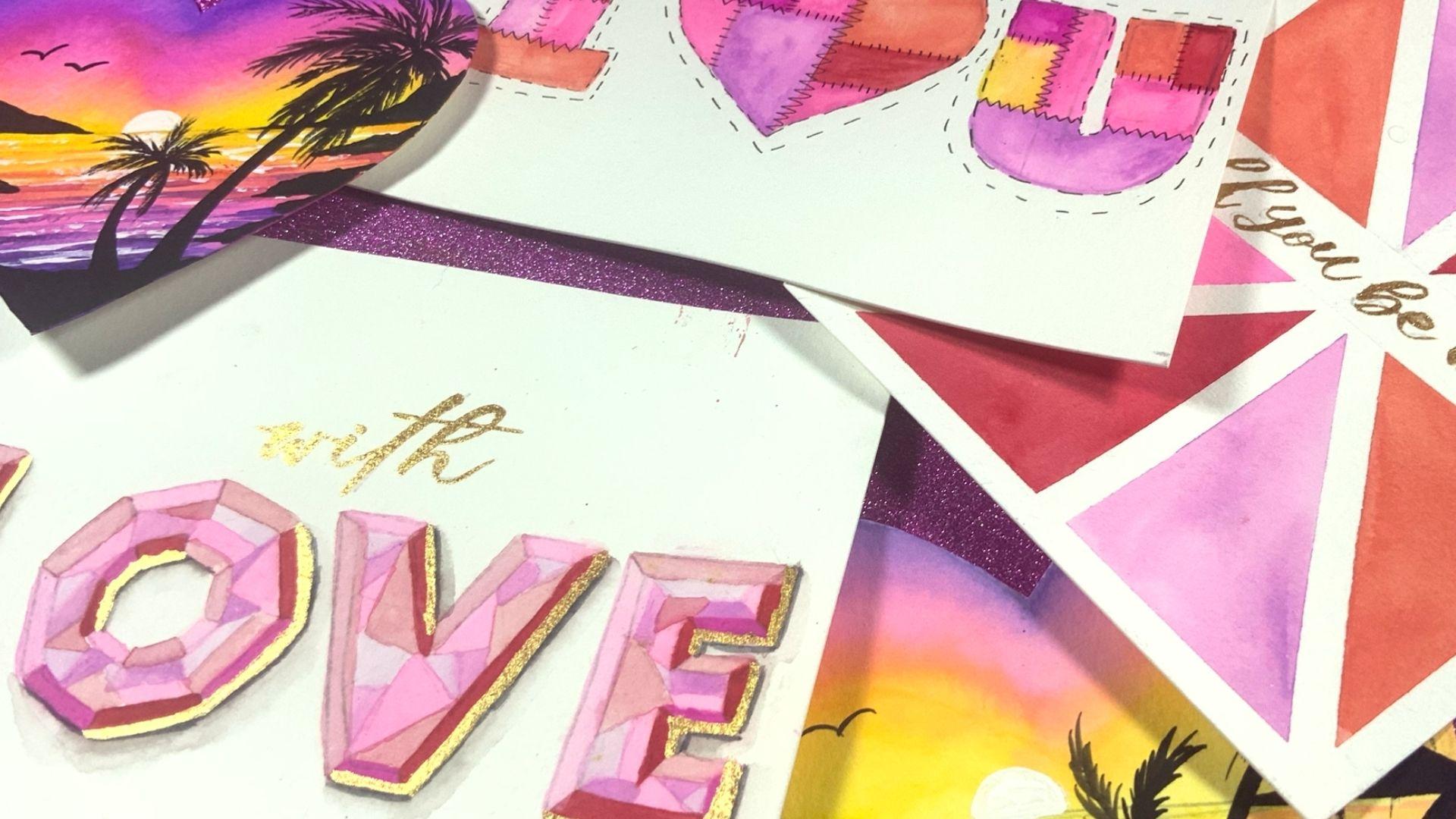
4. 'I Love You' Quilt Letters - Part 1: Once you have your
lettering all sketched out, you can lightly erase those lines because
we don't want them to be showing through the paint. We just want them to
be visible enough that we can see the sections we've created and the outline
for the letters. Once you have that all erased, we are now going to
start adding our colors. I'm going to be adding them
directly from the pan. As you are painting, make sure that you keep your lines as straight and
as smooth as possible. I would definitely
recommend you use a very tiny brush
to just make sure your lines look as
smooth as possible. I'm going to add to maybe
one or two sections on each of these letters, and you don't want them
to be next to each other. So you can see my first
letter, letter I, I have pink at the top, and then I have at the
bottom right side. You are pretty much just painting on instinct
for this one. I don't want you to
be too worried about following exactly my
color placements. You can have fun. You can even try different
colors if you want. When you're finished
adding your pink, we're going to move
on to the next color, which is that nice
orange peach color. Before you start
painting, though, make sure that the
pink sections are completely dry because we don't want any bleeding to occur. Again, I'm using my
color from the pan. I did add a little
bit of water because the consistency directly from the pan for this color
was a little too thick, and it wasn't moving around
on the paper as I wanted. So I added just a drop of water. Then my next color that
I'm painting is purple. So again, make sure that the other sections are completely dried before
you add your next color. As I was adding my
purple to the latter U, I did not like how perfectly it lined up with the pink
section above it. I don't want this to
look too symmetrical. So I then just decided to
extend that section a bit. Once you have your colors already added, you're going to allow that to dry and now we're
going to start adding
5. 'I Love You' Quilt Letters - Part 2: So I'm going to just draw a Zazag line along where
your colors will meet. So as you can see, I started
with this red section first, and I'm just going to
do that zigzag down and across to kind of stitch
that part of the letter. I'm also going to
add some short lines to kind of switch up
the stitching pattern. And you're really going to look at where your colors meet and join them together with
these stitching lines. I am using a size 01 marker, and the size marker you
use should really be on the finer side because if
these lines are too bold, you may find that the effect
doesn't look the same. You're just going to continue adding in these stitching to all of these sections of colors
on all of these letters, alternate between your zigzags
and your short strokes. When you're done adding
that stitching to the inside of your lettering, you're going to then
add a stitched outline. So pretty much you're just doing some dashes with spaces in between them all along the
outside of your letters. Then once you're
finished with that, I'm going to add another
set of stitching, but I'm going to
leave a little bit of white space in between the letters and the new
border that I'm going to add. It is going to be the
same stitching design, so you're just
drawing short strokes and leaving some space
in between them. And once you have finished adding this stitching border
all around your letters, your quilted lettering
is complete.
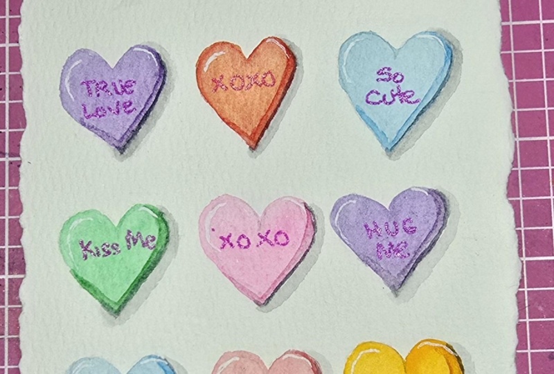
6. Candy Hearts - Part 1: To get started, you're going to erase some of your pencil lines. You just need it to be visible
enough for you to see. You don't want any of
it to show through your patin because these colors are
going to be very light, and we're going for a
more pastil effect. Once you have erased
away your pencil lines, we're then going to
start adding colors. You can use any colors for this. I'm starting with pink, so I've added a little bit of pink to one section
of the heart. Then I am picking up water and using that to paint in
the rest of the heart. This will help to give the heart are lighter
transparent appearance. We don't want the full
intensity of the color. Again, we're going for
a more pastele look. Then you're going to clean your brush and pick
up your next color, which, for me, is
going to be yellow, and you're going to apply it the same way by starting with that color in one section and then using water
to pull it down. Then clean your brush
and add your next color. For me, this is going to
be a light green, again, starting with color in one
section and then using water. This is already a very
light pastel color, so I had to add just a
little bit more pigment. The next color I'm
using is purple. And again, I'm starting
with a small section and using my water to pull that color to complete
the entire shape. So you're going to
use this technique to apply color to the
remaining hearts. I am going to repeat the colors that I use
for the first six, for the remaining six, and I'm just going to
change up the order. But you can use whatever
type of color scheme or pattern that you want
to complete these hearts. When you're finished adding
your first layer of color, it is now time for us to add our shadowing to make these look a little bit
more dimensional. By now, your first
heart should be dry, so we're going to start from
the top and make our way down just like we did
for that first layer. I'm going to be mixing a darker shade of the
colors that I use. So for this pink, I started
with the same color that I used and added a little
bit of red to darken it. And, of course,
you're going to need a piece of scrap paper to test your colors before you
apply them onto your paper. When you get the
color how you want, you're then going
to paint a line on the right and the bottom
part of the heart. My light source is coming
from the upper left side. So my shadow will be
on the opposite side, which is the bottom
and the right. So I'm going to do this
for all of these hearts. When I'm done adding that color, I'm going to clean
my brush and pick up a little bit of water
and just pull it along the middle of the line that I
just painted to just create a lighter value on the
inside of that shadow. It is very important
that you only do this step once
that heart is dry, you don't want to be adding this darker line when the heart is wet because you're going
to run into bleeding, and you're not going
to have that sharp, clean line that you
want to create. So once I'm finished
adding that color, I'm going to go
onto the next one and I'm mixing a little bit of a darker color to it
and just testing it out before I add
it onto my paper. Again, we are adding just a small line to
create that shadow, and then cleaning the brush
and using that brush to lift a little bit of color from the middle of that line
that you've just added.
7. Candy Hearts - Part 2: The next step that will really
make this pop and appear as though these are really off the page is to add
a gray shadow. So I am going to use
a smaller brush to add a gray line on the outside of what
we've just painted. When you're done
adding that line, you're going to clean
your brush and use a little bit of water to fade that gray into
the background. And you may need to pick up a little bit more
gray and add it along that edge just to help define the shadow
a little bit more. So again, you're
adding a line of gray on the outside of the
heart, cleaning your brush, and using a little
bit of water to blend the outer part of
that shadow into the paper. You don't really need
a seamless blend. It is quite okay. If it just blends
to a lighter gray. The effect will be the same. Again, you're just going
to have to pick up some more gray and add a thin line in between the shadow and the heart just to
make sure that it is sharp enough to
help define the heart. The next thing we're
going to add to these hearts are some
cute little messages. You can write whatever
you want on them. I'm going to use some
of the phrases that are commonly found on
these candy hearts, and I'm using a red fine
liner pen to write them on. And just to add a little
bit more dimension to them, I'm using a white paint pen to add a little highlight in the upper left
corner of each heart. After you're finished,
your hearts are complete.
8. Sunset Scene in Heart - Part 1: Before we start painting, we are going to cut
out this heart. I've sketched the outline on the back side of my
watercolor paper, and I'm just following along those lines to cut
out the shape. That way, I don't have to worry about my pencil lines showing through because they'll be on
the back part of the paper. Once your heart is all cut out, you can get a piece
of cardboard. This is usually the back of a watercolor paper
pad that I cut. And I use it to attach my watercolor paper onto
when I'm painting so that I don't have any problems with getting my work
surface or my desk dirty. Then I'm going to quickly swatch and mix any colors that I
want for the sunset scene. So I'm using purple, then I'm using pink, and then a yellow. One thing I also want to
do is test these colors and make sure that they
blend with each other. So I'm using a pencil to just lightly sketch
the horizon line, and this is just a line
that is going to go horizontally across your heart. I have mine a bit in the middle. You can put yours as high
or as low as you want. You can experiment with
your horizon line, and it will give you
different effects. Then I am starting
with the purple. So I'm adding that color following the shape
of the heart. So it's going to be curved. I'm not worried about
realism with this painting. Want to capture just a nice
romantic sunset scene. So I'm adding this color in following those curves
at the top of the heart. Then I'm going to
clean my brush, and I'm going to add my pink directly
underneath this purple. Now, as you can
see, these colors are not really blending
together nicely. So you're going to have
to blend them yourself. And that is just going to be some back and forth motion along the line where
these colors meet. Now, as you are painting, remember that watercolor
will typically dry a lot lighter than it
appears when it is wet. So if you need to
intensify your colors, you can definitely add a
little bit more purple to the top and a little bit more of the pink before you move on. And, of course, you're
going to use that same back and forth motion
to blend them together. So before I add my yellow, I'm just going to
use a clean brush with some water to
add a little bit of that water along the bottom part of the pink where I want
the two colours to blend. And then I'm going to
pick up that yellow and lightly add it to the sky. And to blend these colors, we are also going to use that
same back and forth motion. And then once I'm happy with that transition from
pink to orange, I'm going to add some
yellow to complete the sky. Once we get to the
bottom of the horizon, this is where our water will be. So I'm taking that yellow to about a third of the way
down below the horizon line, and then I'm going to
start adding my pink. I'm not going to blend
these colors as yet. I'm just going to add my pink, and I'm taking that to about
two thirds of the way down. I'm just going to switch back to my yellow and lightly blend. I wear the pink and
the yellow meat. I'm just going to fill in the bottom part
of the heart with purple and clean my brush and blend those two
colors together. So while that is drying, I'm going to move that off to the side and then
quickly show you how we're going to
be adding our waves and the brush strokes
that we want to create. This is usually the most challenging part
of this technique. We're not going for realism. It's going to be very abstract. So I'm going to show you the
method that I like to use. So feel free to grab a piece of scrap paper
so you can practice, and that will really help. So for this technique, we're really using the tip of the brush, the
belly of the brush. We're using all of it
because we want to create line variation
in our waves. So you can start by pressing very lightly
on the tip or you can press with the full pressure of the brush and gradually
release pressure as you go. So now we're going
to start adding the waves like we just practice. So I'm going to make some
pink and yellow to get an orange color similar to one that is in the top
part of the heart. And you can test this out on your scrap paper to make
sure that it is dark enough. And I'm using the smaller brush, so this is the size two brush, and I'm just going
to add some of those brush strokes to the
top yellow part of the sea. And I'm going to add these coming from either
side of this heart. H Then I'm going to switch to my pink, and I am going to
start adding it over the section of
color that is orange. So the orange part of the
see that is already dried, not the orange breastros
that we just added. So I've added my pink over
that orange part of the s, and I'm also going
to bring it down a little bit over the pink Arab. And then I'm switching
to my purple to add those lines
above the pink area. Now, as we're getting closer
to the foreground of this, which is the bottom
of this heart, I am making these lines a lot more bolder
and more defined. So I'm applying
pressure and making them a lot thicker
so that they can appear more defined
in comparison to the waves at
the horizon which is further away. M.
9. Sunset Scene in Heart - Part 2: So the next step we're
going to do is add the white reflection and highlights that
come from the sun that will be glistening
on the waves. I'm using some white
acrylic paint. You can also use
gouache for this step. And I'm gonna use
it a little bit, so I'm just going to take
some from the cover. I'm using a small liner brush. You want something very small, and we're just going
to add some of those sharp choppy
lines across the waves. You don't want to add too much, so just make sure that you're only using a
small amount of white. Much like how we added the
waves in the previous step, we want to make the lines in the foreground a lot
larger and bolder, while the ones in the background closer to the
horizon are smaller, almost like they're vanishing
the further away they go. So you don't want to overdo
it and add too much white, so I'm really happy
with the amount that I have before we move on. I'm going to add the sun
along the horizon line, and I'm using that same
white acrylic paint. He So now we're going to add some mountains. I am using black paint. This is watercolor, and
I'm just going to draw a straight line above the horizon for the
base of the mountain. And then I'm going to go in
and add my peaks and fles. You can make your mountains as large or as small as you want. You can tailor their shape to whatever silhouette that you
want your mountains to be. And if you start
something and it's not turning out
how you imagined, you can always
adjust your shape. Then I'm going to go in on the other side and
add another mountain. This one is going to
be a lot different, so I don't want them to look
the same on both sides. So now I'm going to add the
block to the foreground. This is going to be the section of land that is closest to us. Then in between,
I'm going to add a few other mountains
or pieces of land. Then I'm just going to add
two birds flying in the sky, we're just doing
two curved lines to make a bird and two
for the other one. Then you can leave that or you can take it
a step further, and I'm going to add
some palm trees. You're just going to draw a curved line that
goes from the patch of land in the front and curves
to the left or the right. You can choose
which direction you want your palm trees to go. And the bottom of these palm trees are usually
a lot thicker than the top. Then we're going to
draw some curved length for the leaves. A And your sunset
painting is complete.
10. 'Love' Diamond Lettering - Part 1: We're going to start this by painting in the
shadow colors first. These shadow colors will be on the right side and the
bottom side of your letters. So I am using a very dark red. This is going to be the
darkest shade of red that I want to use in
these diamond letters. So I'm going to add it
to my palette you can use whatever surface you
want to make your colors on. And I'm going to start adding
it to my first letter, which is a letter
L. I'm adding it to the bottom and then I'm
not going to add it to the right side of this section because when we are doing this
diamond pattern, how to really make these
colors look realistic is to make sure you
don't have two of the same colors
next to each other. So if I were to add this red to the section that is directly next to that
bottom one that I added, it wouldn't create the
contrast that I'm looking for. So I am adding that darker
red to the right side of the top part of the. Mm. And then I'm going
to start adding that color to the other letters. For the letter O, we have a bunch of
different sections that make up the shadow side. So I'm starting with the one at the bottom and
the shadow side of the top part of this O. And because we have a lot
of different sections, I can skip one and then add that darker color
to the one next to it, and I won't have any
problems with my contrast. For the latter V, we pretty much only have
one section on this side, so I'm adding my
darker colored there. And I'm going to add it on the right section of the
other side of the lacquer V. For letter E, I'm adding that color to the
bottom part of the E. And I'm going to add it to the other
shadow sides of the later. You can pretty much
just alternate which section you are
adding this dark color too. Once you're finished
with your first color, which is your dark
red, we're now going to add our dark pink. This is going to be the darkest shade of pink we're adding. And we're going to add this to the shadow side in
the sections that we left out because they were connecting to that
red that we added. So I'm picking up some of that, and I'm just going to
add it to my palette. I'm not adding too much
water to it because I want it to be very vibrant and bright and just the most
darkest intense version of this color that I use
for this painting. One thing you want to
be sure of before you move on to painting in this is that you want to make sure that those red sections
are completely dry. When we're doing this, we don't want any
bleeding to happen. So really, really make
sure that your paint is dry before you start
adding the next color. You also want to
keep your edges and your lines as smooth
and sharp as possible. This also helps to make this
look a lot more realistic. So, again, we're adding this
dark pink to the bottom and the right side
of your letters. So rate, because it has so
many different sections. If you look, there is a
section next to that pink that I added that needs to
be in a darker shadow color, but I can't add pink to it. Make sure that
this paint is dry. And then I'm going back
in with that dark red, and I'm going to fill in those remaining sections
that needed to have color. So now we're going
to start adding our lighter shade of red. I've added a bit of water to
the mixture on the palette, and I have a scrap
piece of paper, which I'm using to test out the shade of the color
that I've mixed. And one thing to keep in mind
is that watercolor dries a lot lighter than it
looks, but it is wet. These two colors were
a little too light, so I added a bit more pigment, and then I'm just going to
start adding these colors on, which would be the
highlight side of this. And that is the left side and
the top of these letters. So I'm just going
to be painting in that color pretty
much in those areas, and I'm going to add them
to a few more places across the letters as well. As you are painting,
remember to keep your lines as straight
as smooth as possible. So we're going to
continue adding this color across your letters, and remember to pay attention to where your colors are placed. You can add them
wherever you want, because we really covered the
most important part so far, which is your shadow colors. So pretty much
these other colors can go wherever you
want to place them.
11. 'Love' Diamond Lettering - Part 2: When you're finished
adding in those red areas, I'm going to now add some water to the pink mixture that
I have on my palate. And again, I'm testing it. This one was a bit too light. So I add a bit more pigment to the mixture and test it on
that scrap piece of paper until I get the color
looking how I want it. And remember that your paint is going to dry a lot lighter. So when you're happy with the consistency in the
color that you have, you can then begin to add
it into your letters. Make sure that all
the previous colors that you've added
are already dry. We do not want any
bleeding to happen. And as you add
this color, again, you're going to remember
you don't want to add two sections of this
color next to one another. The next color that I
want to add is purple. This purple is a little
on the lighter side. So this is very close
to a pastel purple. I am going to just add a very small amount
of water to this, and I'm going to add
it to my letters. Now, the final color
that I am adding, I'm going to first
add some water to that purple mixture that
I have on the palette. And on camera, it is not showing the correct shade of
purple that it is. So the contrast you may
not be able to see, but I can guarantee
it is purple. But just to make it a
little bit more darker, I am adding just a little bit of a darker purple
into that mixture. And then I'm going to paint in the remaining parts
of this layed. Now, in the event that
you have, for example, two sections next to each other that have
not been filled, you don't have to try to fill them both in
with this color. What I'm going to do is I'm
going to fill in one of those sections and just move on to the next letter and
then come back to that to see which of the
previous colors that I can add back
in next to it. So once I finish
adding in that purple, I decided to go back
in with my red, and I'm going to add it
in to the missing spots. Oh So
12. 'Love' Diamond Lettering - Part 3: Once our letters are filled in, we're now going to add a
shadow to them just to make them look a little bit
more three dimensional. So I'm using gray, and I'm going to add a bit of water to it. I don't want this gray
to be too intense, so I'm going to take on
my scrap paper and test the mixture before I start
to add it to my lettering. Once I'm happy with that shade, I'm going to use my brush to draw a thin line
of that color on the bottom and the right side of each letter because this
is where our shadows will be. And then I clean my brush, and with just a little bit
of water on that brush, I'm going to run
that brush along the bottom part of that
color that I've added, which will cause the
color to just blend and bleed out into
the paper on its own. So again, you're going to add a line of color,
clean your brush, and then run that clean brush along the outer
edge of that line. In the event that your color is not showing up
how you want it, you can pick up a little
bit of that green and just add it in along where you first
added that color, and this will create a
wet on wet style blend. So you're going to continue this around all of the letters. And again, you're adding a very thin gray
shadow and using a clean brush to fade
that line into the paper. H So your lettering is complete, but you can add a
few more details to make this a lot more fun. You can add some splatters. You can add some highlights
with a white marker or pen in the upper left corner
of each of these letters. You can even add some
metallic accents. So, for example, I'm using
my smaller liner brush and some gold metallic
watercolor to write the word with so that this becomes a really fun card
that says with love. And you can even take this
a step further and add a go shadow to each
of these letters. And that is pretty much just a thin line on the right and the bottom part
of each of these letters. Now, this line is very thin. It is not going to take over the section of color
that we painted, or it is not going to
take over the shadow. It is pretty much just
going to fall right in between those two things. And that is how you can
just add a little bit of fun and personality
to this card.
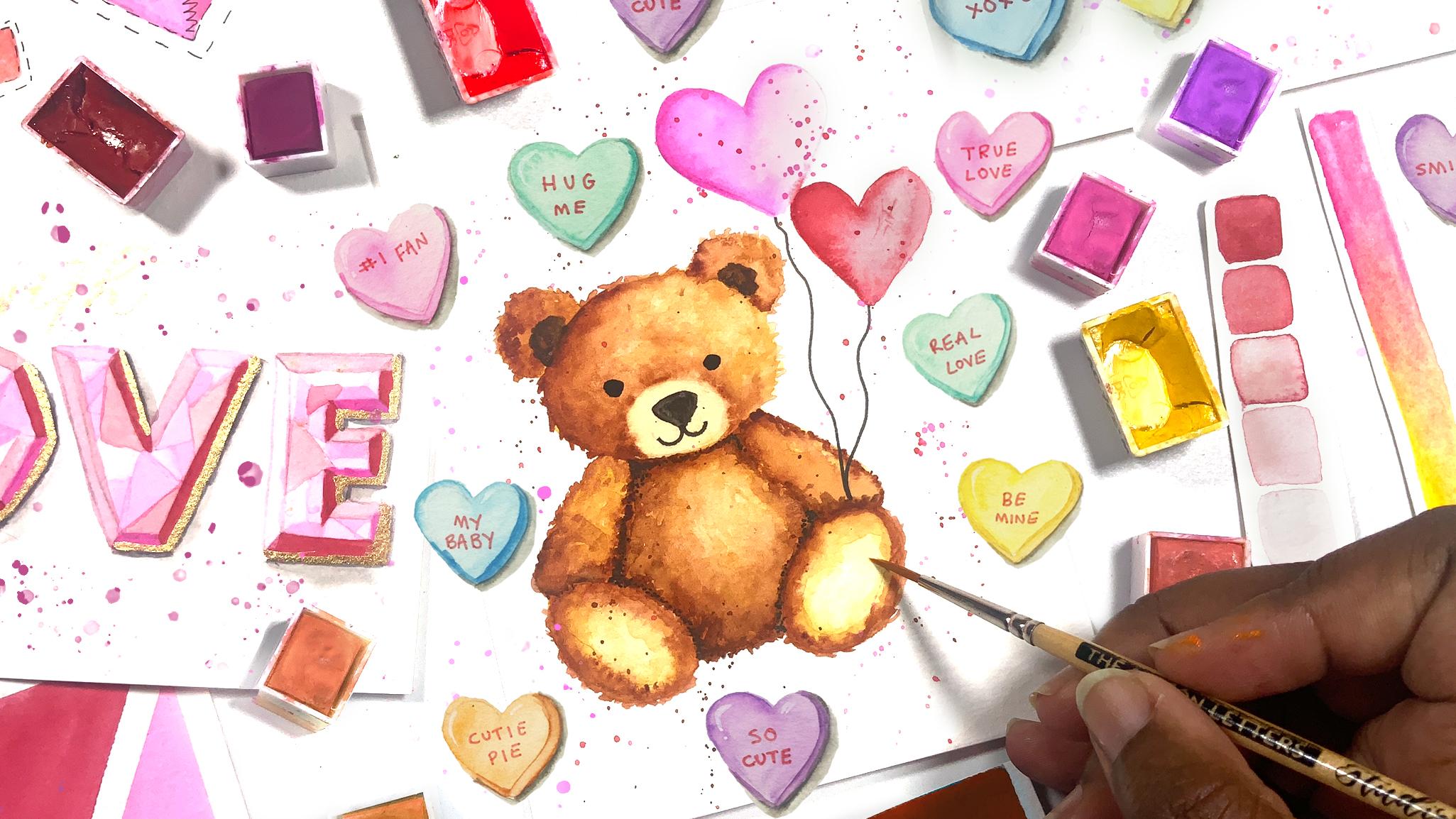
13. Teddy Bear with Balloons - Part 2: While that is drying, I'm going to move on to adding color to the
body of the beer, and I'm using that darker
brown straight from the pan to add that line of color
on the shadow side. And again, I'm using a
little bit of stippling, as well as some sharp
strokes just to create that fur texture on the
outside of the line. On the inner part of the line, I'm adding some water just to help blending into
the background. I'm also going to be dropping
in some darker brown, as well as some yellow ochre. And as I'm painting
this section, I'm not using straight,
smooth lines, I'm using choppy
or jagged strokes just so that this can also help to create
that furry texture that is a little bit uneven
and not necessarily smooth. And again, you can mix
in a little bit of that yellow ochre as you get towards the center and the
right side of the beer. You need to add some of
your darker brown to separate the arms and
the legs from the body, but you're going to
keep the rest of that side in the later
yellow ochre color. While that is one, I'm going to head back to the
top of the bear and add a few darker patches
of color to the ears. And this is a completely darker brown than
we've been using, and I'm stippling this
in to form a semicircle. Now, we're going to paint
the arms of the bear using the same technique we use
for the head and the body. So the outer line is
going to be made up of a few jagged lines to
create that fur texture, and then we're going to blend it in the background using some
water and some yellow ochre, keeping the left side of the arm a lot darker
than the right side. You're going to repeat those same steps for the other arm. So you're using that brown
straight from the pan to draw some choppy lines and some dots to create the fur
on the outside of the arm, and then blending that in with some yellow
ochre and some water, keeping the darker side on the left and the lighter
colors on the right. So I'm going to head back to the body of the
bear because it has dried and I'm going to
start adding a few dots. So I'm stippling some
of that darker color along the area where the
arm overlaps the body, as well as where the head
overlaps the body as well. As well as where
the feet overlap. So this is the shadow that will separate these
parts of the bear. I'm also going to add
a few choppy lines along the body in this color to also create that fur texture. And as I get towards the center, I'm going to use some yellow ochre So you're just going
to continue adding these sharp strokes all
across the body of the bear with yellow ochre
on the later parts and the darker brown
on the shadow parts. To paint the feet, we're going to do
the same thing, have a darker brown
on the outer part of the foot and lightly blend it towards the
center with yellow ochre. And don't forget to
add those stipulin or those sharp lines
to create the texture. To add the details to the face, I am going to use some black, and I'm just going to
draw the eyes, the nose. And for the mouth, which
has thinner lines, I'm going to use
a fine liner pen, and I'm also going to use that to draw the strings
for the balloons. And the last thing I'm
going to do is add some splatters just to help
tie everything together. I'm using a little bit of red
and a little bit of pink. You can use a piece of
scrap paper to cover your beer if you don't want too many splatters to go on it. I really want the splatters
to be on the background. You can also leave your
painting without splatters. It is completely up to you. If you need to separate the arms and the legs from
the body of the bear, a little bit more, you can use that same fine liner just to stipple a few dots to create a black shadow
in those areas, and you don't want
to overdo it or overpower what
you've just painted. So you just add a
few small dots.
14. Teddy Bear with Balloons - Part 1: To start painting this beer, I'm going to paint a flat
wash for the first layer, and I'm using a mixture of yellow ochre and
some clean water, and I'm going to paint
all of the beer. As you paint this layer, you're also going to
be thinking about your lighter areas and
your darker areas. So I want my darker areas to be on the left side and
the bottom of the bear. And I also know that I want the snout of the
bear to be lighter. So I'm going to use a clean paint brush and
lift some of that color. From that snow area. And the reason why
I'm doing this rather than just
leaving it is because I want a soft edge
because bears are soft, and to get that fur texture, we really need it to look soft rather than having sharp edges. So I'm going to lift that color while that layer is still wet. And I'm going to paint the
remaining parts of the beer, as well. Mm. And for the bottom of the feet, I also want to lift color. So again, to lift color, you're going to clean your brush and remove
some of the water from it and then drag it along the area where you
want to lift the color from. Well, that first layer of
color on the beer is drying. We're going to start adding
color to the heart balloons, and I'm starting with pink. I'm using it straight
from the pan. Then I'm going to clean
my brush and pick up some water and use that to blend the color into the white space to
create the heart shape. Again, we want to pay attention to our shadows and
our highlights. So my shadow side is the left, so I'm keeping the darker
color on that side. For the next heart,
I'm using red. My color is still wet. The pink is still wet, and I don't mind a
little bleeding, but it was a little too much, so I just clean my brush and
remove some of the color. Then I'm going to just continue painting the second
balloon again with my darker value on the left side and the
lighter value on the right. You can also add a second layer to these balloons if they are
a little too transparent. And I used a darker pink
for this second layer. It has a little bit of
a purple undertone, so I really like
how these two are mixing together and
the color they create. Again, paying attention so
that the darker side is the left side and the right
side is much lighter. Once your beer is
completely dry, we're going to start
building up our color. I am going for brown. This is going to be
the darkest brown that I use on this beer. So I'm adding it
on the left side. I'm using some water to blend
it into the later side. And I'm working in very
small sections because I don't want to add too
much of this dark color, so it's okay to work
in small sections. And to get that fur texture on the outer edge of that line, you're going to do a
few sharp choppy lines to give that fur effect. Uh, So I'm picking up a little bit of
that yellow ochre that I used for the first layer, and then I'm going over
this highlight side, which is the right side
of the bear's head, and I'm also building up some of the darker color on the
other side as well. You can also use a
paper towel to lift some of the color in
the upper right side, just to make that area a little
bit lighter if necessary. So I'm going to add
this same color to the ears and using a few small dots and some sharp strokes to
create the fur texture. For the ear on the later side, I have a mixture of
yellow ochre and my dark brown so that it isn't as dark as using the
color straight from the pan. And when you are
adding that color straight from the pan
on that right ear, you're going to keep
those darker colors at the bottom of the ear and on the left side of
the ear because remember, the right and the upper part
is going to be lighter. So when you add the stippling and the sharp strokes
in that area, you're going to use
the yellow ochre. So as the head started
to dry a little bit, the area between the snout and the rest of the head
started to get a sharp line. And again, I want
to soften this, so I'm using some water to just lightly paint over that line so that it starts to fade out. And I'm using a little
bit of yellow ochre mixed with some water just to go over that
area a little bit.
15. Wrap Up: Congratulations. You've made
it to the end of this class. Together, we've
painted six Valentine inspired watercolor and
lettering projects, and I'm so excited to
see your creations. Head to the Projects and
Resources tab of this class, tap the Create Project button, upload an image of your work, and then hit that
published button. Don't forget to leave a review, sharing your thoughts
on this class, and make sure that you follow
my Skillshare pace so that you'll be the first to know
about any upcoming classes. Thank you so much for joining me and I'll see you
in the next one.
 Shannon Layne, Lettering, Procreate & Art