Transcripts
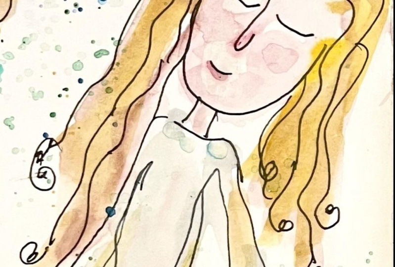
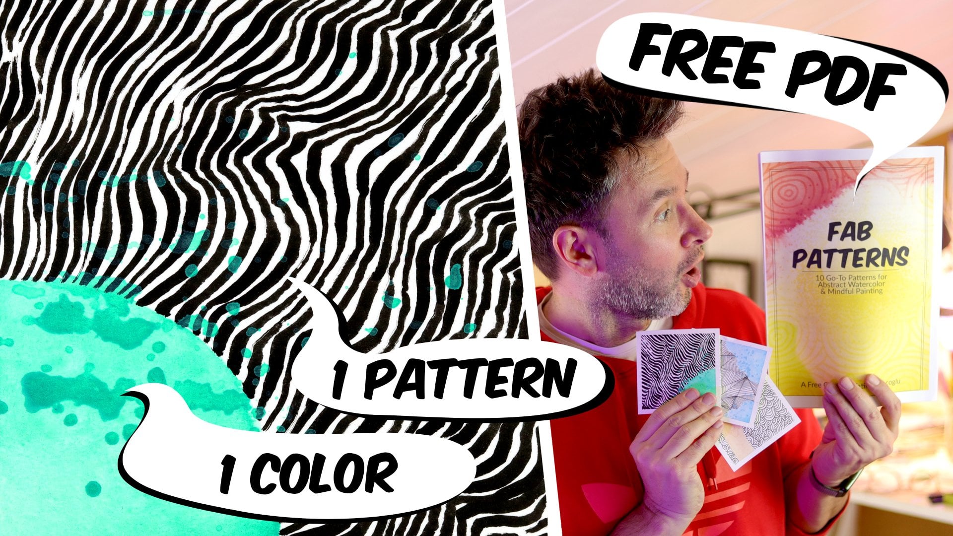
1. Introduction to No Effort Painting: Can you paint with watercolors? Loosely? It's not
that easy, is it? Some voice inside the
office says, Do it nicely. Don't go over the lines.
Paint everything. Don't mix up the colors. Maybe it's our art teachers or parents from
when we were kids. Whoever they were, they were
wrong. Let's make a mess. Hi. My name is Fati, but
you can call me Fab. Fab is not short for fabulous. I am fabulous, but
it's just not. I'm a watercolor artist, online teacher, and
productivity enthusiast. Check. What's that?
Productivity enthusiast. Like, I'm a big fan
of productivity, but not quite there yet. I want to make this class
because when I teach or show, for sketch journaling, painting doesn't get the
credit it deserves. I call it dismissively
splashing around, and it takes the
least amount of time. But it's essential. While it's not hard to paint the way I do, it might not be
intuitive for you. It certainly wasn't for me. I had to train myself
to be able to do this. So by the end of this class, you will be able to paint so loosely your watercolors
will feel spontaneous, bold, and full of energy. This class is for anyone. You don't need any experience or prior knowledge
to take this class. If you feel like you
can't quite grasp the idea of what no effort
Sketch learning is, you can go back and watch
other classes of mine on this topic because this is
the part three of the series. Other than that, grab
your watercolors and watercolor paper and get
ready to splash around. Look, again, I'm saying splash around painting,
proper painting. Than that, you might need
a brush, a cup of water, and some pages on
your sketchbook with ready to paint drawings. Since this is no for painting, we are not going to
slow down with drawing. That was the previous
class. During the class, I will break down
how I paint with watercolors when I'm doing
no for sketch earning. We will talk about
how to choose colors, coloring the subject,
coloring the title. Latin colors mix, how to
make a mess on purpose, the art of splashing and the art of not painting,
bloody everything. So your class project
is to let loose. I want to see an
art journal page from you that is so loose, I'm going to think that you were drunk when you painted it. I can't wait to start
painting with you. This is my favorite
part. Let's go. Jack, are you ready
to let loose? Actually, I want to
see you a bit tighter. You are already losing
2. Your Class Project: Rigidity. Your class project is to let loose.
Can you do that? This is my 16th class, and I've seen hundreds of
projects from my students, and most of the time, what I
see is you can't let loose. I think it comes
from our childhood. My childhood is full of memories
where I was being told, do it like in the example. Don't go out of the lines, do it properly,
follow the lines. I understand that
when we are little, we need a little structure to
be able to draw the letters properly and draw
a circle evenly. But I think this rigidity
leads to rigid people, rigidity, quite a
word. Rigidity. Your rigidity is boring me, basically, Jack. That's
what I'm trying to say. You need to let
loos. And later on, it's very hard to let it go. We don't even think about
it, but it's there. It feels like it's
against our very being. It's embedded in
there somewhere. Anyway, that's my hypothesis. And some of the
students projects I see prove my hypothesis. That's why I have the mission to break your shackles
and set you free. Believe me, it's much
easier to paint this way, and it's much more expressive
and artistic and unique. So I want from your
page, painted loosely. We will get into the
details in a minute. But basically, take your color, put it on the page,
wash the brush, take another color, do the same. Let it touch to the
previous color. Maybe take another
color, splash, splash some more, take a
photo, and share it with us. Okay, let's not
lose time here and get to the part where
we will let loose. Did you see the word play
there, Loose, loose? No, I have to explain
every joke to you, Jack. Onwards we go, Jack,
to the materials.
3. Materials and What Do I Pack in My Backpack: What am I going to
use for this class? The materials video? Here they are. It's not much, I have to say. Let's
go through them. Let's start with this
group here first. This is what I have
in my backpack. This is my little set I made with what is this thing
called Elastic band. Yeah. So let me take that. Of this keeps it all together in my backpack
and it's very useful. This is my tiny sketchbook. Let's put it aside for now, and let's have a
look at the paints. This is my painting set from Kuretake brand that you
can see the name here. I hope it's in focus, Kuretake. And I think this set
is called Ganzi tambi. Does those who say here? No. But it's called
Kansai Tambi. I will write it on the screen. This is my eraser, but I don't really
use it when I do not sketening since I don't use pencil, but I keep it with me. You never know what you're going to if I'm going to do another
project or something, if I come up with some
other idea, I might use it. So these actually, I don't use, but they are always
in the set here. And inside this section
not made for this. This is the box of this
small set from Kartage. I have a bigger set of this with how many
colors one to three. I think 48 colors
of the same brand, and this is the smaller
one with one, two, three, 12 colors, and it
comes in this box. And I thought usually
I was carrying around a box of pens
and brushes and so on. But I wanted to make it
lighter at some point when I started doing Noy ford sketch journaling with
small sketchbooks. And this is very light in my backpack, and
I really like it. I have one thicker brush. It's number eight and one thin
brush, it's number three. Let's put them here. And in here, I have a tick pen. You know, I like from
my drawing class like the previous class on first
sketching with a tick pen, I like drawing that it has more weight on the paper
and it looks better. And I have one brush pen, and I don't usually use
this for noifskeing, but recently I
started doing lots of abstract and what's
called neurographic art, and that's going to be
probably the next class, and I'm using this for that. And the paints have this
cover which also also doubles for me as a place to mix the colors put
to the side as well. And this is the set. I think
in this set originally, there was in this lilac. I took it because
I use it often. Later, I'm going
to tell you why. And this blue, I think I d from the big set and maybe
the black as well, but I'm not sure now.
This is Number 20. Let's see what is under
if I can pick it up. Yeah, this is number 20,
that's supposed to be here. Maybe the beige wasn't
here, number ten. Yeah, this is number 11. So there was something else.
So the colors I use a lot. I took it from the
big set and made a set for myself that this
kind of covers my basic needs, basically that I have
a nice bright yellow, and this color I use a lot for wood and baked stuff because, you know, I go to
coffee shops a lot. And I have an orange. I have
a sort of a pinkish red. I don't use red that much. And this blue and lilac and
beige, they are opaque, and I like their effects on
into the other pins that it kind of pushes them and moves them around because
they are heavier. And I have two
types of green and this is I'm actually missing
a bit of a brown here, but I usually use
the black and this. I'm not sure what this was. Was it burned amber? It doesn't say here,
but number 46, yes. This is what came with the set. And then I have another
blue here, navy. But it looks darker
than it is, actually. On the paper, it's much lighter. So I have this set, and I have my noFg
sketch journal. It's small. I think
this is nine by nine. And normally, you know, I have let me find you an example. Actually really like
using this coming. Let's push this aside a bit. I actually really enjoy
using this from SMLT art because you can
break away the This maybe you remember from my
first no for sketching class, I was using this mixed
media sketch album. And it also takes
the water very well, as you can see,
it's hardly banded. And so, but as a present, I got this yellow, small, very cute sketchbook,
and I want to use it. So at the moment,
I'm using this one. And inside, you can see this actually upside
down that I think, yeah, I started in Turkey, and all these pages are
actually on YouTube. There is a special
series on YouTube for now for Sket journey on
holiday in Marmar Turkey. And then let's speed up a bit. This is where Marmars
finished and back to Warsaw. And and this is
how I usually do. When I go to coffee shops, I draw the scene from them. And so, like I said, I started doing some
abstract as well, and this was in the
previous class, this page, the same scene
I created in the class. And then from Spain. But since you are here,
I can just show you guys maybe and this is
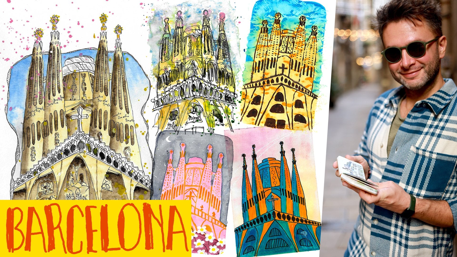
La agrada Familia. If you haven't watched
my Barcelona class, I do five different styles of the same building and experiment
with different styles. And that's where I'm
at at the moment. We recently been to the
mountains, but for the mountains, I was using another sketchbook and that's a little bit bigger, and this one will be
a bit more kind of combining my traditional sketch journaling with no effort
sketch channeling, and I'm working on
this at the moment. This is what my son Drew. And some more abstracts.
This is coming. I'm working on this tool, and this is the page from the months I
haven't finished yet. But anyway, it's about
materials, not about drawings. Let's go back to the materials. So I have a small box of sets. I showed you just two pens, a pencil and two brushes inside, and my tiny sketch book. And always have some
kitchen towel with you and small jar for water that usually I keep
it full in my backpack. I open it, even if it's
not perfectly clean. It does the job
still. And with this, I can do like two,
three paintings, and it still would be fine. And you will see
during the class, I'll be using this as well. And also in a coffee shop, it's very easy to just go
and fill it in the bathroom. So that's my tiny
jug. And this is it. This is my set, the set of watercolors, brushes, pens, even just this pen, we can say just number five
and little sketchbook. This is it. That's what I use. So this is what we're going
to use in the class as well, and I will see you
with the first lesson, which we will talk about
how to choose colors, and then we will get
to the paintings. But first, we need to talk about address the
issue of choosing colors because that can be difficult for some
of you, I imagine. So I will see you on
the next lesson. Bye.
4. How to Choose Colors: Welcome back. So
we're gonna splash around and let loose and
it's all fun and games, but how are you going
to choose the colors? I try to categorize
how I go about when I'm choosing a color
when I'm doing my paintings, so we're going to
have a look at them. This was a bit funny. I don't know what this is. So we're gonna have a look
at them. Like, shall we? Where is the confidence?
Place or location. This is the most
straightforward approach. Whatever the colors
of your subject is, that's what you use on the page. Try to pick two colors from the scene and apply
that on your page. You don't have to color
every single thing. In fact, don't paint
more than three objects. Day, sometimes the day you are out can carry
special importance. For example, we took our son to the pride parade
here in Warsaw, and of course, on that day, I use the rainbow for the title. Or if it's Valentine's Day, you could use hot pink or
red and green for Christmas. Feeling. This is
something more abstract, but I do it from time to time. For example, my wife and
I give each other one, free afternoon once a week, and on those afternoons, I usually go to a
cafe I like and draw. On those days, freedom is the main feeling, and
when I'm painting, I usually use the color green
because for some reason, green is associated with
freedom in my brain. So you can try to find some colors for the feelings
you are having on that day. Person. This is like tagging people in your
paintings, but with color. I love this kind
of use of colors because it would be
unique for every person. For example, my wife's
favorite color is lilac, so when I'm out with
her and drove that day, I use lilac for the
title or background. It almost feels like this
color represents her presence. Or when I'm out with my son, I use the color yellow because
it's his favorite color. And this is the way
I choose my colors, but you don't have to do my way. You can choose any
color you want. There are no los. You can paint everything blue
and call your blue era, then move on to pink.
It's up to you. But I thought I would
show you the way I do, so you can decide
how to go about it. At the end of the day, color
is a very personal matter, and you should experiment and see what feels
good for your eye. In the next lesson, we
will start painting and we will start with
coloring the subject. See you next lesson.
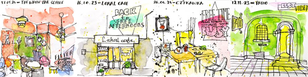
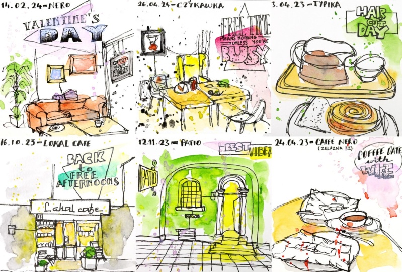
5. Coloring the Subject: So what I did for you guys, I think this is
going to be one of my favorite classes because I always say that
for painting for me, the drawing part is
like preparation, and painting part
is the fun part. So I kind of make my own
coloring books, basically. And while I'm drawing, I can't wait to the part
that I'm going to paint. And this is just
a painting class. What I did from my
existing pages, I made for my
personal project cafe portraits that from all
the cafes, you know, when I started No sketching, it was with the like, this is one of the first ones that I was just throwing
what's in front of me, yes, my coffee, my cake,
whatever I'm eating. And then I want to move on to a bit interior
of the places. So I came up with the idea
to make a cafe portrait. So I was trying to capture
a portrait of the cafe. Either it's the coffee station or how it looks
inside or outside. So I just recreate it from
the origins I painted, and I'm going to paint
this for you here in this class to show you how
I am doing the painting, basically, like
this or like this. So we will get into that now. Let me pull this together. We're going to
start with this one for coloring the subject. For this lesson is about
coloring the subject. Let's keep this one around here. And as you can see in the photo, this is already a
very colorful place. So there is nothing wrong with getting
inspired with the place. And I say, you
don't have to stick to what you see and you
can do whatever you want. There are no rules.
But in the meantime, sometimes, what you see is inspiring and that's
what you want to capture. And that's what I
did on that day. I really want to normally, I don't use this many colors
and fill the page so much, but the place was so beautiful. That's what I wanted to
capture, and that's what I did. And so that's what we
are going to do here. Let me bring my paints. For this class, I'm
not even going to use my big set because this usually happens at a
coffee shop. It's no effort. Like, it's in the name. And I don't carry
the big set with me. I carry this small set, and I just changed a few
colors from my big set. I want to have this lilac with me and this blue I use a lot, as you can see, they
are running out. And I'm going to do the
class with this as well. So I'm going to use, I think, when I'm outside, I have this brush with me. This number eight. But I'm going to use for
this class this number 12. I want to show you guys that I want them to
be a bit more messy. We're not going to get
into the tiny details. In here, I have two water cups. Normally, I use if
I'm in my studio, I use two cups for clean
water and dirty water, so it lasts longer this way. But when I'm outside,
I'm just using my there. This tiny jar, I have, and sometimes the water
inside is not even clean, and I will just pour
some water in this. And this is going to be
here and we go to start. You can see like, there's green on the wall. There's a brick wall, wood, and the blue chairs,
pink chairs, black chairs, it's
a beautiful place. This white bear. I think I wrote the name wrong. I think it's supposed to be
white bear. Sorry about that. And let's start with a bit of orange and just very roughly, I'm applying and I'm taking
directly from there, I'm not diluting anywhere. If it's a bit more, a bit less. And I'm not trying to, like, just smerge across the page. I say that I don't care about where the lines
start and finish. But if there is a corners
of the wall that's giving a bit of white space in between helps to
give this feeling. So I leave a bit of white there. I don't make it all
the way orange. And now for this brick wall, I'm going to also
take some orange, but I'm going to use
a bit more of it. And I'm gonna hoops. I'm getting tangled with my setting here
with my long brush. I'm going to add
a bit of this on the page, just like that. Sorry to differentiate a bit. But I'm not going to
go more into that. And I want to do this quickly while the painting is still wet. I'm going to go into
this green wall. As you can see, the
color start mixing. I don't worry about
that. I encourage that. Do that. It's okay. And this green was actually
coming here as well, I think. And then I see a
bit of wood here. I'm going to apply that. Not everything has
to touch and mix. Sometimes you can just leave
it a bit of a gap between them and sometimes let
them touch it like, play. This part in here,
there was a mirror, so I'm not going
to get into that, and let's do it bit of color
for the furniture here. Sometimes when I check if I have too much pigment on the brush, I drop a bit of it on the
side on the paper towel. So there are these chairs
with black and white flowers. So I'm not going to paint
it white all the way. Pine painted black all the way. I left a bit of white space. And at the back, I see
there is this painting, and the background is black, so I'm going to just apply
the background like that. I don't know. I'm not going
to even feel the middle, to be honest, but it gives
the feeling of the place. And over here, I
have a yellow lamp. In these places, I often felt like these cousins of
the coffee shops I like. That's why I want
to do this project. And it often comes from
the yellow of the light. So I always make it come
out a bit of the lamp. And actually, I also see
some more yellow here. It's here, or it mixed
with the I think these tables had like
brass on the side. Okay. And as you can see, the page is already filled up with lots of colors
just like our place. And here, there was
a pink chair is, of course, more complicated
than just pink. It has lots of patterns going on, but we're not
going to go into that. For me, there's a pink chair. So today I'm going to
add this pink here, so it will represent the chair. And behind it,
there's a blue chair. So I'm going to pick
some of this baby blue. And there's also some
blue chairs here. And just like that,
I'm actually done. And for the we will
get into the titles, coloring the title
in next lessons, but should I get into
that now or later? Okay. This was the
coloring the subjects. We did the coloring subject. And I'm not going
to get into title. We will talk about titling
in the next lesson. One thing we shouldn't
forget to do, of course, I think the main color here
for me is this nice orange. So I'm going to splash a bit, and I'm going to
leave it at that. So now I'm taking
this to the side. Later, I'm going to
show you how it dried. For the next one,
I have this one, and the original was like this. This I want to show this as
an example as Less is more. And sometimes, you don't have to make it so
colorful like the last one, that it can be definitely less. And here, I like the simplicity of it this cafe
was very nice and I want to paint it how
it looks the entrance. And it was just a green wall and the yellow warm light was
coming through the window, and the door, and that's
what I want to capture. So now we have a
unpainted version here, and I'm just going to pick up some water and some green paint, and very roughly, I'm
going to color the green. And then while it's still wet, I'm going to add this yellow for the light coming from inside. I will definitely going to let
it go out because that was the feeling of the place that this yellow was radiating
from the windows, and I'm going to this
to door as well, and I'm going to come
outside like this. So as you can see, just two
colors and there was a sign. And just like that, it's done. But again, in here, I think yellow is
the hero color. I'm going to splash with
the yellow a bit around. And now we're done. Wasn't that quick?
Wasn't that no effort? And did you capture the
feeling of the place? We total. So this is also it. I'm going to now put this
aside, and of course, I have to wait for it to
dry, but in the edit, I will show you how
they all dried. And yeah, that's what
I'm gonna do now. After that, we'll move
on to the next lesson, and we will talk about coloring the titles, which is our day. Talk to you soon. Thank
6. Coloring the Title: Okay. So, welcome back. In this lesson, I always
confuse the class and lesson. In this lesson of this class, we're going to focus on
the coloring the title. And for that, I
have two examples, but those two
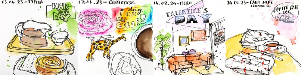
examples are, again, one of my originals I
did back in the day on Valentine's Day last
year with my wife and I made a copy of
that now to do it over. We'll quickly paint
this as well. Maybe we want to like in here, but maybe I will just do
quick splashes. Let's see. And also another one pica. Again, the original is here, and here's a copy of it I made for the class
just for painting, waiting, and we'll start
with the Valentine's Day. So let's put this aside. So this lesson is
about the title. Painting the title like
after painting your subject. But let's start with
painting the subject because sometimes it also helps where the title
is going to go, so I don't think it's a good
idea to do it on the empty. So for this in the
original image, this was from a coffee
shop we visited. Now, I think in here
when I'm going paint the subject the sofa is kind
of the main character here. So let's give some
color to the sofa. And those two
frames on the wall, I like how they look. Let's put this, sorry,
paintings here. And there are also those frames with two different colors. I'm not worried
with what's inside. I don't think that's
that important here because it's about the place and the
Valentine's Day, and I'm not using my tiny water
here because on the side, I have my waters here and
I get distracted by them. I put them away. Okay, and let's put some color
to this frame, too. And there is, again, similar wood color
this coffee table is. But I'm leaving the drinks
empty and like unpainted. I didn't go over them. And I'm not going to
go into the wall, but these pillows look fun. So I'm going to get
it bit of color, but I'm not bothered mixing purple on the
side in this set. I don't have a purple, but I'm just going to put
a bit of this blue and a little bit of
this pink and will do. And for the balance, I want to put some color here, so I will give some color
to the plant as well. So there's a bit of
a green over there. And in the original, what I did because it
wasn't really important, what's inside the frames. I'm not going into the detail. I gave a bit of blue color here just
to represent something and some reddish orangish
color here, and that's it. Later on, I carried
this blue to the title. That's why I want to show you this taking something
from your subject. And in the same time, this green cafinera
we have in Poland, they have this very orange in their logo, very distinctive. I'm going to add that, and the rest of the
sign is also black. That's also good
for the balance in this white space that
actually stands nice. So I will just add
a bit of black. I'm trying not to
touch the orange here because I want that
orange to be visible. And so just like that
the image is done, and after this, usually
I move on to title. And for title, I try not
to make it complicated. I use one or two color stops. And like I mentioned before, sometimes I use one color
and take one color from the subject so
that there's a bit of a connection going
on between the two. And in the original one, I use Lilac, this one. And this is another
way I pick colors. I think I mentioned this before that pick a color
based on the people. This is this color, this lilac is my
wife's favorite color. So when we are together, I often use it somewhere on the page to it's kind
of tagging someone, but just with colors. So I'm adding a
bit of lilac here, and I'm going to take this blue from here and
take it into the letters. And for the splashes, I'm going to use the lilac, that is the presence of my wife with and in
the original IC, I also did a bit of
black splash here, and I like how it looks, so I decided to keep
it for this, as well. And that's how I do the titles. I picked a color
tagging my wife. It's her favorite color Lilac because that was the
day we spent together, and the blue came
from the subject. So I'm going to put this aside, and later again, you
will see how it looks. And the next one I
said is this one. Again, this is the original
I made. I put this aside. So quickly, I will do this, that this is not the
color for the coffee, but I don't have that brown. So like I was saying
before, use what you have, and I'm going to eat
a bit of black here, and the rest I will drop and
make this look a bit darker. So it will have this bit of
brownish, darkish color. And as you can see, I'm
just mixing it on the page. And underneath, there is this
wooden usually for wood, I use this I think
this is ore. And also, I have a kind of a bun here, and for baked stuff, I also usually use this color. But to make it a little
bit more interesting, I will add a bit of
this light brown. Let's see what is the name
of this. I don't remember. It doesn't say, but, like, it's like burnt
amber or something. This way it's done,
the painting. I think, and again, here in the original, we did two colors title
and in here, let's do one. And I was saying this
before that I pick also colors by like the
feeling of the day. And this was a day
out I was by myself, and the theme of the day
was freedom, let's say, and for some reason, I connect freedom with green, and I will add a bit of
a color just like that. Like, I didn't follow any box, any lines, I didn't
feel any boxes. I didn't try to color
the individual letters, which you can do if you want. But I decided to
just do a bit of a smudg with my
brush, and that's it. And I think this needs
a bit of a splashing. And for that, I'm going
to use the green. And just like that, we
are done with this too. I think I should take this here, so I'm not covering
the entire screen with my hand when I'm trying
to wash my brush. And I'm putting
this aside to dry. And while we're at it, let's do the titles from the previous lessons as well because I didn't do it's there. So for this one,
in the original, I also didn't and this is
again, another option. You can just leave it as it is. But I think here, this was again date with my
wife. I could use Lilac. But because there is
this just two words best be question mark, I think I want to do two colors like one brush stroke this way, one brush stroke
this way, and let's see how it will turn out. And what colors would that be? I think I'm going to again, use the lilac
because it was with my wife and I'm going to use the yellow from the painting. So I will follow my own lessons. Let's see how it turns out.
So one brash struck this way, I said, and one breast
struck this way. So I will just
leave it like that. And I'm putting this
aside to dry as well. And from the previous
lesson, there was also this. And in the original I made, I used, again, green
because it was again, I was a day out of the freedom to represent the freedom
there was green, and there was orange here. But I think that I can show you actually the
original it's here. To make it different, I'm going to use this
I want to use blue. I think it will go
well with this orange, so I will, maybe I should
have washed my brush better. I'm picking some blue, and I will apply in
two places like this, and in the middle, I'm going to use this orange, but I don't want
to be too strong. And I will just leave the colors to their
own thing and mix up. So this was it for the titles. I'm just checking my notes
if I forgot anything. Let's see, you can
use a single color. I mentioned that. You don't always have to paint the shapes. And inside or outside
of the boxes. I also mentioned that
in the haircut day in this one that you can just you don't have
to fill the boxes. You don't have to
follow the lines. You make up your own rules. And make it go out of the box, fill half of it,
fill none of it. You are the boss.
Just like I said, add water and make it bleed out. We can actually do
that here a bit. And I was mentioning the
green came from the freedom. I also mentioned that.
Okay, so I think I covered all my points. I wanted to tell you, and this is going on the site. I almost knocked down my water. Well done. Yeah. So this
was it for the titles. I'm gonna now edit write versions of them so you can see how
they turned out, and I'm gonna see you
on the next one. Bye.
7. Letting Colors Mix: So for the next one, I have one example for this
letting the colors mix. It's this one. I made
it back in 2023. I think this might have
been the beginning of coffee portraits that I want to actually do
the store fronts. But then I realized
not every store front is very painting friendly. Like, sometimes it's
really nice inside, but outside is just a door,
but not in a good way. So I decided doing
the coffee portraits. Later, I moved on to
interiors as well. And I made a copy of it
for us to paint now. I wanted to use
this lesson to tell you to let the colors mix. And let's put the orgino
there. We don't need it. So in this one, again, the original image is not much, as you can see on the
screen. It's not much. You can see it's October, middle of October in Poland, it was a gray, very cloudy
day. It was getting dark. There wasn't much going around. The inside of the
place is lovely. I love this cafe and I go
there. I try to go there often. It's like the name
suggests local to me, but there wasn't much. So making the tricks you
can use with watercolors can actually elevate a situation
that is not very pretty. This place had gray walls. I will pick up a bit of
black and dilute that. Oh, that came out rather strong. Well, that will be
another example on maybe how mistakes are Okay. Now, I think that's
enough pigments. Let's make it go around. Basically, it's all gray
because it's the gray walls, gray building behind,
and everything gray. But watercolor has
one fun thing you can do it mixes well on the
page just like that. And if you are quick about it, And I want this yellow to
come out of the page a bit to represent the
warmth coming out, radiating outside the cafe. So you can break this actually
boring gray black colors and make it a bit more fun. And the sign over there
was already white. I'm going to add a bit of
a green here there was, and I think this could definitely use some
yellow splashes. Can you see how much
more interesting than just a gray blob here? And I will go a bit even
further with the mixing colors, letting the colors mix because this color coming from the
cafe is almost like orange. So I want to make it a bit
more orange because of that. So again, in here, I'm
letting the colors mix. And this was another
free afternoon. So now you know the drill. If I'm out, I'm using the
green color to represent that. But maybe I will use
different green just for. So now the free part, I'm going to emphasize
with this color, and I don't want to use the
yellow again for some reason, I don't want to be too much. I want this part to stand out. So I'm going to use this kind of beige just to make it a
bit more interesting. And I think I will
leave it like that and let the colors
do their own things. And as you can see, you can let the
colors mix to arrive at much more interesting
results than I think like, stick to the photo. There's nothing wrong with that, but if it's a bit boring, use what you have, yes. So I will show you how this
turned out when it's dry, and then we will move on to making a mess on purpose.
See you on the next one.
8. Making A Mess (on purpose): Now, for this one, I'm
picking the sample image. I have this one from
Chekovka that page I did in 2024, April, apparently. Or about a year ago. I'm just thinking,
by the time you see, will it be a year? But no, it won't be
still a year because I want it to be out
quickly in February. And in this one, we will talk about making
a mess on purpose. And as you can see, I did a nice mess here, and it is a controlled mess
that it looks like something, but it's not
completely abstract. But still, while painting, making a mess in this no effort
painting environment is recommended,
and let's do that. So I made unpainted version of it for painting with you guys. Maybe you can do this with
your own paintings as well. If you have already taken
Mino for class and you made some pages and you weren't quite happy
how they turned out, you can try to
recreate them after this class and try to
see the difference. So for this one, my first advice for making a mess
is using a thick brush, and don't worry about
the fine details. We are not going to try to paint the details of the
cake here and so on. It's all about the
broad strokes. So the main thing here, let's go with the
chair first, maybe. It was a beautiful yellow chair, very comfortable in
that cafe, I remember. And always leave
some white gaps. Like if something has a corner, try to leave a white cap
there that represents that this is not a
continuous flat space. For example, let's leave it as it is. I
like how it looks. For example, this table, this wooden table
that I'm just adding, don't try to fill every line. And in here, leave a bit
of a white gap between. And this represents that
there is a break there, and this is always a good idea. Now what I will do is I have this color and wooden floors are similar color,
but kind of lighter. I'm going to dilute this a bit, and then with what's left, I'm just going to apply it to the floor just like
that very roughly. So I guess for this, I could say with yellow with yellow that normally
when you go outside, you don't have the chance
to in a coffee shop, take out 50 different shades
of all the colors you have. You have to make
with what you have. In here, I have I think 12
colors, one, two, three, yeah. And you need to learn how we can make the best
of what you have. And in here, I have, let's
wash rush first, maybe. And as you can see,
I'm using this water. It's getting dirty,
but it's still fine. You don't have to rush to
the bathroom every moment. In here, there is my backpack. And over there on the wall, I like that there is this
drawing of a coffee thing. The origin looks darker, but I decide to break
it from the frame because frames I want to do
black can vary roughly and, again, I think I did too much. I will pick some of that so that the lines
under will be visible. Okay? And is there
anything else? Maybe I have a drink. Maybe I can add some
color to my drink to create a bit of a contrast there and same color can
go for my cake, maybe a bit of this like Okay. Like that. It was a
cheesecake, I think. And I think on the table, there was my actually this set of watercolors
as a green box, maybe you can see from here, and it was standing
right over there. So I'm going to put
it there. But, look, I went out of the line a
bit, so it's more visible. And yeah, so this
way, use a big brush. Don't follow the lines, let
the colors mix, make a mess. And the biggest part of making a mess for me, is splashing. However, I like
the black splashes when the painting is dry, so they stay like little dots. It gives lots of character
to the painting this way. But if you are going to
splash with similar colors, like I think this one could use a splash of
yellow that it won't disturb so much what's going on here and it will make
it more interesting. So let's do that. And for the title in the
original, I use yellow, but I think in retrospect now, I want a bit of a contrast
with what's going on here. So I'm going to use, I think, should I use this brown, it would be taking
the colors from here. Or go completely something out of the colors we use, then
I'm going to use this. And I will just
leave it as it is. Maybe I will let it
bleed a bit downwards. You can even lift it to
go colors go down a bit. And once it's dry, I'm going to add black splashes to this. And that's also that gives this messy watercolor
look, which I love. But like I said,
when it's black, I like doing it once it's dry because I want to see the
black splashes as they are, not mixing into the colors and destroying kind of
what we made so far. So this was making a mess. And after this, I'm
going to show you how it end up with the black
splashes once it's dry. So this is all for
making a mess. After this, I will see you
on let's see. Oh, splashing. Maybe we can do it for the splashing part if
it's already dry. I have cafe Niro
and on the right. Okay, so I will see
you on the next one. Bye.
9. Splash, Splash and Splash Some More: So on this one, we're going
to focus on splashing and there are two ways to
do that on wet or on dry. For on wet, I decided to just do not representation.
What was this word? Demonstration. For this, I
want a bit of clear water, so it will show better. I'm going to put some one
half of it clear water. And another part let's
use maybe this one, I always like this color. My color for wood
or baked goods. So give your colors
the chance to become something else by letting
them mix with another color. And one way to do this
is by splashing on them while they are still
wet, just like in here. So let's say I want to have more reddish color
I want to add to them, and by splashing them, can you see how much
difference that makes? And let's pick another color, maybe some blue came
out a bit strong. And by adding some blue to that, you see, when you
have these kind of patterns going on
in your paintings, this makes total difference. This is the beauty
of watercolors. You can do this on the
page just like that. And while your paintings
are still wet, feel free to splash on them to make them more interesting, give more depth,
give more character. And now, this is
one way to do it. Another way to do it is
while it's already dry, this is also an option
because then actually, there are some examples of it on my background I create
for this class. You can see so many
splashes already here. Later probably I will
make a painting out of this with some drawing patterns. I'm really into that
now. That might be the next class actually,
little spoiler here. For this one, let's
take this example. This was one of the first
non effort paintings. This was actually the one that's not the first one,
but after this one, it kind of found its
footing that is using tick pan and continuous
contour drawing in sort of blind
contour and so on. But later when I looked at it, I realized, I didn't
splash on this one. And you can definitely
go and fix this by going back to those
paintings and splashing sorry, splashing on them when it's dry. These splashes, by the way, they just happened in the previous lesson
when I was painting the a copy of this and I splashed and some of them
must have landed here. And in the one I
made in the lesson, I use green splashes. You can see how much this
already looks loose and this fun watercolor feeling it has just because
of these splashes. Let's make a difference
than this one. And let's not use
green splashes and maybe use like I was saying
in the previous one, making a mess, strong black
splashes, strong black color. I was telling you
that I like it on dry because I want them
to stay as they land. And I think one part
I will do here, like, because there is this
darkness here and a bit here, And when you compare
with this one, they have a totally different
feeling, don't they? Like, this one is
more airy and fun. This one's a bit more serious like splash what's going on. Like, it has a strength to
it, and I do like that. So you can definitely
splash on your paintings. You can go back to
those you already made and splash it like this. You won't be you
won't regret it. So this is going on
the side to dry. And while we read it
in one of the lessons, I don't remember now which one. This was the first
lesson, maybe. I made this one, and I
use yellow splashes. There are already some splashes
on this one. You can see. But I feel like it's not quite making an impact
on this painting because it's kind of green is mixing well with yellow
and it's not very visible. So for this one, I will I should wash. I think now it's about
time to change this water. I was saying, it's
okay, and it is. Up to some point, I'm just
pouring some fresh water. Give me a second. Yay. I did
it without making a mess. It's good to make a
mess on your pages. It's not so good when you do it in your sit on your clothes. So on this one, I decided
it needs some splash. So for this one, we can
also make an example of splashing wet on dry, like doing like you
can't splash dry, like splashing on dry. This is dry and this is wet. And I decided to go with this lilac color
that I picked from. It was a date with my wife, and this is her favorite color. So this will represent
her presence. And like that. I think this will
be more visible, a little bit more around
the title as well. I'm going to wash my brush. This is it for splashing. We did it on wet and end
up with this now dry, look at how fun these
blocks of color look. This was from just water
splashing on water, you end up with this
and this was splashing on the yellow Ochre
or whatever it was. Or you can splash on your existing paintings
or after they are dry. After this, I'm going
to show you how they end up once they are dry. And I will see you next one, which will be the last lesson, leaving lots of white.
See you on the next one.
10. You Do Not Have to Paint Everything: So for this one, we're going to talk about
living lots of white. And the original I made
was this in 2023, April. Wow, this was almost
two years ago. And I think this will be a good example of
living lots of white. As you can see, there's
not much going on here, and still I love
this page actually. It's one of my favorite pages. One of the early pages of NE for Sketch earning
and still one of my favorites because there's
very little going on, and I still love how it looks because of how
much white space was left. So let's try to recreate that. So you don't have to
paint the entire page. I know in the first example, the first lesson did this because it was
that kind of a place. It was colorful. I
wanted to capture it. So I made, lots of colors on
the page. This is also okay. But in the meantime,
you don't have to. Pick two, three
items you want to paint and leave the rest. That would be my advice
to you most of the time. You can leave the
background white. You can leave the table white. You can paint everything. Leave the subjects right. Don't do what they
expect you to do. Never let them know
your next move. Okay? This is the trick to it, that you don't have to do anything by the
conventional rules. I think you picked it by
now throughout the class. I was telling you,
don't follow the lines. You don't have to feel
inside the boxes, you don't have to fill
outside the boxes, just make up your own ruse and kind of breaking the
mold with this class. So for this one,
in the original, it was like this that I did just leftover of the muffins
we had with my wife, and the lilac is coming
from being with her. And there is this green caffeine had this orange in their logo, and I just put a bit of
orange there, and that's it. And the coffee inside the mug. So for this one,
let's try to go a bit differently and do
a bit opposite. I'm not gonna paint things
I paint over there, and let's see how it turns out. I'm going to go with
the table first. Table is there. And I'm not
going to do the background. In the background,
I put a bit of a lilac because I
was with my wife. I'm going to put
just over the wife. This, by the way,
very opaque color, but later when it dries, it goes to the background
and it's okay. And I will just do it like that and splash over
there to break it. And I think still the
subject needs a bit of help. So what I'm going to do that I will put it almost
looks black anyway. I will put some black
for the coffee. Maybe I can break it with
a bit of this brown. And I'm going to
leave these white. I'm not going to
bother with them. I think this orange is
also very strong here. So I'm going to add that. And so I pick some black
and drop some of it here. So there's a bit of
black left on my I'm going to add a bit
of shadow to things, just to step out of it and
do it a bit differently. And this way, we are leaving
lots of white space. We didn't do everything. We didn't paint all the
things on the table, and we didn't do the background. And what I'm going to do, I want to use this orange, and I'm going to splash
here a bit with orange, and that will be it. So again, you don't have
to paint everything. You can leave lots
of white space. This was the original one. This is the new one. They're
both from the same moment in time and two different
ways. They're both okay. So you can do whatever you want. Just make up your own roos. And this was it for
leaving lots of white. But we left lots of
white and nobody died. It's fine. Like I said, don't
do what they expect you to do and never let them
know your next move. And with that, we
finished our class. This was the last
lesson, and, of course, I will show you how it end
up when it's dry at the end. And after this, we
will go to conclusion, seeing the conclusion. Bye.
11. Conclusion (and Something More Maybe?): Conclusion with. Thank you very much for
staying with me until the end and congratulations
on your concentration levels. These days, people can't even make it until the
end of a Tiktok. I'm saying that, but in my
mind, Kendriamar's song, not like us is keep
playing and Okay. Let's focus and finish this.
Let's remember what we did. We talked about how to choose
colors, and after that, we repainted some of the pages
from my nowarsket journal. We focused on coloring the
subject, coloring the title, letting colors mix,
making a mess on purpose, splashing on wet or on dry,
leaving lots of white. The main lesson I want to
give with this class is, if you want to let loose
when you're painting, you have to let go of
the fear of being wrong. You don't have to paint like
anyone else but yourself. As long as you are putting
the brush to the pen, no. Don't put brush to the pen.
I don't know what that does. Again, as long as
you are putting the brush to the paper,
you are winning. Please remember to
leave a review. When there are good
reviews, the ski hair CEO comes and strokes
my hair gently, and I don't want to
miss out on that. Also, it lets me
know what you like and you don't like,
which is an Edit plus. Remember to follow me so I will feel loved and appreciated. You can also follow me on
various social media platforms. I'm all over the place.
I'm all over the place. And don't forget to share
your class projects. I'm looking forward to
those. They are really good for my self esteem.
This is all from me. Are you feeling loose? You got to let loose. Thank me later. Jack, I'm letting you loose, meaning you don't have
to come here anymore. Stay creative. Stay loos. See you on the next one. Bye. Videos recording two. Let's go, Jack.
Okay. What's this about, Jack, headphones? Like, what am I DJ? It was your idea.
I look ridiculous. Okay, okay. Let's just do it. Can you paint with watercolors? Loosely. Loosely? Loosely?
What's this voice? Jesus. Okay. Calm down. And I don't know how much
noise this makes when I'm picking it up. I'm
gonna put this away. Jack, stupid idea. Visual cue. You coming. Social media
expert to me, all of a sudden. Hi, my name is Fati. How
do you get stuck on that? My name is Fati,
and I'm checking because Jack doesn't like
when I go out of the script. He's very strict about that. So by the end of this
class, you'll be able to. Again. So by the end of again, don't rush. Don't rush. You can go back and watch the I'm showing every
which direction. Just find them wherever.
Which way should we Like, where are the previous
classes this way or this way? Like, this is showing
to the right. This is showing to the
left on the webpage. I will go with this
one. Let loose. I want to see an
art journal page from you that is so loose, I'm gonna think that you
were drunk or drunk. I'm, like, a bit drunk at the moment because I can't
speak. Check, let's go. Check. Let's go.
Jump, something. Can you speak, please, properly? But I'm doing it to myself. Do you see it? I'm telling
myself to do it properly. And this is exactly
what I wrote about my childhood memories that I was being told to do it
properly all the time. It's just get stuck there. Again, let's wait for
the plane to pass. Anyway, that's my hypothesis. And some of the
that's why I have the mission to break your
shackles and set you Again, expressive, artistic and unique. I try to categorize the way I go about choosing a color when
I'm doing my paintings, so we renew? Again, I. This is the way I
choose my colors. Again. Not good. When I'm not writing the
scripts, it's a nightmare. Thank you very much for
staying with me until the end, and congratulations, congratulations. I
don't know what it is. Again, as long as as long as as long as as long as too much too many
hands, too many hands. I have too many hands. No, I have perfect amount of hands. Two is an idle number. Please, please remember,
please let let alone. Again, I lost focus. Okay, now, stay creative. Stay loose. I don't
know what's left. Okay.