Easy Valentine Hearts in Layered Technique
 Olga Koelsch, Watercolor artist and Pattern Designer
Watch this class and thousands more
Watch this class and thousands more
Lessons in This Class
-
-
1.
Welcome!
0:53
-
2.
Materials
0:40
-
3.
Heart 01
5:32
-
4.
Heart 02
7:39
-
5.
Heart 3
5:58
-
-
- --
- Beginner level
- Intermediate level
- Advanced level
- All levels
Community Generated
The level is determined by a majority opinion of students who have reviewed this class. The teacher's recommendation is shown until at least 5 student responses are collected.
104
Students
5
Projects
About This Class
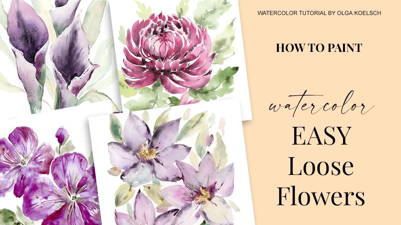
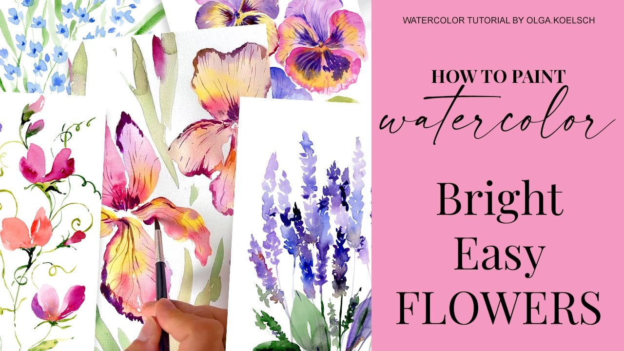
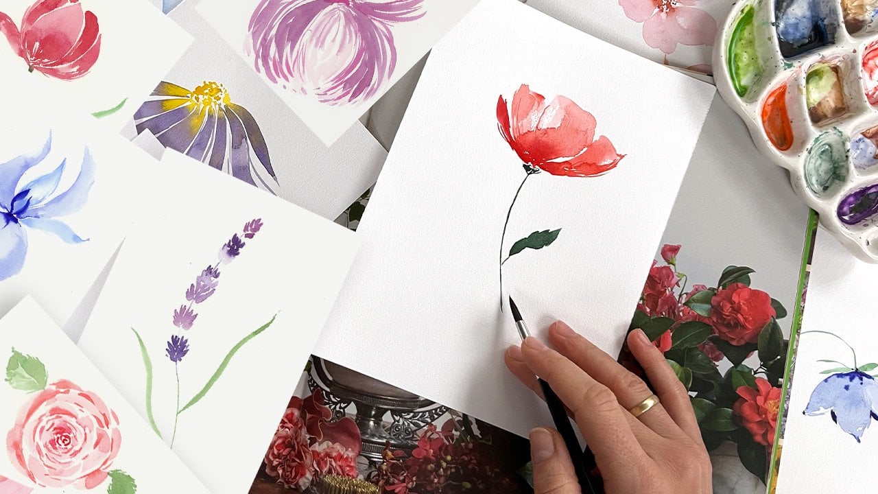
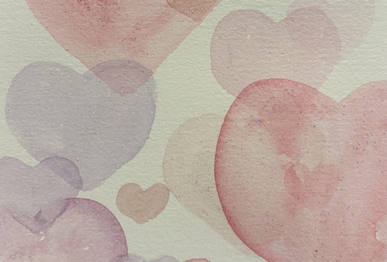
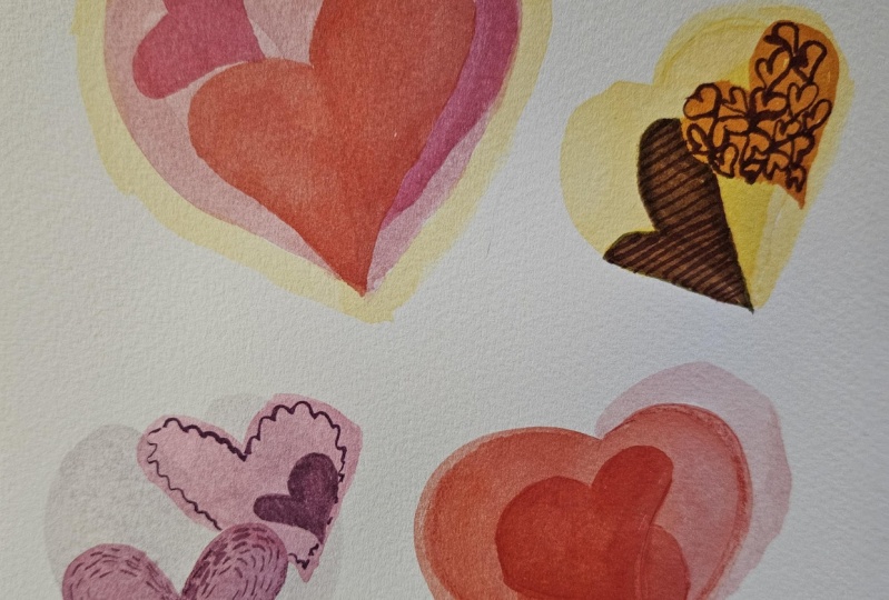
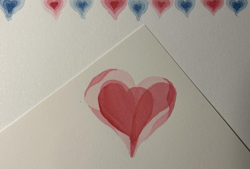
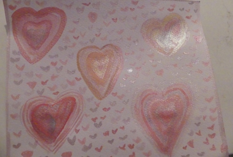
In this watercolor tutorial, I will show you how to paint an easy Valentines hearts in my signature transparent technique. It is great for greeting card ideas, wedding gifts, home decor, centrepieces and for a just mindful and relaxing painting.
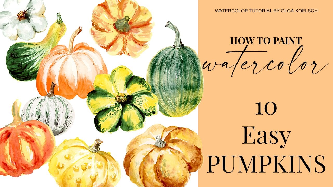
This tutorial fits any skill level and beginner-friendly!
Materials I used:
MATERIALS I USED
PAINTS by Daler Rowney Aquafine https://amzn.to/4gRUxGY
https://amzn.to/4jau60v
PAPER Arches, Hot press, 300 gsm https://amzn.to/426jycQ
POSTCARDS - https://amzn.to/40asYBn
BRUSHes PrincetonAqua Elite, size 12 and 4 https://amzn.to/4iTumRo
Order my book "How to paint transparent Flowers with watercolor"
You could use your favourite suppliers for the course or follow my list as a guideline.
I am encourage you to share your projects with the others, here on Skillshare, on Instagram to support each other, being more and more confident with bringing your artworks to public!
Let’s connect!
- Follow me on Instagram - to get more inspiration and a sneak peek on how I turn my paintings into commercial designs and patterns.
- Follow me on Skillshare - to be notified each time I release a new class. Just click the “follow” button
Meet Your Teacher

Hello friends!
I am Olga Koelsch, watercolour artist and pattern designer living in Norway.
I started my art career in traditional botanical illustration but later on I focused on modern watercolour techniques and loose painting as it has more flexibility and have a high commercial demand.
I love intuitive painting, free-hand painting that comes organically but nevertheless based on knowledge of colors, techniques and composition rules.
I create whimsical watercolours in delicate painting style combined with bohemian touch and expressiveness. I am also known for transparent flowers illustrations (or X-ray flowers) which are becoming my personal signature.
I recently published a book "How to paint transparent flowers with watercolor"See full profile
Hands-on Class Project
1. Prepare your materials. You could paint with any of your favourite materials or follow my recommendations
Check out my examples for each step.
-
Although my classes were recorded in real time I would recommend you to just watch a class to get a hint of technique and after that watch it again painting together with me))
-
Upload your work on the CLASS PROJECT section of this class and give some feedback and ideas for the next lessons. It helps to improve classes and focus on what’s important for you!
-
Tag me on Instagram @olga.koelsch to show your works and I would be happy to share!
Happy painting!
Class Ratings
Why Join Skillshare?
Take award-winning Skillshare Original Classes
Each class has short lessons, hands-on projects
Your membership supports Skillshare teachers
Learn From Anywhere
Take classes on the go with the Skillshare app. Stream or download to watch on the plane, the subway, or wherever you learn best.


Related Classes