Transcripts
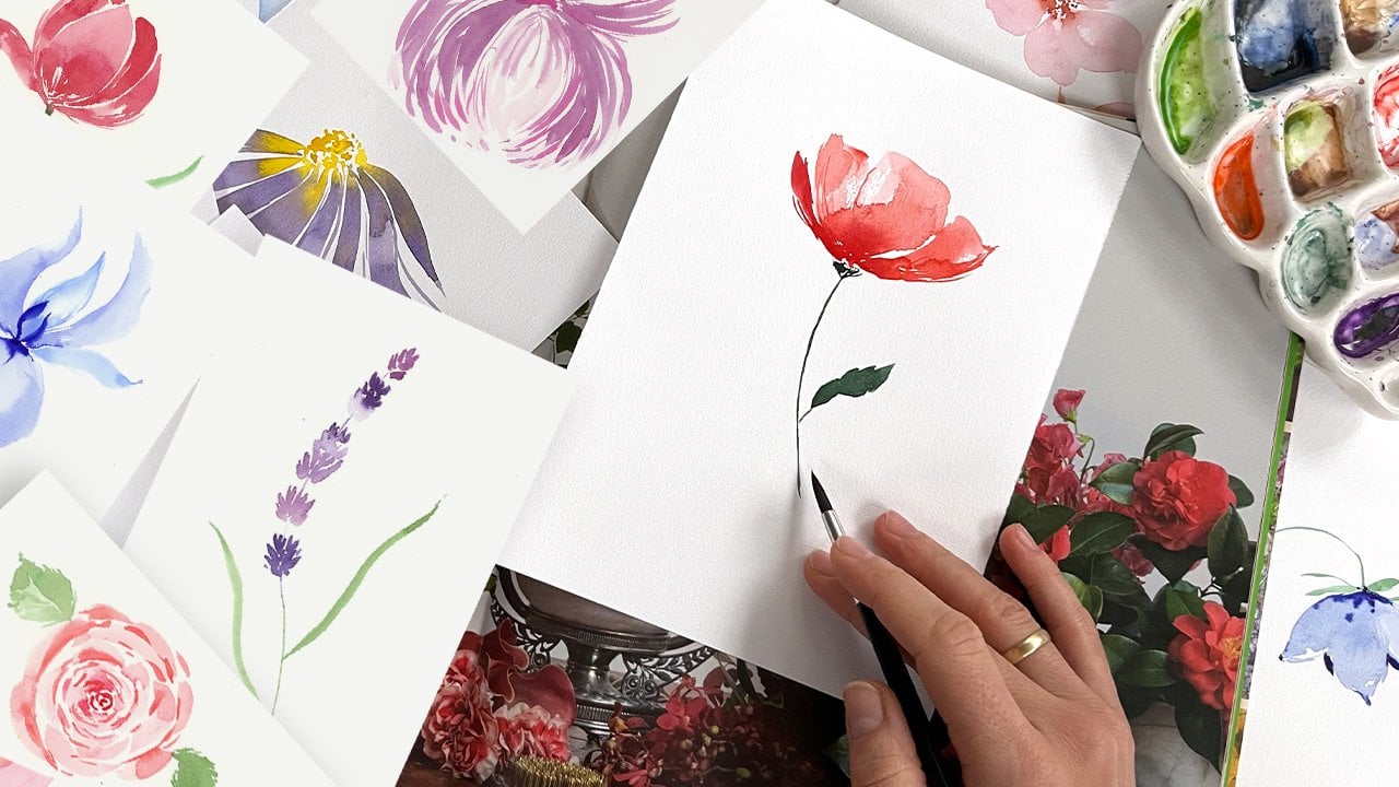
1. Welcome!: Hi, friends. I'm Loch, and welcome to my studio
in Bergen City in Norway. I'm a color artist. I'm a pattern designer, and I have a book offer. My book, How to pay
transparent flowers with Watercolor has been
released in June 24, and it is available
all over the world and inspiring a lot of artists. For today's series of classes, I invite you to paint bright, loose easy summer flowers, and I hope you
enjoy the classes. I will break it
through into small, easy steps so everyone
can follow it. Everybody can paint. I try to use accessible
materials for everyone, and I hope you just enjoy
the class. Let's start.
2. Materials: The painting, I would
recommend you to use one of your favorite
watercolor papers, or you could use
one from the list. It should be cold pressed and 200-300 grams with
soft, nice texture. It helps colors to bleed nicely. It's very pleasant to paint
on this type of paper. We will be painting all the
project with one brush. It's synthetic round
brush, relatively big one. With the in ten or 12 number. Mine is ces gran. I'm not sure if this is
applicable worldwide. I could also
recommend you to use Princeton brushes and I will give you the
links to everything. The last important thing is
a nice roll of paper towel, which we will use
to dry our brush.
3. Lavender: Elevender, I already prepared a very diluted mixture of for purple color and some with
trammeling blue color. What I'm doing right now, I just with the
tip of the brush. I paint very diluted layer. Just with the tip of the brush, I go with different
direction and sometimes I mix purple with
with tromrn, blue, and sometimes I just paint
the stem and go around the stem with just with the tip of the brush painting
the triangles. I try to make it
different and to make the stem a little bit
more curvy and same here, again a little bit
more of purple. It will be the background, so don't make it too intense. Don't make it too intense. We just need to make a
nice Nice background. It will be that effect like in the camera when it's
a little bit blued. When you paint big Bo care, always think about the camera that it will be a
little bit blued and soon you will see what
I exactly mean under this. Another stem. And a little
bit more of purple. I really enjoy just to play
around with random colors. Sometimes it's nice to add
some hint of magenta here and a little bit of tramline blue, purple,
lavender mixtures. All bluish shades
from your palette, don't overthink
it, it's playful, it's random, and that's
the whole beauty of this. Oh. I like to add this vintage feeling
to our bouquets. I add a little bit of sepia
to some stems and flowers. You see the color and gives es process. Right at the same
time, I start to add some greenish s into their
stems to make of variety. For example, again
for the variety, I would like to add
pinkish shades. B too intense. It's easy to remove. And so on. Oh. Ho. Ho. Ho. Now we could paint a little
bit more intense. I takes a same colors,
purple, tramarine blue, but a little bit more intense with the same
movements of the brush, with the strokes, with
the tip of the brush. When I see that I could
add a bit more of color, I just go again on the top. And mixing the cream. And again, If I see that something is too dark, I just wash my brush, clean the brush with
the paper towel and remove unnecessary like this, Another trick, you paint
first with boulder colors, and then just drug
out the color, a little bit down and a
little bit to the sides, and you get these
beautiful vender, fluffy fluffy lavender bouquet. You see, I do it very randomly, and now I focus more on
intense darker pots. I always try to trace how the battle would go and
try to make it in a nice and some always good, very natural. So we have very nice,
something very nice. And I think we could add one more very dark, very intense. But here. Show you my paper
towel looks awesome. I like the shades. I'll probably scan it and do something
nice out of please. I like how the blue colors
plays with each other. It's really a treat
for e. I'm wondering, what is your favorite color? You could send me
something in common. Oiga let's paint
something yellow. I like pink so much. Can we do more pink and
different shades of pink? It looks awesome, and I will add probably 11 last small
brinch to the left. Still one is missing here. I promise you guys,
that's the last one, and they called
Merv farther away, but you wouldn't
believe we almost done. You probably see it already. We have a nice book, flowers, petals intersect with
each other and we used different
shades of blue and purple and it looks
it has a nice volume, this book care, and
it has nice depth And this thought was our goal to make it artistically,
very, very pleasing. Last one. My be a little bit
even more green. I will play a little bit
with greens on the top. Los Sometimes it's nice to
paint the stem first and then decorated
with with flowers. The last part is the greenery, which we would not
really much focus on. Just the same style. I will paint some green stems. So green parts, Now leaves, I will start with very diluted green with
the tip of the brush, and then value of the brush. I paint these lander big above the stems and just above everything and put
every on a branch. I use different
shades of green here. Again, for the variety and maybe some violet
will also work. I see how beautiful
it spreads the color. I want to be very nice. J behind everything. O. And I mix green and sepia. And as the last touches, some of the small
little green details. So stamps. I want to mix a little bit in between. And we have beautiful
lavender bouquet,
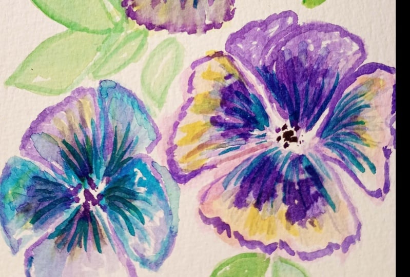
4. Pansies. Part1: For painting penses,
I already prepared very bright yellow
quinacridon rose combination. I think we might use
ultramarine blue, purple, and maybe something else from the palette,
but let's see. Our main color will be
this bright yellow, and I start to paint
from my imaginary center of pence with thick
brush stroke, I start from the center, and I paint the bottom petal. I try to make the brighter
accent in the middle. I a little bit distribute
diluted yellowish with some brush strokes to the end because here I would like
to add some purple ac, maybe some other accents. Now I'm painting these two side. Petals. I start with
the tip of the brush. I press on the belly
of the brush and I make a nice curve around
the bottom petal. Actually, I would like
to add some worm orange. Hint here and around
the edges of the petal, I just go with clean
and almost dry brush, and I drag out the colors. I distribute, make some texture, try to make it interesting, and the second petal. Second petal on the left, again, I prepare the
shape of the petal, with clean brush, I just distribute relatively
random the yellow color. I leave some white spaces to make it interesting and nice. Now we prepare just
the first layer, and we will be back here later. I would like to try ready to add some purple Quena cred purple. I will go around the edges and let's see what's happening. I just feel in the water water edges
with a purple color and let it flow by itself and
distribute by itself very naturally without me pushing too much the color and
the same on this side. I go just along along the edge, which we already
painted with yellow, and it is still
wet and that's why the purple color distributes
really nicely around. Just like this. I do not want to make
these petals too dark, but also I would like to add some contrast between
the upper petals and the bottom petals. Just like this. Some play around. I wash my brush, I clean my brush and write
with the paper towel. I have very very fine
and tip of the brush. I try to drag out
some purple color, and that's how I make some wines on the petal and the same
on the other side. This one is a
little bit too wet. Maybe I will give it one
or two more minutes. You could try how it
works on your flower, or you could just keep drying your brush with a paper towel and try to drug out the color. That works pretty well. We will be back to
this petal later on. Right now, I would like to
paint these two upper petals, and this time, I will start
with Quin acrid on purple. I will take it rather diluted, and first time
painting one petal. It's a little bit too bright. I wash my brush and I distribute the
water just around. Very carefully, I'm
trying not to overlap, to one petal another one. I make a shape of the petal. Here, I would like to add
some of pink quinacridone rose or any pink color
around the edges. Just a little bit, not so much. With dry and clean brush, I do the same, make the shades. I make the vines. Just with clean brush with a
tip of clean brush, I down. So the color, the pink color, and that's how I
make these shapes. I would like to add some darker purple accents
close to the middle here. I go once again with
purple color on the tip of my brush like this. Now it's time to paint
the second second petal. Which the one is mostly
covered with others, but we all know that
penses have five petals and it's important that our eye could count easy all
these five petals. This is the last one, and it lies a little bit behind. I would like to add some
darker shades on it. Of course, I will repeat the same pattern of
painting on this petal. You also probably
notice that to penses. It's usually the upper
petals are the same, the side petals are the same, and the bottom petal is
slightly slightly different. That's what we improvising, what we try to create here. With the tip of the brush, I try to imitate some wines around and
also to create a nice, beautiful edge of this petal. Again, with a dry
and clean brush, and you could shape
the tip of the brush, so it will be and sharper. You create these petals texture. For now, we will let
it just like this. We will be back here
to all this pansy.
5. Pansies. Part 2: Now, let's paint this one. Here, this one, I would
like to make more pinkish. My main color here will
be quencridon rose. I'm mixing it here,
quinacridone rose, and I will also combine it
with some colors from the plt. Again, we start with the with the central bottom petal because it's the bigger one and the brighter one I
painted rather random. I want to play
around a little bit. That's why I wash my brush. I dry a little bit. And I drug out the color
from sides to the middle. I want to keep the middle a
little bit lighter and edges, I will be back to the edges. I will add more
color to the edges. Right now, I'm taking
my yellow and just go just above all these big petal. I also would like to add
something to the middle. Usually, Quena crinal
rose works very well and mix very well
with all pink colors. So it's nice to try it out
to make all these mixes. Now I have slightly bolder mixture on
the tip of my brush. Here it is too wet. I would not go, but for example, on some areas, I see that the paper
is much drier already, so I could add some
nice wins around. If you do not feel comfortable, you could wait until the
petal is completely dry and then go around with
the color on the top. I'm painting right now
because I like this feeling of spontaneous watercolor when things are slightly
unpredictable, and we could get some
sometimes weird results, sometimes very
beautiful results. I like these experiments. For example, just right here, I would like to add something
dark, purple, dark. I'm not sure if
that's a good idea, but yes, let's try it out. With more like tipping
moves, I go round. The baby is still wet, but you see it's more
wet on this side and not that wet
on the right side. But that makes a nice variety. I think enough of
experiments with this petal. Let's continue with
Quinacridon on this side. Just with the value
of the brush, I'm shaping the next petal and I distribute the color round. I add some nice curves
to these petals. Again, when it is still wet, I would like to add
some yellow exits. And mix everything
with a half wet brush. And the second petal. Now I go with the
tip of the brush and more I'm getting
close to the edge. I turn to the belly
of the brush. I do not want a lot of overlaps
with the previous petal, I will let it go like
this. I wash my brush. I dry a little bit
my brush and I distribute the color to the center from the
edges to the central. H. Again, few nice
spots of yellow. I think I will risk again to add some purple accents with
the tip of the brush. Right on the top of our colors, maybe making some accents,
some moves around. Same on the opposite
side, on the left side. Tip of the brush. It's important to follow
the shape of the battle, so we're not striking like
this, not like these. All the lines have to come back to the
center of the flower. This is the center.
But around this, it could be relatively random. I think it looks
very, very pretty. I want to show you
one more triag. I wash my brush. I try
my brush very carefully, so it should be dry. I shape. The tip. And with this stip. I go along this almost dry area, and that's how I
remove a little bit of color layer and create
some white wines around. Pretty lovely. So it's very bright
here on the f. So for the top top petal, I would not go for very
complicated textures. I will make them just
this pinky purple. That's actually how it's
already mixed on my palette. It's incrodon rolls
with incrodon purple. I just use what I
have on my palette. I distribute it
down to the middle. The only thing I
would like to make some accents to make the middle of the
flowers slightly darker, and I will paint the last one. Very carefully, I distribute
the color and let it go down and some accents to divide the petals and to show
some of the depth. Of petal. With dry tip of the brush, you could a little
bit distribute, drag out the color
from the middle to create some vines around. But that's all I would not spend too much
time here on this.
6. Pansies. Part 3: Let's paint the front one. I would like to
make it more pro, almost almost without
yellow accents. We proceed and paint just
the bottom the bottom petal. More accents in the
middle of the flower and also some shades
on the edges. For this petal, I will
go just with monochrome or style with
Quinacridone purple. You see, I keep adding the
color and it distributes by itself on the petal and create these beautiful
Beautiful shades. And with the tip of the brush, I add some wines. For example, here, I
do not like that it is too big. I could remove it. Next flow, I would like to
add some bluish accents. So I took what did I took? I took this blue color
and I mix it with purple. And I just distribute
everything. You should not be
confused that we are painting flower from
the bottom to the top. Usually we paint it in
the other direction. But with pence, it really works easier and
organically in this way. With this pence, I would
like to have some fun and I just add randomly purple
and I mix it with blue. Always nice to put some
accents in the middle here and great wines round. It's very similar. We would paint a
butterfly, for example. I want to add a
little bit more of ultramarine blue to this side, and a few wines. For the top, I will get a mix of purple and
ultramarine blue. Let's see what we will get. I'm painting the
outline of the petal. I wash my brush and distribute all the color down and I
do it in very organic way. Also, this way
allows me to create the vines and show the direction and form the volume
of the petal. Many things we're
doing just at one go. Again, some darker balder
color in the middle to make some accents like
this and last pettal, around here and here. I wash my brush,
I clean my brush, and I drug out the color down. I try not to go too
close with the petals. But sometimes it's
really nice when colors into each other goes
into each other's direction. Like this. Let's add some accents around. I will take athena
brush number seven, but it could be very different
brushes numbers could be very different depending
on the brand you use. Just take the fina brush. Now I would like
to make a shape. I prepared Quinacridon
purple in very bold. Consistence. And I want to paint some shape around with this
with this moves, I'm shaping this
beautiful pattern, this beautiful at on the
bottom of this petal. And with clean and dry brush, I drug out the color, and that's how I shape it. I create all these nes, which goes very organically from the dark area
of the battle. I will paint some middle, with some tipping moves, I paint middle, like this. If we want to make
it more interesting, you could add some
en acrid rose, very bold one right
on the top of these purple purple flowers. Another thing I would like, I would like to add some accents
to this yellowish petal. It looks a bit pale, especially together with
all the neighborhood with all this bright
neighborhood. I paint the outline,
I wash my brush. I dry my brush a little. And I try to
distribute the color. It is still wed, that
why it goes pretty well. And I drug out the color from the edge to the
top to the middle. So we go a little bit of
the opposite direction. It is not very handy
you cod T the paper. Just go just like this. If you are not very
happy with the result, you could add just a
little bit more of color. But I we're, good.
7. Pansies. Part 4: More touches here on this area, same thing, same moves. With the tip of the brush, we shape this darker
area on both sides. I hope you could.
Could you see well? I do hope you do. And we painted these darker areas, and also I again would like
to add some Quena quid rose, some top to add some accents, to add some variety. And depth. And with clean and dry brush, I will make some winds out of these dark areas It's
pretty relaxing, it's pretty nice, and I
think you will like it. I think you will
like this process. The upper butts
are pretty ready. I would just like to add just
a few of more bold wines. One or two or three, and that would be enough. And some accents on the edge. So this one, O. This one is done. Why did this, I do not know. Don't do that. Don't repeat after me. I want to add some crispiness
on the edges, but it's all up to you. This one. This one really cries for some
contrast in this area. I take quinacrid purple in
relatively bold consistence. And I go on the
top of this area. And shape. This nice this nice ornament, this nice middle of the flower. And same with these areas. Here. Don't be afraid of making
things too dark on this step. It's pretty lovely to
have some contrasts. That's why I paint
some wines on the top, and I paint it with
rather bold colors. When you paint wine
on the flowers, try not to make the low line. Paint with some dots
and spots in it. It will look more natural. Use some different pressure
on the tip of your brush, also it creates variety. Once you get this variety, your art will look
very artistic. Same here. I would
really like to add beautiful dark accents. I go from the middle
to the top and I move my brush along the
shape of the battle. Just imagine that you
have some round an apple, for example, and you
paint on the apple. It will bring a nice
curve to your lines. If you imagine that you're painting on the
apple, for example, on a ball on any
round shape, thing. And the last one. Last one, actually I like
very much how it is, but it's very usual for for pences have very
dark area around here. Of course, we could have
shaped it when it was still. But sometimes They could paint things
later on on the top. Now I prepared a place for this, and I go on the top
of the strokes with that brush to create
more natural flow. I dit color And with the tip of the brush, I as video before,
I create wines. I just drug out the color
from this bright area, and she few similar strokes just here. I wash my brush. I have relatively dry brush, dry and clean brush, and this allows me to distribute and create
very beautiful wines. Along the area along the petal. So maybe not very handy for
me to paint on this side. You could always turn
the paper and paint. So it would be
convenient for you. Some wines here. Ins and wines here. I think this area really cries for a small,
lovely, yellow accent. It's a little bit treaty to paint yellow on the
top of the purple. But what we're doing now, I washed the area. Now I put a paper towel. That's how I removed a
little bit of color. Now I could add some yellow on the light area and that looks
very pretty and different. And I'm pretty happy
with our pences. I think some spontaneous
greenery would be nice. I have olive green
just on my palette. With some brush strokes, white brush strokes,
I add some greenery. Pence leave there
relatively small, bit round and very curvy. I'm not going into the details. It's not about greenery here. But some green accents, I think we assemble all
these free flowers into, into a nice composition. How I paint greenery. I just paint with the side of my brush and I finalize
with the tip of the brush, just distribute some
colors around randomly. But usually, if you just press your brush and make some lines, that's enough to
create this greenery. Feeling. Make one more here. And we have beautiful pansy, a
8. Irises. Part 1: Irises, and I will start
with very light background. I painted with some mixture of orange and just a
hint of yellowish. I try to imitate the shape. Iris, I just randomly
take appropriate colors, very diluted from my palette. Right now, I do not
concentrate too much on on painting the exact shape. I just try to follow the lines and just remember the basics
of iris, for example, here, should be nice
to paint the central, the nice central petal. Just right here, I allow all the colors mix to each other
flies into each other. What I would like to do now
is to emphasize the middle. As my paper is very wet, it distributes very nicely
and goes into all directions. While the paper and
colors are still wet, I could add some shades. And some other color mixtures. Here, for example, remove
unnecessary water. I would like to add
a little bit more of purple hint just right
here along the edges. I do it with the tip
of my brush like this. Sometimes I apply more pressure, sometimes I apply
a little bit less. I want to make nice
curry shape here. As the final touch, I will go along the top
edge with I think I have some violet color
right on the tip of my brush and could
be very nicely here. Again, a little
bit to the middle. If you think that it looks
too simple, no worries, we will be back here
once it gets dry. In the same style, I will paint one and two. You could just repeat after me. For the second one, I take very diluted, very diluted pinkish color, and with the belly of the brush, I imitate two petals. This will be a little
bit different Iris. Maybe with, some different petals. I'm just very bravely
mixed yellow and pink, and I know that it
is very cheerful, cheerful story,
cheerful combination. I just keep an eye
that colors are wet and very n diluted. I even do not tell you the
exact names of the color, as you see, I do
everything very randomly, so you will be surprised
at the end how it's possible to paint even without really looking
at your palette. Just emphasize again, just
emphasize a little bit the edges and the middle. With something with something pinkish, and something reddish. I emphasize this part. It's a little bit in the
shade of the other petals. I want to add some variety
into this yellow detail. I add some violet. So Red touches. You could do
everything you want, but while the paper is still wet and do not
touch it once it get trie. It's very loose, very
playful, and just here.
9. Irises. Part 2: And the second one. The
second one would be here. Then now the trick is to find
a place. Just for this one. I would like this one to be
a little bit more violet. I'm thinking on the
composition as well. I will make this
battle a bit longer, this a little bit shorter. It's a nice flower and from the middle from the middle to the side
and tip of the brush. And maybe add some texture here, and now the trick is to
make it nice and not to crumble in this area. So I will do it like this. I don't make very
beautiful central petal, which will take
attention on it instead of taking care of
this one on the side. I think it would be
also nice to add some yellowish
ins. Yellow color. If you look more close,
the yellow color, it moves aside all
the other colors and creates very nice texture. It's really fun to play
with, but not too. Otherwise it will get
a little bit dirty and again darker and bolder color
here on the on the edges. To emphasize the
shades and the middle. I would really like
to make this front petal very, very, very bold. Let's see. I think
would be nice as a final touch and here pinkish. Pots. This time, I will
take my paper towel and go go into the middle and remove a little bit from the middle point and keep
it like this for now. While it gets, I will
combine green color. With CPR to get the
nice dirty green and just paint around with
brave and thick brush strokes, the leaves, the greenery around. To make the greenery looks nice, I add here and there some
touches of colors P example, it will be small part here. Again, green color, sepia
color stems, greenery. In this case, we do not pay so much attention
to the greenery. It's just to connect all
the picture together. At some variety, a
little bit more green, a little bit more brownish, example, I think
this is very lovely. Sometimes it helps
to look through the camera to see
what's missing. For example. For example, I think we are done
with this part. Now I need this to
be completely dry. Now comes the fun part
of adding details. I paint with the
tip of my brush, just the vines and to make
them really random and fine. I hold my brush like this. Just very randomly. But following the main, the main s, the main idea. I add details. I add some beautiful
edges and shades. I paint the middle
with dark violet, and I little bit
go along the edge to to emphasize and I drag out some colors just from
the painted area like this. And to make it more interesting, I use different
trades for the vines. But always I use something from the plate which I
used for the petals to make it very organic and I, of natural in the
static meaning. Although it looks that here
we have hundreds of colors, which is not really true. I think I guess
it's maximum five, but it looks very with
a lot of variety here. Just now I'm making the
nes, just like this. I will paint with you
one flower and the rest, I will just make
a speed painting and you probably tood the idea, and you could easily follow
me on your convenient tempo. Sometimes I just wiggling, wiggling, wiggling with
the tip of the brush, and I use different I use different
colors to emphasize So one flower is done. And let's paint
others like this. Hello. Hello. Hello. So our bouquet, our garden with irises is. We added a lot of details, and you could go longer
with decoration, but it's always to stop
at the right time.
10. Sweet Pea. Part 1: Painting sweep, I
would recommend you to prepare all possible
purples and pinks and reds from your palette so you could improvise
during the painting. I paint with a
white brush stroke, the very first petal, and the one on the bottom. Usually sweet peas, they
have this nice shape, and to make some variations, I'm taking the
second brush and I add more purple color here
in the center of the flower. And I will paint one more petal, which which is right
behind the first one. I will let it dry
for now because I will later on create
some greenery around, right now, I'm taking croplk. It's a bit p, red and pink, and I will paint
another flower, one petal. Another petal. Sometimes I'm painting from
the center to the top. Sometimes I'm painting from
the top to the center. I'm pretty sure you
will find your moves, which will make your painting
very natural for you. Again, I add some
contrast darker color, a little bit bolder, to divide petals and
to create volume. Exam, right here. And I let all my colors
mix with each other. What I would like to do
now I wash my brush, I dry my brush with
a paper towel, and I remove a little bit
of color on this edge. You see how the volume on this petal appeared and
the same as here. Next one. Right now, I will paint a lot
of different petals. We could later run connect
them with the greenery. One petal. Other petal. Could you already recognize
sweet peas or not really? I hope it will come in a
moment if it did not come yet. I add contrast to imitate
the other the second one, looking just a bit
from the other. I create some waves, and I'm wriggling with
the brush just like this to create these
very light pretty moves, another actually I would
like to take something. I, I will mix it a little bit with orange
to make it more creamy. I paint, for example,
ve. Like this. I like all these variations of battles which we have here, color wise and shape wise. You could take any
reference you like with switch to follow the idea how
the pets should look like, and we will connect them
all with lovely greenery. For example, one more
pedal could be like this. And with some purple. I add some purple
right here, please. I wash my brush, I dry my brush, and I remove some of color along the edge
to create this volume, and s is here on this petal. I try to paint all sweet piece looking
into different directions, and a different
boldness of color. For example, this
one, I would like to make really, really pale. Underneath, I will add
something for contrast, some purple for contrast. I think it would be nice
to add some orange. S how could you see how nicely orange orange
color place with pink and creates this
beautiful texture. This beautiful overlaps. Let's something. Yellow one. It's a mixture of
yellow and pink. It creates this
shady pink feeling. For the second, petal, I will take I paint with the whole brush, pressing it sometimes
more on a paper, and sometimes I let it go and paint with the tip of the brush. Some contrast. Wash my brush, I dry my brush, and I would like to remove a little bit of the
color along the edges.
11. Sweet Pea. Part 2: And I suggest that now we will switch to greenery painting. I have olive green on my palette
and chromium oxic green, which are both very, very nice. I like very much to
paint with olive green, especially for
summer flowers for middle flowers, et's try. Let's try it out, and
take a thinner brush. It is still wet, so I
think it will create very nice very nice
details around. So I paint green bottom. And just with a permanent queen, I paint stem, and I want to I want the whole
picture to be connected. So I don't know where
the stem will end. Right now, I had
some contrast with permanent green and some
variety to the stem. I wash my brush, I clean my brush, and I remove a little
bit of color here. I want leaves to be more
transparent, not that intense. For example, this now I have
more diluted olive green, and I will paint the bottom bar area and paint stem and sem or underneath another flower and who knows where it will end. It's totally improvising. I could imagine
that, for example, one small stan gole here and
right right at the moment, I would like to add
small closed bard. Really it cries for it here
in this place, didn't it? I add and connect everything. With the tip of the brush, I with the tip of the brush and then press on the
belly of the brush, and tip of the brush, belly of the brush, and
that's how I'm shaping the green part the bad and it could be some intersection of the stems and had
with darker green, permanent green, some contrast. Such a bright sunshine.
Out of the sun. I hope you could
see well anyway, and maybe some leave right here. What I'm doing now, I'm just feeling in all
the area with greenery and try to create this feeling of a big swee bouquet. To get this feeling, I try to place all the steps
in different directions, a play around with colors. And I promise you
in a moment we will come to very interesting part. First, I would like to finish
some preparations with green with all these connections to find a place for
all the flowers. You just look on your
painting and think, what might be missing here? Maybe this will sit
just on this stem, and let's do it in that way. Now it's flower with
seeds on this stem. And this one. For the variety, try to paint this greenery in different directions with maybe different
pressure on a brush. And you could connect. For example, I could see that the grow
somewhere around here. Now Oh.
12. Sweet Pea. Part 3: Let's paint these
curvy curvy things. At of a sudden, now we have very playful
very playful picture. You could add as much of the
curry greenery as you like. Do it in different ways
in different directions. Let this greenery and create of feeling. Not to be very very
precise and overthink it. This picture of this painting, it's great for improvising. It's great for
relaxing painting, and you could just paint all the curve lines and
your main idea is to re, have fun and at the end, get some lovely lovely picture, which is nice to be which
could be a nice present, which could you frame
and put in the hallway. For example, scan it and make a greeting card
so many things, I think are very nice for
these types of pictures. I would like to add some buds, Painting bars, it's really easy. You start with the
tip of the brush, you press a little
bit and make them. The end of the flower that
some green way around. Usually, I paint with
the tip of the brush. I have a very nice brush
with very sharp tip, and it allows me to and to create very nice
sharp leaves and petals. Let all the flowers
have a dialogue. Lets them communicate with
each other and think, for example, this one
tells, Hey, hello there. How are you doing
today? Very bright. Could you maybe
come closer to me? I have to tell you
something about pinky one. The more you have,
the more things like this, maybe sounds. I sounds a bit
weird probably now. But the more funny
stuff you think around, the more creative, it
will be at the end. The playful, the more unique. I'm pretty sure right now
at that at this moment, you have something completely different from from my picture, even if you try to
follow all the steps. I'm pretty sure you're already painting something very different, which is great, and this is really way to
improve the creativity. To make it very different, I use different shades
of green color. Maybe at the very end, I would like to add some leaves. Usually leaves for sweet peas, they are long and narrow. Maybe here. It would be nice
to add something. I start with the tip of thrush and I'm
wiggling a little bit. Let it go and add some darker from the d to the tip a little
bit long the edge. Just like this and Mmm. Have a look, have a thorough
look on your painting and see where maybe some
contrast could be added. So details. Some extra curves. And it's also important to
stop at the right moment. Right now, I'd like to add this one more here. This one would not look
that lonely and have a pal. I could see how all these
could be connected. Also, you could
check, for example, this one really needs some logical connection
to the main stem. Just come across
your painting and maybe add a few final touches. For example, this one, could
connect here to the stem. D. I would say our picture is.
13. Forget me nots. Part 1: Paint, forget me notes, I already prepared ruulum. This is dusty blue
color and cobalt green, also a bit of dusty
green for greenery. I have this funny
brush with very long very, very long edge. It's perfect to
paint some stems. For example, like this, I want to make very abstract, a very Free hand bouquet
of forget minutes. This brush really
helps to release the release all the control of what you are doing,
what you are painting. Don't be afraid to
make uneven lines. They should be uneven. I would be nice if
they would be uneven. I prepared that base. Maybe just one more here. We'll see if we
need these or not. I would like to paint first
few of forget me nots. I just used. If you do not have um color, you could use any blue color and maybe add some green to make
it a little bit more dust. I forget me nots. They have five petals. I'm not going to paint. I will show you first what
I'm not going to paint. I'm not going to paint each and every forget me not like
this. No, no, no, no, no. Let's remove this.
With the paper towel. But what I'm going to do? I I will just stamp around with some
random brush strokes. Just keeping in mind that
it would be nice if there will be five on some flowers. I also like this randomness
and the dynamic. On when I paint with When I
paint with brush strokes, when I do not paint
each and every petal, it brings suddenly a
very beautiful dynamic to all our paintings. If you want to say better, I paint with tip and a little bit with
the belly of the brush. I slide my brush on the paper. I press it on the paper and
make strokes like this and don't be afraid that sometimes
it's not that realistic, we will get there or not. Let's see. Our task now is to paint first to get the
volume of the bouquet. It would not like
11 single branch. One single stem with flowers. Because usually in
nature, forget me nodes, they grow in clusters, and they're beautiful
in these clusters. I just feeling. I will add all these lovely
details a bit later. On this stage, it's
just important to to paint them
of the same size. Maine a few on tops. Of course, some of the
flowers they are wide open, some of them slightly closed, and we look at the flowers
in different angles. And that's what we imitate here. You see, it's very free hand. It's maybe less
realistic, more abstract, but it's really big
fun and pleasure and relaxing way to
paint such a tiny, little flowers like
forget me notes. What else could be
a lilac could be. The example, some grass,
some wild flowers, which have small, tiny, little flowers, sometimes
which looks scary to paint. Really, do I need to paint all these hundreds
of small flowers? No no way I could manage that. Have you ever had
that feeling? I had. That's why usually I
prefer to paint roses, for example, big
bold, no problem. No problem to paint
big bold rose? A Now we are done
with preparing. We might later on add
some details here. Now I'm taking
Cobalt. Cobalt blue. It's a bit and I take it in a bolder consistency,
mix with cobalt. It's bit grey. I would like to
paint the middles. Usually, middles are yellow. But I do not want to
do that complicated. I want to make our
bouquet monochrome, and I just paint the middles with tiny
little brush strokes. I hope you could
see it really well. For example, Some
flowers are still wet and that's strokes
are a bit diluted. That's okay. But some flowers where the area the paper is dry. You could really add some
nice texture brush strokes. Also with the direction
of brush strokes, you could really show the
direction of the flower, where the flower
looks on the top, on the left, on the right. It helps to create the
dynamic and the flow. Try to make the middles for each and every
wide open flower. It will make it
deeper, interesting. No need to paint
thousands of flowers. I'm not counting how many
we already painted here. I guess maybe 20, marks, but it looks enough for
a beautiful bouquet. That.
14. Forget me nots. Part2: Now it's time to paint greenery. I'm back to my cobalt
green mixture. I make it a bit more diluted. Forget me notes. Greenery is long and narrow, and I will imitate it. For example, let's start here. I start with the
tip of the brush. I press on the belly, I make some curls
and wiggle, wiggle, wiggle around and let it go. For example, one leaf. One leaf is ready. It's sometimes
it's nice to cover some of these green clots
which you do not like. For example, here. I look it a bit closer. Start with the tip of the brush, press on the belly of the brush, wiggle, wiggle, wiggle, wiggle, and again finish with
the tip of the brush. I would like to paint even longer to a gain for
the purpose of dynamic, tip of the brush, by the brush, Pickle kle Wikle le ickle, wickle, vehicle,
and now let it go. That's nice. This one
I like very much. Now let's do 500 of this. Maybe just 20, but nice if greenery will look
in different directions. Tip of the brush, ickle,
icicle, vehicle, vehicle, vehicle, vehicle.
Tip of the brush. We'll be back here again. It's a perfect place
to add more here. Tip of the brush,
by of the brush. I could even go on the
top of the flower. Nice. I'm very minimalistic
with colors in this painting and no, I just concentrate on the
composition, on the dynamic. Tring some variety, you
could sometimes use more diluted color of
the same cobalt green, just more diluted, for
example, for example here. I'll start here already
with the belly of the brush and Pickle
Vickle igle let it go. Now it's a little bit lighter. Maybe with dry and clean brush, I just go the same route, and I could remove some of some of the boldness
of the colors. Here, for example,
I would like to start again with
the thick part of the leap to paint them
under the flowers. Like this. You see with these different
shades of greenery, they are getting to the volume. They are getting to the nice, interesting vary we use
just one color for green, one color for flowers, playing around with
boldness of the color. We could really get a of
different variations. Now I'm back to the bold green. Always nice to paint together. 11 lighter leaf, one leaf. Suddenly, we have a volume here. For example, I would like
to add some volume. Here. It's important to find the end, sorry, that's more like the
beginning of the leave. It would not look like some
weird thing without a root. It's about dynamic, and also bold greenery
will help us to cover the maybe slightly unfinished spots. I want to add some volume here. Let's. No worries. Make it a bit bold. Here. Let's have a look what we have would be nice to add
some boulder greenery. Here. You could
improvise on this state. I'm pretty sure if
you're painting with me, you already have something
completely different. Agh, if you try to
follow all the steps, now you probably came to
something very different. But what's important is to get the principles and now
you could improvise and I think it's great that even painting the same thing
with the same tutorial, everybody will
definitely get there. Own pictures, unique
pictures, that's nice. Now, I would like to paint some greenery one on the top
of the other, for example, I made here would be nice to just thinking,
what would be nice? For example, for example
here would be nice. Have to paint something here. This one could be a nice. Let's just paint
again on the top. Now we have nice overlap
and that makes our book care big fff vibrant. 00 Now, I want to make the logical
ends for the bouquet. So it doesn't really cut. So with some curry moves, I imagine how the steps could
grow where they could end. I had some greenery
inside the bouquet. I try not to leave too
many wide weird spaces. And think we are
almost getting to the logical and it's important
to stop on the right moment. I like this very fine stems, but anyway, I would like to make some of
them a bit bolder. Again, for the
purpose of volume, just in some spots. You see one I'm getting bolder, it looks very interesting, very contast but just
with some of them. I add some short leaves, especially to the stamps which do not have to much
of the greenery. As a final touch, as a final touch, I come
back to a covet mixture. I take this very
bold, very creamy. And I would like to
paint some bots. With small tiny moves
of brush randomly. This one is to be a good
with a paper towel. Just go on the top, I
make it lighter and now it does not irritate the eye. So strokes. Oh Oh So strokes, for variety for making the composition looks
really interesting. The interesting compositions, it's very interesting for people to follow I follow
their dynamic, follow the moves, and to
look into the details. That's it's nice to add some tiny details,
some little details. It will make our painting more
interesting to look into, to enjoy it, it's important to stop
at the right moment. I think here it is.
15. Final thoughts: Thank you so much for
painting with me. I hope you got inspired, and what I suggest to you is
to bring all the theory into practice and enjoy painting bright flowers with watercolor. See you next time. Bye bye.
 Olga Koelsch, Watercolor artist and Pattern Designer