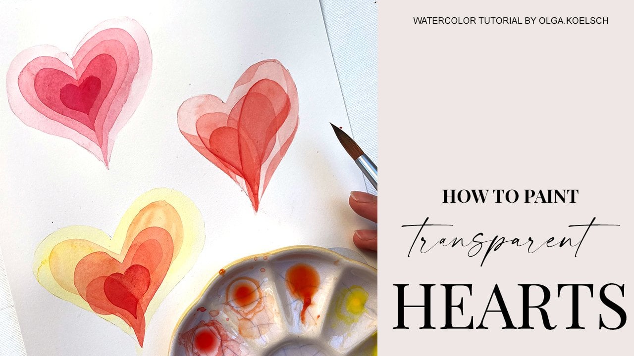
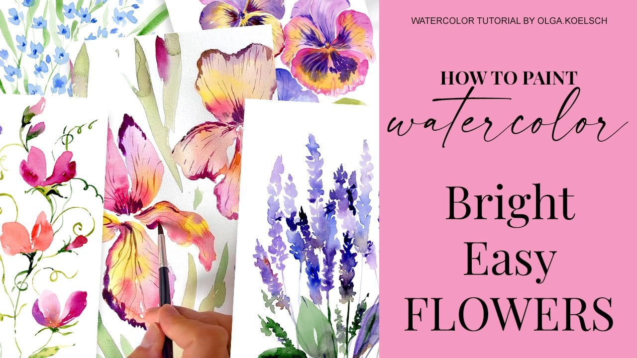
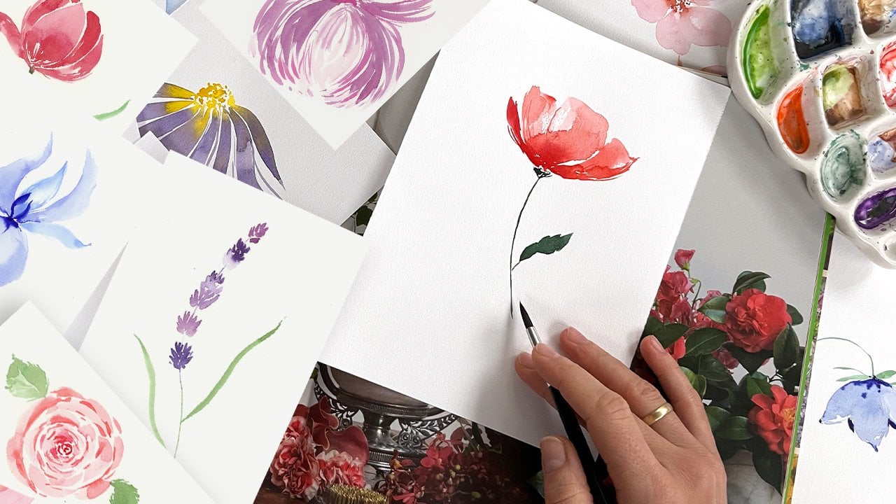
Transcripts
1. Welcome!: Hi, friends. I'm
Loch and welcome to my studio in Bergen
City in Norway. I'm a color artist. I'm a patent designer, and I have a book offer. My book, How to pay
transparent flowers with a color has been
released in June 24, and it is available
all over the world and inspiring a lot of artists. For today's series of classes, I invite you to paint bright, loose easy hours, and I
hope you enjoy the classes. I will break it
through into small, easy steps so everyone
can follow it. Everybody can paint. I try to use accessible
materials for everyone and I hope you just enjoy
the class. Let's start.
2. Materials: The painting, I would
recommend you to use one of your favorite
watercolor papers, or you could use
one from the list. It should be cold pressed and 200-300 grams with
soft, nice texture. It helps colors to bleed nicely. It's very pleasant to paint
on this type of paper. We will be painting all the
project with one brush. It's synthetic round
brush, relatively big one. With the in ten or 12 number. Mine is ces gran. I'm not sure if this is
applicable worldwide. I could also
recommend you to use Princeton brushes and I will give you the
links to everything. The last important thing is
a nice roll of paper towel, which we will use
to dry our brush.
3. Chrysanthemum. Part 1: Let's start, chrysanteum
flower looks like a big bowl with hundreds
of small tiny petals, and we will try
to recreate that. I take very diluted, lyser and crimson because the flower consists of
a lot of tiny petals. I would recommend to
start very light. Let's find the center
of the flower. Maybe it will be around
here and we very diluted suu crimson because
we could always make it. We could always make it
darker with watercolor, but we can't make it lighter. Let's say it's not that
easy to make it lighter. I create the middle, the very dense part of
chrysant where all the petals, come into one small little ball. From our point of view, we could see the front
petals like a long strokes, and the bottom behind petals, we could see as a
small tiny strokes, that what create perspective. Let's make another row. I painted these petals
from top to bottom. Now I would like to paint
from bottom to top. The petals will be slightly
different in their shapes, not too symmetrical,
because our point is to bring some variety and
volume to our flower. Try to leave a lot of wide
space between petals. When you paint the
petals on the back side, you could see only small
little tips of these petals. It's like you have
a look on your arm and you see only these
parts of the fingers. The paper is still wet. I would like to add
volume immediately. I mix a lasering crimson with black color with
its neutral tint. I like that it has some
granulation effect in it, and I add a little bit of this mixture to the
bottom part of the petals. The point is to divide them and to bring more shades
and contrast in it. Also, I would like to bring more contrast and shades into the middle
part of the flower. Because the light shines
from this direction, which means the top parts of
these petals are very light, but everything
underneath the petals is d. I'm not painting
very detailed. I just paint a few
brush strokes around. Again, the paper, the
paper is still wet. I add a little bit
more dense of of Alizarin crimson,
more bold color. I added more to the petals which are already on this shady
part of the ball. Our flower, chrysanteium,
it looks like a ball. In principle, all
the shades will be similar if we paint
just no plastic ball. That's the lightest part, that's the darkest part. I know it could be
slightly confusing, especially in the
beginning to get all these things about shades. You could just check out on
the reference, for example. The only thing important
to remember that the more the petal goes
down, the darker it is. If you follow that rule, everything will be beautiful
and everything will be nice. In the upper part, our flower becomes a little bit more open. We could see a little bit
of details of the flower. Still, you see, I do not
paint each and every petal. It's more like applying
brush strokes, and any round brush about size 7-12 will
fit really nicely. The more you go aside, the longer, your
brush strokes are. But remember to add some variety because some petals still we could see
only the short part, but more and more we could
see the longer petals. And you could paint the
petals from bottom to top, you could paint
from top to bottom. It always nice to
add some variety. Try to remember that the petals which are on
the top get more sunshine. They are more lighter. Don't worry about
the shades now. Even if we do not manage
to add the shades on this stage of wet paper, we could always go with the
second layer on the top. That really no problem with watercolor to add
shades and dark parts. Let's paint few, very long long brush long
petals on this side, on the bottom side,
and like here. If you want to know more
about my technique, about how I paint, loose flowers to get
more into that style. You could join my skill
share class where I give really detailed
information and I give a lot of exercises to practice
and a lot of examples. If you follow the link in the
description for this video, you could join Skillshare for trial period for
one month for free, and I think it's a
great opportunity, try not only my classes, but hundreds, really
hundreds of other artists. I really like this
this platform. I think it's one of
the greatest things to get more knowledge. Or in painting, in art, in design, in many
different fields. Our basement of
chrysantemum is ready. Now let's play
around with shades. I will start with black, it's mixture of neutral tint, and alizarin crimson,
it makes it very beautiful, bold, dark mixture. I know that some artists do not recommend to add black
colored painting. In my opinion, it really brings nice contrast and
black color has these gran granulated effects
which are very beautiful. Be careful with
playing with shades. It's better not overdo it and try to leave a lot
of white space in between. It creates the freshness, I would say, the freshness, the of our Think about where
the more shady part goes. The more shady part goes between these small petals and here. B right here is the main
ball of chrysantemum, which creates a big shade on the bottom bottom
petals, bottom petals. Right here in this area, you could really feel
free to add shades. Be on the here. That's how we divide
different parts. With the tip of the brush, you could add a little
bit of extra lines, extra strokes, because
now we are moving to the fun part of
creating details. With the tip of the brush, with some random strokes, no need to be too specific, no need to try to follow
the reference one by one. We just create the
impression of the flower. I keep adding more
and more dark tones. Principle, right now, I add
just the black mixture, but very careful, only
on the tiny little part. I really like how
black color plays here and divides
these two areas, and it brings a little
bit of to the painting. Chrystm is a winter flower and winter flowers. I
think they need some. Now let's take just a bold
mix of alizarin crimson, like it is, maybe just with
a small hint of black. With the tip of the brush, we create a little
bit more of details. Remember that the more you go
to the bottom of our bowl, the more shades you could add. Don't touch this area, which is right on the top. Rather go rather go
into the bottom part. You could play around
with some lines, which will be our flower wines. Add some shady parts to these leaves to
create the volume. Step a bit from the top, so you leave a little
bit of lighter space, and that's how we got
these folded feeling. Because right now we already we switch to the second
layer of our watercolor. Of course, if you like,
if you are satisfied, it's okay to stop
right here and it's also quite nice and move
to the greenery part, which we will come back in a few minutes once we're
done with ranging here. I would like to add just a small idea of intersection of petals
here in the middle. I relatively random paint with my brush with
the tip of the brush, just creating some mass of
lines of different lines. I would like to add just a
little bit more of shade, but leaving the light area
around my brush strokes. Let's have a look. In principle, it's
nice, few petals, they need to be more included
into them into the picture, B two aside, B two separated just
with dump brush, I soften the edges. I bring these all to one drawing into one idea. This area is getting dry, and I would like to divide a few petals,
add some details. It's our dark mix of black and sarin crimson
and that's how it is.
4. Chrysanthemum. Part 2: Um, pull the greenery part, first of all, I will
take another palette. And I will take Cbd green. I have a cobalt green. It will be for lighter parts. Chrysantanum has
relatively big leaves, and I will start with
the middle wine, which I decorate and into
chrysantanum greenery. In principle, it's
similar brush strokes, which just in the direction
from the middle vine outside. I do not go into the details. Moreover, I would like
to add a little bit of black neutral tint
for the shades. For some tips to
create the volume, to create the
variety in the leaf. Another leap, I think
nicely be here. First, I create some curve line, and from that curve line
with just wiggling my brush. I create some greenery. I like to paint greenery. First of all, it creates
volume, it adds variety, and it brings all nice
contrast to the flower. A little bit of black, net, which is black. You could use any black you
like, usually all blacks. They have some granulated. Texture. You could get
very nicely results. The third one. The
third one greenery leaf would be nice to have here, and we imagine that the
green leaf grows around, growth, and now we see it curve. From this, We put brush strokes. Again, we decorated our middle
wind with brush strokes. But this leave is
more on the top. It's more on the sunshine, so I would not go to too
bright with it too dark. I will just add
few bruh strokes. But not to. I want
to keep very light. I do not like that. For example, this part looks a
little bit to cut out. I think some greenery, some extra greenery will really help to bring some variety, I I add olive green. It's the warmer,
warm tone of green, which could make a nice contrast with relatively
coser and crimson, relatively cold purple color. I do not go into
any details here, it's more like a brush stroke. It's more like I creating the background to
bring the flower up. I would like to add, very small tiny leaf here. In principle, it's just
few brush strokes around, very light, very free hand. Now it's it's a nice
composition on the top, but could be slightly
n on the bottom. We have two options to create
composition in the bottom, either to put the second flower, for example, a chrysanteium bard here or decorated with greenery. I think I would
like to prefer to paint very loose bard here. And to show you in the same way how to
paint even more loose. You see I just organize
brush strokes. Same principle longer brush
strokes on the side which looks on us and on this
area, they are shorter. I organize brush strokes
in different directions, but I try to bring
them from one point. That's the main ball and that's the extra petals
which goes around. Some darker shades
to separate petals, and bit of darker
shades in the middle. In principle, it's
the same idea. It's the same idea as
the painted on the top. I'm unsure which one I like more because I really
like to paint loose, but I also like to
add some details. Why why not to paint
everything in one. In one picture. I switch to my palette. It would be of course
easier if everything will be in the in one plate, for example, or in one palette. But things which would be
lovely to play in advance. I hope after you
watch this video, you maybe plan a little
bit better your workflow. And we are almost there.
We are almost there. I'm looking where
my paper is wet. And I create different
greenery brush strokes around. This looks a little bit
too yellowish, isn't it? So I take paper towel. And take a little
bit of the material out and go on the top
with cobalt green. This one, maybe to reduce
this yellowish idea. No really necessary. No no picture. I like what we have
here very much. The only thing I would
really like to point out that this is chrysantaum, not rose and chrysantaum
needs longer brush strokes. It has longer petals. I just add few of
longer petals here. And that's how it is. Let me have a look from the top. When you look from the camera. I really different if you see on your work
from your desk. I would really recommend
you to stop here and there, take a picture of your work, or have a look for your camera. It really change your idea of
what are you painting now. This is it. That's
our chrysentium.
5. Calla Lily. Part 1: Color lily, I prepare dusk pink or dusk
violet flower colors. If you are not fan of
granulated colors, you could just, for example, quinacridone rose or
quinacridone purple. I I have a relatively big
brush and soft brush, and I start to create the
curry petal of color. I'm painting the inner part
of color flower for now, and I had a lot of
lovely, beautiful curves. The most dark part
of our color flower is inside this cone. That's why I add
the darkest color. It's dk purple color. I add it into the
middle of this part, and I'm mixing and
distributing colors. I it would be very handy to use the second brush just
clean and dump brush and then you could go a little
bit and di soften the edges. The beauty of granulated colors is that they create, really, really specific
texture, which is difficult to repeat and everything will be
very individual. I think that's great. Of course, while the
paper is still wet, you could add more
and more shades inside of this part
of the flower. Remember, we paint in
just the visible part. Later on, we will paint the
outside of a color conn. I do not really like this bold super bold
wine here colors. They do not have very
certain middle wines. I have a feeling
that I could better distribute it a little bit
and the paper is still bd, so it's no problem to do this. I might Now, you say suddenly
I have free brushes. That's okay. Just important to remember which one is what form. I add a little bit more of
darker texture inside the con. And I will stop here, I would like to paint the
outside part of the cone. I will keep my dark
brush untouched, I will put it aside. The outside part has a little bit greenish
yellowish texture. I will start with light. I take ply green, which also has slightly
granulated color, and I will go Just with
the top of a brush, I map out the shape of the
flower and color flowers, this cone, it looks
like an ice cream cone, if that helps with association. One part goes inside and the
second part overlapping it. What we are going
to recreate now. Now I'm just maping out with the tip of the brush
with very diluted color. It will disappear later on, so no stress at all. I'll just map out these two
parts how they will grow. I maped out this con. I remember that this
right part will be on the top of the left part. If you are not
happier right now, you could correct it sometimes just with clean fingers or with paper towel and change
a bit of the shape. For example, make it
a little bit narrow. Take a little bit more of bling green and with very diluted, mixture, feel in the left
part of color. O color lily. And with our thick brush
which has purple on it, just go on top and let
all the colors mix. I would like to make this part more light
and more bright, so we will see very clear
border between these two areas. With another brush,
just the clean brush, I'm soften the edges, and I do not allow the dark purple color mix
and go too much to the top. For me, it's very convenient to jungle with this
amount of brushes, and that might look a
bit confusing for you. But give it a try. It's a time saver, and it's crucial when
we paint on wet paper. Because when we start to wash
out brushes, dry them out, get a new color on it, you lose the precious
time of wet paper. Just like this, you see, I'm not paying too
much into the details, but I would like to add a
little bit more curve here. I still have this opportunity because the paper
is a bit wet yet. I always advise you, even if you see on your
reference that flower is has a straight stem or straight lines,
add some curves. It really adds some
artistic touch. That's our left part. Let's go back to the right part. Again, Perlin green,
it's very dusty green. For example, you could get
it when you mix tallo green or vermilion with
some brownish colors with Spa for example. It will be very close to
what we are painting now. Let's paint this right petal. Yes. It will be the lightest part of color
lily because it's on the top. So Right now I'm just
ptering this area. If you say, for example, when you touch the neighboring
area, that's all right, and it just adds some
nice touch to our flower. I would like to paint
this area with dusk pink. It's a lighter version of this. I remind that in a part, we mainly paint it
with dusk purple, which has more black
pigment in it, more black color,
and it's darker. Outside part, I would like
to paint with dusk pink. Again, I keep an eye that the border will be
light and soft. Some shades are always
good and all the shades will go to the side part
to create the polu. The paper is still wet. O collage has
distributes by itself. I do not really do
much with this. That's my clean brush. If you're confused with brushes, you could just test it
out on the paper towel. I want to distribute
it a little bit. Now I would like to add
a little bit more of green touch with Berling green. To the bottom part.
I add some stripes just with the tip
of the brush to create the texture
of color lily. With the same go,
with the same brush, I paint the stem. You may be noticed. Again, I paint the stem a
little bit curvy. I always emphasize
that try to add more curve line to
your paintings. Let's paint in the same style
three other color flowers, just to be sure that we just
to practice the technique. You could, for example,
paint one color, but then you may be
shifted to the middle. I composition wise, it
will be more organic. I usually prefer to paint some compositions consist of
uneven amount of flowers, because it's more interesting. O eye has more way
to investigate to go I will just remind
what I'm doing. I made the first layer with
very diluted dusk pink color. Now I paint the darkest
part of color lily inside inside the cone
with dusk purple. It's very dark and bold. I would like soften
a little bit. I will go from inner part
to the outside part, soften the edges. With
granulated colors. It's a little bit sometimes
confusing because you could see different shades
of the color. For example, right
now, I could see only black colors on the view. But give it a time. All particles of
granulated colors, they will move while
paper is still wet and they will create
very beautiful, nice mixes, nice structures, which you probably already could see on the neighboring flower. Let's paint the co. Let's paint the second con
with our green dusty mix. Firstly, let's outline
as we did before, and then with clean
and dump brush, soften and distribute
all the our grayish mix into the body of the
into the color body. And let's do the left part same starting with watery outlines and apply a little
bit more pressure in the brush and then drag out our watery mix into the whole areas into
the areas of the ce. Our paper is still wet I would like to add our purple mix into
our grayish green mix. I just grab our
purple mix and go alone and go along the edges. I let my watercolor
distributes by itself, and with the tip of the brush, I help a little bit to
set up the direction. I use tip of my brush with boulder mix of the same purple, but it's bolder right
from the palette. I add more shades into our mix. Then with clean and dump brush, I soften the edges
where it's necessary. Now, I grab greenish, I add more shades into
the body of the corn. The paper is still wet. I allows my watercolor
flow freely, and at the same time, I add purple mix with my
clean and dump brush, I distribute and
soften the edges. Also I leave quite crispy
edge on the top of the cone for more contrast and to show them thickness of the
petal of the space.
6. Calla Lily. Part 2: I would like to bring all
the stems in one direction, at least for these two colors. I would like to add
just a few details. Some crispiness with
the tip of the brush, I go along some edges and
create more lovely curves, emphasize this
emphasizing these curves, just a little bit with
the tip of the brush. It brings some difference. The third one, I
would like to paint a little bit on the side
with the side of you. If we turn this bd, it will look on us in a different way and
it will grow like this. Again, dusk, very diluted. Now, I mixed all the brushes. Let's use this on
the bigger one for diluted pink color and I
paint the middle part. If that's difficult for you
to paint without a sketch and I show you I know it is. It takes practice. You could just
sketch the outlines before you start and then
you will feel more relaxed, and maybe it will be easier
for you to paint in this way. For me, why I'm painting
like this without sketch, on one side, it's my
personal challenge. On the second side, I realize that I'm a
little bit bored with pictures which takes too
much time to be painted. Let's put it in this way. Because first you
have to make a. Then you transfer the sketch to the paper and that is over. I bit kidding, of course,
and exaggerating. But I think painting
without a draft, without a sketch really
trains your vision, trains your own, and brings spontaneous feeling
to to your art. What's important
with color painting is that we emphasize we put darker shades on
intersections and on the side of the cone with
dump and clean brush, which are soften the edges. As we paint with
granulated colors, we leave it like it goes
because the granulated colors, they will find its
way on the wet paper, and usually it's very
beautiful B watercolor and works by itself
without our interfering. Now the trick part is to find the stem for
this third guy. To make it nice, I'm make a move with
my hand with my brush. And here it is. Here I will find the logical way where
the bard goes comes out. Right now, I would like
to add just a hint of racena contrast and to
divide all these areas. I think it's time to
paint the third stem. About this. What would be nice
is to divide a little bit and add more shade to
the bottom flower. I do it rosy, and then switch to ping green, which is our main green
color in this drawing this. Again, I just make the
shades and the color flow. I guess I really could go
a little bit more dark. Just like this. We need to bring this flower
on the top and we do it with painting a really contrast shade
on the other flower. Now, it all looks
very nice and lovely. I would like to
add some greenery because all greenery
when we paint greenery, it really everything together. I will don't be surprised. I will take cross ena for this. I will take rosena, but very, very diluted. Color leaves, they are long, and relatively
they have a little bit curvy and relatively
simple shape. I just maping out, preparing the area, and
with my second brush, I will add perling green to this to the yellowsh, leaves. Why I choose that weird color. We paint in greenery, but with yellow
with brown colors. Why? Just because of
the contrast and not to take the focus out of
the focus of our flowers. I just soften the edges, I leave the color flow as it is, and I paint another one. I'd like to paint a few
more of the green green. Brown brown leaves. But to make it work, I'll stress it out our roca, our brown color, it
should be very diluted. Should be very diluted
and you just add a b just a hint of green color. F just a little
bit, just a hint. You see it somehow it dissolves
inside and do not try to over paint it or paint
it. Let's paint more. I paint imaginary stem and
proceed with the leaf. Immediately while the
paper is still wet, I add few hints of green of green green and
let it all mix. Right here, I could see
a nice curry leave. How I paint it. I take my brush. I start with the
tip of the brush, I press it on the belly, and I let it go once I'm
approaching the end of the leaf. Once I approach in the stem. While the paper is still wet, I add a little bit of greenery
of green touch in here. Just a little bit.
I want to make the feeling that all
these green leaves just melting in the paper. I think you all agree that
something is missing here. First of all, the stem of this wonderful leaf.
Better not to do it. Let's paint that stem, and it's slightly empty
right in this area. I'm going to paint to
set one more leaf here. To better understand the
flow, how I'm doing this. I test it with my hand, and I start with a stem. You say a paint is very diluted. I will have a chance to fix if there will be
need to fix something, but I hope it wouldn't. Now, I could go with the second with the
second go on the sleeve. Let's check it out,
does it look nice. Does it need a little
bit more of green? Yes. Let's add some green shades and dots and spots around. But for example, here
is the green part. Don't put too green
in this area. Maybe here just in between. Contrast between
all these areas. But on the top, There
is no intersection, you could add slightly
more intense green color. Also, just in this area because it touches the purple one. It's completely fine to add
a little bit more intense. Let's check it out. I would like to
intensify some steps. Add some final touches. Maybe some texture
to our colors. Let me have a look
again for the camera. This area is missing, and I promise you, guys, that will be our last leave
while I'm painting it, it's same technique, start
with the tip of the brush, press the brush, let it go. I want to make it curve
and I want to make it be around here. It would be really
nice if you write in comments which flower you
would like me to paint next. Are you artist, or
you are an artist and a designer who is interested
how to apply your art, how and to sell your art, how to have some
commercial value in your art because
I'm a professional, I'm a commercial artist, and I do custom works, I do pattern design. I'm just thinking
about next tutorials. Maybe there are
topics which you are interested as well as painting. Maybe you do not feel very
confident in your art and you need some advice
or hand of support. Just let me know. It is very, very important. It has a great value for me, and I hope it I could
create more related topics. Difficult to stop with
painted leaves. I know. But right now it
feels very nice. Let's stop here. Thank you.
7. Clematis. Part 1: Paint today clematis and we will paint it with
granulated colors. It's big form to paint, and that's not really a basic
colors in your palette. But it's very fun to try it out. Granulated colors means
that the color consists of small particles and they
run away from each other. They dissolved and distributed in the surface of watercolor and they create these fantastically beautiful
mesmerizing textures. You will see it very soon. I paint climats. In principle, I always try to follow the
rule of free one, to free buds or flowers, or uneven, let's say, part of amount of flowers. Because it's pleasant for eye, because it does not
create this symmetry, which sometimes is nice, but for pictures, it's more interesting when your eye
has some flow around. What's important with
clematis flowers to keep in mind that it's always even amount of petals, either four or six or eight. This one, I'm going to paint
with one to 34 with six. Sometimes it's actually eight. I think the most
common, but we'll see. Now I will make it closer, have a closer look
and you already could see how all these
particles started to fly and distribute and create very fun,
very unique texture. We also keep in mind
that clematis has very certain middle
wine in the petals and usually some
light middle part. I leave it white for now because when we
paint watercolor, we have to think in layers. We can't paint darker layer and after that, something light. It's just not possible
because of the medium. I leave this area for the yellow part and I will
add it a little bit later. For the basic color of clematis, I use dusk violet, and I will leave you a list of my
materials in this video. You could try either my list or have a look for
some other brands, or just try everything. I wanted to point out that that's not a basic
watercolor palette, and you need to make some
research in your stores, in your in your favorite
online shops to find and create your
perfect granulated set. Let's keep moving. I immediately want to
paint another one. Okay. I start with more lighter version of of the mixture and
now I use dusk pink. It's slightly lighter
than Dusk purple. But if I add just a heat of the color right from the palette without
adding some water. You could see how intense
and bright it would be. You I think here you
could see really well how it start to dissolve and create all these
beau beautiful textures. Climatis flowers They more like late autumn winter flowers depending on the
region, of course. I see it here in Bergen, I see it's for rather long
time for October at least. You could leave me some
feedback and comments. Do you have clematis
in your region? What's your favorite Late
autumn, winter flowers? We could paint more
of them together. I I want you to see all
the picture around. I emphasize a little
bit of the middle part, so it will later on
create a nice contrast. While our paper is still wet, I like to add some extra colors, which maybe not really present in the flower
in the picture, but together, they
create very beautiful, very specific mixtures
and shades and makes our painting very special. I'm preparing a little
bit the middle part. I want to see how my watercolor is mixing with I
think it's Rosana, but it's also from
granulated collection. I'm going to paint all
the pure all the picture with granulated colors. That's the challenge for today, and I want you to give a taste of granulated color of painting
the granulated colors. It's a bit special. One, two. Now now the third b. What's challenging for me
when I'm painting is to count the petals and keep in mind the amount the right amount
of petals for a flower. That's why I like to
paint roses and peonies because you could paint so
many petals as you want. With these types of flowers, if you miscalculate something, it will look a bit o. And about technique,
I just paint with a big brush with very
big brush strokes. I try to make my
petals in some curves, in some moves, not
very symmetrical. And I divide petals just
with a very bold color, which I take right from the from my palette without
going into water. I have very watery mixture
in my ceramic palette, and I really like to add contrast with the
help of just bold colors. If you think that's a
little bit too bold, you could dry a brush and
distribute all colors around. Let's put some drops
of green color. It's cobalt green and it also has granulated
granulated basement, maybe not that certain
as these dusk colors, but it helps us to create nice consistent feeling
of this texture. I paint some vines. The central vines, as I told, clematis has very
certain middle in. That's what I'm
going to point out. I paint with very brave strokes. Just with the tip of the brush, you could see that I use
just one brush for for both thick big petals and
for small tiny lines. The important thing that your brush has a
very fine, nice tip. Then you could paint
all the picture, principle just with
one brush and it saves quite a lot of money and quite a lot of thinking
about which brush shall I buy what will be better for me.
8. Clematis. Part 2: I think I will play
round a little bit and add some lavender. Let's play around. Usually, I prefer short, small palette with free
colors, for example. But today, I think I'm going a little bit overboard
with different colors. Let's see what I will get. The only thing I try to Remember is
that in principle, I like a little
bit dusty shades. But coincidentally,
granulated colors. They usually they are also a bit dusty because of these
particles of dark particles. This yellowish green
color, it's dusk yellow. It's probably hardly very
difficult to see any yellow. But if you compare, for example, this green and this green, it might be a little
bit yellowish. I paint clematis sleeves just with big brush strokes
and here and there. I just combine it with
with cobalt green, which is cold color, cold green, and this dusk yellow, which is not really yellow. It's more on the warm side. So it's a. Also nice to add to play around. If you do not have
all these colors, all these granulated colors. That's completely okay
and the trick is. I'll tell you a trick. You might try just to buy
one color, one basic color. Maybe some pink is good
on the brownish side. Then you mix it with
your usual colors from your palette and
that granulated color, it brings all these textures, all these beautiful
granulated textures to you mostly of your colors. That's really a way to try out. I just keep to fill in
the space with with greenery and I like the colors mixing together. For example, here. It's maybe a little bit
unusual from I painted before. Usually, I like to paint one certain
element in the middle, around the middle of the paper. Right now, I'm painting something completely
filled with elements, and I'm going to make
a pattern out of it. Because I'm also a
pattern designer, and I make patterns for fabric. And I could see these flowers
on some fabric. Oops. See how that was just one drop
and now it distributes by itself and it creates
very nice mixture, I want to make close. Let's try to add something else. A little bit of dark color. It's still that dusty yellow, which doesn't look
yellow at all. But that's the fun.
That's the fun part, the more, it is diluted with
water, the more yellowish. Probably you could see it here. It's getting a little
bit yellowish. What I like to do is
to add some contrast. Leaves of clematis. They also they have relatively
certain middle vine, not as big as the main petals. St re relatively noticeable. I just keep adding
greenery and I try to make it very different and in different shades
in different tones and in different
types of strokes, slightly bigger,
slightly smaller, and I allow all the colors mix It's always nice to add some colors from
petals to your greenery. That creates that consistency of your picture that the
colors doesn't look random. They feel. The creates a feeling that
it's all one mono drawing. I think it's very
good with greenery. So Some last touches with very, very light and diluted colors. To add some variety. Now let's paint the last part, the central parts and clematis, the pestol, and stemens, they have this structure. It's like a big knot in the middle and a
lot of stems like a spider around to show
that up, I use CienaN. Again, the tip of the brush, I paint some random. Some random ts. In each of
the nature of the flower. Don't paint it too much, leave a lot of
white space around. When I wash my brush, I think it's time to change
the per tower. Wash my brush. Soften a bit everything. Soften a little bit. With dump and clean brush. Again, not like this, not go overall of the middle. It feels like you again
adding some random strokes. If you for example, see that it's a little bit too white here in this
area, soften it, soften it with your
brush, and again, same color, you could
go a little bit around, add some extra strokes to create the volume
and the shades. It's not really
possible to paint all these spider
spider small stimens. But just a little bit to give the impression
of the texture For example, if you think it's too dark petals are too dark
and nobody could see these. That's okay. Just a
little bit of reminiscent often which just mapping it out and I youtly do not like it, you could take a bit
of white, for example, and paint stems ad and the
trick is to Pushy brush. Dr. Make the point sharp and go a little bit just the dump brush and that
remove some texture. It's maybe not
very visible here. But if your paper is still wet, usually it takes a little
bit of of the color. Our climatic. I hope you enjoyed it.
9. Mallow Flower: We're going to paint mallow
flowers, very loose, very spontaneous,
without any drawing, and I hope you will like it. L et's plan a little
bit our painting. I'm planning to have
free main flowers located in the C curve. To keep me focused, I will just map out the
future flower centers. I try to avoid placing
them in one line, so a little bit
tilted everywhere. Now let's paint from
the central flower. I have some of pink violet
colors, granulated colors. I will also add quinacridone
purple, quinacridone purple. You can use any purple, violets, pink violets,
which you have. Firstly, I will mix my purple and pink to
make pretty bold mix. I have a nice amount
of water in my brush. Now now let's start to paint. As I said, let's start to
paint from the central flower. Let's imagine that here
is the flower center. We are not painting here. We're painting all other petals, leaving a spot in the middle. To make it easier, you can
put your finger and start to paint some So brush strokes, and then you can
paint the petal edge. B one petal edge. Then you brush wash your brush, and then you wash your brush, dry with a paper toal and
soften a little bit the edges. It will be very loose
spontaneous painting. In this time, we
are not trying to avoid blooms and some textures. We I looking for that. Let's have fun. Next petal. Next petal. Why do
I use this mix? Because this pink color,
is granulated color, which also creates nice texture and mixing it with just
normal color of usual color. I still get that texture this is just very
fun to play around. Now keep our finger
in the flower center. Create brush strokes with
the tip of your brush, and then with bold
brush strokes, create the edge of
the next battle. You can move your wrist in
different directions that helps to create more
spontaneous strokes. You can soften a little bit, where you don't like how it looks or maybe
it's too bright. You can also dry a brush with a paper towel and lift a
little bit the colors. That's a nice way to
create very organic veins. Now let's have a look
what's happening here. I think if we add a little
bit more lifted areas, that will be more interesting. Now, let's try to do it with two brushes because it
saves time and no need to wash out pressure pains and can just use our
time more efficient. Five petals, mellow flower has, and that's important
to keep in mind. The only thing when we paint loose is always nice to
keep in mind the amount of petals because that makes
your flowers recognizable. On one hand, very loose abstract spontaneous
in the other hand, and that's why loose
painting is so popular. The more water you add, the bigger these
bloomy areas will be. The more you dry your brush, the softer you will
get this edge. Now I want us to
make a little bit quicker because my idea is to add a green color in
the middle and ideally, we will do it while
this area is still wet. Let's make another
petal. Another petal. Brush strokes, then a
little bit Mulder age. I use the whole
body of the brush. I use the very simple
synthetic brushes. But they allow me to control nicely water and paints ratio, which is very important. You can add a little
bit more dark tones here. The last one. Last one, think where it
will be located underneath. If it is underneath, you can paint it a
little bit darker. On one side, because there
will be shade from that petal. Then just the edge of the petal. You see how beautifully
colors mixing, interacting with each other
very n very beautiful. No. I will wash my brush. I will use some green
color for the middles. With tipping moves,
I will create the middle part,
the pollen area, and with pretty watery brush, I will add some brush
strokes into the flower. R into our watery mixes. Sometimes it's already
dry here. That's fine. That will create very
different feeling. This is a nice
exercise to to release the pressure of
creating a masterpiece. Just to play around with your paints with
amount of water, and then you get
something really nice. One flower is ready, we are going to paint
in the same way, another one, which will
be a little bit tilted. Again, we're finding
the flower center. Let's start with one petal. Now I will work a
little bit quicker. I hope that's okay. Mixing colors. Adding water, landing. So brush strokes. These flowers tilted
a little bit, so I set up the direction for brush strokes to
move in a nice way. I remember that I need to
keep the center light, later on, I can add pollen area. Some partly these part will be underneath
the previous one. I tried to add a little bit of different color in this area. Shape the edge. Okay. I would like to lift
a bit of colors here and add some
veins in this area. One and two. I want to soft a little bit. It's bright, too harsh border. I like veins flowers, washes, which are a
bit soft. Sweet spot. A this. If something feels too bright, there is another
way to reduce it. Take a paper towel, preferably clean, and
then press a little bit. It might create some textures. Sometimes very organically. Now let's add the middle. With the tipping moves, I create pistol area we pretty diluted,
pretty diluted mix. This green has yellowish
undertone, yellowish pot, that we will see it
in a moment once it's all dissolved and particles
will move from each other. No need to go very precise, some details like this. Now let's paint the last one. Now I think you got the idea. Let's move it around. I already moved pretty
far from what I plan, but still I see my dot here, and I still agree that
it is a good direction. Now, let's make this one
a little bit lighter. Petals and flowers wouldn't
look very similar. If you have some drops, just take a paper to. O Just take a paper towel, and remove everything. Also, when we paint in different values,
creates nice contrast. Flowers are different
from each other. No. It would not look
like one single shape. There will be a diversion. This is the bottom petal bard. We hardly concede, I
painted very loose. Probably will be the best of. The more you apply
pressure on yourself, usually the better the
result. Sometimes. I move a little bit
texture into the middle. A this. While the
middle is still wet, I would like to add
the green part. It will. Try to wash your brush to avoid too much of the mixes
because granulated colors, each paint already
has two colors, so to say in it, and if you mix it with another granulated
color that will be plus f plus two colors in total. Sometimes it can be
a little bit too. L et's add few details. You can add details while
your paper is still wet. Not so much actually right now. Right here it can work. Almost dry ready. Let's just paint in add
some dry brush strokes. And soften them with damp brush. Now let's paint some gly around. I will use my smaller
brush and the green mix and usually all the buds
they grow on one stem, which we can hardly see. I will add an idea of the stem. Maybe there will be one
more bd and same here, and maybe even s here. Let me think. I will add a bad where basically
just a brush stroke, Same right here, I
would like to paint a leaf Leaf i that was I
would like to paint a leaf. Usually, they are pretty big. I just do some vehicle moves. Try not to overdo it. With the tip of the brush. Ale bit greenery here. Soften a little bit. Make it one more would
be nice right here. Always think how it
grows. Brush strokes. I just bein with the whole body of the brush and then very quickly rise it, rise the bruh, and then just with the tip of
the brush, I add textures, always nice to add the
colors which you used before and allow them
all mix nicely around. I wash my brush, I go around, soften in the edge, adding some structure, adding
some texture like this. This is nice. This feels
a little bit lonely here, add some idea of af. Maybe some unexpected water drop can be a perfect
place for a leaf. Just look around, maybe
with your try brush. You can add a few cute details. Veins, especially
in the light one. But also I can see right here
for this that will work. When you add weights, we just walk in that
direction of battles. No straight lines,
but curvy lines.
10. Final Thoughts: Thank you so much for
painting with me. I hope you got inspired, and what I suggest to you is
to bring all the theory into practice and enjoy painting bright flowers with watercolor. See you next time. Bye bye.
 Olga Koelsch, Watercolor artist and Pattern Designer