Transcripts
1. Welcome To The Class: Hi, my name is Alexandrina, and I'm a watercolor artist. Welcome to my new
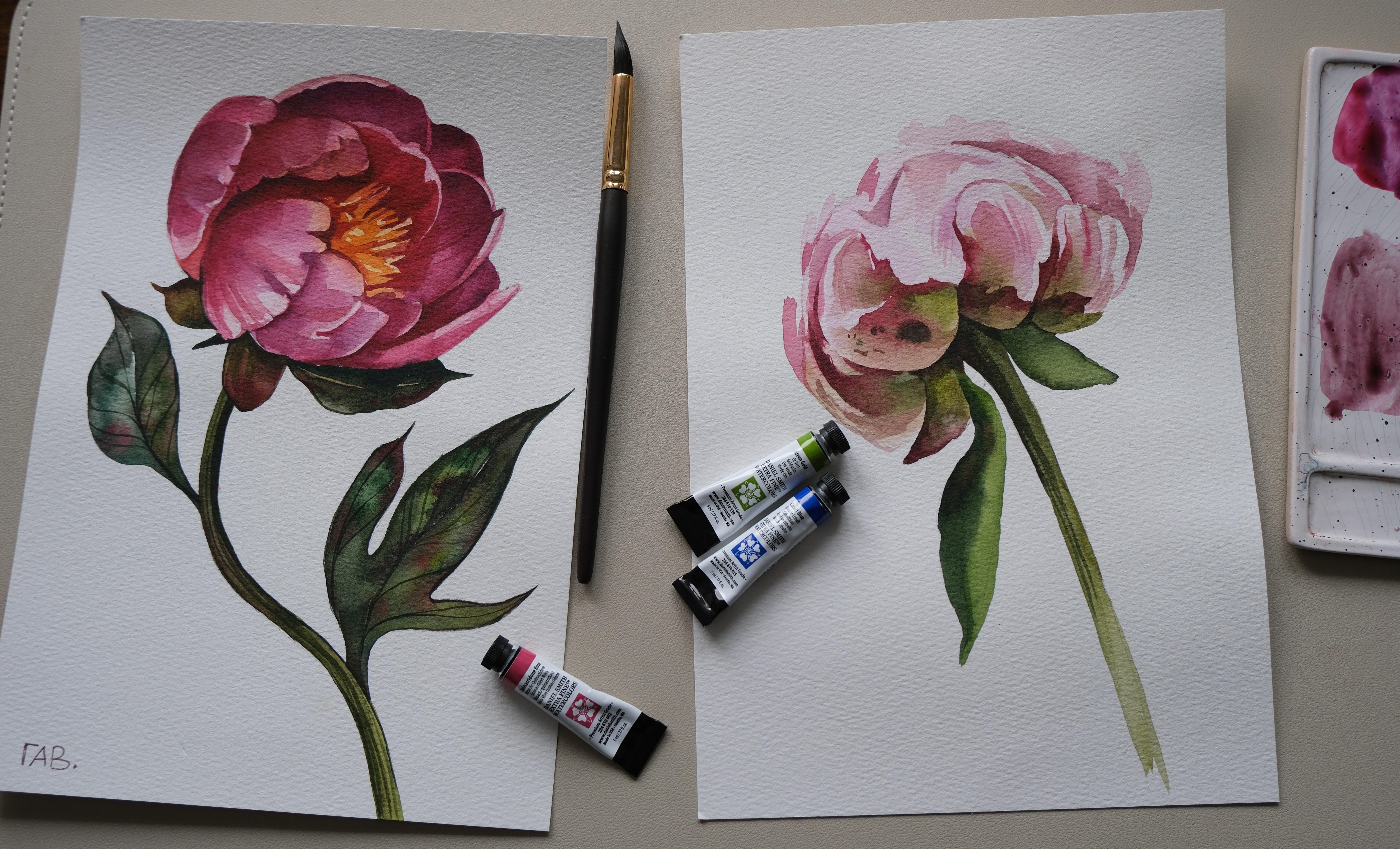
class where we will paint this beautiful
peonies with watercolor. In this class, I'll guide you through the entire
painting process, starting with
watercolor swatches and an introduction to all the
materials we'll be using. Then we'll to painting
step by step, exploring two
essential watercolor techniques wet-on-wet
and glazing. You'll be able to practice
both techniques and create two class projects
each helping you understand how to work
with watercoloor built, beautiful layers and bring
delicate peoni petals to life. Grab your brushes,
prepare your watercolor, and I'll see you in the class.
2. Color Mixes: Let's start with color mixes and colors we will use
for this tutorial. I'm placing the colors
on the palette, and now I will show you
the colors watches. I'm using watercolors in tubes, but it's also okay to
use watercolors in pan, make sure that you sprayed
some water on top of them. I will use Daniel
Smith watercolors, but they are quite pricey. So if you don't have
them, it's totally fine. You can just replace them with other colors
from your palette. I'll start with cascade green. It's granulate in watercolor, like the next one Judd genuine. I like using granulating greens for painting botanicals because they bring up granulation and nice interesting effects
when we are painting leaves. But also it's totally fine. Just use ordinary
green like dips up green or any other green
that is pretty neutral. You can also mix your own
green by mixing blue and yellow and maybe
adding a little bit of red to make it more
warm and deep. Main red shades that I will use it's Carmine Quinacridone Rose. And also, I will use Hansa Yellow Deep for painting the middle
area of the flower. I chose two red shades
because one of them is more classic and
neutral and more warm. And Quinacridone Rose
is more cold color, which is perfect for
painting peonies because peonies have pretty cold
shade of red pink color. Also, I will add later to
the palette RodenitGenuine, which is also primatx serious
colors of Daniel Smith. And there is one color I
forgot to add to this list, but I will use it
later in the tutorial. It's cobalt blue, and I
will use it in mix with kink ridenroe for creating
even more cold shade of red, leaning to purple shade. And here is an example of the effect I will
create on the leaves. I will use dips up
green or other green, and I will add some red
spots into the wet area, letting the colors blend. This is very specific for
leaves of the peonies. They have these red
colors in the leaves. And here is another
color mix that I will use a Hansa Yellow
Deep and Carmine, or Hansa Yellow Deep
and quinacridonos, for creating orange shade. I will use it for painting the
middle area of the flower, and all of the color mixes I will use during the painting, I will share through
the tutorial.
3. Peony First Layer: I'll start by removing pencil lines with
kneadable eraser. It's a soft eraser that doesn't
damage watercolor paper. You can find a copy of my sketch in the
attachments to this class. I will place the
colors on the palette, including this
rhodonite genuine that I use for a light pink shade. You can just use Kincrtanrose,
mixed with water. I'm using Paul
Rubens brush number 12 with natural squirrel hair, and I will start by covering the area of the
flower with clean water. Now when I'm done covering the area of the
flower with water, I will apply light pink color. I'm using Rhoden
igenim by Daniel Smith or Quinacridone Rose
also by Daniel Smith. You can find list
of the materials I'm using in the description. Trying to create
very light layer because the first layer
should be lightest, and then we will build up
the color with layers. The middle of the flower will
be more yellow or orange. So I paint the edges, and then I will apply some
yellow shade in the middle. I add this color mix of Hansa Yellow Deep and cermine
or Quinacridone Rose, which is almost orange,
just warm yellow. And I apply this very
transparent color in the middle. When we are working with
wet-on-wet technique, we have water on the paper, so it means that we use less water in the color
mix and on the brush. And here I have more intense
mix of carmine and yellow, which is more red. And I can apply it
closer to these petals. Now I can wash the
brush and start applying more Kincrdonros
to the wet surface, letting the color plant. I still keep some areas light, but this is the advantage
of cotton paper. It doesn't get dry too quick, so we can continue working on these wet areas,
but be careful. The paper should still be damp. Otherwise, you will just
create rough edges, and we don't want that. When working with wet-on-wet, we see that color blends
pretty chaotically, so I can use the paper towel and dry my brush and
with a dry brush, lift some color from
the light areas, creating more precise edge between light areas
and dark areas. So now I remove the color
from the light areas, creating the contrast between light areas and
darker areas behind. Even with the brush number 12, which is pretty big, I
have this very pointy end, and I can work with this end
to create more thin lines and more precise brush
strokes like here, creating the edge of the petal. Now I will continue
working on these petals, creating the contrasts between light areas and dark areas. When I apply more intense layer, more dark color, I'm trying
to create more smooth edges, so I use them brush and
I just drag some colour, creating more soft
edge like here, using just clean water. Now I will move to painting the leaves and the
stem of the flower, and I'll start with
mixing green colors. I will use Deep
sub green and mix with yellow to create
more warm green shade. Also, I will use the color green gold
as additional color. Also, I have jaded genuine and cascade
green by Daniel Smith. They are both
granulating watercolors, so they can create nice,
interesting effects. So now I'm just creating a few green shades
on the palette. Making it from very dark, intense green colour to
more light and warm. And I will start with a stem. And normally when we are
painting with watercolor, we start with light color, and then we build up
the color to the dark. And also, you can apply some
dark color to the wet spot. For example, here, I created
a light area of the stem, and now I can just
take pure deep sub green and JadidGenuine
a little bit of red. A, it creates nice
interesting shade and connect this dark area with
this light area of the stem. It will create a very nice, beautiful transition that we always use in
botanical painting. Also interesting part
of the leaves of pone flowers that they
have these red elements, which is very water colorish. So we basically paint
with green color, and then we will apply some red colour to the
green areas which are wet, Latin blend the red coloring. And the same we will try
to do maybe on the stem, but not too much
because we don't have a big area here for
this experiment. So we will try to
keep it simple. Now I can make some
dark green color and apply it on one
side of the stem, creating the area of the shadow, and we keep in mind the shadow normally will be on one side. I can also add Carmine to make this green color
more interesting and dark. And if you know
the color theory, you know that mixing green and red will give us brownish shade, so we can use it for creating more warm and dark green color. I'm placing the shadow
on the right side. And a little bit on
the other edge to just highlight the
edges of this object. Now I can come back to
painting the flower.
4. Peony Second Layer: Now I will come back to
painting the flower, and I'm just using Quinacridone Rose
mixing it with water, but using more pigment and less water for creating
more intense layer. So now we continue building
up the color on the layers, and layer by layer, we creating dark
and dark shades. But still, we try to keep smooth edges and very
transparent layering. It will keep the watercolor
very transparent and light. I'm trying to use
almost pure water on the edges of the petals
because I remember simple thing that these
petals are light and dark. So light areas will be above and dark areas will be
on the below petals. So basically, they are
laying on each other, and we need to show
which petal is on top. For now, I can simply
paint the dark areas, highlighting the light
petal on top without even painting this light
area because in watercolor, we use the white of paper
for the highlights, and the less layers we have, the light area appears to be. Now I'm using negative
space to paint some petals. So it means that I'm painting basically the shadow
underneath the petal, creating more precise edge for this petal with the shadow. And also, I'm trying
to switch between different areas because if I will paint areas
next to each other, they will blend and
I don't want that. So I'm trying to switch
between different areas of the flour to not let them blend
and letting them get dry. So I can work simultaneously
on the whole flour. Okay, I have some cobalt
blue on the palette, so I decided to create more cold mix of Quinacridone
Rose and cobbled blue, which is not that purple, but a little bit
more colder because normally when we are painting
flower with one color, we are trying to use
different color mixes, adding a little bit of
different shades to make the painting more interesting
and look more realistic. And actually, I didn't mention this
color in the beginning, so I will have to add
it in the description. I'm trying to create more
smooth edge by applying more transparent
layers from the edge and moving my brush
towards the dark area. You see how I'm creating
very smooth brush strokes, very careful and moving the brush from
light area to dark. Be careful. We need to not make these areas on the
front too dark, and I think I already
did it too dark, but I won't change it. I will just create more intense colors
of the whole flour, and you can just keep it lighter and you can always make it
darker, but with watercolor, it's harder to make it lighter because if you already
applied too dark color, it will just sit on the paper. Oh
5. Leaves: And now I move to
painting the leaves, and it's actually very pleasant and easy
part of the work. So now I'm mixing green colors like Deep sap green and jaded, green, and also cascade green. But if they are too cold, be careful because Deep sap
green is a perfect shade. You cannot make it
run with this color. So I will just apply big green washes connecting
it with different shades. And then I can apply some Carmine or other red colour that you are using on the
edges of these leaves. And I'm painting these
leaves half by half. It's easier to create these very interesting
color transitions in these areas like
working in halves. I let the first
half to dry a bit, and now I can paint
another half and I can just apply even
color not color, but just water drops to bring up the granulation of these colors. But also, I can apply
some red colour, which also looks very nice. With the first leaf, I just applied the color
straight to the paper, and with this one,
it's a bigger area, so I want to wet
the paper first. So I'm using clean water, and I will just
apply clean water, and then I will apply colour and blend the colors
on the paper, letting them create nice,
interesting watercolor effects. I will use also green gold and color mix with
Deep sub green. And I will try to create different color mixes with cascade green as well. If you don't have this Jedd
genuine and cascade green, it's pretty specific colors. And if you are into
granulation, you can have them. If you don't have them,
it's totally fine. You can also add a little
bit of ultramarine to the color mix with green because ultramarine
brings some crenulation. It will be also nice to
have in these color mixes. Or you can even mix
your own greens using paints gray and yellow or
ultramarine and yellow. I'm doing the same with the
other half of the leaf. Just create in this
side a bit darker. So these two halves, they will be separated
by the color value. Or you can leave a very thin, unpainted line between
these two halves and then cover this white line with a
very light green color mix. I can add some more dark color
to the edges of the leaf and also make sure that the area of the
paper is still wet, so the color will blend. Or it will appear to
be like this here, I placed a little bit of
color and the edge is dry, so I have to connect
it with the wet area. So the edge would be smooth. As a final step of the
pinching leaves part, I will add a little bit of red
colour to the wet surface.
6. Middle Of The Flower: I cleaned my palette, and now I will create again this orange color
and will continue working on the next layer for the middle area of the flower. In this area, we will work
also with negative space, so I will create dark
areas and we keep some light areas of the yellow color from the
first layer unpainted. A highlight because
in watercolor, we don't use white
colours normally, and we just use the light
areas of the paper, trying to not paint over
it, keeping it light. And there is dark area underneath
the petal on the left, which is pretty warm, but pretty dark as well. So I'm trying to create this perfect mix of
Carmine, Quinacridone Rose, and I'm using more
intense opaque color using more pigment
and less water, but not creating it very flat, but with different
shades and transitions. And this is how I
make the petal on top to pop because I create
dark shadow underneath it. I'm trying to use different
shades of pink using rodent genuine and incredonrose,
mixing with yellow.
7. Glazing: Now I will make some
cobalt blue and kinecridon rose and more kinecrdon
rose than blue, and I will use this dark color to continue
working on the shadows. Normally, the
shadows will be more cold than the light is, and blue color helps us to
create more cold color. I also don't forget to add some Rodenit genuine since I
already used this color, so I will use it in other
color mixes as well. No. Always make sure that there is enough
color on the palette, and I want to add
some kinecriton rose because I run
out of the color. I'm using colors in tubes, but you can use also
watercolor bands. Now, I'm mixing again cobalt
blue and kinecriton rose, and I apply even more dark color to the shadow area
to the wet surface. The color nicely blend
with existing layer, and that's what I want
very soft and nice shadow. And now I move to the next petal that
lies next to this one, and you see that I leave this
very thin unpainted area, which is highlight on the petal. This area helps me to separate these two
shadow areas between each other with this
highlight and to create interesting contrast between
light area and dark area. So these thin lines, they are essential if you want to paint petals
next to each other. It's essential
without saying that this area should be dry
so the color won't blend. And here I apply dark color. It's more burgundy,
because I used less cobalt blue and more
Carmine and quinacrudon rose. And here I leave this
unpainted light area, also a pretty thin line on the outer edge to show that
this petal has dimension. So the shadow is
inside of the petal, and out area, it's
exposed to the light, so it will remain lighter. And to make this area not flat, I can apply even more color
mix, darker color mix. I take pure cobalt blue, and I apply to the
most darkest area, which is closer to the light
area that we left unpainted. While I have this dark
color on my brush, I can even increase
the darkness of some shadows in the petals
that I already painted. It will just create nice
more bright contrast. And once I applied
this dark area, I can clean my brush and just using water and
leftovers of the color, I drag the water towards
these dark areas. Now, I'm using a mix of dent
genuine and cobbled blue, creating also pretty cold
shade, almost purple. I also had a little bit
of incred and rose, and I will start
painting this petal. And the same here, the
area on the left will be darker and the area on
the right will be lighter. So I will try to keep
it light as possible. And as you see, I move the brush from light
area to dark area. Since all the petals seems pink, I have to create
different shades adding more and less cobalt blue
Carmine and quinacridonros, different shades to create more cold or more
warm red shades. And also, I can create this
texture of the petals, creating very light lines
because the peoni petals, they have this very specific
texture or shape. I
8. Building the Color: Now I will paint more warm
shade inside of the flower. So I'm using pure Carmine, I'm glazing it on the palette. And I will start creating
this dark shadow area. Of course, I will add maybe
some more colors to it. But now I will just use this pretty opaque color
to create this dark area. Below this orange
area in the middle. So basically, this orange
and yellow area in the middle should be lighter
than the petal behind it. So I will use this pretty
dark color for petals, but I have to keep the diversity between this petal and the
petals that are behind one. So I have to keep the edge
of this petal pretty light. And you can probably see
that little by little, it's already looking like a flower because
we are building up the color and it becomes more interesting
and more realistic. Now I will add cobalt blue to this color mixing
cobalt blue and Carmine and will create slightly different
shade for the shadow, and also adding more
and more contrast. I highly recommend using this brush because
as you can see, I created the whole painting with just one brush because it has natural hair and the tip
is very pointy and flexible. I can create even thin
lines with the tip, and I can create vast
areas and vast washes I don't like this one petal, and I want to darken the edge, and I will try to mix even more kinocrton
rose and will darken the edge of this petal. Don't be afraid. If you see that the color that you
applied is too dark, I just clean my brush and dab it on the paper towel and drag the color and lift some
color from the wet surface. It's very easy when
the paper is wet, and also it's easy
when it's cotton paper because on the cellulose paper, it's harder to fix some things. Now, I also don't like this area orange area in the middle because
it should be darker than the petals that
we see in the front because the middle of the
flower is in the shadow, and this shadow is
from these petals. But we keep this area very warm. So I use Carmine mixed with
a little bit of yellow, and I will just create this
dark area trying to keep the light yellow areas as
well to not bend over them. I
9. Finalizing Flower: And now some of the
green leaves are left. I'm mixing green gold with some deep sub green
and add genuine, creating this nice green shade. And also, I can add a little
bit of carmine to create this very intense Burgundi
shade because I will paint these leaves or green petals that are
closer to the flower, and they have a lot
of red shade inside. If you don't have
green gold color, I actually showed in the post
on my patron how to mix it, so you can use just cobalt blue and yellow color
that we already have in this limited palette and mix these colors until you will
create this warm green shade. Make it more yellow and less blue to make
the color more warm. I left a little area unpainted closer to
the flower because I need to create dark contrast between petals and
this green leaf, so I'm using more dense
color right underneath. And I do the same
with another petals. I apply some carmine to the edge of this little
petal when the area is already wet and filled with green shade and
closer to the petals, I will use a dark green colour. We'll try to create
this contrast. And this one on the right
will be pretty dark, so I can use just
pure deep sub green or genuine and apply
it straight away. But I will keep a very thin line between
two halves of the leaf, which will help me to
show that this leaf has direction and also to create a very thin line that is very
specific to these leaves. When we are painting leaves, normally, there is a
vein in the middle. Now, with the mix of dip
sub green and Carmine, I can create these very graphic and
dramatic dark lines to create even more
contrast on the stem of the flower and on
the leaves as well. Now I'm just mixing leftovers on the branch with some
green shade with Carmine and I will apply even darker shadows underneath
some of the petals, creating dark contrast,
and you will see how it dramatically improves the
image because our eyes, they see contrasts first. So if you add contrast, it will make your
painting more beautiful. D I can create an outline for
these light petals. And also, I can apply
one more layer to create even more depth on
the petals on the edge. But I use a pretty transparent
color of RodonitGenuine, and I just apply in some
areas, creating just glazing. So this technique lays in is just building up the
color little by little, adding more transparent layers, which I'm doing right now. And I hope that you also realized and understood
how to do it as well.
10. Final Steps: I I'm already satisfied
with the result, but the one thing left as a final detail is to take a very thin brush
like number two. I have silver brush,
black velvet, and to create the
dark outlines for the leaves and maybe in
some areas of the stem. And also, you can
create these lines inside as veins
inside of the leaves. Just don't make it too much because they just have to hint the pattern and shape
and direction of the Flower and licks. Uh Now, the only thing left is to add very light green shade to
this vein, and that's it. And now our painting is done. I hope that you like
this tutorial and you enjoyed painting this
beautiful dark pink peony. Don't forget to submit
your painting as a class project and
leave a review. I can't wait to
see your painting.
11. Peony 2_Color Swatches : Before I start painting, I need to pick the
right red shade. I started by watching a few
shades that I have in mind, Quinacridone Rose, Carmine,
and Alzarin Crimson. I need pretty cold red shade. And after swatching, I see that I will choose
Quinacridone Rose. You can find list of
materials in the description, but now I will show you the swatches of the
colors I will use. Here are some of
the main colors, Quinacridone Rose, Cobalt
Blue and green gold. Also, I will use paints gray, green by white
knights and Carmine. Quinacridone Rose is a
perfect fit for this painting because ponia have
quite cold red shade, and Quinacridone Rose is something that we
are looking into. Just the main thing is
to add enough water, so the color would appear
very transparent landlight. Carmine is slightly warmer
version of this red shade. You can use just one red shade. If you want, I used Carmine in some places where I wanted
slightly different red shade. We will need cobbled blue for color mix with
Quinacridone Rose to create shade for the shadows and to mew down the red color. Green Gold is very nice, vibrant green shade
by Daniel Smith. You can use sub green or even
mix just green with yellow. You will get the same mix, and I actually have a post on Patron about how to mix
this green gold shade. I used Allen and cobbled
blue for mixing it, and I will use a
few green colors. Actually, I have
leftovers on the palette. Otherwise, I would use just one, these green by white knights. For me, it's perfect
green shade that I will always use for
painting botanicals, for painting leaves, and
something like that. Are all the colors I placed in this wooden palette and these
are my most used colors. And you see that I have a
few of green shades here. Also like cascade green, which is granulating
color by Daniel Smith, which is quite cold and
also deep sub green, which is very close to
green by white nights. But if you don't have green, you can use deep sub green. It's also very good
for this painting. As always, I have paints
gray on my palette, and if you know my tutorials
and you joined already, some of them, you know
that I always use paints gray for
creating darker shade. In this painting, actually, I won't use it a lot, but I will use it to
darken the green colour and a little bit of
red shade, as well. Here is one of my
favorite ways to mew down the red shade is by adding
green color to the red shade. So I'm mixing here a kin
credonrose and a little bit of green to show you how nice
it looks on the palette, and I will watch it
also on the paper. You can use different
amounts of green to control which red color
you will get in the end. And my other color mix, I will use its kinocridn
rose and cobalt blue. Normally it would
make a purple shade, but if we will use just a
little bit of cobbled blue, it will we down the red
shade and will create a shade for the
shadows on the flower. And that's it. That's
our main colors I will use for this painting, and we can move to
painting part. To
12. Peony 2_First Layer: You can find traceable copy of my sketch in the
attachments to this class, and as always, I
start by removing strong pencil lines with
the kneadable eraser. It doesn't damage the paper
and also it helps to keep very transparent
pencil lines without removing them totally
as a guidance. The first step is to
mix kinocredon rose and water on the palette and with a very transparent color, I create the first layer where I cover the whole
area of the flower. I use brush number
12 by Paul Rubens. I ordered it on Temo and
you can order it too. I will leave the link to the
brush in the description. After I covered this area with this very
transparent color mix, I will leave a try before
I move to the next steps. Now, I will add a little bit of cobbled blue
into the color mix, making the pink color more cold. And with the same
transparent mix, I will add a little
bit of shadows under the petals on
the top of the flower. This brush has very pointy end, and it allows me to create very precise brush strokes and even small details with
this pretty big brush. The most important thing is to find the right consistency of water and color to
not make it too wet and to have enough
water on the brush. This technique is
called glazing because I'm building the layer by layer, creating more intensity without actually letting the layers
blend with each other. I just place another layer
on top of the previous one.
13. Peony 2_Second layer: Now I'm creating, again, dark mix of kinocrdon rose. Water and a little bit of paints creating slightly
dark pinkish color. I will use it for the shadow
part on the middle petal. Make sure that the color mix is pretty transparent because we are building up the color with each
layer little by little. We want to keep this
transparency of watercolor. It's something that makes it
very beautiful and unique. I will also place green gold
color on the palette and also green or dip
sub green creating this very bright and
vibrant green shade. We see that color
transition from the Quinacridone Rose elements to slightly greenish color. And we start with this greenish color,
very transparent one. And then we can create
very bright color with just Quinacridone Rose and less water than
we used before. And apply very
carefully on the edge, letting the color
Quinacridone Rose, blend with this green shade
that we already applied. Somewhere we can
help the color with wet and clean brush and drag the color towards
this green area. We want to keep this
green part visible. So if the green color
disappeared with this pink one, I can reapply this green
shade very carefully. These bright pink edges help us to divide these petals
between each other. And the main secret is
that we want to keep the edge very sharp
where the pink color is, but letting it blend
into the green area. And I'm still using
my brush number 12 because it has pointy end. It's not problem for me to
create very thin lines, but if you feel more confident, feel free to switch to the smaller brush
for thinner lines. And I move to another
petal on the right side. I can also start with this pink color and then
create this green transition. We don't want to
keep rough edges, so we need to create the
transition into clear water or very transparent color mix of this shadow on the
petals, muted pink shade. So I clean my brush and apply this color next
to the green one. This color mixed a
little bit with green, and it became even
more nice pink shadow. And I can create these
shadows on the petals in other places using this color or even a little bit with
more in crudon rose. I come back to this middle
petal while it's still wet, and I can also create
shadows around these petals. Now, I move to the left side, and I just want
to make sure that the colors won't blend
with each other. I mean, colors on the petals. So you have to be
very careful when you connect them on the edges. I moved to paint in
this little leaf on the bottom part of the petal, which is also green merging into the pink but a
little bit more opaque. You see that the flower itself is very
transparent and light. And these leaves at the bottom, they have a pretty
opaque green shade. So I'm mixing green
gold and green, trying to create slightly
more intense green color. But still, it should
remain transparent. And I can connect this green area to the pink
one, letting it blend. While this area is wet, I can apply a little bit
of kinecridon rose to let the color blend and create
nice watercolor effect. Now, you can wait
a little bit to let this area get
dry a little bit, and then using pure kinecridon
rose, apply this edge, very bright one as we
already did before, letting the color blend
with existing layer. I use cotton paper. It means that it doesn't
get dry very fast, and I can switch
between areas and come back to some petals
that are still wet. Or in general, even if the
surface is already dry, I can apply some of
the color again, making it more dark.
14. Peony 2_Building The Color: Now, I'm creating the edge
for these two petals, and I'll start with
this dark pink edge, and then I will apply
this green area below. I can make the red
color even darker and more intense by
mixing it with green. And in general, if you
know the color theory, you know that mix of red
and green will give you a very nice brownish shade
from burgundy to brown, depending on how much green you will use
in the color mix. Now, I'm mixing green
and green gold, creating more intense green
color like we did before. And also, I have green earth
on palette by Schminke. I can also add it
to the color mix. In general, I have a
few favorite colors. Green colors, it's
green by white knights, it's Deep sub green
by Daniel Smith. And now one of my
favorite is green gold. I discovered it recently and trying to use it in
different paintings. Now, I'm creating, again, a dark pink shade, mixing in cred and
rose and paints gray. And if I see that the
color is too dark, I can always clean
my brush and drag the color with clean brush
with a little bit of water. Now I move to painting
the left part, and for this area, I will use slightly
warmer colors. So I mix in kino credonos and
a little bit of green gold, creating more warm red shade. I will start as always with
very transparent color, and then I will apply again, more green shade into
the wet surface, letting the colors blend. Since the area is already wet, we use more dense
color on the brush. So if you feel like your
brush has too much water, you can always tap it on the paper towel and then
load it with the color. And now I will apply a little
bit of ina gridon rose quite bright and opaque
and let the color blend. Yeah. Now I can apply even more green color
to the edge between these two parts to make this left one slightly
dark and also I can darken some of the parts to make this shadow
more intense. Also, I see dark spots
on the bottom part, so I use pink gray maybe
mixed with a little bit of green and red to make it more brownish or just
simple pink gray, and I apply these little
dots on this area. At the same time, I'm letting the left side get
dry a little bit, and then I can come
back to painting it. With this dark red color mix
of no credonrose and green, I can reapply the red shade, creating slightly dark areas. And now with a very
transparent inocrdonrose, I want to create
even bigger volume for the flower
itself in general. So I create these brush strokes around this light area of
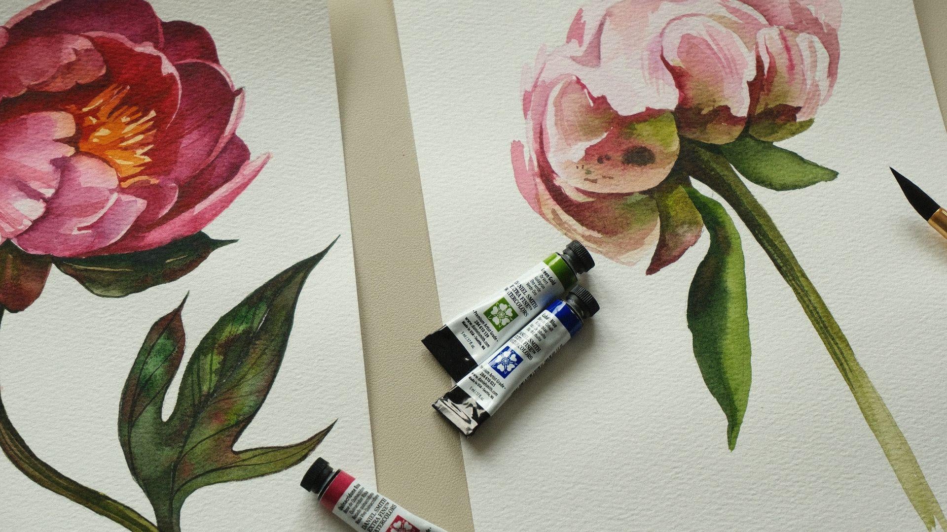
the top of the flower. If we compare these two class
projects inside this class, they are very different because the more pink and
intense flower, it's more precise in terms
of structure of the petals. And this one is more about the feeling of the
flower because peony have very chaotic
petals and sometimes you cannot even see
where one ends, and you can just
recreate the feeling of the flower like the
butterfly or swan, something like that, something
fluffy and very tender. This is actually my first class after I had my firstborn son, and it's the first time that
I stayed alone at home, and I decided to
dedicate this time to create this class
for you this tutorial. So I really hope that you will
like painting this flower, and I hope that you
will leave review about the class and will share
your paintings as well.
15. Peony 2_Stem: So what I've done, I created a few brush strokes with thin lines showing the
direction of the petals. And also, I applied some transparent brush strokes building up the
color on the petals. And now I can move to painting
the stem and the leaves. I will use green color, and I'm mixing green
and a little bit of Quinacridone Rose to highlight the difference
between light flower and dark leaves underneath. So you can even not use dark color like black
one or paints gray. You can simply mix red and
green using less water, and it will be very dark. Now I add a little bit of
green gold and green again, and I paint this area
underneath with a little leaf. And when we are painting
the leaves of peonies, just like in the
previous pone flower, we will add a little bit of red color into the wet surface. Maybe I will use
this time Carmine, and I will add this Carmine
to the wet surface, creating this very specific
color for the peoni leaves. I also have a little
bit of cascade green on my palette
here in the corner, and it's quite cold color, but mixed with existing colors
like red and green gold. It's more warm. So now I just use this green
colour to paint the stem, and I try to not make
it very dark because I will need to add shadows
on top of the first layer. As I move closer to the
bottom of the stem, I use more warm colour mix, using more green
gold and more water, creating more light
and warm shade, like disappearing into
the bottom of the page. Now, I want to come back to
the left area and to apply more green color and to make it more intense and
build up the color. So I will use the same colors create one layer more on top
of the existing one. Normally I would release the glasses according
to the season, and I'm recording these
peonies while it's autumn. I don't know why I wanted to make the summer
last this time, and I love this possibility to paint something from summer, even when it's cold and
gray and rainy outside. Using green color
left on the palette, I can separate
these two petals on the right side with a pretty transparent
but additional layer. And I just place
this darker color creating this shadow
on the right side. And I want to darken this middle area as
well, a little bit more. Now I'm analyzing, is it
enough Contrasts on the flour, and I decide that I want to add a little bit more dark color
on top area of the flower, so I add additional
transparent layer, just creating a
few brush strokes. Behind the light petals
to make them pop. Also, I think that the
left side looks too flat, so I can add just little dots and little brush strokes
on the left side as well. I'm using a mix of
credonos and green. It's very neutral mix, and I can use it anywhere.
16. Peony 2_Final Steps: Now I will move to
painting the lips, and I will start by creating
just a green shade. I'm using mix of green and green gold and a
pretty light first layer. And now I will move my
brush towards the edge, creating dark spot in
the corner of the leaf. The stem got already
dry so I can create these very thin lines to show the texture of the
stem and direction. Just make sure that
it's not too dark and I'm still using
my brush number 12. But again, if it's
more convenient for you, use smaller brush. Now I will add more green gold and mix green gold with green, creating more vibrant
and lighter shade. And I will move to painting
the leaf on the left side. It has two parts, and we need to
separate them in terms of color value to make
one dark and one lighter. You can make it in two steps. Paint left side, let it
dry and then right side or just carefully paint
the right side like I'm doing right now
with a lighter color, and then carefully add darker
color on the left side. Let it dry a little bit. Otherwise, the colors will
blend on these two parts, and now I can add
a little bit of water and move color
on the previous leaf, creating more interesting
texture and difference between the area underneath
the flower where the shadow is and lighter
area in the middle. Make dark green color, I can mix green and a
little bit of pink gray for this dark area on the
left side of the leaf. And I carefully apply this dark green color
moving from top to bottom and being very careful
on the edge with this light area because you
see that it's not fully dry, so the color is slightly blend. But I'm trying to avoid
blending them too much and creating the difference
between left and right side. While I have this darker color, I can highlight the shadows
also underneath the flower. Now I can add to this dark green car mix a little bit of
quinacridondrose, or ermine. I'm using kermine and with
this slightly warmer color, I will place the shadow on
the left side of the stem. And our painting is done. Don't forget to submit
your painting as a class project and
leave a review. I hope that you enjoyed
painting in this class with me, and I hope to see you
in my other classes.
 Aleksandryna Gromyko, Watercolor tutorials for everyone