Transcripts
1. Trailer: They say a picture
tells 1,000 words. But a video can do
it in 3 seconds, which is good
because apparently, that's the average
attention span we're dealing with these
days on social media. I'm Rebecca Flaherty and I work from home here
in Somerset UK. As a full time artist
and content creator, I am more than just a
little obsessed with surface pattern design and it's my favorite way to
illustrate my ideas. I've licensed my
designs to lots of different companies for
all sorts of products, and I also still
regularly upload to print on demand sites like
Thread List and Spoon flour. I love sharing my
surface pattern designs on Instagram and being part of the hashtag surface pattern design
community there. Although our industry is
a very visual one and therefore perfectly suited to an image sharing
platform like Instagram. Over the last few years, there's been an atmosphere
of frustration among us artists that the
algorithm is favoring videos. And we are all more
than just a little tired of those
pointing at captions, videos that we all made
in an attempt to keep up. The good news is
there is an easier, and thankfully less
cringe worthy way to create video content from
your surface pattern designs. I bet that a lot of you are already designing your
patterns in procreate. And you probably know that it
has an animation interface. But maybe you think animation
is too hard or it's boring, or it's just not the
surface pattern design. Well, I'm here to change that. We're going to be
using it to bring our surface pattern
designs to life. I'm going to teach you three
simple animation techniques that you can use on patterns
you've already made. And then we'll turn them
into reels for Instagram, the techniques are so simple it almost feels like cheating. There's no redrawing involved. Just a few simple settings can create movement and
magic like this. As long as you're familiar
with the very basics of procreate than this
class is for you. You don't even need to
know how to make patterns. These techniques will also work with non repeating
illustrations too. I've got some ready
made templates for you to use so you can
get started straight away. The class is also packed with the usual extra tips and nod background information
that I love to share to. There's something in here
for all skill levels. I always love seeing your surface pattern
design projects in the gallery and this time I'm even more
excited to see them coming to life.
Let's get started.
2. Class Project: Your project for this
class is really simple. You're going to be following
along with me to make your own animation using your own surface
pattern designs. Or you can use the templates
from the resources section. I'll show you how to
save the final video as an MP four for
exporting to Instagram. I'm also going to show you how to export it as a gift file, so you can upload it here
to the project gallery. You can tackle just
one of the projects or all three of you
feeling adventurous. There will also be some
ideas for developing your animations even
further in the last video. If you need any help or
get stuck at any point, give me a shot in
the Discussions tab. I'm super excited to see
what you come up with.
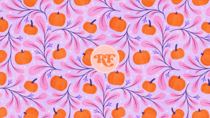
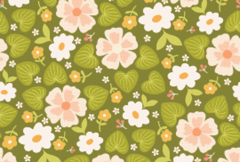
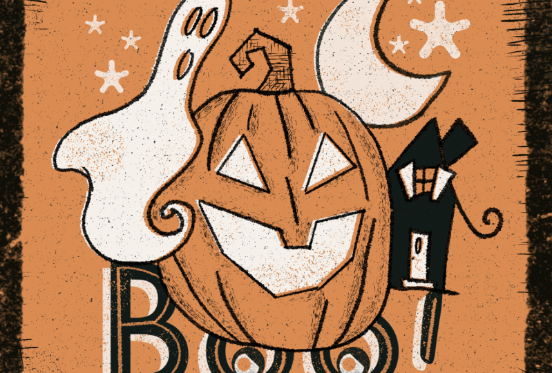
3. Project 1: Colour Animation | Setup: Okay, so let's jump in
with our first animation. It's super easy and we don't even have to do
any extra drawing. What I'm going to do is show off all the color changes for this cute pumpkin illustration or pattern that I have here. I've got four different
color ways for this one. Step one is going to be to
create the document that we're actually going to be doing
the animating in up here. We're going to tap
on this plus icon to start a new document. I've got a preset on here
for an Instagram reel, which is what we're going
to be animating for. If you don't have your own
preset already on here, you can create a new one by tapping on the
plus icon up here. The recommended size for an
Instagram reel is a width of 1080 pixels and a
height of 1920 pixels. I'm going to keep the DPI at 72 because it really doesn't need to be any bigger than that. I know smartphones these days
have higher resolutions, More than 72 pixels per inch, but 72 is still
going to look fine. It's nice to keep
video sizes small. They're not taking up a ton
of space on your phone, your hard drive, or your ipad. Let's go with 1080 by 1920
at 72 pixels per inch. You should also then have a nice lot of layers
to work with. Even if you've got a
smaller or an older ipad, the color profile should be RGB. Because this is just
going to be for screens and the
other settings on here you don't need to worry about once you have all those. You can also give your canvas a name so that you can
find it again easily. An extra tip is to add
an Emoji it looks, and it can also help you spot the preset you'd need much
quicker on your list. If you're a visual
memory person like me, we can put Instagram
real click on Create, and this is the
document we're going to be working in now. We've got that set
up. I'm actually going to go back out into the gallery and we need to grab our color layers from
our pattern file. I'm going to go
into this one here. This is a pattern that I made
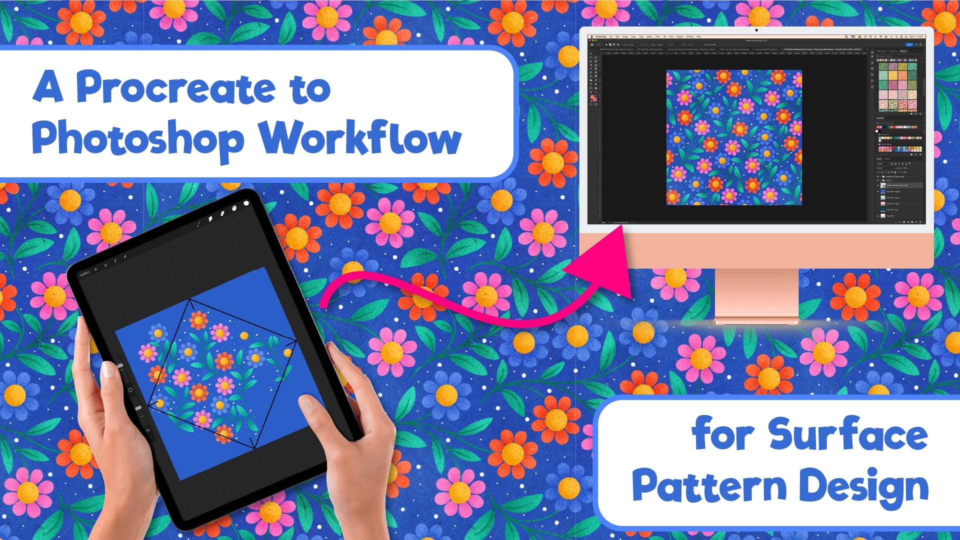
in procreate and finished off in Photoshop with smart objects. I have
a class on that. If you'd like to know more about actually making patterns, you can use any pattern for this project made however
you normally make them. It doesn't even have
to be a pattern. You can just use an
illustration that you've recolored as
well if you wanted to. The easiest thing to
recolor is the background, which is what I've
done on these tiles. I've still got the
same main motifs and just recolored
the background. You can also use a tile where you've recolored
the motifs as well. What you will need to make this work is having
all the motifs be in the exact same
position on each tile. We don't want to have
like this pumpkin here, be there in one tile, and then on the next
tile have it offset. And slightly down here. You need to have
all of these tiles be essentially duplicates
of each other, but just in different colors. I've already got all these flattened as different
layers up here. I'm just going to
turn those off for a moment and turn on
my pattern layers. If you're not at that stage where you've got
those tiles up there, and you're at this stage where you've got your motifs in there, what you can do is go through and choose some
different background colors. Let's just grab one from here. Doesn't necessarily look great or go well, but that's fine. What you need to do is swipe
down with three fingers. Tap, copy all. Then you can go to the very
top of the document. Swipe down again
with three fingers. You get this menu pop up again and you can tap in
Paste up there. Now we've got a flattened
version of this color way. We can now hide this layer and
we can choose a new color. I've got these pre
chosen backgrounds down here which I've
picked ahead of time. Let's enable this one swipe
down with three fingers. We can tap copy all we
can go up to the top, make sure we're on
this top layer. Swipe down again with three
fingers and tap paste. And then we've got a second flattened version
of that colorway. I've already chosen these
colors ahead of time, and I've already got these flattened up here
in my tiles folder. Let's turn these on now, because we'll need
those in just a second. Take as long as you need
to choose your colors, it's good fun choosing different color ways if you haven't already
got some chosen. Here's a top tip
that's not essential, but will help your
video look nicer. Try and choose colors that will all blend well
into the next one. Here I'm using pinks and
purples and oranges. I can go from orange to pink, purple to the other pink
and then back into orange again without jumping too
far around the color wheel. For example, if I was to try
and go from this orange, peachy color here, straight
into this dark purple. What we're going to do
to transition between colors is to gradually
change the opacity. And you can see if
I bring this down, some of these areas
where we're jumping from almost one side of the
color wheel to the other. Purple and orange
are almost opposite, where you've got everything
mixed together like that. You can get some of these
muddy color combinations. We will only be on these
frames for parts of a second. It's definitely not
a deal breaker, but it's a thing to
bear in mind and might help you choose
some cohesive colors. I'll explain more
about this later, so don't stress too much
about it on your first go. But as you're going
through, try and pick color combinations that do all look cohesive and
go together nicely. But as I said, don't stress too much about it on your first go to recap the process
for making these layers. Once you've got
back crank, swipe down with three
fingers to copy all, then you go back up
to your top layer, swipe down again, and then
you can paste those in. Now I've got all of
these layers up here. I've got four
different patent tiles you can use as many as you like. Obviously, the more
different colors you have, the more work you're
going to have to do. I think for this animation, I recommend using
at least three. Probably four, maybe five. I'm going to stick
with four on this one. The easiest way to
get these over into our other document is to make
sure they're all showing. First we're going
to swipe, right. Well, first of all we
need to make sure we've just got this layer
up here selected. If we have this one down
here and then we swipe, right, we're going to
select that layer as well. Make sure you tap on
one of these layers. And then on the others
swipe to the right, that's going to
select all of those. Then what we can do is
to drag these over here. Tap on the gallery, Tap
onto our new document. And we can just
drop those in there like that on our old ipad. That can take a while
for those to come in, but that's still probably
the quickest way to bring those files over here into your animation if your pattern document is
already in procreate. If you already have made
tiles like this, for example, saved in Cloud or Dropbox, you can bring them
into this document by going to add and then
inserting a file. That way what we want to
have at this stage is our document that we're
going to be animating in with all our tiles on
separate layers like that. At this stage I am going to rename these with the names of the colors so that we can keep track of what
is much more easily. The next stage is to fill the whole of the
layer with our pattern. Let's hide all of the layers. We don't want to be
showing at the moment. We've just got one
patent tile showing. We're going to come
up here to the arrow, tap on that to transform. Depending on the
scale that you're looking at your pattern in, you may want to
change the scale, as this shows on the screen, to make it bigger or smaller. If you want to change the scale, make any adjustments
that you want to make. For example, if I want
to make it bigger, it's maybe that size
adjust the scale. And then we're going
to come up here to our layers panel and we're
going to duplicate this layer. Then up here we're going
to tap to transform. And you want to make sure you
have snapping on down here. You need to have magnetics
and snapping both turned on and then distance and
velocity up to the max. Then this one that
we've duplicated, we can drag this up here, snap it to the edge of that one. And then I recommend
zooming in and making sure whenever you transform and move patent tiles like this, it's a good idea to make sure
that they're looking good, where the two edges meet
and these two are okay. I do feel the need to go off on a little nerdy tangent now and talk about resizing artwork. Always bear in mind that once you start resizing patent tiles, and this goes for any software, not just procreate, it
applies to Photoshop as well. You're going to be
changing the amount of pixels in the design. The software is
going to be using various interpolation
and sampling methods to rebuild your tile
at a different size. It doesn't know that this is a patent tile and that
you would still, in fact, quite like the edge
pixels to match up exactly with the
ones on the other side. Thank you very much. Don't try and change the size
too drastically. For example, making it
super tiny like this, because then you're
pushing it beyond what is realistic for the software
to be able to achieve. It can't work miracles. You might also notice that
your pattern isn't matching up anymore and you might also get
gaps where the tiles join. I'm just going to see if
I can replicate that. Now with this one. I'm going to resize this one down here. Then I am going to
duplicate that layer. I've got magnetics and
snapping turned back on there and snap it
into place there. You'll see that even though
we snapped it to the edge, we've got this gap that's
coming in that is just simply down to the resizing
and the interpolation, not because you did actually put the tile in the wrong place. If that's the case, you can
actually fix these tiles. I'm going to pinch
these two together. I'm going to duplicate them. Then I'm going to pinch
these two together again, and you'll see that this
gap is getting thinner and less translucent
each time. There we go. Now we've not got that
seam there at all. If that's happening,
you can fix that by duplicating the layer a few
times to make it opaque. Again, again, that's due to the interpolation and sampling
methods that it's using. When you resize talking
of interpolation methods, you might notice that I'm
using nearest neighbor, which might surprise you
since everyone loves telling us to use
bicubic or bi linear. I think the reason that
people say those are the best is because they do
give the smoothest results, which for a lot of people
is what they want. But let's look closer at
some of my artwork here. The original version, I
like to use these scruffy, textured brushes with
these fuzzy edges, and I'm going to
duplicate this layer. We will move this one and transform it with
nearest neighbor first, we'll snap this to halfway. Then on this one here, we will use bicubic
for this one. Snap this one to halfway again. Then we'll zoom in and
you'll see on this one here, the top one that I transformed
with nearest neighbor, I've still mostly got that nice, scruffy, textured edge there. If we hide that one and the one underneath that I transformed
with nearest neighbor, it does give smoother results. You can't argue
that, but I don't actually want these
edges to be smooth. I want to keep that
scruffy texture that I've got going on
there even down to where I had my
texture overlay on there that's been smooth
down a lot more too. That is why I personally
choose nearest neighbor. If I resize things, nearest neighbor is often shunned because of
its jagged results. But that suits me perfectly, and it keeps these edges more how I intended them to look. Nearest neighbor is also
the method which pixel artists use to
keep their sprites as clean as they
can when resizing. The bottom line is
just try them out for yourself and use
the one which keeps your artwork looking closest to how you originally
intended it to look. I will also admit that
it's not something that's hugely important for a
fun project like this, because let's just undo
these steps before I leave this document and we'll go back into our
animation document. This tile is already
getting sized. When I brought it in, I had
nearest neighbor on for that. And as you can see, it has still smoothed. This right down. The width of this
document is 1080, Whereas my original was 3,600 This is nearly four
times smaller anyway, which is an example of not expecting it to
perform miracles. It's not something
to stress over, especially for this project, But I just thought it was something worth
mentioning to give you a bit of background knowledge and learn the Y as
well as the how. And if you've watched any
of my classes before, you'll know I'm a big advocate for not transforming
things at all. For high res artwork, it's fine for a sketch layer
or a fun project like this, but not for final artwork. I personally think it's
best to avoid transforming motifs in order to keep your artwork as high
quality as possible. And if you need to draw a motif of a smaller size,
just redraw it. Okay, nerd, talk over. Let's get back to animating. I'm actually going to keep
these at the scale they are. I think this size is
fine for this project. I'm probably going
to need to bring this layer in again
because I can't undo this. Now let's go out into my original document.
Let's go into here. We can tap this pink layer, Tap copy, and then we can go back into here.
Let's delete those. And then we can swipe down with three fingers and tap paste. And we can paste
that back in there. Okay, transforming these
around the canvas. You want to make sure you've
got snapping turned on. As I said, I'm going to snap this to the top of the document, I'm going to duplicate it, and I'm going to snap
it down to there and make sure there's no gap
there which is looking good. And then we can pinch
these two together. Then I'm just going
to go through and do that with all of these
other layers as well. Then when you've got
all of your layers on there and you've renamed them so you can see what's what we're ready to move
on to the next step. If you're using the template
canvas that I provided, you can go ahead and just
open that in procreate. And there will be
some ready made color layers all
in there for you. Now we've got our document all set up with these different
color layers here. In the next lesson, we will look at how to start animating those.
4. Project 1: Colour Animation: The next thing you need to do
is decide which order makes the most sense for
these layers to go in. Here is an example. You might not want the
orange transitioning into this purple because some of the colors aren't quite so
good as I showed you before. Or if you've got, for example, a really dark color next
to a really light color, when the capacity gets to
50% between the layers, you can end up with some
muddy or gray colors. Admittedly, this
one isn't too bad. But also, I don't think we don't have to have these
two colors together. What we want to do is to
make sure that we don't have these on layers
next to each other. But also if you have
this layer at the top, you don't want to have
this one at the bottom. Because if these are two colors you don't want merging
into each other. This animation is going to loop. When we get to the
top, it's going to go back down to the
bottom and loop again. You want to have them separated, not next to each
other and also not one at the top and not
one at the bottom. Mine will go from this light
purple here into this peach, and then into the pink
into dark purple, and then right back down
into the light purple again. If you want to check
how they're going to look going into each other, you just select the layer above and bring
down the opacity. And you can slide
back and forth, and you can see that those
are going to work nicely. Then on this pink one, you can see that that's
looking good. Then this peach
into purple again. Because it is a
peach into purple, we are muddy and gray a
little bit in the middle, but it's not too much
of an ugly color. I think we'll be
okay with this one. Once you're happy with
the order of your colors, the next thing that
you want to do is turn on the Animation
Assist interface. We're going to come
up here to the spanner and under canvas, we are going to toggle on this one here, Animation Assist. And then we now have this tall bar down
here at the bottom. You can see that's got some of our controls and settings on it. It's got a play icon
down here on the left. We can tap play. It's turned all of our layers into frames, and if we tap on
that, it's going to flash quickly through
all of these. Well, that's a look in itself. If this is a look you
wanted to go for, you could certainly
export a video like this if you wanted to
strobe effect animation. Let's just pause that for so we're not giving
ourselves a headache. I think it's much nicer
if we gradually fade from one color
into the next one. We're going to do that by
smoothing the transition. Gradually increasing
the opacity on the layer above until we
just have that one showing. And then work our way through
that into the next color. While we're down here,
let's just have a look at our settings and
make sure that we've got them all in a good
place to start from. At the moment, it's showing
15 frames per second, which is fine for
this working stage. We do want to have it on a loop, but we may change and
go and use ping pong as we're working to have a look at how
things are working. We're going to keep the onion skin settings just as they are. You can keep that up on
max and 60% Those are a good place to start from quick explanation of what
onion skin frames are. If you think of an onion skin, it's slightly translucent and you can see through
one into the next one. When you're animating,
you want to have a translucent version of, at the very least,
your frame before. And you'll frame after so that you know what
you're working on, how it's matching up
with what's coming next, and also with what
has just been. You'll see it in action
later in the second project. As we work through, we may go back and change some
of these settings. But to start off with, I would just leave it the
same as I have here. If we have a look up
here in our layers, all of these different
layers have been converted into frames down here. What we're going to be
doing is duplicating each one of these
enough times to change the opacity
on the layer above by 10% each time to
make it more visible. This one here is going to
be our very first frame. Then as we move through these, you'll see it skips down
here to the other frames. You can also use this down here to cycle between
the different frames. This is our first one that
we're going to start off with, and we want to see
this at 100% capacity, which is just what we have
here for the next frame. We want to duplicate
this layer and see this plus 10% of
this layer here. If we change this to 10%
you might see that it hasn't actually done anything at the moment until we go
onto the next frame. That's because each
one of these layers is just one frame to get that. Plus that making one frame, we have to group these together. Now if I start on this one and I zoom in so you can see the
color more clearly, we've got frame one here, which is our light purple
at 100% Then in frame two, you can see the color
change slightly there. And that's because we've got
light purple underneath, plus 10% of the color above it. Then to get our next
frame, our frame three, all we have to do is
duplicate this one, tap into it, and on the peach, we can change the
opacity up to 20% On this one down here, we've got our first layer at 100% our next layer
with 10% peach, and then the next
one with 20% peach. Now we can just work our way through duplicating
the layer and increasing the peach
or whichever layer you have above by 10% each time. Now we've got 30%
duplicate it and bring this one up
to 40% duplicate. And we can bring
this one up to 50. Duplicate again, 60% and
duplicate this one again. And 70% 80% bring
this one up to 90. Lastly, we can bring
this one up to 100. On this last frame, we can't actually see this purple at all. And we've just got
100% of the peach. What I'm going to do is hide
these two layers above. If we look down here
on our timeline, you should see a
nice gradual change between the two colors. I'm going to tap on settings here and I'm going to
change this to ping pong. And what that's going to
do is going to make it play all the way to
the end and then go back and play and
reverse. Let's play this. Now we should see
that ping ponging nicely in between the
two color variations. We've got that nice,
smooth transition. Now things you can do to have a play with this is to change the number of frames per second. At the moment it's 15
frames per second. Each one of these
frames down here is showing on screen for
one 15th of a second. We can make that slower. That's going to make the
transitions more jagged because your eyes will be able to
focus on each of those frames. Or we can increase
it all the way up to the maximum of 60
frames per second. It will be transitioning so fast that your eyes
won't actually be able to detect the transition between those frames
because it's going so fast. But at this point, we're
almost back into the realms of that flicker stroke
effect we had when we didn't have any
graduation between them. Going to leave this at 15, because I think that
looks pretty good. It's a good compromise. You get to see the
color change slowly, but it's also looks smooth. If you wanted, you
could increase it to 24 frames per second. That can look good as well, but let's leave that for
15 as we're working. That's the basic how to, of this effect that we're doing. Which is duplicating
the layer and increasing the opacity on
the layer above each time. Let's pause that now and look at how to get on to the next part. We've got this layer which is 100% of the
peach for this one. On the next frame on from this, it needs to be the peach
plus 10% of the next color. We're going to duplicate
just the color that we've just transitioned
into, the peach. We'll duplicate this one. I'm going to drag this out
and onto its own layer. At the moment, that
is its own one frame, but we want it in with the pink. We need to group those together
and make them one frame. We want 10% of the
pink on this one. This frame here has 100% peach. Then this next frame on has the peach plus 10% of the pink. Then we just work through these exactly the
same as before, duplicating it, and bringing the next layer up
by 10% each time. Then on this last frame, we're up to 100% of our pink
to go onto the next color. We duplicate this, bring
it out as a main layer. Then we're going to group
it with the purple. Then put 10% of the
purple in above it. From there, we just carry on the same as we did with
the other steps, duplicating and
increasing the opacity of the layer above. Once we get to the last
color we have up here, the next thing we would
be doing is transitioning into the color that's all the way down
here at the bottom. To make our loop on your bottom layer down here that's just got 100% and
the one we started with, Tap copy on that it's easier than duplicating and dragging
it all the way up here. Then at the very top swipe
down with three fingers. And that will then paste
that layer up there. We can then duplicate our last dark purple
layer. Drag that out. And then one last thing to do is transition
into this color. We want 10% of this new color, which is the one that we
started with right down at the bottom, down here, here. Let's go back up to that layer. Let's group these two together. And then we're going
to do another cycle of duplicating these and bringing the capacity up
by 10% each time. Just like we did with
all the other layers When you're working through it, don't stress too much about
if you've got one layer that's 49% and then
the next one's 51. It's not going to matter if 1% out with your 10% increases. When you get to
this top layer of 90% don't duplicate
this one again. You might think that
you would bring it up to 100% from the next frame. But if you remember, we
already have this color at 100% That's our very first frame that we started with down here. This last, when you get
to your very last color, leave that at 90% because the next frame on from that
will be the first frame at 100% this animation
should now be done. You can see at the bottom here, we've got this lovely ombre
like effect going on there. It's quite cool to look at. We can press play. When we press play,
you can see it's seamlessly scrolling
through all of the colors. This is actually
still playing on ping pong can change it to loop, and you'll see it
goes from that dark purple right into the light
purple at the other end. That is technically
ready to export now. But there's a few little
tweaks we can do to this just to get it
looking even better. What I think would
be nice to do is to insert a frame hold when we
get to one of these frames where we've got just one color
at 100% insert frame hold, which means it's just going
to pause on that color for a second or two before moving
on with the animation. What we have to do is
to find those frames. The first one is easy because
it's the first frame. Tap on it and you'll see a
little hold duration up here. You can bring that up. Let's try five frames
to start off with. That's going to add in
five frames Down here, you'll see it's got
these little grade out frames down there. It hasn't actually
made layers for those. It just knows to
show this one and hold it for five frames. The next thing we need to do
is find the next frame on from that where we've got
100% of our color in it. This one's 90, so
it will be the one after tap on that there. Then set that duration to five frames for
that one as well. Then we need to
find our 100% pink, which is up here somewhere. This one. Bring the whole duration
up on that one as well. Then lastly, we need to
find our 100% dark purple. Let's see if we can find
this one first time. Yep, tap on that one, then bring the whole
duration up to that one. And then that's the last one, because when we get to the end, we will be holding at
the beginning instead. Let's now play this and
see how that's looking. I think I like
that a lot better. Pausing for a second. Well actually it's not a
few seconds, It's five, 15th of a second, one third of a second on each color.
It still looks a lot. You could experiment
with making those holds a bit longer
if you wanted to. We could try adding a frame
hold of ten frames on those. Once you've inserted them, it's a lot easier to find them
because you can see where the grade out frames are and then you can just tap
on the frame Before that, let's go through
all these and let's try changing it to ten frame holds is just this last one to do what? The first one to
do those all done, let's play that and see
how that's looking. Now it's totally up to you to decide how many frames you want to hold it
for on the colors. If you want to do it at all, have a play here and
see what you like. You can then use
this opportunity to adjust the frames per second. If you want, maybe try it
at 24 frames per second. It's going to make
that hold shorter. Because remember, it wasn't a specific time we
said to hold it for, it was the amount of frames when we increase the frame rate, the actual length of time that it's held for is
going to decrease. If you do adjust the
frames per second, you may decide that you
also want to adjust your frame holds to match
up with that new setting. I think because I had just moved that frame hold up to ten, that that probably works quite well with this 24
frames per second. For this one, if you want to
use the settings that I had, I had my frame hold at ten, and then this one is at
24 frames per second. In terms of exporting
these onion skin settings don't make any difference. This is just what you would
use whilst you're working. They won't have any effect
on your final video. I think that this is now looking finished and I'm happy with
this overall animation. It's now ready to export, which we will look at how
to do in the next lesson.
5. Project 1: Colour Animation | Exporting: If you wanted to save this
and share it to Instagram, you would go to your
spanner up here, Tap Share. And we want to share it
as an animated MP four. You've got the
option to save it as max resolution or web
ready resolution. Even with max resolution, you'll see this is
only 332 kilobytes. Because we were careful to keep the file size small
in the first place. We made it 72 pixels
at actual size. If we make it ready, it's going to crunch
that even smaller. But we want to keep this
in the size that we made it because we made it at the
correct size to start with. You can change the frames per second here if you wanted to, but we already set those how we wanted them in the
animation screen. At this point, we
can tap on export. And we want to save this
either to camera roll or to your files. If you don't use
Instagram on your ipad, you can save it
to files and then download it on your
phone from files. Let's now go into Instagram here because I have
this installed on my ipad, so we can do this,
you can tap on the plus icon there and your
video will be down here. You can tap on
that. Go into next, you'll see you have the option
to share this as a real, just like you're used to doing with any other video
you make in there, you'll see because we made this, Instagram is going to loop it
endlessly for you as well. That is how you upload
it to Instagram. Let's now have a look
at how to save it as a gift for sharing in
the project gallery. For uploading these
to the gallery, what you can do actually, is export these as a
gift for these ones. You'll see the file
size is a lot higher. It's like 24 megabytes up there. If you leave it
at max resolution to upload these to the gallery, definitely tap web
ready and you'll see this is only now 3
megabytes, which is fine. Much more easy to
handle and upload. You can leave all
the other settings as they are for this one, that's going to be fine as it is just for uploading
to the gallery. Again, as before, you
can now tap on Export. Either save it to your camera roll or
save it to your files. We can go over to Skillshare. We can click on
Submit Project here. Then if you tap on the
image icon down there, you can either choose from
your files or your photos. Tap on your gift. And wait a
second for that to upload. Just take a moment
or two to appear. That is how you get
your little video into the project gallery for
everyone to be able to see. You can give it a title, write some notes in
there if you want, and then you can tap on Publish if you want to put
an image as a cover image. Let's just see if we can also
put a gift for that one. Let's find that file again.
Let's see if this works. Yep, it looks like you can also put a gift for a
cover image as well. Then from that point,
you can publish, and then we can all see
your lovely animations. In the next video, we
will look at adding some movement to our
animations and pans.
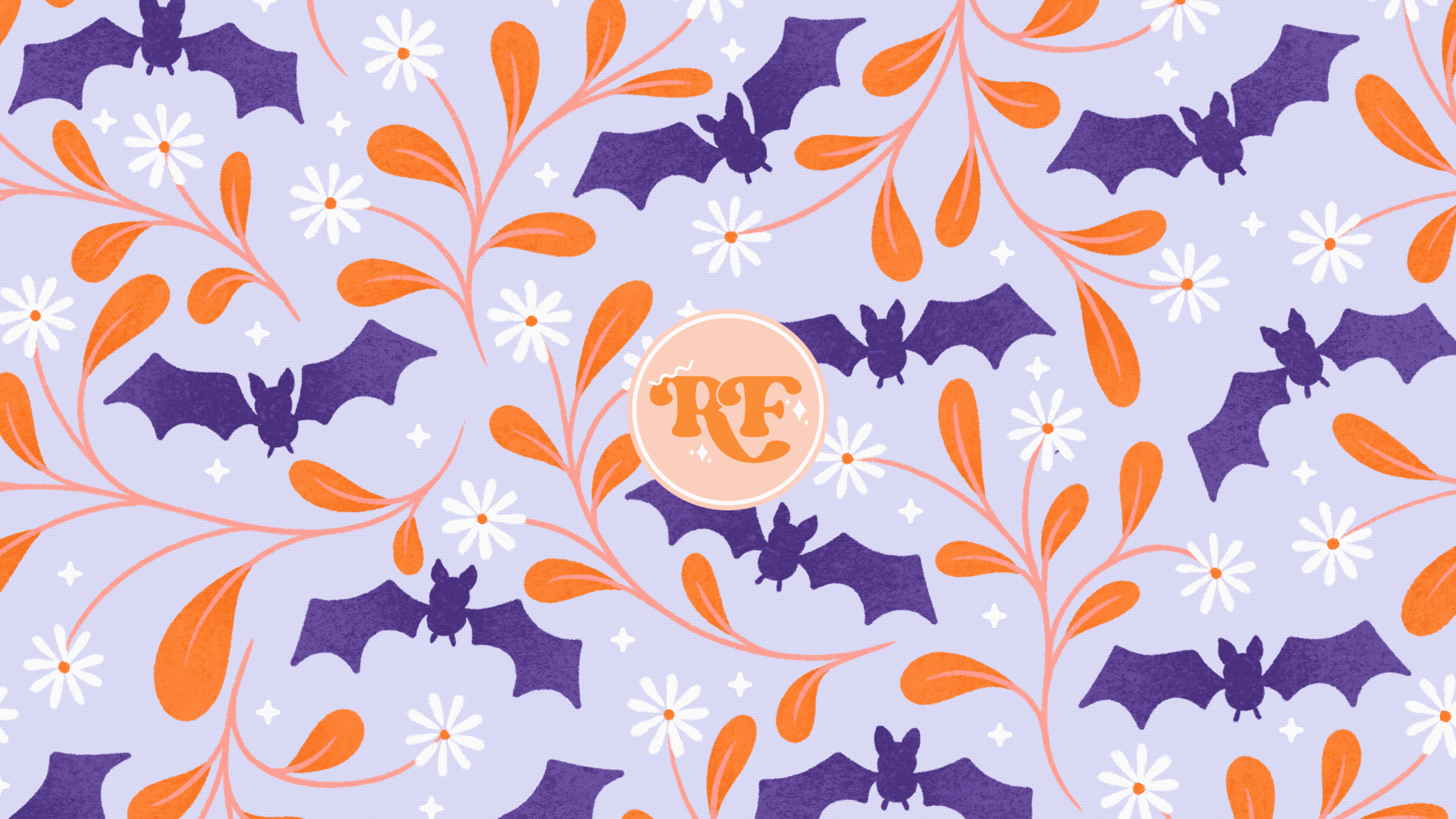
6. Project 2: Adding Movement | Setup: Okay, let's get started
on project two, which is going to be rotating
elements of our pattern. In my case, I'm going
to use these bats, but you could do it with
flowers or anything really, that you can rotate from side
to side to make it go on a little jiggly loop like
that in this pattern here. I'm going to choose
to make these bats, in my pattern rotate or
oscillate side to side. You could also do
it with flowers or just about any element
in your pattern, which is easy to make it jiggle
back and forth like this. The way you want to bring your
pattern into the template we'll be using is you need to have a transparent
layer like this. They need to not be
attached to anything, otherwise you're going to have
to go in and cut them out. Which gets a bit messy. Not impossible, but messy
because these bats are mostly isolated and they've got this transparent
background on them. I'm going to swipe down with
three fingers to copy all. Then I'm going to come
out into my gallery and I'm going to use the preset that we made in the last lesson. I'm going to go into
this Instagram real. I'm going to swipe down with three fingers and I'm
going to tap on Paste. Then also, let's change
the background color so that we can see all the
elements on that design. A bit better for this one. I don't want to make too much
work for myself or for you. And you can see if I fill the whole screen with
the pattern like this, I'm going to have quite a
few bats to animate there. What I'm going to
do with this one is I am going to make
this one bigger and I'm going to make
it that sort of size. So we've just got a few
of these bats to do, and then I would only have to do these ones in the middle. Now you see these
ones at the edge where they cut off at
the side of the screen. You might think that we won't
be able to animate those, because as soon as we
start rotating them, we're going to get bits
missing because they were cut off by the
edge of the canvas. But I've got a trick to
show you where we can actually go past the
edges of the real size. By that I mean
Instagram re size. I'm going to actually start
by deleting this thing here. Deleting, not duplicating, We've still got that
in our clipboard, you can paste in later. This first layer
here, layer one, I'm going to grab a color, El, color is fine, and I'm going to fill the whole layer
with that color. Then up here I'm going
to go up to the spanner and I'm going to tap on canvas. And we're going to crop
and resize our canvas. All we're going to do is
to drag the canvas out, give us a bit of breathing room and a bit of space and margin around the edges of our
actual canvas size. And then we can tap done. Now we've got this
rectangle inside our canvas which is
1080 pixels by 1920. That's going to be
our final canvas. Now I'm going to paste
my pattern back in. Then I'm going to snap this
to the top of the document. Let's duplicate that. Let's drag that down there. Hopefully we don't
have any gaps or anything that doesn't look
right. That looks okay. Let's pinch these together. These bats over the center of the canvas are the ones
we're going to be animating. What we can do now is to move this bottom layer around and
put it in the best place. It doesn't matter if
it goes off center, it's not centered
in the first place. I'm going to turn off
snapping and magnetics. What we're going to do is we're going to move this around. Like up here, I
don't have any of these bits showing
by just a tiny bit. Because then I would
have to animate that. I'm going to make
sure I haven't got any point less tiny bits of motifs hanging over the edge that I don't want
to have to animate. That looks good up at the top. We want to make sure we
avoid that one on the right and that one at the bottom,
that's looking okay. There we go. I'm going to
leave that where it is. You can move this around with no fear of it going off center. It wasn't centered
in the first place. That's just so that we know what area we're eventually
going to crop to. Yet the position of this
is only relevant to the bits that you either do
or don't want to animate. Now that that step is done, what I'm going to do is
add another layer in here. Basically, we're going
to have some of the bats going left to right,
starting off, turning that way and that way then some of the bats will start off turning that way and
then going that way. Some will be clockwise,
some will be anticlockwise On
this layer here, I'm just going to
grab any old color. Let's go for something
that we can easily see. I'm just going to put
a blob behind each bat so we can and keep
track of what's, Let's make this nice and big. This is going to be one layer, the bats going anticlockwise. We'll have that one
going the other way, then this one going that way. Then maybe that one. We'll do this one
that, on that one. And then maybe that one there, maybe we'll do this one here. I'm going to have roughly
half going one way. And then we can do this
on the same layer. Actually, we don't
need to add a layer, just grab another color
that's going to stand out and then just put a
blob behind the other bats. This is so that we know our green bats will all be going in one direction and
our yellow bats will all be going in
the other direction. And that is going to help us
keep track of what is what. What we want to do is
cut all the green bats, and then cut all of the yellow bats and have
those on two separate layers. On this layer here, I'm going to use
the select tool, you want to have
this on freehand. Then all we're going to
do is just trace around the bats and cut them out
from this pattern layer view. It might be flowers or something else that you're
going to be rotating, but make sure that you don't get any other parts of
the pattern with it. Then when you've done
one, you press Add, and then you can move
on to the next motif, Tracing around this one and pressing Add down there
on the bottom tool bar. In between each motif, once you have all
of your a set of motifs all highlighted
and selected, you can then swipe down with three fingers and we're going
to tap on cut and paste. Now that's got all of those
onto one separate layer, we can hide that for now. Then we'll go back to
our main pattern layer, grab our selection tool again. Now we do the same thing, tracing around and cutting
out all of your second set of motifs tracing around
them and then tapping, add in between to move
on to the next one. Then once you have all of those, swipe down with three
fingers and tap, cut and paste, then
we can hide those. Now that should be all. I can see that I've
missed a bit here. Let's undo then. Get to the part where I
have everything selected. Let's show you how to fix this. I'm at the part just
before I cut and paste. We're going to long press
on the Select tool again, I'm going to just draw around
that bit there, tap, add. And that's added that to
the selection as well. Then just like before
we can cut and paste, that's now picked up
that mistake in there. The next thing to do is
tidy this document up, ready to do some animating. The first thing that I'm
going to do is to group this rectangle down here. The bottom layer I'm going
to swipe right on the layer above and the main pattern
layer to select all of those. And we're going to
group those because we want those all
to be one layer. This is going to be
our background layer as a way of selecting
this frame. If we go into animation, we've got animation
assist turned on. And because these two
layers are hidden up there, you can't see them down
here in the timeline. This one here, the layer
with the main pattern, we want this to show
all the way through. We'll get rid of
those two layers. Eventually we want to
show this layer of our pattern all the way through the video,
through the animation. Let's tap on this down here. If you look at the bottom,
we have the option to make this a background layer.
We toggle that on. That's going to
show this one frame in every single frame as well. And then which ever
other frame is active, it will still show
this background layer. This will be persistent
through the whole animation. If you want to put a
foreground in your layers, for example, if
you want to put in your logo or watermark
over the top. We can go to add insert
a photo or something. If you could put your logo down here at
the bottom subware, we can line that up later. Then if you tap this frame, you'll see you have the
option to add foreground, then everything you add in
between these two layers. If we just play through this, it's going to look
pretty weird at the moment because we've
only got these two frames. It's going to keep the background layer
at the whole time. And it's also going
to keep your logo, the foreground layer in there
the whole time as well. Let's just hide
that one for now, and we can use that later. All that we have to do now before we are ready
to get starting animating is these two layers
here with the bats on. We want to have those groups together so that they
will be one frame. We'll always be working on
either one or the other layer. Let's name these up so we
know which one is which. I'm going to name
this one yellow. And I'm going to
name this one green. That's going to help us keep
track of what we're doing. In the next lesson, we will get started on animating some movement
into these bats.
7. Project 2: Adding Movement | Animating: So let's get started
with these yellow bats. What we want to do
in each frame is to move these round by a
set amount of degrees, a couple of times this way, and then a set amount
of degrees that way. And then we'll
have that looping. Or we could also use ping pong for this one if we
make it go that way. And then that way we can just have it ping pong
between the two. To start off with, let's turn on ping pong
style for this. Again, we can leave all these
settings just as they are for no, this one here. This group is going
to be our first frame with the bats in this
neutral position, as they were from the pattern. Then in the next frame, we
will start to add movement. Let's duplicate this group. Let's start work on this
yellow bat layer here. We want to use our
select still on free hand and we're just going to go through
these one at a time, drawing around these,
just like we did before. Then we're going to tap
up here to transform. If I zoom in, it doesn't
actually make it any bigger. Let's zoom in through the video. Instead, this green node here, if you tap that, you get to choose what angle you rotate it. Let's rotate this
by five degrees. You'll see it all move there. You can see the onion
skin effect there. Here we can see the
previous frame. That's grade or translucent. We know it's moving
from there to here. That's why I was talking
about the onion skin effect. Once you've done that,
you can on the transform. And we're going to do that for every single one of these
bats on the yellow layer. We're going to
draw random select them and then rotate them
all by five degrees. Let's draw round this
one tap to transform. And tap five,
you'll see it move. And then you can tap on the
arrow when you're done. That's all we have to
do for this layer. Just work your way through your first set of whatever
motifs you're animating. Rotating them all
by five degrees. I'm just going to go ahead
and whizz on through that. Then once you're done, have a quick look
over all your motifs. You should be able to see
that onion skin shadow behind them to know
you've done them all. And then we're
going to move on to the green bats,
exactly the same. We're going to
trace around these, select the bats to transform
on the green node. And we're going to
move it five degrees, but this time we're going
to make it five degrees. It's going to go five
degrees the other way. The yellow ones are going
to be going anticlockwise. And then the green ones are
going to be moving clockwise. And then exactly the same as we just did with all
those other bats. Work your way through all
of these green motifs, moving each one by
minus five degrees. Once you've done all
of those, you can see the onion skin shadow behind them to know that
you've done them all. That is our first frame done. Now in our previous animation, we duplicated the frame to
then work on the next one. But in the previous animation, we weren't doing any
transforming or scaling, or rotating things in those, it was okay to duplicate. If we were to
duplicate this again and move it on
another five degrees, we would really start
to see the image soften and blur as we rotate it. You can see, for example, like in this one, this
one is my original. By doing just that one
small transformation, that's what my edges look like. Now probably the best
place to look up is there. You can see they're a lot
more so than the original. If we were to
transform this again, they would again become
even more fuzzy and soft. What we're going to
do is instead of duplicating the one we just
worked on the whole time. Because if we did that, by
the time we got to the end, it would just be
a big fuzzy blob. We're always going
to be working off this original bottom layer here. We're going to
duplicate that one. Then bring that
one up to the top, and we'll work on
this one this time. Instead of rotating
it five degrees, we're going to rotate it ten degrees. I'll just
show you that. Now we'll go to
the yellow layer. I'll just trace around this. This is going to
give us the best quality image that we can have. We do ten degrees. You see we've got
those nice steps. They're showing
with the onion skin because we're always
working off the original. We're only ever
transforming it once. We're keeping the image
distortion to the minimum. Now we're going to work our
way through this layer. Again, rotating each one
of these by ten degrees. I just realized I'm tracing
round this really carefully. We haven't even got these petals on this layer. These
bats are on their own. I don't know why I'm tracing
around them so carefully. Literally, circles around these and then rotate
them ten degrees? Yeah, once you've got all your bats or motifs
on a separate layer, you don't have to be precise
about tracing around them. I could have done
these last two layers a whole lot quicker,
but never mind. I'm not going to
edit this part out. I'm not going to do a retake and pretend that I don't ever make silly weird mistakes like this because
we're all human. And hopefully it'll make us all feel a lot better
about ourselves. Anyway, when you've got your three little shadows
showing on all of those, we're ready to move
on to the green ones. These ones we do again by
ten degrees, but minus ten. Work your way through all
of the bats on this layer. Moving those by
minus ten degrees, then when you can see
all three shadows on the onion skin
frames on those ones, you know that those are
all done on that layer. Then for the last of the
turns in this direction, we're going to go
up to 15 degrees. We're going to duplicate
this bottom layer. Again, drag that up to the top. This time with our yellow ones. We're going to move
them by 15 degrees. Then just work your way through all of the
bats on this layer, moving those all by 15
degrees in that direction. Then once you've done all those, we'll move on to the green ones. As I'm sure you can guess, these ones will be
moving by -15 degrees. Then again, you can
just whizz and work your way through all of
those bats on this layer, moving them by -15 degrees. Now we've got one part
of our animation done, where everything is going
to rotate either this way or that way by 15 degrees. Now what we want to do is
bring it back the other way. Now for this part, we
actually can duplicate, because we're not
going to transform anything any further. Because when we've
got to this one, which is 15 degrees, the next step would
be to have it back again there to ten degrees. We can actually just re,
use the one behind it. Let's go to this one, which is then we've got 510.15 After 15 we want
ten, we can use that one. What I'm going to do actually is let's label up the group. We've got this one
at the bottom, we'll name as zero. Then we've got five. This is going to make it a lot
easier to keep track of. Then we've got ten. Then this last one
at the top is 15. What we want to do is go to our ten degrees group
and duplicate that one, and drag that there
above the 15. Then we want to go
to our five degrees. Duplicate that one and drag
that one up to the top. And then finally duplicate our zero and take that right
up to the top there. And then we're back
where we started. Let's give this a little
play Now let's go down here. You can turn off these
bits at the bottom so they're not distracting
us on our settings. We'll go to ping pong and let's tap play and
see what we have. That's already looking
pretty cute there. They're just going that
way and then back again. What I think would be nice
is if we went that way to the middle and then
over to this side as well, where we've got the
yellow ones moving, I think positive 15 degrees
and then back to zero. Let's have them go the other
way up to -15 degrees. Let's just pause that for now. We are back to zero. Up here on our time line, what we want to do is
duplicate this one. It's okay to
duplicate from zero. Let's put our markers on so we can keep track
of where we are. Let's rename this 15 even
though it's not quite the same, five as the other one,
because this is going to be. Everything's going
to be moving in the opposite
direction in this one to where it was in the first
five group that we had. Our yellows are going to
be minus five this time. Have we got the yellow
layer selected? Yep. Let's tap these
and we'll move these by minus five this time
through all of those. Move them by minus five degrees. Then for our green ones, this time these are going to be moving in a
positive direction. We can draw around
those quickly. Tap on the green
node and we'll move those five degrees if you find you're not sure whether you've done a but
on a layer or not, because we've got so
many onion skins, it's quite difficult
to count them all. What you can do is go
here to your timeline and if you flick
between the two layers, you should see some
movement in all of them. If you weren't sure if you
had or hadn't rotated about, you'd see it standing still
between these two frames. That's how to check
if you're not sure. Once you get too many onion
skins to easily count. Now we go back to zero and
we'll duplicate this one. Drag that up there, and
this one we'll call ten. Then all the yellow
ones on this layer, we're going to rotate
by minus ten degrees. Then onto our green ones
we can select these. And these ones, you guessed, it will be moving by
positive ten degrees. Then again, because
it's getting busy here, let's just make sure we've got some movement between
all of those there. There's nothing sitting
still between frames there. So we're good then. Once you've checked that you've
done everything you can, go back to your last zero layer. Duplicate that one and
bring it up to the top. This last one will
be 15 degrees. Our yellow ones are
all going to be moving by -15 degrees this time. Then onto our green ones, and these are going to be moving by plus 15 degrees this time. I nearly said -15 Then
as I was doing this one, I could see that it's not
quite lining up properly. Going back to this one
here, the frame before, I can see that what
must have done is moved it the wrong
way in this frame. How do we go back
and fix things? When we spot we've
gone wrong like this, what you need to
do is narrow down and find the frame where
you've gone wrong. It's this one here
that I've gone wrong. Select the green
one on this layer. We'll draw around it. And we will swipe down
with three fingers. And we are just going
to cut this one out. Then we can go back down to the zero layer on neutral one. Select the green bats on here, We can draw around this one. Swipe down with three fingers. We can tap copy. Then go back up to the group where we
just cut it out from, which was the ten,
I think this one swipe down with three fingers and we can paste that in there. Not going to merge
it down just yet, because we will do the rotating first tap to transform up here. It was ten degrees, we needed to move this
by for this layer. There we go, that's where
it should have been. And now we can pinch that down and merge
it with the other layer. Now we can just scroll and move through
these other layers just to double check that it's moving as
it's supposed to. That's now looking correct. That's how to fix any mistakes if you spot any
as you've been going along. I'm going to show you
another one here. There's this bit where I didn't quite cut it out carefully
enough, I think. Let's draw around this guy with the select tool and just
delete him completely. Then we can go back
down to our zero layer. Find the zero guy from this one. Swipe down with
three fingers copy. Go back up to the layer just above the layer we
just cut it from. We can paste it in. Check on the group layer what
it was supposed to be. It was 15 degrees,
we can do that. Now he's in the right
position as well, yet the more motifs you have, the more you are likely to
make a mistake along the way. Just keep checking as you go to make sure that everything is
looking how it should be. Probably the easiest way is, I guess, is to just
play our video. It's not quite finished yet, but it's nearly there. Let's just play,
it's on ping pong. And that seems to be
looking okay, hang on. I can see something here. There's a bit cut off
that one as well. Let's narrow down
and find the frame. This one here, I think I must have got that in with another back
when I was selecting. Let's cut this guy out. Swipe down, we can cut, go back down to our zero layer, then we can copy him from there. And paste it in.
Yeah, you can move backwards and forwards between
your animation frames, either on the layers
or on the timeline. Or just every now and then. Give your video a play just to check that everything is
looking how it should be. I'm going to collapse all
of these layer groups. Now if you remember
on the first cycle, we went 0510-15 and then
we went back down to ten. We're going to do the
same on this one. Going back the other way. Let's just pinch those down. Yeah, where we've gone up, we can go back the other way. We can duplicate
this ten layer here. The swipe left tap duplicate
and drag that to the top. Then we want this five layer, we can duplicate that one
and bring it up there. Lastly, let's duplicate
this zero layer and bring that up there. Now we should be able to hide these marker
layers at bottom. Again, we're on ping pong. Let's play it and see how it
looks playing on ping pong, that gives us a really cringe
that I'm even saying this. It gives us almost like
a floss type dance move, like they're doing it, wiggles
one way than the other. Let's have a look and see what
we get if we do this loop. I think because we went back down to zero here, it's
looking a bit off. Let's try hiding this zero
and then trying loop. Yeah, that looks a bit
more smooth because we had two of the zero frames. Let's go back in and
hide that because it does look a bit weird when it finishes on this five
on the loop is then going to go back down
to this at the bottom. If you want to loop it, I'd say that's a better
way of doing it. Don't have the final
on this layer here. I can notice it's doing
something a bit weird, like more than rotating. He's having a little
hop to the left there. Let's see if we can fix that. These ones are
rotating, whereas he seems to be doing
a little sidestep. Let's have a look and see if we can find out where
that's going wrong. We can either use these
frames at the bottom. It seems to be in this one here where it goes from rotating is also moving
over to the side. Then possibly that's also
messing up the one above. Let's try and drill down
and find this frame. We're okay up until this one. And yet this one, he
hops over to the side. Just double check that
this one is fine. That one's fine. Then
this one it moves. Let's go into this layer. We need to go down and put
our markers back on so we know if he's team
green or team yellow, we want to cut him out
from the yellow layer. And then go back down to
our zero neutral layer. Find him on that one and cut
him out from that layer. Swipe down copy and then go up to just above where
we cut him out from. Then we can paste him in there. Then we need to rotate
him by 15 degrees, which I think was -15 Let's just check that that's
playing correctly now. Yeah, that's moving
much smoother and he's not doing his
little sidestep anymore. Let's pause that and we can pinch to merge him
down into the main group. Anytime you spot a mistake on here somewhere when
you're playing it, drill down into the frames and figure out which
frame it's on. You can then cut the mistake out from that frame, remove it, then go back to a zero frame, copy it, and paste it back into where
you've taken it from. You can then rotate it by the appropriate amount of
degrees for that frame. It matches up nicely
with everything else. Now we can go down
to the bottom layer and hide those two markers. Let's decide if we want to use Loop or ping pong for this. I think I prefer loop for
this one frames per second. Let's try it at 24. That just looks a little
too busy and crazy for me, that's maybe too slow. I think 15 does feel a
little bit too fast. I think I might bring
this down to 12. I think we can say
This animation is now finished at this stage. In the next lesson, we will look at how to crop this back down into our 1080 by 1920 size
for an Instagram reel.
8. Project 2: Adding Movement | Cropping: All that's left to do now is
to crop this back down to our 1080 by 1920
size for Instagram. At this point, you
won't be able to go back and change things so
easily once we crop it. I recommend coming out into the gallery, duplicating this. Then work on a new one. So you've always got
that one to go back to, because once you've cropped it, these pixels will be gone forever and you won't be
able to get them back. Let's go up to our actions, and we're going to go to Canvas. And we're going to
go back to crop and re on our settings. We want to type in 1080 by 1920, then we can tap done down here. Then you get to tap on this
with your apple pencil. And you can drag this around
and choose exactly where you want to crop where we had it. I want to make sure
I'm not getting any of those animated bats in
there on the canvas. We want to have this one
here. I want to keep out. I need to make sure
I avoid this one. We can drag that over to
the right a little bit. Look around all the edges
and make sure that you don't have any un animated
parts showing in there. I think that's all of them. Careful not to resize it. You drag around from the middle? Yeah, move it around so
you've got just the bits you want in there and then when
that's in the right place, you can tap done. Now when we play
this, these are all animating perfectly
off the edges. If we come back into
the layers here, we can probably delete
those now because we've got those as a
backup in our other copy, so we can just get rid of those. This one here is the background. If you want to go ahead
and put your logo back in. Let's show this layer again. Maybe we will resize that,
make it a bit smaller. Go up here to transform. Make that a bit smaller, and maybe center it as well. Let's turn snapping
and magnetics on. And we can center that
tap to select that. That's our foreground. Now I can play our video. And that is now ready to share and export for Instagram
or Skillshare. Just to give you a
quick refresher, if you want to save
it for Instagram, you will want to
share an animated MP, four max resolution. Double check your
frames per second, and then you can save
that to your camera or your files and then send
over to your phone. If you want to save
it for Skillshare, you can do that as
an animated gift. Go to share tap
on animated gift. This one you want
to do web ready. So it's nice and small, we don't need to see
it super high res, just the movement is all
that we need to capture. And then we can
export that to files. Then you can go back into Skillshare where we've
still got this project. Open. Press Enter, choose another image from
files. Find that one. There it is up there. Just
give it a second to up load. That's how to add your second
animation to the gallery. That's how to make something rotate using
procreate animation. Other ways you could use this, we only went up to 15 degrees if you wanted to make
something rotate completely. If you had fliers for example, and you wanted to make them
rotate in a complete circle, you could maybe choose
ten degree increments and just keep going all
the way around until it's rotated all the way around Way you could loop it or you could duplicate the
subsequent layers to make it rotate background
again to the right. The other way you could
do it with flowers, you could do it with animals, you could do it with any
motif we could have done, Use the pumpkins to do
this if we wanted to. There's lots of different
ways you can use this rotate movement feature. I've got another animation
here in procreate, this one down here, where I've got two types
of movement going on. I've got the big flowers
going backwards and forwards, the same as the bats in
our previous project. At the same time,
these smaller flowers are also rotating in a loop. If I show you this one as a
way of combining movement, there's all kinds of different
ways you can imagine this and ways you can use
this rotating feature. In the next lesson,
we'll look at adding some twinkling stars
to our patterns.
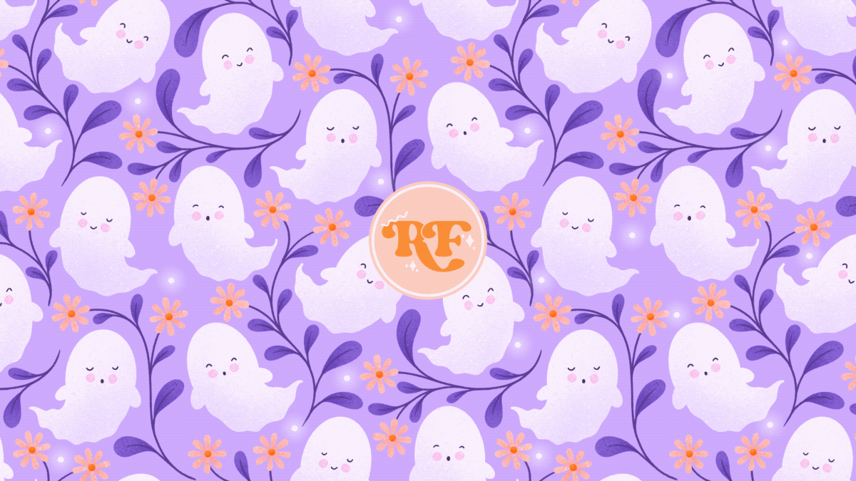
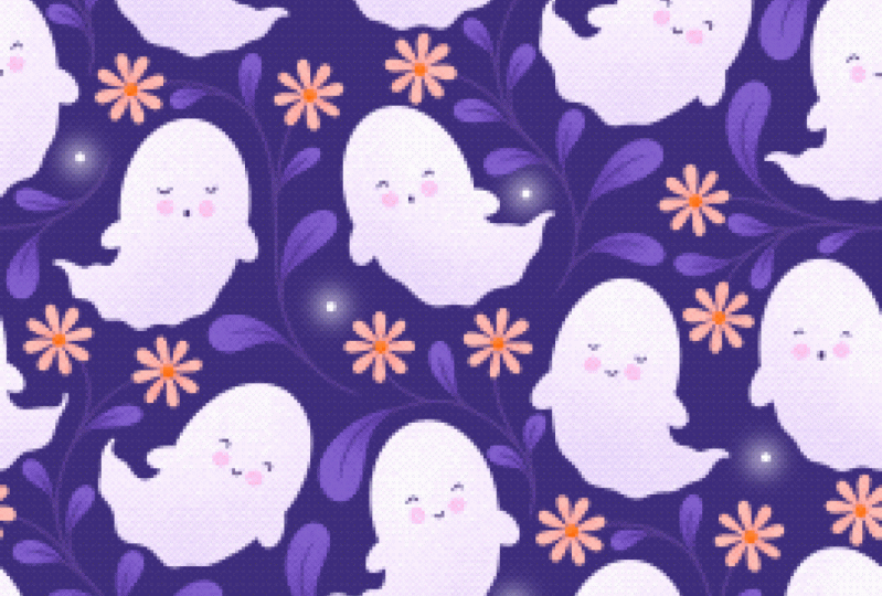
9. Project 3 Twinkling Stars: Welcome back for project three. This one we're
going to be adding some twinkling stars to
this ghost pattern here. This is one I've
brought in and I'm, it's on a transparent
layer as you can see here. But you don't have to use a pattern with a transparent
layer for this one, because we'll be putting the
stars right over the top. This one does have a
transparent background and I've got my background
color underneath. If you're using the template
that I've given you, which is this one here, this is the one that you'll be using. Again, this is 1080
by 1920 pixels. And I've already brought
my pattern into this one. Same as we did in the other
lessons for this animation, we're going to be
adding some stars and making them softly
twinkle on and off. What you need to do first is set up a brush
we're going to use, come down to your default
procreate brushes and find the
airbrushing section. Just going to delete this
one that I added there. We don't need that
one right now. Find the hard airbrush
right at the bottom. You can duplicate that one
so that we're not messing up any real brushes and
tap on the settings. What we want to do up here
in the stroke path is bring the spacing on that right up so that we can draw some
tiny uniform dots. Then on apple pencil, make sure pressure is
not affecting the size because we want to be able to draw everything the same size. Once you've done that,
you can tap done. Now you've got this
dotty air brush here. We're going to choose our color, and we want to use white
on the color wheel. We can double tap up
there to snap to white. And let's just have a look
and see what size this is. Massive. Let's bring
that down a bit. I think these preset sizes
is why I want to use there. This one I'm using is at 7% Basically what you
want to do is just decide where some stars
would look nice on this, on a layer above it. Let's add a layer above there. Let's set this bottom
one as our background. Then on this layer up here, we're going to add some stars, just anywhere that you think
the stars will look good. Obviously, the more
stars you add in, the more work it's going to be. I'm not going to go too mad
and put too many on here. Hopefully that's
enough on there. Said, you can make this as busy as you want
it to be or not. You put some more up there. Then at this point, we're
going to hide the ghosts or your pattern layer at the bottom so we can see better
what we're doing. What we're going to do is
have two sets of stars. Some will be fully on while
the others are fully off. We want to divide these
up into two sets. I'm going to choose
1.2 just like we did with the green and yellow blobs underneath in our
previous pattern. Just going to grab any old brush here and I'm going
to number these up, either one or two. What you want to be
trying to do is make these as spaced out. And I want to say random, but it's not random because we're choosing
where to put them. But yeah, try to make it so that the stars look as random as
possible with only two sets, it's not going to be
completely possible to have clumps of two stars on the
same layer next to each other. But here, you might not want to have three of the same number,
so close to each other. This is just to help you
break them up a bit. See here where
I've got a 2.2 and 1.1 That might look a bit
weird and not random enough. Let's swap these
two around and make that one and this one or two. Just label these up and try and get them as
spaced out as you can. Then we're ready to move on
to cutting these out onto separate layers
similar to how we were drawing the green and yellow circles on
the other document. Now let's group these together so they're not messing around with
our onion skinning. I'm going to turn
this one off for now. And then on this layer
here with the stars, Remember how we cut the
bat site so that we had all the green bats on one layer and all the yellow
bats on another. Well, we're going to
do the same with this. Just making sure that we've got everything on the same layer. What I'm going to do is go
through and cut out all of these two pressing ad in
between using the select, same as we did with the other bats on the previous lesson. I think I've got
everything there. I'm now going to swipe down with three fingers and I'm going
to cut and paste those Now, hopefully that should just be all the ones left showing there. Just have a quick check.
Okay, let's rename this one. Let's rename this 12 name, the layer below one. Then you should then
be able to hide that ones and twos because we don't
need that layer anymore. And then we can group
these two layers of stars together and then
deselect everything. I'm going to show you how to
make these stars look a bit cute and sparkly and add
a soft glow on them. I'm just going to work
on one layer at a time. I'm going to add a
layer above this one. I'm going to go back to the brush that we
were using before. Just go up here to my recent. I'm going to make
it slightly bigger. I'm going to draw a slightly
bigger dot over the top. It needs to be the same
color, also in white. I'm going to go around and draw a slightly bigger dot over
the top of all of these, and then on this layer
here with the bigger dots, we're going to go to our
adjustments down here. We're going to tap
Gaussian blur. If you swipe across
with your apple pencil, you should see these
will start to go nice and blurred and we get this cute little
starlight effect. I've taken this up
to 8% on this one. We can then merge that
with what's underneath. And then we're going
to do the same with our two, add a layer above. Then with our dot brush, let's just hide these, just add a dot over the
top of all of these. Then we go up to
our adjustments, choose Gaussian blur, and we'll bring that
across to 8% as well. Then we can merge
those two together. Now we've got these cute
little glowing stars. Our first frame we're going
to start with, we want, let's have our ones at
0% opacity fully off. Then our two, we will have
at 100% opacity fully on. Then we're going to
duplicate this layer. Let's bring this up to 10%
let's bring this one down to 90% Then we can duplicate
that layer again. Then what we're going to
do is just keep either increasing or decreasing
these by 10% each time. Duplicate this one,
bring it down to 80, bring this up to 30, down to 70. As you can see here, it's
already looking really cute, like where we've got some faint stars and some brighter ones. Duplicate this one, do 60.40
Then we get to this one, the halfway point
where everything is at 50% Although on
the preview here, you'll see they don't
all quite look the same. And that's because of the
onion skin where some of the frames below are
being duplicated. That's why they don't
quite look the same. They don't both
look like they're 50% Then last one down to zero on this one and this one all the way up to 100. That is literally all
we have to do for this. If we put these settings on
ping pong and we press play, you'll see we've now
got these really cute, softly glowing stars. Let's go down to our
layers down here. Turn our background layer on, now we've got these
cute sparkly stars. This is set to 24
frames per second. At the moment, I think you could play around
with the settings. You could bring it
down to like 12 or 13. If you go super high,
it's going to look like those chasing stroke
Christmas tree lights. I think 20 is probably
quite a good setting. I think I'm going to
keep mind set at 20. But absolutely choose
how you want to have yours As harrowing
Ben to leave mine. That is our third and
final animation style. This one is especially suited to nighttime scenes
with dark backgrounds, maybe Halloween scenes,
but it will look cute with any flower animation
or anything like that. The beauty of this
one is that you can use any pattern or illustration. You don't have to have
one that's transparent. You can bring anything in here. It could even be text or words. You could, I don't
know, something like special offer or sale written and then have these stars
sparkling around it. This is really easy animation to add to any piece of artwork. Once you've done this, you're
ready to export this as an MP Four for Instagram or
as a gift for skill Share. Just tap on share and
you can then export it using the instructions
from the previous videos. In the next video, we'll
wrap things up and have a look at a few
different examples of ways you can use these simple
animation features to bring other surface
pattern designs to life.
10. Next Steps: Well done for completing
all the lessons. Thank you so much for
taking this class. If you've always
thought that animation in procreate was too difficult to get started with or maybe not for surface
pattern designers. I hope this class
has changed that. I also hope that you found
it as much fun as I do. There's nothing more
cute than seeing your little motifs come to
life and dancing around. If you want to develop
things further, you can try things like making elements rotate in
different directions. You could add some
eye movement to your characters or even have a go at panning
around the pattern. These animations
were all made in procreate with the
assist interface. You're probably aware
that Procreate Dreams is on its way. I was lucky enough to go to the Launch Wood Skillshare
and see it in action. And I have no doubt
we'll be able to do even more with our patterns
in the very near future. The principles of this
class will be a great jump. Enough point when we get the
chance to have a go with it. Don't forget to upload your animations to
the project gallery. Stopping by to look
at them is always a welcome distraction
during my working day. And don't forget, you can earn certificates for posting
class projects now too, if you want any feedback,
help, or advice, you can always reach me via the Discussions tab I try
to look in once a week. And I'll always get back to
you if you need an answer, if you want to see more from me. I have a Youtube channel with
weekly tips and tutorials for procreate surface
pattern design and all things related to that. If join challenges and
community or you think, then you can keep up with those via my monthly newsletter and over on Instagram when you
sign up for my newsletter. You'll also get access
to my Freebie library, which has things like procreate
palettes and brushes, mock ups and other
templates in it. You can find all the
links for those things either in the class
resources sheet or by going to my Instagram at Becky Flaherty and following
the links in my bio there. Most importantly though,
don't forget to follow me here on skill share and thank
you if you already are, because then you'll
be the first to know whenever I publish
a new class or if I have exciting news like a skillshare membership
giveaway to share with you. If you've enjoyed the class, then please leave
me a quick review. They help other students
to know which classes are the good ones and they are always lovely for us
teachers to read too. Thank you again. Stay creative and I will see you next time.
 Rebecca Flaherty, Surface Pattern Artist & Content Creator