Transcripts
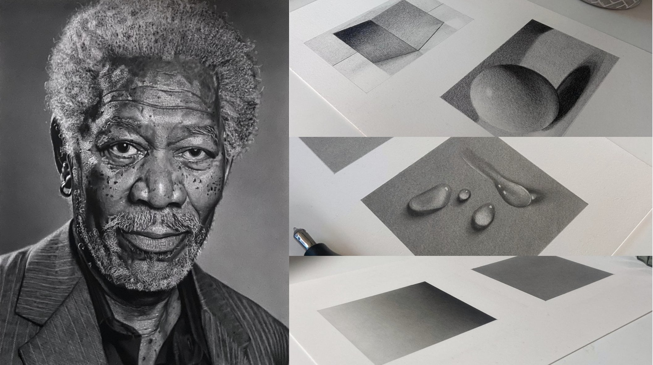
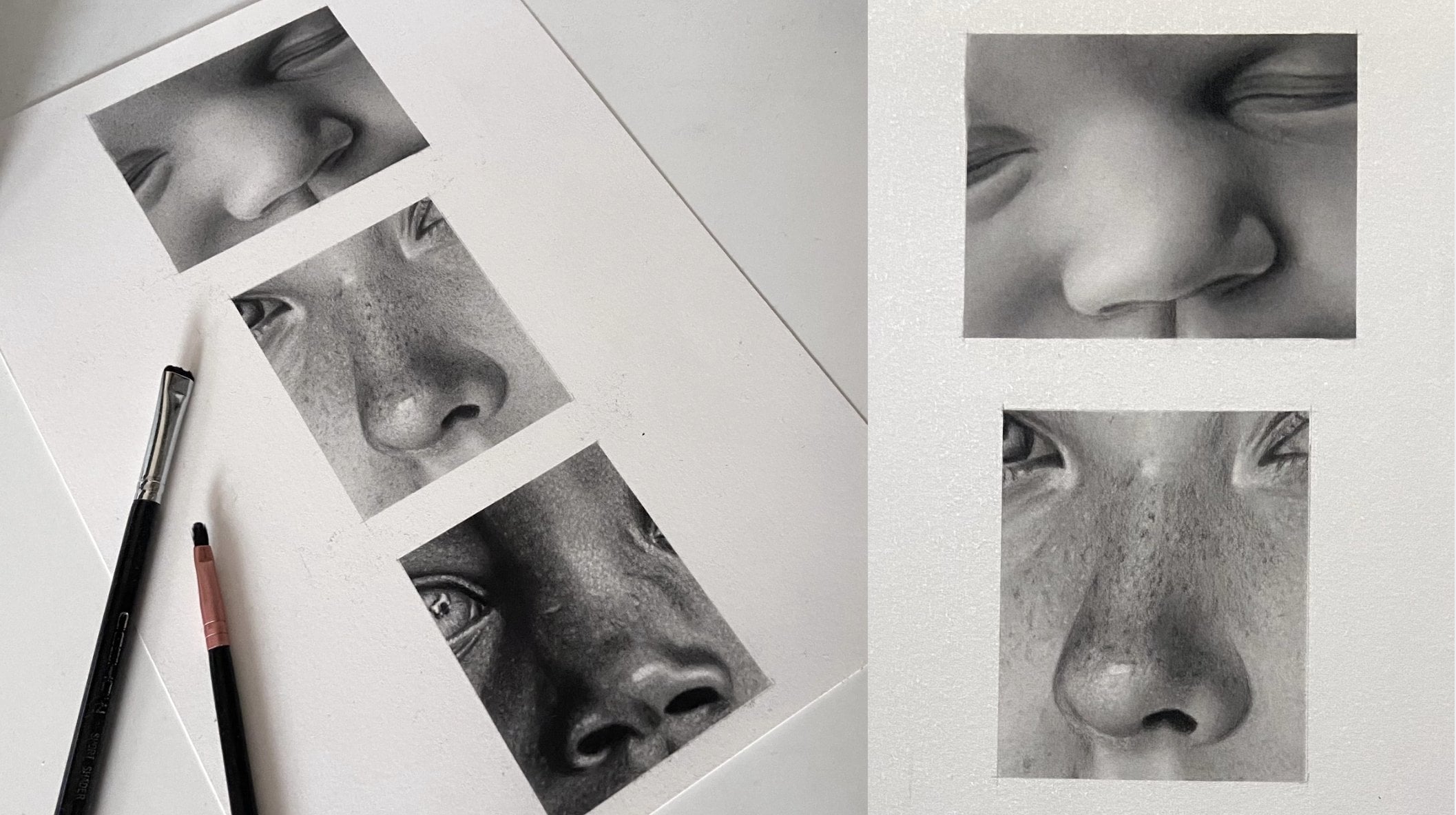
1. Water Drop Study: Intro: You may have unbelievably
good free hand capabilities, but turning this into this takes a completely
different skill set. Most people think you need heaps of natural talent
to draw realism, but the truth is
most realistic art isn't about talent at all. It's about patience,
persistence, learning a few key techniques, and developing the
ability to notice subtle details that aren't
immediately obvious. The following easy realism drawing series is
designed to give you a taste of realistic
drawing without being overly difficult
or time consuming, full of fun, short form lessons that are simple to follow
and easy to complete. Won't need expensive materials
to get started and we'll probably have some pieces of equipment laying around
the house already. Each tutorial works as a standalone class introducing different tools and
techniques along the way, or with a strong focus on
simplicity, accessibility, and fast results,
which can all be found on my main profile
page as and when published. If you've always wanted to
try realistic drawing but didn't feel ready to jump into a full length course just yet, this series is a
perfect starting point. You'll learn how to transform
simple outlines into three dimensional drawings with convincing structure,
depth, and detail. Knowledge that can improve
not only portraits, but almost any type
of illustration work, including character
design, animation, fashion illustration,
storyboarding, and much, much more. So if you're ready to jump
in, I'll catch you in class.
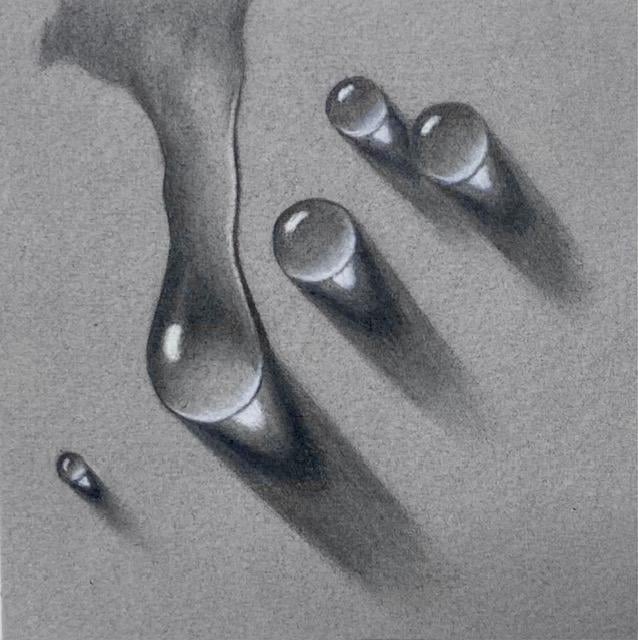
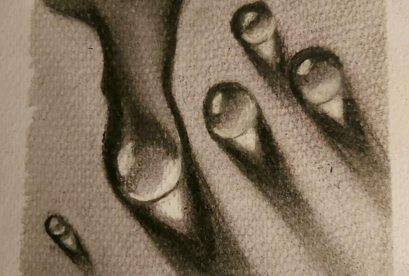
2. Water Drop Study: Demo: Hi, I'm Shane, a professional portrait artist based in the UK. And in this lesson,
you'll be using value and form to create some
hyper realistic water drops. I'll be using Arches
paper or arch, as I think it's
correctly pronounced, hot pressed watercolour paper. But any smooth paper will do just make sure it
has a good weight, as this does help prevent the paper from
buckling when working. I wouldn't recommend
printer paper, for example, as it's too thin. So I'm just outlining my square in the
middle of the page by drawing a line halfway up
the page and halfway across. Then mark 6 centimeters at either side of both lines to
form a 12 centimeter square. Then use scotch removable tape to keep a crisp, neat edge. This tape is perfect
for sharp edges or borders and will not rip
the paper when removing. Okay, so now I've
outlined my square, I want to create a solid,
even saturated background. To do this, I'll need layers. You'll notice the tone
becoming more and more saturated with each
additional layer. If I were working on a portrait, I wouldn't necessarily use one grade of pencil to
reach the required tone, but instead, I'd start
a couple of grades lighter and add darker grades until I reach the tone I want. Using two or three passes
with every new pencil, this will give you a beautiful, solid tone and is a
great technique to use if you have any
gradients to deal with. Notice how I change the angle
of my pencil strokes here. This will help create
a solid layer. Use extremely light pressure
and hold your pencil or pencil extender far from the lead and at a low
angle to the paper. This will give you
better control and allow you to keep a light
pressure throughout, which will make it easier to
create a solid, even layer. I'm using a cotton pad to
blend the graphite together, but a tissue will
work just as well. Use circular motions going in both directions
for a great blend. You can see that the first
layer is quite blotchy here. You'll notice it's reducing
with each additional layer. If you notice any particular
dark areas appear, you can use a pointed
kable eraser to lift the graphite and
then re blend that area. Repeat that process for another two layers and you'll
get a lovely solid tone. And the last layer just to
fill in any lighter areas. Keeping with the
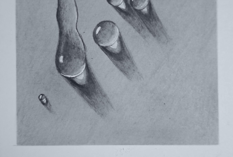
same B grade pencil, I start to loosely
outline the water drops. I don't want to go too
dark at this stage, just in case of mistakes. I keep my strokes
loose and go over them again and again until
I'm happy with the shape. The lines will look a
little messy at this stage, but I'll be able
to tighten them up as I go so they look sharp. I've uploaded my drawing to resources if you'd
like a reference to follow or else you can make up your own
configuration of drops. Now to create the outline
for the cast shadows. The light source is coming from the top left of the
page in this drawing, so creating a cast shadow going in the opposite direction, heading towards the
bottom right at the page. I'm using the Faber
Castell Perfection Eraser here to lightly
erase some lines. This pencil is
fantastic for removing a very subtle graphite without disturbing
layers beneath too much. You need to use extremely
light pressure low. I normally run the
tip of the eraser at an angle along a sandpaper
block to flatten the end, using tiny circular motions when erasing can be
really effective. Uh Okay, so I'm adding some mid tones to start building the
body of the drops. This will provide a kind
of roadmap to follow, and you'll slowly start to
see the drops come to life. Then when we add the lightest and darkest
tones a bit later, around the mid tones, the drops
will really begin to pop. This tiny brush is part of a cheap generic makeup brush set that I bought from Amazon. I think they were called bestop. You don't need to spend
loads and brushes. The main thing to focus on is the difference in
bristle stiffness. This brush is the softest, but I have a mid
stiff and a set used for oils and acrylics,
which are quite stiff. All the different
stiffnesses have a part to play when
working with graphite. Lighten my pressure
here as I move across the drops to lighten the
tone and create a gradient. Just adding highlights, this Derwent battery
eraser doesn't come with a two
millimeter lead adapter, so I use one from an old Tihoo battery eraser,
which fit nicely. I use this as it has a little
more power than the Tihoo. You can buy a rechargeable
battery eraser from Derwent, which does include the
two millimeter leads or go for the hepi version
by Tihoo or tenuin. Again, I'm using
a combination of pencil pressure and brush work for the cast shadow as I move away from the drops to
fade the darker tone into the lighter tone underneath
to create a soft gradient. I'm using extremely
light pressure here with the five B blue as I don't
want to risk going too dark. Don't forget to keep the tip of the battery eraser sharp by running it along a
sandpaper block. I make another pass
with the five B blue working on the darker areas
within the five B tone. Over time, when drawing realism, your eyes become trained to notice very subtle
changes in tone. Applying all those
subtle changes in tone really helps a flat
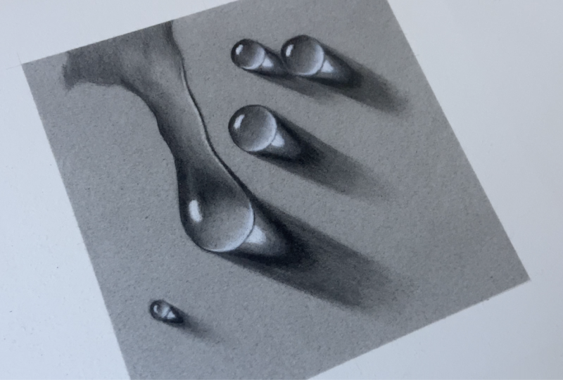
drawing come to life. Okay, so now that we have
our mid tones on the page, let's work around them
and fine tune everything and incorporate our darkest and lightest tones at a piece. I'm using a sharp
four B black to add the darkest tones
of the cast shadow, but also to help create a really sharp outline to
the edge of the drops. Creating a sharp edge
will really help project the drop
from the background. Be mindful not to go
around the whole outline as there are some
areas that aren't as dark as four B black. Also, something to
be mindful of when using the black pencils is
that more often than not, you need to use even lighter
pressure than the blue set. The aim is not to leave
any visible lines. Sometimes it feels like it's just the weight of the
pencil touching the paper. Not only am I making sure
the outline is sharp, but I'm also spending time
perfecting the gradients, which is to say, making sure different tones fade into
each other smoothly. M Sometimes a Na bill razor won't be enough, and you'll need a
little more pressure. So dabbing the perfection
erasor to remove a slightly more stubborn
mark should do the trick. Now for the
highlights, I'm going to use Generals white charcoal, but to do so, I need to
remove the graphite first. White charcoal never really
works on top of graphite, but if you remove
most of it first, using any eraser, you can
get a bright white tone. Notice how I don't use any power at the end
of the lines here. This is to make them
fade away naturally. I'm just moving the highlights across to the right a little, so they'd better
match the trajectory of the highlights
in the cast shadow. You can manipulate
graphite tones by carefully switching
between pencil, eraser, and brush to
get the perfect blend. So as we come to the
end of this class, I just want to give
you a huge pat on the back for
completing the lesson. Well done. I also want
to encourage you to upload your drawing to the
class projects folder. I'd love to see what
you come up with. If you hit the
Projects and Resources tab under the video, you'll find another tab
that says, submit project. I hope you enjoyed this
short form lesson. I'd really love it if you
left a review for me. It not only helps with exposure, but also gives me a
chance to learn what you liked and maybe what
you'd like to see next. So farewell for now, and I'll hopefully catch
you in the next class. And if you fancy
testing your skill and patients with some
harder drawing studies, you can check out some
of my other classes.
 Shayne Wise, Professional Portrait Artist