Transcripts
1. Class 1 Introduction: Hello and welcome
to the third class in this whole series. So I started with
abstract plurals. I went to landscapes, and now I thought of doing
something really fun. I plan to do something more fun. Abstract but really
intuitive kind of a work. I was working on these
really fun pieces to be basically learning.
And I thought, why not? Let's make a skillshare
class on this. So this is what we're
going to learn today. We learn the art of making colorful abstracts
with a little bit of representational
pieces, right? And this class is going to be structured
on only one painting. So I'm going to teach
you one painting with a warm color scheme and that's how it's
going to be structured. But then in the project section, I'm going to actually teach
you this one as well, so you will have an idea of at least two paintings
in the whole class.
2. Class 2 Supplies and Materials: Hi, welcome to Supplies
and materials. I'm basically a
mixed media artist working majorly in
acrylics today. I'll just go through the paints that I will be using for this. There is no pressure on the kind of brand
that you want to use, the paints that you want to use. I would suggest gashcrylics because that is how we get
the texture of this art. That is my only suggestion. I don't have any particular
suggestions on the brands. I use liquid sometimes. I also have local Indian brands like Camel and I also have Taiwanese brands which are are something that I don't know, but they are really
good in their quality. The colors that we will be
using for this painting. Let me just take you
back to the painting. This is a painting, the
colors that we will be using are Vermilion. I'm was finishing
up with this one. This is portrait pink. Any pink or you can mix your color like
white and vermilion will make a nice pink. Then I have my lemon yellow which is basically
cadmium yellow. That well be using, you can
use a lemon yellow as well. There are parts of green
that is olive green here. Obviously, I'm also using blue, which I'm using
Prussian blue here. Basically a combination of the warm and the
cool color scheme. Also we always white. Yes, these are the paints. Now, coming back to
the mixed media, I have these Fosco pens, which are basically
acrylic pens. I also have these oil pastels and these are in the
brand Symbolian, I don't know if I'm
pronouncing it right, these are the pastels. I also sometimes work with my son's pastels because
I really love them. If you're testing your pastels, if you're buying pastels
and you will test them, then a good idea is to
just see how they are. If they're smooth and if
they give a very creamy, buttery texture, then
they work really well. Okay, apart from this, I have to show you my brushes. I don't use any
particular brand, but I do like to
use a square brush. Most of my brushes in
this painting, in fact, all of my brushes
are square brushes because that's how
you get the texture. These are the brushes
that I have used. They're in different sizes and middle size and
then smaller size, but that really depends on the size of your paper as well. I also love to use
these ka brushes. They're one of my favorites. Whenever I go to
ITI just buy them. And I know they're
available globally, so I would really
recommend them. By no ways kids brushes, they're lovely to use. Okay. In terms of paper,
this is an acrylic, acrylic sheet, like a normal
paper for acrylic painting. It's a very thick sheet because our paint is going to be thick, so we have to make sure that we have a very thick
sheet of paper. These are the supplies, of
course, apart from water, a damp a rug, basically to wipe your brushes. And then a palette, of course, I use the palettes which are
basically palette papers. I can just leave them and throw them away
once they're done. That's the palettes I use. I think the next step
in this course is basically I'll go and I'll show you some of
the inspiration. And I'll show you
something about colors, which will be a quick
study of how you can learn to understand what
kind of colors you like. It'll be a good
homework that you can do before you
start this particular
3. Class 3 Colour Studies: Hi and welcome to
the lovely portion of this course because I
really enjoy this light. As an artist, I
feel like there are so many times I am
short of inspiration. Every time taking a canvas to actually ruin it is something
that I really don't like. Plus, I don't feel
it's useful, right? Because I feel that
it puts a lot of pressure on me to
perform on the canvas. That's why I love to
work on small pieces. Whenever there's a whole
combination that I want to test, I'll work on small pieces
and then I take it back. I was recently working
on a lot of abstract. I love combination of yellow and purple and
I've been testing it. I work on like four or five, or three or four pieces. And then I'll show you a
failure like this one. I always thought that black and red and green
would be wonderful, but somehow it did
not work for me. I really recommend you
working on small pieces. It could be a sketchbook or
loose sheets like these. When I was working on
this, this is when I realized it's a good topic for sharing it with others and for sharing how to work on it
because it's very interesting. It was easy fun, but also the end product
was very beautiful. I'm going to go through an
activity which will really help you grow your
color language, right? We all know warm
colors, cool colors. We understand the
opposite colors. We understand how
we can mix colors. This white, mix black, mix other shades
to make it darker, lighter, and all of that, right? But there is a very interesting
activity that I do, which is basically, think
of your favorite memory. Let's say maybe the day your son was, your
child was born. Or let's say maybe the
day you went to school, or probably a good
day in college. Let's say something to
do with your parents. For me, it has always
been the first rains. What I do is I make a grid. Okay? I make a grid with at least at least ten plus
colors that I have to make. I put up a topic, Okay, this was first rains. Then I mix and merge the colors that I
associated with the memory. Now the beauty of
doing this exercises, you do this for at least two or three memories,
or four memories, or do it constantly, and you will start building
the color language that you like to have
in your artwork. I think this is what I have
done on a consistent basis. Not knowing that this is the help it would actually
do to my practice. Basically, I just write my
memory, I write the colors. Sometimes when I'm making something I'm able
to remember and use the same paints and
make the same combination. I also write down
the combinations. So I remember this in the
next time when I'm doing it, or I can refer to
it if I'm trying to copy something or leverage
this to make a bigger piece. I try to do that if
you see a lot of my paintings at these
colors because that's the duty and that's the
inspiration that drives my whole collections or sometimes even a
couple of artworks. This was a little session, if you want to do a
homework on this, I would really recommend take two or three memories and make
this a chart for yourself. Make sure you're not using the paint directly
from the tube. Make sure you're mixing
a couple of paints and using them because that's
the whole essence. You are trying to
make your own paints. No one can go to
the store and make the same paints as
you have done it. That is the idea of
this color study. Do this and let me know how
you're able to work on it.
4. Class 4 Painting Session1: Finally, let's get to painting. Before that, let me show you these lovely abstracts
that I have made, okay? They are very easy studies, just basically
colorful works that was very less strenuous and very happy and
colorful for me. That's what we're going
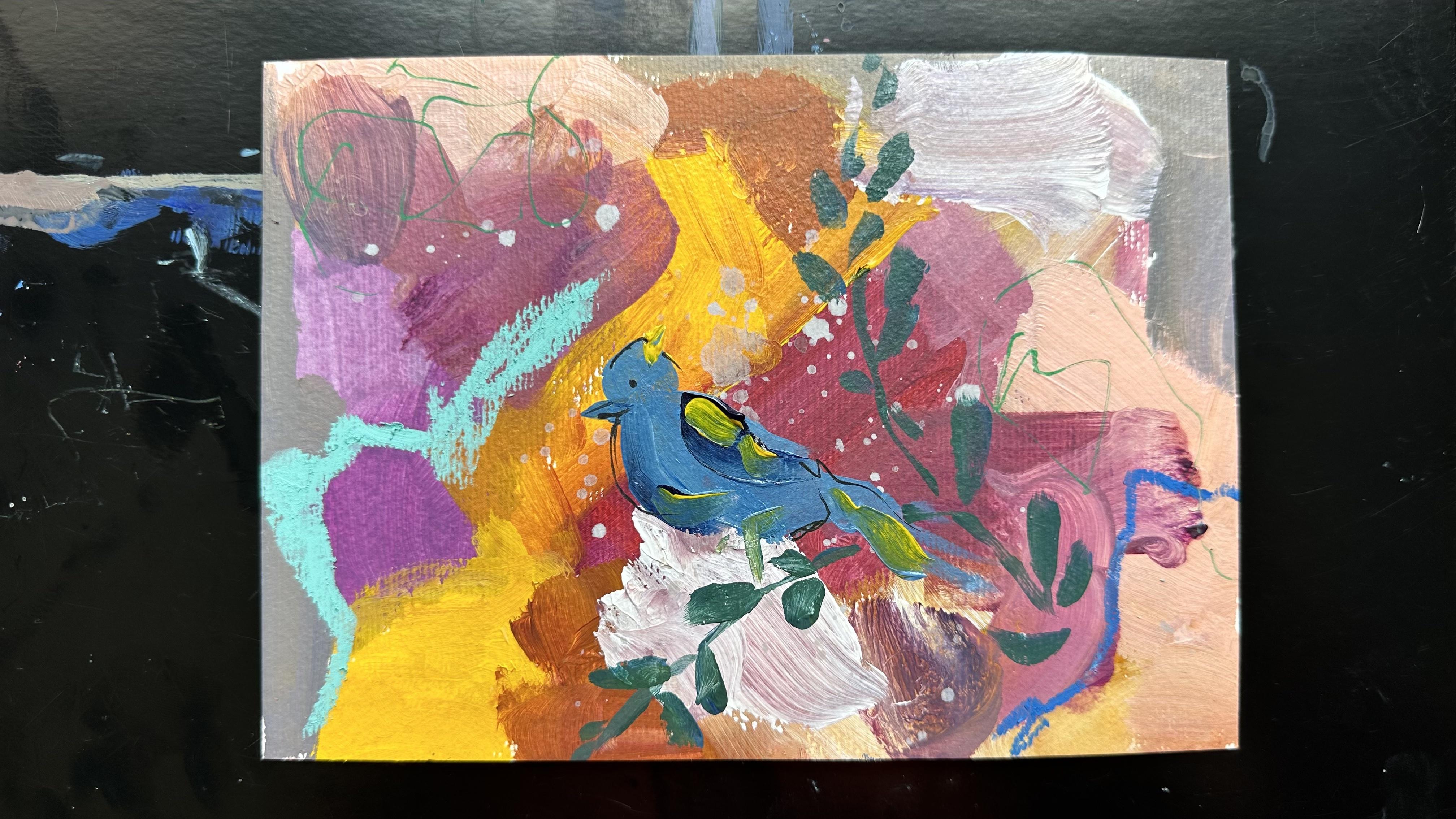
to be working on today. Let's get started on this. I fixed upon this
floral bird abstract because I just felt it's much more easier
than any of them. I felt because of piece, it will be easy to make. It's a very nice thing for something card or something like a beautiful framed artwork that you can just
put up on your wall. Here I am with my
warm color schemes, I have a purple which if you don't have, you
can easily make. I also have white with me. This is a palette sheet. And what I have done is I have first put in all
the colors here. As you can see, I mix
and merge my colors. The base for this is going
to be very abstract. It's going to be
a mix of a lot of colors and shades which
I showed in earlier. But the idea is to be very abstract and very
organic with it. We don't want to create
the perfect ombre effect, rather we want to create
the imperfect effect. We sometimes make the shades. Sometimes we're going to pick
up directly from the tube, like you will see in
the images ahead. I will pick up directly the purple shade that I
use for making the base. Then I do everything wet on wet. The idea of wet on
wet is that when you put wet paint near
the next wet paint, it just merges in and creates
these lovely brush marks. Now when you create these
lovely brush marks, they have this visual
effect on you basically, which is very organic, also a little bit imperfect. And that is the effect I
really want to create. I want to create something
that is far from perfect. The reason why one of
these course love creating these courses is it forces out the perfectionist
from us, right? When we force out
the perfectionist, we get in the person
who is more creative, who's more Gulvil, and who's
ready to make mistakes. I now went in with my cool tone. The cool tone is, I
want to make the bird. You see, my complete
surface is still wet. I'm lifting up my hand and I'm creating this really
organic shape of the bird. The idea is I first
create the body, then I create the
head, of course. I then make sure
that the bird has an effect on how
represent actually looks. You can see the base. My bird is actually picking up the color
of the base as well. That's essentially the idea. We're creating work
that is wet on wet. It's organic, it's easy to make mistakes in
this kind of work. If you're the
perfectionist who doesn't feel comfortable
in this activity, then you can wait for things to dry and do it slow step by step. That is also perfectly fine. It's very different
nature basis on nature. We like to make art
in the same way. That's what we're going
to try to create. Now, I just added yellow to the blue and I'm
creating the leaves. For creating the
leaves, I'm just holding brush completely
straight at a 90 degree angle. And just creating something
that looks like a leaf. Not necessarily something
with a thin brush, with an exact shape of a leaf. This is something which is
more organic and abstract. And it's really not forcing
yourself to create something that looks exactly like a textbook leaf,
You can see that. I'm also picking up
colors from the base. And that's happening
organically. I'm not really trying and
testing to do that now. This is the first session
and this is how we have just completed the
first part of the painting. I will continue to do the same
thing as I keep going on. I'm going to add in
splatters in the end. That is something very personal. I like if you feel this
is how it is complete, then you cannot add it. But if you feel that
you want to add it, then of course you're
welcome to essentially, this was my wet piece. And I know it can be a little tough for all
of us to make it, but let's go ahead and see
how we end the final piece.
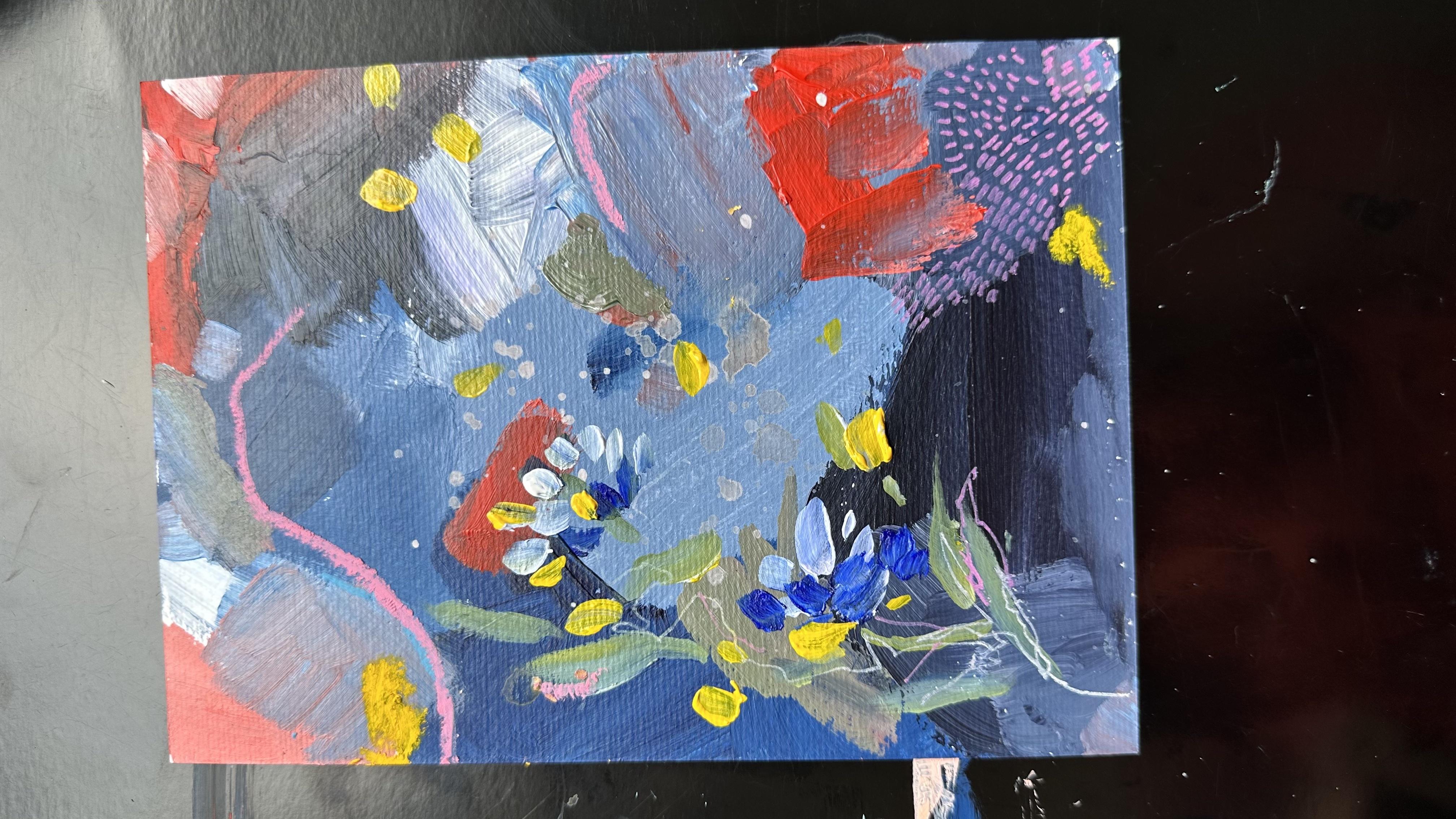
5. Class 5 Painting Session2: Hello and welcome
to the next part. Basically, our backdrop is completely dry and we
have completed it. Now we go in with a
small flat brush. Now this is I think a size
eight or a size nine. I have gone ahead and I'm now going to detail this further. By detailing it, I mean, I'm going to put in
the dark marks and basically the outline that I've already created in
terms of the birds. I'm going to go and add
more further details to it to suggest a darker shape, size, and a
representational image. I've gone in with
making some highlights. Basically just imagining a pair of lights probably
coming on the bird, if you think of it as a
three dimensional object. But you don't want to give
it a representation or feel when the idea is to create lights and darks at
some point of time. The good thing is to
imagine a source of light. For me, it's on the
left hand side and the extreme right is what I'm imagining the source
of light to be. Obviously part of the bird is white that's
facing the light. And then this more
darker shades. I've tried to create more
detailing within that. Now the reason I have kept this video at the same
speed as what I'm painting, because I wanted to
focus on the fact that this is a very easy
activity to do. Okay, If you see I have made the complete detailing of the
painting under 5 minutes, I feel like it's a very
easy intuitive practice that you can use
for making artwork. The next step is
basically what you see is I'm just putting in some
details of the leaves here. Alternatively, what you could do is you could go
over the leaves with the small brush and make the leaves properly
in the exact shapes. That's not something that
I generally like to do. I have not done, I have just
put some marks further. But if that is something
that you would like to do, then I would highly
recommend it. Going ahead, I have
picked up yellow, blue and I'm just adding
different floral elements. Now what this would mean, I wouldn't be able to put a
name on it, but essentially, I'm looking at adding some details which
includes organic shapes, metamorphical shapes,
suggesting a flower, suggesting a tree, or
suggesting a branch. Nothing which is very
strongly suggestive of a particular shape
or any natural element. I now go in with
the mixed media. The next part of the video, you'll see me using a
lot of mixed media. These are basically
acrylic pens. They're from Posco and I love to use them over dried artwork. They're easy to use and
they also work very well. And they have these
beautiful shades which are luminicent
and fluorescent, and they always look nice when you add
them to the artwork. Now I'm very loose
with the way I hold my pens and that
is something that is specific to my art style though I do believe
it is something that you could add or
probably you could do something like a
detailed work, right? You could even do
something exactly opposite the next step. What I'm doing here
is basically I'm doing a repetitive step
of making small lines. Essentially this is
call as mark making where you just add a singular
mark to the painting, which is just in conjugation. It's one after another. It's just a way of adding, balancing your composition,
resolving your composition. Adding more details to your
compositions in a sense. Right? I went ahead and now
I've started with my pastels, which I showed earlier here. Again, it's just about making these organic shapes
that look like leaves or textures or trees
that I have tried to add in for the going ahead. As we keep moving and as
we keep working on this, I will just add the
finishing details. Now these finishing details are like the eyes of the word. I'm also going to go at
and add the splatters, which is something that's very specific to me and
I love to add them. I've just added some highlights. Is there a way to do this? Probably. Can I put this
in paper? Probably no. But yes, I can just
share that this is more intuitive and more feeling based versus something that
I can put on paper and say, take these five steps to
achieve this similar painting. I think that offers you
a lot of more freedom. Work that is more intuition based versus something
that can be said, okay, do these four
steps and follow it as is to make a
realistic artwork. This is different and I will encourage you to use
your creativity and your intuitive skills to
just work on it and help yourself understand how
this artwork will look. This artwork is now complete. I feel like this was the
final details that I added. And then of course,
I played with the older pieces just to see what looked nice
and what I really, really liked. And
that's about it.
6. Class 6 Conclusion: I hope you had a lovely lesson
and I hope you enjoyed it. I hope you didn't take a lot
of stress working on it. I wanted to show
the final artwork. It's a little wet, but I wanted to show it. This
is how it looks. All right? I do
think it looks good. There's a couple of changes
that I could have made, but I wanted to be
true to the practice and just show it to
what I have done. But I do think I would
like to do some outlines, but this is a really
pretty abstract that I worked on and I really
enjoyed working on it. Similar to this,
Similar to this, you can do many of them. And in the project section, we'll go with this one. You can also do something in which you're finishing
the palette. Let's say you've taken a lot of paint in this palette and
you want to finish it up. I'll just show you something I made with the finished Pat. I was making this painting and I did not finish
up all my colors. I made this with Pat. It's like a pretty abstract but no representational piece, but is like finishing
up my colors. And this is something
you can really do because it really
helps your practice. Again, it becomes to
the color study, right? I will like to really remember this combination,
especially this one. You know how I made
it and what I did. Then you can hang
it on your studio, or you can remember
it for yourself. Take a photograph of it. Make a collage of it so that you remember it when you go
to make next painting. I hope you enjoyed the session. I hope you could understand
all the questions. Um, I hope you could
understand the whole process. If you have any more questions, just ping me in the commands
or you can message me. You can just connect
with me anyhow, and I'll be happy
to answer them. I'll be honored to answer them. And I hope this process helps you let loose and
lets you understand a little bit of your
intuitive process and lets you connect
with something deeper.
 Pallavi Saxena, ARTIST | EDUCATOR | DESIGN