Transcripts
1. Introduction Abstractlandscapes 1: Hi everyone. My name is Valerie. I'm
an abstract finite this I have already done one session
on abstract floors earlier. And today I'm here to teach something on
abstract landscapes. So we were out
outdoors this weekend and I was thinking the
landscape was beautiful, view by the beach
and the mountains. So what came to my mind was how can I simplify this
particular subject? Show and reflect the energy that I felt when I
visited the place. The idea of abstraction for
me is about simplification. It's about taking a
subject that exists in real life and then
simplifying it in the forms of shapes,
textures, and colors. And that is what I feel is, I don't know what the
style of painting is called because it's
very personal to me. I started making it and then
I realized what I'm doing to join me for this workshop on fearless abstract landscapes. And I'm sure we'll
have a good time. And let's move to
the next session.
2. Materials Abstractlandscapes 2: Good to start with it today, I'm going to make
three paintings. I have three sheets of people. I have all of the acrylic inks. These are Liquitex acrylic inks. And I have artist
grade acrylic paints. I have kind of picked
on four sheets today. We have green, that
is an olive green. We have Audrey pinks
look very light pink. And I've taken a Indian yellow, cobalt blue, cobalt d, and a titanium and an orange. So the idea is we
can go ahead and use these paints like just a
minimal beans that I have. And we kind of tried to pin
the landscape out of this. Now, we go into the details
of this painting more. And we've tried to understand
what we're trying to paint. What I'm going to show
is I want to show the differences of the
photographs that I want. I've also put these
references in the projects Ellis side so you can see these photographs and then tried to show
make your own version. I'm also going to show
you the process of elimination that I
use an abstraction. That's a very interesting
thing personally for me because when I was
trying to make this class, I thought that is
something that comes uniquely to the person
who's trying to paint this. So even if you try to
do it in your way, even of the same photograph, it's going to be very different. So there's an
interesting session. I hope. I hope you
find it interesting. I've kept it short and
I've kept it to the point. So let's dive in.
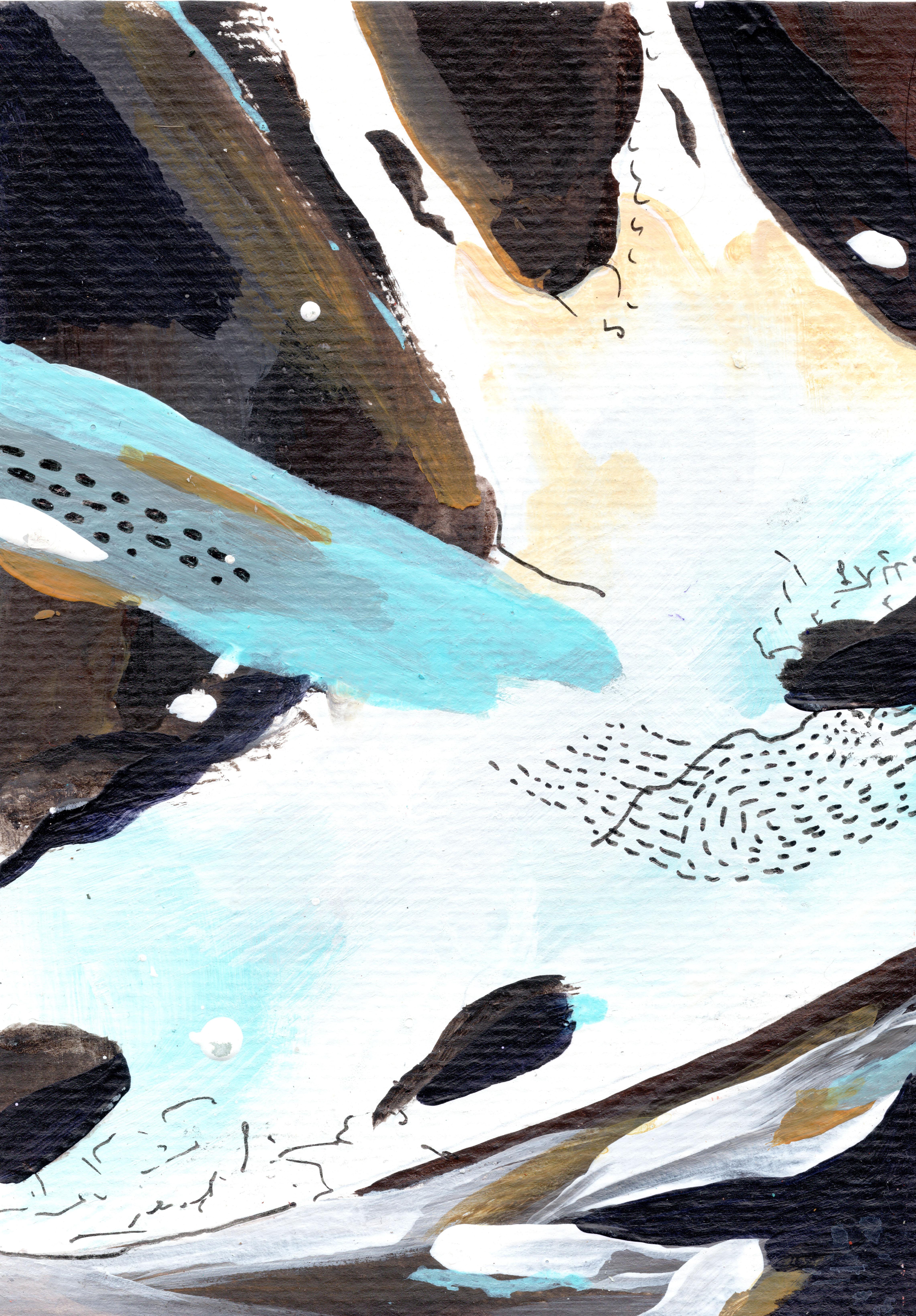
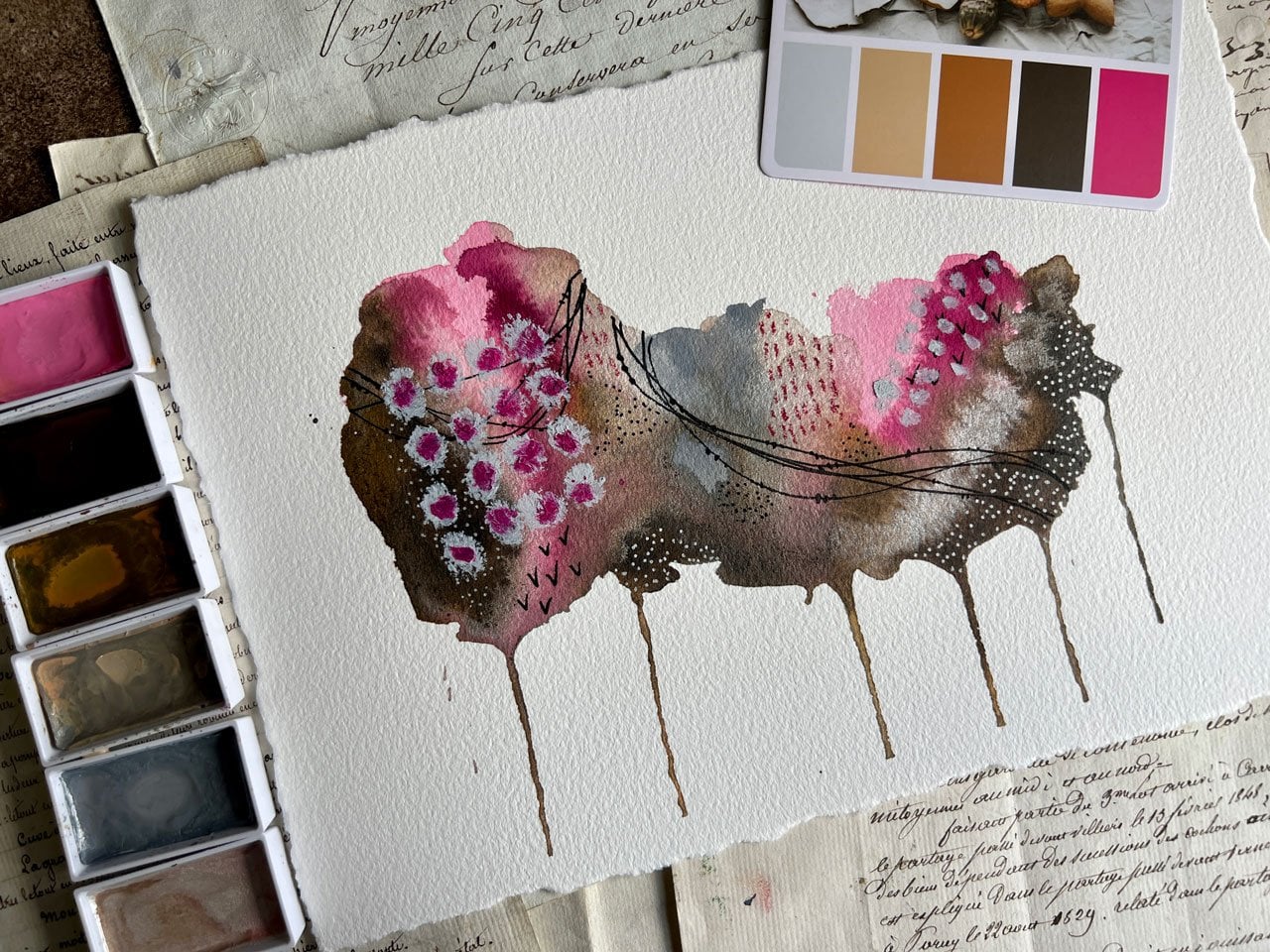
3. Process Abstractlandscapes 3: So here we start with
the first landscape. So as you can see on the left
is my reference photograph. On the right is the painting. I have kind of focused on the puddle that you see
on the right lower side. And that is the
shape I'm trying to replicate with similar colors. And what has caught my attention is of course, the
driftwood bees. And a v lies against
the whole photograph. This just put, I'm
just trying to capture the study
and basically the shape of the drift food that has been kind of my focus here. Though, focus on the
colors and textures, is just to get about a little representative and not into the details of
how the world looks. So as you can see, that's how I have
made that piece. Now, to give the composition
a little bit of closure, I'm looking at the
light that has been coming up in the
mountains from the sun. This is this orange bright
and I've exaggerated it. After that. I have also put in the
shapes of the mountains. So as you can see, I have put more water in this beautiful way that we act really be is when
we add more water, it almost behaves
like watercolors. It's one of the beautiful traits of acrylics and I
really enjoy it. So as you can see, I pulled it down the hole acrylics and
use them as watercolors. The next step in this painting
that I'll be doing this, I want to look and
show those guy. That's going to be
like though opposite. It is going to be the
opposition in my composition. So I go ahead and I'm making really broad and almost
aggressive strokes. Now the idea is I wanted to
show a very strong Scott, the strong blue kind of a sheet. Now the deflection
of this guy is also seen in some parts in the water. And that is what I'm trying
to highlight through these crystals that I'm using. I'm using soft pastels
and I'm putting in lines, are crooked lines around the whole painting to give it
some kind of a composition. The last time ending it with
the textures on the rocks. That was really something
that stood out for me. And I've taken a
black pen and I have made these black marks
around the painting. Again, for me, this
is about giving the complete composure
composition to the artwork. This is how we're making
the first artwork. And now we will move
on to the second one. The orange that I
have added is mostly for the opposition
and the contrast. So let's move to the second one. The second one is
a top-down view of what I really liked about this photograph
is the colors. So if you see on
the left top part is the yellow and the red, then there is a
deep blue actually, which is there in the central
part of the painting, which is what I'm
trying to highlight. Again, I have utilized similar
shades, similar colors, and I'm also trying to build textures through oil stake and, and different kinds of mediums, including splatters
from acrylic paints. The next painting
that we work on is, I think this is one of
the beautiful paintings of these mountains. The mountains have amazing
color including black, brown, gray, yellow,
you name it. I want to make this a little
more representative piece. So I am, the focus has to be the
texture of the mountains. Every time we look at some
kind of a photograph, I want you to look at the hero piece that
you will be using. The hero piece
that will help you highlight that
particular artwork. For me, it was the
mountains and it was basically the look and feel of the way the mountains looked. Also at, wanted to add the
opposition of the colors. So as you can see, I will add cream, I'll be adding yellow ahead. I'd be adding colors to give
the dimensions and textures. And that's the idea when
you are trying to make an abstract piece on how can you give the
reference to context. So that is what I'm
trying to do here. As you can see, I have
increased my color swatches. I've also put textured swatches. So that also gives
you an idea of how you can make textured work. I'm just giving you the
reference of this guy. This is an old stick.
It helped me blend the edges and it will just help me make the
composition more complete. And movie D. And this is how I've
completed the pain. The paintings are quick sketches in rural lighter as well. And I've tried to go
with the flow tank less, be limited in my usage
of supplies and colors. Keep my mediums, Quicken
shot and use off. The study is also the size of
the studies are just more. I think these are the few
good points that you can remember when you were
trying to make yard work. And I'm sure it'll help
you go in along with also an idea is make two or three styles of
the same photograph. This will also help
you understand your own indu to stay and
help you understand on what you like in
terms of maybe you like a geometrical more, maybe you like them
to be more flowy or maybe like them
to be more explicit. Whatever the case, we try
and do the trial and errors. And I'm sure you'll
be able to come and understand the whole expressive, intuitive feeling
of abstracts that you want to portray
in your artwork. So I hope you enjoyed
this session. Now let's move on and
conclude the session and understand how this
has helped us. And let's move ahead.
4. Conclusion Abstractlandscapes 4: Guys, welcome to the
conclusion video, and I thought I'll have
a chat with all of you in terms of how you
felt the session rent? One thing for sure I am is that it would be
an easy session. It could be a quick session. And also, this is all
about being quick in the limited materials that we have and also the
limited time we have. I believe you can
do this outdoors. It will also help you be very quick in terms of the execution. I just love the way this kind of painting works because
it's very expressive. It also helps you find
your unique style. That is something
you're looking at. It's a good step to begin. You can do the same steps and still-life or you could
do it in Florida, or you could do it on a garden. You could do it in
any subject you wish. I have chosen to do it
in landscapes today. As you can see, I've picked up knickknacks from the beach and I am just decorating
my studio with it. And I'm really happy
with my paintings. I'm happy with the way I
have finished the work. The work was quick
and I was able to set some intentions for
some big globe that I can actually do
in the near future. Texture has been an
important part of my work and I'm just
highlighting that here. And thank you for joining
my class and I hope you had a good session and you
will learn something from.
5. Bonus Clas Abstractlandscapes5: Hi guys. I hope you had a good session
and I hope you enjoyed it. I hope it was
expressive for you. I hope it was not very taxing. And you could intuitively create something
in your own style. So what I want to do
is I'm going to go through some of the work
that I have done previously. And also in this class, we will just discuss
this I taught to add this particular session because I feel like this
is not a very easy, breezy style of
painting because you don't look at the photograph
and painted as it is. So I can probably give him a little more explanation
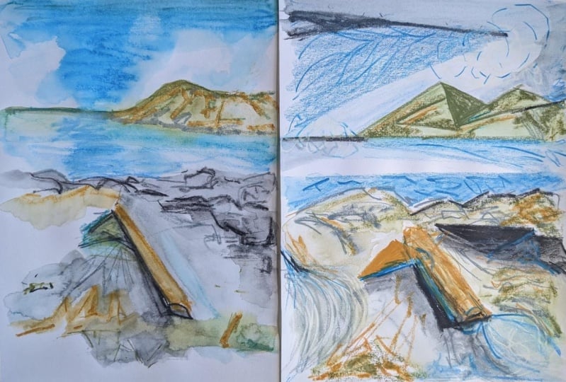
will help you. I will start with
something like this. Okay, so this is an
artwork that I made yesterday before I started
recording the class. It's just the whole
scene that I saw. But as you can see, it's in larger brushstrokes
and it's very abstract. Like even though it's abstract, there's a complete painting dictates the
complete photograph. And it's just like use large brush strokes
to denote everything. This was like the first screen. Then I need, before I
started abstracting, I kind of went into the details, a little bit of the detail
and try to understand what the landscape
is divided into. How will the sections, if this is though, if this is the part which is those rocks and
this is the water, how is the mountains? I kind of understood
this myself. A good idea is to first paint
how exactly you see it, but in bolder strokes. So I use these kind of brushes. I used a little larger brush
like this and I made it. So this is a really
good exercise in helping you understand
and breaking down chips. For you, it's very
tough to suddenly come down to something smallest disk. I will suggest you first make a painting of exactly
the photographs. But in larger and bigger ships, in larger, in single colors. And don't try to merge it. Like if you see, I have tried to keep the
colors separate. Do that, and don't care
about the final result, but care about how the process
and what you're doing. If you're understanding
what you're doing in terms of blockage of shapes,
understanding colors. Where is the light falling? How do you want to make
a particular shape? How can you change it? And then how can you
manipulate it in a way that it is still true to what
you want to portray. So once you're done with that, I would always go
for small pieces. Because when you're
working in small work, it happens quickly and
even if it gets boiled, you are not too
worried about it. Now. I'm just showing
you my work, okay? Okay. I'm just going to go
into a little bit of the parts if you see this
textured work, great. And I have used
mixed media cured. I have tried to
show the shape of that rock that I was
mentioning that this was harder of photograph force and this was the
focus of the rock. And then the orange and the yellows are just something
that I have exaggerated. The color. I have kept a bluish color even though there
was a brownish blue, I have made it more blue. And then there is obviously some manipulation on the text, on the external part of it. Then the splatters
because of the waves. This rock was much
more blue rocks. But the beach. This is the first run there. And this is one of
the most easy ones effect we can easily
see there would be, so we can easily see
the mountains people feeling this as the Skype. Only detailing that I have exaggeration I have
done is we've basically these parts of the yellow and orange just to bring out the
composition the opposites. Then the textural book
that I have added to this. Then this was the last one, which was basically
the mountain scape. And this guy, and I
really loved adding this whole texture of pencils. And then there's oil stick
that I have added here, again, a very textural piece. And I really enjoyed working in, I enjoy making these kind of
scribbling marks as well, but it's more intentional than it actually shows
on the big thing. Now, what do we do that
I'll make a big piece. This is the final one. This was a big piece
that I created and it was something that I was like I made this kind of like a culmination
of this whole project. And it's actually
the same photograph. So it's actually the smaller
version of this though, the constricted abstract
version of this. So like if you can see
what I really saw in that in on that photograph
is this Padlet, which was the shape. Then there was this v, which caught my attention. And then there was this
hints of yellow and orange that were coming through in the landscape that if
you only wanted to show. So I kind of exaggerated it. I've also shown some
textured rights, which are references
to the waves. And that's what I
completed my painting. Now, normally, I would not
explain my painting so much, but explaining my process has been very helpful
for me as well. So what I would generally
do as after making the, the studies, I would actually write down
what I have liked, so important to us,
what I have liked. And then kind of go in for
the final piece because the final piece is the culmination of everything
that you have used. And also it needs to be balanced in the form of
composition that it is. So that is about it. I hope this additional class
helped because I felt it was required to give perspective on how this work can be seen, on how it can be made better, or how it can also be used by
the person who's studying. So by you and me or
whoever is doing it. So I hope you'll enjoy it again, like I said, you can
use it for anything. You can do this
with a still-life, you can do it for Florida work or you can do it
for a human face. So I hope to keep teaching
these kind of videos, these kind of sessions
which are more different than the regular ones, and they focus more on the inner creative
and then replication. So hope you enjoyed the session and see
you in the next one.
 Pallavi Saxena, ARTIST | EDUCATOR | DESIGN