Transcripts
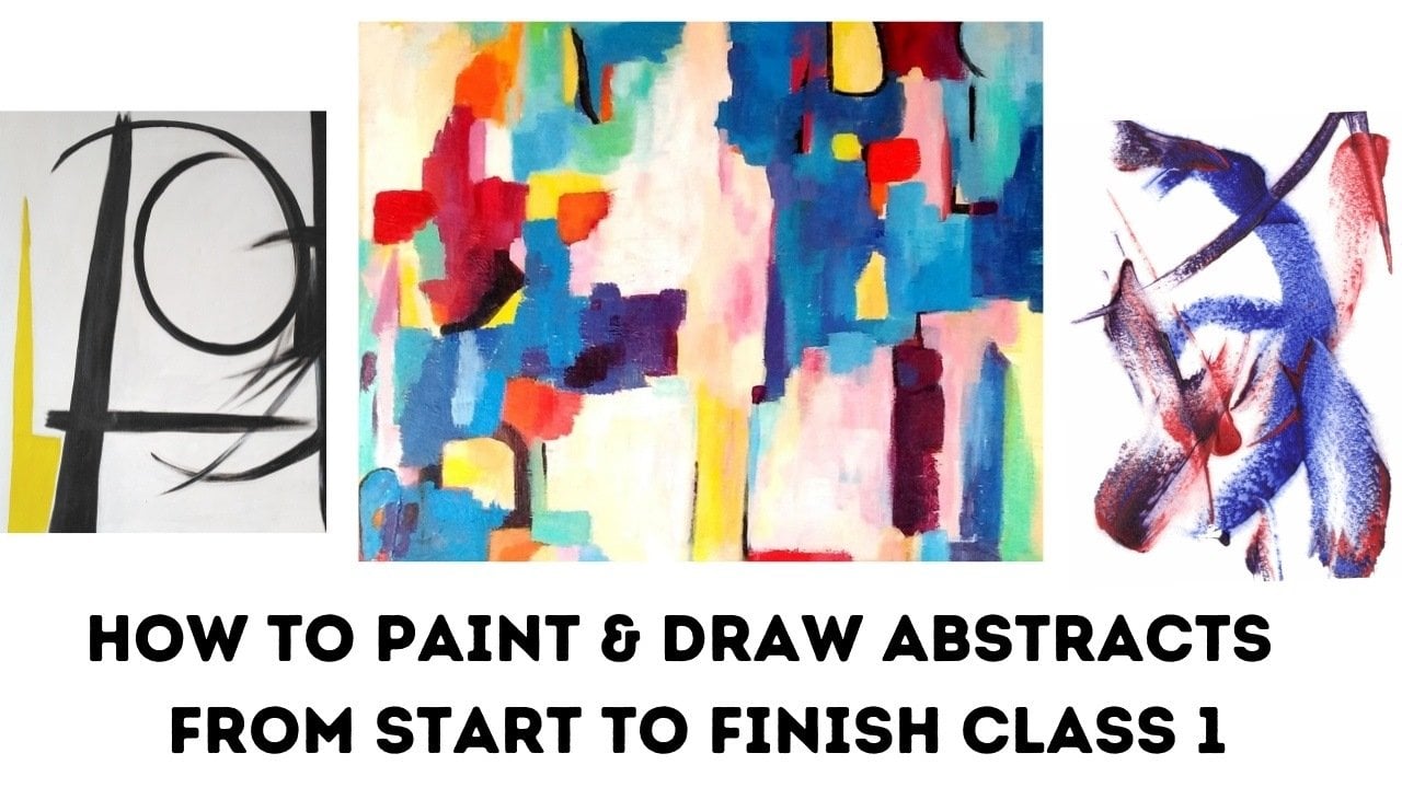
1. Introdution to Design, Values & Compostion: Welcome everybody, and I'm really excited to share
this new class with you. This class is going to be
about composition or design. How we design our painting, how we make it extra special. I'm going to be talking about composition, design, and value. Those are the two most
important things in a painting. Not necessarily the color. It's the design and the value. It's where your eye
goes to in a painting, what springs out to make it
different and have an impact. And if you put your design, your competition, and your
values together correctly, you're going to get really
fantastic paintings, which will make
all the difference in your understanding and knowledge of this when you look at paintings that
you've already done. And maybe sometimes you think, you know what, it
needs something extra, but I don't know what to do with what I'm going to teach
you through this class. It's going to help you
understand that better and know how you can put something extra into
those paintings that will bring it alive and make all the difference
in the world. We want to be happy and
feel satisfied with our painting and not look at
it thinking, you know what? I'm not sure what to do with it. I feel certain that by the time you've
finished doing this class, you'll have a real
understanding of what to do to make the difference
in those paintings. Now it's quite interesting
talking about differences. When we think about differences, It's all the things that
make us feel alive. And if we're going to a party, it's something that we
don't do every day. So when we go and
get excited and we get dressed up and we
go and it's great fun. A different event in a week if, if we're working and we've got the same old routine,
nothing stands out. But then when something does, it makes us feel great. It's her birthday. It only happens once a year, so it's different
to the other days. The same with Christmas and other events,
Thanksgiving or whatever. They're special times
in our life that we remember and break
up the routine. If you think about that in
relationship to your painting, you want to make
that painting feel different and it to stand out. So if somebody is
actually looking at it, they get an impact. They get a feeling of, Oh wow, that's amazing. That's really different. If we know how to use our
values and our design, it will make it different. So it will give it that
impact where somebody looking at your work will
know what to look out. They'll take a
journey around it. It'll inspire them and
you'll feel great. So we've got quite
a lot to cover. And I want you to get prepared to have some
fun to really elevate your understanding of
your work and to take it to another level to make it really exciting and different. So let's get started.
2. Why Compostion Design : So the first few things
that we're going to have a look at in this class. We've got basically
five key points that are important to remember. With design. Design is the arrangement of
your shapes in the areas in your painting where you put your shapes is important
for your design. So we're going to go into
that in a lot of depth. The second thing is
talking about your value. And the values, as you know, is the difference
between the light and the dark in Neil painting. The third thing is to
understand that your design and your value are the most important
things in the painting. That's what takes
your eye around. It catches those focal points. If the value and the design
are all very similar. If everything is the same value, the same shade, the painting isn't
going to be as interesting as it could be. So we're going to have
a look at how we can design the painting such that you go on a
journey around it. You often hear me
talk about having a journey in a painting. And this is what it's all about. It's where your eye goes, how you follow a
painting through itself. And the design and
the values are more important than
the actual color. You can have a look at a lot of black and white pictures that have fantastic design
and fantastic value. And it draws you in. So it's got nothing to do with
the color in that respect. We're going to talk about
value and color later. But what we're going to focus on is having a look
at how we can design and compose or composition of our picture to make
it really exciting. And then the, the
most important thing is, are those differences. As I was mentioning
to you before, differences in our life make us excited and stand out
there, standout events. And the same thing applies to
your painting, to your art. We want to make
something stand out. We want to make it different. So those are the key
points that we're going to be covering. And I'm going to show
you them what we'll need to be able to do that. But I just want to emphasize
those important things. The take-out from
what you're going to get in this, in this class. The things that you're
going to need really are a sketchbook because they're
going to be as references. So you can refer to them when you need to remind yourself. And some black and white paint, some black and white pencils. That's all you're
going to need to begin with to start this process. And I'm going to walk you
through it so you can see what we're what
we're going to do. So let me get those out and then we'll get
we'll get started.
3. Exploring Differences: So I'm starting off talking about what I mean
by differences. But before we
actually get to that, what I've done is I've
included a list of emotions. Because if we start to
understand how we want to express our emotions
in a painting, we get to understand how we
can use those as difference, differences in our painting. So you, you absolutely
know the differences. If I was to say e.g. here, just put a little dot. Okay. It's very controlled and it's
small and it is what it is. However, if I was
to do this here, that's completely
out of control. It's just, you know,
whatever it is. I could be feeling frustrated, angry, you know, hacked
off with things. And there's a great
difference between the dot and this area here. It could be such that I do
a little dark box here. It's different again. Or I could do a box that's empty which has got all of them have got
a different feeling. And I could just do dots around and they've
got another feeling. But see the difference. It's kinda becoming sort of interesting because I've
got so many differences. Now, if I was just to repeat this and repeat
this and repeat this, you're just looking
at the same things. But as this is, we've got an emotion, we've got a different
difference in feeling. From the little dot to
the random scribble, to the square filled inbox, to the empty box, to the dots. And it's interesting,
and it's different. It's rather surprising. What I want you to
think about is to do something that you
wouldn't normally do. Might be that you're
very detailed with your work and
everything's very precise and ordered and down to the
last perfection of the line. So in that case, I want you to jump
ship right onto the other scale and do
something that's crazy. Equally, if you're used
to doing something crazy, go into something a
little bit more detailed. Now, I'm going to
include in the downloads a list of all things
that are different. Obviously small to
large as obvious, dark to light is obvious, but I'm going to give you a really good list of
things that you can look at to give you that
idea of differences. So that kind of starts
us off with this idea of how you can make something
different in a painting. The tendency is, is that we tend to make things
the same size, and it's usually
the size of a fist. So you might put something down here and you might put
something over here. And you might put
something over here. And relatively they're
all the same size. They're different, granted, but they're
all the same size. We want to find something that's really different to go in that. So again, I could put
something over here, which is very different. I could put something
here that's different. Again, I could put something
here that's different. I could make one
of these smaller. So I can change this altogether. By filling that in. I could actually make this
one that much bigger. See how much more
interesting It's becoming. Because we've got
different sizes, different shapes, and
a different feeling. I could do something
crazy on it. These are just to
help you get a grasp of how you can make
something more interesting. Rather than just go
with the same size in each place that
it's kind of normal. The idea now is to make
it a bit more crazy. Now actually, when
we think about, about this idea of
design and values, which I'm going to
come to in a while. Designing value, makeup. Muscle man or so, give or take. 80 per cent of a painting. Interestingly enough,
color only makes up 20. Now, you might think that's
the other way round. But actually if you've got your design worked out properly, your eye will be focusing on the design and the value
rather than just the color. Now, could I make this
more interesting? Well, I could now at the moment, our eye is probably going
to the darkest bits. Remember dark against light. So obviously this one is a focal point
because it's very dark. Maybe then we come over to here, which again is very dark, so we need something
else that stuck. So even if I filled
in this dot here, your eye is going to
go here, isn't it? Now if we want to go
round and picture, then we've got to
find other places to make a different shape
and make a contrast, make a different design. So e.g. if we wanted to
bring the eye over here, maybe what I might do
adding something in here. Now, can you see how we're
moving to those places? Without even thinking about it. We're looking at the
contrast in places. Maybe I can do some things
to alter that down here. So you can see how we're
moving to those places. So maybe we want to do
something that brings our eye around the pain that the paper find something
more interesting here. We might do something up here, which again brings
our eye to that. So can you see we
started off with just all things being similar size and then
we've changed them. We've added some
different value to it. And our eyes are going to those reference points and
going round the picture. So the exercise for you
to experiment within your sketch book is maybe do something
that you normally do. If you're very neat and tidy, then do a dot. And then do something random. If you're normally random, then transfer it
to something else. What we're trying to do here, the aim is to bring out as
much of ourselves as possible. We want to express ourselves. How do we feel? Even just looking at that, this is a feeling. It's quite restrained, isn't it? There's a, there's a
feeling here of craziness. While we might put
some crazy in here, or here, we've balanced it up. It's not quite as much as that, and it's not quite
the same as that. But we've balanced it up. We might want to get
a little bit neater. So we might straight
in a line here. So it's very, very, very, very obviously straight. And we've got no rough edges. On the other hand, if we want to bring this in, we might ruffle up this edge. You see how interesting
it starts to become. If you want a little bit of calm and we want to just
soften things a little. We might desk port,
something common. That our eyes are still going
to our reference points. Design points. And these ones are
kind of secondary, aren't they were not
looking at those first. We're looking at these first. And that's the point. That's the very point. I want you to have a
little play yourself with some shapes and
do the opposite. If you just start off with
something and then see how similar are they and how different
could you make them. And have a go with that? And then we'll come
back to the next stage.
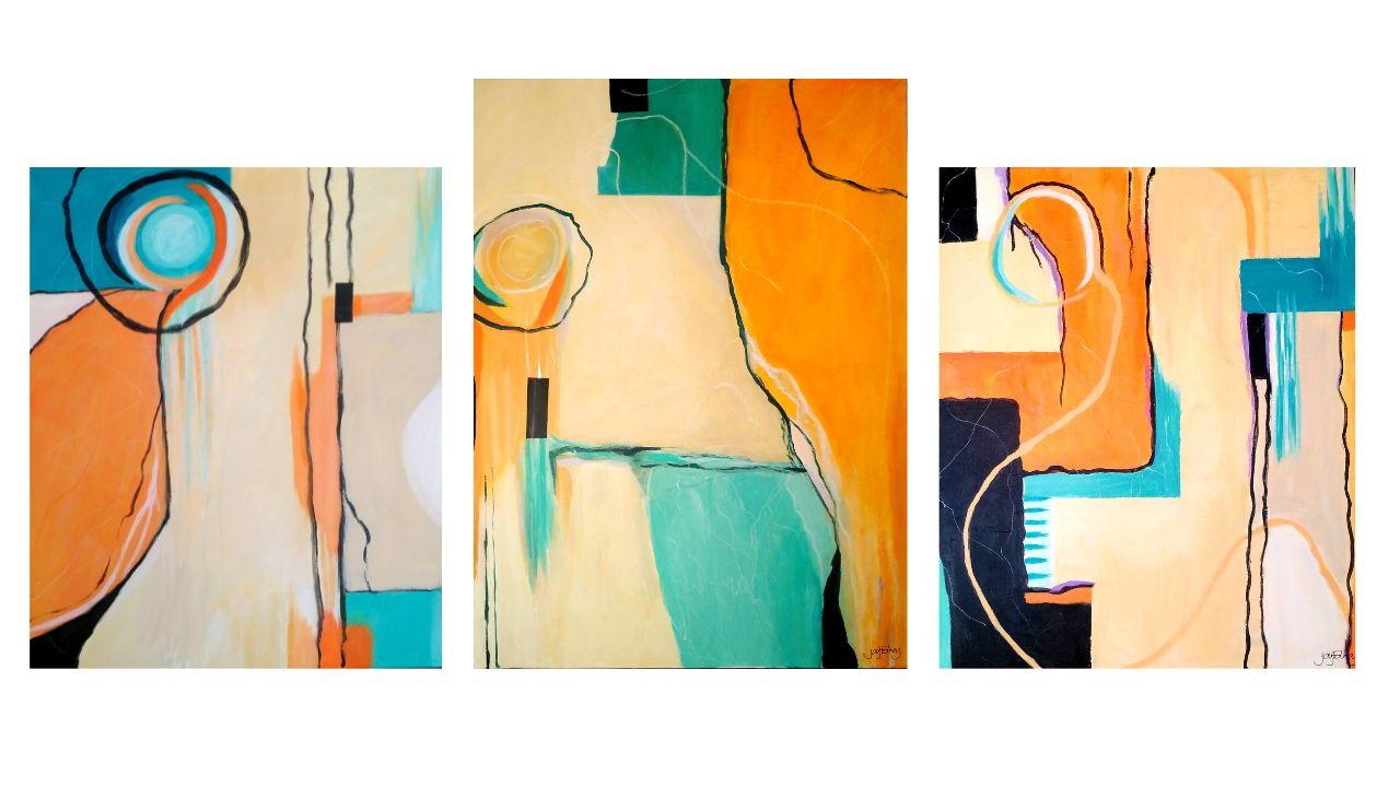
4. Design Painting Examples: I just want to show
you a few paintings that will explain this even more than I've been showing you. So say e.g. we take this
picture here of Salvador Dali. Now, the shapes are amazing. We're back to squares,
circles and triangles. But look how interesting it is. Look at the variation and the parts where your
eye is going to. What I want you to do is do a little journey
around this picture. Where are our biggest contrasts? So we can see a
really big contrast here coming off
to the side here. And it's taking us around to look at this lovely
little shape. None of the shapes
are the same size. Look at this one here. Again, our eyes coming to here. Look at the black line here that's bringing
us up to here. There's black around
the top here. So you can see all the
variation of those shapes, which makes this picture so interesting and you
get involved in it. That's the point. It's surprising. Now let's have a look
at this one here. This is a mirror. The three of them
are actually Miro. It's this one particularly
that struck me was this one. Now look at all the
variant shapes and hear from the very
small shapes here. Catching our eye. Very big shapes. Look at the lovely
contrast of color. They're all interesting shapes and they're different sizes. Even though this is quite big and this is quite
big, It's broken up. We come to eye hits here,
it's coming around. Look at the lovely
shapes in the face here. Coming round. Look at the shapes here in
these squares and the circle. And again, look how
different they are in size. Over here and over here. It hits a wonderful kind
of childlike painting. It draws us in. We get the excitement of it. And it's fascinating. And really you, you can
do yourself a great, great service of going
and looking at some of the masters who could
master this tremendously. And it gives you that idea. Now you will start to recognize
it when you're looking at paintings and also when
you're looking at your own. And we're going to have a
look at this a bit later. We maybe take a couple
of your paintings that you've done
that you feel you're not as happy with
as you could be. And see what you could do to create interests and
those differences. Now here's one of my favorites. Here is Kandinsky. Now look at this. Wonderful all the, all the ****. I mean, most of the
shapes are rectangular, but then you've
got this surprise here of this leaf shape. And you might not be able
to see it on camera, but there's a circle
underneath there. Which again breaks
up these blocks. But look when all
of those blocks are the same size, they're
all different. And you've got these
different angles of them. Look at this lovely
little shape up there. Your eye comes up here. It comes through here. Look at this lovely
shaped down here. So again, you've got that wonderful interests
and difference. This shape here,
the leaf shape is completely different to
all the other shapes. It gives it something magical. And then we have a
look at this one. If you can see it again, it's condensed skates
and it's small. But again, you've got the variance of the different
shapes from tiny little, very thin to very thick. And it's so interesting, we've got this
little one up here. Your eye can't fail, but go around that picture. I just wanted to really
validate what we're talking about to help you understand and see how
putting those kinds of differences into a
picture can spark it off. Can you imagine if
that wasn't there, it would still be interesting. But it wouldn't be
magnificently interesting. Soon as you've got
that, There you go. Oh, it stops. You, you think about it. And that's the point. We want somebody to stop and think about what we've painted. And then there's
an intro into it. So if you can go on Pinterest or take an
artists that you like, if you've got any books
or go on, on Google. And then just go and study a few of the paintings
and see what they've done for you to be able to jump out and see that
as a difference. And you'll have fun looking at it and then it will
make a big difference when you come back to actually doing your own pink picture. So we'll come back
with more in a minute.
5. Free Drawing and Design: Having looked at some
of those pictures now, we're going to refer back
to what we did again in the abstract Made Simple
course on our free drawing. And what I would like to do is to do some free drawing and
show you and then see how we can put
what we've been talking about in relationship to our design into
our free drawing. So I've just divided
my page into two. And again, I'm just
going to relax. I'm going to do something
just free and easy. That's it. Okay, hopefully
you can see that. Okay, now, I've got some nice
interesting shapes here. It's all the same, the same kind of line
and whatever Exactly. It's free drawing and
it's an interesting, nice design. I like it. But then how am I going
to actually compose this to make it even
more interesting? So just for the sake of this exercise to
show you a quicker, I'm going to darken some
areas so I want to be able to create something
that's really, um, that much more exciting. And I've got all these
different shapes. Some of them are similar in
size and some of them aren't. So let's change it up a bit
and see what we could do. So e.g. I've got this
lovely big shape here. So I could make some
outline on this shape here. I'm just going to
bring it to here. And then I've got a
shape in between, which is really nice to
have a look at this here. And I'm going to make
that darker immediately. Obviously, your eye
is going to go here. Now let's see what
else we can do. So I might just bring this
down and make something here. Obviously, you can play around with this as much as you like. I mean, it's so lovely
exercise to do, particularly because we're
doing our free drawing. How we can, how we
can change those up a little and make them very, very much more interesting. Now I want my eyes to go around. So maybe I cut this one here. Just take an area here. Maybe I'll put another line. So can you see how
our eye is going? So I'm just going to
have a look now and see how I'm feeling
about this drawing. And I really still want to do some more interesting things with it because some
of the lines are just really lovely and interesting. Excuse me. Maybe I can do something a little
bit smaller down here. I've got a little triangle here. I could actually make
the triangle bigger. Here. I am again, my eye is
going to those places. Let's make this a bit safer. You see how interesting
it's becoming. Just from that free drawing. I've got an interesting
design happening where we're following
through with our eye. We've got points, focal points, points of interests
and differences. Which is fascinating. I feel like doing
something here. And again, that's brought
another idea to it. What I'm saying is
it's kind of a face and like a bird's head, I'm just going to turn it round. So you can see that too. I hope you can see that. And I might carry on
doing it this way because it's a
different perspective. But you can see what's happening and how interesting
it's becoming. I get the feeling that I would
like to make this bigger. So I'm going to
bring it down here. It's very much bigger than everything else
that we've got going. And let's have a feel about. What else we could possibly do? I could just bring a line here. And I could have got
something from here, which is another
different kind of shape. I feel I could put
something in here. So it's kinda coming together
as a very interesting, sort of an interesting design about where
our eye is going, what we're looking at first, I could spend more
time developing that and see what
else I could do. And you know, the more that you do I do it with
this one this time, the more you do these
three drawings, the more interesting and
the more practice you get at doing this kind of design. So you're actually
seeing where things will go before you
even start to paint. So I'm just going to go
for it with this one. And it's wonderful. They're sort of like
live a bit like doodles. But you've got to, you've got an idea and a
structure to work from to to actually compose
your design it. I can do. Now, tell me what's
wrong with this. I wonder if you can say, isn't that size very
similar to that? Not a lot of difference
in size of these two. So maybe what I need
to do here is I need to extend this and fill
the whole thing in. Now see how different artists, it's definitely
different to this one. Now, obviously, we're just
looking at those two. So let's make some differences. Let's maybe put
adopting up here. Right? You can see what's happening. I'm going to this dot, as well as these
two shapes here. Now, Let's do something else. Let's say, okay, we've got all straight edges
and we've actually got all straight edges here. So we could do
something different on that as well as
different on this. So maybe I can do that. Maybe I can do this. See how different this
is two that we've got a nice contrast
of those two. Maybe over here. I put a dot there quite like that because we've got one that's open and
one that's closed. And this one's a little
bit bigger than that. We could rough this
up a little too, by perhaps something like that. Can you see how, when you start
thinking in this way, how you can really expand
what you've already done. Let's carry on with this
one a little bit more so you can see our
eyes going here, It's going here, It's going
here, It's going here. We've got this interesting thing going on in the background. Maybe we do something else. Maybe we do Something like that. So all these points are
points of reference, of points of interest, and they're all different. None of those have the same. None of this is the same. Let's balance it up, down here. They become fascinating. So have a play doing this
with your free drawing. When we go back to have a look
at say, that lovely Miro. It was a fun, childish
kind of drawing. Wasn't it? Interesting how that worked? What made it so interesting was the design where your eye goes, what you're looking
at, it has an impact. You would actually
look at that and say, oh, that's interesting. And using our creativity. And then we're using
our right side of the brains to start with
our left side of the brain. Secondly, to put in our design and we want to be able to
balance those two up. I don't know if you
remember me saying to you, but when you think about your
painting or your drawing, if you take a ruler on the
right side of the ruler, you've got creativity and on
the left you've got skill. And the idea is to try and bring those two things together so we still remain loose and creative and interesting
on the right side. But then we bring
the skill side in to make that something
really incredible, to really enhance
that creativity. And this certainly
is going to go a long way to help
you achieve that. Get this design
concept in your mind. You'll design and
then your values. I'm going to come onto
values in the next video, in the next lesson. But at the moment, just get to, get to grips with how you
can impact your design. I could, I'm looking
at this and I think I can do a lot more with that one. This one, I'm kind of liking it simple, but it's interesting. And I feel it's got an impact. And it's got those differences, which I really have
a go with that. And then in the next
video we're going to have a look at those values. Okay?
6. Free Painting Examples: Now it's time to have
a look at values. And we've talked about
this a little bit in the abstract, made some course. I want to really
embellish their small. And one of my favorite
paintings when we're talking about contrast and values and
design is this potassium, very famous painting, Guernica. And I've actually seen this in real life in the
Prado in Madrid. And it's like
unbelievably fantastic. But we'll have to just make
do with the book for today. So when you have a look at the design and
the contrast in here, It's essentially the
tone values between your grace and your
whites and blacks with lots of different
tones of grace. So if you get a chance to have a look at
this, just study it, to have a look how it's put together and see where
your eye is going. The difference
between the darks and the light, the contrast. And then subtle contrast. Just have a look around
and see where your eyes going at such a
dramatic painting and really expresses his
devastation at what happened in the Second
World War in Guernica, which is a story in itself. But you can really
feel the passion and the anger and the
angst and the 0, the trauma going on
in this picture. And it's all in black and white. So it's really worth
having a look at. So let's, let's get to
actually doing this ourselves. So hopefully you've already
got your gray scale. Put one in the downloads. But I would really, really, really, really, more really. I'm recommend that you do this yourself to get
to grips with how these tone values go from white to black and grading
all the way through. And we can use this with all
different kinds of thing. It's fantastic reference. If we're looking at a
painting and we want to see what tone is that? What tone is that?
What tone is that? We've got this as a reference, how dark it is, how light it is. So we can use this as
reference all the time. So you can download
it on the downloads, but actually even copy it and do your own and
experiment with it. I've talked about
it before and I'm absolutely not talk again. But it's kind of our
main go-to tool. This and the color wheel are your two things that you
really should not be without. Okay, so let's have
a go with this now. If we were just to let
me just take this, I should have gotten
Australian sorry. Let me get one of them
pictures that we were doing before on here. And again, if we have a look at these two
pictures that we did before, they're both very interesting. This one is, it's clearer. This one is shouting
out is a bit, isn't it? There's a lot going on. This one. There's some nice spaces
between the shapes between now. And I've mentioned it before. We want places of interest and
then we want quiet places. You could say, we want
loud conversations. And we want soft conversations on this one because it's
quite loud all over. There's not okay. We've got the spaces in-between, but it's very busy. There's lots going on on here. So I'm going to come
back to this later, but I'm going to show you how
we can do that with paint. And then I'll come back
to this and show you on this on this picture. So we're just going to need some black and
white paint. For now. I've got my gear
on my wet palette. So you can see I've got
that ready and I've got a brush with the black and
the black brush with white. And we're going to
just sort of play around and see now the purpose
of this is our design, competition and our values. And we really want to deep
dive into understanding this, because now we're going
to relate this to color. If you've got it in black
and white in your mind, then that transition
is going to be very much more straightforward than if you just went
straight into color, because then we've got values of color and daddy, daddy door. So let's have a look
at it in relationship to to just doing it
in black and white. Now, we could do both. I'm going to do
one with this with shapes and won a free draw. So you can again do the
same experiment and play. I'm just giving you examples. The point of this is
for you to go away and practice it and get to grips with how it works and how you can use that
in your own painting. I just want to kind of
give you a guide to help you really design
your paintings to get the most elevated
picture that you can and to enhance maybe pictures that
you've already done. So e.g. let me let me go here first
with just some shapes. I'm going to put just
a dot here in black. Right? Then maybe I
do a shape down here. So obviously we're
going to be looking, there's nothing else to look at. But it's interesting. And there's just
those two shapes. They're very different that
we're looking at differences. Let's do something
different over here. And then let's do
something different here. So we've got four shapes
and they're all different. They're all very strong. We're just looking here. We've started, we've started
making our painting. And then we want to have a think about what else
we're going to do. Where are we going
to go with this? So I could e.g. we want we want to set
everything down to start with. Let's make this one even bigger. Let's change that up and you get a different kind of
thing altogether. So that's a little
bit bigger than before And bit different. Let's do something. Let's do something with this. Okay, so those are very loud. Loud conversations. Could put just
something else here. Let's put something in here. At the moment is going
here, here, here, here. But we want to do
something interesting, but we don't want to
take away from that. So e.g. if I was then to decide to go a little
bit quieter on this, to put some things in between. We're still going to see this. Even if I did, was to do this, let's go actually a
little bit lighter on that similar shape. But you're not going
to be noticing it as much as the darker shape. Now, look what happens
if I was to do this quiet conversation that we've got the loud
conversation in the middle. Okay. Let's go even lighter. Because we can really do all kinds of
interesting things with different values and not take away from the
design of the picture. You see how interesting
this starts to become. I could go even lighter. I could put some light in here as a contrast next to that. Now it doesn't necessarily
matter so much then if our shapes are similar, because we're not looking
at those as much as we're looking at our focal points. Even this, It's interesting because we've got
two shapes similar, but we're looking at that
one that's just kind of like a shadow after it. I could then think
about doing something like he does get another pen. See this? Right? Now, what would happen if I
then got a different kind of line, very thin line. Again, it's interesting. It looks fascinating. I, I really like that. Let's go, let's go with
this white one here. And I could just
see if this is dry. I could do something
interesting. Here. Now, that changes
it, doesn't it? Our eye is going here. We've got a loud conversation, but we've also got some of
the white dots in it as well. I hope you can see that. I'll make them a
little bit bigger. Still a bit wet. Hey, I just want to wait
till that a bit drier. Let's, let's carry on doing
something interesting with the quiet
conversation here. So we could just
bring this around. And we can go over, you see, we can put
the design together. We can do all kinds of interesting things with
it, with the background. But we're still looking
at our focal points. We're still looking
at those differences. So we can, we can
really do a lot in a painting with looking at the quiet conversation and
the loud conversation. Let's go a bit darker. Now let's use this one.
Just got to black. And let's go for a midterm. If I was to bring
this over here. We've got the darkest ones. And we've got this one
which is around about six. We've got the lighter ones here. This is very light over to here. This one is about six as well. So we could do
something in-between. This is kind of a darker one. So let's do something here. So it's, it's quite strong. But it's not as
strong as the others, is that we could actually do something
else that's interesting. I hope the paint is going
to be where we can start actually doing some
things with some layers. I can take this over here. Right? Let's have a think. We can do something
here with this one. We're still not moving away
from our actual design. If I put something down here, it even brings our eye
through to here as well. So we can start really
experimenting with how we can use these contrasts and values to design a really
lovely picture. Now let's go to this. We've got a little bit more
variety, haven't way now. This one is up in the 78 area. That one about the same. So we've got all these
different values, but we're looking at our shape, but let's make the shapes a
little bit more interesting. Let me just get
another brush here. So if I'm looking, I feel that this
needs to be older. So let's make this
one a bit bigger. Okay? I think this one
could be stronger. Let's do something like this. Then. Bring it down a little bit. If I wanted to, I can highlight this. So I could put something
under hoping the paints dry. Some white into here. See how our eye. Now that becomes the
loud conversation. You see how interesting it is. So I hope you can have a play around with
this and see what happens. I'm going to do
something a little bit more interesting over here. I don't like these so much. I'm going to actually
bring it over. So we've got a layer over here. I'm going to layer it over here, here, and here, and here. It's fascinating. So we've got something
interesting going on. I love it when I'm displaying, you never know what's
going to happen. So that's actually specifically putting shapes in the place
without any free drawing. And Nino, dependent
on how you feel, will be dependent on
what shapes that you do. There's a sort of a various kind of feeling around this
paint, this painting. But you're definitely
knows where to go. It's going to here,
it's going to here, it's going to here, it's going to here, it's
going to here. So we're moving around. The quiet conversation
behind it. We know it's there, but it's not distracting
from our actual design. I mean, I can even just put
some other things in here. I could put some dots down here and have a look brighter. I can come over here
with something. So we're getting I hope you're getting what
I'm saying here. What maybe I might feel like
doing is that paint dry. I could actually
bring this down here. Take it over there.
7. Creating Different Shapes : Now I wanted to show
you something else. I'll do it on here
and then we'll come to a free drawing
with the other. Now what we could do this
is all kind of pieces of bits of shape
joining it together, seeing loud conversation
or focal points. And then how would the, the value we've got the others, but they're not shining
light on the picture. Let's do something. Again.
That's very different. Let's have a look here. And I just want to
show you something. If we do, say, Let's do something
very different here. So very bold here. Right? Now, where is your eye going? Well, at the moment, the greatest contrast
is here and here. So we want to do something
interesting with that. So let's have a play. And maybe what you could do is if you were to
take your kitchen roll, let, let's do something
a bit different. Let's do this. What might happen if we
were to roll it row? That's kind of interesting. How you can just play. What's going on here is I've got some nice little bits going on. We've got this
lovely texture here, but I'm still going as the
focal point to that line. However, Let's see what would
happen if we did this. Now. If we came here. Now we're going to hear, now we're going to hear. It starts to become interesting, but we've got this going on, but it's not a focal point, It's a quiet conversation. This is a loud conversation. This is the loud conversation. Now, let's change
this up a little bit. Let's see what would
happen if we did something like this in here. Immediately. We're going to there. So we all know we've
used the light. We're using the dark to
highlight the light. We're using the light
to highlight the dark. So it's fascinating, isn't it? So now let's do something
a little bit more here. Let's do something here. That knife here. I'm going to scrape this in. So it's different again. We've got a little bit
of texture going on. So we are going
round this picture already and it's
so, so, so simple. Let's try something else. Let's see if we
can set to white. If we were to do something. We want something up here. This is sorry, my
dogs are barking. What I was doing was saying, let's try something
different here. Now, see how we're going around the picture now we've got so many interesting differences. We've got this heavy blocked, but we've broken it up. We've got some points
of interests in there. And this is taking us round. We've got obviously a
big focal point here. Now let's do something here. We could do something again. That's a little bit different. Sabbath thing we could
do. We could do. Okay. So we've got the
quiet conversation, we've got a softer
conversation and we've got some movement taking
us around the picture, see how simple that is. And particularly
if you wanted to do something like landscapes. The same principles
apply whether it's with abstract
painting or whether it's with landscapes or portraits or whatever you
might like to do. Flowers. You still got to
have differences. You've still got to
have focal points to make the painting stand out. Look what happened here. Now if I just did this here, I've got the dark against it. So fascinating when
you have a play with this of things that can happen, I'd know what I want to do here. I'm just looking, I want
to make this lighter. It's dried off.
Simple little design, but it's very
effective, isn't it? So, have a real good
play with this. We're gonna do one
with a free drawing now and see what we
can come up with that.
8. Free Painting & Values: Okay, got these two here. Now, I'm going to see
some free drawing here. Okay? This is my first one. And, um, yeah, it's rather,
rather interesting. So let's have a look at
what we can do this with. Quiet conversation. Loud conversation. Why do I want the eye to go? So I'm going to first
of all take this. What's interesting to me
at first glance is that this shape and this shape are the same size more or
less as is this one. So we want to break that
up and make it different. So first of all, I'm going to, I'm going to fill
this one in here. Let's see what happens. So obviously that's
a nice focal point. Let's put a focal
point and down here, this is a different shape. Okay? This is a very
similar size to that. So what I'm going to do here, I'm going to make this
triangle a lot bigger. Because we want
those differences. And we want the
difference in shapes. We want the difference in size. So now you're kind of
thinking and assessing for yourself how that will
work in your picture. Still it needs to be more. I think that's taken
off the page here. Let's take it off
the page there. Let's go really vague here. Very different, which
is fascinating. Let's see what we could do here. It's not the same. Have a feel of what
might go here. Let's come around here. So we could do something. Okay, so we've got focal points. And now let's do the
quiet conversation and see what happens. Now, say e.g. I. Was to come in here. Even though it's the same
shape, similar size. If I was to put a quiet
conversation in here, it still doesn't take
away from shape here, Does it was still going there, even though that's a
little bit bigger. Let's try something over here. Let's divide this. Let's have some
straight line in here. That's different again. Even though this shape
is similar to that, if we do it in a quiet
color and the quiet tone, It's okay, it works. Now we can add some other
interests into this. So I've got these nice lines. I can still do
something with them. I'm going to see if I can
go a bit lighter here. Get rid of that and then
it will get lighter, too much gray in it. And then we could
go darker on this. See what would happen if we
went quite dark on that. On here. We're still going
to focus points. We've got this playing
in the background. And really how that works. We've got lots of possibilities
here to do what we like. Because our focal
points are here. Now I could change these
out over a bit because they look a little bit
static at the moment. So I could come round
and do something here. Could bring this down, bring this down
and come through. And interesting how that's,
that's really nice. Then I could do is just
start this out a little. And I will see the layer
of the black underneath, which is really nice. Let's have a look what
we could do here. We could bring this round here. And we could maybe put
something in here. Again, interestingly,
it's highlighting, can you see how we
can really go to town with some
fascinating designs? I want to go a little
bit darker in here. Let's put some more black
and see what happens. If you don't like it, you
can just paint it out. Let's put some dark,
darker in here. Nice contrast. Come all the way round. It's a nice tone that
it's not distracting. Okay? Now that lends itself
to doing something else, to balance something up. So we could put something here. And a bit of a different
shape. Let's come here. Let's come here. You see how it works. Let's put something
down here that's going to highlight dog. And we could go Come here. We could put some
things in here. We wanted to. But we're still going here,
here, here, here. This is from our free drawing. You can see how we
could build this up. I would like to let this dry
and then play with it with some other pain to my acrylic
pens and see what happens. Keeping our mind on our design. Here, I could feel my
switch on the switch. Let's go here. Yeah. Make a really nice
contrast next to this here. So I'm painting it all in, but it's not distracting from the actual design that we've
set up from a free drawing. So you've got different
options here. Yeah, it's kinda
quite fascinating. Let's put something in here. Layers, if this layer over here. Let's do something with going back to this
because this was nice. See what would happen if we
did something with this. I've got some paint on here. Let's do something
completely different. Put some paint on here. We don't want it all
kinda neat and tidy. Interesting textures arrive. Yeah, like that. I might do some more of that. So can you see how playing
this playing and having fun? Let's see what will happen if, what will happen if, if you've got that going? Let's just put some
different things on here. Then. You never know what might happen. I love it. It's becoming fascinating. We can go on and on
and on and do some, really can take
some of this out. We can leave some of it in. You know, we've got
some other kind of dots and things going on. This to me is to static. So let's do something
else with that. I'm going to take that piece
of code it's really worth. Now. Let's go to another piece. Fun, fun, fun. I'm going to put some black on here and just go over that. Let's see what will happen
if we were to do that. Yeah, that's great. That's kinda taken that
blockage and thus away. We could enhance that up here. Okay, Let's come back here. Let's go over one of these. Make a line here. We want some straight
lines. We want some. Let's do something here. We want something down here that's more, put something here. So you can keep playing
and playing and playing. But make sure I'm
over that little. So we've got a contrast of both. Yeah. Yeah. So play and play and play, see what you come up with. It's very exciting and very
interesting and really good. I know I keep saying
it's really good fun, but it is That's the thing. You know, there's, there's no, there's no rule and regulation. You can really do what
you want, how you feel. I might decide to
how with all this, I'm going to paint over
it and start again. But if you do that, you'll be amazed because
you'll still get something going from underneath. And that's absolutely fine. You know, to see just
what might happen if what might happen if in fact, I'm going to do that now. I'm just going to
get my tool and we'll have a look and see
what will happen with that. Okay, I've got my lovely
squeegee thing here. So what I'm going to do, I'm going to get my white paint. And I'm going to I'm
going to run it. Make sure it's okay. It'll come out, which it will. I know it will you will you will put something
down here. See. I'm okay with my squeegee. I'm going to take this I'm going to pull it
all the way over here. And I'm going to put it here. How interesting is that going to get rid of
the paint on here, not to waste it. I'm going to take a
bit more off here. I can take some more off here. I can take some more here. Isn't that great? You
see what you could do? I can do all kinds
of things with this. The pushing it
down quite firmly. Take that thing top here. Here. Okay, so we've got some amazing possibilities. It's taking that paint off here that we can do
to get our Contrast, get something
interesting happening. So we want now to get back to our lights and
darks and our design. We might take, let's
see what would happen if I take my knife. Can I get through to hear yeah, I can I can start doing some other things because I know that the dark underneath. So I can start to create
new drawings in this. And I can see what happens. Let's see if I was
to do my scraper. Again. Interesting things going on. I can come back to
it with some paint. I can put some paint in here. You see how you can just develop some amazing
pictures. Doing this. I love what's happening. It's really interesting. What's happening here. Like this here. We can just play and
play and play all day. I can get very
carried away here. Okay, so I hope that's given you some really good ideas of
how you can do this design. Where is your eye going
now, I'm looking at this. These two are the same. So I immediately want to
feel as if I need to change that so I can change
it in different ways. Let's change it to metal. Let's let's do
some more of that. Okay, That's better. I can go in really dark. Once it's dried, I can
make it much darker. See how my eyes
going up here now. We want something
darker over here. I like this shape
that's under here. I think I might have
to wait till it's dried because I'm just picking up paint
because it's so wet. It's kinda coming
together, isn't it? You can see what I'm getting at. And you can have a
play with this. Okay. Have fun, see what happens and put them in the
Facebook group. And I'd really, really like to see what
you've been doing. But most of all have some
fun with it and enjoy. I'll see you on the next video. We're going to do
some color with this on the next video. Okay.
9. Colour Value Scale Greys: In this lesson now
we're going to talk about value with color. Now It's very interesting. Subjects and people can tend to find it a
little bit confusing. So I want to really go into this in some depth
so you can really get a grasp of how you can
evaluate the value of color. Now, we come to our gray
tones or tone values 1-10. So the idea really
is to have a look at color and see what
value those colors are. So if I was to have a
look at this ocher, yellow ocher, and I come
to the gray scale of it. What value is it? It's round about eight
on my scale here. You can see that then
this is a Mars red. So if I come down to this one, what value is that? Well, it's really dark. So I'm 9-10. If I come to the yellow, this is really saturated yellow. Where is that? Well, again, I think
that's around about 6.7. If I come to the lighter yellow having mixed a little
bit of white with it, I'm more to 55 on here. So the exercise that we're
going to do is see for yourself how you can discern
the colors in values. Now you remember that
we did this one. We were looking obviously this black and
white and then the different values that
we got from here. So for the exercise, I'm just going to
turn this over here. I've drawn some grids here. And the exercise one is to
have a look at the colors. Do your colors, and then
have a look at the value. Now you can pick any two
colors that you like, but try and make one dark
and one a bit lighter. For my colors, what
I've chosen here is Payne's gray and
a yellow ocher. So the, the exercise
is very, very simple. Just draw yourself a couple of rectangles and then put a
line down one of the sides. So we're going to
evaluate what the, what the value will be. So I'm going to
take from the tube, so it's completely saturated. The Payne's gray, It's
a beautiful color. I love Payne's gray. You can make so many
different colors. So let's put the
Payne's gray in here. It's nearly black,
but it's not quite. And it's going to be kind of obvious where it's going to
go on the gray scale, on our tone value scale. When you go through
your own colors. Interesting to do this with
as many colors as possible. And I'm going to show you
different way of doing that. And to start to train your eye. Because really this is
about training our eye. The more you do it, the more you'll understand it. To begin with, you can be a
little bit confused with it. But the more you
practice, the more, the more astute you color sense will become to what
the values are. So it's kind of it looks
black, but it isn't. So if we were to come to
the value scale here, it's really
in-between those two. So 9.10. So what I'm going
to do and what I suggest you do is to then see if you can get that value
in the black and white. And it might take you
a little bit of time. But I'm going to mix
here some of the white. I'm not going to need too
much white because I'm going to have to use probably
a lot more black. So as I add the black here, it's not black, black, it's a very, very dark gray. So I'm going to use
this as a reference. And if you haven't done this already, then please, please, please do because
you'll find it so, so helpful in your painting. Get your interesting
contrasts and you're interesting tone
values in your contrast. And that's kind of
like the point. So I'm just coming over here to see a little bit
more black to that. And let's see if I
can get it here. Yeah, not bad. It's probably a little bit dark. So let's go back to a
little bit lighter. It takes a little
bit of time to work out with your color. The actual tone value. And you'd, you'd see
this if you took a black and white photograph
and you'll see your turns, talked about that before. So that is black with a
tiny little bit of gray. So you can see now that those two values are
the same, right? So now let's go to the opera, which is going to be more interesting to see
where the value is on the value scale with
the yellow och-re. Let me come here
to enter brushes. Let's put the ocher in here. And beautiful, saturated yellow ocher is such a fantastic color to mix with so many different things. So in choosing your colors, you might use the same. You might go different. Practice it with lots
of colors to see how you can start really
recognizing the value of it. As we've said before, the design and the value are essentially the most
important in the painting. The color comes later, but we need to know what the color values are
before we start that. So let's have a look
at this on our scale. So let's turn it this way. Where do we think this is? I would say it's about
it's about a seven. You see that? On my color, on my term
value color scale. So let's then start mixing that white with the
black to get that, to get that gray. So I'm going to add
a lot more white here and see if we
can we can get it. It's about a seven. Let's see how that is. Yeah, that's about right. So you beginning to
understand how this works in relationship to finding
the value of a color. All right? And if you practice this, you'd be amazed then
how you can find some really beautiful
harmony in your paintings. So that's our first exercise. And really have a go and
try and find just using two colors to start with the
value of those colors. Okay?
10. Colour Value Scale Colour: Let's go to the second exercise. What we're going to do in the second exercise
is we're going to look at how we change
the value through adding black and adding white. Now, what's the difference? The lightness when we
add white to the color, we're adding a tent. When we add black to the color, we're adding a shade. On this here I've drawn
out my little grid again, sorry, I put a line down that. Ignore that. So we're going to
go from light to dark with the Payne's gray. Now it's going to be
interesting because we've seen how dark that value
is of the Payne's gray. So it's going to be our side. It's going to be about here. So we're going to put that in. On this side. This is our actual Payne's gray. You can see it's
very dark already. So we're going to lighten it up then slowly adding the white. Now, we've done
quite a lot of this. If you've done the
color mixing course, you will see a lot of
things that we've done, but we didn't do it as specifically as
we're doing it here. And that's the point
I really want to deep dive into understanding
how this really works. So now with that saturated blue, Payne's gray, I'm going to
add little bit of white. Not very much. So easy to go to make
it lighter too quickly. Then we're going to have a
look here where that will go. Right? So let's
put that in here. So you can see, I hope the camera
subtle difference with just adding
the tint of white. Then we're going to safely, when we were at nine. And then this is seven, so we're going to add
a little bit more. Go to eight. It's very subtle. But you can see how you can get so many beautiful tones
by I'm adding the black, adding the white, and
finding the tone. It's a really, really
brilliant exercise to try. Let, let's try a little
bit more white M2 here. Let's come into here. It's light, it's still so on and so on and so on
until you get right to here. So I'm not going to go
through all this because it's fairly obvious
how this looks. I'm just going to take that off. I'm going to do is show
you then the lightest. So I'm taking pure white and adding a little bit of the gray. It's minute. So
I'll come to here. So it's nearly white
but not quite. Right. You can see how this works. If I was to mix black with that, I'm going to go a
really dark, dark. And you can see how
that will work. Then let's try it
now with the ocher. I'll just get this started
with the yellow ocher. So if we looked at
that, where are we? What tone are we here? I'd say we're about to seven. Okay. So let's come to here. Right? Line it up here. So we're a seven. So actually put the
opera into the seven. Right? So let's put this in here. So that's the actual color. Okay, so this time, let's go and add the dark to it. Because we added the
push this down a little. We added the light
to the other one. Just for the exercise. Let's add black to it so
we're creating shade. So I've got my okra here. I'm going to add
tiny bit of black. And you'll start seeing that
you'll get a lovely rich. I'm gonna move this along
because this is number seven. So we're making it a
little bit darker. Maybe that's too dark. Can you see Possibly, Let's see. Might well-known. No, actually it's ok. So you can see that it's really a very worthwhile practice. And you can have a lot of
fun with it because it really broadens
your idea of color. Now let's add a little
bit more black to this. I'm going to go really dark. It's getting there. Oh, that's beautiful,
rich green. This is adding shade. Now you can see, if I wanted then say I've
got the yellow ocher here. And I want you to
do is shade of it. I'm just going to
add some black. It's so simple. Once you really understand this, you really get how this works. Then let me add a
little bit more black or really dark here. Put this one in here. And that's really a very warm black because you've got
the ocher in it. Okay. Then obviously the same
thing if we did the light. So let's have a
look at that rather than me go through
the whole thing. They hear. You add a
little bit of white, a little bit more white
cow and carry on, carry on, carry on. Til you get to the end here. Let's just clean this
off so we haven't got any of the dark
cognitive tool. I'm going to take my
white tiny bit of okra and come to the light here. The lighter than that actually. See, you just have to
play to get it right. That would probably be a two. We want to go to a one. Yeah, that's better. Okay. So that is tinting. And adding the black
is adding the shade. Okay? So if I wanted to
carry on with that, I can go whichever way I want
and just add a little bit more and a beautiful color. I try these as much as
possible to really familiarize yourself with how the
values relate to color. And then when you come to do whatever design
you want to do, you've got some subtle
changes in your values. Then if you put a dark value
next to a light value, you're going to really
lift a painting up. Hope you found that helpful. And I'd spend a
little bit of time on this and have an experiment
with different colors. And we're going to come
back and have a look. Now how we can see our values with using the limited palette that we're going to
use for painting. Okay?
11. Colour Contrast and Values: So what I've done here, I've divided my page into two. I've just put some tape
down the middle so we can have a play with the colors. And I'm emphasizing play, right? We want to find are designed
to what we want to do. And then see how we can use
all that we've learned about our values in making our differences and making
the design in our painting. So I've, I've got just
this, the same palette, the Payne's gray and yellow
ocher and black and white. So I'm just literally
going to play, I don't know what's
going to happen. I just want to explore
the possibilities and C, so I could do a free drawing. I could do some of it free, and I could do some
of it as a shape. This is fun and play. We've got I love, I love how that's working. Let's put something up here. Now let's if this is all dark, I want to start with dark and then build it up and
then see what happens. So let's go saturated color. So I'm using the op
crow just as it is. And let's put something here. And this is what we call
a loud conversation. We can really see it. It's really standing out. Let's make our okra
With the blue. We're going to go
kinda greening. So let's put
something down here. Let's put something here. Okay. Now that's not to say we're
not going to go over it. But we're just kinda
starting off with some ideas and using our saturated
color to see what happens. Now, let's then
explore the mid tones. Using the white with the blue. Let's see what happens. If we come here. Now, the contrast isn't massive. Who is it? It's not brilliantly. Let's have a look what's
going on with that. Whereas this one, There's a really nice contrast
of both of them. So let's have a
play around with it now and see where we might go. It just kept another one
to a smaller brush here. So I'm going to go to
a soft conversation, something that's just subtle. In the background. You can see how this might work. It's kind of enhancing
what I've got. And interesting. Let's come much, much lighter. E.g. I don't really
like this very much. So I'm going to do
something here. I'm going to just make it a
little bit more interesting. Let's see what
might happen here. I'm still keeping
this nice shape. And let's go add a bit of
yellow, green to here. Where is my I going? I'm still going to hear I'm actually going here
because we've got a, a really loud conversation
on top of that. I'm going to here, I'm going to here now what
do I notice about this? This is the same as this. So what do I want to change? I want to change this. So let's do something
completely different here. Let's go much lighter over here. I might take it
right the way down. Completely changes it. We've got some different ideas
that we can do with using our saturated color and
different tone values and see what happens. Now let's go shift it from here, because we've got quite a lot of the ocher with the white. Let's go really pale on the blue and see what
happens with that. I'm taking my white again. And I'm just going to go really, really pale on the blue. And it's soft, subtle. I can do an awful lot
with this because. The soft conversation. Let's do something down here. Let's come right across here. I come right across here. Let's see. I can keep going. I can change the design, but I want to always
have in mind where am I, I is going and the values and
the contrast of the color. Not much contrast
going on in here, and it looks pretty dead to me. So I'm going to let that dry and then we'll come
come back to him. This again is not looking great. I'm still a little bit wet. Let's do something here. We're just building up and
building up that we're looking at where
our eye is going. What we can do, Let's go into here. Let's have something a
little bit darker down here. Not too much. Do something down here. We could balance it out up here. And we've got this here. Let's do something here. Something here. So we can do an awful
lot of things and with this combination
and see what happens. So then let's do
something completely different on this side. So say e.g. I. Here. I'm going to do something here. Obviously our words are I
going it obviously going to go to the edges of this one is a bit
defendants might get sick. And then let's do something. Yeah. Just really doing big shapes. Now, obviously our
strength is still here, but we're adding in here. And let's go a bit darker
with the okra up here. Okay? So we've got
some contrasts. This is obviously
the main contrast. So let's do something with this. Why is it? Okay? Let's compare. Use a bigger brush. And let's put these over here. Something a bit different
because we want differences to see
what will happen. So I'm going to take the blue. I'm going to mix the blue
with a bit of black. And I'm going to come. Obviously that's very
different to here. It's very different to
everything else that I've got. And if I was then to
do something similar, here works because
it's a different, it's a different tone, but it kind of starts
to look interesting. Then if we put something really contrasting next to the dog, I could come here, can add some interests. So we kind of building up an interesting design
with our shapes and seeing how this will work for our design
and our saturation. Right? That's all
kind of like shame. So let's do something different. Let's come in and do
some of the blue. Blue. And we could do something
here, something here. And let's put something
really dark here. We've got some nice contrast. So eye's going to those places, see something
different than here. See how that can come together. Suddenly you get in some
really interesting designs. I just want to do
something here. Okay? You see where I'm going
with this I could fill then some of the background
with very quiet conversation, but I've got some
loud things going on. We could make this more interesting by going
really dark on that. I'm going to add
some black to blue. And I'm going to put some here. We can do all kinds
of interesting things with the knowledge of what kind of colors
that we can get, I can do all kinds of
subtle colors now in the background to give
the painting extra depth. This is kind of soft here. Let's do this here. But if it's kinda interesting, gray, I can start putting
some different things in. If I want to. Then I could have say
something like this brush. This one needs something here. Put something over here. Do all kinds of things that
will make differences. With this black. Like that. We've got some
different textures. Let's do something different
with this because we can play play, play, play, play. See what happens.
Just having a look at contrast and differences. Contrast and differences. Because the contrast
with color and differences with shapes and
differences with color. So you picking up on your values and the
color is secondary, you want to see where
our eye is going. What are you looking at here is fascinating when we start
looking at it in that way. And you just need to play and explore and see what happens. Paint over it started
again, do something else. We've been looking at
that the longer way, different tools and
different textures. But understanding your
values in your color. When you take your child out, have a look where your control
so your darks to lights. You don't steal your midterms. This probably needs
some lighter here. I can already see that needs
something very much lighter. Going on. It's not light enough. Make it even lighter. Let it dry this, take this paint off here
so not contaminating it. And let's go to here, which is a lot more white
in a lot more white. And something down here. I can do quite a lot
of different things. And it's going to enhance, but doesn't take away from the design here and
do something here. Come up through here if I want numerous amount of things
to make it interesting. And you'll have fun with it. So I can carry on
playing here all day. And I hope you I hope you
got the gist of what I'm, what I'm talking about, and how you can use the tone values of
your colors to create some very interesting
paintings with the design and make
the design really pop. So next one we're
going to actually do a picture and really have a play with now
we've played with this, we're going to go
on to the next one and see what happens with that.
12. Discover Your Colour Palette: Okay, so once you've
filled all this in, you now got an idea, the color palette
that you using, whatever colors you're using, how many darks and lights
you can get on both colors. Now let's have a look now
we did a little bit of this with the color mixing, but it's interesting when you're starting a painting and
you deciding on a pallet, you get to know what
your palate can do and you can try this with
as many colors you like. But I'm going to just
try it with a limited, this limited palette of the Payne's gray and the outcrop to see how many different
colors I can get from it. Then when you actually
come to do the painting, you've got a reference
of what you're mixing to get what tones and colors from just
those two colors and a black and white. So if I was just
to start this very simply by saying
I'm going to add, this is just the Payne's gray. So if I was to add then some
white to the Payne's gray. I'm looking at here. But just for the sake of it, let's put it here. Okay. And then if I was
to add some yellow, some okra, what would happen? Okay, I'm getting a
beautiful green here. If I was to add some
more awkward to it, I'm going to go a
little bit lighter. So I'm exploring my
possibilities for my painting by doing all these
fun little things to see what might happen, then what would happen if I
added some white to that. I've got a beautiful
olive green. If I was to add a
little bit of black to that. Don't want much. I've got a lovely
gray, gray green. See. If you've done the color mixing, you will have explored this. But I really suggest that
before you start a painting, when you've decided on the
colors that you want to use. So you've got an idea, experiment with them to see
how far you can take it. Now let's see what
would happen if I just did annotate this off. If I did the yellow, just the yellow ocher. Let's put that here. And the blue together. Well, we know that we're
going to get a green because it's yellow and blue. But a bit more. This is more or less 5050, perhaps not quite
a bit more blue, go a bit darker green. So you can see how many beautiful
colors you can make from just your
small palette. So I could go darker and darker. I mean, I'm adding shade really because the
blue is so dark. I'm actually added any
black here that you can see how just keeping, adding blue, the
beautiful tones of green. While it's lovely. Then if I added some white
to that, what would happen? Obviously, I'm going
a lighter green. Let's come back here. That's gone a little
bit different. You probably can't
see the subtlety of that on the camera, but I can see it here. So I'm going to add
some more white. And I'm getting some
beautiful gray, very warm gray because
you've got the yellow as a base and more white. And obviously it's going to increase the tent because
we're adding white. So, you know, making a painting from these
beautiful colors, you'll find that
you're doing something completely different that
you've never done before. And it expands your
whole palette and, and, and, and
painting possibility. Because you've used all
these different tones and needs different tints
and shades from jest, in this case two colors. Now what would happen
say with this one? Then if I was to add
a lot more yellow, Let's see where
that might take us. It's going to be very warm
gray and it had a bit more. You can see how beautiful
it can turn out. Then obviously we could
go to like we did here. Adding the light, the
white to the outcrop, all those beautiful tens. So let me get
another tissue here. And adding white is
going to be tinting. It gives us contrast
to the shade. So let's come to here. To here, adding
some white to this. This will be white. And again, you see, you would put, I'm
going to show you. So you want a nice
contrast in your painting. If you have this, even to be in
harmony with itself. If I was to take the blue, added a tiny little bit
of the opera. Alright. I put it next to here. Harmonize, but there's
a beautiful contrast. Get what I mean. So in doing this exercise, you can find your
contrasting colors and your values by adding the white and the black or adding more of one
color to the other. And you'll develop a
whole beautiful range of tone values in your painting. By doing this, It's
very exciting. Obviously, we could add other
colors if we wanted to. I could go right to
the opposite and add different tones of red because that's our complimentary
color to the green. Then you can again try out all the different combinations you can get from using the red. And you'll find your
amazed with what you can achieve with just using this method and using your
values making differences. I could come back
onto this side. Let's say I want it to have a different contrast
using the same colors. I could go to this gray here. I've got another
interesting contrast. Not quite as much as that, but nevertheless interesting
too that you put it up here. It's subtle. Your understanding, I hope you know what
I'm doing to show you how you can really
expand and create some beautiful tones in your painting and
those differences. So let's put this
into practice now. Now we've done the
central exercises. I hope that that will show you all your different
possibilities and options with a very
limited palette using your tone values. Don't forget this. Where do these
come on the chart? So if I got contrasts here, obviously on these two, they're a great
contrast on this one. There isn't so much. I might want to
add something else here to give that
a real sparkle. Let's have a go and see
what happens. Okay.
13. Beginning the Painting: So I'm getting prepared now
for the do it on the canvas. I just wanted to show you
that I've got my tools ready, all the things I
think I might use, I don't know whether
I'll use all of them, but the whole point
is to be prepared. I've got my sponges, I've got palette knife, I got some scrapers. I've got a lovely rubber brush
here which I love using. And I've got different
sized brushes, whole collection of
different brushes. These are my favorites. So get prepared. I've also got my palette ready. Again, I'm going to be
using limited palette. I'm using cadmium
orange, primary blue, yellow ocher, black, and white. So I'm going to keep it simple. I've been just playing
with some designs and I've just done
a simple drawing, just free hand to
see where I might go and have a play and
see where it takes us. So again, you can do some sketches of what
you might like to do. Take some ideas from some of the things that
you've done with your play. I love doing sketches and just sort of singing and
playing around with them, seeing where it might go. Okay, So really this is
about creating our design. So we're going to
start and we're going to let it develop to see where our design and
our values are going to be. Different values of
very opaque paint, more translucent, the
contrast of the colors. So let's get started
and see where we go. Now one of my favorite things to do when I'm painting is two. So it's quick and it
doesn't take too long, is to use a sponge. So I'm going to
just put a bit of white on here and
a bit of opera. And it's going to mix together
on the, on the canvas. What I might start off with doing is just giving it a spray, just dampen it down a bit
and absorbs much quicker. And maybe just go over that with another
sponge, wet it down. It's much easier to do. So let's get started. I've got this on here. It's going to mix, well, give us a nice very,
very quick covering. Which is what I love to do. Because it's so
quick and easy done and it doesn't take
too long to dry. Decide about your palette, what colors you're
going to use again, do an experiment, see how they will make and go from there. Now, it's still
obviously very wet. I'm going to add little
bit more white to this. I want to put a little bit
more white in congest really, it's sort of like glazing it. An undercoat, as it were, gives it some nice
textures and lifts it up. See where we would go with. Again, it gets you in the flow. Is kind of interesting. Okay? There we go. That's a nice beginning. So now I'm going to put
some actual paint on. And I'm really sort of
start developing my idea for my design and
using the colors. These are first layers and
it can always be changed. And so I'm never worried
about that at all really. So if I was to start, I'm going to actually
start with some of the orange, with some white. I'll build this up as I go. So I'm going to bring
this down here. It's just lovely to to
just let the paint flow. And because it's
still quite wet, it's going to move
really easily. So I've got this
lovely color here. Just for the. Because I've got the color, I want to kind of balance it up. So I'm going to bring
a bit down here. Now, the color of
this might change, but it's just going to give me an outline of where the
color would like to go. I'm also thinking that I'm going to bring some
color in here. So you can see I'm just
relating the thing flow. Blend it out a little. So it started. Now. I want to now have some
contrast going on here. So I'm going to go darker. So I'm going to add
some more orange. This time I'm going to mix a
little bit of ocher with it. Just so I changed the tone. I'm also going to add
a touch of black. There's a contrast
again, it might change, but at the moment, that's really dark
against there. So that it's a nice beginning because it gives
me a foundation. So I'm going to bring
this down here. Nice contrast between the two. Straighten that up a bit. Okay. Then I'm going to
be having a look at where I can put my
first focal point. I'm looking here and deciding
where that might go. So i'm I'm feeling that it would first of all, take some of that off. I'm going to put some down here. So immediately my
eye is going to this corner with that shape. And then I feel I'd like
to do something over here. So I'm going to put different kind of shape because again, we
want differences. So bring this over here. You can see how that's
kinda set already for our, for our eye to go
from here to here. So we want it to go round. So I'm going to need which
I might just put in later. But you can see how that works, how that would work. Now then I'm going to
come now to doing some, maybe some blue into here, some different soft blues. So I'm coming over to here, put some of this and that
lovely blue and white in more. Now that's kind of very bright. So I'm going to lower it
down with a bit of a black. See how that's toned it down
a little bit more white. And again, we can change this. Where do I feel that
would like to go? So I'm going to
bring it in here. Lovely contrast to the color. Now what I like to do
is blend that out. As we go. I'm going to start adding a little bit
of white in here so I can blend it into color, so I don't want it just flat. So it's going to go lighter
and lighter as I go. I might change brushes so I can really get to the
light a bit into here. I'm going to come into
here with the white. And then I'm going to blend. So I've got some nice
contrast and different, uh, different textures Going on. Bring it around to here. It's kind of quite
interesting at the moment. And then I want to
balance it up here. So I'm going to do
just something, just something around here. This might change that kinda, kinda like that idea. Then I'm going to come
really softer up here. So a lot more whites still with a tiny bit of the blue,
but not very much. Just attempt with the white. Again, we're looking
at contrasts and where the eye will go. We want our focal points
and then our quiet areas. So you see that softened
it down tremendously. Now we've got a lot of
background stuff that's empty. So let's have a
think about how we can bring some of that together. So I'm loving this color
that she's just very, very, very, very
soft with the blue. So let's kind of enhance that. I'm going to put some down here. A little bit more blue with it. It out. Really nice feel to it. And then detailed to the white. And then blend it out a
little bit to the okra. So it's not just
all a flat surface. And you know, he wants it to be interesting and intriguing. Then I might just bring
up a very light blue, maybe just great down a little bit more to
bring you in here. So we've got some
different values going on, really coming together slowly. Let's have a look here now, what we could do down here, again, I'm going to
come back to the blue. And I'm going to go darker blue. Let's see how that will work. If I was to bring
that down here. You can see the
difference in the values, the darks against the light and then this is very contrasting. But it's both. It's dark. And I got an
interesting shape here. So yeah, it's kinda
coming together. Let's have a look what
we'll put down here. I think we'll go back
to the very light, blue, very, very, very light
and bring that in here. So we've got some
interesting turns going on. Might change that. Not sure it's enough. But there's a kind
of a nice start. And it gets his going out here. Just a little bit. Here's bit of texture going on. And the texture's
nice. Coat the black. But actually, you know, it's kinda causes an interests. And I love this kind of kind of happy accidents because it
leads you to somewhere else. I'm going to let that
dry and then I'm going to come back to it
and we'll carry on.
14. Building Up The Layers: So I'm going to
carry on with this. I'm going to put a
little bit of music on and so I can concentrate. And then I'll do, I'll tell you as we go what we're up to. So you can see that I'm developing the
layers and looking at the different tone values and contrast,
creating the shapes. We've talked, talked
about that quite a lot. And I'm keeping the
balance of the painting. So the darks coming
up here a little. So the eye needs to be
going round the painting. And which I've talked
about so much. But it's so important
when you're at this stage of your own painting is
to be having a look, you know, where
you're going with it, and what is standing out. What is your statement? And what do you want
people to have a look at? So what's kind of interesting
about this design are these various focal points where you've got
the sharpness of the shapes and then
the software area, which is a transition. Now what I'm doing here then is obviously adding
more focal point and adding more difference. And you'll see as I go
how that will play out. It's sort of keeping you
involved in the painting. So always sort of adding extra dynamic points of
interests, focal points. So these are the
things to be thinking about when you're doing
your own painting. You want those contrasts
in order to make it fascinating to move around. If it's all one thing, it's difficult to get the
right feeling from it. So when you're actually
putting your design together, see if you can really have
a look at those variations. Variations. You know what we've
been talking about? The differences, the town
values, the contrasts. So you've got stopping
points and quiet points, focal points and soft points to keep you involved
in the picture. And that's the main
point about it. So I'm just going to carry on and see where it's
going to develop. I'm sure it will make
some changes as we go. But just so you are aware of where you're
looking at the picture, it's interesting here
what I'm doing now is I'm balancing it up with
the contrast of the black. I'll actually go on and
increase that a little. But look at the balance, see how your color is, see how the shapes are, how they're relating
to each other. And, um, as you, as you go so you
get a feel of it, um, as you're progressing
through your own painting. So I'm just going to carry on and I'll come
back to you later. Okay? Okay. You can see how the
painting is progressing. And I've made a few changes, which is, which always happens. I mean, the painting tells
you where it wants to go to. And you can go with
the flow with it. You can see the
different tones and different contrasting colors
and how this works together, the soft areas and
the strong areas. And then you're adding some
details and extra interest. And it's fascinating really when you're doing this
with the painting, you're so involved with it. It's a wonderful feeling. And it's difficult
to explain because you're in the zone when you're
doing it and it kind of tells you do this and do that. So you can see here a little, or you did see they're
a little bit on the close-up, some
extra details. And in the next video, I'm going to show you
how you can really add those extra details which can make all the difference
to a painting. You might think it's finished. But just adding some
extra final touches can really enhance what
you've already done. So I like that shape there. It's kind of
balancing the circle. And that sort of came to me that that would be an
interesting thing to do. And I think that's
worked really well with a similar color,
slightly different tone. But you'll see then on the next video where
we're going to take it to really finish it, and to then have the final painting
and what you'll be able to do with your
painting. Okay.
15. Finishing Touches: We've got this far with it now. Let me just turn it around
so you can see it that way. Interesting with
the composition. And you might say it's finished. But what I would say is now it needs loosening up
and tightening up. So how are we going to do that? And looking again at the design and the textures and the values and all
that kind of thing. So the first thing
that I feel the tide like to do is just change
some of the texture a bit. Now, how I'm going to do that is I'm going to
do that with a sponge. And it's sort of like
a glazing really. So I'm going to just
do a little bit. What I did when
we first started. That is do a little bit of
glazing and with a sponge. So just very gently, I'm going to just get some other textures
happening with it. So it's not, it's not too flat. And it adds some difference
to the overall thing. So I'm not sure whether
you can see that. Clearly. I'll do close-up a bit later. But it's just giving us a
little bit more interests of the texture. And a glaze over the, over the color. Blended it. It softens it at the same time. That's kind of
interesting how it works. To do the glazing. I kinda like that field. I might also do a little
bit of that down here. Not much. Just a little, maybe a
touch more white on that. Now I've got a very damped
sponge and I've just got a tiny little bit
of the paint on it, so it's not going
to be too much. It just says it's going to add a little bit more interests. We'll just kind of
soften some of it, learning some of the N. And the kind of given
it a bit more depth. Because all this,
this can quite flat. And we want some variation. We want those contrasts, we want the differences. So I've done that over here. So I'm going to change the
sponge and go to another one. I'm going to do something
similar on the blue. Not too much, but
just a little too. And change it up slightly. Might work. It might not, it doesn't matter. But it's just gives it a
little bit of extra texture. Difference. Yeah, that's better. Doesn't look so flat. Just glazing over
very, very softly. I'm hardly touching the canvas. It just adds something
a bit different to him. And I might do the
same over here. Just for interest sake. Okay? So that just gives us a
little bit more depths. We might even consider doing a little bit of that
with the orange. So not very much. Just using the other
side of the sponge here. Don't want it too much. Yeah, that's lovely. That looks much nicer. Just takes away the flatness. And that's interesting.
How's that work? Do a little bit over here. Okay, so that's number one. Number two, what we've got
to think about is edges, straight edges, soft edges, and these edges here, but they're a little bit wonky, so I don't want to straighten
those up into bits. So what I'm going
to do with that is I have quite a
few acrylic pens and I've also got some pencils. You can basically use
what you would like. This is just a
black acrylic pen. So what I'm going to do here. Is get a very straight line because it's a contrast
to the non-straight line. So I'm just going to
put this in here. And you'll see the difference. See how, again, it's a focal
point, It's very strong. So we can do that. Obviously you paint,
but I like to do it sometimes with pen
because it's a bit easier. I'm going to do another one here to make this very straight. And adds to the, it adds to the contrast of the wobbly lines
and the straight line. So it's adding interests. And I really like that. Now, most have got the pen. I can actually define some more of the
edges if I want to. Just a little. I don't want them straight. These are one needs
to be wobbly. And it's kind of interesting because when you
see it like this, you wonder how on earth did you get such a thin line
with the brush? Well, it's very difficult
to do it with a brush. So it's much easier to do. And it just kinda defines this. It's nice because you've got the harsh line and then
the soft line underneath. I might just do the same here. You have to keep taking the
time to get the ink working. So I'm just going to come
down here just gently. I don't want anything too harsh, but it just defines
it and little. And it's all these
little extras that make a difference to a painting
and finishes it off. So you can see that's a
little bit more defined. Now, Let's have a
look over here. I'm not really happy
with how that's working. So I'm going to go back
actually with paint and I'm just define that better. So again, I can do that using a ruler or
whatever you want to use. So I can get a really
straight edge. And it's so much, when you're looking at
contrast between the edges, it makes a difference. The soft lines and you've got the harsh lines off carefully. You can see it's a focal point. And our eyes kind of
going round here. And that's the point, really. That's what we're aiming for and just pulling this in a literal. Then again, using the pen. You can actually define
your corners a little bit stronger and get
them a bit neater. We want, we're looking
at nytimes loose. That's the key to it. Here. I want to define this a little
bit more. To come down. Some interesting. Let's have this one
coming down to, let's go over to here. Because this looks still
a little bit shabby. So I'm going to just define this a little
bit more with the pen. And it's just a bit easier to
do it then using the brush. Now to get another one. I think I'll just do what
I wanted to do for now. That's better. Again, you know,
it's a focal point, It's an interesting
point, contrasts. And we want our eye to
go round the painting. Now, my thinking is with this is to just kinda do a bit of a wobbly
line around here. I don't want it straight. I just wanted I'm probably just in contrast with all the other
straight lines. Just defines it a
little bit differently. So when you're assessing
your own painting, just have a look
at the soft lines, the hard lines, the hard lines, soft lines, hard
lines, soft lines. And that will make a difference. Now the next thing
I want to do is I want to do something
a little bit. But I love doing it. I've got a white pen here. And I'm literally just
going to do something. Again, just very loose on it. It can be whatever
you want it to be, but suddenly it changes. A painting. It kinda adds
that extra interests. It's put one up here. And I don't know, I love doing this stuff. Let's put one around here. And again, it's taking us around the painting and I
really enjoy that. So those are our
finishing touches. And take it to where
you feel happy with it. There's some interesting
textures going on. It's our turn this around so you can see
it the right way. You've got your,
Obviously there's, the design is very strong. But you've got these
points where it's taking you around the painting. And this is the whole point. You've got different textures, different values, the
contrast of colors. And that's what you want to be looking at when you're doing your own painting is bringing
together those textures, the design, the values, and therefore the composition. So I hope you've enjoyed doing this yourself
with your own design. And this gives you an
idea of how you can approach it and what you
can do for yourself.
16. Roundup: I really hope you've
enjoyed doing this class on the design and values
with your composition. And it would be wonderful to see what you've come up with and
put them in the projects. It's always great to
see your work and, and get some feedback and
I always love to see them. So please put something in there and we can
have a look at them. And talking of which, if you would like
to see the rest of my series based
on the theme that we've been doing in this demonstration
there on my website. There are now ten paintings and it's on joy Fe artists.com. And you'll also find on
their little e-book, free download on five
great tips of color mixing that I'm sure that you
will find really helpful. Also, don't forget to check out some of my other classes that I've got here
on Skillshare, particularly the abstracts
made simple because really that's the forerunner to this class, doesn't
really matter. But I think that if you do
that combined with this one, you'll find it
tremendously helpful. I hope to be putting some
more classes up soon. So until then, Happy painting
and take care. Bye for now.
 Joy Fahey, Joy of Art