Transcripts
1. Hello & Welcome!: Everyone loves a
two for one, right? In this class, you'll create a unique custom birthday
card for someone special. And you'll spark
your creativity and boost your Procreate
skills at the same time. That's a win-win. My name
is Kelley Bren Burke. I'm a digital artist and I have designed lots of greeting
cards in the Procreate app. I started by making them
for friends and family, then I published a class on creating animated
birthday greetings. Last year, the card
company Postable asked me to design a
line of cards for them. And this year one of my holiday cards is a
top seller on Postable. I love creating cards,
and I bet you will too. It's so fun, and being able to make something that's just right for your
friends and family? Well, that is icing
on the birthday cake. All you need for
class is an iPad, the Procreate app, and
a compatible stylus. You'll get lots of
goodies that make card design easy, breezy. Fun Procreate brushes and stamps, eight different color
palettes and free fonts. During class, you'll create three unique and
easy birthday cards. You don't need any drawing
skills for this class. And although some Procreate
knowledge is helpful, I will walk you
through every step. Here's a peek inside the class: First, we'll visit my
favorite online source for some cool free fonts. Next, we'll dive right into
making the first card. Next we'll create
the second card. I call this one a
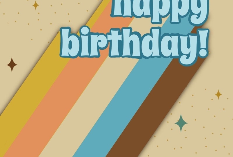
Banner Birthday. The last card is my favorite; I love the colorful rays
and the subtle shadow. By the end of this
class, you'll have three fun custom birthday cards to share with your
friends and family. Ready to add a touch of creativity to the
next celebration? Meet me in the next lesson
to get this party started!
2. Class Project & Resources: For the class project,
you'll create a birthday card, or three. You'll have free
fonts, color palettes, and Procreate brushes and
stamps to support you. Here's the cards that
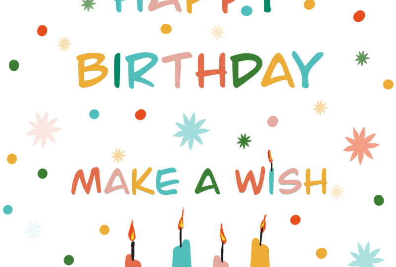
we'll be creating: The first one has a festive, free font and birthday candles. The next one features a banner that we'll
create with a stamp. The next one has fun, colorful
rays and a subtle shadow. We'll create our
cards using layers in Procreate. With layers, you can easily edit
the card to make a brand new card with
new colors and new text; in just a few
minutes, you'll have a custom card for the next
birthday celebration. We'll be using lots of
Clipping Masks in class. Clipping Masks are pretty easy to master, and
they are so useful. I use them just about every
time I use Procreate. They're a non-destructive
way of editing, so you can easily go back and
change details, like colors. As always, I'll walk you
through every step I take. If you have questions
I've got you. Click on the Discussions tab and I will respond to
every question. I can't wait to see
what you create. Upload your project
by clicking on the Project and Resources tab, your work will inspire
me and others, and I'll leave a
comment back for every student project. Ready
to take the first step? Download the class resources. To access these goodies, click the Class Project
and Resources tab. The next lesson we'll browse some cool free fonts for you to use in any
project you'd like. I will see you in
the next lesson.
3. Let's Download Free Fonts: Welcome back. In this lesson, we are going to quickly
review Google Fonts, and I will show you
the three fonts that I'm going to use in this class. You are welcome to use any
font that you would like, including the fonts that
I am using in class. Let's go to Google Fonts. I'm just going to type
in Google and then type Font, and here we are. Here are some Google Fonts. And it's organized
here by Trending. We could look at it
by Most Popular; here are some of the most
popular Google Fonts. It looks like, as of now, there's 1,576 font families. You can also change the
filters here. For example, you could tap Handwriting, and these are the most
popular handwriting fonts. I'm not using any handwriting
fonts for this class, but you certainly could.
The fonts that I am using. The first one is called Barrio, but what I'm going
to do first is type into this preview box. I like to do that when
I'm working on a project. So then I can see exactly what the words will look like in the specific font
I'm going to go and find Barrio. Here it is. This is what it looks
like for "Happy Birthday." I like this font a lot. I am going to tap Download Family to download it, and then I'm
going to Download again. It's going to go into
my downloads, and there it is. To download it, I
would just tap on that. You need an unzipping
app to un-zip your file I use an app called, I think it's called iZip Pro, but any un-zipping
app will do. Okay, so that's Barrio. The
next one I'm using is called Bowlby One SE. And here's "Happy Birthday." We can bring the size down
so we can see it better. You would download this
in the exact same way, Download Family, and so on. The last font we're using
is called Spicy Rice. It's another font I'm fond of. If you just type Spicy,
it pops right up. Apparently, it's the
only spicy Google font. Here is Spicy Rice, and that's what it looks
like for "Happy Birthday." You'll also have a PDF
with the class resources, and I'll have the direct links to all the fonts there that
you can just download. All right, on to
the next lesson, where we are going to make our first birthday card.
I will see you there.
4. Let’s Set up Our Card Template : Welcome back. In this lesson, we are going to
create this card. I'm calling it Birthday Candles. And I have given you
everything that you need to complete this card, including the font, the stamps, and all you will need to draw is the little flames
on the candles. It will be a good way for us to kick off this class,
so let's get started. We are going to start by
creating a template for our cards so we can use it over and over again
since we're creating several cards during this class, and you might want to create
more cards in the future. So I'm going to hit
plus > this little folder, I am going to title
this Card Template. As far as the size, we want to move from
pixels to inches. And we want it to
be a 5 by 7 inch card. The DPI is at 300, it's an excellent print quality. The maximum layers
for my iPad is 209, which is way, way, way, way more than what we'll
need for this class. I'm going to go ahead
and hit Create It. Here we have our new canvas. I'm going to go back and
label it Card Template. I always like to start
with paper texture and I will provide you a
subtle paper texture as well. It's right here and
it is indeed subtle, But it does add a
little something. I'm going to do a three
finger drag down, hit Copy, and then I'm going to go
back to the gallery and to my card template and hit Paste. It's a little too
small. No worries. We're on uniform selection here. We're just going to
stretch it out a little bit. so, that is good. I'm going to tap my arrow
to get out of there. Now we have this layer and
I'm going to rename it paper. I'm going to add another layer. And I'm going to grab this Rule of Thirds grid that is for a
five by seven canvas. I'm going to tap that here. I'm on a new layer. I don't want it to be on the
paper layer because we'll have this layer turned
off most of the time. It is right here. I'm going to tap this
arrow and I'm going to bring this to the corner
and then stretch it out, so it fits perfectly there. I am going to bring the
opacity way down by tapping this "N" here and
going from max to about, let's do 33% opacity. And I'm going to
label this Thirds. The Rule of Thirds is a big topic that could have
practically its own class. I use it in almost
all of my art. And essentially what's
happening here, I'm going to do a new layer
in between by hitting plus, is you want to pay attention to what
you're putting here, and here, and here, and here. Like maybe if your subject
was lined up here, it would be a more
dynamic composition. You also want some breathing
space in your composition, so you might have breathing
space here in this top third. This is just a really rough overview of
the Rule of Thirds, but it's a great composition
trick and we're going to be using it a little bit in this class and I'll
talk you through it. So that's really all you
need to know right now after you've seen my diagram
here for the Rule of Thirds. I'm going to delete
that lovely diagram. This is our canvas
that's set up. We have the Rule of Thirds, a layer to create
on, and our paper. We want to keep
this as a template, so we are going to copy it. And we'll keep doing
that throughout the class to make it easier. Here's our card template, we're going to swipe to
the left to hit Duplicate. I'm going to relabel
this Birthday Candles and we are going to get started. This seems like a good
time to take a break, and I will see you
in the next lesson.
5. Let’s Start Our Candles Card: Welcome back. I'm going to
turn off the Thirds grid right now. I'm in
the middle layer. I'm going to tap the
Wrench and Add Text. I forgot I need a color palette. I have helpfully labeled it for myself KBB 1 Birthday Candles. So I've provided three
color palettes for you for this class and I'll
be using them as well. So as you create, you can choose your own color palette or follow along with
my color palette. So the one I am using
is this one at the top. I will start with the
text in this blue. Now that I have the text,
I'm going to tap on it and make sure that it's all
selected so it's blue. I'm going to hit that Aa Then we're going to cruise
through our fonts and there is a lesson on downloading these free fonts
from Google Fonts, so make sure you've seen that if you have any
questions about that. The font we're using
is a really cool font that I just discovered
called Burio. I think it is really fun. Here's my burial font and I
am going to tap on there, back up and write
Happy birthday. I am going to pop on our
Rule of Thirds guide here. I am going to hit this arrow and I'm going to bring the Happy
Birthday right about here. I think that's a good size. If I tap on the
text box and hit Aa, it's 40.4 Let me just make that 40 so it's a
nice round number. Now that that's changed, we want to duplicate this because we're using
the font again. We are going to take the second copy that you can't see because it's
right behind there. And I'm going to tap that arrow. And bring it down here. I'm going to type
here, make a wish. You could do a personalized one. If you have a friend's
birthday coming up, you can do whatever you want. I want this font
to be a little bit smaller than Happy Birthday, so I'm going to hit Edit Text, and I'm going to make sure
that this is all selected. I'm going to hit Select.
All, it's outlined in blue. I'm going to tap this Aa, and let's see how say 24 works. I do like that. I think
I want it just a little bit bigger. Select all. Let's try 28. 26. Yeah, I like that. The font size here is 26. I'm going to tap that
arrow to unselect it. I'm going to group
our text together by swiping right on both of
them and then hitting group. I will label this text, this is our text, exactly
how we would like it. I'm going to turn off
the rule of thirds grid, we may not need that for
the rest of this card. What I always like
to do before I start changing things with the text is I like to
duplicate the text. I always have an
editable text layer. And I'm going to show
you what I mean if I hit rasterize here and
rasterize here. Now that these fonts
are rasterized, they just become
pixels on a page. They are no longer
editable font like this. When it looks like
that, it's pixels, and when it has an A in there, then it's text, you can edit. I'm going to collapse
this and drag it down under the paper just
in case we need it later. I'm going to group this as well, and I'm just going to
call this background. The next thing we're going
to do is change the colors of some of the letters by
using a clipping mask. We'll also use one of the palettes I provided
with the class, or you can choose any
palette that you would like. This seems like a
good time to take a break and I'm going to
see you in the next lesson.
6. Let's Explore Clipping Masks in Procreate: In the last lesson, we set up our canvas and started
our candles card. In this lesson, we are going to keep going on our candles card, starting with
recoloring our letters. Let's get started. I have my
text exactly how I want it. Let me just check that it's
centered, I think it is, but I'm going to tap on
happy and that little arrow. And when you get that gold line, it is centered and I'm
going to make a wish. And this arrow, yeah, it was centered, do
that automatically. I just wanted to
double check now that we have it centered
perfectly and where we want, I am going to bring these two layers
together with a pinch. Now they are on one layer and I'm going to add a new layer above that
with the plus sign. Next I'll tap clipping mask to the layer
directly above the text. And that means that anything that I'm drawing
on this layer will be clipped directly to this text. Let me
show you what I mean. I'm going to grab
this red color, I'm going to grab my mono line and bring the size up over here. And then I'm going to just
show you what I mean. No matter where I draw, the color is only applying
to the pixels on the page. And that is because
of the clipping mask. If I undid the clipping mask, then we would see
what I created here. Go back to clipping mask, and it's only applied to
the letters on the page. That is an interesting
look of its own actually. But that's all
we're going to do. So I'm going to hit
clear on this layer. We are going to go to
this color palette and I am going to start changing
the colors in order. Let's start with red.
I have the monoline. I'm on the clipping
mask layer, I'm on red. My Madeline is pretty big. And I just color the H here. And I'll zoom in so you
can see this better. I'm going to go on
exactly like this. Next is the yellow.
Next is the orange. I'm going to make my mode
line a little bit smaller because I'm coloring
onto the other letters. I'm going to go back to my yellow by pressing here
to get the last color. And I'm just going to
make that yellow again. Our next color here is blue
and it is already blue. So we can skip that
and go back to red. We're not using the lighter color here because we wouldn't be able to see it
against the background. Just like that. We have our first word done and we're going to continue
on in that fashion. We could continue going back to the palette for our colors, but I think I might
just sample them from here to make it
a little bit easier. Actually, my next
color is yellow, so I'm going to grab that
by touching down here. I still have my Modeline. We're just going to keep going. What you don't want
to do is color on the same layer as
your original text. Because that way if you
wanted to recolor it, you could change the colors easily and you still
have this one. This is the way to do it. We are going yellow, blue and then red again. If you get it wrong,
the order, no big deal. This is just a fun
birthday card. Go back to yellow, orange, and you can see that
your color is changing. If you look up here,
blue and red, yellow, then we go back to
orange, blue, red, yellow, orange, that little
eye, yellow and orange. So that already
looks really right. I think this is a
really fun font. Just going to zoom in here
and make sure my letters are all colored in
and they look good. The next thing we're
going to be doing is adding candles to the
bottom of our card. And I have provided you
some candles stamps here. I'm going to do them
just to be consistent. I will do them to start
in this blue color and then we'll be recoloring them in the same fashion that we
colored our birthday message. So I'm going to
tap on this layer, I'm going to add a new
layer above it with a plus. I'm going to group these two together and I am going
to label this candles. I'm going to tap on layer
three and get my candles. Let's just see, those are small, we want them to be larger. If we look at our rule
of Thirds, again, it would be a good idea to have them come about to this line. That's what we're going
to do. I'm going to bring the size up
till we get it right. I think that one looks good. I'm going to bring that to the middle by hitting
this arrow and moving it. And then we're going to draw
more candles around there. Actually, rather than
changing the colors, I think I'm just going to
start with the right colors. Let's just see how
that one looks. I want it to be a
little bit smaller. I'm going to tap this arrow there on the same
layer. I forgot that. I'm going to tap on the selection and do
a circle around that. Tap this arrow and
bring it over here. I think that looks good. I'm actually going to do the
next candle on a new layer. I'll eventually merge them, but just so we can
manipulate it better, I'm on a new layer, I'm going to tap
the candle again. Maybe I want it a little
bit taller. It's up here. No big deal. I wanted a here. Then I can merge these because
I like the way they are. I'm going to add another layer, grab a different color. We have our red,
that is right here. I want these candles to go down. Do you see how
that's going down? I want to switch this candle. We can easily do that
by hitting this arrow. We're on uniform and we want
to just flip horizontal. That way they're not wicks. We'll be making a
little pyramid here. I'm just moving it
over while it's selected and we are good. So we have used up all
of our colors here. I think I will do
another yellow candle. Since these are the
way I want them, I am going to merge this down so those
are pinched together. And I will draw another
yellow candle on a new layer so we can
manipulate it easily. I'm going to tap this arrow. I'm on uniform flip horizontal. And here we have
our other candle. And they're not
exactly machi machi, which I think is good,
it's the way I want it. Then we want to make sure
our candles are centered, so I'm going to
pinch them together. Go to that arrow and
center our candles. I think that looks good. Maybe a little bit lower. I'm going to have this
so the flames will be roughly at this bottom
horizontal line. There we go. We can turn
off our rule of Thirds. What we are going
to do next is draw our wicks and our flames. This seems like a
good place to take a break and we'll see
you in the next lesson, where we continue
with our candle.
7. Let's Add Wicks & Flames to Our Candles: Welcome back. In the last lesson, we
created our card thus far. Now we are adding wicks
and flames to our candles. And so what I'm going
to do here is I have a clear layer here and I want to bring it
below the candles. So I'm going to move
the candles up, so when I draw the wicks, they're under the candles, not on top of the candles. And for the wick color, I'm just going to
choose this blue color because it's the darkest. I'm going to grab my trusty
monoline again and bring the size way down.
That's about right. And I'm just going
to draw wicks. I'm also going to draw
a cute little wick on this E. I think I want this
to be a little bit thinner. It's different from the eye. That is good. Okay, now we are going to draw
the flames on a new layer. I am going to add a new
layer above the candles, and I'm going to use my red
and yellow for my candles. You can use any color you'd
like in your color palette. It can be realistic or it can be any color you'd
want for your flames. I am going to grab my red
from the color palette. We are just going to draw
little wicks again with the monoline, just like that. We're going to color
fill them all together. We want some variety with it, so we don't want them
all to look the same. When I'm doing that, then I will start in different places. Sometimes when I'm
drawing that way, it'll give me a little
natural difference rather than my hands just doing the same thing
over and over again. I have a little tail here, so I'm going to press
on that Erase button. I'm erasing with the same brush. That's a monoline brush. I'm just going to
clean that up there. I also want to draw a little flame up here.
I'm on the eraser. I need to switch back
to the monoline here. We have our flames. We want to make sure that all
of our flames are closed. Let's say this flame
had a leak in it, because I didn't
draw it completely. I didn't close the loop. When I go to color fill that, it'll make the
whole canvas change color except for the areas
that I actually wanted it. I'm a tap to undo that. I'm going to close this. Then
we're going to color fill. So I'm going to drop
my first color. I'm going to t continue
filling up here and just dot that is done. I'm going to add a
new layer above that, so we're going to
add, in my case, the yellow to the candles. I'll just grab the
yellow right here. We have our mono line
again and again. I'm going to do a clipping mask to clip to the candles just so all of the flames stays within the red of the candles
like we did before, it's just going to
stay within there. Let's make my monoline
a tiny bit bigger. We are going to just be
drawing our little flames inside here or whatever it is. Let's see if we can
color fill these. If they're all closed, I have my yellow color, I'm going to bring it over here. Continue filling boop. Okay, so that is looking cute. We have our candles. In the next lesson,
we will be adding star stamps to
complete our card. I will see you in
the next lesson.
8. Let's Add Star Stamps: Welcome back. Let's finish
our cute birthday card. We want to start a new
layer for our stamps. And I'm going to add it above
the candles and hit stars. Dots is what I will label it. We are going to continue
with the same color palette. I will just, so I'm going
in the right order. I am going to start
with the red, I am going to find
this five point star. And then the other
one we're going to be using is the dots. Here is my five point star. The size is a little
bit variable. To give you a variable look, I'm just going to
start by adding, let's say four red stars. Then I will add four red dots. This doesn't have
to be exact at all. I'm just keeping them
separate from each other. Four or whatever.
It doesn't matter. I think that looks good. Then we're going to navigate
onto our next color. For me, it's yellow. I might as well do, since
I have that here, 1234. And then we're going to
go back to stars 12. Whoops, I don't want
yellow and yellow next to each other, right
next to each other. 234. Then let's move on to orange. We have our stars. We'll
keep going with those. It's a pressure
sensitive a little bit. This brush, if you tap lightly, you'll get a smaller
one and so on. But they'll be
varied regardless. Let's see, there we go. And then we want to
move on to our dots. These stamps are a
little unpredictable. And I like that it doesn't
go exactly where it lands, and that helps for a more
spontaneous scattered look. I think we have
orange stars now. Our last one is our blue color. We have a dot here, 123. No, I don't, I don't want these two
like book ending there. Okay. Then we go
back to stars 1234. Okay, I think I want a
little bit more here. I'm just going to fill it in. But I'd like to start
with a less approach and then fill in from there. I'm just going to
grab this yellow, or maybe I'll grab the orange, since we have a little
bit more yellow here. The two yellow candles. Orange star, orange star. Let's just try red star. I'm going to go back
to blue and look for areas where there
isn't a lot of blue. Maybe I'll go back to my dots, there isn't a lot
of blue over here. I'll grab my star again and
do a little star over here. Maybe over there I like it. Let's just grab the yellow and
just fill in a little bit. It's looking pretty good. I think I want a yellow star
like about here, maybe here. Then I'll go back to dots and I'm just going to fill
in some yellow dots. Maybe just a couple blue dots. I think that looks pretty good. I may have overdone it
a bit with the stars. I don't know. Let's make it really small and
see how it looks. And then really big
and see how it looks. Sometimes it'll
just help you get a different perspective.
Spin in it around. What do I want to do?
I think this is good. All right, but you did
want to edit your stars. You can certainly just erase
them with your mode line. And then if you want to
back to finger tap to redo. So there we go, you guys, we have our first
cute birthday card, and I would love to see
what you guys make. So make sure that
you are putting your cards in the class
project and resources area. I will look at everyone and enjoy them and leave
you a little note. In the next lesson, we are
going to create our next card. I will see you in
the next lesson.
9. Let's Start our Banner Birthday Card: Welcome back and
congratulations because you are more than halfway
through this class. Next we are going to create this fun polka dot birthday
card with banners. Again, I have provided everything that
you'll need for this. We have a banner stamp. We have our poca dot
pattern in the background. I have a color palette for you. The font is free from Google. It's called bulb one, S, C. Go back to the font lesson if you need help downloading fonts. We have our handy card
template here so we can just swipe to the
left, hit duplicate. We have our new card. I'm going to label
this banner birthday. And we are ready to
go for this one. I am going to use our third
palette, KBB Birthday. Three banner and candles. And we will start
here with our banner. Let's go to our brushes. We will tap banner, I have the stark, rosy color. I'm going to whoop, way too big. I made this pressure sensitive, so you can always tap
a little lighter or a little harder to get
the desired effect. That is right in the middle, ish of the page. I think I want this
one a little bit smaller rather than having
the centered in the middle. I want to have it
a little bit up. I think that looks good. Then what we have is some
breathing room down here. There is our banner. I'm going to turn off
the rule of Thirds. We do not need it right now. I want the banner to
have a little outline. What I'm going to
do is duplicate it. I am going to label things, it's not confusing,
banner outline. These are separate so we can
change the colors easily. This would be banner color. Then I'm going to
add a new layer below banner color and
call it banner shadows. And let's group this
together by swiping, right? Group, name it, banner. Okay, We have our outline. We're not going to do
anything with that. Below it, we have
our banner color. And you can't really see it
because it's below here. You can see the difference when I'm toggling it on and off, but not a big deal. I am going to use
this color right here for my banner and I am going to fill in
the non shadow parts. I'm going to tap
this color here. I'm going to tap, continue
filling dot to do the shadows. Let's just start with the same color and put
it on a blend mode. Let me show you what I mean. These are the blend modes. And I always like my shadows
on a multiply blend mode. That's the multiply blend mode. Then that changes
from N to when I put that's my problem on
my banner shadows layer. I don't have an actual banner. It color filled the
whole thing. No problem. I will bring this down here. Pinch these together. Hopefully, yeah, it'll
still be named shadows. And bring these all
back, I have this color. I'm on multiply blend mode. I'm going to go
into the shadows or not because my layer
was turned off, I didn't actually duplicate it. Here we go. Okay, let's do this. Here it indeed is. On a multiply blend mode, there is our color, here are our shadows. In this case, it
didn't make that big of a difference
for the shadows. Let's go to the disc view here of the color
palette and just drag your color down a
little bit like this. It doesn't have to be perfect. Let's try that. I am going
to go back and refill this. Actually, I can tap.
Continue filling. I think that looks good then. I think I also want the banner outline to be the
same color as the shadows. For now, let's try that. I'm going to tap
my banner outline. I'm going to hit
Alpha Lock and then fill color with a
darker shadow color. I think that fab for this one I am going to do
colored background. I want to color that's the same as this but
a little bit lighter. I wonder if this
is a good color. Let's try that. I'm
going to add it above the paper and I'm going
to hit Phil layer. I like that. We
will go with that. For now, I am going to change this
blend mode to multiply. That way it will interact
with the paper below. If it's on multiply blend mode, if it's not, it's
flat like this. If it's on multiply, then you get just a
little bit of texture. It will make your color
a little bit darker too. But we'll go with this for now because we're working
on different layers, we can always change the
colors later if we want. I'm going to be organized
with my layers. I'm going to group
these together and name them Background. That is a good
start to our card, it is looking good. In the next lesson, we will
add the font to our card. I will see you in
the next lesson.
10. Let's Add Text to our Banner Card: Welcome back. Here we have our birthday banner and the next thing we are
going to do is add text. You can use any font you'd
like. You can hand letter. I am going to be using a free Google font
called bowl something. Let's go to my fonts and see. I am going to hit
Wrench Add Text. Going to bring the
text down here. I think I'll change the
color to this white. Let's go to I have
a lot of fonts. Here's our free
Google font bole. I like it. I am going to actually grab this little
green dot and rotate the text. It fits well on the banner
that doesn't fit perfectly. What this will do is it'll
rotate in like 15% intervals. If you want a more specific one, you can tap on this green one. In this case, let me try three plus that did not do
what I wanted to do. Let's try a 10% angle. That was pretty good.
Instead of that, let's try 11% I think we might want to
tweak it a little bit, but let's just start by writing, happy birthday to you. Let's do happy tap that nodule. Let's try another
four over this way. Nice. That looks good. I am going to tap on my text and make it
a little bit bigger. I'm on uniform now. I'm just going to stretch it out so it's within this banner, But there's a little
breathing room. And I'm going to
Duplicate happy. And here's our Duplicate happy. I'm going to grab the arrow, bring it down here. And this is going
to become birthday. That is a little too big. I'll just make that smaller. I think what I'm looking
for here is like roughly the same
amount of white space, or in this case peach space, or whatever it is
around the letters. I think that looks
good. Duplicate again, here's birthday,
and we're going to change this to say to you. Okay, so the two
looks pretty good. Maybe a tiny bit bigger. I think that looks
good. The white is a little white to me, I might like that. But let's tweak the font. When the words are all together, I'm going to group
them together. I'm going to label this text. I'm going to duplicate
it by swiping left. I'm going to bring
my original text down here to the background. Just drag it down, there we go, collapse our T by
hitting flatten. Now our text is no longer editable and it's all
on the same layer. It would be a good time
to check your spelling because I have done birthday cards without an H
or something silly like that. Double check your spelling. Let's see if we can change
the color a little bit. I'm going to grab this rosy, peach color and I'm
going to bring it over here and see what
this looks like. Alpha lock fill layer that
is too light and too pink. I'm going to go to
huge saturation. Brightness. Just brightness up just 2% maybe you'll
try a saturation down. That doesn't seem to matter. Sure for now we can
always change it. And I will grab this color and add it to the color
palette right there. The next step is for us to add our little polka
dots to the background. I am going to go to
my background layer. I'm going to add a new layer. It's actually going
to be two layers because we're going to
do a clipping mask. Again, I'll group
these together and I'm going to call them pockets. That layer should
be in the middle, is below the banner,
above the paper. And the color for that, we are going to start out, let's start out with
the color we use last, this color, I have a KBB
dots pattern brush for you. I actually want to
be on this layer because we're going to do
a clipping mask above. I'm just going to fill
it with these dots. You just want to make
sure that there are any gaps in the dots. If you missed an area, I think that looks good. We are going to do a
clipping mask over that, like we've done before. We are going to
hit clipping mask, that way we can recolor some of the dots and the
color will remain. This seems like a
good time to take a break and I will see
you in the next lesson.
11. Let's Color Our Polka Dots: Welcome back. I'm
going to go back, grab my trusty monoline. And I'm on a clipping
mask above the dot. Again, the color is only
going to apply to the dots. I started with a yellow
color in my palette. I don't think I
really want that. So I'm just going to delete it. I'm not going to use
it for this card. I'm just going to move
these colors over again. We have a color palette
of five colors. I'm going to start
with the darkest color so we can go in order. I'm going to grab my
trustee mode line. Because it's on a clipping mask, the color is only applying
to the pixels on this layer, which is the dot layer.
I'm going to clear that. And we're just going to start
randomly coloring dots like we were randomly placing
our stars in confetti. In a less lesson, let's start with six. We'll do six dots. We're not going to color
in all of these dots. A lot of them are going to
remain the light color. The rule I have for
myself to make it look more random is to
not have dots in a row. For this, we'll try not to have colors touching each other, like we wouldn't have any
color right next to it. Just to keep it, that's my
system for looking random. Okay. This is in a row with
that. I don't want that. I'm just going to put it here. Let's do seven. I
like odd numbers. Let's do this one
on the outside. We'll start with that and see if we want to
add any more colors. Okay, let's keep going. The next color in our
palette is this green. I am going to randomly start
filling in green 34567. You don't have to be
this precise at all, it's just the way I'm Roland. And then we will grab
this peachy pink color and we will go 1234567. Okay, that looks good. I think we want a few more. Since I have this peach color, we'll just keep going with that. Maybe we'll try five more. 1234. That's kind of in a row. So I'm going to change
that. I don't like that. That's a line five. No, I don't want that there. Okay. And then
we'll go backwards. The next color is teal color. Let's see, 12345 and then our blue 12345. Let's, as I have this color up here that's cut off and it looks
accidental to me. I'm just going to
grab my, again, I'm just being fussy, like this dot instead. Okay, so it is looking
good. Our birthday card. Now, we just decide
whether we want to add more dots or not. Maybe a few. So I'm just going
to grab this color here and see where we
could add some more red. In this case, I did four teal and then our Navy. Oh, there's a lot
of Navy over here. Where does Navy want to be? Okay, so we have our
random dots here, and I think it
looks pretty good. One more orange dot up here. No, it's, it's done. Our cards again, I would
love to see what you create. Remember to share your project, and we are going to keep going and we're going to
make another birthday card. I will see you in
the next lesson.
12. Let's Start Our Colorful Rays Card: Welcome back. This is the third and final card for
our birthday card class. Congratulations, You're
almost done with this class. This is my favorite
card of the bunch. It's a happy birthday one with colorful rays and a
little shadow effect. We'll be using a trick
with the drawing guide to help us get those rays
perfectly lined up. And there are ten
color palettes, again, for you to choose. This one is this color
palette right here, but I'm going to use
a different one. I think I will use this
bottom one right here. Let's get started. Okay, here is our card template with our rule of thirds on
in the background. We don't need that right now, nor do we need the
drawing guide quite yet. So I'm going to turn that off Wrench canvas drawing guide off. I am going to choose a darker color for the text just for now so
you can see it easily. I'm going to be using a
font called Spicy Rice. It's a free Google font. You can of course, use
any font you would like. This card, this is a
little bit tricky. I would recommend just to
use the font I'm using, so you can follow
along really easily. So I'm going to hit Add Text. And I have the font
here, Spicy Rice. And I'm going to tap
here and I'm going to make it 55 points
for the size. I think that looks good. I do want it to be
right justified. I'm going to edit the text. I'm going to use all
lower case for this one. I am going to type
happy birthday again, lower case and
exclamation point. I want to bring the rule
of thirds up here so we can get an idea of how
this is going to look. I want this to be made it
smaller about right here. I want the happy
and the birthday to be closer to each other.
So I'm going to hit Edit. Then I'm going to
change the letting. Need to select this all
first edit, Select All. Here's the letting, which brings the words closer or
further together. I want them and I want the P and happy to be close
to the D and birthday, because we're going
to outlining it. We just want it to
look altogether. I think that looks
good. Negative 13 and letting 55 in size. I'm going to turn off the
rule of thirds Right now. I'm going to make a
duplicate of happy birthday. I always keep an editable, a hard word as I
always keep one. I can it some texts I can edit in the
background just in case. This one I will
just keep up here. What we want to make sure with our placement before we get started is I'm going to
grab this KBB monoline. And just make sure that if we were drawing lines from
here, this is just messy. It's going to look better later, but that we would have like
rays coming down that way. And I think that looks good. If I brought this over
just a little bit, I think that might look better. It's just a tiny bit different. I'm going to clear that because the next step is outlining, this seems like a good
place to take a break. I see you in the next lesson.
13. Let's Outline our Text: Welcome back. I'm going
to grab my KBB mono line. You have that in your set
as well. From the class. I'm going to bring the size
to about 7% I'm just going to grab an orange to outline
it so you guys can see it. Because everything
is on its own layer. It's really easy to edit later. If you don't love your colors right now or you're not sure, don't worry about it. We
can always change it. I am on a layer underneath
the happy birthday. I'm realizing I want
happy birthday. A little bit closer together. Just a little bit.
Edit, Select All. It's more like 14 now. Whoops. I don't know
if it moved or not. I turn because snapping and
magnetics can be really easy, like if you want to
center something, but if you want to nudge it
into a particular place, which is what I want right now, you can be more precise
if you turn that off. Okay, back to the model line and orange and I'm going
to do an outline. I'm just going to start by
filling in these letters here. Then I'm just going
to trace around. This doesn't have to be perfect. You can be as fussy about
it as you want to be. What I am going to
do is just trace. I'm going to go in
and clean up later. And I'm just going
across like this just to be a little bit
more efficient. I'm going to go back in here. I can see there's places I'm
going to want to clean up, but I'm not going to worry
about that right now. A lot of times I'll turn my screen around
to make it easier. I'll just fill that in there. A little messy, but
we'll come back to it and I'm gonna do the
same with birthday. I'm just kind of
making sure it's roughly the same
thickness all around. I had said I want the outline of the P and the
D to be touching. It is not, but that's okay. Okay. And now I'm going to grab the eraser and just
tight you up a little. I always say in my classes that it doesn't
have to be perfect. And then you see me
trying to make it as perfect as I can and I am just a recovering perfectionist. Who's still a perfectionist? I think I'm just going to
fill this in right there. Racist little guy. We are good. I want to change the happy
birthday font to white. I just didn't want
it to be white before you could see it easily. I'm going to group these two together and label that text. I forgot to do a back for
the background color. I'm going to do
this Beijing color. I'm going to fill
the layer and I do want the blend
mode on multiply, it interacts with
this paper texture that I have below there. The next thing we
are going to do is add layers for our rays. I'm going to do
is I'm just going to duplicate some layers because we'll need at
least five of them. This layer right here is
going to be our rays. These are going to
be clipping masks. If you don't know about
clipping masks, don't worry, I'll help you out now. These are all clipped
to the ray layer. You'll see what we're
doing with that later. This looks like a good
place to take a break. I will see you in
the next lesson.
14. Let's Add Colorful Rays: Welcome back. The next
thing we are going to do is add layers for our Rays. And what I'm going
to do is I'm just going to duplicate some layers because we'll need at
least five of them. I think this layer right here
is going to be our rays. These are going to
be clipping masks. If you don't know about
clipping masks, don't worry, I'll help you out now. These are all clipped
to the ray layer. You'll see what we are
doing with that later. I'm just going to grab this
gold for the ray layer. What we're going to do is
we're going to do a trick with a drawing guide to help us get nice straight rays
really easily. So I'm going to go to
Wrench canvas drawing guide and then I'm going to go
to Edit Drawing guide. And then we have this screen. My grid size here is at
66 and that looks good. And what we're going to
do is we're going to take this little green nodule and we're going to
twist it to the side. And what we want to do is look at how the Rays will
be coming from here. I have it lined up pretty good there, but it
doesn't have to be. When we have the drawing guide on and we do something else, the Rays will only be able to be made in the same direction
that the lines are. What we are going to do with all these layers
is we're going to turn on drawing assist. Drawing assist is
what's going to help us get our lines right. I will show you what I mean. I have the monolines
still. That's good. And what I can do
is I can only draw lines the way the
grids are going. I'm going to clear this now and we are going to do our Rays. I'm going to do the rays
all in yellow for now. And I'm going to line them up like they're coming
from the words. Like then we're going to be doing a clipping mask
of the words above them. I'm just going to close this. I turn the words off so I
could get a better look. Color dropped at the yellow. Now I'm going to turn
the words back on. I'm going to fill in the yellow where I don't see it here. I want that to be coming
straight that way, looking here. I am going to do that line here, that line here, fill that in. They're coming from the
corners of the letter. I'm going to do
this birthday here. I have a little bit of
cleanup to do here. It's the same, since
it's on drawing assist, My eraser can only
erase like that too. I just want this to be
in a little bit more. Okay, let's zoom in
and take a look. I think that looks good. Clipping mask is when you
have this little arrow, then these layers are all
clipped to this color. So then I can only draw on the yellow what
it's clipped to. And there's going to be a different layer
for every color. We're going to be using
five different colors on our rays to help
us get even ish. Let's count the
blocks we're having. We have here 123-45-6789, 10, 111-213-1414, Let's round
it up to 15/5 is three. We want each color to be
about three blocks wide. I'm just going to choose
some colors here. And again, because we're
working with layers, you can change them later
if you don't like it, Let's not get hung up on that. I'm going to do blue
as my first color. Again, this is on
drawing assist. I can only go this way. I want to go about three squares in. I'm going to do that. Then again, three squares over. I'm just going to draw
the lines for now. I'm going to do red on a new layer about
three squares over. Then I'm going to do white again on a new layer,
about three squares. Then the last layer
I'll do pink again. The clipping mask keeps all
the colors right on there. Okay, now we are going to turn off our text so we can see what we're
doing with our colors. I'm going to keep the
first block yellow, so I'm going to start
with this blue. I still have my mono line. I'm on the blue
layer unassisted. So like I said, unassisted. And I'm going to
color fill that. I'm going to go to orange. I'm on the right layer
color, Phil White. I'm just going to
change to disc view so I can see my
palette more clearly. Okay, white layer, close
that off, and then pink. Okay, so did I draw? I drew some pink
on a white layer. And that's not the
end of the world, but I want it to be
on the same layer, so I can close that
up in color, fill it. Now I'm on the right pink layer, I believe. There we go. Okay, let's turn on our text
and see what we have here. I'm just going to
group these layers together, like tidy layers. And I'm going to
label this rays. Let's see what we have here. I'm going to turn
the drawing guide off because we are
done with that. I think that looks really good, except right here,
my orange layer, I'm going to go back to this
orange and fill this in. I think that looks pretty good. I'm wondering if I would prefer
the white in the middle. I'm going toplock the
orange layer players. I want to fill it with white. Then I want to go
back to this one. Alpha lock fill layer orange. Yeah, I'm being
fussy about this. Let me try the pink, orange, alpha lock fill layer
and make this pink. Okay. I like that better. And the reason I chose the
colors this way is I wanted some colors that are more contrasty with the
background on the outside. Then I want blue is a cool color and
yellow is a warm color. So I wanted those
next to each other. We didn't have our warm
colors altogether. Next up, we are going to add a shadow to our rays that will make it look like they're
coming off the page. And then we're going
to finish it up by doing some little stars. I will see you in the next list.
15. Let's Add an Easy Shadow : Welcome back. Next, as promised, we're going to add our
easy shadow to the rays. So I'm going to go
to the main layer, which for me is gold. I'm going to hit Duplicate. I'm going to alpha lock this
color so it can be black. I'm going to double tap here for a black just to make
sure it's a black. It's not a black because a
black would be all zeros. It doesn't super matter,
but cool trick white. Other people make this
look so easy and I get it. I'm able to do it
most of the time, but oh, for the love
of God, goodness. Okay. So I'm going
to do it the other way and just do a
bunch of zeros here. It's six zeros, but
I don't count them. I just put zeros in
there until it fills up. Okay, now we have our
black in the corner. I do like having like a pure
black and a pure white. I can do this most of
the time, honestly. Anyway, we don't need a white. We don't need a pure white.
That might be a pure white. I don't know. We have
our black. Okay. Alpha lock and fill layer and now our layer under
the rays is black. I always like shadows to
be multiply blend mode. They are interacting with
the colors around it. I like my shadows at
about 55% In general, multiply blend mode 55% I need to alpha lock this so I
can gage and blur it. It won't work for
a gage and blur. If that's alpha locked
magic wand, gage blur. And I'm going to bring that. I like my shadows at about
six or 7% That looks good, 7% So I'm going to stop there
and we have our shadows. They look good right there, but I want to pull them
over a little bit. For our purposes,
we're going to pretend the sun or the light
is coming in this way. So we're going to bring
our shadows opposite that I'm on my shadow layer. I'm going to hit Select, so I get that little
square and I'm just going to tap it away
from the light source. Let's do 1234 down, 1234 over. I think that shadow is a little harsh against
the light color. If that was a dark color, it wouldn't be as obvious. But I'm going to bring down the percentage
just a little bit. I'm going to do 44% I have a thing with repeating
numbers like 4455. All other things being equal, I just go with that
just because I like it. Okay, here we go. We have our Rays and
we are almost done. We're just going to add some
stars in the background. I have stars and dots here
that we're going to use. I'm going to grab
this retro star here. I'm going to see if
this shows up on white. It does a little, that's fine. My star size 4% We're just
going to scatter them around. I'm going to do three whites. Then I'm going to go to yellow. Do three yellows, blue. I don't like it when
they're lined up like that. I like it more scattered
than that orange. Those guys are too close. Okay. And we could keep going. Let's just add the dots in there first and see what
kind of space we have. I'm going to start in the
same direction again. We 123 yellow. I don't want that yellow by the yellow, blue and orange. We'll do some
little orange dots. That looks good. I'm going to go
back to this star, which is at 2% Let's see how that looks.
Yeah, that looks good. Let's throw some pink in there. Let's see how that
looks. It's okay. It's kind of hard to see.
Sure, we'll throw it in there. And we didn't use pink before, so I'm just going back to the other star and then I'm
going to grab my dots again. I still have my pink because
we didn't use it last time. I think that looks pretty good. Add in a few more
dots to fill it in. Let's go to this yellow color. I'm just using the
dots to fill in here to grab orange or not. Let's see, I mean, I did. But look at that. We have a cute happy
birthday card. Congratulations, you are
almost done with this class. We have one quick
wrap up lesson. I will see you there.
16. BLOOPER REEL!: Here's the peek inside the
class. Blooper reel! Okay. Hot rodders. Oh. It’s a FedEx truck. If you have questions I'd just (unintelligible) say that really close together (unintelligible) I just ad libbed that. Could you tell? Download
the class resourcesssssss Energy (clap) energy (clap) energy (clap, yawn) And that is worth celebrating (shrug). [Dog nails clicking, dog drinking water] And I
hope to see you soon. I sounded Minnesotan. I'm getting better
at this, aren't I? Didn’t I use up to say it like eight times or ten times
or something? Kelley out. Kelley wants spinach dip.
Now we're having fun.
17. Congrats! And Next Steps: Congratulations,
you have completed this class and you deserve
this round of applause. You carved out time to boost
your procreate skills. And now you have some
fun custom cards to share with your
family and friends. I know your life is busy
and you still made time for some creative play and
that is worth celebrating. I would love to see
what you create. Please share it in the
class project area. Your work will
inspire me and others and I'll leave a comment back
for every class project. If you want even more
free procreate resources, check out my website, Kelly Brenburg.com for more creative fun on
the procreate app, check out my other
Skillshare classes. And if you want to be
the first to know about new Skillshare classes and Skillshare membership giveaways, follow me on Skillshare
by clicking here. Thanks so much for joining me, and I hope to see you soon.
 Kelley Bren Burke, Artist & Educator