Transcripts
1. Into to easy: Hi and welcome to easy abstract compositions for beginners or advanced. If you need a refresher, you can do both. By Doris Shaw there. I am a BFA and a master's degree in visual art education. And I love teaching art and life talked all over and I've taught online for years and years. What I wanna do is share my knowledge with you. I want you to have fun. That's my goal because our earth is fun. What I am going to do is show compositions from my composition for abstract painters course. I'm going to show you a different example. We're going to cover the explosion composition where everything just radiates from one location. We're going to cover the vertical compensation where the elements are all vertical. But we're going to do it with a twist. We're going to use scrapes and we're going to do drips. We're going to do a diagonal composition. This is fast and this is easy. We're going to do the high horizon composition where you pick one element that you emphasize that's higher than the middle. This is one, and this is easy. Here you'll get to use moulding paste and gold leaf. We're going to have a lot of, we're going to cover the x composition, my all-time favorite composition. And this time we're going to use blues, blacks, greens, and whites. So I usually limit my color palette and I'd like you to try that too. It usually leads to a really dynamic abstracts. So join me, whereas my easy abstract compositions will have lots of fun together. See you soon.
2. Materials for Easy: Materials that you will need. You're going to need acrylic paint. Red, yellow, blue, black, white, gold. Essentially, just pick your favorite colours. You don't have to use the colors that I use. You only use the colors you like. You'll need one small brush, one medium brush. A small one might be a size. Medium one might be a 1.5 inch brush. You'll need canvas or a painting surface. For a painting surface, you can use the word illustration board or even heavy watercolor paper. You can use gold leaf. If you don't have gold leaf and you have no way of obtaining it, you can use gold paint. You'll need speckle. Backhaul is stuff that you use to repair holes in the wall or you can use molding pace was just sturdier. You'll need a scraper, any kind scraper Like the painters use, or even just a piece of cardboard or, or an old credit card. You'll need alcohol, you'll need a water bottle to spray water, and you'll need rags, a container for water, a plastic sheet to cover your table or your floor. We will get messy. So gather these materials up and then we'll see you in the next section.
3. Golden mean: Bonus tips for your abstracts. In this course, I mentioned the golden mean a lot. And if you look in any artist handbook, they often mentioned the Golden Mean. It's also known as the golden section, the Golden Ratio, the golden per portion, the divine proportion, fee bone matching number, and phi. In photography, it states that if you divide the any composition into thirds, vertically and horizontally, then place the key elements of your image either along these lines or at the junctions of them, you'll achieve a more pleasing arrangement and the more interesting and dynamic photo it applies to paintings to this. Imagine this as your paper. If you place your focal point near one of these green dots, what happens is you naturally create a more pleasing and proportionally well-developed painting. Here's some examples. On the right you have this abstract where the circles are falling. The circles are on the right are 1 third up, in 1 third down, and falling down. Part circle is about the same, but in the lower third with the figure is, the focal point is on the right side and the upper right side. Here the face is on the upper right. The nasties on the upper left. Notice none of these are directly centered here. On the left, the figure is in the top right. The focal point of the figure is the head. And that's just about perfectly in the where the green spot is on the right. And here on the left the figure is in the bottom left of the Calvin. So when you're creating your compositions, Think about the golden mean. Place your focal point near one of these green dots. Keep that in mind when you're creating your paintings. That's it for now. We'll see you in the next video.
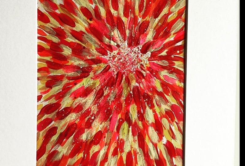
4. Explosion: In this video we're going to do explosion. Bateson, very interesting composition format and it's easy. But the first step is always the sketch. So the sketch shows where I want to put the elements that are most interesting. And it's in the top right, not in the middle, not on the bottom. On this side. Only about 1 third to before this side of the paper and 1 third down. So if you've studied the golden mean, that's the perfect spot. So we're going to start with little dabs of paint. This is a very easy composition and what I'm showing you here is just the easiest way you could ever do this composition. I'm starting off with a white that's got a bit of gray in it. And it's a little diluted so it doesn't look very strong. It's just a lightweight and it looks like a grey when its stem. I started out on a black background simply because it's a painting that I painted over and I liked this service and I really like working with black. Unlike a black background, by like a red background, I'll take several different colored backgrounds more than I like. Wait, I rarely work on a white background, but I, I do occasionally. Now we're going to add read. This is like a reddish orange. The bottle said read, but to me this is really like a dark orange. And I add more elements of orange than I did of the white. Am I use different sizes, so I have small elements of the orange, larger elements in here. I'm going to do a bit of splashing too. So we're going to splash a little bit of that orange. And then I have small, medium, large, extra large marks. So whenever you're creating this composition, also other compositions, it's important to vary your marks. You wanna have small, medium and large. Here I have many small minute enlarge. This is going to be a high key painting, a painting that's very bright, using mainly colors that are primary colors, but also a few secondary, but they're very bright colors. I thought it would go well with the actual name of the composition explosion. So here I just keep going and I add small, medium, and large marks. And I tried to make them a little different from the orange bark so they don't look all the same. And again, I spatter a little bit. So I have small, very small, medium and large. And I want to vary the marks. I wanna make sure that there are different than the adult look all the same member. You're not a machine. It's not a machine making this. It's a human being. The next color is white. So I sped are a little bit of white. Just so I'm repeating the white that I had before and I added a few marks. I lot that many. I don't want as many as I did for the orange or further yellow. I just want a little bit of a highlight. Sorry about my Have I just couldn't figure out how to do that. And I'm no good as a lefty fact, I can't hardly do anything with my left hand. So look, there's less marks, but they work. They really help brighten the piece and add another dimension. So they are nice and bright the highlight the other colours. Now it's dry and I'm adding one more colour. Normally what I do in between each color is I let it dry. In this case, I added the light to, I let it dry. It doesn't show on camera because I just cut it so that it looks like I'm doing it all at once. If you do too much of this all at once, the colors blend together and it doesn't always look good. I love this. Purple is one of my favorite colors. And when I went to India a few, well, quite a few years ago now, I saw orange and purple together, and it looks awesome. And before them, I had never thought of putting it together. So this is something that I've been trying to combine since van. I just love the way it looks. It makes that orange just pop. So the scene looks really good. So again, spattering. So I have some very small marks and some medium marks and some larger marks. Remember, you're getting an explosion. You want it to look like an explosion. So when there's an explosion, there's little pieces, big pieces, medium pieces, all kinds of pieces. And they all scatter. You want it to look scattered, you don't want it to look planned. Not bad. I don't mind this, but I'm going to add a bit more white near the focal point. You want it to be really contrasty. So I also want it to look random. So I'm going to spatter. If I use my gratia and I added these dots, they would look placed. But when you spatter like this, it looks like it really happened. It was really an explosion. Here it is, up close, the explosion composition. See you in the next video.
5. Vertical: Now we'll do the vertical composition. And this is just what it is. It's all the lines go up and down. And we're going to do it in a funky way of this time. What we're going to do, well, it's going to be surprised, so I won't tell you. So the idea is that you make all kinds of lines that are all vertical. But other certain point, there's one part of the lines that's more interesting than the rest. So that's right here. So right here what I wanna do is create an area that's more interesting than the rest of the composition. And I might have a few little areas that looked like that main area that kind of repeat that hold pattern. But at the same time, it's only one area that's more interesting than the rest. So all the colors lead the eye towards the focal point, that main area. That's more interesting than the others. So here we have a painting illustration board that I like working with. And we're going to roller the color on there and let it dry. I like the texture it creates and the also it catches the paint really well. Here we go. We add paddles of paint, just like I'm doing now on top of it. And I've chosen purple. And the compliment is like a yellow color. And the green is also considered like a yellow color and pink and white. So what I'm going to do is scrape those colors in a linear fashion. So I'm going to use this scraper. I had thought of using the other one, but I think this one will work better. So you just scrape the colors like this. And you see little bits of that grid behind there and it looks good and you scrape it so it all goes down like that. And you want to have the color start at the top and then finish at the bottom. There we go. So I have the yellow and the pink, the purple, the green, the weight all mixing together. And I let it dry. Remember, I'm not stopping in this video. It's going to look like I didn't let it dry, but I did. And now I add some more pink because I would like the pink to be part of that mean color, that focal point. And I need to be repeated in several spots and it wasn't in that spot. And I let it dry. Fits all bumpy, but that's okay because it'll catch the paint even better when we add new colors. So it's dry. We add black and we spread it. And like that. And I like the way it's, the little parts are spread but the big parts, not soul happy with. But we will let it dry and then add another color. So here it's dry. I'm going to add green on top and I'm going to let it bland. And I'm going to admit a pink to that because I want to repeat my pink 2Ds making a mess. So we're going to just spread that a little bit. And I don't want the bottom showing through. So if at any point you're unhappy, you let it dry and then you work it. When it's dry member that acrylic dries really fast. It can be dry within about ten minutes, so it's not a problem. You don't have a long week. But with these paintings, what I often do is I do one color, one night in another color, another knight, etcetera, etcetera. So now I'm switching to a brush because I want to add these little interesting spots and the brush doesn't better for me. The goal is to make it look like I used that scraper and not that I used a brush goes, I want the texture to look the same all the way through and let the paint dry. And now I'm adding white. So I'm adding little bits of white. This white is going to highlight the pink and it's going to create that focal point. So I'm trying to give it that scraped bloke and not the painted look. It's harder with this brush. So here we go. We're scraping Just to make it look like it's scraping. But look how the white kinda hops across the painting and lands in and around that pink area. So you want this to be the focal point. And all the other colors just lead the eye towards the focal point. So that's what this little line of white is meant to do, is lead you to the focal point. Remember to wipe off anything you don't like. You have maybe two minutes to wipe off what you don't like and then add it again. And I want a skinny Mark. I don't want the big flat bold Mark. I want to skinny mark. So it's really hard to do. So what I do is I just picking it up and then I try to push it with my finger and make it look skinnier. There that looks more like a scraped mark and not a painted mark. See how the ion goes through this pinks all the way across. And there's white all the way across, and there's black all the way across, and green and yellow and the colors all repeat themselves. And your focal point is where the white and the black and pink are. So that's the vertical composition done enough funky way. Now it's your turn to try the vertical composition.
6. Diagonal : Welcome back. Today we're going to do the diagonal composition. And like all compositions, it starts with a sketch, so we're going to do a little sketch. Now. It's just what it says. All the marks kind of go diagonally. And then there's one spot where it's a little more interesting. So I could choose that spot. Now, personally, I wouldn't put that spot right there. I'm fixing it because it's too much in the middle. When you have a focal point, you want your focal point to be nearer to the bottom, nearer to the top, and closer to the sides being of the golden mean. That's the important part. Always think of the golden mean when you're doing your composition. So this one's easy. I start with gray and I just make marks. And I start with skinny marks and then I get to fatter marks. And I add it. Now in this video, I let, every time I put a color on, I let it dry. It's not going show in the video because I show you one color after another color, but they actually let everything dry in-between the colors. So my focal point, if you look at it, is has bigger marks. And the marks that are further away from the focal point to have smaller Marks. And I'm going to add this purple red. And I'm just going to make marks the same way I did with the grey. So the marks near the focal point are bigger and the marks away from the focal point or smaller. You could do it the other way around. You could have the focal point with very tiny marks and big fat marks near the edges are further away from the focal point. It's up to you. Each way is good. It's just this is the way I chose to do it this time. I'm going to let it dry after this color. Now we're going to peaks. Well, it's more like a purple in this video, it looks like purple. Yeah, it's like a pinky color. The Always On this video it looks purple. And again, the marks will change. So when you're near the focal point, the marks will, you will have certain number of marks. This one focal point, I put skinnier marks of purple. Remember, I don't want it the same for every color, so I don't want it to look like a machine. Put that color on. I want it to look like a human person. Put the color on, and now I add white. And again, I varied the marks. I want them to be different. Story about my hand being in the way. I just count paint with my left hand. And it's hard to paint and not have that problem when you're painting in front of a camera. Anyways, now white. White's going to just show me where the focal point is. Can you guess? It'll be on this video is on the top, right. So there's more marks. They're closer together, there's a bigger chance of bad catching your eye. So your goal is, for those marks in the focal point, catch the eye of the viewer. And you want your marks to be relatively the same. Don't change direction. Keep going. But at the same time, somewhere fatter summer skinnier and now I really add a hot pink. And so that's going to help really brighten up the painting and helps set the focal point a little better. So you just paint, paint, paint, add marks, keep them different. While you're painting, you're goal is to create marks that are not the same all the time. You want that human touch. You want it to look like a human person made it not a machine. And you want to create a focal point. So your focal point needs to be more dominant. And so you put less marks away from the focal point and more marks closer to the focal point. So now I want to add some white, but I didn't follow my rule. I didn't let it dry in-between colors. So here I'm repainting after it's dry, so I want the White to be more dominant. It's a bigger mark. And they, all the marks after that, or skinnier, lighter, different from all the other whites that are there. This is a big bold white and that's my focal point. And look how all of the marks around it lead to that focal point. So that's all there is to it for a vertical composition, you look at it from different angles. And I think I like the original angle better. So have fun and try this out. And we'll see you in the next video.
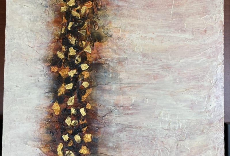
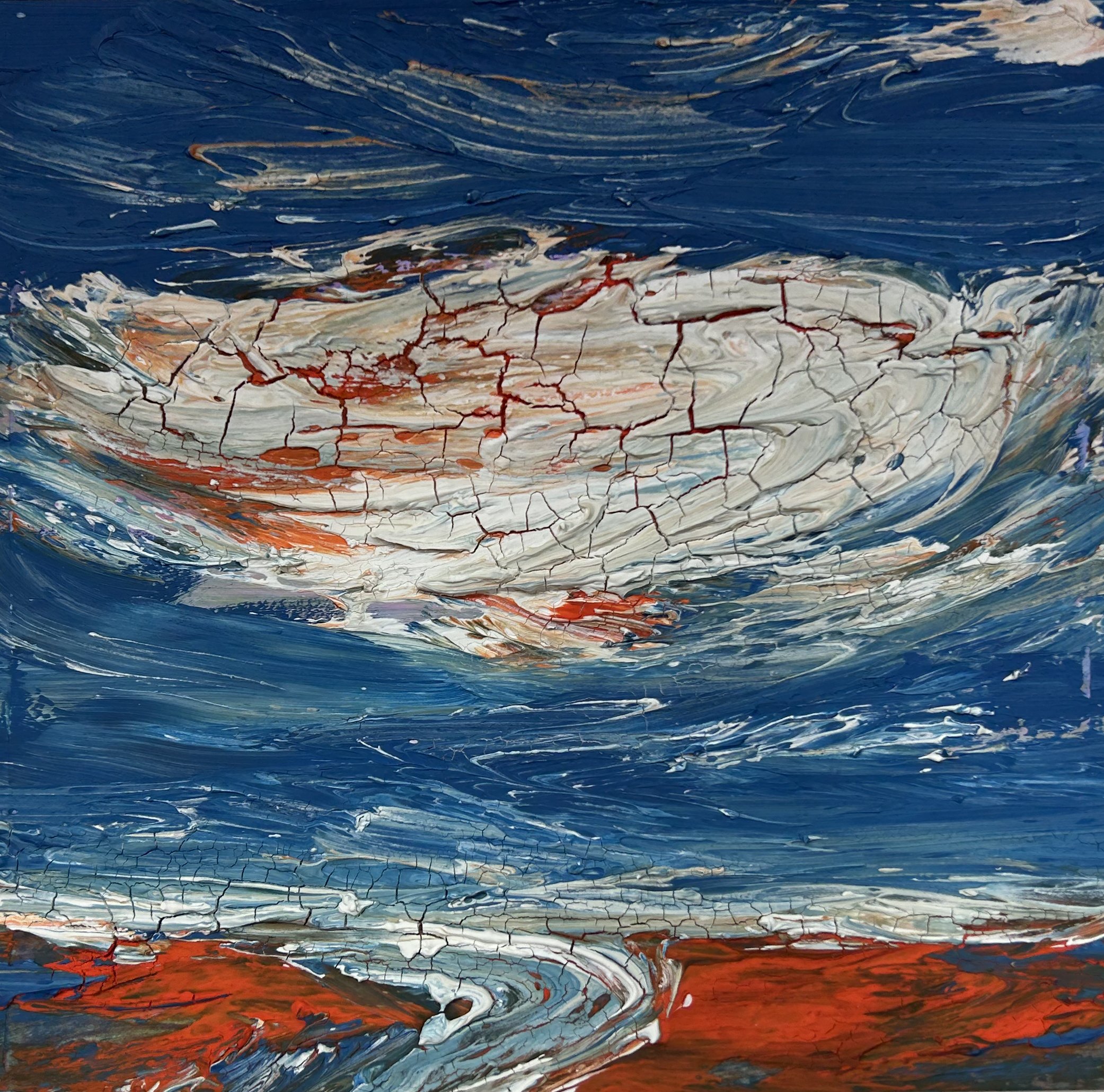
7. High horizon: Hi horizon composition by Doris shot. I'm so like all combs positions. So it starts with a sketch. So I'm want to have just very random works. I'm just very plain on top and bottom. And then in the middle, I want to put little specks of gold and darker color. Not very complicated. I want to keep this very simple. So the gold and the darker colors will stand out. And I want the top and bottom to be very light. So this is a test composition for me. I wanted to try it out on a smaller canvas. And then if it works really well, I want to put it up and make it maybe 36 by 48. I wanted very large. So I'm going to use a spatula. First. I'm going to just put a little bit of medium. This is moulding paste. What I'll do is I'll put it on, leaved a texture on, and then let it dry. It dries really hard and it gives you great texture. So I just use the spatula and spread it all over. And I want to leave a little bit of the black, but I want the texture to be mostly where the horizon line will be. So I want texture allover but more so around the horizon line. So I just scrape and push and pull and edge dry. So now I'm going to add my favorite color, which is a color called Cuatro quinacridone. Goal, and it's no longer made. This is my last, very last jar of this color and I just love it. A substitute color is nickel AZO, yellow, I've been told but I haven't bought it yet. I'm just busy using the one I had before, so I apply it thin Lee and a little bit all over. I want to have a medium color. So I'm going to add different layers of color and they are going to be different values. Now I'm adding a lighter color. It's not weight. It's like a bleach on bleached white. And it's beautiful. I love this color. And I have to decide if I wanted transparent are really opaque. I might try and little bowls and see what happens. But I want less of it where the horizon line is. And I want it to be quite a bit lighter. So the focus is on the horizon line. So on this horizon line I have lights, I have darks, I've mediums, and I'll also have some gold leaf soul. First step to gold leaf is putting some gel on. And then I add pieces of gold leaf. I just Shred it and let it fall. Quite often. I like to let it fall. It's really hard to do after awhile because your fingers get sticky and it sticks to your fingers. But when you let it fall, it looks natural like the goal should be just the wind blew it in and it looks great. So that's what I'd like to do with the gold foil. But in the end you end up having to just put it on simply because it sticks to your fingers. There's a lot of static cling. And then once you get gel on your finger is everything sticks. As you can see, my fingers are all full of gel angle. I will let this dry and then I'll add a layer of gel on top of it. Once it's dry, i'm going to seal that gold up and then let it dry. So all this says is acrylic gel medium and I'm just sealing that gold so it doesn't move. Otherwise, it could just fall off because it's so fragile. It's good to seal these kind of materials any time. Now I'm going to add the gold back. So this is quinacridone goal, My favorite color. And I want some of it to seep into the cracks and crannies where the texture is. And I wanna like CO2 little bit everywhere. I wasn't really happy with the color that I had before, so I want to really just let it seep in. So when I spray water like that, it creates spots where the original color can be lifted. So I spray the water and let it sit in this video, it doesn't really show about what I do. I let that set and then I actually lift where the water is. The water dissolves the paint again, and then we have some brand new spots. Now when I did is I added in some heavier spots of quinacridone gold. And now I'm adding more of that on bleached white. And it's more or less like a very light bees. But it's really on bleached white. And I'm just re-introducing it than letting some of the conoco, quinacridone, gold underneath show. That's quite a mouthful, that name, but I love the color. So now I'll let this dry. And here are those, dr. And now I'm going to add little bits, lacks all the way to do that. That's easiest, is to make your black really wet and lots of water and then put it on. We're going to lift some of that. I'm also spreading some of it so that it creates a variation on the colors. So I have different values of that. Until each flight, I have different values of the quinacridone gold. And I'll have some grays wonder what on bleached white than the black mix. More interesting painting now, because there are so many changes in values. Now when you use very diluted paint, what happens is your paint is very weak and doesn't bind very well to the canvas. So I'm adding gel for two reasons. One is to add this gold and two is to seal the block because the black is so thin with so little binder that it could easily rub off. So here we go. I'm adding little tiny bits of gold back in. So what I have is anti goals. That's the gold where I've painted quinacridone over it. And then there's graze, there's dark quinacridone. There's like the macro domes. There's dark and bleached white and there's light on bleached white. I have a lot of different values and that's important. Now let this dry overall. I'm very happy with this and I might just leave it that way. Or I might just add one more layer of white. I'll have to think about that one. I'd like you to choose your own colors and create your own high horizon painting. Have fun. Remember, let things GI in between each stage. And we'll see you in the next video.
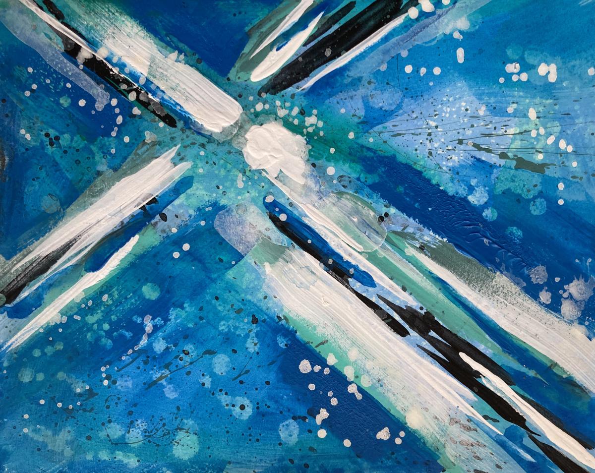
8. X composition in blue: X composition by Doris survey. I loved the x composition on I like doing it a lot. So what we're going to do today is start with a sketch. You're gonna get tired of me saying everything starts with a sketch, but it does, it really helps to organize your head and plan what you're going to do. So remember that the x is a broken up X and that's not one x, that's the same. Just a big x right through the canvas. You want to break it up. Some parts are bigger, some parts are smaller. And there's variations and colors. So this is what I'm going to do. I'm going to have a variety of colors around one dark area. And I'm going to have this x composition to work through. So I want some areas are really dark, but I want those areas broken up and I want other colors mixing in between. And sometimes the x composition is an adventure because you never know what'll happen. So I used old painting background. I'm going to not show you how to do the painting, painting background. All I did is I took my brush after other paintings and nice smudged it on this piece of board. And that's how I got my background. So it's not very complicated. I even spattered water on one part and I spattered darks on another part. And it's all leftovers from other paintings. So it's really hard for me to show you. But here's my x. It's broken up. And when I do one color, I let it dry afterwards, so I'm going to spatter a little bit. You'll notice in my videos that I love spattering. I like to create texture now because it's block. If I add another color on top of it, it'll be really messy. So now I'm going, I let it dry and now I'm adding this teal greenish blue color. And I'm not sure if I really like this color, but it, it adds variety and it adds movement. And I'm going to try and make it a little darker, make it turn it into a gray and see what happens. It's okay. It's not my favorite color, but it does add movement. So if you don't vary the color and change it up like that, what happens is you end up with a static painting. I like static paintings. I like them to show movement. Now I've spat or the bit and I've let it dry, and now I'm adding white. Notice the size of my brush, it's bigger than the other one. So I'm making bigger marks. I'm spreading the pain around. Sorry about my hand. I just can't work as a lefty. It doesn't work for me. Notice that the marks are all different sizes. There are big ones, skinny ones, flat ones with edges, somewhat sharp edges. You want to vary all the edges of the color. I don't mind this at all. There's almost too much the same there, so I'm going to change it up. So I have small, medium, and dark sizes. So now I'm going to add some blue. And I think I'll cover a lot of that with the blue. And I'm not really happy with all those spattering got ideas. I like the texture, but it's almost too strong. So now I'm going to spatter water on top of this paint. I'm adding this paint a little bit everywhere, but at same time I've spattered water. When you spread wring water, don't take it off right away. Count the 20. And then what happens is the water kind of pulls the paint and then it's makes speckles like this. And I love that part. But you do have to let the water sit on top of the paint first. So now I see some of the underneath part which I didn't all light, but now it's changed. I'm back to white and you want to change up my remarks? I want to really vary those marks so they're not the same. And I want to go back to my spattering. I loved this weight spattering. It adds a bit of light to the composition. So the spattering just spreads that light and arenas all around. And I make sure that some of them are smudged out. I have light weight, I have really heavyweight and I have skinny weighted sum. I have fat whites. They're all different. I've let it dry and adding more weight. I want this mark to be my focal point. I want it to stand out. And I wanted irregular. That's the harder part. It's easy to make a mark that's got smooth edges, but this one, I want it to be irregular and want some skinny current, some fat parts, some. It's gotta look broken up and that's what I want. So here we go. We add marks. Very the marks. Notice all the different sizes there are. That's exactly what you want here or this. I've switched up these composition, put the mark going up, so looks more active, but that's my x composition. So we'll do this now. Try it out and see how yours turns out. And then we'll see you in the next video.
9. Conclusion fun easy: Conclusion abstracts are Fontan, there's no way around it. We have learned about five different compositions. You have learned to create the x composition in two different ways. You have learned to use different tools. You have learned that abstract painting can be easy. You have learned that abstracts are fun. We have covered the x composition with dry paint, the x composition with wet paint. The vertical composition in black and white, the T composition, the cantilever composition, and the foramen frame composition. I hope you had fun because I sure had fun teaching you. So look for my next class. Easy abstract composition will see you in the next course.
 Doris Charest, Contemporary Fine Art Specialist and Instructor