Transcripts
1. Introduction to the class: Seven abstract art projects based on art history
really master artists because some of the
master artists that I use in this course
are still alive. My name is Do Char and I've been an art instructor
many years. I've taught at college
and I've taught in schools and community groups,
just about everywhere. The first artist will
cover is from Japan, and her work emphasizes pattern. Second artist will
touch is Claude Monet. And I call this one obsession
because we're going to talk about repeating
something that you love. Monet painted his water lilies
for more than 20 years. Georgia Keefe also did the
same thing with flowers. Then we do what I call
is color studies. Where there's artists like Mark Rothko and
Joseph Albers who created abstracts just by using different colors against each other to see
what would happen. Then we'll touch mark making. Jackson Pollock is a person that did a lot of mark making. He would splatter and splash his paintings until he
got a good composition. We also talk about
pattern as a message. Damien Hirst used
pattern in his work. Shirin Neshat pattern
in her photograph. And Agnes Martin
created huge paintings. All patterns. Then we'll discover feminist
art and the Gorilla girl, They created posters and paintings that they put
all over the place. Then we'll talk about Judy
Chicago and American Feminist. We'll also touch Hilma af Klint, who in 1906 painted
her inner cell. Then we'll add gold
to our painting. Gold has been used in different
cultures for many years. We're also going to talk about using lettering
to create a painting. There are a lot of paintings to create in this
course, your project. For this course, I want you to choose one of your
projects and post it. Choose the one you love the most or you think was
the most successful. Explain why you love it. You love the composition, the color choices you made, any reason that you
really loved it. And share this with
your fellow students. We often learn just as much from our fellow students as
we do from the instructor. Sharing is important. Join me in my course
and let's have some fun together creating some
really interesting artwork.
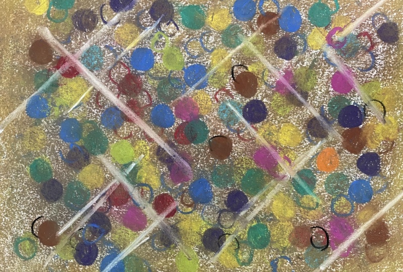
2. Learn from a great Japanese artist : Experimental abstracts
where pattern dominates Yay Kusama, sorry if I'm not
saying it right, she's a Japanese artist that
is obsessed with pattern, mostly polka dots, but she
does pattern extremely well. She was born in 1929 and she has been working with
installation related to pattern, especially dots, for
most of her life. She's just really good at it. For this project, we're
going to let ourselves be influenced by her
and we're going to create a painting with dots. For this painting, you will need a foam brush, masking tape. Acrylic paint brushes a canvas with a strong painting
surface like a board. Paper can be used, but only watercolor paper
or a really heavy paper, a water container, rags, and clean up materials. Now the materials don't have
to be exactly the same, but something very similar. Let's look at the video
repetition of shapes. In this case, we've
chosen polka dots. I'm dividing my canvas
into three sections, one on one side and one
white part on one side, one white part on the other. Then in between, we
will have masking tape. I didn't show you how I put on the masking tape because
that's too easy. But what I am doing
right now is taking acrylic gel and just rubbing it on the side
of the masking tape. This will help give you
a really straight edge. I let it dry and then I painted it with pink and it
wasn't good enough. I'm painting it again. The goal is to put one
coat of plain color. Plain color is the deal. Now we're going to take
a round sponge and make poka dots on one
side and then the other. I'm going to be doing
different colors, just keep watching, the
first color is yellow, the second color is green, and we're mixing blue
with the yellow to create the green again. Stamp, stamp, stamp, Just pick your spot,
your favorite spots. They don't have to be
the same ones I do. You can even go
over the edge onto the masking tape and
have a partial circle. Now we're going to mix red
and yellow to get orange. And my video didn't work. I'm just pretending I'm
putting on the orange. Because somehow or other, my video didn't come on. The next color is orange. I have lots of bright colors. I'm going to put one dark
color and put it on, that's just black dipped into that sponge and then spread
all over the sponge. Doesn't give you the same
look every single time. And that's the part that I like. If you want something
that's all even then you may have to sponge a couple
times on the same circle. But I like the variety. It's more interesting. I'm trying to decide
if I have enough now. My camera died again. I did add white pieces here. I just ran out of power. I'm really sorry, I didn't
show you how to do the white, but it's just the
same stamp, stamp, stamp, as I peel off
the masking tape. I can talk to you about it. I just pots that
were empty and made sure there was an even
representation across the pieces. Here I have the white with the colors on each
side. Not bad. But after a while, I decided I like to look, but it might look better if
I added color in the middle. I added the masking tape
and then chose yellow as the interior color. Here we go. I'm just adding the yellow. Remember, don't forget
to paint the sides and also don't forget to put a little gel on each
side of the tape. That'll help the yellow
color from seeping inside and spreading
across the tape. I'm painting that white spot and we're going to see
what it looks like with yellow and then you can
decide which way you like it. Again, I apologize for not
showing you the white, but you can see the
yellow. There's a plus. Making those spots is easy. Z activity. I take off the tapes, I have a nice
straight line thanks to the gel that I put
beside the tapes. I think I might like the
yellow better than the white because there's
yellow on each side. It works really well. Which one do you like the best? It's your turn now.
Give it a try. Choose the one you like. We'll have fun together. See you in the next video.
3. Color field painters did this experiment: Experimental Abstracts,
Color Studies. This is a focus on
what color will do. What happens when one color
is placed to another? Does it seem bolder,
bigger, lost? How does green effect red in comparison to green and gray? All combinations create
possible results, really. This whole section now
is about color studies. Mark Rothko was one of the biggest experimenters
with color. He did what was called
color field paintings, where he contrasted
different paintings with using different colors. Another one that did
that was Joseph Albers. He's considered to be one of the most influential painters in the 20th century as a
teacher and as an artist. For this, you will
need acrylic paint, brushes, a canvas or
any painting surface. Paper can be used, a water container, rags, and clean up materials. You don't need a lot
for this exercise. I consider this more of
an exercise, mind you, a big one of these types
of paintings looks great. Let's look at the
video color studies. We're going to do two
different color studies, and we're going to see what contrasting colors
do to each other. I'm going to keep it simple. I'm going to do this in
the style of Mark Rothko, simply because it's very
simple and very effective, just the way they are. I'm using a blue. The blue can be flat blue, but it looks better. Actually, if you vary
the blue a little bit, you have a little bit of dark streaks of
other lighter blue. I've done two of these now, one is going to have pink. You've probably noticed in my other paintings that
I really like pink. We're going to see what pink against this main color does, because when he
did these studies, that's what he was
interested in, how the colors that are put together affect
you as a person. Now my paint is very thin, I might have to
do another layer. I'm going to do blue,
blue against blue. This is a very
quick color study. When you paint these
on a large format, they look absolutely awesome. You leave some color
variations within each color. When they're large, they
look absolutely great. But it's also at the same time, a study of color. It's your personal
interpretation of what you think colors look best together
and how they affect you. What feeling they give you, Pink against the dark blue, and blue against the dark blue. I decided to put another
layer of pink on there. I decided to show
you just in case you thought that that one
coat did the job. But I'm using a thicker
paint this time. We're going to do pink against dark blue and then a
blue against dark blue. I'm just going to
paint that and let it dry and see what happens
inside the blue. I'm going to paint the pink, create another visual effect. If I was to do this
on a large format, I would actually
use masking tape to grid it off and make sure
my lines were straight. Because this is a study to see if I really like those
colors together. I'm not doing that, I'm just painting it by
eye, more or less. I'm seeing if these colors
look good together. Actually, that
looks pretty good. I don't mind that at all. The dark blue, the
lighter blue, the pink. It really makes the pink pop. It's like three
different levels. I'm going to try
teal on the pink, this is dark blue, pink and now teal. And see what happens and the
visual effects those create. The teal really makes the pink pop more or the
pink makes the teal pop. I don't know which
way it should be, but I'm deciding that when I paint this on a larger format, if these are the colors
that I want to use. This is called color
field painting. You're trying to create
a visual effect. Is that the effect
I want to create? Is that a quiet effect,
an exciting effect? What am I trying to create? And are those colors working? That's what you have to decide. So here's the pink and the
blue. Which do you like? This one you decide, choose your own colors. And we'll see you
in the next video.
4. Mark making is all about expressing your inner self : Experimental abstract
mark making. Some artists like making a mark. It's the big part
of their painting. Marks. Marks create different
means of expression. You can have bold, angry marks. You can have soft, easy marks to provide the texture for a background
of your paintings. Other times, marks
are the subject of the painting, Jackson Pollock. His work, The Marks, the subject of the painting, the leader of the
abstract experiment. He's the leader of the abstract
expressionist movement. He used to drip or
pour paint onto the canvas and he would do it on the
floor. You could see. So he could see how the marks
would be from every side. He's very well known. I love Kai Gio Kuang. If I know I'm not
saying this right, but he's a Chinese artist who uses explosives to create marks. I love the idea that he experiments with materials to create marks for his paintings. I also like in vote, a German artist who does
large scale drawings that are influenced by music,
philosophy, or phonology. She's a professor of
conceptual drawing. Now for this painting, you need acrylic paint, brushes, a canvas board or paper, water container, rags,
and clean up material. Let's watch the video. Marks out lettering, mark making using letters. I'm going to use paint and stencils and
create marks with paint. So I'm going to paint
around the letters. I'm going to create
a pattern and different kinds of marks I like the brushy look that
I'm getting here. Really, it's all about
the marks I'm using, different sizes of
stencils and letters. And look how brush I leave it. I want the marks to show. I'm going to do different
colors and overlap them all. Next one I choose another
color and I add more marks. I'm adding a lighter color. This time I'm just
creating a pattern. The marks are all overlapping
and creating that pattern. I'm just brushing
over everything. It's more of a random effect. I'm not choosing anything yet. I'm just creating the marks and the pattern and
letting them overlap. I let it dry in
between each layer. This means that
you might need to take maybe 23
evenings to do this. Keep in mind the a curling
dries within about 10 minutes. You could do quite a few in
one evening if you wanted to. If you wanted to take it easy, you could easily just spread this out over several evenings. I'm doing the same
thing every time. I'm just brushing completely like this and
creating a pattern. I'm letting the marks dominate the marks are more
important than anything else. Now I'm creating a dark purple
and I'm watering it down. I'm creating a wash
that will go all over the painting and just
even out all the marks. I'm unifying the marks because everything will
have a purple tint. And that'll help me
decide what to do next. This is often what
I do when I can't decide what the next step is. Usually the reason I can't decide what the next step is is because there's too much variety
and it's hard to decide. I keep adding like
this and brushing, just like I did before. I've speeded up
the camera so that you don't have to watch
me slowly build up this. It does take a little
while to brush it, I'm just speeding it up
so you're not so bored. And again, the effect
is for the letters. I'm more interested in
the texture created around the shapes of the letters than I am in anything else. I want the texture, I want the brushwork. That's the important part. It's not the fact that
they are letters. I'm just trying to create a mark making type of
effect with paint. I just am tweaking a
little bit as well. I'm trying not to tweak
too much. Next step. There are a lot of
steps to this one. Again, I'm going to do a wash, I'm doing a pink wash over
absolutely everything. Just neutralizing the white. The white was just too bright. It was just too much for me. I just wanted to have a little more unity to
the whole painting. Now I'm adding a wash of blue, but it's a light blue and
it's a transparent blue. And I wanted to go all over. I'm very careful. I try very hard to go around the letters and make sure
that the pattern stays there. The wash, what it will do is
unify the whole painting. Just give me light variations
on all those colors. I'm getting blues,
pink light areas, but no real dominant ones. And that's what I want. Now I'm going to use
a card to make marks, and I'm going to go around the letters and different
areas in the painting. Not necessarily
just the letters, but I want to create
the effect of marks, not necessarily letters again, but just the effect
of overall marks and stamp stamp to create the effect of marks that are stretching
all over the canvas. I'm not necessarily
touching just the letters. I'm combining the marks so that the lead one to the other, I'm trying to create an overall
effect for the painting. I'm going to drag
a few of these. I'm going beyond the idea
of creating letters. Now I'm working on creating
a painting. Here it is. The color didn't turn
out as well in this one, but I really like the effect of the marks and the
paint, creating the marks. Your turn. Now you
create a new painting, and we'll see you
in the next video.
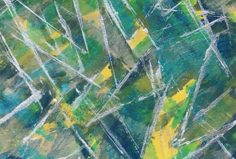
5. Meditative paintings can be fun too: Experimental abstracts. Pattern as a message all over. Pattern is another way
to create artwork. We're going to use
repetitive pattern. We did this with the polka dots, but we're going to do it
differently this time. It's usually, in this case, what I'm aiming for is the play of colors
against each other. We're going to aim for a
different kind of pattern. Pattern is everywhere. Damien Hearst, in
our current time, is an English artist
and art collector. And he's one of the young
British artists who dominated art in the UK. And he created patterns. This pattern, I call this more or less meditative
pattern, visual patterns. Shira, same thing. She was an Iranian that
works in New York City. She put pattern on
her photographs. This created a very
interesting effect. The artist that's going to be our influence today
is Agnes Martin. She did what I call
meditative abstracts. She was born in Canada and lived 1912-2004 These are
large linear elements. She would create a
pattern of overlapping lines and created them on a
scale that would fill a wall. These were very large. When you stood in front of them, it was almost a relaxing
atmosphere that it created. Or also just like a relaxation, or if she used brighter colors, it could do the opposite. Let's watch the video
for this project. You will need acrylic
paint brushes, a canvas or a board or paper. You can use either one, a water container, rags, and clean up material. Now, your brush might need to
be simple for this project, I'm working very small, I'm using a small brush. If you choose to work larger, you will need a larger brush. Let's watch the video. Experimental Abstract
Meditative Abstracts. What I've chosen to do is just do exactly like Agnes Martin, what I'm going to do
is create a pattern of very neutral colors
and see what happens. I'm starting with like a
beige off white color. I'm just making stripes. I've speeded up
the camera because it's very boring to
see me make stripes. Try to aim at being
fairly even stripes. You can create another illusion
by varying the stripes. I'm going to change the color to have a little bit of a gray. I will work on stripes
going the other way. Now, these are very brushy,
very quick stripes. If you wanted to get a more even look in your stripes
and more straight, less wiggly, you would
use a square brush. Here, I'm using a very small
brush and going very fast. What I'm going for is
the overall effect. If I was working a
very large painting, I would be making my stripes
a little more carefully. But this is like a
test painting for me. I often do a test
painting so that I know if I really want
to do this painting, see if I like to look or if
there's anything I'd change. When I do a test
painting like this, I'm deciding if the
colors are right, if the width of the
stripes are right, if there's anything
I want to change for when I do a larger piece, When I choose to do a
larger piece of this one, I can decide, okay, I may want to start
with a different color. I might want to start
whatever you decide. Every time I do a row
of stripes like this, I'm changing the color somewhat. I've changed the color
to a lighter one. I had big, then I
went to a light gray. Then like even lighter gray
yet now I'm going to a white. I'm a fairly even consistency in the stripe. It's similar. If it's not completely straight, so long as it's similar,
it doesn't matter. I'm trying to create a pattern, I'm trying to see if I
like this meditative idea. I'm doing a test piece to decide if I want to do
this on a very big canvas. I would start at the
smallest size of about 36, 36 for this painting, because it's mostly
effective on a large scale. These small scales
give you a good idea, but they don't really create
that same impression. Look at this up close. Imagine it, 36 by 36. Give it a try. See
if you like it. If you want to build
your own that's large. See you in the next video.
6. Feminist topics can challenge you : Experimental abstracts
discover feminist art. Now, the Gorilla girls were some of the very first
feminist artists. And what they did is they created posters and artwork with text and images made by
females and of females, both. This was in the 1980s. They'd combined graphics
with eye opening facts and figures and posters and
put it all over the city. Judy Chicago is also an artist that's considered a
feminist and an educator. She did a whole
series about birth. For this project, you will need acrylic paint,
brushes, a canvas, a board paper, any kind
of painting surface, a water container, rags,
clean up materials. And one thing that
I didn't put on this list is a marker,
a black marker. So let's watch the video and
you can see what I mean. Inspired by feminism, now I've decided to
choose a necklace. So I'm going to repeat
the shape of a necklace. I'm going to do this
all the way down across the paper I've decided
to do like Judy Chicago. And repeat and create a pattern. I'm using a necklace which is predominantly
a female object. I'm going to repeat it
to create a pattern. I'm using colors like pink in order to emphasize the
feminist part of it. So females are often
known for wearing pink. And I'm going to use
pink and purple, so I just painted in. And I'm going to just
block in all the colors. At first, I'm blocking
in the pinks and then I'll start blocking in
all those other areas. The first step in any
painting is blocking in. And that's the slowest and
probably the hardest part, because you have to wait
for everything to dry. Now the pink is dry. I'm adding grays. I wanted a neutral
to see if it work. I'm testing out colors. At the same time I fill in the necklace
areas with the gray, then I will work with
the central image. First, I'm adding a bit of gold jewelry and gold
go well together. Most of the jewelry is made
with some kind of gold. Gold has to be part of it. I'm just going to block it in. Maybe the gold
will peek through. Eventually when I start
adding the necklace piece, now I'm adding bits of purple. I'm repeating the linear
shape of the necklace, the cord that goes
around your neck. And I'm going to do
this on each side, That's what the purple is. I'm doing this part now because when I start
adding the middle part, it will be very hard
to do this way. I can paint on top of the
other areas just like this, and it's just that much easier. Then I block in again. Remember blocking in
is the first step, and then you add the details. I'm adding a small one
there and one right here. I'm blocking in with blue. I have pink, gray, gold, purple, and now blue. These are all colors that go well together on
the color spectrum. Here, I'm using a paint marker. I'm going to create the
lines with the paint marker. I love these paint markers. They're just paint
in the marker. You can get them at any art supply store
or on the internet. It's actually paint in there. It's not really a marker, it's like a paint spreader. And it's a great way to make
lines, very even lines. This works really well
for this painting. Now I'm going right over the masking tape
that's on the edges. When we take off
the masking tape, it'll be that much easier. Now, I want to
repeat the colors. I'm adding purple. I'm going to do that
all the way down. Remember, for this piece, what I'm doing is I'm creating pattern a little bit
like Judy Chicago. I want to repeat the
colors, Repeat the shapes. Now I'm adding pocalots
down the middle, creating a pattern
repeating again and a line. I'm repeating the line that
I made with the marker. But this paint, actual real paint instead of marker paint is
actually brighter. It's not as even as a marker, but I like the effect. The idea is to create a
pattern that repeats itself. Remember I'm copying the
style of Judy Chicago. Now I'm going to take off
the tape, see if I like it. Go quickly here and we'll switch to the end of
the masking tape. You don't watch me struggle
with this masking tape. Here it is, all done. But outside, I
need a black line. I need to create a
little more drama, but my marker isn't
working very well. I got another one. Finally I have a
marker that works. I'm outlining with the darks. I'm going to outline each one in a similar manner so
that I have repetition. The idea is to repeat colors. Repeat shapes, and create
a visual interest, something quite
interesting to the viewer. Then that's up to you. See if you really like it. In the end, I'm just
going to have patience. I'm just going to
paint over these. I repeated pinks, purples, blues, gold, white, grays. That creates a great effect to add a few darks on the side. What I want is to create
a visual tension. I want my eye to be aiming towards the circular
shapes in the middle. I'm also creating a pattern
and the design by the end, I want repetition of shapes,
repetition of colors. I want it all to be
like a visual face. I should be intrigued
by all the lines, all the colors, and
all the shapes. If I were to do this
on a large scale, I would probably aim at
exaggerating one piece. I took this and I put it through a Photoshop and I enlarged
the center areas. I think that would be more interesting if I had
to do it over again. That's what I would
do your turn now. Create a piece based
on repetition.
7. This Artist painted her inner self: I call this section the
unseen world of Hilma. It's a very special section, and I wasn't sure how
to label this one. Hilma, Alf Clint. She began creating abstract
paintings in 1906. And they were beautiful,
bold, colorful shapes. They were references
to the physical world, but also to her spiritual world. She created what
she felt inside, that's what this
section is all about, is creating something, patterns, designs, a painting that is
inspired from inside of you. We're going to create a painting that's in the
mode of hilma, Alf, Clint. For this painting, you
will need acrylic paint, brushes, canvas,
a board or paper. In this case, I've used paper, a water container, rags,
clean up materials. The option is paint pens. I'm going to be using
paint pens in this, but you can also use a very fine brush that
very carefully apply. You don't need to go out and buy a paint pen if
you don't want to. Let's watch the video painting. The internal in this painting, I've decided to just use
Hilma as an inspiration. I'm creating shapes. I'm starting with gray. You can copy these shapes or you can create
your own shapes. What I'm aiming for is just a relaxing painting
that is happy painting. The internal for me is something that's very joyful and playful. That's my goal. Your
goal might be different. You have to think about that. I'm going to apply some of
this paint right away and then I'm going to let it dry
and keep adding afterwards. Keep in mind that when
you're pattering like this, it's best to let it dry
and then wait again. At this point, it's
best if I let it dry. One of my rules is to
repeat the design here. I'm, that's why I added
that third pink stripe. I'm repeating the design. I'm going to be doing that
throughout the whole process. Now, one thing about a balance painting is
that you repeat shapes. You repeat colors. You don't make everything
the same all the time, but you create something
that is very similar. White is a good color. My goal is playful. That's what I'm going to do. I've let that dry and
I'm adding yellow. I'm choosing colors
that are playful. Pink, yellow, blues,
primary colors. They're really well known for
being very playful colors. I'm adding a bit of purple to the intensity
of the painting. It's very calm and I want to make it a little
more dramatic. I'm adding a wash
of purple here. I'm still going to
have the pink there, but there's going
to be little bits of pink that will be
peeking through the purple. And there's going to be a
purple hint across this one. I've let it dry and now
I'm adding more white. I have two levels of white. I have a purplish white, and now I have a pure white. I'm deciding this as I go. I made a plant in my head, but as I apply the paint, sometimes what happens
is it changes. My whole plan
changes quite a bit. I've decided that on the spot
sometimes that it would be better if I added this amount
or this line or something. That's what I'm doing now is I'm changing up the
design that's in my head because I
think the design would look better if I had a little more light areas here, a little more dark areas there. As you're creating, you're
going to be deciding, you see my gray hair again. Here we go. I'm adding a marker. Now, when you're
choosing a marker here, I'm just using a Sharpie. But if you're concerned
about archival quality, you can buy markers
that are archival. Sometimes I would
use a paint pen, but my paint pen ran out
just before this video, I decided to use the Sharpie. It's quite a trip for me to make it to the art supply store, it's over an hour away. I've decided to use
the Sharpie for this. You can substitute with a
paint marker if you like. I'm just outlining the shapes to make the boulder brighter. More contrast, remember,
my goal is happy. I want something
bold and bright, and joyful. I keep adding. Be careful, make sure that your paint is
dry When you do this, if you get acrylic paint on
your marker or your Sharpie, that's the end of your Sharpie. It's not going to work anymore. As I take off the masking tape, I get a better idea of what
the painting looks like. It's looking way better right now with the
white line around it. I'm getting that feeling of happiness that I was aiming for. Is it a happy painting? I think I think I've done it. Here we go, I like
it. How about you? Which way does it go this
way or the other way? Anyways, your turn now. We'll see you in the next video.
8. Adding gold to your painting will change it completely: Adding gold to make your
work look precious. Now, gold is very common and it's been
used for centuries. Here in this icon, they've added gold to show the
preciousness of the image. Other cultures have
done the same thing. On the left, there's gold
from a Chinese artist, and on the right is gold from another middle
Asian country. Gold is used everywhere. Gustav Klimt, one of
my favorite painters, he used gold too. And he added it to
many of his designs, especially when he created
patterns like this and created portraits with a
dresses that had a lot of pattern and he
added pattern behind. For this project, you
will need gold paint. An old painting, realistic or abstract, it doesn't matter. Acrylic paint brushes, a canvas painting
surface or board. Actually, your old
painting is just fine, a water container, rags, and clean up material. In this painting,
I'm painting over an old painting with gold and you'll see how it
changes everything. In fact, we're going to look at two different variations of
ways that you can use gold. Let's look at the
video, Adding Gold. Here I have an old
painting of a bird. It's an okay painting, but it's not great. What I'm going to do
is cover it with gold and add one more
element after the gold. And you'll see it changes the
whole look of the painting. It becomes a whole new
painting all by itself. You could pick an old painting, you don't have to pick a bird. You can pick any painting. I just picked this
one because I had it handy and it's
been sitting around for a while and it just
needed that little extra, something that I couldn't
figure out what to add to. This is this is what I'm
going to add to my painting. I'm just using gold paint. You can use any
brand that you like. The brand that I'm using
right now is called seller. It's a very good semi
transparent gold that you can see a little bit of what's underneath that
gold once it's dry. And I like that
because it creates a variations in the goal. I'm just adding it and
filling in the space. I'm just adding it that way. That's all you have to do. I should have speeded up
the camera a little more. I did speed it up, but not quite enough as
far as I can see. Just take the time
you need to fill out everything and see what
it does. There's no rush. You can take a whole
evening to do this. It really works well
with landscapes, it works really well
with portraits, it works really well
with abstracts. Just a little bit of
gold on an abstract, and it looks awesome. It adds a little
something else that often was missing
in the abstract. Right now, gold is very trendy. Art does have trends. Gold is becoming a trend at
the moment in the art world. I'm almost done. Then I will let it dry. I will do one more
thing. I like it. There's varieties of
gold, lighter, darker. It works well for me.
I'm happy with this. I don't want a big
flat gold area. I want it varied. This is exactly what I want. Here it is, dry now, it still needs something. I'm taking the lid
of ice cream pail. I'm just going to
create a nice circle. This is an easy way to
make the perfect circle. You paint the edge of a lid. This is the edge
of a small pail. Then it's easy to
get the circle right because all you do is
flip the lid over, place it, press, press and
left and see a perfect circle. Now I can add other
things to it. I'm going to be adding dark. I'm going to add a dark
all around the circle. It's going to help
highlight the gold. Sometimes I like to add an orange or red color
and then paint the black. Because what happens?
The orange or the red color peaks
through orange and red, with black and gold looks
absolutely fabulous. It's really, really good. That's something to think
about, an idea for you. You can just go around the berries or go
over the berries. You can choose. I know you're not going to
have a bird like this, just in your own painting. You get to choose if you're going to cover
everything or not. Sometimes I'd like to just cover everything and just
have a perfect circle, but it looks neat as it
peaks through right here. Sometimes it depends on how good my brush
is moving that day. Sometimes it's a little
harder for the brush. I'm adding a little more gold. And this is a trick. I use my finger, I hit the bumps. Now, this painting
was a collage. It's bumpy all over. I'm adding bumps. I'm adding gold just to the
highlight of the bumps. This is where your finger
is, your perfect tool. You just put some gold on
your finger and very lightly just touch the top
of the canvas. Don't rub hard, just
go very quickly. Keep going like that. If it's varied,
if it's brighter, gold in some areas and lighter
in others, that's okay. That makes it a little
more interesting. See how already this painting is way more interesting than it was when
we first started. The black was too
black and too flat. Now we're adding a bit
of gold just like this, and it's creating a more
interesting painting. It looks not quite
like a bull's eye, but it's like we're zoning in on the bird when
we're looking at it. It just creates a
focus for the bird. Now, add the gold
anyway you like, have fun with this, it's a great way to change
up a painting. Your turn now, and then we'll
see you in the next video.
9. A second example of using gold to change your painting: A second way to use gold. This is an old abstract painting and I'm going to
add a bit of gold, just paint it in, it changes
up the look of the painting. I'm adding just a few lines and some different marks in there with the gold,
just like this. Then it changes up the
look of the painting. Instead of a blank, ugly looking spot, I
have like a gold spot. And I'm adding a few gold lines. It just adds a little bit
of extra to the painting. I have black next to the
gold really helps it shine. I'm just adding these lines right here to guide my
eye through the painting. The gold goes from
top to bottom. It's got one larger area and
it still needs something. I'm trying to add one more
black. Is that enough? And a few spatters wrecks the
white edge of my painting, but that's okay. Here we go. We have gold lines black, and if you don't like
the black at this stage, you can wipe it off, except on the white part
because there's no paint there. Wherever there's
paint, change it up. I think it looks best
this way, don't you? This is a great little edition. It probably saved this painting. I've added gold and
I've added more darks, and now it's more interesting. It's bolder and there's more
parts that I can look at. It's your turn now.
Find an old painting. Change it up with a bit of gold. See you in the next video.
10. Lettering can lead to unusual results : Using letters by Doria here. We're going to use letters
that I cut out in card stock. We're just going to paint
them over and over again. We're going to use them. I want that brushy. We're going to leave that brush look there and keep going. I want one more letter. I want that brush
look everywhere. We're using lettering for this and leaving that
brush effect there. Now I let it dry and
now we're going to use another color and we're
going to overlap it. We're going to make sure that color goes a
little bit everywhere. But except where
the stencils are, you just keep it going and you brush and
you brush and brush. You keep going like that and you just fill up the
paperwork. Just keep brushing. Hold down your stencils
and now let it dry. We're going to
change color again. I have the same stencils, I've just flipped them and rearrange them in
a different spot, and I'm adding purple this time. Notice that I'm keeping
that same brushy texture. I want to keep that
texture everywhere. I want to keep that consistent throughout every layer
that we're going to do. I don't want to flat effect, I want a brushy effect. The brushy effect leaves some
of the color underneath. And that's what I
want to happen. I want to add a new color, but at the same time have the
other color show through. Now we're going to add a wash
just to unify everything. It's a wash is just a
water down acrylic paint. And we brush it everywhere
and it evens out the values. Now I have values that are similar in color and as
well similar in value. Now I'm going to add whites. I'm going to brush the whites. Keeping with that brush
effect that I had before, I keep going and adding
the brushy effect. You can choose where
you put your lettering. I'm just choosing these spots. You can choose whatever
spots that you would like. The only thing that's
important for me is I keep that brushy effect
that I have had. Every single time that
I've added a new color. I'm creating a texture more
than I'm creating letters. The letter is second
only to the texture. I want to keep that texture there even when the
letters aren't there. I'm adding the texture
just like that. It's not very complicated. I still want to leave
some spots where the lettering is, Don't
cover everything. Just some areas that I have that brushy effect
throughout the paper. I better stop soon.
Okay, here we go. Now we're going to add another, we're going to add a pink wash. I'm going to tone
down the whites. This is another way of
adding another color. As I add to the whites
and everywhere else, I'm changing the value. I'm creating a light white. Then I'm creating like
a pinkish purple, and so on and so forth. Now, for the blue step, for the blue, here we
go again. It's a wash. It's a wash. And the
wash is very thin paint. I want to add very thin paint. I don't want to add deep paint. I want the colors
underneath to show. I don't want to wipe out all the colors
that I had before. I just want to leave them there. Then I let this dry
and see what it does. I have little bits of
pink peeking through. And it's more of a design
than it is anything else. Now, I'm using my card that
I've used in other videos, all I'm doing is adding pure white line and
creating a pattern. I'm highlighting the letters, but at the same time I'm
not staying on the letters. I'm adding that line
everywhere else. I want to create
a pattern design. I want a focal point. I want an area that
my eye goes to. My eye goes to, thanks
to all these lines, to the darker areas
that I have there. Like the areas that are darker, pink, purple, these lines
all lead to those areas. This is called an
all over pattern. It's actually
difficult to achieve. Take your time doing this one. It might take more
than one evening. Now the photo turned out a little darker than
the real item, but you get the idea this way. Your turn. Now, try using letters to create
your abstracts, and we'll see you
in the next video.
11. Conclusion and a bit of advice: Conclusion, we can learn a
lot from famous artists. They have developed a
style uniquely their own. Sometimes that took years
for them to develop. Keep that in mind when
you're doing your painting. We can try out their
techniques or their concepts to help us grow in
our own practice. Sometimes we can
adopt the techniques, but usually we can
rarely recreate them. Like the original artists, we naturally add our own
spin to the technique. Don't worry about copying. I'm sure you'll add your own spin to whatever
technique you've learned. Thank you for joining my course. I hope you had a lot of
fun and I hope to see you in my next
course. See you soon.
 Doris Charest, Contemporary Fine Art Specialist and Instructor