Transcripts
1. Out of the box introduction: I'll have the box compositions by Doris shortly. These are little different from your traditional compositions, but I'm going to do in this course is touched some compositions that my students lounge, but don't really fit the categories. Traditional composition. My name is doors, so I have a BFA and a master's in visual art education. I like teaching, or in fact, I love teaching art. And I have talked all over and online for many years. What I wanna do is share my knowledge with you and share my love of art. I want you to have fun because I find art really fun. And these are compositions that are not in my composition for abstract painters chorus, they're a little different. So we're going to start with the modified frame and frame. For this, you'll need black and white paid one other color. This composition is really fun to do. It's mostly splashing and working with really wet paint. The focal point, that's what I call this one, where you create a background and leave some space for a very vibrant color. It's almost like an electrical charge. It's really fun to do. I call this one little way. And my students love this wave. The circle of life starts with, I call this one, and we have fun making drips. Drips on the src and now the vertical drift. This is where you have the most fun. You just put down paint and let it drip and see what happens. It's fun. It's a great technique. So we have some great compositions. I hope you can join me and making all these wonderful compositional. So join me in fun compositions, five different ways that we've not taught before to make abstracts.
2. Materials: Materials that you will need. You're going to need acrylic paint. Red, yellow, blue, black, white, gold. Essentially, just pick your favorite colours. You don't have to use the colors that I use. You only use the colors you like. You'll need one small brush, one medium brush. A small one might be a size. Medium one might be a 1.5 inch brush. You'll need canvas or a painting surface. For a painting surface, you can use the word illustration board or even heavy watercolor paper. You can use gold leaf. If you don't have gold leaf and you have no way of obtaining it, you can use gold paint. You'll need speckle. Backhaul is stuff that you use to repair holes in the wall or you can use molding pace was just sturdier. You'll need a scraper, any kind scraper Like the painters use, or even just a piece of cardboard or, or an old credit card. You'll need alcohol, you'll need a water bottle to spray water, and you'll need rags, a container for water, a plastic sheet to cover your table or your floor. We will get messy. So gather these materials up and then we'll see you in the next section.
3. Golden mean: Bonus tips for your abstracts. In this course, I mentioned the golden mean a lot. And if you look in any artist handbook, they often mentioned the Golden Mean. It's also known as the golden section, the Golden Ratio, the golden per portion, the divine proportion, fee bone matching number, and phi. In photography, it states that if you divide the any composition into thirds, vertically and horizontally, then place the key elements of your image either along these lines or at the junctions of them, you'll achieve a more pleasing arrangement and the more interesting and dynamic photo it applies to paintings to this. Imagine this as your paper. If you place your focal point near one of these green dots, what happens is you naturally create a more pleasing and proportionally well-developed painting. Here's some examples. On the right you have this abstract where the circles are falling. The circles are on the right are 1 third up, in 1 third down, and falling down. Part circle is about the same, but in the lower third with the figure is, the focal point is on the right side and the upper right side. Here the face is on the upper right. The nasties on the upper left. Notice none of these are directly centered here. On the left, the figure is in the top right. The focal point of the figure is the head. And that's just about perfectly in the where the green spot is on the right. And here on the left the figure is in the bottom left of the Calvin. So when you're creating your compositions, Think about the golden mean. Place your focal point near one of these green dots. Keep that in mind when you're creating your paintings. That's it for now. We'll see you in the next video.
4. The focal point composition: The focal point, this isn't that composition that's traditional. It's just a composition that my students loved. So what you need to do is just create like random marks and leave a space for those random marks. But between those random marks where you can add something. To me, it looks a little bit like in the electrical current that's flying through the air. And it's going to be beautiful and colorful, and we'll see how it goes. The goal is to create bright, bright areas. So my video for the white color, I don't know where it went but it disappear. So all I did for the white color is take paint with my spatula and added like this. Now I'm adding gray paint on top of the white paint. Remember that I met the white paint dry before I add the gray paint? I've tried before to do it all in one step and it just makes a mess so it's better to let it dry. So a set aside that week. And then you just do one color a night to in one step and I, and you'll have a painting by the end the loop. You'll be great. A little spatter here. I spattered in white and noun spattering in gray and ongoing to spatter in black as well, and add just darker grey. Now, I want to create a variation. I want different values, so I want white, light gray, dark gray. I don't want the space where the electrical current, that's what I'll call it, goes to be filled in. I want to leave some space there for that electrical current to go. So I'm going to spread its batters. I want to create values. I want light areas, medium areas, medium, dark, and very dark. So that means adding a bit of gray paint and spreading it around. It's important to have those values. And now I'm going to add more dark values. I went dark values that lead to that center part that bring my eye towards the center where the focal point is going to be. So I just use a brush like I would a palette. I just spread it very thinly and try and make it look like I'm scraping that palette on there with the black. I have a little more control with that breath so I can spread that a little better. Now I'm going to add the focal point. I'm going to start there. Remember that I let these colors dry before. Add a focal point. So there's a line that goes through like this and another. And you just take a long skinny brush and just add lines. So I want to that are close together and one that's a little bit apart. And I'm going to spatter a bit just to have the orange red color, not just in one spot. I wanted to repeat it. Now remember, you're trying to create a focal point. Focal point isn't just that orange line. We're going to create a t composition. So here goals. I'm adding a bit of yellow. I want this to be a really high key painting and a dab of yellow. Guess what? Now I'm going to just wipe it out because I don't like it so big. That's a little better. And I fix the lines. You don't have to be precise here. And the little spattering really helps. It spreads the color around so that I'm repeating color. I'm not just having that orange line in one spot. No, those Fette, I don't have that focal point dot blob along with the lions, all straight in the middle. When I have, is off to the side. So think of the golden mean. I hope you watched my video on the Golden Mean. I really follow that principle. It's a classic principle that works were realism and abstract, but it especially works really well for abstract. Remember that if you don't like something after you've painted it, you're allowed to wipe it off. I'm going to let this dry. Here. I've let it dry and have a smaller brush. I want any irregular shape. I wanted to break up this orange. And I have small, medium and large blobs, I guess you could call them. And then I'm going to refine my orange. I want my eye to be lagged by the yellow across the page, by the orange across the page. I find that second shape, shape too big and competing with the top one. So I'm just going to add a little yellow. What I really should have done here is let that dry. So now it's upside down and I'm going to just add more orange and little black. I want this spot, this focal point to stand out. So I'm going to make the black darker. I want different values, they're still. But what I'm doing here is I'm tearing up a piece of paper. I'm going to cover it. And then I'm going to spatter on top. I want the orange to state orange. So I put the piece of paper there and it protects it from less battery. So I'm going to just use a little bit of white paint and spatter in and around there. And today, the orange spot is clean. And then I see another spot and then another and I want to just touch it up. I want an irregular shaped spattering works best for me for any irregular shape. And I spatter up and down to create a little bit of a T composition. So my eye follows those lines and I have just the perfect focal spot really. So remember to spread the color around. You don't want it just in one spot. You want it to look a little bit more natural. So you can add as many layers as you want of these colors until it's just right for you. So I've added white, matting, black. And here it is, the focal point with a t composition blended in. So now it's your turn to give this composition a try. And then we'll see you in the next video.
5. The spiral composition: The spiral composition by Dora showing this is going to be fun. We're just going to play with this one. It's just a spiral and it's using your paint in a very loose way. But like everything, it starts with a sketch. So I want to apply on my spiral and want to have a concept of how I want to get it on the paper. And I wanted to cover most of the space on the canvas that I use. And I want one focal point. I want that to be the, I, the middle of the spiral. And I want to have different colors of paint. So in my head, those gray areas are the different colors of paint. Here we go. We're going to start on a purple background, and I'm going to start with really bold black marks. I have a bit of an bleached white on my brush now, and I'm creating that spiral. This has the quickest composition ever. So you can try it this way. When I'm creating my courses like this, I tried to cater to different style. So this is somebody that just loves to make a painting instantly. And actually I have to admit that's probably just about everybody. So now I'm having purple background. I have tinges of black. I have an bleached white, and now some green. I want the illusion of movement in this painting. I'm adding a bit of spatter and then I'm going to spread that spanner. That's part of the plan. So the spiral is moving so fast that little pieces are falling out of it. So I'm adding a bit of purple again and recreating that movement. I really want to show that movement. And I want, but active brush, I want the spatter, I want it all to come together in one spot. So I'm adding a bit of binge. I should've let a dry, but because some of the colors are blending too much, but it's not too bad. And I really want to keep that movement concept in there. So now it's dry and things are never the same ones that are driving. Now I'm adding white. I want the White to add even more movement than before. And now the black, I wanna go back to the darks. I've covered up just about all the darks. And I'm going to put them back in the, the black, rather dark. In this case it's a black. It could be a dark purple. It doesn't have to be black. It just adds more drama, as I call it, a higher contrast. Remember that in every painting you want light areas, very dark areas, and lots of values in between. And that's what I'm trying to do here. Keep adding some more and it's almost, I almost have to stop now. I have that movement. And now I'm adding more spatter because I've lost most of that spatter. I'm adding a bit of dark spatter. It's looking more like there's movement again with the spatter added. And then I soften a few lines on the outside. I want soft lines on the inside, I want harder lines. I want the center of attention to be near the center. And that's not only through the movement of the lines, but the changes in edges, so soft edges that lead to heart the edges. And a way to create a focal point is don't have hard edges against each other. And I think I like it better this way. And here we are. One spiral composition all done. That's it for now. We'll see you in the next video.
6. The wave: Welcome back. I call this painting the wave and painting that my students love to. And it doesn't really fit in most compositional formats. It's almost like m x composition, except it's all together. And it just marks different colors that move along the horizon line. Looks almost the T composition. It's almost an x composition, but it doesn't really fit in any category. And I'm going to add a bit of Spanner at each end. And here goals, this is a really fast composition. So what we're going to do is just add little puddles of paint and then use a cardboard and spread it just like this, and spread it along. And then I use a palette knife and they spread it some more. Again, what you're going to need, what this painting is a few nights where you do a layer and then you let it dry and see what happens. You get some great effects when the paint dries, it's almost a surprise. But again, this painting doesn't fit to any usual categories, but it looks lovely. It's a great painting to do and it's really fun and lively. I like the way you can play with puddles of paint and how they blend together. It's really great that way. I just keep adding, modeling some more. And it's a really big wave this time. Now, some of my students that loved this painting or this composition, the added little waves. This is a humongous wave. It doesn't matter. You can use any signs of Wave you want. And it's all about the paint's really, it's all about seeing what the paint can do and how it blends together, and how you can make it look like a big wave. I liked that little spots that when the paint dries it just, they just appear. I like the way the colors blend together. This all sorts of really neat things that happened in this painting. But again, just think you might have to block off a few days. So do one layer, Think about it at a little bit more and think about it again. And then just keep going. I spatter, because I love spatter. And if it's a wave, you're going to have spatter. I liked the way the center is drying. And now I'm going to add a bit of gold. I use a palette knife, but you could use also a brush. And I want the colors to blend. Now, what I want is that white spot in the center there to pop out. So the wave has one focal point. Area. And it sort of starts in the middle, laughed, and then it goes down. So I'm adding a bit of drama around the focal point. I'm taking a chance. I'm experimenting with puddles of paint and seeing how they will flow. It's a test. If paint fall somewhere, you just fix it, you wipe it. You can always add more white paint if you wanted to get your white back. Oh, I like the mass part. I like the way the paint is spreading. I'll probably have to stop and let it dry. But I really liked the way the paint is spreading right here. And it remember, it always dries differently. So you just never know what you're going to get. Now it's dry and I haven't on its side. And I have decided to create a frame for my wave. I'm covering most of the Wave with packing t. You could use masking tape. Don't use duct tape. It sticks too much. We'll probably lift your paint. What I want now is to create an outside edge made in goal. So I want a frame around my wave. So on the edges of the packing tape, I put a little gel that stops the opinions from seeping under the tape itself. And then I can add the gold. I can now add the gold around it. It's good to let your gel dry a little bit before you add the paint. So now I'm going to paint the outside of the packing tape. And I have to gel near the edge of the packing tape to stop the goal from going under. And I should have a nice straight edge. And there we go, we're adding goal. And this goal is considered an AMT. Gold gets a dollar gold. It's not really bright. But I really like it gives you the effect of gold without being too shiny and dramatic. Sometimes the goal takes the center of interest away. We only look at the goal. But this goal, this antique gold, it adds a little glitter here. I'm taking away that packing tape. It's really sticky. Masking tape might've been better than the packing tape. I just thought that nice white edge would really nice. Okay, so now I have a few spots that's seep through, but hardly anything. I can add little bits of gold. I can tweak it again, but I really like the gold around the edges. I'm going to just add a little more in the spots that are lighter. And then I will let it dry. You can tweak as along as you want, as often as you want. Tried to hold back, sometimes sometimes over tweaking is not good either. It's nice to have that nice fresh paint. But here I don't quite have enough gold, so I'm going to add little bits of gold, not a big brushstroke, but lil tiny bits so that it goes with the outer edges. This is a painting that takes a lot of time. You have to think in between each step. Now, I'm still not happy with the paintings. So what I'm going to do is take masking tape and cover the edges like this and paint on the inside of the edges. There's time. I didn't do such a good job with the packing tape. And it will help straight street in the edges. What I'm going to do is add color around the wave so that we're looking at the wave more. Right now, I find that the white is taking over and we're not seeing the wave. Which is the important part. So what I'm going to do is I'm going to tone down the white so that we see the wave and the center of the wave. And remember you add gel near the edges of the tape so that the paint doesn't see under the TPP and create a ragged edge. Unless that's what you want. You might want a ragged edge that's up to you. But they're your goal. You add edges. And I'll just paint in some blue. So I want soft paint. What I'm going to do is just not take away all the way, but some of the light so that we focus on the center of the wave. That's the important part, that center of the wave. And that's what you want. We keep adding paid. And I want it nice and wet because I'm going to add this spring water technique to create some little spots. So the white comes back a little bit. So you spray your painting with water, you count to 20. And then you take a paper towel and sponges and it leaves little white specks. So there I go and see how it leaves spec. And it looks even better. That looks really good because it really works with the concept of the wave. And tap, tap, tap, tap, tap. Trying to eliminate some of the texture of the paper title and leaves some spots. That's not very hard. I could just tweak it so that I'm still looking at my wave. Remember, squint. If at some point there's something that's taking away from your center of interest. And that's what I'm doing in this case. I'm neutralizing the white by adding blue and changing the color. Let it dry once you're done and then see what happens. So I'm a little darker edge in these spots. So I'm going to just add more paint center of the wave to really dramatically top right out. And now I'm sponging again, just dabbing a little bit. Get to some of those spots. You could do this a couple times. It's a great way to bring the white back in and bring values back in. So I'll have lighter areas, medium areas, and darker areas. So you're creating a variety of value. When you're done, you take the tape off and carefully so that the paint doesn't leave. I have one leak rate there and the rest, Ben Lee, I was pretty lucky there. So I went to neutralize a few more areas. So I take my blue and I neutralize some of these white areas that are taking away from the center of interest. Just little tiny spots. You can tweak a few times and see what works for you. But I think this wave really works once I neutralize some of the whites that are taken away from the center of interests. And that's the center of interests. It's a little bit to the left, upper left. Not quite in the Golden Mean section, but pretty close. Now, I'd like you to try your own wave. You know, wave will ever be the same. So you could do this painting ten times and you'll end up with ten different waves. It all depends how the paint pulls together. So have fun. Enjoy the whole process of playing with the paint. And we'll see you in the next video.
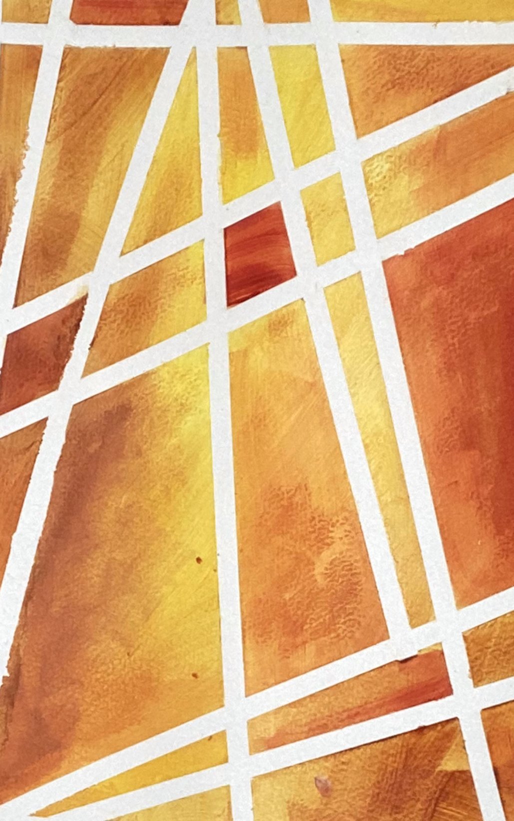
7. Modified frame in frame: Modified frame in frame composition by Doris shy. I call this a framing frame composition, but it's modified. It's just four different sized rectangles. And like all great abstracts, it starts with a sketch, so I want one dark side at the bottom and one dark side at the top. And then I want to add color in the others sections. So just shade it to show that you want some dark there. When I rub my table in, my camera moves with my table. Sorry about that. And I want to add something else. I want to add some marks near where the lust for rectangles join. So I'm just going to draw it like this and see what happens. Keep in mind that sometimes a great idea on paper is different on Canvas. And I just want to make sure that I have a plan before I actually start. And I want to add some textures in the other parts. That's what bat will both scribbles are. But I have a plan. So I take a chalk, can I divide my Canvas? I want not for even squares, but for uneven squares. I like a chalk because it's easy to erase soon, it's easy to paint over. So I'm going to start with white. I'll put White in two of the rectangles and the darks On the other rectangles. So lets us just white paint and it's pretty wet. And I just add it and convert that black up. I'm not that careful, but because I'm going to add a texture to it. If I wanted a nice flat surface, I would probably put two or three coats of white and be very careful about how I apply my brushstrokes. I would be very careful about putting the paint on evenly and not letting any of the breaststroke show. But in this case, we want a little bit of variety. We don't want the white areas to be the same everywhere. Now I spray my wife and I count to 20. What happens is the water dissolves the paint and makes it liquid again. So when I robbed like this, I end up with spots and that's when I want. So if I don't have enough spots, I spray again. So I spray some more and then I Rob again and more spots. That's better. That's more what I'm looking for. Now. I need to let it dry. Now in this video, it doesn't show that I let it dry. It looks like I'm doing everything. Just one after the other, but I'm not every color. I let it dry. So now I'm adding gray and it's very wet paint. You can see it's paddling already as it sits on the surface. And what I'm going to do with that is I'm going to add alcohol. So alcohol gives you these circular bubble shapes and creates a texture mallets done. Now I'm going to add that line and the little bit of spatter. And I have darks and lights and I have that line and I have a I don't like just the black, so I'm going to add white lines. Just added like yes. Now because my black is wet, it's mixing was my weight. So I flipped the canvas over and I've signed to add some pink. So I'm adding pink in there. So it looks like it's a little more dynamic. You want fat lines, you want skinny lines, and you want thin lines. So I'm going to add the pink on top of the circular texture. And I'm just going to brush it in really quickly, just like that. And water it down a little bit and spread it around some more. So I want to get close to the lines, but not touching the lines and I add some of the alcohol. So it creates not only black bubbles are gray bubbles, but also pink ones. And I do the same thing to the other square or a rectangle, I should say. It's not quite a perfect square. And make sure your paint is really wet. This texture with alcohol does not work if the paint is dry, so make sure your paint is really wet. And there we go. I added and spatter a little bit of pink to make it more random. I like irregular edges and spattering really creates irregular edges. And now I add the alcohol and I let this dry. And things always dry differently. So it's just wait and see what happens. I'm going to add a little bit of white Spanner before I keep going. I really like that irregular white spatter. That looks pretty good. And we'll leave it at that. Trying not to do too much. Otherwise. It just looks a mass. Now, I don't like those lines, so I'm using the artists prerogative. I'm going to cover optimal lines. So I'm just taking black and covering all back up. You might have a little texture there because the lines left the bump. No problem. You want to just get rid of the lines. So that's what I wanted to do. I want to make sure that it's interesting still. So that white is little with yet and it's smearing my black. But that that's okay. I'll just cover it up again. I don't like those lines. I don't like that. It looked too much like straw and I don't like that part, so I'm going to just paint it out and choose something else. And see what happens. I just make sure that black covers really well and the lines are relatively straight. Now I'm going to add more pink, going to make them go into the black area. Whoops, I dropped some pink. Remember you have about two minutes tops to wipe it off so that it doesn't become permanent. My black paint little thin, so it's showing a little bit, but I can cover that outputs batter. I think I like the spatter better than the lines. It seems to work better with the circular texture in the pink areas. Now I'm going to add weights pattern, and that seems to unify it a little better. I'm going to add little more white. You want them marks to look random like dues just exploding from that centre. It almost looks like a flower even. But I'm going to add more pink and you tweak it til you're happy with it. And just keep adding. Sorry about my hand. It's hard to paint with my left eye. In fact, I kept so lines so that my eye extends to the borders of the canvas. So that line is creating the illusion that my eye was looking all over the county. And that's what you want. Do you want the viewer to look at your canvas and be fascinated by it? So here it is, all dry. A modified frame and frame. I like the spatter more than I liked the line, so I'm glad I changed it. So now it's your turn. I want you to give it a try, try the modified frame in frame.
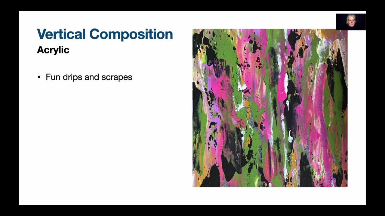
8. Vertical drips: Vertical composition lift drips. So we're going to create a sketch. And all I wanna do with this one is something very simple. I wrote the drips to start at the top and move their way down and flow. I wanna create the illusion of flow. And there should be like in all vertical compositions, one spot that's more interesting than the rest. So have a look at my video on the Golden Mean. You don't put your focal point right in the middle. You put it off to the side, upper right, lower right, lower left, upper left. And then you make sure there's little marks that repeat that focal point and create the illusion of movement. So this is very easy. You just need a lot of paint and a bottle. What's to spray water? So I add my paint. I'm speeded up the video because this is actually a very slow process and you wouldn't know it until you actually try it out. You're going to need a whole week. So you're going to do some things and the first day you're going to tweak it. The second day. Two, we get the third day, and maybe even more. So I'm adding lots of variety of colors. So I have two kinds of blue or black and white. And I've been of gold. And I'm going to just spray those to see what happens. So I spray and I let it drip. You might be lucky. You might spray and let it drip and you might like it the first night. And that means you're done because you never know how it's going to tell it dries really. So I wasn't this lucky with this painting. I had to use several nights, so I'm just going to show you what happened over each evening after I sprayed. So now it's dry and I still don't have a focal point and I have some beautiful color, but I don't have a focal point. So I'm going to just add more colors and let them drip. So I have watered down dark blue, I have gold and I'm going to spray. I liked those darker drips. They really add something. And I need to add loom more water than my spray bottle and spray a little more. Now I add white, I watered down the weight, put it in the bottle, and now I'm just taking the bottle and just adding it at the top. So there's many ways you can do this. You can add puddles of paint at the top and then just spray. Here. I've used most methods where you water down your paint in the bottle and then you just add little bits. You can also water down your paint in little bottles, little glasses, I should say. I use little paper glosses. And then now I'm adding black. Black adds the contrast. Remember that in every painting you want white areas, dark areas, not necessarily black, but in this case it will be black. You'll want many different values in between. So you, in this case, you're going to have graze. You're going to have a variety of blues, variety of grays, a variety of gold, and black and white. And where the paint meats and blends and create something interesting. That is where your focal point is going to be. Keep in mind that you will have to help it along Sometimes because the focal point might end up being in the middle and you don't want that. Or in this case, if you look carefully, there are two focal points. There are two areas that are interesting. And I want to have just one focal point. So I keep pouring until I'm happy with what I see. That's why I said you need to block off a whole week. You might be pouring for a whole week, or you might be pouring for one day. You never know. It all depends on how the how the paint flows together. And that's the fun part of it. It's the surprise element, and that's the element I like the most. So it's starting to come together for me is more interesting parts than there were in others. And I just keep adding and seeing how the peak flows together. I liked the gold. I like to light. I want one area that's lighter than the rest. I've more or less decided I want my focal point to be a light area. And now I'm just adding more and trying to create an interesting spot. And I let the paint drips and land by itself. It's dry again. And I like this area. And it's high contrast. It's got larger shapes and, but it still needs a little tweaking. So I'm just going to work on that one area. I want to make sure that the focal point is in one spot, not in many spots, but at the same time, I want those darks to be repeated. The focal point is going have darks. It's going to have gold and it's going to have white. And it's either mangle now. And I just am trying really hard to emphasize my focal point. And I keep painting. Like I said before, it might take ten tries, might take one try. You just don't know how the paint will react and what will happen. So now I let it dry. Here it is, that's the focal point. I want that area. But that one other white rate there is competing with the white areas. So I'm going to add a bit of blue. And that way it's not competing. If I add blue in one spot, I should add it elsewhere. So I'm adding it here so that my i is repeated with the blue's. My eyes, sees different spots in the canvas with that same value of blue. That's what I meant to say. And that way it creates a repetition and a vertical composition. That's one of the main elements of a vertical composition, is the repetition of values and different colors. So this is C u, the focal point right there, and all the different areas that lead to my focal point. So that's what I want. I want different elements in the painting leading to the focal point. So give it a try and then we'll see you in the next video.
9. Circles: Welcome back. Drips and circles by dora. So what we're going to do today is start with a sketch as usual. This is a composition mice, students just love doing. And it involves just circles and lots of trips. You can choose the size of circles you want, and you can choose the colors you want. It at all is up to you. I want a darker Brock I want a darker background in this case. And then the drips come from the circles. I can imagine localist drips would look like. But really once we get adding the drips, a lot of it is hazard. My favorite colors at the moment are blue, so we're going to be using blues. You can use whatever colors you want to use and see what happens. If your favorite colors are orange and yellow. Use orange and yellow. Doled use a colours I used simply because I'm using them. Try it out, do something different. So here are my colors to variations of blues, gold and white. Step one is covering that whole canvas with a variety of blues. So I want to create a background surface. I can wet the surface a little bit. I don't want it to be a flat color. I want it to be varied color. So I have darks and some areas light in other areas and just cover the surface really well. And again, you don't have to use my colors. You can use whatever colors you want. Now to make the circles, I'm going to use the lid of my gel campaigner. And I'm just going to paint my gel container edge. And you can use anything, you can use any land of any kind to create this circle. So I paint the edges of the lid and I stamp like that. So I wanted to add the second one. Then I paint my LED edge and I could use different colors if I wanted to. And I let it dry. Now right here, I'm adding a bit of color just to see what happens. It almost looks like the Aurora Borealis. So I want to spread the gold around with the blue, just see what happens. You might like it. You might want to try this experiment. Don't be afraid to try salting. If you have an idea, just test it out. Remember this is just Canvas. It's just a canvas. It's not gold. You can experiment with anything, any idea you will have. Just trial experiments at end up being great ideas sometimes. And you never know until you actually try it. And then move on to the next step. I keep adding and adding, and now I stop and let it dry because you never know what'll happen. It's quite dry, but I don't like it. So what I'm going to do is just paint over it. And now I want to cover everything up and start again. I'm going to mix a little bit of gold with the blue and just create a brand new surface. Here. There's all dry. Again, I start so I paint the lid of my gel container and I start again. I just put the circles back where they were like that. Now what I'm going to do is I'm going to drip paint. So I added a bit of water to my paint and I made it more liquid and now I'm spraying the paint down. And I put added water to the gold. And now I'm going to just let it drip and see what happens. You can tweak certain areas. I liked the way the gold spreads. And here I'm just going to spread this gold around. Here is where you need several days in a row to do this. So you do one of these steps one night, and then you do the next one another night. You're going to add many layers of drips. But remember, it's just way better if you just do one color per night. Here. I'm doing more than one color per night, but really the best is just to do 11 night and then let it dry and then adds more and see what happens. You can try it this way too. I just find I have more control when I do one-color per night. And here I'm spring just so that it spreads a little better. I have to put it at an angle so that the paint to a drip. So you're not seeing the whole thing, but you get the idea. Here. We're going to just add little bits and let it drip. When it drips like this and dries overnight, what happens is it changes. So what you see now will not be what you will see once this is dry, you're getting the speeded up version and now I'm just adding a bit of water again so it drips even more. It's dry now. And I like some areas but not others. So I'm going to try and tweak it so that it looks a little better. I'm using a dark blue. I am going to spray this small amount of paint and see how it creates another value. So you'll have white, light blue, medium blue, and dark blue. And the gold acts like a medium value as well. So you have a lot of variety. So you just paint a small spot on and spray for does't work, you just do it again. This is not a composition. You have to think a lot about. Your goal is to have these colors blend and just enjoy the process of the color falling together. This is to me, almost like a dream catcher painting. It just makes me think of the dream catcher. I love the way the colors blend. And you could almost write a story about how the paint goes together and what it means. You can tweak with abreast. I'd like to add little bits of white so that we don't lose the circle. Because it can happen that you'll lose the circle and that will spatter a little bit. So it's not just in one spot and it makes it look like stars almost. And I will want to just spatter a bit more and then take out anything I don't like. That one spot was big spatters and I didn't like the big spatters. I didn't want big spatters. And now I want this dark blue to jump all the way down. I had a bit of water with my brush and their goals, and little bit more space, starting to be a lot of spatter. Not sure I like it, so I'm going to make it thus batter drip as well. So I spray the spatter and see what happens. But it just looks like planets coming out enough space or dream catchers with beautiful wool coming out from it. It makes me think of dreams and just fun. So now your turn, Give it a try. Remember you can change the colors, change the size of the circles, change it any way you want.
10. Conclusion Out of the box: Conclusion. Abstracts are fun. You've learned five different compositions. You have learned to use different tools. You have learned that abstract painting can be easy. You have learned that abstracts are fun and they are. We've touched all kinds of different compositions. The x composition, the high horizon composition, the diagonal composition, the vertical composition, the explosion composition. I hope you had fun. I sure had fun teaching you. Now look for my next class, fast and fun abstract compositions. See you soon.
 Doris Charest, Contemporary Fine Art Specialist and Instructor