Transcripts
1. Introduction: Winter is one of the
coldest seasons. It is a magical time of the
year when the weather gets cooler and the people enjoy
the weather around them. The essence of winter cannot
be described in one word. It is the hot cup of
coffee in the morning. It is the wall you get
from the fireplace. The fun of making a snowman is what forms the essence
of winter season. There is a charm about
slope field mountains, winter Kevin's,
and dreamy skies. The winter months offer incredible frozen beauty and
often soft diffused light. We will be capturing
this Fintech a sense in this class by painting a
dreamy winter landscape. Hi everyone. I'm Charlie kg into a
business consultant, a watercolor artist, and
a Skillshare teacher. I have been documenting
my watercolor journey on Instagram and go by the handle name at the
rate, Schultes chronicles. In this class, we
will cover some of the basic watercolor
techniques, like wet-on-wet. Using the wet-on-wet technique, we paint a color sky and also learn how do we get the
cloud effect into the sky. With the techniques
learned from this class, you will be able to paint wonderful skies and clouds
for your own projects. We will also learn how to paint the winter trees and combined all the different
components to paint this dreamy landscape
without any further delay. Let's move on to
the next section and look at the materials that
we require for this class.
2. Materials : Let us have a look
at the materials that we require for this class. For the paper, I'll
be using our cheese, 300 GSM, 100% cotton paper. I have this paper pad with me. What I've done is I've cut this one sheet of paper
into four smaller sheets. And this is what we will
use for the class project. You can go ahead with any
size of paper that you have. But I would suggest
using 100% cotton, 300 GSM paper for this class as we will be working
on wet-on-wet technique, I have listed down some other options in the
description section. Moving on, The next, we need our brushes. I will be using
these four brushes. The first one is a mop brush, large size, which I'll
use to wet my paper. The second is a
medium-size brush. I'll be using this one on the brand's liver
will wait size six. And the next two are
the detailing brushes from the brand Princeton. One is a long round
brush of size four, and other is the detailing
brush of size 12 by zero. You can go ahead with
any large size brush, medium-size brush, and
a detailing brush. Moving on to the colors, I will be using two
types of colors. One is a pan set from the brand Art Philosophy
Co, based on dreams. I will be using two
colors from the set. The other or the tube
colors that I'll be using from the brand
medulla machine gourd. The colors will be
discussed in detail with alternate options
in the next section. But you can go ahead
with any type of colors that you have, any brand. Beat, a pan set or tubes. Next, we need a palette. I will be using this palette to take out and mix my colors, will also need masking tapes. I'll be using two
different types of masking tape for
today's class project. One is the thick one, which I'll use to tape down the paper on my writing board. And the thin masking tape. I will be using that to
mask the horizon line. We will also need
two jars of water. One, we will keep it clean to apply an even coat of water. And other we can use
to wash your brushes, will need a pencil and
eraser to sketch our cable. I'll also be using this
kneading eraser to tap on, Sketch and lighten
the graphite marks. And the last is tissue or rough cloth to
wipe your brushes. Gather the materials
that you have. And let's move on to
the next section to understand the color sheets that we will be needing
for this class.
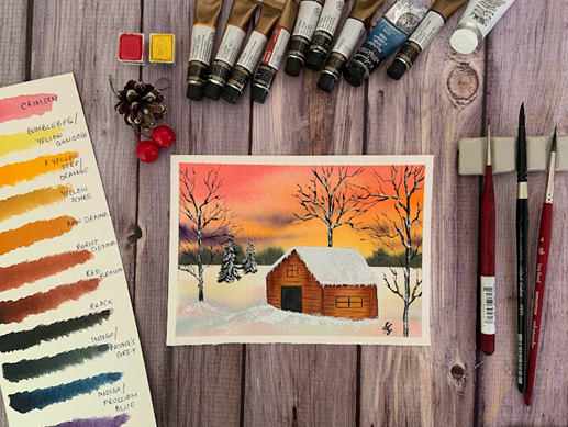
3. Colours: Let us have a look at the colors that we
require for this class. First is crimson. I will be using it from the
brand Art Philosophy Co. But this is a common sheet available in all our
watercolor sets. Be it a pan set or a tube set. You can use the color of any
other brand that you have. Next is bumblebee. Again, I'm using it from the
brand art philosophy called the alternate colors
that you can use is yellow gamboge hue. And this is also a common sheet available in all the
watercolor sets. You can also go ahead and use any other bright
yellow that you have. I have already taken out the colors from the
cubes into my palette. The next color is
permanent yellow deep. This is not a common sheet. I'm using it on the brand
Magellan Mission Gold. You can use orange as an
alternate shade for this color. The next is yellow ocher. This is like a transition
shade between bright yellows, oranges, and earthy tones. This color looks like the
color of sand and mud. This shape is also commonly available in
the watercolor sets. Next color is raw sienna, moving towards more of
browns and, or the sheets. Next is burnt sienna. Next shade is similar
to burnt sienna. Darker color called
as red brown. You can use a darker
shade of burnt sienna. If you don't have that brown, just add jeff Payne's gray to
dark when you burnt sienna. The next shape is a very
common color, black. We will use this to
paint our trees. Next two sheets of
gold as indigo, but they are made of different pigments,
hence differentiates. This indigo is grayish in shade from the brand
Magellan mission. This indigo is bluish shade
from the brand Sennelier. I'll just show you
the difference. The one from the
medulla mission. If you look at the
pigment names, it's P B29, be B27, and PB K7. Whereas pigments from
Sennelier are Pb, pb 15 colon one can PB K7, although both are called indigo. But because of the difference
and pigment names, the shades are different. If you don't have the
indigo with gray shade, you can use Payne's
gray as an alternative. And if you don't have
indigo with bluish shade, then you can use Prussian
blue as an alternative. The last sheet is white
gouache or white watercolor. I will be using the Winsor and Newton design a
gouache for this. So these are the colors that we will be requiring for
today's class project. Let's move on to
the next section and learn some of
the techniques.
4. Techniques - Sky/Cloud: Okay, so for the techniques I'll be using this watercolor block. And what I'll do is
I'll split this block into two with a masking tape. The three-fourths of
the paper will use that section to learn the
technique for painting skies. And the rest one-fourth, will learn the technique
to paint trees. The technique that
we'll be using to paint the sky is called as
the wet on wet technique. What does this actually mean? This means we'll be
applying wet colors, which is basically when you add water to your watercolors
to activate it, that is the wet
part of the colors will apply this wet
color on the wet paper. Now how do we wet the paper? Basically, we apply an even
coat of water onto the paper. Let the papers soak the water. So this makes your paper wet. And when you apply wet
color on top of it, so it's basically wet
color on top of wet paper, hence the wet on wet technique. Let me show that to you. Before we wet the paper, I'll just take out
some colors from the pants into the palette. Activate them, keep them
ready so that we can paint as soon as we're done
with wetting the paper. Now, applying an even coat of clean water onto the paper
generously and multiple times. Make sure no section
of the paper is dry. Spent some time on this, and totally and generously
wet your paper. The more time you
spend on this step, the more time you will get
to work on your sky as the moisture in the paper will stay humid for a longer
duration of time. Okay, So we are already
taking in the color. So let's see what happens if I apply a stroke off crimson
color onto the paper. This, the color bleeds
beautifully onto the paper. This happens because
the paper is wet and we apply the wet color. Hence, natural spreading of colors onto the paper happens. Applying more strokes. I'll just keep some of
the whitespaces onto the papers as we're painting sky with two different colors. I've used the same color
combination just to give you an idea on how we are going to paint it into the class project. But the same technique
can be used with a combination of different
colors to paint sky. It can be a combination
of blue and pink. It can be combination
of blue and yellow. Wish beat any sky, any color technique
remains the same. Now what I'll do is I see, because the water
content in my color is almost same as the water
content on the paper. The color is bleeding a lot. So I'll just take more
consistency of the color, less of water and then
apply the strokes. You see the difference before the color was bleeding a lot. I was not able to
see my strokes. Now because I've taken color
directly from the pan, I have not added in more water. The color is thick versus the
water content on the paper. And hence you are able to see the strokes of the
crimson color. Now adding in yellow
in-between the whitespaces, or even on top of crimson. Now as yellow and
crimson when combined together give a beautiful
shade of orange. Hence, we're able to work
together with these two shapes. Because of this wet
on wet technique, you can see how beautifully
and naturally the colors spread the combined
with each other and give a beautiful
contrast, beautiful shade. Although we have just
used two colors, but as you can see on the sky, we get an effect
of three colors. Just because of the bleeding and blending of colors
happening naturally. Just adding in more
yellow to have a little more brighter
and distinct effect. Just one caution while
working on wet-on-wet technique is you just
work on the paper. The paper is wet. As soon you find papers
is starting to get dry and your strokes are
leaving out harsh edges. We should stop all the bleeding
of colors that was living supernatural will
have harsh lines and will not look so beautiful. Now say, we want to
add in the clouds as the paper has now
started to get little Dr. This is the time when you can
add clouds to your Skype. For that, what I'm doing
is I've just taken violet, purple shade onto my palette. I've activated it with
very little water. So the water content of
your color should be less than that of your paper
to get prominent strokes. And when you are
painting clouds, we want at permanent strokes. So taking the color, dabbing on the excess water
onto the tissue or the clock. And then just adding in cloud-like strokes
onto the painting. You see as the paper
is still wet and we have water content
in a color as well. It is bleeding, but it's
not bleeding a lot. This gives the natural effect of the clouds being
part of the sky. Again, taking in more color, dabbing on excess water onto your tissue
paper or your cloth. And working on the strokes. As the water content of a violet color is less
than that of the paper. Because the paper has now
almost started to drive. And we have not taken a lot
of water into a violet color. You see these strokes, the tape prominent,
they do not bleed. As the paper is now
starting to get dry. You can see in the top
patches it has become drier. It's better. We stop
with the painting now. The main concept of
wet-on-wet is to paint only till the
paper is wet and stop, as well as the paper
starts to get dry. This technique can
be used to paint multiple sky's chi gradients. Even if we don't want
to paint a cloud, just two colors blending together to give
a beautiful sky. You can use the same technique. This was the first
technique that we will be using to paint our
dreamy winter Skype. Let's move on to the next
technique and understand how do we paint the bearing
or the winter trees.
5. Techniques - Trees: The second technique
will be used to paint the winter trees
or the parent trees. I'll be using my
detailing brush for the same and black color. So taking some color on the brush during
the winter season, all the leaves from
the trees fall off and treats remained
barren with the trunk, the branches and the tiniest
branches being visible. So we start with the
trunk of the tree. As the natural trees
are not straight. They are grouped from places. That is what we will try to
paint in this technique. So here I'm starting
with the trunk. And as we go above, we can split this tree trunk
into 34 main branches. And then we split
those three for individual branches
into more sub-branches to get the effect of the tree. So here I have split the
trunk into two main branches, and then the branches have
split more into sub branches. And then using the
tiniest detailing brush or a detailing brush
with a good tip, we paint out small thin
branches from each of them spreading out across and giving
the shape of a tree. To have the natural effect. You can have group
lines for the branches. The branches might
not be straight, they might be tone twisted. The technique using
which we have we did the tree comes under the
category of wet on dry, which means that
paper was dry and we have applied wet
paint on top of it. Near the main tree, we can have some smaller trees are small bushes also painted
in the similar manner. So these are the
two main techniques that is used in watercolor. Wet on wet, wet on dry. So combining these two
is what we will be painting a class project today.
6. Project - Sketch: Let us start the class project. Hyper paper head on the writing part using
the masking tape. Let's take down the paper
on all the four edges. Let me show that to you. While applying the basicity, make sure to run your fingers
between the people and the masking tape so as to not leave any
gaps between them. As we are working on wet-on-wet, there is a chance color
leading into the corners. If the masking tape
is applied properly. We're ready to sketch
a class project. It's going to be a
very simple sketch. On the top to torque
would be our sky. And one thought
would be a ground. Let me just draw
the horizon line. Now let's sketch the Cuban. Okay, so we're done with it. Just adding on some trees
around the Caribbean area. Okay, so here we are
done with the sketch. I just use the kneading
eraser and tap onto the graphite marks
to just lighten them. As I mentioned in the
materials section, I'll be using to masking tapes. So the tin masking tape with
elastic and capability, I'll just apply it
on the horizon line. As we will be working on
wet-on-wet technique. I don't want the water to spillover to the
bottom ground area. If you don't have the
masking tape, It's okay. Just make sure while
applying the water, be very careful to not let the water seep into
the bottom area. Okay, so here we are
ready with the sketch. Let's move on to the next
section and paint this guy.
7. Project - Sky: Let's start with the painting. We will be working on
wet-on-wet technique. Let's apply a thin, even coat of water
on the sky area. Here I am using my larger size brush and applying an even coat
of the Clean Water. Be very careful to not apply
water onto the roof area. Apply multiple layers of water. This is just to make sure that the paper gets caudally vet. And this makes it easier to walk on for a longer
duration of time. Just taking the tissue and dabbing excess water
from the corners. Again, apply an even coat of
water to keep the paper wet. So crimson, yellow, gamboge, and permanent orange are the colors that we will
be using for this guy. Plus little tinge
of wallet as well. So you can keep these four
colors ready on your palate. Starting to paint the
sky with crimson. I'm just taking some
color onto my palette. I'm going with the
horizontal stroke, like we saw in the
technique section. Keeping some whitespaces. Similarly, let's add in yellow gamboge or bumblebee
into the white areas, as well as on top of some
of the crimson area. Got some yellow and the blue. So just take some tissue paper and dabbing off the
colored with it. Now baking simple
mint orange and similarly applying some
strokes or to the sky area. So taking more crimson
as the color looks dull and applying another coat of the crimson color
onto the sky area. Similarly, adding
another layer of yellow to get it through
more brightness. You can play around this guy. Keep on adding more colors till you're happy with the
brightness of the sky. Just make sure that you work on this guy will get in.
The paper is wet. As soon as the paper starts
to dry, please stop. Else you will get harsh
edges on the Skype from the brush strokes. Here. I'm happy with this guy. Now what I'm going to do this, I'll just take little while it, a tick concentration with
less water than one, the excess water onto the tissue paper or
the love of God. And as we saw in the
technique section, we will just create some
cloud-like strokes. So here I'm just creating
those clouds strokes. Okay, so that's all we
have for the clouds. Now as you can see, the colored is
spreading and we have thread-like structure
of the violet color. So I'll just take
some little bit of yellow and I just apply and clean up the area
below the clouds. And similarly, I just clean
up my brush with just damp brush soaking in all the excess water
on the tissue paper. I'll just run my brush through the clouds to avoid having
the thread like structure. The last thing that
we do is using indigo or the Payne's gray and
dabbing off excess water. Because now our paper has
started to get right. And before it completely dries, we will add just some bush like structures on the horizon. So this gives an effect of some verified trees and bushes, which are not very
clear and as it's wet on wet bleeds beautifully
into the background. Okay, so here we are done with the sky and the background. Let's wait for this to
dry before we move on and paint the foreground
and the first given layer.
8. Project - Foreground + Cabin : Okay, so our sky has dried and now we can
remove the masking tape. For the foreground. We're again going to
paint wet on wet. So again, taking
the large brush and some clean water will apply even layer of water
on the ground area. Being careful around the
horizon line and the Caribbean. The paper is now wet. The foreground has
known as the sky has the shades of yellow,
pink, and orange. Those are the colors that
will also be found on the ground because of the
reflection on the snow. So just randomly
applying those colors, taking some yellow and
applying the random strokes on the ground like this,
followed by crimson. We will not cover the
whole of the ground. We will have some whitespaces, some crimson, and
also some indigo, the bluish indigo, to get just a bluish tinge of showing
the snow over the ground. So going ahead with some
crimson and then indigo, you can go ahead with
any blue that you have. That's it. Our ground is ready. Let's wait for this to
dry before we paint on. The ground area has dried and
now let's paint the cabin. So again, we will use the
wet-on-wet technique, but as the area is small, I use my size six brush and applying even coat of water on the wooden area
of the cube it. So here I am applying
the even coat of water. And once it's done
using the yellow ocher, that is the lowest shade of
orange tones that we have. We'll just apply some
color on the window area. It's okay if the
color spreads across the cabin as the cavemen
is a wooden cabin, we will have different shades of food across the Caribbean. So using that concept is what we are going
to paint a cave in, starting with the lowest shade, which is the yellow ocher. Then we'll move to raw
sienna and drop in some colors across the
Caribbean like this. So here I am just dropping
in some of the raw sienna. Moving to the next sheet, which is then burnt sienna. Specifically around the ages, it would be slightly darker. So applying the tone of
burnt sienna over there. And then just using clean
water or a damp brush, blending out all the colors. Once done, taking the red, brown or darker,
burnt sienna shade. We'll apply this color again on the edges where there might
be darker wooden shades. Using the damp brush just again, blending out the colors. Just taking bit of yellow
ocher and applying it all over the window area just to get that in just
orangeish color back, sticking more of
red brown and just highlighting the darker
areas of the shed. It's okay if the color spreads because this is
just the first layer. Okay, so here we are done. You can see we have
brighter shades of colors around the window. And as we move
further from there, the shade of brown darkens. Let's wait for
this to dry before we add in more details
onto the cable.
9. Project - Cabin + Background trees: We will be using grayish
indigo to paint the door of the shed or the
keeping that they just take out some of the
indigo on my palette. And it would be a flat wash
of color across the door. So this is done. The roof of the shared has no so some sky deflection would
also be dead on the roof. So just using the wet-on-wet
technique, again, applying water and
then dropping some of the crimson and yellow
gamboge onto the roof. It's okay if it is not perfect. Because we will be painting some snow effect on
the top of the roof. Now using my detailing
brush and the color black, we will paint the trees
in the background, starting with the tree. So as you can see, this is Christmas tree painting. Leaves downward,
starting from top with less leaves versus
as we come down, the number of leaves
are increasing. And so, as you can see, the thickness of the
brushstrokes also increases. Just dropping some cluster
of leaves structures will paint two of these trees. So in a similar manner, we'll paint a shorter
one beside this. And the same
approach at the top, the number of leaves
is less so we have less scribbling
of the brush. And then as we come down, we tried to paint and give effect of more
leaves on the tree. So the next tree is like the one that we learned with
the technique section. So I'm starting with
the top two branches, which are divergent
from the same trunk. We're going to paint
on more branches like the tiny lines. As it's winter, it's bearing. So we will have more
of the brands effect versus the nice effect
compared to the previous tree. Similarly painting another
one on the right side. Similarly painting the
one behind the cabin. Just go with the random strokes. The line doesn't have
to be very straight. The trunk of the tree
doesn't have to be very straight as it's all natural. You can have a big sack moment. Okay, so we're done
with the trees. Let's wait for this to dry before adding the final details. The Caribbean and the painting.
10. Project - Final Details: Using black and the
detailing brush, Let's add the window
details to the cabin. Okay. Now using my
smallest detailing brush, which is size 12, mix of burnt sienna
and red brown or you can use darker
shade of burnt sienna, will just add in these word-like lines
across the Caribbean. Now in some places
they could be dark, in some places they
could be light. These depict the wooden
pains of the Caribbean, which are somewhere darker
and some were lighter. Using the same color, darkening the areas
near the edges of the cube it just highlighting. And given different contrast of dark and light colored wood. Adding some strokes
on the ground. Now, taking some white
quash onto my palate, we paint the snow effects
on the landscape. Starting with the roof. Just being things that move
with the white quash to give the effect of a layer
of snow on top of the roof. The consistency of the
course is very thick. I have not added water to it as the water content
in the color. If you just move your
brush with the color, it will give some dry effect. The colors spreading
would not be as good as with a paint that has
a water container. Continue with the dry
brush stroke on the tooth. Adding some frozen
ice drop structures across the roof area. Adding the dry brush pattern
onto the ground area. It just helps give the landscape
or Dimension 3D effect. Applying the gouache
onto the trees as if some snow has collected on
it after a fresh snow fall. Adding this effect that
randomly across all trees. Adding some more
dry brush patterns on the edge of the trees. The very clear bifurcation
between the ground and the trees that can be awarded with this dry brush technique. Now let's wait for this to dry. We are done with the painting. Once tried, we can
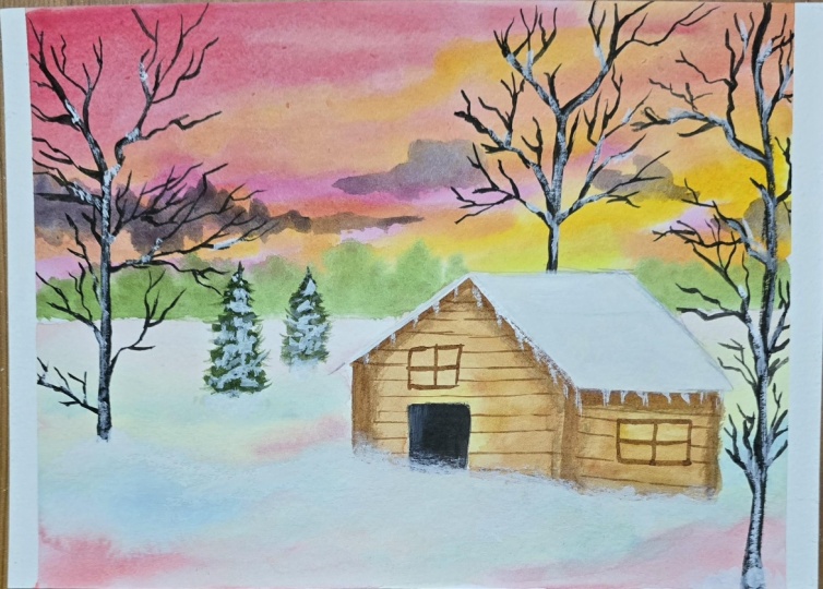
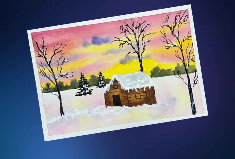
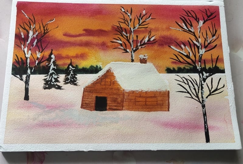
remove the masking tape. And this is how the final
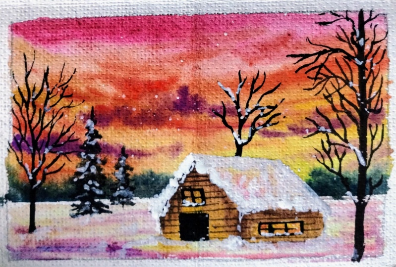
painting looks like. Doesn't this look like a
dreamy winter landscape?
11. Conclusion: Congratulations, You made
it to the end of the class. I hope this class was helpful and you learn
the techniques, especially painting the
skies and the clouds. Don't worry if you didn't get it correct on the first
try. With practice. And over time, you will be
able to paint beautiful skies, like I have been able to do. If I can do it. So can you, if you
like the class, please do share review, and don't forget to upload
your class project. I will be looking
forward to have a look at them till we meet again. Happy painting. Buh-bye.
 Shalika Gupta, Watercolor Artist