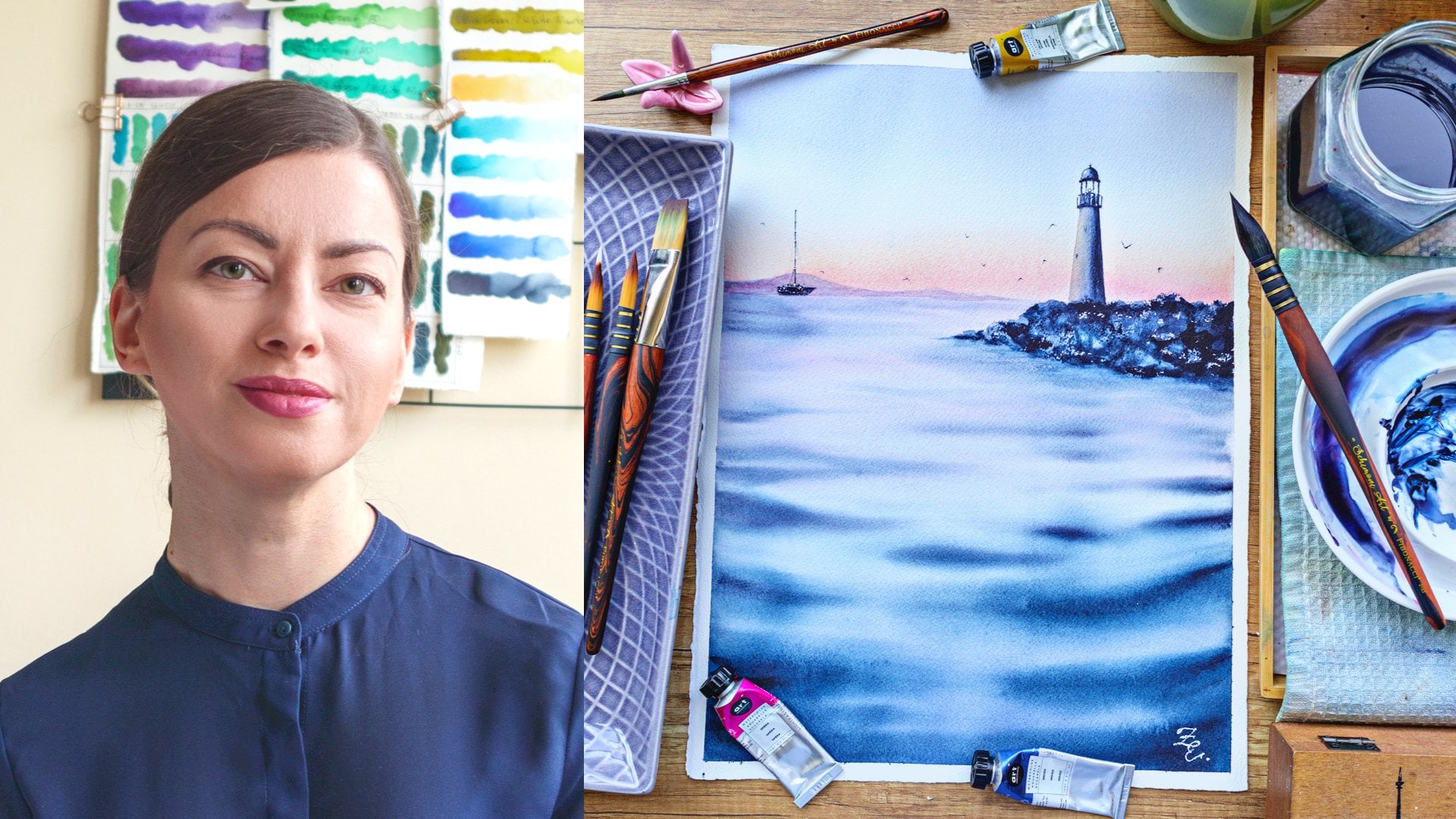
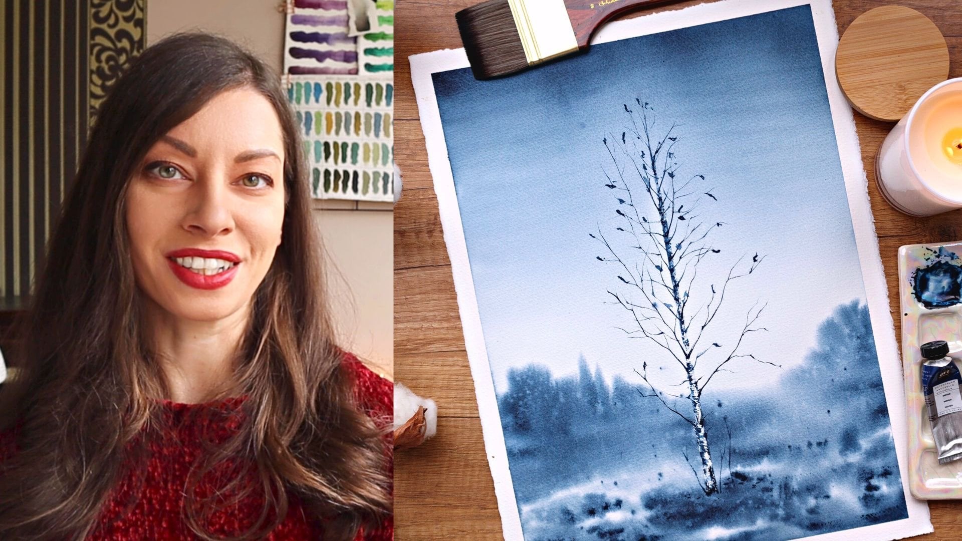
Transcripts
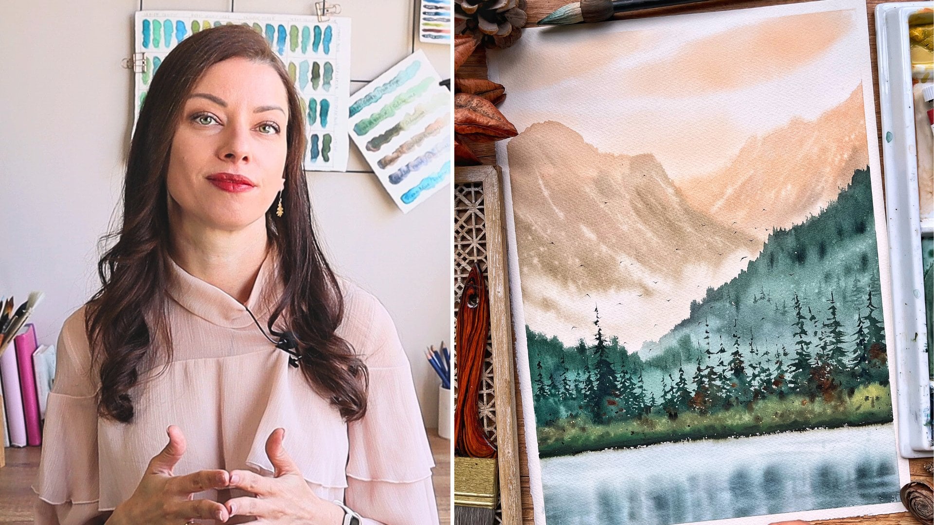
1. Welcome to Class!: [MUSIC] Hello friends.
My name is Elina, and in this class, I'm
going to show you how to paint dreamy sunsets
with watercolor. It's been three years since I discovered the magic
of watercolor. Since then, I'm constantly looking for new ways to improve, and I continue to
experiment with different topics and
subjects for my paintings. But one thing I'm always excited to paint and that
is sunset skies. I love the way the sky
is changing at sundown, the beautiful colors
put together in a perfect color palette
that glides in the sky. It's really a wonder and such an inspiring
thing to paint. In this class, I'm
going to guide you to the different elements that make a beautiful
sunset painting. We'll start with the basics. Mixing and matching
our colors is one of the most important steps
for harmonious scenery. We'll learn and practice
different types of watercolor washes that made the background of
various sunset sky. I will show you how you can add some interest by using different elements that
will complete your work. Last but not least, I will show you my secret
for fluffy clouds. This class is for you if you
want to learn how to paint beautiful and harmonious
sunset scenery. Are you ready to
make some magic? I'll see you in the next video
where I will tell you more about our final project. [MUSIC]
2. Class + Project Overview: [MUSIC] For the final
project in this class, we're going to paint a
beautiful sunset with clouds. I love painting this. It feels so calming
and relaxing. Almost every sunset has my favorite colors,
pinks and purples, and I love playing
with them and watching them mixing and creating
magic on the paper. You can use this project as
stepping stone for creating more and more complex works
just by changing the colors, composition, or by adding
different elements to them. Don't worry if this looks
too complicated for you. We'll start from scratch and I will guide you through
the whole process. We'll start by choosing a color palette that is
harmonious and well-balanced. We'll practice the
different types of watercolor washes that are the base of every
watercolor painting. We are also going to
have an exercise session where we'll practice
the techniques before jumping to
the final project. If you are new to watercolor, I strongly suggest that you
take my previous class, Watercolor Secrets: Techniques for Adding Magic
to Your Paintings, where I explain the basic
watercolor techniques, water control, which
is extremely important for painting beautiful
skies and clouds, and you will learn some cool
techniques that will make your painting look more
complex and magical. Otherwise, I will see
you in the next video where we'll discuss the
materials for the class.
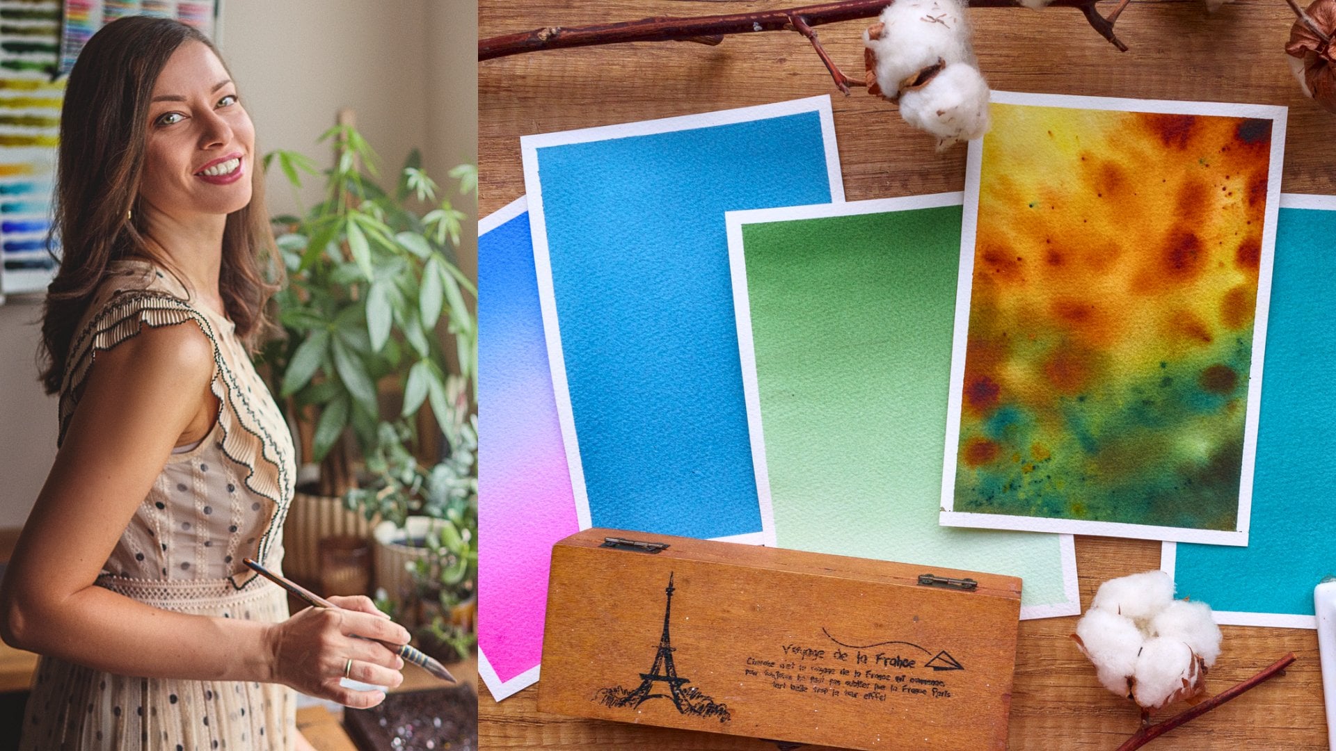
3. Materials: [MUSIC] Here's what materials
you'll need for this class. First and most
important is paper. I recommend that you use
100 percent 300 GSM paper. Using cotton instead
of sales paper is crucial for the techniques we are going to
use in this class. Small planes are easier to
achieve on cotton paper, plus it stays wet
for much longer, which is very
important for painting natural-looking skies
and fluffy clouds. I will be using Fabriano
Artistico cold press. It has very nice picture. I hope you can see. You can use whatever
brand you have available, but try to find 100
percent cotton paper. There are so many
options on the market, Some of them are
quite affordable. You are going to need something
to tape your paper to. For the final project, I am going to use
this plastic board. Try to find a board
that will not absorb the water
because I will show you a technique with
which you can keep your paper wet for
a longer time. For the exercises, you can
use whichever board you have or even the back of a
sketchbook or a magazine. Of course, we'll need
watercolor paints. Generally, they
come in tubes and pens and you can use
whatever you have already. For this class, I will be
using my big tin palette. These are various brands, but most of it is White knight. For my sunset skies, I love to use pastel colors. White Nights are having a
nice range of pastel shades, and I'll mostly use
them in the class. Don't worry if you don't
have pastel colors. I will show you how to make them yourself in the next lesson. Here are the brushes that I'm going to be using in this class. First, I will use my big
hake brush to wet the paper. It's very soft and it
holds a lot of water. You can use your biggest
brush for the purpose. For the washes, I will use
my Escoda Ultimo Size 10. For smooth washes, you need a soft brush that holds a lot of water and pigment and distributes the color
easily on the paper. Look for a square-end
synthetic squirrel mop. I will also use my Silver
Black Velvet Size 10. It holds a lot of water pigment and it has a very nice point. For painting the clouds, I will use my Princeton
Heritage Size 4. It's a synthetic brush and
I have it for a while, so it has lost its pointy tip, but it's perfect for painting
clouds since I can be a little rough with it without worrying that I will ruin it. Synthetic brushes
hold less water, which is exactly what we
need when we paint clouds. We don't want to
introduce more water than we already
have on the paper. For some of the
additional elements, you might want to
use a flat brush. I will use my Daler Rowney
Aquafine half-inch brush. Don't worry if you didn't
have a flat brush, you can use a round one instead. Lastly, here's my
secret weapon for painting for the clouds,
a smaller hake brush. It has such soft
here that I can use to blend the pigments without
leaving brushstrokes. I got it for just a
couple of dollars, but if you don't
have this brush, you can use a big soft brush, but remember to use
it while it's dry. I will use a cotton towel to absorb the excess
water from my brushes. I got this one from my Ikea and it can take a lot of water. You can use a paper
towel instead. I will use both. You will need the paper tape to tape down
your sheet to the board. You can find those in any hardware store or
the bigger supermarkets. I won't be making any
sketches for our skies, but you may want to use
a pencil and an eraser. I love to use this
mechanical pencil because it doesn't
need sharpening. For watercolor paper, I suggest that you use
a kneaded eraser. It's more gentle and one
mess up its texture. If you don't have pastel colors, you will need white
gouache to mix them. Mine is from Raw Talens. A spray bottle, you don't
necessarily need this. I'm using it to
activate my paints. Next, you'll need something
to mix your paint. I'm going to be using
a ceramic palette. I prefer that instead of
plastic or metal palettes because it doesn't stain
and it's easier to clean. You can use just a
regular ceramic plate. You will need two cups of water. One you'll be using to wash
off your brush and the other we'll use when
we need clean water. I will list all the materials
in the class description. Please don't feel
compelled to go on by any of the materials
I'll be using, just use whatever
you have in hand. Gather all your
materials and I'll be waiting for you for
our first lesson.
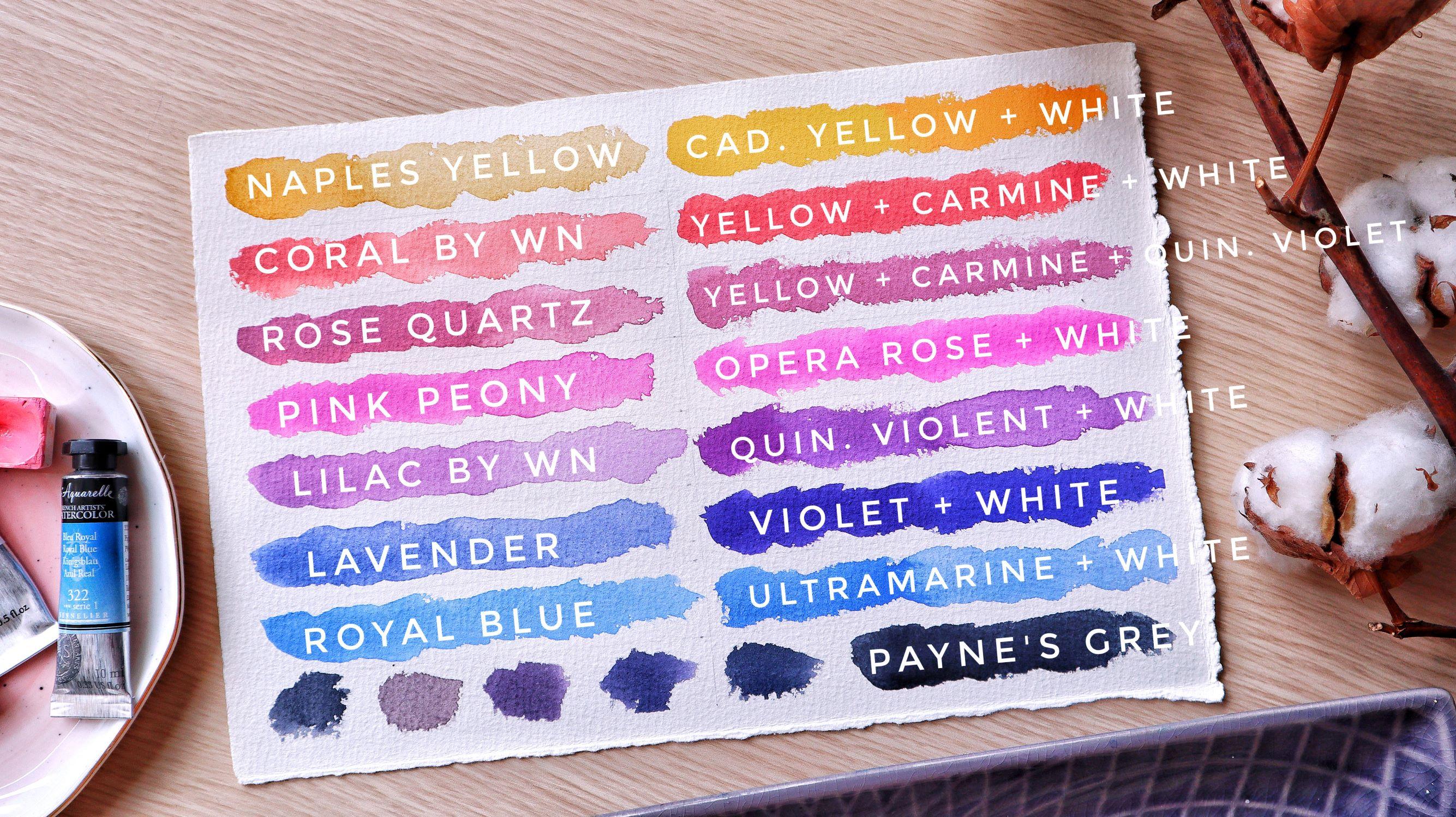
4. How to Mix Pastel Colors: [MUSIC] In this lesson, I will show you how you
can mix pastel colors. If you don't have any, all you need is your
regular watercolors and some white gouache. Watercolors are known to
be a transparent medium, which means that you
can see the paper and previous layers
of paint through it. It's one of the most beautiful
features of watercolors and it can be used
for amazing effects. But there are also opaque
watercolors which have a thicker consistency
that allows them to cover previous layers
at some extent. There are also semi-opaque
colors that are basically in-between
transparent and opaque. Watercolor paint brands are marking each of their
colors with symbols on their packaging so that
we know if the color is transparent,
semi-opaque, or opaque. You can also check
their website, almost all of them have
this information available. In watercolor, pastel shades are achieved by adding
white pigment to the main color and
this is how we're going to mix our
colors in this lesson. I have taped my
paper to my desk. On the left side of it, I will show you my
favorite pastel colors for skies and on
right right side, we're going to try and
achieve the same shades using more common colors
and some white gouache. Let's get started. I love to start my
sunset paintings by using some Naples yellow. This one is by Roman Szmal. Next one is coral
by White Nights. [MUSIC] This one is
called rose quartz. Again, by White Nights. [MUSIC] Next one is pink
peony by White Nights. It has beautiful pink shade. [MUSIC] This one
is called lilac, again by White Nights. [MUSIC] Lavender by PWC, it's a very beautiful color for sunset skies and for clouds. [MUSIC] Last one is royal blue, again by White Nights. I'm using this color a lot. Now let's try to match
those shades by using some regular colors that
everybody has in their palette. I'm going to start by picking
some cadmium yellow light. [MUSIC] But first, I will
need some white gouache. Again, this is by Royal Balance. I'm taking some white
gouache with my brush and I will place it
here on my palette. I'm not adding water to it, I want it to be thick. I'm adding some of that to
my yellow color over here and you can see that we already
achieved a bathtub color. I will add some more yellow to it and a little bit of orange
because it's too lemony. I want it to be more warm color. A little bit more
orange. Let's see. [MUSIC] We can make
it even warmer. I'm adding more orange. [MUSIC] This one is better. Next to the very same mix, I will add some carmine. If you don't have carmine, you can add to it any
cold red that you have. Cold red means the red that
is more on the pinkish side. A little bit more, [MUSIC]
more white gouache. [MUSIC] We are already having this beautiful
pinkish shade. [MUSIC] Now I will take
some quinacridone violet, I will mix it here
on my palette, and now we'll add some of the white gouache
directly into it. [MUSIC] This is how we match the lilac
shade which I love. I need more white gouache. But you can make those
according to your taste. They can be more
intense or more pastel. I will add some of that
color to my mix over here. [MUSIC] This is how we're achieving this
dusty pink color. [MUSIC] Next, I'm
taking opera rose, this one is by Jackson's. [MUSIC] I'm adding some
white gouache to it. [MUSIC] This is how I match the color of pink
peony by White Nights. [MUSIC] Now let's try to mix lavender. I'm taking pure violet, adding some of that
to my white gouache. You just need a tiny
drop because this color is very intense. Now let's see. [MUSIC] I will add ultramarine blue to
this mix because I want it to be more
on the blue-ish side. [MUSIC] That's better. Lastly, I'm taking ultramarine blue, I'm mixing it with the white
gouache on my palette. [MUSIC] This is how you
can mix your royal blue. [MUSIC] I will add
more white gouache. [MUSIC] This is how you can mix your pastel
colors, but also, we will need a darker shade of these colors for our
shadows in the sky and in the clouds and we're
going to achieve that by adding paints created
in mixes we already have. Now let me show you. I'm taking some Payne's
gray and I'm adding that to each of the mixes I
already have on my palette. [MUSIC] Payne's gray is a very intense color so you need just a little bit of that. By mixing it to
our pastel colors, we're getting darker shades. [MUSIC] We're getting different
shades of gray this way. But remember to use very little amount of
Payne's gray because it is very intense color and it can easily overwhelm your mixes. [MUSIC] This is how Payne's gray looks when
it's straight from the pen. Now it's your turn. Try and mix your favorite colors with a little bit
of white gouache. Keep your swatch sheet for
some future reference. You can also put them in the project section
of the class, I'll be happy to see the
colors you have mixed. Now let's learn how we can
make sure that the colors we have chosen for our paintings
are going well together. I'll see you in the next lesson.
5. Choosing a Color Palette: [MUSIC] Choosing a color of palette was
never easy for me. I love playing with
colors and I often find myself using more
shades than I should. It made my paintings look
unnatural and unbalanced. Here are a few tricks
that I learned and that helped me with choosing
the perfect color palette. Tip number 1, use a limited palette, it may sound boring, but it's one of the best advices for harmonious paintings. It's also the best way
to learn color mixing, and it's way cheaper than
buying lots of shades. What does it mean? Basically, it means to
limit the colors that you use for a painting to
the bare essentials. Tip number 2, look attentively
at your photo reference. Check where are the lightest
and the darkest spots, the different shades
each color has. Once you start painting, you won't have much
time to observe, so, do that beforehand. Tip number 3, and this is
what we are going to do next. Swatch your colors and see how they mix on a separate
sheet of paper. You need to do this
on the same paper that you are going to
use for your painting, otherwise, the colors may vary. Here, we're going to try
some color combinations. I separated my sheet of paper, so in each section, I will try different
combinations. I will use mine as color
number 10 mod for that. First, here's a classic
combination I love to use. First I'll color
yellow on your left, then we warm it up with orange. Carmine to go more
on the cold side, some violet, and we finish
with ultramarine blue. This is the classic combination and we see that each of the color mixes well with the
one that's mixed with. You can actually achieve the same effect
with less colors. Again, let's start with the
yellow and this time we'll skip the orange because when
we mix carmine and yellow, we're getting an orange shade. Again, if we mixed
carmine with the blue directly we are getting
a purple shade. Here this, we have
almost the same result, but we skip two colors. Basically what you try to avoid
is that you don't want to mix yellow with blue
because it gives you green. Another mix you may wish to
avoid is yellow with purple because it gives you
such muddy brown color. Sometimes depending on the purple and the
orange that you use, they may not mix
quite well together. Let's try to use Naples
yellow instead of yellow. You see that this time we
are not getting green color. If you want to use yellow
next to the blue I suggest that you use Naples yellow instead of
classic yellow. Naples yellow also mixes
well with royal blue without giving us green
shade and you can use it again for the
classic combination, yellow, gold red, and blue. Now let's try a hot sunset. I'll start this time with
some orange, adding carmine, connected on violet, and ultramarine blue, are getting tropical vibes. Now let's try a romantic sunset, I'll start with upper rows, ultramarine blue, and now we'll darken it up
with some Payne's gray. Again now, let's try one more. We'll start with Naples
yellow again, don't mind, I'll be using pastel
shade this time, adding this coral shade. It makes it very
nice with carmine. This one is lavender
by the way you see it and ultramarine
blue for the darkest part. Last one's starting
with coral, rose parts, pink peony, I'm just
basically mixing every pastel color that
I have, lilac, lavender. I will finish with
the royal blue. I can darken up this blue a
bit by using Payne's Gray. I think I'll be using
this combination for our final project. Try these combinations or
come up with your own. You can keep that sheet
for future references. Just make sure to write down
the names of the colors. In the next lesson,
I'll tell you more about four types
of watercolor washes.
6. Types of Washes: In this lesson, we
are going to explore the four types of
watercolor washes. The color wash is smooth, transplant layer that is
painted with a diluted color. We usually use those cover big colors and
more specifically, the backgrounds
of our paintings. Smooth watercolor washes
require good water control and timing so you
need to practice those if you are
new to this menu. It takes some trial
and error but once you get familiar
with the process, you'll find it enjoyable
and inner relaxing. Washes can be painted
both wet and wet or wet and dry but for the
purpose of this class, I'll demonstrate how to paint
washes using the wet in wet technique since it gives us more smooth natural
looking results. Remember that's
watercolor always dries lighter plus you already
have water on paper, so mixed a slightly
more saturated color. I've got wash is an even layer of color
to the whole area. In order to get the seamless washing me to make
some big pool of paint beforehand and paint
it with broad strokes, not leaving the paper to dry before you covereded in the air. I'll use orange for this one and I start from the top and
drag the color down. I'm taking the color
there but if you use your own mix unique to mix on big bottle before you start. I'm going with my brush back and forth up and down
and I'll try to distribute the color and I repeats this process
until I'm satisfied. You can even tilt the board, this way the pigment
will flow more easily. Next is gradient wash. Gradient wash you just start
with the color from on site role in gradually
fade out the color by adding more and more water
until you reach the answer. Its basically a gradient
from dark to light. I'll use carmine for this, I'm taking fair
concentrated paint and I drag the color down, I wash my brush, I get rid with some of the pigment and I continue
to drag the color down. I wash it again, so I have less and
less pigment on my brush and I continue
with the same movement. Now I'm using a completely
clean brush and again, I try to smoke the blend
by going up and down, left to right, I'll add more concentrated
paint on the top. Again, I can do to top to
help the pigment flow. Next is a variegated wash. In this wash we start
with one color on one side and we smoothly
blend it into another color. You might want to
make sure first that you two colors make a nice mix. This time I'll
start with yellow. I drag it down, I wash my brush completely, and I try to smooth the blank. I'm taking some colored ink
and I start from the bottom. I'm washing my brush and I
start to drag the color up. Now I'll add a bit more
yellow to that part, we finally have some sunshine. I continue by adding more concentrated
carmine on the bottom, more yellow on the top. In the middle I try to mix
those colors smoothly. Last one is wet in
wet wash. Of course, I've the previous washes
we're painting wet in wet, but while we were trying to make small transitions
ingredients. With this one we're
just going to have some fun and play
with our colors. This is the most fun part
so I'm adding colors just randomly on the wet paper. They start to mix and
flow to each other. Again, you can tilt your board, don't purge the colors to flow. Each one of these can be a base for your sensitive guide, you can make its smother or apache according to your taste. If you're not happy with
how your colors turned out, you can apply a second layer
in order to intensify them. Just wait for the first
layer to dry completing, wet the paper again and
repeat the process. Now let's try to paint
some actual sunsets.
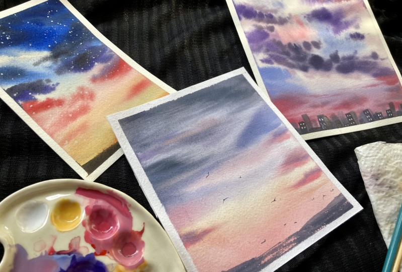
7. Exercise 1: [MUSIC] Before jumping
to the final project, we're going to have some fun and we'll practice what
we've learned so far. We're going to paint two
different sunset sceneries and I will show you
the different types of elements that you can add to your dazzling skies to make
the paint more interesting. I'll start by wetting my paper. I'm going to be
using my hake brush, I'm wetting the paper
very thoroughly, I'm going back and forth. I will put my tape like that so that the water and
the colors can flow down. I will wipe the sides
of my paper tape with my paper towel
because I don't want these drops of water to
flow back to my painting. I'll start again by
using this color mode. I'm taking yellow, I warm it up with orange. I'll start by
placing the color on the bottom part of my paper. I'm making some random strokes. Now, I wash my
brush and then mix carmine to the same color I
already have on my palette. I'm getting this orange color. Now, I add few strokes I intensify
the right color. Now, I will add some beautiful ultramarine blue to the top part of the paper. I'm doing these strokes that are imitating the
movement of the clouds. I want to try to
blend those colors perfectly because there
we will have some clouds. I wash my brush and I
clean this part a bit. Here we are having white cloud, so I will leave it white. But I will try to smooth
the edges like that. I'm adding Payne's gray to the top and I'm already starting to
add the darker clouds. I will wipe the part
that has formed here below with the damp brush. I will tilt my board, which will help the
colors to flow. Now, I'm taking my
secret weapon for a fluffy clouds and I'm
starting to blend the colors. On the bottom of the paper, I'm doing these
horizontal movements while on top of the paper, they are more diagonal. I continue to
intensify the color. Now, I will put my
Princeton brush, we'll start to paint the clouds. I'm taking carmine and
I will mix it with ultramarine blue until
I get the purple shape. I won't be using my
already violet color because I want to use a
limited palette in this one. I'm adding some of
the dark clouds. I'm holding my brush on
a [inaudible] to help me make more natural movements. I'm mixing orange and carmine
for the lightest clouds and I'm adding some of the
dark color on top of them. The sun here is below the
cloud so the bottom part of the clouds will be lighter and the top part on the
clouds will be darker. On the lower side
of our painting, the clouds are more
horizontal and it's tricky because they're in the distance and we see them from far, while on the top part of
the painting they are more bigger and they have
more rounder shape. I add some dark colors again. Now, let us move this again. Again on the bottom part, I'm doing horizontal
movements and while I go up I make
those more diagonal. I spread this part a bit. Now our wash is dry, so we're going to
add some stars. I'm taking some white gouache. I'm not adding water to it, I want it to be thick. I'm just placing a few drops that are going to be our stars, just remember to make
them different size. I'll make some splatters for more tiny stars, just few more. Now we're going to add our
first element to the painting. I'm mixing yellow with
orange and carmine and I'm going to
paint a mountain, I try to paint this at one go. Don't let the paint to dry before you are ready
with the element. Now I'll mix a darker color, add some Payne's gray into
the photo I have over here. I'll paint another mountain
that is closer to us. Again, I try to do this quickly
before the paint dries. With your previous
mountain should be dry. We are ready now,
let's remove the tape. I'm doing this very
carefully and then go. Congratulations, your
first sky is ready. [MUSIC] Now have a little break and let's paint another one.
8. Exercise 2: [MUSIC] For our second exercise, I'm going to be
using pastel colors, but you can use whichever
colors you like. I'm starting again,
by wetting the paper. Whereas these tape and your paper to be wet
for a longer time. This time I'll start
with Naples yellow. I'll mix it with coral. Taking corals straight
from the pan, and I'm adding to the
bottom of the paper. I'm washing my brush, and
I'm taking some of the mix I have already on my
palette. I add it on top. I'm washing my brush, and I'm dragging the color up like we did with
the gradient wash. I wipe the sides of my paper, and I start to add
lavender color on top. I use it straight from the pan. I'm adding more and
more pigment because I want the top part
to be very intense. I'm dragging the color down. Some paints gray
to the top part. Now, let's start to
paint the clouds, I'm using my smaller brush and pure coral for
the lightest clouds. Again, for these clouds, I'm making such
horizontal movement. I'm holding my brush up. I'm adding some
lavender to the coral, although I had from my pallet, and I add this color
on top of my clouds. Again, this one is
below the clouds so the top part of the
clouds will be darker. I'm using pure lavender
to add more clouds. I mix the colors in
my palette to get different shades that I
will use for the top part. I'm starting to add
paints gray to the mixes, and I'm painting
my bigger clouds. I'm adding some of that dark
mix to the clouds below. Now I'm just taking
whatever I have on my palette to add some
interest to the clouds. Few tricky lines. Now, I will wipe this,
although that has formed here below
with my damp brush. Time to flip it out. Now, I place on tape
on the bottom part of my painting to help me have
clean horizontal line, and I'm going to be using a
flat brush to paint a sea. I'm just waiting my
brush and I'm going to reactivate this mix I have
over here on my pallet. My brush is very dry, and I will start to make
these horizontal movement, from the sides to the
center of my painting, and then try to leave
the center light. Because my brush is dry, we are getting
such nice texture. I continued to add
color to this part. Now I will add more paints gray, and I intensify the
color on the sides. I'm adding more and more paints gray until I'm happy
with the result. You can stop whenever
you're happy with your sea. Now I'm taking my
silver black violet, I'm taking some dark color. I damp my brush in
the paper towel, and I add some more texture. I love the effect
we're getting here. Now when that's dry you remove
the tape very carefully. I will leave the same mix to add some mountains there
in the distance, so they will be very tiny. Don't use too much water here because you're
going to spoil your sea, just use a damp brush
to pick up the paint. Now, let's paint some birds. Use the same mix and
very little water. I'm painting my birds like that. Make sure that not every
bird is exactly the same. Use thin lines to paint
the birds. We are ready. Now let's remove
the masking tape. Always do this
when your painting is right and at an angle. Now if you don't have a
clean border like me here, here's what you can do. You can take some
white gouache and use a flat brush or any brush
to fix some of the edges. Use the gouache without
adding too much water to it, because you want
a good coverage. Great job with these
exercises, guys. It's finally time to
paint our final project. I'll meet you in
the next lesson.
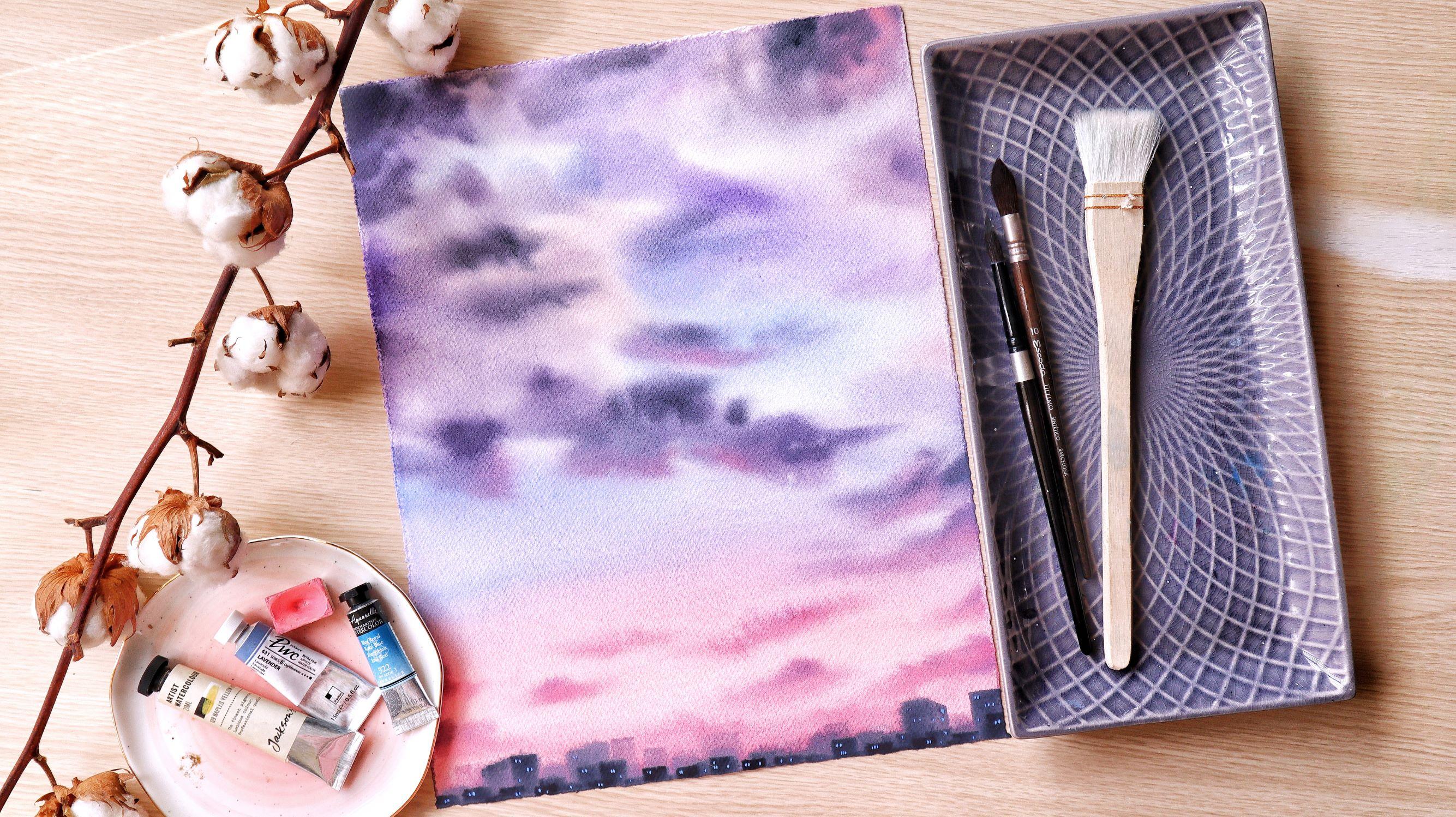
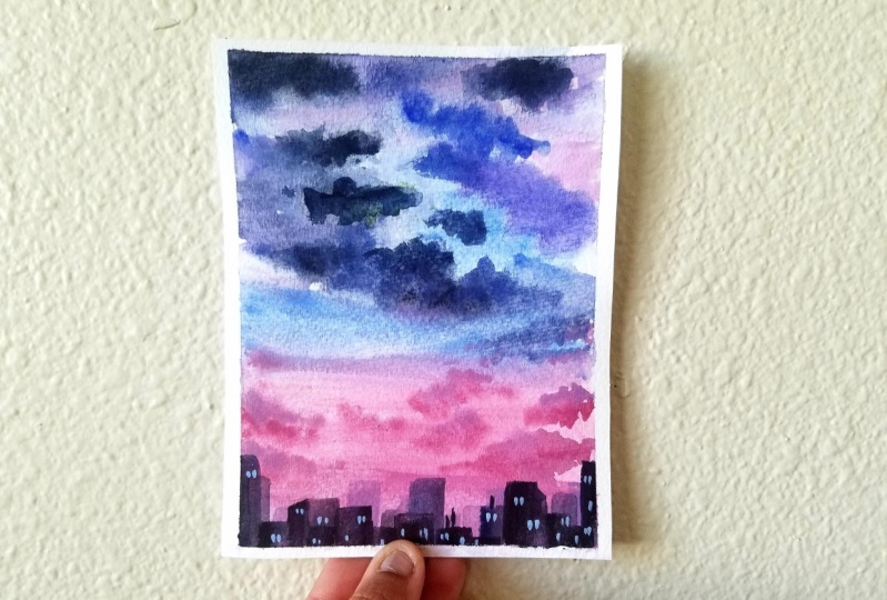
9. Final Project part 1: [MUSIC] For our final project we're going to paint a beautiful sunset
with pastel colors. For that, I'm going to use
another technique for wetting the paper and I'm going to wet the back side of the paper too. I want to have more time
to paint the cloud. This sheet of paper is bigger than the ones I used
for the exercises, so I want to make sure my paper
will stay wet for longer. If you're painting on
a smaller sheet of paper you can stick to
your usual routine, but I strongly suggest that you try this one together with me. You will be amazed how long
your paper will stay wet, which will allow you to
paint for a longer time. Painting wet mode is
very important for achieving this mode
look we're going for. I'm starting by wetting
the backside of my paper. If you don't have a big brush
like me you can just go to the sink or in the shower
and wet your sheet there. Now I'm flipping
the paper again, and now wet the front
part the same way. Now I will leave the paper to absorb the water and meanwhile, I'm going to mix
all the the colors that I'm going to be using. Here I have some coral, I'll add some carmine to it. Royal blue, I'm adding
some purple to it. This is pure violet and
again, some royal blue. But this time I will
add some Payne's gray to it to make
a darker color. Here, I will mix coral
with rose quartz. Again, I will add
Payne's gray to it a bit more, the rose quartz. We are getting this
dusty pink shade. Now let's go back to the paper. I'm wetting the
front side again. Now, I will place my towel
on top of the sheet like this so that there are no gaps between the
sheet and the board. Now I will wet the
front side again. This is the last
time, I promise. I wipe the sides, otherwise water will
flow to the painting. Let's start. I'm
taking the coral and carmine mix and I start with this horizontal movements on the bottom part of the paper. I am adding pure coral and pure rose quartz on the top. I make sure that I have
enough pigment on the edges. I'm taking this dusty pink, some of the purple mix, and I add it here on the bottom. I continue by adding
pure royal blue. Here I'm starting to
leave some white gaps. You can see how easily
the color flows, because the whole
sheet of paper is wet. I'm starting to mix the
blue with the pink. I'm getting beautiful
purple shade. Some more royal blue and
I drag the color down. Pay attention to your edges. I continue to add the bigger clouds on top of the painting. Now I start to add
distant things, violet. I still make sure that I have some white
gaps on the paper, this will be our highlights. Now I start to add the very dark mixed with
the Payne's gray. It always looks better when the top part of our
painting is darker. I'm just adding a few
strokes here and there. Remember to use more and more
intense colors as you go. Now, I will wipe the sides of my painting because I already have puddles of water and paint and I don't want them to
go back to my painting. Next, we'll add the clouds on
the bottom of the painting. Head over to the next video without leaving
your paper to dry.
10. Final Project part 2: [MUSIC] Now we'll start
to add the small clouds. I'm going to be using my
Princeton brush again. I'm taking pure
color-wearing things. I mix it here on my palette. I'm adding some Payne's
gray just a little bit and a little bit of carmine to make
them more pinkish. My mixture is very thick. I start to make
those tiny movements with my brush to
form the clouds. Remember that your movements
need to be more horizontal, from left to right and
from right to left. Now let's add some darker shade. I mainly do this on
the top of the clouds because the sun is shining
through all of them. I'm adding more Payne's
gray to the mix and I continue to add darker shades. Remember to use less
water and more pigment. I'm not following any pattern. I just add the colors
wherever I feel like my painting needs to
have more diversity. I'll add some color here on
the top to add more interest. But still, this part needs to be more darker and with
more cold colors. I'll make this corner more dark. I'll add more violet here. I add more and more Payne's gray and I'm getting
a darker mixture. I add it wherever I feel like
it needs more dark color. Now, I will add some warm color to
these clouds over here. [MUSIC] It makes them look
like they're glowing. I will add more tiny
clouds here below. More pinky here. Now it's time to bring
those into the sky. Again, I am making horizontal
movements here below. While I go up, I make them more
and more diagonal. If you want, you
can leave some of your clouds with a hard edge. I spread up this part a bit. We're ready for the stage. Look how gorgeous our
clouds look like. I love all these shades
of pink and purple. At this stage, our paper is
still glistening like that, so we will leave it to
dry just a little bit before we add our
additional element. Again, now, our paper is still this glistening
but not so much. We'll start to add
our city below. I use a dry brush. I am just taking some Payne's gray and I add it to the
mix I have over here. Since the paper is still wet, we need to use very thick mixture in
order to avoid blooms. I'm starting to
add our buildings. I'm just doing this horizontal
and vertical movements. I'm adding buildings that are different heights
and different size. I'm not looking at
any photo reference. I just add whichever
shapes I feel like. I will also make
diagonal lines like this because not all
buildings are facing us. Now I'm starting to add more
and more Payne's gray to the mix and I continue to add darker and darker buildings. Make sure you don't color all
of your lighter buildings. We still need those to be
visible in the distance. I continue to add more
and more Payne's gray. I'm making few lines also. If you notice that your
edges are starting to lose color like mine here, you can fluff them
out with your brush. This means that we still
had some water there. But because our
paper is still wet, we can move the pigment a bit. I will add more
darker buildings. Our paper is
starting to dry now. The edges are going up, so I'm going to tape
it to the board. Do this very gently
and very lightly because our paper is
still wet inside. We don't want to
push the pigment. You can skip this step,
but this will help our paper to dry more flat. If you are worried that
you're going to ruin it, just leave it like
that and I will show you a trick that will make your painting look flat
again. Leave it like that. I suggest that you don't
use a hairdryer here. In my case, I will leave this to dry for at least three hours. Now our painting is dry. You can touch it with the
backside of your hand. If you feel the paper is cold that means that it's
still wet inside, so you better wait
a little bit more. In my case, I am going to
remove the paper tape. Now I will use some pure royal blue to add some glowing
windows to our buildings. I use very thick
paint and I just touch the paper with my brush. You can add as many as you want, but focus on the
darker buildings. That's it. Here's how you
can flatten your sheet. Spread the backside
of it very lightly. Put something heavy on
top. Leave it all night. Here's our final project, guys. I think it looks amazing.
11. Wrapping Up: [MUSIC] Congratulations
on completing the class. I really hope that now
you feel more confident and ready to create more
beautiful sceneries. Remember that inspiration
is all around us, we just have to look for it. Also, don't forget that watercolors often have
a mind of their own. It's nearly impossible to recreate the same
painting twice. There will always be
something different, and that is the magic
of watercolors. Don't be too hard on yourself if your painting
looks different. It what makes it unique. Don't forget to upload your project to the project
section of the class. I'm so excited to see all
your beautiful creations. If you post your
project on Instagram, don't forget to tag me and I'll be more than happy
to share your work. If you have a question for me, just post it in the
discussion section of the class and now I will get back to you as soon as I can. Until the next class, guys. Happy painting. [MUSIC]
 Elina Zhelyazkova, Watercolor Artist