Transcripts
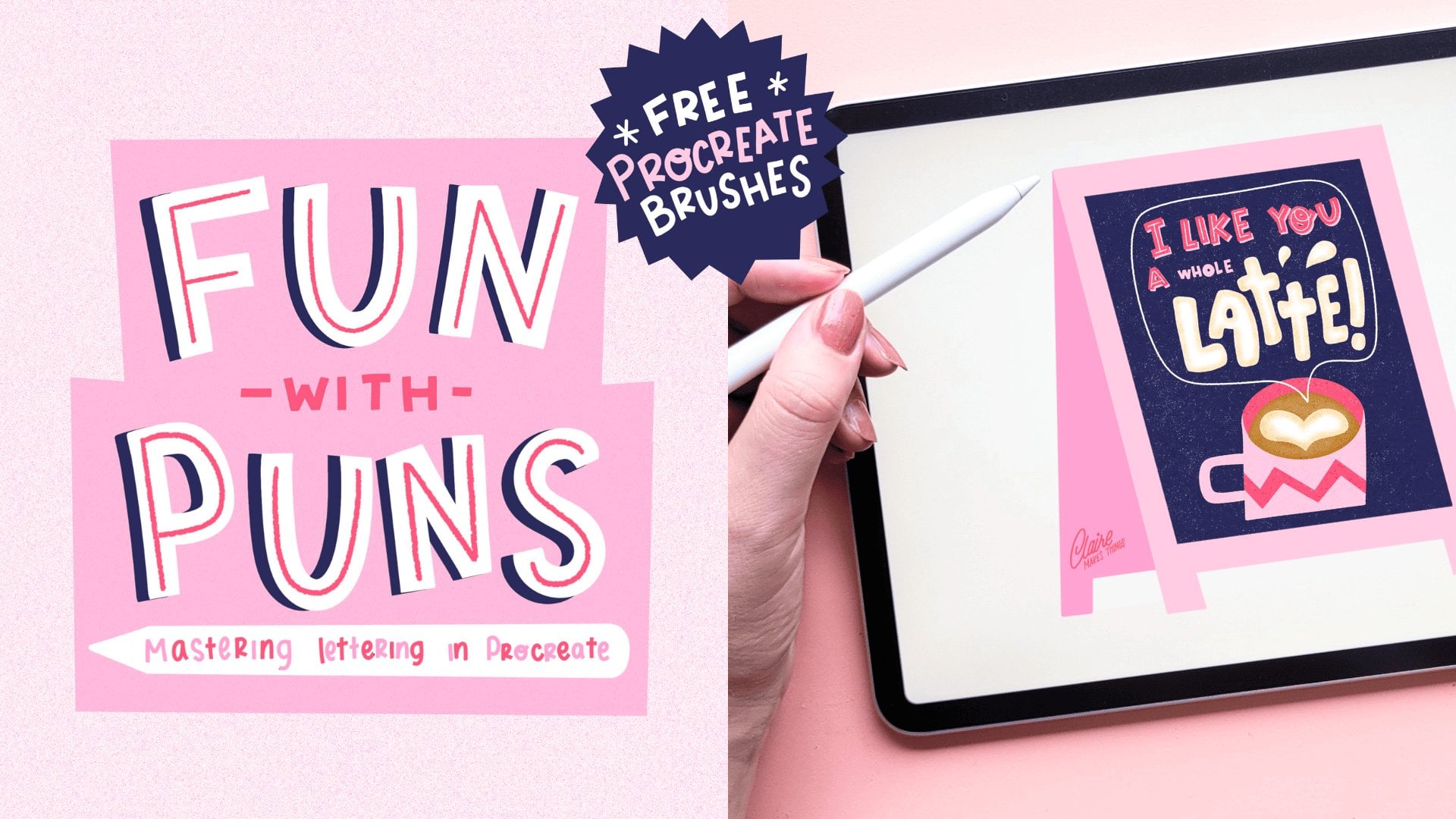
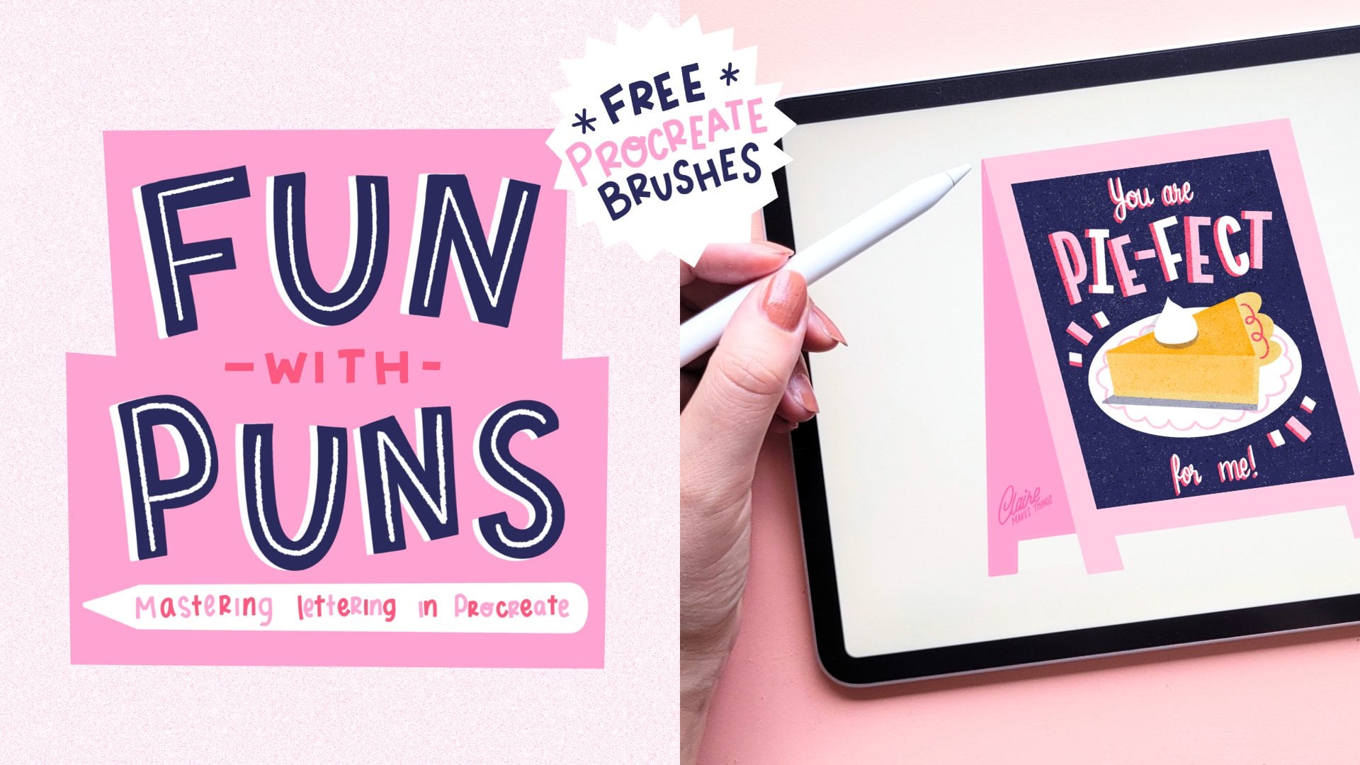
1. Introduction: Do you want to learn how
to create something that combines illustration
and lettering? I'll be teaching you a
quick and easy way to combine illustration with
lettering in Procreate. We'll be going over
the simple steps I take to turn an idea
into an illustrated pun. My name is Claire, I'm an illustrator
and lettering artist. I create things by
hand and with the IPad. And I've been working
with businesses on custom illustration for
the last six years. As an illustrator, I
use puns and wordplay to communicate an idea in a
short and sweet way. Puns are a great starting
point for communicating an idea to your audience because they're
memorable and fun. That's why create
illustrated puns for greeting card designs, chalkboards, art
prints, and more. I've learned a few
things along the way, so this class gives you a sneak peek into my
creative workflow. Turning a pun or wordplay into a visual is really good
practice for illustrating and a great way to work
on your lettering skills too. We'll transform your ideas into a unique polished
illustration, and follow a plan that you can
reuse for other artworks. We'll start with our inspiration
and references, and I'll also share
some essential tips for building your
composition in parts. We'll finish off
our illustration in a technique of your choice. I'll use Procreate for
this illustration, but you can totally use a tool or technique
of your choice. The steps are gonna be really similar since we're
less focused on tools and more on the
step-by-step creation process. The end results will be unique illustration you can
use as a greeting card, give as a gift or
share on social media. Each step is short and sweet, so you can quickly build up
your illustration and reuse these steps to come up with your own ideas,
quick and simple. The purpose of
this shorter class is to go through
steps quite quickly, so if you're new to
using Procreate, I will suggest having a look
at one of my other classes where I explain a bit
more about composition, and specific Procreate techniques. If you want to learn how to turn your ideas into
fabulous illustrations, this class is for you. Whether you're a professional or a beginner in your
illustration journey, these steps will help you to communicate your
ideas effectively. So let's get started!
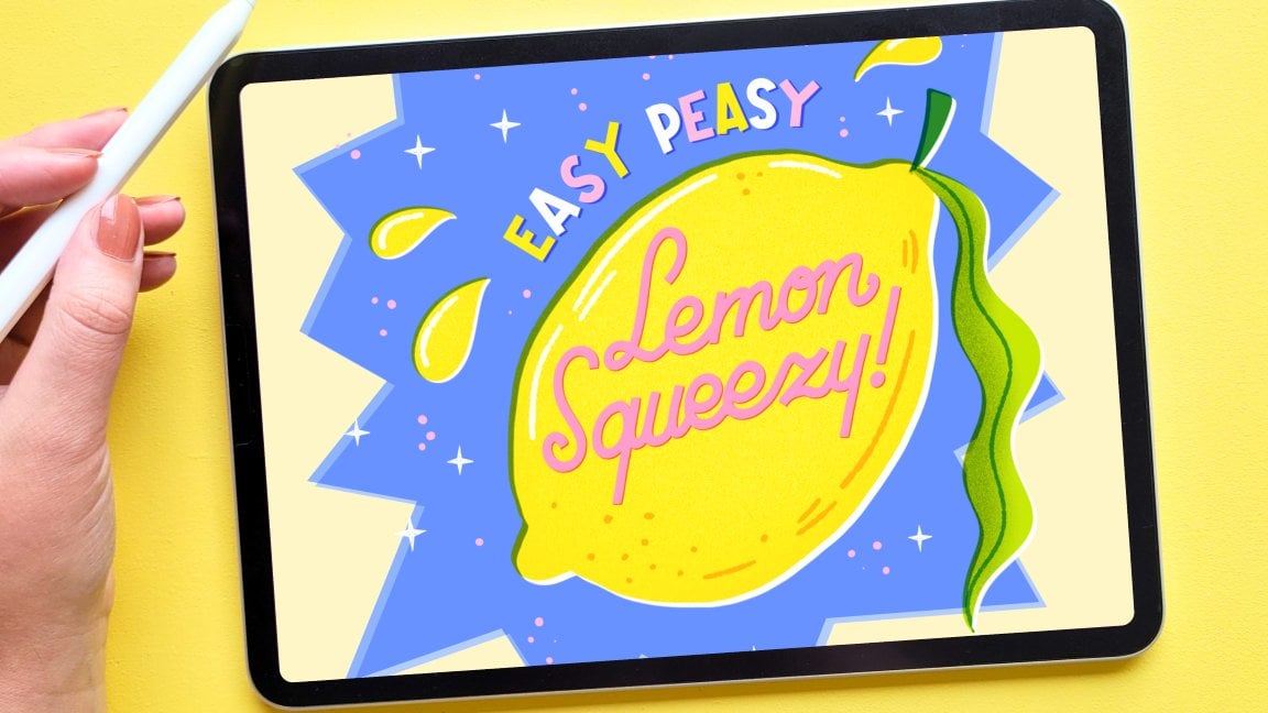
2. Gather Ideas: Firstly, let's pick
our inspiration. What are puns? A pu is a joke
that makes a play on words, and they rely on
words that sound similar despite having
different meanings. Puns and wordplays are
perfect for creating fun illustrations with a
short but sweet message. There are different types
of puns and wordplays. we're going to focus on
the visual ones. These are best for illustration because they're
easier to visualize than longer wordplays and usually, they're
memorable and fun. That's why they work
so well on greeting card designs, as stickers, on chalkboards, or as
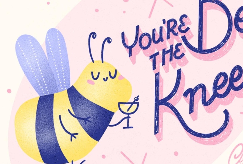
part of a bigger design. My choice is 'you're the bee's knees', The bee's knees is a delicious
classic 1920s cocktail, but it's also a saying, the bee's knees
meaning that something is excellent or
someone is excellent. I love cocktails and
everything retro, So this one is perfect for me. You're the bee's knees, I think, will make an adorable
greeting card design or as part of a cocktail menu, for example.
You might actually recognize this piece, I did this before and I changed it around a
bit because I want to make sure that we can
do it together with the custom brushes that
are part of this class. They're not a necessity, but if you want to follow along, make sure to download
those in the resources. You can follow along
with creating this pun, or pick one yourself, I would
suggest a pun that is short so we don't have
too many letters to draw. Make sure that you have a look
at the project resources. I've added a bunch of
inspiration there, especially puns that are
all about food and drinks, those are my favorite. Now that we have our
starting point, we need to visualize that pun. So we want to do is
turn the sentence into something visual and make it fun for the
viewer to look at. We're communicating an idea, so for that, we need both
texts and illustration, and they're equally important. And we need to think
of how to communicate this well to the viewer or what they're
going to see first. So we're going to start
with brainstorming some ideas and looking
at inspiration.
3. Sketch It Out: Let's start with our
canvas. Make a new one. And this one is going to
be 2000 by 2000 pixels. That's what I usually work in. So these are the brushes
that we'll be using. There's a sketch brush
to start with, then a shape pen and a
few lettering brushes, texture brushes, and
a few stamp brushes. Let's start with
brainstorming some ideas. Firstly, I'm going to
write down our text and write down a couple
of words that come to mind and some
ideas that I have. So for example, a bee, it's a really
good opportunity to add a nice character. Of course, the cocktail and then something maybe about the 1920s, the time from this cocktail
and this saying as well, maybe something in the lettering
that we can add there. At this point. If
you maybe want to use Pinterest as a
reference for a few ideas, maybe look at some
1920s inspiration or some ideas on how to actually draw a bee and make
it look like one. I'm thinking of a bee that's maybe holding a cocktail, for example. I'm also just having
a quick look at this 1920s Art Deco
style of lettering. Maybe we can add that as well. At this point, I think it's
also a good opportunity to make some thumbnail sketches to visualize this pun
in different ways. Maybe there is a certain layout
you'd like to work with, or maybe you already have
something in mind that you want to put in a little sketch. Make sure to add
that here as well. So think about how you can visualize this pun
in different ways. This is all up to
your interpretation. Going through this short design thinking process will help you practice coming up
with ideas really quickly and to think visually. And of course,
we're going to only select a few things from this, but you'll always have
some more inspiration to look at later on. I would love to see what
you came up with so far. So sketches, mindmaps, maybe you have a little mood board
with some inspiration. Those are all really
insightful and they show a lot of character already. Especially if you're
working on your own pun, this would be a nice time to see your sketches and your mind map. So you can at this point already create a project in
the projects and resources tab and add your
sketches to your project. Since this illustration is
not gonna be too complicated, I'm gonna give you
a quick summary of how I build my compositions. in the next lesson. I want to talk a
bit about building up your illustration in parts and using basic shapes
to make a composition. So make sure you
have some sketches to work with in the next lesson.
4. Create a Composition: The stage where
we're thinking about composition is where
we're planning, where things are going to go, and how are we going to
communicate an idea. Making a composition
is about placing and arranging elements in a space and make sure
they work well together. So you can use this to guide the viewer's eye
and tell the story. So we're going to
use simple shapes to build our composition. Shapes like squares, triangles, circles, rectangles and more, can be used to guide your eye in a certain direction, to give a sense of movement, to create contrast and frame your subject. To make sure that we can build
our composition we'll turn every element of our
illustration into shapes. For me, this helps to build
my composition because I know where things
are going to go and where the negative space is. Secondly, it also
helps me to imagine all the bits the audience is going to see and in what order. This is also going to be really useful when we're working
with a lot of lettering. If you took my chalkboard
lettering class, you might remember this is how I build up my compositions. I usually build it up
by using those blocks, especially when there's
a lot of texts involved. So our artwork consists
of three parts, we've got our illustration
our lettering, background, and then also
our canvas or our frame. Let's select the parts
that we like most, and that's what we're going
to use for our illustration. So before we get started, I also want to turn on a guide. And we're going to divide
our canvas into nine parts. This helps to see what is
central in our canvas. Firstly, we've got
our square frame. Because it is square, it leads the eye to the center. And it also means there's
not a lot of empty space. And next up is the oval shape. This is where our
illustration is gonna be. I'm kinda going to place it
off-center because we need to leave some space for
our lettering as well. Placing it off
center like this is also quite pleasing to the eye. Next up we've got our text. This is gonna be
placed next to it. It's also the same size, but in a different shape. So we're going to
use this block, to place our lettering
inside later on. I'm placing it diagonally to give our illustration
a sense of direction. And it can also elevate the
movement in a composition, it just feels a
bit more dynamic. It also gives us
a bit more space to fill in our lettering, and it fills out
the frame nicely. And lastly, we've got an oval
shape as the background. And later we can fill
this in with color. This kind of also helps
frame our composition, and it makes it feel
like the lettering and illustration is
gonna be more connected. And as you can see, we're playing
with some contrast between different shapes. And I like that oval, soft
shape in the background compared to the sharp diagonal direction
of our lettering. Another benefit of adding a
background separately like this is that we're
not really going to use the square frame. So we can later on maybe change the canvas size for a greeting
card design if we need to. And it won't really change
the rest of the composition. Keep in mind that
a good composition consists of an effective
use of contrast. The more contrast you create the more dynamic your
composition is gonna be. So now you've got these abstract shapes
and at this point, you can move stuff around a bit if everything is on
separate layers. Don't forget to look at the negative space
around your object, instead of just focusing
on the shapes themselves. I'm also going to
make a rough sketch, at least, of our illustration and see how this looks so far.
5. ✨ Update: Student Spotlight ✨: This is a new
update to celebrate all the amazing student projects that have been added since
this class launched. I wanted to highlight some of these incredible projects in this class because they
are really inspiring, and I'm hoping they'll motivate you to create
something, as well. Even though we start with
a theme in this class, lots of you created
your own topic, and the results are fantastic. The topic of this class
kind of overlaps with a collection of shorter
classes about puns. I published afterwards, which I think you'll like if you're
enjoying this course so far. The results there
are also really fun, and I've noticed
students have used this short and sweet
lettering class in combination with the
fun with puns classes to come up with new ideas
and finish their creations, which is really fun to see. And my related class
procreative print has been used to then turn these pun
greeting card designs into printed results,
which is super fun. Thank you so much to
everyone who has shared their project and process
in this class so far. You can go directly
to these results by going to the project
link in the notes. Just hover over the menu bar
and the notes will come up. And if you're browsing
through students artwork, consider leaving a kind
compliment or alike. It will really
brighten someone's day and it keeps the
creative energy flowing. If you haven't shared
your project yet, make sure to do so by
the end of the class. Whether it's a polished result or something that's still
in progress like a sketch, I would love to see
what you're working on. As I mentioned, for
shorter lettering classes, you can have a look at
my funded pun series, which comes with a brush
set and templates as well, so you can get
started right away. For a deep dive into
retro lettering, which suits this topic
of puns really well, have a look at my
retro lettering class. And for finishing
up your designs, make a pop would be
really helpful as well. Lastly, there are a couple of ways that you can
stay up to date on my new classes and
brushes and freebies. You can go to my
profile and then click on Follow or subscribe to my newsletter.
That's all for now. Thank you so much again, and let's continue the course.
6. Sketch the Details: Now we're going to use
these basic shapes to add in our lettering and
a few more details. I'm just writing down
this sentence again so I know what letters
I have to work with. In this case, 'bee's knees' is the most important
in this pun. And 'you're the', can be a little bit smaller.
That'll also create a nice contrast. And that way we
can put some focus on the B and the K in this case, make that a bit bigger and make sure that everything
fits together as a puzzle. So I'm going to
sketch these blocks and use the capital letters, make those a bit bigger and make sure that
everything fits nicely together in
that diagonal shape. I wanted to make these
letters quite playful, maybe use a script. But for that, we also
have to make sure that all our letters are the same height to make sure
that it's still legible. So what I'd like to do for
this is use a combination of guidelines and the grid
as a guideline as well. If you go to the brushes, you see this letter
guideline brush. And I use that to make sure that when
I'm making lettering, all of my letters are going
to be that same height. I find that really useful
to use as a guide. You can even make this round or maybe use this in a perspective. I'm just adding those
guides to our shape. And I'm also going to
turn a drawing guide on. Use a grid to help you with the spacing and direction
of your letters. Your letters can be messy, but as long as they're all on the same slant or
the same thickness, it will look intentional. Make sure that your
letters are consistent. I find a guide really
helpful if you, for example, want to make
your letters a bit slanted. This would be nice for a script, for example. In this case, I want mine to be straight, but you can use that
as a guide to make sure that your letters are all going in the same direction. I'm just quickly, on a new layer, going to fill in my text. It doesn't need to fit
this box perfectly. It's just a guide
really to make sure that everything kinda fits well. Script lettering might seem a bit daunting if you've
never tried it. But one tip is to leave a lot of space
between your letters. This makes them look wider and gives them a lot more space. This always comes out looking
a lot better in my opinion. Another tip here is that
your round letters, so for example, the S or an O, they can go over the
grid a little bit. This optically looks much nicer. I'm putting a lot of emphasis
on the B and the K here. And I'm kind of giving these a very art deco feel,
with big shapes. And I'm just placing
the script here. You can of course use more reference photos or inspiration for
your letters here. Especially if you're a beginner, that might be useful to do. So, make a couple of sketches here to see what works best. I'm also using the K
to make a flourish and follow the roundness of the letter to make
everything fit nicely. I'm starting here with
the most important word. So 'bee's knees', that has
to fit first of all, and then I'll make
some more space for 'you're the' and make
that a lot smaller. I'm also going to do that in
a slightly different style. You can cut and paste
your layers at this point and make sure that your letters fit and they're a
bit more compact. So at this point you
can add flourishes, serifs to your letters,
some more decoration. You can add some
visual interest to the most important words in our pun and make them more
prominent if you want to. Keep the rest quite
simple to make sure that the viewers eye is drawn to the most important
words on our canvas. I'm quite happy with how
the letters look so far. So what I wanna do
now is make sure that the line thickness of my
letters is exactly the same. I really like using a
Monoline Style for letters. For that I'm using this
double monoline brush, which helps us to create the
same width in the letters. One more thing I'll
say here is that if you find that when
you zoom in and out, that the width of
the brush changes. Go to the wrench tool
and to Preferences, and then turn on your
dynamic brush scaling. This means your
brush will maintain its size relative to the screen. So it's not going to change the size when you
zoom in and out. As you can see,
it's not perfect, we still need to
clean up the edges. But at least it helps us with the consistency of the
thickness of the letters. I'm cleaning this up
as well as possible because later on when we're making our final illustration, we can just use this layer and we don't need
to do this again. But you could also
decide to use this as a guide and maybe use this as the bones of your
letters and add decoration, add serifs,
whatever you want. This is a really good starting
point for your letters either way. When you are ready
with your lettering, makes sure to
clean everything up and see if you're happy
with your composition. Turn off all your
other shapes and sketch layers and make any
changes if you need to. Remember to keep things simple, the audience needs to
understand right away, because we're also going to add some more shading and a
few more details later. So we're filling up this canvas. Make sure that the
text is legible and think about how things
are placed on your canvas. Next up we're going
to look at color, so make sure that your final illustration sketch
is ready to go.
7. Plan Your Colours: So now we're going to
have a look at color. And I want to think about
where this is going to end up. I'm thinking of a greeting
card design for example. And that's quite small,
so we don't want to use too many colors because
it's not going to show. So I think two or three
main colors will do. And then maximum one or two for extra details
if necessary. I'm not going to color
them right away. I'm just going to put
a palette on the side. Firstly, I want to think about what we need
to show information. We definitely need
yellow for the bee. So that's the most
important part, so I'm going to
pick a warm yellow. And then as a contrast, something dark,
either black or blue. I like this dark blue, so that's what I'm
going to pick for this. And I also want
to reuse that for our lettering, so we can bring back that same
blue somewhere. So when you're looking
at your colors, think about warm and cool
tones and use a contrast between warm and cool
and dark and light. And lastly, I also want to pick a soft color for the background. I really like using
pink in everything. So I'm going to
use this baby pink because we don't have a
lot of shapes here or a lot of shapes to
fill in with color, I want to make sure that we
reuse these three colors in some details to be
able to bring it back in balance or
illustration a bit. This also creates a
harmonious composition. So what I really
like to do is use lighter and darker tones of the same colors
that we already have. So for example, this blue, I want to reuse in the wings maybe and
turn them light blue. And then this light pink
we can use for details, maybe the background, and then possibly a lighter yellow
for something else. There's also helps to not add too much noise by adding
lots of different colors. And I think it's quite
pleasing to the eye. And at this point, if you're not sure about your
color palette, I also really like using
the color balance and change the colors
around slightly and experiment and see
what works best. I'm happy with the
colors as they are now. So this is the palette
that I'll be using. And next we're going to start
on our final illustration. I'm going to use the shape pen, and then after that
we're going to use these texture brushes. At this point, don't forget to add a
sketch to your project. I think at this stage it's really fun to see your final sketch, what that looks like, and
your final color palettes. So make sure to add that
to the project gallery.
8. Layering Your Pun: Now we're ready to start
on our final illustration. And I'm going to
start with filling in the big shapes first
with the shape pen. So we're starting with yellow. And I'm just turning
the opacity down so we can see the sketch
layer underneath. I'm going to use that
light blue for the wings. And I'm going to put
the blue stripes on a separate layer. For the bee, I'm not going to
use a clipping mask with this because I want to use a clipping mask
for our textures. So instead, I just draw
this on a separate layer. So I'll just select the
yellow layer, invert, and then on the blue layer cut. This way, our blue layer is
contained within that yellow, and we still have
the opportunity to use a clipping mask in-between. I'm using this shape pen
so that we can easily fill our big shapes
in with color. If you're using a really
heavily textured brush, even though I like using those, it will be a lot harder
to fill in your shape because most likely there
will be lots of gaps left. Next, we're going to
fill in our lettering. And because we cleaned up
this sketch quite well, I'm just going to use
that exact same layer, so I'm duplicating this, and then on Alpha Lock and
I'm filling this with blue. I'm going to color this in
by hand quite roughly so that you get this kind of
texture inside our letters. I think this will
create a nice contrast with the shapes that are filled
in perfectly and smooth. You can also trace your lettering layer again and just use our
sketch as a guide. If you've been moving
around this sketch layer, a lot of you've been cutting and pasting or scaling
parts of that layer. It might end up looking blurry because we're
working with pixels. So you might just
need to redraw this. Next up, I want to add some
texture to our character. I'm just going to
use white for that. And then our stipple brush. Wherever we're adding
these textures or highlights to our shapes, we'll also create some
depth at the same time. I usually like working
with flat shapes, but I think we need some
visual interest here. So that's why I'm using
this stipple brush. And on top of our blue as
well on a clipping mask, I'm also adding a
bit more of that white. And on these wings,
a bit of white. And I'm selecting
one of the wings, to add a bit of shading. That way we're separating those two
simply by using textures. I'm using clipping
masks for all of these to clip all the
textures to the shapes. Adding texture to
these big shapes also makes it feel less
blocky or bulky. And it makes it a bit softer. And I like the contrast between the texture and
the smooth lines. I'm also adding that
background in pink, actually in the light
paint. And with blue, I'm going to add some
details to this bee. I'm also adding a few more
highlights. And to those wings I'm adding these dotted lines it's from the dotted
line brush, just to make it a bit more
interesting, to break up that big shape as well. I'm also adding some of that same texture as the lettering to the
bottom of our bee. So it creates a bit of shading and it doesn't feel
like it's floating. You can also still change the colours at this
stage if you want to. This should be pretty easy to do since everything is
on separate layers. If you're struggling
at this stage, obviously ask your questions in the discussions tab
below so I can help out. I also want to make sure that our background isn't
completely white, but a bit beige or a bit off-white to make it feel a
little bit more retro. So at this point
you can turn off your sketch layers and
clean everything up. Next up we're going to
add a few more details.
9. Finishing Touches: Before we finish, let's
add a few more details. Details are what make
this illustration shine and it gives
it more personality. So let's see what we can add
to make this a bit more fun. Firstly, I mentioned before that we want to add some
shading to this lettering. So I'm duplicating
this layer and then on alpha lock, fill it with
our dark pink. And then I'm just going to
add that layer underneath. And I'm going to
shift it slightly. And this is an easy way
to give our lettering some depth and some shading. The further you move this shading layer,
the more dramatic your shading is going to be, It's an easy way to
add some interest to your lettering and bring back
some of that pink as well. The only thing that's
left to do is connect your shading, the pink
lines, to the blue. You could even add some more
line work to your lettering, some details inside the
letters if you wanted to. But I'm going to keep it as is. Now I also want to use a
bit of filler elements around our bee and our lettering to fill up the
canvas a little bit more. For that, I added a few stamp
brushes in the brush set. You could also do this by hand by maybe adding some flourishes
around your lettering. I'm just going to
add a few stars, make it look a bit more
retro, and then use the dots stamp brush to add
just a bit more texture. This is a really
nice opportunity to add a bit more
of your own style, bring back some more color and set the tone of
your illustration. At this point, we haven't
added a whole lot of textures because I like
to do that at the end. So on a new layer with
that speckled brush, fill your whole layer. And on a second layer, exactly the same thing. This is an easy way to
add some more texture to your illustration
without having to apply that to all these
different layers. So I'm going to change one
of these texture layers to overlay and the other
blending mode to divide. And then I'm changing
the opacity slightly. By changing that opacity, you're changing the
intensity of your texture on top of your illustration. You can see that one
of these creates these white speckles and the other enhances the
colors a bit more. If you've taken my
texture class before, you'll recognize this type of speckled brush and
this technique. Another reason that we can add this texture in
the end is to get a more uniform texture
on top and make the image as a whole look
a bit more aged or grainy. This is also going to look
really nice as a print. You could even use texture
layers and blending modes this way to change your color slightly or change it
to a different tone. And lastly, of course, don't forget to sign your work. I'm adding my signature just right outside
that pink oval. I usually end with just
checking my canvas, flipping it horizontally, then checking if everything is in the right place
and if I'm happy. And at this point don't
forget to export your work. And remember that you also have a timelapse replay that
you can export as well. So this is the final result! And here's what that
looks like as a print. This way, I can also hang it up for maybe give it
as a gift to someone. I really like the texture
that you can see. It's very subtle, but it really
adds to the illustration. And I think it works really well as a greeting card on
a smaller size too. I love making prints of my Procreate
illustrations like this. Because if I wanted to print
this on a bigger scale, for example, this is
what I would take to printer to show what I
want it to look like. Now that this pun
has been turned into a final illustration, I would love for you to
continue making more. I love working in a series.
It's a great way to practice your process, but also to show something
in a series of, for example, three puns, is so much
more powerful than a standalone piece
and it's really valuable for your
portfolio, for example. So in the next lesson, I'm gonna give you some
quick tips on how to create more puns and use this
creation process again.
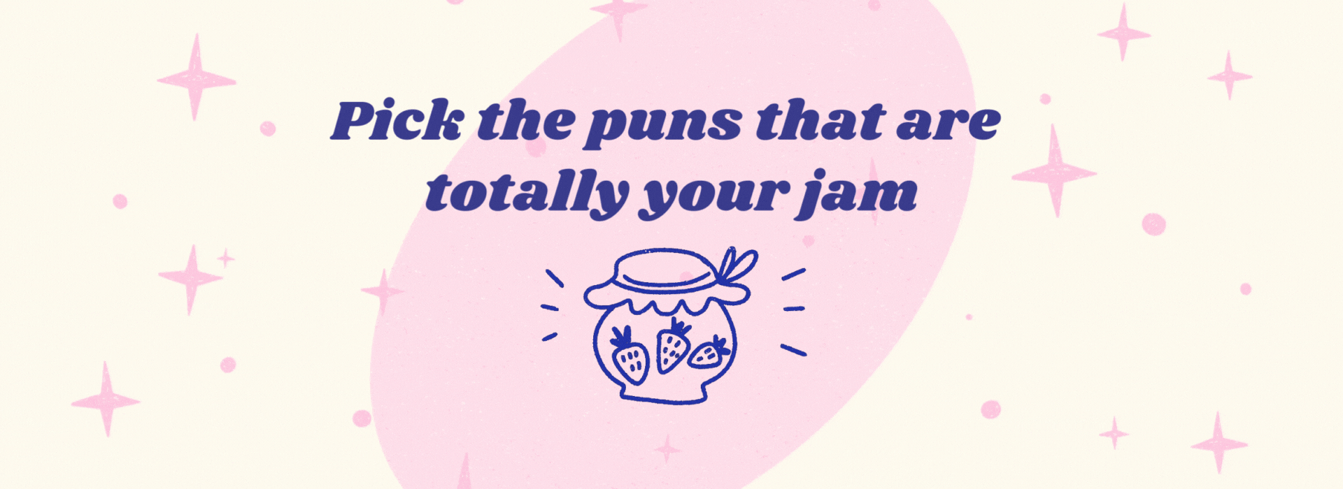
10. Your Next Pun: Pick the puns that
are totally your jam! Illustrating is not just
about how you draw, but what you draw.
You're curating your own world, so you're showing your
unique perspective. How you choose to interpret
wordplay and how you visually communicates something is
what makes your style unique. So pick the puns that interest you, and that you can turn
into a little story. You can even create
your own or pick ones in your native language. What you decide to use
as a starting point, and how you decide to
include your ideas in your art is part
of your style. Secondly, it doesn't need to be perfect. When you're finishing
up your illustration, remember that you've done the most important part already. You've created the concept. The beauty of puns or
wordplays is that they're silly and they're usually
easy to understand. So don't over-complicate
your drawings. If that's difficult for
you to do, I understand, I'm a perfectionist. Keep the following rule in mind:
When you feel like your illustration
is 70% done, stop! Don't aim for 100%. Most likely those
finishing touches will polish it further, but it's not going to make
the results any stronger. If you're not comfortable
with stopping a 70%, just take a break. You can always go back to your original
illustration later. At least you have a
fresh perspective on things in that case. Lastly, don't give up! As I mentioned, try this
creative process again. Committing to your
creative process is just as valuable as creating
a final piece. Working on a passion
project like this is never a waste
because you tried something new and
you're learning on the way.
You practiced the skill of committing to an idea and learning how to
filter down your ideas, which is really valuable. If you give this process
another try, maybe turn your puns into a
series using the same colors, the same lettering style. Maybe it could be
a collection of funny Valentine's Day cards or a series of Taco themed
illustrations for Taco Tuesday. I like to work in a series
of three or five pieces usually, to be able
to create a theme. In the thumbnail sketching
phase from the beginning, maybe sketch three
different puns at once. That way you've got three
different starting points and that will make it much
easier to start later on. Making three versions of the same idea or a series
of three shows you're thinking skills and your ability to recreate a concept
in different ways.
11. Bonus: I Love You to Reese's Pieces!: In this tutorial, I'm going
to show you how to make this pun illustration and a few simple steps in Procreate. We're going to follow
the same steps as our Bees Knees illustration, but with a slightly
different theme. You can follow along
with this pun or pick another one and
give it your own spin. As I shared in my tips
in the previous lesson, practising this creation
process again will help you to come up with collections and practice what
works best for you. Let's get started. We're
going to start with a new canvas and we're going
to use 2000 by 2000 pixels. So we're going to start
with this sentence. And in this case, I love you two pieces reminded
me of Reeses pieces. So this is a really
nice way to maybe add some food into this design. And I think that would
look really fun. So we can then add
those Reeses pieces. Those are the really
small chocolate ones, but also the peanut butter cups because those are just
really recognizable. So we're going to
start with some thumbnail sketches and see how we can incorporate this
lettering into our canvas. I want this to end up as
a greeting card design. So it's going to be quite small. That means that the
lettering has to be quite clear and legible. So not too much
information on this, I'm going to keep
it quite simple. So here, I've got
three examples, and I just wanted to
show you these sketches. We're going to work
on the middle one. But here you can see how you could use either
lettering on its own, or maybe do a combination
of lettering and illustration or
incorporate the lettering into the peanut butter
cup, for example. So there's many different
ways that you can do this. And when I'm making small
sketches like this, I'm always thinking
about the direction of the lettering and what shapes
things are going to be in. So at this point, we can
have a look at references. I'd like to use Pinterest, but you can use Google as well. So I'm going to save an image of the Reese's Pieces logo so we
can pick out those colors. You could also create
a color palette directly from a photo or a file, but this way and we're not going to have
all the different shades. I just want a couple
of these colors. So we're going to
pick out the colors from this packaging. If you want to skip
this part and just download the color palette,
that's totally fine, too. So we're going to
use that orange and then that warm yellow and a slightly darker
orange or red. And then this dark brown. I also want to make
sure we add, like, a lighter brown that
we might be able to use and some kind of
light orange as well. And I think that's enough. Usually what I keep
in mind to create a color palette is to
work with a cool tone, a warm tone, a light tone, a shader tone, and
a neutral tone. We've got a bunch of
warm tones already, so I want to make
sure we contrast that with something a
little different. So we're going to work with this thumbnail sketch that's
in the middle. And I really like to just put everything in the
corner of my canvas. But of course, you can just
use a reference window, whatever you feel most
comfortable with. And I'm adding a guide as well. I usually like to work with a guide that's
in nine squares. This way, we kind of know
where the middle is, and it helps us to put our
composition into place. So we're going to start with
the most important shape. This is a big circle. That's what our lettering
is going to be placed into, and those little rhesus pieces are going to be placed
on top of that circle. And then the most important
lettering es pieces, that's the most important part. It's going to be placed
sort of diagonally. This helps to create a
more dynamic composition, and that also means we can make the letters a little bit bigger. And then we're also going to add the rest of our sentence
that's going to the top. I think we might just stick to one peanut butter cup
and that's going to be placed sort of underneath. So at this point, I'm kind of thinking about where
the biggest letters, the R and the P are going to go. So the reason I'm using
these boxes is to make sure that our letters
are actually going to fit. And I'm not thinking too much about the
lettering style yet. I'm just looking at the spacing
between the letters and making sure everything fits on the canvas and the
composition makes sense. And then I love you too. That part is going
to be a bit smaller, maybe in a slightly
different font or style. So I'm just placing that
text quickly in there. I also want to make
sure that we add a frame around it so that we
can create that round shape. So those are the Rhesus pieces that are going to go around. And because this is
such a round shape, maybe we can contrast that with something sharper
in the background. And there will be a nice opportunity to
add some more color. If you want to change
up the colors or change up the composition
here, feel free to do that. I would love to see
some different versions of a Rhesus
Valentine's Day card, that would be
really nice to see. So get creative and try
other options, too. At this point, I'm just moving
stuff around a little bit and making it a bit smaller too to make
sure everything fits. My sketches are usually
really messy, as you can see, so feel free to clean
this up a bit more or just start with a new
sketch if you want to. I usually like to zoom in
and out quite a bit at this point to see if I'm
happy with the composition. Also on a smaller scale. Make sure that your letters at this point are a bit
centered and that you have enough space around
it to maybe later as some shading or some other
filler elements, for example. I'm going to make sure to add another sketch layer on top
later to clean this up. But feel free to use this as your sketch for your
final illustration. So for this lettering,
we're going to use this letter guideline brush to make sure that our
letters are going to fit. I find this really helpful, and I think this would be really helpful for beginners too. So your letters can be
quite messy, as I said, but make sure that you stick to that he so that it
will look intentional. And then for the
smaller letters, I'm just changing the size of the guideline a little bit.
I'm making it smaller. And then I'm going
to use that as a guide to try our
letters again. But this time we're going
to use the other brush. This is the monoline brush, the double mon ly bruh. As you can see, this is kind of the same but a lot thinner. If we're going to
use this, make sure to turn on your
dynamic brush scaling. If you don't have
that turned on, anytime you zoom in or out, the width of that line
is going to change. So make sure that
is turned on so that you can zoom in and
out without that changing. The point of this brush is that the width always
stays the same. So I'm just going to follow
the lines of my sketch. I'm not going to do
anything too complicated. I'm just going to do a
kind of simple script. And I'm going to stick
to the height of our letter guides and make sure to give your letters
enough space at this point. This might take a
bit of practice, but try it out a couple of
times and see how it goes. I'm going to stick to
this basic script style, but you can easily
try something else. This could just be a
base for maybe adding serfs to your lines or change
your letters up a bit. The most important
thing with lettering is to start with the skeleton, I guess, or the bones
of your letters. As you can see, and moving
stuff around quite a bit. Because we're
working with pixels, that scaling and
moving stuff can affect the quality of
your lines a little bit. So I'm going to make sure that afterwards with the
final illustration, we're doing this again. But if you don't
want to do that, just make sure that
you don't need to move stuff around
just in case. That way you can use this
as your final illustration. And then the smaller text, I'm just changing the style. I'm still going to
use the same brush, but just change it up a bit
and use capital letters. The only thing you need to do
when you use this brush is finish it off and
make sure that you close all those gaps at
the end of your lines. And that's our letters done. And next up, we're going to work on our peanut butter cup, and I'm going to pull
up a little reference. I know what they look like.
I eat them all the time, but sometimes it's difficult
to and make it recognizable. And then we're going
to add those es pieces in a circle around our letters. And that's our sketch
pretty much done, I think. You're adding a
few more lines to make our composition
a bit more dynamic. And I'm also redoing that frame, so everything is on
that one sketch layer. And I don't think we need
our drawing guide anymore. We can turn that off. I'm just making sure that everything
is placed the right way. And as I said, we'll
probably overlap this a bit. Whenever you're happy
with your final sketch, we can move on to
making the final piece. So on a new layer, we're going to
select that orange. I'd like to start
with the letters. Those are the most important
part of our design. So I'm going to use
that monoline brush again and just trace those
letters the same way. Another thing that
you can do is if your sketch is really
cleaned up already, you can just put on alpha
lock and then fill it with orange and then you can fill up those
letters yourself. And I'm just dragging that orange to our letters
and filling everything in. And you might need to clean
things up a little bit. It also becomes
much easier to see what parts of your
letters you need to clean up a bit more
when they're filled in. And I want to make those
other letters white, but we're not going to be able
to see that on our canvas, so we'll just fill
in that background. So I want to do that star. And for that, I'm not
going to use a brush. I'm just going to select it because they're
all sharp edges, so that's really easy to do. And I'm going to use the pink for that as a nice contrast with all the warmer colors
we're going to use for our letters
and illustration. Remember to put everything on separate layers
at this point. If we want to change
any colors, lets run, we can do that really easily if everything is on
separate layers. I'm bringing down the
opacity a little bit. We can change this
later as well. We just need to be able to
see those other letters. So I'm doing all of
that same thing with our monolin brush and filling
all of that in with whites. And next up, we're going to
make those Rhesus pieces. And I want to use
three colors for that, so we're going to
have our yellow, our orange, and brown, just like the actual
Rhesus pieces. Hopefully, this will make
it pretty recognizable, even though they're just
little ovals, basically. Okay. And next, we're going to
draw this peanut butter cup, and I'm just going to
draw a perfect oval and duplicate that
and then move it. And with the eraser, I'm just cutting out those
little Zeg sac. And with our peanut
butter color, I want to color in that bite, basically, so you
can see the inside, and we can add that color there. And I'm now going to add
that under our letters. And I'm actually going to use that monoline brush again for those white lines that we're adding so that they're
all the same with And next up, we're also going
to add our back ground. So this is behind our pink. And for that, I want
something very light. But we can just use one of the colors in our
color palette and just make it a bit lighter
and see how that looks. But for now to finish
off these shapes, I'm just using a
simple, smooth line. This makes it easier to color everything and
to fill in shapes. And we're going to add
that texture later on. Now we're going to finish
off this peanut butter cup. So I'm going to
add a layer on top and then turn that
blending mode to multiply. I'm just going to merge these two layers 'cause we're not going to
change anything there, so they don't need
to be separate. I forgot to turn on
the clipping mask. In that same brown, I'm just going to
add some shading because it's on multiply. It will be a little bit. And this is what I
mentioned before about keeping colors
quite simple. If you need a darker color of
something you already have, try to use multiply on top as a blending mode or try
other blending modes too. Instead of separately adding a darker version of all
these colors on top. Okay, I think that is finished. And then we're going
to do the same thing with those hess pieces. I just want to add a little
bit of shading there as well. And I'm also making these
just a little bit darker. I feel like on top
of they're pink. They're quite bright. And now, I think we don't
need our sketch anymore. And let's go back
to our lettering. We're going to
finish that up now. And as I mentioned before, we're going to add
some shading to this. So I'll show you a
quick way to do this. So we're going to
multiply that layer. And then on Alpha lock, and I'm going to try white, fill this layer up, and
then just move it slightly. So instead of
shading, the letters, we're adding some white as if the shapes are sort of cut
out of the background, which helps to create
some contrast too. And I'm also going to
set the blending mode to multiply of the orange layer. This also creates
some more depth. So now you can see
you've got a little bit of a different shade
of orange there, and this was really easy to do. This is kind of
like how you would create some darker lines
and some highlights and kind of like as
if you were printing where the layers of the screen printing don't quite add up. And I want to do
exactly the same thing with the other layers too. So let's do exactly the same
with our rhesus pieces. So duplicate that layer, alphac and I'll fill it with some white and just
shifting it slightly. And that also makes
it much easier to see those colors on
that pink background. And the same with a
peanut butter cup to. It's adding a bit of white. I discussed this specific
technique a bit more in my finding your style with
textures class on Skillshare, and there we talk a
little bit more about how we can make something look like it's actually printed. And the same thing with
that pink star underneath. Now, everything looks just
a bit more interesting to look at a few different shades of all those different colors. Next up, we're going to add
just a few more highlights. I'm going to add a layer
on top of the aces pieces, and with a really smooth brush, just add a few stripes, just a couple of highlights on the opposite side
of our shading. And we're going to do
the same thing with our peanut butter cup,
just a few lines there. And the last thing that
I'd like to add is some filler elements to fill up a bit of empty
space on our canvas. And I'd really like to give my illustrations a
bit of a retro look. So I'd like to use
stem brushes for that with different little
dots and stars, little loops, whatever
I can think of. This doesn't only help to balance the composition
a bit more, add some visual interest, but also add a bit of
your unique style. So if you really like
certain elements, you can add that by just
using a stem brush. This really helps you to set the tone of
your work as well. If you wanted to make
something like extra retro, then filler elements are a
really great way to do that. And these temp rushes are
pretty easy to make yourself. You don't need to do any of this by hand if you already know
exactly what you like. You can just reuse those elements in your
other works, too. So I think this is
looking pretty good. And as I said, the
last thing that we would do is add some
texture on top. I didn't want to add
this separately to all our layers because we
might want to make changes, and this is just
way easier to do. So I'm using a speckled texture. Any kind of big
texture for this will do some sort of grainy
texture, maybe, and I'm going to fill a full
new layer in black with this texture and do exactly
the same with another layer. And now we have two
separate layers. So we're just having these
two separate layers on top, and then we're going to set one of them with the blending mode to overlay and the
other one to divide. And the reason we're
adding all this texture in the end is because it creates a bit more
of a uniform texture on top of our illustration, and it makes the whole
image look immediately, a bit more aged or grainy. And it's a lot
easier than adding those textures separately to all your layers or working
with texture brushes. And then you can change the
opacity as you see fit. If you want something really
intense, opacity to maximum, if you just want a little
bit of a grainy texture, just set the opacity
all the way down. So here you can see that we
have these white speckles, and then also a
few darker spots, and that's just basically taking the color you already
have and making it a little bit darker and that creates
those imperfections. And lastly, don't forget to
add your signature somewhere. And now I think we're finished. What I'd like to do
as a final check is flipping my
canvas horizontally, zooming in and out, see if
I'm happy with everything. And you can use
your drawing guide as help here as well to see if your letters are actually centered if everything
is in the right place. And lastly, don't forget
to export your work. So you can save your image. I remember that you have a video time lapse
of this as well. This would be
really fun to share on social media, for example. So these sketches
in the beginning, please don't throw them away. Don't delete your layers because
the kind of compositions we came up with are useful for maybe other
pieces in the future. I'm a big fan of doing
stuff in series. So if you want to
do, another piece in the same style with these
brushes, that would be awesome. So I did a little
print just a test, and you can see the texture a little bit better here
as well, which is nice. Sometimes it really
helps to print your work and to see if
you missed any details. It always looks
different on paper. I hope you enjoyed
this tutorial, and if you have more ideas,
please keep creating. I would love to
see your results, so add it to your
student project or tag me on Instagram
with your work.
12. Thank you! : You made it through!
And hopefully you have a fun little
illustrated pun plus some motivation to keep creating and make your
next eg-cellent pun. Thank you so much for
being part of this class, I really appreciate it. Before you leave, Id
love to see what you created and give
you some feedback. At this point, you should
already have a couple of sketches uploaded to
the project gallery, but don't forget to share
your final illustration too. I love sharing
student's artwork in my newsletter and
on social media. So make sure to find me there. Don't phoget to leave
a review below. This really helps me to create
new classes in the future, but also helps for other people to see my
class on Skillshare. If there's something
specific you want to learn more about,
please let me know. And remember that if you
have any questions, you can ask those in
the discussions tab. And I also added a
few links there with extra resources for
you to read, use, and look at.
If you're interested in learning more about my creation process, compositions, croissants, cocktails, puns and lots more, don't forget to check
out my other classes. If you want to stay up-to-date
with new tutorials, live sessions, and
procreate brushes, subscribe to my newsletter. See you in the next class. *Blooper time* I need some sugar and coffee.
 Claire Makes Things, Illustrator | Lettering Artist