Transcripts
1. Welcome: If you look at my
Skillshare class, you'll realize that I have a
lot of videos on watercolor. The reason why the
RNF Drawing Oils really drew me in because
there's nothing like it. It's not like oil pastels. I mean, it is similar, but it's not equivalent, and it's not like
oil sticks, either. And I'll explain why. I started off with oils. So I kind of long for
that oil texture. Watercolor has very different
personality from oils, but I wanted to
incorporate some of that gooey fleshiness of
oils into my watercolor. So that's why this drew me in. I don't see any
classes out there on RNF dryingles because
they're relatively new. I'm going to be covering the materials that
I use, my tips. And then, second, we'll be going over some quick swatches. And I also give you
tips on how to choose colors that might fit
your needs specifically. And then we'll be going over
some warm ups and then to the final project
where we draw an eye. Have posted quite a
lot of YouTube videos. So I'll have a playlist
down below where it shares all the
learnings and tips and tricks and also a light fast test results
that will be coming up that I've checked with direct sunlight here
in my window sill, how they lasted for months. So I hope you have
fun with this class. Okay, so let's dive in.
2. Meeting Drawing Oils: What are Drawing Oils? Drawing Oils are a medium
that is only sold by RNF. And RNF has this thing
called the pigment sticks, which is basically oil sticks. So you can use it on
top of oil paintings, and they are smooth and buttery. And then basically, these
are like the pigment sticks. But the key difference is that you can use these on paper. Why? Because they have
more wax content, making it much more harder. Guess, then the RNF
pigment sticks. I have a whole playlist
on YouTube where you can deep dive into all
the videos I have there. If you want more
knowledge about them, I'll have it in the description
or the resources section. But that's a key
difference, which means then we can use this for sketchbooks on
paper, which is lovely. The only downside, I would say, is that when you're using these, if you want them
to be archival and want them to last as
long as possible, RNF does mention to
use a prime surface. So you'll have to use transparent gesso on that paper or whatever surface you're working on if you're
very concerned about the longevity of your drawings. Okay, let's get into
the next class.
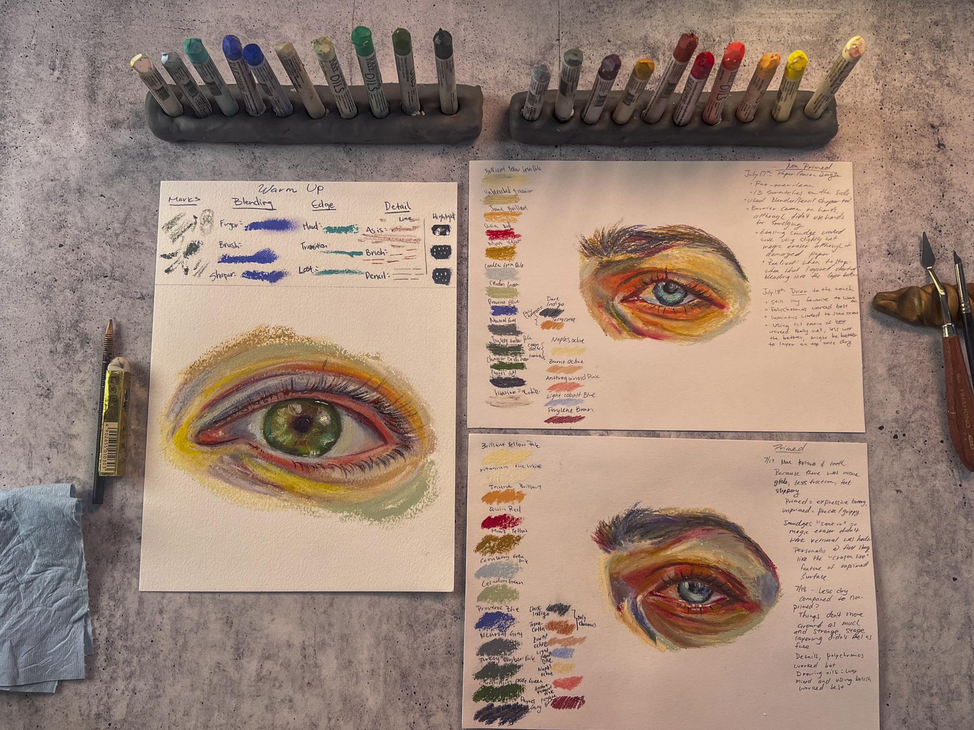
3. Materials: I want to go through the materials that
you would definitely need followed by things that you might want for
your convenience. So first of all,
aren't Drawing Oils. I have them right here. If you do have only
a few drawing oils, that's totally fine. I didn't have all
of these when I started off painting
eye portraits, so don't worry about that. And then any paper will do. I did use this Kansen
paper before when I did my eye drawings, but having that said,
RNF does mention to make the RNF
drawing oil archival, it's better if you do have a primed surface using a gesso. Hence, I'm using this
arches oil paper, which works lovely,
so I don't have to worry about anything
to make it last. Scrap piece of paper, but with tooth is good. So what I did was that I
used this Kensin paper, and then I put
transparent gesso on it, so it has a bit of
tooth to catch it. But if you don't have
transparent gesso around to prime a paper, you could even use the
kitchen paper to kind of scrape off the dried
skin of the drawing oils. And then you'll need
some paper towels or some cloth to wipe off
these drawing oils, and then pencil and eraser. The rest is if you have
it, it'll be great. If you don't don't have
to worry about anything. So if you're watercolor
artist like me, you might have this
Doran's wax medium. So if you want to if you want to be able to
work in details, these things might be useful. So first, if you're a
watercolor artist like me, you'll have Dorlans wax medium. It's great to get the details
using the drawing oils. So that would be great. Or if you have some
solvent free gel like this by gambling or a solvent that you
can spread out the drawing oils to get
the details, that's great. I will be using a brush for the final details
for the drawing. So I have a **** Blick wonder white here that I use for
many different purposes. And then you might
want a shaper tool, like a silicon shaper
tool like this would be great to get details if you
don't want to use any brush. And also the polychromos,
any kind of, like, color pencil will do, I just find these
polychromos to work lovely to get details as well. When you're mixing up the
drawing oils to get, like, a thin layer to
add details later, you will need a
palette knife, and a palette. So I'm using this gray matter paper palette so I don't get the
place too dirty. So these are all
the things that I will be using for
this whole class.
4. Choosing Your Colors: I just finished the project, but I'm going back to kind of
share with you the colors. So we will all have different colors at
the end of the day. So it's quite hard. And I own 21 Drawing Oils. So doing a full color chart
will be incredibly long. I want to go over the
neutrals and values. So we are going to pick
like I have the zinc white. Now, the titanium zinc white. So let's go over the neutrals. I have the titanium zinc white,
the unbleached titanium. And then I have the neutral
gray medium, paints gray. And then I have the
turkey umber pale. So what are these going to do? They are going to be the colors I'll probably
be using the most. But actually, I use quite
a lot of erleanEtra pale. But anyways, these
are the colors that you'll most likely use because we have to use
it for highlights, shadows, lowering the intensity at times and also
the value control. So you'll see me use the paints gray at the
end when using details. So when you are considering buying drawings and you're kind of wondering which colors, I do have a YouTube video
where I kind of go over that. But pick the colors that you love that you don't really
need to mix. That's one. Second is, for paints gray, I don't think I'll
be using as much. So if you have, like, oils from the tube, because I use the pains
gray a lot for details, and why would I be cutting it off from
the drawing oils to just mix it with solvent free gel or
something to create details. It doesn't really make sense. So yeah, that's my suggestion. But either way,
let's go over these. I'm going to quickly just show you what they
kind of look like. When mixed and so forth. So this is the
titanium zinc white. You wouldn't be
able to see this. So let me go over with
the turkey amber pale. So that's going to be
quite a good color to get, like, certain depth and greens. We do have greens in our skin, and look at what that looks like when added with
titanium zinc white. That's why we use a
lot of the whites like this to get the full value,
if that makes sense. And I'm going to even
add that paints gray on the edge of this turkey
Amber pale green. Yeah. So that's what
it might look like to even deepen further deepen
that turkey what is it? Turkey umber pale. Turkey green umber pale. Yep. Okay, and then
oops Let's try using the neutral gray medium and see what color
that looks like. So this is more on the cooler side than
the turkey umber pale. This would be great
for shadows as well. And let's look how
that would look like when we mix the
unbleached titanium. I love that color because
it creates this, like, warm but also neutral
kind of color. And then let's add that zinc white inside to get,
like, a full scale. So this is why we use so
much of that titanium zinc. And then, again, using the
paints gray to get that depth, and you get a full
scale right there. Okay. And then I want to
show you what paint's gray, and then the white
looks like together. So that's the pain's gray. Let me put this back. And
then the titanium zinc white. Beautiful. It almost looks like that bluish kind of color. And let's see what that looks like against a
neutral gray medium. It's much warmer compared to the paints gray. That's cooler. So there you go. It's interesting to
understand all your colors like this and try to do
as much mixing as you can with what you
own and also make sure to wipe them so they
don't get mixed as much. Okay, so we're going to the next bit wiping
off my Drawing Oils. Okay. And then the next
bit is skin and warm. So we're looking at warm
pink, John brilliant yellow. Actually, John brilliant, and then brilliant
yellow extra pale. And then the cadmium yellow, as well as Mars red. And then the quinaculon red. And then and also the
Mars yellow light. So my question is, does manganese violet
go to the warm? And then the manganese violet. Now, you might think,
wait a minute, isn't that like Yeah, you might feel like, Oh, this doesn't belong,
but it does. And I find that the violet is needed for areas that
the blood is running, but there's, like, a curve, like the eye socket, so it really works
well for those. Okay, so let's kind
of mix around. So these warm colors. So these are I believe
these are all very important for the warmth and portraits that
is in your skin. So let's try mixing this. I'm going to get this
manganese violet, and let's see the range
that it can create. So I'm going to use the
brilliant yellow extra pale. Now, remember, the opposite from the manganese
violet is yellow. So this does have
a bit of yellow, which then mutes desaturates
the color a bit. But look at that
beautiful violet that it creates right there. I just love it. Let's
use this shader. I mean, shaper tool. Beautiful, isn't it? Okay, so and then next, let's see what the
cornicuonRd creates. Now, this is a super
vibrant color. Great to create. It also has, like, quite a deep value
compared to the warm pink. The warm pink is
quite light in value, and let's use this. I'm using the brilliant
yellow extra pale again and the
blender tool shape. Creates really lovely pinks. Okay. And then next, let's see, with the Mars red. Now, this is, like,
kind of, like, transparent red
oxide, basically, and it's great for getting the depth in the
eye crease as well. Let's just try mixing it with that brilliant
yellow extra pale. It almost reminds me of the oil pastel the mummy,
I think it was called. This is a gorgeous
color as well. Let's try mixing the manganese
violet from the other end, and you can go really deep. Okay, and then let's
use the Mars yellow, and then let's use the manganese violet
from the other end. So the manganese violet
is more deeper in value. And then we can mix in the brilliant John brilliant and get this more
pinky kind of look. And then ultimately,
we can also mix in that warm pink to get that
kind of, like, the cheeks. It reminds me of
the cheek color. And then we can use the yellow extra pale and
then create that nice warm. So the warm pink alone, and then the brilliant yellow
pale that would create, like, a lovely, fleshy
kind of color right there. Okay, and finally,
the cadmium yellow. Let's see how that mixes. And then let's try using the
brilliant yellow pale again. Oops. Got a bit of that
warm pink mixed, but. Okay. So those are definitely colors that you
would use in portraits. And then the next one is the cool like maybe
foreshadows or even creating some atmosphere
that I absolutely love, and let me share you that. Alright. So, the cool
atmosphere cobalt violet, I mean, cobalt blue. CerleanEtra pale. And then Province
blue, Malachite. So these are all
the cool colors, and I think they are probably my favorites when it comes to these Arna Drawing
Oils, to be honest. Yeah, let's look. I'm going to just mix in all of
these blues and let's see what they kind of look like when mixed with the white. I did a whole RNF drawing oil
like light fastness test. So if you're interested, that would be on the
YouTube to check them out. So adding in the white here. Oops. Okay, I should
wipe this down, I suppose, but Alright. I'm just gonna blend
them with my hands. Oops. Ah, getting
messy right here. Always have a clean
paper towel in hand, I suppose. Oh, my goodness. Okay. Sorry about that. Okay. Let's do that. Our time. And then mix
it with the white. Okay. That looks beautiful. Alright. And then
wipe that down. Beautiful. And then that's
the That's the sildenGreen. No, that's the serleanEtra pale, which I absolutely adore. This is the color that I've
been using like crazy. And then this is
the coal but blue. Alright. Okay, and then we're
getting into the greens. So I've come to realize that the greens are
also quite important, especially when I was doing some drawings with using Monet. He seemed to have quite
a lot of greens in it. Now, with portraits, it's good
to have a green because it can be very useful to
mute your skin warmth, to have it more muted
in order to create more believable skin color,
if that makes sense. Okay, so first,
it's the sap green, and then the solden green, and then the ernese green. And then the chromium and then
the chromium oxide green. So that's the erne
chromium oxide, silden and then sap. So let's see what
that looks like. Let's go with the sap first. The sap can look very dark. It's got one of the if you want, like, a really dark green,
it's the sap green. Look at that. That's the
darkest green that you can get. And then the chromium oxide
green, it's more opaque. It almost has, like,
a bit of white. The sap green is definitely,
like, transparent. And then the Veronse green, it's almost like a vango
green, if that makes sense. And then the Celadon green, which I love, as well. It already has a
lot of white in it. Okay, so let's try mixing in the whites with
these, maybe I'll use, actually the unbleached
titanium just to give you a sense of how different
it'll look with the whites. That's gorgeous, isn't it? Oh, my goodness.
I just love that. And then let's mix in with that. Then the ernees oops. A bit of the other
colors mixed in. Yeah, the Bernese green mix with just white is
beautiful, as well. And then Okay, let's
mix it with the Yep. I mean, the solidn green doesn't really need any
bleached titanium, I think we should mix
it in with white. Okay, I'm going to mix the
white on the other hand so you kind of get the feel
of what it might look like. It's more punchy when it's
like white white, I suppose. Look at that. That's
super beautiful. Yep. Alright, so that's
basically the green, so we can always
mute the colors. So let's try just muting
a bit right here. I would pick, let's
pick the sap, and then let's try testing them out with different reds to see if it becomes more of a believable skin
color, so to speak. Just go to add a tiny
bit goes a long way, so we're just going to
have a bit right there. And then I'm going to choose different reds just to
show you how muted. So they are opposite colors. Bear in mind, they are opposite. And look at that dark
color right there. Let's try to pull this out a bit just to see
what it looks like. That's quite dark right there. And let's even add, like, a white to see
what it looks like. Look, that's quite
pretty, isn't it? It's like a
believable skin color if you get what I mean. Okay. And then let's try the Mars red. Maybe I need a bit
more sap right there. And let's pull that out. Let's get some white. Yes. Definitely a beautiful
color right there as well. A muted, kind of
brown, warm color. Okay, and then let's
try the warm pink. Let's see what that looks like. Let's white. It almost looks like the, the Mrs red, actually, but lovely, like, muted
skin color again. And finally, I'm going to get the John Brilliant to see
what that looks like. You could already tell
because it does oops, I mixed other colors in. Again. Yeah, it doesn't need
as much white 'cause it obviously has quite a lot of
white already. Let's see. Again, a bit of
muted kind of color. Just adding white to
see what it looks like. Yep. It looks like a
believable skin color to me. Alright, so you kind of get the idea of all this.
I'll have this. Once it dries, I'll
write down the colors, and I'll have it in
the resources section. I might just post the
videos beforehand, but this will eventually
dry in a week. So I believe it
will be ready by, I would say, like, 20 June around then. So you can check
out the colors and swatches that I've created
if you'd like to know. Okay, let's get into
the next project.
5. Getting to Know Your Drawing Oils: So I'll have this scanned available in the
resources section. So try to go over there and kind of write this
out for yourself as well. So we're going to be
working on the warm ups. I didn't make quite enough
space for the warm up because I wanted a bigger space to do the drawing of the eye. But you can create a whole page of the warm up just to
use to this medium. Okay, so first for the warm up, we're going to create marks. Now, let me explain
when it comes to these drawing oils and
you leave them over time, they are going to
kind of form a skin. Skin, we have to
basically scrape it. You would definitely want
to have some scrap paper around that you can scrape
off them as you apply it. I'm going to use this
turkey umber pail. Whenever you the drawing oils,
you would scrape it off. Until everything comes off and you have the underneath
layer coming out, basically, because it always creates thick skin at the top. So let's create mark. See how much marks
you can create. Oh, and by the way, when I'm like, when I'm
creating these marks, I try to when I scrape it off, I try to understand where it's been scraped
so I can use that. So try to create different
marks can be quite hard. Some could be kind of try
to create a fine line as possible and just try
to play around with it. Sorry, Mini see planes going by. Okay, so you can just go on, try to create different
marks as possible. And then for the
blending section, we're going to work with
a finger and a brush. I don't have much
space for the finger, but let's see what we can do. I'm gonna get something
kind of creamy. To work for this, maybe
this Province blue, one of my favorite colors. So first, scrape. Okay. And then I'm
going to lay that down. And then I am going
to lay that down. Maybe we could even
try the Shaper tool, actually, to see what kind
of blending that looks like. Okay, so with the finger. And now, please bear
in mind that RNF has a whole safety downloadable
PDF right there that tells you whether some of these pigments
are dangerous or not. So you need caution. But yeah, I'm just going to use my finger. I don't want to
take too much time, so look at how that blends. And these drawing oils can really work nicely
when you warm them up. So if you're in a cold place, it might even help to kind of warm them up with your
hands and so forth. Okay, so I'm going
to use a brush, and I'm going to use a solvent. So we're just going to see
how that looks like, okay? So I got my solvent right here. And this is a very small brush, but look at how lovely that
looks like with the solvent. It's just amazing. Yeah, it just feels
like watercolor almost. Okay, and then let's use the Shaper tool to see
what that looks like. Going to write
down shaper. Okay. The shaper really
pushes things around, and that could look
beautiful, too. Definitely, using the brush and the solvent is more controllable,
if that makes sense. Okay. And then the edge, we're going to create, like, a hard edge, a transition edge, and a lost edge. So I am again, maybe I'll use a
different color. I'm going to use the Malachite. Scraping it off first,
and then hard edge. Uh, let's see. Yeah, let's just go straight. Okay. Yeah. It really
is not much space here, but okay, hard edge. And then transition. See, this is quite difficult. And then lost. So trying to, like, when you're painting the eye, there's always the hard edge, the transition, and
also the lost edges. So that's what I'm
trying to recreate here. So let's see how transitioning
would look like. You can spread that across I'm using the Shaper tool. Okay, so that is a transition.
That's a hard edge. And then the lost edge is, like, the most difficult when it comes to,
as you can see, the most difficult when it comes to using the drawing
oils because, like, trying to get it really
subtle is quite tough. I think even I'm going to
use the solvent right here, which makes things much easier. Yeah, that is quite tough. I must agree, but it all
comes with practice. Okay, so detail, we're
going to create, like, a small, thin
line as possible, which you probably can
imagine what that would be like from my past
experience right here. So it's even hard for me. I mean, these are Okay, I'm going to scrape this off. And then as is. So meaning we're
just going to create the line try to create, like, a thin line. Trying different
lines right there. Quite tough. Okay,
and then brush. So what I'm going to do
is I'm going to show you. You can even, let's use this bit from the scrap paper here. And then I am trying to kind
of make it soft right here. Even add that solvent. I move it around and look
at how it's already created this pile of What is this, Mars red that we
can use for detail. So sometimes I use the scrapped
drawings that you have to scrape off the surface. Every time you use them, you could even use them for the details and
keep them around. Okay, so the brush, the detail. See how thin you can get and
I'm using the solvent, like, the solvent free gel by Golden, but you could even use the Dorlans wax medium in the same way as I am right here. So that's the detail
of the brush. It's excellent, isn't it? And then when I say pencil, I literally just mean
using any kind of color pencil that you
have or even a pencil. It doesn't really
matter. But, I mean, how thin they can get. And then now I've created these a bit of swatch
with the watercolor. I use Pains gray right here, but we're going to check what a highlight looks like
with drawing oils. So I'm going to use this
white titanium zinc white and try to create
the slightest dot. So let's see what
that looks like. Let me understand where
the highlight is gonna be. Oh, yeah. I kind of made a mistake. So it's better if you can
create a point with your stick, and that means you have to basically get it
to have a point. But even so it's
quite difficult. It's gonna be quite big. That's the whole point of this explanation
of this warm up. Okay, and then next, it says, use a brush. But actually, before
we move there, I even want to use what I've
scraped off right here on this scrap and put that with a palette
knife as a highlight. We got to press it a bit, but that could be
even a highlight. And then with a brush, I am going to again
wipe off my brush, go inside that
solvent that I have. Actually, I think I'll. So I am going in with a brush. Let me show you what
that would look like. See, that's the detail, the highlight that we
can create with a brush. So point is, it's gonna be quite hard to just use the drawing oils if you really want to get
those small details. But that might be also
the beauty of so. Okay, and pencil, obviously, we could use pencil, like color pencils to
create highlights, which will then look
like that. Okay. Alright, so I think
he got the idea. It's really hard to get
the details, obviously. And it requires a lot of
patience, but it moves around. It blends with fingers. It blends with solvents. It blends with Orleans wax. You have to scrape
off before using it. So those are some of the
things that you might want to practice and warm up before we get into
the final project.
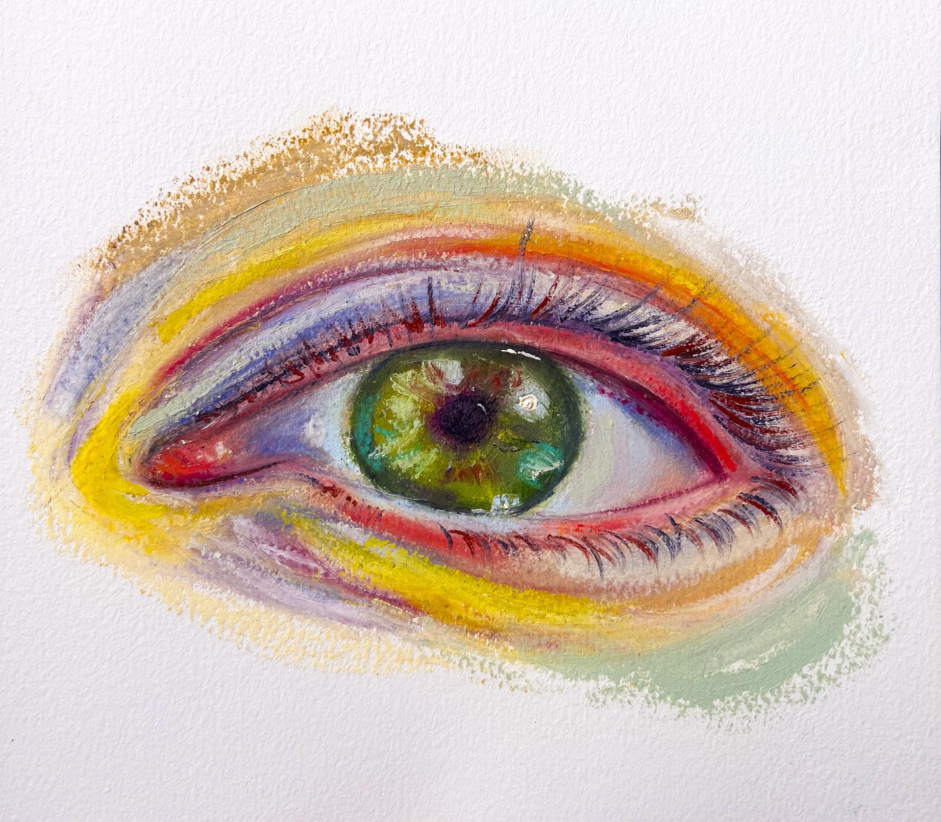
6. Eye Study Part 1: Building the Foundation with Color & Values: So this will be the final project where
we'll be working on an eye. Now, I have my own eye as a resource that you
can possibly use, but I've already sketched
it with my pencil so I can get into it relatively quickly and
start working on it. So um, for the colors
that I'll be using, I'm not too picky about colors. It's more about the values. I have done eye portrait class painting only eyes
in watercolor before. So if you have
watercolor and you want to get into
working on more values, feel free to work on that class. It's really fun. But today, I'm just going to work with these Drawing Oils, and
it's going to be fun. So I've already sketched the eye right here.
You could do that. I have my own eye in the resources section if
you'd like to use that. And basically, you might ask, well, what if I don't
have a range of colors? You don't really need to. The most important thing is
to get the values correct. If you're not too sure if you're not comfortable
with that, you can even take my watercolor
eye Lover's eye class, which will get more
deeper into that. I think it will help you immensely before getting
into this class. So I will start drawing the eye. I must say I'm not a
drawer, so to speak, but we all have to be
able to kind of draw and understand the values to be
a better painter, as well. So here I am. And I'm
going to kind of relax, enjoy this process and
not think too much, again, of the colors, but more so of the values. Um so I like to draw the eye. So as I mentioned,
with drawing oils, one of the key
things that I want to mention is that they
are a stick form, right? They're sticks, basically. So one, because they are sticks, you can't really cover
up a large area at once. It's going to be really hard. So I do recommend using, like, watercolor for the
underneath layer or even oils or acrylics or any kind of gouache
or any kind of medium really to lay out the the under like
layer, basically. But here I am. I'm
just going to use the drawings just to give you the sense of what
that might look like. So when I start
off with painting, let's see what am
I going to use? I like to kind of use
kind of crazy colors. So I am going to use this Province blue
to start off with. And then I kind of see these I don't know
if you see them, but I see these
violets right here. So I'm just going to
work into the violets. I'm really not thinking
too much of it. I'm just trying to get in those colors really
as just having fun. And then I look at
that and it's like, basically like a blue purple. So I'm going to grab like a yellow orange just to
kind of get the opposites. And you see like
yellows right here. I'm just going to
go in right here. With a bit of yellow. Um, even right here, I see a bit of yellow. And I would suggest not mixing the colors too much when you
just are starting off with. We're gonna be blending
a lot of them, too. Maybe I might even
use the yellow what's right here. I might use this purple. Let's see what that looks like. I think the purple
blending it with the blue would not mute it
or make it very strange. So that would be like a
nice color to add in. But I see these pink
tones right there, right? So I'm going to use
this warm pink. And later on, I think you'll notice that there
comes a point where, like, you start adding colors and it just doesn't take
any more colors on top. When that happens, you have to wait for another day
until it kind of starts the colors kind
of set enough for you to start working on it
again, if that makes sense. It's just like oils, basically. You can't move around the paint when they're
kind of like, Oh, I need a I mean, Alaprimas quite fun, too. And for the whites of the eye, they're not quite white, but there are like,
bluish areas. So I'm trying to fill that in. I might even cover up
a bit of the sections. I'm using this color called
the serleanEtra pale, one of my favorite colors, and even go in some areas that
I see that the blue's been extended towards And
then right there, I see, like a bit of that
kind of province blue. So I'm going to add that. And I see a bit of
warmth right here, so I'm just going to add
a bit of that orange. Think a bit of that
purple right here. And then a bit of that blue. And then finally,
for that section, I might just add the
yellow ochre, actually. So, I for my eyes, I think I will add
a bit of that. Maybe I'll add the yellow first. I haven't quite used this
yellow for any painting, so it'll be kind of fun. A bit of yellow here and there. And I see some reds,
actually. Not red. I would say browns. Oops. Browns. And then some greens. Oh, my God. Then some of the blues. Now I'm going to start blending. When I do blend, I just feel like the
hands work better. To really blend them around. I'm going to get and when
I'm mixing the colors, like here, I have a bit of
that purple and oranges. I tend to white my hands
so I don't mute it, desaturate it as much. I can see that I haven't
got enough there, so I'm going to go in more. I'm even going to use this unbleached titanium
just to get things moving. I'm almost, like, like, this is a very convenient
color for eyes, specifically, like skin tones because it
will create like this white, you know, to get
the paints moving. It's almost like a blender tool. Now, I don't know where
my paints gray went. I might have kind of what do I call thrown it out by
mistake. I have a feeling. But I have Manganese
violet, which is, like, one of the dark
colors that I have, so I put that for the pupil. Now, I've at least laid down quite a lot of colors just to get the underpainting
kind of sorted out. I'm just blending
it with my hands. So I think this is one
of the ugly stages. You have to kind of how would I call trust the
process and be like, Oh, it's it's gonna be
because now I'm just, like, screaming in my head. This is this is not
going well. But it will. So I'm just trying to bring
back some of the colors. Back, I guess. And yeah, it's gonna be tricky
without the paint's gray, actually, so I'm a bit worried. I don't think sap green is gonna be like an efficient color. 'cause I need a bit
of that dark color. So I'm seeing a bit
of, like, nice greens. I mean, you can extend your painting as far as
you want it to go, really. I'm going to add a bit
of purples right here. And And I see a lot of yellows right here. So I'm going to kind of put kind of play around
with that yellow. I'm white. Alright. And then here see
a bit of white coming in. And then I'm trying to
define again, some areas. And then, remember
we had that, like, hard edge and the transition. You could totally
see that right here. There's that hard edge. And to be honest, I'm not too sure which
color I should use, but probably the Manganese
will do the job. So trying to make, like a
bit of a detail right here. And then there's
the warm hard edge. That softly kind of disperses
grades into heart edge. Can I try to create that. It's getting really hot in here. Okay. So I'm going to use the Shaper tool. Kind of blend these out a bit. So right now, what I'm trying
to do is there's, like, white spaces that you can see that's seeping out
from paper white, right? So this is what I mean by it
takes quite a lot of time for the drawing oils to
cover up completely. Like, you'll have
to blend it so much until it's, like,
completely covered. And some of you may
like that look. I don't necessarily like it. So as you could see, I'm trying to basically
cover those whites out, which is taking quite
a lot of my time, But I do like to
use watercolor to basically cover up
most of the areas and then from there onwards
with drawing oils. So we got most of them covered. So from here, it's really
about working in more details. So I will be adding some of
the violets, right here. Like, you could see a
bit of that violet. I'm going to use this blue
blending some areas out. The more colors you have, the more it's gonna be
fun. Let me tell you that. So it doesn't have to be like a realistic depiction of it. It could just try to have fun with the
colors that you have. I don't know if you've
realized it, but I'm, like, I'm not able to add
the color on top, and it's almost like digging
into what lays underneath. That's what starts to happen
with the drawing oils, which means you've done enough layers on top
that it's not like, it's the underneath
layer is not dry enough to take more oils at this point. And when you get closer to that, you'll basically really have
to step away for a while and come back another day to start working on it unless
you like that look. But at least for me, I realized that I like to let it dry a bit
and then come back. So here, what I'm trying
to do is I'm trying to get the darkest
dark back again, and those, like, hard edges. It's a shame that I can't
find my paints gray. Seems like I'm going back into
saying that over and over. But it's quite true. Yeah, you need you definitely
need some of those, like, dark colors just to help you get really deep in value. So I think I'm at the
stage where I need to let this kind of sit and wait
for a couple of days. I am trying to get there's
going to be a bit of those, what do you call, small clots. I'm trying to remove as much
of those as possible right now before it kind of
sets and dries up. And I do have, like, a light fast test
that will be up on YouTube if you want to know which pigments don't
shift in color, even exposed in the light. But, yeah, I'll be it really depends on the
colors that you use. Some really dry up faster, but some really take a
lot of time to dry up. So I'll see. But hopefully I can come
back in a couple of days So now I am going in and I am using this polychromal
dark indigo to kind of create more details. As you can see, you can do this, not even using the drawing
oils to get the details. I'm using this alone, and it does work quite well, so it's like I'm drawing just to get the details
kind of set because I'll have to kind of wait for a couple maybe a couple of days. It really depends on your
place that you live. But it'll take me a couple
days here in Washington State until these drawing
all set enough for me to work on the
next layers until then. Yeah, I'm trying to put this polychromo down
so I can come back and I know where the details are. And then I'm going to try to wipe those drawing oils
off of the polychromos. I'm going to use this
Karin dash luminance. This is the maroon Perlin brown. But yeah, I think
the polychromos are better to use as a mixed
media with drawing oils, but Yeah, you can
judge it yourself, what works for you. Can I use this bright yellow. I think I think it's
pretty much set. But I'm going to add a bit of this blue onto this
bottom right here. All right. So this
is the first layer, and then I've added some of those polychromos and
the aluminum pencils as well for some areas, but I will be coming back in a couple of days just to
kind of work into more of the details because
the drawing oil at one point will
not work as much. I'll stop yeah, it'll be like, Hey, I'm done for now. Kind of, there'll be a point like that where
it's not gonna take any more of the drawing oils, and that would be the
perfect place to stop. I'm going to add a bit of those interesting
shadows right here. So we'll be working on the next layer once
this sets a bit.
7. Eye Study Part 2: Bringing It to Life with Texture & Details: It'll be way easier to work with because I've left it to
kind of dry out for a day. So I want to start working on the second layer. Here we go. And there shouldn't be
so much need of scraping these oils if you're
using the same one because a day wouldn't
create that skin. So we're going to work into some details now
because I've laid out most of the
colors from here on, I'm more into making
movements and creating, like, a creamy texture because that's the fun of drawing
oils, ultimately. That's why I like to do this
with a different medium, if possible, like the
underneath layer. But yeah. So let's get into it. I'm going to use this color, I think it wasn't used
as much yesterday. Yep, it's accepting more
of the drawing oils today. And I'm more being mindful of kind of trying to
create more strokes, like painterly
strokes almost Oops. Got to wipe that off. I'm almost looking into where it needs more whites,
more lightish color. You could even go a bit, crazy with the colors
as well. Right. Rabbit Maybe I'll add a bit more white here. And then I think I'm going to go dark on the pupil
because I couldn't quite do that yesterday
because I didn't have the paints gray around. I think I want to
use the quinacran red because I haven't
quite used this color. Whoa. There we go. And you never want to use too much of one color or it could come out
quite overpowering. I'm going to add I think the
iris looks kind of dead, so I'm going to bring in a
bit of, like, fun colors. I see some blues right here. And then I see even these
light blues coming in. What good dot right there. I'm going to get rid
of that big chunk. I think it's coming along. And I think I might
even add a bit of those browns that you
can see in the iris. I think if you
leave it for a day, you can really feel
the difference in how the colors are more taking in your like how the drawing oils are taking more of
that color on top. And right here, you can
see the lost edges. So I'm just going to
come in with my hands. Just go to come in. So try to look at your
work and kind of think, which areas you want
to leave the marks as is and which areas you want
to smooth out or harden. And right now, I kind of like these marks that I have
here as well as here. I think I'll go in a bit more with that Mars I think
it's called Mars red to go in a bit more over here and create a bit
of, like, these strokes. And I even see the kind of, like, dark, not black, but paints gray kind
of colors coming in. Definitely there's, like,
a shadow at the top. So I'm gonna drag that. I sometimes even use that
dried skin to move things around because that could help. Yeah, like, move it
move the paint around, so to speak, the ols
around just enough, but also kind of getting
out a bit of that color on where the color is now. And then now I am
going to try to get the tip right there
sharpened as much as I can. And then I'm going
to come over to where that kind of
shadow comes in, and I'm not trying to get so
much of it down, but enough. Then there's oops. I think I went
overboard right there. And I'm trying to I'm
going to try to get any kind of paints gray I've scraped off here on this sheet, and maybe I'll just get it out. So I'm going to get a bit
right here and I'm going to smooth it out so I can work
into the details slightly. Maybe you've heard of this, but, like, I hear it many times, like artists talking about this, but do the shapes, and then the details last. It's more shapes, right? Yeah, to work on
the shapes more, but it's hard to keep on going when you don't
get at least for me, if I don't get enough
of that shape down, I feel like I can't
push forward. Like, I don't see the end goal. So I typically allow
myself a bit of it, if that makes sense. And then I think I'm going to scrape off that paints gray a
bit more, actually. And one tip I would
give is that, once you scrape off, like, a certain area, try to use that area rather
than going in other areas. That's how stingy I am, but that kind of works. So I'm trying to
get the drawing oil as smooth as possible. And then I'm going
in that dark area. Just enough. Not the whole detail, we'll be working
on details later, but I'm just getting enough
of it to keep myself going. And for So for the pupil, I'm trying to I
would suggest not covering the entire
area completely dark. Somehow having, like,
a slight difference in the value would make it
more like, more believable. And then if you can
see, there's, like, this darkest dark right there, so I'm just going to put that I think that's enough for now. And then I am going
to mix a bit of that Mars red with a bit
of that paints gray. I just want something
kind of brown but a bit dark in the value to kind
of go in slightly here. I think I got enough
of the I think I got enough of the details. So I'm gonna be working more
to create fun textures. So let's get into it. I think I might
use I don't know. I'm leaning into creating, like, a warm feeling. So let's look at actually, I'm going to use
a bit of that Um, a bit of like, I want to brighten this area
right here where it's like, curled inside, if you can see. I want to just a touch,
make it lighter. And then I'm going
to use a shaper and blend it a bit just
making it slightly bright. So we're gonna do a bit
of fun stuff right here. I am going to create
like a gestro mark And then a bit of
orange right there. And then think right
here right here. I guess right now, the aim is to create, like, fun, like somehow like
this fun feeling of what Drawing Oils can create with those
oliness because that's what merely
is lacking with watercolors that I don't
get the fleshiness of things and try to have fun. I think this is the most
stage you can have fun with And then I think because it looks, how would I say quite yellowy, I'm going to soften it a bit. Again, getting sterol I think I like how
it's coming along. Now, finally, I think we're
at this stage where we can, when you kind of
work on the eye, and you want to kind of play
around with the colors, I would I think it's
a better idea to, like, lean into either
warms and cools. So here, I think you see more warm colors
than cool colors. Always a mix of both is good, but when you when you
become too playful and go, like crazy, I think
it tends to lack, like, which way
it's going towards. So try to be mindful of, like, if I have, like, 80% or 70% of warm colors versus the
cool, it should work. Alright, so I think I want to
now work into the details. I might once this
dries again tomorrow, I might add some more. But I think, yeah, I think it's at a
good stage for us to kind of move on
to the details. So I am going to scrape off. I think for the details, it's mainly the eyelashes
and then some highlights. You can see, like, that bright sun hitting
a part of the eye. So I think I want to add that. I think for that one, I'm going to use the
yellow extra pale. Sorry for my chair squeaking. It's basically the only chair that really works
in this setting. Yeah. And it tends to squeak
whenever I move around, but it's hard not
to move around. Hopefully, it doesn't the mic doesn't capture much of that. Alright, and then I am going
to mix the solvent free gel. Kind of use my palette oops. That's spread across
palette knife to kind of get it
more soft and creamy. All right. So I'm
going to create, like, a big, huge dot right there, maybe even a bit of
movement like that. And then if you see
closely, there's, like, a bit of light
catching right there. Bit of light right there. And then a bit of light coming in right there. And then a bit of
light right there. A bit of, like, kind of
trickling right there. I think for the whites, they should do it, and then now we're going
to get into the eyelashes. So for the eyelashes, they are quite dark. So I am going to mix
a lot of paints gray. I think this crap doesn't work. So, you have to try to get
them to make your life easier, try to get what's
inside and still wet. Getting a bit of solvent. I think I'm ready. So we're going in
with the details. Now, if you see closely, you can tell that actually the eyelashes don't start
off from the inner corner. It starts from the outer corner. So here I think
that, it starts off. And you might find that actually waiting to do this on the next day might be even
good because ultimately, we're using this
really thin brush to create these hairs,
like eyelashes. And basically, with
the oils in the back, they yeah, like, you're
kind of pushing in them. So you might find that quite difficult to do
because it's basically like aprima we're working while the oils underneath
are still wet. But it does create this kind of interesting look that I
personally quite like. Especially 'cause we're
not trying to capture, like, like, realism or anything. It's um yeah, I think. And oh, I forgot to say. Look how much the
eyelashes extend outwards. It extends until
here, pretty much. But I am going to keep it
within where I've painted, because if we extend that, it's gonna look quite different. And try to also imitate as much as possible
how the hair is moving. They start to move
kind of down here. And then we're going to
the other side a bit. There's some hair that
comes out from there. Now we're going down a
bit, but before I do, I want to get that corner a bit. So I talked about how having like 70% of the kind of warms or cools depending
on what you choose. Like, you should probably
stick with that, right? But here, basically, I would say that this paints gray
is on the cool side. So it kind of stands
out quite a lot. So what I'm going to do is now I've kind of marked
I think I've marked enough of those
eyelashes at the bottom. What I'm going to do now is I'm actually going to get the, like, a warm color that will make things
pop out a bit more. So I'm going to
make the Mars red, and I'm going to cut this out, and I'm going to create some
colors for the eyelash. So I'm using the solvent
gel again to kind of create like a creamy, fluid texture so we can go over this So I'm just going to add not a
ton, but enough. And adding some on the bottom, but also what I am doing
right here is kind of bringing in some of those same colors
elsewhere as well. Tends to kind of
work when painting. I don't know. It's just
I think you've also realized that sometimes adding, like, bits of colors here and there makes it more harmonious. And then I'm going to add
a bit here just because I think there seems to be
a lot of that red color. Don't want to mess it
up too much. All right. And then I'm just going to
go slightly inside here. And then I'm going to
add a bit of that paints gray to that brown
that we just created. Then I'm applying it here. Because I could see
that kind of, like, almost hard edge,
right there. Alright. I think I, I like
how it's looking. I would call it done. You could even go really, like, playful, like, creating the
ins with even the reds, but I don't think
I'll be doing it. I think I like how
it looks so far. I might even had a
bit of warmth in. Um, yeah, I might even add this. Let's see. I want to
brighten up this area. Maybe brighten up a lot
of areas, actually. Just to give it
that kind of, like, oily texture and maybe even
bring in those lovely greens. I just love this color. It's called the don green. Just to kind of play around. Yeah, I think it's quite nice. Right here. Alright. So I'm just gonna scrape off all the big particles just
to kind of clean it out. Yeah, the great
thing about drawing oils apart from being
able to work on paper is that I I just miss the
fleshiness of oil, the texture, how, yeah, like, pretty much the
closest thing it is to skin. It's fleshy. And I
quite miss that. And playing around
with drawing oils, like, you could just have so
much fun with the textures. So yeah, I hope you
enjoyed the class.
8. Bonus: Drying & Protecting Your Drawing Oil Artwork: So the drawing oils are going
to take time to dry up. They can take, like,
a full week to dry, and some colors would
dry faster and some wouldn't I wouldn't want
to close this completely. The best way is obviously if you have those drying trays
to put it in there. But if you don't would
even suggest using, like, parchment paper,
like baking paper, and then place a
masking tape on top to let it stay and then
close your sketchbook.
9. Final Thoughts: Keep Exploring: I enjoyed all of them, really. But the key part
that I feel like it doesn't quite change is
that drawing oils are not the best at covering because they're
stick form, right? So here, I use only
the drawing oils, but I had to lay so much of it. So I would really suggest to use other mediums
to cover most of the area. Maybe even with crayons, you can do that or watercolor, but with watercolor, you can't
really use this oil paper. I might even use acrylic.
That would work as well. So I hope you enjoy the class and please share your projects. At the end of the day, what
is art? Art is something. You have a vision and you execute output that
into the world, right? It's visual communication. So I would love to see
your different worlds. I would love to see them.
Please upload them. And please, please, please leave a review for me
because basically, if we don't get enough reviews, what happens is that Skillshare will delete that
class eventually. And it's sad because we put quite a lot of time as teachers trying to
make these videos. So I hope you can
leave a review for me. It'll mean a lot. And if you have any struggles during the class of
using this medium, please let me know, because I'll try to give you the
best answer I could. This is a community,
right of artists, and we can help each other as
well if we know the answer. Okay, and finally,
I have a playlist. Down below, you can go
check out if you want to deep dive into
more of drawngle. So I'll see you in
the next class by
 Miwa Gardner, Watercolorist- Watercolor for Relaxation