Transcripts
1. Intro: Come on. Good morning, everybody, and welcome
to my skill short class. Now, sorry for I haven't put
any effort. I just woke up. My son has a day off today, so he can come down anytime, and I really wanted to post this class as soon as possible. So yeah, so we had a
big storm last week, which caused a power
outage in the area. And this was my second
time apart from the Hunhen earthquake
that happened in 1995, that I experienced it,
and it was pretty bad. And what happened was
we live in a woody area and a lot of the pine trees
and all kinds of tree, pretty much, how did they
call fell on the ground, and, you know, that's
the end, pretty much. The roots are showing
and everything, and it's just so sad watching. I know we can't do
anything about nature, but this was the inspiration
of the start of this class. And I thought, Well,
Christmas is coming, and I imagine a
lot of you will be creating gift cards
for your close ones. So I thought, Okay, I
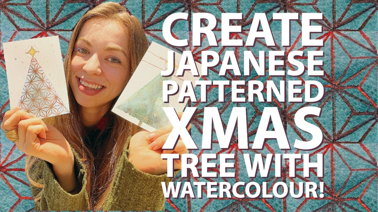
should create this class. So that's where it all started. The final project would
be for you to create at least one these would be the cards that
we will be making. And one of the cards, I would like to see you posted
on the project section. Oh, and I forgot to mention. There will be a gift for me at the end of the class,
so stay tuned. Okay. Let's dive in.
2. Materials: Okay, so I'd like to go over the materials that
you would need. So first of all,
you'll need a pencil, a needed eraser, and a compass
would be nice to have, but you don't need to have it. I'll be using these three
watercolor brushes. And then I'll be using this
for the final project. This is about hung
hot press paper. But which I'll eventually have it cut here and
then use it as a card. Or you could also get
something like this. This is the Strathmore
creative cards, which comes with envelopes,
which is quite nice. I've paid some for my neighbors as I just moved to this area. And then you'll need a
watercolor sketch book. I'm using this
Canson just to get some ideas and you'll
need a kitchen paper. Then you'll need
watercolor paint, and I'll be using this Kansai
tambi which doesn't come with the wells to mix
the watercolor with. I will be using this
ceramic um, palette. And it's nice to have
a paint brush holder, and you'll need some water, which is very important
with watercolor. Then I'll be using
these or I might be, but I'm not too sure yet. These pen touch calligrapher, silver and gold pens,
which I love using. And that's pretty much it. Okay, let's get to
the next class.
3. The Plan: Okay, so I like
to share with you what the plan is
because I will not be going into the details specifically of the techniques
that you would need with watercolor because
of the fact that those can be seen in other videos that I've
already posted on, so please check those out. But watercolor is all
about really planning. You can do relaxing kind
of watercolor painting, but I want to tell you
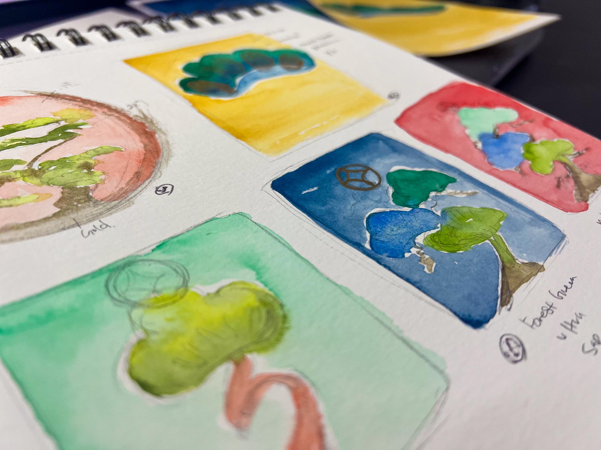
what we'll be doing. So for the first card, we will be making these
pine tree and first of all, we'll create this circle. We'll create this
circle with a compass, and then we'll sketch out
this pine tree like this, then we would go in with a cat scarlet or
something similar, red. Go in here, go in here as well. And we'll then paint the greens. With lemon yellow and
sap green and then go in to add a bit of dark
greens with olive color. Then we'll do a wet and
wet technique for that. We'll just be
mindful not to touch the hedge of the pine
tree with the red. But yeah, this really is
all about practicing. You can even put
in masking fluid or just create that negative
white space as you go in. But it doesn't really matter. You can go either way. Then we'll use a gold to
put in those tree bark. And then finally, with the gold, I like swiping in a bit of
that paint brush like this. I've created a color. I've created a class
before called the ENSO, which is a Zen practice and it's a very short class as well. You can also check that out if you really like to
learn about that, but we're going to create
ensole right there. For the second card, we will again be sketching
this pine tree in this shape, and then we will use
a forest green color, very dark green first, being mindful of
this white space right here between the
blue and the green, and then we'll come in
with Prussian blue. And then finally,
we will then use yellow ochre or a similar
yellow to go around it, being mindful of the edge here, not to overlap it as much. Then once it's completely dry, I love using my finger to use the gold and then
stamping it on like this. If you're not going
to give this card to some family member you
can trust, maybe not. You can also, like, draw in some lines
with gold watercolor. That would be kind of
beautiful as well. And then for the
third final card, we will be making
this one right here, and we will again, draw the pine do. I mean, the pine tree, one, two, three pines right
here and then with the bark we'll go in
with different colors. And finally, we will go
in with indigo around, let that completely dry and use the metallic pen or either a gold water color if
you have one and draw this star at the top,
that's pretty much it. Okay, so that's the plan. Now, let's get into
the final project.
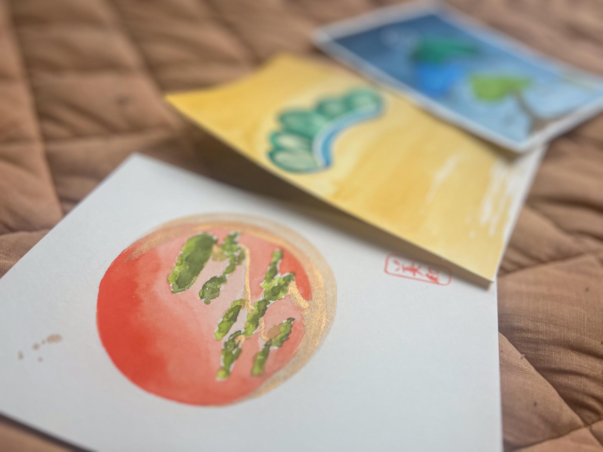
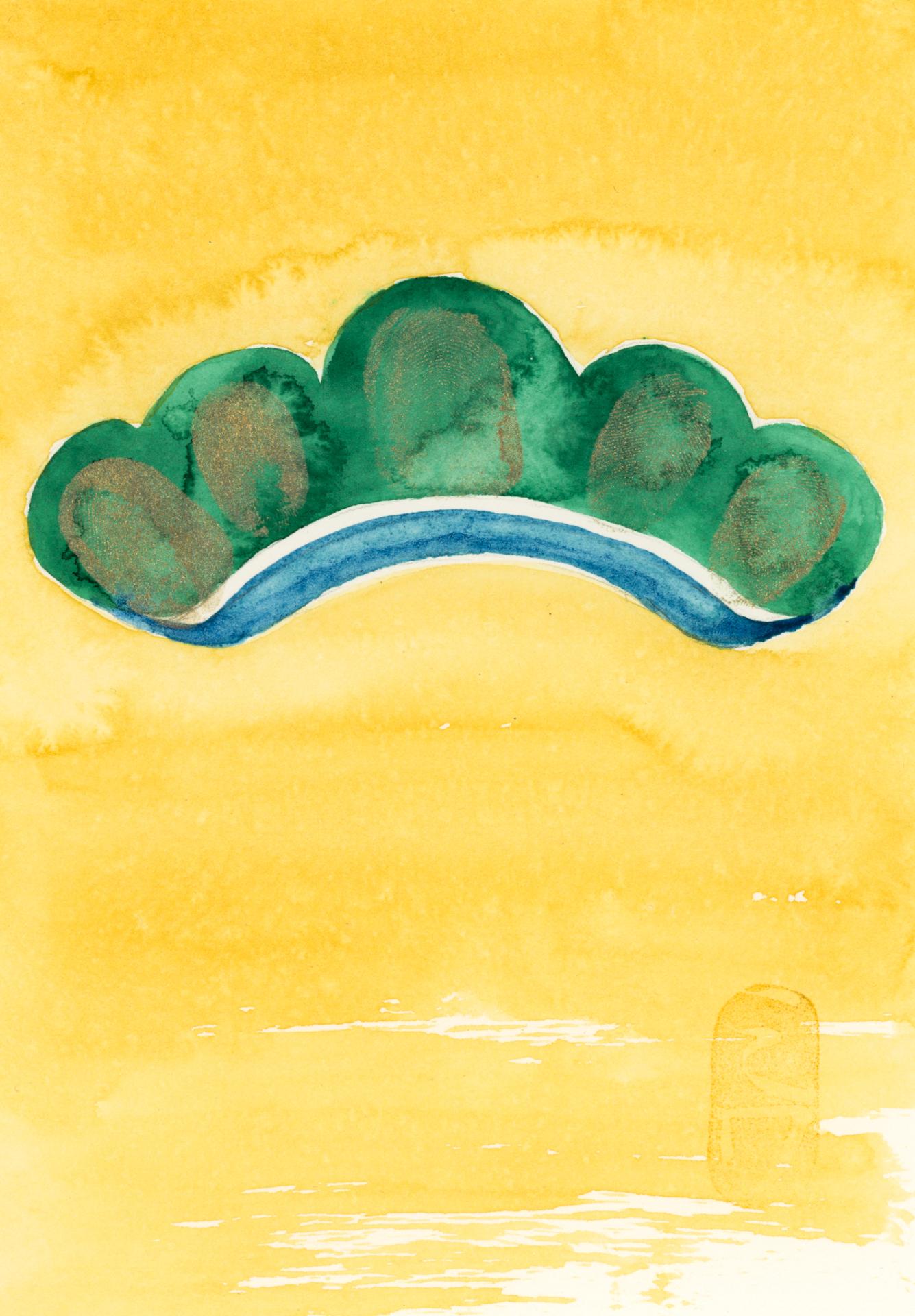
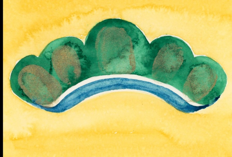
4. Final Project Card 1 & 2: So I've sketched two of the paintings that we
will be doing for the cards. So first, we'll kind of
simultaneously work on both, but I'll start with
this one first. So I created the circle and I've sketched
out the pine tree. And the key for this one
would be creating um, a bigger pine at the top, so it balances out, but it's going here, like a curvy shape. At the end, the
bark flattens out, but there's more that goes
that way rather than this way. I would have a sketch that you can use in the
resources section if you'd like. Um, that's available as well. But I quite like these kind of loose sketches because they feel more I don't know,
somehow more Japanesque. And this one, I've created
one, two, three, four, five, five round circles, and then made it a bit curvy. And also this bit right here would be like a negative space, so we're not going
to paint that in. Okay, so first, I
would like to go in with a wet and wet technique. So I am being mindful of the
pencil mark on the outside. I'm not trying to go over with
the water on top of that. I will be erasing that
completely later on. And once you lay that water and the watercolor on top
of that pencil line, you're not going to be
able to rub it off, just being mindful of that. I suggest that you
use a very tip, like a fine pointed brush
for this so you can get in. And then I will be using the ca I will be using the Cadman scarlet
for this one, I think. And I am going to
try to move that paint close to the tree
as possible from here. The rest is not wet at all, so I'll have to move it quickly before it
totally dries up. And especially, I'm
using a hot press paper. And in a way, a
hot press paper is not that forgiving because it shows those edges
when it dries, really. Like, it's going
to be quite crisp. So if you are using, like, a hot press paper, I suggest you work as
quickly as possible. And I'll probably keep
saying this over and over. But when it comes to
things that look Japanese, I quite like the imperfections. So try to embrace those. There are ones that are really,
like, tightly controlled, but a lot of the watercolor art I think has quite like
this imperfection, kind of embracing look. So there I already
see the white line. I wasn't fast enough. So I'm trying to put a bit more of that cad rid in there. I mean, you could use the masking fluid to
make your life easier. But I don't know. I I like to work on things like this
without the masking fluid. Okay. And I come in
a bit more here. The intention here is to get those reds in more on the
outside rather than the inside. The inside is more
lighter in value. While this is drying, I like to go over to
this one right here. I'm going to get a dark green. It's called a force green. Okay. And I will go over this being mindful of the white space that I will be creating
at the bottom. But other than that,
we're just coloring in. And I'm not using any
wet on wet technique. I'm using wet on dry
right here because we want as much control as
possible for this one. But just to give it
a bit of a fun look, what I will be doing
is where I'm going to be placing my fingerprints. I will I will be tapping in a bit of the water right in when
it's almost drying. So I think here, it's
starting to dry, so I'm just going to
tap in water like that. Here, tap in water like that. Just to give it an
interesting look to it because that's
gonna create the blooms. I just love blooms. Yeah, it's quite a shame. We had quite a big
storm hit here in Washington and had power
outage for four days. And it's my I haven't
experienced this outage since Hun shing earthquake
in Japan in 1995. So yeah, but it's such a
shame that the pine needles, I mean, the pine trees, like, some of them have fallen. And just to think
that their life is pretty much done
it's quite sad. I mean, we're talking
really big ones. They're huge. Okay, now I'm going to
get the Prussian blue. And then I don't mind
it touching a bit here because I like how things
can mingle in a bit. I even want to go really
thin in the middle. I hope my head is not getting
in the way right here. And I do apologize for the
bad lighting at the moment. I'm still receiving all
my shipment from Munich, Germany, having moved
to the United States. And yeah, I'm still
not settled in here, but I promise things
will get better. And Okay, I really like
how that's looking. I might even clean
the edge a bit, get it really thin at the top. Then coming down, gradual Shift. Yeah. I'm just going to add more
Prussian blue at the corners. Okay. I'll waive
that to dry for now. Were coming back into
this one right here. I don't like how there's, like, do you see that
bit right there? Oops. I want to kind of scrub it a bit to make
less of that hard edge line. That's what I'm talking about. Hot Press just
creates those lines. I mean, it's pretty and it's more vibrant than
using cold press, but still you can, sometimes it may not be as nice
as you want it to look. Okay, I think the outside
layer is ready to be erased. I mean, it's still a bit damp, but I'm running out
of time right here, so I'm just going to
go ahead and clear off that edge bit. Okay. Now we're going
in with sap green. Um, yeah. I'm going to mix like a vibrant
green with lemon yellow, usually a PY three, a bit towards the green. And then I'm going to put
a tiny bit of sap green. And once you get
that kind of color, then tap it on to the trees. And it might even
look nice if you can, like, create some
white space in there. Just some tap it
in there as well. Then I'm going to
get olive green, which is a green like that. Then I'm going to tap in areas that I would think that
there'll be the dark values. Quite random right here. And then I'll mix that
lime green again. I mean, lime yellow. What. Again, Topping in those greens. And then getting the
darker green again. And I would say to add in those olive
green more at the bottom, if you're having a bit of hard time navigating
where they should go. And having too much green, having too much water in
your paint brush could then, not give you the
effect that you need. You really need to
know your brush and how much pigment to
water ratio it has, and I've talked about this in another video, go to that class. I'll link it in the resources
or in the class details. Okay. So finally,
while it is still wet, I'm going in with a gold color. Now, this gold is kind of
towards a bronze, actually. They call it gold in
this Gansai tambi, but it looks kind of
like a bit brownish. So I would use this tap a
bit of that right there. And trying to use the tip of my brush as possible
for the top layers. And then going here to sweep it. Okay. And then here I want
to create a bit of a edge. Like a more harsh edge here. Okay. And then finally, I would swoop up that
paint brush right here. Go like that. I think I might
even go with a N. I think space wise, this is good enough. Okay, I think I went overboard. I might clean off
that edge a bit. Okay. I might clean it
off later a bit more. Maybe even take up some of that. If it. Folks. This one, I put the
masking tape here because I want to go over it with another
color, the yellow ochre. So that's what I'm
going to be doing. I'm going to mix yellow ochre. I also thought about
using gouache for this, which is basically also a
watercolor, but more opaque. It uses a white acrylic, more of the white paint to
basically make it opaque. But you can use different um, yeah, different mediums
for it if you wish. But I will be using watercolor. And for this, try to use a bigger brush so you
can work quite quickly, and this is where
it gets tricky. Again, with cold press paper, you have to work as
fast as you can, and I have to be mindful of
creating enough white space, trying not to go over any of the greens that
we've painted right there. G. I think it's okay. And if you do have to slightly go over it
or you're scared, try to use less water
and very light pigment. So then even if you run over it, you're not that scared
of destroying it. Because if you have a lot
of pigment and water, then it might start coming off and blending
into each other. Having the right size brush is, I quite like having a bit of
a dry brush at the bottom. Maybe I'll keep it that way. Just finding new
things right here. Yeah, I quite like
that. Don't you? Okay, so I'll keep it at that. And basically, for
that painting, I will be finally going over with my
fingerprint at the top. Oops, put some drop some yellow
ochre on that one. Okay. So for this one, I think we could get it
a bit more darker. I just think it doesn't
have much umph to it. So I think I would make the
cad red a bit darker as well. I mean, the cascara
bit. I got it. So I am working
wet on wet I mean, wet on dry because I already have the
foundation laid here. So I'm not too scared of making
a big mistake or whatnot. And then So I'm just being mindful
to work quickly. But not only that, but to also add more depth
to the color, more value. And I'm only adding more to this left hand side. Okay. And then I would also add a
bit to this right hand side. Okay. Now I will be
adding more greens. So with the same colors. I'm just trying to
maybe even get more of that soft green mixed instead. Maybe even a bit
more here and here. Just adjusting, where you
think might need more greens. Getting that olive green. Okay. I went overboard
on that one. Which case is ten it up erasing
it with a bit of water. Okay. Extend the wrong
green right there. But Okay, I think it's done. Now, I am going to get that
same bronze gold that I have. Maybe even darken
the bottom of it. Then Okay. That's done? I might even. Okay, I
might make this worse. But I think I might even try to create like a
dry brush stroke right here. I think
I quite like it. It's a bit towards the right. From here, you don't
have to do it, but I'm just going to do
it just for balance sake because once I get rid
of this masking tape, there's more space here
than there is here. It might be a bit of balance. I'm just going to create
a bit of splatter. At this top. And call it a day. I didn't mention this in the materials section
of the class, but I will be using these colo pearl colors that I got from Germany and I'm
using this moon gold. The reason why is
because if I did use the Gansai TambiGld
which are these, they're not going to be they wouldn't pop out because this is quite a dark color
right here at the green. I'm going to put this paint. On my I think I'll use
my thumb, actually. I know this is kind of awkward, but just putting paint. It's just, like, the
perfect the perfect size. Yeah, I'm gonna tilt the paper a bit to make my life easier, but again, oops. I guess the the
paint wasn't as dry. I gonna keep growing at this. It's not consistent, but getting less water here. Okay. I think I might
yeah, I think that's good. Okay, so it's done. And then I am I think
this should be dry. Tear out that masking tape. And the cards are ready. Now, I teach this
in another class, but you could also put a
Japanese kind of looking daka. It's like a stamp to mark
a completion of your work, but it's basically a signature. But yeah, check that class out. It's quite fun. So I will
be making mines right here. I have since my
name is Japanese, I have the Kanji Mwa as
well as a katakana Mwa. But for this one,
I might even use my I think that's
what I'm going to do. I have a stamp used for my artworks
that I sell online. Kind of it's goal so it
doesn't show up too much, but quite like the
subtlety of that. Okay, so that's
two of the cards. Now we are going to move
on to the final project, which is another
card, the third card.
5. Final Project Card 3: Okay, so I like to get into the third card,
the final project. So we will first paint the
background with indigo. So I would quickly do this. And I am just going
to be mindful of making the top more darker. And unlike the other paintings. This is a cold press paper. So you'll see that I handle
it a bit differently. And it's much easier
when it comes to you don't have to be as mindful when
it comes to the edge. And I just feel like it dries more slowly compared
to hot press paper. Again, I'll try to
create the sketch that you can use to
create the same painting. I get the met any just trying to make the masking fluid stick. H Okay. I would let that dry a bit. But I am running out of time, so I would go ahead and get this forest
green started. It's a the green, basically. But I'm just going to be mindful of
creating a bit of space, so I don't I don't bleed into that
background layer as much. And also being mindful not to touch the next pine tree below. Okay. And then next I will get
the ultramarine blue. And being mindful. A bit about that space in the background I just feel
like it's dried already. And again, I'm trying to be
mindful of the space here. Creating a white space. I might go back into
that green a bit here. I don't mind if it touches. Sometimes that leading into
another color looks pretty. Just refining that
shape right there. But also adding a bit of water. I think it hasn't dried yet, so it's created that bloom, but I love blooms. It's fine. Okay. Then
we're going in here, I will use the sap
green for this. The top collar is bleeding in, but I quite like it. It's fine. My husband sneezing in the back. Man, his sneeze is one of
the biggest noise ever. Sometimes it scares
me and I jump up. Yeah. Okay. Okay, that's looking good. Now, I think I come in
with the bark here, so I'm going to use raw umber. But I kind of want
to go in while the green is still wet because it just creates
a really pretty color. I like to create a bit of I some dry brush strokes,
leaving the whites. It's quite nice. Just go to add a bit more green
there. Coming down. I like the blend. I mean, the pine trees in my area have moss on
it and so pretty. So yeah. And I'm coming in with some of these areas just
to make it a bit more rich in color,
creating more depth. Big. Maybe even add those lines. Then coming in with
the raw umber, again, using the
tip of your brush. We might erase this
because I'll probably be going over the background
again with indigo. I don't think it's
dark enough really. I may leave it, but let's see. I like to go over the
background again. This time, being mindful of clearing some of
these white spaces. Yeah. And I don't mind too much about going over the pine trees. The main purpose here is to add more color and trying
to create more Oops. Okay. Okay. And I'm going to let
this dry and then finally, we'll go over the details. Okay, next, I will be cleaning up some
of these edges. I like to leave this
one right here. It's quite pretty. But I will try the common here and get rid of that some
of these white spaces. And I'm trying to
kind of clean some of these shapes that don't
look like they should be. Do. And too. I think that's Okay, I think that looks more like it. And then next, I'm going
to go in the blue. Because this is not perfect. I mean, there's something
nice about not being perfect, but I don't mind a bit of blending in that
color right there. I want to keep that
and right there. A clean a little this and Okay. Then finally,
for the green, I kind of like how
it's looking already. I love those blooms right there. I'm just going to clean
out this edge right here. Make it a bit more puffier here. Okay. Okay. I think I like how
it's looking so far. And then finally going to
get that raw umber again. And then if you feel like
you've added too much, like, I don't like
how that looks. Just tap on a bit of water and it'll do
its job softening it. Okay. I like it so far. I think I might even
add a bit of the dark. Browns here. Basically, if you get
stuck with where to add those dark browns of the tree added to
where it's bending, usually, that will
solve the problem. Finally, I will add
the star at the top. I will add the star, and I think I will
not use the gold, but actually the silver. And this can go terribly wrong. So bear with me. I have to get a bit close. I like it when the
circle actually comes down on the pine tree. Quite difficult when I
can't move the pape. Okay. This circle
doesn't quite look. It's just like how
I wanted it too. It's not fine enough, but Ask I guess
that is what it is. See. Okay. They don't quite like that indigo that's
quite thick there. So I'm just going to
soften that a bit. Bit dry brushing. Okay. I was going to say I'm gonna
let it dry, but it's fine. I know that this bit
has that pression. I mean, the indigo
kind of leaked. But I played it, the japanesq Christmas tree. Really? I would say that I don't quite like
this the thinness. You got to get it very thin
and nice and clean and crisp. And I know this is
quite difficult with having it in a
distance so you can see, but also with a pen, you don't have much control. So if you do have a color
pencil or even a thinner pen, it might look nicer. But okay, hope you
enjoy the class.
6. A Gift!: I hope you enjoy the
class and you have created one or maybe all
of these japanesque, watercolor paintings
for your close ones. So I have never
done this before, so it's quite new to me, but I would like to physically send these to you as a gift. And for that would be a draw. So if you can first
post your projects, two, leave a review
for the class. And three. I have started
a podcast since 2024, August, so I would love you to listen to
at least one episode. Maybe I'll leave a link for you to access and
you can listen to that. And if you can leave
a review for me, that would be lovely there and take a screenshot
when you do. And I will ask you for your address and
so forth in email, and I will send these to you. The deadline will be
December 15, Sunday, 2024. By then if you can do all this, I will be sending the cards. Hopefully, it will reach you by Christmas. That's the goal. Okay, hope you enjoy the class and see you next
time. Be patient.
 Miwa Gardner, Watercolorist- Watercolor for Relaxation