Transcripts
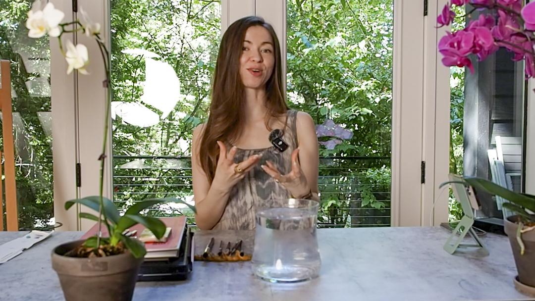
1. Welcome!: If you've ever felt stuck
or stiff while painting, I hope this class will
ease you to let go. We'll be exploring abstract
watercolor as a way to unwind play with water inspired colors and to
paint what you feel, not what you think you
should be painting. No sketching, no perfect plan. Just brush, water. And watercolor and you. So we'll be exploring what
kind of shapes brushes create, color harmony and
layering glazing. And also, one thing that a lot of beginners
struggle with, we'll be looking at the stage of wetness
on the surface of a watercolor paper because
I feel like this is the crucial probably
number one thing that was very eye opening for
me when I was a beginner. For the final project, we'll be creating a circle of abstract watercolor
brush marks. That connect with the flower of your choice or your emotions, following the 631 palette that often we always
pretty much works. So I'll share with you the tips. If you feel like your painting often doesn't feel like
what you want it to be I have just created a
video on YouTube called ten Watercolor Mistakes ruining your painting and
how to fix them. So if you're interested, I'll have that in the
description below. And also, I've created
a PDF that you can download in the
class resources section, which will have the list of all kinds of flowers
that I absolutely love, especially that are often seen in Japan and the
meanings of them. So maybe you can apply the emotions that you're
feeling for that day with the color charts so you
can simplify the colors and then go on from there to
create your final project. Okay, so without further
ado, let's dive in.
2. Materials: Let's dive into the materials
that you would need. First of all, you'll need
some watercolor paint. Now I got this huge
humongous palette of paints. And then next, you'll need
some watercolor paper. Now, I'm going to be working on the warm ups on this
mixed media Canson one. And then for the final piece, I'll be using the Bao hung
Academy watercolor paper pad. And I would suggest getting 100% cotton paper.
That's like, key. And then you'll need
a pencil of any sort and preferably a compass
for the final painting. And then this is kneaded eraser, but any form of erasers will do. I just like using needed eraser so it doesn't damage the paper. You'll need a jar. So preferably, two jars. So one is totally clean, and one is for the
first dab that you do when you have watercolor
pigment in your brush. And then all different kinds
of brushes will be good. But for the final project, if I have to have one, I would prefer to
have this mop brush. This does the job all around. It's like all
around paint brush, as well as this long round Princeton velvet touch
is one of my favorites. I have a video where I cover
my essentials on YouTube. So if you're
interested, I'll have that in the class
description as well. Okay, so let's dive in.
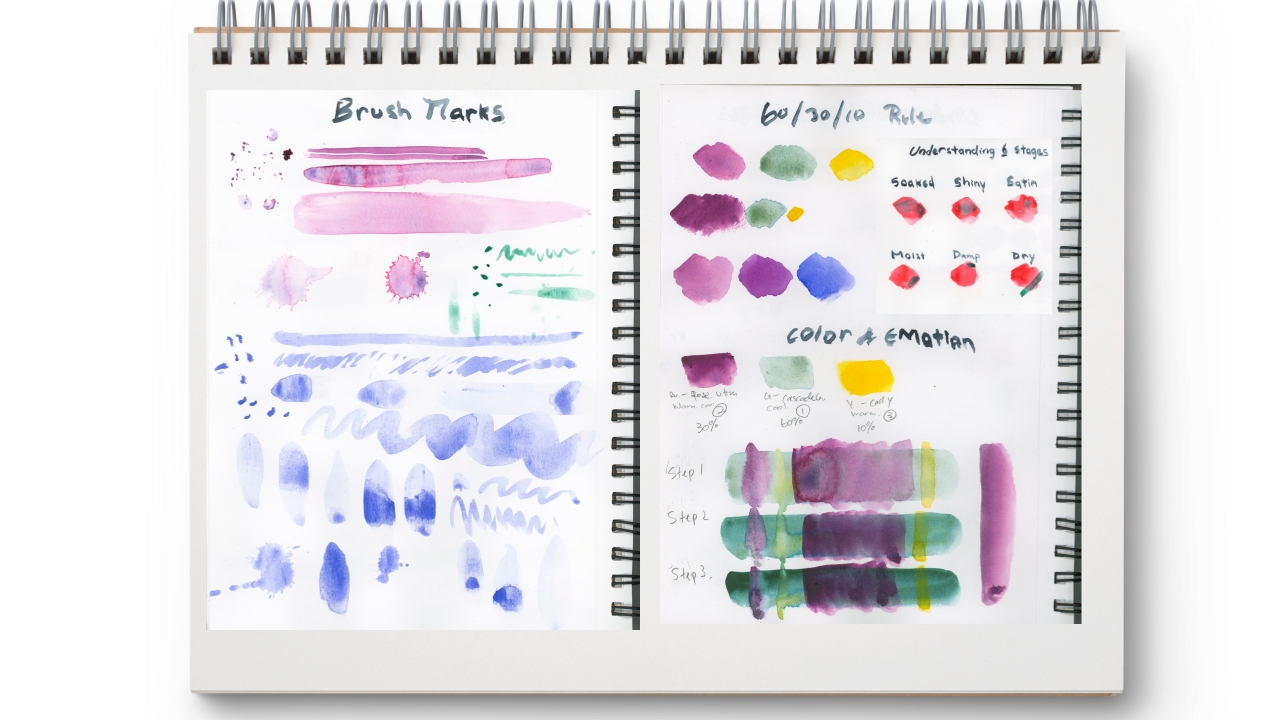
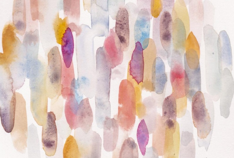
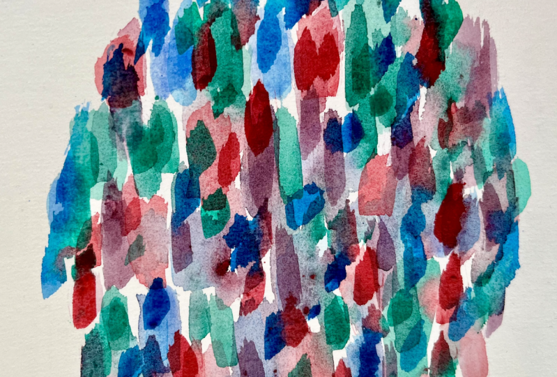
3. Brush Marks: We're going to be practicing
different kind of strokes. Now, with brushes, just get any kind of
brush that you have. But this is going to
be important to know the characteristics of
what your brush is like. It's like beginning to have a friend or a relationship
with somebody. You need to what they are like. So we are going to be looking
at different brushes. Just get all the brushes, all different kinds you have. Here is a round brush. This is the professional
watercolor synthetic sable from Windsor Newton. This one is Cassano
DaVinci mop brush. This one is a long round
Princeton velvet touch. Yeah, it's a long
round. That's key. And this is a liner brush that I have from silver black velvet. And then this one is
the same as this, just, like, a smaller size. And this one, I don't
think I'll be using it, but this is Raphael's series
one, three, six, three, four, I think it is, but this
is not really widely sold, but it's one of my
favorite brushes. If you were to ask me, what is the one brush you'll
need for this final project, I think the up brush will
do all different kind of look a specific kind of oval, like, tear drop shape
that we'll need, this one will create it. But anyways, if you
have a mop brush, that will definitely do the job. And speaking of my portraits
painting that that's, like, the key thing that I do for
commissions and so forth, those I typically use this long round Princeton
velvet touch. This one thing. If I have this, I
can do all of it, and I'll tell you
why in a minute. Why are they watercolor brush? Because they hold out
tons of water compared relatively to other
brushes that are made for oil or acrylic, painting with a
tip is one thing. And painting with the
belly is one thing. And when I say belly,
it's right here. Okay, so those are
the key things that we'll be thinking
while painting. So I want to start off
with my round brush. And we'll be making
just any kind of shape. Think of all the ways
that you can use this one brush and try
creating different marks. The key here is different marks. Just using the tip of my brush. So now it's kind of dry. So it's creating all these
different marks right here. It's creating all
these split marks, and you can dab a bit of water, let the water kind of go down, and then now you're
creating a circle. And then you add say
more water to this, and you do the same thing. I'll create a more
pigment saturated, less watery kind of
blob right there. So we'll be getting into the
water pigment ratio later. Well a bit. And you can
also create a stroke. Let's add a bit of
more water, a stroke. And then you can use
more of the belly. And it's also coming up
to a point like that. So try to create all the
things you can make, and you can even do
some splattering. That would be one
kind of stroke. The point here is just try out all the things that
one brush can do. I'm going to get into my other mop brush,
see what that does. Use a different color. I'll just use one of my favorite color smolt Dumonts blue and
see what that does. So again, creating
some dots here. And once you finish this
kind of, like, testing out, just write down which
brush it was so you have, like, you know, a data of what
they can do and so forth. Using more of that belly
and then creating some dot, dot, dot. Dot, dot. Um, going and using
more of that belly now. And to the point again, let's see how it does
well with creating like a circle or a tear drop. Again, a tear drop, maybe opposite tear drop. So the key here, play around. That's it. Serious art comes
from serious play, like Julia Cameron says, and I think it holds
so much truth. Just play around and
explore what you have. Again, I'm going to
create some splatters. See what that does.
Oh, I forgot. One of the important things, materials that you
need, paper towel. So just try to vary the pressure that you apply with your brush, the speed, the pigment loads. These can all make your brush marks look
really different. So try out everything you can. But for the final project, it is very crucial you get
a mop brush and create that kind of like a oval
or even the tear drop. And how you do that is you
use your tip of your brush, and then you go pushing that
belly onto the surface, applying pressure,
and then lift up. So that's what we'll be doing
a lot in the final project. Tip, press on the belly. And then pull up. And let's just look at what
the liner could do. I'll just use a different color. This pretty and
green and going tip, tip, tip, tip, tip, tip, tip, and then squiggles. And then a line thin line, thin line but pressing
on the belly. Coming up trying to
create an oval shape, tear drop shape, maybe. So that's going
to be super thin. As it's called the liner, you can imagine
what it might do. For the rest of the class, I'll specifically be using these two because
I think these are two or even the liner will be the brushes that
I'll be using mainly.
4. Wetness & Paint Behavior: There was some problem
with the video and audio, so I'll explain some
things right here. Understanding wetness and paint behavior is
very important. I think this is one of the most mind blowing
things that I've learned as a beginner that
changed a lot of things. So we're looking at understanding
six stages of wetness. Now, the shoutout goes to handprint.com because they are the ones who wrote about this. So this is not what I created. It's what they created, but something that helped
me that I want to share. So they say there are six stages in wetness on the surface. So they're soaked, shiny, satin, moist, damp, and dry. And because I couldn't quite explain it and
work on it timely, I think these are not
quite the best example, so you might want to
look at their website. But basically, I'm
going to explain all the stages each of these
and what they're like. So the soaked pool of
water on the surface, paper is fully flooded. So when you add paint to this, paint spreads very far. Edges are extremely soft, but brush marks Spanish, great for large soft blends. So when you're working on, like, a gradient or the background and you want to
work a large space, having it soaked and working in your watercolor is very good. So for these examples, I use quinacrin and coral
to wet the surface, so it's more easier to see. And then I added veridan onto them at different
stages of the wetness. For shiny, it has
a shiny surface, but texture of paper is visible. Tilt causes water to flow. And when you add water
or pigment to that, strong diffusion, and
most back runs happen. Think paint creates soft
edges with texture. And for satin, it's dull. It has a satiny look, cool and moist to touch, no shine, but still damp. And when you add some
pigment or water, softer, subtle backgrounds
happen gentle blends, great for layering
with soften edges. And for moist, appears dry but cool and damp to
touch, may feel limp. And when you add paint, it begins to behave
more predictably. Edges are slightly fuzzy. Backgrounds can still happen. And for the damp one, feels barely cool, slight
moisture in the fibers. And when you add paint, slightly smudges, diluted,
paint moves slowly. Paint becomes more controlled. And then for the dry one, fully dry crisp paper, no coolness or dampness. It creates sharp lines and
edges best for detailed work, dry brush and precision. That's the six stages. So I'll have that link in the class description for you to check out
the differences. But a lot of people ask me, so how long should
I wait until to get to say the damp stage. But this really depends on
your environment and where you live because where I
live in Washington in July, it's quite dry and it's warm. But when I used to
live in Singapore, it would have more
of the soak, shiny, satin and moist stage because it was very
humid with, like, 86, 90% humidity, but it was still hot
and yeah, very hot. So it really depends
on your environment. So I say to kind of
time it even and see what the stages
look like and how minutes it takes
and so forth to get, like, an sense of where you live because that will definitely
help you along the way.
5. Your 60 30 10 Palette: We'll be looking at this
magical 60, 3010 palette. So what is it? A lot of design schools or
even art degrees, I think you'll come across this. But basically, when you choose a color
palette with the 60%, which is the base or
the dominant color, and then 30%, which is
the secondary and 30%, which is the support color, and then 10% is the pop
or the accent color. Let me give you an example. So here I have an
orchid, very beautiful. So let's look at
the 603010 role. I think 60% will be
the purple right here, and then maybe 30%, the support will be this green. And then the pop
accent will be the one inside that is
a yellow color. So we looked at the orchids. I'm going to use
Rose ultramarine. That's going to be
the 60% of this. And then I'm going to
use the cascade green. That is the support
color, the 30%. And then I might use the
cad yellow for the 10%, the pop accent color. So there it is. I have my 60, 30 by ten, and this
typically works. And by the amount, it might look like this. Let me show you the amount of these that it will look like. So that'll be, say, 60%, and then
that'll be like 30%. And then that may be like
maybe less than that, but that's a general rule, the 60, 30 by ten. For the final project, you can use the 60, 30 by ten rule, which typically works
for really everything. Or you could be like, actually, I want to just use the purple because
that's what I'm feeling. Now, in that case, you can
go for analogous colors, which means that
when you look at the color wheel right here, when you look this
is a great book, the oil painters color handbook. I started off with oil, but this is a great book, even for watercolor artists. So when you look at color wheel, see if you're
selecting a violet, then you look next to it. It can be going down or
it could be going up. But the ones that are
next to each other, like here, the violet,
the violet blue, and the blue violet,
maybe you can use those or you can even use, like, violet and blue
or violet and red. And that would be like
analogous colors. Say, Okay, I just want
to use analogous colors. I might be like, Okay, I'm
going to use this violet, Rose ultramarine, but
I'm also going to use very similar
reddish purple again. And then I could be like, and I want to use a blue violet. So there, that would be
analogous like color. So I could do like a 60, 30, ten rule with those,
that would be good, too. And another one
that I find kind of fun is you can either go like, I'm using warm or
cool colors of them. So what I mean by that, again, is let's look at this book is that the so violet
is right here. And if I were to
say I want to use, like a warm violet, then I would go violet red. If I say I want to
use a cool violet, I would say, Okay, I'm
going to use a violet blue. So you can kind of work together with the warms
and the cools of colors, or you can even be
like, actually, I'm going to use red,
and for the cool color, I'm going to use green and go for the complimentary split. But I would say the 60, 3010 rule or the analogous, um, especially with flowers will be a good place
to start off with. And one more thing that
I would add to is next we'll be getting a bit more
into layering and colors. But when the warm
and cool colors, what are the key differences? Is that you might want
to use a cool color for the background for
the first layer because that could look
like it's distant. And for the warm colors, you can lay on top of the second or the
third layer because warm colors tend to come
forward and closer to you. So you can play around
with that and choose which stage of the
painting you're going to use what color.
I hope that helps.
6. Color & Emotion: We're going to be looking
into color and emotion. Also, on top of that, we're
going to be slightly kind of understanding the
water to pigment ratio. I go into depth into
this in another class, so you can take a look at
that class for more depth into pigment to water ratio because that's quite important. I would want you
to kind of dig in deep what colors
you're feeling today. Today, I'm feeling very, um, like red violet, so
I'm going to go with that. So first, we're oops,
I mix the colors. First, we're going to lay down we're going to lay
down three gradients. Just select one color
for the first gradient. The first wash that we're going to create is going
to be one color. And then once that dries, we're going to go into
the second layer. But for the second
layer, you can choose, like, a different color
or different colors. So I'm just going to lay
this down at the top right here just for
your reference. So I'm going to use
this rose ultramarine, and then I'm going to use
this um, cascade green. And then, that cad yellow. As an accent, I think that
would be kind of fun. So I'm going to just use those three colors.
This is the key bit. I'm going to just
write these down so you'll know what
colors these are. I want to think about what are cool colors and what
are warm colors. So then we can think like, Okay, what's going in the back and
what's coming in the front? So we can do those
warm ups right here. So for the final painting, we'll be right on it, okay? So I wrote warm cool, but cool because violets
tend to be cool. So it's kind of like
in between color. Let's say that is warm,
that is warm, that is cool. So what are we going to do? We're going to first
layer the cool color, the cascade green first. I might mix in some rose ultramarine into
the cascade green for the final painting. But I'm going to layer the
rose ultramarine next and then put some accents of
yellow on top of that. So this is going to
be my number one. This is going to be the 60%. This is going to be number two. This is going to be the 30%. And this is going
to be number three, the 10% because I'm not a
huge fan of yellow anyway. Okay, so get a brush
that's relatively big. Water to pigment ratio
is very important. We already know that. So
for the first gradient, I'm going to let me
write this down. What I'm going to
do is I'm going to create three gradients, but we are going
to be mindful of creating different
pigment to water ratio. So here, I'm going to
go very watery first. Oh and just to let you know, this is not a watercolor paper. Probably should have done it on a watercolor
paper, but it's fine. So that's a lot of
water, as you can see. That's the key right here. And then we're going to add
a bit more of that pigment, a bit less water, but more pigment
to the next one. So that is step two. And then for the final layer, we're going to go really dark. And create that
gradient right there. I do want to test out a bit, adding a bit of this rose right here just to see what it
kind of looks like, 'cause we always want to know what it looks like
when it blends into this other color because this is going the green is going
to be the dominant one, but we always want
to know, like, what the support mix into these does look like wet on wet, as well as the yellow.
Let's just see. And then we're going to let this totally dry and
then we're going to layer the next colors next
to each other and go light, but also dark and see what
that kind of looks like. The video somehow cut off, so I'm going to
continue explaining. So I'm going to lay down the watery pigment of the
ultramarine up until here. So I can see the
underlying layer as well. And then I'm going to
get a heavier load, see what that looks like. It's quite overpowering. You can't really see any
of that green underneath, and then I'm going even darker. Okay. And then I'm going to lay down this ultramarine just to show you what it kind
of looks like on its own. I'm going to also lay down
the yellow just slightly. A watery wash first. A bit more pigmented. I'm a bit more pigmented. And then what we're going to
do now is I want you to look at this and select what you
like and what you don't like. So now we got
different ranges of the pigment over other color. I've noticed that I
don't quite like it when the rose ultramarine is very
dark on top of the green. So then that might mean
for me that I'm going to work less on that cascade
green on the bottom, on the first layer of the
final painting, the project, and then lay down a very light wash of
that rose ultramarine. And for the yellow, I think
I quite like it when it's, like, blended into the other
colors like the green. So I might even work that on the first initial
layer with the green. Um, very gently lightly
for the pop accents. And I might add in the very heavy pigmented
yellow at the end, because I do like
that just slightly, but I don't want to overpower it because it's the
10% rule, right? It's the accent, the pop color. So this is how you
may kind of um like, go through the whole
process and see what colors really speak
to you and how we're also thinking about
the layering process of what we're actually going
to layer on the bottom, and then the second and
maybe even the third. So this is like a color
processing stage. Now that we kind
of nail this down, let's get into the
final project.
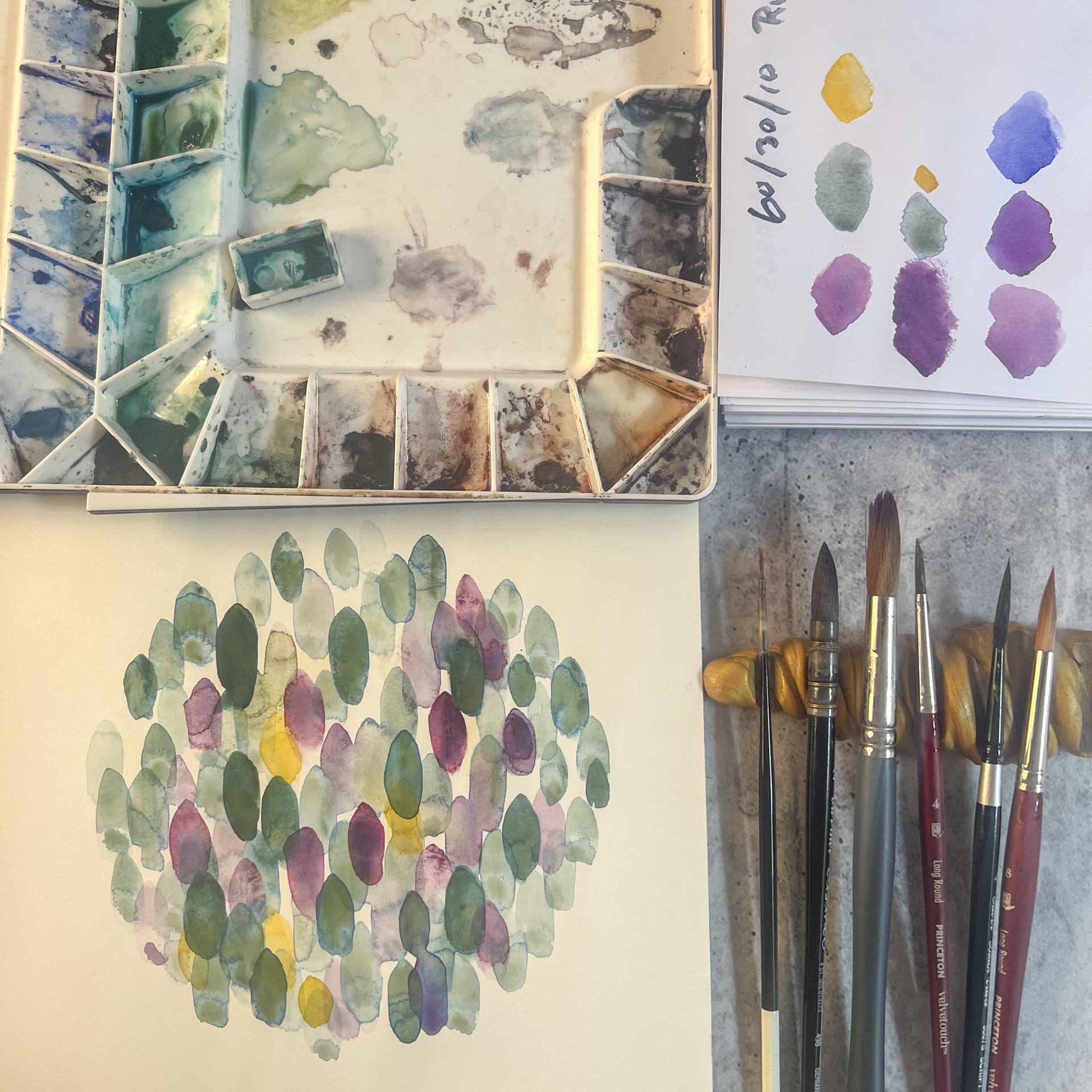
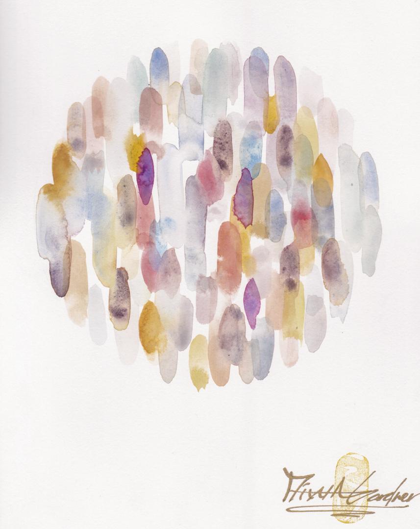
7. Final Project: We're going to get into
the final project. Now, I've already created my circle that I'll be
working on with a compass. I drew the circle to outline it. So I know within where I should keep my
breast strokes inside. So we're going to
be erasing this. What that means that you
don't want to paint over that pencil mark because
if you paint over that, you can't erase it later on. So that is very important.
Don't paint over. Even the white, like,
a really washed layer, it's still going to stick there. So you don't
want to do that. I'm just going to kind
of use my needed eraser to gently kind of make
that line a bit lighter, so we just see it slightly. Okay, I think
that's good enough. I'm going to try and
work from here so that the light doesn't
hit me and then doesn't cast this shadow
on top of the painting. Okay, so first things first, at this point, you should
select your 631 palette. If not, then maybe analogous or whatever palette that you're going to go for. And you should already have done that exercise with the step
one, step two, step three, where you determine what kind of color layering you like and what pigment to water ratio of that certain color you want and which color
you want more, which color you don't
want more, and so forth. So now I already got the
visual sense of what I want. So I am going to go
into that green, the cascade green, and I already know that from my study that I want
it to be super light. So Okay, here we go. Remember the brush strokes
is very important, what kind of strokes
you're applying. So here, I'm going to be very mindful of creating
the tear drop almost, like, but slash oval, as well. So we're using the
tip and try to go to different areas
even at the water. We're just loosening up here, not really thinking too much. Then I might even add a bit of that rose ultramarine.
Doesn't matter. It can get muted and try to vary the sizes
a bit, as well. And it doesn't really matter
if some are heavy pigmented. Or less pigmented. Try to go to many
different areas, being mindful of
those pencil pencil marks not to cover them. And then I would say, try to work as quickly
as you can for this. And it's better to obviously
go from left to right in the painting if you are
right handed and vice versa, if you're a lefty. But also try to be mindful of creating enough space
for the next layer. It's like a bit of a
tricky balance, actually. And because I went quite dark
in that load right there, it's okay because now we have to also be mindful
of having, like, a movement of the eye, maybe even coming down
like this, adding yeah. That's good. Adding similar
heavy pigmented load in other areas. I'm just going to drop in
some water to loosen up that color in some areas because I think I went a
bit to overload, like heavy pigmented
areas right here. And you can start even going over the layers that
you already created to draw some ambiguity and even let the colors
mingle together, although they're
the same colors, just to get that organic feel that things are
kind of connected, but also being
mindful of what might happen with the dampness
stage that we've covered. Okay, I think that
kind of looks good. Next, I'm going to use the
ultramarine, the violet, basically to gently
lay down some of this color in some
areas, but very light. Be a bit more lighter. And I'm okay with a bit of mingling of the colors.
It's totally fine. But also being mindful
of that 60 to 30%. So the violet should
be 30% and not more. Okay. I think it's good
for the initial ear. When you add the 30%, you want to make
sure that it's not overpowering the
dominance, the base color. So when you do add
the supporting color, you want to make a flow of it where you want your
viewers eyes to go around. I'm going to add a bit maybe I would say like two
of the yellow somewhere. Yellow. Right here. It's not a good one. Too strong. Okay,
then maybe there. Okay. And we're going to let
that to dry and then we're coming in with the second
layer after this has dried. Now that it has
completely dried, I want to do the final layer or even maybe the second
layer. Let's see how it goes. So I want to be mindful of what's working and
what's not working and also think about
which colors I'm adding out of the three
and work into that. So here, I have a bit
of space right there. I think I'll add the
ultramarin the violet. Quite dark one right there. Okay. And then I am
going to probably add more darken right there. And then I am going
to add more greens. Right there. Right
there. Just a small one. Maybe even lighter. Swoop up a bit. D didn't work. Mm. When you don't like something, use a paper towel.
That's what I do. Then maybe we here. Big one. One here. Trying to cover up
a bit more space overall, but trying to not
make the same stroke, so to speak, and also being
mindful of what I love. I love that one right there. I don't want to do anything
with that mark right there. Maybe even go a bit in here. But a lot of space right there. So there's a lot of greens. I think I might add more
of that ultramarine, some areas maybe right here. You can't overdo the ulgmarin. Finally, we're going to go
in with the accent color, the yellow that I do not like bringing in that color a bit more there, maybe here. I think that's good
enough, actually. I quite like that. I'm
going to let this dry. Finally look at the piece
from far afar, even, like, move it around, turn it upside down and see
if it works either ways. Sometimes that could be the key. When you flip it over, you see, like, something you've not seen. So let's see how that goes. The painting's dried,
so I'm going to use my needed eraser to
delete the outside marks. I think I might add
a bit of a layer right here where
there's a lot of whites showing. Just a bit. And right here as well. Then right here. And then I'm going to darken
that green right there. I might add a lighter
green right here. Maybe even go darker a bit. Yep. That looks good. I'm gonna go darker
for that one. Maybe darken this area
right here. Dark in here. And then I'm going
to darken some of the rose ultramarine, as well. If I might add a bit more here. That one. Maybe I overdid that area. Gonna lift it off. Maybe
lift that one off, too. Finally, I will add
a darker yellow, maybe even use a smaller brush. Maybe I'll go in a
bit more heavy there. Even a bit more here. Maybe use a light one. Let let some disaster happen. My a need for that one. I think it looks good. Actually, I'm going
a bit overboard, so I'm gonna delete
that, delete that. Maybe even delete a bit of that. Maybe that is too strong. Okay, I think I'm done now.
8. Bonus: I'm recording this
in a different day, but I was driving
my car and realized some key points and things that maybe might help
you even further. So this is not going
to be a flower inspired piece that
I'll be creating, but because I have to work on a bigger piece and I'm going to be going into this
relaxation creative flow, I thought I'll
share this process. But let me give you heads up. Um, the color palette that I
chose for the final project, actually, one thing
I did was wrong. Well, not to say that it
doesn't look pretty at all, but I was thinking, Oh, I'm going to choose
a cool version for the background and then gradually warm,
which kind of I did. But actually, this was the first green that I
use. Yes, that's correct. It's cool, which should
be in the background. It's a green with a bit
of blue tint in it. So, yes, it's cool. But the second,
Rose ultramarine. Although this kind of looks like red, but it's red violet, but it's red violet leaning
into more of the blues. So actually, this rose
ultramarine is on the cool tone. But relatively speaking
to the cascade green, yes, you can kind of
get away with it. And because I was using
my orchids as a source, I had to choose these
two, so it's fine. But the cad yellow
kind of worked as an accent at the end because that's definitely warm yellow, and it pops. So it's okay. Maybe I'll work on here
to show you a bit. I'll have all these supplies
in the class description. So Say, I'm looking at this. Today, I'm feeling quite oceani. I don't know even
if that's a word, but I'm feeling like the ocean. So I'm going to
find the ocean from the top bit because this
will have all the colors. So I'm feeling like the ocean. I often feel like the ocean, but Okay, so here it goes. So it has the pure
intensities right here, which means it's not
desaturated at all, but it has the monochrome. Kind of from starting from
the dark to the light. So that would be really useful for watercolor artists
because you can be like, Okay, the less water will
be looking like this, the most water will
be looking like this. But these one on the
right hand side, the tones is when
you desaturate them. So you mix in the
opposite of this color, probably in orange to make it look a bit
like these, okay? And you flip it, and
then it'll give you in one glance, all
the compliment, which is okay, like the
opposite of that color, the ocean color, monochrome, which is helpful for
watercolor artists analogous. See, it splits between
where it's side by side, and then split complement, which basically um
it's like, Okay, these are further off, but they would work as well. The split compliment,
which is Hughes next to the compliment used for designs with harmony
and contrast. When you pick the ocean and
you go like this, like, it's almost like a bit
of a pie right here, then that's split compliment. And then the triadic is when you can place a triangle
on the color wheel. I don't know why, but
I have this thing with triatic palettes and
every triadic painting, I just get drawn to it. And even with my paintings, I've realized that it's
a triadic scheme often. So I'm going to use this to create this 60
30 by ten rule. First of all, I would get my usually I get my
swatches that I own, but I'm not going to do that because I want to work
quickly with this one. So my ocean color will be
cobalt, like turquoise. So that would be I would just
consider that a cool color. So that would be my background. That would be my 60% because
that's what I'm feeling, and I want that to be the main color because
I just love it. And then the next one is
this pink one because I think that is it is a
bit cool, I would say. So I'm going to
choose like a red. Sorry, there are sea planes kind of going around in my area. I just love this
quinacuinin coral, so I'm going to use that so I'm going to even blend in a bit to see what that kind of looks like when blended in
because we want to know, like, what it'll look like. And then finally,
for the yellow, I think I might warm yellow. Hmm. Um, I guess I might even use the same one
or even this one. I don't know. I just don't
like yellows, really. But I know this accent
color needs to pop. So I think I will choose the same yellow
that I chosen before, and we will go with that. Okay, so I'm going
to use those colors, and I'm going to create
one color wheel. So let's see if this
is going to work. Okay. So first, I'm going to use the um the the ocean color. And being mindful
to go 60% on this. So Ah. See, I guess I'm not
used to this paintbrush, the silver, the silver velvet, 'cause I don't typically
use this anymore. I used to use it,
but and guess what? I think I'll even
add um a bit of a darker version of this color just to get a bit
of variation right here. Just a bit. Not gonna
do it too much. So I'm just going
to carry on being mindful of placements
of these and going leaving enough space for the pinks to come in later. But I'm just going to carry on with this and
come back when I've placed the next quinaquiin coral from Daniel Smith
that I'll be using because some of them
I do want it to blend into this blue green
that I'm using. Now that I've relatively
covered the areas, maybe I would actually add in a bit more at the
bottom right here. But kind of trying to be mindful of not touching that bottom bit because I
touched it right there. Once you touch it, you
just can't erase it. So Okay, I'm going to let this
dry and come back again. So some of the
places have dried, so I'm going to add in a
bit more of the blue again. I don't mind it not being
completely dry, as I will. I like how things kind of
blend into each other. Okay, I think I'm pretty
much out of space, but I think the reds are enough. Maybe it might be even
a bit more percentage wise than the blues,
but that's okay. Now I'm going to add the yellow. It's only 10%, so I'm trying
to be a bit mindful of that. Okay. I think the
yellows that's enough. I'm going to add a bit
more of the cobalt teal. And this time around, I've pretty much covering
more of the space that I have than compared
to the last work. But it creates a more powerful, less minimal look, and that
could be fun, as well. Okay. And I call it done. Now, this is the ocean
piece that I've created. No flower inspired,
but I hope you got um a bit of a different
approach to colors. So when you do want to create something that you
personally connect to, try to look at the paintings
that you relatively, like, get drawn to and figure out
what the palette looks like, whether they're usually like compliments or
monochrome analogous, split compliment and triadic. That's a great place to start
off your project as well.
9. Outro: In this class, we let go of perfection with creating
intuitive brush marks. Explored watercolor control
with six stages of wetness, created a meaningful
palette with a 603010 rule, and we just enjoyed
creating marks with the feelings that we were inspired by these flowers today. So I hope you leave
this class feeling more connected to your
inner creative voice, and also it made you relax
and loosen up a bit. Please upload your projects. I love to see what kind of
different color palettes you select and how different the final
painting looks like. It will mean the world for
me if you can leave a review so I can make my videos better. And also this class will then be pushed to other creatives out there who would enjoy creating
this painting as well. So thank you so
much for watching. And again, if you're
struggling with your watercolor paintings
and you don't quite know why or you want to test
to see whether you know all these ten top
common mistakes that beginners make
with watercolor, check out my YouTube video. I'll leave it in the
class description. Okay, see you next
time. Goodbye.
 Miwa Gardner, Watercolorist- Watercolor for Relaxation