Transcripts
1. Intro: Hi everybody, this
is mu and welcome to my Skillshare class. This skill share classes
probably going to be called watercolor
for beginners. Line drawing of a Japanese lady. When I say Japanese
lady, I mean geisha, but I thought maybe some people might not
know what geisha is. Geisha is a female
Japanese performers basically who performed Japanese traditional
Performing Arts. I said performing
a lot, but anyhow, I came across gauges
and I thought, Oh, no, actually it was
the other way around. So I came across
these line drawings, these simple minimal
art drawings, and I thought I wanted
to create something, and then I thought I
want to create geisha. Then as I worked
further into it, I thought I want to
share this because I'm sure there are
people who want to create their own art and then hanging it but with the
same kind of taste, like a line drawing, simple, minimal
art kind of thing. So this is why I'm sharing what I came to know along the way of the things
that I do to create this. So first of all, we're going to be looking
at different arts, like arts that speak to you with a specific subject that
you would want to paint. Or you can also go along with
what I selected as well. And then we'll combine
all these things and we'll look at the
compositions and think, Okay, this is what
I want to create. And then we're going to do something like a
contour drawing. Now, contour drawing is
like when you look at something and you don't
take your eyes off of it, and then you draw that. And then usually you don't
lift your pencil up. So we're going to do
something like that, but not exactly because I'll
be lifting here and there, but it's basically to push
you to make it very simple. So that's our whole purpose. So we're going to create that. And then we're
going to say, Okay, this is gonna be the final. Then next, we're going to be looking into like
color palettes, what kind of color
policy you want to use for this specific line drawing. And if you want to dig deeper, I did a class before that went into color theory,
like more deeply. So you might want
to check that out. And then third,
we're going to be doing warm-ups of
watercolor because I do want to add a bit of
splash of joy into this line drawing because I just feel like line drawing
itself is beautiful. But because I'm, I
love watercolor, I want to use a bit
of it so we're not gonna go overboard with
it, but we're gone. I use watercolor as a medium. It's gonna be a mixed media. And then for this
watercolor warm up, we're going to go quite quickly. So it might be like a watercolor beginner
intermediate class. But if you want to dig deeper
into the warm-up section, then I strongly recommend you to go to my ornamental
Japanese stones class because that's
where I dig deeper into the warm ups and it'll
definitely help you. And then finally, we're going to create this final project. So I hope you enjoy it. And without further
ado, let's get into it.
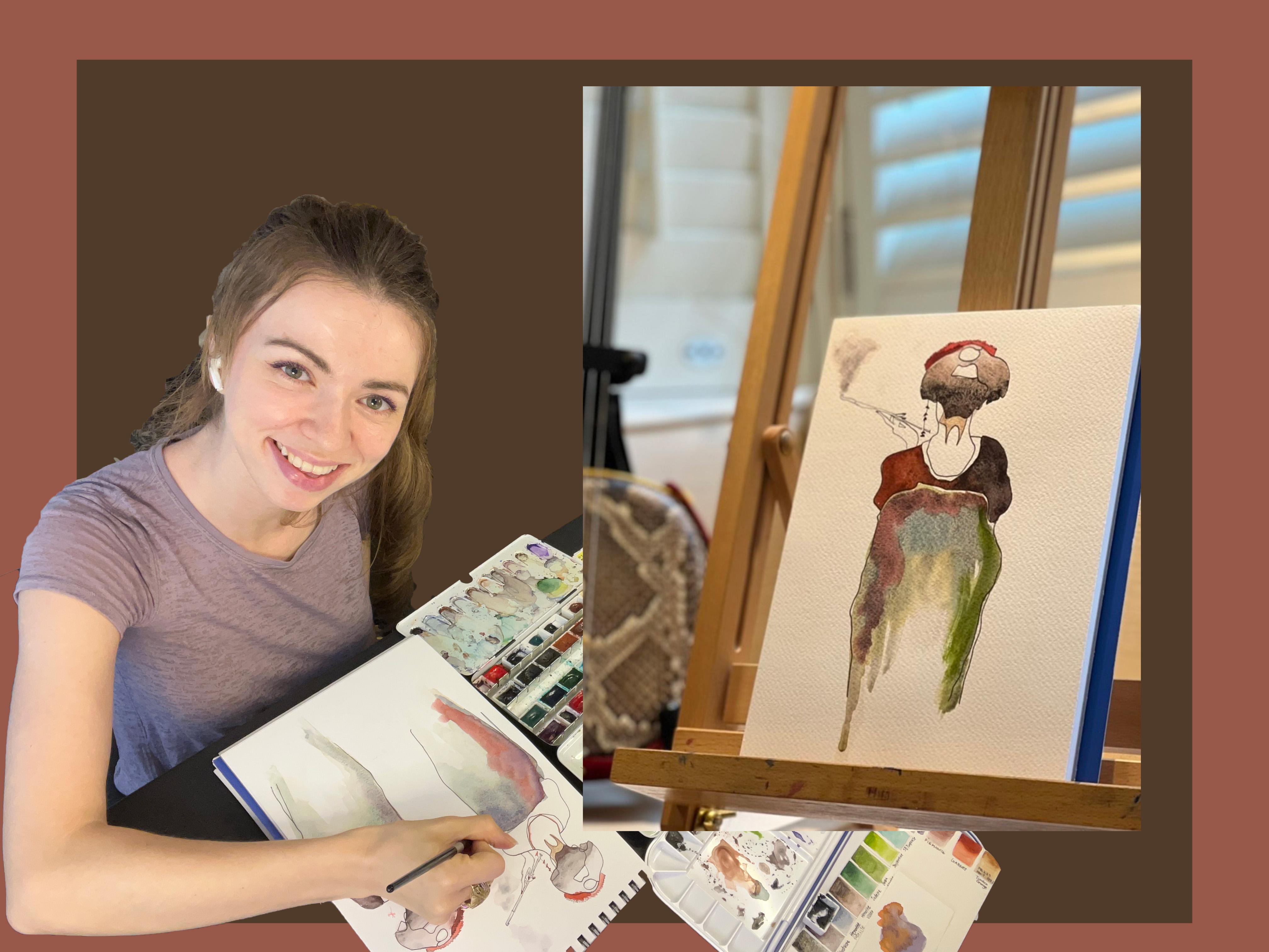
2. Materials: Okay, So I like to explain the materials that you
would definitely need, followed by some of the things that you might want
for your convenience. So first, you'll need
two cups of clean water, a paper towel to wipe off your
brushes, a kneaded eraser. Now I like these
because they wouldn't damage the watercolor
paper that you will be using when you erase
your pencil marks and a pencil and waterproof pen. I like this 0.45
millimeters lying pen because it's like the perfect size for
the look that I want. And these are the brushes that
I'll be using is the Black Velvet 3 thousand Series round brush with the trek or golden tough 12 thousand Around series. I really like this. It's
kind of more snaps. And this one is the
Tokyo number of soccer. It's like a Japanese
watercolor brush that I'm loving at the moment. And I'll be using these
watercolor paints. Now, you wouldn't use so much. So you might just want like a few around that you
have at your house, but I'll be using
this Daniel Smith Premack series
colors, main leaf. And you'll want a sketch book
to sketch out your ideas, see what kind of design
you come up with. Also, for the final piece, I'll be using this Stonehenge
Aqua cold press paper. I've never used this, so I can't really don't know
what will happen, but let's see how it goes. And these are the things
that you might want around. So of course, scrap
paper, watercolor, scrap paper because
I find it quite nice to kind of lay out my strokes or colors that I would like on
the actual final piece. And also these are
kinda looks weird. But this is my
paintbrush holders to keep things kinda
neat and clean. And I highly recommend making these kind of swatches with your watercolor paints
that you have around. Because when we look
into the design, you can just like, kinda look at different colors and line them up together and see which one you would like
to use for the final piece. And some spray bottle like this. This is actually
just to spray over my palette, watercolor,
pigment palette. So it activates the paints. And this, I'm sure not much people have
something like this around, but I'll be using this. This is like a golden ratio. I don't know if
you could see it, but it's like a golden ratio on plastic kinda thing that I
could look through to see whether the design itself
looks kind of nice. Because when you follow
this golden ratio and things are around
here or split here, here, then it kinda supposed
to look good to the eye. So I'll be using that. And also some people
might call this cheating, but I have this optical
mirror reflection drawing, whatever you call it, drawing board, where
I placed my phone here with the image that I
want and then basically trace, it makes my life much easier. And with the baby around, I'm more likely to use
this because sometimes I just want to draw things quickly and just get into painting it rather than taking
so much time drawing it. So that's just me. You can also basically
print out whatever you want to trace out and
then basically do a tracing over that with
some kind of tracing paper. So here I would be
using this as well, the tracing paper pad. So you might want
a tracing paper to make your life
easier, like me. Okay, so that's all
for the materials. Now let's get to
the next lesson.
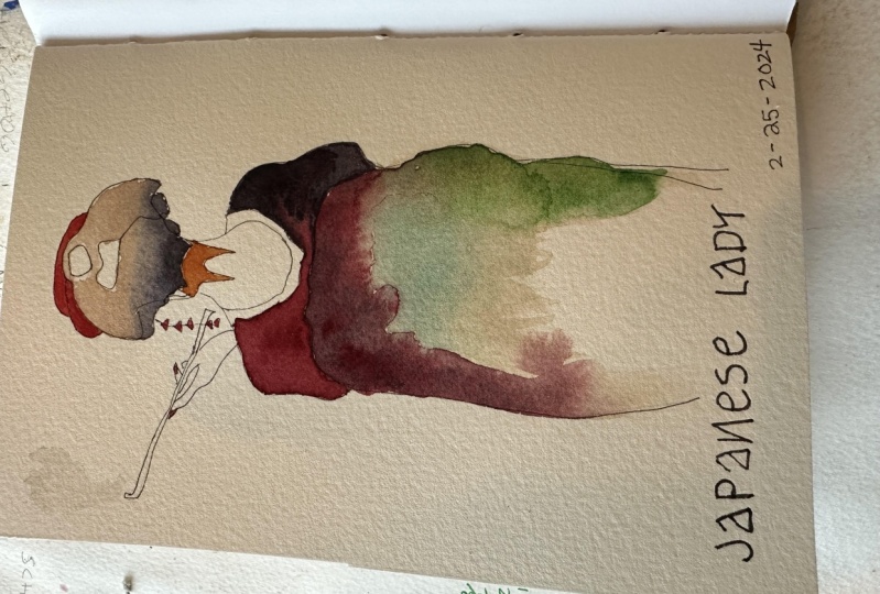
3. Composition: So first we'll be
designing this project. And I've kinda looked up Geisha and I've seen some
different photos that might, I might want to try to recreate. So here I have three that I'm quite interested
and try to narrow down what it is that
you want to paint and what speaks to you the most. And then next you want
to question yourself, what do I like about
each of these? So here, I like the
silhouette of the geisha. I'm looking from behind because
it shows the neck line, the hair ornaments there and then the chemo
that she's wearing. And then here I like
the coolness of the geisha with the
like, she's smoking. And then here, I'm
not quite sure, but I just like the
simplicity of it. So here I am. I want to recreate, trying to put these
all together into 1. First, mike to try to use this. Now you can do this by tracing, like print this out into a paper and then trace over it and then trace that onto the paper. There's many ways to do
this so you can look it up, see what suits you. But I will be doing it this way. I wonder if you can see, so I'm going to try to
get the size quite close enough to what the
actual final piece like. So, okay, so the
main focus here is to just make it
simple as possible. And try not to lift your
pencil as much as possible. Because then that creates
more kinda contour like simple line drawings
that look really nice. The best way to use these mirror reflection things is to make the room quite dark. So you see more of
what's going on. But I can't do that for the
purpose of this recording. So bear with me. It may not turn as much as
I want it to be, but okay. And to be honest, I've already kind
of test it out. Few more geisha photos, like just sketching
them out. Like this. And I've come down to this one that I want
to go ahead with. So it may take time
for you to search like the perfect perfect
photo to then work on. But for the class purposes, I'm just being quite quick. Seemingly quick, but it
wasn't actually this quick. And you don't have
to be so careful as into like tried to delete every bit that you kinda make mistake with
because we're going to be we're going to be going over it with
the waterproof pen. And so it's gonna
be erased later on. And you're going to, while
you work on this pen, you're going to kinda make choices of which line am I
going to use, and so forth. So it's alright if
you make mistakes, you don't need to delete
it at this point. Okay, so I think I'm
pretty much done. I'm not going to put too
much details because I dislike the way it is without
too much detail here. Okay, and then I'm
going to look at. The other photos that I quite liked or the paintings that
I quite like this one. I really like how the
girl is holding the pipe. So then I think maybe I'll trace this hand. Should it be there?
I don't know. I guess I'll just go like that. Okay. Okay. So I like quite
how that looks. So next, I might want to
add like an umbrella here. But I am going to check with this golden ratio
what actually looks good. I don't know if you can
see this one I'm doing. But when I place this right here, can you see that? So basically where this is, is where this is. So that's the focal point, the point of interests that
I want people to look at. So it's good to be
mindful of like, Okay, where is it that you want
to draw the attention? So that's one bit. If I look at it like this, then I think there could be
like an area right here, like an umbrella
that can come down. So that's what I'm going to do. I don't think you
can quite see this because I'm using my
own eyes rather than the camera lens to kinda
see what's going on. But that's the area that I
want this umbrella to go into. And then I quite like
this leaf right here. So I'm going to use that. And just trying to place it
where it could actually go. Oh, I think I'm pretty
much done here. I don't know if I
still want this. This kinda seems to be not
quite in the right place, so I might delete that, but let's just see now, we're going to basically use the ink and go over the drawing. Now I can fix some places
here and there that I might not want to include or that
I might want to include. So let's just see how it goes. Quite like these. I liked these ornaments here. And then go more. Going down. Second thought, I don't think I'll be using the umbrella leaf
because I don't know. Just quite nice as I want it to. I don't necessarily
think working on it would make it better. Just feel like the hair
ornaments is quite enough to catch people's eyes. Okay. I think I still want this. Okay. So now I've outlined the lines. I'm going to erase everything. Now this is not a
watercolor papers, so I think all my
they're eraser. Okay, so I quite like
how this looks now. So I'll be using this as
my final project piece. Now, I would be tracing
it onto tracing paper. So then I can trace that back to the final watercolor paper. I'm not going to
explain how to do that. I've explained it in a
different class before, so you can go check that out
if that's what you would like to know how to do for
ready to do the color palette, testing out to see
which colors work.
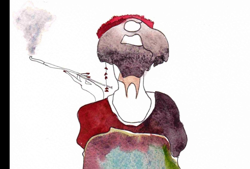
4. Color Selection: Okay, so now in this class we'll be looking at the
color palettes. So we're gonna go
into color theory that we'll want to use
for this final piece. Now, I am only going to use this sketch book
piece first because I want to test out to see
what colors go with it. So I'm going to try to create a color
palette here and then work into this sketch
that I've done night. I highly recommend you to trace it first onto
tracing paper. So then you can practice
this many times, much as you want until you find the perfect color
swatches palette that you want to use
for the final piece. Now, I am again using Pinterest. I searched color palettes, and I've got all
these color palettes that I'm interested in. This looks really beautiful. I kinda wanted to use red. So this is another good tip that try to select one color
that you really want to use. And then try to work around
there to see what it is that you will finally
be working on. Here I like this palette. It says I'm dark cocoa
black, shell pink, gray. So this is the color
palette that I, I am really liking here. So it's got the red
that I really want, but it's also got that
kinda cool tones of like basically grays and blacks
and dark cocoa look. Okay, so this is the
color palette that I'm like that spoke
to me the most. It's got the red that
I really want to use. So I think all kinda
place these out, try to create them with the
watercolors that I have. So first the block, the block that I want to use
is not quite black here. I might use the ivory
black later on, but I'm going to
use the hematite. These are the the
premier tech colors and by Daniel Smith. And what they are is
basically they're made from minerals like real stones. So I'm going to use that and try to write these
down like what mixes use? I use to make them. So hematite, black. Next dark coat color,
very dark cocoa. So I'm going to be
mixing PM tonight. I don't know if that's how
you say it. Pm tonight. With maybe bloods. Don't think. That's pm tonight. Okay. That looks pretty much like it got to
turn this around. So it's easier. We need to recognize
which is which. Okay. So that's all
night with bloods done. Okay, M shell pink. Now, I think I need to use
another palette that I have, but I mixed Garnet with
scarlet lake by Mission Gold. So that's one color that is
not a prima click series. And later on my
change this to ivory black actually, but that's dark. Scarlet lake plus garden. And then the next
one is Peter Gray. Okay. So I think I'll
use this suit you. I think it's called Tsugi light. So that is two, purple. Now I've so purple, the opposite would be yellow. I need to mix yellow. My knees. So I've done a whole
color theory in my class before and took quite
a lot of time to explain, um, these kind of
basic color theory, but makes sure to
check that class out. If you struggle with this, I think I need a bit more blue. I might get this
SP turquoise blue. I think it's close enough. Let's add a bit more purple. Okay, I think that's
pretty close. So that Is Ag light plus tundra orange, which is not Daniel Smith, but as b turquoise. But it's shrink, shrink. I don't know how
to pronounce it, but anyhow, okay, In this
next one light Peter, I think our mix, a bit of green, almost got a bit of green in it. And then add a bit more. Hello, close, but it's got
a hint of green there. Okay. So that was the bottom plus
syrup been time genuine. And then the final color. Think, I'll need to
add this tundra. Tundra and just to purple. Okay. Drought plus like okay. So I think that's
pretty much done. Now the question is, where am I going to
place these altogether? So, um, the, the good thing about
these line drawings is that this itself should
look good on its own. But because I just
love watercolor, I really want to use
colors obviously, so I'll be putting these in. But you don't have to. The good part is you don't
have to go too much, like you'd have to go too much with the
colors that you use. So think I'll use
black for this. And then think I'll use the so I'll just
number these 123456. And then I'll use six for this, one for this, and a
definite for this. So the red bits would be here. Then. Okay, so we used up one and then 465, we haven't used five yet. Maybe this could be five. And this area right here
could be three with a two. Then a bit of five, maybe 3 May 5 clash, but that's kind of nice. And then I might leave this as one because I don't want
to paint it too much. Okay. I think I'll try to do this. Now. You can always practice these
as much as you want to see. Like, you know, to test
out which colors and which kinda color should
go in which areas to see what works the best for you. And again, these don't
have to be perfect because we're only kind of practicing. And just like another note, because this is not
a watercolor paper, it doesn't necessarily act
like what it might do. On the actual watercolor paper. That's why it's got to be a bit mindful that he
might not work as you want it to because the sketchbook paper doesn't hold as much
pigment or water. Hi, maybe. A bit of a sketchy look, kind of like
sometimes looks good. You could use a dry brush where there's not
much pigment inside the paint or water inside the
paint and just go over it, leaves some bits out. So here I want to go with
the three and then put a dark five and then also
use the greenish colors. So I have to work around it because you don't want everything to smudge
into each other. So I'll think I'll work
on number 2 first. Kinda create a lot
of that color here. So that's a serpentine
with tundra. And then with the SP turquoise. Since it's a bit too green, maybe a bit more purple. Ok, that looks right. And then for the final piece, I want it to drip down. So I'm going to put use
like a lot of water. It's not going to look
as I want it to here, obviously because it's, again, it's not a watercolor paper. I want this side To drip more. I'm going to put
more of these here. Then I'm going to create
the number three. Then finally, I'm going
to use that dark red. I'm going to make mixed blood. Garnet noise PM. He'd be evens net. And then at the end, I want to add a
bit of smoke here, a bit red, but doesn't quite look
like a smoke pot. So I think I'm pretty much done. This is what it looks like. I'm not quite sure
about the colors. I might do more tests
alone and see what works. But overall, I think
it's not too bad, I guess, for a
quick rough sketch. But yeah, I think
I'll test it out a bit more to create more impact. Because when I look at the, the Pinterest, like the
palette that I wanted. Here. It doesn't look at all quite like it because of
the fact that most of the red is now like most the green and the top on this
light beaver, was it? Beaver gray is kinda
dominating the whole colors. So I might switch
things around to see which one I really
want to go for. This is the general idea of
how to do the color palette. And next class would be warm-up. So it's good that you go through the next class because
then he'll have kinda like a momentum of
how the watercolor works. So you can make a better
piece for the final project.
5. Warm up: Hi everybody. This is mu and welcome to my Skillshare class, watercolor for beginners, line
drawing of Japanese lady. Now, when I say Japanese
lady, I mean gay, shocked if you don't know
who or what geisha is. They're basically Japanese
female entertainers that perform like traditional
Japanese Performing Arts. Well, I came across this kind of simple line drawing and this kinda minimal art drawing. And then I thought, wow,
I really want to create my own and I want to
be in with gaseous. This is why I kind of like made different art
and I kinda thought I wanted to share this
skill that I have. I don't know if it is a skill, but I wanted to share it
with you how I create them. First in this class, we will be looking at different like Art of what you do
want to create at the end. And we'll combine all these are elements to create your own. And I have a specific
way of doing this and we'll look
at the composition and think, okay, is this right? Is this not quite right? And then we kinda make few different changes
here and there. And then second,
we're going to be looking at the color palettes
that we want to use. Now I explain how I do that, but if you want to go into more like a deeper dive into it, then I really recommend taking my other Skillshare
class, which I did this. It's more like
getting into deeper into color theory
that would help. And then third, we're going to do some watercolor warm ups. Now, this, It's not just
about line drawing. It's going to be
specifically about like, it's going to also be about using hi everybody.
Hi everybody. So this is Mia and welcome to
my other Skillshare class. This time we're going
to be looking into this class called
watercolor for beginners, line drawing of a
Japanese Navy lady. Hi everybody, this
is mu and welcome to my Skillshare class. This skill share classes
probably going to be called watercolor
for beginners. Line drawing of a Japanese lady. Now when I say Japanese
lady, I mean geisha, but I thought maybe some people might not
know what geisha is. Geisha is female
Japanese performers basically who performed Japanese traditional
Performing Arts. I said performing
a lot, but anyhow, so I came across gauges
and I kinda thought, oh, no, actually it was
the other way around. So I came across
this line drawings, these simple minimal
art drawings. And I thought I want
to create something. And then I thought I want
to create geisha us. Then as I worked
further into it, I thought I want to share this. Share this because I'm
sure there are people who want to create
their own art. And then hindgut, but with
the same kind of tastes, like a line drawing, simple, minimal
art kind of thing. So this is why I'm
sharing what I've like came to know along the way of the things
that I do to create this. First of all, we're going to be looking at different arts, like arts that speak to you with a specific subject that
you would want to paint. Or you can also go along with
what I select it as well. And then we will combine
all these things and we'll look at the
compositions and think, Okay, this is what
I want to create. And then we're going to do something like a
contour drawing. Now, contour drawing is
like when you look at something and you don't
take your eyes off of it, and then you draw that. And then usually you don't
lift your pencil up. So we're going to do
something like that, but not exactly because I'll
be lifting here and there, but it's basically to push
you to make it very simple. So that's our whole purpose. So we're going to create that. Then we're going to say, Okay, this is gonna be the final. Then next, we're going to be
looking into color palettes. What kind of color palette? So you want to use for this
specific line drawing. And if you want to dig deeper, I did a class before that went into color theory,
like more deeply. So you might want
to check that out. And then third,
we're going to be doing warm-ups of
watercolor because I do want to add a bit of
splash of joy into this line drawing because I just feel like line drawing
itself is beautiful. But because I'm, I
love watercolor, I want to use a bit of it. So we're not gonna go
overboard with it, but we're going to use
watercolor as a media. It's gonna be a mixed media. And then for this
watercolor warm up, we're going to go quite quickly. So it might be like a watercolor beginner
intermediate class. But if you want to
dig deeper into the warm-up section than I
strongly recommend you to go to my ornamental Japanese stones class because that's where I dig deeper into the warm ups and it'll definitely help you. And then finally, we're going to create this final project. So I hope you enjoy it and without further ado,
let's get into it. Okay. Kinda leak but it's fine. Okay. So that's working on wet on
wet and I'm letting it drip. Kinda wanna stop right there. And then I want that
pigment to be darker so I'll add a bit more. Even connect it a bit. I'm going to wipe this. Okay, and what other
colors can I use? My taste is purple then. Okay. So in this warm up, I didn't quite add this color. It doesn't quite suited. Okay, So I didn't quite
add it onto this warm up, but one of the things
that you might want to practice a bit is lifting. So what that means is using a clean brush and kind of
like really squeezed it out, but then kinda lift the paints that you don't want
it to be there. This really depends on the pigment and the water
color paper that you use. Some colors just aren't as kinda two strong basically and they get into the
grains of the paper. So it's very difficult
to lift off, but some are quite forgiving. And also it also depends
on the paper that you use. So try to see how much
you can work and knowing your paper is kind of the point of this
whole warm-up as well. Okay, So that kinda turn
out pretty, I think next, I'll try working a bit more on here and then try to
work on the glazing. So essentially this
is still kinda okay, it's still wet, so I'll work
on the glazing bit here. So I think I'll use this
Tundra orange bit of red. So this is going to be glazing. And I don't want to use
too much time on this, so I'm going to make the first layer quite dark. Okay, Let's wait
until that tries. And now I'll probably add a bit of just in love with red nails. So classic. Okay. Maybe this try to get as much out of this practice to see
what colors might work. Might not work. My add a bit more
color in this one. It's looking pretty
really like both of them, but maybe not that color. Tried to mix these, make it more green. So now I'm kinda going over it. Dry color. This is kind of glazing as well. When you glaze, the color
underneath kinda changes. And then dry brush strokes
are kinda nice as well. Might even go darker there. Okay. Okay, so what color
will light glaze it. Think I'll use this red. That goes. Sometimes when you don't like the hard edge, you can soften it up
with some wet brush. Okay. So I think I'm pretty
much done here. So this is this is the warm up. I'm trying to do as
much as you want. It's a good start to get you back to doing
watercolor because sometimes you're
just kinda busy in your daily basis
and you just forget how the mine of
watercolor works. So there you go. So I think now we're ready for
the final project.
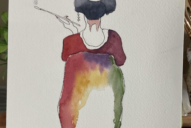
6. Final Project: Okay, So I like to get
into the final project. The only different
thing that I've done is I basically wanted to work on the geisha that has
the right hands up. So I wanted to flip this around, but I trace it on
the wrong side. So that was my mistake. But anyways, And also I was planning to use
is 0.5 millimeters, but I also use 0.15
millimeters for the small details like
the hair ornaments and also the hands and the pipe. Okay, So I've activated
my watercolor palette. So I like to start
working. First. I think all kinda
put a layer of red. So I'm mixing the Garnet
with scarlet, scarlet lake. And I'm just going
to color this in. Now. I'm going to be pretty
sketchy and rough with this. I usually take a lot of my time, like getting into the detail,
working really thoroughly. But for this, I kinda
wanna be a bit sketchy. And why I do this is because
basically when you're working with kind of
like line art drawings, I think it tends to be
nicer when you're kinda more rough with these things. So I'm just gonna
use that style. I think I need a
smaller brush for this. Yeah. Okay, so I
put in the reds, I think that's it for now. That's all the red
style I'll be using. Next. I'm going in with my
shrink or tundra orange. Then keep working wet on dry right now, but I'll be using
the wet on wet soon. So I worked on that. And for the close, I'm going to be using the garnet as well as this
color, the PM tonight. I don't know how
to pronounce it, but he is saying this. I'm going to create
both mixtures. And also I quite like
to use the hematite. That's this color
is interesting. It's not really a
color, I would say. Doesn't really have
oh, I made a mistake. That's not it. I wouldn't say it's a color. And the reason why I say
this is because it's more like a jelly like form. And when you mix it
just becomes more gooey and kind of like almost
like a snake skin like. So I'm going to mingle
with it in the middle. So first, let's just
work with this. I'm using the garnet first. Going to work fairly fast because I'll
want to mingle it. Actually, I think
I'm just going to use this color all the way out. Try to put a lot of water
here just so it stays wet. And then I'm going in with
the blood stone. This side. To make it as possible. Okay. And then I'm going in with this hematite or
whatever it's called. Okay. And then next, I want to work on this. I think you called OB. But before I do, I'm going to come in
with a darker red. Kind of make this darker
just to create a bit more. Okay. And then while
this is still wet, but I quite like it when it
leaks into another color. So I'm just going to
work with the hair. First. I'll use the
blood stone again. Then I'm going to
use the hematite, not the hematite violet
that I mentioned about it being kind of
scaling and sneaky. But the hematite, like
the black version of it, okay, kinda went
overboard right here. And I want to create
a grad nation. So from here, I'm going to clean my brushes. My brush. Clean it again. I might even add that hematite violet just to give it a bit of
a slimy texture. Okay, So that is done. I'm going to try to save
this bit that I kind of see how this paper lifts. It's doing quite well. I forgot which artists. It was mentioned that
when you want to lift, you could kinda deb like the same color in the
area and then try lifting, but man, I'm scared to do that. So I think it kinda
helped a bit. I'm going to leave it there. Okay, so now I want to
get into the final OB. So this is gonna be, uh, layers of different colors. So I might have to let it dry up before I kinda
work on it again. But first I want to
go in this Tundra, orange, but kinda
mix a bit of purple just to give it a
bit of gray in it. And because I want to
really make it wet. So it kinda drips. Think I'll go over it
with clear water first. Try not to mix. So I'm trying not to. I'm creating this thin line
in between these two because the top layer is still wet. Okay. So I'm going
over this Tundra. I need to create more pigment. So by putting a lot of this, basically I'm letting
it drip down. And when it needs
a bit of pushing, you can just kinda move it with your with your paint
brush just to help it. Come on trip a bit more done. And next I want to tap
in more color here. So I think I'll go with a
bit more green and blue. The serpentine, Genuine
and speak turquoise, the Sleeping Beauty, turquoise. So d like, I really
don't know how to say all these, but okay. I'm just gonna don't
want to overdo it. Quite like that. Look, it almost looks like a turtle shell. Turquoise shell.
Tort toys shelf. Oh my goodness, my English
is getting really bad. Okay. So anyways, I'll add
a bit more of this color. I don't want to cover it
all up because I just love how some of these have. Like each, each layer has
its own kind of looks to it. So I don't want to overdo it. Think I'll wait for
this to dry up a bit. But the next layer
would be a bit of the Peter Gray. I believe. That was more purple. I actually quite like
this greeny look. So maybe I'll go a bit more stronger with this
in some areas. Recall that this green
drip a bit more. Okay, So I think for
the final layer, I'm going to put. Red. Red wouldn't
stand out too much. Maybe purple. See how
it goes. Maybe right. Okay. So I think I'll just let this
dry up a bit and then come back to put maybe a red
layer for finalizing it. But before I do, I think I'll just
test to see this green looks with red and
different kinds of Fred. So one could be like the
red I used at the top. Or one could be more darker. Mix of Garnett and
the Bloods don't. I think I'll add a bit more blue here because I just feel like it's missing out. Color. If you overwork
is gonna become muddy, so you have to be
careful with that. Okay, So for the final layer, I think this would
be a bit too bright. So I think I'll go with
this garnet blood stone. I'm layer. Once it's dried up. Graduations. Congratulations for making
it this far and give yourself a pat on the back
and maybe a cup of tea. So these are all the things that I've created
during this class. This is the final project. It turned out quite
beautiful. I really love it. These are some of the other things that I
did outside of the class. It turned out lovely as well. I don't know which
one I liked the most. They're all beautiful.
So I hope you feel the same with what you've created
so far in this class. Now please share your art. In the project section I
really want to see, and it's, It's really great for
me to look back on Skillshare and kinda like look at all the projects
that I've posted. It kinda reminds me
how much I came from then till now and how
much I if proved, I've improved over time. So I hope that the same with you and see you in the next class. Bye, bye of speed turquoise. Just think I'll leave it there. And I'm just going to wait
for the final layer for this. But now that it's
kind of almost dried, I think it's ready to
kind of go over this bit. So I am going to put a bit of clear water where I want. Okay. I guess it's
still a bit wet. Go here. I think I'll use a darker green and also
maybe it's a bit too dark. And then kind of make
it like a dry brush. Okay, so before I finish this, I kinda thought, well, I don't quite like this. Smoke actually when I kinda
laid the first layer, it kinda look nice, but now that everything is
quite dark, I don't know. Like it's more warmish tone, this kinda cool tone
doesn't quite work. So I'm going to wet this
area again just randomly. I'll be using just a
hint of red for this. But just trying to make it a bit darker. I think that's better. Okay, so I'm done
with this project.
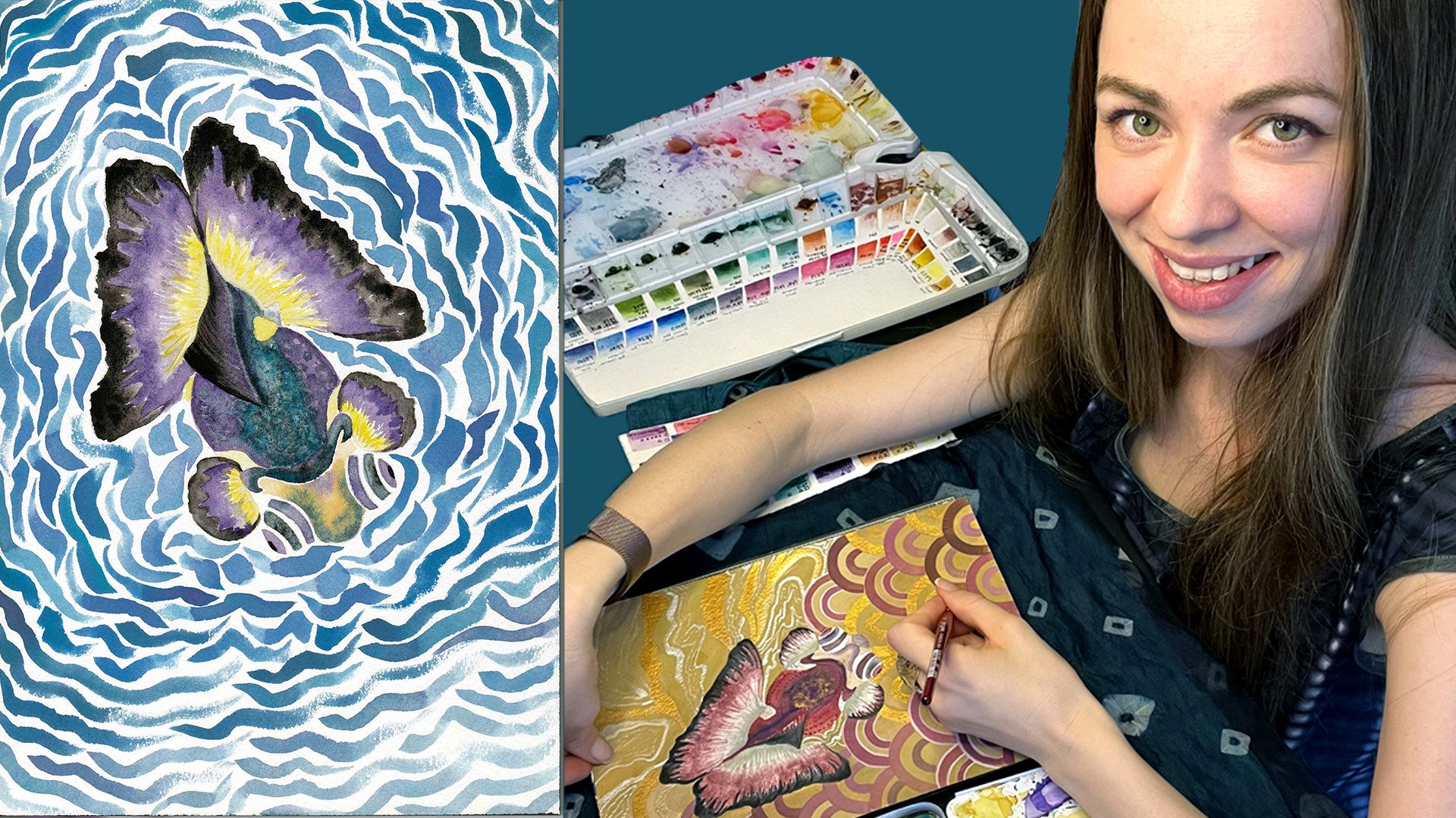
7. Final Thoughts: Congratulations for making
it this far and give yourself a pat on the back
and maybe a cup of tea. So these are all the things that I've created
during this class. This is the final project. It turned out quite
beautiful. I really love it. These are some of the other things that I
did outside of the class. It turned out lovely as well. I don't know which
one I liked the most. They're all beautiful. So I hope you feel
the same with what you've created so
far in this class. Now please share your art
in the project section. It's really great for me
to look back on Skillshare and kinda like look at all the
projects that I've posted. It kinda reminds me
how much I came from then till now and how much
I improved over time. So I hope that the same with you and see you in the next class.
 Miwa Gardner, Watercolorist- Watercolor for Relaxation