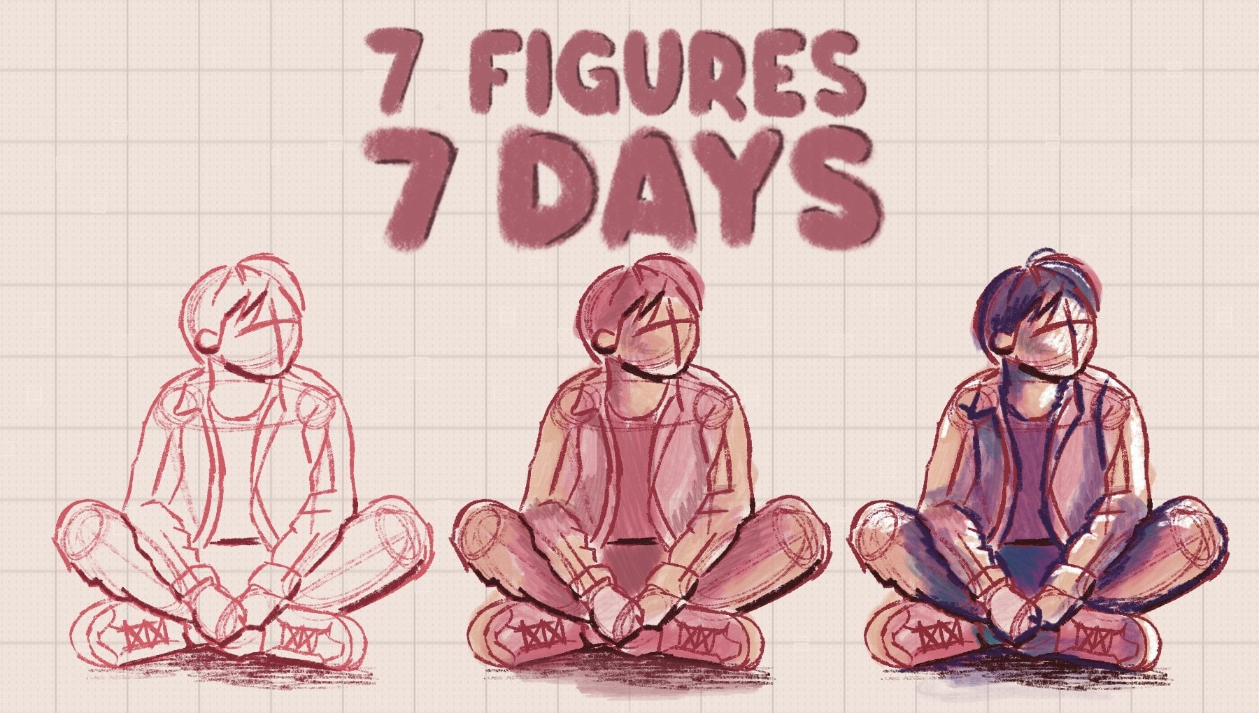
Transcripts
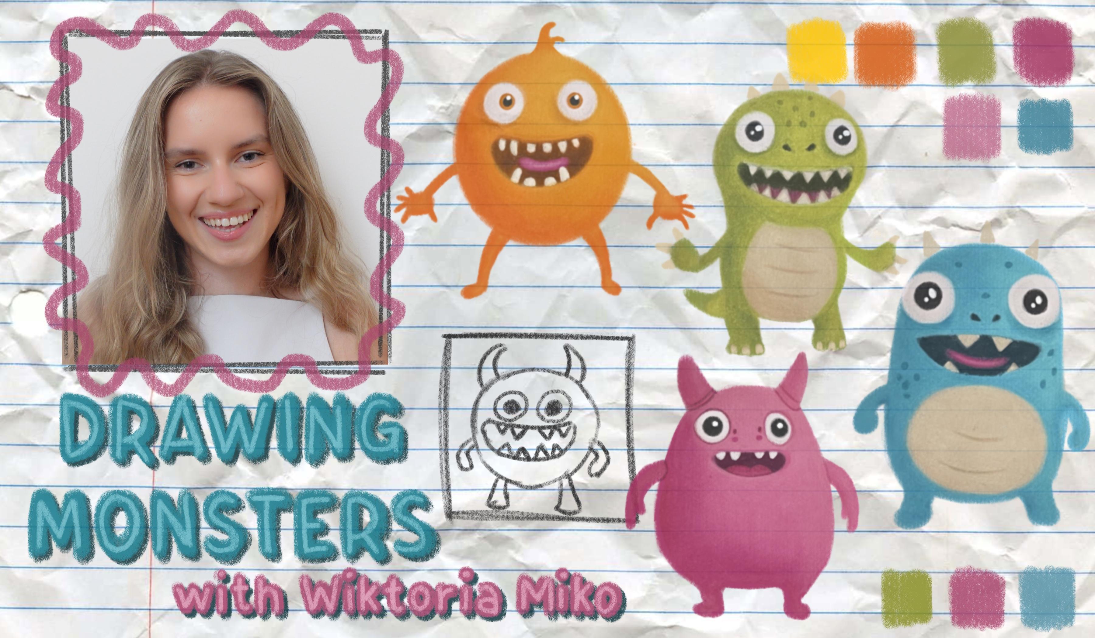
1. Welcome!: Hi artists. My name is Victoria, and I'm a professional artist
and teacher here in Scotia, and I love to draw everything. From realistic drawings of
people to creepy clowns, cute dogs, fun
landscapes, you name it. I also love filling
my sketchbook with drawings like the adorable. Oh. Oh, I mean, terrifying monsters
we're creating today. We all begin with our
lovely pink monster. This one doesn't have
too much detail, so hopefully it's a
good starting point. Then we will move on to our
cute friend orange Boo. After that, we have the
awfully scary grape zilla. Then our little
cheerful character, Sonny spook and his
brother Frogles. Next, we will move on to
our friendly Grenosaur and last but not least, our fuzzy ball pompom. Each of the seven Monsters takes around 30
minutes to complete, so you can treat it as a fun
seven day drawing challenge, or you can build your army
of monsters all in a day. Outlines are provided,
so if you want to focus mostly on
the coloring aspect, you are free to trace
the character figures, or you can trace the
outlines with me, and I will guide you through
the process step by step. I have tried to make the
coloring process rather simple. We begin by creating an
initial layer of our dark, medium and light tones. Then we continue
layering until we build a beautifully saturated,
blended effect. I keep my fingers crossed
that you join me in this class so that we can create our spooky monster
friends together. I hope to see you in
the first lesson.
2. Pink Monster : Hi, students. Welcome
to the first lesson. I'm so happy you're here. So in this first lesson, we are going to be creating
the first creature. This is going to be
the pink monster, and I think he's going
to be the easiest for us because he doesn't
really have much detail or texture going on. So hopefully, it's a
good place to start. So before we even
begin, allow me to tell you just 30 seconds
the material I'm using just in case you're interested in working
with the same tools. So the paper I'm using is
the mols king sketchbook. Now, I like the
sketchbook because it's small and also because
the paper is really soft. I'm also using a
graphite pencil. I am using the cretacolor
monolithe brand, and you can really
use any pencil at all. It doesn't
really matter. The only important
thing is that you use a relatively light pencil because you don't want to
create very heavy outlines. Probably the most important
material that I'm using I'll go into be my Caren
dach Luminus pencils. And, of course, if
you don't have these, any color pencils will do. And then the last thing is just a regular erasa just so that when we're
done with the outlines, we can just tidy up any outlines that we don't need.
And that's all. So now let's get started. So before I even begin, I would like to go ahead and
mark up where my creatures will be because I am creating these creatures inside
of my sketchbook, and as you can see, it's not the biggest piece of
paper in the world. So I am going to first
try to just create guidelines where I want each of my monsters to be so that
it all fits on one spread. So I'm going to so we have
seven monsters in total, and two of them are
going to be in a pair. So let's suppose that the first one we will have here like this, maybe a height, like so. Then the second one can
be maybe like here. The third one,
perhaps like this. So we have one, two, three. And I actually like when my drawings kind of overlap
onto the second page. So I think it would
be a cute idea to have the second monster, the one that's going to
be in the pair over here, so we'll have one,
and we'll kind of be crossing over to the
second page and another. I can show you an
example of this in my previous pages
in my sketchbook. For example, this is
my favorite spread, and you can see here how
this girl's elbow is crossing over to
the other side of the page or maybe her
hair over here as well. So I kind of like to
create this effect. And that's what we'll do.
Oh, and also this one. This is what you can see
flashing through the page. I got this mouse on Pinterest. I think he's adorable. Oh, yeah, and you
can see here that the tail is also crossing
over to the other side. So yeah, hopefully I'll
add more to this page, but I just kind of
created this recently. Anyway, so we've got
one, two, three, four, and then we need three
more, five, six, seven. So maybe we'll have one more
towards the right side, kind of above the pair, and then one more here. And you want to keep them
roughly a similar height. You know, you don't
have to be like crazy, specific, but more
or less the same. So I don't know if this
shows up well on camera, but I have one, two, three, four, the pair, five, six, and over
here, I have seven. So these are going to be the random placements
for my monsters. And this is good to
do at the beginning, because you don't want to
create, like, you know, a super advanced sketch and then find out that you don't have
enough space on your page. Um, and you really
only need to do this if you want to fit all of your
monsters on the same page. So we are going to begin with the outlines first for our character before
we start coloring in. Now, I'm going to
take you through the basics of sketching
and creating proportion, just so that our sketch is as close to the reference
image as possible. We want to keep all the
proportions the same, so I will show you
how I do that. So I do the same process
for all of my drawings. This can be like figure
drawing, even faces. Whenever I draw from
a reference photo, I always try to
follow the same step. So, of course, this is a
much more simple image, but it's still the same process. So um, yeah, let's begin. So I have a rough, um, height, um, created
for my monster. And you can make this, you know, you can adjust
this if you want. This was just a rough placement. So I know where I want my
first character to be. Now that we know the rough
height of our monster, we can estimate the width
of our monster as well. Now, looking at the
reference photo, um, he looks to be a tiny bit
taller than he is wider. So if this is going
to be his height, then his width is going to
be something like this. So he's like, if you
include his arms, he's pretty much like just about the same
height as width, but I think a tiny bit
smaller, so here we go. This looks like an
okay estimation. And of course,
this isn't perfect because we're still
estimating here. Now that I've got
my kind of, like, a box established where
my monster will be, I am going to look for what's in the middle
of the drawing. So now we're going to turn our attention to the
reference photo again, and the next step is to decide what's in the
middle of the drawing. So imagine you take your picture and you cut it along this way, right down the middle
of the height. So if we do that, the middle would be
kind of like where his shoulders would have
been if he had them. So right on the top of his arms. So we know that his little
arms are going to have to begin about here at the
height of this line, right? That looks about good. This is about halfway from here to here. So then we're going to have
to pencil in his body. And then we know, okay, and now that we've
got this established, we can kind of visualize all the details that
are going to have to go above this line, right? Because now we have
a rough estimation of where things are
supposed to be. So let's work on the top half of his body first just to make things a
little bit easier for us. So again, if we do
the same trick where we cut the drawing in half
now from the middle upwards, if we cut it in half, then it looks like maybe
his head would be halfway, maybe a tiny bit
higher than halfway, so we'll create a
line right here, and this is where the
top of his head will be. So this is where
that first curve is going to be for the head, and then we've got
room for the horns. Here we go. And then we can draw the rough
shape of his body. So we've got this kind
of funky shape going on. Now, he definitely is
taller than he is wide so do account for
this in your sketch. And I'm trying to schedule
very lightly first, because right now, all of these outlines
that we're creating, we're practically guessing
where everything is, right? Like, I don't really know how it's going to look until
I have the lines down. Now that I've got
the lines over here, I can kind of visualize
whether it's correct or not. But either way, I try to keep my lines light in the beginning. So here we go. Okay, this is roughly
where his body is, and there's a tiny bit of
space left for his feet. Trying to simplify the shape and just create the outlines. Not really worrying
about the details. Then there's the other foot. Okay. And then we know that all of his face
is going to have to be practically above this line. So his mouth kind of overlaps, slightly with the shoulders. But everything else is
practically, above that. So I'm going to create a small little shape
for his mouth. And you can make all of the adjustments you
want to this reference photo. Like, if there's some
details you don't like, you don't
have to add them. For example, I don't really
like the shape of his tongue. So I'm just going
to do one curve. I don't like how it, I guess, like two shapes inside. So this is my alteration. And then he's got a little gap, H two front teeth
kind of spread apart. Very cute. So here I have that. And then his eyes
are above that. Now, notice something. He is actually not facing
towards us entirely. He's kind of off to the
side ever so slightly. So, for example, if you look
at the distance between the edge of his head and his left eye and then the edge of his
head and his right eye, the distance on the right
side is much smaller. It's about half the
width as it is here. And this shows you that he's slightly staring, like,
in that direction. Um, so we'll have to, of course, create it like
it is on the fritter. Here we go. There's one eye. So it's like a round shape, but it's slightly almost
leaning to the side. Okay. And then we've got
his pupil on the inside and his pupil follows the same shape as the eyeball or
something like this. And then he's got a little
highlight in the middle. Okay. And then
we've got this eye, the right. I mean, the left eye. And then remember there's
a little bit more space. So you see I made
a mistake here, and I'm slightly shifting
towards the right now. And this is fine because I created that line
and I visualized it, and I figured it's slightly
too far to the right. I mean, too far to the left. And then I adjusted it. So it looks kind of messy, but once we apply some color we'll be a little
bit more careful. Yeah, this is a rough shape. I think I should
have made his eyes a tiny bit bigger, so
I'm adjusting that. And then he's got these two
little dots on the side, which I guess we don't need
to drawing with the pencil. We can just add it
with the color on top. You don't need to, like,
copy down all the details. Mm. And then now
we'll draw his horns. So you can see, I
actually didn't go all the way up to here, I feel like I'm slightly short of where this
estimated line would be, but it still looks
proportional, so that's fine. And then his hands. So, again, we established where
his elbows would be. I mean, his shoulders would
be somewhere around here. I think I made his mouth a little bit too small, so
I'm going to adjust that. And now we have to remember that his arms have to be
asymmetrical length. So I'm using this as a guide to see how far down
the arm has to go. And actually, we can't see this. Okay, because he's tilted, we can't see kind of where
his arm connects to the body, so we won't have this
line like we have here. So you want to make
sure that the armpit is starting at the same height. And then we just have his hand details
left, and that's all. And that's it. This is
our first sketch done. So now I guess we'll
do the coloring. Okay, so now we're ready to start coloring in our monster. So the first one we
have to do is we have to pick out
the correct colors. So, you don't have to have the
exact same shades of pink. You can pretty much, in fact, pick any colors that you want, as long as you
have a dark medium and a light variation
of that color. So if you want to create
the monster in blue, you can do so with, like, a dark, medium, and light blue. Um, you can do
anything you like, but I am going to stick
to the pink colors. So for my monster, I'm going to be using these free colors. This is going to
be my main tone, and then this is going
to be my dark tone and my medium tone. This is kind of like a fleshy, pinkish color like this. And then we are also
going to need some black and white for the
eyes and the mouth. And now, before we start
coloring in let's quickly just get rid of any
unnecessary lines. You can also use your eraser to lighten the
outlines generally. The role is kind of that
you don't want your sketch to be too dark because
if it looks too dark, then it might be tough to erase it at the end or to cover
it up with the pencils. So ideally you
want the sketch to be light enough that you
can just about see it. So if you feel like it's really, really strong on the paper
and you're using very, very dark values to
create your sketch, then it's probably too dark. I'm also just going to tap in certain areas
with my needed rasa, just to lighten any areas that appear too
dark, in my opinion. Okay, this looks good to me. Now, I'm going to work
from darkest to lightest, and we'll just do the
body of the monster first and then we'll do
the eyes and mouth. So we'll start with
the darkest color, and we'll just go in sections, trying to put down all of the shadows in the
correct places. So the first thing
we'll do is shadows and then the medium values, and then the lightest values. So if we start with the
general shape of the body, we can see that it's mostly
darker towards this side. It's as though the light source is coming from this direction. So the darkest areas
are going to be here. So what you want to do
is lightly at first, and then we'll make our
lay a little darker. You're going to
create just a bit of a shadow at the bottom here. And we'll darken this, but I like to go slowly and lightly because we
can always add value, but we can't really
remove any value. So we'll add gradually. And then he's got
little feet details. So there's some shadow here. Like this. You generally want to shade in his
feet a little bit, but he's just got a
more pronounced shadow. And then the same
thing on this side. And I'm just going to stretch the shadow just a bit higher because we're going to blend in this lower area
with the medium area, so you're just going
to want to overlap your values slightly. You see how we are even
creating the gradients within the shadow
because a shadow won't look natural if
it goes from really, really dark to really
light suddenly. You don't want there
to be any sharp lines. You want there to be
subtle transitions. And that's how it's going
to look more realistic. Okay. And then we've got some
dark areas around the eyes. So we have to be careful
here because we've got details around here. Then he's got sr on
the side of his mouth. Okay. And that looks
like mostly it. We've just got one more
shadow underneath the arm. And that's pretty
much all the areas of darkness on the body. So the next thing that
we'll do is we'll pick up the medium pink. So this is mine. And what we're going to do is we'll
just go over everything. I mean, the body area. We're not doing the arms and the face and the horns just yet. And then what we're going to do is we'll just
keep on layering those colors and making sure that we have smooth transitions
between values. And we will do this until this entire layer is filled
in with some kind of value. So we're ultimately aiming to have a very thick
layer of color. So I think now I'm going to use this pink pencil just
to fill everything in. So now I'm going to really
start applying pressure. So You can see now that because we had the
darker color underneath, it's going to show fruit, and this area is going to
appear as though it has depth. Okay, so now I'm gonna go I in and add a little bit more of this daca cola and then we'll start layering
everything again. So now, to add some more depth, we are going to use our
latest pink pencil, and we're really going to press
into the paper this time. And we're going to
basically seal in any value in the
highlight areas. Then also up this area. Now I'm just stretching this lighter value towards the belly, but I'm not pushing it all the way into the paper
because I still want there to be room
in the paper for the medium pink so that we have this nice
gradient happening. Okay. And now I think I'm
ready to fill the rest in with the medium
pink. So this one. So now we'll go over
the remaining layers and press really, really hard. And we'll just be careful around the areas where there's
a colour transition too. So as you can see, over the
areas where it's blending, I'm actually using
a light layer. And now I think
I'm just going to go over everything
with that light pink again just so it kind of blends
everything in together, and I'm really, really pressing quite hard with this pink. And then we'll
repeat the process with the arms and the horns, and then we'll do
the mouth and that will be it for the
first drawing. So for the arms, I see we have a little shadow at the bottom of
the arm, I guess. This little finger has a shadow, very tiny detail and just
an overall gradient here at the top. Mm. So now we are moving on to
the mouth and eye details. So how about we
start with the eyes. Ideally, you have a
very sharp pencil because the eyes are tiny, so you're going to want to have as much precision as
you can in there. Now, what we're going
to do is, first of all, we are going to, you know what, I'm just going to erase the little sketch marks that
I have inside of there, because especially on
those white areas, I don't want
anything to show up, so I'm really going to make it as light as possible in there. I still want to see my initial
outlines ever so slightly. And then I'm going to create a nice reflection
in the eye and, of course, the pupil
of the eye as well, right in the center
of the eyeball. And I'm going to
shade it all in. And now I'm going
to press really, really hard and make sure
it's all entirely black. But I and now I'll repeat the steps with
the eye on the right. So again, I'm removing all the graphite details
and then refilling it in. You know what I'm actually
going to use some of this dark red just to add these details
inside of the eye. I'm just going to sharpen
my pencil as well. So for example, right over here, there's a small shadow. Now, I'm just using
that medium pink to add some details around
the eye, as well. So it doesn't look like too plain around there because I definitely see some shadows. And we don't have to
make our shadows as complicated as they are
on the reference photo, but still you want to
add just some details. Okay. Oh, and let's not forget the two little dots on the face. There's one here. I quite like this
detail, actually. Okay. And now we
can do the teeth. So again, I think it's worth erasing around the teeth
just because they're white. So if we have any pencil
marks, they would show, and then we'll just go over
it with the black pencil. Again, you want your
pencil to be very sharp. And we're going to create
the outlines again. Like this. Now, I'm going to fill in I
want to the tongue. Okay. And before I sew
in that black layer, I'm quickly going
to do the tongue. So I'm going to use
my dark red color. And I'm just going to
create some shadows because it looks like the tongue is darker at the top,
lighter at the bottom. Hey. Then I'll fill
in the rest with that pink medium pink turn and maybe I'll use some white
here at the base just because it looks very light. Okay. And now using
the black who fill in. And again, I'm going to use a little bit of the medium
pink now to add some shadows. And now, this is it. Our
first monster is complete. And something I love to do
in my sketchbook to make my characters pop out more is to give them a little bit of shadow
where they are standing. So you can use the
reference photo, just to establish where
that shadow would be. And I'm using this color for it. It's kind of like a medium gray. I remember the shadow
is going to be darker, closer towards the body. I'm just going to make
mine kind of round like this. And there we go. That's our first character. Dan, I hope you enjoyed, and I will see you
in the next lesson.
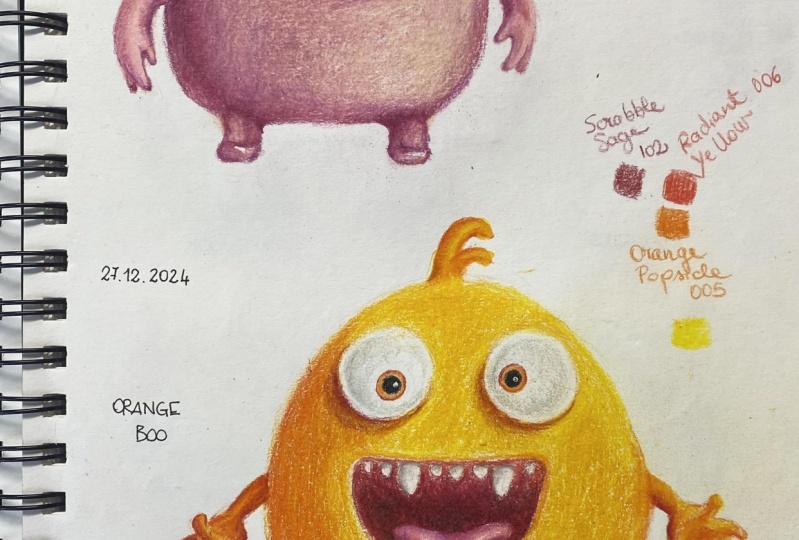
3. Orange-Boo: Students and welcome
to the second class. In this lesson, we
are going to be completing the second creature, which is going to
be the orange one. The colors that I
have chosen for this sketch are going
to be these five tons. Now, I'm going to be using the black for the pupil details, the brown for the really
deep shadowy areas like the mouth and
underneath the eyes. And then we've got
free shades of orange just to build some
depth on the figure. So we are actually going to start by creating the outline. So for that, we need our
pencil, our graphite pencil. So you want to establish the
height of your creature. So I want mine to be
roughly from here to here. Now, this is going to
include the top of the head and the
bottom of the feet. I'm going to ignore that
little piece of hair, I guess, of his until the end. I'm just going to consider this line to be like the
top of his head, okay? So because he's almost
a perfect circle, okay, let's say the bottom of his body will be
somewhere here, right? So now we need to create because he's
almost an even circle, this height has to be
equivalent to the width. He seems to be maybe a
little bit more narrow. But either way, because we're going to be
drawing a circle, this has to be similar
width to this, right? So now within those lines, I'm going to be creating
the main body area. And I'm making it
light for now because spheres are actually trickier
to draw than it seems. I cannot draw a
sphere in one go. I kind of need to,
like, create some lines first and then visualize
it and then see, like, what needs to be adjusted. So I create a shape first, then I'll decide if
I like it or not. Okay. I like this enough. I'm just going to
adjust some areas, maybe make the top of his
head a little flatter, something like that. Okay. And then we can now
draw the legs in. So make sure that they
are evenly spaced apart. So it looks like the middle
of the sphere is about here. So you want the legs,
evenly spaced, okay? And then the feet. Okay. Now, let's do the hands. So the hands look like they grow out from the bottom
half of the body. So if we have a half over here, the arms are even below
the halfway point, they would be about
a here maybe. So we want to make sure that
they're an even height. So you can create
an imaginary line like this and just
make sure that the arms are levelled
more or less, okay. And then we'll match up
the thickness of the arms. Perfect. Okay. And now we'll create the hand details. It actually looks like his hand is the other
way around, right? Like, shouldn't his thumb
be up once, I guess. So I guess the right way to
do this is probably to create some kind of a box shape
first, a regular cube. And then create fingers
coming out of it, because you can kind of
see, like, the thumb. Well, I guess, if that's
supposed to be the thumb, it comes out of the corner. And then this little finger
comes out of this corner. This one comes out
of this corner, and then there's two more. Feel free to just not do a
hand and just give him, like, legar block hands or, like, just what we did with the feet, just like a little circle. Um, okay. Now the next one. So, again, I'm going to
do the same box my food. Alrighty. And again, I'm going
to erase that box shape. Lighting that hand, generally, because it doesn't need
to be this dark. Okay. Now we can draw that little hairy toe in
and then we'll do the face, and then we'll get coloring. Okay. So now we've got all of
the main body parts in, and now we have to do
the mouth and eyes. So, let's start with the mouth
because I feel like it's actually pretty
simple because it's in a good placement
because it's like, right in the center
of the sphere, right? So here's a smile. So if you compare
it to the hands, it looks like the bottom
of the mouth is, like, halfway through the height
of the hands, right? And then if you look at
the width of the mouth, it's like it goes
through the legs. So it really goes
up to, like, here. So I kind of made a mess
of it because I have a lot of outlines now,
but that's okay. As long as you're
drawing lightly, we have endless opportunities
to fix the shape. Okay, so this is the
outline I'm happy with. Okay, we'll do tif in a second. It's just do the eyes quickly. So the middle of the figure
is about here, right? It looks like the eyes are exactly in between the
mouth and the top of the head. So if we have a line like this, the eyes would even
be on this line, and it's even good to do something like this
because if you draw one eye first and
then the other eye, you might find that like this eyes lower than
this one, you know? Okay, so now that
we have this line established for the
height of the eyes, let's go ahead and
pencil them in. So we can see that the
eyes go maybe a tiny, tiny bit wider than the mouth. Like this. And then
you have to have an even distance because
he's looking right at us. It's a front view,
so you have to have an even distance
between the side of this eye and the middle and the side of this
eye and the middle. So now his eyes are
going to be symmetrical. And then the bottom and top of the eye has
to be even as well, so you can use this
as a reference. There you have it.
That's the eyes. So now you just make
them perfect spheres. I'm actually not happy
with that shape. I'm just going to make it a bit bigger. Okay. So now I'm actually
looking at his teeth and then realizing that
his teeth aren't, like, evenly spread apart. For example, he has free
teeth between the big ones. So if you like,
you can keep that. But I don't like it. Um, I'm just going to
draw his two big fangs. And then I'll draw two teeth. And then one tooth on the side. Then these. And then he's got a tongue. It looks like it's
kind of levitating. All right. So this
is the sketch done, and now we can
start coloring in. So again, the first
thing you're going to do is get rid of all of these reference marks
that we no longer need. And you can go ahead and just lighten your creature ever so slightly so that you can
hardly see it because, again, we don't
want any of those graphite outlines flashing
for the complete drawing. So I hope you can
still somewhat see it. I can just about see it myself, so that's good enough for me. Okay, so again, we're going
to work from dark to light. We'll do the mouth and
the eyes at the end. For now, we'll just focus on the spherical shape of his body. So why don't we grab, first of all, go from
darkest to lightest? We're starting with
that brown color, and there's really not that many places where we will apply it. It's mostly reserved
for the mouth, but I am seeing he's got some shadows
underneath his eyes. And I'm not going to
make this too deep because I don't want
this to look brown. I just want it to look like a slightly dark orange shadow. So we will actually go over
this with a lot of orange, but yeah, don't make it
too crazy at this stage. And make sure that
you have a little bit of a gradient going on. So it goes from the
darker brown color to the color of the page. And for now, I think this is all that we'll
use the brown for. Now we'll move on to the
darkest orange color. And we will just follow
the spherical shadow. So again, like the
first monster, the light is coming
from this direction. So the monster has all of the
darkest areas around here. I remember we're applying slowly because we can
always add more colour. There's also a
little bit of orange around his mouth. Okay. And now we're moving down
to the medium orange, and we'll use the medium
orange to go over everything. Okay. And now that we have
the basic shades in place, we're going to now go ahead
and press a little harder to really blend all the values together and create
the final layer. And we are going to go over these darker areas
with the deep orange, and then we'll slowly, you know, we'll make our layer
very, very thick, but the areas where
it's starting to merge into the medium orange, we're going to make them
a little bit thinner, and then we're going to overlap that with the medium orange. And then as we go into
the yellow areas, we'll make the layer thinner
and overlap with the yellow. If that's confusing,
I'll show you now. So it goes daka, orange, medium orange,
and then yellow, right? So over here, we
can really press. Wait a second. This is
not the dark orange. This is the dark
orange. So over here, we can really press
as hard as we like. Okay. And you see I'm slowly starting to press a
little bit lighter. And that's just so there's a tiny bit of room
for the orange, medium orange color so
that it's going to now blend with the
deeper orange color. So I'm really filling
up the paper here. Okay. And now I'm slowly transitioning to
the medium orange. So all of those areas now that are half filled with
the dark orange, I'm going to really
go over them, press into it with
the medium orange, and you'll see that this creates a gradient because it doesn't go like in a straight line from dark orange to
medium orange, right? Like, you're merging
the colors together. And then, yeah, it creates a
nice smooth snow transition. So if you did have lines, then you wouldn't have
an accurate figure because the figure is a sphere and the sphere doesn't
have any sharp edges, so you just have
to make sure that all the colors change
very smoothly, okay? Looks a little crazy, but we keep drawing, it'll all work out in the end. Then right below the mouth,
I'm actually going to leave a tiny not a gap, but just a light layer of that medium orange because
it's mostly yellow. So I'm going to want to
leave some room for that. Okay, and over here,
we'll start to fade out. I want orange in preparation
for the yellow transition. Alright, and I'll the yellow. And we'll just use
the yellow to go over the remainder of the sketch. I'm just making sure that I'm going all the way
up to the edges because I want them to be
sharp against the paper. Okay. And that's it for the body. So now we will do the arms legs, that little piece of
hair, and then his face. Okay? So again, we'll
follow the same steps. We'll go from brown to
dark orange, medium, orange and yellow, and we'll do that for all of the limbs. So let's start with
the brownish color. Maybe I'm just going to add a tiny bit of brown
on this hand, just to separate
it from the body. So just a tiny bit. Yeah, otherwise,
that deep orange is going to connect with this orange and it's not
going to look right. So we'll just do a
tiny bit of that. Okay. Why don't we just
do all of them at once? So you're really just
looking at that hand and trying to copy down
all of the shadows. So the lighter the drawing gets, the lighter the reference gets, the lighter we have to
switch power pencils to. I'm going to do it very
lightly over the hand here. So for the hair piece area, I feel like it's dark
orange to the left, medium, orange to the right, and then yellow in the middle. So that's the pattern
I'm trying to recreate. Okay. And then we can seal
everything in with yellow. So I'll start with the hair. I'm actually going to use that medium orange colour to see in this hand because I didn't
add enough orange here. So now it looks too yellow. Okay, so now it's
time for the face. We will start with the eyes and then move
down to the mouth. For the eyes, I'm
actually going to use my dark orange color, and first of all, I'm going to make sure that
it's very well sharpened because that's such a small area we're working with right now. So here, this is
extremely sharp. Okay. Um, so I'm
going to begin by outlining as neat of
a circle as I can. Because there's some
depth in there, what we can even do is maybe
go in with some yellow. Shop yellow. Maybe we can just add something
interesting, so there's a gradient
within the eye. Small detail might not even
show up, but I like it. And then the same
on the right eye. I like this one looks a
little bit too sharp. Okay. And now I'm gonna
go in with black. And again, my black
is also very sharp. And two. Okay, so the last
step is the mouth. So we will begin with the
darkest area of the mouth. So grab your brown, and we're going to have to
carefully create a gradient. So what I mean by a
gradient is when there's a transition between one color to another and it's very smooth. So it doesn't go from, you
know, brown to yellow. Immediately, it goes
from brown and then it merges into a
somewhat orange color, and then it turns into yellow. So we can see that the mouth, it has a very deep undertone, and then it becomes
lighter and lighter. So we're going to have to be
careful here to go around. The teeth and the tongue. So we can go ahead and lightly at first, outline everything. So I'm pretty much going to do a light layer of brown in
the entire mouth for now, and you're going all the way up to the edges of the mouth. We can start pressing Hata
in the Red ready Doc areas. Okay, and now I'm
really going to push that brown into the paper, but I'm only doing so in the
darkest part of the mouth, and then the rest I will kind of blend with the deep
orange, I think. Okay, and now I'm grabbing the deep orange and I'm
going to kind of fade everything at the edges of
the inside of the mouth. Okay, and now I guess we're
ready to do the tongue. So actually, I
forgot to pull out those colors, but
we're going to need, I guess, the same
colours that we used for the pink tongue of
the first creature. So we'll grab a pink colour and kind of like a
Biji skin tone color. I have these too. So
with that first color, we're going to add any
shadows on the tongue. So I guess I see some at
the bottom of the tongue. Tiny bit on the side. And now I'm going to use
that creamy light color. And actually, I think
I'm going to use white right in the middle of the tongue because
I'm seeing there's quite a sharp highlight there. Let's see. Just down
the middle. Like so. And there's somewhat
of a tongue. I guess, looks enough
like a tongue. You might even be able to add
some details to the teeth, and then I'm going to clean
up the shape of the teeth, as well with my
deep orange pencil. Oh, yeah, and we were
going to add a little bit of shadow on the eyeballs. So I'm using this really
light gray color. And I'm not actually going to press this into
the eye too much, but I'm just going to create a very light shade just like this. And I feel like this adds
a little something in our. Just a little shade, makes it look a little bit
more three dimensional. I'm going to make
this one even deeper. We can even add some
to the teeth as well to create some shadow. That's a pretty cool idea. I'm just going to add this
on the left of every tooth. Since the light is coming
from the right side, the shadow would be
on the left side, right? I actually
really like that. I'm actually also considering adding a bit of a white
reflection to the eyes, kind of like we have
of that monster. So I'm just going
to see if I can use this pen and go like
this, just tap. One and two. Yep, I like that. Okay. Okay, and the final thing we're going to do is
create that shadow, like we did with
the monster above. So we go like this. And then like this,
and we remember that the shadow is
going to be darker, closer towards the body. So it's going to look something like this. All right. So that's it. I
hope you enjoy it? I'm actually really happy
with how he's looking. Thank you so much for watching. I hope you enjoyed, and I will see you in
the next lesson.
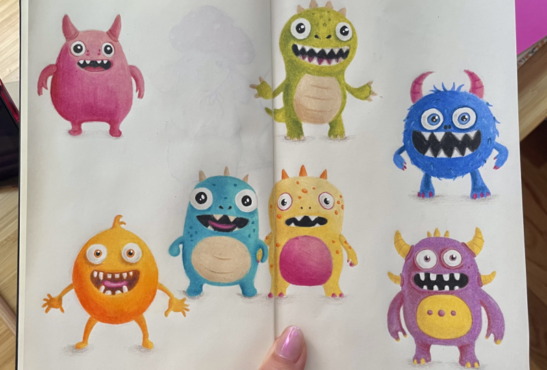
4. GrapeZilla: Okay, it's another lesson, and we're creating
another monster. So on the reference photo,
he's actually blue, but a lot of the
other ones are blue, and I kind of wanted to
switch it up so that it's, you know, a nice variety
of colors on my spread. So I'm actually
going to make mine, like, a purplish color. It's really easy to just, you
know, change the colours. Why you see dark blue, use
dark purple, medium blue, use medium purple, and
then the light is, you use light purple. So
it's really all the same. So yeah, I'm excited
to begin. Let's do it. So we have the
bottom of his feet and the top of his
head over here. His head doesn't actually go all the way up to this
line because there's a smoke gap between the top of the body and the top of the
head because of the horns. So, yeah, that's something
to keep in mind. So now that we have the
height established, let's try to figure
out the width. So he is definitely more
narrow than he is taller. Visually, if I was to guess it, it would look like he's
about this wide, I guess. Okay. So these are the rough parameters of where our monster is going to exist. So the middle of his body looks like it's going to be the
top of the shoulders. I guess the monsters will
have similar proportions. So his shoulders are
going to be about here. Okay, so now we can begin to fill out the
shape of his body. So now we have the
width, the height. The head is a little
bit away from the top about here, I suppose. And then it looks
kind of like if you look at just the
top of his body, it's like perfectly rounded. Okay, and I'm going to ignore
his legs and arms for now, and I'll just draw the
bottom of his body. Sorry the bottom of his body, the bottom half, it's very similar in shape
to the top half. It's less rounded off, though, more square shaped, like so. It's kind of like a
pill shaped creature. Something like this. This
looks more or less accurate. Okay. And then we
can draw the legs. So roughly, they
begin about here, and you want to make
sure that the legs are even thickness. Okay, they would
pretty much recall. And then he's got
some nail details. And then his arms
grow out of here. So again, just make sure
that the arms are going to be an equal length. So they kind of go all the way up to roughly where
the legs begin, so he's got really
long arms up to here. So this is where the
arms have to reach. They kind of look like this. They're very steep. Like this. Okay. And he's got kind of like a Llega man shape
happening here. And then he's got a little nail. Alrighty. And then
he's got a belly. So the belly begins slightly ever so slightly
below his shoulders. It's a pretty easy shape. You just have to make
sure that it's centered. So I guess this figure does
have a tiny bit more detail. That's why we didn't
start with this one, so we're progressively
increasing in difficulty ever so slightly. I'm trying to decide if I like those free dots in the middle. I'm gonna come back to them at the end if I want
to include them. Okay, now, his eyes. Okay, so the bottom of his eyes look to be roughly
in the middle between, like, the top of the stomach
and the top of the head. So his eyes have to be, like, at this height,
more or less. Then you want to make sure
that they are also centered. So the middle of
the body is here. So I'm going to have one eye
here and another one here. You can kind of use
other points of the figure that we've
already drawn to compare where everything should be
to make sure it's not wonky. And then he's got somewhat
of a spherical eye. And again, I'm just creating a bunch
of lines just to try to figure out
the best shape here. Okay. Looks like a minion right now. Okay, and then his big smile. Really close to his eyes. Okay, and then his teeth, his many, many teeth. So again, you want
to establish where the middle is and
then go from there. I'm going to give him, I think, just four teeth. I mean, fourteeth on the top, and maybe also 40th
on the bottom. With these figures, it's very
easy to make alterations. So you can make yours as close or as far from the
reference fitter as you like. Okay, I'm gonna have
four on the top. Let me add two at the bottom
just to see how I feel about that. I quite like this. I quite like him having
my only two bottom teeth, and if we're at the top. Let me just add some more to
see if I like this better. You know what actually right
found the four teeth there. Okay. Alright, so
we're almost done. All we have left are the horns. So again, you want to make sure that you have them leveled. So the top the main
horns at the top, they are roughly, they begin, like, like halfway down
the height of the eyes. So and then like here, this is where they
would go out over it. And then they go upwards. And thing is, these sketches, they are very forgiving as well, because you know
they're characters, and they can look
anywhere, you know, even if you made their horns much different than they
are in a reference photo, then nobody would ever know
because they're made up. So it's fun to practice this. Lots of room for error. Okay. And then we'll draw all the
details within the horns out. He's got two more
parallel to his mouth. Which again, you don't have to include only if you like them. He's a very spiky monster. Okay. And then I'm just going
to draw one at the top. Well, maybe three. Let's see. I quite like that. He's going
to have three little um, horns at the top. Alright. Um So I
guess that's it. Um I suppose I'm seeing a little bit more detail kind of where the
horns grow out of, so I'm quickly going to add
that, and then that's it. Hey, that's it. Do I like the little dots on the
stomach? Let's see. Mm. I like them. They're. They're a bit
too high, I think. I'm at that one all the time. One, two, three. I'm making the one in
the center a bit bigger. Okay, I'm happy with this. Um, so I guess that's it. The outlines are done, and now we're ready
to start shading in. Okay, so now we are moving
on to the shading process. So I'm quickly going to tell you all the colors
that I've picked. So we have the black color for the eye details
and the mouth, the inside of the
mouth area as well. Then the free colors
that I've picked for the body are these
kind of plum colors. So this is my darkest
one, medium and light. Then for the yellow
stomach and horn details, I have dark yellow, medium, yellow,
and light yellow. And lastly, I'm still
using that gray color that I was using for the shadow beneath the feet just to make it look a little bit freedy. And then we have a
light gray color just to add some dimension
within the eyes. So yeah, that's a lot of colors, but that's the purpose
of all of them. So for now, we will just concern ourselves with the plum colors. So I'm going to start
with the darkest one, and then we'll work our
way to the lightest. We'll just work on
the purply areas, and then we'll move on
to the yellow areas. So grab your darkest
purple color. This is more red, but I'm gonna be referring to as purple. Oh, and actually, before
we even start shading in, we should probably clean up outlines just so perhaps
they're a little bit lighter and get rid of any
lines that we don't need. So I'm actually going to
tap on his face slightly, just so I can pick up
that excess graphite, because Rambo, we
don't want it showing for at the end of the drawing, so just ever so carefully
trying to lighten everything. As long as you can see
it, that's good enough. It doesn't need to be
any darker than that. Alright. This is very
light, but that's good. You can hardly see it, but
I hope you can see enough. So we are going to begin with
the main part of the body, and then we'll do the arms
and the legs, as well. So I definitely see a bit of a shadow towards the left side. It's almost like all
of these figures have the same source of light. So it's darker on the left side. Okay. Maybe you'll extend
some of the shadow. Just remember you
want your values to be lighter kind of
when you're going into the middle purple areas because you want
to have gradients. So you don't just want to add value harshly to certain areas without thinking about
overlapping the values. I draw all of these little I don't really
know what to call them, but you see how he has
some smaller areas around the horns and
around his eyes as well. I'm just going to add
those at the end. So you see over here, I'm just adding the dark purple color es slightly just so that it overlaps when we add more
colors on top of it. Again, it's possible that I'm going to go over
these areas again, but I just want to add
my values very slowly. I'm just going to add
a tiny bit more here. Okay. And now we're ready to
add our medium purple colon. So I'm practically
going to go over m over all the dark areas, and then I'm going to overlap into the light areas as well. Okay, and now I'm going to go
in with the latest purple, see how everything's looking, and then we'll apply the values a little bit harder so
that the color shows up. More. So right now there's no depth, or not too much depth at least because we're applying
the colors very lightly, but you'll see that once we start to really
press into the paper, that's when we can see the
difference between them. So for now we're kind of just establishing the
general placements of all the different
colors. All right. So now I guess that the
entire body area is filled, we will start to apply our
colors with more pressure. So we'll start again
with the darkest paple and then
move our way down. So I'm going to go ahead with the darkest color first and really start to put down just a little
bit more pressure. And I'm going to build
up to this gradually because, you know, we don't want to add a
lot of color and then find out that we actually wanted to overlap this with
something else. And then there
won't be like room on the layer of the
paper to add more color. So yeah, going gradually
is always the answer. I remember we can always add, but we can't remove, or at least it won't be
so easy to remove. Okay, now with the
medium column, Okay, and I think
I'm now approaching the time when I can just fill everything out with
the lightest color. So I'm going to start by
going over the darkest areas. And you can see how
those colors are slowly merging and
they look very smooth. It doesn't go from a harsh, dark value to a
harsh lighter value. The colours just kind of
melt together so nicely. And I'm leaving a little bit of area around the eyes
because he's got some more freedi looking um I guess
circles around his eyeballs. So now we'll do
the arms and legs. So again, we'll start
with the darkest value. So I can see he's got a lot of shadow kind of at the
joint here on the left side. And then kind of,
like, by the armpit. And then on this side, it's really only dark
towards the left side. And you're leaving some gaps
there for the nails a co? I think I'm going to make
these values at down. You have a strong ga. Okay, and now we'll do the medium value. I think we'll fill in everything with the lightest colour. Just being careful that we don't go over the nail details, aka. Okay, so now we'll do
the little details around the horns and the eyes, and we'll also complete
the area around the mouth. So first of all, you're going to want to sharpen your pencils, and mostly we're relying on the darkest and
lightest turn here. Um, So I added darksacles around
the eyeball itself, and I'm also going to
exaggerate kind of, like, underneath the
eyeballs, I suppose. I'll do the same on this side. Now, going with
the lightest tone. And I'm even considering using some white just to make sure that this area is clearly separate from
the rest of the body. But I'm definitely going to add a lot of that light
purple first. Okay. Now, I'm just going
to refine around the mouth. So our little
character has a bit of a shadow towards the
right side here. And a little bit more shadow, kind of like
underneath the mouth. There's almost like a highlight. A And we'll fill out with the lightest value and go carefully around
the outlines of the mouth. Okay, and then we have the
four around the horns, and then that's it. We'll do the yllary
details in a second. So again, you're going to
grab your darkest value. Okay. And now the
lightest turns. Okay. Now we'll do the
yellow details and then we'll finish off by doing
the eyes and the mouth. You can put all of your
purple colors aside. We don't need those anymore. Now we'll grab our dark, medium and light yellow colours and we'll begin on this
left horn perhaps. The first thing we can do is
create those line details. And I'm starting with that
darkest yellow color. One, two, three lines. I'll do this on
this line as well. One, two, three. One, two, and three. And again, one, two. Three. Okay. So now, if we're happy with the placement of those lines,
we can make them darker. So I'm just carefully going
to go over it once or twice in kind of like a
straight continuous line. Okay, and now we'll
do the shading. So pay attention to where
the darkest yellow is. I think I'm just
going to go over a little bit with more pressure. Just right down the
middle of each shadow. Now the mediumuler I'll
kind of go everything with the mediumula Do you know what? I think maybe we don't
need the lightest yellow because there's enough contrast between these two already. Yeah, I'm just going
to use this one. I'll leave the light
yellow for now. So I'll start reinforcing
over my layer. Okay. And I'm actually going to do all the nail
details as well with yellow because the white won't really show
up on the papa, so I'll just do that. And I'm just doing that
with the meeting yellow, kind of filling out
all those areas. Okay. And now the belly. Oh, and I also just
realized we forgot to do the blue dots on the stomach. So, um, I guess
we'll do that now. So I'll just use the darkest
and the lightest color. First, I'm going to
outline my dots and then make it do a little shadow towards
the left lower side. And filling was a medium. Okay, and that we'll
do the stomach. So again, we'll just
use the darkest color. And in a similar fashion
to how we shaded in, these little dots. We'll do darker in
the bottom left side, consistent with the highlights and shadows on the creature. But it's not all too dark. There's not really that
much curvature here. So I'm just going
to add a tiny bit. And then fill everything
with the medium er. I'm thinking of outlining
around his stomach, even though it's
not really so much like that on the reference. It looks kind of incomplete without a little
bit of an outline. And now the medium yellow. And this will be the last
of the yellow areas. So we'll move on to the eyes and mouth, and it will be done. So now we grab our black pencil. And why don't we start by
outlining around the teeth? So trying to do this
as neatly as possible. Okay. And we'll make it pitch black
inside of the mouth. Okay, and I'm just going to
fix around the outlines with the lightest purple
color just to make sure the edges meet. We can even use the white color to clean
up around the teeth. Alright, and now we do
the eyes and we're done. So we will begin with purple. So again, I'm going to use the darkest purple and just create a slightly darker
line wherever I see it. And now the lightest purple. And now, there is a
white.in the eye, and I'm going to be using
my pen to create it, like I did with the
orange monster. But if you don't have this pen, then you just want
to leave as neat of a line as you possibly can. As neat of a dot, I mean inside of the black
area of the eye. But since I have the
pen, I'm just going to create a very sharp,
black circle. Like so. And now the white. And any final details now. So I'm going to use that light gray
pencil to kind of create some shadowing
in the eyes. And I also noticed he's got these two little dots on the right side of his face. I'm going to add those now. And then the shadow beneath
his feet are the last step. Alright, so that's it. That's
our FAD monster complete. I hope you enjoyed, and I will see you in
the next lesson.
5. Sunny Spook: Alright, students, welcome
to Lesson Number four. In this lesson, we are going
to do the pair of monsters. I figure the way we would do them is we would do the outlines first just so we know that the creatures are accurate
relative to each other. And then we will fill
in the yellow monster, and then we will do
the green monster. Alright. Sounds good. So we will now get started
with the outlines. So I have the placements for my little creatures right here. So this is the bottom. I don't know if you can see
this on camera, but this is the bottom. And this is the
top of both, okay? And what I was planning on doing is because they're kind of
in the middle of the page, I think I showed you before. I like the effect of
certain elements of the figure going onto the
other side of the page. So that's an example
or maybe this like, there's a piece of
hair or the arm. So yeah, we'll do just that. Or you can, of course, just do them normally
as you normally would. It's up to you, you'll practice. So, okay, so let's begin. Why don't we start with
the right monster first? Um, so let's do it so that the yellow monster
is slightly on this side. So I'm thinking I'm
actually going to have four different
creatures here, so it's probably
better that they're more on this side as
opposed to this side. So we have some of that balance shifting over here
to the spread. Okay, so this is the
height of the creature. The middle of the body would roughly be where the
stomach is, I guess. So right about there. And then the top of the head, would be we've got some room between the
head and the spikes, so we're gonna have
to account for that. Okay. Okay, so I'm actually
going to have to go. The head of the
creature is gonna have to go all the way
up to the side. Maybe even like this. So I
should have probably shifted my lines like this. Okay. Okay, so this is the
rough shape of the head, and it looks like the head is just about
as big as the body. So I try to keep these
proportional roughly. Kind of like a peanut shape, I guess. Okay. And then the legs have to
be evenly spread apart. You already know the
drill one and two. Like this. Um, so I've slightly exceeded
the bottom. That's okay. I'm just gonna have to
make sure that this one is, um, the same. The feet are in the same
place now, which is okay. Maybe I'll just give him
two nails like this. Why not, you know? Okay. Now, the arm placement is
easy because we know it's in the most narrow
point of the body, and it goes up to about slightly below halfway down the stomach. It goes up and then
slightly down. And then he's got a little nail. Okay. Okay. And then we can already place the
spikes if we want to. And then we'll draw the
eyes and the mouth. So if I'm looking at the
placement of the eyes, if I imagine a line going right down the
middle of the head, it looks like the eyes would
be right down the middle. So somewhere about here, and they are way off to
the side of the head. And then we've got the
funny little mouth. Very, very wide. I don't know how I
feel about his teeth, to be honest. I'm
gonna experiment. Maybe I'll give him just
two fangs like this. Maybe four. There, I like this. Okay, he's gonna
have four teeth. Um, I don't know, for some
reason, I prefer this. Wait, he's got nostrils. Do I like nostrils? Yeah, I don't have
no strolls. Okay. And I don't think I'm going to draw the orange
details with graphite, because they are
randomly scattered. I feel like we can just go
in straight with the orange, when we're coloring,
you know, create the outlines when
we start coloring. So that's that Oh, we need to do this.
Hold up a sec. Okay, this on the ughia. I remember you have to align them. In terms of the height. And I'm actually just going to leave this arm as
it is now because I kind of want the two creatures to be overlapping slightly, so it's possible that this
arm will be covered anyway. Alright, so that's
creature number one done. I mean, the outlines, at
the very least are done. And now we'll do the second
little crocodile looking guy. They're roughly the same height. His feet actually gonna have to go lower because they'll have
to be in line with this. So the head will start here, and the feet will end there. So his shape is kind of more
like a tick tack, right? Just a bit more straight. This guy in a right hand a tiny bit more curvature to him. But this guy is
kind of just like a leaning tick tack,
right? So like this. I like this, he's gonna
have to be wider. Something like that. Okay. So I've got the rough shape, but I guess he's a little bit wider at the bottom
than he is at the top, so I'm just going to make
this a tiny bit wider here. And he like this. I right
and now we've got the feet. I'm actually going to
make an alteration, and I won't give him nails on
his legs and on his hands, I think, because they're really
small and they're white. So I feel like they won't really show up
against the paper. And if I try to make
them a different color, then it will introduce a
different color to the figure, which I don't really want to do. So yeah, then his belly looks like it
goes about halfway as well. So his belly is in place. Now let's do his arms. I'll just give him kind of the same shape he has
now, but no nails. Maybe we should have them
holding hands. You know what? That's what we'll do. I just want to cross over
the shapes slightly. Okay, like this. I love that. And then his other arm
it's going to be here. Now he has really
big eyes, okay? So the middle is about here. Don't forget he's
kind of tilting, so he's going to be off center. So when you're doing this line that represents the
middle of his body, it's going to be a
slight angle come. So he's got one eye here. And actually, we should
establish how far low they go. Again, it's similar to
the monster on the right. Looks like about halfway
down the height of the head, the supposed head, I guess, it's just one part of the body. It goes up to about here. And then the peoples have
to be exactly centered. And then he has nostrils. And then his little mouth
will not south ittle, Rudy. I'm thinking of giving him
the same amount of teeth as his brother because
it looks cute. And just like the
creature on the right, we'll create the dots
once we add the details. So now we are ready
to add the color. So, um, we will begin with the monster on the right
for no particular reason. But here are the colors
we will be using. So, of course, we need
black for the eyes. I was also using
this very light gray just to add some shading to
the white parts of the eye, so it's not completely
white like the paper. Then we need this
darker gray for the shadow beneath the
feet of our creature. Then for the actual
body of our caractert, I am going to be using dark, medium, and light yellow. And these are the same
colors that I was using for the purple
monster we created. So yeah, that's it. And then we have orange for the details. And then I'm actually considering instead of
doing his belly and nails using this kind
of mint green color, I'm actually just
considering using pink because I feel like a
lot of the monsters are blue, and it just kind of adds a little bit more of a different, interesting, color. So we can begin by, first of all,
lightening our figure, so you don't want
it to be too dark. So you want to tap at
certain areas just so that the graphite is dark enough that you can
just about see it. But you don't really
want the outlines flashing through at the
end of the drawings. So I'm going to start
with the orange parts. And I can see that
the orange dots, they have some depth to it. So I'm actually kind of filling out the paper
with the orange, but really only at the bottom. And then I'm going to use some yellow to go over
the other areas. And as long as I have
some orange underneath, that area is going
to be different from the yellow areas everywhere else because we will
mix those two colors, the orange and the
yellow, so it will look a little bit different. So we have one, two, And for this, you really
don't need to make it exactly like the reference because they're kind
of randomly scattered, so you can kind of add
the dots wherever you want them to be. Okay. Then we have some on
the side of his body. Okay. So that's
the dots for now. Um, you know what? We
might as well just do these spike details since that's the only other
orange a remaining. So again, the light
source is the same for all of these
creatures so far. So I'm going to create those
little lines going upwards. And as I go towards
the left side, I'm just going to make
them a little bit lighter. And then I'm going
to fill in with just a light layout so that there's some texture.
I'm doing these lines. It's not going to be
exactly how it is on the reference because
it's just a quick sketch, but kind of conveys the texture that we
see on the reference. Okay. And then you'll see if I grab that light yellow color and then go over this orange. Still in that
straight line motion. You can see how it nicely just blends all of
those colors in, and it gives us that
similar texture. Okay. We can actually go over
the dots with this as well, just to seal them
into the paper. So now we will do the body, and we just want to
grab the dark yellow, medium yellow, and light yellow. So again, just make
sure you can see the outlines as little as possible that you can
still use them as guidelines, but they're not
really so visible. Okay. All right. So again, the light is coming
from this direction. So we're going to start off by lightly filling in
the side of the body. And we're doing a
soft layer for now. Okay. I think I'm going to dig this a little
bit farther out. You know, I'll actually go
over the nostrils for now. We'll come back to
them with the black and fill them in at the end. I guess we'll just do the
hands already at this stage. Normally, we do them
separately, but I don't know. I just I guess I went
on autopilot and I started doing the
yams and legs anyway. So because this hand is, you know, they're holding hands. So the hand that's behind, it's going to be in shadow. So you're going to
want to make it just a tiny bit darker than it is
on the reference potter. Okay. Now we can go over
the image again and just reinforce that uh just a bit. Okay. So I think that's enough for now for the darkest healer turn. Now we'll go over everything
with the medium healer turn. So even the light areas we'll
just go over everything. I kind of do a nice even
layer throughout, okay? Okay. And now I
guess we'll start reinforcing with the
medium yellow pencil. So we'll try to start to
create that final layer. So we're really going
to apply pressure now. But in the areas where it
appears a little bit lighter, like, towards the top
left, here at the stomach, we're going to kind
of blend the pencil, like, so it's like a
lighter layer so that we can overlap with the
lightest yellow tone, okay? So I'm pressing harder over here on this side. Okay. And now that I'm kind of
coming into the ita area, I'm just going to make sure that my yellow my medium yellow is well blended so that when I
go in with my lit yellow, there'll be a very nice
smooth transition. Alright, that looks
good. And now I've got my white yeler and
I'm just going to go over these areas now. Okay. So that's the body. I think we've done everything
for the body now. So next we'll move on
to the tummy and nails. So you're going to
grab your pink colors. And again, the
shadow wings follow the same kind of placement, I guess, as the rest of the body because it's consistent
with the light source. So it's going to be darker in the lower
left side of the body. H So I think I'm going to make this area kind of like on the
darker pink side. So I'm going to fill this area and then get darker as I come
towards this side. Okay. And now I think I'll go over everything with light pink. Okay, that's the belly done, and now we'll do the nails. And then we'll blend
over the lighter pink. And I've also noticed
that our character has some of this shade from the stomach and the
nails around the eyes. So let's make sure that
our pencil is very sharp because this is
a very narrow line. Okay, so now that's done, I suppose we can
fill out the mouth and then do the pupils, and
then we'll be finished. So let's grab the
black pencil and fill out the inside
of the mouth. Okay, so that's the mouth done. I'm just going to clean up around the edges with
my yellow pencil. I'm also going to grab some
white just to go around the edges of the
teeth to kind of blend cap black and make
sure that I can't see the grainy texture
of the paper. Okay. And I suppose now let's sharpen our black pencil
again to do the pupils. And again, I'm going to be using the white pen to create
the white reflection. But if you don't have that,
then just make sure you leave a nice white outline before
you fill in with the black. Now, I'm just going to add some value to the inside
of the whites of the eye. Okay. And now the
white reflection. Oh, I was going to
say we're done, but we forgot the nostrils. One and two. Okay. And now all we have left is the shadow beneath the
feet, and we're done. I'm actually thinking of adding another reflection in
his eye right below the big one like this. Okay, now I'm finished.
I hope you enjoyed. I hope your character
turned out well, and I will see you
in the next part of this lesson where we will create this green one
star. See you then.
6. Froggles: Okay, so we'll come
back. In this lesson, we are going to be
completing the teal monster, I guess, the Bova of
the yellow monster. So the main two colors
that we will be using for the monster are these
two teal colors. I actually am only going to
use two colors for this, a dark and a light one, and not use a medium
teal because I just don't have a color that
goes with this so perfectly. And also, I feel like we can
just lay out the darker one heavier in some areas and kind of create
those transitions, so we will still
have all the variety of the values without
needing three colors. So the main two colors that I'm using for the months here of the body are the dark teal
and medium teal color. And then for the belly and
nails and horn details, we have these two
yellowy colors. So this is just a pale yellow, and this is a slightly
darker yellow. Then for the inside
of the mouth, we will be using
this pinkish color, and, of course,
black for the eyes, and then these two graters. So the darker one we use for the little shadow
under the feet, and the lighter one we use for the eye details just to make the eye look a little bit
more three dimensional. So we will begin by erasing all of the outlines
that we do not need, any outlines that we don't like. And then you can also
just in general, lighten the creature just
so the outlines don't flash through the
layers of color. Okay. Here we go. So we're
going to ignore the little circular
details on his skin, and I will just fill in without paying attention to any details, we'll just fill in
the shadows and the highlights and then do
the details in the end. So we are going to fill in the entirety of the body except for the lightest
area with this color. So I guess, again, the light is coming
from this direction, so we'll go like this. We'll just leave this area without any of the darker color. And then everything
else will fill in. And for now, we'll just leave this as a fairly light layer. And then once we keep
going over this, we'll darken it and darken it just like you did with
the previous monsters. And as we're coming
into the lighter areas, we'll just create somewhat
of a gradient so that the color isn't too harsh
going from light to dark. Okay, and now I'm going to go over the areas we
want to darken. So here it's definitely
a little darker. Let's also fit in the arms because we're not doing
any details for them, so we don't have to
do it separately. It won't be too
overwhelming to do it now. And now we will fill in
everything else with the lightest color,
lightest tie. Okay. And now we will start to complete kind of like the
final layer of that monster. So we will really apply
pressure now with our pencil and see what
all the colors in. So I will actually begin with
my darkest my darker color. And over here, I see this
little shadow on the foot, so I'm just going to press
very, very hard here. So kind of in the areas where the shadow
is the darkest, like, over here by the armpits
and the side of the feet, that's where I made the
layer of the dark blue, really, really dark and also on the side
of the palm here. Um and everywhere that it's
kind of like a medium value, I did, like, a relatively darker layer
of the darkest blue, but I didn't fill up the paper. And then where it's not light, and then where
it's the lightest, I just kind of left it so that it's only the lightest
shade of tear. And then I'm thinking
we'll just go over everything with the
lightest color. I might just reinforce the
medium value one more time. Okay. And now we will go over everything with the
light teal color. So I'll start on this side. I'm actually going to add
some of that darker blue underneath this armpit here. And that's because even though it's not dark
on the reference, they monster's hand is kind of overlapping some
of those areas, so there should really be a shadow if they're
locking hands. So I'm just adding
a touch of that. Just to make it a
little more realistic. And now I'm just blending
it with the lighter bloom. So you see, now, even
though we used two colors because we were careful
to create the gradients, we really achieved
such a variation of colors of different shades
of this teal color. Okay. Alright, now let's do the little
pattern on his skin. So again, why don't we just do dots we'll simplify
it a little bit. I'm just using that
darker tail color. And I'll just create simple little spots similar to what we did with the
character on the right. Okay. And now we'll
do the tummy. So I'm going to grab that
darker yellow color. And first of all, I'm going
to create those lines. And then with the same color, I'm going to start
creating that shadow in the bottom left area
of the stomach. And then we'll fill in a
layer with that yellow color. Okay. Okay. And since we've got the yellow
colours in hand, let's quickly fill
out the horns. So again, we've got a little bit more darkness to the
left of each one. And we'll fill out with
the light yellow color. Alrighty. And maybe we can also do his teeth
with this color. Just a small amount. All right. And now we will fill out his
tongue with that red colour. So well, I guess it's more pink. So we'll first do a light layer. And then I'll apply some of that yellow
right down the middle, just to lighten it and blend it. And then we'll fill out
the rest with black. Then I'm going to grab that
pink color once again, and I'm just going to blend
the border between the mouth, between the inside of the
mouth and the tongue. And you'll see kind of bring some of that black
into the tongue, so you'll darken it and
kind of make it look like it's in the
depth of the mouth. Like so. And then I'm
even going to use that light yellow color to blend the teeth in just
around the edges. I'm just trying to get rid of that grainy paper
texture, essentially. Then lastly, I'll grab
the light spar and just blend again around the
edges of the mouth. Alright, he's coming
alive monster. Now I'm going to do the
nostrils with black. And also blend them. Now, again, it's
time for the pupils. So again, I'm using black, and I'm actually going
to leave this space white for the little
dotted reflection. I'm still going to use my pen, I think, to enhance
that highlight, but it's big enough for me to just be able to go around it anyway. So that's
what I'll do. So now I'm using a lighter
gray pencil just to make the eyes look a
little bit more fred. Maybe I'll use some of that
darker blue just to add a little bit of detail
around the eyes. And now we're going to add some shadowing to the
base of his feet. And that will be
the final thing. So here we go,
just some shading, so it makes it look like
his feet on the ground. And again, I'm going to make it a little bit darker
closer towards his feet on this side as well. And that's it. I
hope you enjoyed, and I will see you in
the next lesson. Bye.
7. Greenosaur: Hi, students, and welcome
to the next lesson. In this lesson, we
are going to be creating character number six, which happens to be
the green monster. So I'm going to place
him right here. I was thinking that
the last character that we will draw is blue, and we've already got
a blue character here, so I kind of want him to
be away from this guy, so there's a bit of a balance. So yes, I've chosen this
spot for the green guy. I'm actually thinking of also overlapping maybe a bit of
his hand onto this side, just because I like that effect, but you can place your
character wherever you like. So this is the rough height that I have for the character. Now I'm going to try to
estimate again, the outlines. So we will begin, I'm
holding my HB pencil. We'll begin my marking
down where the head is. Now, it seems that the
bottom of the head is pretty much exactly
down the middle. So maybe about here. And it seems to be
about this wide. He's got quite an oval head, and it's and it's a lot
wider than it is taller. So I'm going to kind of
connect these dots now. Okay. And then his chin is like around here,
something like this. So he's also kind of
tilting his head and staring a little bit into
the right direction. So if the middle of
his face is here and then his eyes cut
across like this, we're learning to try to create
the eyes along this line. But we'll get there
in a second. But now we'll continue doing the body. Kind of, if you just isolate the torso itself
relative to the head, it's a little bit more narrow. And also the shape of his
body is kind of just like, I suppose, like a peanut. So it's just like a
long curve throughout. So it looks something like this. Then as bunny goes down. Okay, so this is the
rough shape of his body, and of course, we can adjust it if it doesn't look
right in a second. And now I'm going to
connect his legs. So again, if you ignore the tail for now and you just
look at the feet, when you try to oversimplify the shape, they look like this, and also they connect with
the side of his body. Okay. And let's give
him little nails. Um, one more. I'm not going to
make them pointy. I'm kind of just going
to make them half ovals so that his foot kind
of looks more like a stump. Okay. And now his
hands His hands grow. If you look at his elbows, they are beneath the top of the white part of his stomach. So there's something like this. Then he's gone. His
sharp long nails. Okay. And then we can see
some of his tail sticking out like this. And then we will do
his little spikes, and then the face, and then
we'll be ready to color it. Let's draw his
eyes first because we've got the line established
for where they should be. So it looks like the bottom of the eyes reach about, like, halfway down the
height of his head. And he also has really big eyes. Okay. And then his mouth. And his mouth goes
almost all the way up to the edges of his eyes,
the outside edges. Should we give him
all of his teeth? Should we only give him some?
I'm deliberating it now. Maybe. You know what? Let's give him all of his teeth. Or maybe just six. That's enough. Then
on the bottom. On the bottom, let's
give him just three. Like, so. And that's
frowing a tongue, as well. So his tongue is kind of
more like a gradient. So actually, we won't
outline the tongue. We'll just draw
it with the color pencils once we're ready. Okay, and the only final
detail is the nostrils. So something like this. And that's it. Looks like
we're ready to color in. So make sure you like
all of your outlines. Um, I might make his body
just a little thicker. So before we pick our colors, let's go ahead and erase
any lines we don't want, lighten the entire sketch. So I figured I would
change the colors of the creature from
the reference photo. So on the reference photo, he obviously appears blue, but I feel like we don't have a green character here anywhere, so I'm just going to use
green colours for him. So here are my two main colours. So I have kind of,
like, the birth, quite yellowy earthy
tones, I guess. So we've got, like, a
dark tone and more of a greenish lime. On almost. Then for his belly and nails, I am using these
two yellow colours, which are the same
colours I was using for the blue belly of the
previous monster we did. Then I have this
pinkish color and black for the tongue
and the eye details, the mouth, and so on. And then we have
both of the graynes we've been working
with the whole time. So we have the light one
for some depth in the eyes, and this is just the base, the shadow underneath all
of the character's feet. Here are all the colors that we're using for this drawing, and now we are ready to begin. So again, we start by filling out the body of the character. So I'm just using my two
green colors for now. So again, we'll just ignore the little details the character has on his body,
those little circles. And we'll just focus on the highlights and shadows for now. And you can totally choose
any color that you like, because it's very easy to change the colors on
a photo like this because you're mostly just following the shadows
and highlights anyway. So where you see, like,
a darker blue color, you can use a darker green or
a darker pink or anything. And then in the lighter areas, you can use a lighter equivalent of whatever color you're using. So yeah, you can
pretty much just, um, Make it however you like
it, and I like my green. So I'm using the darker green to go over the
darker green areas, and then we will talk over the next step
once we're done with this. So I think this
character is probably the only character
that doesn't follow the same source of light
as the other ones did. All the other
characters were dark on the bottom left side and
light on the top left side. And I guess it kind of
applies to this one, but the light the
contrast is much softer. So, you know, I think we
should just follow kind of the same format as
the other images. We just kind of
enhance the shadows on the left side and highlights
on the right side, just to make it consistent because for me, they're
all on one page. Okay, so now I'm starting to go over all of these areas with a little bit more
pressure trying to slowly look in
those dark areas. So I think the areas where
it's really, really dark, I'm just going to seal them in, I guess, by applying
more pressure. So right here on the deo
pit, it's really dark. So I'm just going
to press a little harder. And then by the feet, So I'm going to
apply maybe, like, one more layer just to dock in these areas
a little bit more, and then I'll seal everything
in with the lighter green. So now we will go ahead and seal everything in with
the lightest pencil. Now, there's colors, the shadows that we've built up underneath will blend
with this layer. And so we'll get this nice depth and Okay. Now we can do the
hands and the tail. So again, we'll start
with the darkest color, and we can see that
the tail is slightly darker at the tip, and maybe some shadowing, kind of, like, towards
the top of the tail. And then the rest is relatively
actually very light. So I'm only adding a touch
of the darker green, and then everything else
I'll do the light green. And I'm going to ignore the
spike details on the tale. But you can, of
course, add them. Okay. And now we do the hands. So it looks like
there's a lot of shadow towards the body. And then at the fingertips, there's also a little
bit of a shadow. And then on this side, All right. And then rest. We will fill in over
the light ring, and that's it. Okay. Now we are ready to do the yellow Tammy and nails
and the horn details. So again, we'll pick up
the darker yellow color, and we can start by just drawing those line details
on his stomach. And, of course, they have some more depth
shadow and highlight, but we don't need
to focus on that. We can just make ours
a bit more simple. Our drawings have a bit more of a sketch effect than
the pictures do. So they're like this. And then we can fill out the bottom. Again, it's kind of
the bottom left. That's where we'll
focus the shadow. And then we can even let's
just do all of them at once, so I'll fill out the nails. I'll just kind of make it darker towards the
bottom left side. And then I'm going to make it darker towards the bottom here. Okay. And then the rest, I'll fill out with the light to. I'm just adding a
little extra of this daka yellow on top because I feel like
the light yello kind of blended
with that too much. And then I'll
enhance that texture on the belly one more
time, and that's it. I just realized I forgot
to do the right hand ah. So again, I'm doing that
with the daka yellow. And then finish off with the
lighter yellow. That I did. Okay. Next up, we
will do the mouth. So we're going to pick
up that pink color. We'll just do that pink between the teeth. That's
where the tongue is. And then it kind of
fades away as it goes towards the
inside of the mouth. So it's more pink over here. And then kind of above
the teeth a little bit. And then it fades into the
black inside of the mouth. Okay. And now we'll
do the mouth. So we'll go between the teeth. Okay. And now we will do in it. I'm just going to go
into that pink area slightly so that we're overlapping nursery colours
so we can have that blend. And now I'll go over
it with the pink. O And maybe I will use that light
yellow color just to blend it at the base
of the pink tongue area. So really only at the bottom. Okay. And now I'm just going to make sure that
all of my gaps are filled in with black because it's looking a little
bit rough still. So I really want
to make sure I'm going up to the
edges of the teeth. And maybe with that
lightest yellow color, I'm gonna go over the
teeth just slightly. Kind of how we did
with that blue monster just to make sure the
teeth are blended in. Okay. Now let's do
the nose rolls. So again, grab
your black pencil, fill out the little
nose shape. Mm. And we also have to do
the details on the body, which I forgot about until now. So we're going to grab
that darker green color, and we'll just create
dots on the forehead. Like this. Okay, perfect. And now we'll do the eyes
and we'll be finished. So let's grab that
lighter gray color, and we'll just fill
in the bottom left of the eyeball will kind
of create just like a little shadow running through the middle of the
whites of the eye, and that kind of gives
it a little bit of depth because it makes it look like there's a shadow in that area. So it does a little something. And maybe I'll also do a
little bit more of that dark green around the bottom of the eye just to make the
eyes stand out a bit more. I'm going to just create
the pupils straight away. But if you want to leave the white reflection in there and not go into it
with the black, that's fine. I use that pen, so I don't
have to work around it, but you can definitely create
a little dot and, like, you know, just don't
fill it in with black, leave it the color of
the paper, basically. And now we'll use that
pen, create two dots. A large dot. And a small dot. I'm gonna do, like,
the blue monster. I'll do a smaller one beneath
it, beneath the big one. Okay, and now we're going to do the little shadow
beneath our character. Alright, so we're all
set. I hope you enjoyed. I hope you like how
this turned out. Thank you for watching, and I will see you in the last lesson.
8. Pom-Pom: Hi and welcome. In this lesson, we are going to be completing
the last character. This little creature is
definitely on the fluffy side, so his texture will be a little bit different
but not too difficult. So let's get started. So I have left this little
space for a character, so I'm going to make the
feet somewhere about here and the body
somewhere over here. Actually, maybe
I'll make him lower so he doesn't clash
with his hand. So this is the outline. I guess, really, what we can begin with is
just Roy sphere because he is a perfectly
rounded off little guy. So it's really just however big we make the circle is going to be
the size of the character. So the way you make a circle is, first of all, you want
to make a bit of a box. So you want to make
sure that the height. I'm going to make the
bottom of the circle here. This will be like the legs. So the height of
the circle has to be the same as the
width of the circle. So what you can even
do is you can take your pencil and line it
up against the height, so the top will be here and
the bottom will be here, and then just make
sure it aligns. So my one looks like
it aligns mostly. Maybe I could take
it in a little bit. And now we go ahead and
kind of connect the dots. And the thing about drawing circles is that they probably will not look good immediately. Like, I cannot draw a perfect circle if I
try to do it in one go. I have to draw these
feathery strokes before I find the shape. It's almost like I have
to I just put down anything as close to the
circle as I can get. And then once I visualize it, then I can kind of see
what needs to be taken in. So now I've got my rough circle. I can see this is way too flat. This needs to be rounded off, maybe a little bit like this. And now I'm refining. And the thing is when you
draw a very light hand, that's when you can make
all the changes you want. So it doesn't have to be
perfect the first time, as long as you don't
make it too dark, because then it becomes
really difficult to erase and fix your shape. Okay, so here's the body. He probably is a little bit, like, wider than he is taller, but I don't know, almost the same
height and width. So I'm going to maybe take
this off just so that he is, in fact, a little bit
more flat at the top. And I'm going to erase
whatever lines I don't need. Okay, I kind of erase
a little bit too much. Okay. And now we
can draw the legs. So if the middle of the shape is here, you
can draw a little line. And then you want the legs to be an even distance
from the center. So about here for both. I think I made mine a little
bit even more spread out than they are in a
reference, but that's okay. I'm happy with it. Okay. And again, I'm not going to give him those long nails because they're just a
little bit too much to draw. So we'll just make
the same nails we've been doing
for the other legs. Okay. And now the hands. So when you're
drawing the hands, the only thing you have to make sure of is that they grow out of the same height because
he's facing us, right? If he was up to the side, maybe the perspective would have
been shifted a little bit, but in this case, he isn't. So it looks like the hands grow out slightly below the
middle of the circle. So it looks like they grow
out. Maybe like here, right? This looks about
correct. And they go almost up to the
bottom of the height. And now we just
draw in the lines. And I don't know if I want to give him nails, to be honest. Maybe maybe I will. Okay, fine. I will. Okay. And now the horns have
to reach an even height. So let's suppose that's here. Again, the middle
would be around here. So you want them
to reach to be at, like, a similar distance. And maybe let's say that
they'll reach to about here. So we've got one. Two and now I'm going to draw a very faint line through the middle of the face. I'm going to do a cross because I want to make sure that the
features are placed evenly. So first of all, the top of the mouth
looks like it's, like, exactly on this center line. So it's probably like this. And then it kind of curves. It's not like a straight curve like the other ones have been.
This one goes in and out. And then we have a
little line here. Like so. And again, you can give him
as many teeth as you like. I like four on the
top and bottom. And then his eyes, he has huge, huge eyes, and the eyes kind of line up with
the width of the mouth. Maybe they're a little bit
more towards the center, but more or less the same. Do I like his eyes? Um, I actually don't know if I like the
details in his eyes. Maybe I'll just do
it kind of like the orange guy that will have, like, a bit of color
around the pupils, but I won't really
do any details. I'll just do it like
this. So it'll be blue, but I won't add any details. Okay, and then he's
got a little nose. Uh I did this one a little bit too low.
Let me try that again. Like this. Alright, so I
think we're ready to begin. So again, we're going to erase any outlines we don't need and generally lighten
the portrait. So I'm just gonna go like this, just to pick up that
excess graphite. So now it's a little
bit too light, but as long as I can still
see it, that's good enough. So in terms of the
colors that we're using, for the main body
of the monster, I'm going to switch up
my colors slightly, and I'm going to be using slightly darker
colors because I feel like this little guy here is
already a similar blue tone, and I kind of want to vary
the character slightly. So I'm just going to
use the same colors, but I'm including a
darker pencil for the shadow just so that
there's a bit of a variation. We have a dark pink and a light pink for the
horns and the nails. And then, again, we have black for the eyes and the mouth, this dark gray for the
shadow beneath the feet and a light gray just for
some details in the eyes. We are going to start with the main body of our character. And for now we are just going to ignore the hair texture.
We're just going to Fill in our character as it is. And, again, we can kind of oversimplify the
shadow slightly. Just follow the main, I guess, the same shadowing, um, same light source that
the other characters had. So because the sky is a sphere, the shadow is very
easy to figure out, it's just going to be lighter around here and darker,
darker, darker, darker as it goes towards the
left corner, bottom corner. Okay. So I've got the darkest
color placed in here. Now I'll move to the slightly lighter color and then start working that
towards the top right side. Right now, there's really
not much difference between these two values because
it's really when you start pressing harder that I guess the difference
becomes more obvious. Nonetheless, we're just
filling out around the eyes. Okay. And the rest will fill
out with the lightest blue. Okay, so now we
have a little base, so we can start creating the details of this
little character. Alright, so now we will start
doing the hairy texture. So with your lightest
blue pencil, you're just going to
create specks of, like, hair all over, and it helps if your
pencil's very sharp. So you're going to create
specks on the body, kind of, like, also
sticking out of the body. Just all over, Ready. We can even create the
ones on the top, as well. H so the effect will be a little
bit different than what we see on the
reference photo. So we're kind of just focusing
on those little pieces, that kind of, like, are more
of the individual shapes, not the general texture
you see everywhere. So once you feel like
you have enough, you want to take your
darkest blue color, and we can go ahead and create some shadowing around them. So you can also see on the reference photo that a
lot of these hairs have, like, a little shadow
kind of at the root. And you're really pressing down, applying maximum
pressure at this stage? Alrighty. And once that's all done, I think we'll just
reinforce our base layer. So I'm going over the
darker areas first, and then we'll use the medium blue to kind
of go over everything, and the light is
blue just over here. Actually, you know
what? We'll just use the light blue to
go over everything. Now, what I'm actually
going to do is with the medium blue, I'm going to go over this side and reapply my final layer now. And then with the lighter
blue, we'll go over this side. So you're trying to avoid those little specs that we've created as much as possible. I'm thinking what we'll have
to do is reinforce over the lightest blue with maybe white because they're
kind of blending a little bit too much with this
blue colour, maybe. For you, it's okay, but for me, they're
definitely disappearing. So I'm just gonna go
over it once we're done. Still kind of flofyth but
not as much as I wanted. Okay. And as we get now
towards the lighter areas, we will kind of still press relatively
hard but not fill out the whole paper
because we want to merge the lightus blue
and the medium blue. Let's leave some room for the nostrils. Let's
not forget those. Okay. And now the light is blue. So we'll begin in this area so we can
merge the two colors. So now that the body is done, I'm going to take
the white pencil, and I'm just going to go over those areas where we created the fur details because they
kind of disappeared for me. So I'm just going
over them one by one, and then they'll be it. Alrighty. I think
I'm happy with that. Um, kind of wanted it to
be a bit more fluffy, but, you know, it's okay. I still looks cute. Alright. So now we are
going to do the alms. The arms I'm going to start
with the dark blur darkest. And then just go like this. And over here as well,
there's a bit of a darkblu. Okay. And same for the legs. The legs are actually
darker than the body, so we're gonna have
to create that shadow to make it clear that
they're separate. So I'm just going to really fill out with that
darkest blue color. You know, the same for this arm, actually. And this leg. Okay. And now I'm using the little medium blue to do just an even layer
throughout the medium areas. So over here as well. And then towards the left side, Because that foot is
really in the light there. And then over here. Okay. And now I'm going to
grab the lightest blue, and I'm just going to kind of do a final layer
over everything. So starting with this hand. Okay, now let's do
the pink details. So his nails. So I got
one, two, and three. He doesn't actually
have a nail in his n, but I feel like he
should, sir there we go. One, two, three, and
then on his feet. And now, first of all, I'm
doing the lines on the horns, one, two, and three. And then we're going to do
fill out the darker side. So towards the
left of each horn, it's a little bit darker. I'm actually going to fill
out the entirety of the ear, but I'm going to kind of press harder towards
the left side. Okay. I done? No. Just grab that
lighter pink color and seal that layer in. I'm going to go over that. The horns just create
some extra lines to bring back that detail because we definitely
kind of lost it. At least I did. Okay. And now let's grab
the black color, and we will fill out the inside of the mouth and the nostrils. So I'll start with the nostrils
and just fill those out. One and two. And now we'll fill out the
entirety of the mouth. I'm going to carve out
his teeth slightly because they look a little
bit too, um, sharp. I want it to have a softer
look, I guess. Okay. I'm going to grab the
lightest blue colour, and I'm just going to make sure the edges of the
mouth are nicely blended. I'm actually thinking
about maybe we'll use the same gray that we use to create the
depth in the eyes. I'm just going to use
it to kind of go around the outside of the teeth just
to give a little detail. Maybe I'll just shade
them in ever so slightly just so that
they're not too white. Alrighty. And now we have
the final step left. We just have to draw the eyes. So we will start by just
doing the outside of the eye. So we'll do the same technique that we did with
the orange monster. So we'll do a darker blue
around the edges of the eye, like, on the outside and then lighter blue towards the inside. So it helps if your
pencil is very sharp, again, this is how
sharp my pencil is. And just going around
the outside like this. And the same with this eye. And then with the lightest blue, I'm going to complete the eye. Okay. And now black. And now with black, we are
going to fill everything in. Again, unless you've got
the white reflection in the eye and you don't have
that pen that I'm using, you can just leave some
white reflection that even though actually the monster in the picture doesn't have
a white reflection, I still like to add it
because I feel like it somehow brings life
to the characters. That's, like, such
a small detail, but it makes such
a big difference. Alrighty. So now So now with
this white pen. I'm going to do, again, the same placement I did
with the other eyes. So I'm gonna do a big drop, um, in the top right corner. And a smaller highlight
in the very bottom. Well, right beneath
the other highlight, I guess, one and two. Perfect. So we're almost done. Um, I'm going to
grab my dark blue, and I'm going to create some
shadowing around the eyes. So now we're just making
any final adjustments. Okay. And now with the light gray, we're going to create
some shadow on the bottom left side of
the whites of the eye. Alrighty. And that is, I guess, it. We just have to
complete the sketch by doing the little shadow
beneath his feet, and then our job is
done. So here we go. Okay, our characters are done. Thank you so much for watching. I will see you in the last
video, the conclusion, where we will talk about
the class project, so I will see you
in the second. Bye.
9. Class Project : Congratulations on getting
for the challenge. I hope you had fun creating
the little Army of Monsters. If you did enjoy it, I would really
appreciate if you left a positive review
because that would help me get my class out there
and find more students. I would love to see a character, so please upload them
as a class project, and I will be so happy to see
art and give you feedback. If you are interested
in more classes, I have a portraiture class where we go through each
facial feature, and I show you how
to create them realistically step by step. We start with the outlines, and then we move on to creating the base layer and finish
off of the details. If portraiture is
not your cup of tea, I may also recommend a class where we learn the very
basics of drawing. We go over light and shadow, shading, one, two, and
three point perspective. This class is great if
you are just starting out with pencil drawing.
That is all for me. I am waiting very
impatiently to see your art. Thank you so much for following the class and enjoy creating.
 Wiktoria, Professional portrait artist